cse 442 - data visualization data and image models
TRANSCRIPT

CSE 442 - Data Visualization
Data and Image Models
Jeffrey Heer, Jane Hoffswell Univ. of Washington

The Big Picture
task questions, goals assumptions
data physical data type conceptual data type
domain metadata semantics conventions
processing algorithms
mapping visual encoding
image visual channel graphical marks

Topics
Properties of Data Properties of Images Mapping Data to Images

Data Models

Data models are formal descriptions Math: sets with operations on them Example: integers with + and x operators
Conceptual models are mental constructions Include semantics and support reasoning
Examples (data vs. conceptual) 1D floats vs. temperatures 3D vector of floats vs. spatial location
Data Models / Conceptual Models

1D (sets and sequences) Temporal 2D (maps) 3D (shapes) nD (relational) Trees (hierarchies) Networks (graphs)
Are there others? The eyes have it: A task by data type taxonomy for information visualization [Shneiderman 96]
Taxonomy of Data Types (?)

N - Nominal (labels or categories) ! Fruits: apples, oranges, …
O - Ordered ! Quality of meat: Grade A, AA, AAA
Q - Interval (location of zero arbitrary) ! Dates: Jan, 19, 2006; Location: (LAT 33.98, LONG -118.45) ! Only differences (i.e., intervals) may be compared
Q - Ratio (zero fixed) ! Physical measurement: Length, Mass, Time duration, … ! Counts and amounts
Nominal, Ordinal & Quantitative

N - Nominal (labels or categories) ! Operations: =, ≠
O - Ordered ! Operations: =, ≠, <, >
Q - Interval (location of zero arbitrary) ! Operations: =, ≠, <, >, - ! Can measure distances or spans
Q - Ratio (zero fixed) ! Operations: =, ≠, <, >, -, % ! Can measure ratios or proportions
Nominal, Ordinal & Quantitative

Data Model 32.5, 54.0, -17.3, … Floating point numbers
Conceptual Model Temperature (°C)
Data Type Burned vs. Not-Burned (N) Hot, Warm, Cold (O) Temperature Value (Q-interval)
From Data Model to N, O, Q

Dimensions (~ independent variables) Often discrete variables describing data (N, O) Categories, dates, binned quantities
Measures (~ dependent variables) Data values that can be aggregated (Q) Numbers to be analyzed Aggregate as sum, count, avg, std. dev…
Not a strict distinction. The same variable may be treated either way depending on the task.
Dimensions & Measures

Example: U.S. Census Data

People Count: # of people in group Year: 1850 – 2000 (every decade) Age: 0 – 90+ Sex: Male, Female Marital Status: Single, Married, Divorced, …
Example: U.S. Census Data

People Count Year Age Sex Marital Status
2,348 data points
Example: U.S. Census

People Count Year Age Sex Marital Status
Census: N, O, Q-Interval, Q-Ratio?

People Count Year Age Sex Marital Status
Q-Ratio Q-Interval (O) Q-Ratio (O) N N
Census: N, O, Q-Interval, Q-Ratio?

People Count Year Age Sex Marital Status
Census: Dimension or Measure?

People Count Year Age Sex Marital Status
Measure Dimension Depends! Dimension Dimension
Census: Dimension or Measure?

Census Data Demo

Data Tables & Transformations

Represent data as a table (or relation) Each row (or tuple) represents a record Each record is a fixed-length tuple Each column (or field) represents a variable Each field has a name and a data type A table’s schema is the set of names and types A database is a collection of tables (relations)
Relational Data Model

Operations on Data Tables: table(s) in, table out
Relational Algebra [Codd ’70] / SQL

Operations on Data Tables: table(s) in, table out Project (select): select a set of columns Filter (where): remove unwanted rows Sort (order by): order records Aggregate (group by, sum, min, max, …):
partition rows into groups + summarize Combine (join, union, …):
integrate data from multiple tables
Relational Algebra [Codd ’70] / SQL

Project (select): select a set of columns select day, stock
Relational Algebra [Codd ’70] / SQL
day stock price
10/3 AMZN 957.10
10/3 MSFT 74.26
10/4 AMZN 965.45
10/4 MSFT 74.69
day stock
10/3 AMZN
10/3 MSFT
10/4 AMZN
10/4 MSFT

Filter (where): remove unwanted rows select * where price > 100
Relational Algebra [Codd ’70] / SQL
day stock price
10/3 AMZN 957.10
10/3 MSFT 74.26
10/4 AMZN 965.45
10/4 MSFT 74.69
day stock price
10/3 AMZN 957.10
10/4 AMZN 965.45

Sort (order by): order records select * order by stock
Relational Algebra [Codd ’70] / SQL
day stock price
10/3 AMZN 957.10
10/3 MSFT 74.26
10/4 AMZN 965.45
10/4 MSFT 74.69
day stock price
10/3 AMZN 957.10
10/4 AMZN 965.45
10/3 MSFT 74.26
10/4 MSFT 74.69

Aggregate (group by, sum, min, max, …): select stock, min(price) group by stock
Relational Algebra [Codd ’70] / SQL
day stock price
10/3 AMZN 957.10
10/3 MSFT 74.26
10/4 AMZN 965.45
10/4 MSFT 74.69
stock min(price)
AMZN 957.10
MSFT 74.26

Join (join) multiple tables together
Relational Algebra [Codd ’70] / SQL
day stock price10/3 AMZN 957.1010/3 MSFT 74.2610/4 AMZN 965.4510/4 MSFT 74.69
stock minAMZN 957.10MSFT 74.26
day stock price min10/3 AMZN 957.10 957.1010/3 MSFT 74.26 74.2610/4 AMZN 965.45 957.1010/4 MSFT 74.69 74.26
select t.day, t.stock, t.price, a.minfrom table as t, aggregate as awhere t.stock = a.stock

Want to examine population by year and age? Roll-up the data along the desired dimensions
SELECT year, age, sum(people) FROM census GROUP BY year, age
Dimensions Measure
Dimensions
Roll-Up and Drill-Down

Want to see the breakdown by marital status? Drill-down into additional dimensions
SELECT year, age, marst, sum(people) FROM census GROUP BY year, age, marst
Roll-Up and Drill-Down

Age
Marital Status
Sing
le
Mar
ried
Div
orce
d
Wid
owed
19701980
19902000
Year
0-19
20-39
40-59
60+
All Marital Status
All Ages
All Years
Sum along Marital Status
Sum along Age
Sum along Year
Roll-Up
Drill-Down

YEAR AGE MARST SEX PEOPLE 1850 0 0 1 1,483,789 1850 5 0 1 1,411,067 1860 0 0 1 2,120,846 1860 5 0 1 1,804,467 . . .
AGE MARST SEX 1850 1860 . . . 0 0 1 1,483,789 2,120,846 . . . 5 0 1 1,411,067 1,804,467 . . . . . . Which format might we prefer? Why?
ORIGINAL
PIVOTED (or CROSS-TABULATION)

How do rows, columns, and tables match up with observations, variables, and types? In “tidy” data: 1. Each variable forms a column. 2. Each observation forms a row. 3. Each type of observational unit forms a table.
The advantage is that this provides a flexible starting point for analysis, transformation, and visualization.
Our pivoted table variant was not “tidy”!
(This is a variant of normalized forms in DB theory)
Tidy Data [Wickham 2014]

CSV: Comma-Separated Values (d3.csv) year,age,marst,sex,people1850,0,0,1,14837891850,5,0,1,1411067...
JSON: JavaScript Object Notation (d3.json) [ {"year":1850,"age":0,"marst":0,"sex":1,"people":1483789}, {"year":1850,"age":5,"marst":0,"sex":1,"people":1411067}, ...]
Common Data Formats

Administrivia

A1: Visualization Design
Design a static visualization for a data set. The climate of a place can have a tremendous impact on people's lived experience. You will examine average monthly climate measurements for six major U.S. cities, roughly covering the edges of the continental United States. You must choose the message you want to convey. What question(s) do you want to answer? What insight do you want to communicate?

A1: Visualization Design
Pick a guiding question, use it to title your vis. Design a static visualization for that question. You are free to use any tools (inc. pen & paper).
Deliverables (upload via Canvas; see A1 page) Image of your visualization (PNG or JPG format) Short description + design rationale (≤ 4 paragraphs)
Due by 11:59 pm, Monday October 12.

Quiz & discussion comments on class forum. Both are due by Monday, 11:59pm.
This week has a non-graded, but required, quiz. One comment per week, ending week 8. You have 1 “pass” (quiz + comment) for the quarter.
Course Participation

Image Models


Visual Language is a Sign System
Images perceived as a set of signs Sender encodes information in signs Receiver decodes information from signs
Sémiologie Graphique, 1967Jacques Bertin

Bertin’s Semiology of Graphics
1. A, B, C are distinguishable 2. B is between A and C. 3. BC is twice as long as AB.
∴ Encode quantitative variablesAB
C
"Resemblance, order and proportional are the three signfields in graphics.” - Bertin


Position (x 2) Size Value Texture Color Orientation Shape
Visual Encoding Variables

Position Length Area Volume Value Texture Color Orientation Shape Transparency Blur / Focus …
Visual Encoding Variables

Value is perceived as ordered ∴ Encode ordinal variables (O)
∴ Encode continuous variables (Q) [not as well]
Hue is normally perceived as unordered ∴ Encode nominal variables (N) using color
Information in Hue and Value

Bertin’s Levels of Organization
Nominal Ordinal Quantitative
N O Q
N O Q
N O Q
N O
N
N
N
Position
Size
Value
Texture
Color
Orientation
Shape
Note: Q ⊂ O ⊂ N

Deconstructions

Playfair 1786

William Playfair, 1786
X-axis: year (Q) Y-axis: currency (Q) Color: imports/exports (N, O)


Wattenberg’s Map of the Market
Rectangle Area: market cap (Q) Rectangle Position: market sector (N), market cap (Q) Color Hue: loss vs. gain (N, O) Color Value: magnitude of loss or gain (Q)
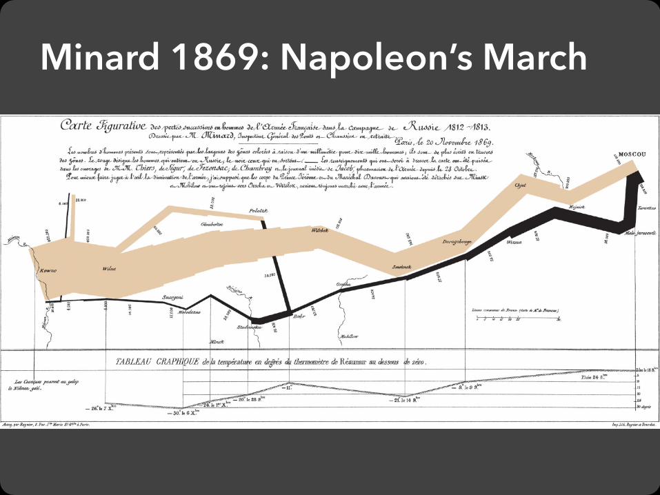
Minard 1869: Napoleon’s March

+
Single-Axis Composition
=

Y-axis: temperature (Q)
X-axis: longitude (Q) / time (O)
Mark Composition
+
=Temp over space/time (Q x Q)

Y-axis: latitude (Q)
X-axis: longitude (Q)
Width: army size (Q)
+
Mark Composition
+=
Army position (Q x Q) and army size (Q)

latitude (Q)
longitude (Q)
army size (Q)
temperature (Q)
longitude (Q) / time (O)

Depicts at least 5 quantitative variables. Any others?
Minard 1869: Napoleon’s March

Formalizing Design

Assume k visual encodings and n data attributes. We would like to pick the “best” encoding among a combinatorial set of possibilities of size (n+1)k
Choosing Visual Encodings

Assume k visual encodings and n data attributes. We would like to pick the “best” encoding among a combinatorial set of possibilities of size (n+1)k
Choosing Visual Encodings
Principle of Consistency The properties of the image (visual variables) should match the properties of the data.
Principle of Importance Ordering Encode the most important information in the most effective way.

Expressiveness A set of facts is expressible in a visual language if the sentences (i.e. the visualizations) in the language express all the facts in the set of data, and only the facts in the data.
Effectiveness A visualization is more effective than another visualization if the information conveyed by one visualization is more readily perceived than the information in the other visualization.
Design Criteria [Mackinlay 86]

A multivariate relation may be inexpressive in a single horizontal dot plot because multiple records are mapped to the same position.
Can not express the facts

Expresses facts not in the data

Expresses facts not in the data
A length is interpreted as a quantitative value.

Expressiveness A set of facts is expressible in a visual language if the sentences (i.e. the visualizations) in the language express all the facts in the set of data, and only the facts in the data.
Effectiveness A visualization is more effective than another visualization if the information conveyed by one visualization is more readily perceived than the information in the other visualization.
Design Criteria [Mackinlay 86]

Tell the truth and nothing but the truth (don’t lie, and don’t lie by omission)
Design Criteria Translated
Use encodings that people decode better (where better = faster and/or more accurate)

Conjectured effectiveness of encodings by data type
Mackinlay’s Ranking

APT - “A Presentation Tool”, 1986
User formally specifies data model and type Input: ordered list of data variables to show
APT searches over design space Test expressiveness of each visual encoding Generate encodings that pass test Rank by perceptual effectiveness criteria
Output the “most effective” visualization
Mackinlay’s Design Algorithm

APT
Automatically generate chart for car data
Input variables: 1. Price 2. Mileage 3. Repair 4. Weight

Does not cover many visualization techniques Networks, hierarchies, maps, diagrams Also: 3D structure, animation, illustration, … Does not consider interaction Does not consider semantics / conventions Assumes single visualization as output
Limitations of APT
Recent related work: Draco visualization design knowledge base

Formal specification Data model: relational data; N,O,Q types Image model: visual encoding channels Encodings map data to visual variables
Choose expressive and effective encodings Rule-based tests of expressiveness Perceptual effectiveness rankings
Question: how do we establish effectiveness criteria? Subject of perception lectures…
Summary: Data & Image Models