css · bootstrap
DESCRIPTION
CSS · BootstrapTRANSCRIPT

CSSGlobal CSS settings, fundamental HTML elements styled and enhancedwith extensible classes, and an advanced grid system.
OverviewGet the lowdown on the key pieces of Bootstrap's infrastructure, including ourapproach to better, faster, stronger web development.
HTML5 doctypeBootstrap makes use of certain HTML elements and CSS properties that require the use of the HTML5 doctype.Include it at the beginning of all your projects.
<!DOCTYPE html><html lang="en"> ...</html>
Mobile firstWith Bootstrap 2, we added optional mobile friendly styles for key aspects of the framework. With Bootstrap 3,we've rewritten the project to be mobile friendly from the start. Instead of adding on optional mobile styles, they'rebaked right into the core. In fact, Bootstrap is mobile first. Mobile first styles can be found throughout the entirelibrary instead of in separate files.
To ensure proper rendering and touch zooming, add the viewport meta tag to your <head> .
<meta name="viewport" content="width=device-width, initial-scale=1">
You can disable zooming capabilities on mobile devices by adding user-scalable=no to the viewport meta tag.This disables zooming, meaning users are only able to scroll, and results in your site feeling a bit more like a nativeapplication. Overall, we don't recommend this on every site, so use caution!
<meta name="viewport" content="width=device-width, initial-scale=1, maximum-scale=1, user-scalable=no">
Typography and linksBootstrap sets basic global display, typography, and link styles. Specifically, we:
Set background-color: #fff; on the bodyUse the @font-family-base , @font-size-base , and @line-height-base attributes as our typographic
Copy
Copy
Copy
http://getbootstrap.com/css/
1 of 58 5/07/2014 8:48 pm

baseSet the global link color via @link-color and apply link underlines only on :hover
These styles can be found within scaffolding.less .
Normalize.cssFor improved cross-browser rendering, we use Normalize.css (http://necolas.github.io/normalize.css/), a project byNicolas Gallagher (http://twitter.com/necolas) and Jonathan Neal (http://twitter.com/jon_neal).
ContainersBootstrap requires a containing element to wrap site contents and house our grid system. You may choose one oftwo containers to use in your projects. Note that, due to padding and more, neither container is nestable.
Use .container for a responsive fixed width container.
<div class="container"> ...</div>
Use .container-fluid for a full width container, spanning the entire width of your viewport.
<div class="container-fluid"> ...</div>
Grid systemBootstrap includes a responsive, mobile first fluid grid system that appropriatelyscales up to 12 columns as the device or viewport size increases. It includespredefined classes for easy layout options, as well as powerful mixins forgenerating more semantic layouts.
IntroductionGrid systems are used for creating page layouts through a series of rows and columns that house your content.Here's how the Bootstrap grid system works:
Rows must be placed within a .container (fixed-width) or .container-fluid (full-width) for properalignment and padding.Use rows to create horizontal groups of columns.Content should be placed within columns, and only columns may be immediate children of rows.Predefined grid classes like .row and .col-xs-4 are available for quickly making grid layouts. Less mixinscan also be used for more semantic layouts.Columns create gutters (gaps between column content) via padding . That padding is offset in rows for thefirst and last column via negative margin on .row s.The negative margin is why the examples below are outdented. It's so that content within grid columns islined up with non-grid content.Grid columns are created by specifying the number of twelve available columns you wish to span. Forexample, three equal columns would use three .col-xs-4 .If more than 12 columns are placed within a single row, each group of extra columns will, as one unit, wrap
Copy
Copy
http://getbootstrap.com/css/
2 of 58 5/07/2014 8:48 pm

onto a new line.Grid classes apply to devices with screen widths greater than or equal to the breakpoint sizes, and overridegrid classes targeted at smaller devices. Therefore, applying any .col-md- class to an element will not onlyaffect its styling on medium devices but also on large devices if a .col-lg- class is not present.
Look to the examples for applying these principles to your code.
Media queriesWe use the following media queries in our Less files to create the key breakpoints in our grid system.
/* Extra small devices (phones, less than 768px) *//* No media query since this is the default in Bootstrap */
/* Small devices (tablets, 768px and up) */@media (min-width: @screen-sm-min) { ... }
/* Medium devices (desktops, 992px and up) */@media (min-width: @screen-md-min) { ... }
/* Large devices (large desktops, 1200px and up) */@media (min-width: @screen-lg-min) { ... }
We occasionally expand on these media queries to include a max-width to limit CSS to a narrower set of devices.
@media (max-width: @screen-xs-max) { ... }@media (min-width: @screen-sm-min) and (max-width: @screen-sm-max) { ... }@media (min-width: @screen-md-min) and (max-width: @screen-md-max) { ... }@media (min-width: @screen-lg-min) { ... }
Grid optionsSee how aspects of the Bootstrap grid system work across multiple devices with a handy table.
Extra small devicesPhones (<768px)
Small devicesTablets (≥768px)
Medium devicesDesktops (≥992px)
Large devicesDesktops (≥1200px)
Grid behavior Horizontal at all times Collapsed to start, horizontal above breakpoints
Container width None (auto) 750px 970px 1170px
Class prefix .col-xs- .col-sm- .col-md- .col-lg-
# of columns 12
Column width Auto ~62px ~81px ~97px
Gutter width 30px (15px on each side of a column)
Nestable Yes
Offsets Yes
Column ordering Yes
Example: Stacked-to-horizontalUsing a single set of .col-md-* grid classes, you can create a basic grid system that starts out stacked onmobile devices and tablet devices (the extra small to small range) before becoming horizontal on desktop (medium)
Copy
Copy
http://getbootstrap.com/css/
3 of 58 5/07/2014 8:48 pm

devices. Place grid columns in any .row .
.col-md-1
.col-md-1
.col-md-1
.col-md-1
.col-md-1
.col-md-1
.col-md-1
.col-md-1
.col-md-1
.col-md-1
.col-md-1
.col-md-1
.col-md-8
.col-md-4
.col-md-4
.col-md-4
.col-md-4
.col-md-6
.col-md-6
Copy
http://getbootstrap.com/css/
4 of 58 5/07/2014 8:48 pm

<div class="row"> <div class="col-md-1">.col-md-1</div> <div class="col-md-1">.col-md-1</div> <div class="col-md-1">.col-md-1</div> <div class="col-md-1">.col-md-1</div> <div class="col-md-1">.col-md-1</div> <div class="col-md-1">.col-md-1</div> <div class="col-md-1">.col-md-1</div> <div class="col-md-1">.col-md-1</div> <div class="col-md-1">.col-md-1</div> <div class="col-md-1">.col-md-1</div> <div class="col-md-1">.col-md-1</div> <div class="col-md-1">.col-md-1</div></div><div class="row"> <div class="col-md-8">.col-md-8</div> <div class="col-md-4">.col-md-4</div></div><div class="row"> <div class="col-md-4">.col-md-4</div> <div class="col-md-4">.col-md-4</div> <div class="col-md-4">.col-md-4</div></div><div class="row"> <div class="col-md-6">.col-md-6</div> <div class="col-md-6">.col-md-6</div></div>
Example: Fluid containerTurn any fixed-width grid layout into a full-width layout by changing your outermost .container to .container-fluid .
<div class="container-fluid"> <div class="row"> ... </div></div>
Example: Mobile and desktopDon't want your columns to simply stack in smaller devices? Use the extra small and medium device grid classesby adding .col-xs-* .col-md-* to your columns. See the example below for a better idea of how it all works.
.col-xs-12 .col-md-8
.col-xs-6 .col-md-4
.col-xs-6 .col-md-4 .col-xs-6 .col-md-4
.col-xs-6 .col-md-4
.col-xs-6 .col-xs-6
Copy
Copy
http://getbootstrap.com/css/
5 of 58 5/07/2014 8:48 pm

<!-- Stack the columns on mobile by making one full-width and the other half-width --><div class="row"> <div class="col-xs-12 col-md-8">.col-xs-12 .col-md-8</div> <div class="col-xs-6 col-md-4">.col-xs-6 .col-md-4</div></div>
<!-- Columns start at 50% wide on mobile and bump up to 33.3% wide on desktop --><div class="row"> <div class="col-xs-6 col-md-4">.col-xs-6 .col-md-4</div> <div class="col-xs-6 col-md-4">.col-xs-6 .col-md-4</div> <div class="col-xs-6 col-md-4">.col-xs-6 .col-md-4</div></div>
<!-- Columns are always 50% wide, on mobile and desktop --><div class="row"> <div class="col-xs-6">.col-xs-6</div> <div class="col-xs-6">.col-xs-6</div></div>
Example: Mobile, tablet, desktopsBuild on the previous example by creating even more dynamic and powerful layouts with tablet .col-sm-*classes.
<div class="row"> <div class="col-xs-12 col-sm-6 col-md-8">.col-xs-12 .col-sm-6 .col-md-8</div> <div class="col-xs-6 col-md-4">.col-xs-6 .col-md-4</div></div><div class="row"> <div class="col-xs-6 col-sm-4">.col-xs-6 .col-sm-4</div> <div class="col-xs-6 col-sm-4">.col-xs-6 .col-sm-4</div> <!-- Optional: clear the XS cols if their content doesn't match in height --> <div class="clearfix visible-xs-block"></div> <div class="col-xs-6 col-sm-4">.col-xs-6 .col-sm-4</div></div>
Example: Column wrappingIf more than 12 columns are placed within a single row, each group of extra columns will, as one unit, wrap onto anew line.
.col-xs-12 .col-sm-6 .col-md-8 .col-xs-6 .col-md-4
.col-xs-6 .col-sm-4 .col-xs-6 .col-sm-4 .col-xs-6 .col-sm-4
.col-xs-9
.col-xs-4Since 9 + 4 = 13 > 12, this4-column-wide div gets wrappedonto a new line as one contiguousunit.
.col-xs-6Subsequent columns continue along the new line.
Copy
Copy
http://getbootstrap.com/css/
6 of 58 5/07/2014 8:48 pm

<div class="row"> <div class="col-xs-9">.col-xs-9</div> <div class="col-xs-4">.col-xs-4<br>Since 9 + 4 = 13 > 12, this 4-column-wide div gets wrapped onto a new line as one contiguous unit.</div> <div class="col-xs-6">.col-xs-6<br>Subsequent columns continue along the new line.</div></div>
Responsive column resetsWith the four tiers of grids available you're bound to run into issues where, at certain breakpoints, your columnsdon't clear quite right as one is taller than the other. To fix that, use a combination of a .clearfix and ourresponsive utility classes.
<div class="row"> <div class="col-xs-6 col-sm-3">.col-xs-6 .col-sm-3</div> <div class="col-xs-6 col-sm-3">.col-xs-6 .col-sm-3</div>
<!-- Add the extra clearfix for only the required viewport --> <div class="clearfix visible-xs-block"></div>
<div class="col-xs-6 col-sm-3">.col-xs-6 .col-sm-3</div> <div class="col-xs-6 col-sm-3">.col-xs-6 .col-sm-3</div></div>
In addition to column clearing at responsive breakpoints, you may need to reset offsets, pushes, or pulls. Seethis in action in the grid example (../examples/grid/).
<div class="row"> <div class="col-sm-5 col-md-6">.col-sm-5 .col-md-6</div> <div class="col-sm-5 col-sm-offset-2 col-md-6 col-md-offset-0">.col-sm-5 .col-sm-offset-2 .col-md-6 .col-md-offset-0</div></div>
<div class="row"> <div class="col-sm-6 col-md-5 col-lg-6">.col-sm-6 .col-md-5 .col-lg-6</div> <div class="col-sm-6 col-md-5 col-md-offset-2 col-lg-6 col-lg-offset-0">.col-sm-6 .col-md-5 .col-md-offset-2 .col-lg-6 .col-lg-offset-0</div></div>
Offsetting columnsMove columns to the right using .col-md-offset-* classes. These classes increase the left margin of a columnby * columns. For example, .col-md-offset-4 moves .col-md-4 over four columns.
.col-xs-6 .col-sm-3Resize your viewport orcheck it out on yourphone for an example.
.col-xs-6 .col-sm-3 .col-xs-6 .col-sm-3 .col-xs-6 .col-sm-3
.col-md-4
.col-md-4 .col-md-offset-4
.col-md-3 .col-md-offset-3
Copy
Copy
http://getbootstrap.com/css/
7 of 58 5/07/2014 8:48 pm

<div class="row"> <div class="col-md-4">.col-md-4</div> <div class="col-md-4 col-md-offset-4">.col-md-4 .col-md-offset-4</div></div><div class="row"> <div class="col-md-3 col-md-offset-3">.col-md-3 .col-md-offset-3</div> <div class="col-md-3 col-md-offset-3">.col-md-3 .col-md-offset-3</div></div><div class="row"> <div class="col-md-6 col-md-offset-3">.col-md-6 .col-md-offset-3</div></div>
Nesting columnsTo nest your content with the default grid, add a new .row and set of .col-sm-* columns within an existing.col-sm-* column. Nested rows should include a set of columns that add up to 12 or less (it is not required that
you use all 12 available columns).
<div class="row"> <div class="col-sm-9"> Level 1: .col-sm-9 <div class="row"> <div class="col-xs-8 col-sm-6"> Level 2: .col-xs-8 .col-sm-6 </div> <div class="col-xs-4 col-sm-6"> Level 2: .col-xs-4 .col-sm-6 </div> </div> </div></div>
Column orderingEasily change the order of our built-in grid columns with .col-md-push-* and .col-md-pull-* modifierclasses.
.col-md-3 .col-md-offset-3
.col-md-6 .col-md-offset-3
Level 1: .col-sm-9
Level 2: .col-xs-8 .col-sm-6 Level 2: .col-xs-4 .col-sm-6
.col-md-9 .col-md-push-3
.col-md-3 .col-md-pull-9
Copy
Copy
Copy
http://getbootstrap.com/css/
8 of 58 5/07/2014 8:48 pm

<div class="row"> <div class="col-md-9 col-md-push-3">.col-md-9 .col-md-push-3</div> <div class="col-md-3 col-md-pull-9">.col-md-3 .col-md-pull-9</div></div>
Less mixins and variablesIn addition to prebuilt grid classes for fast layouts, Bootstrap includes Less variables and mixins for quicklygenerating your own simple, semantic layouts.
VariablesVariables determine the number of columns, the gutter width, and the media query point at which to begin floatingcolumns. We use these to generate the predefined grid classes documented above, as well as for the custommixins listed below.
@grid-columns: 12;@grid-gutter-width: 30px;@grid-float-breakpoint: 768px;
MixinsMixins are used in conjunction with the grid variables to generate semantic CSS for individual grid columns.
Copy
Copy
http://getbootstrap.com/css/
9 of 58 5/07/2014 8:48 pm

// Creates a wrapper for a series of columns.make-row(@gutter: @grid-gutter-width) { // Then clear the floated columns .clearfix();
@media (min-width: @screen-sm-min) { margin-left: (@gutter / -2); margin-right: (@gutter / -2); }
// Negative margin nested rows out to align the content of columns .row { margin-left: (@gutter / -2); margin-right: (@gutter / -2); }}
// Generate the extra small columns.make-xs-column(@columns; @gutter: @grid-gutter-width) { position: relative; // Prevent columns from collapsing when empty min-height: 1px; // Inner gutter via padding padding-left: (@gutter / 2); padding-right: (@gutter / 2);
// Calculate width based on number of columns available @media (min-width: @grid-float-breakpoint) { float: left; width: percentage((@columns / @grid-columns)); }}
// Generate the small columns.make-sm-column(@columns; @gutter: @grid-gutter-width) { position: relative; // Prevent columns from collapsing when empty min-height: 1px; // Inner gutter via padding padding-left: (@gutter / 2); padding-right: (@gutter / 2);
// Calculate width based on number of columns available @media (min-width: @screen-sm-min) { float: left; width: percentage((@columns / @grid-columns)); }}
// Generate the small column offsets.make-sm-column-offset(@columns) { @media (min-width: @screen-sm-min) { margin-left: percentage((@columns / @grid-columns)); }}.make-sm-column-push(@columns) { @media (min-width: @screen-sm-min) { left: percentage((@columns / @grid-columns)); }}.make-sm-column-pull(@columns) { @media (min-width: @screen-sm-min) {
http://getbootstrap.com/css/
10 of 58 5/07/2014 8:48 pm
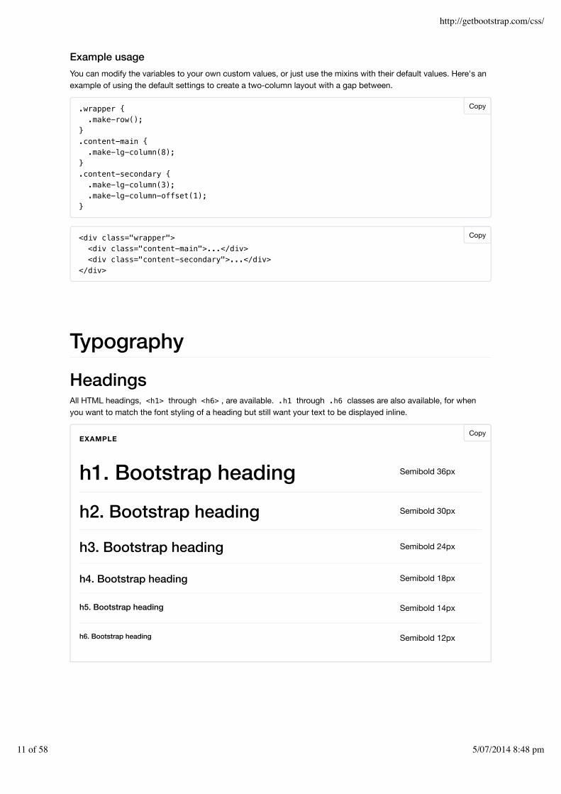
Example usageYou can modify the variables to your own custom values, or just use the mixins with their default values. Here's anexample of using the default settings to create a two-column layout with a gap between.
.wrapper { .make-row();}.content-main { .make-lg-column(8);}.content-secondary { .make-lg-column(3); .make-lg-column-offset(1);}
<div class="wrapper"> <div class="content-main">...</div> <div class="content-secondary">...</div></div>
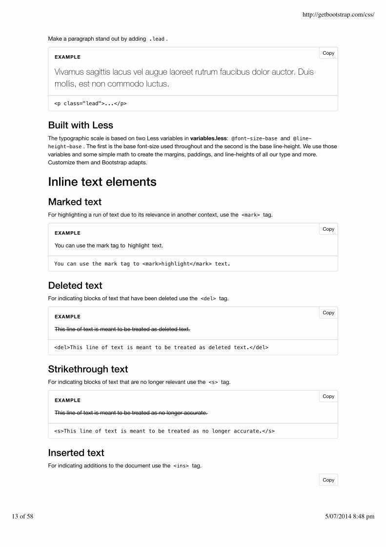
TypographyHeadingsAll HTML headings, <h1> through <h6> , are available. .h1 through .h6 classes are also available, for whenyou want to match the font styling of a heading but still want your text to be displayed inline.
h1. Bootstrap heading Semibold 36px
h2. Bootstrap heading Semibold 30px
h3. Bootstrap heading Semibold 24px
h4. Bootstrap heading Semibold 18px
h5. Bootstrap heading Semibold 14px
h6. Bootstrap heading Semibold 12px
EXAMPLE
Copy
Copy
Copy
http://getbootstrap.com/css/
11 of 58 5/07/2014 8:48 pm

<h1>h1. Bootstrap heading</h1><h2>h2. Bootstrap heading</h2><h3>h3. Bootstrap heading</h3><h4>h4. Bootstrap heading</h4><h5>h5. Bootstrap heading</h5><h6>h6. Bootstrap heading</h6>
Create lighter, secondary text in any heading with a generic <small> tag or the .small class.
<h1>h1. Bootstrap heading <small>Secondary text</small></h1><h2>h2. Bootstrap heading <small>Secondary text</small></h2><h3>h3. Bootstrap heading <small>Secondary text</small></h3><h4>h4. Bootstrap heading <small>Secondary text</small></h4><h5>h5. Bootstrap heading <small>Secondary text</small></h5><h6>h6. Bootstrap heading <small>Secondary text</small></h6>
Body copyBootstrap's global default font-size is 14px, with a line-height of 1.428. This is applied to the <body> andall paragraphs. In addition, <p> (paragraphs) receive a bottom margin of half their computed line-height (10px bydefault).
<p>...</p>
Lead body copy
h1. Bootstrap heading Secondary text
h2. Bootstrap heading Secondary text
h3. Bootstrap heading Secondary text
h4. Bootstrap heading Secondary text
h5. Bootstrap heading Secondary text
h6. Bootstrap heading Secondary text
EXAMPLE
Nullam quis risus eget urna mollis ornare vel eu leo. Cum sociis natoque penatibus et magnis dis parturientmontes, nascetur ridiculus mus. Nullam id dolor id nibh ultricies vehicula.
Cum sociis natoque penatibus et magnis dis parturient montes, nascetur ridiculus mus. Donec ullamcorpernulla non metus auctor fringilla. Duis mollis, est non commodo luctus, nisi erat porttitor ligula, eget laciniaodio sem nec elit. Donec ullamcorper nulla non metus auctor fringilla.
Maecenas sed diam eget risus varius blandit sit amet non magna. Donec id elit non mi porta gravida at egetmetus. Duis mollis, est non commodo luctus, nisi erat porttitor ligula, eget lacinia odio sem nec elit.
EXAMPLE
Copy
Copy
http://getbootstrap.com/css/
12 of 58 5/07/2014 8:48 pm
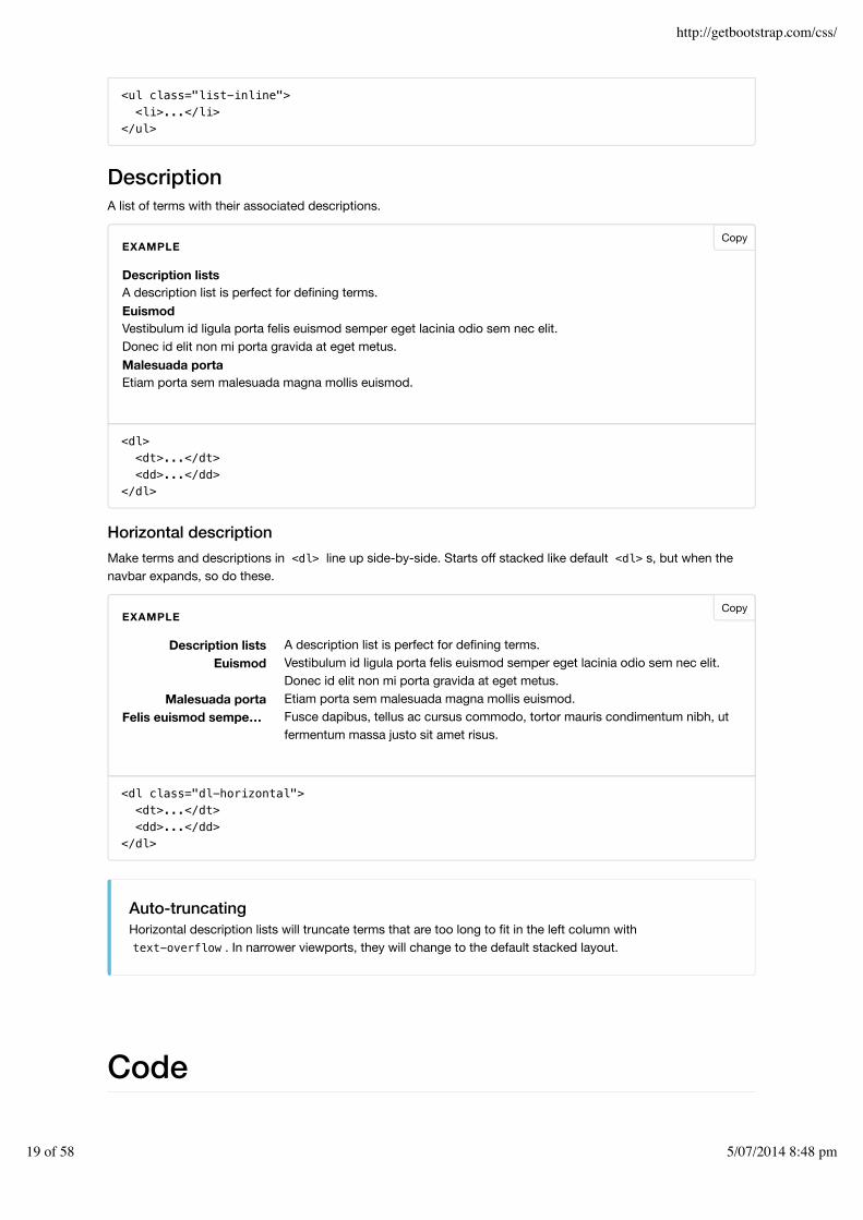
Make a paragraph stand out by adding .lead .
<p class="lead">...</p>
Built with LessThe typographic scale is based on two Less variables in variables.less: @font-size-base and @line-height-base . The first is the base font-size used throughout and the second is the base line-height. We use thosevariables and some simple math to create the margins, paddings, and line-heights of all our type and more.Customize them and Bootstrap adapts.
Inline text elementsMarked textFor highlighting a run of text due to its relevance in another context, use the <mark> tag.
You can use the mark tag to <mark>highlight</mark> text.
Deleted textFor indicating blocks of text that have been deleted use the <del> tag.
<del>This line of text is meant to be treated as deleted text.</del>
Strikethrough textFor indicating blocks of text that are no longer relevant use the <s> tag.
<s>This line of text is meant to be treated as no longer accurate.</s>
Inserted textFor indicating additions to the document use the <ins> tag.
Vivamus sagittis lacus vel augue laoreet rutrum faucibus dolor auctor. Duismollis, est non commodo luctus.
EXAMPLE
You can use the mark tag to highlight text.
EXAMPLE
This line of text is meant to be treated as deleted text.
EXAMPLE
This line of text is meant to be treated as no longer accurate.
EXAMPLE
Copy
Copy
Copy
Copy
Copy
http://getbootstrap.com/css/
13 of 58 5/07/2014 8:48 pm

<ins>This line of text is meant to be treated as an addition to the document.</ins>
Underlined textTo underline text use the <u> tag.
<u>This line of text will render as underlined</u>
Make use of HTML's default emphasis tags with lightweight styles.
Small textFor de-emphasizing inline or blocks of text, use the <small> tag to set text at 85% the size of the parent.Heading elements receive their own font-size for nested <small> elements.
You may alternatively use an inline element with .small in place of any <small> .
<small>This line of text is meant to be treated as fine print.</small>
BoldFor emphasizing a snippet of text with a heavier font-weight.
<strong>rendered as bold text</strong>
ItalicsFor emphasizing a snippet of text with italics.
<em>rendered as italicized text</em>
Alternate elementsFeel free to use <b> and <i> in HTML5. <b> is meant to highlight words or phrases without conveying
This line of text is meant to be treated as an addition to the document.
EXAMPLE
This line of text will render as underlined
EXAMPLE
This line of text is meant to be treated as fine print.
EXAMPLE
The following snippet of text is rendered as bold text.
EXAMPLE
The following snippet of text is rendered as italicized text.
EXAMPLE
Copy
Copy
Copy
Copy
http://getbootstrap.com/css/
14 of 58 5/07/2014 8:48 pm

additional importance while <i> is mostly for voice, technical terms, etc.
Alignment classesEasily realign text to components with text alignment classes.
<p class="text-left">Left aligned text.</p><p class="text-center">Center aligned text.</p><p class="text-right">Right aligned text.</p><p class="text-justify">Justified text.</p><p class="text-nowrap">No wrap text.</p>
Transformation classesTransform text in components with text capitalization classes.
<p class="text-lowercase">Lowercased text.</p><p class="text-uppercase">Uppercased text.</p><p class="text-capitalize">Capitalized text.</p>
AbbreviationsStylized implementation of HTML's <abbr> element for abbreviations and acronyms to show the expandedversion on hover. Abbreviations with a title attribute have a light dotted bottom border and a help cursor onhover, providing additional context on hover.
Basic abbreviationFor expanded text on long hover of an abbreviation, include the title attribute with the <abbr> element.
<abbr title="attribute">attr</abbr>
Initialism
Left aligned text.
Center aligned text.
Right aligned text.
Justified text.
No wrap text.
EXAMPLE
lowercased text.
UPPERCASED TEXT.
Capitalized Text.
EXAMPLE
An abbreviation of the word attribute is attr (attribute).
EXAMPLE
Copy
Copy
Copy
http://getbootstrap.com/css/
15 of 58 5/07/2014 8:48 pm

Add .initialism to an abbreviation for a slightly smaller font-size.
<abbr title="HyperText Markup Language" class="initialism">HTML</abbr>
AddressesPresent contact information for the nearest ancestor or the entire body of work. Preserve formatting by ending alllines with <br> .
<address> <strong>Twitter, Inc.</strong><br> 795 Folsom Ave, Suite 600<br> San Francisco, CA 94107<br> <abbr title="Phone">P:</abbr> (123) 456-7890</address>
<address> <strong>Full Name</strong><br> <a href="mailto:#">[email protected]</a></address>
BlockquotesFor quoting blocks of content from another source within your document.
Default blockquoteWrap <blockquote> around any HTML (HyperText Markup Language) as the quote. For straight quotes, werecommend a <p> .
<blockquote> <p>Lorem ipsum dolor sit amet, consectetur adipiscing elit. Integer posuere erat a ante.</p></blockquote>
HTML (HYPERTEXT MARKUP LANGUAGE) is the best thing since sliced bread.
EXAMPLE
Twitter, Inc.795 Folsom Ave, Suite 600San Francisco, CA 94107P: (Phone) (123) 456-7890
Full [email protected] (https://mail.google.com/mail/?extsrc=mailto&url=mailto:#)
EXAMPLE
Lorem ipsum dolor sit amet, consectetur adipiscing elit. Integer posuere erat aante.
EXAMPLE
Copy
Copy
Copy
http://getbootstrap.com/css/
16 of 58 5/07/2014 8:48 pm

Blockquote optionsStyle and content changes for simple variations on a standard <blockquote> .
Naming a sourceAdd a <footer> for identifying the source. Wrap the name of the source work in <cite> .
<blockquote> <p>Lorem ipsum dolor sit amet, consectetur adipiscing elit. Integer posuere erat a ante.</p> <footer>Someone famous in <cite title="Source Title">Source Title</cite></footer></blockquote>
Alternate displaysAdd .blockquote-reverse for a blockquote with right-aligned content.
<blockquote class="blockquote-reverse"> ...</blockquote>
ListsUnorderedA list of items in which the order does not explicitly matter.
Lorem ipsum dolor sit amet, consectetur adipiscing elit. Integer posuere erat aante.— Someone famous in Source Title
EXAMPLE
Lorem ipsum dolor sit amet, consectetur adipiscing elit. Integer posuere erat a ante.Someone famous in Source Title —
EXAMPLE
Lorem ipsum dolor sit ametConsectetur adipiscing elitInteger molestie lorem at massaFacilisis in pretium nisl aliquetNulla volutpat aliquam velit
Phasellus iaculis nequePurus sodales ultriciesVestibulum laoreet porttitor semAc tristique libero volutpat at
Faucibus porta lacus fringilla velAenean sit amet erat nuncEget porttitor lorem
Copy
Copy
CopyEXAMPLE
http://getbootstrap.com/css/
17 of 58 5/07/2014 8:48 pm

<ul> <li>...</li></ul>
OrderedA list of items in which the order does explicitly matter.
<ol> <li>...</li></ol>
UnstyledRemove the default list-style and left margin on list items (immediate children only). This only applies toimmediate children list items, meaning you will need to add the class for any nested lists as well.
<ul class="list-unstyled"> <li>...</li></ul>
InlinePlace all list items on a single line with display: inline-block; and some light padding.
Lorem ipsum dolor sit amet1.Consectetur adipiscing elit2.Integer molestie lorem at massa3.Facilisis in pretium nisl aliquet4.Nulla volutpat aliquam velit5.Faucibus porta lacus fringilla vel6.Aenean sit amet erat nunc7.Eget porttitor lorem8.
EXAMPLE
Lorem ipsum dolor sit ametConsectetur adipiscing elitInteger molestie lorem at massaFacilisis in pretium nisl aliquetNulla volutpat aliquam velit
Phasellus iaculis nequePurus sodales ultriciesVestibulum laoreet porttitor semAc tristique libero volutpat at
Faucibus porta lacus fringilla velAenean sit amet erat nuncEget porttitor lorem
EXAMPLE
Lorem ipsum Phasellus iaculis Nulla volutpat
EXAMPLE
Copy
Copy
Copy
http://getbootstrap.com/css/
18 of 58 5/07/2014 8:48 pm
<ul class="list-inline"> <li>...</li></ul>
DescriptionA list of terms with their associated descriptions.
<dl> <dt>...</dt> <dd>...</dd></dl>
Horizontal descriptionMake terms and descriptions in <dl> line up side-by-side. Starts off stacked like default <dl> s, but when thenavbar expands, so do these.
<dl class="dl-horizontal"> <dt>...</dt> <dd>...</dd></dl>
Auto-truncatingHorizontal description lists will truncate terms that are too long to fit in the left column withtext-overflow . In narrower viewports, they will change to the default stacked layout.
Code
Description listsA description list is perfect for defining terms.EuismodVestibulum id ligula porta felis euismod semper eget lacinia odio sem nec elit.Donec id elit non mi porta gravida at eget metus.Malesuada portaEtiam porta sem malesuada magna mollis euismod.
EXAMPLE
Description listsEuismod
Malesuada portaFelis euismod sempe
A description list is perfect for defining terms.Vestibulum id ligula porta felis euismod semper eget lacinia odio sem nec elit.Donec id elit non mi porta gravida at eget metus.Etiam porta sem malesuada magna mollis euismod.Fusce dapibus, tellus ac cursus commodo, tortor mauris condimentum nibh, utfermentum massa justo sit amet risus.
…
EXAMPLE
Copy
Copy
http://getbootstrap.com/css/
19 of 58 5/07/2014 8:48 pm

InlineWrap inline snippets of code with <code> .
For example, <code><section></code> should be wrapped as inline.
User inputUse the <kbd> to indicate input that is typically entered via keyboard.
To switch directories, type <kbd>cd</kbd> followed by the name of the directory.
Basic blockUse <pre> for multiple lines of code. Be sure to escape any angle brackets in the code for proper rendering.
<pre><p>Sample text here...</p></pre>
You may optionally add the .pre-scrollable class, which will set a max-height of 350px and provide a y-axisscrollbar.
VariablesFor indicating variables use the <var> tag.
<var>y</var> = <var>m</var><var>x</var> + <var>b</var>
Sample outputFor indicating blocks sample output from a program use the <samp> tag.
For example, <section> should be wrapped as inline.
EXAMPLE
To switch directories, type cd followed by the name of the directory.To edit settings, press ctrl + ,
EXAMPLE
<p>Sample text here...</p>
EXAMPLE
y = mx + b
EXAMPLE
This text is meant to be treated as sample output from a computer program.
EXAMPLE
Copy
Copy
Copy
Copy
Copy
http://getbootstrap.com/css/
20 of 58 5/07/2014 8:48 pm

<samp>This text is meant to be treated as sample output from a computer program.</samp>
TablesBasic exampleFor basic styling—light padding and only horizontal dividers—add the base class .table to any <table> . It mayseem super redundant, but given the widespread use of tables for other plugins like calendars and date pickers,we've opted to isolate our custom table styles.
<table class="table"> ...</table>
Striped rowsUse .table-striped to add zebra-striping to any table row within the <tbody> .
Cross-browser compatibilityStriped tables are styled via the :nth-child CSS selector, which is not available in Internet Explorer 8.
<table class="table table-striped"> ...</table>
# First Name Last Name Username
1 Mark Otto @mdo
2 Jacob Thornton @fat
3 Larry the Bird @twitter
EXAMPLE
# First Name Last Name Username
1 Mark Otto @mdo
2 Jacob Thornton @fat
3 Larry the Bird @twitter
EXAMPLE
Copy
Copy
http://getbootstrap.com/css/
21 of 58 5/07/2014 8:48 pm

Bordered tableAdd .table-bordered for borders on all sides of the table and cells.
<table class="table table-bordered"> ...</table>
Hover rowsAdd .table-hover to enable a hover state on table rows within a <tbody> .
<table class="table table-hover"> ...</table>
Condensed tableAdd .table-condensed to make tables more compact by cutting cell padding in half.
<table class="table table-condensed"> ...</table>
# First Name Last Name Username
1 Mark Otto @mdo
Mark Otto @TwBootstrap
2 Jacob Thornton @fat
3 Larry the Bird @twitter
EXAMPLE
# First Name Last Name Username
1 Mark Otto @mdo
2 Jacob Thornton @fat
3 Larry the Bird @twitter
EXAMPLE
# First Name Last Name Username
1 Mark Otto @mdo
2 Jacob Thornton @fat
3 Larry the Bird @twitter
EXAMPLE
Copy
Copy
Copy
http://getbootstrap.com/css/
22 of 58 5/07/2014 8:48 pm

Contextual classesUse contextual classes to color table rows or individual cells.
Class Description
.active Applies the hover color to a particular row or cell
.success Indicates a successful or positive action
.info Indicates a neutral informative change or action
.warning Indicates a warning that might need attention
.danger Indicates a dangerous or potentially negative action
<!-- On rows --><tr class="active">...</tr><tr class="success">...</tr><tr class="warning">...</tr><tr class="danger">...</tr><tr class="info">...</tr>
<!-- On cells (`td` or `th`) --><tr> <td class="active">...</td> <td class="success">...</td> <td class="warning">...</td> <td class="danger">...</td> <td class="info">...</td></tr>
Responsive tablesCreate responsive tables by wrapping any .table in .table-responsive to make them scroll horizontally on
# Column heading Column heading Column heading
1 Column content Column content Column content
2 Column content Column content Column content
3 Column content Column content Column content
4 Column content Column content Column content
5 Column content Column content Column content
6 Column content Column content Column content
7 Column content Column content Column content
8 Column content Column content Column content
9 Column content Column content Column content
EXAMPLECopy
http://getbootstrap.com/css/
23 of 58 5/07/2014 8:48 pm

small devices (under 768px). When viewing on anything larger than 768px wide, you will not see any difference inthese tables.
Firefox and fieldsetsFirefox has some awkward fieldset styling involving width that interferes with the responsive table. Thiscannot be overriden without a Firefox-specific hack that we don't provide in Bootstrap:
@-moz-document url-prefix() { fieldset { display: table-cell; }}
For more information, read this Stack Overflow answer (http://stackoverflow.com/questions/17408815/fieldset-resizes-wrong-appears-to-have-unremovable-min-width-min-content/17863685#17863685).
<div class="table-responsive"> <table class="table"> ... </table></div>
FormsBasic exampleIndividual form controls automatically receive some global styling. All textual <input> , <textarea> , and<select> elements with .form-control are set to width: 100%; by default. Wrap labels and controls in.form-group for optimum spacing.
# Table heading Table heading Table heading Table heading Table heading Table heading
1 Table cell Table cell Table cell Table cell Table cell Table cell
2 Table cell Table cell Table cell Table cell Table cell Table cell
3 Table cell Table cell Table cell Table cell Table cell Table cell
# Table heading Table heading Table heading Table heading Table heading Table heading
1 Table cell Table cell Table cell Table cell Table cell Table cell
2 Table cell Table cell Table cell Table cell Table cell Table cell
3 Table cell Table cell Table cell Table cell Table cell Table cell
EXAMPLE
Copy
Copy
Copy
http://getbootstrap.com/css/
24 of 58 5/07/2014 8:48 pm

<form role="form"> <div class="form-group"> <label for="exampleInputEmail1">Email address</label> <input type="email" class="form-control" id="exampleInputEmail1" placeholder="Enter email"> </div> <div class="form-group"> <label for="exampleInputPassword1">Password</label> <input type="password" class="form-control" id="exampleInputPassword1" placeholder="Password"> </div> <div class="form-group"> <label for="exampleInputFile">File input</label> <input type="file" id="exampleInputFile"> <p class="help-block">Example block-level help text here.</p> </div> <div class="checkbox"> <label> <input type="checkbox"> Check me out </label> </div> <button type="submit" class="btn btn-default">Submit</button></form>
Don't mix form groups with input groupsDo not mix form groups directly with input groups (/components/#input-groups). Instead, nest the inputgroup inside of the form group.
Inline formAdd .form-inline to your <form> for left-aligned and inline-block controls. This only applies to forms withinviewports that are at least 768px wide.
Requires custom widthsInputs, selects, and textareas are 100% wide by default in Bootstrap. To use the inline form, you'll have to
Email address
Enter email
Password
Password
File input
Browse… No file selected.
Example block-level help text here.
Submit
Check me out
EXAMPLE
http://getbootstrap.com/css/
25 of 58 5/07/2014 8:48 pm

set a width on the form controls used within.
Always add labelsScreen readers will have trouble with your forms if you don't include a label for every input. For these inlineforms, you can hide the labels using the .sr-only class.
<form class="form-inline" role="form"> <div class="form-group"> <label class="sr-only" for="exampleInputEmail2">Email address</label> <input type="email" class="form-control" id="exampleInputEmail2" placeholder="Enter email"> </div> <div class="form-group"> <div class="input-group"> <div class="input-group-addon">@</div> <input class="form-control" type="email" placeholder="Enter email"> </div> </div> <div class="form-group"> <label class="sr-only" for="exampleInputPassword2">Password</label> <input type="password" class="form-control" id="exampleInputPassword2" placeholder="Password"> </div> <div class="checkbox"> <label> <input type="checkbox"> Remember me </label> </div> <button type="submit" class="btn btn-default">Sign in</button></form>
Horizontal formUse Bootstrap's predefined grid classes to align labels and groups of form controls in a horizontal layout by adding.form-horizontal to the form. Doing so changes .form-group s to behave as grid rows, so no need for .row .
Enter email Password
Sign in
@ Remember me
EXAMPLE
Enter email
Copy
Copy
http://getbootstrap.com/css/
26 of 58 5/07/2014 8:48 pm

<form class="form-horizontal" role="form"> <div class="form-group"> <label for="inputEmail3" class="col-sm-2 control-label">Email</label> <div class="col-sm-10"> <input type="email" class="form-control" id="inputEmail3" placeholder="Email"> </div> </div> <div class="form-group"> <label for="inputPassword3" class="col-sm-2 control-label">Password</label> <div class="col-sm-10"> <input type="password" class="form-control" id="inputPassword3" placeholder="Password"> </div> </div> <div class="form-group"> <div class="col-sm-offset-2 col-sm-10"> <div class="checkbox"> <label> <input type="checkbox"> Remember me </label> </div> </div> </div> <div class="form-group"> <div class="col-sm-offset-2 col-sm-10"> <button type="submit" class="btn btn-default">Sign in</button> </div> </div></form>
Supported controlsExamples of standard form controls supported in an example form layout.
InputsMost common form control, text-based input fields. Includes support for all HTML5 types: text , password ,datetime , datetime-local , date , month , time , week , number , email , url , search , tel , andcolor .
Type declaration requiredInputs will only be fully styled if their type is properly declared.
Email Email
Password Password
Remember me
Sign in
EXAMPLE
http://getbootstrap.com/css/
27 of 58 5/07/2014 8:48 pm

<input type="text" class="form-control" placeholder="Text input">
Input groupsTo add integrated text or buttons before and/or after any text-based <input> , check out the input groupcomponent (../components/#input-groups).
TextareaForm control which supports multiple lines of text. Change rows attribute as necessary.
<textarea class="form-control" rows="3"></textarea>
Checkboxes and radiosCheckboxes are for selecting one or several options in a list, while radios are for selecting one option from many.
A checkbox or radio with the disabled attribute will be styled appropriately. To have the <label> for thecheckbox or radio also display a "not-allowed" cursor when the user hovers over the label, add the .disabledclass to your .radio , .radio-inline , .checkbox , .checkbox-inline , or <fieldset> .
Default (stacked)
Text input
EXAMPLE
EXAMPLE
Option one is this and that—be sure to include why it's great
Option two is disabled
Option one is this and that—be sure to include why it's great
Option two can be something else and selecting it will deselect option one
Option three is disabled
EXAMPLE
Copy
Copy
http://getbootstrap.com/css/
28 of 58 5/07/2014 8:48 pm

<div class="checkbox"> <label> <input type="checkbox" value=""> Option one is this and that—be sure to include why it's great </label></div><div class="checkbox disabled"> <label> <input type="checkbox" value="" disabled> Option two is disabled </label></div>
<div class="radio"> <label> <input type="radio" name="optionsRadios" id="optionsRadios1" value="option1" checked> Option one is this and that—be sure to include why it's great </label></div><div class="radio"> <label> <input type="radio" name="optionsRadios" id="optionsRadios2" value="option2"> Option two can be something else and selecting it will deselect option one </label></div><div class="radio disabled"> <label> <input type="radio" name="optionsRadios" id="optionsRadios3" value="option3" disabled> Option three is disabled </label></div>
Inline checkboxes and radiosUse the .checkbox-inline or .radio-inline classes on a series of checkboxes or radios for controls thatappear on the same line.
1 2 3
1 2 3
EXAMPLECopy
http://getbootstrap.com/css/
29 of 58 5/07/2014 8:48 pm

<label class="checkbox-inline"> <input type="checkbox" id="inlineCheckbox1" value="option1"> 1</label><label class="checkbox-inline"> <input type="checkbox" id="inlineCheckbox2" value="option2"> 2</label><label class="checkbox-inline"> <input type="checkbox" id="inlineCheckbox3" value="option3"> 3</label>
<label class="radio-inline"> <input type="radio" name="inlineRadioOptions" id="inlineRadio1" value="option1"> 1</label><label class="radio-inline"> <input type="radio" name="inlineRadioOptions" id="inlineRadio2" value="option2"> 2</label><label class="radio-inline"> <input type="radio" name="inlineRadioOptions" id="inlineRadio3" value="option3"> 3</label>
SelectsUse the default option, or add multiple to show multiple options at once.
<select class="form-control"> <option>1</option> <option>2</option> <option>3</option> <option>4</option> <option>5</option></select>
<select multiple class="form-control"> <option>1</option> <option>2</option> <option>3</option> <option>4</option> <option>5</option></select>
Static controlWhen you need to place plain text next to a form label within a horizontal form, use the .form-control-staticclass on a <p> .
1
12345
EXAMPLECopy
Copy
http://getbootstrap.com/css/
30 of 58 5/07/2014 8:48 pm

<form class="form-horizontal" role="form"> <div class="form-group"> <label class="col-sm-2 control-label">Email</label> <div class="col-sm-10"> <p class="form-control-static">[email protected]</p> </div> </div> <div class="form-group"> <label for="inputPassword" class="col-sm-2 control-label">Password</label> <div class="col-sm-10"> <input type="password" class="form-control" id="inputPassword" placeholder="Password"> </div> </div></form>
Input focusWe remove the default outline styles on some form controls and apply a box-shadow in its place for :focus .
Demo :focus stateThe above example input uses custom styles in our documentation to demonstrate the :focus state on a.form-control .
Disabled inputsAdd the disabled boolean attribute on an input to prevent user input and trigger a slightly different look.
<input class="form-control" id="disabledInput" type="text" placeholder="Disabled input here..." disabled>
Disabled fieldsetsAdd the disabled attribute to a <fieldset> to disable all the controls within the <fieldset> at once.
Email [email protected]
Password Password
EXAMPLE
Demonstrative focus state
EXAMPLE
Disabled input here…
EXAMPLECopy
http://getbootstrap.com/css/
31 of 58 5/07/2014 8:48 pm

Caveat about link functionality of <a>Our styles use pointer-events: none to try to disable the link functionality of <a class="btn btn-*">buttons in this case, but that CSS property is not yet standardized and isn't fully supported in Opera 18 andbelow, or in Internet Explorer 11. So to be safe, use custom JavaScript to disable such links.
Cross-browser compatibilityWhile Bootstrap will apply these styles in all browsers, Internet Explorer 9 and below don't actually supportthe disabled attribute on a <fieldset> . Use custom JavaScript to disable the fieldset in thesebrowsers.
<form role="form"> <fieldset disabled> <div class="form-group"> <label for="disabledTextInput">Disabled input</label> <input type="text" id="disabledTextInput" class="form-control" placeholder="Disabled input"> </div> <div class="form-group"> <label for="disabledSelect">Disabled select menu</label> <select id="disabledSelect" class="form-control"> <option>Disabled select</option> </select> </div> <div class="checkbox"> <label> <input type="checkbox"> Can't check this </label> </div> <button type="submit" class="btn btn-primary">Submit</button> </fieldset></form>
Readonly inputsAdd the readonly boolean attribute on an input to prevent user input and style the input as disabled.
Disabled input
Disabled input
Disabled select menu
Disabled select
Can't check this
EXAMPLECopy
Copy
http://getbootstrap.com/css/
32 of 58 5/07/2014 8:48 pm

<input class="form-control" type="text" placeholder="Readonly input here…" readonly>
Validation statesBootstrap includes validation styles for error, warning, and success states on form controls. To use, add.has-warning , .has-error , or .has-success to the parent element. Any .control-label , .form-control ,
and .help-block within that element will receive the validation styles.
<div class="form-group has-success"> <label class="control-label" for="inputSuccess1">Input with success</label> <input type="text" class="form-control" id="inputSuccess1"></div><div class="form-group has-warning"> <label class="control-label" for="inputWarning1">Input with warning</label> <input type="text" class="form-control" id="inputWarning1"></div><div class="form-group has-error"> <label class="control-label" for="inputError1">Input with error</label> <input type="text" class="form-control" id="inputError1"></div>
With optional iconsYou can also add optional feedback icons with the addition of .has-feedback and the right icon.
Icons, labels, and input groupsManual positioning of feedback icons is required for inputs without a label and for input groups(../components#input-groups) with an add-on on the right. You are strongly encouraged to provide labels forall inputs for accessibility reasons. If you wish to prevent labels from being displayed, hide them with thesr-only class. If you must do without labels, adjust the top value of the feedback icon. For input groups,
adjust the right value to an appropriate pixel value depending on the width of your addon.
Readonly input here…
EXAMPLE
Input with success
Input with warning
Input with error
EXAMPLECopy
Copy
http://getbootstrap.com/css/
33 of 58 5/07/2014 8:48 pm

<div class="form-group has-success has-feedback"> <label class="control-label" for="inputSuccess2">Input with success</label> <input type="text" class="form-control" id="inputSuccess2"> <span class="glyphicon glyphicon-ok form-control-feedback"></span></div><div class="form-group has-warning has-feedback"> <label class="control-label" for="inputWarning2">Input with warning</label> <input type="text" class="form-control" id="inputWarning2"> <span class="glyphicon glyphicon-warning-sign form-control-feedback"></span></div><div class="form-group has-error has-feedback"> <label class="control-label" for="inputError2">Input with error</label> <input type="text" class="form-control" id="inputError2"> <span class="glyphicon glyphicon-remove form-control-feedback"></span></div>
Optional icons in horizontal and inline forms
<form class="form-horizontal" role="form"> <div class="form-group has-success has-feedback"> <label class="control-label col-sm-3" for="inputSuccess3">Input with success</label> <div class="col-sm-9"> <input type="text" class="form-control" id="inputSuccess3"> <span class="glyphicon glyphicon-ok form-control-feedback"></span> </div> </div></form>
Input with success
Input with warning
Input with error
EXAMPLE
Input with success
EXAMPLE
Input with success
EXAMPLE
Copy
Copy
http://getbootstrap.com/css/
34 of 58 5/07/2014 8:48 pm

<form class="form-inline" role="form"> <div class="form-group has-success has-feedback"> <label class="control-label" for="inputSuccess4">Input with success</label> <input type="text" class="form-control" id="inputSuccess4"> <span class="glyphicon glyphicon-ok form-control-feedback"></span> </div></form>
Optional icons with hidden .sr-only labelsFor form controls with no visible label, add the .sr-only class on the label. Bootstrap will automatically adjustthe position of the icon once it's been added.
<div class="form-group has-success has-feedback"> <label class="control-label sr-only" for="inputSuccess5">Hidden label</label> <input type="text" class="form-control" id="inputSuccess5"> <span class="glyphicon glyphicon-ok form-control-feedback"></span></div>
Control sizingSet heights using classes like .input-lg , and set widths using grid column classes like .col-lg-* .
Height sizingCreate taller or shorter form controls that match button sizes.
<input class="form-control input-lg" type="text" placeholder=".input-lg"><input class="form-control" type="text" placeholder="Default input"><input class="form-control input-sm" type="text" placeholder=".input-sm">
<select class="form-control input-lg">...</select><select class="form-control">...</select><select class="form-control input-sm">...</select>
EXAMPLE
.input-lg
Default input
.input-sm
.input-lg
Default select
.input-sm
EXAMPLE
Copy
Copy
http://getbootstrap.com/css/
35 of 58 5/07/2014 8:48 pm

Horizontal form group sizesQuickly size labels and form controls within .form-horizontal by adding .form-group-lg or .form-group-sm .
<form class="form-horizontal" role="form"> <div class="form-group form-group-lg"> <label class="col-sm-2 control-label" for="formGroupInputLarge">Large label</label> <div class="col-sm-10"> <input class="form-control" type="text" id="formGroupInputLarge" placeholder="Large input"> </div> </div> <div class="form-group form-group-sm"> <label class="col-sm-2 control-label" for="formGroupInputSmall">Small label</label> <div class="col-sm-10"> <input class="form-control" type="text" id="formGroupInputSmall" placeholder="Small input"> </div> </div></form>
Column sizingWrap inputs in grid columns, or any custom parent element, to easily enforce desired widths.
<div class="row"> <div class="col-xs-2"> <input type="text" class="form-control" placeholder=".col-xs-2"> </div> <div class="col-xs-3"> <input type="text" class="form-control" placeholder=".col-xs-3"> </div> <div class="col-xs-4"> <input type="text" class="form-control" placeholder=".col-xs-4"> </div></div>
Help textBlock level help text for form controls.
Large label Large input
Small label Small input
EXAMPLE
.col-xs-2 .col-xs-3 .col-xs-4
EXAMPLE
Copy
Copy
Copy
http://getbootstrap.com/css/
36 of 58 5/07/2014 8:48 pm

<span class="help-block">A block of help text that breaks onto a new line and may extend beyond one line.</span>
ButtonsOptionsUse any of the available button classes to quickly create a styled button.
<!-- Standard button --><button type="button" class="btn btn-default">Default</button>
<!-- Provides extra visual weight and identifies the primary action in a set of buttons --><button type="button" class="btn btn-primary">Primary</button>
<!-- Indicates a successful or positive action --><button type="button" class="btn btn-success">Success</button>
<!-- Contextual button for informational alert messages --><button type="button" class="btn btn-info">Info</button>
<!-- Indicates caution should be taken with this action --><button type="button" class="btn btn-warning">Warning</button>
<!-- Indicates a dangerous or potentially negative action --><button type="button" class="btn btn-danger">Danger</button>
<!-- Deemphasize a button by making it look like a link while maintaining button behavior --><button type="button" class="btn btn-link">Link</button>
SizesFancy larger or smaller buttons? Add .btn-lg , .btn-sm , or .btn-xs for additional sizes.
A block of help text that breaks onto a new line and may extend beyond one line.
EXAMPLE
Default Primary Success Info Warning Danger Link
EXAMPLE
Large button Large button
Copy
CopyEXAMPLE
http://getbootstrap.com/css/
37 of 58 5/07/2014 8:48 pm

<p> <button type="button" class="btn btn-primary btn-lg">Large button</button> <button type="button" class="btn btn-default btn-lg">Large button</button></p><p> <button type="button" class="btn btn-primary">Default button</button> <button type="button" class="btn btn-default">Default button</button></p><p> <button type="button" class="btn btn-primary btn-sm">Small button</button> <button type="button" class="btn btn-default btn-sm">Small button</button></p><p> <button type="button" class="btn btn-primary btn-xs">Extra small button</button> <button type="button" class="btn btn-default btn-xs">Extra small button</button></p>
Create block level buttons—those that span the full width of a parent— by adding .btn-block .
<button type="button" class="btn btn-primary btn-lg btn-block">Block level button</button><button type="button" class="btn btn-default btn-lg btn-block">Block level button</button>
Active stateButtons will appear pressed (with a darker background, darker border, and inset shadow) when active. For<button> elements, this is done via :active . For <a> elements, it's done with .active . However, you may
use .active on <button> s should you need to replicate the active state programmatically.
Button elementNo need to add :active as it's a pseudo-class, but if you need to force the same appearance, go ahead and add.active .
Default button Default button
Small button Small button
Extra small button Extra small button
Block level button
Block level button
EXAMPLE
Primary button Button
EXAMPLE
Copy
Copy
http://getbootstrap.com/css/
38 of 58 5/07/2014 8:48 pm

<button type="button" class="btn btn-primary btn-lg active">Primary button</button><button type="button" class="btn btn-default btn-lg active">Button</button>
Anchor elementAdd the .active class to <a> buttons.
<a href="#" class="btn btn-primary btn-lg active" role="button">Primary link</a><a href="#" class="btn btn-default btn-lg active" role="button">Link</a>
Disabled stateMake buttons look unclickable by fading them back 50%.
Button elementAdd the disabled attribute to <button> buttons.
<button type="button" class="btn btn-lg btn-primary" disabled="disabled">Primary button</button><button type="button" class="btn btn-default btn-lg" disabled="disabled">Button</button>
Cross-browser compatibilityIf you add the disabled attribute to a <button> , Internet Explorer 9 and below will render text gray with anasty text-shadow that we cannot fix.
Anchor elementAdd the .disabled class to <a> buttons.
<a href="#" class="btn btn-primary btn-lg disabled" role="button">Primary link</a><a href="#" class="btn btn-default btn-lg disabled" role="button">Link</a>
Primary link Link
EXAMPLE
EXAMPLE
EXAMPLE
Copy
Copy
Copy
http://getbootstrap.com/css/
39 of 58 5/07/2014 8:48 pm

We use .disabled as a utility class here, similar to the common .active class, so no prefix is required.
Link functionality caveatThis class uses pointer-events: none to try to disable the link functionality of <a> s, but that CSSproperty is not yet standardized and isn't fully supported in Opera 18 and below, or in Internet Explorer 11.So to be safe, use custom JavaScript to disable such links.
Context-specific usageWhile button classes can be used on <a> and <button> elements, only <button> elements aresupported within our nav and navbar components.
Button tagsUse the button classes on an <a> , <button> , or <input> element.
<a class="btn btn-default" href="#" role="button">Link</a><button class="btn btn-default" type="submit">Button</button><input class="btn btn-default" type="button" value="Input"><input class="btn btn-default" type="submit" value="Submit">
Cross-browser renderingAs a best practice, we highly recommend using the <button> element whenever possible to ensurematching cross-browser rendering.
Among other things, there's a bug in Firefox <30 (https://bugzilla.mozilla.org/show_bug.cgi?id=697451) thatprevents us from setting the line-height of <input> -based buttons, causing them to not exactly matchthe height of other buttons on Firefox.
ImagesResponsive imagesImages in Bootstrap 3 can be made responsive-friendly via the addition of the .img-responsive class. Thisapplies max-width: 100%; and height: auto; to the image so that it scales nicely to the parent element.
<img src="..." class="img-responsive" alt="Responsive image">
Image shapes
Link Button Input Submit
EXAMPLECopy
Copy
http://getbootstrap.com/css/
40 of 58 5/07/2014 8:48 pm

Add classes to an <img> element to easily style images in any project.
Cross-browser compatibilityKeep in mind that Internet Explorer 8 lacks support for rounded corners.
<img src="..." alt="..." class="img-rounded"><img src="..." alt="..." class="img-circle"><img src="..." alt="..." class="img-thumbnail">
Helper classesContextual colorsConvey meaning through color with a handful of emphasis utility classes. These may also be applied to links andwill darken on hover just like our default link styles.
<p class="text-muted">...</p><p class="text-primary">...</p><p class="text-success">...</p><p class="text-info">...</p><p class="text-warning">...</p><p class="text-danger">...</p>
EXAMPLE
Fusce dapibus, tellus ac cursus commodo, tortor mauris nibh.
Nullam id dolor id nibh ultricies vehicula ut id elit.
Duis mollis, est non commodo luctus, nisi erat porttitor ligula.
Maecenas sed diam eget risus varius blandit sit amet non magna.
Etiam porta sem malesuada magna mollis euismod.
Donec ullamcorper nulla non metus auctor fringilla.
EXAMPLE
Copy
Copy
http://getbootstrap.com/css/
41 of 58 5/07/2014 8:48 pm

Dealing with specificitySometimes emphasis classes cannot be applied due to the specificity of another selector. In most cases, asufficient workaround is to wrap your text in a <span> with the class.
Contextual backgroundsSimilar to the contextual text color classes, easily set the background of an element to any contextual class.Anchor components will darken on hover, just like the text classes.
<p class="bg-primary">...</p><p class="bg-success">...</p><p class="bg-info">...</p><p class="bg-warning">...</p><p class="bg-danger">...</p>
Dealing with specificitySometimes contextual background classes cannot be applied due to the specificity of another selector. Insome cases, a sufficient workaround is to wrap your element's content in a <div> with the class.
Close iconUse the generic close icon for dismissing content like modals and alerts.
<button type="button" class="close"><span aria-hidden="true">×</span><span class="sr-only">Close</span></button>
CaretsUse carets to indicate dropdown functionality and direction. Note that the default caret will reverse automatically indropup menus (../components/#btn-dropdowns-dropup).
Nullam id dolor id nibh ultricies vehicula ut id elit.
Duis mollis, est non commodo luctus, nisi erat porttitor ligula.
Maecenas sed diam eget risus varius blandit sit amet non magna.
Etiam porta sem malesuada magna mollis euismod.
Donec ullamcorper nulla non metus auctor fringilla.
EXAMPLE
EXAMPLE
Copy
Copy
http://getbootstrap.com/css/
42 of 58 5/07/2014 8:48 pm

<span class="caret"></span>
Quick floatsFloat an element to the left or right with a class. !important is included to avoid specificity issues. Classes canalso be used as mixins.
<div class="pull-left">...</div><div class="pull-right">...</div>
// Classes.pull-left { float: left !important;}.pull-right { float: right !important;}
// Usage as mixins.element { .pull-left();}.another-element { .pull-right();}
Not for use in navbarsTo align components in navbars with utility classes, use .navbar-left or .navbar-right instead. Seethe navbar docs (../components/#navbar-component-alignment) for details.
Center content blocksSet an element to display: block and center via margin . Available as a mixin and class.
<div class="center-block">...</div>
// Classes.center-block { display: block; margin-left: auto; margin-right: auto;}
// Usage as mixins.element { .center-block();}
Clearfix
EXAMPLE
Copy
Copy
Copy
Copy
http://getbootstrap.com/css/
43 of 58 5/07/2014 8:48 pm

Easily clear float s by adding .clearfix to the parent element. Utilizes the micro clearfix(http://nicolasgallagher.com/micro-clearfix-hack/) as popularized by Nicolas Gallagher. Can also be used as amixin.
<!-- Usage as a class --><div class="clearfix">...</div>
// Mixin itself.clearfix() { &:before, &:after { content: " "; display: table; } &:after { clear: both; }}
// Usage as a Mixin.element { .clearfix();}
Showing and hiding contentForce an element to be shown or hidden (including for screen readers) with the use of .show and .hiddenclasses. These classes use !important to avoid specificity conflicts, just like the quick floats. They are onlyavailable for block level toggling. They can also be used as mixins.
.hide is available, but it does not always affect screen readers and is deprecated as of v3.0.1. Use .hidden or
.sr-only instead.
Furthermore, .invisible can be used to toggle only the visibility of an element, meaning its display is notmodified and the element can still affect the flow of the document.
<div class="show">...</div><div class="hidden">...</div>
// Classes.show { display: block !important;}.hidden { display: none !important; visibility: hidden !important;}.invisible { visibility: hidden;}
// Usage as mixins.element { .show();}.another-element { .hidden();}
Copy
Copy
Copy
Copy
http://getbootstrap.com/css/
44 of 58 5/07/2014 8:48 pm

Screen reader and keyboard navigation contentHide an element to all devices except screen readers with .sr-only . Combine .sr-only with .sr-only-focusable to show the element again when it's focused (e.g. by a keyboard-only user). Necessary for followingaccessibility best practices (../getting-started/#accessibility). Can also be used as mixins.
<a class="sr-only sr-only-focusable" href="#content">Skip to main content</a>
// Usage as a Mixin.skip-navigation { .sr-only(); .sr-only-focusable();}
Image replacementUtilize the .text-hide class or mixin to help replace an element's text content with a background image.
<h1 class="text-hide">Custom heading</h1>
// Usage as a Mixin.heading { .text-hide();}
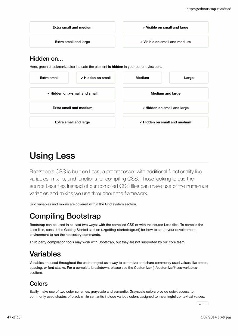
Responsive utilitiesFor faster mobile-friendly development, use these utility classes for showing andhiding content by device via media query. Also included are utility classes fortoggling content when printed.
Try to use these on a limited basis and avoid creating entirely different versions of the same site. Instead, use themto complement each device's presentation.
Available classesUse a single or combination of the available classes for toggling content across viewport breakpoints.
Extra small devicesPhones (<768px)
Small devicesTablets (≥768px)
Medium devicesDesktops (≥992px)
Large devicesDesktops (≥1200px)
.visible-xs-* Visible Hidden Hidden Hidden
.visible-sm-* Hidden Visible Hidden Hidden
.visible-md-* Hidden Hidden Visible Hidden
.visible-lg-* Hidden Hidden Hidden Visible
.hidden-xs Hidden Visible Visible Visible
Copy
Copy
Copy
Copy
http://getbootstrap.com/css/
45 of 58 5/07/2014 8:48 pm

Extra small devicesPhones (<768px)
Small devicesTablets (≥768px)
Medium devicesDesktops (≥992px)
Large devicesDesktops (≥1200px)
.hidden-sm Visible Hidden Visible Visible
.hidden-md Visible Visible Hidden Visible
.hidden-lg Visible Visible Visible Hidden
As of v3.2.0, the .visible-*-* classes for each breakpoint come in three variations, one for each CSS displayproperty value listed below.
Group of classes CSS display
.visible-*-block display: block;
.visible-*-inline display: inline;
.visible-*-inline-block display: inline-block;
So, for extra small ( xs ) screens for example, the available .visible-*-* classes are: .visible-xs-block ,.visible-xs-inline , and .visible-xs-inline-block .
The classes .visible-xs , .visible-sm , .visible-md , and .visible-lg also exist, but are deprecated asof v3.2.0. They are approximately equivalent to .visible-*-block , except with additional special cases fortoggling <table> -related elements.
Print classesSimilar to the regular responsive classes, use these for toggling content for print.
Classes Browser Print
.visible-print-block
.visible-print-inline
.visible-print-inline-block
Hidden Visible
.hidden-print Visible Hidden
The class .visible-print also exists but is deprecated as of v3.2.0. It is approximately equivalent to.visible-print-block , except with additional special cases for <table> -related elements.
Test casesResize your browser or load on different devices to test the responsive utility classes.
Visible on...Green checkmarks indicate the element is visible in your current viewport.
Extra small ✔ Visible on small Medium Large
✔ Visible on x-small and small Medium and large
http://getbootstrap.com/css/
46 of 58 5/07/2014 8:48 pm
Hidden on...Here, green checkmarks also indicate the element is hidden in your current viewport.
Using LessBootstrap's CSS is built on Less, a preprocessor with additional functionality likevariables, mixins, and functions for compiling CSS. Those looking to use thesource Less files instead of our compiled CSS files can make use of the numerousvariables and mixins we use throughout the framework.
Grid variables and mixins are covered within the Grid system section.
Compiling BootstrapBootstrap can be used in at least two ways: with the compiled CSS or with the source Less files. To compile theLess files, consult the Getting Started section (../getting-started/#grunt) for how to setup your developmentenvironment to run the necessary commands.
Third party compilation tools may work with Bootstrap, but they are not supported by our core team.
VariablesVariables are used throughout the entire project as a way to centralize and share commonly used values like colors,spacing, or font stacks. For a complete breakdown, please see the Customizer (../customize/#less-variables-section).
ColorsEasily make use of two color schemes: grayscale and semantic. Grayscale colors provide quick access tocommonly used shades of black while semantic include various colors assigned to meaningful contextual values.
Extra small and medium ✔ Visible on small and large
Extra small and large ✔ Visible on small and medium
Extra small ✔ Hidden on small Medium Large
✔ Hidden on x-small and small Medium and large
Extra small and medium ✔ Hidden on small and large
Extra small and large ✔ Hidden on small and medium
Copy
http://getbootstrap.com/css/
47 of 58 5/07/2014 8:48 pm

@gray-darker: lighten(#000, 13.5%); // #222@gray-dark: lighten(#000, 20%); // #333@gray: lighten(#000, 33.5%); // #555@gray-light: lighten(#000, 46.7%); // #777@gray-lighter: lighten(#000, 93.5%); // #eee
@brand-primary: #428bca;@brand-success: #5cb85c;@brand-info: #5bc0de;@brand-warning: #f0ad4e;@brand-danger: #d9534f;
Use any of these color variables as they are or reassign them to more meaningful variables for your project.
// Use as-is.masthead { background-color: @brand-primary;}
// Reassigned variables in Less@alert-message-background: @brand-info;.alert { background-color: @alert-message-background;}
ScaffoldingA handful of variables for quickly customizing key elements of your site's skeleton.
// Scaffolding@body-bg: #fff;@text-color: @black-50;
LinksEasily style your links with the right color with only one value.
EXAMPLE
EXAMPLECopy
Copy
Copy
Copy
http://getbootstrap.com/css/
48 of 58 5/07/2014 8:48 pm

// Variables@link-color: @brand-primary;@link-hover-color: darken(@link-color, 15%);
// Usagea { color: @link-color; text-decoration: none;
&:hover { color: @link-hover-color; text-decoration: underline; }}
Note that the @link-hover-color uses a function, another awesome tool from Less, to automagically create theright hover color. You can use darken , lighten , saturate , and desaturate .
TypographyEasily set your type face, text size, leading, and more with a few quick variables. Bootstrap makes use of these aswell to provide easy typographic mixins.
@font-family-sans-serif: "Helvetica Neue", Helvetica, Arial, sans-serif;@font-family-serif: Georgia, "Times New Roman", Times, serif;@font-family-monospace: Menlo, Monaco, Consolas, "Courier New", monospace;@font-family-base: @font-family-sans-serif;
@font-size-base: 14px;@font-size-large: ceil((@font-size-base * 1.25)); // ~18px@font-size-small: ceil((@font-size-base * 0.85)); // ~12px
@font-size-h1: floor((@font-size-base * 2.6)); // ~36px@font-size-h2: floor((@font-size-base * 2.15)); // ~30px@font-size-h3: ceil((@font-size-base * 1.7)); // ~24px@font-size-h4: ceil((@font-size-base * 1.25)); // ~18px@font-size-h5: @font-size-base;@font-size-h6: ceil((@font-size-base * 0.85)); // ~12px
@line-height-base: 1.428571429; // 20/14@line-height-computed: floor((@font-size-base * @line-height-base)); // ~20px
@headings-font-family: inherit;@headings-font-weight: 500;@headings-line-height: 1.1;@headings-color: inherit;
IconsTwo quick variables for customizing the location and filename of your icons.
@icon-font-path: "../fonts/";@icon-font-name: "glyphicons-halflings-regular";
ComponentsComponents throughout Bootstrap make use of some default variables for setting common values. Here are themost commonly used.
Copy
Copy
Copy
http://getbootstrap.com/css/
49 of 58 5/07/2014 8:48 pm

@padding-base-vertical: 6px;@padding-base-horizontal: 12px;
@padding-large-vertical: 10px;@padding-large-horizontal: 16px;
@padding-small-vertical: 5px;@padding-small-horizontal: 10px;
@padding-xs-vertical: 1px;@padding-xs-horizontal: 5px;
@line-height-large: 1.33;@line-height-small: 1.5;
@border-radius-base: 4px;@border-radius-large: 6px;@border-radius-small: 3px;
@component-active-color: #fff;@component-active-bg: @brand-primary;
@caret-width-base: 4px;@caret-width-large: 5px;
Vendor mixinsVendor mixins are mixins to help support multiple browsers by including all relevant vendor prefixes in yourcompiled CSS.
Box-sizingReset your components' box model with a single mixin. For context, see this helpful article from Mozilla(https://developer.mozilla.org/en-US/docs/CSS/box-sizing).
The mixin is deprecated as of v3.2.0, with the introduction of autoprefixer. To preserve backwards-compatibility,Bootstrap will continue to use the mixin internally until Bootstrap v4.
.box-sizing(@box-model) { -webkit-box-sizing: @box-model; // Safari <= 5 -moz-box-sizing: @box-model; // Firefox <= 19 box-sizing: @box-model;}
Rounded cornersToday all modern browsers support the non-prefixed border-radius property. As such, there is no .border-radius() mixin, but Bootstrap does include shortcuts for quickly rounding two corners on a particular side of anobject.
Copy
Copy
http://getbootstrap.com/css/
50 of 58 5/07/2014 8:48 pm

.border-top-radius(@radius) { border-top-right-radius: @radius; border-top-left-radius: @radius;}.border-right-radius(@radius) { border-bottom-right-radius: @radius; border-top-right-radius: @radius;}.border-bottom-radius(@radius) { border-bottom-right-radius: @radius; border-bottom-left-radius: @radius;}.border-left-radius(@radius) { border-bottom-left-radius: @radius; border-top-left-radius: @radius;}
Box (Drop) shadowsIf your target audience is using the latest and greatest browsers and devices, be sure to just use the box-shadowproperty on its own. If you need support for older Android (pre-v4) and iOS devices (pre-iOS 5), use thedeprecated mixin to pick up the required -webkit prefix.
The mixin is deprecated as of v3.1.0, since Bootstrap doesn't officially support the outdated platforms that don'tsupport the standard property. To preserve backwards-compatibility, Bootstrap will continue to use the mixininternally until Bootstrap v4.
Be sure to use rgba() colors in your box shadows so they blend as seamlessly as possible with backgrounds.
.box-shadow(@shadow: 0 1px 3px rgba(0,0,0,.25)) { -webkit-box-shadow: @shadow; // iOS <4.3 & Android <4.1 box-shadow: @shadow;}
TransitionsMultiple mixins for flexibility. Set all transition information with one, or specify a separate delay and duration asneeded.
The mixins are deprecated as of v3.2.0, with the introduction of autoprefixer. To preserve backwards-compatibility,Bootstrap will continue to use the mixins internally until Bootstrap v4.
Copy
Copy
http://getbootstrap.com/css/
51 of 58 5/07/2014 8:48 pm

.transition(@transition) { -webkit-transition: @transition; transition: @transition;}.transition-property(@transition-property) { -webkit-transition-property: @transition-property; transition-property: @transition-property;}.transition-delay(@transition-delay) { -webkit-transition-delay: @transition-delay; transition-delay: @transition-delay;}.transition-duration(@transition-duration) { -webkit-transition-duration: @transition-duration; transition-duration: @transition-duration;}.transition-timing-function(@timing-function) { -webkit-transition-timing-function: @timing-function; transition-timing-function: @timing-function;}.transition-transform(@transition) { -webkit-transition: -webkit-transform @transition; -moz-transition: -moz-transform @transition; -o-transition: -o-transform @transition; transition: transform @transition;}
TransformationsRotate, scale, translate (move), or skew any object.
The mixins are deprecated as of v3.2.0, with the introduction of autoprefixer. To preserve backwards-compatibility,Bootstrap will continue to use the mixins internally until Bootstrap v4.
Copy
http://getbootstrap.com/css/
52 of 58 5/07/2014 8:48 pm

.rotate(@degrees) { -webkit-transform: rotate(@degrees); -ms-transform: rotate(@degrees); // IE9 only transform: rotate(@degrees);}.scale(@ratio; @ratio-y...) { -webkit-transform: scale(@ratio, @ratio-y); -ms-transform: scale(@ratio, @ratio-y); // IE9 only transform: scale(@ratio, @ratio-y);}.translate(@x; @y) { -webkit-transform: translate(@x, @y); -ms-transform: translate(@x, @y); // IE9 only transform: translate(@x, @y);}.skew(@x; @y) { -webkit-transform: skew(@x, @y); -ms-transform: skewX(@x) skewY(@y); // See https://github.com/twbs/bootstrap/issues/4885; IE9+ transform: skew(@x, @y);}.translate3d(@x; @y; @z) { -webkit-transform: translate3d(@x, @y, @z); transform: translate3d(@x, @y, @z);}
.rotateX(@degrees) { -webkit-transform: rotateX(@degrees); -ms-transform: rotateX(@degrees); // IE9 only transform: rotateX(@degrees);}.rotateY(@degrees) { -webkit-transform: rotateY(@degrees); -ms-transform: rotateY(@degrees); // IE9 only transform: rotateY(@degrees);}.perspective(@perspective) { -webkit-perspective: @perspective; -moz-perspective: @perspective; perspective: @perspective;}.perspective-origin(@perspective) { -webkit-perspective-origin: @perspective; -moz-perspective-origin: @perspective; perspective-origin: @perspective;}.transform-origin(@origin) { -webkit-transform-origin: @origin; -moz-transform-origin: @origin; -ms-transform-origin: @origin; // IE9 only transform-origin: @origin;}
AnimationsA single mixin for using all of CSS3's animation properties in one declaration and other mixins for individualproperties.
The mixins are deprecated as of v3.2.0, with the introduction of autoprefixer. To preserve backwards-compatibility,Bootstrap will continue to use the mixins internally until Bootstrap v4.
http://getbootstrap.com/css/
53 of 58 5/07/2014 8:48 pm

.animation(@animation) { -webkit-animation: @animation; animation: @animation;}.animation-name(@name) { -webkit-animation-name: @name; animation-name: @name;}.animation-duration(@duration) { -webkit-animation-duration: @duration; animation-duration: @duration;}.animation-timing-function(@timing-function) { -webkit-animation-timing-function: @timing-function; animation-timing-function: @timing-function;}.animation-delay(@delay) { -webkit-animation-delay: @delay; animation-delay: @delay;}.animation-iteration-count(@iteration-count) { -webkit-animation-iteration-count: @iteration-count; animation-iteration-count: @iteration-count;}.animation-direction(@direction) { -webkit-animation-direction: @direction; animation-direction: @direction;}
OpacitySet the opacity for all browsers and provide a filter fallback for IE8.
.opacity(@opacity) { opacity: @opacity; // IE8 filter @opacity-ie: (@opacity * 100); filter: ~"alpha(opacity=@{opacity-ie})";}
Placeholder textProvide context for form controls within each field.
.placeholder(@color: @input-color-placeholder) { &::-moz-placeholder { color: @color; } // Firefox &:-ms-input-placeholder { color: @color; } // Internet Explorer 10+ &::-webkit-input-placeholder { color: @color; } // Safari and Chrome}
ColumnsGenerate columns via CSS within a single element.
Copy
Copy
Copy
http://getbootstrap.com/css/
54 of 58 5/07/2014 8:48 pm

.content-columns(@width; @count; @gap) { -webkit-column-width: @width; -moz-column-width: @width; column-width: @width; -webkit-column-count: @count; -moz-column-count: @count; column-count: @count; -webkit-column-gap: @gap; -moz-column-gap: @gap; column-gap: @gap;}
GradientsEasily turn any two colors into a background gradient. Get more advanced and set a direction, use three colors, oruse a radial gradient. With a single mixin you get all the prefixed syntaxes you'll need.
#gradient > .vertical(#333; #000);#gradient > .horizontal(#333; #000);#gradient > .radial(#333; #000);
You can also specify the angle of a standard two-color, linear gradient:
#gradient > .directional(#333; #000; 45deg);
If you need a barber-stripe style gradient, that's easy, too. Just specify a single color and we'll overlay a translucentwhite stripe.
#gradient > .striped(#333; 45deg);
Up the ante and use three colors instead. Set the first color, the second color, the second color's color stop (apercentage value like 25%), and the third color with these mixins:
#gradient > .vertical-three-colors(#777; #333; 25%; #000);#gradient > .horizontal-three-colors(#777; #333; 25%; #000);
Heads up! Should you ever need to remove a gradient, be sure to remove any IE-specific filter you may haveadded. You can do that by using the .reset-filter() mixin alongside background-image: none; .
Utility mixinsUtility mixins are mixins that combine otherwise unrelated CSS properties to achieve a specific goal or task.
ClearfixForget adding class="clearfix" to any element and instead add the .clearfix() mixin where appropriate.Uses the micro clearfix (http://nicolasgallagher.com/micro-clearfix-hack/) from Nicolas Gallager (http://twitter.com/necolas).
Copy
Copy
Copy
Copy
Copy
http://getbootstrap.com/css/
55 of 58 5/07/2014 8:48 pm

// Mixin.clearfix() { &:before, &:after { content: " "; display: table; } &:after { clear: both; }}
// Usage.container { .clearfix();}
Horizontal centeringQuickly center any element within its parent. Requires width or max-width to be set.
// Mixin.center-block() { display: block; margin-left: auto; margin-right: auto;}
// Usage.container { width: 940px; .center-block();}
Sizing helpersSpecify the dimensions of an object more easily.
// Mixins.size(@width; @height) { width: @width; height: @height;}.square(@size) { .size(@size; @size);}
// Usage.image { .size(400px; 300px); }.avatar { .square(48px); }
Resizable textareasEasily configure the resize options for any textarea, or any other element. Defaults to normal browser behavior( both ).
Copy
Copy
Copy
http://getbootstrap.com/css/
56 of 58 5/07/2014 8:48 pm

.resizable(@direction: both) { // Options: horizontal, vertical, both resize: @direction; // Safari fix overflow: auto;}
Truncating textEasily truncate text with an ellipsis with a single mixin. Requires element to be block or inline-block level.
// Mixin.text-overflow() { overflow: hidden; text-overflow: ellipsis; white-space: nowrap;}
// Usage.branch-name { display: inline-block; max-width: 200px; .text-overflow();}
Retina imagesSpecify two image paths and the @1x image dimensions, and Bootstrap will provide an @2x media query. If youhave many images to serve, consider writing your retina image CSS manually in a single media query.
.img-retina(@file-1x; @file-2x; @width-1x; @height-1x) { background-image: url("@{file-1x}");
@media only screen and (-webkit-min-device-pixel-ratio: 2), only screen and ( min--moz-device-pixel-ratio: 2), only screen and ( -o-min-device-pixel-ratio: 2/1), only screen and ( min-device-pixel-ratio: 2), only screen and ( min-resolution: 192dpi), only screen and ( min-resolution: 2dppx) { background-image: url("@{file-2x}"); background-size: @width-1x @height-1x; }}
// Usage.jumbotron { .img-retina("/img/bg-1x.png", "/img/bg-2x.png", 100px, 100px);}
Using SassWhile Bootstrap is built on Less, it also has an official Sass port
Copy
Copy
http://getbootstrap.com/css/
57 of 58 5/07/2014 8:48 pm

StarStar ForkFork Follow Follow @twbootstrap@twbootstrap 181K followers TweetTweet 4,712
Designed and built with all the love in the world by @mdo (http://twitter.com/mdo) and @fat (http://twitter.com/fat).Maintained by the core team (https://github.com/twbs?tab=members) with the help of our contributors
(https://github.com/twbs/bootstrap/graphs/contributors).Code licensed under MIT (https://github.com/twbs/bootstrap/blob/master/LICENSE), documentation under CC BY
3.0 (http://creativecommons.org/licenses/by/3.0/).
Currently v3.2.0 · GitHub (https://github.com/twbs/bootstrap) · Examples (../getting-started/#examples) · v2.3.2docs (../2.3.2/) · About (../about/) · Expo (http://expo.getbootstrap.com) · Blog (http://blog.getbootstrap.com) ·
Issues (https://github.com/twbs/bootstrap/issues?state=open) · Releases (https://github.com/twbs/bootstrap/releases)
(https://github.com/twbs/bootstrap-sass). We maintain it in a separate GitHubrepository and handle updates with a conversion script.
What's includedSince the Sass port has a separate repo and serves a slightly different audience, the contents of the project differgreatly from the main Bootstrap project. This ensures the Sass port is as compatible with as many Sass-basedsystems as possible.
Path Description
lib/ Ruby gem code (Sass configuration, Rails and Compass integrations)
tasks/ Converter scripts (turning upstream Less to Sass)
test/ Compilation tests
templates/ Compass package manifest
vendor/assets/ Sass, JavaScript, and font files
Rakefile Internal tasks, such as rake and convert
Visit the Sass port's GitHub repository (https://github.com/twbs/bootstrap-sass) to see these files in action.
InstallationFor information on how to install and use Bootstrap for Sass, consult the GitHub repository readme(https://github.com/twbs/bootstrap-sass). It's the most up to date source and includes information for use withRails, Compass, and standard Sass projects.
Bootstrap for Sass (https://github.com/twbs/bootstrap-sass)
http://getbootstrap.com/css/
58 of 58 5/07/2014 8:48 pm