data changes everything: challenges and opportunities in
TRANSCRIPT

To appear in IEEE Transactions on Visualization and Computer Graphics
Data Changes Everything:Challenges and Opportunities in Data Visualization Design Handoff
Jagoda Walny, Christian Frisson, Mieka West, Doris Kosminsky,Søren Knudsen, Sheelagh Carpendale, Wesley Willett
Abstract— Complex data visualization design projects often entail collaboration between people with different visualization-relatedskills. For example, many teams include both designers who create new visualization designs and developers who implement theresulting visualization software. We identify gaps between data characterization tools, visualization design tools, and developmentplatforms that pose challenges for designer-developer teams working to create new data visualizations. While it is common forcommercial interaction design tools to support collaboration between designers and developers, creating data visualizations posesseveral unique challenges that are not supported by current tools. In particular, visualization designers must characterize and build anunderstanding of the underlying data, then specify layouts, data encodings, and other data-driven parameters that will be robust acrossmany different data values. In larger teams, designers must also clearly communicate these mappings and their dependencies todevelopers, clients, and other collaborators. We report observations and reflections from five large multidisciplinary visualization designprojects and highlight six data-specific visualization challenges for design specification and handoff. These challenges include adaptingto changing data, anticipating edge cases in data, understanding technical challenges, articulating data-dependent interactions,communicating data mappings, and preserving the integrity of data mappings across iterations. Based on these observations, weidentify opportunities for future tools for prototyping, testing, and communicating data-driven designs, which might contribute to moresuccessful and collaborative data visualization design.
Index Terms—Information visualization, design handoff, data mapping, design process
1 INTRODUCTION
Creating custom visualizations is a challenging, multifaceted problemthat requires a combination of skills and tools for data analysis, design,and development. Designers and developers must gain an understandingof the dataset and its characteristics through data exploration, thendesign data mappings, aesthetics, and interactions based on it [6]. Thesedesigns also need to be realized and deployed, typically by writingsoftware. Sometimes it is possible for one person to perform all ofthese activities given enough time and resources. However, for morecomplex visualization projects with limited timelines, it is more feasibleto distribute these activities amongst people in specialized roles.
This distribution of roles creates the challenge of handoff, the codify-ing and exchange of information between people working on differentroles in a project, and the related challenge of communicating domainknowledge across roles. This problem is already well-known in generalsoftware design, where interaction designers are often distinct fromsoftware developers [39]. Over the past two decades, a wide range ofspecialized tools has emerged to help interaction designers outline andprototype interfaces in ways that reduce the friction between graphicaldesigns and code. Commercial tools like Adobe XD [2], InVision [27],and Sketch [9] support expressive and precise visual design, interactiveprototyping of animations, transitions, interactions, and streamlinedexporting of specifications and assets for collaborators.
Unfortunately for visualization designers, these tools lack robustsupport for data-driven designs. In practice, many programming-literatevisualization designers still work largely in code, exploring datasetsthrough iterative prototyping using libraries like D3 [10] or notebook
• All authors are with the University of Calgary, Calgary, Alberta, Canada.• Christian Frisson’s secondary affiliation is with McGill University,
Montreal, Quebec, Canada. E-mail: [email protected].• Doris Kosminsky’s primary affiliation is with Federal University of Rio de
Janeiro, Rio de Janeiro, Brazil. E-mail: [email protected].• Søren Knudsen’s secondary affiliation is with University of Copenhagen,
Copenhagen, Denmark. E-mail: [email protected].• Sheelagh Carpendale’s primary affiliation is with Simon Fraser University,
Vancouver, British Columbia, Canada. E-mail: [email protected].• Remaining author e-mails: {jkwalny, mieka.west,
wesley.willett}@ucalgary.ca.
environments like Observable [47]. We call this design-as-development.However, using these low-level tools requires considerable technicalskill and can increase the time and effort needed to articulate, refine,and polish visualization designs. This scales poorly for large visualiza-tion projects, which may involve not just developers but also interactiondesigners, data experts, and clients, each with their own tool sets andinstitutional processes. In these collaborative settings, differing designobjectives and gaps in the tools used to characterize data, design visu-alizations, and develop applications can exacerbate the issues causedby a lack of data-driven support. While unexpected issues can be han-dled with some agility by small, flexible teams, these issues are easilyamplified in larger teams.
Multiple Designers
and/orDevelopers
IndividualDesigner
and/or Developer
Interaction Design Visualization Design
(Developer Tools) UNDERSTANDING & DESIGN AS DEVELOPMENT
DEVELOPDESIGNUNDERSTAND
(Gap) (Data Design Tools)
DEVELOPDESIGNUNDERSTAND
(Gap)
(Sketch, Adobe XD, etc.)
DEVELOPDESIGN
(Developer Tools) DESIGN AS DEVELOPMENT
(Handoff Tools)
DEVELOPDESIGN
(Gap)
or or
Fig. 1: Contemporary interaction design tools increasingly enablesmooth transitions and collaboration between design and development(top-left) and handoffs between designers and developers (bottom-left).In our experiences across projects, these transitions remain challengingfor visualization designers (top-right) and teams (bottom-right).
1

IDB Energy Visualization Energy Imports & ExportsPipeline IncidentsEnergy Futures Pipeline Conditions
DEVELOPMENT
CHARACTERIZATION
DESIGN
CONCEPTUALIZATION
Design Team4 Members*1 author
Dev. Team2 Members
Data ProviderInter-AmericanDevelopment Bank
DEVELOPMENT
CHARACTERIZATION
DESIGN
CONCEPTUALIZATION
Design Team12 Members*4 authors
Dev. Team5 Members
Data ProviderNational EnergyBoard of Canada
DEVELOPMENT
CHARACTERIZATION
DESIGN
CONCEPTUALIZATION
Design Team13 Members*6 authors
Dev. Team5 Members
Data ProviderNational EnergyBoard of Canada
DEVELOPMENT
CHARACTERIZATION
DESIGN
CONCEPTUALIZATION
Design Team10 Members*6 authors
Dev. Team5 Members
Data ProviderNational EnergyBoard of Canada
DEVELOPMENT
CHARACTERIZATION
DESIGN
CONCEPTUALIZATION
Design Team11 Members*6 authors
Dev. Team9 Members
Data ProviderNational EnergyBoard of Canada
Fig. 2: The five visualization design and development projects in which we ground our observations.
We draw on our experience as part of the design team on five complexdata visualization projects (Figure 2) intended for wide-scale publicrelease. Across each of these projects, we observed and participatedin interactions between teams of designers and developers workingtogether and separately to characterize data, create initial designs, andtranslate those designs into production-ready applications. Based onthese experiences, we highlight challenges and opportunities specific todesigner-developer collaboration in data visualization design projects.
While others before us have discussed practical visualization designprojects [31, 60] and design studies [55], our focus is different. Wefocus on the practical work and coordination that goes into buildingvisualizations. Although our projects did employ several researchers,they also employed design and development practitioners. Our projectsalso involved close coordination with project coordinators and dataexperts1 on the data provider’s side. This complex structure and thephysical and temporal separation of different teams heightened the visi-bility of several practical challenges still faced during the visualizationdesign process. Our work articulates issues that are of a very practicalnature and that we expect are frequently experienced by others engagedin practical visualization work. We think our contributions add valueto this practitioner-oriented research space, especially in light of thevisualization research community’s recent focus on practitioners as acrucial source of “energy, ideas, and application problems” [23].
2 ROLES IN VISUALIZATION DESIGN PROCESSES
Visualization design and development requires several unique sets ofskills including experience in human-centered design, perception, eval-uation, statistics, and graphics programming [31]. This conventionalwisdom is exemplified by the (somewhat mythical) notion of “full-stack”visualization designer-developers capable of conducting the full rangeof “data wrangling, dynamic graphics, and derring-do” [22]. However,real-world visualization design projects (especially large ones) ofteninclude a variety of team members with diverse and overlapping subsetsof these skills. As projects grow, these teams can become segmented,with responsibility for design and development delegated to individu-als or teams whose skill sets and preferred tools can be increasinglydisjoint. In particular, institutional and disciplinary divides can resultin the partitioning of early-stage design tasks — such as data profiling,ideation, creating mockups, and prototyping — and development taskslike implementation, testing, deployment, and maintenance.
In practice, disciplinary divides between designers and developerscan be stark [39]. The interaction design literature has examined thedivide between designers and developers from a number of angles,including: how designers and developers align their work in collabo-rations [11], how they work remotely [65], and how design tools canfunction as boundary objects that mitigate designers’ lack of “material”experience with software [49]. Recent work by Maudet et al. [39]has drawn attention to design breakdowns in design handoff, in whichpotential disconnects between designers and developers are highlighted
1Data experts had technical and/or domain-related data expertise.
by difficulties in implementing the final design. Leiva et al. [35] expandon this concept, identifying several specific types of breakdowns —including omitting critical details, ignoring edge cases, and disregard-ing technical limitations — that routinely contribute to difficulties inprojects involving handoffs between designers and developers.
However, research in data visualization design still often fails toacknowledge this division of design and development. For example,McKenna et al.’s Design Activity Framework [41] combines designand implementation into a single “make” step and assumes that theresponsibility for both will be tightly integrated. Other reflections onvisualization design practice also tend to share this assumption, draw-ing primarily on the perspectives of visualization design researcherstasked with both creating and implementing novel visualizations formultidisciplinary collaborators [31, 55, 60].
The design and development of new visualizations, like that of otherinteractive systems, entails considerable iteration and involves transi-tions between multiple sets of tools as designs move from conceptionto implementation. While some amount of visualization design anddevelopment often happens via coded prototypes, many aspects of visu-alization design — from early-stage concept generation and sketchingthrough to late stage aesthetic refinement — are often better-served bygraphic design and interaction design tools that offer greater expressiveflexibility, as evidenced by the work practices of data visualization de-signers interviewed by Bigelow et al. [6]. However, unlike most otherwork in interaction design, the form of new visualizations dependsintrinsically on the data that they will communicate. As a result, theprocess of visualization design is often a complex and iterative oneanchored in multiple rounds of data examination, ideation, creation,and deployment [41]. These activities pose challenges for designerswho may need to transition repeatedly between interactive tools thatallow them to examine data and explore a diverse range of designs andmore low-level data-driven development and coding.
These issues are compounded as projects grow and responsibilitiesfor design, development, and deployment are divided across multipleindividuals or teams, each with different skill sets and priorities. Inthese situations, visualization design and development become an ex-ercise in co-creation [6], complicated by dependencies between teamsand differences in their competencies. Large diverse teams make itpossible to create, deploy, and provide long-term support for complexvisualizations. However, this division of labor reveals a variety of newdesign handoff and iteration challenges, which can be compounded bythe data-driven nature of visualization design.
3 OVERVIEW OF VISUALIZATION DESIGN PROJECTS
Our reflections on handoff in visualization design and developmentare anchored in our own experiences as members of a design teamon five large data visualization design projects (Figure 2) conductedbetween 2012 and 2019. Each project was intended for wide-scalepublic release and involved between six months and several years ofdata characterization, design, and development work.
2

To appear in IEEE Transactions on Visualization and Computer Graphics
PROJECT CONCEPTUALIZATION
DATA CHARACTERIZATION
VISUALIZATIONDEVELOPMENT
DEPLOYMENT AND USE
VISUALIZATION DESIGN
DataMapping
Presentation Design
Interaction Design
DATASETSVISION & GOALS
SUMMARIES OFDATA CHARACTERISTICS
VISUALIZATION DESIGNDOCUMENTATION
IMPLEMENTEDVISUALIZATIONS
ProjectPhases
Artifacts
ChallengesAdaptin
g to
Data Ch
anges
C1Preservi
ng Data
Mapping In
tegrity
Across
Iterat
ions
C6Communica
ting
Data Map
pings
C5Artic
ulating
Data-Dep
enden
t
Interact
ions
C4Underst
anding
Technica
l
Chall
enges
C3Antic
ipating
Edge
Cases
C2
Fig. 3: Stages of a data visualization development process and the dependencies between them. We focus on the data characterization, design,and development phases, highlighting the artifacts that bridge these phases and the challenges (C1-C6) that emerge within them.
For each project, the work was directed by an outside client whowas also the data provider. Our multi-member design teams, whichincluded a rotating cast of designers, visualization researchers, post-docs, graduate students, and interns, were responsible for the majorityof the data characterization and visualization design. In all projects, atleast one (and typically more) of the authors participated in the processdirectly as members of the design team. A separate development teamwas tasked with creating, deploying, and providing initial maintenancefor the final web-based applications.
3.1 ProjectsEnergy Visualization for the Inter-American Development Bank(IDB). The earliest of the projects, conducted between 2012–16 withthe Inter-American Development Bank produced a suite of visualiza-tions showcasing energy source generation, import and export, trans-mission, and consumption for countries in the Americas, as well asother benchmark countries. The resulting visualizations were hostedpublicly from 2013–18, but are no longer accessible as of 2019. In thisproject, the design and development teams were more closely integratedthan in the other projects, with both playing a substantial role in datacharacterization, design, and development.Energy Futures. This project, conducted over 4 months in 2016, led tothe development of four visualizations based on forecasts of Canadianenergy production and consumption [8]. A second 7-month itera-tion [32] of the project in 2017 added a fifth visualization showcasingchanges in projected energy demand across the Canadian provinces andterritories. The visualizations are publicly available at https://apps2.neb-one.gc.ca/dvs.Pipeline Incidents. Developed during 2017, this 8-month projectproduced an interactive visualization system that supported visual ex-ploration of incidents that occurred on or around federally-regulatedpipelines. The visualization is publicly available at https://apps2.neb-one.gc.ca/pipeline-incidents.Energy Imports & Exports. Another similarly-scoped project con-ducted over 16 months in 2017–18 involved creating a set of fivevisualizations showing historical imports and exports of various energyproducts from Canada. The visualizations are publicly available athttps://apps2.neb-one.gc.ca/imports-exports.Pipeline Conditions. The most recent project, conducted over 18months during 2018–19, focuses on visualizing the conditions placedby government regulators on the construction of new pipelines. Atthe time of publication, this project was near completion, but not yetpublicly accessible.
3.2 Design Team RolesThe members of the design team needed to fulfill a variety of design-related roles. The project needed team members who could charac-terize data by wrangling data, exploring data in existing visualization
tools, spreadsheets, or code, processing data (including text mining),and understanding specific data types (for example, linguistic analysisof text data). All team members needed to create and understanddata mappings from data to visual representation, which includedvarying degrees of ideation, basic perceptual understanding, and apply-ing knowledge of visual variables. The project also required peoplewith visual design skills who could design graphics, page layout, andtypography while keeping accessibility in mind. The team includedpeople with expertise in interaction design, including prototyping andanimation. Likewise, some team members developed visualizationprototypes to verify and demonstrate designs and engineered the tech-nically complex portions of design documents. All team membersneeded to collaborate and communicate with the data provider anddevelopment team.
During the Inter-American Development Bank project, the designteam consisted of one primary visualization design researcher and threeVisual Arts students (one undergraduate and two graduate students).The development team consisted of one primary computer scienceresearcher and one doctoral student. These teams worked closelytogether in an iterative fashion and were located on the same campus.
In the remaining projects, the design and development teams wereseparate. The design team consisted of two primary investigators (visu-alization researchers), one project coordinator, one design researcher,1–2 postdoctoral visualization researchers, 2–3 undergraduate or re-cently graduated computer science students, 0–1 information designundergraduate students, and 1–4 full-time employees with roles indesign, development, and specialized data understanding. The devel-opment team consisted of anywhere between 5 and 9 members of aprofessional software development firm located in the same city. In allprojects, the data providers were from separate institutions and werephysically separated from the design and development teams.
3.3 Analysis and Synthesis ProcessWe identified the data-related challenges described in this paper via anongoing process of reflection [44] through which we worked to refineour design team’s work and communication practices. During eachproject, we kept records of artifacts produced for meetings, data explo-rations, ideation sketches, planning timelines, and design documents.We also regularly reflected on communication and design challengeswithin our own team. Throughout, we documented and scrutinizedthe process using approaches drawn from diary-based [15, 48, 53, 56]and autobiographical studies [12, 17, 46]. Individual members of thedesign team, as part of their personal practice, kept notes and imagesdocumenting their work. Later, as part of this autobiographical process,we carefully re-examined our diary-based records and used them toidentify gaps and challenges.
We also took steps to formalize our design communication processes.Within the design team, we leveraged our initial observations to create
3
shared tools and processes for tracking the team’s progress. During theimplementation phase of each project, we also held face-to-face designreview meetings with all stakeholders present. Finally, after each of thethree later projects, we organized formal process discussions with thedata provider and with members of both the design and developmentteams to help improve coordination for subsequent projects. We tookdetailed collaborative notes at all meetings.
Based on these reflections, we focused increasing energy across theremaining projects on improving design communication both withinand across the teams. As part of this effort we documented meetingsand design processes using detailed personal records, team records,design handoff documents, and handoff document revisions. We teasedapart the details of the challenges presented in this paper by drawingon these detailed records. In discussing a particular challenge we couldrigorously re-examine the time-stamped process by which each designwas created, handed off, implemented, re-discussed, re-implemented,and ultimately released.
Throughout our reflection, we noticed that a number of the recurringhandoff challenges were not merely interaction design issues (like thosedocumented by Leiva et al. [35]), but were instead rooted in the deepdependence of the designs on data. From these reflections, we havesynthesized the most prominent unresolved data-related challenges andillustrated them using real examples from our projects. Where possible,the initial reflection was drafted by the team member who most closelyexperienced the example issue.
4 VISUALIZATION DESIGN & DEVELOPMENT
One outcome of our reflection on the processes and communication inour design projects is a formal model of the major phases of our designprojects (Figure 3). This model was born out of a need for a vocabularyto use when coordinating with multiple parties, and serves as a usefulanchor for the design and communication challenges we discuss in theremainder of this paper. In a designer-as-developer scenario, a singleperson or small team might carry out all of these phases with less needfor a formal process. In contrast, in our scenarios — which largelyinvolved multiple teams who did not share a daily working space —this model emphasizes the distribution of roles and responsibilities.In addition, it highlights the kinds of artifacts that can often facilitatecommunication across phases.Project Conceptualization. This phase occurred on the client side,prior to the direct involvement of the design team. The client providedthe design team with the vision and goals for the project as well asa dataset. The handoff of these artifacts ranged from simple emaileddelivery to more involved full-day workshops between client-side dataexperts and the design and development teams.Data Characterization. In this phase, the design team explored andcharacterized the data, prioritizing analyses motivated by the projectvision. This included understanding data types, amounts, and extrema,as well as the relationship between the data and the project goals. Insome cases, the design team recommended a more focused dataset forthe visualization, a process which sometimes entailed several iterationswith the client-side data team. This phase typically involved somedata wrangling [29], but was more akin to exploratory data analysisor domain problem characterization [45]. We used a number of toolsto support this phase, including spreadsheets, hand-coded scripts, andvisualization exploration software such as Tableau [58], as well as hand-sketching for preliminary ideation. This culminated in the creation ofa summary of data characteristics, which we typically delivered tothe client-side data experts via an in-person presentation. The insightsand shared understanding gained throughout this phase served as afoundation for future design work.Visualization Design. The design phase encompassed the abstractionand encoding/interaction design phases of the nested model [45] to-gether with partial algorithm design and extensive visual presentationdesign. This was a two-stage process. First, we developed a visualiza-tion concept and received initial approval from the client. Then, werefined and polished the final design and documented it via a visual-ization design documentation shared with both clients and developers.We developed a data mapping on the basis of the data characteriza-
tion. In this process, we relied heavily on hand-sketching and manualillustration in tools like Adobe Illustrator [1]. In some cases, we usedchart generation tools and utilities (including RAWGraphs [40] andColor Brewer [25]) and hand-coded prototypes using libraries suchas D3 [10]. We developed the presentation design — the overall sizeand layout of the visualization — primarily using Adobe Illustrator [1].Furthermore, we developed the interaction design using various toolsincluding paper prototyping [52], textual and sketched descriptions,and general-purpose interaction prototyping tools (such as Axure [4]and Atomic [3]). The final development document was initially in PDFform but later evolved to be a web-based document. The most recentdesign document was based on Idyll [14], which allowed us to combinemockups, coded prototypes, and explanatory text in a single document.Visualization Development. This phase was led by the software de-velopment team. As the design team, our role was mainly reactionary:we responded to questions about the design, suggested redesigns whenissues arose, and verified that the implementation was functioning asintended. Most of the discussions in this phase were grounded in thedesign documentation and in increasingly polished iterations of theimplemented visualizations.Deployment and Use. As the visualization was deployed for publicuse, the software development team was tasked with its maintenance,including implementing quarterly data updates. The design team wasinvolved if a data update contained unexpected values that were notsupported by the existing design.
5 CHALLENGES WHEN DESIGNING WITH DATA
Based on our reflection and observation, we describe six gaps in thedata visualization design process.
C1. Adapting to Data ChangesData updates can have cascading effects on the data characterization,visualization design, and development phases because all aspects ofvisualization development depend upon the data. The impact of sucheffects may not be clear to data providers.
In our experience, data is rarely available in its full and final form be-fore the visualization development process begins, often necessitatingdata updates later in the process — sometimes even post-deployment.Data changes are particularly impactful if they change the data charac-terization or the data used to generate views in the visualization design.Even when a data change is seemingly innocuous and does not changethe overall data mapping, it may affect the implementation stage, par-ticularly where server-side mechanisms for loading, aggregating, orpreparing data have already been established. For example, changing acolumn name or unit symbol may break existing data parsers.
Data updates are not necessarily undesirable. They might providecorrections or additional data, and they might reflect a positive evolu-tion in how the data provider releases data for the visualization. Thisevolution might itself be prompted by witnessing the interim results ofthe visualization design process. As such, the challenge is not to avoiddata updates altogether but to be able to cope with them efficiently.
For example, late in the process of designing visualizations for theInter-American Development Bank project, the design and developmentteams had created a mature, late-stage visualization design of energygeneration data from Latin American countries (Figure 4-top). Upto that point, all design decisions had been made on the basis of theteam’s work with the initial data that was provided by the client. Thischaracterization led to a design that arranged data about different energysources on a circle, showing the relationship of energy inputs (top halfof the circle) to energy generation and losses (bottom half).
At this stage, an update added data for benchmark countries likeChina, creating views (Figure 4-bottom) in which a single energy source(in this case coal) visually overwhelmed the values from other sources.This dramatically altered the form and legibility of the visualization,crowding all of the original data onto a small slice at the side of thechart, and overlapping the arcs and labels. Given the late stage of thedesign process, there were not enough resources available to iteratethe design, and the resulting visualization was quite different from theoriginal concept.
4

To appear in IEEE Transactions on Visualization and Computer Graphics
MAT
URE V
ISUA
LIZAT
ION
DESI
GN(D
ata
for a
ll La
tin A
mer
ican
Coun
tries
)AF
TER
DATA
UPD
ATE
(+Da
ta fo
r Bas
elin
e Co
untri
es)
A data update late in development added data for countries like China where the heavy use of coal left all other categories compressed.
Fig. 4: Adding data from additional countries late in the design of thisvisualization resulted in a single energy source (coal) dominating theview which made other energy sources difficult to compare.
Late-stage data updates can also cause subtle changes to how avisualization is perceived. For example, in the Energy Futures project, avisualization of demand shares by energy source was initially designedusing data based on the energy production stages. The design teamcharacterized the data and moved on to the design phase, creating aD3 prototype (Figure 5). Our focus here was to support comparisonbetween provinces that have order-of-magnitude differences in scale.Later, the dataset was changed to one based on end-use energy demand.The characteristics of both datasets were quite similar, so the designwork continued with attention shifting to other concerns. However,there was a key but subtle difference in the new dataset: nearly allrenewable energy was included within the Electricity category ratherthan in the Renewables category. The Renewables category in theoriginal dataset was already quite small, so this change went unnoticed.While the resulting visualization still shows the data accurately, it canbe easily misinterpreted because it does not clearly communicate thefact that the Electricity category also includes most renewables.
C2. Anticipating Edge CasesIt is difficult for designers to anticipate and test all possible combina-tions of interactive inputs that a visualization might receive. As a result,it can be hard to anticipate situations in which a chart design or datamapping may break.
Common visualization interactions such as filtering or aggrega-tion essentially change data mappings in real time. In design-as-development scenarios with live prototypes, these kinds of interactions
EARLY DESIGN IMPLEMENTED VERSIONEDITED EXPORT
PE
A late-stage change to the
dataset altered the meaning of categories (like
renewables).
Fig. 5: Changes to the dataset for this Energy Futures visualizationaltered category meanings, creating potentially misleading values.
Some combinations of filters resulted in
edge cases in which bars broke the layout.
In response, designers addednon-linear scalebreaks to bars.
INITIAL DESIGN FILTERS APPLIED (EDGE CASE)
UPDATED DESIGN
Fig. 6: The initial design of the Energy Imports & Exports visualiza-tion (left) responded poorly to particular combinations of filters (center)and ultimately required a revision (right).
can be tested relatively early in the development process and designscan be adjusted as needed. However, when design and development areseparated, designers do not always have the tools or skillsets to fullytest all possible combinations of inputs. As such, potential problemsmight only be uncovered during the development phase after manydesign decisions have been finalized. At this stage, any changes to thedesign can incur significant design and development work, limitingthe possible ways in which the visualization design can be adapted tomitigate the problems.
In the design of the Energy Imports & Exports visualizations, thedesign team developed a mirrored chart that could be filtered to show av-erage quarterly electricity prices between any combination of US statesand Canadian Provinces (Figure 6-left). This data mapping workedwell for the vast majority of views, including the various combinationsof test data that the design team used when creating their initial docu-ments. However, once this design was implemented it became clear thatfiltering by particular combinations of states and provinces revealedoutliers which had been masked in the initial samples (Figure 6-center).
The design solution was constrained by the fixed size and very lim-ited space available for the bar chart, as well as by the need to maintainconsistency with the data mapping in other parts of the visualization.Reconfiguring other parts of the visualization was also not feasible latein the development stage. Ultimately, the design team opted to use acompressed scale break for these outliers (Figure 6-right). This solutionmakes it impossible to make direct visual comparisons between largevalues above the scale break and reduces the visual impact of largevalues, but still communicates relative differences in scale within theavailable space and minimizes changes in other parts of the visualiza-tion. Several related scale issues also emerged late in the developmentof the Pipeline Conditions visualization, necessitating new design workduring implementation. In all cases, if the edge cases had been iden-tified earlier in the design process, the entire design might have beenconceived differently.
C3. Understanding Technical ConstraintsDesigners may not be aware of all of the technical constraints andchallenges that can occur during the development phase. This canlead to uncertainty about design feasibility and can also trigger moredramatic revisions during development.
It is not always clear what types of software and hardware limitationsmay pose challenges for a design. Visualization designers tend tofocus considerable attention on the choice of visual mappings and onproviding a useful and appealing interaction experience. Web andapplication developers, meanwhile are more likely to be tasked with
5

Accessibility librariesadded rectangular selection
indicators around even non-rectangular controls.
Fig. 7: A portion of a visualization showing a heat map of Canadianenergy exports to United States Petroleum Administration Defense Dis-tricts (PADDs). Due to confusion surrounding the limitations of an ac-cessibility template, color mappings and the layouts of non-rectangularcomponents in this visualization needed to be adapted to accommodaterectangular selection indicators.
delivering robust, efficient, standards-compliant implementations of adesign. While collaborators often have an appreciation for the others’areas of focus, it can be difficult to be aware of all potential issuesthat the other group faces. From a design perspective, this can leadto uncertainty, particularly when proposing unique or unconventionaldesigns. Across our projects, the designers often tried to mitigatethis uncertainty by prototyping and testing novel pieces of the designsin code. However, we still frequently encountered technical hiccupsduring development.
For example, during the design of the Pipeline Conditions visual-ization, the design team created detailed working versions of severalcomplex components, including an interactive keyword browser thatleveraged a third-party physics engine. However, the development teamworked within a different set of constraints that included cross-browsercompatibility, future code maintainability, and a decision to use a dif-ferent underlying web framework to implement the site. As such, theychose to re-implement these components from scratch. This resultedin controls that were superficially similar to the original designs butthat behaved quite differently. As a result, they required substantialadditional refinement to achieve behaviour that was already present inthe design team’s prototypes.
Often, these issues arise not from limitations in the visualizationlibraries themselves, but in visualization-adjacent aspects of the im-plementation such as data loading, cross-browser compatibility, andaccessibility requirements. During the development phase of the En-ergy Imports & Exports project, the design team was surprised to learnthat the government-mandated accessibility template within which thedesign would sit also applied to individual components of the visualiza-tion. This meant that each selectable element of the visualization wouldbe surrounded by a stroked rectangular box with a dominant color.This late discovery resulted in a mismatch between the visual aestheticof the design, which was built around hexagonal tiles, and the brighthalos produced by the accessibility template (Figure 7). The use ofthe template also forced the design team to revisit the data mapping toensure that the color used by the accessibility overlays did not conflictwith the palette used to encode import and export data.
C4. Articulating Data-Dependent InteractionsWhen ideating and specifying new data-dependent interactions, design-ers often need to generate a variety of different data-accurate viewsshowing the visualization in multiple states. This extra cost can makedata-driven interactions challenging to develop and communicate toother team members.
The outcome of most interactions with a visualization depends on thedata itself. Typically, these data-dependent interactions generate newviews of the visualization that may represent a different subset of the
Creating a second mockup that introduces a new columnrequires manually adding a
large number of complexdata-driven elements.
PRE-INTERACTION
MOC
KUP
POST-INTERACTION
MOC
KUP
Fig. 8: Two views of a parallel sets-style visualization of incidents onpipelines and pipeline facilities. Top: A single category is selected.Highlighted gray lines represent how the incidents in the selectedcategory relate to incidents in the categories of the column to the right.Bottom: The design allows additional columns to be dragged intothe visualization from the right. This single interaction introducessubstantial complexity to the resulting view. Prototyping, testing, andcommunicating this resulting view in a data-accurate way is difficultusing conventional graphic and interaction design tools.
data, a different transformation of the data, or a different encoding ofthe data. For instance, filtering operations reduce the set of data beingconsidered. This can result in a change of position or appearance of theremaining elements. Similarly, each brushing and linking interactionrequires a change to the encoding applied to a very specific set of marksspread across several views. When prototyping these interactions byhand or using graphic design tools, designers must manually manageand update large numbers of individual data elements. Modeling thetransitions between such views is even more difficult, especially whencomplex animations are required.
Transitions like the one in Figure 8 are particularly challenging.In this example, drawn from our Pipeline Incidents project, a simpleinteraction with the flow visualization can add an additional column,introducing dozens or even hundreds of new arcs. The complexitythat this single interaction adds to the view is substantial. Multipleforking curves appear with varying positions and thicknesses, all ofthem related to the previous selection.
Creating a data-accurate version of the resulting view is very dif-ficult using conventional graphic design tools and requires manuallycomputing the size, positions, and connectivity of large numbers ofedges, then manually adding them to the mockup. This expense ismultiplied every time there is a change to the underlying design oran update to the data. Even trivial changes such as changing screendimensions or color schemes can require manual revisions to thesedesigns. Specifying transitions and animations between these views isalso difficult, even when using interactive wireframing and animationtools, since they do not include data binding or animation support forsuch fine-grained elements. Finally, because this view represents only
6
To appear in IEEE Transactions on Visualization and Computer Graphics
size encodingrendered as
diameter (incorrect)
size encoding rendered as
area (correct)
Misinterpretations of data mappings in designdocumentation can be
subtle and hard to detect.
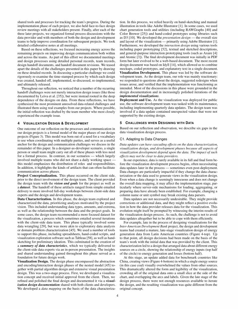
Fig. 9: A static mockup of a bubble chart visualization. While tooltipson the bubbles provide precise values, the image alone does not containenough information to enable a developer to re-create it. In particular,it does not specify that the data values shown are mapped to the area,not the diameter, of the circles.
one of many possible application states, exploring the effectiveness ofthe interaction requires replicating the process for other views.
Unfortunately, exploring this same interaction by coding a low-fidelity interactive prototype capable of supporting it also entails con-siderable effort. In comparison to graphic design tools, low-fidelityinteractive prototypes also make it considerably more difficult to ex-amine alternative layouts, typefaces, controls, and other aspects of thedesign. Testing pixel-perfect versions of interactions and transitions ina coded prototype effectively requires committing to and implementingthe entire design.
Across the five projects, we often took both approaches, usinggraphic design tools to sketch and visually polish components andvisualization views, while simultaneously implementing prototypes totest the impact of the interaction. We also used interactive chartingtools like Tableau [58] and RAWGraphs [40] to create data-accurate vi-sualization elements that could then be exported back into graphic andinteraction design tools to create richer mockups. However, the gapsbetween each of these tools is considerable and interaction prototypingconsumed a substantial amount of the design team’s bandwidth.
C5. Communicating Data MappingsImplementing a data mapping correctly requires more detail and preci-sion than can be easily inferred from a mockup of a visualization view.However, precise and complete specification of data mappings is notwell-supported by current design tools.
The mapping from data to visual representation is the most funda-mental aspect of a visualization. As such, it is critical that a designercreating a visual mapping be able to communicate their intent to otherson the team, especially developers. Current options for communicatingdata mappings are limited and must be created manually. A staticrendering of the view may seem sufficient if the visualization is de-signed to be easily read by non-experts. However, example viewsmay not capture many of the nuances and details that are importantfor implementation purposes. For example, correctly mapping a datavalue to a visual mark often requires data transformations or lookups,which may involve multiple hidden steps (such as using a classifica-tion algorithm to bin heat map values). Furthermore, the complexityof the data may make it difficult to explicitly show all data cases inthe provided views, particularly where interaction is concerned (seeChallenge C4–Interactions).
One clear example of this issue emerged late in the Energy Fu-tures project, which included the bubble chart visualization shown inFigure 9. The visualization design documentation outlining this visual-ization included one static view of the bubble chart created in AdobeIllustrator [1], together with information about which data columnswere to be mapped to the size of the circles. The visualization designers
expected, but did not precisely specify, that “size” would be interpretedas area rather than diameter. This expectation drew from their owndomain knowledge of common visualization guidelines. However, thisguideline is not inherently obvious, particularly to non-experts. In thiscase, the initial implementation mapped the data to the circles’ diameterrather than their area. This subtle difference in the mapping was diffi-cult to detect via visual inspection alone (see Challenge C6–Integrity).Ultimately, the error was caught by happenstance. However, once thediscrepancy was noticed, extra development time was needed to changethe mapping to what the designers originally intended.
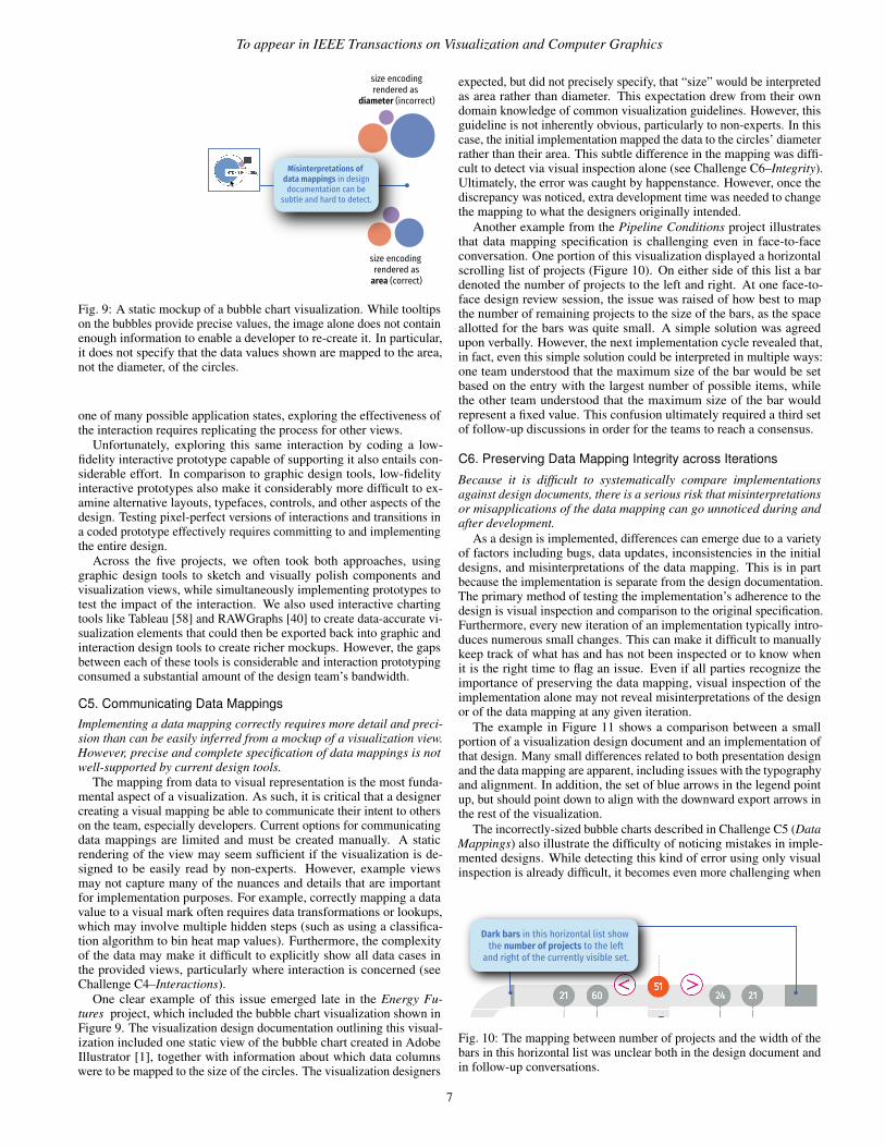
Another example from the Pipeline Conditions project illustratesthat data mapping specification is challenging even in face-to-faceconversation. One portion of this visualization displayed a horizontalscrolling list of projects (Figure 10). On either side of this list a bardenoted the number of projects to the left and right. At one face-to-face design review session, the issue was raised of how best to mapthe number of remaining projects to the size of the bars, as the spaceallotted for the bars was quite small. A simple solution was agreedupon verbally. However, the next implementation cycle revealed that,in fact, even this simple solution could be interpreted in multiple ways:one team understood that the maximum size of the bar would be setbased on the entry with the largest number of possible items, whilethe other team understood that the maximum size of the bar wouldrepresent a fixed value. This confusion ultimately required a third setof follow-up discussions in order for the teams to reach a consensus.
C6. Preserving Data Mapping Integrity across IterationsBecause it is difficult to systematically compare implementationsagainst design documents, there is a serious risk that misinterpretationsor misapplications of the data mapping can go unnoticed during andafter development.
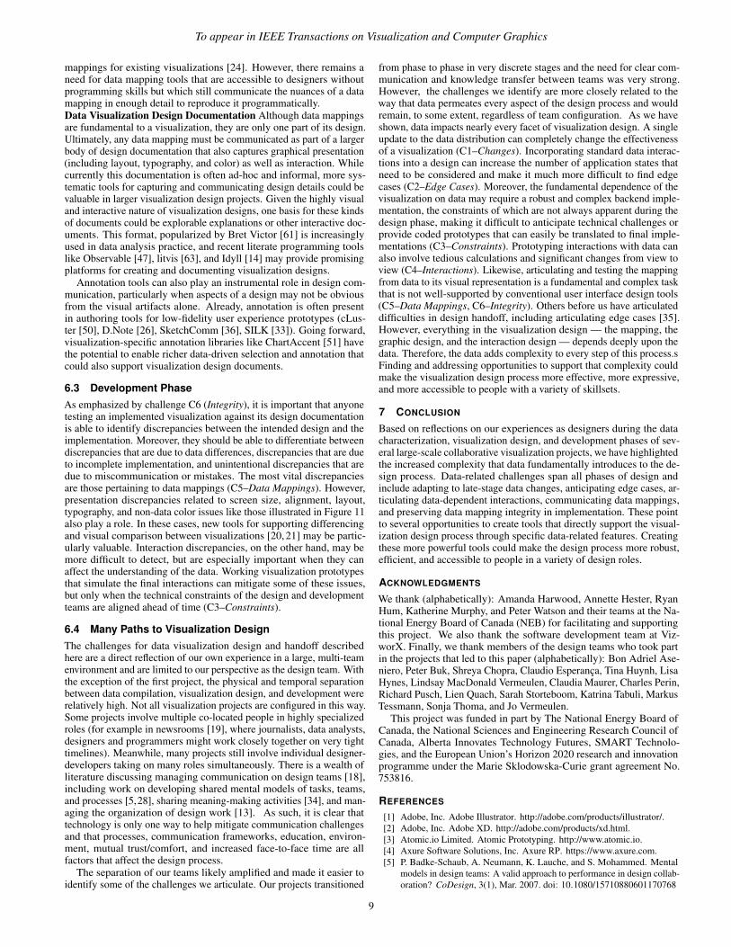
As a design is implemented, differences can emerge due to a varietyof factors including bugs, data updates, inconsistencies in the initialdesigns, and misinterpretations of the data mapping. This is in partbecause the implementation is separate from the design documentation.The primary method of testing the implementation’s adherence to thedesign is visual inspection and comparison to the original specification.Furthermore, every new iteration of an implementation typically intro-duces numerous small changes. This can make it difficult to manuallykeep track of what has and has not been inspected or to know whenit is the right time to flag an issue. Even if all parties recognize theimportance of preserving the data mapping, visual inspection of theimplementation alone may not reveal misinterpretations of the designor of the data mapping at any given iteration.
The example in Figure 11 shows a comparison between a smallportion of a visualization design document and an implementation ofthat design. Many small differences related to both presentation designand the data mapping are apparent, including issues with the typographyand alignment. In addition, the set of blue arrows in the legend pointup, but should point down to align with the downward export arrows inthe rest of the visualization.
The incorrectly-sized bubble charts described in Challenge C5 (DataMappings) also illustrate the difficulty of noticing mistakes in imple-mented designs. While detecting this kind of error using only visualinspection is already difficult, it becomes even more challenging when
Dark bars in this horizontal list show the number of projects to the left
and right of the currently visible set.
Fig. 10: The mapping between number of projects and the width of thebars in this horizontal list was unclear both in the design document andin follow-up conversations.
7

a DESIGN DOCUMENT IMPLEMENTED SYSTEM
Alignment not maintained
Arrow direction inverted
Font size & text differ
Fig. 11: Detailed differences between a piece of a visualization de-sign as specified in the original design documentation (left) and animplemented version of that design (right). Manually inspecting eachiteration of the developed visualization to compare against the designdocument is tedious and error-prone.
there are frequent data updates during the visualization developmentprocess. Frequent changes and updates like these can lead to uncer-tainty about whether the visualization matches expectations due to anincorrect mapping or simply due to differences in the data.
6 DISCUSSION
The challenges we have highlighted stem directly from the intrinsicconnection between visualizations and the source data that drives them.When compared to other kinds of interfaces, data affects the visibilityof elements, their layout, and their appearance to a much greater extent.Viewers of these tools interact not only with the interface but with thedata. As a result, developers and software engineers must also deal withthe pragmatic limitations of the datasets when considering performanceand interactive capabilities. Yet, for designers, anticipating all of theimplications of scale and interaction for a given dataset remains chal-lenging. This is magnified by the reality that datasets are likely to beupdated many times both during and after the design process. Together,these challenges suggest a variety of opportunities for research and toolcreation that could specifically support the visualization design process,both for individuals and for collaborative teams.
6.1 Data CharacterizationThe process of exploring and characterizing new datasets in preparationfor visualization design work has much in common with data analysis,and therefore many existing data analysis tools can be appropriatedwithin this space. However, Challenge C1 (Changes) illustrates someopportunities to create data characterization tools and processes thatare dedicated specifically to visualization design. Changes to datacharacteristics can have a substantial impact upon the final visualizationoutcome because visualization design choices typically reflect the shapeand parameters of the given dataset. However, the extent to which newdata may impact the robustness of the visualization may not be clearduring the data update process.
Data characterization tools could help remove this disconnect byhelping designers better understand how the data has changed from oneversion to the next and how those changes might alter the design ofthe visualization. This could include tools for highlighting changes indata column names, extrema, and statistical distributions of data, orfor simulating likely future changes based on the current distributionof values. Recent work on semi-automated approaches for outlierdetection and profiling in data mining toolboxes like Orange [16] or
data discovery tools like DataTours [42] may provide a useful startingpoint. Similarly, visual tools for quickly comparing the distribution ofvalues in different datasets might help designers more readily detectproblematic changes without relying on statistical summaries [38].
6.2 Design PhaseData-Driven Visualization Ideation. A number of the challenges weexperienced are associated fundamentally with the challenge of ideatingdata-driven visualization designs. Existing commercial tools for man-ual vector-based graphic design such as Adobe Illustrator [1] have littlesupport for creating complex, data-driven views, while visualization ex-ploration and generation tools such as Tableau [58] or RAWGraphs [40]have limited support for custom visuals and interaction. Meanwhile,programming tools and lower-level libraries can be challenging to useas rapid ideation platforms and can disempower non-programmers. For-tunately, recent projects like Data Illustrator [37], Data Ink [64] andData-Driven Guides [30] highlight the potential for more expressivedata-driven graphic design tools. Several of the challenges we experi-enced emphasize the need for further work in this space. More direct,dynamic, and expressive tools for designing with data could facilitaterapid exploration of different design alternatives even in the face ofchanging data (C1–Changes). Similarly, more rapid exploration of data-driven design alternatives could make it easier to discover unexpectededge cases (C2–Edge Cases) and prototype data-dependent interactions(C4–Interactions). Mei et al. [43] identify several additional researchdirections for these kinds of tools, including supporting refinementbased on existing visualizations, providing better debugging support,and exploring programming for dynamic data and interaction.
Where artifact creation cannot be unified into one single authoringplatform, better handoff tools may also offer opportunities for designersand developers to synchronize the artifacts across multiple systems.Already, tools like Hanpuku [7] have explored bridging the graphicdesign expressivity of Adobe Illustrator and the data-driven prototypingcapabilities of D3 [10]. However, designing bi-directional workflowsbetween these sorts of existing tools usually entails compromise —often intersecting the limitations of each tool and limiting the pieces offunctionality that can be translated. This suggests that unidirectionalhandoff tools, like those now widely used in interaction design, are amore likely first step.Data-Driven Interaction Prototyping. Prototyping data-driven inter-actions within a visualization design is important for exploring differentinteraction options, ensuring the scalability and understandability ofthose interaction options, and communicating interaction designs todevelopers (C4–Interactions). Yet data-driven interactions can be com-plex to prototype because one interaction can simultaneously causea change to a large number of data-driven elements in a design. Un-fortunately, commercially-available user interface prototyping toolsdo not address this challenge. Commercial interaction design toolsmake it straightforward to prototype interactions and transitions usingstatic mockups, and even provide some limited support for data-drivenprototyping — for example by populating user profiles or lists of infor-mation. However, they provide little support for creating visualizationviews whose layout, appearance, and interactivity are all deeply andinherently driven by data. As such, opportunities remain for new toolsthat allow designers to more expressively prototype and test potentialinteractions, either by bootstrapping on top of existing visualizationtools or via new authoring interfaces.Data Mapping Documentation. Communicating and documentingdesign intent is useful not only for explaining visualization designs toa development team, but also when communicating with other teammembers or stakeholders and when producing project documentation.One opportunity highlighted by challenge C5 (Data Mappings), isto design tools and methods for communicating data mappings. Suchtools would support explicit communication of the relationship betweendata structures and their graphical representation with enough detail toconvey any transformations, calculations, and algorithms required.
Related work on visualization grammars [54, 57, 62] provides auseful starting point, as do projects that represent the visualizationpipeline [59] and support the deconstruction and modification of data
8
To appear in IEEE Transactions on Visualization and Computer Graphics
mappings for existing visualizations [24]. However, there remains aneed for data mapping tools that are accessible to designers withoutprogramming skills but which still communicate the nuances of a datamapping in enough detail to reproduce it programmatically.Data Visualization Design Documentation Although data mappingsare fundamental to a visualization, they are only one part of its design.Ultimately, any data mapping must be communicated as part of a largerbody of design documentation that also captures graphical presentation(including layout, typography, and color) as well as interaction. Whilecurrently this documentation is often ad-hoc and informal, more sys-tematic tools for capturing and communicating design details could bevaluable in larger visualization design projects. Given the highly visualand interactive nature of visualization designs, one basis for these kindsof documents could be explorable explanations or other interactive doc-uments. This format, popularized by Bret Victor [61] is increasinglyused in data analysis practice, and recent literate programming toolslike Observable [47], litvis [63], and Idyll [14] may provide promisingplatforms for creating and documenting visualization designs.
Annotation tools can also play an instrumental role in design com-munication, particularly when aspects of a design may not be obviousfrom the visual artifacts alone. Already, annotation is often presentin authoring tools for low-fidelity user experience prototypes (cLus-ter [50], D.Note [26], SketchComm [36], SILK [33]). Going forward,visualization-specific annotation libraries like ChartAccent [51] havethe potential to enable richer data-driven selection and annotation thatcould also support visualization design documents.
6.3 Development PhaseAs emphasized by challenge C6 (Integrity), it is important that anyonetesting an implemented visualization against its design documentationis able to identify discrepancies between the intended design and theimplementation. Moreover, they should be able to differentiate betweendiscrepancies that are due to data differences, discrepancies that are dueto incomplete implementation, and unintentional discrepancies that aredue to miscommunication or mistakes. The most vital discrepanciesare those pertaining to data mappings (C5–Data Mappings). However,presentation discrepancies related to screen size, alignment, layout,typography, and non-data color issues like those illustrated in Figure 11also play a role. In these cases, new tools for supporting differencingand visual comparison between visualizations [20, 21] may be partic-ularly valuable. Interaction discrepancies, on the other hand, may bemore difficult to detect, but are especially important when they canaffect the understanding of the data. Working visualization prototypesthat simulate the final interactions can mitigate some of these issues,but only when the technical constraints of the design and developmentteams are aligned ahead of time (C3–Constraints).
6.4 Many Paths to Visualization DesignThe challenges for data visualization design and handoff describedhere are a direct reflection of our own experience in a large, multi-teamenvironment and are limited to our perspective as the design team. Withthe exception of the first project, the physical and temporal separationbetween data compilation, visualization design, and development wererelatively high. Not all visualization projects are configured in this way.Some projects involve multiple co-located people in highly specializedroles (for example in newsrooms [19], where journalists, data analysts,designers and programmers might work closely together on very tighttimelines). Meanwhile, many projects still involve individual designer-developers taking on many roles simultaneously. There is a wealth ofliterature discussing managing communication on design teams [18],including work on developing shared mental models of tasks, teams,and processes [5,28], sharing meaning-making activities [34], and man-aging the organization of design work [13]. As such, it is clear thattechnology is only one way to help mitigate communication challengesand that processes, communication frameworks, education, environ-ment, mutual trust/comfort, and increased face-to-face time are allfactors that affect the design process.
The separation of our teams likely amplified and made it easier toidentify some of the challenges we articulate. Our projects transitioned
from phase to phase in very discrete stages and the need for clear com-munication and knowledge transfer between teams was very strong.However, the challenges we identify are more closely related to theway that data permeates every aspect of the design process and wouldremain, to some extent, regardless of team configuration. As we haveshown, data impacts nearly every facet of visualization design. A singleupdate to the data distribution can completely change the effectivenessof a visualization (C1–Changes). Incorporating standard data interac-tions into a design can increase the number of application states thatneed to be considered and make it much more difficult to find edgecases (C2–Edge Cases). Moreover, the fundamental dependence of thevisualization on data may require a robust and complex backend imple-mentation, the constraints of which are not always apparent during thedesign phase, making it difficult to anticipate technical challenges orprovide coded prototypes that can easily be translated to final imple-mentations (C3–Constraints). Prototyping interactions with data canalso involve tedious calculations and significant changes from view toview (C4–Interactions). Likewise, articulating and testing the mappingfrom data to its visual representation is a fundamental and complex taskthat is not well-supported by conventional user interface design tools(C5–Data Mappings, C6–Integrity). Others before us have articulateddifficulties in design handoff, including articulating edge cases [35].However, everything in the visualization design — the mapping, thegraphic design, and the interaction design — depends deeply upon thedata. Therefore, the data adds complexity to every step of this process.sFinding and addressing opportunities to support that complexity couldmake the visualization design process more effective, more expressive,and more accessible to people with a variety of skillsets.
7 CONCLUSION
Based on reflections on our experiences as designers during the datacharacterization, visualization design, and development phases of sev-eral large-scale collaborative visualization projects, we have highlightedthe increased complexity that data fundamentally introduces to the de-sign process. Data-related challenges span all phases of design andinclude adapting to late-stage data changes, anticipating edge cases, ar-ticulating data-dependent interactions, communicating data mappings,and preserving data mapping integrity in implementation. These pointto several opportunities to create tools that directly support the visual-ization design process through specific data-related features. Creatingthese more powerful tools could make the design process more robust,efficient, and accessible to people in a variety of design roles.
ACKNOWLEDGMENTS
We thank (alphabetically): Amanda Harwood, Annette Hester, RyanHum, Katherine Murphy, and Peter Watson and their teams at the Na-tional Energy Board of Canada (NEB) for facilitating and supportingthis project. We also thank the software development team at Viz-worX. Finally, we thank members of the design teams who took partin the projects that led to this paper (alphabetically): Bon Adriel Ase-niero, Peter Buk, Shreya Chopra, Claudio Esperanca, Tina Huynh, LisaHynes, Lindsay MacDonald Vermeulen, Claudia Maurer, Charles Perin,Richard Pusch, Lien Quach, Sarah Storteboom, Katrina Tabuli, MarkusTessmann, Sonja Thoma, and Jo Vermeulen.
This project was funded in part by The National Energy Board ofCanada, the National Sciences and Engineering Research Council ofCanada, Alberta Innovates Technology Futures, SMART Technolo-gies, and the European Union’s Horizon 2020 research and innovationprogramme under the Marie Sklodowska-Curie grant agreement No.753816.
REFERENCES
[1] Adobe, Inc. Adobe Illustrator. http://adobe.com/products/illustrator/.[2] Adobe, Inc. Adobe XD. http://adobe.com/products/xd.html.[3] Atomic.io Limited. Atomic Prototyping. http://www.atomic.io.[4] Axure Software Solutions, Inc. Axure RP. https://www.axure.com.[5] P. Badke-Schaub, A. Neumann, K. Lauche, and S. Mohammed. Mental
models in design teams: A valid approach to performance in design collab-oration? CoDesign, 3(1), Mar. 2007. doi: 10.1080/15710880601170768
9

[6] A. Bigelow, S. Drucker, D. Fisher, and M. Meyer. Reflections on HowDesigners Design with Data. In Proceedings of the 2014 InternationalWorking Conference on Advanced Visual Interfaces, AVI ’14. ACM, 2014.doi: 10.1145/2598153.2598175
[7] A. Bigelow, S. Drucker, D. Fisher, and M. Meyer. Iterating between Toolsto Create and Edit Visualizations. IEEE Transactions on Visualization andComputer Graphics, 23(1), Jan 2017. doi: 10.1109/TVCG.2016.2598609
[8] T. Blascheck, L. M. Vermeulen, J. Vermeulen, C. Perin, W. Willett, T. Ertl,and S. Carpendale. Exploration Strategies for Discovery of Interactivityin Visualizations. IEEE Transactions on Visualization and ComputerGraphics, pp. 1–1, 2018. doi: 10.1109/tvcg.2018.2802520
[9] Bohemian B.V. Sketch. http://www.sketchapp.com.[10] M. Bostock, V. Ogievetsky, and J. Heer. D3 Data-Driven Documents. IEEE
Transactions on Visualization and Computer Graphics, 17(12):2301–2309,Dec 2011. doi: 10.1109/tvcg.2011.185
[11] J. M. Brown, G. Lindgaard, and R. Biddle. Joint Implicit AlignmentWork of Interaction Designers and Software Developers. In Proceedingsof the 7th Nordic Conference on Human-Computer Interaction: MakingSense Through Design, NordiCHI ’12. ACM, 2012. doi: 10.1145/2399016.2399121
[12] R. V. Bullough Jr and S. Pinnegar. Guidelines for quality in autobiograph-ical forms of self-study research. Educational researcher, 30(3):13–21,2001. doi: 10.3102/0013189X030003013
[13] M.-L. Chiu. An organizational view of design communication in designcollaboration. Design Studies, 23(2), Mar. 2002. doi: 10.1016/S0142-694X(01)00019-9
[14] M. Conlen and J. Heer. Idyll: A markup language for authoring andpublishing interactive articles on the web. In Proceedings of the ACMSymposium on User Interface Software and Technology, UIST ’18. ACM,2018.
[15] M. Czerwinski, E. Horvitz, and S. Wilhite. A diary study of task switchingand interruptions. In Proceedings of the SIGCHI Conference on HumanFactors in Computing Systems, CHI ’04, pp. 175–182. ACM, 2004. doi:10.1145/985692.985715
[16] J. Demsar, T. Curk, A. Erjavec, Crt Gorup, T. Hocevar, M. Milutinovic,M. Mozina, M. Polajnar, M. Toplak, A. Staric, M. Stajdohar, L. Umek,L. Zagar, J. Zbontar, M. Zitnik, and B. Zupan. Orange: Data miningtoolbox in python. Journal of Machine Learning Research, 14:2349–2353,2013.
[17] A. Desjardins and A. Ball. Revealing tensions in autobiographical designin HCI. In Proceedings of the SIGCHI Conference on Designing Interac-tive Systems, DIS ’18, pp. 753–764. ACM, 2018. doi: 10.1145/3196709.3196781
[18] C. Eckert, A. Maier, and C. McMahon. Communication in design. InJ. Clarkson and C. Eckert, eds., Design process improvement: A review ofcurrent practice. Springer London, 2005. doi: 10.1007/978-1-84628-061-0 10
[19] R. Fischer-Baum and C. Esteban. Working in a graphics visual storytellingteam. Keynote presentation, Information Plus Conference, Potsdam, Ger-many, Oct 2018.
[20] M. Gleicher. Considerations for Visualizing Comparison. IEEE Transac-tions on Visualization and Computer Graphics, 24(1), Jan 2018. doi: 10.1109/TVCG.2017.2744199
[21] M. Gleicher, D. Albers, R. Walker, I. Jusufi, C. D. Hansen, and J. C.Roberts. Visual comparison for information visualization. InformationVisualization, 10(4), Oct 2011. doi: 10.1177/1473871611416549
[22] J. Gray, L. Chambers, and L. Bounegru. The data journalism handbook:How journalists can use data to improve the news. O’Reilly Media, Inc.,2012.
[23] H. Hagen, D. Keim, T. Munzner, S. North, and H. Pfister. Vis restruc-turing recommendations, Fall 2018. http://ieeevis.org/governance/1810-Restructuring-Recommendations.pdf, 2018.
[24] J. Harper and M. Agrawala. Deconstructing and Restyling D3 Visual-izations. In Proceedings of the 27th Annual ACM Symposium on UserInterface Software and Technology, UIST ’14. ACM, 2014. doi: 10.1145/2642918.2647411
[25] M. Harrower and C. A. Brewer. Colorbrewer.org: An online tool forselecting colour schemes for maps. The Cartographic Journal, 40(1):27–37, 2003. doi: 10.1179/000870403235002042
[26] B. Hartmann, S. Follmer, A. Ricciardi, T. Cardenas, and S. R. Klemmer.D.Note: Revising User Interfaces Through Change Tracking, Annota-tions, and Alternatives. In Proceedings of the SIGCHI Conference onHuman Factors in Computing Systems, CHI ’10. ACM, 2010. doi: 10.
1145/1753326.1753400[27] InvisionApp, Inc. InVision. http://www.invisionapp.com.[28] T. E. Johnson, Y. Lee, M. Lee, D. L. O’Connor, M. K. Khalil, and
X. Huang. Measuring sharedness of team-related knowledge: Design andvalidation of a shared mental model instrument. Human Resource Develop-ment International, 10(4), Dec. 2007. doi: 10.1080/13678860701723802
[29] S. Kandel, A. Paepcke, J. M. Hellerstein, and J. Heer. Enterprise dataanalysis and visualization: An interview study. IEEE Transactions onVisualization and Computer Graphics, 18(12):2917–2926, Dec 2012. doi:10.1109/TVCG.2012.219
[30] N. W. Kim, E. Schweickart, Z. Liu, M. Dontcheva, W. Li, J. Popovic,and H. Pfister. Data-Driven Guides: Supporting Expressive Design forInformation Graphics. IEEE Transactions on Visualization and ComputerGraphics, 23(1):491–500, Jan 2017. doi: 10.1109/tvcg.2016.2598620
[31] R. M. Kirby and M. Meyer. Visualization collaborations: What works andwhy. IEEE Computer Graphics and Applications, 33(6):82–88, 2013. doi:10.1109/MCG.2013.101
[32] S. Knudsen, L. Quach, P. Buk, K. Tabuli, S. Chopra, W. Willett, S. Carpen-dale, J. Vermeulen, D. Kosminsky, J. Walny, M. West, C. Frisson, B. A.Aseniero, L. M. Vermeulen, and C. Perin. Democratizing Open EnergyData for Public Discourse using Visualization. In Extended Abstracts ofthe SIGCHI Conference on Human Factors in Computing Systems. ACMPress, 2018. doi: 10.1145/3170427.3186539
[33] J. A. Landay. SILK: Sketching Interfaces Like Krazy. In ConferenceCompanion on Human Factors in Computing Systems, CHI ’96. ACM,1996. doi: 10.1145/257089.257396
[34] A. Larsson. Making sense of collaboration: The challenge of thinkingtogether in global design teams. In Proceedings of the 2003 InternationalACM SIGGROUP Conference on Supporting Group Work, GROUP ’03.ACM, 2003. doi: 10.1145/958160.958184
[35] G. Leiva, N. Maudet, W. Mackay, and M. Beaudouin-Lafon. Enact: Reduc-ing designer–developer breakdowns when prototyping custom interactions.ACM Transactions on Computer-Human Interaction (TOCHI), 26(3):19,2019. doi: 10.1145/3310276
[36] G. Li, X. Cao, S. Paolantonio, and F. Tian. SketchComm: A Tool toSupport Rich and Flexible Asynchronous Communication of Early DesignIdeas. In Proceedings of the ACM 2012 Conference on Computer Sup-ported Cooperative Work, CSCW ’12. ACM, 2012. doi: 10.1145/2145204.2145261
[37] Z. Liu, J. Thompson, A. Wilson, M. Dontcheva, J. Delorey, S. Grigg,B. Kerr, and J. Stasko. Data Illustrator: Augmenting Vector DesignTools withLazy Data Binding for Expressive Visualization Authoring. InProceedings of the SIGCHI Conference on Human Factors in ComputingSystems, CHI ’18, 2018.
[38] J. Matejka and G. Fitzmaurice. Same Stats Different Graphs. In Pro-ceedings of the 2017 CHI Conference on Human Factors in ComputingSystems - CHI’17. ACM Press, 2017. doi: 10.1145/3025453.3025912
[39] N. Maudet, G. Leiva, M. Beaudouin-Lafon, and W. Mackay. DesignBreakdowns: Designer-Developer Gaps in Representing and InterpretingInteractive Systems. In Proceedings of the 2017 ACM Conference onComputer Supported Cooperative Work and Social Computing, CSCW’17. ACM, 2017. doi: 10.1145/2998181.2998190
[40] M. Mauri, T. Elli, G. Caviglia, G. Uboldi, and M. Azzi. RAWGraphs:A Visualisation Platform to Create Open Outputs. In Proceedings of the12th Biannual Conference on Italian SIGCHI Chapter, CHItaly ’17. ACM,2017. doi: 10.1145/3125571.3125585
[41] S. McKenna, D. Mazur, J. Agutter, and M. Meyer. Design ActivityFramework for Visualization Design. IEEE Transactions on Visualizationand Computer Graphics, 20(12), Dec 2014. doi: 10.1109/TVCG.2014.2346331
[42] H. Mehta, A. Chalbi, F. Chevalier, and C. Collins. DataTours: A DataNarratives Framework. In IEEE InfoVis 2017 Posters, Oct 2017.
[43] H. Mei, Y. Ma, Y. Wei, and W. Chen. The design space of constructiontools for information visualization: A survey. Journal of Visual Languages& Computing, Oct 2017. doi: 10.1016/j.jvlc.2017.10.001
[44] M. Meyer and J. Dykes. Reflection on reflection in applied visualizationresearch. IEEE Computer Graphics and Applications, 38(6), Nov. 2018.doi: 10.1109/MCG.2018.2874523
[45] T. Munzner. A nested model for visualization design and validation. IEEETransactions on Visualization and Computer Graphics, 15(6), Nov. 2009.doi: 10.1109/TVCG.2009.111
[46] C. Neustaedter and P. Sengers. Autobiographical design in hci research:designing and learning through use-it-yourself. In Proceedings of the
10

To appear in IEEE Transactions on Visualization and Computer Graphics
SIGCHI Conference on Designing Interactive Systems, DIS ’12, pp. 514–523. ACM, 2012. doi: 10.1145/2317956.2318034
[47] Observable, Inc. Observable. http://www.observablehq.com.[48] S. Ohly, S. Sonnentag, C. Niessen, and D. Zapf. Diary studies in or-
ganizational research. Journal of Personnel Psychology, 2010. doi: 10.1027/1866-5888/a000009
[49] F. K. Ozenc, M. Kim, J. Zimmerman, S. Oney, and B. Myers. How to Sup-port Designers in Getting Hold of the Immaterial Material of Software. InProceedings of the SIGCHI Conference on Human Factors in ComputingSystems, CHI ’10. ACM, 2010. doi: 10.1145/1753326.1753707
[50] F. Perteneder, M. Bresler, E.-M. Grossauer, J. Leong, and M. Haller.cLuster: Smart Clustering of Free-Hand Sketches on Large InteractiveSurfaces. In Proceedings of the ACM Symposium on User InterfaceSoftware & Technology, UIST ’15. ACM, 2015. doi: 10.1145/2807442.2807455
[51] D. Ren, M. Brehmer, B. Lee, T. Hollerer, and E. K. Choe. ChartAccent:Annotation for data-driven storytelling. In 2017 IEEE Pacific Visualiza-tion Symposium (PacificVis), Apr 2017. doi: 10.1109/PACIFICVIS.2017.8031599
[52] M. Rettig. Prototyping for tiny fingers. Commun. ACM, 37(4):21–27, Apr.1994. doi: 10.1145/175276.175288
[53] J. Rieman. The diary study: A workplace-oriented research tool to guidelaboratory efforts. In Proceedings of the INTERACT ’93 and CHI ’93Conference on Human Factors in Computing Systems, CHI ’93, pp. 321–326. ACM, 1993. doi: 10.1145/169059.169255
[54] A. Satyanarayan, D. Moritz, K. Wongsuphasawat, and J. Heer. Vega-Lite:A Grammar of Interactive Graphics. IEEE Transactions on Visualizationand Computer Graphics, 23(1):341–350, Jan 2017. doi: 10.1109/tvcg.2016.2599030
[55] M. Sedlmair, M. Meyer, and T. Munzner. Design Study Methodology:Reflections from the Trenches and the Stacks. IEEE Transactions onVisualization and Computer Graphics, 18(12), Dec 2012. doi: 10.1109/TVCG.2012.213
[56] S. Sonnentag. Work, recovery activities, and individual well-being: Adiary study. Journal of occupational health psychology, 6(3):196, 2001.doi: 10.1037/1076-8998.6.3.196
[57] C. Stolte and P. Hanrahan. Polaris: A system for query analysis andvisualization of multi-dimensional relational databases. In Proceedings ofthe IEEE Symposium on Information Visualization (InfoVis). IEEE, 2000.doi: 10.1109/infvis.2000.885086
[58] Tableau, Inc. Tableau Software. https://www.tableau.com.[59] M. Tobiasz, P. Isenberg, and S. Carpendale. Lark: Coordinating Co-
located Collaboration with Information Visualization. IEEE Transactionson Visualization and Computer Graphics, 15(6):1065–1072, Nov 2009.doi: 10.1109/tvcg.2009.162
[60] A. Vande Moere and H. Purchase. On the role of design in informationvisualization. Information Visualization, 10(4):356–371, 10 2011. doi: 10.1177/1473871611415996
[61] B. Victor. Humane Representation of Thought: A Trail Map for the21st Century. In Proceedings of the ACM Symposium on User InterfaceSoftware and Technology, UIST ’14. ACM, 2014. doi: 10.1145/2642918.2642920
[62] L. Wilkinson. The grammar of graphics. Wiley Interdisciplinary Reviews:Computational Statistics, 2(6):673–677, Oct 2010. doi: 10.1002/wics.118
[63] J. Wood, A. Kachkaev, and J. Dykes. Design exposition with literatevisualization. IEEE Transactions on Visualization and Computer Graphics,25(1):759–768, 2019. doi: 10.1109/TVCG.2018.2864836
[64] H. Xia, N. H. Riche, F. Chevalier, B. D. Araujo, and D. Wigdor. DataInk:Direct and Creative Data-Oriented Drawing. In Proceedings of the SIGCHIConference on Human Factors in Computing Systems, CHI ’18, 2018.
[65] C. Yiu. Collaboration with distributed teams. Interactions, 21(4):50–53,Jul 2014. doi: 10.1145/2627341
11