data visualizationtheanalysisofdata.com/computing/data visualization.pdf · data visualization...
TRANSCRIPT
Chapter 9
Data Visualization
Visualizing data is key in e↵ective data analysis. It is useful for the followingpurposes:
1. initially investigating datasets,
2. confirming or refuting data models, and
3. elucidating mathematical or algorithmic concepts.
In most of this chapter we explore di↵erent types of data graphs using the Rprogramming language which has excellent graphics functionality. We end thechapter with a description of Python’s matplotlib module - a popular Pythontool for data visualization.
9.1 Graphing Data in R
We focus on two R graphics packages: graphics and ggplot2. The graphics pack-age contains the original R graphics functions and is installed and loaded bydefault. Its functions are easy to use and produce a variety of useful graphs. Theggplot2 package provides alternative graphics functionality based on Wilkinson’sgrammar of graphics [31]. To install it and bring it to scope type the followingcommands.
install.packages('ggplot2')library(ggplot2)
When creating complex graphs, the ggplot2 syntax is considerable simplerthan the syntax of the graphics package. A potential disadvantage of ggplot2package is that rendering graphics using ggplot2 may be substantially slower.
283
284 CHAPTER 9. DATA VISUALIZATION
9.2 Datasets
We use three datasets to explore data graphs. The faithful dataframe is apart of the datasets package that is installed and loaded by default. It has has twovariables: eruption time and waiting time to next eruption (both in minutes) ofthe Old Faithful geyser in Yellowstone National Park, Wyoming, USA. The codebelow displays the variable names and the corresponding summary statistics.
names(faithful) # variable names## [1] "eruptions" "waiting"summary(faithful) # variable summary## eruptions waiting## Min. :1.600 Min. :43.0## 1st Qu.:2.163 1st Qu.:58.0## Median :4.000 Median :76.0## Mean :3.488 Mean :70.9## 3rd Qu.:4.454 3rd Qu.:82.0## Max. :5.100 Max. :96.0
The mtcars dataframe, which is also included in the datasets package,contains information concerning multiple car models extracted from 1974 MotorTrend magazine. The variables include model name, weight, horsepower, fuele�ciency, and transmission type.
summary(mtcars)## mpg cyl## Min. :10.40 Min. :4.000## 1st Qu.:15.43 1st Qu.:4.000## Median :19.20 Median :6.000## Mean :20.09 Mean :6.188## 3rd Qu.:22.80 3rd Qu.:8.000## Max. :33.90 Max. :8.000## disp hp## Min. : 71.1 Min. : 52.0## 1st Qu.:120.8 1st Qu.: 96.5## Median :196.3 Median :123.0## Mean :230.7 Mean :146.7## 3rd Qu.:326.0 3rd Qu.:180.0## Max. :472.0 Max. :335.0## drat wt## Min. :2.760 Min. :1.513## 1st Qu.:3.080 1st Qu.:2.581## Median :3.695 Median :3.325## Mean :3.597 Mean :3.217## 3rd Qu.:3.920 3rd Qu.:3.610## Max. :4.930 Max. :5.424## qsec vs## Min. :14.50 Min. :0.0000## 1st Qu.:16.89 1st Qu.:0.0000
9.3. GRAPHICS AND GGPLOT2 PACKAGES 285
## Median :17.71 Median :0.0000## Mean :17.85 Mean :0.4375## 3rd Qu.:18.90 3rd Qu.:1.0000## Max. :22.90 Max. :1.0000## am gear## Min. :0.0000 Min. :3.000## 1st Qu.:0.0000 1st Qu.:3.000## Median :0.0000 Median :4.000## Mean :0.4062 Mean :3.688## 3rd Qu.:1.0000 3rd Qu.:4.000## Max. :1.0000 Max. :5.000## carb## Min. :1.000## 1st Qu.:2.000## Median :2.000## Mean :2.812## 3rd Qu.:4.000## Max. :8.000
The mpg dataframe is a part of the ggplot2 package and it is similar tomtcars in that it contains fuel economy and other attributes, but it is larger andit contains newer car models extracted from the website http://fueleconomy.gov.
names(mpg)## [1] "manufacturer" "model"## [3] "displ" "year"## [5] "cyl" "trans"## [7] "drv" "cty"## [9] "hwy" "fl"## [11] "class"
More information on any of these datasets may be obtained by typing help(X)with X corresponding to the dataframe name when the appropriate package is inscope.
9.3 Graphics and ggplot2 Packages
The graphics package contains two types of functions: high-level functionsand low-level functions. High level functions produce a graph, while low levelfunctions modify an existing graph. The primary high level function, plot,takes as arguments one or more dataframe columns representing data and otherarguments that modify its default behavior (some examples appear below).
Other high-level functions in the graphics package are more specializedand produce a specific type of graph, such as hist for producing histograms,or curve for producing curves. We do not explore many high level functions asthey are generally less convenient to use than the corresponding functions in theggplot2 package.

286 CHAPTER 9. DATA VISUALIZATION
Examples of low-level functions in the graphics package are:
• title adds or modifies labels of title and axes,
• grid adds a grid to the current figure,
• legend displays a legend connecting symbols, colors, and line-types todescriptive strings, and
• lines adds a line plot to an existing graph.
The two main functions in the ggplot2 package are qplot and ggplot. Theqplot function accepts as arguments one or more data variables assigned tothe variables x, y, and z (in some cases only one or two of these arguments arespecified). The more complex function ggplot accepts as arguments a dataframeand an object returned by the aes function which accepts data variables asarguments.
In contrast to qplot, ggplot does not create a graph and returns insteadan object that may be modified by adding layers to it using the + operator. Afterappropriate layers are added the object may be saved to disk or printed usingthe print function. The layer addition functionality applies to qplot as well.
The ggplot2 package provides automatic axes labeling and legends. To takeadvantage of this feature the data must reside in a dataframe with informativecolumn names. We emphasize this approach as it provides more informativedataframes column names, in addition to simplifying the R code.
For example, the following code displays a scatter plot of the columns of ahypothetical dataframe dataframe containing two variables col1 and col2using the graphics package and then adds a title to the graph.
plot(x = dataframe$col_1, y = dataframe$col_2)title(main = "figure title") # add title
To create a similar graph using the qplot function use the following code.
qplot(x = x1,y = x2,data = DF,main = "figure title",geom = "point")
The corresponding ggplot code appears below.
ggplot(dataframe, aes(x = col1, y = col2)) + geom_point()
In the following sections we describe several di↵erent types of data graphs.
9.4. STRIP PLOTS 287
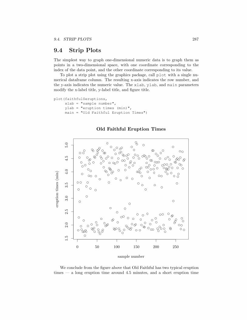
9.4 Strip Plots
The simplest way to graph one-dimensional numeric data is to graph them aspoints in a two-dimensional space, with one coordinate corresponding to theindex of the data point, and the other coordinate corresponding to its value.
To plot a strip plot using the graphics package, call plot with a single nu-merical dataframe column. The resulting x-axis indicates the row number, andthe y-axis indicates the numeric value. The xlab, ylab, and main parametersmodify the x-label title, y-label title, and figure title.
plot(faithful$eruptions,xlab = "sample number",ylab = "eruption times (min)",main = "Old Faithful Eruption Times")
0 50 100 150 200 250
1.5
2.0
2.5
3.0
3.5
4.0
4.5
5.0
Old Faithful Eruption Times
sample number
eruption
times
(min)
We conclude from the figure above that Old Faithful has two typical eruptiontimes — a long eruption time around 4.5 minutes, and a short eruption time
288 CHAPTER 9. DATA VISUALIZATION
around 1.5 minutes. It also appears that the order in which the dataframe rowsare stored is not related to the eruption variable.
9.5 Histograms
An alternative way to graph one dimensional numeric data is using the histogramgraph. The histogram divides the range of numeric values into bins and displaysthe number of data values falling within each bin. The width of the bins influencesthe level of detail. Very narrow bins maintain all the information present in thedata but are hard to draw conclusions from, as the histogram becomes equivalentto a sorted list of data values. Very wide bins lose information due to overlyaggressive smoothing. A good bin width balances information loss with usefuldata aggregation. Unlike strip plots that contain all of the information present inthe data, histograms discard the ordering of the data points, and treat samplesin the same bin as identical.
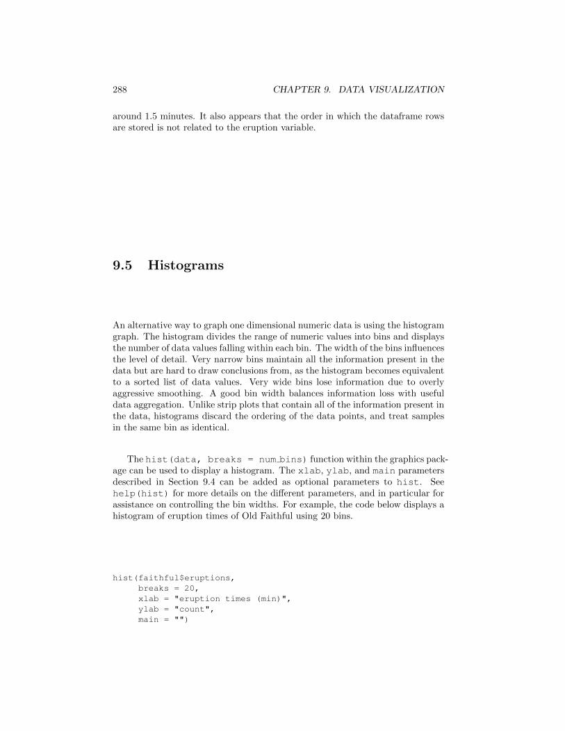
The hist(data, breaks = num bins) function within the graphics pack-age can be used to display a histogram. The xlab, ylab, and main parametersdescribed in Section 9.4 can be added as optional parameters to hist. Seehelp(hist) for more details on the di↵erent parameters, and in particular forassistance on controlling the bin widths. For example, the code below displays ahistogram of eruption times of Old Faithful using 20 bins.
hist(faithful$eruptions,breaks = 20,xlab = "eruption times (min)",ylab = "count",main = "")
9.5. HISTOGRAMS 289
eruption times (min)
count
1.5 2.0 2.5 3.0 3.5 4.0 4.5 5.0
010
2030
40
We see a nice correspondence between the above histogram and the stripplot in Section 9.4. There are clearly two typical eruption times – one around 2minutes and one around 4.5 minutes.
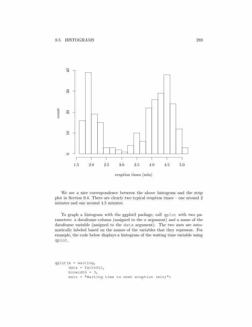
To graph a histogram with the ggplot2 package, call qplot with two pa-rameters: a dataframe column (assigned to the x argument) and a name of thedataframe variable (assigned to the data argument). The two axes are auto-matically labeled based on the names of the variables that they represent. Forexample, the code below displays a histogram of the waiting time variable usingqplot.
qplot(x = waiting,data = faithful,binwidth = 3,main = "Waiting time to next eruption (min)")
290 CHAPTER 9. DATA VISUALIZATION
0
10
20
30
40 60 80 100
waiting
count
Waiting time to next eruption (min)
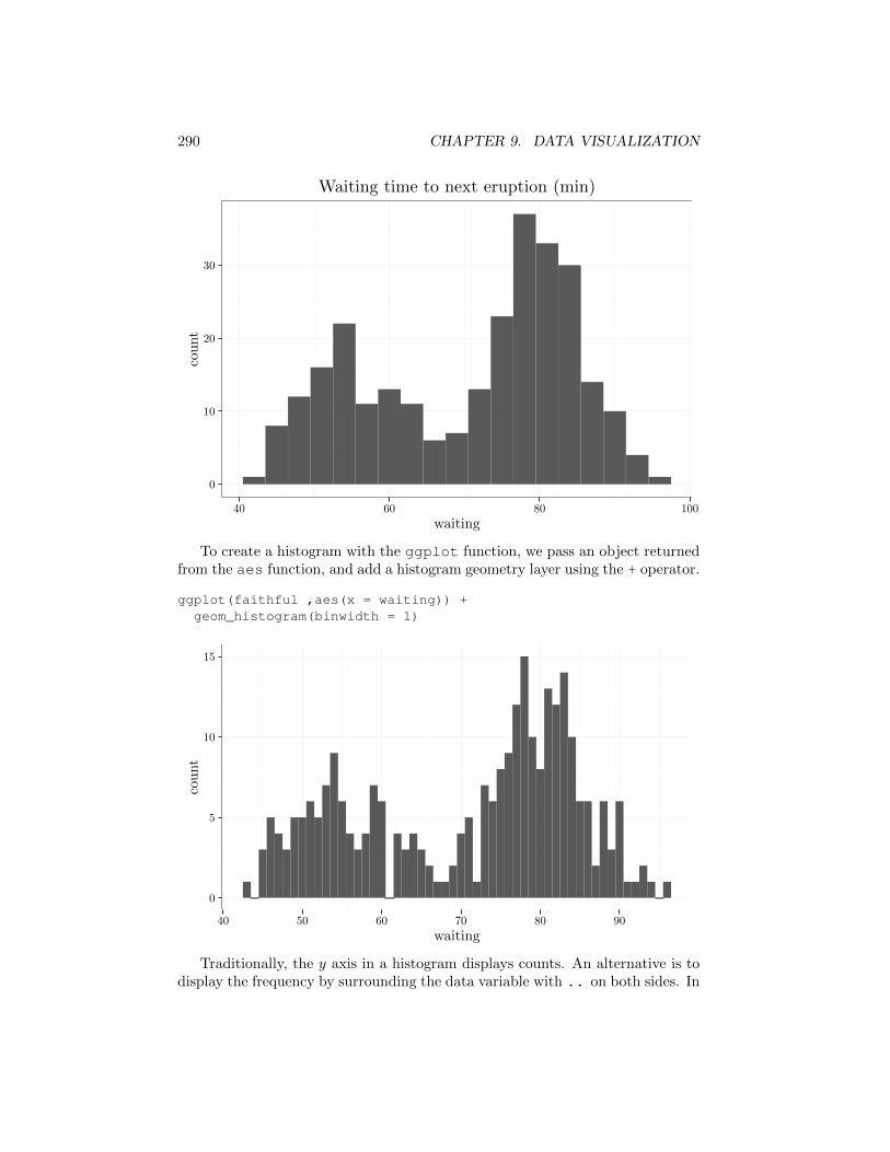
To create a histogram with the ggplot function, we pass an object returnedfrom the aes function, and add a histogram geometry layer using the + operator.
ggplot(faithful ,aes(x = waiting)) +geom_histogram(binwidth = 1)
0
5
10
15
40 50 60 70 80 90
waiting
count
Traditionally, the y axis in a histogram displays counts. An alternative is todisplay the frequency by surrounding the data variable with .. on both sides. In
9.6. LINE PLOTS 291
this case, the height of each bin times its width equals the count of samples fallingin the bin divided by the total number of counts. As a result, the area underthe graph is 1 making it a legitimate probability density function (see TAODvolume 1, Chapter 2 for a description of the probability density function). Thisprobability interpretation is sometimes advantageous, but it may be problematicin that it masks the total number of counts.
ggplot(faithful, aes(x = waiting, y = ..density..)) +geom_histogram(binwidth = 4)
0.00
0.01
0.02
0.03
0.04
40 60 80 100
waiting
den
sity
Note that selecting a wider bandwidth (as in the figure above) produces asmoother histogram as compared to the figure before that. Selecting the bestbandwidth to use when graphing a specific dataset is di�cult and usually requiressome trial and error.
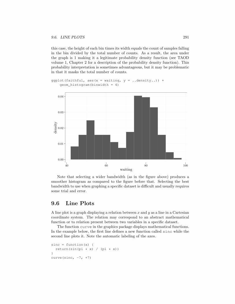
9.6 Line Plots
A line plot is a graph displaying a relation between x and y as a line in a Cartesiancoordinate system. The relation may correspond to an abstract mathematicalfunction or to relation present between two variables in a specific dataset.
The function curve in the graphics package displays mathematical functions.In the example below, the first line defines a new function called sinc while thesecond line plots it. Note the automatic labeling of the axes.
sinc = function(x) {return(sin(pi * x) / (pi * x))
}curve(sinc, -7, +7)
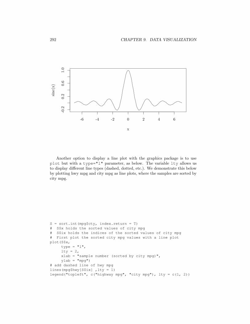
292 CHAPTER 9. DATA VISUALIZATION
-6 -4 -2 0 2 4 6
-0.2
0.2
0.6
1.0
x
sinc(x)
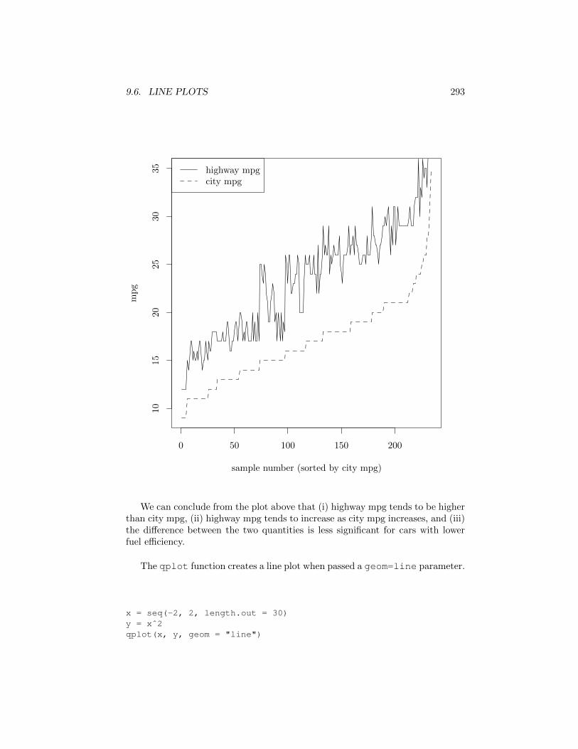
Another option to display a line plot with the graphics package is to useplot but with a type="l" parameter, as below. The variable lty allows usto display di↵erent line types (dashed, dotted, etc.). We demonstrate this belowby plotting hwy mpg and city mpg as line plots, where the samples are sorted bycity mpg.
S = sort.int(mpg$cty, index.return = T)# S$x holds the sorted values of city mpg# S$ix holds the indices of the sorted values of city mpg# First plot the sorted city mpg values with a line plotplot(S$x,
type = "l",lty = 2,xlab = "sample number (sorted by city mpg)",ylab = "mpg")
# add dashed line of hwy mpglines(mpg$hwy[S$ix] ,lty = 1)legend("topleft", c("highway mpg", "city mpg"), lty = c(1, 2))
9.6. LINE PLOTS 293
0 50 100 150 200
1015
2025
3035
sample number (sorted by city mpg)
mpg
highway mpgcity mpg
We can conclude from the plot above that (i) highway mpg tends to be higherthan city mpg, (ii) highway mpg tends to increase as city mpg increases, and (iii)the di↵erence between the two quantities is less significant for cars with lowerfuel e�ciency.
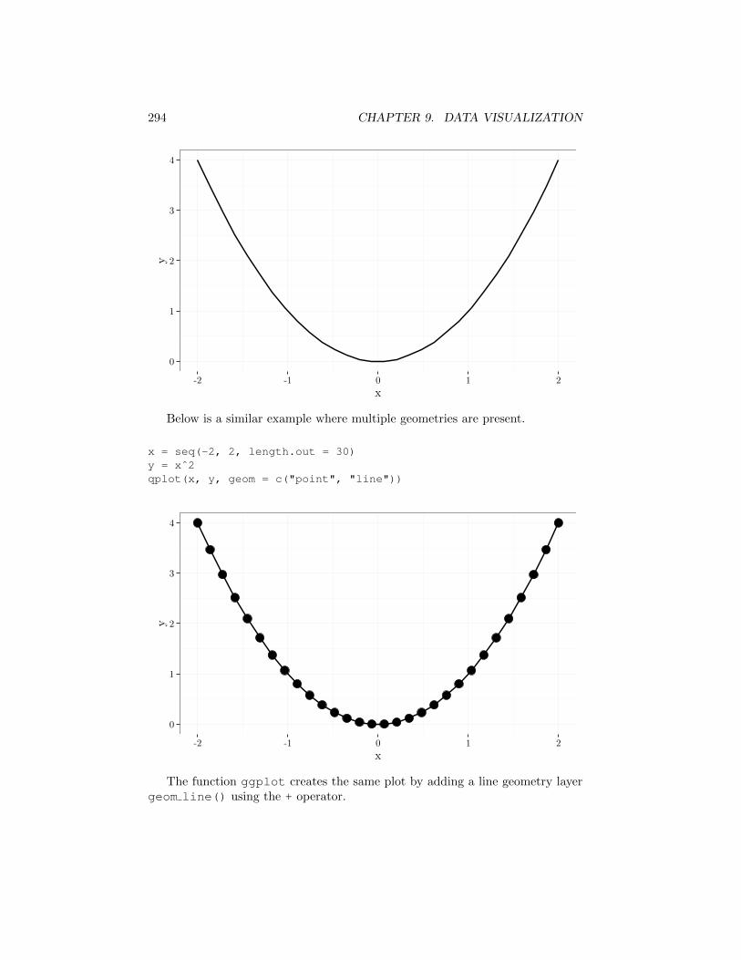
The qplot function creates a line plot when passed a geom=line parameter.
x = seq(-2, 2, length.out = 30)y = xˆ2qplot(x, y, geom = "line")
294 CHAPTER 9. DATA VISUALIZATION
0
1
2
3
4
-2 -1 0 1 2
x
y
Below is a similar example where multiple geometries are present.
x = seq(-2, 2, length.out = 30)y = xˆ2qplot(x, y, geom = c("point", "line"))
0
1
2
3
4
-2 -1 0 1 2
x
y
The function ggplot creates the same plot by adding a line geometry layergeom line() using the + operator.
9.7. SMOOTHED HISTOGRAM 295
# new data frame with variables x,y = xˆ2dataframe = data.frame(x = x, y = y)ggplot(dataframe, aes(x = x, y = y)) + geom_line() + geom_point()
9.7 Smoothed Histogram
An alternative to the histogram is the smoothed histogram. Denoting n datapoints by x
(1), . . . , x
(n), the smoothed histogram is the following function fh :R ! R+
fh(x) =1
n
nX
i=1
Kh(x� x
(i))
where the kernel function Kh : R ! R typically achieves its maximum at 0,and decreases as |x � x
(i)| increases. We also assume that the kernel functionintegrates to one
RKh(x) dx = 1 and satisfies the relation
Kh(r) = h
�1K1(r/h).
We refer to K1 as the base form of the kernel and denote it as K.Four popular kernel choices are the tricube, triangular, uniform, and Gaussian
kernels, defined as Kh(r) = h
�1K(r/h) where the K(·) functions are respectively
K(r) = (1� |r|3)3 · 1{|r|<1} (Tricube)
K(r) = (1� |r|) · 1{|r|<1} (Triangular)
K(r) = 2�1 · 1{|r|<1} (Uniform)
K(r) = exp(�x
2/2)/
p2⇡ (Gaussian).
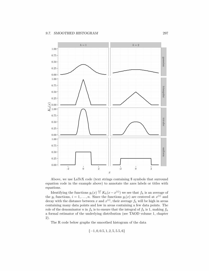
The following R code displays these kernels for h = 1 and h = 2. Note howthe kernel corresponding to h = 2 is twice as wide as the kernels correspondingto h = 1. The technique used to display multiple panels in the same graph iscalled faceting, and is described in the next section.
x_grid = seq(-3, 3, length.out = 100)K1 = function(x) {
ind = abs(x) > 1x = x * 0 + 1/2x[ind] = 0return(x)
}K2 = function(x) {
ind = abs(x) > 1x = 1 - abs(x)x[ind] = 0return(x)
}
296 CHAPTER 9. DATA VISUALIZATION
K3 = function(x) dnorm(x)K4 = function(x) {
ind = abs(x) > 1x = (1 - abs(x)ˆ3)ˆ3x[ind] = 0return(x)
}R = stack(list('uniform' = K1(x_grid),
'triangular' = K2(x_grid),'gaussian' = K3(x_grid),'tricube' = K4(x_grid),'uniform' = K1(x_grid / 2) / 2,'triangular' = K2(x_grid / 2) / 2,'gaussian' = K3(x_grid / 2) / 2,'tricube' = K4(x_grid / 2) / 2))
head(R) # first six lines## values ind## 1 0 uniform## 2 0 uniform## 3 0 uniform## 4 0 uniform## 5 0 uniform## 6 0 uniformnames(R) = c('kernel.value', 'kernel.type')R$x = x_gridR$h[1:400] = '$h=1$'R$h[401:800] = '$h=2$'head(R) # first six lines## kernel.value kernel.type x h## 1 0 uniform -3.000000 $h=1$## 2 0 uniform -2.939394 $h=1$## 3 0 uniform -2.878788 $h=1$## 4 0 uniform -2.818182 $h=1$## 5 0 uniform -2.757576 $h=1$## 6 0 uniform -2.696970 $h=1$qplot(x,
kernel.value,data = R,facets = kernel.type˜h,geom = "line",xlab = "$x$",ylab = "$K_h(x)$")
9.7. SMOOTHED HISTOGRAM 297
h = 1 h = 2
0.00
0.25
0.50
0.75
1.00
0.00
0.25
0.50
0.75
1.00
0.00
0.25
0.50
0.75
1.00
0.00
0.25
0.50
0.75
1.00
gaussian
triangu
lartricu
be
uniform
-2 0 2 -2 0 2
x
K
h(x)
Above, we use LaTeX code (text strings containing $ symbols that surroundequation code in the example above) to annotate the axes labels or titles withequations.
Identifying the functions gi(x)def= Kh(x�x
(i)) we see that fh is an average ofthe gi functions, i = 1, . . . , n. Since the functions gi(x) are centered at x(i) anddecay with the distance between x and x
(i), their average fh will be high in areascontaining many data points and low in areas containing a few data points. Therole of the denominator n in fh is to ensure that the integral of fh is 1, making fh
a formal estimator of the underlying distribution (see TAOD volume 1, chapter2).
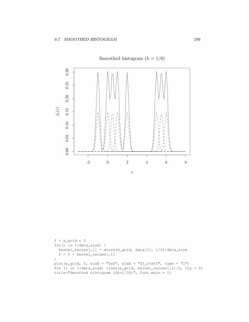
The R code below graphs the smoothed histogram of the data
{�1, 0, 0.5, 1, 2, 5, 5.5, 6}
298 CHAPTER 9. DATA VISUALIZATION
using the Gaussian kernel. The graphs show fh as a solid line and the gi functionsas dashed lines (scaled down by a factor of 2 to avoid overlapping solid and dashedlines).
In the first graph below, the h value is relatively small (h = 1/6), resultingin a fh close to the a sequence of narrow spikes centered at the data points.In the second graph h is larger (h = 1/3) showing a multimodal shape that issignificantly di↵erent from the first case. In the third case, h is relatively large(h = 1), resulting in a fh that resembles two main components. For larger h, fhwill resemble a single unimodal shape.
data = c(-1, 0, 0.5, 1, 2, 5, 5.5, 6)data_size = length(data)x_grid = seq(-3, data_size, length.out = 100)kernel_values = x_grid %o% rep(1, data_size)f = x_grid * 0for(i in 1:data_size) {
kernel_values[,i] = dnorm(x_grid, data[i], 1/6)/data_sizef = f + kernel_values[,i]
}plot(x_grid, f, xlab = "$x$", ylab = "$f_h(x)$", type = "l")for (i in 1:data_size) lines(x_grid, kernel_values[,i]/2, lty = 2)title("Smoothed histogram ($h=1/6$)", font.main = 1)
9.7. SMOOTHED HISTOGRAM 299
-2 0 2 4 6 8
0.00
0.05
0.10
0.15
0.20
0.25
0.30
x
f
h(x)
Smoothed histogram (h = 1/6)
f = x_grid * 0for(i in 1:data_size) {
kernel_values[,i] = dnorm(x_grid, data[i], 1/3)/data_sizef = f + kernel_values[,i]
}plot(x_grid, f, xlab = "$x$", ylab = "$f_h(x)$", type = "l")for (i in 1:data_size) lines(x_grid, kernel_values[,i]/2, lty = 2)title("Smoothed histogram ($h=1/3$)", font.main = 1)
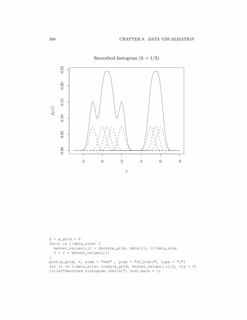
300 CHAPTER 9. DATA VISUALIZATION
-2 0 2 4 6 8
0.00
0.05
0.10
0.15
0.20
0.25
x
f
h(x)
Smoothed histogram (h = 1/3)
f = x_grid * 0for(i in 1:data_size) {
kernel_values[,i] = dnorm(x_grid, data[i], 1)/data_sizef = f + kernel_values[,i]
}plot(x_grid, f, xlab = "$x$" , ylab = "$f_h(x)$", type = "l")for (i in 1:data_size) lines(x_grid, kernel_values[,i]/2, lty = 2)title("Smoothed histogram ($h=1$)", font.main = 1)
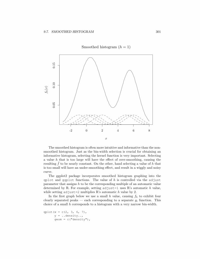
9.7. SMOOTHED HISTOGRAM 301
-2 0 2 4 6 8
0.05
0.10
0.15
x
f
h(x)
Smoothed histogram (h = 1)
The smoothed histogram is often more intuitive and informative than the non-smoothed histogram. Just as the bin-width selection is crucial for obtaining aninformative histogram, selecting the kernel function is very important. Selectinga value h that is too large will have the e↵ect of over-smoothing, causing theresulting f̂ to be nearly constant. On the other, hand selecting a value of h thatis too small will have an under-smoothing e↵ect, and result in a wiggly and noisycurve.
The ggplot2 package incorporates smoothed histogram graphing into theqplot and ggplot functions. The value of h is controlled via the adjustparameter that assigns h to be the corresponding multiple of an automatic valuedetermined by R. For example, setting adjust=1 uses R’s automatic h value,while setting adjust=2 multiplies R’s automatic h value by 2.
In the first graph below we use a small h value, causing fh to exhibit fourclearly separated peaks — each corresponding to a separate gi function. Thischoice of a small h corresponds to a histogram with a very narrow bin-width.
qplot(x = c(2, 3, 6, 7),y = ..density..,geom = c("density"),
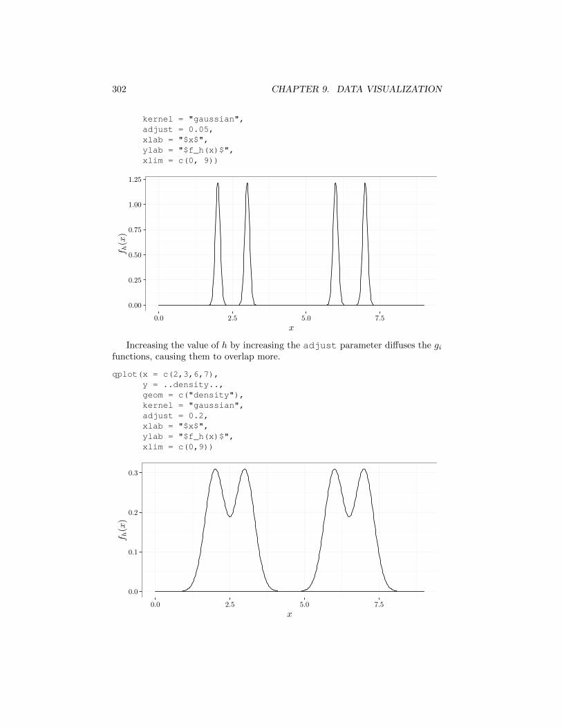
302 CHAPTER 9. DATA VISUALIZATION
kernel = "gaussian",adjust = 0.05,xlab = "$x$",ylab = "$f_h(x)$",xlim = c(0, 9))
0.00
0.25
0.50
0.75
1.00
1.25
0.0 2.5 5.0 7.5
x
f
h(x)
Increasing the value of h by increasing the adjust parameter di↵uses the gi
functions, causing them to overlap more.
qplot(x = c(2,3,6,7),y = ..density..,geom = c("density"),kernel = "gaussian",adjust = 0.2,xlab = "$x$",ylab = "$f_h(x)$",xlim = c(0,9))
0.0
0.1
0.2
0.3
0.0 2.5 5.0 7.5
x
f
h(x)
9.7. SMOOTHED HISTOGRAM 303
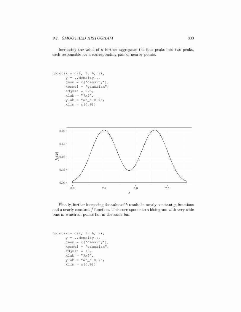
Increasing the value of h further aggregates the four peaks into two peaks,each responsible for a corresponding pair of nearby points.
qplot(x = c(2, 3, 6, 7),y = ..density..,geom = c("density"),kernel = "gaussian",adjust = 0.5,xlab = "$x$",ylab = "$f_h(x)$",xlim = c(0,9))
0.00
0.05
0.10
0.15
0.20
0.0 2.5 5.0 7.5
x
f
h(x)
Finally, further increasing the value of h results in nearly constant gi functionsand a nearly constant f̂ function. This corresponds to a histogram with very widebins in which all points fall in the same bin.
qplot(x = c(2, 3, 6, 7),y = ..density..,geom = c("density"),kernel = "gaussian",adjust = 10,xlab = "$x$",ylab = "$f_h(x)$",xlim = c(0,9))
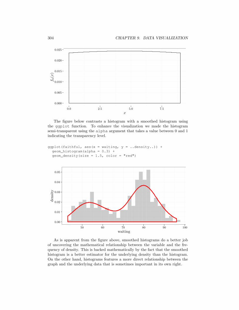
304 CHAPTER 9. DATA VISUALIZATION
0.000
0.005
0.010
0.015
0.020
0.025
0.0 2.5 5.0 7.5
x
f
h(x)
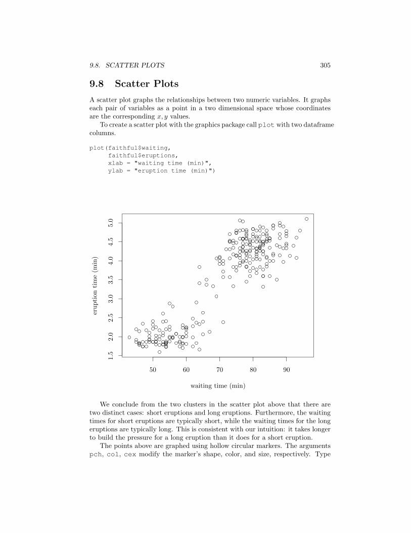
The figure below contrasts a histogram with a smoothed histogram usingthe ggplot function. To enhance the visualization we made the histogramsemi-transparent using the alpha argument that takes a value between 0 and 1indicating the transparency level.
ggplot(faithful, aes(x = waiting, y = ..density..)) +geom_histogram(alpha = 0.3) +geom_density(size = 1.5, color = "red")
0.00
0.01
0.02
0.03
0.04
0.05
50 60 70 80 90 100
waiting
den
sity
As is apparent from the figure above, smoothed histograms do a better jobof uncovering the mathematical relationship between the variable and the fre-quency of density. This is backed mathematically by the fact that the smoothedhistogram is a better estimator for the underlying density than the histogram.On the other hand, histograms features a more direct relationship between thegraph and the underlying data that is sometimes important in its own right.
9.8. SCATTER PLOTS 305
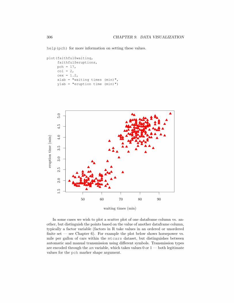
9.8 Scatter Plots
A scatter plot graphs the relationships between two numeric variables. It graphseach pair of variables as a point in a two dimensional space whose coordinatesare the corresponding x, y values.
To create a scatter plot with the graphics package call plot with two dataframecolumns.
plot(faithful$waiting,faithful$eruptions,xlab = "waiting time (min)",ylab = "eruption time (min)")
50 60 70 80 90
1.5
2.0
2.5
3.0
3.5
4.0
4.5
5.0
waiting time (min)
eruption
time(m
in)
We conclude from the two clusters in the scatter plot above that there aretwo distinct cases: short eruptions and long eruptions. Furthermore, the waitingtimes for short eruptions are typically short, while the waiting times for the longeruptions are typically long. This is consistent with our intuition: it takes longerto build the pressure for a long eruption than it does for a short eruption.
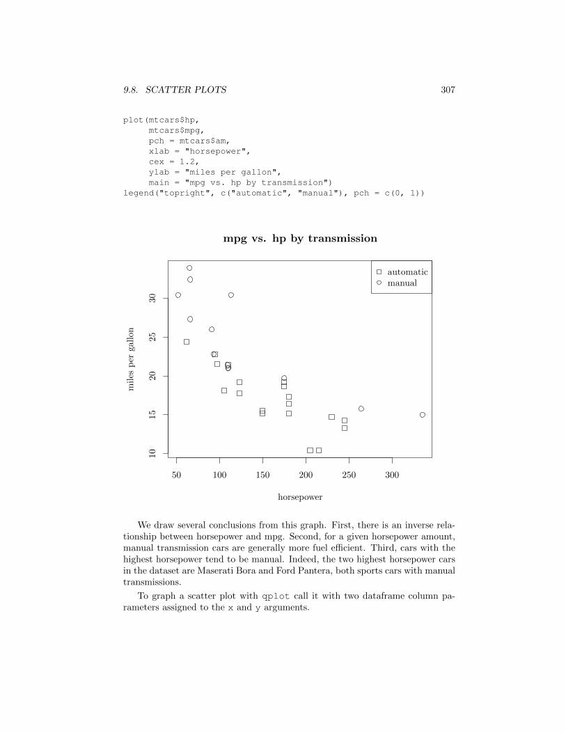
The points above are graphed using hollow circular markers. The argumentspch, col, cex modify the marker’s shape, color, and size, respectively. Type
306 CHAPTER 9. DATA VISUALIZATION
help(pch) for more information on setting these values.
plot(faithful$waiting,faithful$eruptions,pch = 17,col = 2,cex = 1.2,xlab = "waiting times (min)",ylab = "eruption time (min)")
50 60 70 80 90
1.5
2.0
2.5
3.0
3.5
4.0
4.5
5.0
waiting times (min)
eruption
time(m
in)
In some cases we wish to plot a scatter plot of one dataframe column vs. an-other, but distinguish the points based on the value of another dataframe column,typically a factor variable (factors in R take values in an ordered or unorderedfinite set — see Chapter 6). For example the plot below shows horsepower vs.mile per gallon of cars within the mtcars dataset, but distinguishes betweenautomatic and manual transmission using di↵erent symbols. Transmission typesare encoded through the am variable, which takes values 0 or 1 — both legitimatevalues for the pch marker shape argument.
9.8. SCATTER PLOTS 307
plot(mtcars$hp,mtcars$mpg,pch = mtcars$am,xlab = "horsepower",cex = 1.2,ylab = "miles per gallon",main = "mpg vs. hp by transmission")
legend("topright", c("automatic", "manual"), pch = c(0, 1))
50 100 150 200 250 300
1015
2025
30
mpg vs. hp by transmission
horsepower
miles
per
gallon
automaticmanual
We draw several conclusions from this graph. First, there is an inverse rela-tionship between horsepower and mpg. Second, for a given horsepower amount,manual transmission cars are generally more fuel e�cient. Third, cars with thehighest horsepower tend to be manual. Indeed, the two highest horsepower carsin the dataset are Maserati Bora and Ford Pantera, both sports cars with manualtransmissions.
To graph a scatter plot with qplot call it with two dataframe column pa-rameters assigned to the x and y arguments.
308 CHAPTER 9. DATA VISUALIZATION
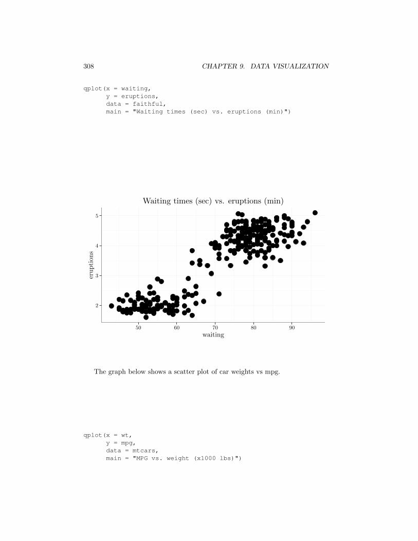
qplot(x = waiting,y = eruptions,data = faithful,main = "Waiting times (sec) vs. eruptions (min)")
2
3
4
5
50 60 70 80 90
waiting
eruption
s
Waiting times (sec) vs. eruptions (min)
The graph below shows a scatter plot of car weights vs mpg.
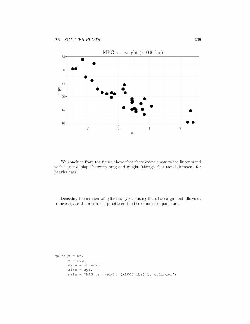
qplot(x = wt,y = mpg,data = mtcars,main = "MPG vs. weight (x1000 lbs)")
9.8. SCATTER PLOTS 309
10
15
20
25
30
35
2 3 4 5
wt
mpg
MPG vs. weight (x1000 lbs)
We conclude from the figure above that there exists a somewhat linear trendwith negative slope between mpg and weight (though that trend decreases forheavier cars).
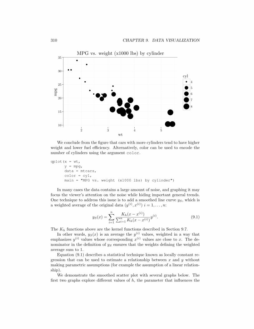
Denoting the number of cylinders by size using the size argument allows usto investigate the relationship between the three numeric quantities.
qplot(x = wt,y = mpg,data = mtcars,size = cyl,main = "MPG vs. weight (x1000 lbs) by cylinder")
310 CHAPTER 9. DATA VISUALIZATION
10
15
20
25
30
35
2 3 4 5
wt
mpg
cyl
4
5
6
7
8
MPG vs. weight (x1000 lbs) by cylinder
We conclude from the figure that cars with more cylinders tend to have higherweight and lower fuel e�ciency. Alternatively, color can be used to encode thenumber of cylinders using the argument color.
qplot(x = wt,y = mpg,data = mtcars,color = cyl,main = "MPG vs. weight (x1000 lbs) by cylinder")
In many cases the data contains a large amount of noise, and graphing it mayfocus the viewer’s attention on the noise while hiding important general trends.One technique to address this issue is to add a smoothed line curve yS , which isa weighted average of the original data (y(i), x(i)) i = 1, . . . , n:
yS(x) =nX
i=1
Kh(x� x
(i))Pni=1 Kh(x� x
(i))y
(i). (9.1)
The Kh functions above are the kernel functions described in Section 9.7.In other words, yS(x) is an average the y
(i) values, weighted in a way thatemphasizes y
(i) values whose corresponding x
(i) values are close to x. The de-nominator in the definition of yS ensures that the weights defining the weightedaverage sum to 1.
Equation (9.1) describes a statistical technique known as locally constant re-gression that can be used to estimate a relationship between x and y withoutmaking parametric assumptions (for example the assumption of a linear relation-ship).
We demonstrate the smoothed scatter plot with several graphs below. Thefirst two graphs explore di↵erent values of h, the parameter that influences the
9.8. SCATTER PLOTS 311
spread or width of the gi = Kh(x, x(i)) functions. To adjust h, we modify thespan argument that has a similar role to the adjust parameter in the discussionof the smoothed histogram above.
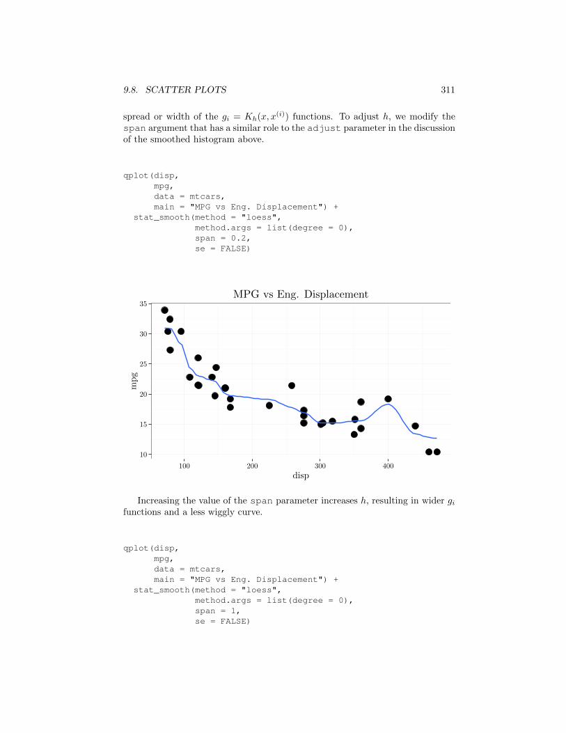
qplot(disp,mpg,data = mtcars,main = "MPG vs Eng. Displacement") +
stat_smooth(method = "loess",method.args = list(degree = 0),span = 0.2,se = FALSE)
10
15
20
25
30
35
100 200 300 400
disp
mpg
MPG vs Eng. Displacement
Increasing the value of the span parameter increases h, resulting in wider gifunctions and a less wiggly curve.
qplot(disp,mpg,data = mtcars,main = "MPG vs Eng. Displacement") +
stat_smooth(method = "loess",method.args = list(degree = 0),span = 1,se = FALSE)
312 CHAPTER 9. DATA VISUALIZATION
10
15
20
25
30
35
100 200 300 400
disp
mpg
MPG vs Eng. Displacement
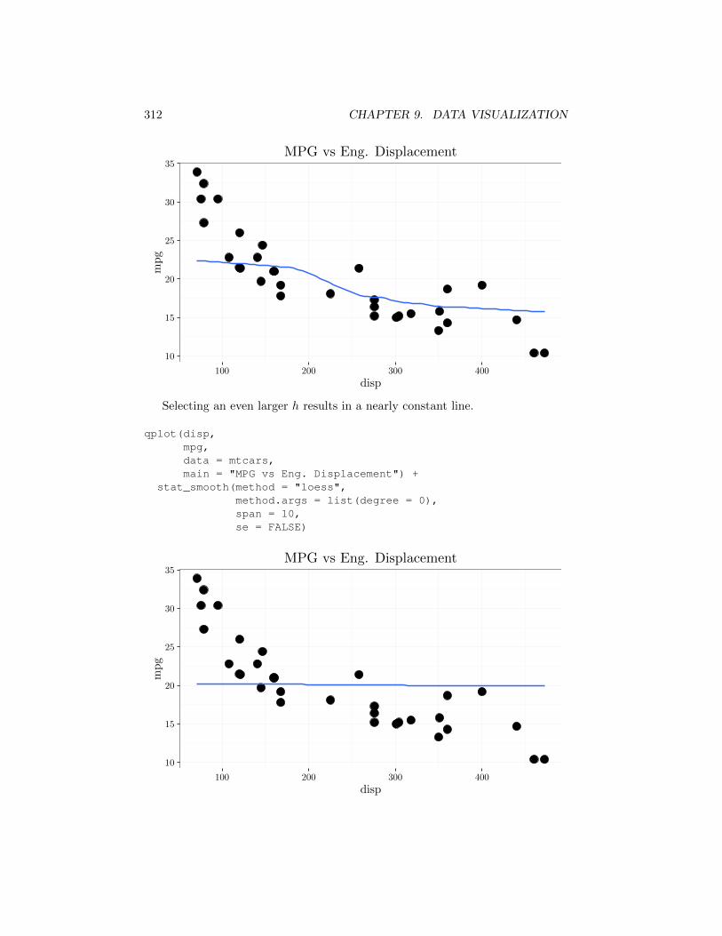
Selecting an even larger h results in a nearly constant line.
qplot(disp,mpg,data = mtcars,main = "MPG vs Eng. Displacement") +
stat_smooth(method = "loess",method.args = list(degree = 0),span = 10,se = FALSE)
10
15
20
25
30
35
100 200 300 400
disp
mpg
MPG vs Eng. Displacement
9.8. SCATTER PLOTS 313
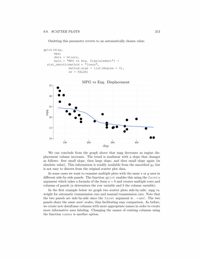
Omitting this parameter reverts to an automatically chosen value.
qplot(disp,mpg,data = mtcars,main = "MPG vs Eng. Displacement") +
stat_smooth(method = "loess",method.args = list(degree = 0),se = FALSE)
10
15
20
25
30
35
100 200 300 400
disp
mpg
MPG vs Eng. Displacement
We can conclude from the graph above that mpg decreases as engine dis-placement volume increases. The trend is nonlinear with a slope that changesas follows: first small slope, then large slope, and then small slope again (inabsolute value). This information is readily available from the smoothed yS butis not easy to discern from the original scatter plot data.
In some cases we want to examine multiple plots with the same x or y axes indi↵erent side-by-side panels. The function qplot enables this using the facetsargument which takes a formula of the form a ⇠ b and creates multiple rows andcolumns of panels (a determines the row variable and b the column variable).
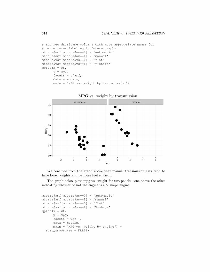
In the first example below we graph two scatter plots side-by-side: mpg vs.weight for automatic transmission cars and manual transmission cars. Note thatthe two panels are side-by-side since the facet argument is . ⇠amf. The twopanels share the same axes’ scales, thus facilitating easy comparison. As before,we create new dataframe columns with more appropriate names in order to createmore informative axes labeling. Changing the names of existing columns usingthe function names is another option.
314 CHAPTER 9. DATA VISUALIZATION
# add new dataframe columns with more appropriate names for# better axes labeling in future graphsmtcars$amf[mtcars$am==0] = 'automatic'mtcars$amf[mtcars$am==1] = 'manual'mtcars$vsf[mtcars$vs==0] = 'flat'mtcars$vsf[mtcars$vs==1] = 'V-shape'qplot(x = wt,
y = mpg,facets = .˜amf,data = mtcars,main = "MPG vs. weight by transmission")
automatic manual
10
15
20
25
30
35
2 3 4 5 2 3 4 5
wt
mpg
MPG vs. weight by transmission
We conclude from the graph above that manual transmission cars tend tohave lower weights and be more fuel e�cient.
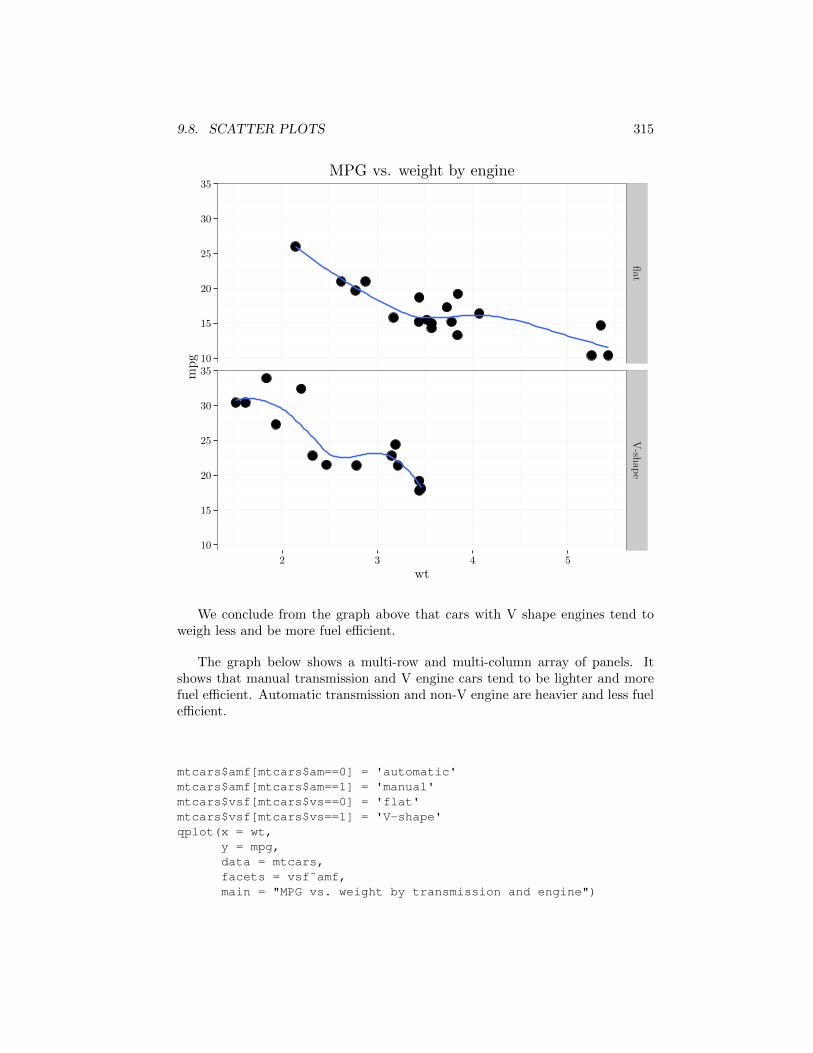
The graph below plots mpg vs. weight for two panels - one above the otherindicating whether or not the engine is a V shape engine.
mtcars$amf[mtcars$am==0] = 'automatic'mtcars$amf[mtcars$am==1] = 'manual'mtcars$vsf[mtcars$vs==0] = 'flat'mtcars$vsf[mtcars$vs==1] = 'V-shape'qplot(x = wt,
y = mpg,facets = vsf˜.,data = mtcars,main = "MPG vs. weight by engine") +
stat_smooth(se = FALSE)
9.8. SCATTER PLOTS 315
10
15
20
25
30
35
10
15
20
25
30
35
flat
V-sh
ape
2 3 4 5
wt
mpg
MPG vs. weight by engine
We conclude from the graph above that cars with V shape engines tend toweigh less and be more fuel e�cient.
The graph below shows a multi-row and multi-column array of panels. Itshows that manual transmission and V engine cars tend to be lighter and morefuel e�cient. Automatic transmission and non-V engine are heavier and less fuele�cient.
mtcars$amf[mtcars$am==0] = 'automatic'mtcars$amf[mtcars$am==1] = 'manual'mtcars$vsf[mtcars$vs==0] = 'flat'mtcars$vsf[mtcars$vs==1] = 'V-shape'qplot(x = wt,
y = mpg,data = mtcars,facets = vsf˜amf,main = "MPG vs. weight by transmission and engine")
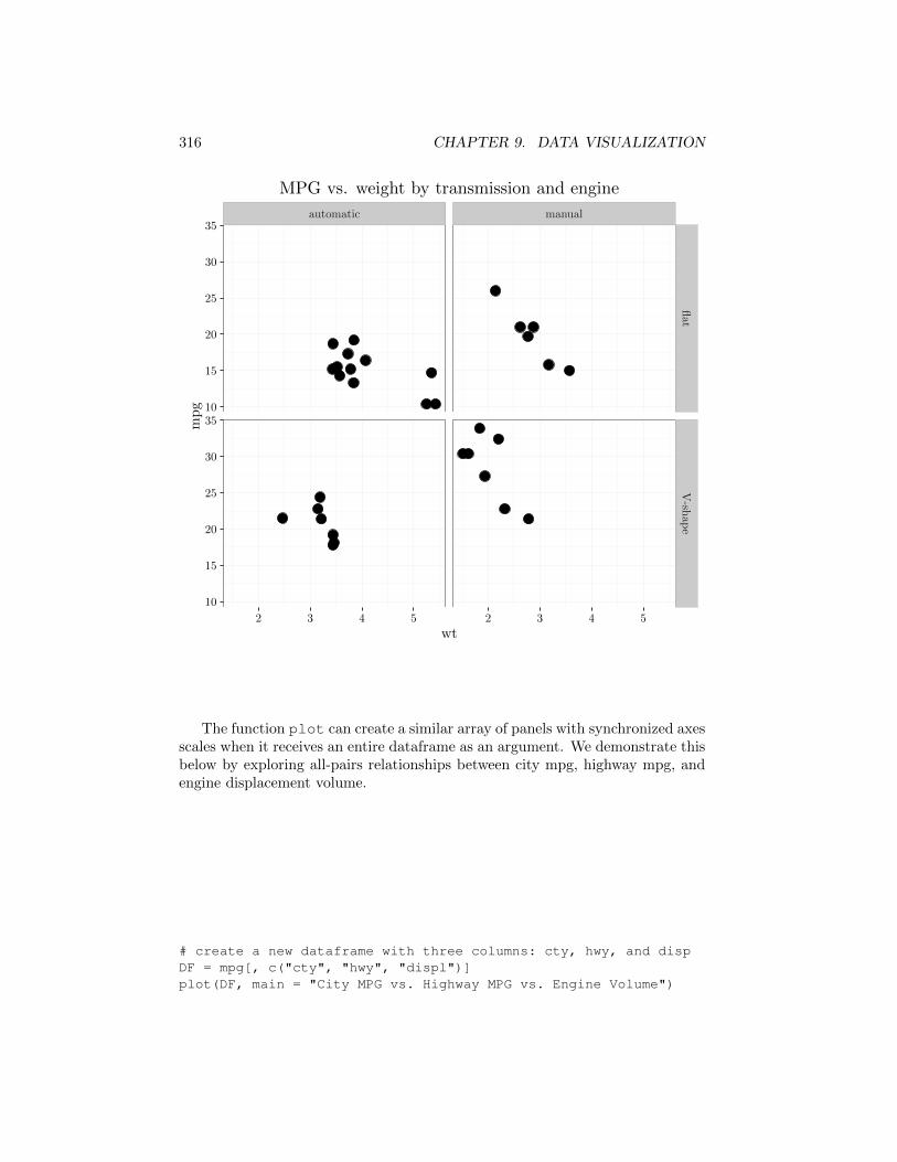
316 CHAPTER 9. DATA VISUALIZATION
automatic manual
10
15
20
25
30
35
10
15
20
25
30
35
flat
V-sh
ape
2 3 4 5 2 3 4 5
wt
mpg
MPG vs. weight by transmission and engine
The function plot can create a similar array of panels with synchronized axesscales when it receives an entire dataframe as an argument. We demonstrate thisbelow by exploring all-pairs relationships between city mpg, highway mpg, andengine displacement volume.
# create a new dataframe with three columns: cty, hwy, and dispDF = mpg[, c("cty", "hwy", "displ")]plot(DF, main = "City MPG vs. Highway MPG vs. Engine Volume")
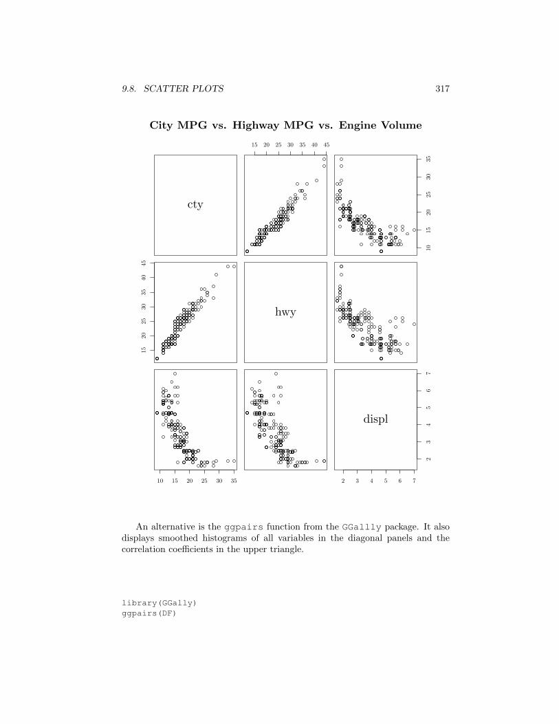
9.8. SCATTER PLOTS 317
cty
15 20 25 30 35 40 45
1015
2025
3035
1520
2530
3540
45
hwy
10 15 20 25 30 35 2 3 4 5 6 7
23
45
67
displ
City MPG vs. Highway MPG vs. Engine Volume
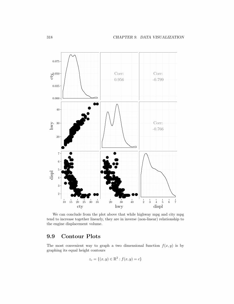
An alternative is the ggpairs function from the GGallly package. It alsodisplays smoothed histograms of all variables in the diagonal panels and thecorrelation coe�cients in the upper triangle.
library(GGally)ggpairs(DF)
318 CHAPTER 9. DATA VISUALIZATION
cty
hwy
displ
cty hwy displ
0.000
0.025
0.050
0.075
Corr:
0.956
Corr:
-0.799
20
30
40
Corr:
-0.766
2
3
4
5
6
7
10 15 20 25 30 35 20 30 40 2 3 4 5 6 7
We can conclude from the plot above that while highway mpg and city mpgtend to increase together linearly, they are in inverse (non-linear) relationship tothe engine displacement volume.
9.9 Contour Plots
The most convenient way to graph a two dimensional function f(x, y) is bygraphing its equal height contours
zc = {(x, y) 2 R2 : f(x, y) = c}
9.9. CONTOUR PLOTS 319
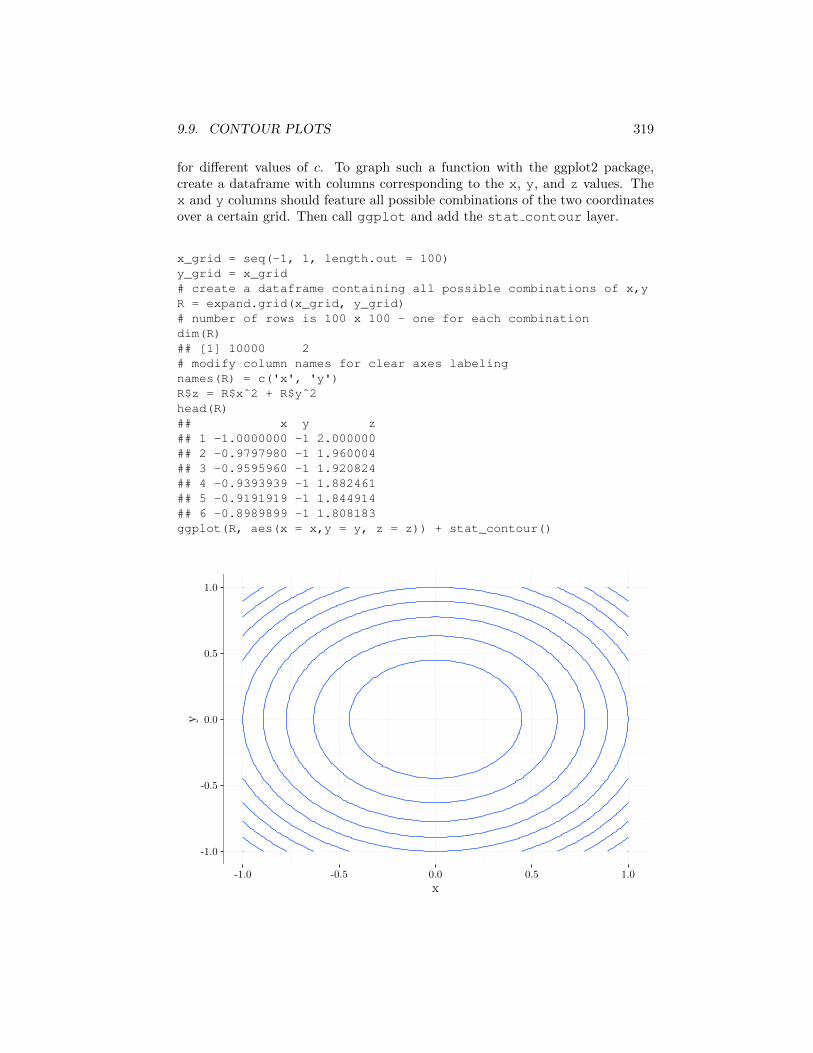
for di↵erent values of c. To graph such a function with the ggplot2 package,create a dataframe with columns corresponding to the x, y, and z values. Thex and y columns should feature all possible combinations of the two coordinatesover a certain grid. Then call ggplot and add the stat contour layer.
x_grid = seq(-1, 1, length.out = 100)y_grid = x_grid# create a dataframe containing all possible combinations of x,yR = expand.grid(x_grid, y_grid)# number of rows is 100 x 100 - one for each combinationdim(R)## [1] 10000 2# modify column names for clear axes labelingnames(R) = c('x', 'y')R$z = R$xˆ2 + R$yˆ2head(R)## x y z## 1 -1.0000000 -1 2.000000## 2 -0.9797980 -1 1.960004## 3 -0.9595960 -1 1.920824## 4 -0.9393939 -1 1.882461## 5 -0.9191919 -1 1.844914## 6 -0.8989899 -1 1.808183ggplot(R, aes(x = x,y = y, z = z)) + stat_contour()
-1.0
-0.5
0.0
0.5
1.0
-1.0 -0.5 0.0 0.5 1.0
x
y
320 CHAPTER 9. DATA VISUALIZATION
9.10 Quantiles and Box Plots
Histograms are very useful for summarizing numeric data in that they show therough distribution of values. An alternative that is often used in conjunction withthe histogram is the box plot. We start with describing the notion of percentilesthat plays a central role in our discussion.
The r-percentile of a numeric dataset is the point at which approximately r
percent of the data lie underneath, and approximately 100�r percent lie above1.Another name for the r percentile is the 0.r quantile.
# display 0 through 100 percentiles at 0.1 increments# for the dataset containing 1,2,3,4.quantile(c(1, 2, 3, 4), seq(0, 1, length.out = 11))## 0% 10% 20% 30% 40% 50% 60% 70% 80%## 1.0 1.3 1.6 1.9 2.2 2.5 2.8 3.1 3.4## 90% 100%## 3.7 4.0
The median or 50-percentile is the point at which half of the data lies under-neath and half above. The 25-percentile and 75 percentile are the values belowwhich 25% and 75% of the data lie. These points are also called the first andthird quartiles (the second quartile is the median). The interval between thefirst and third quartiles is called the inter-quartile range (IQR). It is the regioncovering the central 50% of the data.
The box plot is composed of a box, an inner line bisecting the box, whiskersthat extend to either side of the box, and outliers. The box denotes the IQR,with the inner bisecting line denoting the median. The median may or may notbe in the geometric center of the box, depending on whether the distribution ofvalues is skewed or symmetric. The whiskers extend to the most extreme point nofurther than 1.5 times the length of the IQR away from the edges of the box. Datapoints outside the box and whiskers’ range are called outliers and are graphed asseparate points. Separating the outliers from the box and whiskers is useful foravoiding a distorted viewpoint where there are a few extreme non-representativevalues.
The following code graphs a box plot in R using the ggplot2 package. The+ operator below adds the box plot geometry, flips the x, y coordinates, andremoves the y-axis label.
ggplot(mpg, aes("",hwy)) +geom_boxplot() +coord_flip() +scale_x_discrete("")
1There are several di↵erent formal definitions for percentiles. Type help(quantile) forseveral competing definitions that R implements.

9.10. QUANTILES AND BOX PLOTS 321
20 30 40
hwy
We conclude from this graph that the median highway mpg is around 24, withthe central 50% of the data falling within the box that spans the range from 18to 27. There are two high outliers over 40, but otherwise the remaining data liewithin the whiskers between 12 and 37. The fact that the median line is right ofthe middle of the box hints that the distribution is skewed to the right.
Contrast the box plot above with the smoothed histogram in Page 318 (centerpanel). The box plot does not convey the multimodal nature of the distributionthat the histogram shows. On the other hand, it is easier to read the median andthe IQR, which show the center and central 50% range from the box plot.
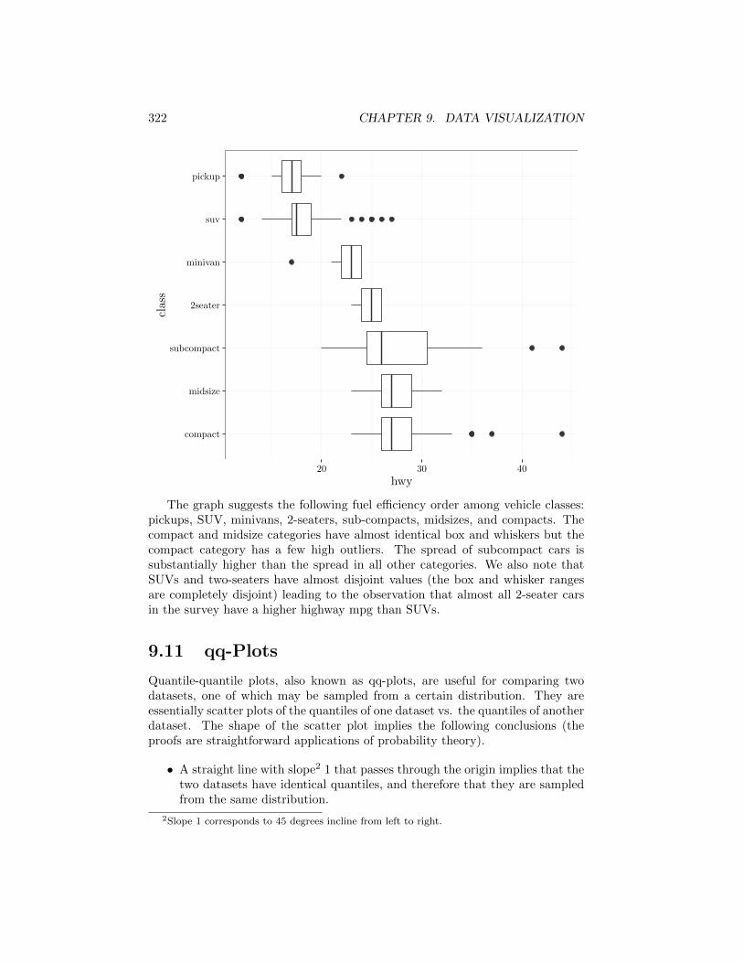
It is convenient to plot several box plots side by side in order to comparedata corresponding to di↵erent values of a factor variable. We demonstrate thisby graphing below box plots of highway mpg for di↵erent classes of vehicles. Weflip the box plots horizontally using coord flip() since the text labels displaybetter in this case. Note that we re-order the factors of the class variable inorder to sort the box plots in order of increasing highway mpg medians. Thismakes it easier to compare the di↵erent populations.
ggplot(mpg, aes(reorder(class, -hwy, median), hwy)) +geom_boxplot() +coord_flip() +scale_x_discrete("class")
322 CHAPTER 9. DATA VISUALIZATION
compact
midsize
subcompact
2seater
minivan
suv
pickup
20 30 40
hwy
class
The graph suggests the following fuel e�ciency order among vehicle classes:pickups, SUV, minivans, 2-seaters, sub-compacts, midsizes, and compacts. Thecompact and midsize categories have almost identical box and whiskers but thecompact category has a few high outliers. The spread of subcompact cars issubstantially higher than the spread in all other categories. We also note thatSUVs and two-seaters have almost disjoint values (the box and whisker rangesare completely disjoint) leading to the observation that almost all 2-seater carsin the survey have a higher highway mpg than SUVs.
9.11 qq-Plots
Quantile-quantile plots, also known as qq-plots, are useful for comparing twodatasets, one of which may be sampled from a certain distribution. They areessentially scatter plots of the quantiles of one dataset vs. the quantiles of anotherdataset. The shape of the scatter plot implies the following conclusions (theproofs are straightforward applications of probability theory).
• A straight line with slope2 1 that passes through the origin implies that thetwo datasets have identical quantiles, and therefore that they are sampledfrom the same distribution.
2Slope 1 corresponds to 45 degrees incline from left to right.
9.11. QQ-PLOTS 323
• A straight line with slope 1 that does not pass through the origin impliesthat the two datasets have distributions of similar shape and spread, butthat one is shifted with respect to the other.
• A straight line with slope di↵erent from 1 that does not pass through theorigin implies that the two datasets have distributions possessing similarshapes but that one is translated and scaled with respect to the other.
• A non-linear S shape implies that the dataset corresponding to the x-axisis sampled from a distribution with heavier tails than the other dataset.
• A non-linear reflected S shape implies that the dataset whose quantilescorrespond to the y-axis is drawn from a distribution having heavier tailsthan the other dataset.
To compare a single dataset to a distribution we sample values from the dis-tribution, and then display the qq-plots of the two datasets. The quantiles of thesample drawn from the distribution are sometimes called theoretical quantiles.
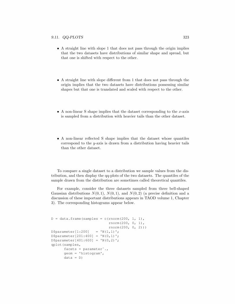
For example, consider the three datasets sampled from three bell-shapedGaussian distributions N(0, 1), N(0, 1), and N(0, 2) (a precise definition and adiscussion of these important distributions appears in TAOD volume 1, Chapter3). The corresponding histograms appear below.
D = data.frame(samples = c(rnorm(200, 1, 1),rnorm(200, 0, 1),rnorm(200, 0, 2)))
D$parameter[1:200] = 'N(1,1)';D$parameter[201:400] = 'N(0,1)';D$parameter[401:600] = 'N(0,2)';qplot(samples,
facets = parameter˜.,geom = 'histogram',data = D)

324 CHAPTER 9. DATA VISUALIZATION
0
10
20
30
0
10
20
30
0
10
20
30
N(0,1)
N(0,2)
N(1,1)
-6 -3 0 3
samples
count
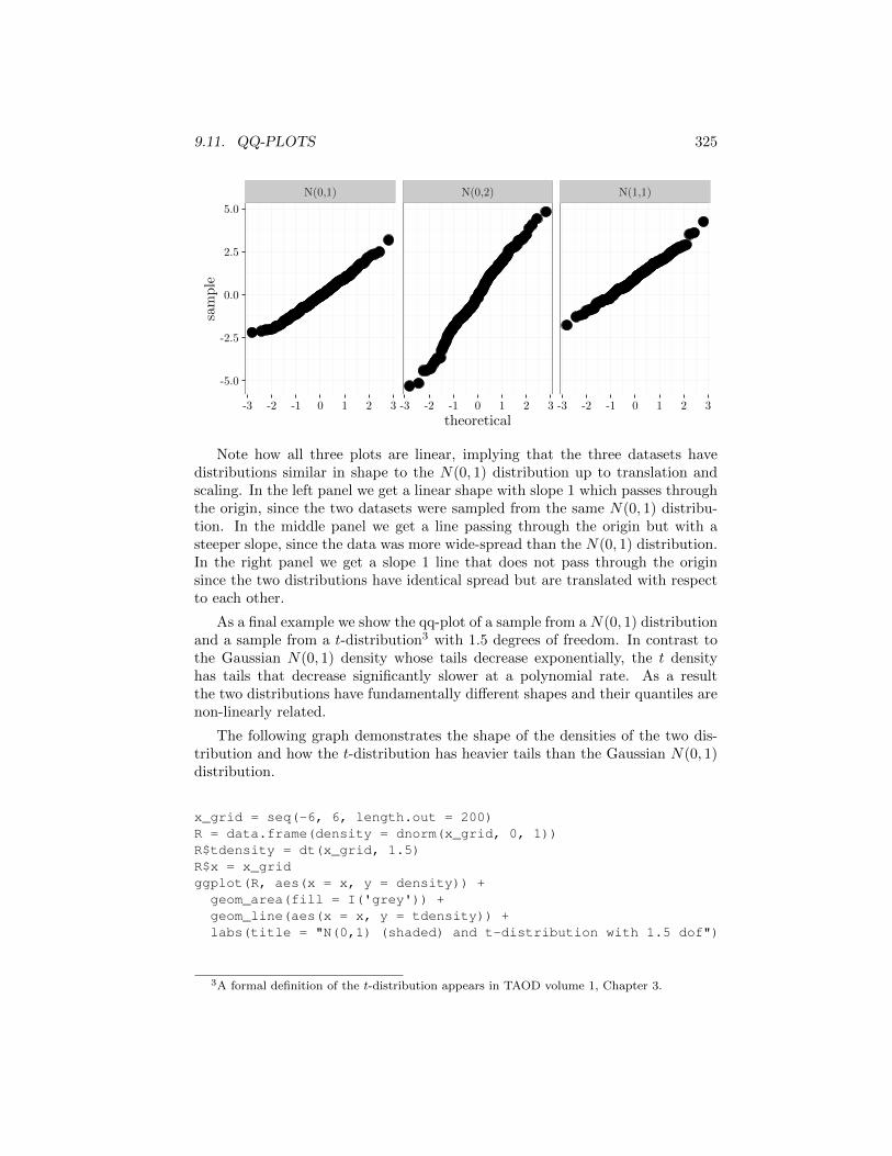
We compute below the qq-plots of these three datasets (y axis) vs. a sampledrawn from the N(0, 1) distribution (x axis).
D = data.frame(samples = c(rnorm(200, 1, 1),rnorm(200, 0, 1),rnorm(200, 0, 2)));
D$parameter[1:200] = 'N(1,1)';D$parameter[201:400] = 'N(0,1)';D$parameter[401:600] = 'N(0,2)';ggplot(D, aes(sample = samples)) +
stat_qq() +facet_grid(.˜parameter)
9.11. QQ-PLOTS 325
N(0,1) N(0,2) N(1,1)
-5.0
-2.5
0.0
2.5
5.0
-3 -2 -1 0 1 2 3 -3 -2 -1 0 1 2 3 -3 -2 -1 0 1 2 3
theoretical
sample
Note how all three plots are linear, implying that the three datasets havedistributions similar in shape to the N(0, 1) distribution up to translation andscaling. In the left panel we get a linear shape with slope 1 which passes throughthe origin, since the two datasets were sampled from the same N(0, 1) distribu-tion. In the middle panel we get a line passing through the origin but with asteeper slope, since the data was more wide-spread than the N(0, 1) distribution.In the right panel we get a slope 1 line that does not pass through the originsince the two distributions have identical spread but are translated with respectto each other.
As a final example we show the qq-plot of a sample from a N(0, 1) distributionand a sample from a t-distribution3 with 1.5 degrees of freedom. In contrast tothe Gaussian N(0, 1) density whose tails decrease exponentially, the t densityhas tails that decrease significantly slower at a polynomial rate. As a resultthe two distributions have fundamentally di↵erent shapes and their quantiles arenon-linearly related.
The following graph demonstrates the shape of the densities of the two dis-tribution and how the t-distribution has heavier tails than the Gaussian N(0, 1)distribution.
x_grid = seq(-6, 6, length.out = 200)R = data.frame(density = dnorm(x_grid, 0, 1))R$tdensity = dt(x_grid, 1.5)R$x = x_gridggplot(R, aes(x = x, y = density)) +
geom_area(fill = I('grey')) +geom_line(aes(x = x, y = tdensity)) +labs(title = "N(0,1) (shaded) and t-distribution with 1.5 dof")
3A formal definition of the t-distribution appears in TAOD volume 1, Chapter 3.
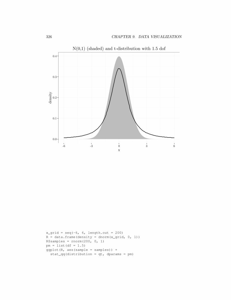
326 CHAPTER 9. DATA VISUALIZATION
0.0
0.1
0.2
0.3
0.4
-6 -3 0 3 6
x
den
sity
N(0,1) (shaded) and t-distribution with 1.5 dof
x_grid = seq(-6, 6, length.out = 200)R = data.frame(density = dnorm(x_grid, 0, 1))R$samples = rnorm(200, 0, 1)pm = list(df = 1.5)ggplot(R, aes(sample = samples)) +
stat_qq(distribution = qt, dparams = pm)

9.12. DEVICES 327
-1
0
1
2
-30 -20 -10 0 10 20 30
theoretical
sample
9.12 Devices
By default, R overwrites the current figure with new plots. The function calldev.new() opens a new additional graphics windows. The ggsave functionwithin the ggplot2 package saves the active graphics window to a file with thefile type (pdf, postscript, jpeg) corresponding to the file name extension.
# detects file-type format (PDF) from file name extensionggsave(file = "myPlot.pdf")
To send all future graphics to a single file use one of the following functions:postscript, pdf, xfig, bmp, png, jpeg, or tiff. It is essential to call thefunction dev.off() at the end of the graphics session in order to ensure thatthe graphics file is closed properly. To see a precise list of optional parameterssuch as font size and compression rate refer to help(X) where X is one of thedevice drivers, for example help("jpeg").
The first three drivers (postscript, pdf, xfig) maintain high-resolutiongraphics using vector graphics. The resulting graphics can be zoomed in toarbitrary precision. Among these formats, pdf is usually preferred, since it isoften smaller in file size and since it is accessible by a wide variety of programs.
328 CHAPTER 9. DATA VISUALIZATION
The latter four drivers (bmp, png, jpeg, tiff) produce raster graphics whichcorrespond to pixelized images with fixed resolutions. While vector graphicsis generally preferable to raster graphics due to its superior resolution, vectorgraphics may produce very large files when the graphics contain many objects.In that case a raster graphics file may be preferable due to its smaller file size.
# save all future graphics to file myplots.pdfpdf('myplots', height = 5, width = 5, pointsize = 11)# graphics plottingqplot(...)qplot(...)# close graphics file and return to display driverdev.off()
9.13 Data Preparation
We emphasize in this book graphing data by first creating a dataframe withthe appropriate data and informative column names, and then calling plot,qplot, or ggplot. This approach is better than keeping the data in an un-annotated array, graphing the values, and then labeling the axes, legends, andfacets appropriately. In the examples above we usually started with a ready-madedataframe, but in most data analysis cases the dataframe has to be prepared bythe data analyst.
To create a dataframe use the data.frame function, for example:
R = data.frame(name = vec1, ages = vec2, salary = vec3).
If a dataframe already exists, but the variable names are not coherent, changethe names using the names function to coherent names so that legible axes andlegends can be automatically created.
names(R) = c("last.name", "age", "annual.income")
The functions rbind and cbind add additional rows or columns to an ex-isting dataframe.
Consider the following example of graphing the line plots of the Gaussiandensity function (see TAOD volume 1, Chapter 3)
f(x) = N(x ; 0,�) = exp(�x
2/(2�2))/(
p2⇡�2)
with the color and line type corresponding to the value of � among four di↵erentvalues: 1, 2, 3, and 4. Note that this function is also Kh(x) for the Gaussiankernel described earlier in this chapter.
Our strategy is to first compute a list of four vectors containing y values —one vector for each value of �. The names of the four list elements identify the
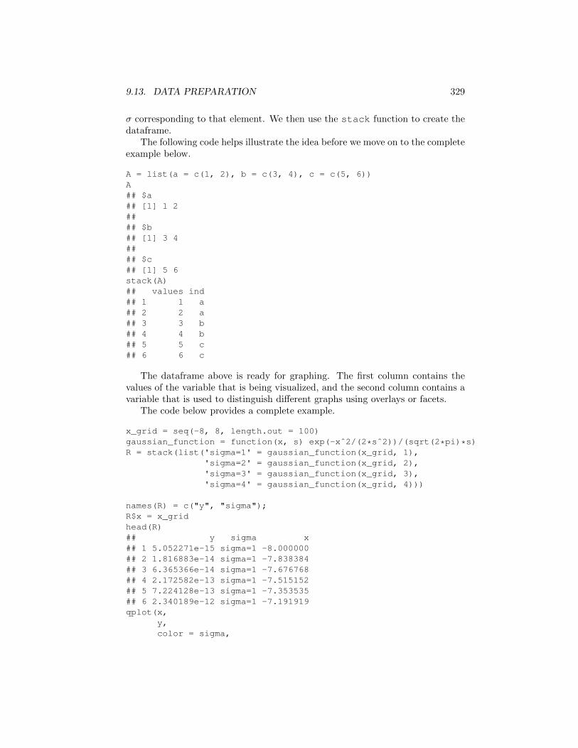
9.13. DATA PREPARATION 329
� corresponding to that element. We then use the stack function to create thedataframe.
The following code helps illustrate the idea before we move on to the completeexample below.
A = list(a = c(1, 2), b = c(3, 4), c = c(5, 6))A## $a## [1] 1 2#### $b## [1] 3 4#### $c## [1] 5 6stack(A)## values ind## 1 1 a## 2 2 a## 3 3 b## 4 4 b## 5 5 c## 6 6 c
The dataframe above is ready for graphing. The first column contains thevalues of the variable that is being visualized, and the second column contains avariable that is used to distinguish di↵erent graphs using overlays or facets.
The code below provides a complete example.
x_grid = seq(-8, 8, length.out = 100)gaussian_function = function(x, s) exp(-xˆ2/(2*sˆ2))/(sqrt(2*pi)*s)R = stack(list('sigma=1' = gaussian_function(x_grid, 1),
'sigma=2' = gaussian_function(x_grid, 2),'sigma=3' = gaussian_function(x_grid, 3),'sigma=4' = gaussian_function(x_grid, 4)))
names(R) = c("y", "sigma");R$x = x_gridhead(R)## y sigma x## 1 5.052271e-15 sigma=1 -8.000000## 2 1.816883e-14 sigma=1 -7.838384## 3 6.365366e-14 sigma=1 -7.676768## 4 2.172582e-13 sigma=1 -7.515152## 5 7.224128e-13 sigma=1 -7.353535## 6 2.340189e-12 sigma=1 -7.191919qplot(x,
y,color = sigma,
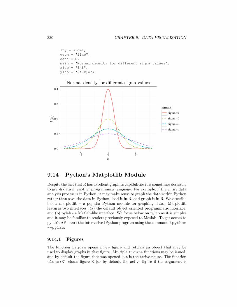
330 CHAPTER 9. DATA VISUALIZATION
lty = sigma,geom = "line",data = R,main = "Normal density for different sigma values",xlab = "$x$",ylab = "$f(x)$")
0.0
0.1
0.2
0.3
0.4
-5 0 5
x
f(x)
sigma
sigma=1
sigma=2
sigma=3
sigma=4
Normal density for di↵erent sigma values
9.14 Python’s Matplotlib Module
Despite the fact that R has excellent graphics capabilities it is sometimes desirableto graph data in another programming language. For example, if the entire dataanalysis process is in Python, it may make sense to graph the data within Pythonrather than save the data in Python, load it in R, and graph it in R. We describebelow matplotlib – a popular Python module for graphing data. Matplotlibfeatures two interfaces: (a) the default object oriented programmatic interface,and (b) pylab - a Matlab-like interface. We focus below on pylab as it is simplerand it may be familiar to readers previously exposed to Matlab. To get access topylab’s API start the interactive IPython program using the command ipython--pylab.
9.14.1 Figures
The function figure opens a new figure and returns an object that may beused to display graphs in that figure. Multiple figure functions may be issued,and by default the figure that was opened last is the active figure. The functionclose(X) closes figure X (or by default the active figure if the argument is
9.14. PYTHON’S MATPLOTLIB MODULE 331
omitted). The function savefigX saves the active figure to a file whose filenameis X (the file type is inferred from the filename extension). For example, thefollowing code opens up two figures, saves the second figure and closes it, andthen saves and closes the first figure.
import matplotlib.pyplot as pltf1 = plt.figure() # open a figuref2 = plt.figure() # open a second figureplt.savefig('f2.pdf') # save fig 2 - the active figureplt.close(f2)plt.savefig('f1.pdf') # save fig 2 - the active figureplt.close(f1)
9.14.2 Scatter-plots, Line-plots, and Histograms
The function plot(x,y) displays a scatter plot of the two arrays x and y, andconnects the scatter plot points with lines.
An optional third argument for plot is a string containing the color code,followed by marker code that is in turn followed by line-style code. For examplethe string ’ro--’ corresponds to color red, circular scatter plot markers, anddashed line. If some of these patterns are omitted the default choice is selected.Omitting the scatter plot markers pattern creates a line plot, for example ’r--’creates a red line plot. Omitting the line-style pattern creates a scatter plot, forexample ’ro’ creates a red scatter plot. Multiple consecutive plot functions addadditional features to the current figure.
The functions xlabel, ylabel, and title annotates the x-axis, the y-axisand the figure. As in the R examples we can use LaTeX code (text surroundedby $ symbols in the example below) to annotate the axes labels or titles withequations.
The range of values displayed in the x-axis and y-axis can be modified us-ing the function xlim([min x, max x]) and ylim([min y, max y]) func-tions.
The code below displays three line plots - linear (black solid line), quadratic(black dashed line), and cubic (black dotted line). Since the scatter plot markspatterns are omitted, we get line plots without the scatter plot corresponding tothe sampled points.
import matplotlib.pyplot as pltx_grid = array(range(1, 100)) / 30.0plt.figure() # open a figureplt.plot(x_grid, x_grid, 'k-') # adds f(x)=x as dashedplt.plot(x_grid, x_grid ** 2, 'k--') # draws f(x)=xˆ2 as solid lineplt.plot(x_grid, x_grid ** 3, 'k.') # draws f(x)=xˆ2 as solid lineplt.xlabel(r'$x$')plt.ylabel(r'$y=f(x)$')ttl='linear (solid), quadratic (dashed), and cubic (dotted) growth'

332 CHAPTER 9. DATA VISUALIZATION
plt.title(ttl)
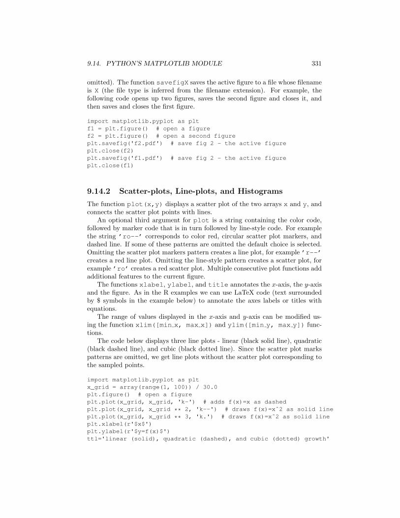
The function hist(x,n) creates a histogram of the data in x using n bins.
import matplotlib.pyplot as pltdata = randn(10000)hist(data, 50)plt.xlabel(r'$x$')plt.ylabel(r'$count$')plt.title('histogram of 10000 Gaussian N(0,1) samples')plt.xlim([-4, 4])
9.14. PYTHON’S MATPLOTLIB MODULE 333
9.14.3 Contour Plots and Surface Plots
Matplotlib can also graph three dimensional data. We describe below how tocreate contour plots and surface plots - the two most common 3-D graphs.
To create a contour plot or surface plot of a function f = (x, y), we needto first create two one dimensional grids corresponding to the values of x andy. The function numpy.meshgrid takes these two one dimensional grids andreturns two two dimensional ndarrays containing the x and y values (the firstndarray has constant columns and the second ndarray has constant rows). Wecan then create a third ndarray holding the values of z = f(x, y) by operating atwo dimensional function on the two ndarrays.
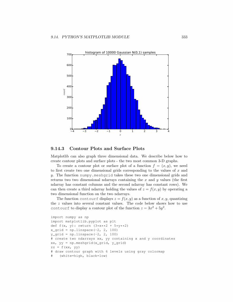
The function contourf displays z = f(x, y) as a function of x, y, quantizingthe z values into several constant values. The code below shows how to usecontourf to display a contour plot of the function z = 3x2 + 5y2.
import numpy as npimport matplotlib.pyplot as pltdef f(x, y): return (3*x**2 + 5*y**2)x_grid = np.linspace(-2, 2, 100)y_grid = np.linspace(-2, 2, 100)# create two ndarrays xx, yy containing x and y coordinatesxx, yy = np.meshgrid(x_grid, y_grid)zz = f(xx, yy)# draw contour graph with 6 levels using gray colormap# (white=high, black=low)
334 CHAPTER 9. DATA VISUALIZATION
plt.contourf(xx,yy,zz,6,cmap = 'gray')
# add black lines to highlight contours levelsplt.contour(xx,
yy,zz,6,colors = 'black',linewidth = .5)
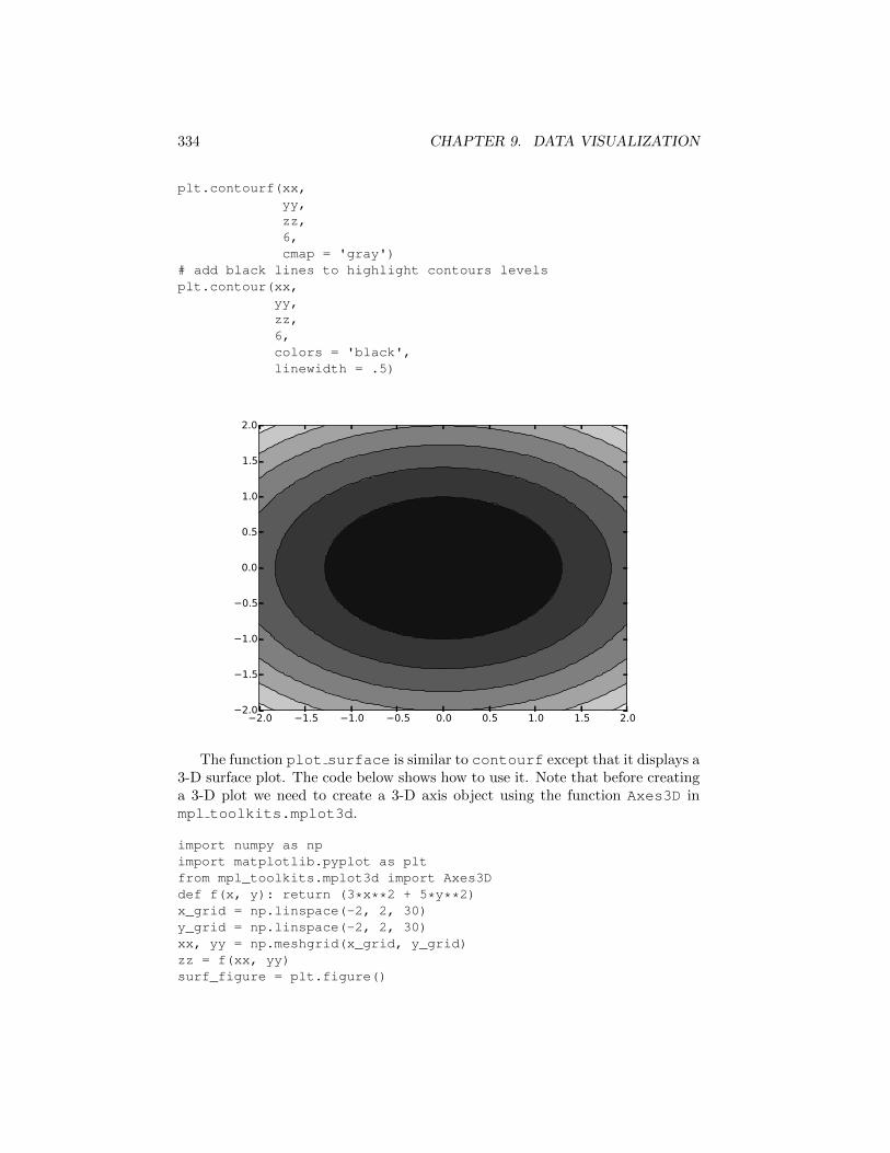
The function plot surface is similar to contourf except that it displays a3-D surface plot. The code below shows how to use it. Note that before creatinga 3-D plot we need to create a 3-D axis object using the function Axes3D inmpl toolkits.mplot3d.
import numpy as npimport matplotlib.pyplot as pltfrom mpl_toolkits.mplot3d import Axes3Ddef f(x, y): return (3*x**2 + 5*y**2)x_grid = np.linspace(-2, 2, 30)y_grid = np.linspace(-2, 2, 30)xx, yy = np.meshgrid(x_grid, y_grid)zz = f(xx, yy)surf_figure = plt.figure()
9.15. NOTES 335
figure_axes = Axes3D(surf_figure)figure_axes.plot_surface(xx,
yy,zz,rstride = 1,cstride = 1,cmap = 'gray')
9.15 Notes
Refer to the o�cial R manual at http://cran.r-project.org/doc/manuals/R-intro.html(replace html with pdf for pdf version) and the language reference athttp://cran.r-project.org/doc/manuals/R-lang.html (replace html with pdf forpdf version) for more information on R graphics. Detailed information on theggplot2 package appears in [29] or on the website http://had.co.nz/ggplot2/. Acomprehensive description of the grammar of graphics which is the basis of theggplot2 package is available in [31]. Two useful books on how to construct usefulgraphs are [3, 4]. A classic book on exploratory data analysis is [27].
The package lattice [22] is a popular alternative to graphics and ggplot2.It often creates graphs faster than ggplot2, but its syntax is less intuitive. Manyother R packages feature graphics functions for specialized data such as timeseries, financial data, or geographic maps. A useful resource for exploring suchpackages is the Task Views http://cran.r-project.org/web/views/.
Python’s matplotlib can display additional types of graphs, including bar
336 CHAPTER 9. DATA VISUALIZATION
charts, two dimensional scatter plots, three dimensional surface plots. See http://matplotlib.orgfor details. Python’s pandas module has some graphics functionality that is use-ful for graphing dataframes. See http://pandas.pydata.org for details. Pythonalso has additional graphics module for specialized graphics, such as interactivegraphics.
9.16 Exercises
1. Using the mpg data, describe the relationship between highway mpg andcar manufacturer. Describe which companies produce the most and leastfuel e�cient cars, and display a graph supporting your conclusion.
2. Using the mpg data, explore the three-way relationship between highwaympg, city mpg, and model class. What are your observations? Display agraph supporting these observations.
3. What are the pros and cons of using a histogram vs a box plot? Which onewill you prefer for what purpose?
4. Generate two sets of N random points using the function runif and dis-play a corresponding scatter plot. If you save the file to disk, what is theresulting file size for the following file formats: ps, pdf, jpeg, png? How dothese values scale with increasing N?
5. The diamonds dataset within ggplot2 contains 10 columns (price, carat,cut, color, etc.) for 53940 di↵erent diamonds. Type help(diamonds) formore information. Plot histograms for color, carat, and price, and commenton their shapes. Investigate the three-way relationship between price, carat,and cut. What are your conclusions? Provide graphs that support yourconclusions. If you encounter computational di�culties, consider using asmaller dataframe whose rows are sampled from the original diamondsdataframe. Use the function sample to create a subset of indices thatmay be used to create the smaller dataframe.