data visualization, a survey survey on data visualization.pdf · since data visualization involves...
TRANSCRIPT
Data Visualization, A Survey
By Xi Chen
Copyright@2017 by Xiaolab
People observe and perceive objects primarily by vision, which allow them to quickly grasp
interesting features in daily scenarios. It is desirable to present information such as datasets
in an organized fashion so that people could understand. The presentation of datasets could
be challenging when the size of the dataset is huge or the elements in the dataset have
complex relationships. Therefore, to effectively and efficiently visualize data become a
prevalent research direction.
Since the first proposal of data visualization as a research topic, hundreds of powerful
visualization techniques and applications have been developed. Each has its own features
and rationales. Such a situation stimulates us to investigate and derive the birds eye view
over this field, before we attempt to make our own contribution to the research of data
visualization.
The rest of this report is organized as follows: Section 1 introduces fundamental concepts,
categorized methods, and symbols commonly used in data visualization field. Section 2
introduces notable programming libraries and software applications for data visualization.
Section 3 overview important techniques used in visualization. Some lately research
progresses with respect to visualization are described in Section 4. We made a summary of
prominent data visualization research problems in Section 5.

Table of Contents
1. Introduction to Data Visualization .......................................................................................................................4
1.1. the Definition of Data Visualization .....................................................................................................4
1.2. Common Concepts in Data Visualization ............................................................................................5
1.3. Data Stream model of Visualization Procedure ..................................................................................5
1.4. the Categories of Data Visualization Techniques ...............................................................................6
1.4.1. GeometricProjectionTechniques .....................................................................................................7
1.4.2. Pixel-oriented Techniques.............................................................................................................. 10
1.4.2. Hierarchical Techniques ................................................................................................................. 13
1.4.4. Iconography Techiniques ............................................................................................................... 14
1.5. Usual Symbols Used in Data Visualization ...................................................................................... 17
1.5.1. Static traits ......................................................................................................................................... 17
1.5.2. Change types ..................................................................................................................................... 17
1.5.3. Change Dynamics ............................................................................................................................ 17
2. Libraries and Software ........................................................................................................................................ 18
2.1. Programming Libraries for Data Visualization ................................................................................ 18
2.2. Tools for Data Visualization ................................................................................................................. 18
2.2.1. Common Visualization Tools ........................................................................................................ 19
2.2.2. Typical Visualization Tools ........................................................................................................... 19
3. Data Visualization Research .............................................................................................................................. 35
3.1. Research Development in Computer Graphics ................................................................................ 36
3.2. Research Development in Visualization Realizing ......................................................................... 38
3.3. Research Development in Augmented or Virtual Reality ............................................................. 47
4. Open Research Problems .................................................................................................................................... 50
5. Reference............................................................................................................................................................... 52

1. Introduction to Data Visualization
With the ever-increasing amount of available computing resources, our ability to collect and
generate a wide variety of large, complex, high-dimensional datasets continues to grow.
High-dimensional datasets show up in numerous fields of study, such as economy, biology,
chemistry, political science, astronomy, and physics etc. Their wide availability, increasing
size and complexity have led to new challenges and opportunities for their effective
visualization. The physical limitations of the display devices and our visual system prevent
the direct display and instantaneous recognition of structures with higher dimensions than
two or three. In the past decade, a variety of approaches have been introduced to visually
convey high-dimensional structural information by utilizing low-dimensional projections or
abstractions: from dimension reduction to visual encoding, and from quantitative analysis to
interactive exploration. A number of researches have focused on different aspects of data
visualization, such as parallel coordinates, quality measures, clutter reduction, visual data
mining, and interactive techniques. In the future, data visualization will become a continual
hotspot in the fields of science and industry.
1.1. the Definition of Data Visualization
Data visualization, is the scientific study in terms of information display. Display format, is
defined as a kind of information recapitulated from raw dataset and involving various
attributes and variables attracting our concern.
The basic methodology of data visualization is to interpret each data item within dataset as
an element of graph, lots of which form the entire visualization figures, images, or charts.
Meanwhile, attributes are exhibited by multi-dimension data. In this way, observating data
from different dimension is capable, which facilitates expected further analysis to find out
their internal rules.
Critical feature of data visualization can be described as: data visualization and translation
tool enables a mapping between source schema and target schema, and they compare
different existing mappers on contributions and limitations [2].
Furthermore, Ivan Herman, Guy Melançon, and M. Scott Marshall provide a terse standard
to determine the applicability of graph visualization [24]: is there an inherent relation among
the data elements to be visualized? If the answer to the question is “no”, than data elements
are “unstructured” and the goal of the information visualization system might be to help
discover relations among data through visual means. If, however, the answer to the question
is “yes”, then the data can be represented by the nodes of a graph, with the edges representing
the relations.

1.2. Common Concepts in Data Visualization
In visualization field, there are some common concepts used to describe scenarios in a
uniform and convenient way, summarized as follows:
① Data Space: a multi-dimension information space constituted by dataset of many
multi-attribute elements.
② Data Development: quantitative deduction and computation of data employing
certain algorithms and tools.
③ Data Analysis: utilizing slicing, block, rotation and other operations to analyze
multi-dimensional data, which provides multi-angle and multi-side observation of
data.
④ Data Visualization: the process of translating massive data into graph form, and
employ tools in terms of data analysis and development to procure sealed
information.
1.3. Data Stream model of Visualization Procedure
Although there have been a great variety of methods proposed to present data with various
mechanisms, all of them can be abstracted to a common mode. Systematically speaking,
visualizing data goes through the following steps:
① First, source data are collected from sense, generation, recording or other applicable
methods.
② Second, though source data have the biggest chance to reserve the nature of entity,
observers may not be able to cognize it by analyzing source data due to obscure
representation. As a result, data transformation is required, which promotes source
data on validity, integrity, and discrepancy etc. Usual methods of transforming data
are coordinate transformation, interpolation, and filtration etc. Taking advantage of
these techniques, source data become more suitable for visualization. However,
inappropriate transformation can also backfire the influence. Hence,
comprehensive awareness of data feature is a critical factor deciding the quality of
transformation.
③ Third, since transformed data remain abstract and unintuitive, they require an extra
mapping process to present data conveniently, i.e. constructing a mapping between
transformed data and view elements. By now, a number of mapping techniques
have been proposed.
④ Through the former three steps, complete view has been generated. Therefore, users
can observe it and acquire information they want.
The aforementioned procedure to visualize data can be felicitously expressed as a flow chart,
namely data stream model. Fig. 1 provides an example of the model. Furthermore, it
demonstrates that user reciprocity is accessible in each step.
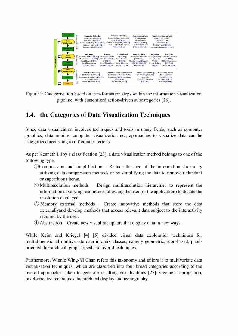
Figure 1: Categorization based on transformation steps within the information visualization
pipeline, with customized action-driven subcategories [26].
1.4. the Categories of Data Visualization Techniques
Since data visualization involves techniques and tools in many fields, such as computer
graphics, data mining, computer visualization etc, approaches to visualize data can be
categorized according to different criterions.
As per Kenneth I. Joy’s classification [23], a data visualization method belongs to one of the
following type:
①Compression and simplification – Reduce the size of the information stream by
utilizing data compression methods or by simplifying the data to remove redundant
or superfluous items.
② Multiresolution methods – Design multiresolution hierarchies to represent the
information at varying resolutions, allowing the user (or the application) to dictate the
resolution displayed.
③ Memory external methods – Create innovative methods that store the data
externallyand develop methods that access relevant data subject to the interactivity
required by the user.
④ Abstraction – Create new visual metaphors that display data in new ways.
While Keim and Kriegel [4] [5] divided visual data exploration techniques for
multidimensional multivariate data into six classes, namely geometric, icon-based, pixel-
oriented, hierarchical, graph-based and hybrid techniques.
Furthermore, Winnie Wing-Yi Chan refers this taxonomy and tailors it to multivariate data
visualization techniques, which are classified into four broad categories according to the
overall approaches taken to generate resulting visualizations [27]: Geometric projection,
pixel-oriented techniques, hierarchical display and iconography.
1.4.1. Geometric Projection Techniques
Geometric projection techniques refer to presenting dataset with modern mathematic
methods with respect to geometric brushwork or geometric projection. It is the most prevalent
and well-known kind of visualization techniques in the world. In the following, some typical
techniques using geometric projection are introduced:
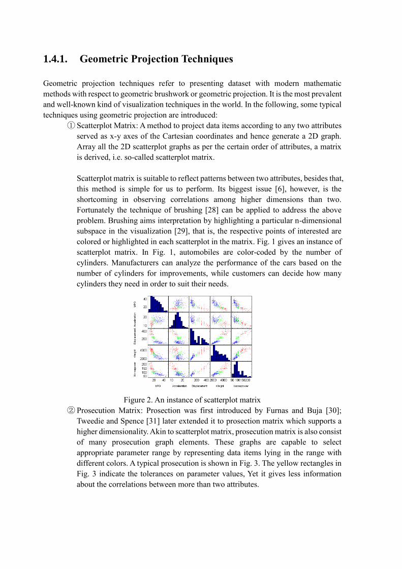
① Scatterplot Matrix: A method to project data items according to any two attributes
served as x-y axes of the Cartesian coordinates and hence generate a 2D graph.
Array all the 2D scatterplot graphs as per the certain order of attributes, a matrix
is derived, i.e. so-called scatterplot matrix.
Scatterplot matrix is suitable to reflect patterns between two attributes, besides that,
this method is simple for us to perform. Its biggest issue [6], however, is the
shortcoming in observing correlations among higher dimensions than two.
Fortunately the technique of brushing [28] can be applied to address the above
problem. Brushing aims interpretation by highlighting a particular n-dimensional
subspace in the visualization [29], that is, the respective points of interested are
colored or highlighted in each scatterplot in the matrix. Fig. 1 gives an instance of
scatterplot matrix. In Fig. 1, automobiles are color-coded by the number of
cylinders. Manufacturers can analyze the performance of the cars based on the
number of cylinders for improvements, while customers can decide how many
cylinders they need in order to suit their needs.
Figure 2. An instance of scatterplot matrix
② Prosecution Matrix: Prosection was first introduced by Furnas and Buja [30];
Tweedie and Spence [31] later extended it to prosection matrix which supports a
higher dimensionality. Akin to scatterplot matrix, prosecution matrix is also consist
of many prosecution graph elements. These graphs are capable to select
appropriate parameter range by representing data items lying in the range with
different colors. A typical prosecution is shown in Fig. 3. The yellow rectangles in
Fig. 3 indicate the tolerances on parameter values, Yet it gives less information
about the correlations between more than two attributes.

Figure 3. A typical Prosecution Matrix
③ Hyperslice: The most significant improvement of hyperslice over scatterplot is the
interactive data navigation around a user defined focal point [32]. An enhanced
hyperSlice was also proposed [33] which incorporate the concept of display
resolution supported by space projection, together with the concept of data
resolution provided by wavelets to form a powerful multiresolution visualization
system. Fig. 4 presents a hyperslice for 4D function [32].
Figure 4. Hyperslice for 4D function [32]
④ hyperbox: Like the above techniques, hyperbox [32] indicates to visualize data
with a box rather than a matrix. It can be a more powerful tool as it is possible to
map variables to both size and shape of the face. Hence emphasizing or de-
emphasizing certain variables [32] is also permitted. Whereas, due to the limitation
of 2D to depict high-dimension figures, the length and orientation may mislead the
information as it violates the “banking to 45 degrees” principle [34].

Figure 5. An example of hyperbox [32]
⑤Parallel Coordinates [35]: Parallel Coordinates is a well-known technique where
attributes are represented by parallel vertical axes linearly scaled within their data
range. Each data item is represented by a polygonal line that intersects each axis
at respective attribute data value, as Fig. 6 shows.
Parallel coordinates can be used to study the correlations among attributes by
spotting the locations of intersection points [32]. Also, they are effective to reveal
the data distributions and functional dependencies. Nevertheless, one major
limitation is the limited space available for each parallel axis. Visual clutters can
severely hamper the user’s ability to interpret the visualizations and interact with
it. Akin to former methods, brushing technique is also applicable in this case.
⑥Andrews Curve: data items are plotted as Fourtier transforms [20]. It’s useful to
detect clusters and outliers [21] and extensible to many dimensions, but
computationally expensive to handle huge datasets.
Figure 6. A demonstration of parallel coordinates [6]
Figure 7. Andrew curves [20]
⑦Star Coordinates: Star coordinate [36] is an extension of typical scatterplots to
higher dimensions Data items are presented as points and attributes are represented
by the axes arranged on a circle.
Users can apply scaling transformations to change the length of an axis, which
increases or decreases the contribution of an attribute. It also provides rotation
transformations that change the direction of an axis, so the angles are no more
equal and thus making an attribute more or less correlated with other attributes.
An example of star coordinates after transformation is shown in Fig. 8. It has been
found to be useful in gaining insight into hierarchically clustered datasets and for
multi-factor analysis for decision-making [3].
Figure 8. Star coordinate with transformation [36]
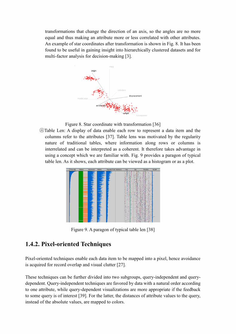
⑧Table Len: A display of data enable each row to represent a data item and the
columns refer to the attributes [37]. Table lens was motivated by the regularity
nature of traditional tables, where information along rows or columns is
interrelated and can be interpreted as a coherent. It therefore takes advantage in
using a concept which we are familiar with. Fig. 9 provides a paragon of typical
table len. As it shows, each attribute can be viewed as a histogram or as a plot.
Figure 9. A paragon of typical table len [38]
1.4.2. Pixel-oriented Techniques
Pixel-oriented techniques enable each data item to be mapped into a pixel, hence avoidance
is acquired for record overlap and visual clutter [27].
These techniques can be further divided into two subgroups, query-independent and query-
dependent. Query-independent techniques are favored by data with a natural order according
to one attribute, while query-dependent visualizations are more appropriate if the feedback
to some query is of interest [39]. For the latter, the distances of attribute values to the query,
instead of the absolute values, are mapped to colors.
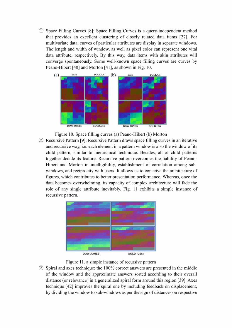
① Space Filling Curves [8]: Space Filling Curves is a query-independent method
that provides an excellent clustering of closely related data items [27]. For
multivariate data, curves of particular attributes are display in separate windows.
The length and width of window, as well as pixel color can represent one vital
data attribute, respectively. By this way, data items with akin attributes will
converge spontaneously. Some well-known space filling curves are curves by
Peano-Hibert [40] and Morton [41], as shown in Fig. 10.
Figure 10. Space filling curves (a) Peano-Hibert (b) Morton
② Recursive Pattern [9]: Recursive Pattern draws space filling curves in an iterative
and recursive way, i.e. each element in a pattern window is also the window of its
child pattern, similar to hierarchical technique. Besides, all of child patterns
together decide its feature. Recursive pattern overcomes the liability of Peano-
Hibert and Morton in intelligibility, establishment of correlation among sub-
windows, and reciprocity with users. It allows us to conceive the architecture of
figures, which contributes to better presentation performance. Whereas, once the
data becomes overwhelming, its capacity of complex architecture will fade the
role of any single attribute inevitably. Fig. 11 exhibits a simple instance of
recursive pattern.
Figure 11. a simple instance of recursive pattern
③ Spiral and axes technique: the 100% correct answers are presented in the middle
of the window and the approximate answers sorted according to their overall
distance (or relevance) in a generalized spiral form around this region [39]. Axes
technique [42] improves the spiral one by including feedback on displacement,
by dividing the window to sub-windows as per the sign of distances on respective

dimensions. Fig. 12 shows their implementation intuitionally.
Figure 12. Spiral and axes technique result of an 8-dimensional dataset
④ Circle Segment [11]: each segment represents a dimension, and data items are
identified by respective distances to center. The ordering and colors of the pixels
are similarly determined by their overall distance to the query. Fig. 13 is an
example of circle segment visualization.
Figure 13. (a) Circle segment arrangement for 8-diemensaionl data
(b) An example of circle segments
⑤ Pixel Bar Chart [12]: derived from regular bar chart, presents data values directly
instead of aggregating them into a few data values. Each data item is represented
by a single pixel and is placed in the bars accordingly. For higher-dimensional
data, multi-pixel bar charts are proposed, see Fig. 14. Charts are duplicated and
different attribute is colored-coded for each chart.
Figure 14. Multi-pixel bar chart with color encoding different attributes

1.4.2. Hierarchical Techniques
Hierarchical techniques target to process organized data as per hierarchical format within
database. Its critical idea is to divide n-dimension space into a certain number of subspaces,
and then iteratively divide these subspaces. Below, some usual hierarchical techniques are
introduced:
① Hierarchical Axis: A method of putting many attributes into one screen [13]. Axes
are laid out horizontally in a hierarchical fashion as illustrated in Figure 15.
Figure 15. Histograms within histograms matrix
② Dimensional Stacking: A variation of hierarchical axis, or to segment the data
space into 2-dimensional subspaces stacked into each other, which is suitable for
discrete categorical or binned ordinal values [13]. The grids in Fig. 16 indicate
visualization of any two different attributes, represented by horizontal axis and
vertical axism respectively. Another comprehension of dimensional stacking from
a unique view is interesting: The extended implementation of hierarchical axis in
2-dimensional environment.
Figure 16. Partition of dimensional stacking
③ World within world, or n-vision [14]: It generates an interactive hierarchy
display, instead of the static objects in the previous one, by using powerful 3D
rendering [22]. It allows the exploration of n-dimensional function spaces, but
could also be adapted to n-dimensional datasets [20]. Fig. 17 is given to show one
of its example.

Figure 17. N-Vision
④ Treemap: suitable to obtain an overview on large datasets with multiple ordinal
attributes [15]. Furthermore, it subdivides the display in a space-filling manner
that fully utilizes the available display space [43]. Fig. 18 presents a typical
treemap. As it shows, each standard rectangular area represents a subclassification.
Furthermore, the bigger square the area has, the higher level of subclassification
is.
Figure 18. Typical Treemap
1.4.4. Iconography Techniques
Iconographic or icon-based techniques map each multidimensional data item to an icon or a
more characteristic glyph, where visual features coincide to data attribute values. Several
graphical parameters are usually contained in an icon, which makes it possible to handle
multidimensional data. Besides, observations of graphical features are pre-attentive which is
welcomed by human. However, unlike geometric techniques that treat all the dimensions
equally, some features in glyphs are more salient than others, and adjacent elements are easier
to be related and accuracy of perceiving different graphical attributes varies between humans
tremendously. It thereby introduces biases in interpreting the result [3].
① Chernoff Faces: attributes are represented by organs on face. Its shortcoming is
that different features cannot be compared to each other. One common issue to
all multidimensional icons, including Chernoff faces, is that the semantic
relation to the task has significant impact on the perceptive effectiveness [44].
Yet it will then very much depend on the application domain. Fig. 19 is a

paragon of chernoff faces.
Figure 19. Chernoff faces in various 2D positions
② Star glyph: There are many variants in the glyph family for displaying
multidimensional data; star plot [45] is one of the most widely used glyphs.
Whereas, it is only effective when data size is moderate. An instance of star glyph
is given in Fig. 20. Besides, star plots can be further combined with other glyphs
to encode extra information, as shown in Fig. 21.
Figure 20. Architecture of a star plot
Figure 21. Box plot stars
③ Stick Figure: map two attributes to the display axes and the remaining to the
rotation angle, length and etc, its deterministic factor is graphical attribute. Fig.
22 is a stick figure for visualizing 5D image data. It provides a meticulous
presentation to visualize data, and hence affects audiences aesthetically. However,
the liability of this feature also exists —— extremely strict requirement for

resolution ratio of screen and for visual sharpness of observer’s eyes.
Figure 22. 5D image data using stick figures
④ Color Icon: is a combination of the pixel-based spiral axes and icon-based shape
coding techniques, merging color, shape and texture perception for iconographic
integration [16]. As shown in Fig. 23, pixel in spiral curve is replaced by pixel
array, whose element stands for a single attribute. In the center of picture, the
yellow arrays state those data items satisfying query completely. Along the spiral
curve, satisfying degree of presented data items for query declines constantly.
Figure 23. Color Icon Spiral Curve
⑤ Texture: allow users to gain insight into the overall relationships between
attributes and it is supported by recent advanced texture systhesis techniques
[17], [18]. Fig. 24 presents a texture application in visualization of weather
conditions.
Figure. 24 Texture visualization of weather conditions
1.5. Usual Symbols Used in Data Visualization
To present data in a meaningful way, some intelligible symbols are favored and commonly
used by public. Usual symbols used for visualizing can be categorized as per entity state,
including static traits, change types, and change dynamics [19].
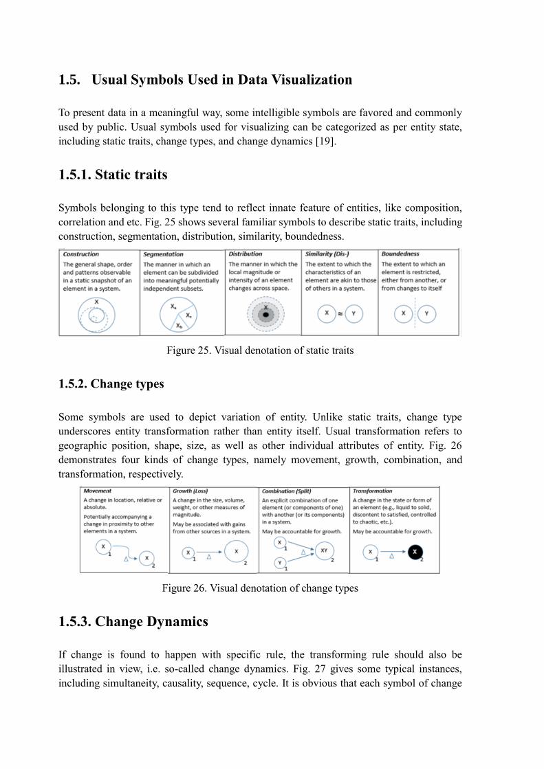
1.5.1. Static traits
Symbols belonging to this type tend to reflect innate feature of entities, like composition,
correlation and etc. Fig. 25 shows several familiar symbols to describe static traits, including
construction, segmentation, distribution, similarity, boundedness.
Figure 25. Visual denotation of static traits
1.5.2. Change types
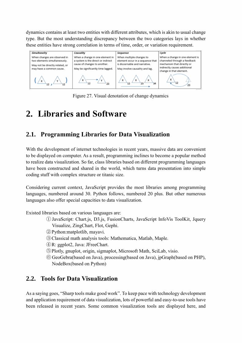
Some symbols are used to depict variation of entity. Unlike static traits, change type
underscores entity transformation rather than entity itself. Usual transformation refers to
geographic position, shape, size, as well as other individual attributes of entity. Fig. 26
demonstrates four kinds of change types, namely movement, growth, combination, and
transformation, respectively.
Figure 26. Visual denotation of change types
1.5.3. Change Dynamics
If change is found to happen with specific rule, the transforming rule should also be
illustrated in view, i.e. so-called change dynamics. Fig. 27 gives some typical instances,
including simultaneity, causality, sequence, cycle. It is obvious that each symbol of change
dynamics contains at least two entities with different attributes, which is akin to usual change
type. But the most understanding discrepancy between the two categories lays in whether
these entities have strong correlation in terms of time, order, or variation requirement.
Figure 27. Visual denotation of change dynamics
2. Libraries and Software
2.1. Programming Libraries for Data Visualization
With the development of internet technologies in recent years, massive data are convenient
to be displayed on computer. As a result, programming inclines to become a popular method
to realize data visualization. So far, class libraries based on different programming languages
have been constructed and shared in the world, which turns data presentation into simple
coding stuff with complex structure or titanic size.
Considering current context, JavaScript provides the most libraries among programming
languages, numbered around 30. Python follows, numbered 20 plus. But other numerous
languages also offer special capacities to data visualization.
Existed libraries based on various languages are:
① JavaScript: Chart.js, D3.js, FusionCharts, JavaScript InfoVis ToolKit, Jquery
Visualize, ZingChart, Flot, Gephi.
② Python:matplotlib, mayavi.
③ Classical math analysis tools: Mathematica, Matlab, Maple.
④ R: ggplot2, Java: JFreeChart.
⑤ Plotly, gnuplot, origin, sigmaplot, Microsoft Math, SciLab, visio.
⑥ GeoGebra(based on Java), processing(based on Java), jpGraph(based on PHP),
NodeBox(based on Python)
2.2. Tools for Data Visualization
As a saying goes, “Sharp tools make good work”. To keep pace with technology development
and application requirement of data visualization, lots of powerful and easy-to-use tools have
been released in recent years. Some common visualization tools are displayed here, and

several typical tools are introduced and commented briefly.
2.2.1. Common Visualization Tools
This section displays common visualization tools employed in different fields.
① Coding independent visualization tools: Tableau, Raw, Infogram, ChartBlocks,
Visualize Free Visual.ly, iCharts
② Geography visualization tools: CartoDB, InstantAtlas, Polymaps, OpenLayers,
Kartograph, Exhibit, Modest Map, Leaflet
③ Financial visualization tools: Dygraphs, Highcharts
④ Time axis visualization tools: Timeline, Dipity
⑤ Function and Formula visualization tools: WolframAlpha, Tangle
⑥ Other visualization tools: Better World Flux, Google Charts, Crossfilter
2.2.2. Typical Visualization Tools
Promoted by industrial market requirements for efficient and professional visualization, sorts
of commercial products or free products have been released by now. This section introduces
several typical visualization tools and make brief comments on them respectively.
① Excel: Excel has always been a ubiquitous visualization tool since Microsoft
released it. As a rudimental tool, it is quite ideal for ordinary users to analyze data
rapidly. Excel has capacity to draw a majority of usual data charts, but it shows
boundedness in selectable colors, lines, and forms, which indicates it is hard for
Excel to draw charts meeting standards of professional publication or official
websites.
Figure 28. Microsoft Excel
② Charting Fonts: Charting Fonts combines symbols and fonts, and hence smart vector
icons are created.

Figure 29. Symbols used in Charting Fonts
③ Gephi: Gephi is a visualization tool focused on social mapping. Besides the ability
to handle large-scale datasets, Gephi is also a visual internet exploring platform,
used to construct dynamic, hierarchical data charts. It is based on Netbeans platform
and JAVA programming language, and OpenGL serves as its engine for visualization.
Figure 30. Gephi platform
④ CartoDB: CartoDB is an open source internet application and a reciprocal mapping
tools that you should not miss. CartoDB is famous for one-button mapping function,
which enables you to pertain table data and geographical map. And it is always the
best choice to do this job.
Figure 31. An implementing example of CartoDB
⑤ Google Chart API: Google Chart provides a relatively perfect method to visualize
data, which mainly reflects in a number of possessed icon types, ranging from
simple lineal chart to complex hierarchical tree map. Build-in animation and user

reciprocity are also permitted in Google Chart.
Figure 32. Typical charts of Google Chart
⑥ Data driven document (D3): D3 is a JavaScript library for manipulating documents
based on data. It allows you to bind arbitrary data to a Document Object Model
(DOM), and then applied data driven transformation to the document. In this way,
proprietary representation is avoided and extraordinary flexibility can be afforded,
exposing the full capability of several typical website standards, e.g. HTML, SVG,
CSS. Besides the aforementioned features, D3 is capable to draw maps and charts
with intricate formats, e.g. Voronoi map, tree map, circular clutter, and word cloud.
Figure 33. Word cloud drawn by Data driven document
⑦ Crossfilter: Crossfilter is not only a chart, but also a smart routine of reciprocal
graphical user’s interface. Once input range is modified in a chart, corresponding
change occurs automatically in other relative charts.
Figure 34. A group of correlative charts in Corssfilter

⑧ Raphael: Raphael is a JavaScript library for establishing charts and figures. It is
cross-browser and supporting numerous common browsers, such as Internet
Explorer 6.0+, Firefox 3.0+, Chrome 3.0+, Safari 3.0+, Opera 9.5+. Being different
to other tools, its biggest peculiarity is sole permission to SVG and VML on output
format.
Figure 35. Pie chart and histogram drawn by Raphael
⑨ Visual.ly: Visual.ly defines itself as —— an online market of information graph
designer, i.e. it is a commercial website. Accompanying with it, all of its service is
marked with price on the website. Visual.ly attracted crowds in 2012 by its first
released tool —— Visual.ly Create, which is used to online drawing. It provides
numerous templates for users, more than that, users do not have responsibility to
offer data to be visualized. Visual.ly Create can realize visualization by accessing
accounts of users on other websites, e.g. google, twitter, facebook. Hence, if we want
information graph rather than simple data visualization.
Figure 36. Information graph drawn by Visual.ly
⑩ Waikato Environment for Knowledge Analysis (Weka): Weka is a free,
uncommercial software focused on data mining and machine leaning. Weka is
grounded on Java, converging numerous machine leaning algorithms to take data
mining tasks, including pre-processing, sorting, retrieving, pertaining as well as
visualization on novel reciprocal interface. It is surely an undoubtable tool to clutter
massive data by attributes sorting, but it also can be employed to draw some
rudimental figures and charts. There is an anecdote that the abbreviation Weka is
also the name of a bird inhabiting in New Zealand, a place where core developers
of Weka come from.
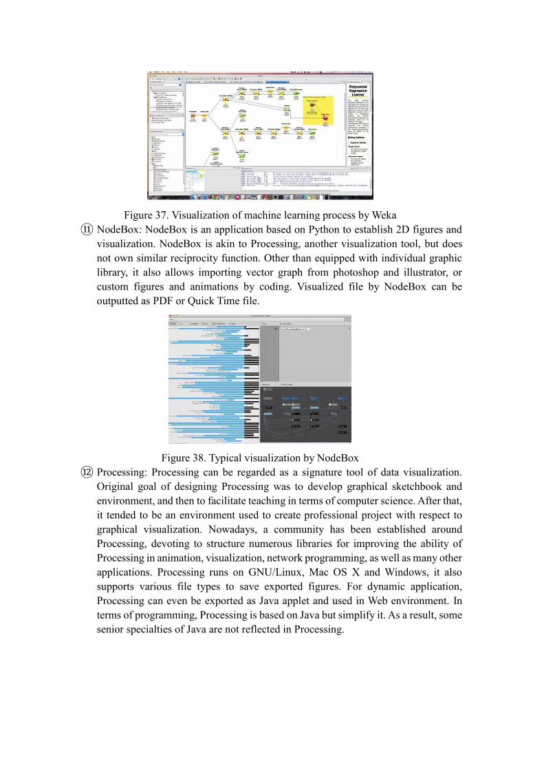
Figure 37. Visualization of machine learning process by Weka
⑪ NodeBox: NodeBox is an application based on Python to establish 2D figures and
visualization. NodeBox is akin to Processing, another visualization tool, but does
not own similar reciprocity function. Other than equipped with individual graphic
library, it also allows importing vector graph from photoshop and illustrator, or
custom figures and animations by coding. Visualized file by NodeBox can be
outputted as PDF or Quick Time file.
Figure 38. Typical visualization by NodeBox
⑫ Processing: Processing can be regarded as a signature tool of data visualization.
Original goal of designing Processing was to develop graphical sketchbook and
environment, and then to facilitate teaching in terms of computer science. After that,
it tended to be an environment used to create professional project with respect to
graphical visualization. Nowadays, a community has been established around
Processing, devoting to structure numerous libraries for improving the ability of
Processing in animation, visualization, network programming, as well as many other
applications. Processing runs on GNU/Linux, Mac OS X and Windows, it also
supports various file types to save exported figures. For dynamic application,
Processing can even be exported as Java applet and used in Web environment. In
terms of programming, Processing is based on Java but simplify it. As a result, some
senior specialties of Java are not reflected in Processing.

Figure 39. Particle fall visualization realized by Processing
○13 Leaflet: Leaflet is the leading open-source JavaScript library for mobile-friendly
interactive maps. Weighing just about 38 KB of JS, it has all the
mapping features most developers ever need. Leaflet is designed
with simplicity, performance and usability in mind. It works efficiently across all
major desktop and mobile platforms, can be extended with lots of plugins, has a
beautiful, easy to use and well-documented API and a simple, readable source
code that is a joy to contribute to. It takes advantages of HTML5 and CSS3 in
advanced browsers, and supports elder browsers meanwhile.
Figure 40. Example map drawn by implementing Leaflet
⑬ Openlayers: Openlayers is a complete open source JavaScript package supplied to
developing WebGIS client and used to realize geographical data access with
standard format. OpenLayers makes it easy to put a dynamic map in any web page.
It can display map tiles, vector data and markers loaded from sorts of sources,
including Google Maps, Yahoo, Virtual Earth released by Microsoft, and etc.
Furthermore, Openlayer also supports network service standard constituted by Open
GIS association, such as Web Mapping Service (WMS) and Web Feature Service
(WFS), and hence enables loading geographical data released as per OGC format
to client of Openlayers based on browsers by remote service.
Figure 41. Simple GIS presented by Openlayers
⑭ Polymaps: Polymaps is a free JavaScript library for making dynamic, interactive
maps in modern web browsers. Polymaps provides speedy display of multi-zoom
datasets over maps, and supports a variety of visual presentations for tiled vector
data, in addition to the usual cartography from OpenStreetMap, CloudMade, Bing,
and other providers of image-based web maps.
Because Polymaps can load data at a full range of scales, it’s ideal for showing
information from country level on down to states, cities, neighborhoods, and
individual streets. Since Polymaps uses SVG (Scalable Vector Graphics) to display
information, familiar, comfortable CSS rules can be used to define the design of
your data. As Polymaps uses the well-known spherical mercator tile format for its
imagery and its data, publishing information is a snap.
Figure 42. An overview of Polymaps implementation
⑮ Timeline: TimelineJS is an open-source tool that enables anyone to build visually
rich, interactive timelines. Beginners can create a timeline using nothing more than
a Google spreadsheet. Experts can use their JSON skills to create custom
installations, while keeping TimelineJS's core functionality. It can derive media files
from numerous sources, e.g. Twitter, Google Plus, Flickr, YouTube and Google
Maps.
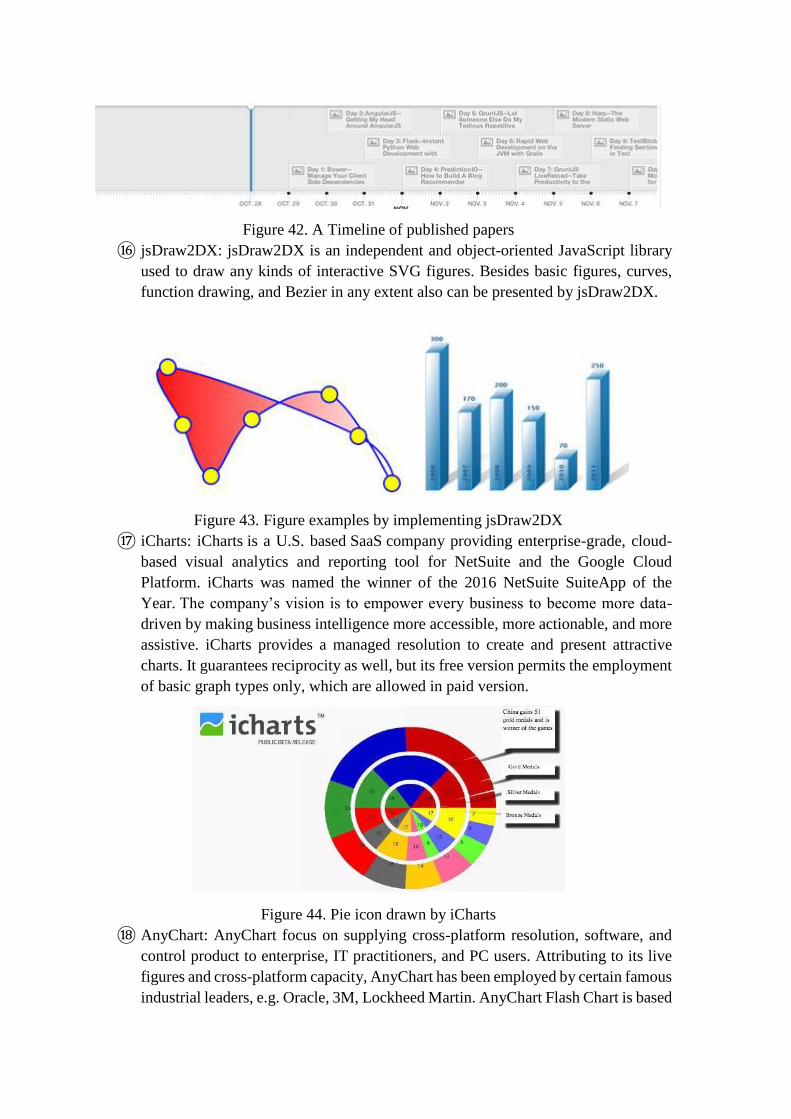
Figure 42. A Timeline of published papers
⑯ jsDraw2DX: jsDraw2DX is an independent and object-oriented JavaScript library
used to draw any kinds of interactive SVG figures. Besides basic figures, curves,
function drawing, and Bezier in any extent also can be presented by jsDraw2DX.
Figure 43. Figure examples by implementing jsDraw2DX
⑰ iCharts: iCharts is a U.S. based SaaS company providing enterprise-grade, cloud-
based visual analytics and reporting tool for NetSuite and the Google Cloud
Platform. iCharts was named the winner of the 2016 NetSuite SuiteApp of the
Year. The company’s vision is to empower every business to become more data-
driven by making business intelligence more accessible, more actionable, and more
assistive. iCharts provides a managed resolution to create and present attractive
charts. It guarantees reciprocity as well, but its free version permits the employment
of basic graph types only, which are allowed in paid version.
Figure 44. Pie icon drawn by iCharts
⑱ AnyChart: AnyChart focus on supplying cross-platform resolution, software, and
control product to enterprise, IT practitioners, and PC users. Attributing to its live
figures and cross-platform capacity, AnyChart has been employed by certain famous
industrial leaders, e.g. Oracle, 3M, Lockheed Martin. AnyChart Flash Chart is based

on Flash/JavaScript, figures drawn by implementing it can be used in instruments,
reports, data analysis, finance, statistics. The newest version of AnyChart has
supported HTML5, and in a manner of speaking, it performs well on nearly all of
PC platforms and mobile platforms, including Chrome, Safari, Firefox, Internet
Explorer, Opera, Android (2.2+) and iOS (iPhone, iPad, iPod Touch).
Figure 45. A typical implementation of AnyChart
⑲ Kartograph: Kartograph is a framework used to create interactive map without
support of any map service providers, such as Google Maps. It is consist of two class
libraries——a Python library aiming to transform vector maps of shapefiles or
PostGIS to SVG format, and another JavaScript library used to draw interactive map
by utilizing these SVG data.
Figure 46. Several examples of Kartograph
⑳ ECharts: EChart is a JavaScript library designed by the front-end technical section
of Baidu enterprise for data visualization. Its bottom relies on a novel lightweight
canvas class library, namely ZRender. EChart is compatible to a majority of
browsers, such as IE8/9/10/11, Chrome,Firefox,Safari. Moreover, more and more
visualization products of Baidu tend to adopt ECharts as their tool to realize visual
effects.
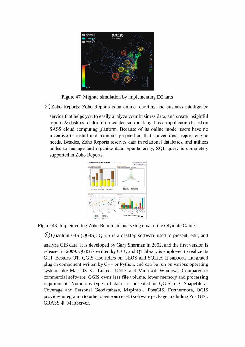
Figure 47. Migrate simulation by implementing ECharts
○21 Zoho Reports: Zoho Reports is an online reporting and business intelligence
service that helps you to easily analyze your business data, and create insightful
reports & dashboards for informed decision-making. It is an application based on
SASS cloud computing platform. Because of its online mode, users have no
incentive to install and maintain preparation that conventional report engine
needs. Besides, Zoho Reports reserves data in relational databases, and utilizes
tables to manage and organize data. Spontaneosly, SQL query is completely
supported in Zoho Reports.
Figure 48. Implementing Zoho Reports in analyzing data of the Olympic Games
○22 Quantum GIS (QGIS): QGIS is a desktop software used to present, edit, and
analyze GIS data. It is developed by Gary Sherman in 2002, and the first version is
released in 2009. QGIS is written by C++, and QT library is employed to realize its
GUI. Besides QT, QGIS also relies on GEOS and SQLite. It supports integrated
plug-in component written by C++ or Python, and can be run on various operating
system, like Mac OS X、Linux、UNIX and Microsoft Windows. Compared to
commercial software, QGIS owns less file volume, lower memory and processing
requirement. Numerous types of data are accepted in QGIS, e.g. Shapefile、
Coverage and Personal Geodatabase, MapInfo 、 PostGIS. Furthermore, QGIS
provides integration to other open source GIS software package, including PostGIS、
GRASS 和 MapServer.
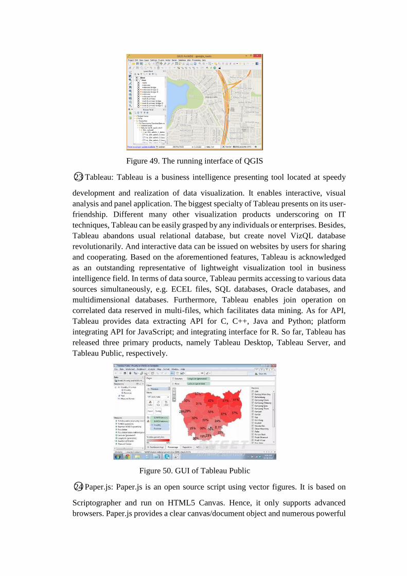
Figure 49. The running interface of QGIS
○23 Tableau: Tableau is a business intelligence presenting tool located at speedy
development and realization of data visualization. It enables interactive, visual
analysis and panel application. The biggest specialty of Tableau presents on its user-
friendship. Different many other visualization products underscoring on IT
techniques, Tableau can be easily grasped by any individuals or enterprises. Besides,
Tableau abandons usual relational database, but create novel VizQL database
revolutionarily. And interactive data can be issued on websites by users for sharing
and cooperating. Based on the aforementioned features, Tableau is acknowledged
as an outstanding representative of lightweight visualization tool in business
intelligence field. In terms of data source, Tableau permits accessing to various data
sources simultaneously, e.g. ECEL files, SQL databases, Oracle databases, and
multidimensional databases. Furthermore, Tableau enables join operation on
correlated data reserved in multi-files, which facilitates data mining. As for API,
Tableau provides data extracting API for C, C++, Java and Python; platform
integrating API for JavaScript; and integrating interface for R. So far, Tableau has
released three primary products, namely Tableau Desktop, Tableau Server, and
Tableau Public, respectively.
Figure 50. GUI of Tableau Public
○24 Paper.js: Paper.js is an open source script using vector figures. It is based on
Scriptographer and run on HTML5 Canvas. Hence, it only supports advanced
browsers. Paper.js provides a clear canvas/document object and numerous powerful

function for users to create vector figures and Bezier Curves.
Figure 51. the icon of Paper.js
○25 Dundas: Dundas chart for .NET is a powerful figure control, acknowledged by
famous enterprises in the world. It provides comprehensive resolution to data
processing and visualizing. Whether Web applications or Windows form
applications can employ it to create precise digital panel or realize other digital
visualization. Dundas chart keeps leading the field of NET chart processing control,
and has been purchased by Microsoft in 2009. Part of its function is integrated into
Visual Studio.
Figure 52. An overview of charts drawn by Dundas
○26 TimeFlow: TimeFlow Analytical Timeline is a visualization tool for temporal
data. The current release is “alpha” software—a very early version that may
have bugs and glitches.
The tool helps analyze temporal data with five different displays:
• Timeline View: plots events over time on a scrollable, horizontal timeline
• Calendar View: plots events by day, month, and year in calendar format
• Bar Chart View: a flexible, aggregate view of data points. It allows users
to aggregate data by any header in the data set.
• Table View: a straightforward table view of all data points
• List View: a simple list of events shown on the timeline, complete with
description and metadata about each data point
Figure 53. An overview of charts drawn by TimeFlow
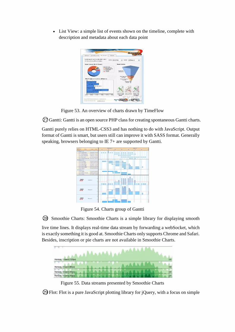
○27 Gantti: Gantti is an open source PHP class for creating spontaneous Gantti charts.
Gantti purely relies on HTML-CSS3 and has nothing to do with JavaScript. Output
format of Gantti is smart, but users still can improve it with SASS format. Generally
speaking, browsers belonging to IE 7+ are supported by Gantti.
Figure 54. Charts group of Gantti
○28 Smoothie Charts: Smoothie Charts is a simple library for displaying smooth
live time lines. It displays real-time data stream by forwarding a webSocket, which
is exactly something it is good at. Smoothie Charts only supports Chrome and Safari.
Besides, inscription or pie charts are not available in Smoothie Charts.
Figure 55. Data streams presented by Smoothie Charts
○29 Flot: Flot is a pure JavaScript plotting library for jQuery, with a focus on simple
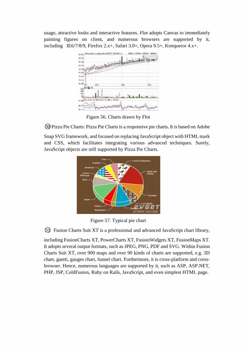
usage, attractive looks and interactive features. Flot adopts Canvas to immediately
painting figures on client, and numerous browsers are supported by it,
including IE6/7/8/9, Firefox 2.x+, Safari 3.0+, Opera 9.5+, Konqueror 4.x+.
Figure 56. Charts drawn by Flot
○30 Pizza Pie Charts: Pizza Pie Charts is a responsive pie charts. It is based on Adobe
Snap SVG framework, and focused on replacing JavaScript object with HTML mark
and CSS, which facilitates integrating various advanced techniques. Surely,
JavaScript objects are still supported by Pizza Pie Charts.
Figure 57. Typical pie chart
○31 Fusion Charts Suit XT is a professional and advanced JavaScript chart library,
including FusionCharts XT, PowerCharts XT, FusionWidgets XT, FusionMaps XT.
It adopts several output formats, such as JPEG, PNG, PDF and SVG. Within Fusion
Charts Suit XT, over 900 maps and over 90 kinds of charts are supported, e.g. 3D
chart, gantti, gauges chart, funnel chart. Furthermore, it is cross-platform and corss-
browser. Hence, numerous languages are supported by it, such as ASP, ASP.NET,
PHP, JSP, ColdFusion, Ruby on Rails, JavaScript, and even simplest HTML page.

Figure 58. Overview of charts drawn by Fusion Charts Suit XT
○32 Protovis: Protovis is a free and open source tool for chart visualization,
developed by Mike Bostock and Jeef Heer from Stanford University’s Visualization
Group. It is based on JavaScript and SVG technique.
Figure 59. Pie clutters drawn by Protovis
○33 Arbor.js: Arbor is a graph visualization library built with web workers and
jQuery. Rather than trying to be an all-encompassing framework, arbor provides an
efficient, force-directed layout algorithm plus abstractions for graph organization
and screen refresh handling.
It leaves the actual screen-drawing to users, which means users can use it with
canvas, SVG, or even positioned HTML elements; whatever display approach is
appropriate for your project and your performance needs. Besides, it proposes an
efficient and force-oriented disposing algorithm for organizing figure and refreshing
screen.
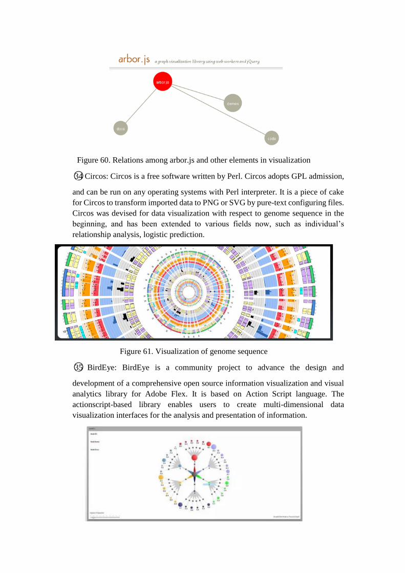
Figure 60. Relations among arbor.js and other elements in visualization
○34 Circos: Circos is a free software written by Perl. Circos adopts GPL admission,
and can be run on any operating systems with Perl interpreter. It is a piece of cake
for Circos to transform imported data to PNG or SVG by pure-text configuring files.
Circos was devised for data visualization with respect to genome sequence in the
beginning, and has been extended to various fields now, such as individual’s
relationship analysis, logistic prediction.
Figure 61. Visualization of genome sequence
○35 BirdEye: BirdEye is a community project to advance the design and
development of a comprehensive open source information visualization and visual
analytics library for Adobe Flex. It is based on Action Script language. The
actionscript-based library enables users to create multi-dimensional data
visualization interfaces for the analysis and presentation of information.

Figure 62. typical chart drawn by BirdEye
○36 Visualize Free: Visualize Free is a free visual analysis tool based on the
advanced commercial dashboard and visualization software developed by InetSoft,
an innovator in business intelligence software since 1996. Visualization is the
perfect technique for sifting through multi-dimensional data to spot trends and
aberrations or slice and dice data with simple point-and-click methods.
Figure 63. typical chart drawn by Visualize Free
3. Data Visualization Research
Brought by data boost generated in new information age, data visualization leaps into a
hotspot in scientific community and industry immediately. Recent years, numerous study
aiming to resolve issues in visualization field have occurred, in terms of texture drawing,
natural evolution simulating, device or software conceiving for augmented reality or virtual
reality, real-time and lightweight applications on website visualization, as well as
psychological experiment to human vision etc.
Data visualization techniques involve a number of disciplines, including statistics, data
mining, machine learning, neural networks, social network analysis, signal processing,
pattern recognition, optimization methods and visualization approaches [46].
Some typical techniques, mainly belonging to artificial intelligence algorithms, e.g.
simulated annealing, adaptive simulated annealing, genetic algorithm, evolutionary
programming as well as particle swarm optimization are useful to resolve global optimization
problem [46].
Social Network Analysis (SNA) is now commonly available as a consumer tool. Linear
mapping methods, such as principal component analysis (PCA) and factor analysis, are
popular linear dimension reduction techniques. Non-linear techniques include kernel PCA,
manifold learning techniques such as Isomap, locally linear embedding (LLE), Hessian LLE,
Laplacian eigenmaps, and LTSA. To visualize temporal aspects, Pencil icons are used for
linear time axes and helix icons are applied for cycle time [55].

In the rest part of this section, development is introduced as per three categories according
to their respective target subfields: Computer graphics, visualization realizing, and
augmented or virtual reality.
3.1. Research Development in Computer Graphics
Computer graphics are graphics created by computers and, more generally, the representation
and manipulation of pictorial data by a computer. Since data visualization takes figure and
icon as elements, the study concerning computer graphics is concerned by specialists and
engineers to construct effective presentation all the time. Several development outcomes are
introduced as below:
○1 In terms of data visualization, one area which has received more attention is path planning
in large point clouds and the ability to quickly compute proximity queries (collision, distance,
etc.). Path-planning through environments consisting of triangle meshes has been studied
intensively and there exists a significant amount research on the subject [56-58].
David Eriksson and Evan Shellshear propose a novel efficient algorithm for the rapid
computation of exact shortest distances between a point cloud and another object (e.g.
triangulated, point-based, etc.) in three dimensions [59]. It extends the work presented in
Eriksson and Shellshear (2014) where only approximate distances were computed on a
simplification of a massive point cloud. The approach works for massive point clouds even
with a small amount of RAM and is able to provide real time performance. Given a standard
PC with only 8GB of RAM, this resulted in real-time shortest distance computations of 15
frames per second for a point cloud having 1 billion points in three dimensions.
Figure 64. The original point cloud and triangulated object moved through the point cloud
○2 Symmetry is an important clue for geometry perception: it is not only in many man-made
models, but also widely exists in the nature [63]. However, existing symmetry detection
algorithms still have much room for improvement in terms of both simplicity and efficiency
in detecting symmetry planes, as well as the degree of freedom to find approximate symmetry

planes for a roughly symmetric 3D model. In addition, most of the existing symmetry
detection methods are geometry-based, thus their computational efficiency will be
tremendously influenced by the number of vertices of a model.
Bo Li et al. presents a simple and efficient view-based reflection symmetry detection method
based on the viewpoint entropy features of a set of sample views of a 3D model. Besides, to
avoid the high computational load resulting from a directly combinatorial matching among
the sample views, they develop a fast symmetry plane detection method by first generating a
candidate symmetry plane based on a matching pair of sample views and then verifying
whether the number of remaining matching pairs is within a minimum number.
Figure 65. an example of an ant model and its viewpoint entropy distribution
○3 The prevalence of weathered rock as visual cue in film indicates that directors find
weathered rock useful in telling a story. Sandstone rock, in particular, has been widely used
to create a feeling of being somewhere remote, exotic, or unique. Many algorithms have been
published for terrain generation in computer graphics but none have adequately addressed
the artistic creation of weathered rock. Most algorithms are difficult to control and do not
admit concave surfaces [76], [77].
Under this background, Michael D. Jones et al. manage to simplify the creation of weathered
rock for use in computer-generated animation or games [78]. They simulate spheroidal and
cavernous weathering using curvature estimation on a voxel grid, within which Simulations
of rockfall and colluvium deposition further improve realism.
Figure 66. The weathering simulation creates visually plausible models of weathered rock
columns
3.2. Research Development in Visualization Realizing
In data visualization field, the study on visualizing approaches and applications is continually
hot these years. Hitherto, there have been numerous sorts of visualizing methods being
proposed or updated, involving natural evolution simulating, real-time interaction,
application on website and so on. Here, some typical research progresses are shown.
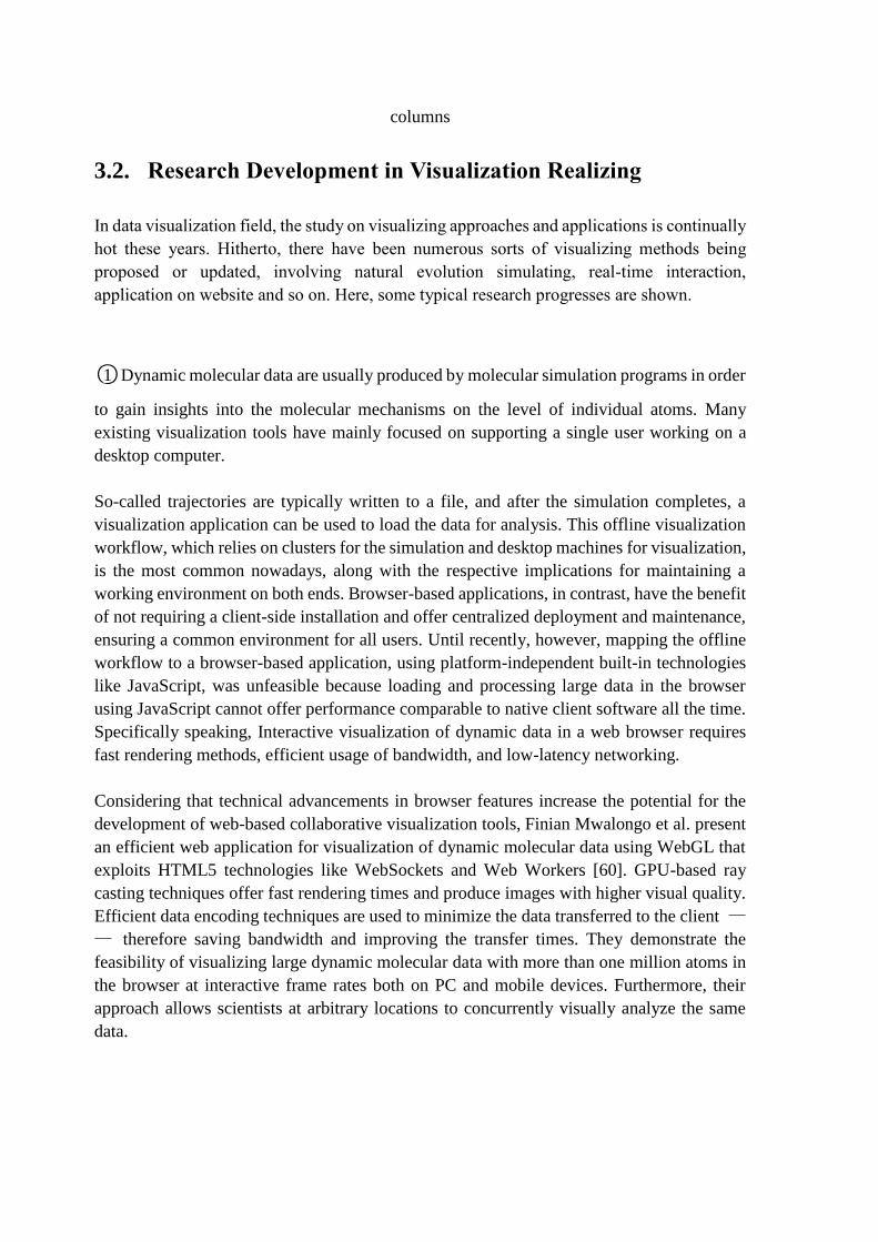
○1 Dynamic molecular data are usually produced by molecular simulation programs in order
to gain insights into the molecular mechanisms on the level of individual atoms. Many
existing visualization tools have mainly focused on supporting a single user working on a
desktop computer.
So-called trajectories are typically written to a file, and after the simulation completes, a
visualization application can be used to load the data for analysis. This offline visualization
workflow, which relies on clusters for the simulation and desktop machines for visualization,
is the most common nowadays, along with the respective implications for maintaining a
working environment on both ends. Browser-based applications, in contrast, have the benefit
of not requiring a client-side installation and offer centralized deployment and maintenance,
ensuring a common environment for all users. Until recently, however, mapping the offline
workflow to a browser-based application, using platform-independent built-in technologies
like JavaScript, was unfeasible because loading and processing large data in the browser
using JavaScript cannot offer performance comparable to native client software all the time.
Specifically speaking, Interactive visualization of dynamic data in a web browser requires
fast rendering methods, efficient usage of bandwidth, and low-latency networking.
Considering that technical advancements in browser features increase the potential for the
development of web-based collaborative visualization tools, Finian Mwalongo et al. present
an efficient web application for visualization of dynamic molecular data using WebGL that
exploits HTML5 technologies like WebSockets and Web Workers [60]. GPU-based ray
casting techniques offer fast rendering times and produce images with higher visual quality.
Efficient data encoding techniques are used to minimize the data transferred to the client —
— therefore saving bandwidth and improving the transfer times. They demonstrate the
feasibility of visualizing large dynamic molecular data with more than one million atoms in
the browser at interactive frame rates both on PC and mobile devices. Furthermore, their
approach allows scientists at arbitrary locations to concurrently visually analyze the same
data.
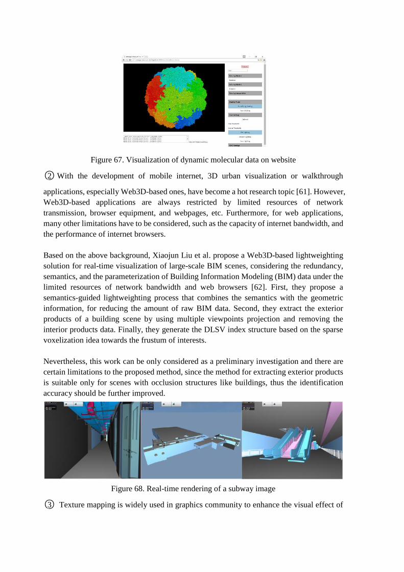
Figure 67. Visualization of dynamic molecular data on website
○2 With the development of mobile internet, 3D urban visualization or walkthrough
applications, especially Web3D-based ones, have become a hot research topic [61]. However,
Web3D-based applications are always restricted by limited resources of network
transmission, browser equipment, and webpages, etc. Furthermore, for web applications,
many other limitations have to be considered, such as the capacity of internet bandwidth, and
the performance of internet browsers.
Based on the above background, Xiaojun Liu et al. propose a Web3D-based lightweighting
solution for real-time visualization of large-scale BIM scenes, considering the redundancy,
semantics, and the parameterization of Building Information Modeling (BIM) data under the
limited resources of network bandwidth and web browsers [62]. First, they propose a
semantics-guided lightweighting process that combines the semantics with the geometric
information, for reducing the amount of raw BIM data. Second, they extract the exterior
products of a building scene by using multiple viewpoints projection and removing the
interior products data. Finally, they generate the DLSV index structure based on the sparse
voxelization idea towards the frustum of interests.
Nevertheless, this work can be only considered as a preliminary investigation and there are
certain limitations to the proposed method, since the method for extracting exterior products
is suitable only for scenes with occlusion structures like buildings, thus the identification
accuracy should be further improved.
Figure 68. Real-time rendering of a subway image
○3 Texture mapping is widely used in graphics community to enhance the visual effect of
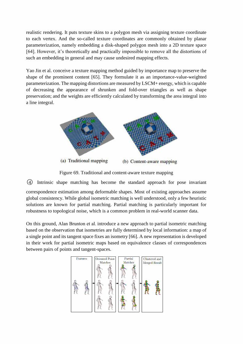
realistic rendering. It puts texture skins to a polygon mesh via assigning texture coordinate
to each vertex. And the so-called texture coordinates are commonly obtained by planar
parameterization, namely embedding a disk-shaped polygon mesh into a 2D texture space
[64]. However, it’s theoretically and practically impossible to remove all the distortions of
such an embedding in general and may cause undesired mapping effects.
Yao Jin et al. conceive a texture mapping method guided by importance map to preserve the
shape of the prominent content [65]. They formulate it as an importance-value-weighted
parameterization. The mapping distortions are measured by LSCM+ energy, which is capable
of decreasing the appearance of shrunken and fold-over triangles as well as shape
preservation; and the weights are efficiently calculated by transforming the area integral into
a line integral.
Figure 69. Traditional and content-aware texture mapping
○4 Intrinsic shape matching has become the standard approach for pose invariant
correspondence estimation among deformable shapes. Most of existing approaches assume
global consistency. While global isometric matching is well understood, only a few heuristic
solutions are known for partial matching. Partial matching is particularly important for
robustness to topological noise, which is a common problem in real-world scanner data.
On this ground, Alan Brunton et al. introduce a new approach to partial isometric matching
based on the observation that isometries are fully determined by local information: a map of
a single point and its tangent space fixes an isometry [66]. A new representation is developed
in their work for partial isometric maps based on equivalence classes of correspondences
between pairs of points and tangent-spaces.

Figure 70. Overview of pairwise matching pipeline
○5 During the past few years, dramatic progress has been made in the area of image-based
object modeling. A typical image-based 3D reconstruction pipeline begins with the
acquisition of a photo collection of an object. Then, the camera poses, i.e. the position,
orientation and intrinsic parameters of each camera, are estimated using structure-from-
motion (SfM) techniques on the photos. Afterwards, a 3D-geometric model is recovered
using multi-view stereo (MVS), silhouette and contours cues. Finally, the calibrated images
are utilized to generate a texture map for the recovered geometric model. A texture map is
an important component that makes the model more realistic and compensates for
deficiencies in the camera registration and reconstructed geometry. In the final step, the
images are usually back-projected onto the geometric model to generate a texture patch for
each surface patch. However, every surface patch is usually visible in several input images
and there is often no one-to-one correspondence between texels in the texture and pixels in
the images. The measured color and intensity for a surface patch observed in different photos
will not agree due to lighting, camera setting and surface reflectance variations across the
views. Visible seams and color discontinuities often arise between neighboring texture
patches. The problem can be alleviated by blending multiple image views per face and careful
selection of views. However, blending often causes image quality degradation due to
resampling and misalignment of geometric projections with inaccurate reconstructed
geometry and camera parameters.
To eliminate the aforementioned visual seam and color discontinuity, Rongjiang Pan and
Gabriel Taubin introduce a color adjustment technique to obtain a seamless texture map from
multiple registered images [67]. The method starts from texture coordinates optimization,
followed by global adjustment at each corner and local adjustment with Poisson editing. Their
color adjustment algorithm is not only independent of the particular choice of view selection
and texture representation, but also computationally efficient to obtain high-quality textures
for large real-world datasets. Experimental results demonstrate that their method is effective
enough to process real-world datasets with hundreds of input images and millions of triangles.
However, the method cannot fully avoid out-of-focus image areas in the process of viewing
selection.
Figure 71. The reconstructed model with texture from registered images
(a) before color adjustment and (b) after color adjustment.
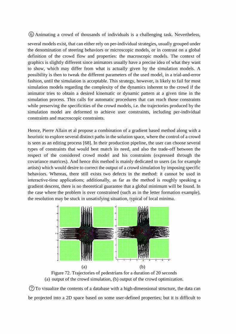
○6 Animating a crowd of thousands of individuals is a challenging task. Nevertheless,
several models exist, that can either rely on per-individual strategies, usually grouped under
the denomination of steering behaviors or microscopic models, or in contrast on a global
definition of the crowd flow and properties: the macroscopic models. The context of
graphics is slightly different since animators usually have a precise idea of what they want
to show, which may differ from what is actually given by the simulation models. A
possibility is then to tweak the different parameters of the used model, in a trial-and-error
fashion, until the simulation is acceptable. This strategy, however, is likely to fail for most
simulation models regarding the complexity of the dynamics inherent to the crowd if the
animator tries to obtain a desired kinematic or dynamic pattern at a given time in the
simulation process. This calls for automatic procedures that can reach those constraints
while preserving the specificities of the crowd models, i.e. the trajectories produced by the
simulation model are deformed to achieve user constraints, including per-individual
constraints and macroscopic constraints.
Hence, Pierre Allain et al propose a combination of a gradient based method along with a
heuristic to explore several distinct paths in the solution space, where the control of a crowd
is seen as an editing process [68]. In their production pipeline, the user can choose several
types of constraints that would best match its need, and also the trade-off between the
respect of the considered crowd model and his constraints (expressed through the
covariance matrices). And hence this method is mainly dedicated to users (as for example
artists) which would desire to correct the output of a crowd simulation by imposing specific
behaviors. Whereas, there still exists two defects in the method: it cannot be used in
interactive-time applications; additionally, as far as the method is roughly speaking a
gradient descent, there is no theoretical guarantee that a global minimum will be found. In
the case where the problem is over constrained (such as in the letter formation example),
the resolution may be stuck in unsatisfying situation, typical of local minima.
(a) (b)
Figure 72. Trajectories of pedestrians for a duration of 20 seconds
(a) output of the crowd simulation, (b) output of the crowd optimization.
○7 To visualize the contents of a database with a high-dimensional structure, the data can
be projected into a 2D space based on some user-defined properties; but it is difficult to
determine the relative weighting to be applied to several properties automatically. A naive
approach for visualizing the graphical data set is list-up each data in 2D space without
considering its properties. However, in a large database, a user would waste a great deal of
time exploring the database to search for the required data. Dimensionality reduction is one
way to reduce the dimensionality of a data-set by maximizing the variance of the data [1,2];
however the axes of the 2D space that best achieve this may have little or no intuitive
meaning.
Thus, Jong-Chul Yoon and In-Kwon Lee design a novel semi-supervised dimensionality
reduction method that can embed data of high dimension in a user-defined 2D coordinate
system that is meaningful in terms of the properties of the data [71]. Using data that define
the axes of 2D space provided in advance by the user, their system embeds the target data
in an axially aligned low-dimensional space with curved axes. Then space warping is
applied to convert the curved axes to orthogonal axes and then calculate meaningful
coordinates for the data. Whereas the primary disadvantage of this method is defect in
robustness.
Figure 73. Two real Cups with augmented with a virtual COKE with different focal
distance (a)40cm (b)100cm
○8 Throughout the years, the prevailing objective within the volume visualization field has
been to generate images that closely resemble reality. However, a new volume-rendering
branch investigates ways to create illustrative images from three-dimensional scalar data.
Techniques from traditional art and illustration are incorporated in the volume-rendering
process. The goal is to gain clarity compared to photo-realism by emphasizing important
features, improving data exploration. Less relevant details are omitted and important
aspects are highlighted, resulting in more comprehensible images [79], [80]. Illustrative
rendering applications typically include a substantial number of user-configurable
parameters. Fast and reliable interaction with these parameters is of great importance in
order to produce the desired illustrative styles.
Thus, Roy van Pelt et al. choose the flexible particle-based approach of the VolumeFlies
framework, aiming to achieve interactive parametrization and rendering in illustrative
volume visualization [82]. Their main contribution includes (1) a GPGPU paradigm,
serving as a model for algorithms varying from data parallel sorting and searching to image
and volume processing, to exploit computational parallelism; (2) A GPU-based generic
particle system, employing this paradigm. This system incorporates energy minimization
for particle redistribution based on the work by Meyer et al. [81]; (3) An interactive
illustrative volume-rendering framework, initiating particle systems to create stylized
depictions.
Figure 74. Various illustrative visualization styles
○9 Generating life-like and responsive human motion has been an important topic in
computer animation. Many approaches have been proposed to create the motion of animated
characters. Among these approaches, data-driven methods with physically motivated
constraints [85], [86] and controller-based physics simulation [87], [88] are two common
techniques used to generate physically plausible motion.
Conventional data-driven approaches usually require a large collection of motion data
captured from human subjects performing a variety of movements [89], [90]. In order to
ensure the physical plausibility in the generated motions, several approaches [85], [86]
adopted physics laws such as minimal energy consumption or conservation of momentum as
optimization criteria to modify captured motions. Data-driven approaches with physically
motivated constraints have demonstrated their success in transferring stylistic human motion
to animated characters. While Controller-based approaches generate motions based on
forward dynamics simulation. Motions are synthesized using feedback control principles in
which the controller exerts torque at each joint of the animated character to perform a desired
motion (usually motion capture data) as well as continuously adjust the character’s motion
to react to variations in the physical world. Most of controllers require careful tuning of
parameters such as PD gains, balance feedback gains, machine learning coefficients, and
optimization parameters. In controller-based character animation, Proportional-Derivative
(PD) controllers and feedback balance controllers are commonly used for their simplicity.
According to the computational performance, existing approaches can be categorized as
offline and interactive. All the data-driven approaches [85], [86], and earlier controller-based
approach [89] are performed offline. Recent controller-based approaches [90] are interactive
as the control parameters for various character sizes/styles can be manually set or
automatically optimized. Once the parameters of a controller are specified, the animated
character can respond to environmental disturbances in real time. However, considerable
efforts may be required in designing task-specific or character-specific controllers.
Aiming to resolving biped walking problem, Yao-Yang Tsai et al. present a physics-based
controller for animating three-dimensional biped characters that can react to dynamic
environments in real time [91]. Their framework employs a balance motion filter that adjusts
the desired motion trajectory in an online manner. They conceive biped balancing strategy
based on an inverted pendulum model (IPM), which is simplified from a full-body character
model. The IPM simplification allows the balance motion filter to produce physically
plausible and balanced motion trajectories for controllers to track. The dynamics of the IPM
is so simple that the balance strategy can be determined in real time either by solving a closed
form (on a flat ground) or through numerical root finding of a simple algebraic equation (on
a slope). And a velocity-driven tracking method is adopted to track the target trajectory
generated by the balance motion filter. The most memorable work of their work is: Although
the IPM has been seen repeatedly in biomechanics and robotics, it has received much less
attention in computer animation.
Figure 75. Snapshots of a character’s balance-maintaining motion
○10 Overview is one of the most basic user tasks for information visualization and it is a vital
building block for the more complex process of visual exploration—using visualization to
form, test, and validate hypotheses about complex or large datasets. However, overview is
becoming increasingly difficult to effectively achieve with the ever-increasing size of real-
world datasets. For most basic visualization techniques that endeavor to show each item in a
dataset—such as scatterplots, parallel coordinates, and treemaps—a massive number of items
will overload the visualization, resulting in clutter that both causes technical scalability
problems as well as hinders the user’s understanding of its structure and contents.
The attempt to draw each item in the dataset, however, is not practical for massive datasets.
As a result, Niklas Elmqvist and Jean-Daniel Fekete provide a model for hierarchical
aggregation in information visualization for the purpose of improving overview and
scalability of large-scale visualization, with extensions to a number of visual representations
such as scatterplots, parallel coordinates, and node-link diagrams [92]. Moreover, from their
work, it becomes realizable to formulate a set of common design guidelines for building new
aggregated visualization techniques.
(a) (b)
Figure 76. Opacity band aggregation for (a) parallel coordinate visualization and (b)
Starplot visualization
○11 Health reports, terrorism alerts, criminal activities, and numerous other incidents need
to be analyzed and evaluated, often within the context of related data sets. It is no longer
efficient for a single analyst to pull files, take notes, form hypotheses, and request data from
different sources. Instead, tools need to be developed that bring varying data sources into a
unified framework assisting analysis and exploration. These needs are being addressed by
the emergence of a new scientific field, visual analytics. Visual analytics is the science of
analytical reasoning assisted by interactive visual interfaces [93]. Major challenges in this
field include the representation and linkage of largescale multivariate data sets.
In order to facilitate enhanced data exploration and improve signal detection, Ross
Maciejewski et al. develop a linked geo-spatiotemporal visual analytics tool designed for
advanced data exploration [94]. Hotspots found in one display method can be selected and
immediately analyzed in the corresponding linked view. Furthermore, our work focuses on
the early detection and analysis of hotspots facilitated through the use of control charts for
alert detection. Alerts generated in the temporal realm can be quickly analyzed in the geo-
spatiotemporal interface, helping users find patterns simultaneously in the spatial and
temporal domains. Users may select hotspots from the generated heatmaps and analyze
historical time series data in the area to look for unusual trends or potential areas of interest.
They have also extended their system to include the spatiotemporal history, bivariate and
multivariate exploration, thresholding, and color mapping tools. Contour histories provide
users with geo-spatiotemporal views of current and past data trends, allowing them to track
hotspot movement across time, or look for correlations between multiple variables.
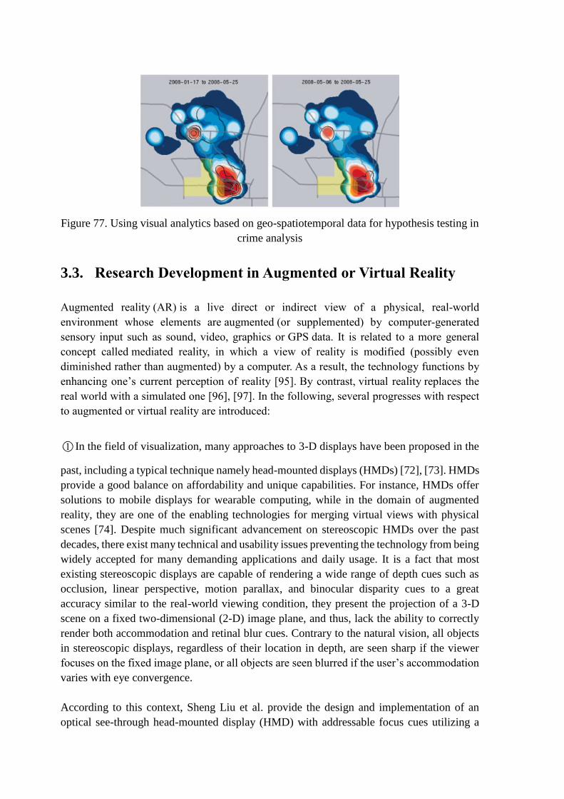
Figure 77. Using visual analytics based on geo-spatiotemporal data for hypothesis testing in
crime analysis
3.3. Research Development in Augmented or Virtual Reality
Augmented reality (AR) is a live direct or indirect view of a physical, real-world
environment whose elements are augmented (or supplemented) by computer-generated
sensory input such as sound, video, graphics or GPS data. It is related to a more general
concept called mediated reality, in which a view of reality is modified (possibly even
diminished rather than augmented) by a computer. As a result, the technology functions by
enhancing one’s current perception of reality [95]. By contrast, virtual reality replaces the
real world with a simulated one [96], [97]. In the following, several progresses with respect
to augmented or virtual reality are introduced:
○1 In the field of visualization, many approaches to 3-D displays have been proposed in the
past, including a typical technique namely head-mounted displays (HMDs) [72], [73]. HMDs
provide a good balance on affordability and unique capabilities. For instance, HMDs offer
solutions to mobile displays for wearable computing, while in the domain of augmented
reality, they are one of the enabling technologies for merging virtual views with physical
scenes [74]. Despite much significant advancement on stereoscopic HMDs over the past
decades, there exist many technical and usability issues preventing the technology from being
widely accepted for many demanding applications and daily usage. It is a fact that most
existing stereoscopic displays are capable of rendering a wide range of depth cues such as
occlusion, linear perspective, motion parallax, and binocular disparity cues to a great
accuracy similar to the real-world viewing condition, they present the projection of a 3-D
scene on a fixed two-dimensional (2-D) image plane, and thus, lack the ability to correctly
render both accommodation and retinal blur cues. Contrary to the natural vision, all objects
in stereoscopic displays, regardless of their location in depth, are seen sharp if the viewer
focuses on the fixed image plane, or all objects are seen blurred if the user’s accommodation
varies with eye convergence.
According to this context, Sheng Liu et al. provide the design and implementation of an
optical see-through head-mounted display (HMD) with addressable focus cues utilizing a

liquid lens, which contains two operation modes [75]: a varifocal plane mode in which the
accommodation cue is addressable, and a time-multiplexed multi-focal plane mode in which
both the accommodation and retinal blur cues can be rendered. By this method, the perceived
depths and accommodative responses of the user match with the rendered depths of the
virtual display with addressable accommodation cues, approximating the real-world 3-D
viewing condition.
Figure 78. Presenting outcome of raw data through refined dimensional reduction
○2 In the real world, we navigate with ease by walking, running, driving, etc., but in
immersive virtual environments (IVEs), realistic simulation of these locomotion techniques
is difficult to achieve. In immersive virtual environments (IVEs), users can control their
virtual viewpoint by moving their tracked head and walking through the real world. Usually,
movements in the real world are mapped one-to-one to virtual camera motions. With
redirection techniques, the virtual camera is manipulated by applying gains to user motion
so that the virtual world moves differently than the real world. Thus, users can walk through
large-scale IVEs while physically remaining in a reasonably small workspace. While moving
in the real world, sensory information such as vestibular, proprioceptive, and efferent copy
signals as well as visual information create consistent multisensory cues that indicate one’s
own motion, i.e., acceleration, speed, and direction of travel. In this context, walking is the
most basic and intuitive way of moving within the real world. Keeping such an active and
dynamic ability to navigate through large-scale immersive virtual environments is of great
interest for many 3D applications demanding locomotion, such as in urban planning, tourism,
or 3D entertainment.
To explore the exact discrepancy exists between virtual and physical movements, Frank
Steinicke et al. conduct psychophysical experiments with a two-alternative forced-choice
task, where they quantified how much humans can unknowingly be redirected on physical
paths that are different from the visually perceived paths [83]. They tested 12 subjects in
three different experiments: (1) discrimination between virtual and physical rotations, (2)
discrimination between virtual and physical straightforward movements, and (3)
discrimination of path curvature. Results show that users can be turned physically about 49
percent more or 20 percent less than the perceived virtual rotation, distances can be
downscaled by 14 percent and upscaled by 26 percent, and users can be redirected on a
circular arc with a radius greater than 22 m while they believe that they are walking straight.

Figure 79. Redirected walking scenario. User walks in the real environment on a different
path with a different length in comparison to the perceptual path in the virtual world.
○3 Many domains in which augmented reality(AR) could be applied pose two sets of
competing constraints. The first set of constraints limits extraneous head, eye, and hand
movements beyond the immediate vicinity of a user’s current task. For example, a mechanic
servicing an engine may find it impractical (or impossible) to reposition their hands to
manipulate any device not currently within reach or sight. Likewise, head and eye
movements that cause the mechanic to avert their gaze from the repair area can break context
and increase task completion time. The second set of constraints relates to various policies,
material properties, and physical space limitations that restrict modifications to the
application’s environment. For example, safety regulations and a confined repair space might
preclude the mechanic from bringing in, or installing, certain interface devices (e.g., portable
devices or keypads) that might, otherwise, compensate for limited head, eye, and hand
movements.
To support these types of AR scenarios, Steven Henderson and Steven Feiner develop a class
of interaction techniques namely Opportunistic Controls (OC) [84]. OC is a tangible user
interface that leverages naturally occurring, tactilely interesting, and otherwise unused
affordances—properties of an object that determine how it can be used. These affordances
serve as tactile landmarks that provide inherent passive haptic feedback for hand gestures
and are augmented with overlaid 3D widgets to provide visual. This approach creates a
tangible user interface with three distinguishing properties:
1) leveraging otherwise unused and unassociated objects that are already in the task
domain as primary user interface components;
2) deliberately exploiting certain features of these objects for passive haptics and hand
gesture recognition;
3) minimizing the need for external user interface artifacts.
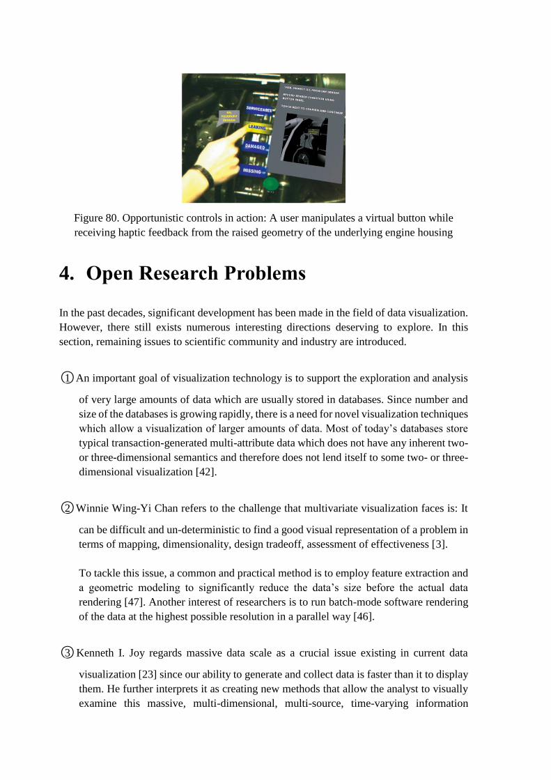
Figure 80. Opportunistic controls in action: A user manipulates a virtual button while
receiving haptic feedback from the raised geometry of the underlying engine housing
4. Open Research Problems
In the past decades, significant development has been made in the field of data visualization.
However, there still exists numerous interesting directions deserving to explore. In this
section, remaining issues to scientific community and industry are introduced.
○1 An important goal of visualization technology is to support the exploration and analysis
of very large amounts of data which are usually stored in databases. Since number and
size of the databases is growing rapidly, there is a need for novel visualization techniques
which allow a visualization of larger amounts of data. Most of today’s databases store
typical transaction-generated multi-attribute data which does not have any inherent two-
or three-dimensional semantics and therefore does not lend itself to some two- or three-
dimensional visualization [42].
○2 Winnie Wing-Yi Chan refers to the challenge that multivariate visualization faces is: It
can be difficult and un-deterministic to find a good visual representation of a problem in
terms of mapping, dimensionality, design tradeoff, assessment of effectiveness [3].
To tackle this issue, a common and practical method is to employ feature extraction and
a geometric modeling to significantly reduce the data’s size before the actual data
rendering [47]. Another interest of researchers is to run batch-mode software rendering
of the data at the highest possible resolution in a parallel way [46].
○3 Kenneth I. Joy regards massive data scale as a crucial issue existing in current data
visualization [23] since our ability to generate and collect data is faster than it to display
them. He further interprets it as creating new methods that allow the analyst to visually
examine this massive, multi-dimensional, multi-source, time-varying information

stream and make decisions in a time critical matter.
Besides, from a cognitive perspective, it does not even make sense to display a very large
amount of data. Consequently, a first step in the visualization process is often to reduce
the size of the graph to display. They also point out that for layout algorithms
predictability and time complexity are two critical issues.
○4 And Ivan Herman et al. propose another possible issue [24]: When data size is titanic, to
display an entire large graph may give an indication of the overall structure or a location
within it but makes it difficult to comprehend.
But NicheWorks[25] claims to handle data sets with thousands of elements. NicheWorks
is a tool that allows the user to interact with the weighted graph, making it possible to
position and focus rapidly on different subsets of the whole by panning, zooming, and
rotating operations, thus building up knowledge about the entire graph.
Figure 81. An instance of NicheWorks
○5 The physical limitations of the display devices and our visual system prevent the direct
display and instantaneous recognition of structures with higher dimensions than two or
three [26]. A variety of approaches have been introduced to visually convey high-
dimensional structural information by utilizing low-dimensional projections or
abstractions: from dimension reduction to visual encoding, and from quantitative
analysis to interactive exploration.
○6 J.Jabanjalin Hilda and C.Srimathi deem four aspects as the goal of geographical visual
exploration [46]:
a. Patterns discovery through similarity representations
b. Correlations and relationships exploration of the hypothesis generation
c. Exploration of the distribution of the dataset on the map
d. And the detection of the irregularities in the data.
Besides, real-time optimization and lightweight web service is also required in many Big
Data visualizing application, such as WSNs and ITSs [46].
5. Reference
[1] “What data visualization class libraries does C/C++ own?” from the ZhiHu, available at:
https://www.zhihu.com/question/21303739, 2013
[2] Khera R A, Game P S. A Survey of Data Visualization and Transformation Tools[J].
International Journal of Science and Research, 2015, 4(4): 2315-2317.
[3] Chan W W Y. A Survey on Multivariate Data Visualization[J]. Encyclopedia of
Environmetrics, 2006.
[4] G. G. Grinstein and M. O. Ward, “Introduction to Data Visualization”, Information
Visualization in Data Mining and Knowledge Discovery, Morgan Kaufmann Publishers,
pp.21-45, 2001
[5] J. J. van Wijk, “Views on Visualization”, IEEE Transactions on Visualization and
Computer Graphics, vol.12, no.4, pp.421-433, 2006.
[6] “Visualizing Higher Dimensional Data” from the MathWorks, available at:
http://www.mathworks.com/products/demos/statistics/mvplotdemo.html, 2006
[7] M. C. F. de Oliveira and H. Levkowitz, “From Visual Data Exploration to Visual Data
Mining: A Survey”, IEEE Transactions on Visualization and Computer Graphics, vol.9, no.3,
pp.378-394, 2003
[8] D. A. Keim and H.-P. Kriegel, “Visualization Techniques for Mining Large Databases: A
Comparison”, IEEE Transactions on Knowledge and Data Engineering, vol.8, no.6, pp.923-
938, 1996
[9] D. A. Keim, H.-P. Driegel and M. Ankerst, “Recursive Pattern: A Technique for
Visualizing Very Large Amounts of Data”, Proceedings of the 6th IEEE Conference on
Visualization ’95, pp.279-286, 1995
[10] D. A. Keim, H.-P. Driegel and M. Ankerst, “Recursive Pattern: A Technique for
Visualizing Very Large Amounts of Data”, Proceedings of the 6th IEEE Conference on
Visualization ’95, pp.279-286, 1995
[11] M. Ankerst, D. A. Keim, and H.-P. Kriegel, “Circle Segments: A Technique for Visually
Exploring Large Multidimensional Data Sets”, Proceedings of the IEEE Conference on
Visualization ’96, Hot Topic Session, 1996
[12] D. Keim, M. Hao, U. Dayal, M. Hsu and J. Ladisch, “Pixel Bar Charts: A New Technique
for Visualizing Large Multi-Attribute Data Sets without Aggregation”, Proceedings of the
IEEE Symposium on Information Visualization 2001 (INFOVIS’01), pp.113-120, 2001.
[13] P. C. Wong and R. D. Bergeron, “30 Years of Multidimensional Multivariate
Visualization”, Scientific Visualization Overviews, Methodologies, and Techniques, IEEE
Computer Society Press, pp.3-33, 1997.
[14] S. Feiner and C. Beshers, “Visualizing n-Dimensional Virtual World with n-Vision”,
Computer Graphics, vol.24, no.2, pp.37-38, 1990.
[15] D. A. Keim, “Visual Techniques for Exploring Databases”, Proceedings of the 3rd
International Conference on Knowledge Discovery and Data Mining Tutorial Program,
available at: http://www.informatik.uni-halle.de/~keim/PS/KDD97.pdf, 1997
[16] H. Levkowitz, “Color Icons: Merging Color and Texture Perception for Integrated
Visualization of Multiple Parameters”, Proceedings of the 2nd IEEE Conference on
Visualization ’91, pp.164-170, 1991.
[17] A. A. Efros and W. T. Freeman, “Image Quilting for Texture Synthesis and Transfer”,
Proceedings of the 28th Annual Conference on Computer Graphics and Interactive
Techniques ACM SIGGRAPH 2001, pp.35-42, 2001
[18] L.-Y. Wei and M. Levoy, “Fast Texture Synthesis using Tree-Structured Vector
Quantization”, Proceedings of the 27th Annual Conference on Computer Graphics and
Interactive Techniques ACM SIGGRAPH 2000, pp.479-488, 2000.
[19] Bendoly, Elliot. "Data Visualization Survey and Report." (2014).
[20] P. E. Hoffman, “Table Visualizations: A Formal Model and Its Applications”, Doctoral
Dissertation, Computer Science Department, University of Massachusetts at Lowell, 1999.
[21] W. Basalaj, “Multivariate Visualization Techniques”, available at:
http://www.pavis.org/essay/multivariate_visualization_techniques.html, 2001.
[22] P. C. Wong and R. D. Bergeron, “30 Years of Multidimensional Multivariate
Visualization”, Scientific Visualization Overviews, Methodologies, and Techniques, IEEE
Computer Society Press, pp.3-33, 1997.
[23] Joy, Kenneth I. Massive Data Visualization: A Survey. Mathematical Foundations of
Scientific Visualization, Computer Graphics, and Massive Data Exploration. Springer Berlin
Heidelberg, 2009:285-302.
[24] Herman I, Melançon G, Marshall M S. Graph Visualization and Navigation in
Information Visualization: A Survey[J]. IEEE Transactions on Visualization & Computer
Graphics, 2000, 6(1):24-43.
[25] Wills G J. NicheWorks: Interactive Visualization of Very Large Graphs[J]. Journal of
Computational & Graphical Statistics, 1997, 8(2):403--414.
[26] Liu S, Dan M, Wang B, et al. Visualizing High-Dimensional Data: Advances in the Past
Decade[C]. Eurographics Conference on Visualization. 2015.
[27] M. C. F. de Oliveira and H. Levkowitz, “From Visual Data Exploration to Visual Data
Mining: A Survey”, IEEE Transactions on Visualization and Computer Graphics, vol.9, no.3,
pp.378-394, 2003.
[28] R. A. Becker and W. S. Cleveland, “Brushing Scatterplots”, Technometrics, vol.29, no.2,
pp.127-142, 1987.
[29] P. E. Hoffman and G. G. Grinstein, “A Survey of Visualizations for High-Dimensional
Data Mining”, Information Visualization in Data Mining and Knowledge Discovery, Morgan
Kaufmann Publishers, pp.47-82, 2001.
[30] G. W. Furnas and A. Buja, “Prosection Views: Dimensional Inference through Sections
and Projections”, Journal of Computational and Graphic Statistics, vol.3, no.4, pp.323-353,
1994.
[31] L. Tweedie and R. Spence, “The Prosection Matrix: A Tool to Support the Interactive
Exploration of Statistical Models and Data”, Computational Statistics, vol.13, pp.65-76,
1998.
[32] P. C. Wong and R. D. Bergeron, “30 Years of Multidimensional Multivariate
Visualization”, Scientific Visualization Overviews, Methodologies, and Techniques, IEEE
Computer Society Press, pp.3-33, 1997.
[33] P. C. Wong, A. H. Crabb and R. D. Bergeron, “Dual Multiresolution HyperSlice for
Multivariate Data Visualization”, Proceedings of IEEE Symposium on Information
Visualization ’96, pp.74-75, 1996
[34] W. S. Cleveland, M. E. McGill and R. McGill, “The Shape Parameter of a Two-Variable
Graph”, Journal of American Statistical Association, vol.38, pp.289-300, 1993
[35] A. Inselberg, “Multidimensional Detective”, Proceedings of the IEEE Symposium on
Information Visualization, pp.100-107, 1997.
[36] E. Kandogan, “Star Coordinates: A Multidimensional Visualization Technique with
Uniform Treatment of Dimensions”, Proceedings of the IEEE Symposium on Information
Visualization, Late Breaking Hot Topics, 2000.
[37] R. Fao and S. K. Card, “The Table Lens: Merging Graphical and Symbolic
Representations in an Interactive Focus + Context Visualization for Tabular Information”,
Proceedings of the SIGCHI Conference on Human Factors in Computer Systems:
Celebrating Interdependence, pp.318-322, 1994.
[38] G. Waloszek, “Table Lens”, available at: http://www.sapdesignguild.org/community/
book_people/visualization/controls/TableLens.htm, 2004.
[39] D. A. Keim and H.-P. Kriegel, “Visualization Techniques for Mining Large Databases:
A Comparison”, IEEE Transactions on Knowledge and Data Engineering, vol.8, no.6,
pp.923-938, 1996.
[40] G. Peano, “Sur une courbe qui remplit toute une aire plaine”, Mathematcis Annalen,
vol.36, pp.157-160, 1890.
[41] G. M. Morton, “A Computer Oriented Geodetic Data Base and a New Technique in File
Sequencing”, Technical Report, IBM Ltd, 1966.
[42] D A Keim, "Enhancing the Visual Clustering of Querydependent Database Visualization
Techniques Using ScreenFilling Curves," Proc Workshop Database Issues for Data
Vzsuahzation, Atlanta, Ga ,1995.
[43] T. Schreck, D. Keim and F. Mansmann, “Regular TreeMap Layouts for Visual Analysis
of Hierarchical Data”, Spring Conference on Computer Graphics SCCG, 2006.
[44] R. Spence, Information Visualization, Addison Wesley, ACM Press, 2000.
[45] J. M. Chambers, W. S. Cleveland, B. Kleiner and P. A. Tukey, Graphical Methods for
Data Analysis, Belmont, Wadsworth Press, 1983.
[46] Hilda J J, Srimathi C. A Survey on Data Visualization Applications Challenges
Techniques and Technologies[J]. Asian Journal of Computer Science and Technology, 2015,
4(1): 29-33.
[47] Chen, CL Philip, and Chun-Yang Zhang. "Data-intensive applications, challenges,
techniques and technologies: A survey on Big Data." Information Sciences 275 (2014): 314-
347.
[48] R. Urtasun, P. Glardon, R. Boulic, D. Thalmann, P. Fua, Style-based motion synthesis,
Comp. Graph. Forum 23 (4) (2004) 1–14
[49] Y. Cao, P. Faloutsos, F. Pighin, Unsupervised learning for speech motion editing, in:
SCA ’03: Proceedings of the 2003 ACM SIGGRAPH/Eurographics Symposium on
Computer Animation, 2003, pp. 225–231.

[50] W. Matusik, M. Zwicker, F. Durand, Texture design using a simplicial complex of
morphable textures, ACM Trans. Graph. 24 (3) (2005), 787–794.
[51] T. Hastie, A. Buja, R. Tibshirani, Penalized discriminant analysis, Ann. Stat. 23 (1995)
73–102.
[52] H. Hotelling, Analysis of a complex of statistical variables into principal components, J.
Educat. Psychol. 24 (1933) 417–441
[53] J. Giesen, U. Wagner, Shape dimension and intrinsic metric from samples of manifolds
with high co-dimension, in: SCG ’03: Proceedings of the Nineteenth Annual Symposium on
Computational Geometry, 2003, pp. 329–337.
[54] Yoon J C, Lee I K. “Visualization of graphical data in a user-specified 2D space using a
weighted Isomap method”. Graphical Models, 2014, 76(2):103-114.
[55] Tominski, Christian, Petra Schulze-Wollgast, and Heidrun Schumann. "Visual methods
for analyzing human health data." Encyclopedia of healthcare information systems 1 (2008):
1357-1364
[56] J.S. Carlson, D. Spensieri, R. Söderberg, R. Bohlin, L. Lindkvist, Non-nominal path
planning for robust robotic assembly, J. Manuf. Syst. 32 (3) (2013), 429–435.
[57] T. Hermansson, R. Bohlin, J.S. Carlson, R. Söderberg, Automatic path planning for
wiring harness installations (wt), in: Proceedings of the 4th CIRP Conference on Assembly
Technology and Systems-CATS 2012, University of Michigan, Ann Arbor, USA, 2012.
[58] J.-C. Latombe, Robot Motion Planning, Edition en anglais, Springer, 1990
[59] Eriksson D, Shellshear E. Fast exact shortest distance queries for massive point clouds[J].
Graphical Models, 2016, 84(C):28-37.
[60] Mwalongo F, Krone M, Becher M, et al. GPU-based remote visualization of dynamic
molecular data on the web[J]. Graphical Models, 2016.
[61] N. Valkanova, S. Jorda, A.V. Moere, Public visualization displays of citizen data: design,
impact and implications, International Journal of Human-Computer Studies 81 (2015) 4–16,
doi:10.1016/j.ijhcs.2015.02.005.
[62] Liu X, Xie N, Tang K, et al. Lightweighting for Web3D visualization of large-scale BIM
scenes in real-time[J]. Graphical Models, 2016.
[63] Y. Liu, H. Hel-Or, C. S. Kaplan, L. J. V. Gool, Computational symmetry 624 in computer
vision and computer graphics, Foundations and Trends in 625 Computer Graphics and Vision
5 (2010) 1–195.

[64] K. Hormann, B. Lévy, A. Sheffer, et al., Mesh Parameter.: Theory Practice (2007).
[65] Jin Y, Shi Z, Sun J, et al. Content-aware texture mapping[J]. Graphical Models, 2013,
76(3):152–161.
[66] Brunton A, Wand M, Wuhrer S, et al. A low-dimensional representation for robust partial
isometric correspondences computation[J]. Graphical Models, 2013, 76(2):70-85.
[67] Pan R, Taubin G. Color adjustment in image-based texture maps[J]. Graphical Models,
2015, 79(C):39-48.
[68] Allain P, Courty N, Corpetti T. Optimal crowd editing[J]. Graphical Models, 2014,
76(1):1-16.
[69] J. Giesen, U. Wagner, Shape dimension and intrinsic metric from samples of manifolds
with high co-dimension, in: SCG ’03: Proceedings of the Nineteenth Annual Symposium on
Computational Geometry, 2003, pp. 329–337.
[70] W. Matusik, M. Zwicker, F. Durand, Texture design using a simplicial complex of
morphable textures, ACM Trans. Graph. 24 (3) (2005) 787–794.
[71] Yoon J C, Lee I K. Visualization of graphical data in a user-specified 2D space using a
weighted Isomap method[J]. Graphical Models, 2014, 76(2):103-114.
[72] B.T. Schowengerdt and E.J. Seibel, “True 3-D Scanned Voxel Displays Using Single or
Multiple Light Sources,” J. Soc. Information Display, vol. 14, no. 2, pp. 135-143, 2006.
[73] H. Hua and C.Y. Gao, “Design of a Bright Polarized HeadMounted Projection Display,”
Applied Optics, vol. 46, no. 14, pp. 2600-2610, 2007.
[74] R. Azuma, Y. Baillot, R. Behringer, S. Feiner, S. Julier, and B. MacIntyre, “Recent
Advances in Augmented Reality,” IEEE Computer Graphics and Applications, vol. 21, no. 6,
pp. 34-47, Nov./Dec. 2001.
[75] Liu S, Hua H, Cheng D. A novel prototype for an optical see-through head-mounted
display with addressable focus cues.[J]. IEEE Transactions on Visualization & Computer
Graphics, 2009, 16(3):381-393.
[76] M. Gamito and F.K. Musgrave, “Procedural Landscapes with Overhangs,” Proc. 10th
Portuguese Computer Graphics Meeting, pp. 33-42, 2001.
[77] T. Ito, T. Fujimoto, K. Moraoka, and N. Chiba, “Modeling Rocky Scenery Taking into
Account Joints,” Proc. Computer Graphics Int’l Conf., pp. 244-247, 2003.
[78] Jones M D, Farley M K, Butler J, et al. Directable Weathering of Concave Rock Using
Curvature Estimation[J]. IEEE Transactions on Visualization & Computer Graphics, 2010,
16(1):81-94.
[79] A. Baer, C. Tietjen, R. Bade, and B. Preim, “Hardware-Accelerated Stippling of Surfaces
Derived from Medical Volume Data,” Proc. Eurographics/IEEE-VGTC Symp. Visualization
(EuroVis), pp. 235-242, 2007.
[80] S. Bruckner and M.E. Gro ¨ller, “Style Transfer Functions for Illustrative Volume
Rendering,” Computer Graphics Forum, vol. 26, no. 3, pp. 715-724,
http://www.cg.tuwien.ac.at/research/ publications/2007/bruckner-2007-STF/, 2007
[81] M. Meyer, P. Georgel, and R. Whitaker, “Robust Particle Systems for Curvature
Dependent Sampling of Implicit Surfaces,” Proc. Int’l Conf. Shape Modeling and
Applications, pp. 124-133, 2005
[82] Pelt R V, Vilanova A, Wetering H V D. Illustrative Volume Visualization Using GPU-
Based Particle Systems[J]. IEEE Transactions on Visualization & Computer Graphics, 2010,
16(4):571-582.
[83] Steinicke F, Bruder G, Jerald J, et al. Estimation of detection thresholds for redirected
walking techniques.[J]. IEEE Transactions on Visualization & Computer Graphics, 2010,
16(1):17-27.
[84] Henderson S, Feiner S. Opportunistic Tangible User Interfaces for Augmented Reality[J].
IEEE Transactions on Visualization & Computer Graphics, 2010, 16(1):4-16.
[85] A.C. Fang and N.S. Pollard, “Efficient Synthesis of Physically Valid Human Motion,”
ACM Trans. Graphics, vol. 26, no. 3, pp. 417-426, 2003.
[86] A. Safonova, J.K. Hodgins, and N.S. Pollard, “Synthesizing Physically Realistic Human
Motion in Low-Dimensional, Behavior-Specific Spaces,” ACM Trans. Graphics, vol. 23, no.
3, pp. 514-521, 2004
[87] J.K. Hodgins, W.L. Wooten, D.C. Brogan, and J.F. O’Brien, “Animating Human
Athletics,” Proc. ACM SIGGRAPH ’95, pp. 71-78, 1995.
[88] K. Yin, K. Loken, and M. van de Panne, “Simbicon: Simple Biped Locomotion Control,”
Proc. ACM SIGGRAPH ’07, p. 105, 2007.
[89] J. Lee, J. Chai, P.S.A. Reitsma, J.K. Hodgins, and N.S. Pollard, “Interactive Control of
Avatars Animated with Human Motion Data,” ACM Trans. Graphics, vol. 21, no. 3, pp. 491-
500, 2002.
[90] L. Kovar, M. Gleicher, and F. Pighin, “Motion Graphs,” ACM Trans. Graphics, vol. 21,
no. 3, pp. 473-482, 2002.
[91] Tsai Y Y, Lin W C, Cheng K B, et al. Real-time physics-based 3D biped character
animation using an inverted pendulum model[J]. IEEE Transactions on Visualization &
Computer Graphics, 2009, 16(2):325.

[92] Elmqvist N, Fekete J D. Hierarchical aggregation for information visualization:
overview, techniques, and design guidelines[J]. IEEE Transactions on Visualization &
Computer Graphics, 2010, 16(3):439.
[93] Illuminating the Path: The R&D Agenda for Visual Analytics. J.J. Thomas and K.A.
Cook, eds. IEEE Press, 2005
[94] Maciejewski R, Rudolph S, Hafen R, et al. A visual analytics approach to understanding
spatiotemporal hotspots.[J]. IEEE Transactions on Visualization & Computer Graphics, 2010,
16(2):205-220.
[95] Graham, M., Zook, M., and Boulton, A. "Augmented reality in urban places: contested
content and the duplicity of code." Transactions of the Institute of British Geographers, DOI:
10.1111/j.1475-5661.2012.00539.x 2012.
[96] Steuer, Jonathan. Defining Virtual Reality: Dimensions Determining Telepresence,
Department of Communication, Stanford University. 15 October 1993.
[97] Introducing Virtual Environments National Center for Supercomputing Applications,
University of Illinois.