data visualization in official statistics · –data visualization is essential in official...
TRANSCRIPT

Martijn Tennekes Jan van der Laan, Edwin de Jonge, Jessica Solcer, Alex Priem
Data Visualization in Official
Statistics

Statistics Netherlands / CBS
- Creates and publishes official statistics on economics,
demographics, health care and others.
- Since 1899
- Website: www.cbs.nl
2

Types of data
3
1. Survey data = data collected by CBS
with questionnaires
2. Admin data = administrative (register) data
collected by third parties such
as the Tax Office
3. Big data = machine generated data of events
caused by human activity
3 Mobile phones Road sensors Social media

Current output
StatLine: a large database (http://statline.cbs.nl)
– More than one billion (109) facts in more than 3000 stand-alone tables
– Output statistics contain uncertainty: published only rarely
A few interactive visualizations (www.cbs.nl)

StatMine
– Interactive visual analysis layer on top of StatLine
– Target population: Policy makers, Journalists, Citizens,
Enterprises, Economists, Social scientists, Historicians, etc
– Goals:
‐ Facts should be presented visually and interactively
‐ Users should be able to combine tables
‐ Present uncertainty understandable to users
– StatMine will soon be available in public
5

StatMine 0.2 6
Bar chart
- compare
Line chart
- development
Bubble/scatter chart
- correlation
Mosaic chart
- structure

Uncertainty research – line chart types
7

Uncertainty research – bar chart types
Chisel chart
Cigarette chart
8

Uncertainty research - user study results
Showing uncertainty improves validity of user statements Line chart: - With point estimate: ribbon - Without point estimate: error bars Bar chart: - With point estimate: chisel/cigarette
- Although users prefer bar chart with error bars - Without point estimate: chisel/cigarette Users appreciate uncertainty intervals and are able to interpret graphs with uncertainty intervals. Reference: Laan, D. van der, Jonge, E. de, Solcer, J. (2015), Effect of Displaying Uncertainty in Line and Bar charts – Presentation and Interpretation, Proceedings IVAPP 2015, Berlin.
9

Visualization of Large Datasets
Goal: to empower data analysts with visual tools to explore
(large) raw datasets, and to examine the data during
statistical processes.
Software:
– R
– Python
– Javascript d3
10

Tableplot
11
Dutch Virtual Census, 2011 test file
R-package tabplot

Tableplot
12 Structural Business Statistics: raw survey data (sorted by turnover)
R-package tabplot

Tableplot
13 Structural Business Statistics: edited survey data (sorted by turnover)
R-package tabplot

Tableplot
14
How representative is our survey sample? Analysis of demographics when sorted by calibration weight
R-package tabplot
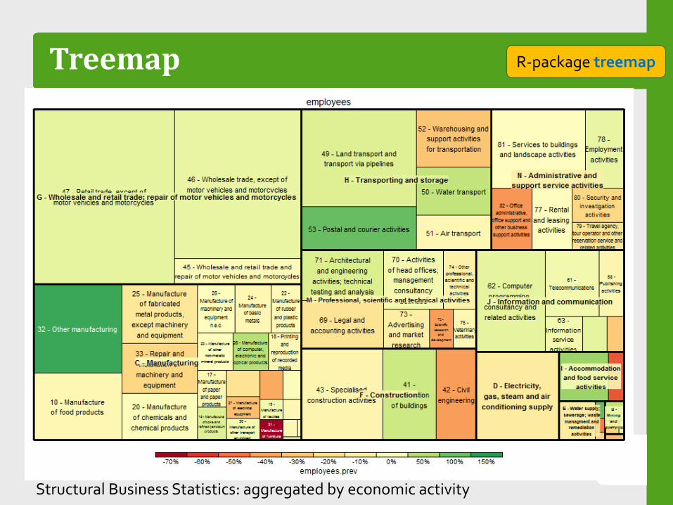
Treemap
15
R-package treemap
Structural Business Statistics: aggregated by economic activity

Heatmap
16
R-package ggplot2
Mobile phone metadata (raw): number of unique devices

Heatmap
17
Python + HTML/Javascript
Interactive tool to analyse income data

Small multiples
18
Analysis of Daytime Population estimates based on mobile phone metadata
R-package ggplot2
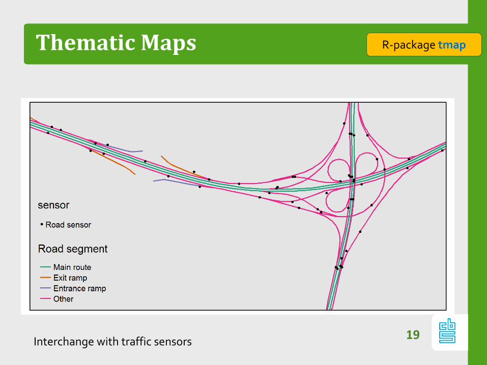
Thematic Maps
19
R-package tmap
Interchange with traffic sensors

Thematic Maps
20
R-package tmap
@ useR! 2015 Thursday 13:00
Population density
R package tmap: • Layered maps
• Polygons • Lines • Points • Raster
• ggplot2 style • small multiples • Open Street Map

Thematic Maps
21
R-package tmap
@ useR! 2015 Thursday 13:00
The relation between metropolitan areas and income class

Thematic Maps
22
R-package tmap
@ useR! 2015 Thursday 13:00
Global land cover (urban areas accentuated with dot map)

Maps
23
Interactive tool to analyse traffic on Dutch highways
Python + HTML/Javascript

Summary
– Data visualization is essential in Official Statistics for
‐ Exploring new data sources
‐ Analysing new deliveries of existing data sources
‐ Analysing data throughout the statistical production process
‐ Presenting the data (to collegues, policy makers, and the
general public)
– Need for
‐ Visualization of confidence intervals
‐ Interactive data exploration tools
‐ Big data visualization
24