dcw03 05 using colour
TRANSCRIPT

8/6/2019 DCW03 05 Using Colour
http://slidepdf.com/reader/full/dcw03-05-using-colour 1/6
t’s difficult to imagine the shimmering surface of
a tropical lagoon inspiring such serenity and
wonderment if the water were muddy brown
and not turquoise blue. And could a single rhythmic poppy
swaying amongst the harshest of hedgerows generate the
same wistful fondness if it were a murky green and not the
deepest shade of red? Colour is the musical accompaniment
to shape, form, and texture; the oft-forgotten element thatbreathes life into every scene we witness. The amateur
photographer too often undervalues its impact; the
professional thinks of little else. Fail to understand how it
informs, inspires and enthuses, and your images will never
provoke the kind of reaction that makes photography so
rewarding and worthwhile.
Choosing and composingFinding a colourful subject is your first step, but to really
make the most of whatever it is you choose you’ll have to
be prepared to stick your artistic hat on. Try to forget the
nature of the subject you’re focusing on and imagine it
simply in blocks of colour and shape. A pair of lampposts
pinned against an overcast evening sky might become analmost monochromatic illustration of lines and curves,
punctuated by golden orbs dissipating their orange glow
into the night sky. Or think of the most mundane roadsign
as a fantastic abstract pattern of uniform blues and reds,
perfectly plausible with a bit of imagination and some
careful close cropping. And nature itself offers a bounty
of ready-made extracts; a single daisy isolated against
the greenest summer grass, a field of corn offering nothing
but the warmest shades of yellow, or a layer of autumnal
leaves infusing majestic golds and browns.
Whatever your subject, making the most of colour
requires you to think carefully about composition – if
something in the scene doesn’t add anything to your image,
crop it out, either by zooming in or getting yourself closer tothe action. A painted Mediterranean house loses its impact
if you include the garden path, next door’s rubbish or a
wandering travelling salesmen. Instead go in tight and
frame a red wall against a yellow window-frame, or a blue
courtyard staircase against orange-painted brickwork – this
way you’ve got just colours and patterns and nothing else.
And don’t be so conservative as to stick with purely
horizontal or vertical compositions – if patterns and colours
work best together with your camera tilted at an angle,
then go with that and use some unusual perspectives.
Of course, there are scenes that offer the impact of colour
026 DIGITAL CAMERAMAGAZINE
COVER FEATURE
YOUR GUIDE MATT HENRYMatt Henry works as an editorial and advertising photographer, shooting people,
fashion and urban landscapes. He’s also passionate about writing and is a regularcontributor to Professional Photographer and Photography Monthly magazines
www.dcmag.co.uk/MattHenry
MAKE COLOUR WORK FOR YOU
PORTFOLIOMATT HENRY
Isn’t it time you gave colour some serious thought? Matt Henry takes you on a journey of discovery aswe step back and look at photo composition from a completely different angle…
I
Using colourUsing colourThe amateur photographer too often undervaluesits impact, the professional thinks of little else
Isn’t it time you gave colour some serious thought? Matt Henry takes you on a journey of discovery aswe step back and look at photo composition from a completely different angle…
The amateur photographer too often undervaluesits impact; the professional thinks of little elseThe amateur photographer too often undervaluesits impact; the professional thinks of little else

8/6/2019 DCW03 05 Using Colour
http://slidepdf.com/reader/full/dcw03-05-using-colour 2/6
DIGITAL CAMERAMAGAZINE 027
WHY WE CHOSETHIS PICTURE
4
Eye-searing iridescentcolours and incredible detailbring the subject to life
Extremely shallowdepth of fieldmakes the subjectstand out starklyagainst anunclutteredbackground

8/6/2019 DCW03 05 Using Colour
http://slidepdf.com/reader/full/dcw03-05-using-colour 3/6
HANDLING AWKWARD LIGHTINGWhen exposing for an awkwardly lit scene such as a stained
glass window or night-time cityscape, the reflective meter in
your camera will almost certainly overexpose the scene
because it percieves it to be too dark. To compensate for this
you need to switch your camera to manual mode, and
underexpose by between one and two stops. Erring towards
underexposure also has the added benefit of making colours
look richer and more saturated, and in the case of a stained
glass window, of turning the surrounding areas jet black.

8/6/2019 DCW03 05 Using Colour
http://slidepdf.com/reader/full/dcw03-05-using-colour 4/6DIGITALCAMERAMAGAZINE 029
without the need for isolation – coastal sunsets, verdant
hillsides, boats at port, neon-shops at night, portraits
with colourful make-up and clothes, and fairground
lights. But no matter how much interesting detail and
shapes are to be had, it’s important not to get carried
away in the emotion of the subject and remember thatit’s the use of the colours at your disposal that will
make or break your image.
The importance of lightingWhatever you choose to photograph, it’s imperative that
you have some knowledge of light and how it works if
you’re going to capture colours at their best – it’s the
reflection of certain wavelengths of light that gives an
object colour after all. The two most important aspects
of lighting you have to consider are directionality and
the angle of the light source, and this goes for both
natural light and artificial light such as tungsten or f lash.Directionality describes the extent to which light is
travelling in a focused, straight line towards your subject
or whether it is bouncing around and hitting your
subject from a number of angles. A cloudless sky means
Because the human eye is more sensitive to green light than it is to red or blue light,
conventional CCD and CMOS image sensors contain twice as many green pixels as they do
red or blue. Colour interpolation technology is used to calculate the in-between valuesa
Making the most of lighting and natural changes in colour temperature is by far the best way
to make sure your colourful images are up to their best, but digital manipulation has its placeas a tool for enhancement – saturation and contrast controls in-camera or via Photoshop can
be used to give colours even more zip.
Some cameras also have toning effects filters that essentially turn your image into black
and white then wash them over with another single colour – usually sepia, but other colours
are sometimes available too. The same effect can be created with the Channel Mixer in
Photoshop, and with a greater range of colours to choose from. It’s best used as a means to
accentuate the mood a subject might already convey – images of boats and water often
benefit from blue toning for example, while the warmth of sepia tends to work well with
smiling, outdoorsy portraits.
DIGITAL ENGANCEMENT2
Photographers who take the
time to carefully balance
colour with subject
composition will usually
yield the best results. In thiscase, however, simply filling
the entire frame with a
shock of colour has worked
sucessfully to create a strong
visual impact
2
The most importantaspects of light to
consider are thedirectionality andangle of the source
■ Underexposing your image by a
third of a stop makes colours go alittle deeper and darker for a more
saturated effect.
■ Inaccurate exposure can play
havoc with colour results. Take a
spot reading (or centre-weighted if
your camera’s not got a spot) from
a mid-tone such as grass and lock
the exposure before recomposing.
This will ensure accurate exposure.
■ Accentuating the bluish tinge of
a dull, overcast day can produce
moody, atmospheric images.
Increase the blueness manually in
your white balance settings, or by
selecting the sunshine option if
there’s no manual option.
■ Burning out the highlights can
actually be very flattering to skintones, killing any spots, blemishes
or other unsightly details. Try
overexposing by half, a full, one
and a half stop for best results.
EXPERT TIPS2
8/6/2019 DCW03 05 Using Colour
http://slidepdf.com/reader/full/dcw03-05-using-colour 5/6030 DIGITAL CAMERAMAGAZINE
COVER FEATURE MAKE COLOUR WORK FOR YOU
you’ll get a very flat, even type of lighting. The latter
is best for maximum saturation of colour, whereasthe former gives your subject much more of a
three-dimensional feel, as form and texture
become more pronounced.
If you want the best of both worlds, keep the sun at
90 degrees and fit your camera with a polarising filter. If
you’re shooting indoors with available light, avoid
directional lighting by using a north-facing window, or
shoot on a bright but overcast day if this isn’t possible.
Alternatively, diffuse the window-light with some sort of
material – fine net curtains, a white bed sheet or tracing
paper can all work well.
Colour and flashThe relationship between flash and colour is subject to
the same principles of lighting as sunlight – a highly
directional light source is going to mean low colour
saturation with dense shadows and highlights so bright
that they begin to wash out. This is why on-camera
flash tends to produce such drab, unflattering results,
and why studio photographers spend so much time
trying to diffuse their flash-heads with contraptions like
umbrellas, softboxes and reflectors.
If you’ve only got the flash that’s built into your
camera, there’s not much you can do but avoid using it
by shooting only when there’s enough light for it not to
be necessary. Those with external Speedlite-typeflashguns can fit a diffuser-hood (try the Omni-Bounce
sold by Jessops for £14.90), or better still, a miniature
softbox (Jessops sell the Lastolite Micro-Apollo for
£26.95). However, neither are as effective in reducing
directionality and maximising colour saturation as
bouncing the flash off a wall or ceiling, possible only
if you’ve got a flashgun with a tilt/swivel feature.
The flash will take on the colour of any surface; so if
there’s no white ceiling or wall close-by, bounce it
off a piece of white card.
Colour temperature andwhite balanceThings get their colour because of the specific
wavelengths of light they reflect back, but light itself can
also take on a colour cast. When all the colour
wavelengths in the visible spectrum are present in equal
amounts, you get neutral or ‘white’ light, but when
there is an unequal amount, light changes colour. So if
you’ve ever wondered why your grandma’s face came
out a rather nasty shade of blue, this is the reason.
On a clear, sunny day at around lunchtime light is
usually white but if the weather’s dull with lots of cloud
present everything appears to take on a bluish tinge.
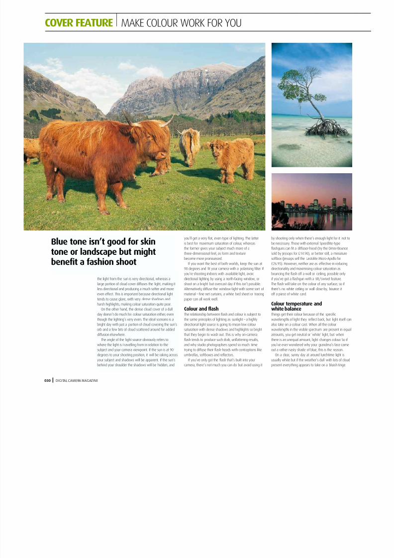
the light from the sun is very directional, whereas a
large portion of cloud cover diffuses the light, making it
less directional and producing a much softer and more
even effect. This is important because directional light
tends to cause glare, with very dense shadows and
harsh highlights, making colour saturation quite poor.On the other hand, the dense cloud cover of a dull
day doesn’t do much for colour saturation either, even
though the lighting’s very even. The ideal scenario is a
bright day with just a portion of cloud covering the sun’s
orb and a few bits of cloud scattered around for added
diffusion elsewhere.
The angle of the light source obviously refers to
where the light is t ravelling from in relation to the
subject and your camera viewpoint. If the sun is at 90
degrees to your shooting position, it will be raking across
your subject and shadows will be apparent. If the sun’s
behind your shoulder the shadows will be hidden, and
Blue tone isn’t good for skintone or landscape but mightbenefit a fashion shoot

8/6/2019 DCW03 05 Using Colour
http://slidepdf.com/reader/full/dcw03-05-using-colour 6/6
Early in the morning and late in the evening, especially
at sunrise or sunset, this tinge can go very orange,
unless of course it’s neutralised by heavy cloud cover.
The eye adjusts to this colour change automatically
so that it’s barely discernible, but a camera’s image
sensor can’t, so the changes in this colour cast, or colour
‘temperature’ can be dramatic enough to spoil or
enhance an image, depending on your intention. A
landscape with a blue tone isn’t going to be too
attractive, but a cutting-edge fashion shot might benefit
from a blue cast rather than orange. For most purposes
blue tends to be considered negative and avoided (it’sparticularly bad for skin tone), and orange positive and
very much sought after.
Artificial light can also have a non-white colour
temperature – flash is generally fairly neutral, but the
tungsten lighting found in household bulbs tends to
be very orange. Fluorescent lighting gives off a greeny
tinge, though other colours are possible too as there
are many makes and types of bulbs.
All but the very cheapest digital cameras come with
an automatic white-balance setting that adjusts to
differing colour temperatures. Most also have a number
of pre-sets so you can override the automatic setting, incase it misjudges a situation or in case you want to
introduce a cast to enhance your image. Some cameras
let you set your white point by taking a reading
manually, though even more versatile are those that let
you go through the range in increments with a slider
scale. White-balance settings can be used to enhance
your images, by giving a landscape a very warm,
orange tone, for example, but this is never a substitute
for the real thing – wait for a bright, clear day and get
up for sunrise or wait till early evening if you want truly
professional-looking warm-tone results.
DIGITAL CAMERAMAGAZINE 031
If you’re interested in taking a more in-depth, scientific look at light, colour and
photography then the following website is worth investigating:www.ted.photographer.
org.uk/photoscience_colour.htmg
There are few contemporary professional photographers
that stick only with black and white as a matter of
principle – check out the photography section in the big
book shops like Waterstones and
Borders for some full colour
coffee-table tomes that offer
breath-taking images of all sorts
of subjects.
Fans of nature photographyshould hunt out a chap called
Frans Lanting; his latest
rainforest book is full of the
most amazingly vivid shots of
the finest specimens the natural
world has to offer.
Landscape addicts should
look out for the work of Tom
Mackie and Charlie Waite –
two of the UK’s most
talented outdoor photographers. Charlie has a
very instructive book about landscape photographycalled ‘Seeing Landscapes’ which explores the artistic
ideas behind this genre of photography – colour plays a
big part so its certainly worth a look if landscapes are
your favoured pastime.
If the great outdoors doesn’t float your boat but the
fantastically surreal does, look no further than David
LaChapelle, the current experimental darling of the
fashion world whose images are the very definition of
vivid and ultra-saturated. His latest work, David
LaChapelle Photographs, is truly inspirational if tongue-
in-cheek people shots are your thing.
RECOMMENDED 1
There are a number of filters that can be used to maximise the effects of colour in your shots,and these don’t include those rather dated and naff experimental special effects things like
Starburst, Prism, or Rainbow. The best ones are actually the most subtle, and there’s probably
only six or seven that are really of any use for digital users – the rest can either be too easily
replicated in Photoshop, or look so bad that you really wouldn’t bother.
Top of the list is the polariser. This is unrivalled for its ability to maximise colour saturation
way beyond the call of duty, and should never be off your lens if you’re serious about vivid
colours in your outdoor work. Others of use include the neutral density graduate, warm-up,
sunset, and various types of coloured graduates. Take a look at the mini-lab test on page 44
for the low-down on the best filters money can buy.
COLOUR FILTERS2