designing great...
TRANSCRIPT
Designing Great Visualizations
AUTHOR: Jock D. Mackinlay with Kevin Winslow
DATE: February 18, 2009
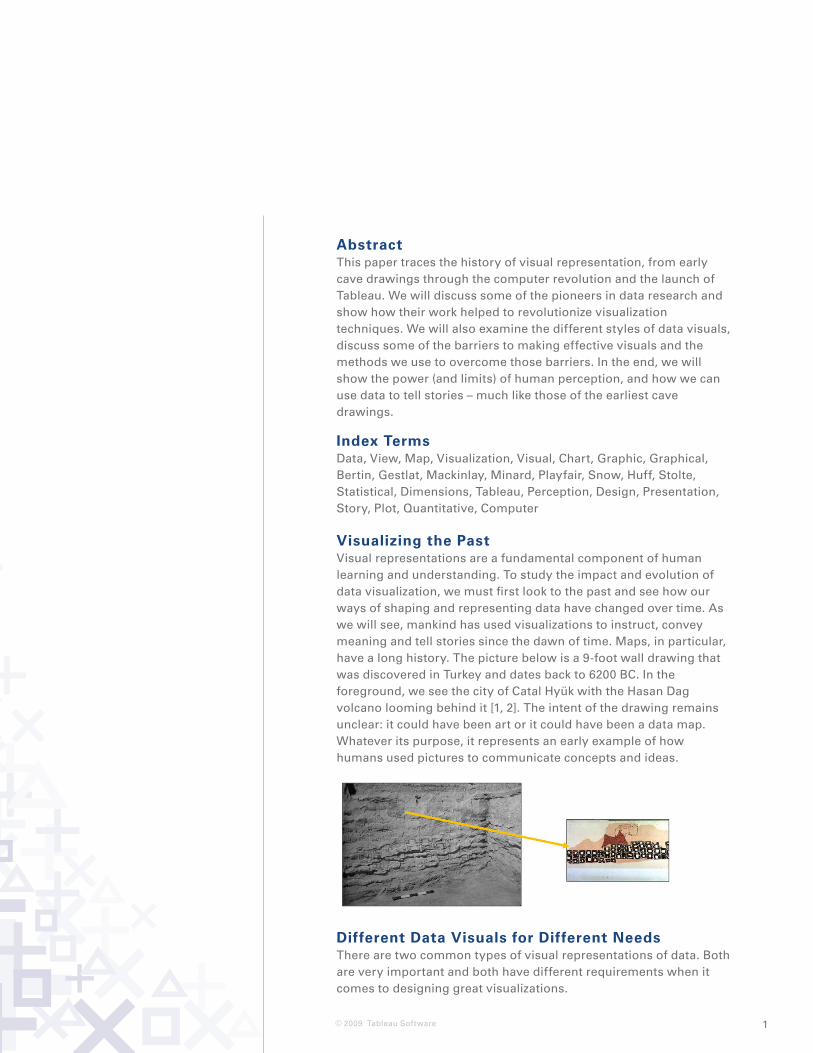
Abstract This paper traces the history of visual representation, from early cave drawings through the computer revolution and the launch of Tableau. We will discuss some of the pioneers in data research and show how their work helped to revolutionize visualization techniques. We will also examine the different styles of data visuals, discuss some of the barriers to making effective visuals and the methods we use to overcome those barriers. In the end, we will show the power (and limits) of human perception, and how we can use data to tell stories – much like those of the earliest cave drawings. Index Terms Data, View, Map, Visualization, Visual, Chart, Graphic, Graphical, Bertin, Gestlat, Mackinlay, Minard, Playfair, Snow, Huff, Stolte, Statistical, Dimensions, Tableau, Perception, Design, Presentation, Story, Plot, Quantitative, Computer Visualizing the Past Visual representations are a fundamental component of human learning and understanding. To study the impact and evolution of data visualization, we must first look to the past and see how our ways of shaping and representing data have changed over time. As we will see, mankind has used visualizations to instruct, convey meaning and tell stories since the dawn of time. Maps, in particular, have a long history. The picture below is a 9-foot wall drawing that was discovered in Turkey and dates back to 6200 BC. In the foreground, we see the city of Catal Hyük with the Hasan Dag volcano looming behind it [1, 2]. The intent of the drawing remains unclear: it could have been art or it could have been a data map. Whatever its purpose, it represents an early example of how humans used pictures to communicate concepts and ideas.
Different Data Visuals for Different Needs There are two common types of visual representations of data. Both are very important and both have different requirements when it comes to designing great visualizations.
© 2009 Tableau Software 1
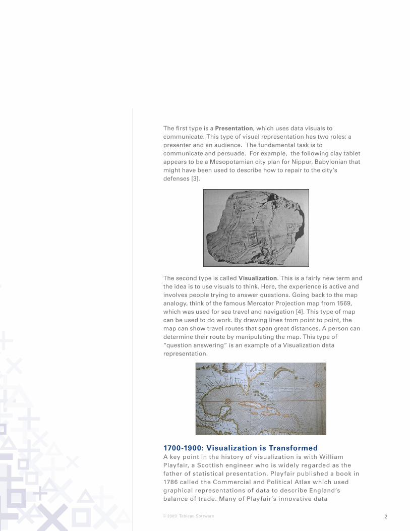
The first type is a Presentation, which uses data visuals to communicate. This type of visual representation has two roles: a presenter and an audience. The fundamental task is to communicate and persuade. For example, the following clay tablet appears to be a Mesopotamian city plan for Nippur, Babylonian that might have been used to describe how to repair to the city’s defenses [3].
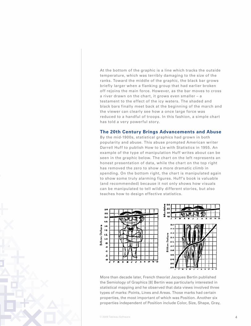
The second type is called Visualization. This is a fairly new term and the idea is to use visuals to think. Here, the experience is active and involves people trying to answer questions. Going back to the map analogy, think of the famous Mercator Projection map from 1569, which was used for sea travel and navigation [4]. This type of map can be used to do work. By drawing lines from point to point, the map can show travel routes that span great distances. A person can determine their route by manipulating the map. This type of “question answering” is an example of a Visualization data representation.
1700-1900: Visualization is Transformed A key point in the history of visualization is with William Playfair, a Scottish engineer who is widely regarded as the father of statistical presentation. Playfair published a book in 1786 called the Commercial and Political Atlas which used graphical representations of data to describe England’s balance of trade. Many of Playfair’s innovative data
2© 2009 Tableau Software

visualizations are still in use today. One of Playfair’s inventions, the pie chart, can be seen in the graphic below [5].
It wasn’t long before statistical graphics were being used for presentation. One famous example comes from Dr. John Snow, a British physician who used statistical graphics to deal with London’s cholera epidemic of 1855. Snow plotted individual cases of cholera as dots on a map of London. These dots showed that the majority of cases could be traced to a water pump on Broad Street. An investigation of outlying cases showed they, too, had connections to the Broad Street pump. Snow removed the handle from the contaminated pump and the cholera epidemic subsided. This shows how the power of visualization can answer questions and, in this case, even work for the public good. Snow’s map also works as an effective example of the Presentation style; Snow’s data was strong enough to persuade city officials to remove the infected handle and quell the outbreak. The most famous example of a data presentation comes from Charles Minard, a French civil engineer who used visualization to capture the story of Napoleon’s march (and subsequent retreat) on Moscow. As you can see in the picture below, Minard’s graphic uses a lightly shaded bar to illustrate the size of the advancing army [6]. The bar’s thickness steadily declines as the army makes its way toward Moscow. Below, a black bar shows the army’s decline in strength as it retreats from Moscow.
3© 2009 Tableau Software
At the bottom of the graphic is a line which tracks the outside temperature, which was terribly damaging to the size of the ranks. Toward the middle of the graphic, the black bar grows briefly larger when a flanking group that had earlier broken off rejoins the main force. However, as the bar moves to cross a river drawn on the chart, it grows even smaller – a testament to the effect of the icy waters. The shaded and black bars finally meet back at the beginning of the march and the viewer can clearly see how a once large force was reduced to a handful of troops. In this fashion, a simple chart has told a very powerful story. The 20th Century Brings Advancements and Abuse By the mid-1900s, statistical graphics had grown in both popularity and abuse. This abuse prompted American writer Darrell Huff to publish How to Lie with Statistics in 1955. An example of the type of manipulation Huff writes about can be seen in the graphic below. The chart on the left represents an honest presentation of data, while the chart on the top right has removed the zero to show a more dramatic climb in spending. On the bottom right, the chart is manipulated again to show some truly alarming figures. Huff ’s book is valuable (and recommended) because it not only shows how visuals can be manipulated to tell wildly dif ferent stories, but also teaches how to design effective statistics.
More than decade later, French theorist Jacques Bertin published the Semiology of Graphics [8] Bertin was particularly interested in statistical mapping and he observed that data views involved three types of marks: Points, Lines and Areas. Those marks had certain properties, the most important of which was Position. Another six properties independent of Position include Color, Size, Shape, Gray,
4© 2009 Tableau Software

Orientation and Texture. Bertin turned these marks and properties into guidance on how to design graphical data. Bertin also developed a very important technique for visual analysis which involved sorting tables. This technique, called Permutation Matrices, manipulated the rows and columns of a table to find patterns in previously unsorted data and show a correlation between values. Always an innovator, Bertin published another book in 1977 called Graphics and Graphic Information Processing which described early efforts at computer-based visualization. Though Bertin’s computers ultimately proved too primitive for the kind of work he was doing, an explosion in technology would soon yield great advances in the field. Computer-based Visualization: A Personal History The history of visualization and presentation quickened with the advent of computers. I focus here on my personal history. In 1986, I authored a program for my Ph.D. dissertation called APT (A Presentation Tool). By extending and automating Bertin’s semiology, I created a presentation tool that automatically designed graphical presentations like the one pictured below. The graphic shows four dimensions in a traditional scatter (or bubble) plot. This was a breakthrough because it showed that we knew enough about how to design effective views of data that we could use computers to help with the design task.
That same year, a panel from the National Science Foundation (NSF) wrote a report on scientific visualization and, specifically, using computer graphics to work out scientific problems. Their computer-designed image of a thunderstorm was extremely effective and led to significant Congressional support for further research on using computers to aid in visualization. In 1987, Richard Becker and William Cleveland tackled multi-dimensional data, which is key to most problems. Their technique, called interactive brushing, allowed you to select a set of points and
5© 2009 Tableau Software
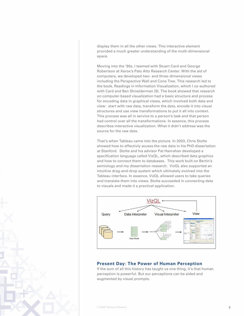
display them in all the other views. This interactive element provided a much greater understanding of the multi-dimensional space. Moving into the ‘90s, I teamed with Stuart Card and George Robertson at Xerox’s Palo Alto Research Center. With the aid of computers, we developed two- and three-dimensional views including the Perspective Wall and Cone Tree. This research led to the book, Readings in Information Visualization, which I co-authored with Card and Ben Shneiderman [9]. The book showed that research on computer-based visualization had a basic structure and process for encoding data in graphical views, which involved both data and view: start with raw data, transform the data, encode it into visual structures and use view transformations to put it all into context. This process was all in service to a person’s task and that person had control over all the transformations. In essence, this process describes interactive visualization. What it didn’t address was the source for the raw data. That’s when Tableau came into the picture. In 2003, Chris Stolte showed how to effectivly access the raw data in his PhD dissertation at Stanford. Stolte and his advisor Pat Hanrahan developed a specification language called VizQL, which described data graphics and how to connect them to databases. This work built on Bertin’s semiology and my dissertation research. VizQL also supported an intuitive drag-and-drop system which ultimately evolved into the Tableau interface. In essence, VizQL allowed users to take queries and translate them into views. Stolte succeeded in connecting data to visuals and made it a practical application.
Present Day: The Power of Human Perception If the sum of all this history has taught us one thing, it’s that human perception is powerful. But our perceptions can be aided and augmented by visual prompts.
6© 2009 Tableau Software

For example, look at the picture below and focus on the table to the left. Now, at a glance, try to determine how many times the number 9 appears. Now look to the table on the right. The 9s are now colored red and this visual prompt decreases the time it takes to count them to mere seconds. This is a very traditional technique called “pop-outs” and is just one of the ways that the visualization of data makes it easier to comprehend large data sets and make sense of the findings.
Pop-outs are just one (very rudimentary) type of visual prompt and only begin to tap the power of the human visualization system. The author Colin Ware has written a series of books that discuss this subject and identified three basic stages to perceptual processing. This first is a low-level stage that looks for Features in the visual. This process goes from the eye back to the brain’s visual cortex. The second stage identifies Patterns while a third Attentional stage does the actual counting. Studies done by William S. Cleveland and Robert McGill, two statistical scientists at AT&T Bell Laboratories, support Ware’s analysis. Their studies found that Position was the most effective way to evaluate a quantitative value. Position is followed by other factors including Length, Area, Volume, Angle and Slope, and Color and Density. Cleveland and McGill found that as we move further away from Position, our quantitative perception becomes less accurate. In this fashion, moving a set of data from a spreadsheet into a bar-chart view, and translating that data into varying line lengths and color, would lead to faster and more effective analysis. Of course, all this is dependent on the task at hand and what data you’re ultimately hoping to tease out. This takes us back to Bertin, who noted that there are three different levels of reading. The Elementary level is used when you’re looking to identify a single value. If that’s the case, a simple spreadsheet might do the trick. However, when looking for relationships between values, you must move to the Intermediate level. An example of this view would be a bar chart. Because the bars are all lined up, your
7© 2009 Tableau Software

mind can easily pull out the differences between them. Finally, the Global (or Gestalt) view looks at relationships of the whole. For this method, the scatter plot comes into play. This type of chart encompasses a collection of points and plots their position on a vertical and horizontal axis. This view provides an extremely effective and “global” view of the data on hand. Different Data Calls for Different Views We have found that the effectiveness of data encoding depends on the data type. There are three types of data: Nominal, Ordinal and Quantitative. An example of a Nominal data type would be naming conventions such as in the way we name different types of birds. An Ordinal data type follows a sequence, such as with the days of the week. Quantitative data deals with numbers and things that can be measured. Examples of quantitative data include length, time, temperature and speed. Looking at graphical options to plot these data types, we can see how Area, for example, would be effective for some, but not others. Plotting Nominal data in an Area view would convey an ordering that is simply not applicable. Area would be slightly more effective for Ordinals, but because these values are distinct, you could have only a few areas in which to distinguish the different sizes. Area works best for Quantitative data in that it conveys an accurate sense of what the quantitative value is in an ordering. Changing the graphical representation to Color reverses these findings. Color is least effective for Quantitative data because it would be very difficult to provide enough in colors to accurately represent the entire data set. Color works best for Nominal data in that each data point can be assigned a distinct, unique color. The figure below shows how Tableau uses these kinds of rankings to design effective visualizations. Again, we have Position at the top as it is the most effective way to represent all three types of data. However, as you move across the chart, you can begin to see how this changes in relation to the different types of data. Some views move up and some move down. It is interesting to note that while Shape is not at all applicable for plotting Quantitative or Ordinal data, it is near the top of the list for Nominal data.
8© 2009 Tableau Software

Human Perception: Its Power and Its Limits While human perception is powerful and able to wrestle with large and complex data sets, it is constrained by certain limits. For this lesson, we’ll turn to Bertin’s synoptic, which summarizes the different types of views of data. One key factor is the number of dimensions involved, be it one dimension, two dimensions, three dimensions or “n” dimensions. A second factor depends on whether the data is fixed or if it can be re-ordered. A final component is whether or not the data is topological. Bertin took these factors and showed all the different types of views available. Tableau currently supports each of these views and also recently introduced Maps. We are currently not able to show node-link views, though it is something that may become available in the near future. The graphic below shows all these views. Note that the views below the orange line can be viewed as a whole or Gestalt. Views above the orange line cannot be viewed in Gestalt, as an instant perception of time. This represents a fundamental limit to human perception and data analysis; there is a limit to the number of dimensions that you can encode in data and see in a single instant of time.
It should be noted that 3D graphics do not break Bertin’s barrier. But while the third dimension adds another layer to encode data, it also adds occlusions. These occlusions make it difficult to see all the data and necessitate certain graphical tricks. Another problem with adding 3D is that it adds orientation issues. The fact that you can move around in space makes it easy to get lost.
9© 2009 Tableau Software

Leveraging Composition and Interactivity Clearly, composition is key to developing good data visuals. To address the multi-dimensional case, let’s go back to Minard’s map of Napoleon’s march on Moscow. It consists of two images: two lines on top that depict the army’s march and retreat from Moscow, and another line below that shows temperature. It’s an effective graphic, but it is not a Gestalt view because the eye has to move back and forth to see and take in all the data. An example of an effective Gestalt view is one that Edward Tufte writes about: small multiple views. Consider a scatter-plot graphic that’s intended for real-estate data. The graph could show multiple neighborhoods as a Gestalt view. And because they’re all lined up and share a common axis, the eye can quickly see the most telling data points in the graph. Composition also comes into play in dashboard-type views. Using a combination of graphs and a careful use of color, the eye can quickly move around, compare values and take in an enormous amount of data. Going back to Bertin, he noted that interactivity was a very effective way to deal with multi-dimensional problems. In addition to sorting, there are a number of other techniques we can employ to help make better sense of multi-dimensional data. Consider a standard scatter plot such as the one seen below. It shows a breakdown of sales and profits, and is further subdivided by container and year. As you can see, with too many data sets laid on top of each other, it becomes impossible to make sense of the findings and get a true Gestalt view.
10© 2009 Tableau Software
One way to fix this would be through Aggregation. For example, simply taking the data and separating it out by year vastly decreases the amount of data and subsequent overlap on the chart. In this fashion, Aggregation can be a powerful tool for dealing with multi-dimensional data. Another technique is to use Interactive Filtering. Going back to the chart above, imagine that we can create filter widgets that allow us to only view the sets of data we’re concerned with. These widgets let us add and subtract data as we see fit, and gives us a clearer view of the overall findings. Filtering is a very powerful way of dealing with multi-dimensional data, though it has its weaknesses. For example, isolating certain data sets can make it difficult or impossible to see the relationships between them. To get around the limitations with Filtering, we can employ a process known as Brushing. With this technique, we simply color one or more of the data sets which allows us to better see the contrasts and relationships between them. Another powerful way of using interactivity is through Links. Let’s use Google Maps as an example. A simple query brings up a map with highlighted areas which we can then click on to bring up still more data. Through the use of drop-downs or widgets on the page, you can further filter the data for more refined views. Interactive Links, therefore, represent an extremely powerful way of dealing with multi-dimensional data sets. Using Data to Tell Stories To illustrate the idea of telling stories with data, let’s use the story of my move from Xerox’s Palo Alto facility to Seattle and Tableau in 2004. One of my first priorities was to find the best school district in Seattle. I quickly found a very neat online guide from The Seattle Times’ Web site. It provided the Washington Assessment of Student Learning (WASL) scores for all the area school districts and the percentage of students who met these standards in each subject. This gave me the scores, but it still didn’t show me the geographical districts. Because I was new to Seattle and didn’t know the area, what I needed was a map – a statistical map. That map didn’t exist, so I created the one below. It shows Tableau’s location in relation to the outlying school districts. The colored circles represent how well each district is doing on the WASL in terms of math scores. So, for example, while the Seattle school district was the closest to the office, it wasn’t performing as well on the WASL. By looking at this map, I decided to move to the Bellevue school district as it was still close to Tableau and was also doing better in the WASL.
11© 2009 Tableau Software

As time went on, I began to notice some irregularities in the math scores coming out of the schools. After some investigation, I found a detailed Web site that showed graphs for both the math and reading portions of the WASL. Both views showed data trends over time, and both these trends were going up. It also showed that the Bellevue district was outperforming the state in both areas. What wasn’t clear was how math and reading scores related to each other. After a little more digging, I found the actual data source itself.
After cleaning this data up a bit, I fed it into Tableau. This yielded something far more interesting: math scores were coming in far lower than reading. Given my interest and background in math, I kept monitoring the data and came up with the chart pictured below.
What I found was that, over the past five years, the state of Washington used two different tests: the WASL and the ITBS (Iowa Testing Program). The chart above compared the two and yielded some shocking results. Whereas results from the WASL were going
12© 2009 Tableau Software
up over time, results from the ITBS were basically flat. Because ITBS scores represent a national cross-section of students, I came to the conclusion that numbers from the WASL could not be trusted. The moral of this story is this: always question data. Ask questions about where the data came from and use visual systems to make sure you can trust and understand what it is telling you. Taking Stock: Lessons Learned Let’s go over some simple lessons that can help us to tell effective stories. The first lesson is that Trust is a key design issue. If you do not design your views properly, they will likely not be trusted by the savvy people who are looking at them. Second, make sure that your visuals are Expressive and that they convey the data accurately. Third, make Effective use of your visuals by exploiting human perception. The following rules will help you to make Effective visuals: •Usegraphicalvocabularyproperly. •Utilizewhitespace. •Avoidunnecessarymaterialandclutter.
Finally, make sure your views include Context. Titles, captions, units, commentary – all these things help your audience to better understand your data view. Always strive to tell stories with your data and your visuals. Understand that good stories involve more than just data and consider the following: •Mindyouraestheticsandknowthatwhatiseffectiveisoften affective. In other words, an effective view can create an emotional response and a genuine communication to your audience. •Styleisalsoimportant.Makesurethatyourviewsareconsistent and pleasing to the eye. Your views are representative of who you are and what you care about. •Viewscanbeplayful.Interactiveviewsthatpeoplecanplay with are very engaging. Interactive elements allow your audience to manipulate the data, ask and answer questions, and arrive at findings on their own. This helps to foster Trust in your data. •Makeyourviewsvividandmemorable.Payspecialattention to structure and context.
13© 2009 Tableau Software
References [1] http://www.henry-davis.com/MAPS/AncientWebPages/100B.html [2] http://www.math.yorku.ca/SCS/Gallery/milestone/sec2.html [3] http://www.henry-davis.com/MAPS/AncientWebPages/101.html [4] http://www.henry-davis.com/MAPS/Ren/Ren1/406B.htm [5] http://www.math.yorku.ca/SCS/Gallery/images/playfair2.jpg [6] http://www.math.yorku.ca/SCS/Gallery/images/minard.gif [7] Darrell Huff. How to Lie With Statistics. Norton, New York. 1955. [8] Jacques Bertin. Semiology of Graphics. University of Wisonson Press. 1983 (Semiologie Graphique Gauthier-Villars, Paris 1967). [9] Stuart K. Card, Jock D. Mackinlay, & Ben Shneiderman. Readings in Information Visualization: Using Vision to Think. Morgan Kaufman, San Francisco. 1999. About Tableau Software Access a trial copy of Tableau Software visit www.tableausoftware.com/producst/trial Tableau Software, a privately held company based in Seattle WA, provides software applications for fast analytics and visualization. The power of data visualization and analysis enables marketing professionals to quickly gain insights and make discoveries from all types of marketing data. Tableau allows marketers to dive deep into all types of data, quickly analyze campaign performance, conversion metrics, and easily determine ROI on marketing efforts.
14© 2009 Tableau Software