designing machine-level hmi with panelview™ 5000 and ... · before beginning work with view...
TRANSCRIPT

Designing Machine-level HMI with PanelView™ 5000 and Studio 5000 View Designer®: Introductory Lab
For Classroom Use Only!

Important User Information
This documentation, whether, illustrative, printed, “online” or electronic (hereinafter “Documentation”) is intended for use only as a learning aid when using Rockwell Automation approved demonstration hardware, software and firmware. The Documentation should only be used as a learning tool by qualified professionals. The variety of uses for the hardware, software and firmware (hereinafter “Products”) described in this Documentation, mandates that those responsible for the application and use of those Products must satisfy themselves that all necessary steps have been taken to ensure that each application and actual use meets all performance and safety requirements, including any applicable laws, regulations, codes and standards in addition to any applicable technical documents. In no event will Rockwell Automation, Inc., or any of its affiliate or subsidiary companies (hereinafter “Rockwell Automation”) be responsible or liable for any indirect or consequential damages resulting from the use or application of the Products described in this Documentation. Rockwell Automation does not assume responsibility or liability for damages of any kind based on the alleged use of, or reliance on, this Documentation. No patent liability is assumed by Rockwell Automation with respect to use of information, circuits, equipment, or software described in the Documentation.
Except as specifically agreed in writing as part of a maintenance or support contract, equipment users are responsible for:
• properly using, calibrating, operating, monitoring and maintaining all Products consistent with all Rockwell Automation
or third-party provided instructions, warnings, recommendations and documentation;
• ensuring that only properly trained personnel use, operate and maintain the Products at all times;
• staying informed of all Product updates and alerts and implementing all updates and fixes; and • all other factors affecting the Products that are outside of the direct control of Rockwell Automation.
Reproduction of the contents of the Documentation, in whole or in part, without written permission of Rockwell Automation is prohibited. Throughout this manual we use the following notes to make you aware of safety considerations:
Identifies information about practices or circumstances that can cause an explosion in a hazardous environment, which may lead to personal injury or death, property damage, or economic loss.
Identifies information that is critical for successful application and understanding of the product.
Identifies information about practices or circumstances that can lead to personal injury or death, property damage, or economic loss. Attentions help you: • identify a hazard • avoid a hazard • recognize the consequence
Labels may be located on or inside the drive to alert people that dangerous voltage may be present.
Labels may be located on or inside the drive to alert people that surfaces may be dangerous temperatures.
N999 – Your lab title goes here
Presenter: <<Your name>> <<Your business group>>

3 of 121
Designing Machine-level HMI with PanelView™ 5000 and Studio 5000 View Designer®: Introductory Lab
Contents
Before you begin ........................................................................................................................................... 5
About this lab .................................................................................................................................................................................... 6
Tools & prerequisites ........................................................................................................................................................................ 6
Creating a New View Designer Project ......................................................................................................... 7
Download the Controller Project ....................................................................................................................................................... 7
Create a new View Designer Project .............................................................................................................................................. 10
Configure Project Properties ........................................................................................................................................................... 13
Understanding the Studio 5000™ View Designer Software ........................................................................................................... 19
Adding Graphic Elements to a Screen ............................................................................................................................................ 20
Test the Project using the Emulator ................................................................................................................................................ 26
Animation, Events, and Popups ...................................................................................................................................................... 29
Using Logix-Based Alarming ....................................................................................................................... 49
Tag-based Alarm ............................................................................................................................................................................ 55
Using the Built-in Navigation Menu ............................................................................................................. 59
Adding Screens and Shortcuts ....................................................................................................................................................... 59
Organizing the Navigation menu ..................................................................................................................................................... 64
Testing Navigation .......................................................................................................................................................................... 66
Data Logging and Historical Trending ......................................................................................................... 69
Creating a Data Log ........................................................................................................................................................................ 69
Creating a Historical Trend ............................................................................................................................................................. 71
Data Logging and Historical Trending at Runtime .......................................................................................................................... 76
Remotely Accessing the PanelView 5000 with VNC .................................................................................. 80
Configuring the VNC Viewer ........................................................................................................................................................... 80
Exploring the VNC Viewer Feature ................................................................................................................................................. 82
Configuring VNC Options on the Terminal ...................................................................................................................................... 82

4 of 121
PDF Viewer ................................................................................................................................................. 87
Adding a PDF to the View Designer Project Explorer ..................................................................................................................... 87
Viewing a PDF on a Screen ............................................................................................................................................................ 88
Download and Explore .................................................................................................................................................................... 93
Using Add-On Graphics – Optional ............................................................................................................. 95
Creating an Add-On Graphic .......................................................................................................................................................... 95
Adding an Add-On Graphic to a Screen ....................................................................................................................................... 101
Modifying an Add-On Graphic ....................................................................................................................................................... 105
Runtime Language Switching – Optional .................................................................................................. 107
Opening an Existing Project .......................................................................................................................................................... 107
Exporting View Designer Text Strings .......................................................................................................................................... 109
Modifying View Designer Text Strings .......................................................................................................................................... 111
Importing View Designer Text Strings ........................................................................................................................................... 112
Creating a Language Switch Button ............................................................................................................................................. 115
Configure the Default Startup Language ...................................................................................................................................... 117
Download the Project and Explore Language Switching .............................................................................................................. 118

5 of 121
Before you begin
The PanelView™ 5000 terminals represent a new generation of HMI products for Rockwell Automation. The key driver behind
this development was to make it easier to create powerful and attractive HMI projects by taking advantage of newer
technologies, such as scalable vector graphics and by providing premier integration with our Logix controllers. PanelView™
5000 projects are configured using the new View Designer software, which is part of Studio 5000.
PanelView 5000 Common Features
Project contents are held in a single .VPD file to enable easy project movement.
Scalable vector graphics allows users to easily resize individual screen elements and entire terminal applications.
Advanced graphic animation capabilities through color/state tables, property binding, and events and commands for
more efficient design.
Use Add-On Graphics to create reusable content for screens throughout the project.
Preconfigured banner, alarm screens, and diagnostic screens are integrated with Logix - helping reduce design time
and simplifying maintenance at runtime. Predefined screens are not included in your screen count limit.
Run time display scaling allows users to use any size application on any size terminal.
High-speed HMI button provides quick response and feedback for jogging applications.
Intuitive Navigation Menu eliminates the need to configure rows of navigation buttons on all the screens.
Runtime error notification with error detail fly out provides the information you need for quicker troubleshooting.
Logix tag extended property support eliminates the need to create HMI tags.
Logix-based alarms are automatically displayed on your HMI to help reduce development time.
Role based security provides screen-level and graphic element access control for each project.
Easily create re-usable screens by leveraging screen properties which can be named and tied to a Logix data type.
PanelView 5310 Features
Sizes from 6” to 12”, with wide screen formats in 7”, 9” and 12”. All sizes are touch only
Single Ethernet port and USB port
50 screens or popup displays
DC power input only
PanelView 5510 Features
Some of the main features of this first release of PanelView™ 5510 and the View Designer software include:
Sizes from 7” to 19” with wide screen formats at 7”, 9”, and 12”. Keypad versions are available for the 7”, 10”, and 15”
sizes.
Support of Device Level Ring network topologies for fault-tolerant network design.
100 screens or popup displays
PDF Viewer Support
DC power input only

6 of 121
About this lab
Welcome to the Studio 5000™ View Designer Hands-On Lab! This session will provide you with the opportunity to get familiar
with the newest HMI offering from Rockwell Automation. You will create a new project, explore the design time software, add
elements to the project, download the project to a hardware terminal, and explore the runtime functionality of the project while
connected to a controller.
This lab takes approximately 80 minutes to complete.
What Will Be Accomplished
As you complete the sections of this hands-on lab, you will:
Work with the View Designer software to understand its features, functionality and flexibility
Download and run a View Designer project on a PanelView™ 5510 terminal, exploring its runtime features
Who Should Complete this Lab
This hands-on lab is intended for those who:
Have some experience with HMI software and Operator Interface
Have little to no experience with View Designer design time software or PanelView™ 5510 terminals
Tools & prerequisites
The following is required to complete this lab:
Software Programs
Studio 5000™ View Designer software v5
Studio 5000™ Logix Designer software v32
Hardware Required
Windows 10 64-bit computer
CompactLogix 5380 processor
Ethernet network
PanelView™ 5510 9-inch wide terminal
Files required
RACE_CookieLine.ACD
might_qs.svg
cie-wp002_-en-p.pdf
MightyQsCookies.vpd
Cookies_Languages_Complete.xlsx

7 of 121
Creating a New View Designer Project
Business Issue
Getting started with an HMI project can be challenging for new and casual users. Products within a system often have disparate
workflows making it difficult for HMI designers to accomplish simple tasks in a quick and consistent manner.
Solution
View Designer is part of Studio 5000, sharing a common launch point and user experience with Logix Designer for creating and
maintaining projects. The software was designed from the ground up with usability in mind and workflows that make it quick and
efficient for HMI designers to create projects, set up communications, integrate with Logix, and download powerful HMI screens
to PanelView 5000 terminals.
In the following sections you will:
Create a new project
Configure Project Properties
Add elements to a screen and bind their properties to controller tags
Create buttons out of native elements
Apply a State table
Download the Controller Project
This lab uses a CompactLogix 5380 processor. Before beginning work with View Designer, start by downloading the controller’s
project using the steps below.
1. Use the Studio 5000 icon in the taskbar to open Studio 5000.
2. Under the Open heading, click Existing Project.

8 of 121
3. Browse to C:\Lab Files\Logix, and select RACE_CookieLine.ACD, and click Open.
4. When the project opens, click the Communications menu, select Download.
5. Click Download again.

9 of 121
6. Click Yes to change the controller mode to Remote Run.
Notice the controller is set to Rem Run.
7. Minimize, but do not close, Logix Designer using the Minimize button.

10 of 121
Create a new View Designer Project
Studio 5000™ View Designer is a new software package that configures applications for the new PanelView™ 5000 operator
interface product line. View Designer started shipping with Studio 5000 v27. In this section of the lab, you will explore this new
software by doing the following:
Create a new project
Configure Project Properties
Add elements to a screen
Bind properties to controller tags
Create buttons out of native elements
Apply a State table
Follow the steps below to create this new project.
1. Use the Studio 5000 icon in the taskbar to open Studio 5000 launcher.
2. Under the New heading, click New Project.
3. Select View as the project type.

11 of 121
4. Making sure PanelView 5510 is expanded, select 9”.
5. Type ‘MyProject’ in the Name field, then click Finish.
The Studio 5000™ View Designer software will go through the process of loading all of its components. This may take a
few minutes.

12 of 121
View Designer projects are stored as *.VPD files. This single file contains the entire project, similar to the concept of an ACD file for a complete Logix Designer application. The View Designer project can be moved between different computers by simply moving the *.VPD file.
Note that the default project directory is <user>\My Documents\Studio 5000\Projects.

13 of 121
Configure Project Properties
The Project Properties dialog, used to configure the Controller Reference, Application settings, and Terminal properties, is
automatically displayed, prompting for the controller reference.
1. Type ‘MyCLX’ in the Name: field.
The first project property to be configured is a controller reference. A reference is a connection to a Logix Designer project file from the View Designer project file. This connection automatically synchronizes data between the two files during design time. There can only be one reference in a View Designer project, because PanelView™ 5000 can only communicate with a single controller at runtime. Release V5 of View Designer supports up to 4 controllers.
Note that the Controller Reference Name cannot be the same as the name of the project.
2. Click the ellipsis next to the Logix project: field to open the Windows Explorer dialog.

14 of 121
3. Browse to C:\Lab Files\Logix, and select RACE_CookieLine.ACD.
4. Click Open.
5. Next, click the ellipsis button for the HMI to controller path.
The HMI to Controller Path is used to define the route that the terminal will take at runtime to connect to the controller.
6. Expand AB_ETHIP-1, Ethernet, select the 192.168.1.11, 5069-L3100ERMS2 processor, and click OK.

15 of 121
7. Configure the Emulator to Controller Path for the same controller using the ellipsis button.
The Emulator to Controller Path is used to define the path that View Designer will take to connect to the controller. This makes it possible to see real data when using the Emulator.
8. Browse to the controller, and click OK.
The path and the controller selected should be the same as was chosen for the HMI to Controller Path configured earlier.
In this case, the two paths are configured to be the same, because the same controller will be used for both the Emulator and the terminal.

16 of 121
9. Click Apply to confirm the settings.
The View Designer software supports browsing to tags located within an ACD file. Online tag browsing is not available, but if the tags within the ACD file change, synchronization will occur in the background to allow those tag changes to be seen.
10. Click the Application tab, then click the ellipsis button for the Location of the Target HMI Device.

17 of 121
11. Use the Browse for HMI Device window to browse to the terminal at this station.
12. Click OK.
13. Click the Usage & Capacity tab.
This tab, introduced in version 4.01, displays information regarding the number of screens, popups, and shortcuts contained within the projects, as well as other content information. The information can be used to determine the size of the project, and whether or not the project is exceeding any screen or capacity limits.

18 of 121
14. Click OK to close the MyProject Properties window.

19 of 121
Understanding the Studio 5000™ View Designer Software
1. A tab appears at the top of the screen canvas pane for each open screen for easy design navigation.
2. Project Explorer: All user defined screens, including popups, predefined screens, and assets are listed here. In addition, the Navigation Menu can be configured in the Project Explorer.
3. Toolbox: Built-in graphic elements that can be added to screens are listed here, sorted by categories.
4. Properties pane: Modify the properties of the graphic elements or the screen itself using this pane. State and Color Tables, and Event commands are also configured in this pane.
5. Graphic Explorer: A listing of all elements that are on the screen visible in the canvas. This pane makes it easy to navigate through grouped objects on the screen.
6. Property Definition: Re-usable properties or parameters are defined here to be used for screens or graphic element properties. This concept is covered in a different lab.
7. Errors pane: Errors that are found during the verification process are displayed in this contextual pane. This pane opens if errors or warnings are found in the project.
Use the steps below to explore the View Designer Software and its flexibility.

20 of 121
Adding Graphic Elements to a Screen
All native graphic elements can be found in the Toolbox pane of the View Designer software. This pane contains categories in
which all elements are divided for ease of use. In addition, a filter can be applied to the toolbox to focus on specific types of
elements. Use the steps below to add elements to the screen canvas and configure them to display data from the controller.
1. Locate the Numeric Display element in the CommonControls category.
2. Double click Numeric Display to add it to the screen canvas.
21 of 121
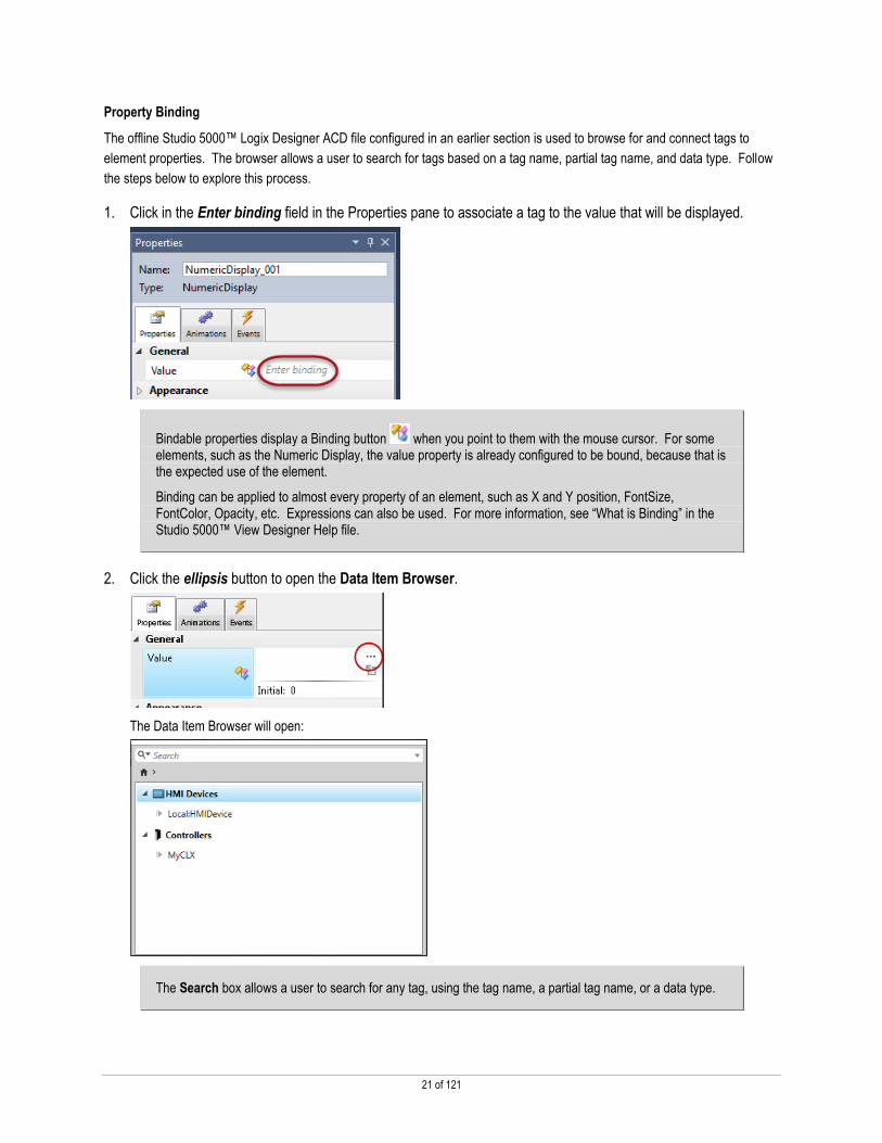
Property Binding
The offline Studio 5000™ Logix Designer ACD file configured in an earlier section is used to browse for and connect tags to
element properties. The browser allows a user to search for tags based on a tag name, partial tag name, and data type. Follow
the steps below to explore this process.
1. Click in the Enter binding field in the Properties pane to associate a tag to the value that will be displayed.
Bindable properties display a Binding button when you point to them with the mouse cursor. For some elements, such as the Numeric Display, the value property is already configured to be bound, because that is the expected use of the element.
Binding can be applied to almost every property of an element, such as X and Y position, FontSize, FontColor, Opacity, etc. Expressions can also be used. For more information, see “What is Binding” in the Studio 5000™ View Designer Help file.
2. Click the ellipsis button to open the Data Item Browser.
The Data Item Browser will open:
The Search box allows a user to search for any tag, using the tag name, a partial tag name, or a data type.

22 of 121
3. Expand MyCLX > Programs > MainProgram under the Controllers container.
+
Notice the breadcrumbs at the top of the data item browser. In addition to the Home button, the breadcrumbs can be used to navigate to other parts of the ACD project hierarchy. Click on a link to navigate back to that part of the hierarchy, or use the right arrows to navigate forward in the hierarchy.

23 of 121
4. Scroll down and double click myTag
The tag will now appear in the Value property field.
A numeric display has now been configured. Next, create a numeric input.
5. Click and drag the Numeric Input element onto the screen.

24 of 121
6. Use the alignment guides to reposition the element so that it is centered just above the Numeric Display.
Alignment guides, as well as other tools, have been included in View Designer functionality to ease the process of creating
screens.
These alignment guides appear whenever one element is being moved into the proximity of another. They show the midline, top, bottom, and side of the element, and enable snapping to an aligned position.
Additionally, canvas tools are available – when multiple objects are selected, a menu of options appear above the screen canvas.
Group: Use this tool to create a group out of one or more elements on the canvas. The new group will function as a single graphic element. This group will now appear as a new entity in the Graphic Explorer.
Order: This tool will change how the selected element is stacked on the screen. The stacking order can be changed to move an element forward, backward, on top of all other elements, or behind all elements.
Align: Graphic elements can be aligned to the edges of other graphic elements, or to the bottom, vertical, or horizontal centers of the elements.
Distribute: This tool spaces elements evenly either horizontally or vertically. This tool can only be used when three or more elements are selected on the canvas.
7. With the Numeric Input element selected, click the ellipsis button for Value in the Properties pane to open the
Data Item Browser.

25 of 121
Notice that the Data Item Browser opens to the most recent location that has been browsed.
8. Double click myTag to bind it to the Value property of the Numeric Input element.

26 of 121
Test the Project using the Emulator
Now that the application has some elements added, use the Emulator feature to test the project following the steps below. New
in version 4.01, the Emulator connects to the defined controller, and displays its data. Navigation, events and commands, and
animation will all function normally. It will not, however, display HMI device data, nor does it support data logging.
1. Click the Emulate Project button.
The information entered into the Project Properties dialog for the Emulator to Controller path will be used to establish the connection between this View Designer instance and the controller at this station.
The Emulate Project dialog window will open.
When the project has been built, and the runtime application has started, the Emulator will open.

27 of 121
The runtime diagnostics message found in the banner of the Emulator is indicating that the data log is not working. This is because the project is not running on a physical terminal with an SD card inserted.
2. Click the Numeric Input element to open the soft keypad.
3. Enter the number ‘15’ and click OK.

28 of 121
Notice that the Numeric Display is showing the new value.
4. Close the Emulator.
Continue to modify this application.

29 of 121
Animation, Events, and Popups
Understanding Animation
Many elements have useful built in properties such as level, fill color, and show flow that can be bound to tags and expressions.
Alternatively, State and Color Tables can be configured for elements when it is necessary to reflect multiple values of a tag or
expression in different ways.
Understanding Events
Events can be configured for any element on a screen. Event options include but are not limited to Touch Press, Touch
Release, State Exit, and State Enter. Once an Event is added to an element, the designer can then create and configure one or
more commands that will be performed when that event occurs.
Understanding Popups
Popups are a different type of screen that can be created for the PanelView™ 5000 terminal. These are usually smaller than the
terminal’s screen, but can be configured to be any size.
In this section you will do the following:
Use built-in animation to determine when a pump’s flow color is visible
Add an Event to the pump element so that it toggles a tag when the pump is touched at runtime
Create a popup
Turn a text display into a multistate indicator
Configure Built-in Animation
First, let’s turn one of the native elements into an indicator and button.
1. In View Designer, click in the Search field of the Toolbox, and type ‘pump’.
2. Select the first Pump and drag it to the screen canvas.

30 of 121
3. In the Properties panel, float the mouse over the ShowFlow property so that the binding button appears, and
click the binding button.
4. Click Bind property to item.
The ShowFlow property is now ready to be bound to a tag. At runtime, it will change status based on the value of the assigned tag.
5. Use the ellipsis button to open the Data Item Browser.
The Data browser should return to MyCLX > Programs > MainProgram, with myTag highlighted.

31 of 121
6. Scroll down and double click PumpControl.
Note that the PumpControl tag is Boolean, so the Pump element will only show its flow when the value of the PumpControl tag is 1, showing simple on/off property binding. More animation could be created by binding an analog value to the X position property, for example, which would result in horizontal position animation.
Using Button Behavior
Most elements found in the Toolbox can be configured to be buttons to be used at Runtime. For the pump element, Button
Behavior will be used to toggle the value of a tag in the controller. Follow the steps below to configure Button Behavior.
1. Right click the pump element and float the mouse over Button Behavior.

32 of 121
2. Click Toggle a tag on release.
Notice that the Properties panel has automatically opened the Events tab, with the Button Behavior event partially
configured.
3. Use the ellipsis button to open the Data Item Browser.

33 of 121
4. Double click PumpControl.
The pump is now configured as a button. When the pump is pressed at runtime, it will toggle the PumpControl tag on and
off.
Using State Table Animation
The State Table makes it possible to select specific properties that will be affected by a value change. In this way, a custom
multistate indicator can be configured. Follow the instructions below to specify the properties of the Text Display that will be
affected by the tag value.
1. Clear the filter used in the Toolbox by clicking the X in the search field.

34 of 121
2. Double click Text Display (under CommonControls) to add it to the screen.
Notice the Text Display contents can be changed within the element.
3. Click the Animations tab in the Properties pane.
4. Open the drop down list by clicking Add Animation.
5. Select State Table from the list.
’

35 of 121
The State Table Definition dialog window will open:
6. Increase the Number of states to 2.

36 of 121
7. Click the checkboxes for the following:
Text
FontColor
8. Click OK.
The State Table will appear with the selected configurations.
Note: the state table has been configured with two states that manage the FontColor and Text properties. The other states of the element will remain at their default values, or whatever was configured in the Properties tab.

37 of 121
9. Click the ellipsis in the Enter binding field to open the Data Item Browser.
This area can be used to bind tags to the State Table. In addition, Expressions can be used in this field.
10. Browse to MyCLX > Programs > MainProgram and double click myTag.
Notice that each state has an Expression Value by default. Each of these Expression values can be changed.

38 of 121
11. Change the Expression Values to match the picture below:
12. In the row for State0, click the FontColor field.
13. Use the drop down arrow to open the color palette, and double click Orange.
Note: it is also possible to manually enter the color’s hex value (f89800 for orange) in the FontColor field.
39 of 121
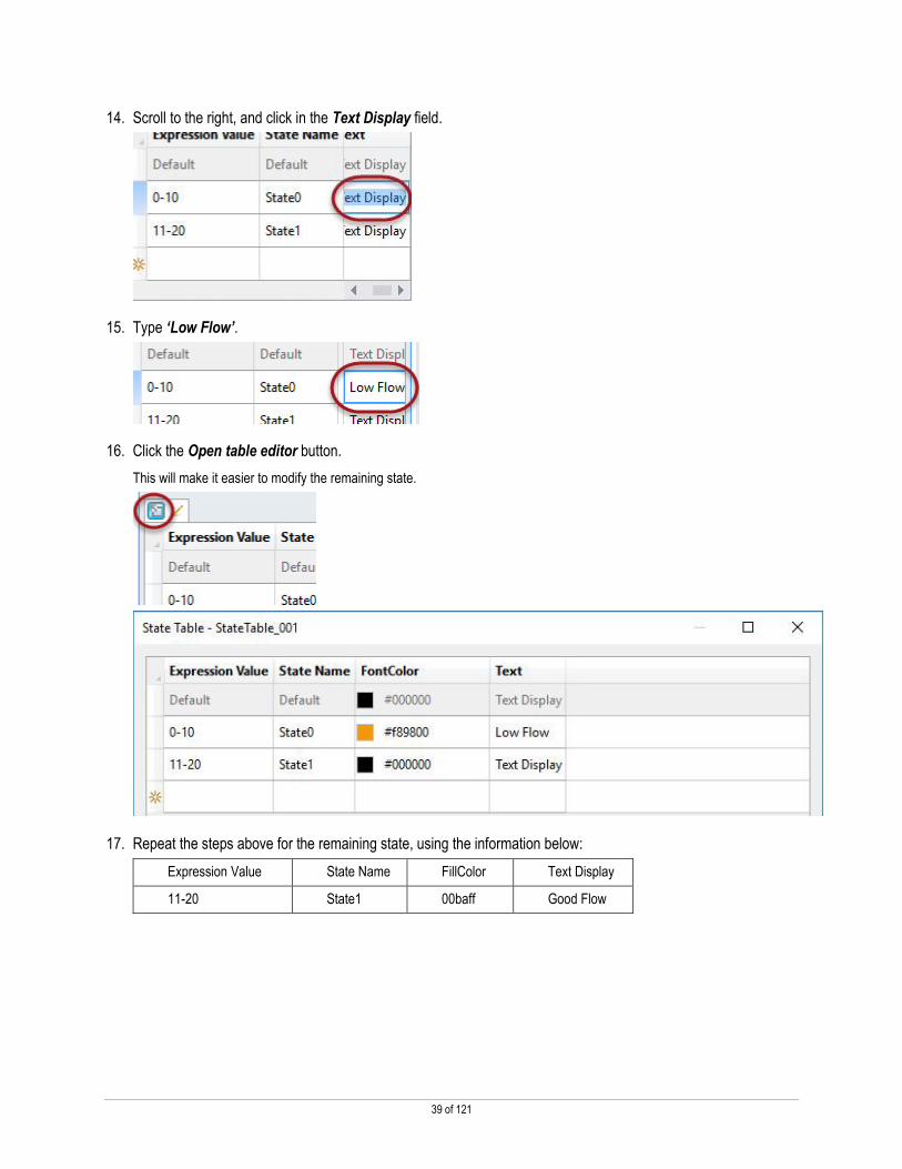
14. Scroll to the right, and click in the Text Display field.
15. Type ‘Low Flow’.
16. Click the Open table editor button.
This will make it easier to modify the remaining state.
17. Repeat the steps above for the remaining state, using the information below:
Expression Value State Name FillColor Text Display
11-20 State1 00baff Good Flow

40 of 121
The State Table should now look like the following:
18. Click Close.
Using the Graphic Explorer
The Graphic Explorer is used to easily locate and manipulate graphic elements, particularly when multiple elements are grouped
together or stacked on top of each other.
1. Move the Text Display and the Pump element so that the screen looks similar to the picture below, using the
alignment guides.

41 of 121
2. Click the Rectangle drawing tool in the Toolbox.
3. Draw a rectangle around the existing elements.
4. Click the Selection Tool arrow in the Toolbox, then right click the newly drawn rectangle and select Order >
Send To Back.

42 of 121
5. To make it easier to move the items on the screen, select the Rectangle, Numeric Input, Numeric Display,
Pump and Text Display elements, and select Group.
6. In the Graphic Explorer, expand Group_001, and select Rectangle_001.
The Graphic Explorer is located in the lower right corner of the software.

43 of 121
7. Expand the Appearance category of the Properties pane, and change the property values as shown below:
Download and Explore
1. Click Communications, and select Download…
2. In the Download Runtime Application dialog window, verify that the HMI Device Location is correct.

44 of 121
HMI Device Location: Use this page to specify the communication path from the computer running View Designer to the HMI device to which the runtime application will be downloaded.
3. Click Next.
4. Now, verify that the Controller Reference is correct.
Controller References: This page shows the controller references for the project as entered in the Controller References tab of the Project Properties dialog box. Use this page to make sure that the correct controller reference and project is selected.
5. Click Next.
6. Click Download to start the process.

45 of 121
The software will now build the runtime application, first verifying the project, then connecting with the terminal. It will then
download the project and the terminal will start the application when the download is complete.
Download: This page shows the progress of the download process as View Designer saves and verifies the project, builds the runtime application, connects to the HMI device, and transfers the runtime application to the HMI device.
Note: If errors or warnings are found, the dialog will update with the number of errors and warnings found.

46 of 121
If any errors or warnings are detected, the Errors pane will appear below the screen canvas pane when the Verify Project box is closed.
Double click the errors or warnings to be taken to the corresponding component of the project.
7. When the download is complete, click Close.
8. Turn to the terminal at this station.

47 of 121
9. Press the Pump element.
Notice the Show Flow property has updated, displaying its blue color.
Also, notice the Text Display is showing Good Flow, and is blue in color.
10. Press the Numeric Input element.

48 of 121
11. Enter a value between ‘0’ and ‘10’, and press OK.
]
Notice the Text display updates to Low Flow, and the font color changes to orange.

49 of 121
Using Logix-Based Alarming
Business Issue
I want to easily configure alarms in my HMI and keep my alarms up to date with changes I make in my Logix controller.
Solution
The PanelView 5000 family of terminals automatically uses alarms which are configured using the Alarm Analog (ALMA) and
Alarm Digital (ALMD) instructions in the Logix controller. When a new project is created in View Designer, an alarm rollup
indicator is created on the pre-built system banner and pre-built alarm summary and alarm manager displays in order to interact
with alarms at runtime. The only configuration needed is the path to the Logix controller. Once the project is downloaded to the
PanelView 5510, the terminal will start showing any active alarms available in the Logix controller. If any new alarms are created
or existing alarms modified in the controller, those changes are automatically used by the PanelView 5510.
Release V5 of View Designer supports Logix Tag based alarms.
1. Turn to the terminal.
2. Press the Alarm button on the System Banner in the upper left corner.
The AlarmSummary display will open, looking similar to the picture below:

50 of 121
Note: The alarms on the terminal may not match the picture exactly, as the controller program may be in a different state.
3. On the computer, restore Logix Designer.
4. Expand Mixer, and double click on Alarms.
5. Scroll down to rung 7.
Rung 7 shows a digital alarm instruction, or an ALMD.

51 of 121
6. Right click the Alarm_Control[1].31 bit in Rung 7 and select Toggle Bit.
7. Notice that the ALMD’s “InAlarm” bit is now enabled:
Notice that the Alarm Summary has updated on the terminal to reflect that the alarm has been triggered.
52 of 121
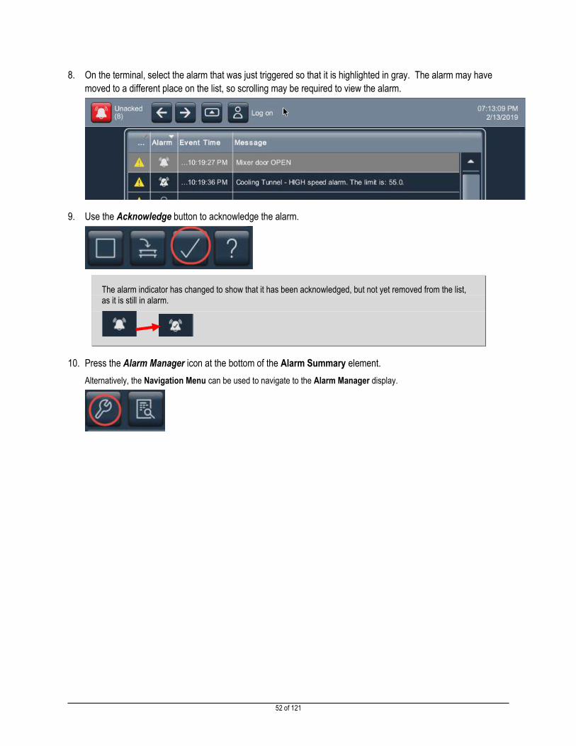
8. On the terminal, select the alarm that was just triggered so that it is highlighted in gray. The alarm may have
moved to a different place on the list, so scrolling may be required to view the alarm.
9. Use the Acknowledge button to acknowledge the alarm.
The alarm indicator has changed to show that it has been acknowledged, but not yet removed from the list, as it is still in alarm.
10. Press the Alarm Manager icon at the bottom of the Alarm Summary element.
Alternatively, the Navigation Menu can be used to navigate to the Alarm Manager display.

53 of 121
11. Scroll down and tap the Mixer_DoorAlarm that was triggered a few steps ago so that it is highlighted in gray.
Note that the icon for the Mixer_DoorAlarm alarm is showing that it is In Alarm and Acknowledged.
12. Select the Disable Alarm button at the bottom of the Alarm Manager.

54 of 121
Notice the Disable Alarm symbol is now in the Inhibit column, indicating the alarm has been disabled. The alarm may have
moved to a different place on the list, so scrolling may be required to view the alarm.
13. Return to Logix Designer and notice the Disabled bit is ON for the ALMD instruction.

55 of 121
14. On the terminal, select the Mixer_DoorAlarm alarm, and press the Enable button. Keep in mind that the alarm’s
position in the list may have changed and scrolling may be required to locate the alarm.
15. Return to the Alarm Summary screen.
16. In Logix Designer, toggle Alarm_Control[1].31 off.
Tag-based Alarm
New for V5 is support for tag-based alarms. Let’s take a look at how to implement a tag based alarm.
1. Under the Mixer Program, double click the Parameters and Local Tags.
2. Select the Edit Tags tab.
3. Scroll to the bottom of the list and click in the empty cell to create a new tag called ‘MixerSpeed’. Leave the
default data type of DINT.

56 of 121
4. Click Enter to accept the new tag.
5. Right click MixerSpeed and select Add Alarm for “Mixer Speed”.
The new alarm editor window will appear
57 of 121
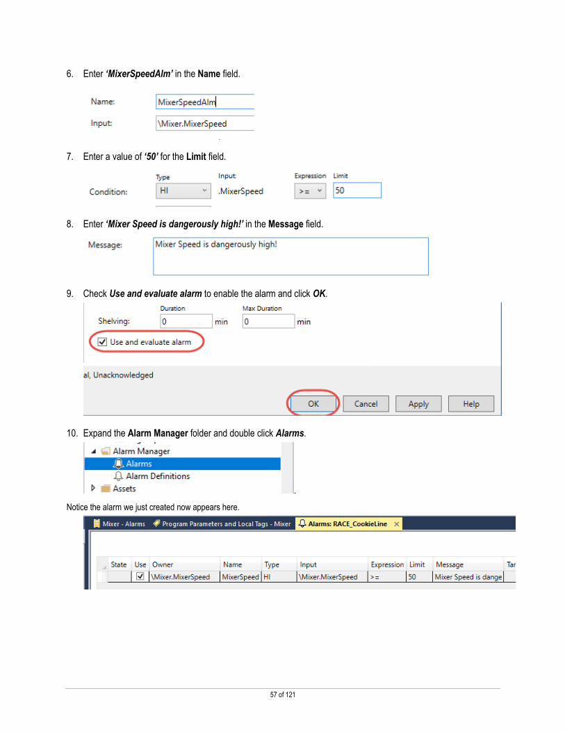
6. Enter ‘MixerSpeedAlm’ in the Name field.
7. Enter a value of ‘50’ for the Limit field.
8. Enter ‘Mixer Speed is dangerously high!’ in the Message field.
9. Check Use and evaluate alarm to enable the alarm and click OK.
10. Expand the Alarm Manager folder and double click Alarms.
.
Notice the alarm we just created now appears here.

58 of 121
11. Select the Program Parameters and Local Tags – Mixer tab.
12. Scroll to the bottom of the window and select the Monitor Tags tab.
13. Find and select tag MixerSpeed, enter a value of ‘51’, and press Enter.
14. Turn to the PanelView 5510 terminal. Notice the tag-based alarm we just created and casued to go into an
alarm condition has appeared on the Alarm Summary display.
Note: the triggered alarms may appear slightly different on your terminal.
15. Minimize Logix Desginer.

59 of 121
Using the Built-in Navigation Menu
Business Issue
Configuring navigation to screens contained within a project can take a lot of time for the HMI designer. Rows of navigation
buttons must be configured on each screen and use valuable screen space. The user experience for plant floor operators is not
optimal or consistent.
Solution
PanelView 5000 terminals have an intuitive navigation menu that provides operators with easy navigation to screens contained
within a project. With the simple push of a button, operators have a common and efficient way to navigate screens from any
place in the project. Project development is faster since the runtime navigation menu is easily configured based on the layout of
screens in Studio 5000 View Designer. HMI designers are no longer required to configure navigation buttons on each screen,
providing more space for application content.
Adding Screens and Shortcuts
1. On the PanelView 5510 terminal at this station, press the Navigation Menu button located in the lower middle of
the bezel to open the Navigation Menu.
Alternatively, press the Navigation Menu button in the Banner.
The Navigation Menu will open, showing all the screens present in the Navigation Menu container of the project in View
Designer
Shortcuts, found in the Navigation Menu, are read-only versions of the User-Defined Screens. A User-Defined Screen will not appear in the Navigation Menu unless a shortcut has been created.

60 of 121
2. In View Designer, right click User-Defined Screens, and select New Screen, then type ‘Main’ as the name of
the screen.
3. Double click the new screen to open it.
4. In the Project Explorer, scroll down and right click Images under the Assets folder, then select New Images.

61 of 121
5. Browse to C:\Lab Files\Explore, select mighty_qs, and click Open, then press Enter to accept its default
name.
6. In the Toolbox, search for Image, and double click the element to add it to the screen.
7. In the Images dialog that opens, select mighty_qs, and click OK.

62 of 121
8. Resize the image so that it covers most of the screen.
9. Right click the Main screen in the Project Explorer under User-Defined Screens and select New Shortcut.
Notice the shortcut now appears under the Navigation Menu in the Project Explorer.

63 of 121
Note that shortcuts cannot be configured for popups. Popups are smaller displays that open on top of full sized screens and are created by right clicking User-Defined Screens.
10. Press Enter to accept Main as the name of the shortcut.
Alternatively, the shortcut can be added by right clicking the Navigation Menu. The New Shortcut dialog will open, giving the user the option of selecting an existing screen (User-Defined or Predefined), and naming the new shortcut. It is also possible to create a new screen here as well.
Renaming Screens and Changing Shortcut Captions
1. Click Screen_001 under User-Defined Screens, so that it is highlighted and rename it to Pump_Control.
2. Repeat this process to change the name of the Screen_001 shortcut under Navigation Menu.

64 of 121
3. With Pump_Control selected in the Navigation Menu, expand Navigation Menu in the Properties panel.
4. In the Caption field, type ‘Pump’, then press Enter, and type ‘Control’ so that the field matches the picture
below:
Previously, the screen name and the shortcut names were changed. This time, the caption is being changed. This caption is what will be used on the Navigation Menu itself – and will now include the configured two line caption. If no caption is configured, the Shortcut name is used.
Organizing the Navigation menu
1. Right click the new Main shortcut under Navigation Menu, and select Set as Home.
The Main shortcut is now the Home screen of the project as indicated by the house icon.

65 of 121
2. In the View Designer Project Explorer pane, right click Navigation Menu, and select New Folder.
3. Name the folder ‘System’.
Up to three levels of folders can be created in the Navigation Menu.
4. Click and drag the AlarmSummary, AlarmManager, and Settings shortcuts into the new folder.

66 of 121
5. Continue to click and drag shortcuts, moving the Main and Pump_Control shortcuts, in the Navigation Menu,
until it looks like the picture below.
The order of the screen shortcuts in the project will be the order of the screen shortcuts when running the project on the terminal.
Testing Navigation
1. Click the Emulator button in the toolbar.

67 of 121
2. Use the Navigation Menu button to open the Navigation Menu.
Notice that the Navigation Menu of the running project matches the Navigation Menu in the Project Explorer
There is no navigation bar using up screen real estate that allows the return to the Pump Control screen, but the Navigation
Menu works just fine.
3. Press the Pump Control shortcut to see the Pump_Control screen.

68 of 121
4. Use the Navigation Menu to return to the Main screen, or use the Back button found in the banner.
5. Open the Navigation Menu, then click the System folder.
The shortcuts that were moved in the Navigation Menu now appear in the System folder in the order they were arranged.
6. Close the Emulator.

69 of 121
Data Logging and Historical Trending
Business Issue
Operators often need to see how machine or process values have changed in the past, so they can more easily see trends in
production values or troubleshoot upsets. For more detailed analyses, engineers need to access past data values in a format
they can easily manipulate with common tools.
Solution
PanelView 5000 terminals now support data logging where up to 250 tags can be logged. Data is logged to an SD card, so log
files can support significant amounts of data. The logged data can be exported to csv files for evaluation in tools such as Excel.
Historically logged data for a tag is automatically shown on a trend if the trend is currently not displaying real-time data.
Creating a Data Log
Follow the steps below to create a data log for the project.
1. In the Project Explorer, scroll down to, and right click Data Logs, then select New Data Log.
2. Press Enter to accept the default Data Log name.
3. Double click DataLog_001 to open it.
4. Use the ellipsis button to open the Tag Browser.
70 of 121
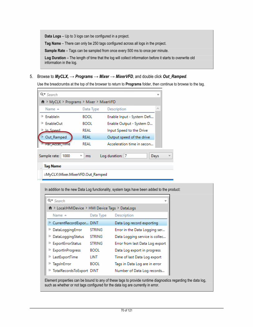
Data Logs – Up to 3 logs can be configured in a project.
Tag Name – There can only be 250 tags configured across all logs in the project.
Sample Rate – Tags can be sampled from once every 500 ms to once per minute.
Log Duration – The length of time that the log will collect information before it starts to overwrite old information in the log.
5. Browse to MyCLX, → Programs → Mixer → MixerVFD, and double click Out_Ramped.
Use the breadcrumbs at the top of the browser to return to Programs folder, then continue to browse to the tag.
In addition to the new Data Log functionality, system tags have been added to the product:
Element properties can be bound to any of these tags to provide runtime diagnostics regarding the data log, such as whether or not tags configured for the data log are currently in error.
71 of 121
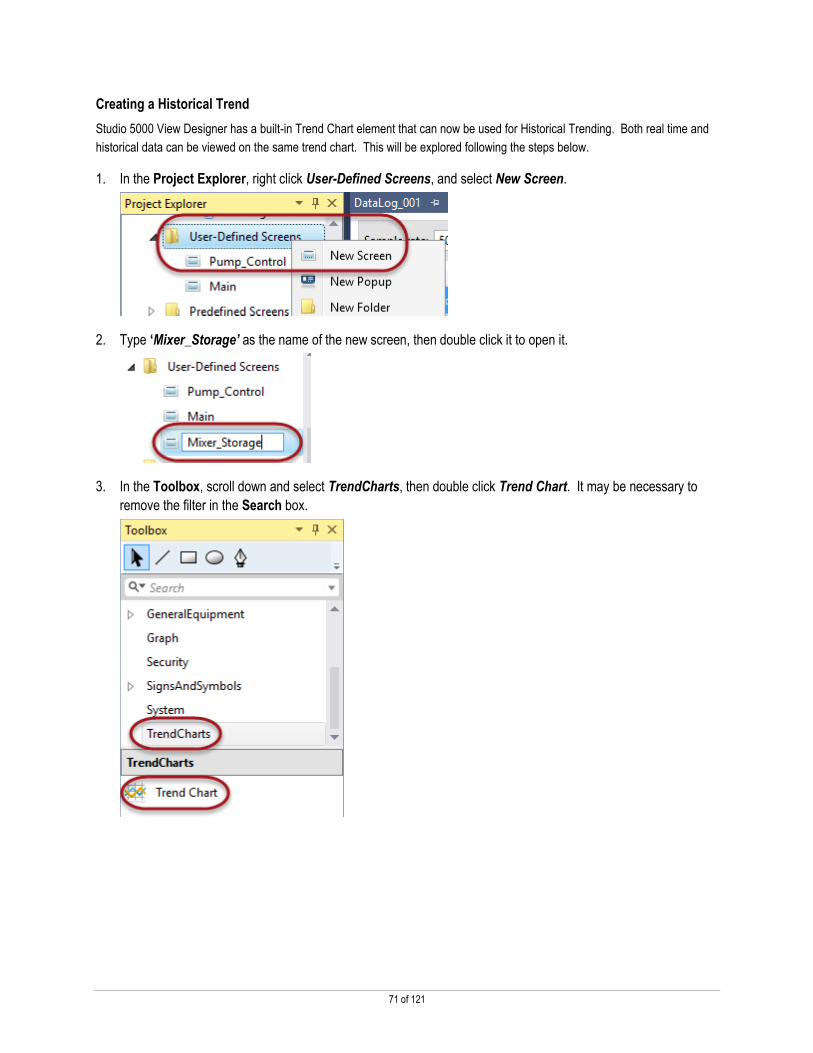
Creating a Historical Trend
Studio 5000 View Designer has a built-in Trend Chart element that can now be used for Historical Trending. Both real time and
historical data can be viewed on the same trend chart. This will be explored following the steps below.
1. In the Project Explorer, right click User-Defined Screens, and select New Screen.
2. Type ‘Mixer_Storage’ as the name of the new screen, then double click it to open it.
3. In the Toolbox, scroll down and select TrendCharts, then double click Trend Chart. It may be necessary to
remove the filter in the Search box.

72 of 121
4. Use the handles of the Trend Chart to resize it to fill the screen.
5. In the Properties pane, change the SampleRate to ‘500’.
In addition to Data Logging, new bindable properties have been added to the Trend Chart.
TimeSpanStart – defines a specific date and time at which the Chart will start
ShowDate – toggles the date display in the lower left corner of the chart

73 of 121
6. Click the Traces tab, and click Add Trace.
7. Click the ellipsis button for the Value property, and double click Out_Ramped.
8. Change the Marker to Circle.
Markers can be used to visualize each data point on the trend chart.

74 of 121
9. Add another trace, with the following settings:
Value – MyCLX, → Programs → Mixer → MixerVFD → In_Speed
Marker – Filled Square
Notice that one of the traces is configured for the tag found in the data log, while the second trace’s value is not.
Add the Trend Screen to the Navigation Menu
1. Right click the Mixer_Storage screen under User-Defined Screens, and select New Shortcut.

75 of 121
2. Press Enter to accept the default name.
3. With the new Mixer_Storage shortcut selected, turn to the Navigation Menu heading in the Properties pane.
4. In the Caption field, type ‘Mixer’, then press Enter, and type ‘Storage’ to change how the caption appears in
the Navigation Menu at runtime.
5. Use the Icon drop down button and select the trend icon.
76 of 121
Data Logging and Historical Trending at Runtime
Use the steps below to explore Data Logging and Historical Trending at Runtime.
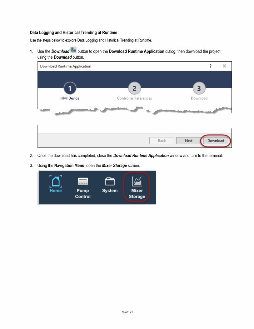
1. Use the Download button to open the Download Runtime Application dialog, then download the project
using the Download button.
2. Once the download has completed, close the Download Runtime Application window and turn to the terminal.
3. Using the Navigation Menu, open the Mixer Storage screen.

77 of 121
Notice the data displayed – the terminal has started logging the data for the MotorVFD.Out_Ramped tag as soon as the project loaded onto the terminal. That data is populated on the trend, while the tag that is not included in the data log is only showing real-time data.
4. Use the panning buttons in the left corner of the screen to pan back and forth, exploring the traces and their
values.
5. Use the Navigation Menu to open the System folder, then press Settings.

78 of 121
6. Press the Data Logs area of the screen.

79 of 121
The Data Log settings popup display enables a user to export the data log running on the terminal. The file will be exported as a zipped *.CSV file, then saved to the selected destination.
When an export is initiated, the following will appear on the settings screen:
Alternatively, elements in the toolbox can be configured to export or cancel a data log export:

80 of 121
Remotely Accessing the PanelView 5000 with VNC
Business Issue
Maintenance people often need to remotely display or manipulate screens on their HMI to monitor their machine or process or to
change values if necessary.
Solution
PanelView 5000 terminals support a VNC connection to the terminal. You can configure both Full Control and View Only
passwords in View Designer as part of your project to limit access to the terminal. You can also further limit access at runtime on
the terminal using a pre-defined VNC configuration screen on the terminal. This allows you to limit VNC access during critical
operations. A system tag on the terminal also indicates when a VNC connection has been made to the terminal, so you are
aware when someone connects remotely.
Configuring the VNC Viewer
The VNC Viewer can be used without configuration – in that case, no password would be required and anyone with the IP
address of the terminal would be able to use VNC to access the terminal fully. In this section, the security settings will be
configured such that different passwords will be required to access the terminal with varying degrees of control.
1. In View Designer, select the Tools menu from the Menu bar, then Security Administration….
2. Select the VNC tab on the left side of the Security Administration window.

81 of 121
3. Under VNC View-Only Access, enter ‘rockwell’ in both the Password and Confirm text fields.
4. Under VNC Full-Control Access, enter ‘mightyqs’ in both the Password and Confirm text fields.
5. Click the OK button on the Security Administration window.

82 of 121
Exploring the VNC Viewer Feature
1. Download the project to the terminal, using the Download button, then click Download in the Download
Runtime Application dialog.
2. Close the Download Runtime Application window.
Configuring VNC Options on the Terminal
In addition to the Security Administration performed within View Designer for VNC access, a new VNC setting popup display has
been added to the pre-defined screens for each project. Follow the steps below to explore and learn about those settings.
1. On the terminal tap the Navigation Button to open the Navigation Menu, then tap the System folder to open it.
2. In the System folder, select Settings.

83 of 121
3. Select VNC from the Settings screen.
4. Select Enabled with Full-Control access if it is not selected already.
VNC has a variety of configuration options, including settings both in View Designer and on the terminal. The options on the terminal are: Enabled with Full-Control access: VNC for Full-Control or View-Only access is permitted Enabled with View-Only access: VNC for View-Only access is permitted Disabled: no VNC access is permitted
It is important to note that if Disabled is selected on the terminal, no VNC access is permitted even if passwords for VNC access are configured in View Designer. Any attempted connection via VNC from a computer to the terminal will result in a failure to connect message.
5. Use the Navigation Menu to return to the Home screen.
6. Click the UltraVNC icon in the taskbar to start UltraVNC Viewer.
Note: This lab uses the UltraVNC client, but other VNC clients (such as TightVNC) will work. UltraVNC is a free VNC client, while TightVNC offers both free and paid versions for varying types of use.

84 of 121
7. In the UltraVNC Viewer window, type ‘192.168.1.12’ and click Connect.
8. Enter ‘mightyqs’ in the authentication window that appears, then click Log On.
A window will open and what is on the terminal screen is now visible on the computer screen.

85 of 121
9. Using the UltraVNC Viewer, click the Navigation Button to open the Navigation Menu, then click
Pump_Control.
10. Change the value of the numeric display.
Note that the display is fully accessible from the computer. This is because the password entered was the one set for “Full-
Control Access”.
11. Click the Close Connection button in the toolbar to end the VNC session.
12. Open UltraVNC Viewer again by clicking the icon in the taskbar and click Connect on the window that appears.

86 of 121
13. This time, enter ‘rockwell’ in the password text field and click Log On.
14. Click around the display and note that interaction with the HMI is no longer possible.
This is because the password entered was the one set for “View-Only Access”.
15. Close UltraVNC Viewer.

87 of 121
PDF Viewer
Business Issue
Providing operators and maintenance people with quick access to process and machine documentation can improve machine
start-up time and reduce downtime. Paper documentation is time consuming for operators to access, can easily be lost or
damaged and is difficult to maintain.
Solution
PanelView 5510 terminals have a PDF Viewer (PanelView 5310 terminals will support a PDF viewer with v5) that allows
operators to quickly access documentation about the process or machine for operating procedures, troubleshooting and
maintenance. HMI Designers can easily embed PDF documents on their screens using the PDF Reader available in Studio 5000
View Designer which includes a predefined PDF viewer, navigation controls and zoom controls. Simply place the PDF Viewer on
a screen and select the PDF document to view.
Adding a PDF to the View Designer Project Explorer
1. In the Project Explorer, right click Documents under Assets and select New Documents.
2. Browse to C:\Lab Files\Explore and select cie-wp002_-en-p and click Open.

88 of 121
3. Press Enter to keep the name of the document as-is.
Viewing a PDF on a Screen
Once the PDF has been added to the project, a viewer element can be placed on a screen, similar to how other elements are put
on screens or popup displays. The PDF Viewer element is located in the Toolbox.
In addition, an Add-On Graphic that includes the PDF viewer as well as buttons configured with typical Event Commands, is
included in all new projects as pre-defined content. The steps below walk through the process of adding the Add-On Graphic to
a new screen.
1. Create a new screen by right clicking User-Defined Screens and selecting New Screen.
2. Name the new screen ‘References’ and press Enter.

89 of 121
3. Right click References under User-Defined Screens and select New Shortcut.
4. Press Enter to leave the name as-is.
5. Double click References under User-Defined Screens to open the screen.
6. In the Toolbox, click Add-On Graphics, then double click PDF_Viewer to add the element to the screen.

90 of 121
PDF documents can also be added to a screen using PDF, which is found in the Toolbox under System. This is just the viewer – there are no page navigation buttons, etc. like those contained in the Add On Graphic.
7. On the Properties panel, click the arrow next to the DocumentName property to show the drop down menu of
available documents. Select ciewp002_enp, the only document that has been added to the project.

91 of 121
The PDF is now visible on the screen, as seen below:
8. Also on the Properties panel, note the Zoom property and the options in the dropdown menu.
The element is currently set to Fit width, which will zoom in on the document to fill the entire element.

92 of 121
9. Change the property to Fit page. The document will now fit the entire page within the element.
The PDF_Viewer Add-On Graphic contains a great deal of built in functionality to allow manipulation and navigation of the PDF. The text and number displays at the bottom of the Add-On Graphic auto-populate with the document title, current page, and total number of pages at runtime. The buttons in the Add-On Graphic include options to view the bookmarks within the PDF, page forward and page back, fit width and fit page, and incremental zoom in and out.
Similar functionality for PDF control can be achieved using a Touch Release type event. The options can be viewed in the drop down menu below.

93 of 121
Download and Explore
1. Click the Download button in the toolbar to download the project to the device. Click Download on the
window that appears, then Close when the download is complete.
2. On the terminal, tap the Navigation Menu button to open the Navigation Menu. On the Navigation Menu, tap
References to open the new screen.
3. Take a few moments to explore the PDF Reader.
1 – View bookmarks that have been configured in the document (outside View Designer)
2 – Page back/page forward
3 – Currently viewed page out of total pages in the PDF
4 – Change view to Fit width
5 – Change view to Fit page
6 – Incremental zoom in/zoom out
These buttons have been configured using the various Event commands available for the PDF Viewer element. One could also add a Text Display object to the PDF Viewer AOG that shows the name of the PDF.
4. Click the Bookmarks button in the lower left corner of the screen.
This button has been configured to open the bookmarks pane:

94 of 121
The pane will show any bookmarks that have been configured for the PDF. These bookmarks are added to the document outside of View Designer, but can be utilized at Runtime.
5. Continue exploring the functionality of the PDF_Viewer Add-On Graphic.

95 of 121
Using Add-On Graphics – Optional
Business Issue
I want the ability to create my own collection of elements to link directly to an Add-On Instruction or User-Defined Tag. Once
they are created, these elements can be used on any screens, just like any other Toolbox element, and all of the instances will
update if I change its definition.
Solution
Studio 5000 View Designer Add-On Graphic functionality allows a group of elements to be reused multiple times throughout a
project. An Add-On Graphic is comprised of multiple graphic elements, which can be treated as a single graphic element when
used on a screen. Consistency among the deployed Add-On Graphic instances is maintained by propagating any change made
to the Add-On Graphic definition. Add-On Graphics can use properties to easily link to Logix data types such as User Defined
Data Types and Add-On Instructions.
Creating an Add-On Graphic
Follow the steps below to create a new Add-On Graphic in the project.
1. In the Project Explorer of View Designer, scroll down and right click Add-On Graphics, then select New Add-
On Graphic.
2. Type ‘TankInfo’ as the name of the new Add-On Graphic, and press Enter.

96 of 121
3. Double click the new TankInfo Add-On Graphic to open the Add-On Graphic definition.
1 – Add-On Graphic definition canvas
2 – Properties of the Add-On Graphic, including Revision, Description and Vendor
3 – Property Definition area, where User Defined Properties are created and can be linked to User-Defined Data Types.
4. In the Toolbox, type ‘Mixing’, then double click Mixing Hopper Side to add it to the definition.
5. Remove the filter by clicking the X button, then select CommonControls.

97 of 121
6. Double click Numeric Display, then double click Text Display to add the two elements to the Add-On Graphic.
7. Click and drag the Numeric Display and Text Display until the Add-On Graphic looks like the picture below:
8. In the Property Definition area, located near the bottom of the View Designer screen, add a new property
named ‘Tank’.
Note: There are two types of property definitions:
User-Defined Property Used as a placeholder in a tag reference. For example, the same button panel screen can be used to manage multiple devices by using a property in its bindings. At runtime, different tag instances can be passed to a graphic element each time the button panel screen is opened, allowing the same element to be used with multiple tag instances.

98 of 121
Alias Create an alias property to reference a property of the screen or a property of a graphic element on the screen. This allows an expression to be passed directly to the property when the screen is opened, whether the expression is a tag or a specific value.
9. In the Data Type field, click the ellipsis button to open the Data Item Browser.
10. Expand User-Defined, and double click Base_StorageLOC.
Note: A user defined property can be given a data type association to make it easier for a user of the screen to assign a tag of the correct type to the screen property.
Note: This Add-on Graphic is now associated with the Base_StorageLOC UDT in the Logix program. Each instance of the Add-on Graphic can now be mapped to a different instance of the UDT, allowing easy integration between Logix Designer and View Designer. When the Add-on Graphic is used on a screen, it will now have a property associated with a Tank data type. This will allow the Add-on Graphic to be reused multiple times with different Tank data type tags.

99 of 121
11. Select the Numeric Display, so that its properties appear in the Properties panel.
12. Click the ellipsis button in the Value property to open the Data Item Browser.
Notice the Tag Browser has opened directly to the Property Definition just created. User-Defined properties are now found in the Tag Browser under Local:HMIDevice > “Component Name”, and can be browsed like any other component in the tag browser.
13. Expand Tank, then double click Current_Level
Notice that the Tag Browser is browsing the elements of the User-Defined Data Type. When the Add-On Graphic is used on a screen and the property is set to one of the UDT instances in the controller, the Tank property definition will use that UDT and its elements.
14. Under Appearance, change the TextAlignment property to match the following:
15. Select the MixingHopperSide_001 element using the Graphic Explorer located in the lower right corner.

100 of 121
16. Use the Binding button for the Level property, click Bind property to item, then click the ellipsis button to
open the Tag Browser.
17. Double click Current_Level.
18. Bind the MaxLevel property, click Bind property to item, then click the ellipsis button in the MaxLevel
property to open the Data Item Browser.
19. Double click Full_Level to bind the property to the tag.
20. Select the TextDisplay_001 element using the Graphic Explorer.

101 of 121
21. In the Appearance category, change the TextAlignment so that it is aligned to the middle:
22. In the General category of the Properties panel, right click Text, and select New Alias…
The Alias will appear in the Property Definition panel:
While this alias is not bound to a tag or a member of the User-Defined Data Type, when the Add-On Graphic is used on a screen, the property will be configurable.
Adding an Add-On Graphic to a Screen
After creating the Add-On Graphic, instances of it can be added to screens throughout the project. The aliases and user defined
properties will need to be configured for each instance. Follow the steps below to explore this functionality.
1. In the Project Explorer, under User-Defined Screens, double click Pump_Control to open the screen.

102 of 121
2. In the Toolbox, select Add-On Graphics, then double click TankInfo to add it to the screen.

103 of 121
3. Move the Add-On Graphic so that it does not overlap the pump control group.
4. Add another TankInfo Add-On Graphic, this time to the right of the pump control group.
5. Select the left TankInfo, then look at the Properties of the Add-On Graphic.
Notice the two properties defined for the Add-On Graphic appear under General. This is where they will be defined for each
instance of the Add-On Graphic.

104 of 121
6. Click the ellipsis button for the Tank property to open the Tag Browser.
Notice the Tag Browser is filtered for the Tags that have the Base_StorageLOC data type.
7. Expand mMixerStorage, and double click mMixerStorage[0].
8. In the Text_001 field, type ‘Butter’.

105 of 121
9. Click the TankInfo Add-On Graphic on the right, and modify the properties to match the picture below:
The screen should now look like the following:
Modifying an Add-On Graphic
In this section, an Add-on Graphic that has already been used in a project will be modified. Changes to an Add-on Graphic will
propagate to all instances of it within the project automatically, reducing design effort.
1. Toggle to the TankInfo Add-On Graphic definition.
2. Select the TextDisplay_001 element from the Graphic Explorer.

106 of 121
3. In the Properties pane, change the FontColor to a color of your choice using the drop down button.
4. Return to the Pump_Control screen.
5. Notice that the color of each TankInfo text display has been updated with the change in color:
6. Feel free to download or emulate the project to explore the real time data.

107 of 121
Runtime Language Switching – Optional
Business Issue
I want to use my project in multiple facilities around the world and allow the operators to choose the language with which the
project displays its information.
Solution
As of version v3.01, Studio 5000 View Designer includes Runtime Language Switching. Users can configure the project to
include up to 20 languages.
Opening an Existing Project
In this section, a partially completed project will be opened and configured for runtime language switching.
1. Minimize the MyProject View Designer window.
2. Open Studio 5000 by clicking the icon in the taskbar.
3. Select Existing Project.

108 of 121
4. Navigate to C:\Lab Files\Explore in the file browser. Change the File Type to View Designer (*.vpd) and
select MightyQsCookies and click Open.
Note that View Designer (*.vpd) must be selected as the file extension to view the file.

109 of 121
Exporting View Designer Text Strings
1. In the Tools menu of MightyQsCookies, select Export Languages…
The Export Languages dialog will appear:
2. Use the drop down list for Select current language, to select English (United States), if it is not already
configured.

110 of 121
The Current Language will be used as the Key language in the Export file.
2. In the Selected language for localization list, scroll down and select French (France).
Feel free to scroll down to explore the other languages that have already been selected (Chinese, German, Italian, Spanish,
and a few others).
Up to 20 languages can be exported or imported into a View Designer project.

111 of 121
By default, the exported languages file will be in the *.xlsx format. However, it is also possible to save the file in a Text Document (*.txt) format, which is similar to the Tab Delimited format used by ACD String exports.
In addition, the file will be exported to the location in which the project is currently located.
3. Click Export to export all of the text strings configured in the project.
4. If prompted, click the Save and Export button.
When the export is complete, the Export Languages dialog will close.
Modifying View Designer Text Strings
1. Open Windows Explorer using the icon in the taskbar.
2. Browse to C:\Lab Files\Explore and double click Cookies_Languages to open the language file.
Notice the different columns in place for the languages that have been exported. In a new file, all cells below the language
headings will be empty.

112 of 121
Be sure to pay attention to the following:
1 – Do not make any changes to the first four columns, as this may adversely affect the import of the file back into the
project.
2 – As mentioned in 1, do not change any text, or in any way re-format these items.
3 – Use these cells to input newly translated cells, matching the translated strings to those in the Key column.
This file shows the other languages minus French that have already been translated. The translation is done manually and entered into the appropriate cell.
3. Close the Cookies_Languages.xlsx file and do not save any changes if prompted.
Importing View Designer Text Strings
1. In Windows Explorer, navigate to C:\Lab Files\Explore and double click Cookies_Languages_Complete to
open the file.
This file contains the translated French text that was missing from the file exporting earlier.

113 of 121
2. Scroll through the Excel file to see the text strings that have been translated.
3. Close the Excel file, selecting Don’t Save if prompted.
4. Close Windows Explorer and return to MightyQsCookies in View Designer.
5. In the Tools menu, select Import Languages…
6. In the Import Languages dialog, click the Browse button for the Language file field.

114 of 121
7. Browse to C:\Lab Files\Explore and select Cookies_Languages_Complete and click Open.
Notice the Import language changes field has been updated to reflect the languages that have been affected by changes
made to the exported file. In this case, French has been added.
8. Click Import.

115 of 121
Creating a Language Switch Button
Due to the functionality of View Designer, any element on any screen can be turned into a button using Events and Commands.
With the release of version 3, the list of commands now includes language switching. Turn a group of elements into one such
button using the steps below.
1. In the Project Explorer, double click the LanguageSelection popup display under User-Defined Screens.
2. Select the French flag and text display group.
3. Click the Event tab, then click the Add Event drop down, and select Button Behavior.

116 of 121
4. In the Choose Behavior drop down, select Switch language on release.
5. Finally, use the Switch Language To: menu, select French (France).
Notice the list includes only those languages that have been imported back into the project.
Language Switching System Tag
A system tag, ActiveLanguage, has been added to the HMI Device Tags in the Tag Browser, making it possible to show the current language being displayed by the project at runtime.
Note that the ActiveLanguage tag is read only.

117 of 121
Configure the Default Startup Language
Use the steps below to verify the startup language for the project.
1. In the Project menu, select Project Properties.
2. Select the Language tab.
3. Using the Select Language drop down menu, select the language the project will use at start up.
The project will use this selection when the project starts up, and will default to this selection if a string does not contain a translation for a selected language.
4. Click OK to close the Project Properties window.

118 of 121
Download the Project and Explore Language Switching
Use the steps below to download the file and explore language switching at runtime.
1. Click the Download button to download the project to the terminal. Click Download again on the window
that appears. Ignore the any warning messages.
2. Once the download is complete, click Close to close the Download Runtime Application window.
3. Turn to the terminal. Tap the Navigation Menu button in the System Banner to open the Navigation Menu.
On the Navigation Menu, tap Areas to open the folder, then tap Mixer to open the Mixer screen.
4. Press the Language Selection button in the System Banner. It contains a flag representing the currently
selected language.
119 of 121
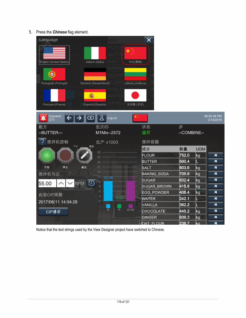
5. Press the Chinese flag element.
Notice that the text strings used by the View Designer project have switched to Chinese.

120 of 121
6. Click the Language Selection button in the System Banner.
7. Next, press the French flag element.
The text strings have now changed to French.
Notice the strings found in white on the screen have not been switched to any language. String tag values will not be converted to the selected language, but extended properties can be.
In addition to the View Designer strings switching at runtime, Extended Tag Properties and Alarm Message strings will switch, as long as the controller project has been loaded with the translated strings.

121 of 121
Publication XXXX-XX###X-EN-P — February 2019 Copyright© 2017 Rockwell Automation, Inc. All rights reserved.
Supersedes Publication XXXX-XX###X-EN-P — Month Year