developing a test of normality in the classroom
TRANSCRIPT

Developing a Test of Normality in the Classroom
Robert W. Jernigan Department of Mathematics and Statistics, American University, Washington, DC 20016
Abstract
Many basic statistics textbooks assess normality with QQ plots with this advice: a
quantile plot close to a straight line, indicates normality. But “how close to a straight
line” is not addressed. As a review of hypothesis testing in a second semester undergrad
course in statistics, we develop, in class, the test of normality due to Filliben (1975),
using the correlation coefficient of the QQ plot. The development starts with the data set
of MacDonald and Schwing (1973) demonstrating a variety of histogram and QQ plot
shapes. First, students classify histograms and QQ plots based on their intuition of
normality as requiring symmetric and bell-shaped histograms or a straight line QQ plot.
Next, they examine the correlation coefficients of the QQ plots to determine how low a
correlation best matches their intuition of normal or not. Then, students randomly
generate samples from the standard normal distribution and calculate the QQ plot
correlation to generate its sampling distribution. For these data their intuition about
normality closely matches both their simulated lower percentage points and the more
extensive simulations of Filliben (1975). The importance of looking at the data, an
analyst’s intuition and experience in modeling, sampling distributions, hypothesis testing,
power, QQ plots, and correlation are all reviewed and reinforced.
Key Words: QQplot, quantile plot, Simulation, Statistical Education, Modeling
1. Introduction and Rationale
Many basic statistics textbooks assess normality with quantile or QQ (quantile-quantile)
plots with this advice: a quantile plot that is close to a straight line, indicates normality.
But “how close to a straight line” is not addressed. As a review of hypothesis testing in a
second undergraduate course in statistics, we develop, in a computer classroom, the test
of normality due to Filliben (1975), using the correlation coefficient of the QQ plot. The
development starts with the data set of MacDonald and Schwing (1973). This is a well-
studied dataset that contains meteorological, demographic, pollution and mortality data
on 60 cities in the US in the 1960s. The data are available in the DASL (Data and Story
Library) online under the heading Environment with the dataset name SMSA and
variable names can be found in a classroom handout below. The data set demonstrates a
variety of histogram behaviors and QQ plot shapes as illustrated below in graphics from
StatCrunch, the software we use in this course. For these projects we have taken the
logarithms of the three pollution variables NOX, SO2, and HC. These are quite skewed
variables and obviously non-normal. Taking their logs makes for more interesting
findings for this test of normality.
First, students classify histograms based on their understanding of what to expect from
samples of size 60 from a normal distribution. They invariably look for histograms that
are symmetric and bell-shaped. The histograms shaded pink below are those frequently
chosen by students as being non-normal. There is a noticeable bias in their selections
towards skewed histograms particularly right skewness. In contrast, variables with
Section on Statistical Education – JSM 2012
2784
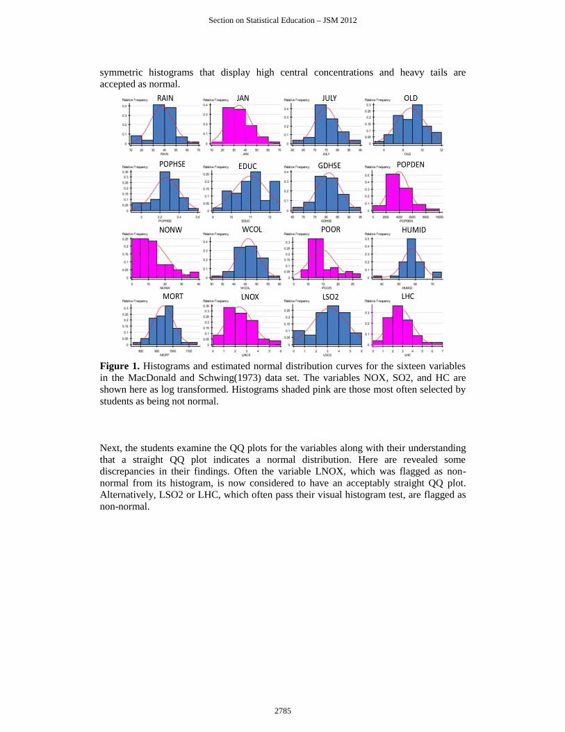
symmetric histograms that display high central concentrations and heavy tails are
accepted as normal.
Figure 1. Histograms and estimated normal distribution curves for the sixteen variables
in the MacDonald and Schwing(1973) data set. The variables NOX, SO2, and HC are
shown here as log transformed. Histograms shaded pink are those most often selected by
students as being not normal.
Next, the students examine the QQ plots for the variables along with their understanding
that a straight QQ plot indicates a normal distribution. Here are revealed some
discrepancies in their findings. Often the variable LNOX, which was flagged as non-
normal from its histogram, is now considered to have an acceptably straight QQ plot.
Alternatively, LSO2 or LHC, which often pass their visual histogram test, are flagged as
non-normal.
Section on Statistical Education – JSM 2012
2785

Figure 2. Quantile or QQ (quantile-quanitle) plots for the sixteen variables in the
MacDonald and Schwing(1973) data set. The variables NOX, SO2, and HC are shown
here as log transformed. Quantile plots shaded pink are those most often selected by
students as being not normal. Variable names in light-gray type are those that were
chosen by students as non-normal from evaluating the histograms, but are not so
evaluated from the quantile plots.
Next, the students compute the correlation coefficients of the QQ plots to determine how
this correlation best matches their intuition of normal or not. Filliben(1975) offers very
specialized advice on computing the QQ plot correlation with careful attention to the
theoretical, normal quantile plotting points. We have taken a more simple approach for
the classroom. First, they sort their data from smallest to largest. Call these values sort(y).
Second, they compute a sequencing variable, call it i (in StatCrunch SEQUENCE),
simply as whole numbers from 1 to 60 by 1. Third, they compute percentages for their
data values as: p = ( i - 0.5 ) / n. This differs from Filliben’s approach. Note we do not
simply use i/n. This choice would indicate that the largest observation in our sample
represented the 100th percentile. This might suggest too strongly to students that no future
observation could possibly be larger. Our choice of p eliminates this and similar problems
in a simple way. Fourth, they convert these percentages p into their corresponding normal
percentiles, i.e. z scores (with a mean of zero and a standard deviation of one). This is
accomplished with the internal StatCrunch function qnorm(p,0,1). Of course these values
could be found in a more tedious manner with normal calculator applets or, heaven forbid
tables! Finally, they compute the correlation between their sorted data, sort(y) and these
z-scores, z. This is the correlation coefficient of the data plotted in the QQ plots above.
This is our measure of normality.
Section on Statistical Education – JSM 2012
2786

All QQ plots are increasing, so that all QQ plot correlations will be positive and quite
large. But a QQ plot that may deviate from a straight line in dramatic ways would
produce relatively smaller QQ plot correlations. Alternatively, QQ plots that appear
almost arrow-straight would, of course, have QQ plot correlations very close to one.
When students identify the QQ plot correlations with the variables they have chosen as
normal or not, often the pattern in Figure 3 results. The variables often chosen as non-
normal from a visual inspection of the QQ plots are shaded pink. Their corresponding
QQ plot correlations are listed alongside. Clearly, in this dataset, students intuition about
normality is quite consistent with the behavior of the QQ plot correlation as a indicator of
normality. The lowest QQ plot correlations correspond to the students’ choices of the
most non-normal QQ plots. This pattern is so strong that we can imagine a test of
normality for samples of this size (60). It appears that for a QQ plot correlation less than
about 0.975, our intuition suggests rejecting normality.
Figure 3. QQ plot correlations of all the variables with those flagged as non-normal from
visual inspection of the QQ plots shaded in pink. Note that a test of normality is
suggested by a procedure that would reject normality if the QQ plot correlation was less
than about 0.975 for these samples of size n = 60.
To investigate how good the students’ intuition really is at spotting non-normality from
QQ plots we then turn to simulation. Students randomly generate samples from the
standard normal distribution and calculate the QQ plot correlation to generate its
sampling distribution. The goal is to illustrate a sampling distribution and test
corresponding to Figure 4.
Section on Statistical Education – JSM 2012
2787

Figure 4. Graphic to illustrate the hypothesis test and behavior of the sampling
distribution of the QQ plot correlation when sampling from a standard normal
distribution.
For these data, their intuition about normality closely matches both their simulated lower
percentage 5% point and the more extensive simulations of Filliben (1975). Figure 5, at
the top, displays the sampling distribution of the QQ plot correlation from 1000 samples
of size n = 60 from a standard normal distribution. The 5th percentile of this sampling
distribution is our critical value and represented by the line at 0.97938466. Samples with
QQ plot correlations below this value are labeled non-normal and samples with QQ plot
correlations above this value are labeled as normal. Included here are also previously
computed sampling distributions from various t distributions with degrees of freedom
equal to 3, 6, 12, and 24. As the degrees of freedom decrease the sampling distributions
of the QQ plot correlations exhibit much more variability and left skewness. The
proportion of these sampling distributions that extend to the left of our critical value
vertical line gives us a simulated power of this test of normality against increasingly
heavier tailed symmetric parent distributions as the degrees of freedom decrease. Similar
plots could demonstrate the effect of increasing amounts of skewness in the parent
population.
Section on Statistical Education – JSM 2012
2788
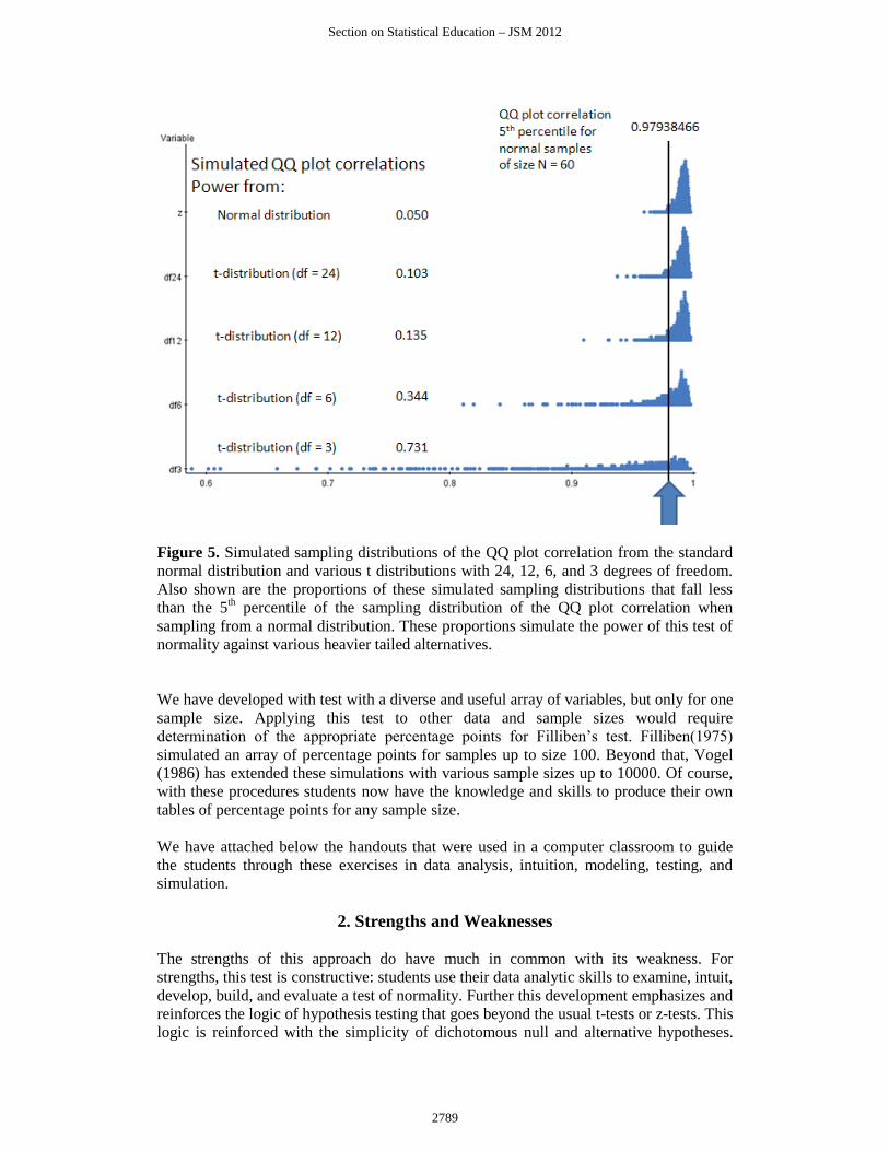
Figure 5. Simulated sampling distributions of the QQ plot correlation from the standard
normal distribution and various t distributions with 24, 12, 6, and 3 degrees of freedom.
Also shown are the proportions of these simulated sampling distributions that fall less
than the 5th percentile of the sampling distribution of the QQ plot correlation when
sampling from a normal distribution. These proportions simulate the power of this test of
normality against various heavier tailed alternatives.
We have developed with test with a diverse and useful array of variables, but only for one
sample size. Applying this test to other data and sample sizes would require
determination of the appropriate percentage points for Filliben’s test. Filliben(1975)
simulated an array of percentage points for samples up to size 100. Beyond that, Vogel
(1986) has extended these simulations with various sample sizes up to 10000. Of course,
with these procedures students now have the knowledge and skills to produce their own
tables of percentage points for any sample size.
We have attached below the handouts that were used in a computer classroom to guide
the students through these exercises in data analysis, intuition, modeling, testing, and
simulation.
2. Strengths and Weaknesses
The strengths of this approach do have much in common with its weakness. For
strengths, this test is constructive: students use their data analytic skills to examine, intuit,
develop, build, and evaluate a test of normality. Further this development emphasizes and
reinforces the logic of hypothesis testing that goes beyond the usual t-tests or z-tests. This
logic is reinforced with the simplicity of dichotomous null and alternative hypotheses.
Section on Statistical Education – JSM 2012
2789
This dichotomy makes the development and discussion of power easier to present and
investigate while considering a parameter that models deviations from normality. This
approach also has the benefit of showing that normality is more than just symmetry and
bell-shaped histogram. Heavy tails can produce nice looking histograms with drastically
un-straight QQ plots.
Many of these strengths are also weaknesses. For weakness, first we must again
acknowledge that the test is constructive. Not all students are ready, willing, or able to
develop and apply their intuition and skills in this way. Many students are quite at home
with t-tests and z-tests and statistical procedures that have alternative testing methods can
be daunting for them. This use of a correlation coefficient can confuse matters with the
more common use of the standard correlation coefficient for quantifying association in a
scatterplot. A null hypothesis of no correlation is common in such problems where we are
examining the data for some evidence of non-zero correlation. The use of a QQ plot
correlation, especially a correlation that we expect to be close to one, can be confusing.
Tables are likely needed for the routine application of this test. As is evident, not all
students in a second course in statistics may be ready for such a constructive, non-
standard type of hypothesis test.
Overall, the importance of looking at the data, the use of an analyst’s intuition and
experience in modeling, simulating sampling distributions, developing hypothesis test
procedures, evaluating power, are all reviewed and reinforced with this approach.
Section on Statistical Education – JSM 2012
2790

3. Classroom Handouts
3.1 Measuring Normality 1
A classic dataset in the study of multiple regression lists data on 60 U.S. cities collected
in the mid 20th century. For each city data were collected on a range of variables
including: meteorological data (such as rainfall and average January temperature),
demographic data (such as population density and the percentage of people below the
poverty line), and pollutant data (such as the log of the concentrations of hydrocarbons or
sulfur dioxide in the atmosphere). Also collected was a mortality variable (death rate) in
each city. The full list of variables and their full definitions is shown below. The data
Mort.xls can be found on Blackboard.
RAIN Mean annual precipitation in inches.
JAN Mean January temperature in degrees Fahrenheit.
JULY Mean July temperature in degrees Fahrenheit.
OLD Percentage of 1960 SMSA population which is 65 years of age or over.
POP/HSE Population per household, 1960 SMSA.
EDUC Median school years completed for those over 25 in 1960 SMSA.
GDHSE Percentage of housing units that are sound with all facilities.
POPDEN Population per square mile in urbanized area of SMSA in 1960.
NONW Percentage of 1960 urbanized area population that is nonwhite.
WCOL Percent employment in white-collar occupations in 1960 urbanized area.
POOR Percentage of families with incomes under $3000 in 1960 urbanized area.
HC Relative pollution potential of hydrocarbons, HC.
NOX Relative pollution potential of oxides of nitrogen, NOx.
S02 Relative pollution potential of sulfur dioxide, SO2.
HUMID Percent relative humidity, annual average at 1 p.m.
MORT Total age-adjusted mortality rate, (deaths per 100 000 population).
1. Use StatCrunch and find histograms for these variables by selecting them all.
Look carefully at each histogram. Classify these samples from each variable
according to whether you think the sample could have come from a normal
distribution. (Normal or Not).
2. Use the StatCrunch Graphics -> QQplot to form QQplots for each variable.
Compare the histograms and the QQplots side by side. Check your classifications
from before.
3. Which variables appear the most non-normal? How do you think we could
improve any analysis that might include them? Modify these variables
accordingly. Check your classifications for these modified variables.
Section on Statistical Education – JSM 2012
2791

3.2 Measuring Normality 2
We have seen that QQ plots give us an indication of whether or not our data come from a
normal distribution. The closer a normal QQ plot is to a straight line the more a normal
distribution is suggested. One way to quantify this is with a simple correlation
coefficient. Recall the correlation coefficient measures the strength of a linear
association. Here that association is between the percentiles (quantiles) of our data and
the corresponding percentiles (quantiles) of a normal distribution.
To compute a QQ plot correlation for a sample y of n observations:
First, sort your data from smallest to largest. Call these values sort(y).
Second, compute a SEQUENCE of observations from 1 to 60 by 1. Call these values i.
Third, compute percentile positions for your data values as: p = ( i - 0.5 ) / n
Fourth, convert these percentile positions p into their corresponding normal z scores (with
a mean of zero and a standard deviation of one) as: qnorm(p,0,1). Call these values z.
Finally, compute the correlation between sort(y) and z. This is the correlation coefficient
of the data plotted in the QQ plot. This is a measure of normality.
1. Compute this measure for each of the variables in the mortality data set.
2. Form a dotplot for these correlations.
3. Recall your groupings from the earlier exercise where your grouped variables
into those you thought were normal and those you thought were not normal.
Highlight on the dotplot correlations for the variables that you selected as being
normal.
4. What is common about the correlation coefficients for these variables that you
selected?
5. What value of a correlation coefficient might distinguish between those that you
selected as normal and those that you selected as non-normal?
6. How could we use this value to test for normality?
Section on Statistical Education – JSM 2012
2792

3.3 Measuring Normality 3
Samples vary. So no sample can be expected to match exactly the population distribution
that produced it. We don’t expect a QQ plot from a random normal sample to be exactly
straight. Likewise, we don’t expect the normal QQ plot correlation coefficient to be equal
to one. But we still expect it to be very close to one. How much variability is there in this
QQ plot correlation coefficient if the data really do come from a normal distribution? We
will simulate the behavior of this QQ plot correlation coefficient with the mortality
dataset in mind.
1. In StatCrunch use Data -> Simulate Data -> Normal to generate 60 rows and 20
columns of data from a standard normal distribution (mean of zero and standard
deviation of one). Use the dynamic seed option (this generates different samples
each time).
2. To construct QQ plots for these columns, first sort them all from smallest to
largest.
3. Construct the sequence variable from 1 to 60 by 1. Convert it to normal quantiles
with the qnorm function as shown earlier.
4. Use multiplot to plot them all together. The x-axis is your sequence of normal
quantiles. The y-axis is the sorted column of simulated normal data. Plot these
with points for all the columns. Notice the range of behaviors for the QQ plots:
variability in the intercept and variability in the slope (most notable by the flared
out regions for small or large observations).
5. Find the QQ plot correlations for the 20 columns. Use OPTIONS then COPY, to
enter these back into the data table: Data, Load Data, from Paste. Then Paste the
data into the window. Delete the first title row. Unclick the box to use first row as
labels and unclick the box to load in a new table. This will add the correlations
into the current table. The first column of numbers added will be your QQ plot
correlations. Rename the column: QQr.
6. Construct a dotplot for your QQ plot correlations.
7. To see how much variability there is in QQ plot correlations you have computed
it ten times for simulated normal data. Now open a new StatCrunch window and
from Blackboard load the dataset: QQcorrelations361224z.xlsx. The column
headed z shows the QQ plot correlations for 1000 normal samples of size 60.
Construct a dotplot for these QQ plot correlations.
8. Find the 5th percentile of these QQ plot correlations. We will reject an
assumption of normality if we see a sample of size 60 with a QQ plot correlation
less than this 5th percentile.
9. This is based on a test of normality due to Filliben (1975). Attached are the
percentage points of this distribution for other tail probabilities and other sample
sizes. Suppose you had a sample of size 60 and your observed QQ plot
correlation was 0.97. At a 5% level of significance, would you reject an
assumption of normality? What would be the p-value for this test?
Section on Statistical Education – JSM 2012
2793

3.4 Measuring Normality 4
So how good is this test of normality? How well does it recognize samples from
distributions that are not normal? If the data do not come from a normal distribution,
what is the probability that our test will reject the null hypothesis of normality?
To answer these questions we need to examine some alternative to normality.
Unfortunately, there are many. We will examine another distribution, the t-distribution
that is closely related to the normal. Perhaps you remember t-tests from basic statistics;
they always had a parameter called the degrees of freedom associated with the test. These
degrees of freedom index the behavior of the t-distribution.
1. How do samples from t-distributions behave? Simulate a sample with 60 rows
and 20 columns from a t-distribution with 3 degrees of freedom. Find a dotplot
and a histogram for this sample.
2. Use StatCrunch’s QQplot menu option to produce a normal QQplots to see how
closely your samples match a normal distribution.
3. As we have seen before, produce quantiles from a normal distribution from a
sequence from 1 to 60 by 1. Sort your t-samples and find the correlations
between the normal quantiles and your sorted columns. How many fall below our
lower 5% rejection point for testing the sample is normal?
4. The QQcorrrelations361224z.xlsx data set on Blackboard. Shows the behavior of
the QQplot correlations for samples of size 60 from t-distributions with degrees
of freedom of 3,6,12, and 24. Produce dotplots of all of these QQplot correlation
samples along with the one for z, the normal QQplot correlation.
5. Calculate the percentage of each of these t-distributions the percentage of the
QQplot correlations that fall below our lower 5% rejection point for testing
normality.
6. What do these plots tell you about the test of normality?
7. What do these plots tell you about how the t-distribution is related to the normal
distribution?
Section on Statistical Education – JSM 2012
2794

References
Filliben, J. J. (February 1975). “The Probability Plot Correlation Coefficient Test for
Normality”. Technometrics 17 (1): 111–117
Vogel, R. M. (1986), “The Probability Plot Correlation Coefficient Test for the Normal,
Lognormal, and Gumbel Distributional Hypotheses,” Water Resources Research, 22(4):
587-590.
Section on Statistical Education – JSM 2012
2795