development of a touch screen interface for scania interactordevelopment of a touch screen interface...
TRANSCRIPT

Development of a touch screeninterface for Scania Interactor
Peder Nordgren
April 10, 2007Master’s Thesis in Computing Science, 20 credits
Supervisor at CS-UmU: Anders BrobergSupervisor at SCANIA CV AB: Michael Waern
Examiner: Per Lindstrom
Umea UniversityDepartment of Computing Science
SE-901 87 UMEASWEDEN


Abstract
Designing a graphical user interface (GUI) for a touch screen in a truck is complex taskthat makes special demands. The GUI has to be usable and easy to interact with. An-other demand is that the GUI has to be safe to use, the driver’s main task to drive thetruck may not be affected in a negative way. This thesis follows a design process for anin-vehicle touch screen GUI. The thesis includes all the work from a theory study to afinal prototype.
The process includes a literature study on touch screens and what to think about whendesigning a GUI for them. A study of what special demands there are when designingan in-vehicle system has also been made. The design process started with user testsand an evaluation of the current GUI at Scania Interactor. After that prototypes weremade, first on paper and in PowerPoint to be able to show the thoughts easy and fast.Then prototypes were made in Flash to test the interaction on the touch screen withuser tests in a realistic way. During the whole process, workshops, questionnaires anduser test were made. A problem during the process has been that it is not a completelynew product / interface that should be designed, it is an existing interface that shouldbe improved, and one of the limitations has been to not change the current interfacetoo much. In the end a final prototype was made in Flash and recommended to Scania.That prototype has a completely new interface but when testing it on users that haveused the current GUI, it turned out that it also was possible to benefit by the knowledgefrom it.

ii

Contents
1 Introduction 11.1 Scania and the Fleet Management system . . . . . . . . . . . . . . . . . 11.2 Problem and Goal . . . . . . . . . . . . . . . . . . . . . . . . . . . . . . 21.3 Limitations . . . . . . . . . . . . . . . . . . . . . . . . . . . . . . . . . . 21.4 Disposition . . . . . . . . . . . . . . . . . . . . . . . . . . . . . . . . . . 3
2 Background 52.1 Fleet Management and today’s GUI . . . . . . . . . . . . . . . . . . . . 52.2 Working environment . . . . . . . . . . . . . . . . . . . . . . . . . . . . 72.3 Interaction design . . . . . . . . . . . . . . . . . . . . . . . . . . . . . . . 7
3 Method 93.1 Theory . . . . . . . . . . . . . . . . . . . . . . . . . . . . . . . . . . . . . 93.2 User evaluation of the current GUI . . . . . . . . . . . . . . . . . . . . . 103.3 GUI Expert evaluation . . . . . . . . . . . . . . . . . . . . . . . . . . . . 103.4 Prototypes . . . . . . . . . . . . . . . . . . . . . . . . . . . . . . . . . . 103.5 Workshop discussions . . . . . . . . . . . . . . . . . . . . . . . . . . . . 113.6 Evaluations of the prototypes . . . . . . . . . . . . . . . . . . . . . . . . 11
4 Theory 134.1 Computers in a demanding environment . . . . . . . . . . . . . . . . . . 13
4.1.1 Principles for a safe in-vehicle system . . . . . . . . . . . . . . . 144.2 Touch screens . . . . . . . . . . . . . . . . . . . . . . . . . . . . . . . . . 164.3 Touch screen limitations . . . . . . . . . . . . . . . . . . . . . . . . . . . 184.4 Graphical user interfaces on touch screens . . . . . . . . . . . . . . . . . 19
4.4.1 Text in GUIs . . . . . . . . . . . . . . . . . . . . . . . . . . . . . 214.4.2 Colours in GUIs . . . . . . . . . . . . . . . . . . . . . . . . . . . 214.4.3 Sounds in GUIs . . . . . . . . . . . . . . . . . . . . . . . . . . . . 224.4.4 Entering information . . . . . . . . . . . . . . . . . . . . . . . . . 224.4.5 Menus and buttons . . . . . . . . . . . . . . . . . . . . . . . . . . 234.4.6 Feedback . . . . . . . . . . . . . . . . . . . . . . . . . . . . . . . 24
iii

iv CONTENTS
5 Results from the evaluation of the current GUI 255.1 Summary of the user evaluation . . . . . . . . . . . . . . . . . . . . . . . 255.2 GUI Expert evaluation . . . . . . . . . . . . . . . . . . . . . . . . . . . . 26
5.2.1 General problems . . . . . . . . . . . . . . . . . . . . . . . . . . . 265.2.2 The combi-view . . . . . . . . . . . . . . . . . . . . . . . . . . . . 275.2.3 Evaluation of the specific functions . . . . . . . . . . . . . . . . . 27
6 Prototypes 316.1 Paper prototypes . . . . . . . . . . . . . . . . . . . . . . . . . . . . . . . 316.2 PowerPoint prototypes . . . . . . . . . . . . . . . . . . . . . . . . . . . . 32
6.2.1 Evaluation of the paper and PowerPoint prototypes . . . . . . . 376.3 Flash prototypes . . . . . . . . . . . . . . . . . . . . . . . . . . . . . . . 376.4 Evaluation of the Flash prototypes . . . . . . . . . . . . . . . . . . . . . 37
6.4.1 Co-workers opinions . . . . . . . . . . . . . . . . . . . . . . . . . 376.4.2 User scenarios . . . . . . . . . . . . . . . . . . . . . . . . . . . . . 38
7 Summary and conclusions 417.1 Future work . . . . . . . . . . . . . . . . . . . . . . . . . . . . . . . . . . 41
8 Acknowledgements 43
References 45
A Conclusion of the interviews (current GUI) 47
B Questionnaire for co-workers 51
C Interview scenario (Flash prototypes) 53
D Conclusion of the interviews (Flash prototype) 55

List of Figures
1.1 An Interactor 300 to the right on the dashboard [10]. . . . . . . . . . . . 2
2.1 The combi-view. . . . . . . . . . . . . . . . . . . . . . . . . . . . . . . . 6
3.1 A simple interaction design model [20]. . . . . . . . . . . . . . . . . . . . 9
5.1 An example of an order support layout. . . . . . . . . . . . . . . . . . . 265.2 Phone layout. . . . . . . . . . . . . . . . . . . . . . . . . . . . . . . . . . 275.3 Sms layout. . . . . . . . . . . . . . . . . . . . . . . . . . . . . . . . . . . 285.4 Driver log layout. . . . . . . . . . . . . . . . . . . . . . . . . . . . . . . . 295.5 Scania assistance layout. . . . . . . . . . . . . . . . . . . . . . . . . . . . 29
6.1 Early paper prototypes. . . . . . . . . . . . . . . . . . . . . . . . . . . . 326.2 Two GUI proposals. . . . . . . . . . . . . . . . . . . . . . . . . . . . . . 336.3 Sliding menu, to get maximum screen area for applications. . . . . . . . 336.4 A GUI with all applications accessible all the time and a GUI with sepa-
rated menu and shortcuts. . . . . . . . . . . . . . . . . . . . . . . . . . . 346.5 Three different proposals for phone structure. . . . . . . . . . . . . . . . 356.6 Structure proposal for Driver log. . . . . . . . . . . . . . . . . . . . . . . 36
v

vi LIST OF FIGURES

Chapter 1
Introduction
This paper is a part of the master thesis at the Master of Science program Interactionand Design in Umea, the assigner was SCANIA CV AB in Sodertalje and all the workhas been performed at the company. In short the assignment is to evaluate the currentgraphical user interface (GUI) at the on-board computer in Scania trucks, and thendevelop a new interface prototype with the evaluation and GUI-guidelines in mind. Theprototypes will also be tested by users and evaluated. Due to secrecy reasons some ofthe results and pictures of the prototypes are excluded.
The task in this thesis is to first do a review of theories about drivers working envi-ronment and what special requirements there are when designing a GUI for a specialenvironment that a truck cab is. The theory will also cover GUIs on small screens andwhat to think about when designing touch screen interfaces. User studies and evalu-ation of the present user interface on the 6.3-inch screen will then be done to identifywhich problems there are with the current GUI. With the evaluation and theory as abase, suggestions on how to improve and evolve the GUI to fit the forthcoming low enddisplay will be given. Finally a prototype which illustrates the findings in the work willbe made. Those prototypes will be evaluated by truck drivers and a final version willbe recommended.
1.1 Scania and the Fleet Management system
Scania was founded in 1891 and since then the company have built and delivered morethan one million trucks and buses. Today the company has over 30000 employees inover hundred countries. Scania also offers many different services to get more out oftheir trucks. Scania Fleet Management is one of those services. The Fleet Managementservice gives a better cost control and makes the communication between the driver andthe office easier. The services in Fleet Management are for example: navigation, phone,driver log (records different activities and times for the truck and the driver) and ordersupport (effective order handling for both the driver and the office) [10].
The Fleet Management system consists of two parts: here called the ”on-board part”and the ”office part”. The on-board part is the computer in the truck and at the mo-ment there are four different computers: Scania Interactor 300, 500 and 600 and ScaniaCommunicator. The Communicator is a passive telematic system and has no driver
1
2 Chapter 1. Introduction
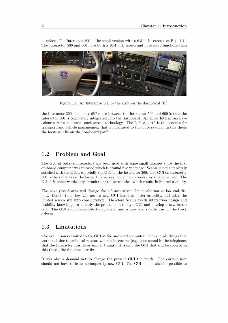
interface. The Interactor 300 is the small version with a 6.3-inch screen (see Fig. 1.1).The Interactor 500 and 600 have both a 10.4-inch screen and have more functions than
Figure 1.1: An Interactor 300 to the right on the dashboard [10].
the Interactor 300. The only difference between the Interactor 500 and 600 is that theInteractor 600 is completely integrated into the dashboard. All three Interactors havecolour screens and uses touch screen technology. The ”office part” is the services fortransport and vehicle management that is integrated to the office system. In this thesisthe focus will lie on the ”on-board part”.
1.2 Problem and Goal
The GUI of today’s Interactors has been used with some small changes since the firston-board computer was released which is around five years ago. Scania is not completelysatisfied with the GUIs, especially the GUI on the Interactor 300. The GUI on Interactor300 is the same as on the larger Interactors, but on a considerably smaller screen. TheGUI is in other words only shrunk to fit the screen size, which results in limited usability.
The next year Scania will change the 6.3-inch screen for an alternative low end dis-play. Due to that they will need a new GUI that has better usability, and takes thelimited screen size into consideration. Therefore Scania needs interaction design andusability knowledge to identify the problems in today’s GUI and develop a new betterGUI. The GUI should resemble today’s GUI and is easy and safe to use for the truckdrivers.
1.3 Limitations
The evaluation is limited to the GUI at the on-board computer. For example things thatwork bad, due to technical reasons will not be covered(e.g. poor sound in the telephone,that the Interactor crashes or similar things). It is only the GUI that will be covered inthis thesis, the functions are fix.
It was also a demand not to change the present GUI too much. The current usershould not have to learn a completely new GUI. The GUI should also be possible to

1.4. Disposition 3
run on the larger 10.4-inch screen without too many changes. The work will be con-centrated on some functions in the GUI, for example the GPS navigation is purchasedfrom a supplier and therefore only small changes can be made on that part.
1.4 Disposition
The next part in this report is the background chapter, where the fleet managementsystem and the interaction design area is described. After that there is a method chapterwhere the work process for the thesis is described. The chapter that follows is a theorystudy about touch screens, and things that are important when designing interfaces forthem. The theory also covers a study about interaction in a demanding environment.After that a chapter with results from the evaluation of the current GUI is presented.The development of the prototype is described in the chapter prototypes. This reportconcludes with the summary and conclusions chapter.

4 Chapter 1. Introduction

Chapter 2
Background
To give the user better knowledge about the Interactor an introduction and descriptionof its current GUI at the Interactor is given. After that, the reader gets a descriptionof the working environment for truck drivers, but also which special demands there arewhen interacting with a computer in a truck. An introduction to the area interactiondesign, to give the reader an insight to the area and the comprehensive goals whendesigning for interaction, ends this chapter.
2.1 Fleet Management and today’s GUI
Today’s Interactor GUI is shown in Fig. 2.1. The figure shows the combi-view which isthe start page the user will come to when the Interactor is started. From the combi-viewthe user has access to all the functions available. On the left side of the screen there area number of shortcuts to some of the functions in the Interactor, the functions dependson which subscriptions the user has. The shortcuts will be visible all the time whenthe Interactor is turned on, except when using the navigator or own applications. Thefollowing list is a description of the applications that are available in the shortcut listto the left in the combi-view.
– Phone (only available on the Interactor 500 and 600 today): In the phone thereare three different submenus: make a call with the number buttons, make a callfrom the phone book and make a call from a list with the last calls.
– Truck message: When clicking on the truck message icon an overview of thecurrent messages is shown. From there it is possible to read, reply, delete andcreate new messages.
– Sms: This application has almost the same appearance as the truck message.
– Order support: Functions in a similar manner as truck message, but is moreadvanced and is connected to the company’s order system.
– Driver log: In the driver log the driver can change the current activity, forexample driving, working, resting etc. It is also possible to see the last days’activities.
– Own applications: Here the user can add and run their own programs.
5

6 Chapter 2. Background
Figure 2.1: The combi-view.
– Navigator / Rear view camera: Here the user choose if the navigator or therear view camera should be visible in the combi-view.
– Scania Assistance: From here it is possible to send a message to get contactedif there is problem with the truck.
In the combi-view there are some fields where information can be displayed, those fieldsalso works as shortcuts to the functions. There are also two instruments that show thetruck status. The arrow button to the right is the menu, but it also works as a ”backbutton” when the driver is not in the combi-view. An activity field in the bottom showsthe current activity registered in the driver log. A small version of the navigator or therear-view camera is also displayed and if the user clicks on it a full screen version isstarted. If the user clicks the arrow (menu) button a list of functions is shown: Addressbook, vehicle info, settings, log on and exit. The address book shows a list of the personsin the address book. It is possible to open the posts in the list and to create new posts.Under vehicle info there are two sub-menus; drive time and reports. Drive time is ahelp for the driver to follow the drive time regulations and logs the driver’s activities.Drive time can be seen as a light version of Driver log. In reports the driver can viewstatistics over the driving, if it has been economically and similar things.

2.2. Working environment 7
2.2 Working environment
The working environment for a truck driver is different from for example working in anoffice. Using a computer in a truck is a completely different task than working in anoffice with an ordinary PC. Problems that often arise for truck drivers are e.g. stressand bad ergonomics. But due to the design improvements in newer trucks the stress forthe drivers has been reduced and truck driving has become less physically demanding[17].
When designing a computer system for trucks, there are certain things to think about.For example the screen size and the use of a keyboard and a mouse are limited. Drivinga truck is often a complex task, where the driver need to keep an eye on several thingsat the same time. When using the Interactor during driving it is important that thesystem does not disturb the driver’s main task, the safety is always the most importantpoint.
2.3 Interaction design
According to Preece et al. [20] interaction design is ”designing interactive products tosupport people in their everyday and working lives”. Interaction design is a relativelynew area and consists of many different disciplines with different focus, but all of themare concerned with designing systems to match users’ goals [20]. One discipline is human-computer interaction (HCI), which is the study of how humans interact with computersystems [23]. HCI is a broad term and covers all aspects of how people interact withcomputers. One important word in Interaction design is usability. Preece et al. [20]breaks down the word usability into the following six goals and when designing a GUIit is good to have these goals in mind.
– Effective to use
– Efficient to use
– Safe to use
– Have good utility
– Easy to learn
– Easy to remember how to use
Donald Norman [15] has written six design principles what users should see and do whencaring out their task using an interactive product, the principles are:
– Visibility, means that the more visible functions are, the more likely users will beable to know what to do next.
– Feedback, there are many types of feedback for interaction design for example au-dio, tactile, verbal and visual. Feedback helps the user by sending back informationabout what action has been done and what has been accomplished.
– Constraints, constraining means determining ways of restricting the kind of userinteraction that can take place at a given moment. For example deactivate certainmenu options by shading them.
8 Chapter 2. Background
– Mapping is the relationship between controls and their effects in the real world.For example the up and down arrows on a keyboard used to represent the up anddown movement of the cursor.
– Consistency makes it easier for a user to learn and use an interface. For exampleinterfaces should have similar operations and use similar elements for achievingsimilar tasks.
– Affordance, can be compared with a clue. If an object has good affordance it iseasy for people to know how to use it.
Stone et al. [23] bring up four physical principles that many user interfaces disregard,and in that way confuse the user. The principles are:
1. Users see what they expect to see. For example buttons that not are consistentlyplaced can lead to errors by the user. If the OK button usually is placed on theleft side of the cancel button, but for some reason are swapped, the user often willchoose the wrong button. Users are not good at handling unexpected situations,so it is important for the designer to be consistent with for example colours andpositioning of buttons. It is also good to exploit the users prior knowledge anddraw on their experience using a metaphor.
2. Users have difficult to focus on more than one activity at a time. If a user getsdistracted, the system should always remind the user what to do next. A goodprinciple is to group similar things, to make it easier for the user to pay attention tothe correct group. Important things should also be placed in a prominent position,for example in the centre of the screen.
3. It is easier to perceive a structured layout. A user has problems to perceive abutton if there are no clues surrounding the button, for example lines and shadows.The gestalt laws are important aids for this principle [23].
4. It is easier to recognize something than to recall it. Direct manipulation interfacesare good to apply this principle on. For example novice users like using menusand buttons instead of commands.
Stone et al. [23] also mentions some other important principles, for example simplicityand tolerance. Simplicity means that the interface should be communicated clearlyand simply in the users own language. When designing the interface actions, iconsand words that are natural to the user group should be used. The tolerance principlehighlights the importance of designing the user interface to prevent the users frommaking errors. Examples can be to greying out menus and buttons that are not availablefor the moment, helping users enter data in the right format, or having audio or visualcues.

Chapter 3
Method
This chapter describes how the problem was solved and the goal was achieved. All partsin the process, from the theory study and evaluation of the current GUI to the finalprototype, are described. The process resembles the interaction design model by Preeceet al. [20] in Fig. 3.1.
Figure 3.1: A simple interaction design model [20].
3.1 Theory
To get a theoretical background a literature study has been made. According to Stoneet al. [23] there are two types of knowledge that is important when designing a GUI:
– Information-gathering activities and analyses that form part of the user interfacedesign and development process.
9

10 Chapter 3. Method
– User interface design knowledge, for example design principles and design rules.This knowledge comes partly from theory and partly from experience, such asstudying designs that are currently working well for users.
The theory is concentrated on touch screens and the use of them in demanding workingenvironments like a truck cab. Advantages and drawbacks with touch screens are coveredand also what to think about when designing a GUI for them. The theory is the groundfor the evaluation and development.
3.2 User evaluation of the current GUI
After the theory study the drivers’ needs were identified and requirements were estab-lished by interviewing users and evaluating the current GUI. The survey started withinterviewing and observing experienced users. Semi-structured / flexible interviews toget the users own opinions about the Interactor were done. In the interviews there weresome questions that the users had to answer, but mostly the interviews were open dis-cussions. According to Stone et al. [23] observing users is the best way to find out whichaspects of the current system the users like and dislike. The observations and interviewswere direct, and no video camera were used, only a block and a pen. Stone et al. meansthat it can be hard to get a full record of the user and that it is no opportunity to reviewthe discussion later if that method is used. On the other side, user can be more nervousif a video camera is used and that can impact on their behaviour.
The interviews were made during October 2006 with eight truck drivers. The truckdrivers were all men in the age group 30-55. All of them had used the Interactor for halfa year or more. When interviewing / observing the users they acted in their naturalsetting in their real working environment.
3.3 GUI Expert evaluation
The GUI expert evaluation from an interaction design and usability view is divided intothe different functions that are available. But there is also a general section for thingsthat apply to the whole GUI. The evaluation was made with theories, guidelines andheuristics in mind. A specification over which applications that should be offered in theInteractor in the future where also collected.
3.4 Prototypes
The next step was designing low-fidelity prototypes on paper and in Microsoft Power-Point. To start the work some paper prototypes were made. The reason to make themwas to get many different ideas in a fast way. The prototypes were focused on the mainstructure of the GUI, for example how to show the current status and display shortcutsand menus. They were not focusing on individual applications/functions. The next stepwas to make prototypes in PowerPoint to be able to show different interfaces and discussthe ideas with the co-workers. After the ideas were narrowed down and main directionssorted out, prototypes with the possibility to interact with the GUIs, were made inAdobe Flash. The prototypes contained all the applications and made it easy for users
3.5. Workshop discussions 11
to click and test them. Since the Flash prototypes were exported to the forthcominglow end display the user tests could be made in a realistic environment.
3.5 Workshop discussions
During the prototype process there have been recurring discussions with people from theFleet Management department and from the design and ergonomics department. Butthere have also been a few workshops with around ten participants. At the workshopsthe work thus far have been shown and the participants have come with their opinionsand comments. The workshops have been instructive with many interesting discussions.
3.6 Evaluations of the prototypes
To evaluate the Flash prototypes a questionnaire (See appendix B) which ten co-workersanswered. The questions were mostly concentrated on the function and the layout of theGUI. During the whole development process of the Flash prototype, a lot of commentsand suggestions from co-workers were received. For the user studies a scenario thateach of the test persons had to do was made. The scenario consisted of 16 tasks (Seeappendix C) to see what parts of the prototype that could be improved and easier touse. Apart from the scenario some general questions were asked and the users weregiven the opportunity to come with additional comments that had not ccme up duringthe scenario. The scenario interviews were made during January 2007 with five truckdrivers. The truck drivers were all men in the age group 25-55. All of them had usedthe Interactor for half a year or more.

12 Chapter 3. Method
Chapter 4
Theory
This chapter starts with a part about using computers in a demanding environment andwhat principles there are for designing a safe in-vehicle GUI. A section with advantagesand drawbacks with touch screens follows after that. According to Schneiderman et al.[22] designing a GUI for a small screen needs a radical rethinking of what functionalitiesshould be included, the GUI is often novel and menu designs specially adapted to thedevice and the application. Due to that a part with the specific things to think aboutwhen designing a GUI on a small touch screens ends this chapter. Even if this part alsobrings up general GUI questions, it is concentrated to guidelines and rules that touchscreens can benefit by. Things that only apply to big screens, web pages etc. will notbe covered in this report.
4.1 Computers in a demanding environment
The use of in-vehicle technologies becomes more and more popular. Many people usemobile phones, navigation systems etc. in their vehicles. A consequence of this increaseduse is that driver distraction and inattention also increase. Driver distraction is one ofthe most common causes of traffic crashes. According to Harbluk et al. [9], driver dis-traction has been implicated as a contributing factor to over 20 percent of motor vehiclecrashes. But the studies that Harbluk mentions are several years old.
Most of the in-vehicle devices require visual attention to the device interface eitherto input information manually or to read visual output. The device will hence divertthe driver’s attention from the road to the device. Due to that, it is important to makethe device interface, that is going to be used while driving, as simple as possible andin that way distract the driver as little as possible. To overcome the distraction prob-lem many devices use voice-based interaction, with for example speech recognition andsound feedback. One advantage with voice-based interaction is that the user can viewthe road and keep their hands on the steering wheel while interacting. However thesesystems do not solve the problem. Harbluk’s study shows that a person who talks in amobile phone with a headset, gets distracted even if there is no device to interact withphysically. The driver will spend more time looking centrally and less time looking tothe periphery, instruments and mirrors. But also incidence of hard braking increasedwhen the users were distracted [9].
13

14 Chapter 4. Theory
4.1.1 Principles for a safe in-vehicle system
An in-vehicle computer system for a truck has special demands. The driving environ-ment is different from an office environment and the interaction with the system isdifferent. The possibility to use a keyboard and a mouse is for example limited, hence atouch screen is advantageous to use. The system will also often be used as a secondarytask while driving, not as a primary task like for example working with the PC at theoffice. While interacting with an in-vehicle system there are many other things to keepan eye on, and it is not only the system that gives the driver input that has to beprocessed. There are many other things in the traffic that complicate the interactionand cause stress.
The European union have made some recommendations for safe and efficient in-vehicleinformation and communication systems [5]. The human-machine interface recommen-dations is extensive and covers all parts of a system, here the recommendations thatapplies to the GUI with some comments are listed. First there are some design princi-ples for the system:
– The system supports the driver and does not give rise to potentially hazardousbehaviour by the driver or other road users. This means that the system shouldenhance or at least not reduce road safety.
– The allocation of driver attention while interacting with system displays and con-trols remains compatible with the attentional demand of the driving situation.This means that the driver needs to be able to anticipate the attentional demandassociated with both the driving task and secondary tasks. And that the drivershould also be able to choose to interact (or not), and to choose when and how tointeract.
– The system does not distract or visually entertain the driver. The system shouldavoid distraction caused by visual entertainment (for example animations). Thedriver’s ability to be in full control of the vehicle may not be compromised.
– The system does not present information to the driver which results in potentiallyhazardous behaviour by the driver or other road users. For example the systemshould not present information in a way that can encourage a user to drive faster.
– Interfaces and interface with systems intended to be used in combination by thedriver while the vehicle is in motion are consistent and compatible. If there aremany systems used parallel or serial, for example instruments on the dashboard,the systems should resemble each other. The same symbols, terminology, logic,feedback and so on should be used.
There are also principles that bring up how information should be shown in the system.Below follows the most important information presentation principles [5].
– Visually displayed information presented at any one time by the system should bedesigned such that the driver is able to assimilate the relevant information witha few glances which are brief enough not to adversely affect driving. For examplea visual display that is rich in detail and needs full and lengthy attention, shouldnot be used.
4.1. Computers in a demanding environment 15
– Internationally and/or nationally agreed standards relating to legibility, audibility,icons, symbols, words, acronyms and/or abbreviations should be used. If ownunique symbols and icons are used in for example a navigation system they willnot be comprehended by a majority of the drivers.
– Information relevant to the driving task should be accurate and provided in atimely manner. Information that giving answers to the questions; what, when,where, for how long etc. should be correctly timed and accurate to help the driverto have advance planning.
– Information with higher safety relevance should be given higher priority. Routineinformation (like an incoming phone call) should not delay important information.
The interaction with displays and controls make demands on the system. The followingare a summary of principles for the interface interaction [5].
– The driver should always be able to keep at least one hand on the steering wheelwhile interacting with the system. For example the driver should not have to usekeyboard and mouse.
– The system should not require long and uninterruptible sequences of manual-visualinterfaces. If the sequence is short, it may be uninterruptible. This means that thesystem should not delete any driver input during interruption unless the sequenceof interfaces is short or a sufficiently large time-out period has passed.
– The driver should be able to resume an interrupted sequence of interfaces with thesystem at the point of interruption or at another logical point. If partly entereddata disappears when an input sequence is interrupted, the driver may be incitedto achieve the full sequence even if the driving situation requires full attention. Agood example is a system where the driver can interrupt entering a phone number,look for several seconds at the road scene and then complete the partly enterednumber.
– The driver should be able to control the pace of interface with the system. Inparticular the system should not require the driver to make time-critical responseswhen providing inputs to the system.
– The driver should have control of the loudness of auditory information wherethere is likelihood of distraction. For example the opportunity to turn off thephone signal should be given.
– The system’s response (e.g. feedback, confirmation) following driver input shouldbe timely and clearly perceptible. For control activation feedback (e.g. buttondisplacement, auditory beep) timing should be from the moment at which thesystem recognises each driver input and for dialogue feedback (e.g. recommendedroute.) should be from the end of the driver’s input. If the system needs significantprocessing time, some signal should be displayed to inform the driver that thesystem has recognised the input and is preparing the requested response.
– Systems providing non-safety related dynamic visual information should be capa-ble of being switched into a mode where that information is not provided to thedriver. Unwanted functions should be possible to turn off. For example it shouldbe possible to have route guidance without showing the navigation map.

16 Chapter 4. Theory
The last principles are about how the system should behave in different situations [5].
– While the vehicle is in motion, visual information not related to driving thatis likely to distract the driver significantly should be automatically disabled, orpresented in such a way that the driver cannot see it. System functions notintended to be used by the driver while driving should be made impossible tointeract with or clear warnings should be provided against the unintended use.
– The behaviour of the system should not adversely interfere with displays or controlsrequired for the primary driving task and for road safety.
– Information should be presented to the driver about current status, and any mal-function within the system that is likely to have an impact on safety. For exampleif there is no GPS signal the system should inform that the navigation does notwork.
All of these principles must be taken into consideration when designing an in vehiclesystem. Many of them are a matter of course when reading them, but in reality it isnot that easy to implement a GUI that is perfect from a safety view.
4.2 Touch screens
Touch screens have been popular because they save space on for example mobile devicesand in places where there are limited space. The high immediacy in the interactionbetween the finger and the device leads to better user acceptance, ease of use and afaster input rate [19].
Today’s touch screens are often durable and robust and work well in environments whereit will be exposed to wear (i.e. airports). Another advantage is that touch screens areintuitive to use. Touch screens uses direct manipulation on for example a button, with-out needing a physical manipulation with an extra input control device, for example amouse. Due to that, touch screens is commonly used in different public environments[1]. Some areas where touch screens are used according to TouchScreens.com [24] are:
– Public information displays. The user-friendly touch screen interface is often usedin for example information kiosks, tourism displays and trade show displays. Insuch cases the users often are novice and have little or none computing experienceand the touch screen can help make your information more easily accessible.
– Retail and restaurant systems. In restaurants and retail-stores the time is oftenimportant. A touch screen can make the input faster and is easier to use, but italso saves valuable space that a keyboard and mouse would have taken.
– Customer self-service. Touch Screens can be used in for example ATM:s and airlinee-ticket terminals to speed up the waiting in line. Another advantage for touchscreens in those environments is that they are more robust than a keyboard anda mouse.
– Control and automation systems. In industrial processes valuable workspace canbe saved with a touch screens. And with a graphical interface, operators canmonitor and control operations by simply touching the screen.
4.2. Touch screens 17
– Computer based training. Touch screens can help to make learning more fun andinteractive and reduce training time for novice computer users.
– Assistive technology. Some people have problems using mouse, keyboard and otherdevices. Touch screens can in some cases make computers more available to peoplewith such problems.
Touch screens are also used in many other areas where the space is limited, for examplein PDA:s and mobile phones. Another example is GPS navigators in for example carsand boats that also have touch screens in many cases due to the limited space for hard-ware buttons and to improve the usability.
Many researchers have compared touch screens with other pointing devices, and mostof them have the same result; touch screens are faster than other devices for some tasksbut also is the least accurate and have higher error rates.
The touch screen manufacturer Touch Screens Inc [11] has listed the following strengthsfor touch screens:
– Convenience of push button control
– Easy enough for a child to use
– All output and input are done through one device (no time consuming lookingback-and-forth)
– 3-5 times faster than a speeding mouse
– Natural - direct
– No dragging mouse to each starting point
– More intuitive than other input devices (everyone knows how to use their fingerto point and push buttons)
– Lasts (2-5 times) longer than a mouse
– Low maintenance
– No training needed (push button control)
– Unclutters desk (no mouse or keyboard needed)
In ”Design strategies for GUI items with touch screen based information systems” [7]Gleeson et al. compare touch screens with a mouse. The results showed as expectedthat the mouse is more usable and efficient when selecting small targets that appearin an ordinary GUI. Gleeson et al. also means that some of the research that showsthat the touch screens have advantages over the mouse are based on selecting arbitraryshapes, and not typical GUI items. Another result from the study is that a touch screenshould not contain items that are 4 mm or smaller.
Stone et al. [23] made a comparison of seven different pointing devices. Three dif-ferent variables were measured: speed, accuracy and user preference. Touch screen wasthe best device in speed and user preference and in fourth place when measuring the
18 Chapter 4. Theory
accuracy. Sears et al. [21] have also made a comparing study between keyboard, mouseand a touch screen, where the purpose was to measure data entry rates. The keyboardwas of course the fastest and then the touch screen followed and the mouse was theslowest. But this result applies to a touch screen with a key size of 2.27 cm, if the keysize decreases the result will change.
Baumann et al. [2] also compares different input devices and their summary showsthat touch screens are quick but imprecise and is good for selection processes by the aidof virtual controls, menus and symbols.
4.3 Touch screen limitations
Due to the direct manipulation on touch screen where the hand is used as pointing de-vice one problem arise. The finger and hand will cover a part of the screen [1]. This factis important to think about when designing a GUI on a touch screen, make sure thatthe hand blocks at little as possible of the screen. Probably both left- and right-handedpersons are going to use the screen and that should be considered. One other problemthat comes up when designing a touch screen for a truck is that the truck can be bothleft- and right-steered.
According to Leahy et al. [13] a parallax effect can come up if the user views andoperate the touch screen from two different angles. It can appear that the touch pointsare ”off” somewhat. Bauman et al. [2] recommends adding 2 mm to the diameter of thecircular or square button due to the parallax effect. However a human finger is largerin the horizontal dimension than in the vertical and therefore it is reasonable to reducethe button size by up to 2 mm in the vertical dimension. A solution to the parallaxproblem earlier discussed is presented by Touch Screens Inc [11]. The company marketsembedded touch screens which minimize the problem.
In ”Improving touch screen keyboards: design issues and a comparison with other de-vices” [21] Sears et al. evaluated three possible positions for the touch screen monitor:30, 45 and 75 degrees from horizontal. The result shows that the 75 degree angle (ap-proximately the standard monitor position) resulted in more fatigue and lower preferenceratings. The 30 degree angle was rated best but not significantly better than the 45 de-gree angle.
A drawback with touch screens is the problem with feedback. For example when aphysical keyboard is used, the user can feel every keystroke and get tactile feedback.When using a touch screen the user has to get feedback in other ways, for example soundor visual.
One other drawback if a touch screen is used continuously is that it can cause problemsin the back of the neck and the arms, due to the hand movements. The ergonomics,like the placing of the screen, viewing and operation angle and so on, is beyond thescope of this paper, but is of course important. Unfortunately the possibilities to makechanges in the truck cabin are limited. The on-board computers are mostly placed onthe dashboard on the right hand side of the driver (the opposite for right-steered trucks).The optimal placement from an ergonomic view would maybe be straight in front of thedriver, but that is of course not possible.

4.4. Graphical user interfaces on touch screens 19
The low resolution of a finger is a problem when using a touch screen. When de-signing an ordinary GUI it is often deigned to be used with a mouse and keyboard. Themouse has high resolution and the user can point and click small targets on a screen.On the other hand, when using the finger as pointing device it is difficult to point attargets that are smaller than the finger width [1]. In ”Improving the accuracy of touchscreens” [18] Potter et al. designed and implemented three touch strategies: land-on,first-contact, and take-off.
– Land on means that the system uses only the initial touching of the screen forselection. If the initial touch is on a selectable item, the item is selected. Otherwisenothing is selected.
– First contact strategy means that it is not only the first position the user landson that is used. It is the selectable item that the user first contacts that willbe selected. In this case the user can point at some part of the screen where noselectable item is, and then drag to the wanted item.
– Take-off, in this strategy a cursor will appear slightly above the finger. This cursoris the specific position of selection. No selection will be made as long as the userkeep the finger in contact with the screen, but when the user lift the finger theitem under the cursor will be selected. One drawback is that the user loses thedirect manipulation when the cursor is not direct under the finger, but about 1
2inch above. The touch position is therefore not the same as the target position.
The result from the experiment shows that the last two strategies, and especially thetake off strategy, give fewer errors when selecting items, especially when the screen sizeand the items are small. The Land on strategy is on the other hand the fastest strategy.
In a truck, the touch screen often is located on the side and quite long from the driver.In addition to that, Brewster [4] showed that users that are sitting down and have some-thing to rest and steady their arms at performing better than users that are standing.The truck drivers are certainly sitting when operating but have in most cases no tableor similar arm support.
4.4 Graphical user interfaces on touch screens
Most of the authors and researchers that study GUIs have fairly equal thoughts on howa GUI should be designed, in this section the important things to have in mind whendesigning a GUI are reviewed.
The screen area is an important but restricted area, often there is not room for ev-erything you want on the screen. A large screen is always better and the user worksfaster than on a small one, but sometimes there is no choice and a small screen has tobe used. A small one needs a well considered arrangement of the screen area [16]. Ifthe screen do not hold all the relevant information, it is important to show that thereis more information available [12].
Icons and symbols are faster to catch and better to use then text. When using iconsand symbols, the user does not have to read and to analyse text [6]. The difference

20 Chapter 4. Theory
between icons and symbols is that icons resembles what it depict for example the paperbin on the computer desktop, while symbols do not have a relation to what it depictbut is an agreement between individuals [3]. An example is some of the symbols usedin a tachograph that have no clear connection to their meaning and have to be learned in.
According to Stone et al. [23], menu selection and direct manipulation is two goodmethods for Interacting with a user interface. The options in the menu can be for ex-ample menu items or icons. Menus are useful because they offer cues for recognitioninstead of forcing the user to recall from memory what to do. But to be effective, themenu items and icons have to be self-explanatory and easy to understand. Direct ma-nipulation interfaces are based on the idea that users should be allowed to manipulateinterfaces in a way that is similar to the way they are interacting in everyday life.
In ”About face 2.0” [6] Cooper et al. discuss different ways to improve navigationin interfaces. The most important thing is to reduce the number of places to whichthe user must navigate. If there are many modes, pages or screens in the interface, theusers ability to stay oriented decrease. Another way to help user navigate, is to providesignposts. A signpost is a persistent object in the interface that works as a reference.A third principle is to organize the GUI to minimize typical navigation. In other wordsplacing the most frequently used functions and controls in the most suitable and imme-diate locations. It is also advantageous to combine an overview with the most relevantinformation with detail information of a finite part. In that way the cognitive workloadis reduced [12].
To help the user work more effective it is important to create groups of the information.The user will in that way work in a more automatic way. For example the buttons thatbelongs to a specific field should be placed close to the field, the user will automaticallyassume that the button and the field is connected [12].
The touch screen manufacturer Touch Screens Inc [11] has listed 10 tips for touch screens.The tips are summarized below.
1. Always run application full screen and use the entire screen area. The applicationarea is in most cases often small even if full screen is used.
2. Bright background colours reduces glare and hides fingerprints. Patterned back-grounds help the eye focus on the screen image instead of reflections.
3. Dragging, double-clicks, scroll bars, drop-down menus, multiple windows, can beconfusing for new users. It is better to use a simple point-click interface and largebuttons, as long as it is possible.
4. By turning the cursor off, the user will focus on the entire screen instead of thearrow.
5. Feedback is important. Give the user visual or audio feedback immediately whenscreen is touched. It reassures the user that a touch has been registered. 3-D but-ton effects are ideal for this purpose. Be sure that the display clears immediatelyand shows an hourglass or something similar while the next screen loads.
6. Make your application fun and fast. Limit choices to 7 on a screen and instead use

4.4. Graphical user interfaces on touch screens 21
multiple menu levels if needed. Users do not like slow systems. High resolutiongraphics slow down the system and may not be necessary.
7. Make the touch screen application intuitive; guide the user as much as possibleand limit the choices.
8. Digitized speech can talk users through the application. Because the human braincan simultaneously process voice while absorbing an image, user interfaces thatprovides voice prompts and touch response is good.
9. Make the application part of an attractive package. Animation (maybe not whiledriving) and large fonts help attract users.
10. Test the application on focus groups. If users pause in confusion, even if it is onlyfor a moment, a problem is identified.
4.4.1 Text in GUIs
An advantage with text is that it is less ambiguous than other components in a GUI [23].Compared to for example icons and pictures, a text has lesser possible interpretations.But text also takes extra place and longer time to process in a GUI and an experienceduser probably prefer icons. When text is used in a navigation purpose, it is important tokeep the words short (but avoid abbreviation), easily recognized and easily rememberedbecause words are best considered as visual elements [6].
When using text in GUIs sans serif fonts should be used because of the lower reso-lution than a paper and the font size (h) should according to Baumann et al. [2] beh=0.0052d, where d is the reading distance. There are on the other hand many differentvalues on the font size, depending on the sources. The recommended font size accordingto the ISO-standard is h=0.00698d, but that is not easy to reach in all situations. An-other important thing to remember is to use common language or terminology, that theusers are familiar with, in the GUI. The users should not have to learn difficult terms [2].
The font is an important question to get the text easy to read. The anti-aliasing tech-nique can be used to better reproduce the soft roundings and details in letters, but thistechnique does not work for small font sizes. There are a number of fonts that havebeen designed considering the limitations the digital resolutions represent. One of thoseis Microsoft’s Verdana which is a font that is easy to read even in low resolution andsmall font size [8].
4.4.2 Colours in GUIs
Both in nature and on the screen, colourful things are more forceful and eye-catching.If colour is strategically applied it can distinguish important from unimportant things,signify tasks, make the display more attractive, represent a particular status, draw at-tention, improve navigation, show relationships and so on. The selection of colours onthe screen depends on many things as seen below and the best way to see if the colourswork is to test them on the screen.
In a GUI, lighter colours appear closer to the viewer and are better to use for the

22 Chapter 4. Theory
foreground or highlighted features, while darker colours seem further away and are bet-ter for backgrounds [2]. But bright colours can become tiring to look at and should beused with care. The number of colours used in the GUI should also be considered, iftoo many is used it can result in eyestrain, fatigue and disorientation [23].
Different colours can also mean different things, for example green for allowed or okand yellow and red for warning and forbidden. But these symbolisms vary between dif-ferent cultures, so it is important to know the culture of the users. Around ten percentof the male population are suffering from colour-blindness [6] and it is important to havethem in mind also. Choose colours that they could distinguish between. For exampledo not mix red and green. An important thing when designing a GUI for an on-boardcomputer is to design it for different light intensity, because they will be used both dayand night.
4.4.3 Sounds in GUIs
Sound is a good way to communicate information; Stone et al. [23] list three particularcases where sound can be used:
– Reinforce the visual component of the GUI.
– Confirm the successful completion of an operation.
– Attract attention.
Sound is best to combine with other media to maximize its effects. Information that arecommunicated solely by sound is often difficult to remember. An important principlewhen using sound is to give the user the opportunity to change the volume or turn itoff.
4.4.4 Entering information
To allow the user to provide information there are several different methods, for example,option buttons, check boxes, list boxes and text boxes. Option buttons (radio buttons)are used when the user need to choose one option of a limited selection. Checkboxesare used in the same way, but are used when the user will have to choose one or moreoptions. If the user have a large number of options to chose from, it is better to usea list box, either a permanently displayed or a dropdown. The list box offers items,often with a scrollbar in the right hand side, from which the user can make selections.The text box is the most flexible way for entering information. When there is no needto constrain the user input a textbox should be used [23]. If bounded entry controls isneeded, a slider can be used. The slider makes it impossible to enter an invalid input.When there are textboxes for different kinds of information, the size of the box shouldbe adjusted to the expected content, for example the number field in a sms functionshould be smaller than the message field. It should also be visible where informationcan be entered. If a field is clicked, to enter information, the current information shouldbe indicated so the user can start entering the information direct [12].
A button that is often used but should be avoided is the flip-flop button [6]. Thisbutton has two states that change when clicking on it. The mute button is one example;the problem is that the user do not know which state that is currently active. If the

4.4. Graphical user interfaces on touch screens 23
user clicks a button with a loudspeaker that is crossed it is hard to know if the volumeturns off or that the icon means that the volume already is off.
4.4.5 Menus and buttons
To control the interaction with the GUI the user has different possibilities, for examplemenus, toolbars and command buttons. The menus can be divided into, dropdown,cascading, roll-up and popup. Important things to consider when choosing menus are;name the menu items in a way that the users understand, limit the menus to functionsthat is going to be used by the user and to order the menu bar and menu items in asuitable way [23].
The most frequently used commands in the menus are often represented by icons ina toolbar. The toolbars helps the experienced user to operate the software quickly.Cooper et al. [6] are using the name ”butcon” for the icons on the toolbar. That isbecause they are half a button and half an icon. The difference between a ”butcon” anda push button (command button) is that the ”butcon” has no text and is often smalland square. If there are two or more latching ”butcons” that are grouped together andlinked, they will be ”radio-butcons”. An example is Microsoft Words alignment control;always one of the ”butcons” is selected. The key issue for toolbars is which icon tochoose, Stone et al. [23] lists properties that an icon should have.
– They can be easily distinguished from each other, to avoid mistakes.
– They can easily be recognized and understood so the user can associate the objectwith the underlying concept.
– They are visually simple, no unnecessary details.
– They are informative, and show what will happen when clicking on it.
– They represent concrete objects, even if the concept is abstract.
– They are easy to perceive, avoid complexity like many colours.
Command buttons (or push-buttons) are buttons like ”Ok”, ”Cancel”, ”Apply”, ”Undo”and similar. When using them there are some important questions; how to label them,what size the button should have and how to position them on the screen [23]. It isimportant that the user understands them to avoid mistakes.
Other things to take into consideration when designing buttons is to use buttons whenthe function is primary for the user and use menus if the function is secondary. Thelabels and the functions of a button in a GUI should never be changed, for examplea close button that changes to a save button if the user starts entering information.Buttons with the same functionality should be placed in the same place on every differ-ent ”picture” and should also have the same order everywhere. When there are severalbuttons in the same place it is best to place them vertically in a column because it isfaster to ”read” vertically placed buttons than horizontally. Avoid using a matrix withbuttons [12].

24 Chapter 4. Theory
4.4.6 Feedback
In ”Improvements in ergonomics and safety by implementing CC Switch to touch screendisplays based on user survey” [14] Mamiya et al. bring up the area of tactile feedbackon a touch screen. In the paper they report the effectiveness of this tactile touch screennamed ”CC Switch”. With a CC-switch it is possible to trace the button by fingerwithout activating the button. When the user pushes the button he will feel a clicktactile feedback similar to a conventional solid switch. This concept may be good forareas where an interface that mostly have buttons is needed, but on smaller interfaceswhere other input areas are needed it will encounter problems.
Poupyrev et al. [19] have also discussed the problem with giving sufficient feedback;the user has to rely on visual and audio feedback. The lack of haptic feedback breaksthe metaphor of directness in the interaction. According to Poupyrev touch is a superiorfeedback channel, five times faster than vision. Poupyrev presents an implementationof a tactile interface for touch screen that uses touch actuators to give the user feed-back. The small touch actuators make it possible to create an infinite variety of tactilewaveforms. When touching the screen the users will get different feedback depending onwhat they doing, for example scrolling and clicking. The evaluation they made on thetactile touch screen got good response from the users, but some of them needed time toget used to it.
In ”Overcoming the lack of screen space on mobile computers” [4] Brewster showedthat if sound is added to the interface the button can be reduced in size from 16x16 to8x8 pixels, without much loss in quantitative performance(but that is if a pen is usedon the touch screen). According to Brewster one of the problems is that the user some-times believes that a button has been pressed when it has not. One example is whena user happens to move off the button, before the finger is lifted from the screen. Thefeedback from the button will look the same both when a user has made a successfulclick on a button and when a user has made an incorrect click and moved off the buttonbefore release. Due to that, the users have to wait for another feedback to know thatthe right action was made. One solution to this according to Brewster is to add differentsounds to the buttons. One sound when the user moves over a button (a constant quietsound). Another louder sound is played when the user clicks the button and for as longthe button was down. A final brief high-pitch sound is played when the user release thebutton. No sound is played if a user slips off a button and is an indication of an error.This sound-feedback strategy maybe not functions well in a truck all the time, becauseof the quite noisy environment that a truck cabin sometimes is. Furthermore if a touchscreen with the Land-on strategy is used for interaction, the system register the initialtouch, and then there will be no states like ”mouse over” and ”mouse down”.
Chapter 5
Results from the evaluation ofthe current GUI
In the first section of this chapter the problems that came up during the interviews withthe users are listed. A section with the GUI expert evaluation of the current interfacefollows after that. The evaluations were made to get a starting point for the prototypework. It was important to check which parts in the current interface that worked welland could be used in the prototypes without too much changing, but also which partsthat did not work well and had to be redesigned in some way.
5.1 Summary of the user evaluation
The user evaluation was made with semi-structured / flexible interviews to get the usersown opinions about the Interactor, there were some questions that the users had toanswer, but mostly the interviews were an open discussion. There were some opinionsthat almost all of the interviewed persons had, some of them on the GUI and some ofthem on the Interactor applications (For additional opinions, see appendix A). The GUIopinions are following:
– Different elements in the GUI are in most cases to small. For example buttons,lists and scroll bars. The buttons on the left hand side are ok.
– The keyboard is too small.
– The icons are not clear enough. Only some of them are easy to understand (e.g.phone letter, disc and paper bin).
– It does not have to be icons on every button, it is better to use text if there is nogood icon.
– It is difficult to navigate in the lists due to the limited size.
– The navigator is difficult to use and has a messy GUI.
The opinions on the functions are:
– It is unnecessary that the combi-view in many cases has two ways to go to thesame function
25

26 Chapter 5. Results from the evaluation of the current GUI
– Drive time is not necessary when the user has a tachograph.
– An address book is not needed if there is no phone function.
– Scania Assistance does not need to be visible all the time and can be moved to amenu.
– The use of the instrument panel is limited; most of the instruments can be accessedin other ways.
– The GUI should be more adaptable. Different truck drivers need different func-tions.
– The navigator should be adjusted to truck drivers (e.g. illicit roads for trucks andbridge heights). Now it is adjusted for cars.
5.2 GUI Expert evaluation
Here the result from the GUI expert evaluation is following, it is divided in generalproblems with the GUI, the combi-view and the other functions. The evaluation is basedon theories, guidelines and knowledge from the education in interaction and design. Thefindings here form the basis of the forthcoming prototype development.
5.2.1 General problems
A problem with today’s GUI is that many elements are too small. When using scrolllists it is easy to miss the button, and when the user have to select an item from a listit is easy to select the wrong item. The keyboard on the screen is also too small, it ishard to use without a pen and while driving the truck. But due to the limited screensize it is impossible to have a satisfactory keyboard on the screen.
Another problem is that the submenus in the functions are inconsistent. In settingsand order support the submenus are divided in tabs (see Fig. 5.1) while in phone, truckmessage, sms and driver log there are buttons on the right side to get in to the undermenus (see Fig. 5.2). The under menus have admittedly different characteristics. For
Figure 5.1: An example of an order support layout.

5.2. GUI Expert evaluation 27
Figure 5.2: Phone layout.
example the number pad, the call lists and the telephone book is not under menus tophone in the same way as the settings are divided in different functions. But despitethat it would be better if the different functions have a more similar structure.
The icons are in some cases hard to understand. It is good to use icons, but some-times it may be better to use text to make the GUI more usable. The menu (arrow)button has different purpose depending on where the user are in the GUI, which shouldbe avoided. The same applies for the navigator / rear view camera button, whichchanges state depending on the current activated function. All other buttons in theshortcut leads to a specific function and the navigator / rear view camera button makesthe menu inconsistent.
5.2.2 The combi-view
The big information field (see Fig. 2.1) in the bottom is unnecessary; it takes a lot ofvaluable space only to show the current activity, and to show if there is a new order. Asthe shortcut menu is placed to the left, the hand blocks the screen while choosing function(for left-steered trucks). The smaller information fields that also work as shortcutsand show the current drive time activity, if there are new missed calls, orders or smsis unnecessary. There is no reason to have double shortcuts for the functions. Theinformation displayed, for example ”two missed calls” or ”one new truck message” canbe displayed in a better way to save space. The activity field in the bottom and the drivetime information field both shows the current activity for the driver and are confusing.The menu button in the upper right corner covers one of the instruments which is notgood, even though the button disappears during driving.
5.2.3 Evaluation of the specific functions
I have also made evaluations on all of the different Interactor applications. The resultis listed below.
– Phone: The ”display” is placed under the phone buttons and the clear button(see Fig. 5.2). This is not like the standard in mobile phone world, where thedisplay always is on top. The clear button has an arrow on it, but the standard

28 Chapter 5. Results from the evaluation of the current GUI
on mobile phones is a C. It would be easier to recognize a C for the users whenalmost everyone have a mobile phone. The place of the clear button is also bad.It is placed between the green and red phone and connected to them via a line. Abetter place for it would be together with the numpad since it is used to erase thenumbers entered by the numpad. The three buttons on the right side where theuser chooses between numpad, call list and phone book might be changed to tabsinstead to better show the three opportunities to make a call. The buttons in thephone book where the user chooses the first letter in the name, is too small, it iseasy to click the wrong letter.
– Sms: The buttons in the sms function is not easy to understand. On the top thereare a Paper bin button and a ”move sms to another folder” button (see Fig. 5.3).The paper bin and delete button should, for a better understanding, be located
Figure 5.3: Sms layout.
under the sms list instead. As it is now the two buttons feels like tabs and not like”action buttons”. Two of the three buttons to the right: sms overview and createnew would be better to place on the top as tabs, and the open could be placed closeto the list with the delete and the ”move sms to another folder button” becauseall of those manipulate the items in the list. When a sms is opened there is fivenew buttons at the top: view previous, reply, forward, view next and print. Thereply, forward and print button should be better grouped with the sms to bettershow that they are connected. The shadowing of the buttons that can not be usedfor the moment should be clearer, today it is hard to see which buttons that theuser can not click.
– Truck message: Have the same layout as sms. See above.
– Order support: Is to a big part user configured. But the main layout with anumber of tabs is not easy to understand and do not follow the standard use fortabs. On the first tab, there is a list of orders and if the user clicks on one order,the order will open in the second tab, the other tabs will give the user extendedinformation about the order (see Fig. 5.1). There are in other words differentlevels depending on which tab that are chosen. The first tab is an overview of theorders and the other tabs can be seen as different pages in the selected order.
– Driver log: The five activity buttons in driver log are easy to understand for atruck driver. The ”new activity” button is on the other hand unnecessary when

5.2. GUI Expert evaluation 29
the driver already have the different activities to choose from (see Fig. 5.4). If the
Figure 5.4: Driver log layout.
user clicks the ”new activity” button (a paper with a star) a popup is shown. Thepopup gives the user the opportunity to choose between the different activitiesthat are shown on the driver log start page. The button used to open old driverlogs (a paper with an arrow) should be separated from the other buttons becauseit has nothing to do with the current driver log as the other buttons have.
– Own applications: In Own applications the users can add their own Windowsprograms and for that reason no evaluation is possible.
– Navigator / Rear view camera: The navigator is a purchased system and forthat reason it is not evaluated, but the navigator icon, an arrow, when the rearview camera running, can be made easier to understand. The fact that the usermust return to the combi-view, click on the arrow and click on the map to showthe navigation is a lengthy procedure, that could be improved.
– Scania Assistance: Shows all the information that will be sent on the page (seeFig. 5.5). The information is uninteresting for the user and can be hidden. It isbetter to have an explaining text about what will happen when sending a message.
Figure 5.5: Scania assistance layout.

30 Chapter 5. Results from the evaluation of the current GUI

Chapter 6
Prototypes
In this chapter the prototypes are described. Three types of prototypes were made, onpaper, in PowerPoint and in Flash. The reason for first doing prototypes on paper andin PowerPoint was to show the ideas and layout in a fast way and to get some commentsand opinions from co-workers. After some main directions could be sifted out they wereimplemented in Flash. Since interaction was added to those prototypes they could beeasily tested on the touch screen by the users. This chapter also contains evaluations ofthe prototypes. Flash prototypes are excluded in this report due to secrecy reasons.
The main goals when designing the prototypes have been:
– To make a truck driver friendly GUI. The truck drivers often have limited computerknowledge so the GUI has to be easy to use.
– To make the GUI as shallow as possible, all applications and functions should beeasy accessible.
– All elements in the GUI should be large. There should not be any problems withseeing texts and symbols on the screen or clicking the wrong buttons.
– Be careful with the screen high. The GUI should not have shortcuts or statusareas placed horizontal, the applications should be able to use all of the alreadylimited screen height.
– Remove all information that is not important for the driver.
– Give the user feedback where they are and what they have done.
– Use the same structure in all of the applications, the user should easy recognizethe GUI between the different applications.
6.1 Paper prototypes
The first prototypes made were paper prototypes (see Fig.6.1) and showed different lay-outs for the GUI. Below a few of the first prototypes are shown. Most of the prototypesthat were made had some shortcuts to the frequently used applications, a status field toshow important information, and in some cases a menu to get access to other applica-tions, settings, etc. The idea was to have a status area visible all the time but also be
31

32 Chapter 6. Prototypes
Figure 6.1: Early paper prototypes.
able to access all the functions with a few clicks. It should not be possible to get lost inan advanced and deep structure.
The upper left picture in Fig. 6.1 shows a layout with shortcut buttons to the right,but also a menu button that gives access to the applications that do not have shortcutsbuttons. The status field is placed on the left side, in that way the hand never covers it.In the upper right picture the idea was to use a sliding menu which would be visible bya clicking the menu button. The lower left picture has a shortcut field to the left anda status field to the right, the menu button is separated from the other buttons. Thelower right has a shortcut field with four shortcuts in default mode, but if the user clicksthe menu button the other applications will be shown in an extended shortcut field.
6.2 PowerPoint prototypes
In this section some of the prototypes made in PowerPoint are described. In Fig. 6.2there are two versions with the shortcuts on the right side. When observing users onething noticed is that most of them hold their right hand on the upper edge of the In-teractor. The reason to do this is to use the screen edge as a support when clicking thescreen. Since the screen is located to the right on the dashboard the drivers will usetheir right hand to interact with the GUI, and if the shortcuts and the menu are placedto the left, the hand will cover the screen when clicking the buttons (in left-steeredtrucks). The first version in Fig. 6.2 has the status-field to the left. The reason for thatis the limited height of the screen and the fact that there is relatively plenty of space onthe ”sides”. In the second version the status-field is placed on top of the screen and anadvantage is that it can hold for example long street names if two rows are used.
In Fig. 6.3 the idea is to use a sliding menu to get maximum space for the applica-

6.2. PowerPoint prototypes 33
Figure 6.2: Two GUI proposals.
Figure 6.3: Sliding menu, to get maximum screen area for applications.

34 Chapter 6. Prototypes
tions. In default mode only a menu button will be visible and when the user clicks thebutton a menu will slide out and cover the screen. An advantage with that is that thespace can be used for other things. A drawback is that an extra click is needed eachtime a new application/function will be used.
Fig. 6.4 shows a GUI example with shortcuts on both sides. The access to differ-ent applications will be faster, on expense of reduced application area. The second
Figure 6.4: A GUI with all applications accessible all the time and a GUI with separatedmenu and shortcuts.
example in Fig. 6.4 has a separated menu button like today’s GUI to make it easier forcurrent users to recognize things in the new GUI. The status field is placed on the lowerpart of the screen, like in for example Windows.
In Fig. 6.5 there are three different application layouts. In this figure it is the threeparts of the phone application that is showed, num pad, call list and phone book. Thefirst has a tab system that is often used in for example Windows programs. The secondone also has tabs, but they are located on the side. The reason for that is to use all ofthe screen height for the applications. The third one uses buttons to jump between thethree different parts of the application.
Fig. 6.6 illustrates one proposal for driver log structure. The first example is a ”startscreen” that is showed if no driver log is running at the moment and the user clicks thedriver log shortcut button. The second example is the ”current driver log” page thatshows information about the current activities. If a driver log already is running thispage will be shown when pressing the driver log button. The third one shows old driver

6.2. PowerPoint prototypes 35
Figure 6.5: Three different proposals for phone structure.

36 Chapter 6. Prototypes
Figure 6.6: Structure proposal for Driver log.

6.3. Flash prototypes 37
log history and can be reached from the current driver log page or from the driver logstart screen if there is no driver log running.
6.2.1 Evaluation of the paper and PowerPoint prototypes
The paper and PowerPoint prototypes were evaluated through discussions and a work-shop with co-workers. After that it was possible to sift out the best ideas. Those ideasthen were implemented in Flash. The reason for evaluating the prototypes with co-workers was to save time. Truck drivers are often busy and it is hard for them to takepart in interviews and it was better to ”save” the time and the truck drivers for theevaluation of the current GUI and the flash prototypes.
6.3 Flash prototypes
To give the user the possibility to interact and to better show the structure, prototypesin Flash were made. Many different Flash prototypes were developed but there werethree main directions:
– One with a combi-view / start page that had similar function like today’s GUIbut a completely different appearance. In this version all the information wantedcould be shown on one single page.
– One with shortcuts to the right and a status field to the left that is always visible.With this version the user can see important information all the time in the statusfield, for example the next turn, new order, missed call current drive time and soon.
– One with the status field integrated with the shortcuts. The reason for that wasto save space and get a better connection between the status and the applications,one drawback is that only a limited part of the information could be shown.
Due to secrecy reasons the Flash prototypes can not be presented in this report.
6.4 Evaluation of the Flash prototypes
The evaluation of the Flash prototypes was made first with a questionnaire and a work-shop with co-workers and then with user scenarios and interviews with truck drivers. Inthe user scenario the users carried out different tasks and it was possible to see whichparts of the prototype that worked well and which parts that had to be redesigned. Inthe following sections the results from the evaluations are presented.
6.4.1 Co-workers opinions
During the development process many opinions from co-workers about the GUI aregiven. A questionnaire where also made to get useful input. But most of the opinionsare different and it is hard to see any general opinions. Below follows the most usefulcomments that are taken into consideration in the prototype work.

38 Chapter 6. Prototypes
– There should be some feedback that shows which application that is currentlyrunning, for example change the appearance of the button. Maybe have an ani-mation when a user starts or closes an application, to make a better connection.Or connect the buttons with the application in another way.
– Is it necessary for the navigation application to use full screen?
– The ”black screen” function (turns off the screen except from the menu and thestatus bar) should be changed. Turn off the whole screen.
– Make the buttons, tabs and graphics more homogeneous in some cases. For ex-ample, rounded and square corners are mixed.
– Show the name of the driver who is currently logged in.
– Maybe the information that is shown in the popup when showing old driver logscan be shown in a different way? The popup causes extra clicks, try to avoid it.
– Use symbols in the call list, to give better feedback.
– Maybe the different status symbols are too small.
– Use colours to indicate for example activated buttons.
6.4.2 User scenarios
The user scenario consisted of 16 different tasks that the users had to do (see appendixC). The users succeeded for the most with the task. But some tasks gave the usersproblems and had to be redesigned. Here the problems that the users had when theycarried out the tasks in the scenario are described.
– One user tries to click the duration field in driver log when he should set theactivity. Maybe the activity buttons can be expanded to cover not only the buttonsthemselves but also the three fields below.
– Some users clicked the phone book when they should use the call list.
– Most of the users had problem to find the missed calls. The feedback has to bebetter to show if the user have chosen missed, outgoing, incoming or all calls.Maybe use both symbols and texts.
– Most of the users try to scroll down the list to Lars when they come to the phonebook start page. But only names beginning with a, b and c can be reached.Only a few persons use the shortcut button ”jkl”. It is better to have the wholephonebook reachable independent on which letter the user currently have chosen.The shortcut buttons should only jump to the selected letters, but not only shownames with the selected letters.
– One user tries to click the ”jkl” button three times to come to the letter L, likethe phone book on many mobile phone works. Maybe that opportunity should begiven here also.
– The user has problems to know which of the phone calls, orders etc. that are thelatest. It is not clear the one on top is the newest. Feedback with time and dateare important.

6.4. Evaluation of the Flash prototypes 39
– Many users had problems to see that there are two tabs, ”Scania applications” and”Own applications”, in the menu. One reason can be that one tab has a symbolon it and the other a text. Maybe it is better to remove the tabs and combinethose two, especially if there are only a few own applications.
– The exit button in the menu can be confusing. If that button is clicked the usercloses the Interactor, but one person believed that he closed the menu with thatbutton.
– One user thought that the drive time since the last stop was the total drive timetoday. He thought that it would be more useful with that information.
After the evaluation one of the prototypes was chosen and redesigned with considerationtaken to the opinions and user tests. That prototype was the final one for this thesis.

40 Chapter 6. Prototypes
Chapter 7
Summary and conclusions
The process of developing a new GUI for the Interactor has been a interesting andinstructive time. From the start of the process the ”design goals” are followed but theappearance of the prototypes has changed back and forth during time. The interviewswith the truck drivers about the current GUI gave many useful insights and formed thebasis of the prototype work. The study of touch screens and what to think about whendesigning a GUI for them has also been useful and given input to the work, as well as thestudy about the special environment an in-vehicle system has. The first prototypes weremade on paper and in PowerPoint to be able to show the thoughts easy and fast. Afterevaluating them with co-workers some main directions could be sifted out. The workthen continued with the Flash prototypes. Those prototypes made it easy to test theinteraction on the touch screen. The possibility to test the prototypes in a realistic wayon the touch screen has been much appreciated. One major question during the processhave been, if a combi-view should be used or if it is enough to use a smaller status fieldthat is visible all the time. That question has still not been answered. Another problemhave been that it is not a completely new product / interface that should be designed, itis an existing interface that should be improved. Due to that one always has to considerthe current interface and not change it too much. The Flash prototypes ended up inthree different versions which were tested on users. After one of the prototypes waschosen as a final, changes with consideration to user tests were made. But the finalversion for this thesis is of course not the final version for the project, it has to befurther developed and tested.
7.1 Future work
The design process is a continuous process that not ends with this master thesis. Thefinal prototype is the one recommended at the moment, but when the ”real” work startsthere surely are things in the prototype that have to be changed. There also have to bea more exact specification over the functions, and what the user should be able to dowith the Interactor. There are two specific areas where much more work can be donefor the moment.
– Adding sound to the GUI. Today there is no sound at all in the prototypes, and thesound is important for giving feedback and to notice the driver about importantthings.
41

42 Chapter 7. Summary and conclusions
– Do more user tests. Truck drivers is a difficult group to do tests on because theyare ”always on the run” and have no office to visit. But it is important to do moreuser tests when the design process for the new GUI is continued.
– Another thing I think would be interesting is to test tactile touch screens. I thinkthey can imporove the feedback problem considerably.

Chapter 8
Acknowledgements
I would like to thank all my co-workers at Scania Fleet Management for all the commentsand opinions about the GUI. Especially I would like to thank my supervisor MichaelWaern and my group manager Peter Madsen who gave me the opportunity to do thismaster thesis. I would also like to thank Robert Friberg and Johan Lunden at vehicleergonomics for many discussions. Thanks to Anders Broberg for reading through thereport. Last but not least I thank Robert Johansson for many ideas and opinions.
43

44 Chapter 8. Acknowledgements

References
[1] P-A. Albinsson and S. Zhai. High precision touch screen interaction. Proceedingsof the SIGCHI conference on human factors in computing systems, pages 105–112,2003.
[2] K. Baumann and B. Thomas. User interface design for electronic appliances. Taylorand Francis, London, 2001.
[3] C. Bjork and K. Reiz. Utformning av grafiskt anvandargranssnitt till cds 760-en insattningsmaskin. Institutionen for arbetsvetenskap Lulea tekniska universitet2004.
[4] S. Brewster. Overcoming the lack of screen space on mobile computers. Personaland ubiquitous computing, 6(3):188–205, 2002.
[5] The commission of the european communities. Safe and efficient in-vehicle informa-tion and communication systems: Update of the european statement of principleson human machine interface.
[6] A. Cooper and R. Reimann. About face 2.0: The essentials of interaction design.Wiley Publishing, Inc., Indianapolis, Indiana, 2003.
[7] M. Gleeson, N. Stanger, and E. Ferguson. Design strategies for gui items with touchscreen based information systems: Assessing the ability of a touch screen overlayas a selection device. The information science discussion paper series, Universityof Otago, (02), 2004.
[8] Stefan Gustavson. Grafisk produktion i IT-aldern.http://staffwww.itn.liu.se/∼tomny/courses misc/typografi.pdf (visited 2007-01-11).
[9] J. L. Harbluk, Y. I. Noy, and M. Eizenman. The impact of cognitive distraction ondriver visual behaviour and vehicle control. Transport Canada 2002.
[10] Scania homepage. http://www.scania.com (visited 2006-10-10).
[11] Touch Screens Inc. homepage. http://www.touchwindow.com (visited 2006-10-10).
[12] inUse AB. Riktlinjer for granssnittsdesign, version 1.01. http://www.inuse.se (vis-ited 2006-11-02), 2004.
[13] M. Leahy and D. Hix. Effect of touch screen target location on user accuracy.Proceedings of human factors society annual conference, 1990.
45

46 REFERENCES
[14] M. Mamiya, T. Nishiki, Y. Tsuji, A. Okamoto, and T. Fujita. Improvements inergonomics and saftey by implementing CC switch to touch screen displays basedon user survey. IDEC review, 18(1):91–95, 2002.
[15] D. Norman. The design of everyday things. The MIT Press, London, 2000.
[16] E. Nygren. Grafiska anvandargranssnitt, nagra tips.http://www.it.uu.se/research/hci/publications/papers/60/60.html (visited 2006-10-10), 1997.
[17] U.S. Bureau of Labor Statistics. Truck drivers and driver/sales workers.http://www.bls.gov/oco/ocos246.htm (visited 2007-02-02), 2006.
[18] R. L. Potter, L. J. Weldon, and B. Shneiderman. Improving the accuracy of touchscreens: An experimental evaluation of three strategies. Proceedings of the SIGCHIconference on human factors in computing systems, pages 27–32, 1988.
[19] I. Poupyrev and S. Maruyama. Tactile interfaces for small touch screens. Proceed-ings of the 16th annual ACM symposium on User interface software and technology,pages 217–220, 2003.
[20] J. Preece, H. Sharp, and Y. Rogers. Interaction design, Beyond human-computerinteraction. John Wiley and Sons, Inc., New York, 2002.
[21] A. Sears. Improving touchscreen keyboards: Design issues and a comparison withother devices. Interacting with computers, 3(3):253–269, 1991.
[22] B. Shneiderman and C. Plaisant. Designing the user interface: Strategies for ef-fective human-computer interaction, fourth edition. Addison-Wesley, University ofMaryland, College Park, 2005.
[23] D. Stone, C. Jarett, M. Woodroffe, and S. Minocha. User interface design andevaluation. Morgan Kaufmann series in interavtive technologies. Elsevier, Inc., TheOpen University, UK, 2005.
[24] TouchScreens.com. What are touchscreens used for?http://www.touchscreens.com/intro-uses.html (visited 2007-02-05), 2007.
Appendix A
Conclusion of the interviews(current GUI)
During the interviews many useful comments about the Interactor were given, some ofthem more relevant for the evaluation than other, in this section the notes from theinterviews are listed. Only things that are GUI and function related will be listed.
– Difficult to type in letters, for example in the navigator.
– Icons are hard to understand in order-support and truck message. You have tolearn them, they are not logical.
– The arrow buttons on the scroll bars are too small, for example if you miss thedown arrow and instead clicks on the bar, the whole list will move to the bottom.
– There is no idea to have an address book if you do not have the phone function.
– Only some of the instrument is useful, and they do not need to be placed in thecombi-view.
– The buttons are difficult to use while driving, the keyboard are difficult to use,even if you are not driving.
– Drive time function is not necessary when you have the tachograph.
– Tries to browse the truck messages, does not see that the button are inactivated.
– Tries to remove a message from the truck message, but does not succeed.
– Wants a better overview in the order support, more details on the order.
– The instrument panel is unnecessary.
– It is easy to make mistakes in drive time and in that way the times will be wrong.
– You have to use a pen all the time due to the small buttons.
– No need for the address book.
47

48 Chapter A. Conclusion of the interviews (current GUI)
– Scroll bars are good to use when you have long lists.
– Hard to understand how to send truck messages.
– Insufficient feedback on some buttons. Keeps the finger on the screen too long.
– Drive time is unnecessary (But depends on what kind of driver you are).
– Too small elements, for example in lists. Often leads to incorrect choices.
– Did not understand many of the icons from the beginning, had to ask colleagues.
– Can be dangerous to use during driving because of the small elements on thescreen.
– It is lengthy to use and the buttons are too small especially in the navigator
– Phone is ok, apart from the size of the buttons.
– It is better to show the total driving time, not only the time since last break.
– The instrument panel are unnecessary. But if you have your own company it couldbe useful.
– You should be able to choose your own function, and adjust the GUI after them.
– The address book is unnecessary
– The GUI is too messy, you need reading glasses to see the elements on the screen.
– Most of the Icons are difficult to understand.
– Can not open a truck message.
– Can not add a post to the phone book.
– Used the ”save” button to cancel the post in the address book. Believed that the”open” meant ”send”
– The navigator program is not good, all other navigator programs he has tried arebetter.
– The phone is ok, but the buttons have to be large, because you often use the phonewhile driving.
– Use text instead of icons, because the icons are hard to understand, apart fromthe most obvious ones.
– GUI and icons should resemble windows to make recognition easier.
– Scania assistance is probably not used so often.
– The instrument panel is not interesting.
– Drive time is not needed when you have the tachograph.
– The buttons in the truck message function should be larger.

49
– Scania assistance is good, but it does not have to be visible all the time. Betterto have it in a menu.
– The tachograph, driver log, and drive time should be connected and have onesimple interface, not three.
– The remaining drive-time until the next rest should be visible all the time.
– The navigator is impossible to use, everything is so messy.
– Use texts instead of pictures on the buttons, most icons are difficult to understand.
– The Navigator should be adapted to trucks.
– It is enough to have one of drive-time and Driver log, not both of them.
– The size of the shortcut-buttons on the left is ok, but the other buttons are toosmall.
– It should be easier to change between drivers.
– The keyboard is too small.
– Many of the icons are ok. Even if one do not understand them the first time, theycan be easy learned.
– The mute button is unnecessary
– Some of the instruments and statistics are interesting, but some are unnecessary.
– The GUI is messy.
– Unnecessary with to have all three of the functions drive time, driver log andtachograph.
– Hard to use while driving, Takes to much attention.
– Unnecessary with double button rows in the combi-view. Annoying that there aremany ways to get to the same function.
– Menus and lists have to be larger.
– Icons have to be learned, only a few are obvious.

50 Chapter A. Conclusion of the interviews (current GUI)

Appendix B
Questionnaire for co-workers
1. What about using a popup for the menu? Or is it better to use the same appear-ance as the applications? Should the GUI clearly divide Scania applications fromown applications with for example tabs?
2. Is the navigation between applications easy to understand? Is it easy to see whereyou ”are” or is it easy to get lost in the GUI?
3. Are the symbols used in the GUI easy to understand?
4. Is black screen an interesting function (the user can close the screen, but it willlight up when something occur, for example a new order or phone call)?
5. What do you think about the colours used? Is it best to use greyscale or shouldthe GUI be more brightly-coloured? Maybe use a different day/night-view.
6. What is your opinion about having a status field visible all the time or having acombi-view like today?
7. What do you think about the tab system used?
51

52 Chapter B. Questionnaire for co-workers

Appendix C
Interview scenario (Flashprototypes)
Scenario
1. Start the Driver log and choose activity work.
2. Check how many missed calls you have, and which is the last missed number?
3. Call a elective number.
4. Call Lars from the phone book.
5. Change activity to driving.
6. Open the rear view camera.
7. Open the map in full screen mode
8. Check how many new orders you have and open the latest one.
9. Open the calculator in own applications.
10. Open the settings page.
11. What is the distance to the next turn?
12. Open the driver log from 2006-11-17 and check the odometer at the begining ofthe day.
13. How long time has passed since the last stop?
14. Activate black screen.
15. Send a message to Scania assistance.
16. Close the Interactor
53

54 Chapter C. Interview scenario (Flash prototypes)
Other reflections:
– Are the symbols easy to understand?
– Is it easy to know where you are? Or is it easy to get confused?
– Are the buttons large enough?
– Other comments?

Appendix D
Conclusion of the interviews(Flash prototype)
Test person 1 Test made with Prototype 2.
1. User first clicks order support, and then driver log and activity work, but clickson the ”time-field” first to set the activity. When it does not work he clicks thebutton.
2. First phone book, then call list and missed calls.
3. OK.
4. User clicks the phone book, then tries to reach the letter L with the scroll list,then presses the ”jkl” button.
5. Clicks menu, but discovers the mistake immediately. Then he clicks driver log andactivity ”drive”.
6. OK.
7. OK.
8. Clicks order support, but then he does not know which one is the newest.
9. Clicks menu, but it takes a while to discover that there are tabs in the menu andthat you can click on ”own applications”. Then OK.
10. OK.
11. OK.
12. OK.
13. Asked if the Information in the status field was drive time since the last stop ortotal drive time.
14. OK.
55
56 Chapter D. Conclusion of the interviews (Flash prototype)
15. First order support, then menu and Scania assistance. But he has problems withthe tabs again. Forgets that he can click ”Interactor”, but discovers it after awhile.
16. OK.
Other reflections:
– Wants more tactile feedback.
– Had problems with the screen, does not click hard enough.
– Mix up the driver log and order support buttons, but think they will be easy touse after a while.
– Good to use colours in for example the phone.
Test person 2 Test made with Prototype 2.
1. OK.
2. Clicks first call list, then incoming calls. But when he was told that it was wrong,he clicked the missed call button and said that he should have known this, becausehis phone uses the same symbol for missed calls.
3. OK.
4. User clicks the phone book, then tries to reach the letter L with the scroll list,then presses the ”jkl” button.
5. OK.
6. OK.
7. Clicks the map but does not know how to reach full screen.
8. Not sure if the list is one single order. After a while he asks which one is the latest.
9. Clicks menu, but has problems to understand that he can click on ”own applica-tions”. After a while he discovers it and then clicks the calculator.
10. OK.
11. OK.
12. OK.
13. OK, but maybe the text is a little bit too small.
14. First clicks the map, then OK.
15. First clicks the map, then OK.
16. OK.
57
Other reflections:
– Symbols are pretty easy to understand.
– Buttons are large enough when you are sitting by a table. But maybe not in atruck.
– Text can be hard to see during driving.
Test person 3 Test made with Prototype 3.
1. OK.
2. User first clicks phone book, the call list and thought that the one on top in thelist where all calls are shown was the latest missed. Then clicked missed call.
3. OK.
4. User clicks the phone book, then tries to reach the letter L with the scroll list,then presses the ”jkl” button.
5. OK.
6. OK.
7. User first clicks menu and checks what is there. Then the map and map full screen.
8. OK.
9. OK.
10. Clicks menu, but does not see the settings at first try.
11. OK.
12. OK.
13. OK.
14. OK.
15. OK.
16. OK.
Other reflections:
– The GUI is cleaner than before.
– The size on the buttons is good.
– Easy to understand.

58 Chapter D. Conclusion of the interviews (Flash prototype)
Test person 4 Test made with Prototype 3.
1. OK.
2. User first clicks phone book, the call list but thinks that the calls that are shownin the list at first, are missed calls. Want better text feedback that he is in missedcall, outgoing calls etc.
3. OK.
4. Opens Phone book, and presses three times at the ”jkl” button, thinks that thebutton works as on phones, does not see the scroll list.
5. OK.
6. OK.
7. User first clicks menu and checks what is there. Then the map and map fullscreen.
8. User says that there are three new orders and open order support, after that heclicks the third order and believes that the third order is the newest since thereare three new orders.
9. OK.
10. OK.
11. OK.
12. OK.
13. OK.
14. First clicking around, than menu and black screen.
15. Does not remember that there are programs under the Interactor tab. Believesthat the text only means that you are in the Interactor. Tries to click on everythingelse.
16. OK.
Other reflections:
– Does not understand the navigation fully. How to exit different applications?
– Thinks black panel is unnecessary.
– Good symbols.
– Why you need the telenor text in the phone?
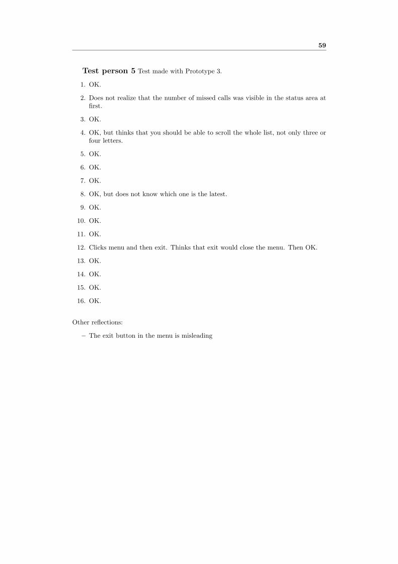
59
Test person 5 Test made with Prototype 3.
1. OK.
2. Does not realize that the number of missed calls was visible in the status area atfirst.
3. OK.
4. OK, but thinks that you should be able to scroll the whole list, not only three orfour letters.
5. OK.
6. OK.
7. OK.
8. OK, but does not know which one is the latest.
9. OK.
10. OK.
11. OK.
12. Clicks menu and then exit. Thinks that exit would close the menu. Then OK.
13. OK.
14. OK.
15. OK.
16. OK.
Other reflections:
– The exit button in the menu is misleading