
Go Mobile Series – Part 1 of 3 By: Wayne Chen
© 2012 -2013 Wayne Chen! Wayne @PocketSquareMedia.co!

¡ All your friends have one ¡ More than 5% of your site
traffic is mobile ¡ More than 10 customer
complained ¡ You boss said to get it
done ¡ You want to grow your
vertical ¡ You are pumped that your
company is adapting!
© 2012 -2013 Wayne Chen! Wayne @PocketSquareMedia.co!

¡ These tips have been selected to help you as you go through your mobile website design.
¡ Understand that every website is different § Business type § Content § Customers § Graphics § Engagement purpose
© 2012 -2013 Wayne Chen! Wayne @PocketSquareMedia.co!

¡ Find out what your website is running on § Is it scalable?
¡ What kind of content exist on your website? § Structure
¡ Graphic asset inventory?
¡ Spend the necessary time to go through your assets
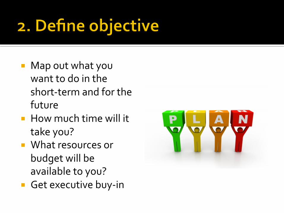
¡ Map out what you want to do in the short-‐term and for the future
¡ How much time will it take you?
¡ What resources or budget will be available to you?
¡ Get executive buy-‐in
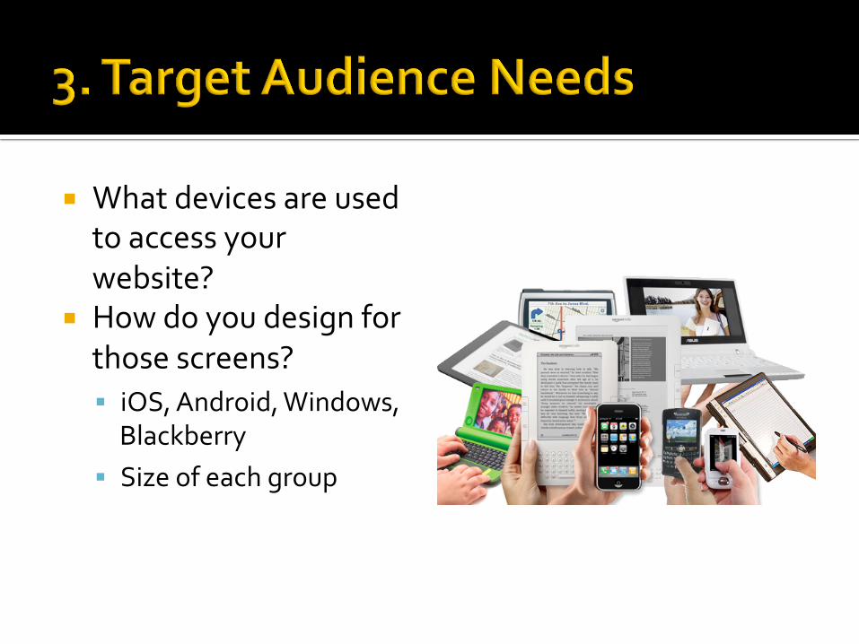
¡ What devices are used to access your website?
¡ How do you design for those screens? § iOS, Android, Windows, Blackberry
§ Size of each group
¡ What do they want? ¡ What do you want to show?
¡ What makes them want to visit your website?
¡ How much time is spent on mobile versus web?
¡ Define the use cases of the site visitor

¡ What tasks are being carried out on your website?
¡ Are they in the subway or at the office?
¡ Understanding user context will go a long way
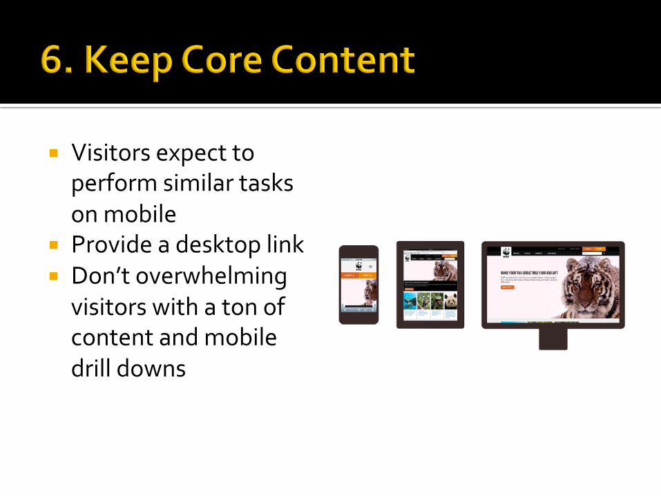
¡ Visitors expect to perform similar tasks on mobile
¡ Provide a desktop link ¡ Don’t overwhelming visitors with a ton of content and mobile drill downs

¡ Optimize your core content
¡ Adjust display of content, layout and graphics
¡ Interactions should be “touch/tap” not “click”
¡ Leverage features of the device
¡ Tailor the experience
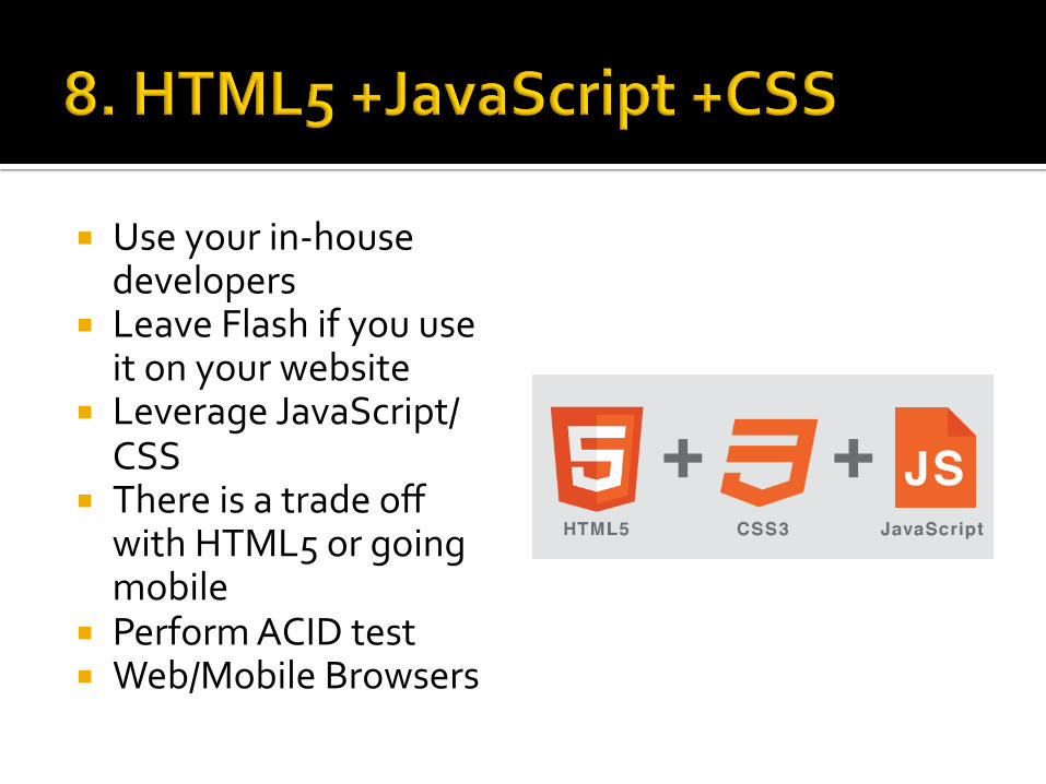
¡ Use your in-‐house developers
¡ Leave Flash if you use it on your website
¡ Leverage JavaScript/CSS
¡ There is a trade off with HTML5 or going mobile
¡ Perform ACID test ¡ Web/Mobile Browsers
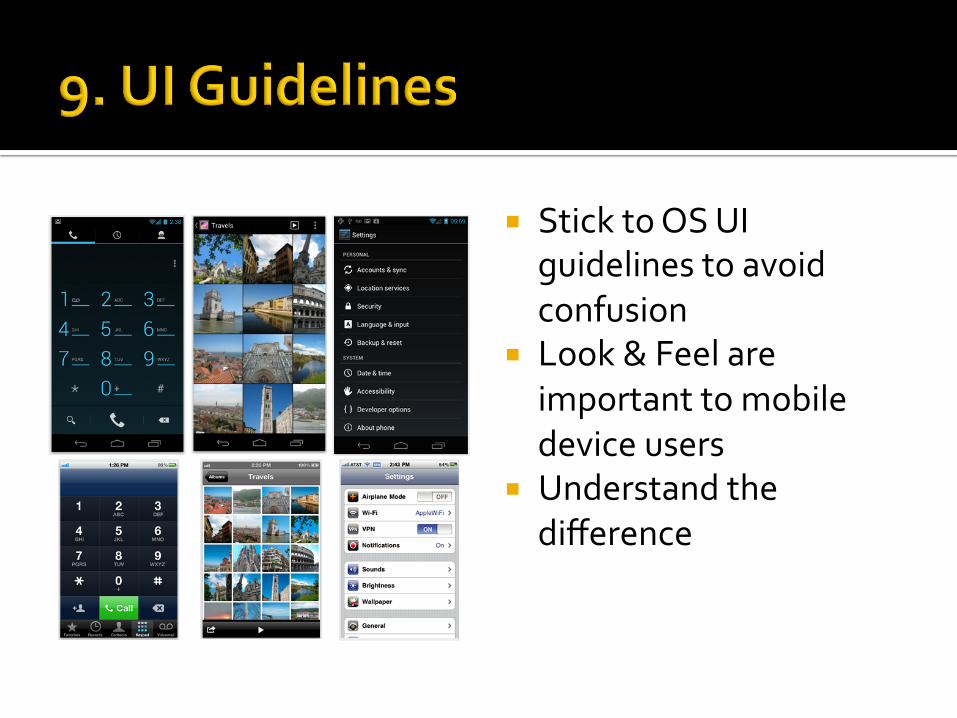
¡ Stick to OS UI guidelines to avoid confusion
¡ Look & Feel are important to mobile device users
¡ Understand the difference

¡ Responsive design is the backbone to your mobile design
¡ Define the number of columns (not excel sheet)
¡ Fixed spacing is preferable for content heavy sites
¡ Make your site modular
Contact information ¡ Wayne Chen ¡ [email protected] ¡ www.PocketSquareMedia.co
© 2012 -2013 Wayne Chen! Wayne @PocketSquareMedia.co!


![arXiv:2001.05201v1 [cs.CV] 15 Jan 2020 · 2020-01-16 · Everybody’s Talkin’: Let Me Talk as You Want Linsen Song1 Wayne Wu 2;3 Chen Qian Ran He1 Chen Change Loy3 1NLPR, CASIA](https://cdn.vdocument.in/doc/165x107/5f31775de3591a62d73e82d3/arxiv200105201v1-cscv-15-jan-2020-2020-01-16-everybodyas-talkina-let.jpg)