10 tips to a great mobile website by wayne chen
DESCRIPTION
10 Great Tips To Get You Started With Your Mobile Website Project. Perfect for marketers and product managers who wants to maximize their time and avoid pitfalls.TRANSCRIPT

Go Mobile Series – Part 1 of 3 By: Wayne Chen
© 2012 -2013 Wayne Chen! Wayne @PocketSquareMedia.co!

¡ All your friends have one ¡ More than 5% of your site
traffic is mobile ¡ More than 10 customer
complained ¡ You boss said to get it
done ¡ You want to grow your
vertical ¡ You are pumped that your
company is adapting!
© 2012 -2013 Wayne Chen! Wayne @PocketSquareMedia.co!

¡ These tips have been selected to help you as you go through your mobile website design.
¡ Understand that every website is different § Business type § Content § Customers § Graphics § Engagement purpose
© 2012 -2013 Wayne Chen! Wayne @PocketSquareMedia.co!

¡ Find out what your website is running on § Is it scalable?
¡ What kind of content exist on your website? § Structure
¡ Graphic asset inventory?
¡ Spend the necessary time to go through your assets
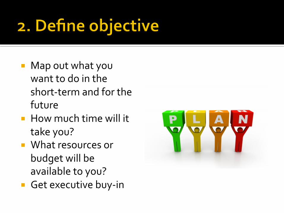
¡ Map out what you want to do in the short-‐term and for the future
¡ How much time will it take you?
¡ What resources or budget will be available to you?
¡ Get executive buy-‐in
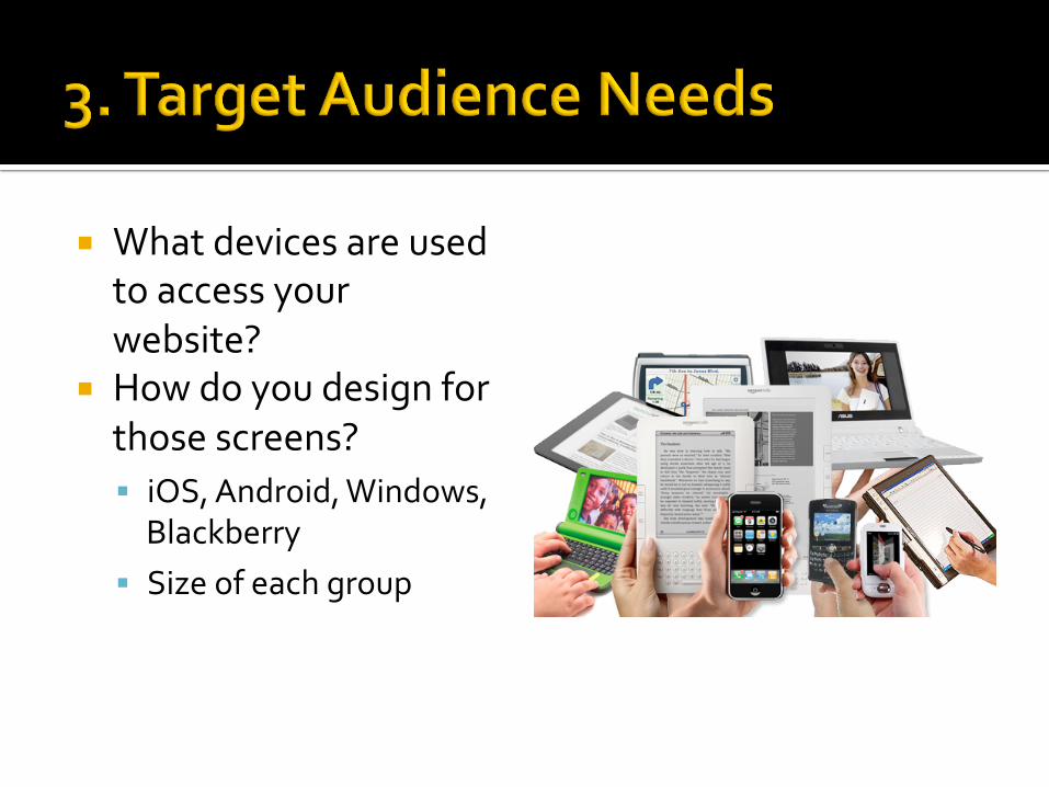
¡ What devices are used to access your website?
¡ How do you design for those screens? § iOS, Android, Windows, Blackberry
§ Size of each group
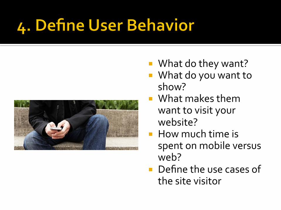
¡ What do they want? ¡ What do you want to show?
¡ What makes them want to visit your website?
¡ How much time is spent on mobile versus web?
¡ Define the use cases of the site visitor

¡ What tasks are being carried out on your website?
¡ Are they in the subway or at the office?
¡ Understanding user context will go a long way
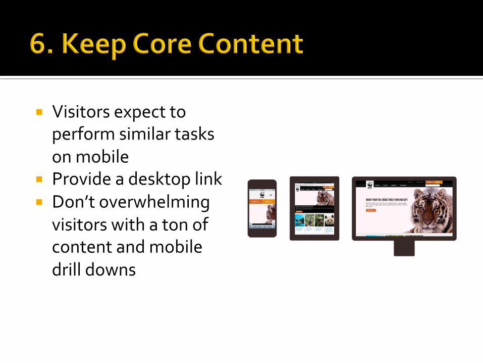
¡ Visitors expect to perform similar tasks on mobile
¡ Provide a desktop link ¡ Don’t overwhelming visitors with a ton of content and mobile drill downs

¡ Optimize your core content
¡ Adjust display of content, layout and graphics
¡ Interactions should be “touch/tap” not “click”
¡ Leverage features of the device
¡ Tailor the experience
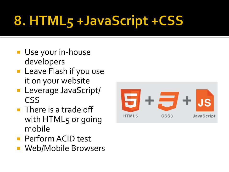
¡ Use your in-‐house developers
¡ Leave Flash if you use it on your website
¡ Leverage JavaScript/CSS
¡ There is a trade off with HTML5 or going mobile
¡ Perform ACID test ¡ Web/Mobile Browsers
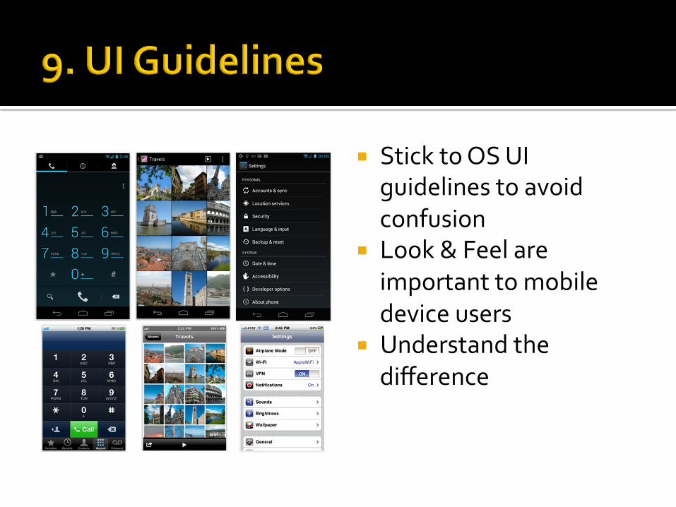
¡ Stick to OS UI guidelines to avoid confusion
¡ Look & Feel are important to mobile device users
¡ Understand the difference

¡ Responsive design is the backbone to your mobile design
¡ Define the number of columns (not excel sheet)
¡ Fixed spacing is preferable for content heavy sites
¡ Make your site modular
Contact information ¡ Wayne Chen ¡ [email protected] ¡ www.PocketSquareMedia.co
© 2012 -2013 Wayne Chen! Wayne @PocketSquareMedia.co!