Download - A2 Media Studies Evaluation Question 2

Q2. HOW EFFECTIVE IS YOUR
COMBINATION OF YOUR MAIN
PRODUCT AND ANCILLARY
TASKS?

• Throughout the entirety of the research, planning and production of the music video A2 text, it
has been important to use consistent elements of media language across the texts in order to
create and develop a continuous and cohesive look and representation. All of the ancillary
tasks I have created also need to all look of similar presentation and are easily connected
towards an audience.
• In real music media production industry, all areas of the production and planning would be
created so that they are all connected so that they are all linked together and collectively
create a strong, memorable and recognisable representation for the artist throughout all of the
different media platforms. It is important that all of the different media product are connected
and resembled the artist’s style and overall look.
• I have done this within my own media work, creating the music video, digipak and magazine
advertisement to all resemble and connect with the general style and themes, incorporating
recognisable and consistent visual effects used in my music video and links that portray the
artist in a certain way with the same connotations. Creating continuity also helps with
promoting an artist as it creates an overall look and appearance that, collectively, all contribute
into promoting the artist in a certain light and to a specific audience.

ROLAND
BARTHESFrench literary theorist, Roland Barthes, developed and created the theory of
Semiotics, which is the study of certain signs, symbols and imagery that all have
certain denotations and connotations. Denotations is what something actually and
literally is, and Connotation is what something may stand for and connote. An example
of this is the iconic image of the smoking pipe, which is actually just a piece of paper
with a drawing of a pipe (denotation) however it does connote that it is a pipe, even
though it is not actually there (connotation).
I have used this theory within my own work as I have used many different semiotics to
connote various amounts of different things. Connotations are also something that can
later become and turn into motifs for an artist.
Within my own work, I have included semiotics that are often connoted and connected
to the alternative genre, as well as my sub/hybrid-genre of horror/thriller. I am going to
be analysing and giving examples of these within my ancillary tasks.

COLOUR
CONNOTATIONS• The colour red is used dominantly and continuously throughout all 3 of my media texts.
The colour red has many connotations, most specifically blood, horror, romance,
sensuality, danger, hate and lust. I used red on all of my media texts to connote the theme
of horror and that my artist is alternative in presentation. In my music video, I use the
colour red in two different ways – one is the lipstick, which is connoted and linked to
glamour/beauty and sexuality and as the ‘blood’ which is connoted to the themes of
horror and despair. However, the lipstick is shown in an alternative way by smearing it
across the artist’s face and not typically just putting it onto his lips.
• The red lipstick connotes the element of androgyny as, although my artist is male, the
lipstick is a typical connotation towards women, which adds a contrasting element.
• On my digipak, the colour red is used alongside a contrasting blue, edited onto the sign
of my artist, which makes him appear more alienated and unusual, and translates the
horror genre as well as the alien theme.
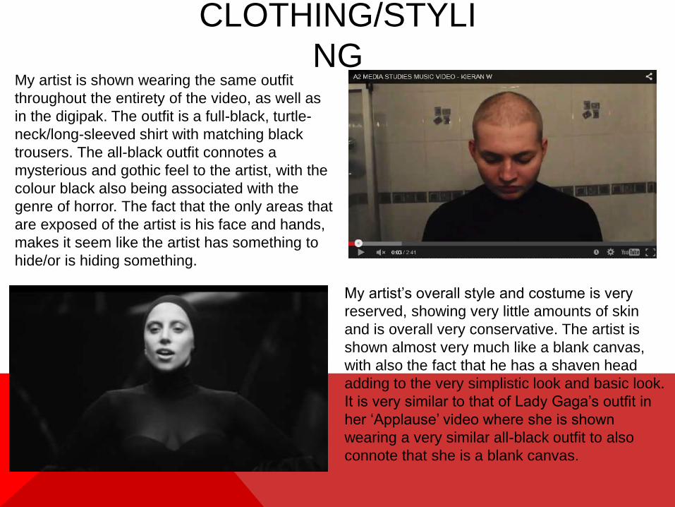
CLOTHING/STYLI
NGMy artist is shown wearing the same outfit
throughout the entirety of the video, as well as
in the digipak. The outfit is a full-black, turtle-
neck/long-sleeved shirt with matching black
trousers. The all-black outfit connotes a
mysterious and gothic feel to the artist, with the
colour black also being associated with the
genre of horror. The fact that the only areas that
are exposed of the artist is his face and hands,
makes it seem like the artist has something to
hide/or is hiding something.
My artist’s overall style and costume is very
reserved, showing very little amounts of skin
and is overall very conservative. The artist is
shown almost very much like a blank canvas,
with also the fact that he has a shaven head
adding to the very simplistic look and basic look.
It is very similar to that of Lady Gaga’s outfit in
her ‘Applause’ video where she is shown
wearing a very similar all-black outfit to also
connote that she is a blank canvas.

MAKE-
UP• Alternatively for a male music artist, make-up plays a big part of my music video
and digipak. Most male artists are featured in very heterosexual ways, however
my artist is constantly represented in a way that would be classed as androgyny
and somewhat feminine.
• My artist uses bright red lipstick in the video, which is somewhat a typical
iconography and image for women’s make-up in general. My artist also does
place the lipstick onto his lips at the very beginning of the video, before twisting it
and presenting it in an alternative way by smearing it across the whole of his
face.
• The red lipstick is not so much translated onto the digipak, however the essence
that it is still there, due to me editing the face of my artist red for the majority of
the different images.
Being applied
normally (left)
and in an
unusual
manor (right)
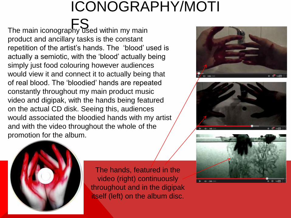
ICONOGRAPHY/MOTI
FSThe main iconography used within my main
product and ancillary tasks is the constant
repetition of the artist’s hands. The ‘blood’ used is
actually a semiotic, with the ‘blood’ actually being
simply just food colouring however audiences
would view it and connect it to actually being that
of real blood. The ‘bloodied’ hands are repeated
constantly throughout my main product music
video and digipak, with the hands being featured
on the actual CD disk. Seeing this, audiences
would associated the bloodied hands with my artist
and with the video throughout the whole of the
promotion for the album.
The hands, featured in the
video (right) continuously
throughout and in the digipak
itself (left) on the album disc.

FACIAL
EXPRESSIONSBecause my artist’s representation and genre
style is alternative, my artist is seen showing a
very bizarre, blank and intimidating facial
expression throughout all of the different media
products. In the music video, my artist is shown
for the large majority with a glaring, intense
facial expression, making direct eye contact at
the camera. and to the audience watching. In
the bath and lipstick scenes, despite having
lipstick smeared across his face, the artist never
loses his gaze towards the camera. The look
and expression of the artist may cause a slight
discomfort and maybe awkwardness to the
audience, which connotes the alien theme and
style as well as creating an essence of
suspense. There are scenes where the artist is
seen alienating himself to the audience by
having him look away from the camera, such as
the mirror scene where he instead looks at his
reflection. This is followed on through to the
digipak layout, where the many images of the
artist use follow a similar composition.
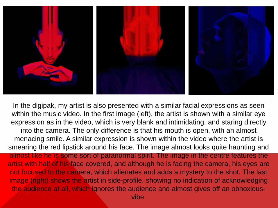
In the digipak, my artist is also presented with a similar facial expressions as seen
within the music video. In the first image (left), the artist is shown with a similar eye
expression as in the video, which is very blank and intimidating, and staring directly
into the camera. The only difference is that his mouth is open, with an almost
menacing smile. A similar expression is shown within the video where the artist is
smearing the red lipstick around his face. The image almost looks quite haunting and
almost like he is some sort of paranormal spirit. The image in the centre features the
artist with half of his face covered, and although he is facing the camera, his eyes are
not focused to the camera, which alienates and adds a mystery to the shot. The last
image (right) shows the artist in side-profile, showing no indication of acknowledging
the audience at all, which ignores the audience and almost gives off an obnoxious-
vibe.

BODY
LANGUAGE• There isn't a lot of body language featured in my products, instead focusing more
directly on close-up shots of the artist. The scene where the artist is shown in the
bath does have an essence of the artist portraying himself being cold and lonely,
shown with his arms across him. This positioning could also connote the body
language of that of a vampire that sleeps in a coffin, which is another typical
horror/thriller villain and plot.
• On the digipak, most of the photos are of close-up/profile images of the artists,
however the hands are featured in a very angelic and strongly postured manor,
similar to what is seen during the scenes with the ‘bloodied’ hands.
The positioning
of when the
artist is in the
bath is similar
to that of a
vampire, as
seen in horror
movies.
The hands shown in the digipak are
in a similar positioning to that of the
hands that are featured fluently
throughout the video.

CAMERA ANGLES &
SHOTS• The main camera angles used within my music video is mainly close-up shots,
however there are some elements of longshot and mid-shots. With my ancillary
product, I use entirely close-up shots.
• By featuring so many close-up shots, it familiarises and makes the audience
establish the artist’s overall look and representation, and although the digipak is
quite heavily edited, I have made sure that the close ups used are still
distinguishable and recognisable to an audience for if they were to see the album
being sold in stores.
• The large array of close-up shots also makes the audience gain a better
relationship with the artist, and because my artist makes often and constant
notions to looking at the camera, makes the audience gain a better connection.

I have also included a varied amount of establishing and none-featured artist shots
of things like the sink and bath. Within these shots I again use the semiotic of ‘blood’
(aka red food colouring) within these scenes and use water to make the bleed and
move in interesting ways and movements. I have added these into the video to
make the alternative and gothic/horror sub-genre more dominant, and also adds a
refreshing element to the video instead of just constant close-up shots of my artist. I
also included artistic imagery on my digipak, featuring heavily edited images that
reflect a very out-of-the-box/other-worldly/extraterrestrial look. I used effects such as
the blur and smudge effects which make the images of my artist appear as if they
are being abducted/melting which connotes, again, the quirky and alternative genre.

FONTS/PLACEMENTS/COLOU
RINGFor my digipak product, I wanted to make sure all
of the elements looked and connected together,
with a sense of continuity and all look like they
are from the same distributer and production
team. The font I used was a font entitled ‘Disco’
which I think adds a very professional and
dynamic essence to the different products. It also
contrasts well with the general style of the
products with the red and blue neon colouring
and adds a sense of normality. I also spaced out
the letters in the font to make the texts look much
more cinematic.

IN
CONCLUSION…I believe I have created a strong combination and
final product of both my main product and ancillary
tasks, creating products that interlink and create
continuity both between its representation of the
artist and overall look and presentation. The media
product, together as a whole, all contribute to the
artist’s alternative genre and sub-genre themes and
include and distribute elements and conventions that
are all instantly recognisable and understood with
audiences.


