Download - An Introduction to Sensible Typography

TYPOGRAPHYAN INTRODUCTION TO SENSIBLE
A UCLA ACM PRODUCTION

YOUR HOST

WHY SHOULD I CARE?

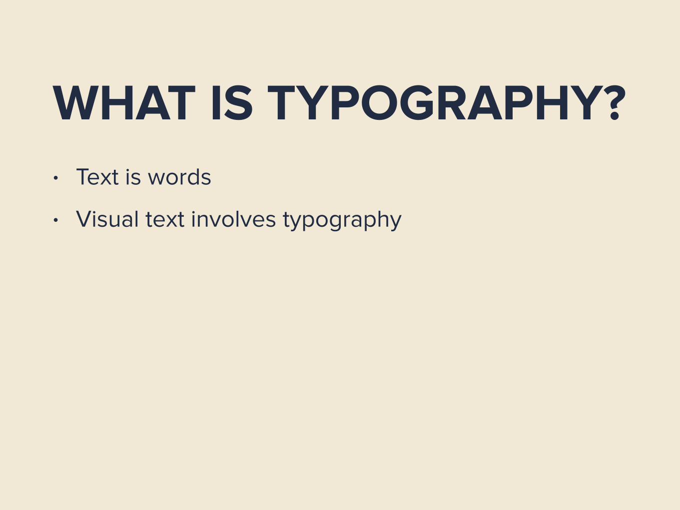
WHAT IS TYPOGRAPHY?• Text is words
WHAT IS TYPOGRAPHY?• Text is words
• Visual text involves typography

WHAT IS TYPOGRAPHY?
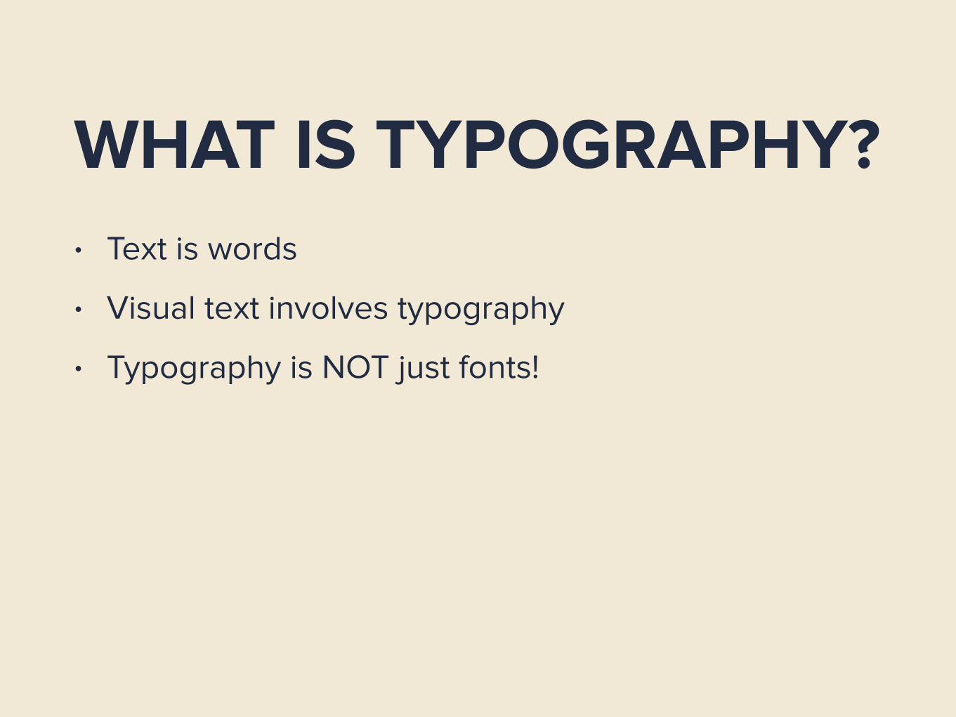
WHAT IS TYPOGRAPHY?• Text is words
• Visual text involves typography
• Typography is NOT just fonts!
WHY DOES IT MATTER?• Reader attention
WHY DOES IT MATTER?• Reader attention
• Readers do not want to read

TYPOGRAPHY DOES NOT MAKE YOUR WRITING BETTER
–You, presumably
“But James, I don’t know design!”
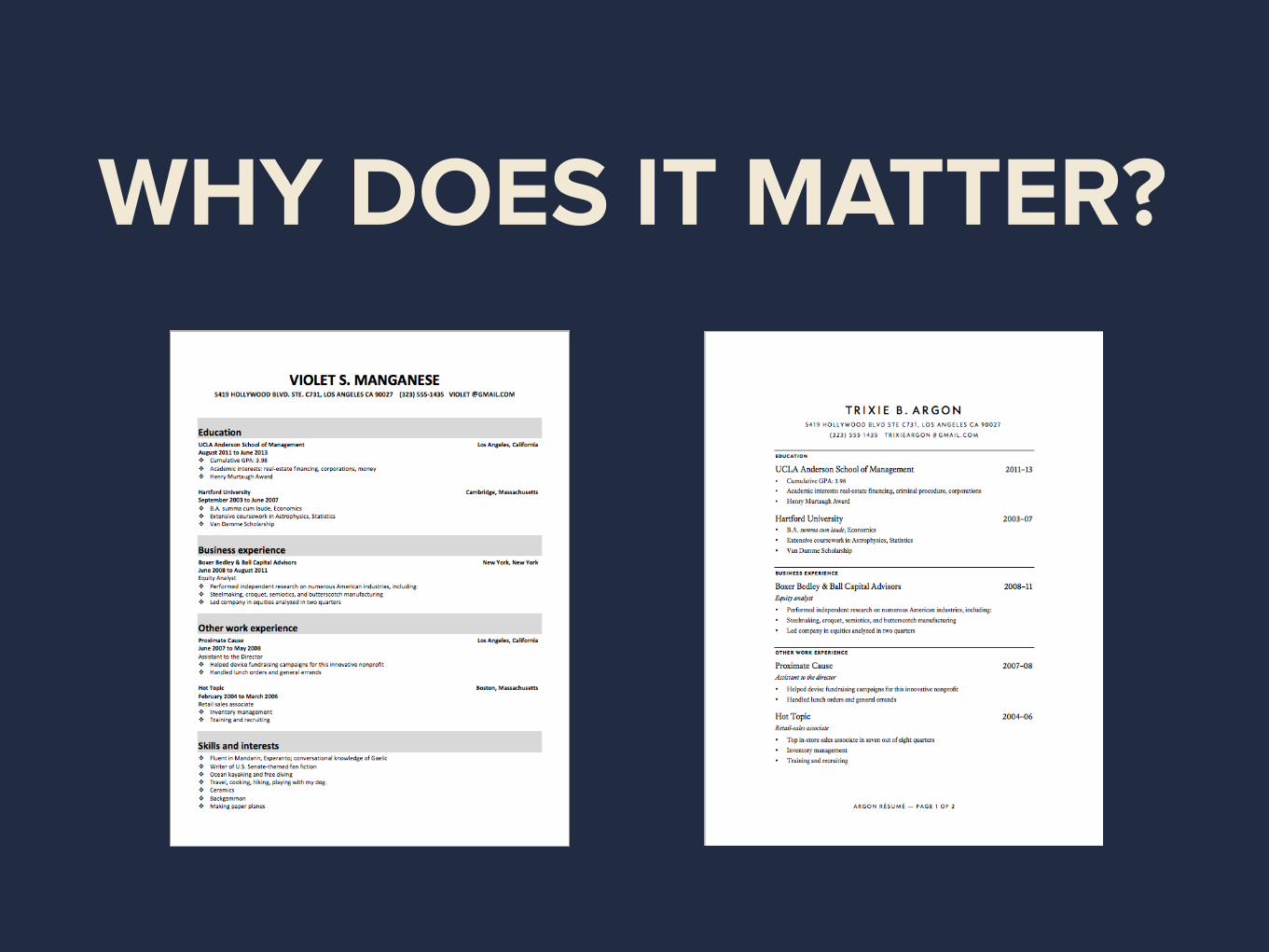
WHY DOES IT MATTER?

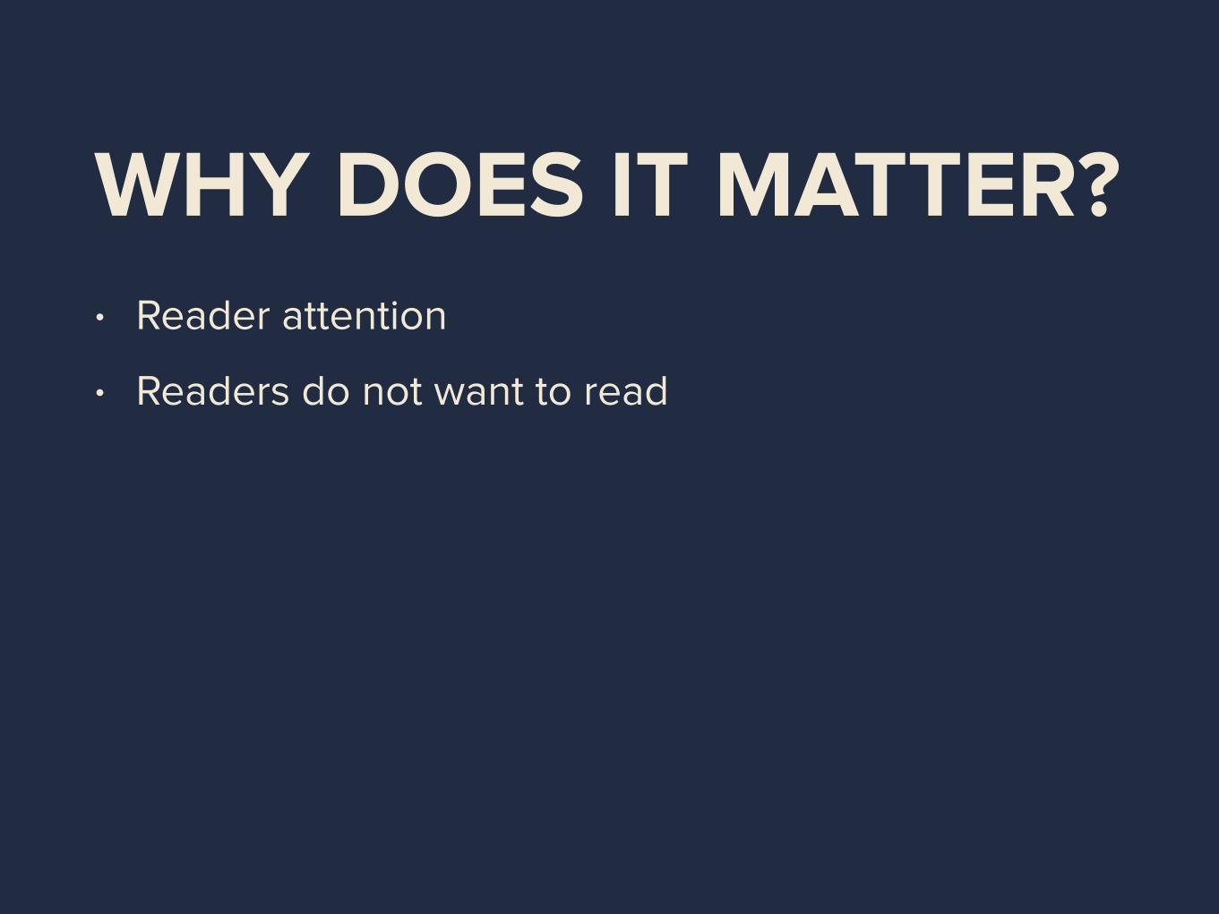
WHY DOES IT MATTER?• Reader attention
• Readers do not want to read
• Typography already matters to you
TYPOGRAPHY ISN’T REQUIRED, BUT
NEITHER IS SHOWERING
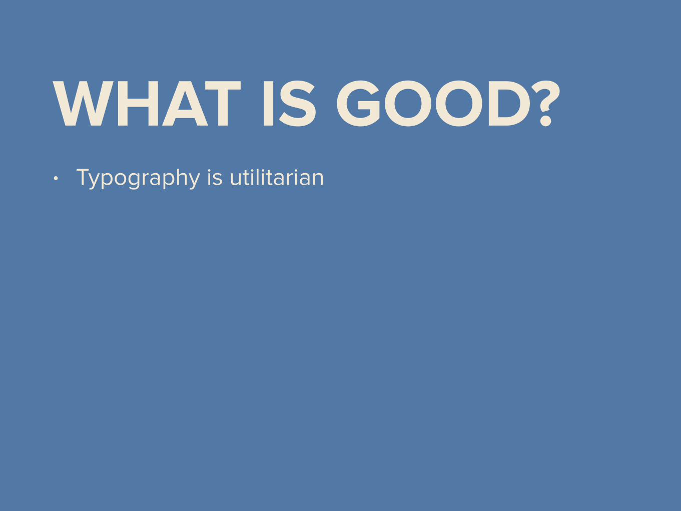
WHAT IS GOOD?• Typography is utilitarian
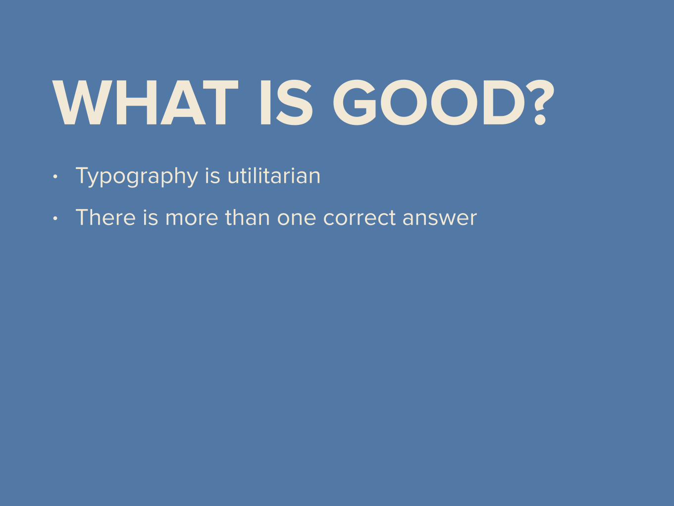
WHAT IS GOOD?• Typography is utilitarian
• There is more than one correct answer

WHAT IS GOOD?• Typography is utilitarian
• There is more than one correct answer
• Good typography can be ugly

–Some famous designer dude
“Good design is invisible.”
HOW TO GET GOOD

BAD TYPOGRAPHY HABITS
FIVE RULES
1BODY TEXT
2POINT SIZE
3LINE SPACING

4LINE LENGTH

5FONT CHOICE

COMPOSITION

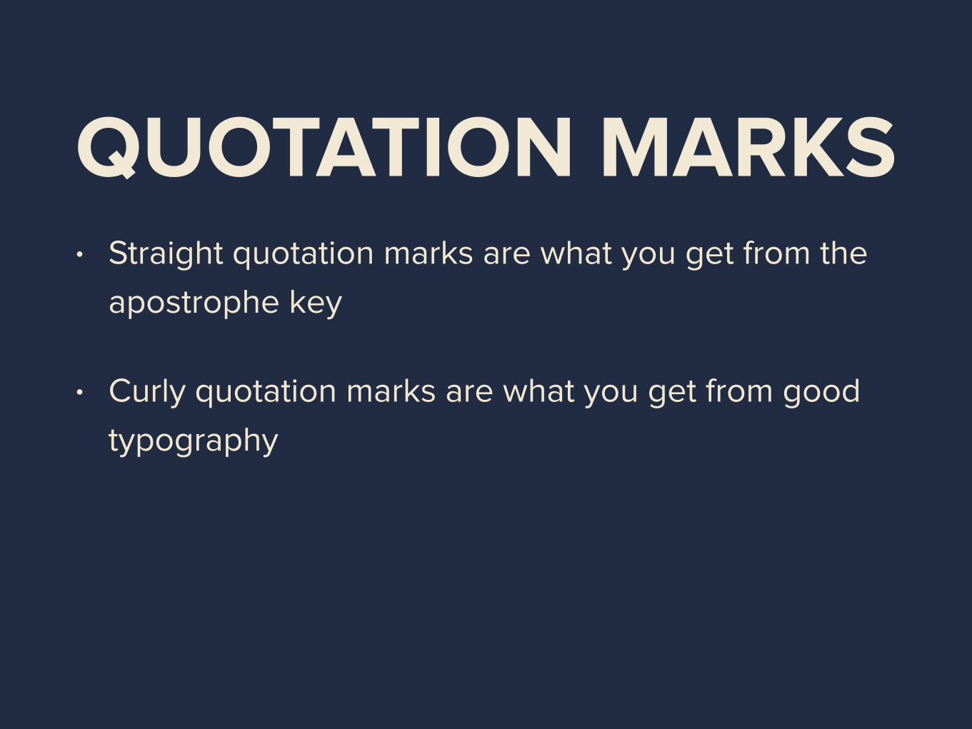
QUOTATION MARKS• Straight quotation marks are what you get from the
apostrophe key
• Curly quotation marks are what you get from being
good

QUOTATION MARKS
'' ""
‘’ “”

QUOTATION MARKS
‘ “
’ ”
QUOTATION MARKS• Straight quotation marks are what you get from the
apostrophe key
• Curly quotation marks are what you get from good
typography

ONE SPACE• Always put one space between sentences

PARENTHESES, ETC.• Parentheses, brackets, and braces should not take
formatting of surrounded material

PARENTHESES, ETC.
[LA Hacks OST (feat. LA Hacks)]
[LA Hacks OST (feat. LA Hacks)]
[LA Hacks OST (feat. LA Hacks)]
[LA Hacks OST (feat. LA Hacks)]
HYPHENS/DASHES• Not interchangeable

HYPHENS/DASHES
- hyphen
– en-dash –
— em-dash —
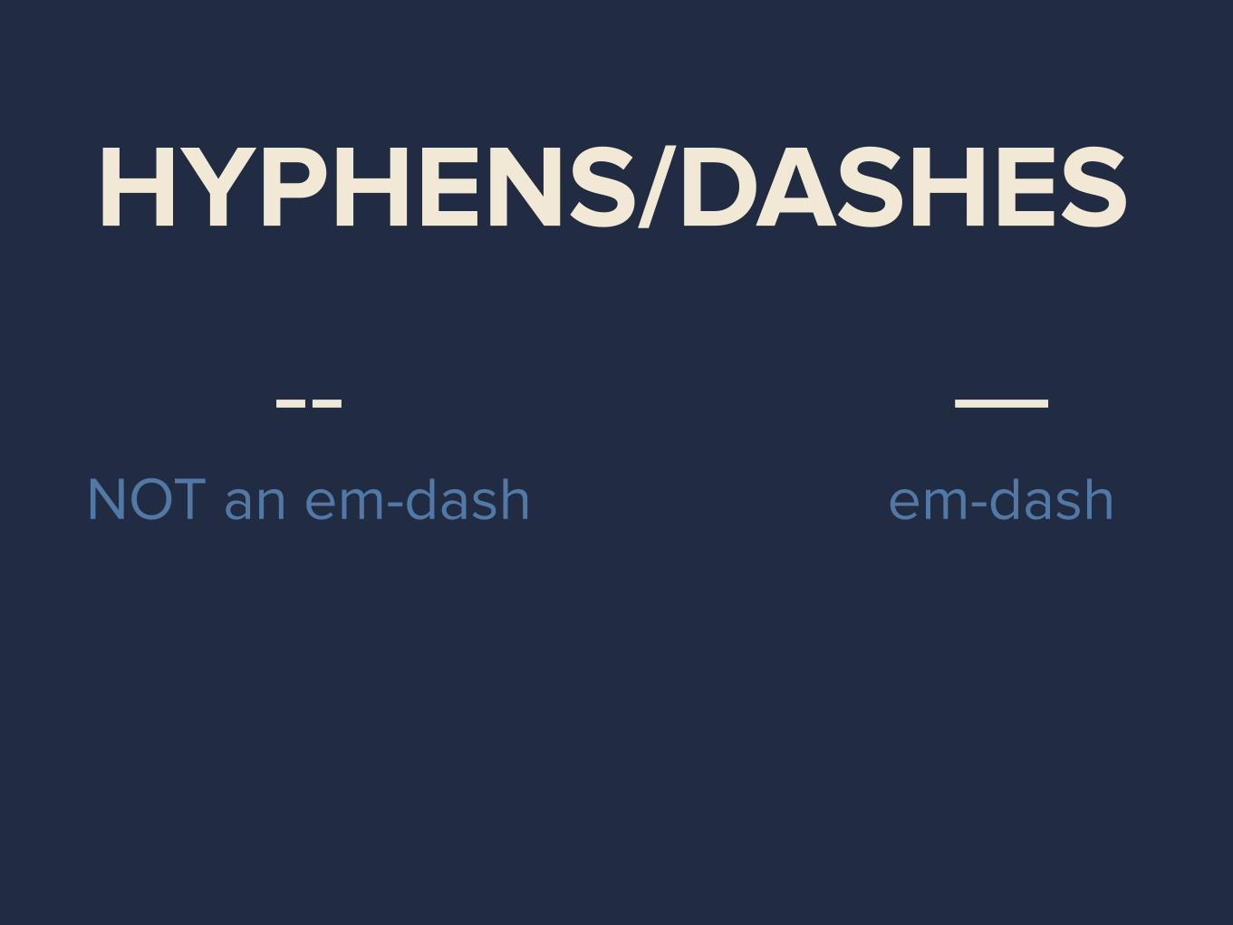
HYPHENS/DASHES
— em-dash
-- NOT an em-dash

HYPHENS/DASHES
—em-dash
--NOT an em-dash
BAD NO
STOP

SPACES• Nonbreaking spaces exist. Please don’t abuse them.

FORMATTING

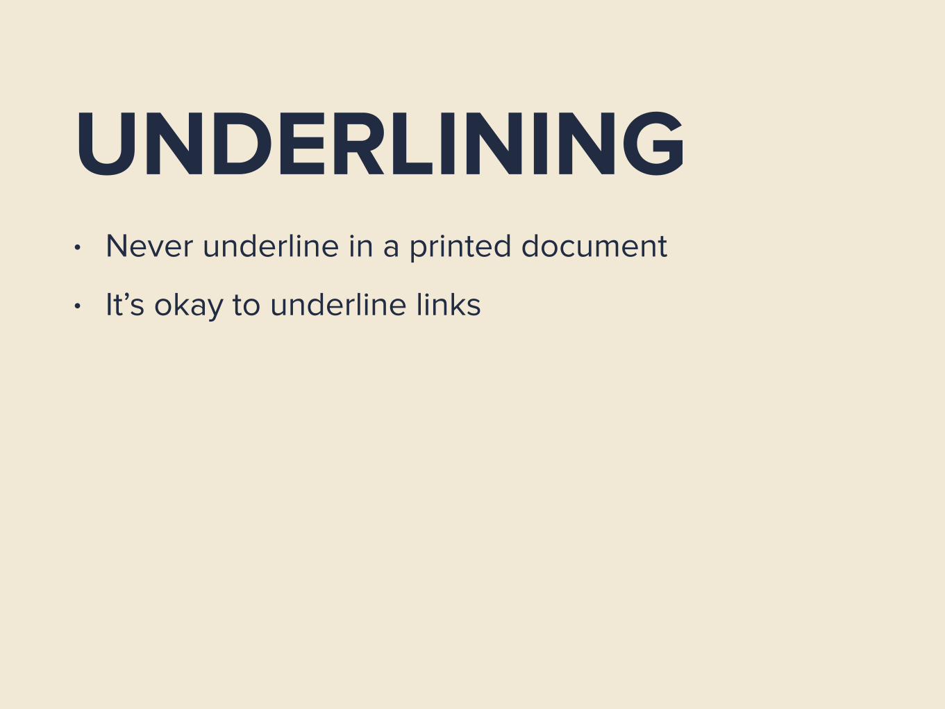
UNDERLINING• Never underline in a printed document
UNDERLINING• Never underline in a printed document
• It’s okay to underline links

SILLY FONTSJames Wu
James Wu
James Wu James Wu
James Wu

MONOSPACED• Only use in code

SYSTEM FONTS• are bad

SYSTEM FONTS• are bad
• are overexposed

WAIT, WHAT
BOLD OR ITALIC• Mutually exclusive
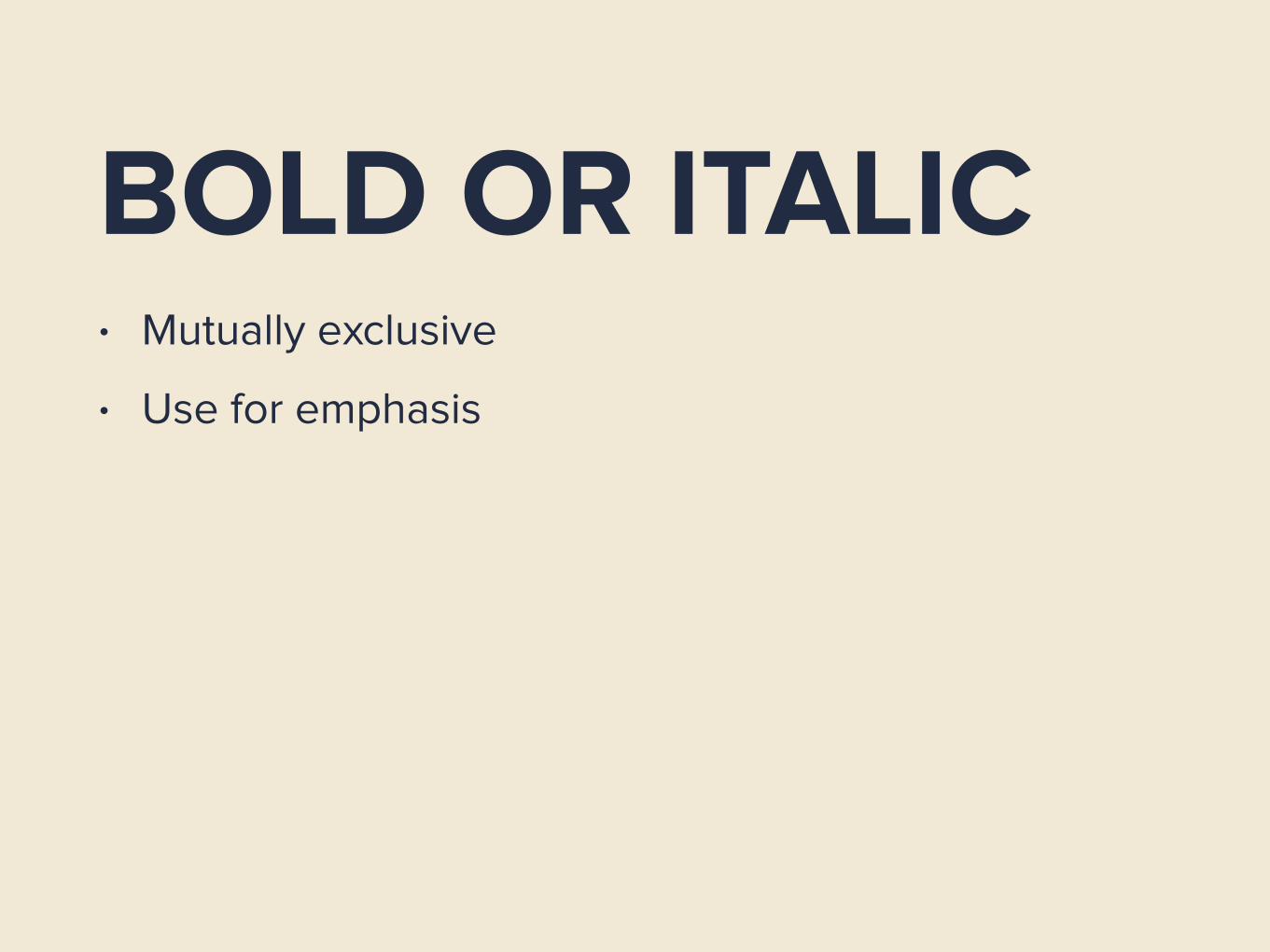
BOLD OR ITALIC• Mutually exclusive
• Use for emphasis
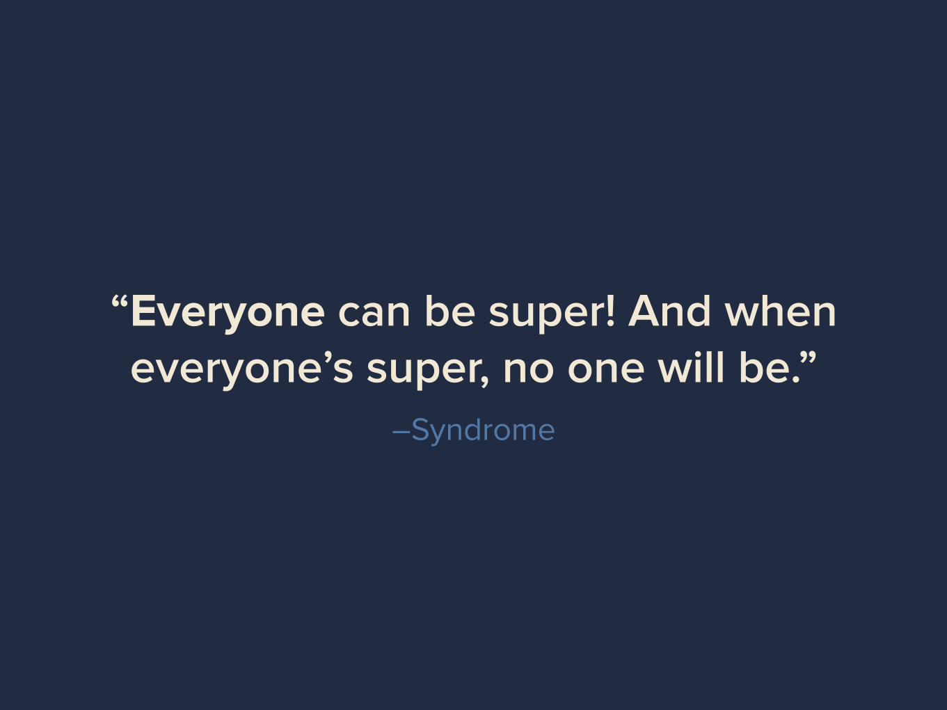
–Syndrome
“Everyone can be super! And when everyone’s super, no one will be.”

BOLD OR ITALIC• Mutually exclusive
• Use for emphasis
• Italic for soft emphasis, bold for heavy

BOLD OR ITALIC• Mutually exclusive
• Use for emphasis
• Italic for soft emphasis, bold for heavy
• With sans-serif fonts, use bold for both

ALL CAPS• Use sparingly

ALL CAPSCAPITALIZING FULL PARAGRAPHS IS BAD. WHY DO
YOU STILL HAVE CAPS LOCK ENABLED ANYWAY.
REMAP THAT TO CONTROL OR SOMETHING. IT’S
BETTER FOR CODING. THIS IS EVEN HARDER TO
READ WHEN IT’S BOLDED. ARE YOU HAVING FUN
READING THIS? ARE YOU HAVING FUN YET?
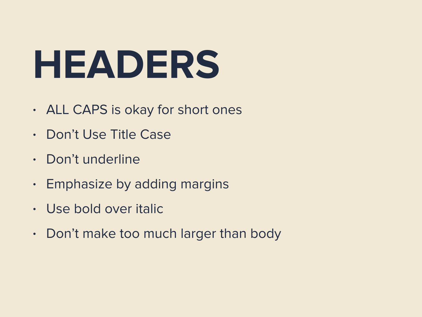
HEADERS• ALL CAPS is okay for short ones
• Don’t Use Title Case
• Don’t underline
• Emphasize by adding margins
• Use bold over italic
• Don’t make too much larger than body
KERNING

LETTERSPACING• CSS letter-spacing
• If you can fit another character in the space, it’s too
wide
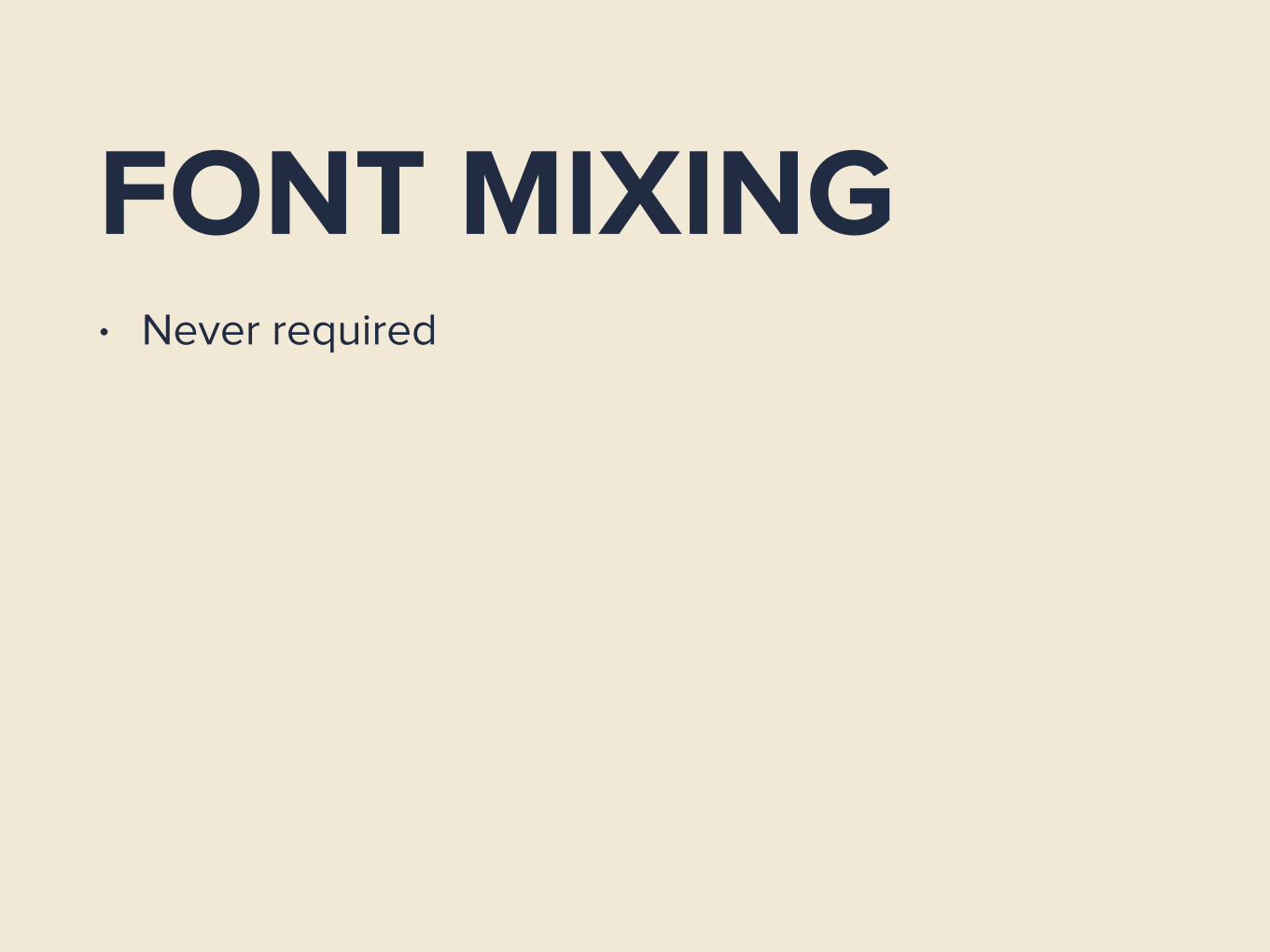
FONT MIXING• Never required

FONT MIXING• Never required
• Diminishing returns

FONT MIXING• Never required
• Diminishing returns
• Any two different fonts are valid
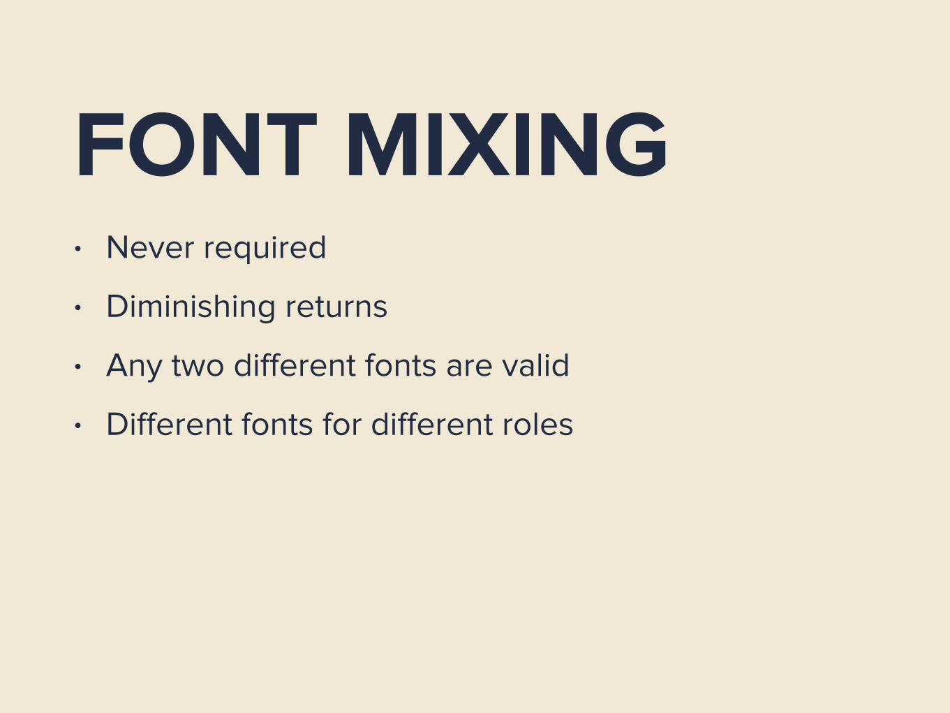
FONT MIXING• Never required
• Diminishing returns
• Any two different fonts are valid
• Different fonts for different roles

OKAY, BUT WHAT FONT SHOULD I USE?
NOTHING BEATS PROFESSIONAL
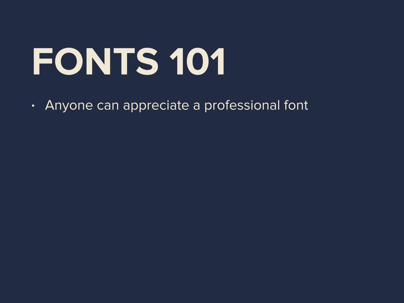
FONTS 101• Anyone can appreciate a professional font
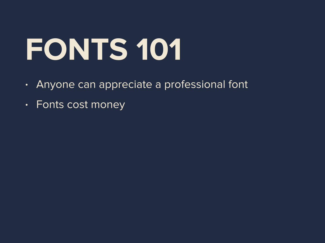
FONTS 101• Anyone can appreciate a professional font
• Fonts cost money
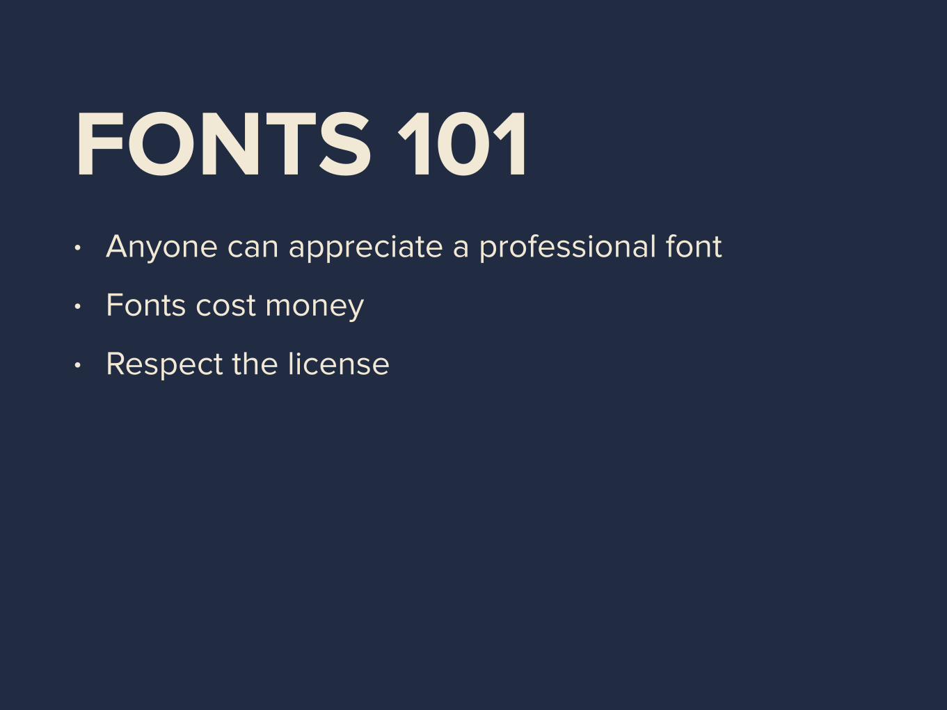
FONTS 101• Anyone can appreciate a professional font
• Fonts cost money
• Respect the license
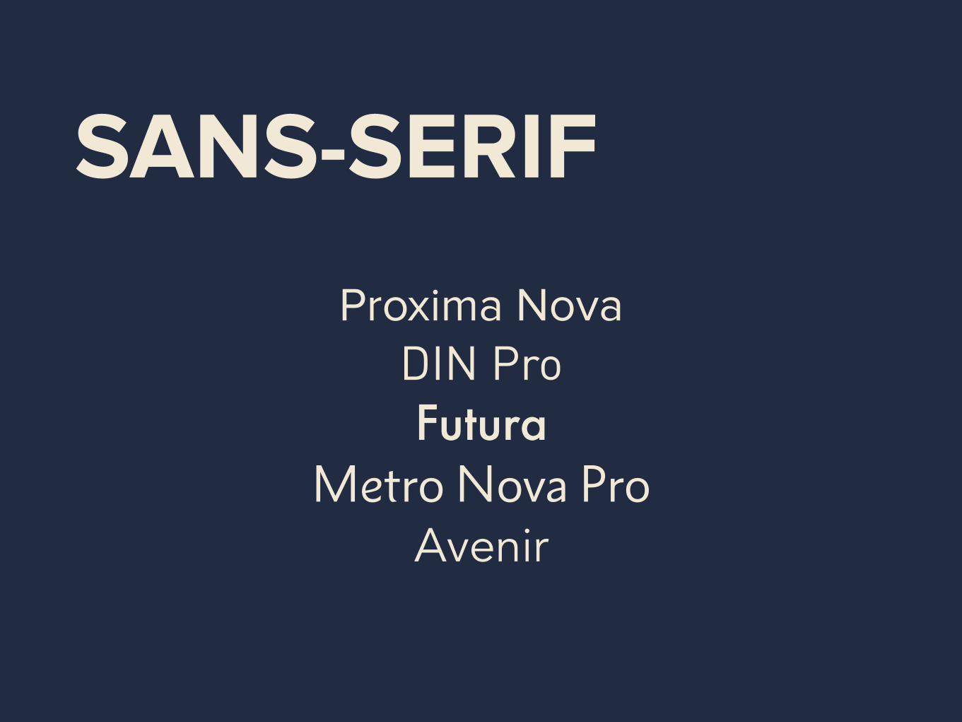
SANS-SERIF
Proxima Nova DIN Pro Futura
Metro Nova Pro Avenir

SERIF
Grandesign Neue Serif Roboto Slab Quattrocento
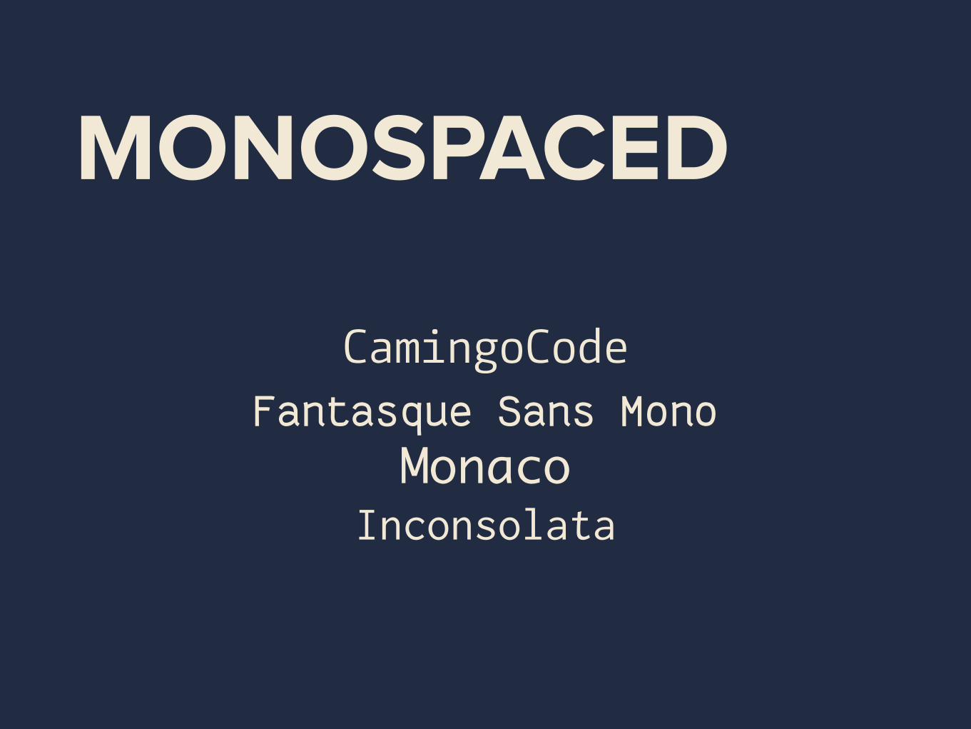
MONOSPACED
CamingoCode Fantasque Sans Mono
MonacoInconsolata
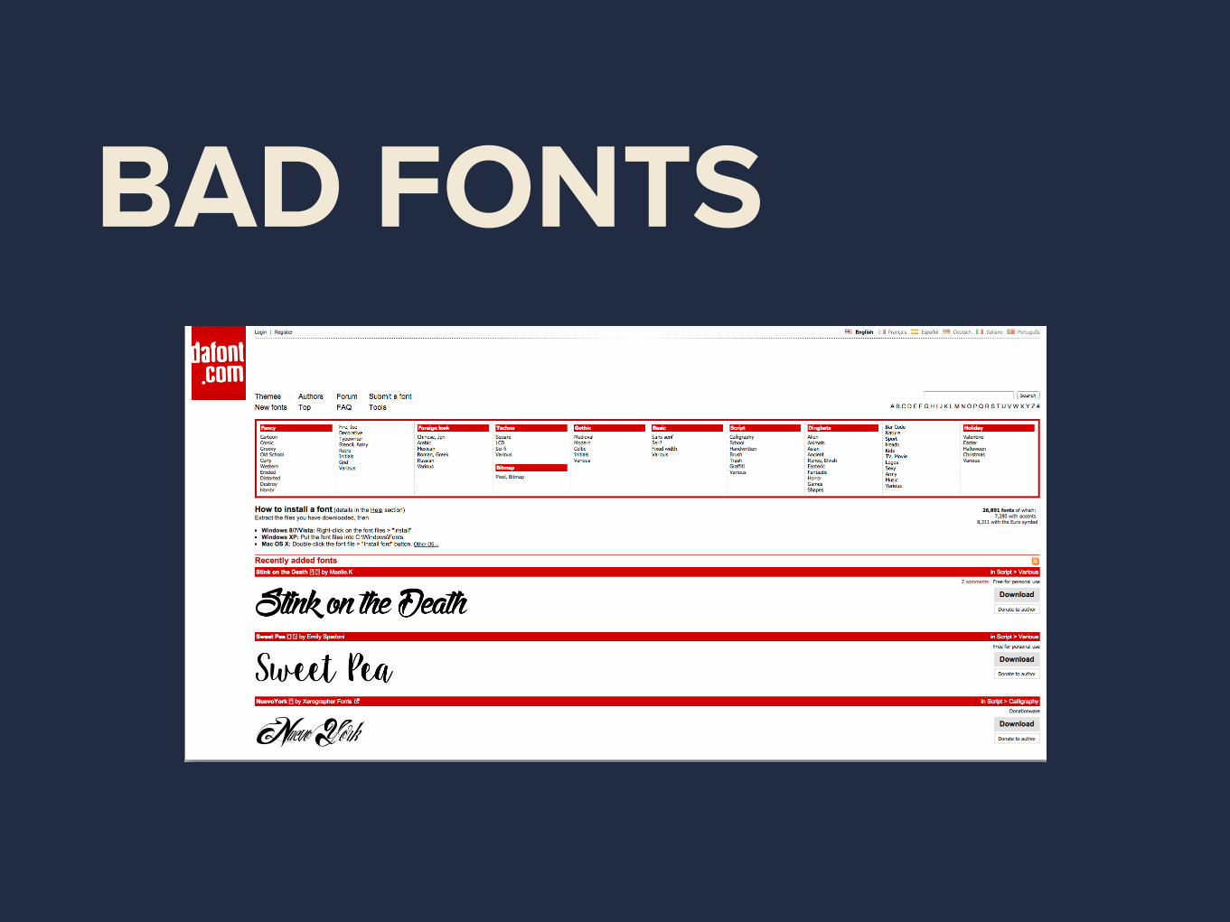
BAD FONTS

GOOD FREE FONTS
The Lost Type Co-op The League of Moveable Type
ADDENDUM: LINE WIDTH


DO NOT FEAR WHITESPACE


THANK YOUTWEET ME @ZEKANOSHI


