economic review 2016-01
TRANSCRIPT

08 January 2016
Office for National Statistics | 1
Economic Review, January 2016Author Name(s): Malindi Myers, Philip Wales, Andrew Agyiri Amankwah, Ciaren Taylor, MattLuff, Rhys Morris, Faizan Yousefzai, Annie Chirambo, Lee Mallet
Abstract
The main economic stories from National Statistics produced over the latest month, painting acoherent picture of the UK economic performance using recent economic data.
Main points
• GDP grew by 0.4% in Q3 2015, revised down from the previously published estimate of 0.5%.Growth averaged 0.5% during the first three quarters of 2015, following growth of 0.7% perquarter during 2014. GDP is now 6.1% higher than its pre-downturn level.
• The levels and rates of longer term unemployment, and that for the younger age groups have allfallen in recent months, which is important for the medium to longer term human capital and skillbase of the economy.
• Although nominal and real wage growth has come down since July 2015, both are still well abovewhere they were around a year ago. Despite this recent rise in households’ disposable income,stronger household consumption has resulted in a lower household saving ratio.
• While the level of productivity is higher in large than in small firms, micro-firms of fewer than 10employees have experienced faster growth in output per worker than larger firms since 2009.
• The proportion of firms and employees working at zero or negative levels of productivity waslower in 2014 than at any point since 2008.
• Professional, scientific and technical firms accounted for almost 1 in 3 of the UK’s highestproductivity non-financial business economy firms in 2014: significantly above their share ofclose to 20% of all firms that year, and considerably higher than in 2008.
Introduction
GDP continued to grow in Q3 2015, as it has been doing for the past eleven quarters. Althoughgrowth was 0.4% quarter on quarter in Q3 2015, and averaged 0.5% across the previous threequarters of 2015, this represents something of an easing in GDP growth compared to 2013 and2014. Aggregate output is now 6.1% above its pre-downturn level. Broader measures of economicwell-being also increased in Q3 2015, notably GDP per head and Real Net National DisposableIncome per head.
Household consumption has been one of the main drivers of GDP growth over the last year, whilenet trade and private sector housing investment dragged on GDP growth over the same period.

08 January 2016
Office for National Statistics | 2
This edition of the Economic Review examines how the balance on trade in goods and services hasvaried since 2008, as well as the contributions of the income components to aggregate GDP growth.It also considers the revisions to GDP introduced in the Quarterly National Accounts, identifyingrevisions to the output and income measures in the financial industries as the primary cause.
The growth of household consumption during the economic recovery has outpaced growth ofhousehold incomes. As a result, the saving ratio has fallen over this period, dropping from itspeak in 2010, at 11.9%, to 4.4% in Q3 2015. This edition of the Review examines these dynamics,and highlights the importance of relatively weak inflation to increasing the purchasing power ofhouseholds over the last year. It also shows how lower energy and food prices in particular havedriven a ‘wedge’ between headline and core inflation, which has persisted since late 2014.
The recent relative strength of real wages and the rise in employment have both come alongsidea fall in average hours worked. This edition of the Review finds that the fall in hours has beenparticularly marked among full time workers and that suggests that this might help to explain therecent moderation of weekly earnings growth. It reviews the recent fall in the unemployment rate,finding that levels and rates of longer term unemployment, and that for the younger age groups haveall fallen in recent months. These have implications for the medium to longer term human capital andskill base of the economy.
Output per hour increased by 1.3% in the year to Q3 2015, unchanged from the previous quarter,and considerably stronger than in 2014. This edition of the Review conducts an analysis of firm-levelproductivity using detailed data from the Annual Business Survey (ABS) and the Inter-DepartmentalBusiness Register (IDBR). It finds that the distribution of firm level output per worker is strikinglyvaried – even within specific industries – that it has changed in shape over the course of theeconomic downturn and recovery and that professional services firms in particular grew as a shareof the UK’s most productive firms between 2008 and 2014.
Analysing firm-level output per worker data, it concludes that on average, larger businesses havebeen more productive than small- and micro-firms over the 2008 to 2014 period. However – eitheras a consequence of stronger productivity growth among these smaller firms, or because of less-productive small firms ceasing trading during the downturn – the productivity gap between thelargest and smallest firms has narrowed over this period. The proportion of firms and employeesworking at zero or negative levels of productivity was lower in 2014 than at any point since 2008.
GDP
The Quarterly National Accounts (QNA) indicated that the UK economy grew by 0.4% in the thirdquarter of 2015, and by 2.1% when compared to the same quarter of the previous year. Thisrepresents a 0.1 percentage point downward revision to the quarter on quarter growth rate and a0.2 percentage point downward revision for growth compared to the previous year. Although weakerthan previously estimated, this still represents the eleventh consecutive quarter of GDP growth andcontinues the positive trend in rising output that started in 2013.
Broader measures of economic well-being also increased in Q3 2015. GDP per head increasedby 0.3% over this period compared to the previous quarter and was 0.3% above its pre-downturnlevel, having initially surpassed it in Q2 2015. Real Net National Disposable Income (NNDI) per
08 January 2016
Office for National Statistics | 3
head - which adjusts GDP for capital consumption and net income flows - gives a measure whichrepresents the income available to UK residents. In Q3 2015 real NNDI also increased by 1.3%compared with Q2 2015, somewhat faster than GDP per head as a result of an improvement in theUK’s net earnings in direct investment abroad.
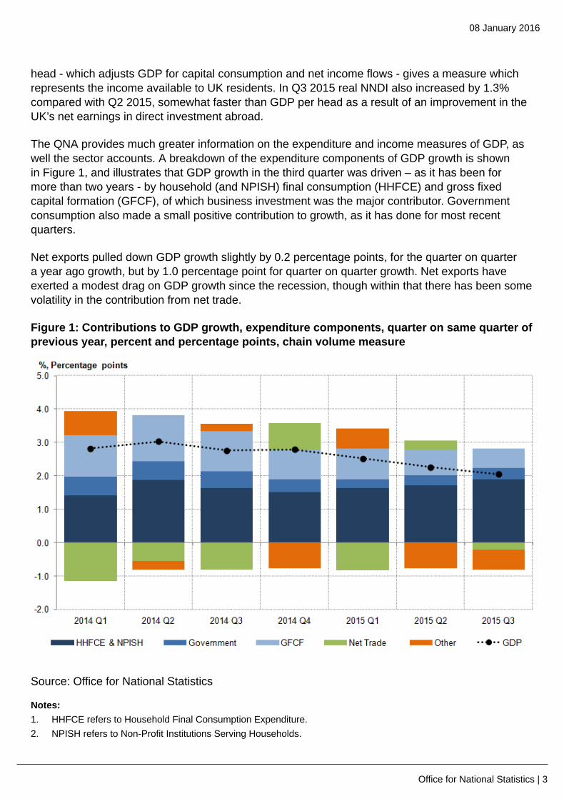
The QNA provides much greater information on the expenditure and income measures of GDP, aswell the sector accounts. A breakdown of the expenditure components of GDP growth is shownin Figure 1, and illustrates that GDP growth in the third quarter was driven – as it has been formore than two years - by household (and NPISH) final consumption (HHFCE) and gross fixedcapital formation (GFCF), of which business investment was the major contributor. Governmentconsumption also made a small positive contribution to growth, as it has done for most recentquarters.
Net exports pulled down GDP growth slightly by 0.2 percentage points, for the quarter on quartera year ago growth, but by 1.0 percentage point for quarter on quarter growth. Net exports haveexerted a modest drag on GDP growth since the recession, though within that there has been somevolatility in the contribution from net trade.
Figure 1: Contributions to GDP growth, expenditure components, quarter on same quarter ofprevious year, percent and percentage points, chain volume measure
Source: Office for National Statistics
Notes:1. HHFCE refers to Household Final Consumption Expenditure.2. NPISH refers to Non-Profit Institutions Serving Households.
08 January 2016
Office for National Statistics | 4
3. GFCF refers to Gross Fixed Capital Formation.4. Q1 is Quarter 1 (Jan to Mar), Q2 is Quarter 2 (Apr to June), Q3 is Quarter 3 (July to Sept) and Q4 is Quarter 4 (Oct
to Dec)
Download chart
XLS format(27 Kb)
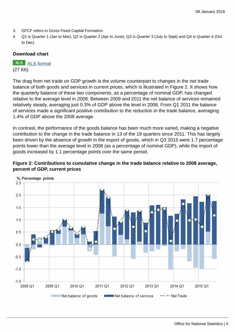
The drag from net trade on GDP growth is the volume counterpart to changes in the net tradebalance of both goods and services in current prices, which is illustrated in Figure 2. It shows howthe quarterly balance of these two components, as a percentage of nominal GDP, has changedrelative to the average level in 2008. Between 2009 and 2011 the net balance of services remainedrelatively steady, averaging just 0.3% of GDP above the level in 2008. From Q1 2011 the balanceof services made a significant positive contribution to the reduction in the trade balance, averaging1.4% of GDP above the 2008 average.
In contrast, the performance of the goods balance has been much more varied, making a negativecontribution to the change in the trade balance in 13 of the 19 quarters since 2011. This has largelybeen driven by the absence of growth in the export of goods, which in Q3 2015 were 1.7 percentagepoints lower than the average level in 2008 (as a percentage of nominal GDP), while the import ofgoods increased by 1.1 percentage points over the same period.
Figure 2: Contributions to cumulative change in the trade balance relative to 2008 average,percent of GDP, current prices

08 January 2016
Office for National Statistics | 5
Source: Office for National Statistics
Notes:1. Q1 is Quarter 1 (Jan to Mar), Q2 is Quarter 2 (Apr to June), Q3 is Quarter 3 (July to Sept) and Q4 is Quarter 4 (Oct
to Dec)
Download chart
XLS format(29 Kb)
The quarterly national accounts also provide detail on the income measure of GDP. Figure 3shows that the main drivers of GDP growth in nominal terms were from growth in compensationof employees and ‘other income’ (including mixed income - a measure of the income and profitsgenerated from the self employed). The consistent contribution from compensation of employees(COE) in recent quarters echoes the contribution from household consumption to the expendituremeasure of GDP. The contributions to the income measure of GDP also highlight the differentperformance of the financial and non-financial sectors, with the latter contributing more positivelyand on a more consistent basis.
Figure 3: Contributions to GDP growth, income components, quarter on same quarter ofprevious year, percent and percentage points, current prices
Source: Office for National Statistics

08 January 2016
Office for National Statistics | 6
Notes:1. FinCo GOS refers to Financial Corporation Gross Operating Surplus.2. NFC GOS Ex refers to Non-Financial Corporation Gross Operating Surplus, and covers both private and public
corporations3. CoE refers to Compensation of Employees4. Q1 is Quarter 1 (Jan to Mar), Q2 is Quarter 2 (Apr to June), Q3 is Quarter 3 (July to Sept) and Q4 is Quarter 4 (Oct
to Dec)
Download chart
XLS format(28 Kb)
As noted at the start of this section, this quarterly national accounts release brought some notablerevisions to GDP growth, particularly for elements of the financial sector relating to life insuranceprofits and pension funds, which were reflected in the GDP output and income measures. Theserevisions to the output and income measures were correspondingly reflected in the expendituremeasure in GFCF revisions.
The measurement of the financial sector in the national accounts is more susceptible to revisionsthan some other sectors, in good part because of the inherent nature of the transactions andinstruments, and the longer lead times for in-coming data which means forecasts are in the datasetsfor a relatively long period during the quarter.
The main causes of these revisions were:
• life insurance profits, with new annual data for 2014 from financial institutions, revisions to Q22015 data and the replacing of forecast data for Q3 2015 with actual survey data
• other financial institutions data resulting in a revision to Q2 2015 data, to reflect some stockmarket volatility that affected asset valuations, and the updating of the forecast for Q3 2015
• revisions to FISIM estimates for Q3 2015
GDP growth forecasts for 2015 and 2016
Although GDP growth during the first three quarters of 2015 has been positive, and has beenabove growth seen in most of the years following the downturn, it has nevertheless been somewhatsubdued in comparison to 2014. Quarter on quarter a year ago growth averaged 2.9% during 2014compared to 2.3% during 2015.
This easing in the growth rate since mid-2014 is reflected in a gradual reduction in the forecasts ofGDP growth for 2015 and 2016 by other organisations, both public and private sector, but whichappear to gravitate toward the OBR’s forecast (Figure 4). Forecasts for 2016 stabilise around the2.3% mark, mirroring the averaged GDP growth for the first three quarters of 2015.

08 January 2016
Office for National Statistics | 7
Figure 4: External forecasts of GDP growth for 2015 and 2016 – average and distributionaround the mean (%, changes on a year earlier)
Source: Treasury (Her Majestys)
Notes:1. For some months, an overwhelming majority of forecasts were the same number across percentile swathes.2. Please click on the image to view a larger version.
Download chart
XLS format(19.5 Kb)
Sector accounts – households’ saving ratio
The saving ratio for households (and non-profit institutions serving households (NPISH)), measuresthe amount of money households (and NPISH) have available to save as a percentage of their totaldisposable income. Decomposing this into households’ income and consumption levels, and theratio of households’ saving to income gives some insight into their financial position.
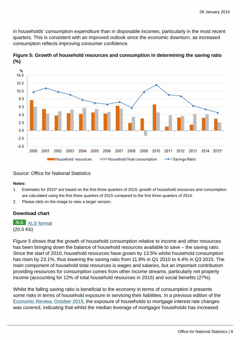
The saving ratio is a nominal concept, so the difference between consumption and income alsobears some relationship to price and earnings growth. Prior to 2015, inflation was well above wagegrowth and this may have had a bearing on the saving ratio. For instance, it may have encouragedhouseholds to spend more in a bid to limit the squeeze on the volume of goods and services thatthey could purchase with a given level of income. Figure 5 shows the movements in the saving ratioover the past fifteen years.
In keeping with an improving economic position and household confidence, the saving ratio hasfallen considerably from its peak in 2010 at 11.9%, down to 4.4% in Q3 2015 – broadly the same asat the start of the downturn (Figure 5). This downward trend has mainly been driven by faster growth
08 January 2016
Office for National Statistics | 8
in households’ consumption expenditure than in disposable incomes, particularly in the most recentquarters. This is consistent with an improved outlook since the economic downturn, as increasedconsumption reflects improving consumer confidence.
Figure 5: Growth of household resources and consumption in determining the saving ratio(%)
Source: Office for National Statistics
Notes:1. Estimates for 2015* are based on the first three quarters of 2015; growth of household resources and consumption
are calculated using the first three quarters of 2015 compared to the first three quarters of 2014.2. Please click on the image to view a larger version.
Download chart
XLS format(20.5 Kb)
Figure 5 shows that the growth of household consumption relative to income and other resourceshas been bringing down the balance of household resources available to save – the saving ratio.Since the start of 2010, household resources have grown by 13.5% whilst household consumptionhas risen by 23.1%, thus lowering the saving ratio from 11.8% in Q1 2010 to 4.4% in Q3 2015. Themain component of household total resources is wages and salaries, but an important contributionproviding resources for consumption comes from other income streams, particularly net propertyincome (accounting for 12% of total household resources in 2015) and social benefits (27%).
Whilst the falling saving ratio is beneficial to the economy in terms of consumption it presentssome risks in terms of household exposure in servicing their liabilities. In a previous edition of theEconomic Review, October 2015, the exposure of households to mortgage interest rate changeswas covered, indicating that whilst the median leverage of mortgagor households has increased

08 January 2016
Office for National Statistics | 9
slightly during the recovery, average mortgagor gearing has fallen, reflecting the fall in interest rates.However, there is now a higher concentration of gearing, with more households attributing 15-20%of disposable income to mortgage repayments than in previous years.
Inflation
Despite the continued growth of GDP - particularly household consumption - alongside a resilientlabour market position and improving real earnings, inflation and price pressures remain historicallylow. The headline rate of inflation has generally been falling since its peak of 5.2% in September2011. The Consumer Price Index (CPI) rose by 0.1% in the year to November 2015. Inflationremains broadly flat, and has been around zero for 10 months. This is due to a combination offactors that include low oil and petroleum product prices, subdued industrial and agricultural rawmaterial prices, supermarket price competition, slow growth in labour costs and the appreciation ofsterling during 2015 pushing down the prices of imports.
Core inflation, which excludes some of the more volatile prices of goods and services such asenergy, food, alcohol & tobacco, increased from 1.1% in October to 1.2% in November. Figure 6shows the ‘wedge’ between headline and core inflation, and therefore the contribution that energy,food, alcohol and tobacco have made to the downward pressure on headline inflation.
Figure 6: Inflation – headline and core (12 month percentage change)
Source: Office for National Statistics
Notes:1. CPI All Items: Percentage change over 12 months2. Core CPI: Excludes energy, food, alcohol & tobacco3. Please click on the image to view a larger version.

08 January 2016
Office for National Statistics | 10
Download chart
XLS format(32 Kb)
Labour market
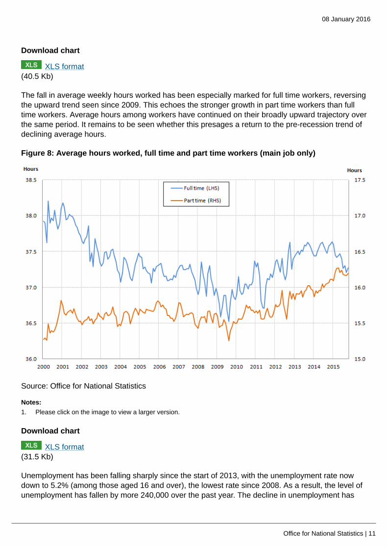
The weakness of inflation has been important factor driving the recent growth of real wages, whichis one of several indications of continuing strength in the labour market. Employment has continuedto grow in recent months, with the employment rate rising to 73.9% in the three months to October2015. Unemployment has also continued to fall – dropping to a rate of 5.2% among those aged over16, in the same period. Despite these signs of growing labour input, average hours worked havefallen over the past twelve months, indicating that while more people are in work, they are workingfewer hours on average. The reasons for this trend are unclear but may include slightly faster growthin part time than full time workers and the improvement in real earnings over the past year, meaningthat employees have not needed to work quite as many hours to maintain a desired level of income.
Figure 7: Actual weekly hours worked, total (million) and average per worker
Source: Office for National Statistics
Notes:1. Please click on the image to view a larger version.
08 January 2016
Office for National Statistics | 11
Download chart
XLS format(40.5 Kb)
The fall in average weekly hours worked has been especially marked for full time workers, reversingthe upward trend seen since 2009. This echoes the stronger growth in part time workers than fulltime workers. Average hours among workers have continued on their broadly upward trajectory overthe same period. It remains to be seen whether this presages a return to the pre-recession trend ofdeclining average hours.
Figure 8: Average hours worked, full time and part time workers (main job only)
Source: Office for National Statistics
Notes:1. Please click on the image to view a larger version.
Download chart
XLS format(31.5 Kb)
Unemployment has been falling sharply since the start of 2013, with the unemployment rate nowdown to 5.2% (among those aged 16 and over), the lowest rate since 2008. As a result, the level ofunemployment has fallen by more 240,000 over the past year. The decline in unemployment has

08 January 2016
Office for National Statistics | 12
been across all age groups, but has been greater for the 18 to 49 age brackets during this period(Figure 9).
Figure 9: Unemployment by age group , selected periods, thousands
Source: Office for National Statistics
Notes:1. Please click on the image to view a larger version.
Download chart
XLS format(17.5 Kb)
The fall in unemployment also appears to have affected workers who have been unemployed fora range of durations. While the level of short term unemployment has returned to its pre-downturnlevel most quickly, recent falls in the number out of work have been more concentrated among thoseunemployed for longer durations. As the short term unemployed are thought to be more attachedto the labour market than those out of work for longer, this may be an indication that firms aredrawing more deeply from the unemployed pool to fill their vacancies. From the perspective of theUK economy, it also means that the level of long term unemployment has peaked much lower thanin previous downturns reducing the extent of skill atrophy in the labour market.

08 January 2016
Office for National Statistics | 13
Figure 10: Unemployment level (age 16+) by duration, thousands
Source: Office for National Statistics
Notes:1. Q1 is Quarter 1 (Jan to Mar), Q2 is Quarter 2 (Apr to June), Q3 is Quarter 3 (July to Sept) and Q4 is Quarter 4 (Oct
to Dec)2. Please click on the image to view larger version
Download chart
XLS format(26 Kb)
A further indication of the improvement in the labour market, and therefore household earnings, isthe rate of wage growth. Although annual growth in average regular pay has come down in recentmonths – from 2.9% in the three months to July 2015 to 2.0% in the three months to October -nominal earnings growth was nevertheless higher in September and October than it was for theperiod from mid-2011 to March 2015. Real earnings growth has been between 1% and 3% over2015, having been negative for the previous six years.

08 January 2016
Office for National Statistics | 14
Figure 11: Average nominal and real wage growth (3 month on 3 month a year ago)
Source: Office for National Statistics
Notes:1. Please click on the image to view a larger version.
Download chart
XLS format(39.5 Kb)
The aforementioned decline in average weekly hours worked may be one factor in the recentmoderation in average weekly earnings, and hourly earnings may have held up more strongly.Experimental statistics for the Index of Labour Costs per Hour (ILCH) show that hourly wage costsrose by 3.6% in the year to Q3 2015, broadly unchanged from Q2 2015.
Distribution of productivity
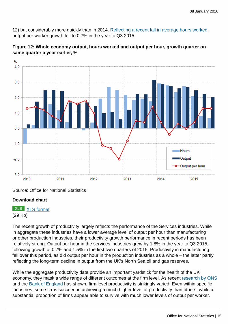
The fall in real wages between 2008 and 2015 is closely related to the weakness of productivitygrowth which has been one of the defining features of the recent economic recovery. AggregateGDP growth has been accompanied by relatively strong employment growth over this period– reflecting sharp falls in unemployment and inactivity – and as a result the recovery of labourproductivity has been weak. However, output growth in recent quarters has been accompaniedby slowing aggregate labour input growth. As a consequence, whole economy output per hourincreased by 1.3% between Q3 2014 and Q3 2015, unchanged from the previous quarter (Figure
08 January 2016
Office for National Statistics | 15
12) but considerably more quickly than in 2014. Reflecting a recent fall in average hours worked,output per worker growth fell to 0.7% in the year to Q3 2015.
Figure 12: Whole economy output, hours worked and output per hour, growth quarter onsame quarter a year earlier, %
Source: Office for National Statistics
Download chart
XLS format(29 Kb)
The recent growth of productivity largely reflects the performance of the Services industries. Whilein aggregate these industries have a lower average level of output per hour than manufacturingor other production industries, their productivity growth performance in recent periods has beenrelatively strong. Output per hour in the services industries grew by 1.8% in the year to Q3 2015,following growth of 0.7% and 1.5% in the first two quarters of 2015. Productivity in manufacturingfell over this period, as did output per hour in the production industries as a whole – the latter partlyreflecting the long-term decline in output from the UK’s North Sea oil and gas reserves.
While the aggregate productivity data provide an important yardstick for the health of the UKeconomy, they mask a wide range of different outcomes at the firm level. As recent research by ONSand the Bank of England has shown, firm level productivity is strikingly varied. Even within specificindustries, some firms succeed in achieving a much higher level of productivity than others, while asubstantial proportion of firms appear able to survive with much lower levels of output per worker.

08 January 2016
Office for National Statistics | 16
This distribution of firm-level productivity reflects the varied characteristics of firms and productmarkets in the UK, capturing differences in firm size, production technology and capital intensity, aswell as other characteristics such as their managerial capability, the degree of competition betweenfirms and the extent of firm market power.
The breadth of this more detailed distribution of firm level productivity is accessible using theAnnual Business Survey (ABS) and estimates of employment from the Inter-Departmental BusinessRegister (IDBR). Conducted by ONS, the ABS is one of several sources for the output measure ofGDP, and provides detailed information about the turnover and intermediate consumption of firms
in the non-financial business economy1. The difference between these concepts – turnover less
intermediate consumption – is called approximate value added2. These data are deflated to give a
measure of the real value added produced by each firm3. As the ABS does not collect informationabout labour input, the IDBR – a comprehensive list of UK businesses which provides the samplingframe for a range of different surveys – provides the estimates of employment we use to calculatereal value added per employee in each firm. These data capture a snapshot of employment at thetime the ABS sample is drawn, and are estimated from a range of different sources including theBusiness Register Employment Survey (BRES), administrative sources including data from HMRC,
and contains some imputation for small firms4. As this analysis involves several different sourcescovering only part of the UK economy, the results necessarily differ from the headline data presentedin Figure 12.
Figure 13 shows the distribution of this measure of firm level productivity for the population of UKfirms, showing the proportion of companies at different levels of output per worker in selectedyears. Similar to the distribution of earnings, this distribution is skewed to the right, indicating alarge number of firms with output per worker between £5,000 and £15,000 per worker per year in2014, and a gradually shrinking number of firms at higher levels of productivity. Each year, somefirms report purchases which exceed their turnover – reflecting operating losses – which results innegative value added per worker, shown to the left hand side of Figure 13.

08 January 2016
Office for National Statistics | 17
Figure 13: Distribution of firm level productivity (output per worker) in the non-financialbusiness economy, selected years, constant prices
Source: Annual Business Survey (ABS), Inter Departmental Business Register (IDBR) - Office forNational Statistics
Notes:1. Kernal Density, Bandwidth size = 42. Firms can have negative levels of value added per head in specific periods as a consequence of reporting larger
values of purchases than their total turnover.3. Deflators for the two-digit Standard Industrial Classification have been taken from the low-level GDP(O) release and
used to deflate value added to constant 2014 prices.4. Includes surveyed firms in the non-financial business economy (see Footnote 1), weighted to reflect the population
of firms.
Download chart
XLS format(29 Kb)
While the broad distribution of firm level productivity is a persistent feature of the UK’s economiclandscape, there is some evidence that this distribution has changed in shape through time. Thisis particularly evident at the bottom of the distribution: between 2008 and 2010, the mass of thedistribution shifts noticeably to the left, represented by the larger number of firms reporting levels ofproductivity of less than £20,000 per worker per year. Over this period, firm level output per worker

08 January 2016
Office for National Statistics | 18
appears to have become more concentrated at the bottom of the productivity distribution, as a
growing fraction of companies appear to have experienced low or negative value added per worker5.
Over the 2010 to 2014 period, however, some of these effects appear to have unwound. Figure13 suggests that the proportion of firms with negative value added per worker has fallen over thisperiod, and the mass of the distribution is now centred further to the right than in the previous yearsof this relatively short period. This change is likely to reflect both the impact of unproductive firmsceasing to trade during the economic downturn in the face of continued operating losses, as wellas the positive impact of rising productivity among surviving firms. Although slight in comparison tothese changes at the bottom of the distribution, there is also some evidence of higher concentrationsof firms at relatively high levels of productivity in 2014.
Firms with relatively high levels of productivity – located in the right-hand tail of the distributionshown in Figure 13 – are drawn from a range of different industries (Figure 14), although some aremore heavily represented than others. Firms in the Production industries accounted for around 1in 20 of the 10% most productive firms in 2014, compared with 6.9% in the population as a whole,while firms in the Construction industry were slightly over-represented in this group – accountingfor 15.5% of the top 10% of firms by productivity, compared with just 13.9% in the population as awhole. Professional, Scientific and Technical firms accounted for almost 1 in 3 of the UK’s highestproductivity firms in 2014 – significantly above their share of 19.7% of all firms that year, and aconsiderably higher proportion than 2008. By contrast, the share of high-productivity firms accountedfor by Distribution, Hotels & Catering, Real Estate and private health and education services hasfallen over the same period.

08 January 2016
Office for National Statistics | 19
Figure 14: Industry composition of the top 10% of firms by productivity, 2008 to 2014
Source: Annual Business Survey (ABS), Inter Departmental Business Register (IDBR) - Office forNational Statistics
Notes:1. Deflators for the two-digit Standard Industrial Classification have been taken from the low-level GDP(O) release and
used to deflate value added to constant 2014 prices.2. Includes firms in the non-financial business economy (see Footnote 1).3. Industry groupings are consistent with the low-level GDP(O) publication and those found in the Index of Services
release. Distribution, Hotels & Restaurants includes Wholesale & Retail services and Accommodation & FoodService activities. Transport, Storage & Communications includes Transport & Storage and Information &Communications.
Download chart
XLS format(27.5 Kb)
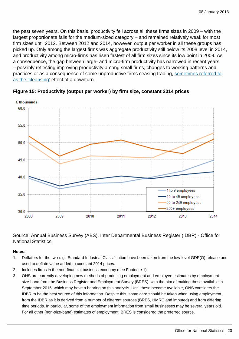
Differences in productivity across industries, partly captured in Figure 14 above, are also evidentby firm size. Larger firms – which might have greater scope for dividing up production activitiesinto specialised units, or which can benefit from increasing returns through centralised businessfunctions, for example – tend to have higher productivity than smaller firms. Figure 15 shows totaloutput per worker for micro (1 to 9 employees), small (10 to 49 employees), medium (50 to 249employees) and large businesses (250 employees or above). It indicates that output per workeramong medium-sized and large firms has been higher than among micro- and small-firms over
08 January 2016
Office for National Statistics | 20
the past seven years. On this basis, productivity fell across all these firms sizes in 2009 – with thelargest proportionate falls for the medium-sized category – and remained relatively weak for mostfirm sizes until 2012. Between 2012 and 2014, however, output per worker in all these groups haspicked up. Only among the largest firms was aggregate productivity still below its 2008 level in 2014,and productivity among micro-firms has risen fastest of all firm sizes since its low point in 2009. Asa consequence, the gap between large- and micro-firm productivity has narrowed in recent years– possibly reflecting improving productivity among small firms, changes to working patterns andpractices or as a consequence of some unproductive firms ceasing trading, sometimes referred toas the ‘cleansing’ effect of a downturn.
Figure 15: Productivity (output per worker) by firm size, constant 2014 prices
Source: Annual Business Survey (ABS), Inter Departmental Business Register (IDBR) - Office forNational Statistics
Notes:1. Deflators for the two-digit Standard Industrial Classification have been taken from the low-level GDP(O) release and
used to deflate value added to constant 2014 prices.2. Includes firms in the non-financial business economy (see Footnote 1).3. ONS are currently developing new methods of producing employment and employee estimates by employment
size-band from the Business Register and Employment Survey (BRES), with the aim of making these available inSeptember 2016, which may have a bearing on this analysis. Until these become available, ONS considers theIDBR to be the best source of this information. Despite this, some care should be taken when using employmentfrom the IDBR as it is derived from a number of different sources (BRES, HMRC and imputed) and from differingtime periods. In particular, some of the employment information from small businesses may be several years old.For all other (non-size-band) estimates of employment, BRES is considered the preferred source.

08 January 2016
Office for National Statistics | 21
Download chart
XLS format(27.5 Kb)
These differences in productivity levels between large and small firms have implications for thedistribution of labour productivity among employees. For instance, if the low-productivity firms shownin Figure 13 are relatively small in employment terms, while the higher-productivity firms tend toemploy more people, then Figure 13 will understate the distribution of labour productivity amongemployees. Rather than giving each firm an equal weight regardless of its level of employment –as in Figure 13 – Figure 15 weights each firm by its level of employment, to show the distributionof productivity among employees. It therefore yields some idea of the level of productivity at whichdifferent proportions of employees are working. While the distribution presented in Figure 16 issimilar in width to Figure 13, it is notably shifted to the right – indicating the heavier employmentweight accounted for by relatively more productive firms – and the mass at and close to zero isnotably reduced – indicating that many of the unproductive firms in Figure 13 account for a relativelysmall share of employment. The centre of this distribution – which is more symmetrical than inFigure 13 – is close to £20,000 in 2014, considerably closer to median earnings of £22,000 in thisperiod. Changes in this distribution also appear to suggest that the productivity of the UK’s medianemployee has improved in recent years. In 2014, the mass of the distribution appears to be centredfurther to the right than in recent years, and a smaller fraction of employees are working in firms withzero or negative productivity.
Figure 16: Distribution of productivity (output per worker) by worker, current prices, andselected years 2008 to 2014

08 January 2016
Office for National Statistics | 22
Source: Annual Business Survey (ABS), Inter Departmental Business Register (IDBR) - Office forNational Statistics
Notes:1. Kernal Density, Bandwidth size = 42. Deflators for the two-digit Standard Industrial Classification have been taken from the low-level GDP(O) release and
used to deflate value added to constant 2014 prices.3. Includes Private, non-financial firms (see Footnote 1)
Download chart
XLS format(29 Kb)
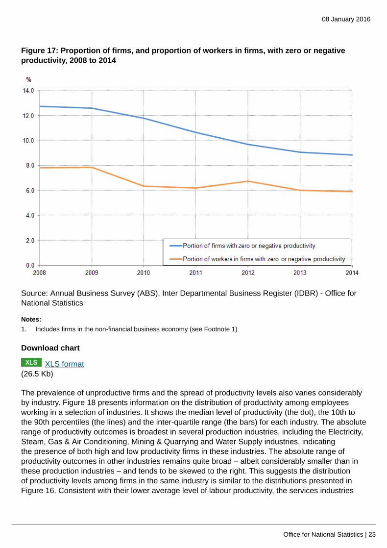
The analysis presented in Figures 13 and 16 suggests that the proportion of firms and employeesworking at zero or negative levels of productivity was lower in 2014 than at any point since 2008.Figure 17 uses data from the ABS to estimate these quantities. Consistent with the analysispresented above, it shows that many low-productivity firms have relatively few employees, as theproportion of firms with zero or negative productivity is larger than the proportion of employees.Between 2008 and 2014, the proportion of firms operating with zero or negative productivity fell fromaround 13% to 9%, while the proportion of employees working at these firms fell from close to 8%to 6% over the same period. In common with the preceding analysis, this likely reflects both therecent improvement in demand conditions, as well as unproductive firms ceasing trading followingthe economic downturn.
08 January 2016
Office for National Statistics | 23
Figure 17: Proportion of firms, and proportion of workers in firms, with zero or negativeproductivity, 2008 to 2014
Source: Annual Business Survey (ABS), Inter Departmental Business Register (IDBR) - Office forNational Statistics
Notes:1. Includes firms in the non-financial business economy (see Footnote 1)
Download chart
XLS format(26.5 Kb)
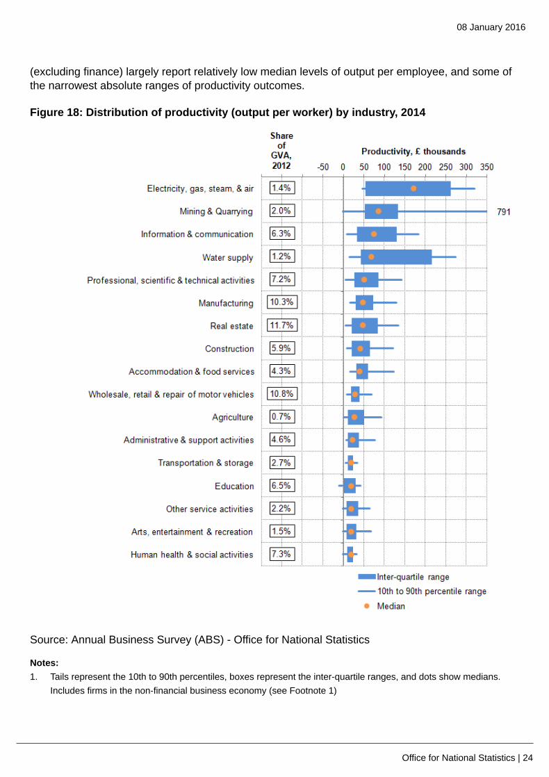
The prevalence of unproductive firms and the spread of productivity levels also varies considerablyby industry. Figure 18 presents information on the distribution of productivity among employeesworking in a selection of industries. It shows the median level of productivity (the dot), the 10th tothe 90th percentiles (the lines) and the inter-quartile range (the bars) for each industry. The absoluterange of productivity outcomes is broadest in several production industries, including the Electricity,Steam, Gas & Air Conditioning, Mining & Quarrying and Water Supply industries, indicatingthe presence of both high and low productivity firms in these industries. The absolute range ofproductivity outcomes in other industries remains quite broad – albeit considerably smaller than inthese production industries – and tends to be skewed to the right. This suggests the distributionof productivity levels among firms in the same industry is similar to the distributions presented inFigure 16. Consistent with their lower average level of labour productivity, the services industries
08 January 2016
Office for National Statistics | 24
(excluding finance) largely report relatively low median levels of output per employee, and some ofthe narrowest absolute ranges of productivity outcomes.
Figure 18: Distribution of productivity (output per worker) by industry, 2014
Source: Annual Business Survey (ABS) - Office for National Statistics
Notes:1. Tails represent the 10th to 90th percentiles, boxes represent the inter-quartile ranges, and dots show medians.
Includes firms in the non-financial business economy (see Footnote 1)

08 January 2016
Office for National Statistics | 25
2. GVA shares are based on low-level nominal GVA estimates for 2012. The coverage of the low-level GVA datadiffers to the ABS data and are provided for contextual purposes only. While ABS data only covers the Non-Financial Business Economy, low-level GVA data covers the entire economy. For more information, see thebackground notes for the latest ABS release.
3. Please click on the image to view a larger version.
Download chart
XLS format(28 Kb)
Notes
1. The ABS covers only the UK Non-Financial Business Economy which accounts forapproximately two thirds of the UK economy in terms of Gross Value Added. The industriescovered are (a) Agriculture (sections 01.6 and 01.7 of the Standard Industrial Classification2007), forestry and fishing, (b) Production (section B-E), (c) Construction (section F) (d)Distribution services (section G) and (e) Non-Financial Services industries (sections H, I, J, L, M,N, P (private only), Q (SIC 87 and 88, private provision only in SIC 86.1 and 86.9), R and S).
2. Note that approximate value added calculated here and that published alongside the AnnualBusiness Survey outputs differs from the National Accounts aggregates in both level and growthterms for a range of different reasons.
3. Consistent with other work in this field, deflators for the two-digit Standard IndustrialClassification have been taken from the low-level GDP (O) release and used to deflate valueadded to constant 2014 prices. These deflators are compiled in gross output terms, and do nottake account of price movements for intermediates.
4. Note that this differs from other work in the field which uses survey responses from the BusinessRegister Employment Survey (BRES), which permits analysis by employment size-band. ONSare currently developing new methods of producing employment and employee estimates byemployment size-band from BRES, with the aim of making these available in September 2016.Until these become available, ONS considers the IDBR to be the best source of this information.Despite this, some care should be taken when using employment from the IDBR as it is derivedfrom a number of different sources (BRES, HMRC and imputed) and from differing time periods.In particular, some of the employment information from small businesses may be several yearsold. In addition, the productivity performance of firms in our analysis may be misrepresentedto the extent that employment levels vary through the year. If employment is particularly strong(weak) at the time that the sample is drawn, then firm-level output per worker may be under(over) stated.
5. Some of these trends will be affected by changes in average hours worked. Changes in theshape of the distribution shown in Figure 13 may overstate the fall in productivity to the extentthat employees shifted from full- to part-time employment.

08 January 2016
Office for National Statistics | 26
Reference tables
Table 1: UK demand side indicators
2013 to 2015
2013 2014 2015 2015 2015 2015 2015 2015 2015
Q1 Q2 Q3 Aug Sep Oct Nov
GDP1 2.2 2.9 0.4 0.5 0.4
Index ofServices
All
Services12.8 3.3 0.3 0.5 0.6 -0.1 0.5 0.1 ..
BusinessServices&
Finance1
3.6 3.8 0.1 0.5 0.6 -0.1 0.7 0.1 ..
Government
& Other11.4 1.9 -0.1 0.1 0.2 0.0 0.1 -0.1 ..
Distribution,Hotels &
Rest. 1
4.1 4.7 1.2 1.0 0.9 -0.4 1.0 0.5 ..
Transport,Stor. &Comms.1
2.2 3.1 0.9 1.1 1.0 0.4 0.0 0.2 ..
Index ofProduction
All
Production1-0.8 1.3 0.4 0.7 0.2 0.9 0.0 0.1 ..
Manufacturing1-1.1 2.7 0.0 -0.6 -0.4 0.3 0.9 -0.4 ..
Mining &
Quarrying1-3.3 -0.5 1.0 7.6 2.6 6.0 -4.3 0.9 ..
Construction1 1.6 7.5 2.1 0.3 -1.9 -2.0 0.0 0.2 ..

08 January 2016
Office for National Statistics | 27
2013 2014 2015 2015 2015 2015 2015 2015 2015
Q1 Q2 Q3 Aug Sep Oct Nov
RetailSalesIndex
All
Retailing11.4 3.9 0.8 0.8 1.0 -0.3 1.8 -0.5 1.7
AllRetailing,
excl.Fuel1
1.9 4.3 0.4 1.0 1.0 -0.5 1.6 -0.8 1.7
Predom.Food
Stores1
-0.1 0.7 0.2 0.3 0.2 -1.0 2.2 -1.3 0.8
Predom.Non-Food
Stores1
1.7 6.5 0.0 1.4 1.1 0.2 0.6 -0.4 2.5
Non-Store
Retailing1
17.2 11.8 3.7 2.8 3.9 -2.0 3.3 0.0 1.9
Trade
Balance2,
3
-34.2 -34.0 -10.7 -4.7 -8.7 -3.2 -1.0 -3.5 -3.2
Exports4 3.8 -1.4 -1.9 2.1 -2.2 2.1 2.2 -1.8 -1.2
Imports4 3.7 -1.4 -0.8 -2.4 0.9 -1.1 -2.7 3.9 -1.8
PublicSectorFinances
PSNB-
ex3,5-25.3 -2.7 -9.0 -4.5 -3.7 0.2 -1.9 0.4 1.3
PSND-ex as a% GDP
78.1 80.9 80.0 80.5 80.4 79.7 80.4 80.2 80.5

08 January 2016
Office for National Statistics | 28
Table source: Office for National Statistics
Table notes:1. Percentage change on previous period, seasonally adjusted, CVM2. Levels, seasonally adjusted, CP3. Expressed in £ billion4. Percentage change on previous period, seasonally adjusted, CP5. Public Sector net borrowing, excluding public sector banks. Level change on previous period a year ago, not
seasonally adjusted
Download table
XLS format(42.5 Kb)

08 January 2016
Office for National Statistics | 29
Table 2: UK supply side indicators
2013 to 2015
2013 2014 2015 2015 2015 2014 2015 2015 2015
Q1 Q2 Q3 Aug Sep Oct Nov
LabourMarket
Employment
Rate1, 271.5 72.9 73.5 73.4 73.7 73.7 73.9 .. ..
Unemployment
Rate1, 37.6 6.2 5.5 5.6 5.3 5.3 5.2 .. ..
Inactivity
Rate1, 422.4 22.2 22.1 22.1 22.0 22 21.9 .. ..
ClaimantCount
Rate7
4.2 3.0 2.4 2.3 2.3 2.3 2.3 2.3 2.3
TotalWeekly
Earnings6
£474 £480 £487 £491 £494 £494 £492 £493 ..
CPI
All-item
CPI52.6 1.5 0.1 0.0 0.0 0.0 -0.1 -0.1 0.1
Transport5 1.0 0.3 -2.5 -2.1 -2.4 -2.6 -2.7 -2.6 -2.1
Recreation&
Culture5
1.1 0.9 -0.4 -0.8 -0.8 -0.9 -0.8 -0.4 -0.1
Utilities5 4.1 3.0 0.9 0.4 0.3 0.4 0.1 0.2 0.3
Food& Non-alcoh.
Bev. 5
3.8 -0.2 -2.9 -2.3 -2.5 -2.4 -2.3 -2.7 -2.4
PPI
Input8 1.2 -6.6 -13.5 -12.0 -13.6 -14.6 -13.4 -12.3 -13.1

08 January 2016
Office for National Statistics | 30
2013 2014 2015 2015 2015 2014 2015 2015 2015
Q1 Q2 Q3 Aug Sep Oct Nov
Output8 1.3 0.0 -1.7 -1.6 -1.8 -1.9 -1.8 -1.4 -1.5
HPI8 3.6 10.0 8.5 5.6 5.6 5.5 6.0 6.9 ..
Table source: Office for National Statistics
Table notes:1. Monthly data shows a three month rolling average (e.g. The figure for February is for the three months Jan - Mar)2. Headline employment figure is the number of people aged 16-64 in employment divided by the total population
16-643. Headline unemployment figure is the number of unemployed people (aged 16+) divided by the economically active
population (aged 16+)4. Headline inactivity figure is the number of economically active people aged 16 to 64 divided by the 16-64 population5. Percentage change on previous period a year ago, seasonally adjusted6. Estimates of total pay include bonuses but exclude arrears of pay (£)7. Calculated by Jobseeker's Allowance claimants plus out-of-work Universal Credit claimants divided by Jobseeker's
Allowance claimants plus out-of-work Universal Credit claimants plus workforce jobs8. Percentage change on previous period a year ago, non-seasonally adjusted9. Q1 is Quarter 1 (Jan to Mar), Q2 is Quarter 2 (Apr to June), Q3 is Quarter 3 (July to Sept) and Q4 is Quarter 4 (Oct
to Dec)
Download table
XLS format(33.5 Kb)
Background notes
1. Details of the policy governing the release of new data are available by visitingwww.statisticsauthority.gov.uk/assessment/code-of-practice/index.html or from the MediaRelations Office email: [email protected]
Copyright
© Crown copyright 2016
You may use or re-use this information (not including logos) free of charge in any formator medium, under the terms of the Open Government Licence. To view this licence, visitwww.nationalarchives.gov.uk/doc/open-government-licence/ or write to the Information Policy Team,The National Archives, Kew, London TW9 4DU, or email: [email protected].

08 January 2016
Office for National Statistics | 31
This document is also available on our website at www.ons.gov.uk.