enhancing scatterplot matrices for data with ordering or
TRANSCRIPT
Enhancing Scatterplot Matrices for Data with Ordering orSpatial Attributes∗
Qingguang Cui, Matthew O. Ward and Elke A. Rundensteiner
Computer Science DepartmentWorcester Polytechnic Institute, Worcester, MA 01609
ABSTRACT
The scatterplot matrix is one of the most common methods used to project multivariate data onto two dimensionsfor display. While each off-diagonal plot maps a pair of non-identical dimensions, there is no prescribed mappingfor the diagonal plots. In this paper, histograms, 1D plots and 2D plots are drawn in the diagonal plots of thescatterplots matrix. In 1D plots, the data are assumed to have order, and they are projected in this order. In2D plots, the data are assumed to have spatial information, and they are projected onto locations based on thesespatial attributes using color to represent the dimension value. The plots and the scatterplots are linked togetherby brushing. Brushing on these alternate visualizations will affect the selected data in the regular scatterplots,and vice versa. Users can also navigate to other visualizations, such as parallel coordinates and glyphs, which arealso linked with the scatterplot matrix by brushing. Ordering and spatial attributes can also be used as methodsof indexing and organizing data. Users can select an ordering span or a spatial region by interacting with 1Dplots or with 2D plots, and then observe the characteristics of the selected data subset. 1D plots and 2D plotsprovide the ability to explore the ordering and spatial attributes, while other views are for viewing the abstractdata. In a sense, we are linking what are traditionally seen as scientific visualization methods with methodsfrom the information visualization and statistical graphics fields. We validate the usefulness of this integrationby providing two case studies, time series data analysis and spatial data analysis.
Keywords: Multivariate Data Visualization, Time-series Data, Geospatial Visualization, Linked Brushing
1. INTRODUCTION
A scatterplot is a visual representation of data that illustrates the relation or association between two or threevariables. The positions of data points represent the corresponding dimension values. Two or three dimensionsare shown directly, and additional dimensions can be mapped to the color, size or shape of the plotting symbol.For visualizing multivariate data, the scatterplot matrix1 is an efficient and common tool. Given a dataset withN dimensions, the matrix consists of N2 scatterplots arranged in N rows and N columns. The plot in row i andcolumn j uses dimension i and j to create a scatterplot. Each scatterplot reveals relationships between the twodimensions.
Since the diagonal scatterplots use the same dimension for the X-axis and Y-axis, the data points forma straight line of dots in these scatterplots, as shown in figure 1a. Although the straight line can show thedistribution of data points in one dimension, its usefulness is very limited. Screen space is one of the mostprecious resources in visualization. Many layout algorithms and viewing mechanisms have been proposed toshow more data or relations on the screen.
Some researchers display the labels for dimensions in the diagonal plots, while others draw histograms ofindividual dimensions.2 In this paper, we present a number of 0D, 1D and 2D visualizations for these diagonalplots and illustrate the usefulness of linking these views with scatterplots.
A histogram, one kind of 0D visualization, illustrates the distribution of a single dimension data. It conveysthe data distribution much more clearly and precisely than a plot of a data dimension against itself. In 1D plots,
∗ This work is supported under NSF grant IIS-0119276.Further author information: (Send correspondence to M.O. Ward)
E-mail: [email protected]; Project Homepage: http://davis.wpi.edu/˜xmdv

Figure 1. (a) Original Scatterplot Matrix. The data points in the diagonal plots form a straight line. (b) ScatterplotMatrix with Histograms. The diagonal plots show the histogram of each dimension. The blue boxes show the brush area;brushed data and their histograms are drawn in red.
the data are assumed to have order, which can be temporal order, one dimensional spatial order or other kinds oforder (e.g. query-based ordering). The data are projected onto the screen by this order, which can convey order-based patterns, trends and anomalies. In 2D plots, the data are assumed to have two spatial attributes, whichmeans each data point corresponds to a particular location in 2D space. The dimension values are projectedusing a color scale.
In 2D plots, the spatial attributes can be provided in two ways, implicit location and explicit location. If thedata are collected from a uniform grid of a two dimensional space, and the position of the data point is implicitlyrelated to the sequence of the data records, this kind of 2D plot is called a Raster Plot. If the dataset hastwo dimensions that explicitly specify the location of data points, this kind of 2D plot is called a Data DrivenPlot.
The implementations presented in this paper are integrated into XmdvTool,3 developed in the ComputerScience Department of WPI, which is available in the public domain. It combines several of the most commonmethods for visualizing multivariate data, including parallel coordinates,4 scatterplot matrices, glyphs,5 dimen-sional stacking6 and pixel-oriented methods.7 The high dimensional brushing feature8 was added to XmdvToolto support the exploration within and between the visualizations. The structure based brushing feature9 wasadded to help users navigate cluster hierarchies when exploring very large datasets.
Brushing10 is a mechanism by which user can interactively select a data subset. Brushing can help usersseparate the interesting data from the uninteresting. For multiple views, the linking makes the brushing techniquemore powerful. Brushing in one view will affect the selection in other views, which links together the data pointsthat represent the same records but are scattered in different views.
Traditional brushing operates on data values. Fua et al.9 extended the brushing operation to hierarchicalstructures. This paper extends the brushing operation to the ordering and spatial attributes of data. Thetemporal attribute is one kind of ordering attribute. The ordering and spatial attributes can be treated as otherkinds of structure on which brushing is supported. Order-based brushing is implemented on the 1D plots, andspatial brushing is implemented on the 2D plots. Data brushing is also implemented in the histograms. Brushingon histograms, 1D plots and 2D plots is integrated with the brushing on other views.
2. RELATED WORK
In recent years, many research efforts have focused on the integration of scientific and information visualization.Information visualization typically involves abstract data without spatial information11,12 e.g., financial dataand demographic data, which is usually found in non-scientific domains, while scientific visualization typicallydeals with physical data with spatial information, e.g., medical image data and geographic data, which is usuallyfound in scientific domains. However, some datasets are not easily classified, e.g., bioinformatics data and GISdata with multiple dimensions.
Kosara et al.13 linked scientific and information visualization with interactive 3D scatterplots. The 3Dscatterplots showed the three dimensional information and the abstract information at the same time, andbrushing was used to highlight interesting subsets.
The WEAVE system14 linked 3D object rendering with histograms, scatterplots and parallel coordinates.The 3D object rendering show the physical characteristics of the objects, while the histogram, scatterplot andparallel coordinates illustrate the abstract patterns of the objects. They are linked by brushing. Our systemdiffers from WEAVE in that our system assumes the dataset has ordering or spatial attributes, and then itemploys 1D and 2D within the scatterplot matrix to show these attributes. We also allow users to control theordering and spatial mappings to give users a wider range of views of their data. At present we do not deal withthree dimensional attributes.
VizCraft15 integrated the visualization of an aircraft with a parameter set that describes the aircraft design.The visualization of the aircraft was an image of the aircraft, whose data were viewed in parallel coordinates.Our system employs 2D to show the spatial attributes, which is integrated with the scatterplot matrix and manyother visualizations.
Many techniques based on hierarchical structures have been proposed to organize datasets. Cone Trees16
present hierarchical information in 3D in order to make full use of the available screen space. They also pro-vide operations for pruning and growing the tree, reconstructing the tree dynamically, and searching the tree.Multitrees17 are a class of visualization methods for directed acyclic graphs that can present information withmultiple subtrees. These subtrees imitate models of the natural world, where many objects belong to multiplehierarchies.
3. INTEGRATION OF SCATTERPLOTS WITH HISTOGRAMS, 1D PLOTS AND 2DPLOTS
3.1. Histogram
A histogram is an aggregation method to illustrate the data distribution of a single dimension. From its minimumvalue to its maximum value, the data are partitioned into several sub-ranges. Each sub-range corresponds toa bin. The height of a histogram bin is decided by the number of data points whose value falls in the rangeassociated with that bin. The number of bins is the bin count, and it influences the usability and effectivenessof a histogram. The default bin count is calculated using the formula:
W = 3.49S × N− 13 (1)
where S is the standard deviation and N is the number of data points. It has been illustrated18 that this generallyresults in an effective bin count. Usually the maximum bin count for continuous data is the number that makesthe bin width one pixel. The bin count can be customized from the control panel to reveal more informationabout the data.
On every diagonal plot of the scatterplot matrix, a dimension is used to generate a histogram. An example isshown in figure 1b. The green outline shows the regular histogram for the entire dataset corresponding to thatdimension. The brushed bins (usually red) show the histograms of the data that are brushed in the scatterplots.Since each bin in the regular histogram contains at least as many data elements as the corresponding one in thebrushed histogram, these two histograms can be drawn on top of each other.
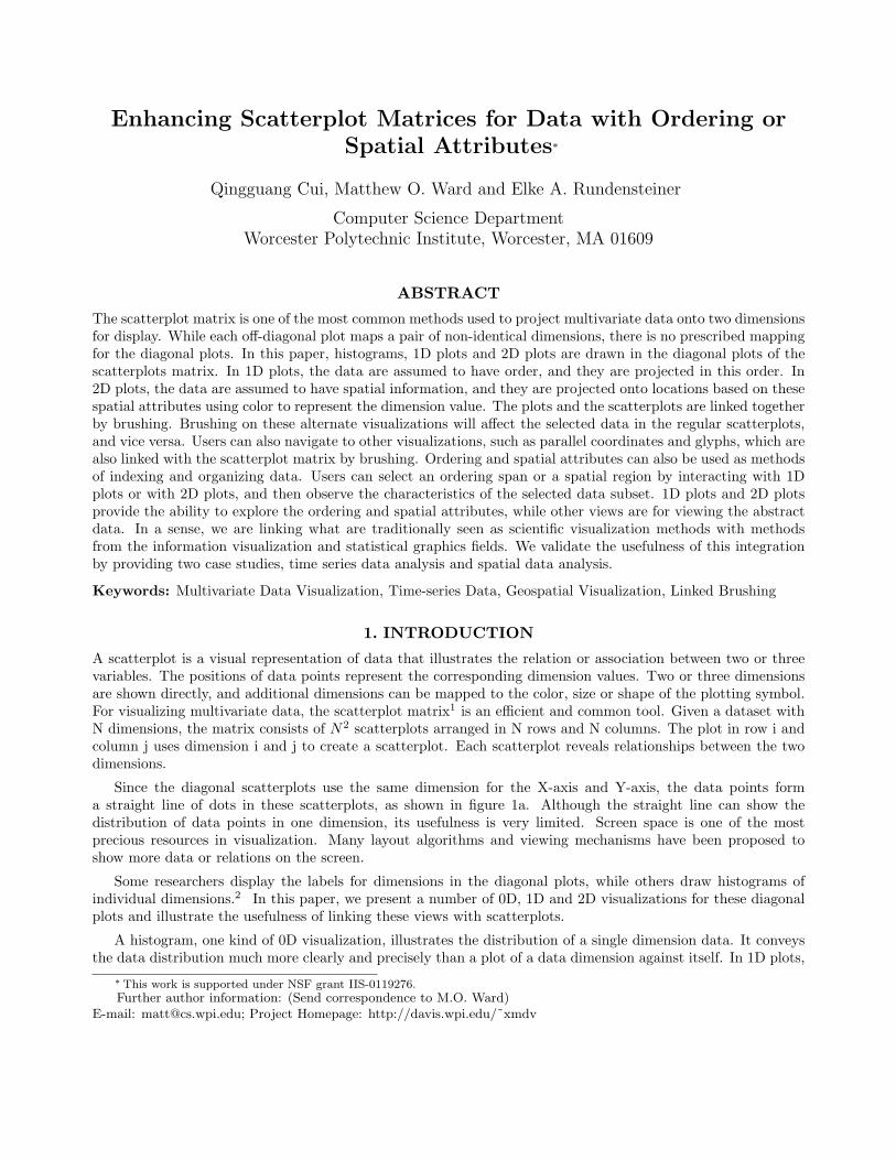
3.2. 1D PlotMany multivariate data sets have order: financial data change over time, demographic data change by the year,and geophysical data change by the depth of stratum. A 1D Plot is a very common method to show trends andpatterns in one dimensional data. The x-axis is for the order, and the y-axis is for the data values. The datavalue is drawn as a point or other graphical marker, which results in a point graph. If the consecutive points areconnected together with lines, it becomes a line graph. It can also be drawn as a column graph, on which theheight of each vertical bar represents a dimension value. Figure 2a shows an example of line graphs.
Figure 2. Scatterplot Matrix with 1D Plots, River Dataset.19 This dataset is about the flow measurements of twoicelandic rivers collected daily from 1972 to 1974 with temperature and precipitation. Here only the data of 1972 areshown. (a) The diagonal plots show the trends of dimensions over time. (b) The dataset is sorted according to the flowof the Jokulsa Eystri River. The diagonal plots show the possible relations of the flow of the Jokulsa Eystri River withthe flow of the Vatnsdalsa River, temperature and precipitation.
1D plots are widely used to show mathematical functions, basic principles in physics, and economic dataover time. A 1D Plot can only show one dimensional data. For multivariate data, multiple 1D plots are a veryeffective tool to reveal trends and relationships. With them, users can read the data in multiple dimensions,can compare the data in multiple dimensions, and can infer the causes for change in one dimension from otherdimensions.
Another powerful function of the multiple 1D plots is rearrangement of data points.20 The data pointsmay be sorted by the quantitative or categorical order in one dimension, allowing users to search for trends andpatterns in the other dimensions. An example is shown in figure 2b. Sorting sometimes partitions the data pointsinto several categories. The category boundary may be vague for quantitative and continuous data dimensions,while it is usually clear for categorical data dimensions. This partitioning makes it possible to compare values,examine trends and find patterns in or between categories.
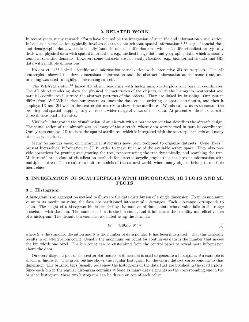
3.3. Raster PlotsSome multivariate data are collected in a regular spatial grid, such as multiple channels of remote sensing data.Raster plots are generally used for the analysis and visualization of this kind of data. A raster plot correspondsto the data of one dimension and it is composed of data points. The data points are put in the plot one by one,from left to right and from top to bottom. If the metadata explicitly specifies the number of the data points ina row (column count), it is used. Otherwise the implicit square root of the record count is used as the rasterwidth. Figure 3a shows a raster plot whose data are collected from a 128*128 grid; the diagonal plots createimages of individual dimensions.
The dimension value is mapped to color. There are many possible mapping methods: hue mapping, saturationmapping, lightness mapping, grey scale mapping and customized color mappings in which users specify a color
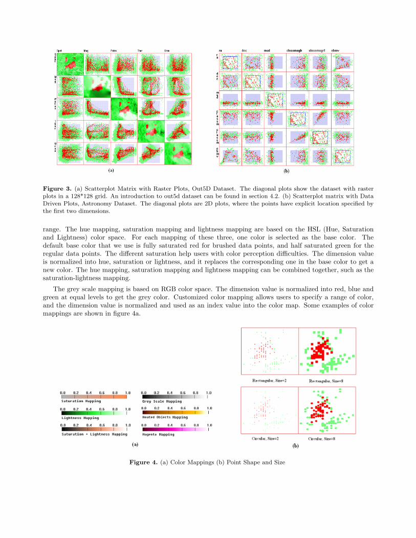
Figure 3. (a) Scatterplot Matrix with Raster Plots, Out5D Dataset. The diagonal plots show the dataset with rasterplots in a 128*128 grid. An introduction to out5d dataset can be found in section 4.2. (b) Scatterplot matrix with DataDriven Plots, Astronomy Dataset. The diagonal plots are 2D plots, where the points have explicit location specified bythe first two dimensions.
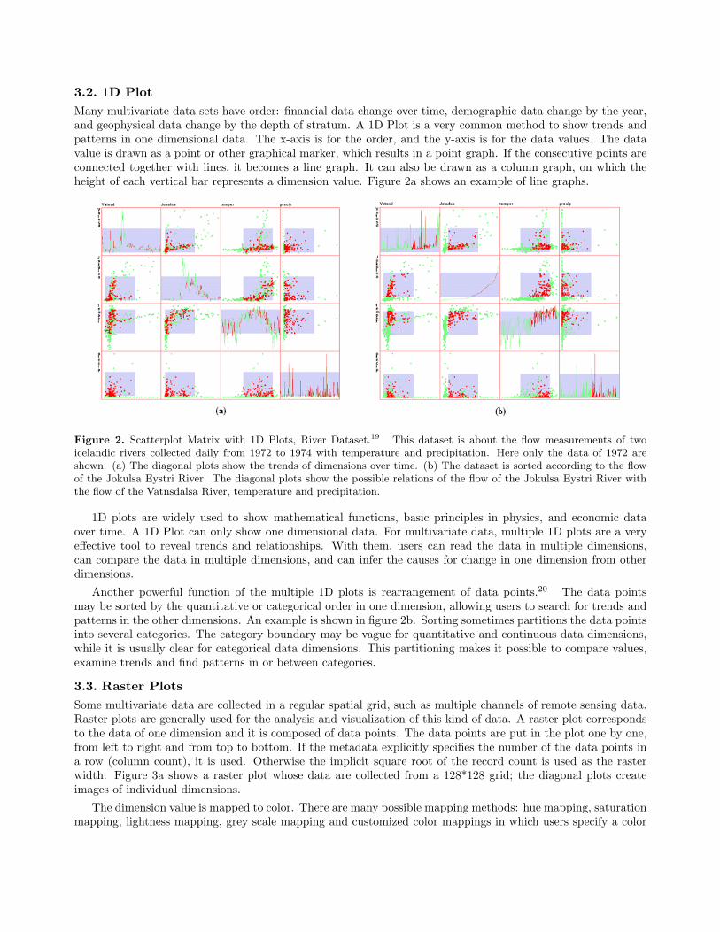
range. The hue mapping, saturation mapping and lightness mapping are based on the HSL (Hue, Saturationand Lightness) color space. For each mapping of these three, one color is selected as the base color. Thedefault base color that we use is fully saturated red for brushed data points, and half saturated green for theregular data points. The different saturation help users with color perception difficulties. The dimension valueis normalized into hue, saturation or lightness, and it replaces the corresponding one in the base color to get anew color. The hue mapping, saturation mapping and lightness mapping can be combined together, such as thesaturation-lightness mapping.
The grey scale mapping is based on RGB color space. The dimension value is normalized into red, blue andgreen at equal levels to get the grey color. Customized color mapping allows users to specify a range of color,and the dimension value is normalized and used as an index value into the color map. Some examples of colormappings are shown in figure 4a.
Figure 4. (a) Color Mappings (b) Point Shape and Size
The point size can be changed to make the color easy to recognize, fill in the gaps between data points andallow users to reduce overlaps in regular scatterplots. The point shape can be circular or rectangular. Examplesare shown in figure 4b.
3.4. Data Driven PlotsSometimes, the dataset itself contain location attributes, for instance, city climate records may contain thelongitude and latitude. Data driven plots are drawn in the diagonal plots for this kind of data. A data drivenplot is composed of data points, each of which represents spatial attributes and a dimension value. The spatialattributes is a pair of dimensions, which can be changed through a control panel. Figure 3b shows a data drivenplot, in which the dimension ra and dec are used as x and y coordinate respectively.
In the data driven plots, the dimension value is mapped onto color, employing the same mechanism as thatin raster plots. It is basically a hybrid plot, combining the features of raster plots and scatterplots.
4. BRUSHING AND LINKING
Brushing is a mechanism by which a user can interactively select a data subset. The selected data may behighlighted, masked, deleted or used for further analysis. Average values of the selected data can be shown, anddetails about the selected data can be displayed in another window.8
The traditional brush operates on data values, in which the brushing condition is based on the dimensionvalue. We extend the brushing operation onto the ordering and spatial attributes of data. Each data record hasan associated ordering attribute or spatial attributes. Although the ordering and spatial attributes can be easilydescribed as data values, they are different from data values. They are often implied in the data values, thoughusers can explicitly specify them.
A dataset usually has many potential ordering attributes, such as the data collection order, the temporalorder, and the order from sorting the dataset by an individual dimension. When the dataset is retrieved fromthe database and ordered by distance to the query center, the data sequence of this query will form anotherorder, query-based order. Users can specify one of the orders and explore the dataset by this order.
Usually a dataset only has one set of spatial attributes. The spatial attributes can be explicitly specified bytwo dimension values, or implicitly specified by the shape of the dataset and the sequence number of the record.
The selection criterion is called the brush constraint, which is used to decide if a record is selected or not. InXmdvTool, the original brush constraint is composed of several atomic conditions for the multivariate dataset.Each atomic condition acts upon a dimension. An atomic condition is a predicate, which has a high value anda low value as its boundaries. It can be described by the following formula:
Ci : Li ≤ Vi ≤ Hi (2)
Where Ci is the atomic condition for the i-th dimension; Li is the lower boundary of the i-th dimension; Hi isthe upper boundary of the i-th dimension; Vi is a data value for the i-th dimension.
Then the brushing constraint for the regular N dimensional brush can be described by the following formula:
C =N⋂
i=1
Ci (3)
where C is the brushing constraint; N is the number of dimensions; Ci is the i-th atomic condition. The brushingconstraint is the product of the all the atomic conditions. This means that the brush will select the data recordswhose values satisfy all the N atomic conditions.
4.1. Brushing on HistogramsThe X-axis of the histogram is the regular data dimension, and the brushing operations on it are like the brushingoperations on the scatterplots except they are constrained to the bin boundaries. Users can resize and movethe brushing range. The Y-axis of histogram is the number of data points that fall within each bin; there arecurrently no brushing operations in that direction. The brushing constraint is the same as that in formula 3.
4.2. Brushing on the 1D plot
The 1D plot employs the ordering attribute and the data dimension as its two dimensions. A new brushingmechanism is introduced, the order-based brush, in which users can operate directly on the ordering attribute toselect a range, just as in the brushing operation on the regular data dimensions. The multiple 1D plots sharethe same brushing range. The selected data points are the data points that fall in the range of the brush. Thescatterplots and the 1D plots are linked together, and the changes to the brush in any of them will affect theselection in the others. This brush constraint can be described by the following formula:
C1D = Co ∧(
N⋂
i=1
Ci
)(4)
where C1D is the brushing constraint; Co is the ordering condition; N is the number of dimensions; and Ci is thei-th atomic condition. The brush constraint is the product of the ordering condition and all the other atomicconditions. It means that the brush will select all the data records in the ordered list whose position satisfy theordering condition and whose data satisfy all the N conditions.
4.3. Brushing on the raster plot
The data points of a raster plot are structured in a two dimensional space. Users operate on this two dimensionalspace and get a subspace of two dimensions. Users can resize and move this subspace. The brushed data pointsare the data points whose spatial attributes fall in this subspace and also satisfy the conditions of the regularbrushes. A new brushing mechanism is introduced, the spatial brush, which makes it possible to analyze thespatial attributes of the data. This brush constraint can be described by the following formula:
C2D = Cx ∧ Cy ∧(
N⋂
i=1
Ci
)(5)
where C2D is the brushing constraint; Cx and Cy are the spatial conditions; N is the number of dimensions; andCi is the i-th atomic condition. The brush constraint is the product of the spatial conditions and all the atomicconditions.
4.4. Brushing for the data driven plot
The location attributes of the data records in this plot are provided by two dimensions in the dataset. Thesetwo dimensions are like the regular dimensions, and they can be used in the scatterplot matrix. These twodimensions also form a structure space on which the brush can operate to specify a subspace. Like in the rasterplot, the brushed data points are the data points that fall in this subspace and also satisfy the conditions of thedata brush. This brush has the same constraint as that in formula 5.
5. CASE STUDIES
5.1. Case Study 1: Time Series Data Analysis
Many scientists explore time series data in their research. Here we use a wireless network performance dataset21
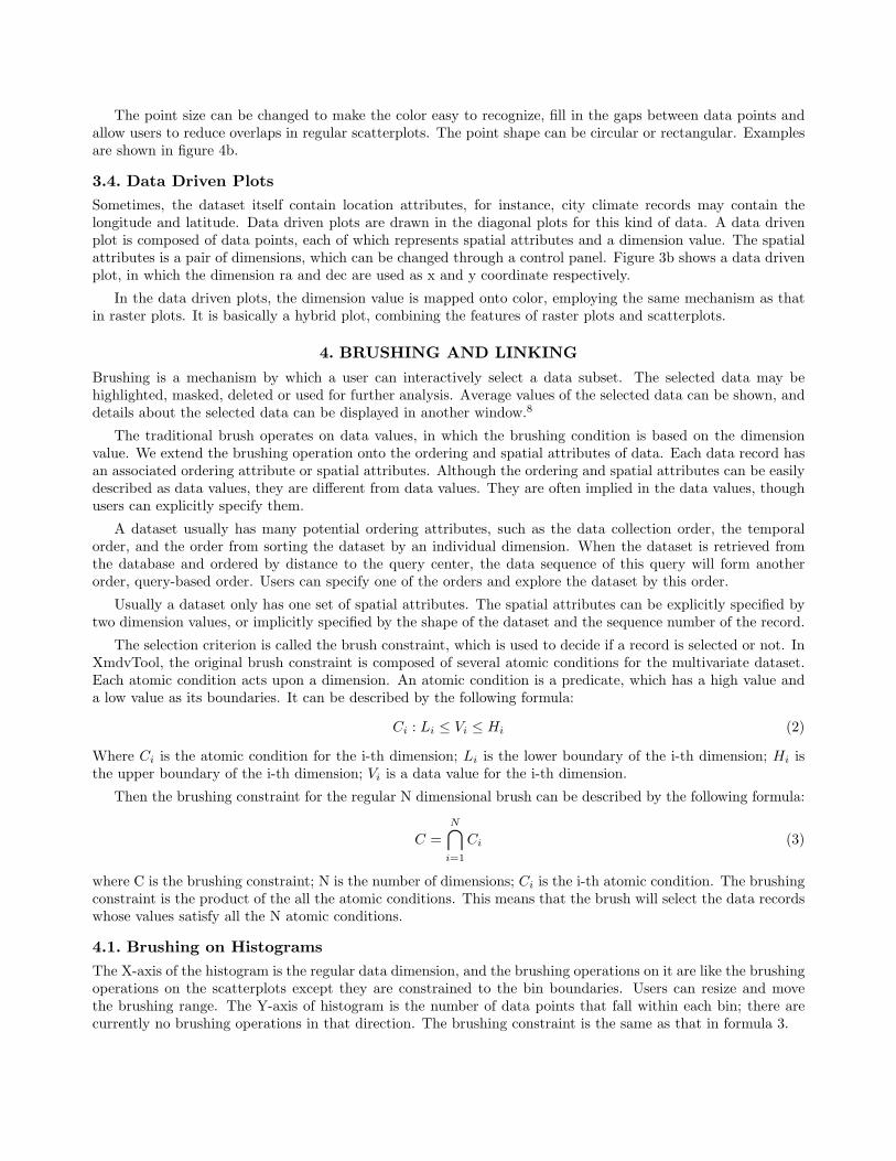
as an example. It is from the Wireless Multimedia Streaming Laboratory in the Computer Science Departmentat WPI, and describes the measurements of the physical, network and application layers of a streaming video overa wireless campus network. It has many dimensions, and we use six of them: signal strength (Wireless SignalStrength, physical layer), rtt (Round Trip Time, network layer), lost rate (Frame Lost Rate, network layer),bandwidth (Bandwidth, network layer), throughput (Throughput, application layer) and framerate (Frame rate,application layer). Four usage patterns illustrate how to explore the time series data with this newly developedtool.
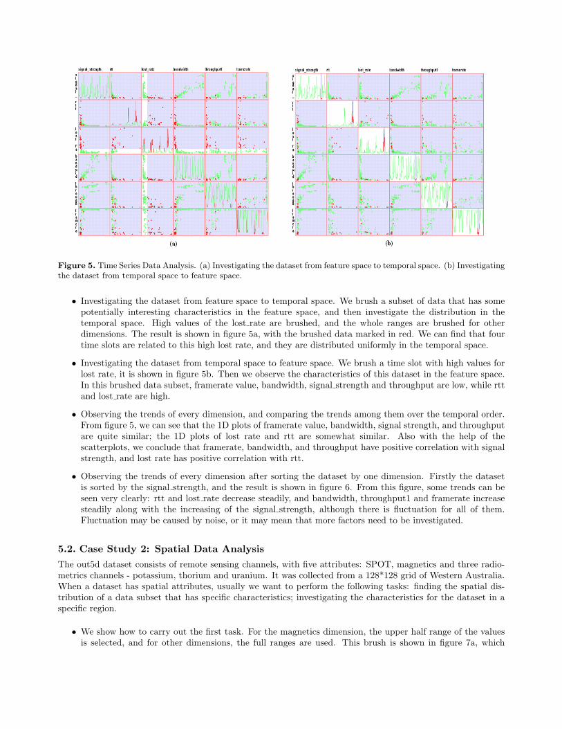
Figure 5. Time Series Data Analysis. (a) Investigating the dataset from feature space to temporal space. (b) Investigatingthe dataset from temporal space to feature space.
• Investigating the dataset from feature space to temporal space. We brush a subset of data that has somepotentially interesting characteristics in the feature space, and then investigate the distribution in thetemporal space. High values of the lost rate are brushed, and the whole ranges are brushed for otherdimensions. The result is shown in figure 5a, with the brushed data marked in red. We can find that fourtime slots are related to this high lost rate, and they are distributed uniformly in the temporal space.
• Investigating the dataset from temporal space to feature space. We brush a time slot with high values forlost rate, it is shown in figure 5b. Then we observe the characteristics of this dataset in the feature space.In this brushed data subset, framerate value, bandwidth, signal strength and throughput are low, while rttand lost rate are high.
• Observing the trends of every dimension, and comparing the trends among them over the temporal order.From figure 5, we can see that the 1D plots of framerate value, bandwidth, signal strength, and throughputare quite similar; the 1D plots of lost rate and rtt are somewhat similar. Also with the help of thescatterplots, we conclude that framerate, bandwidth, and throughput have positive correlation with signalstrength, and lost rate has positive correlation with rtt.
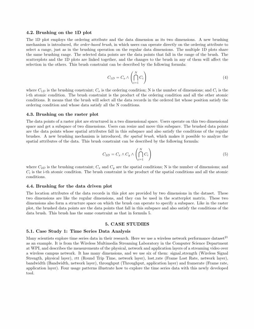
• Observing the trends of every dimension after sorting the dataset by one dimension. Firstly the datasetis sorted by the signal strength, and the result is shown in figure 6. From this figure, some trends can beseen very clearly: rtt and lost rate decrease steadily, and bandwidth, throughput1 and framerate increasesteadily along with the increasing of the signal strength, although there is fluctuation for all of them.Fluctuation may be caused by noise, or it may mean that more factors need to be investigated.
5.2. Case Study 2: Spatial Data Analysis
The out5d dataset consists of remote sensing channels, with five attributes: SPOT, magnetics and three radio-metrics channels - potassium, thorium and uranium. It was collected from a 128*128 grid of Western Australia.When a dataset has spatial attributes, usually we want to perform the following tasks: finding the spatial dis-tribution of a data subset that has specific characteristics; investigating the characteristics for the dataset in aspecific region.
• We show how to carry out the first task. For the magnetics dimension, the upper half range of the valuesis selected, and for other dimensions, the full ranges are used. This brush is shown in figure 7a, which
Figure 6. Time Series Data Analysis. Observing the trends of every dimension after sorting the dataset by signalstrength.
illustrates the distribution of strong magnetics in geographic space. We can continue to adjust the lowerlimit of the brush to shorten the brush range, and the result is shown in figure 7b, which illustrates thedistribution of stronger magnetics in geographic space than that in figure 7a.
Figure 7. Spatial Data Analysis. (a) Finding the spatial distribution of data with strong magnetics. (b) Finding thespatial distribution of data with stronger magnetics than that in figure a.
• We show how to perform the second task. The data value is mapped to color. The lighter color marks thehigher value. In the Magnetics diagonal plot, there is a very dark zone, which shows that magnetism islow. After brushing this zone with the spatial brush, as shown in figure 8, we can see if this data subsethas discernable characteristics. From the scatterplots associated with potassium, we can see that most ofthe data have high values in potassium, while we cannot find obvious characteristics for the other threedimensions. Thus we can conclude that low values of magnetics has an inverse correlation with potassiumin this region, but has no apparent relation with other dimensions in this dataset.
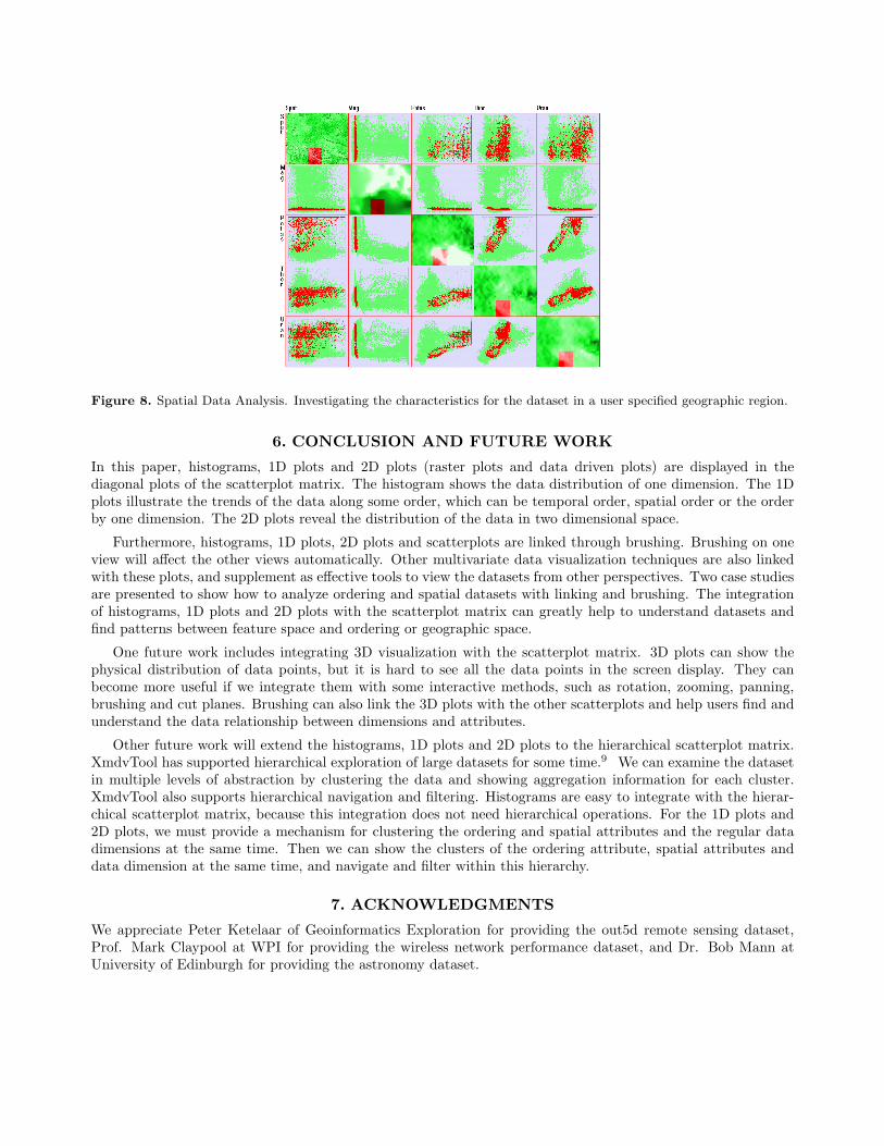
Figure 8. Spatial Data Analysis. Investigating the characteristics for the dataset in a user specified geographic region.
6. CONCLUSION AND FUTURE WORK
In this paper, histograms, 1D plots and 2D plots (raster plots and data driven plots) are displayed in thediagonal plots of the scatterplot matrix. The histogram shows the data distribution of one dimension. The 1Dplots illustrate the trends of the data along some order, which can be temporal order, spatial order or the orderby one dimension. The 2D plots reveal the distribution of the data in two dimensional space.
Furthermore, histograms, 1D plots, 2D plots and scatterplots are linked through brushing. Brushing on oneview will affect the other views automatically. Other multivariate data visualization techniques are also linkedwith these plots, and supplement as effective tools to view the datasets from other perspectives. Two case studiesare presented to show how to analyze ordering and spatial datasets with linking and brushing. The integrationof histograms, 1D plots and 2D plots with the scatterplot matrix can greatly help to understand datasets andfind patterns between feature space and ordering or geographic space.
One future work includes integrating 3D visualization with the scatterplot matrix. 3D plots can show thephysical distribution of data points, but it is hard to see all the data points in the screen display. They canbecome more useful if we integrate them with some interactive methods, such as rotation, zooming, panning,brushing and cut planes. Brushing can also link the 3D plots with the other scatterplots and help users find andunderstand the data relationship between dimensions and attributes.
Other future work will extend the histograms, 1D plots and 2D plots to the hierarchical scatterplot matrix.XmdvTool has supported hierarchical exploration of large datasets for some time.9 We can examine the datasetin multiple levels of abstraction by clustering the data and showing aggregation information for each cluster.XmdvTool also supports hierarchical navigation and filtering. Histograms are easy to integrate with the hierar-chical scatterplot matrix, because this integration does not need hierarchical operations. For the 1D plots and2D plots, we must provide a mechanism for clustering the ordering and spatial attributes and the regular datadimensions at the same time. Then we can show the clusters of the ordering attribute, spatial attributes anddata dimension at the same time, and navigate and filter within this hierarchy.
7. ACKNOWLEDGMENTS
We appreciate Peter Ketelaar of Geoinformatics Exploration for providing the out5d remote sensing dataset,Prof. Mark Claypool at WPI for providing the wireless network performance dataset, and Dr. Bob Mann atUniversity of Edinburgh for providing the astronomy dataset.
REFERENCES1. W. Cleveland, The Elements of Graphing Data, Wadsworth Inc., 1985.2. “Nist/sematech e-handbook of statistical methods.”
http://www.itl.nist.gov/div898/handbook/eda/section3/eda33qb.htm, 2005.3. M. Ward, “Xmdvtool: Integrating multiple methods for visualizing multivariate data,” Proc. IEEE Visual-
ization , pp. 326–333, 1994.4. A. Inselberg, “The plane with parallel coordinates,” Special Issue on Computational Geometry, The Visual
Computer 1, pp. 69–97, 1985.5. D. Andrews, “Plots of high dimensional data,” Biometrics 28, pp. 125–136, 1972.6. J. LeBlanc, M. Ward, and N. Wittels, “Exploring n-dimensional databases,” Proc. IEEE Visualization ,
pp. 230–237, 1990.7. J. Yang, A. Patro, S. Huang, N. Mehta, M. Ward, and E. Rundensteiner, “Value and relation display for
interactive exploration of high dimensional datasets,” Proc. IEEE Symposium on Information Visualization, pp. 73–80, 2004.
8. A. Martin and M. Ward, “High dimensional brushing for interactive exploration of multivariate data,” Proc.IEEE Visualization , pp. 271–278, 1995.
9. Y. Fua, M. Ward, and E. Rundensteiner, “Navigating hierarchies with structure-based brushes.,” Proc.IEEE Symposium on Information Visualization , pp. 58–64, 1999.
10. A. Becker and S. Cleveland, “Brushing scatterplots,” Technometrics 29(2), pp. 127–142, 1987.11. S. Card, J. Mackinlay, and B. Shneiderman, Readings in Information Visualization, Morgan Kaufmann, San
Francisco, Calif., 1999.12. M. K. Tory and T. Moller, “Rethinking visualization: A high-level taxonomy,” Proc. IEEE Symposium on
Information Visualization , pp. 151–158, 2004.13. R. Kosara, G. N. Sahling, and H. Hauser, “Linking scientific and information visualization with interactive
3d scatterplots,” Proc. International Conference in Central Europe on Computer Graphics, Visualization,and Computer Vision (WSCG) , pp. 133–140, 2004.
14. D. L. Gresh, B. E. Rogowitz, R. L. Winslow, D. F. Scollan, and C. K. Yung, “Weave: A system for visuallylinking 3-d and statistical visualizations, applied to cardiac simulation and measurement data,” Proc. IEEEVisualization , pp. 489–492, 2000.
15. A. Goel, C. Baker, C. A. Shaffer, B. Grossman, R. T. Haftka, W. H. Mason, and L. T. Watson, “Vizcraft: Amultidimensional visualization tool for aircraft configuration design,” Proc. IEEE Visualization , pp. 425–428, 1999.
16. G. G. Robertson, J. D. Mackinlay, and S. K. Card, “Cone trees: animated 3d visualizations of hierarchicalinformation,” Proc. ACM SIGCHI Conference on Human Factors in Computing Systems , pp. 189–194,1991.
17. G. Furnas and J. Zacks, “Multitrees: Enriching and reusing hierarchical structure,” Proc. ACM SIGCHIConference on Human Factors in Computing Systems , pp. 330–336, 1994.
18. D. Scott, “On optimal and data-based histograms,” Biometrika 66, pp. 605–610, 1979.19. H. Tong, B. Thanoon, and G. Gudmundsson, “Threshold time series modelling of two icelandic riverflow
systems,” Water Resources Bulletin 21(4), pp. 651–661, 1985.20. R. Rao and S. Card, “The table lens: merging graphical and symbolic representations in an interactive
focus+context visualization for tabular information,” Proc. ACM SIGCHI Conference on Human Factorsin Computing Systems , pp. 318–322, 1994.
21. F. Li, J. Chung, M. Li, H. Wu, M. Claypool, and R. Kinicki, “Application, network and link layer measure-ments of streaming video over a wireless campus network,” Proc. Passive and Active Network MeasurementWorkshop (PAM) , pp. 189–202, 2005.