evaluation 2 media
TRANSCRIPT

Evaluation Question 2 :How effective is the combination of your
main product and ancillary texts?
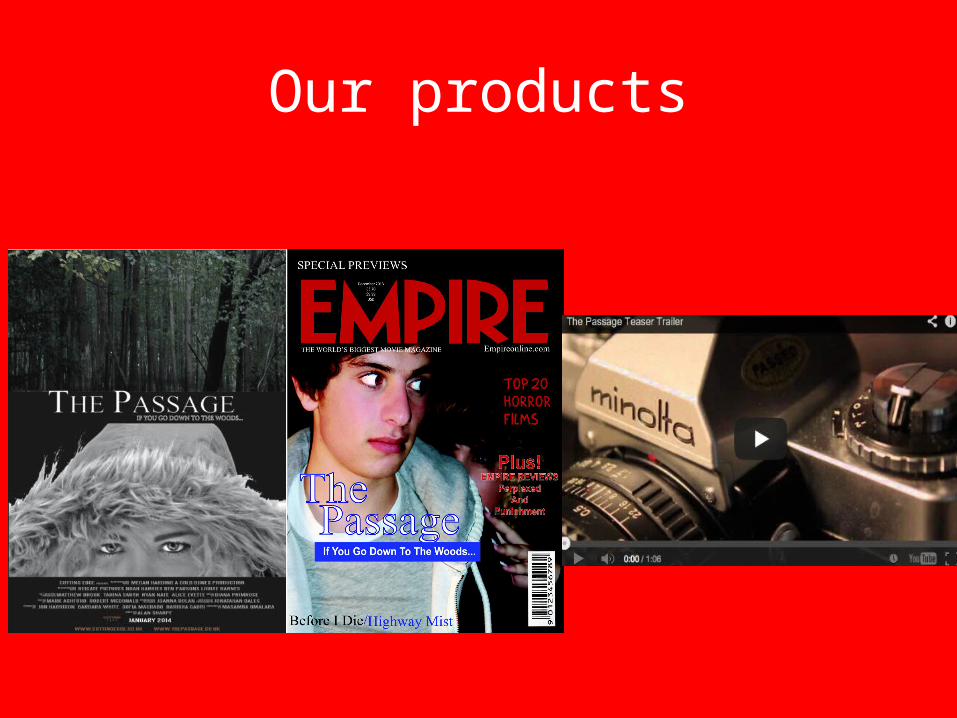
Our products

Titles
In our marketing package of ‘The Passage’ we used the same title on our poster and our teaser trailer and then a different title on our magazine cover. The font that we used on our poster and in our teaser trailer was similar to existing horrors that we had analyzed like The conjuring and Insidious. We believed that this font fitted In really well with our horror genre. The font that is on our magazine cover is different because it is made by a different company to our poster and teaser trailer. You can still tell that they are advertising the same film though because of the characters which are featured within them.

Titles design
The design of our titles were all from inspiration from existing films that were in the horror genre like our film. The images above show our three products titles and then below them is images I have print screened from existing teaser trailers that we had inspiration from. I feel that the design we choose from our teaser trailer title and our poster title where very similar whereas our magazine cover title was slightly different. The reason I feel that we did this is because on existing Empire magazines which is the magazine we based ours on is , there versions of horror films weren't generally dark and eerie like the trailers and posters. The magazine would of also been made by a different company so this is why the titles could be slightly different. I feel that the title designs although the magazine one is quite different compared to the teaser trailers title design and the poster you can still tell they are part of the same marketing package because of the use of the white font on every title design and then also the use of the tagline is on every product , so this clearly highlights how they are all advertising the same film.

Taglines
Above is two of our tag lines that have been taken from our poster and our magazine cover. Within our marketing package our tag line is used on all three products. On the poster and magazine cover our tag line is just under our main title. Our tag line is ‘ If you go down to the woods…’. I feel that it was important that our tagline was used on all three of our products because it was one of the main features of every product and it helps link all the products together so that the audience would know without checking that they all advertise the same film. In our teaser trailer the tag line is a lot longer and you cannot visually see it because it is a voice over of the villain character saying It. In the teaser trailer there is pauses between each bit of the tagline so that footage is shown through out it. This doesn't make the poster and magazine cover tagline any different because it is all said exactly the same and is not changed. I felt that overall our tag line was effective . I felt this because on the poster and magazine cover it created an impact for the audience because it made them know where the location of the film is and leaves them a lot of mystery because they want to know what's going to happen in the woods and what's going to happen to which character in the woods. Where as in the teaser trailer because the tag line is a voice over by the villain character it creates a lot more impact for the audience and can come across as scary and builds the tension for the audience which would make them want to know what's going to happen in the rest of the film.

Main images
On all three of our products which were part of our marketing package for our film ‘The Passage’ they all had main images. The main image of each product was to promote the film and be as eye catching as possible so that our target audience would want to watch the whole film. The images that are used on the poster and magazine cover do clearly highlight that the film is a horror so it’s a selling point. The colors that are all used within the main images all fall under our horror genre as they are all simplistic and plain, this is a way you can tell that these two products are advertising the same film. The main image on both products are of either one out of the two main characters, which are the innocent boy and the villain girl character. The use of these characters as the main images for the products highlight how they are going to be the main focus of the film. The poster and magazine cover main images then link up with the footage from the teaser trailer and you can tell their advertising the same film because through out the two main characters which are featured on either the poster or magazine cover are only shown within the teaser trailer.

CharactersOn all three products the two main characters which are the evil villain girl character and the innocent boy are featured on either three products. The use of the characters on each product shows how they are all from the same film marketing package and all link together. On all three products the evil villain girl character is featured but on the magazine she is not shown very well its just her leering over the boy characters shoulder. The use of the villain female character on every product could maybe highlight to the audience how she Is a main character. The male innocent character is featured on the magazine cover and is in the trailer so this also shows how he may be a main character. The use of the same characters throughout the whole marketing package really links up the three products well and shows how they are all for the same film. The three products also all feature close up shots of the characters eyes. The reason we chose this was because we did research on existing teaser trailers and posters and magazine covers and found out that films like The Blair witch project and The women in black which were in the same horror genre as our film included shots like this. We felt that the close up shots of the eyes could create tension and impact as it could highlight that maybe someone is being watched and then it could also represent the feelings of fear and loneliness. The close up shots of the eyes being used in every product through out the marketing package means that when the audience see either one of the products and then see another they can straight away realize that they both belong to the same film.

General information on each productOn all three products there is general information about the film. On the magazine there is the information of other films and then the release date. On the poster there is the billing block , the release date and the website. On the teaser trailer there is the release date. The billing block we have only included on our poster. The reason we did not include our billing block on our other two products was because we researched existing horror teaser trailers and Empire Magazines and none of them contained billing blocks so we believed we did’t need to include one. The general information on each product is all very important because it has details like the films website , where to see the film , the release date and much more. The use of the general information on each product meant that they all linked together somehow through the fact that each one contained something of the same . For example the poster and the teaser trailer both mention the release date. Below is our billing block that features on our poster.

Iconography : The Evil character
In our marketing package for ‘The Passage’ our evil villain character is shown on all three products. The evil villain character is the only character on the poster and is then also on the magazine cover with the innocent male character. The evil villain female character is also in most of the teaser trailer. As a group we all decided that the villain character should be on all three products because she makes all the products look like they are from the horror genre like it is , if it was just the innocent character acting all happy it wouldn't look right and wouldn't’t then attract the right target audience. The use of the evil character being featured on and in all three products meant that when the people who viewed each item and then saw another product would realize that they are all from the same film because they would recognize the evil villain character.

Iconography : The setting of the woods
In our marketing package the setting of the woods is extremely important as it is where most of the film is located. The setting of the woods is really good for our horror genre because it was empty and there was no one passing by so that we could just get on with filming without anyone walking into the footage. The setting of the woods is revealed on the poster at the top and then is also in the teaser trailer which is where most of the footage was shot. On our magazine cover we choose to do an Empire cover and when looking together in class we realized that all the background were plain and didn't’t contain images so we thought to make it look professional we should not use our idea of putting a picture of the woods in the background. The use of the setting of the woods in the teaser trailer and on the poster really shows how they are part of the same film because you can tell that the woods is the same location in both different products.
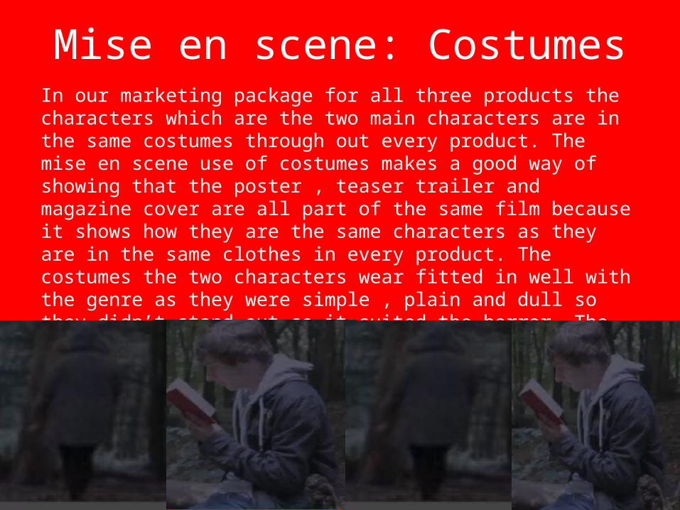
Mise en scene: CostumesIn our marketing package for all three products the characters which are the two main characters are in the same costumes through out every product. The mise en scene use of costumes makes a good way of showing that the poster , teaser trailer and magazine cover are all part of the same film because it shows how they are the same characters as they are in the same clothes in every product. The costumes the two characters wear fitted in well with the genre as they were simple , plain and dull so they didn’t stand out so it suited the horror. The use of the costumes being the same on every product could also mean that the audience can tell that the film is set in one place and doesn't move out of that location.

Mise en scene: PropsIn our teaser trailer there is the prop of the doll. The doll is a main part in the film but is not shown in the poster or on the magazine cover so this could be one reason why people may not believe that the three products are advertising the same film. The use of not using the doll in on the poster or magazine cover does create the sense of mystery because If you’ve seen the poster and then seen the teaser trailer and then wonder how the doll fits in with the story line it can be interesting for the audience and make them want to watch the whole film because they want to know why the doll is in it.

Mise en Scene : Color schemeOn all three parts off the marketing package the color scheme stays the same mostly through out. The teaser trailer is all very dark and eerie and looks although it has been set at night. Then on the poster the villain character is dark in black and white and the woods at the top again looks like night time. The magazine cover has a dark background and the characters aren't necessary wearing bright clothing . The magazine cover although does come across as brighter then the other two products because of the titles that have been used. I feel that all three products do link together and you can tell they are for the same film because of the dark color scheme that has been used through out and the main images which feature the characters are all particularly the same.

Target AudienceI feel that all three of our products from our marketing package of The Passage are suitable and aimed at the same target audience. Each of our products are different ways of advertising the film so if one person didn't’t have access to the internet then they could always seen the film being advertised on the Empire magazine cover or on the poster. The different ways of advertising show that everyone from our target audience will be able to see it some how. I feel that the reason all of our products are suitable for our target audience is because the color scheme we have used is very simplistic and is not too girly or too much what a boy would like. I feel that all three of our products are uni sex because of the colors we have used which are all dark like greys and whites and then there is some light colors like red and blue. Another reason why I feel that all three products are suitable for our target audience is because they are containing our characters like the evil character and the innocent character. When our target audience who are older teenagers and young adults who enjoy horror films see either one of our products from our marketing package they will recognize that it is the type of film they enjoy due to the images that have been used on every product.