evaluation question 1 magazine
TRANSCRIPT

In what ways does your media product use, develop or challenge forms and conven8ons of real
media products?

Magazine front cover that was created by Ohemaa

Codes and Conven8on of magazines
The font is similar to the original font.
Image is at the centre, making the audience pay aBen8on.
Direct eye contact with the audience, making the audience feel connected to the character.
Studio photograph, usually medium or close up, allowing the audience to see the blood on the characters face.
Included buzz words, for instance ‘plus’ and would aBract the audience because it is in a different colour compared to the text around it.
Barcode
Includes cover line, which excites the audience because they would want to know more about what is inside the magazine.
A sentence about the image and is helpful because it gets the audience excited about the film.
Tag language has been used to engage the audience with the magazine cover , such as ‘exclusive’.

What did I repeat?-‐ magazine What is Repeated My group’s magazine Exis8ng magazine
The ‘weekly’ text in the magazine 8tle makes the magazine front cover appear realis8c.
Character that has direct eye contact, which helps build a rela8onship with the audience because they would be familiar with the character.
Limited colours, there are not too much colours in mine and other magazine front covers. The main colours my magazine has are: red, black, white and yellow and the colours the other magazine has are: blue, black and white.

What did I repeat?-‐ magazine What is Repeated My group’s magazine Exis8ng magazine
Words that encourages the audience to buy the magazine, such as ‘plus’ and ‘exclusive’. These words are important in a magazine front cover as it gets the audience excited about what it magazine contains.
Image is at the centre, where the audience would pay aBen8on the most. The image is the most important feature that the audiences actually focus on and sums up the magazine front cover.
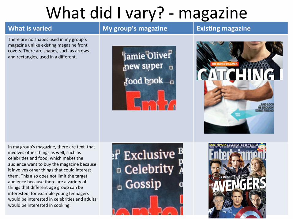
What did I vary? -‐ magazine What is varied My group’s magazine Exis8ng magazine There are no shapes used in my group’s magazine unlike exis8ng magazine front covers. There are shapes, such as arrows and rectangles, used in a different.
In my group’s magazine, there are text that involves other things as well, such as celebri8es and food, which makes the audience want to buy the magazine because it involves other things that could interest them. This also does not limit the target audience because there are a variety of things that different age group can be interested, for example young teenagers would be interested in celebri8es and adults would be interested in cooking.

What did I vary? -‐ magazine What is varied My group’s magazine Exis8ng magazine A line of text is used above the magazine 8tle but in my group's magazine, there is a bunch of text. Even though it is above the 8tle, it makes the audience less likely to read it because it is not short and catchy.
The text size in exis8ng magazine varies but in my group’s magazine it does not, so it is all in the same size. This makes all of the text equally important.
The only image on my group’s magazine is the killer but some magazines have different images at the boBom, which is a good idea because there is more informa8on.
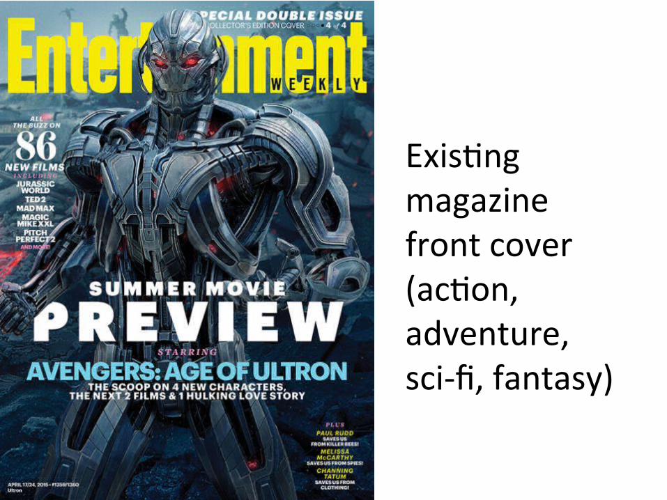
Exis8ng magazine front cover (ac8on, adventure, sci-‐fi, fantasy)

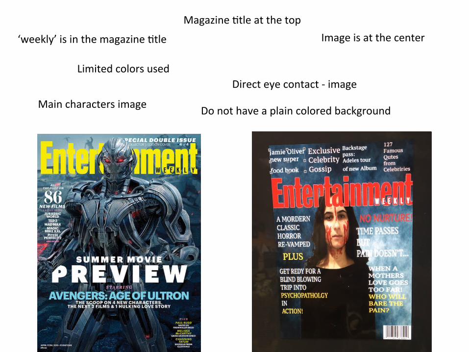
Magazine 8tle at the top
Limited colors used Direct eye contact -‐ image
Image is at the center
Main characters image
‘weekly’ is in the magazine 8tle
Do not have a plain colored background


Title of the film is overlapping the image
Limited text
One sentence above the magazine 8tle
Align text leU Center text
Bunch of text above the magazine 8tle
A lot of text
Film’s 8tle is next to the image
One type of font At least two types of font

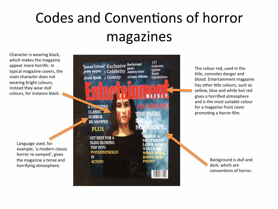
Codes and Conven8ons of horror magazines
Character is wearing black, which makes the magazine appear more horrific. In typical magazine covers, the main character does not wearing bright colours, instead they wear dull colours, for instance black.
Background is dull and dark, which are conven8ons of horror.
Language used, for example, ‘a modern classic horror re-‐vamped’, gives the magazine a tense and horrifying atmosphere.
The colour red, used in the 8tle, connotes danger and blood. Entertainment magazine has other 8tle colours, such as yellow, blue and white but red gives a horrified atmosphere and is the most suitable colour for a magazine front cover promo8ng a horror film.
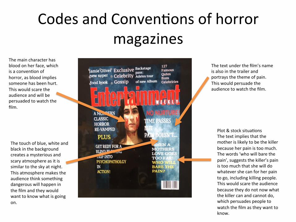
Codes and Conven8ons of horror magazines
The main character has blood on her face, which is a conven8on of horror, as blood implies someone has been hurt. This would scare the audience and will be persuaded to watch the film.
The text under the film’s name is also in the trailer and portrays the theme of pain. This would persuade the audience to watch the film.
The touch of blue, white and black in the background creates a mysterious and scary atmosphere as it is similar to the sky at night. This atmosphere makes the audience think something dangerous will happen in the film and they would want to know what is going on.
Plot & stock situa8ons The text implies that the mother is likely to be the killer because her pain is too much. The words ‘who will bare the pain’, suggests the killer’s pain is too much that she will do whatever she can for her pain to go, including killing people. This would scare the audience because they do not now what the killer can and cannot do, which persuades people to watch the film as they want to know.

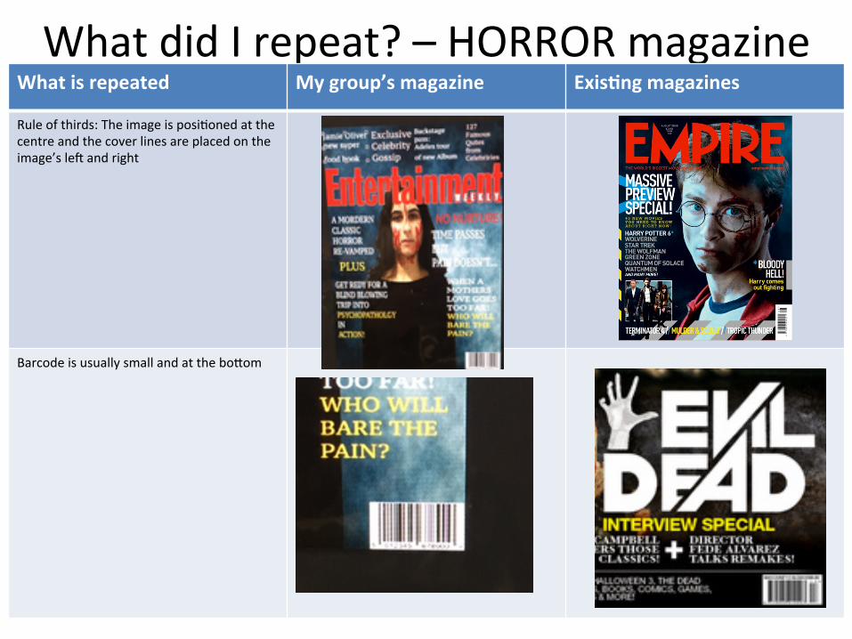
What did I repeat? – HORROR magazine What is repeated My group’s magazine Exis8ng magazines
Even though it is not obvious, there is a tagline in my magazine
Dark and dull ligh8ng has been used to create a horrifying atmosphere. Dark and dull ligh8ng is also a conven8on of horror
Main colours used are: red, white and black. Red connotes blood, black connotes danger and white is used to make the text stand out, as there are dark images and backgrounds
What did I repeat? – HORROR magazine What is repeated My group’s magazine Exis8ng magazines
Rule of thirds: The image is posi8oned at the centre and the cover lines are placed on the image’s leU and right
Barcode is usually small and at the boBom

What did I vary? – HORROR magazine What is varied My group’s magazine Exis8ng magazines
Other horror magazine covers have a thick font for the cover lines. In my group’s magazine, there are serif fonts used for the text.
Other magazines used different font types like the image on the right. My group’s magazine has simple and plain fonts.

Exis8ng HORROR magazine


The colours red, white, black and yellow are the main colours The size of the cover lines are constant
Overall, the magazine appear dull and dark
There is some sort of blood in the magazine, whether it is part of the cover lines or on the character’s face
Barcode


The name of the film has two leBer in a different colour Has one colour throughout the film’s name
The only source of light is the candle The background has a touch of white and the text is mainly in white, which are reasons the magazine looks bright
Low key ligh8ng has been used to take the picture There is no dark ligh8ng in the picture taken
There are smaller images at the boBom There are no images