freelancer.com email audit
TRANSCRIPT
Freelancer.comNewsletter flow
Created by MailCharts.com

Let’s check MailCharts for their emails.

Let’s check MailCharts for their emails.

Let’s check MailCharts for their emails.
Alright, let’s pick this one.


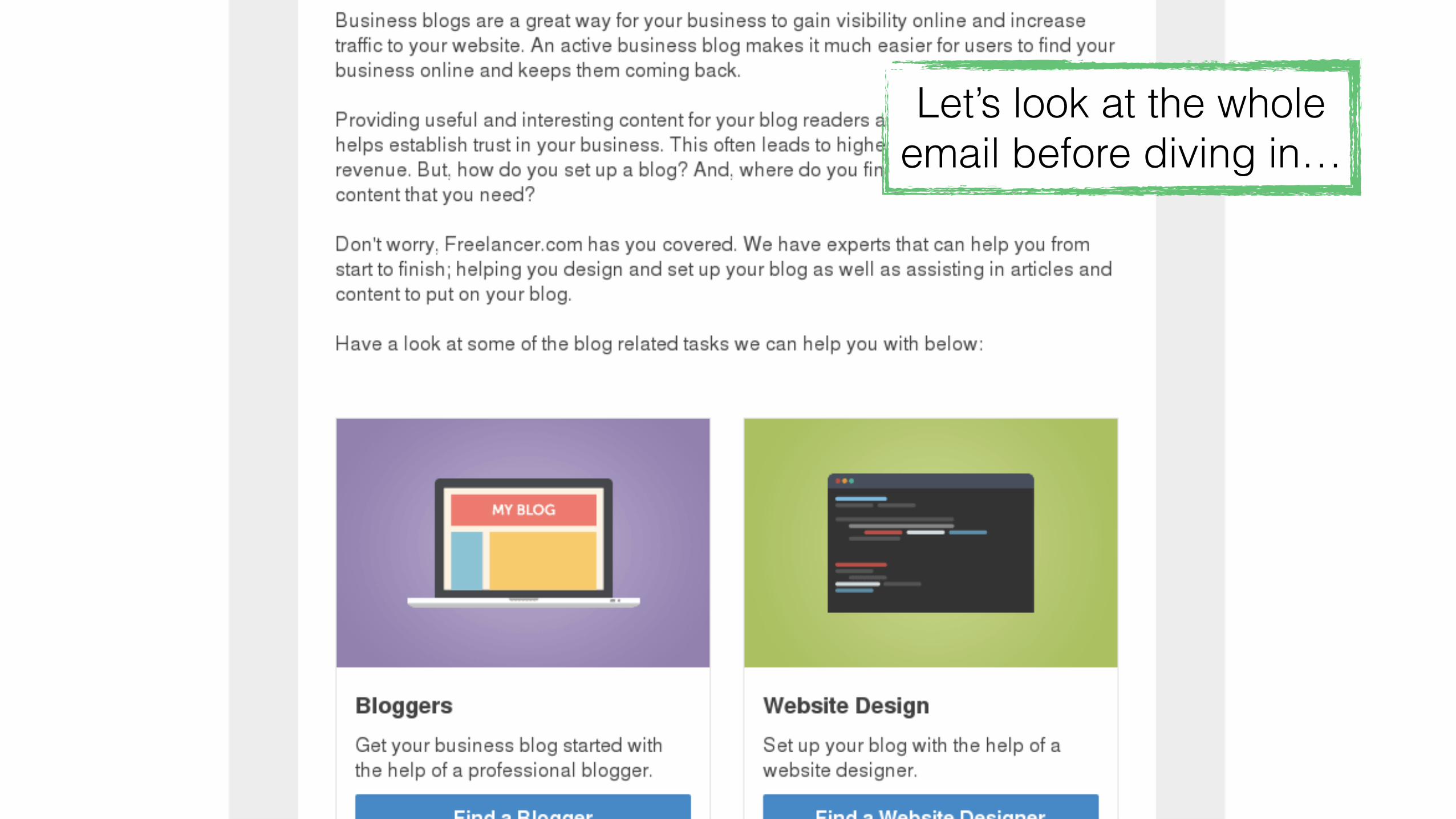
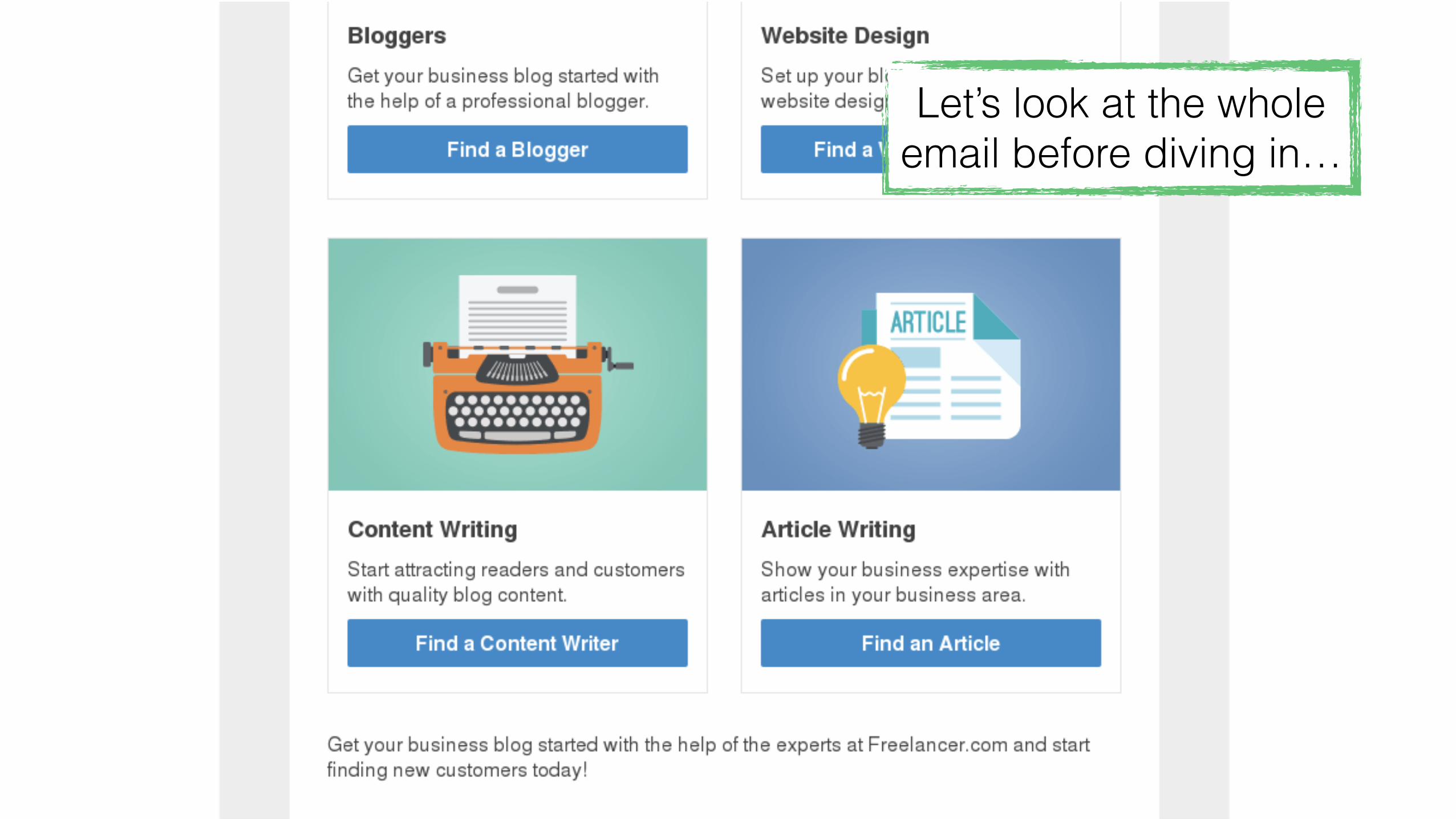
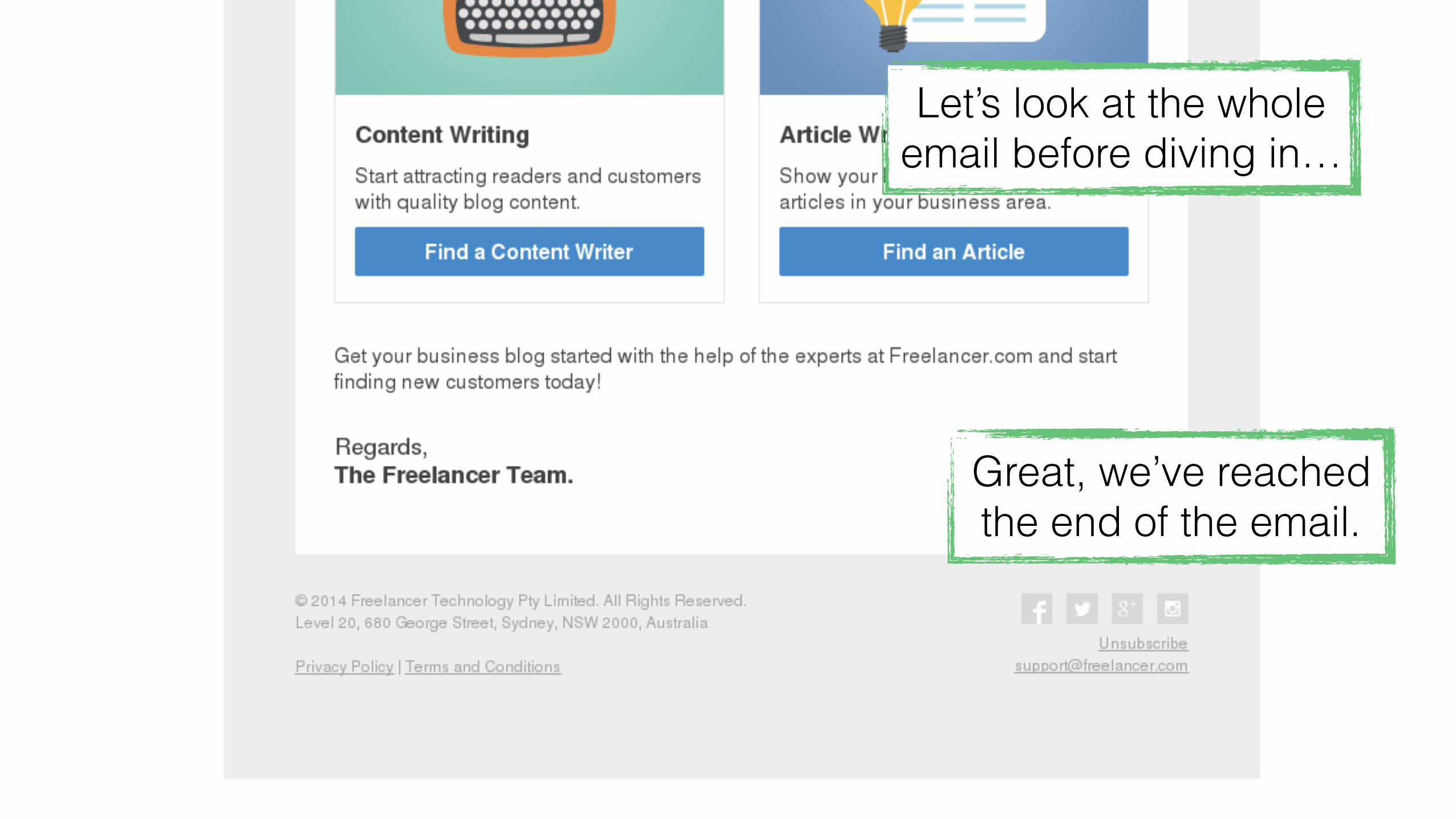
Let’s look at the whole email before diving in…
Let’s look at the whole email before diving in…
Let’s look at the whole email before diving in…

Let’s look at the whole email before diving in…
Let’s look at the whole email before diving in…
Great, we’ve reached the end of the email.

Let’s look at the whole email before diving in…
Great, we’ve reached the end of the email.
Back to the top…


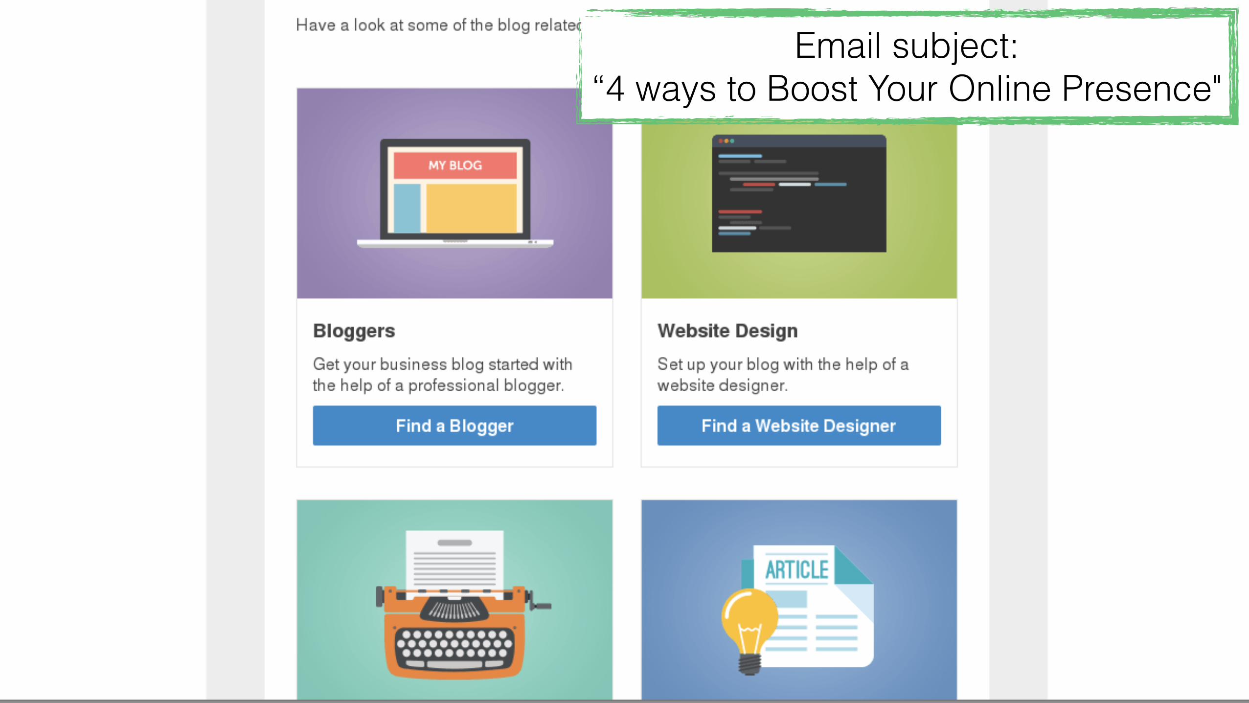
Email subject: “4 ways to Boost Your Online Presence"

Email subject: “4 ways to Boost Your Online Presence"
The header image totally aligns with the subject.

Email subject: “4 ways to Boost Your Online Presence"
The header image totally aligns with the subject.
This is lovely!

Email subject: “4 ways to Boost Your Online Presence"
The header image totally aligns with the subject.
This is lovely! Also, the whole banner is clickable! :)

Buuuut, the logo isn’t clickable. I would expect this to take me
to freelancer’s homepage.
Email subject: “4 ways to Boost Your Online Presence"
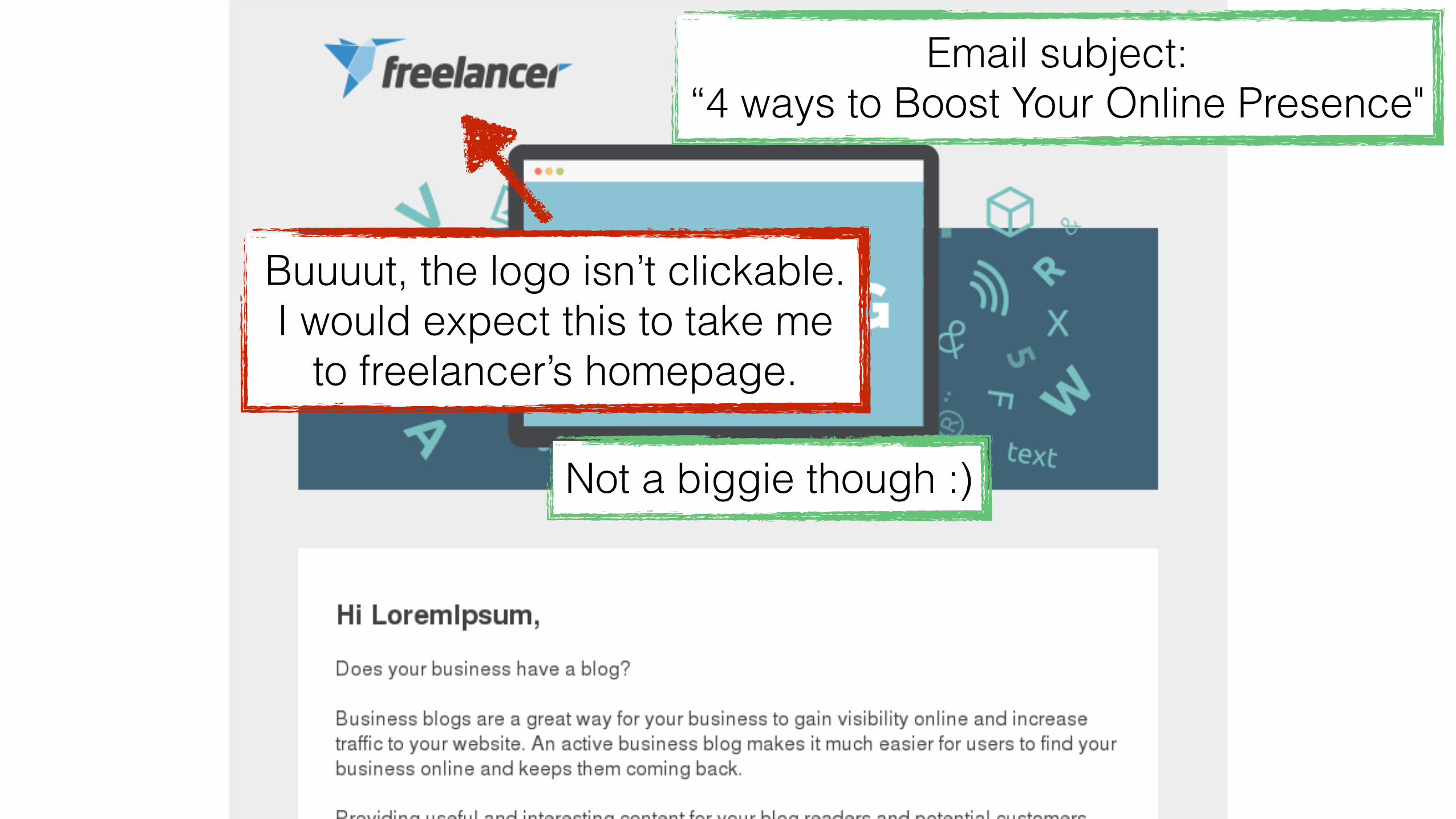
Buuuut, the logo isn’t clickable. I would expect this to take me
to freelancer’s homepage.
Not a biggie though :)
Email subject: “4 ways to Boost Your Online Presence"

Email subject: “4 ways to Boost Your Online Presence"

Nice personalized greeting (your real name appears here)
Email subject: “4 ways to Boost Your Online Presence"

Nice personalized greeting (your real name appears here)
Email subject: “4 ways to Boost Your Online Presence"This copy is amazing. Spot-on
for their target audience!

Nice personalized greeting (your real name appears here)
Email subject: “4 ways to Boost Your Online Presence"This copy is amazing. Spot-on
for their target audience!
Nice transition!
Email subject: “4 ways to Boost Your Online Presence"

Email subject: “4 ways to Boost Your Online Presence"One way…

Email subject: “4 ways to Boost Your Online Presence"One way…
Two… Four!
Three…

Email subject: “4 ways to Boost Your Online Presence"One way…
Two…
The subject perfectly aligns with the content.
Three…
Four!
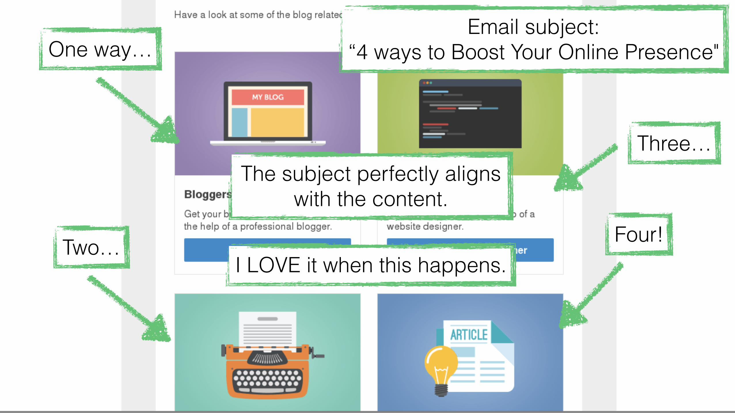
Email subject: “4 ways to Boost Your Online Presence"One way…
Two…
The subject perfectly aligns with the content.
Three…
Four!I LOVE it when this happens.

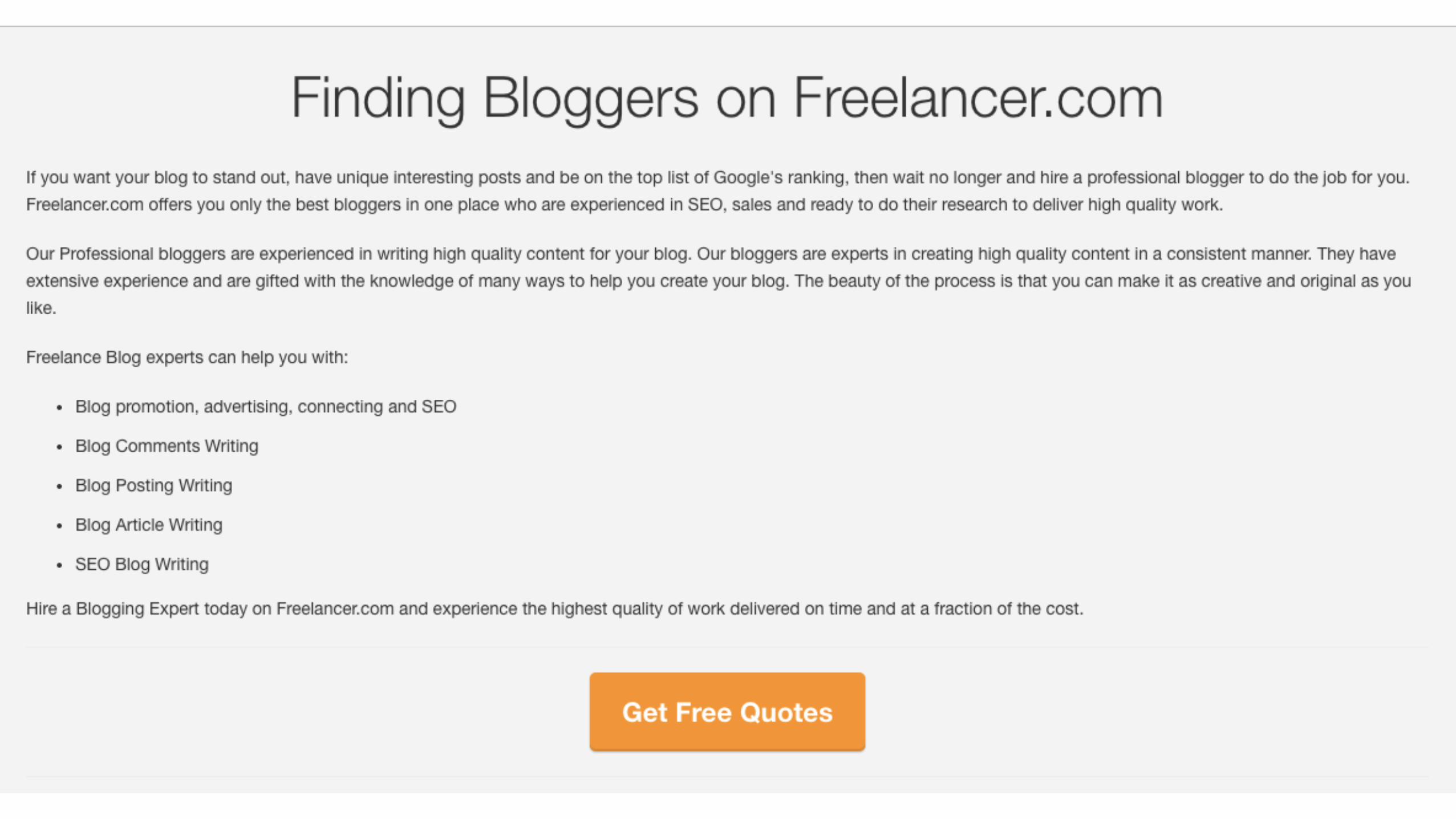
Ok, let’s find some bloggers!


Look at that!

Look at that! This perfectly aligns with the button we clicked.

Look at that!
Experiences this great are rare, sadly.
This perfectly aligns with the button we clicked.

Let’s keep going
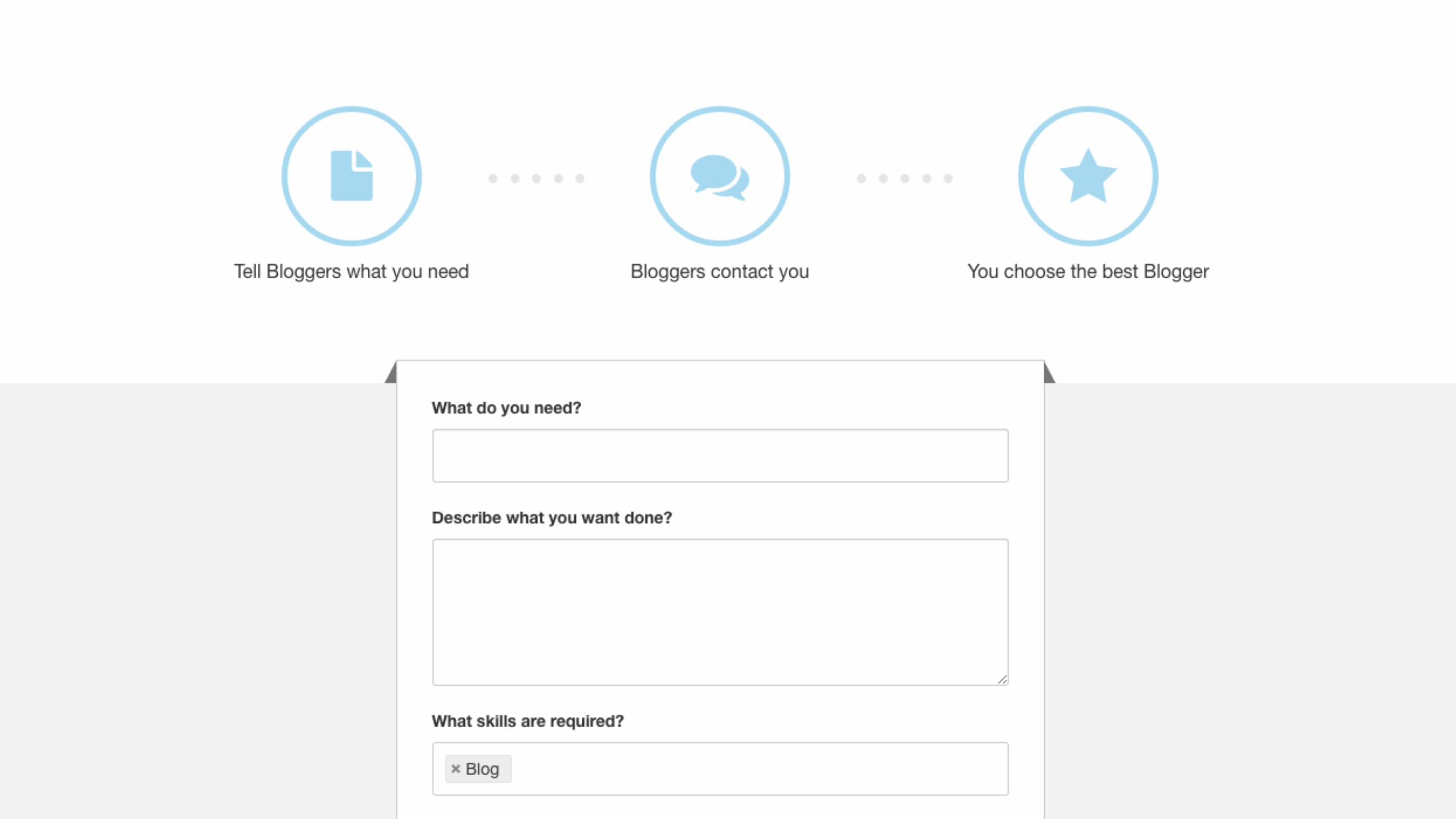
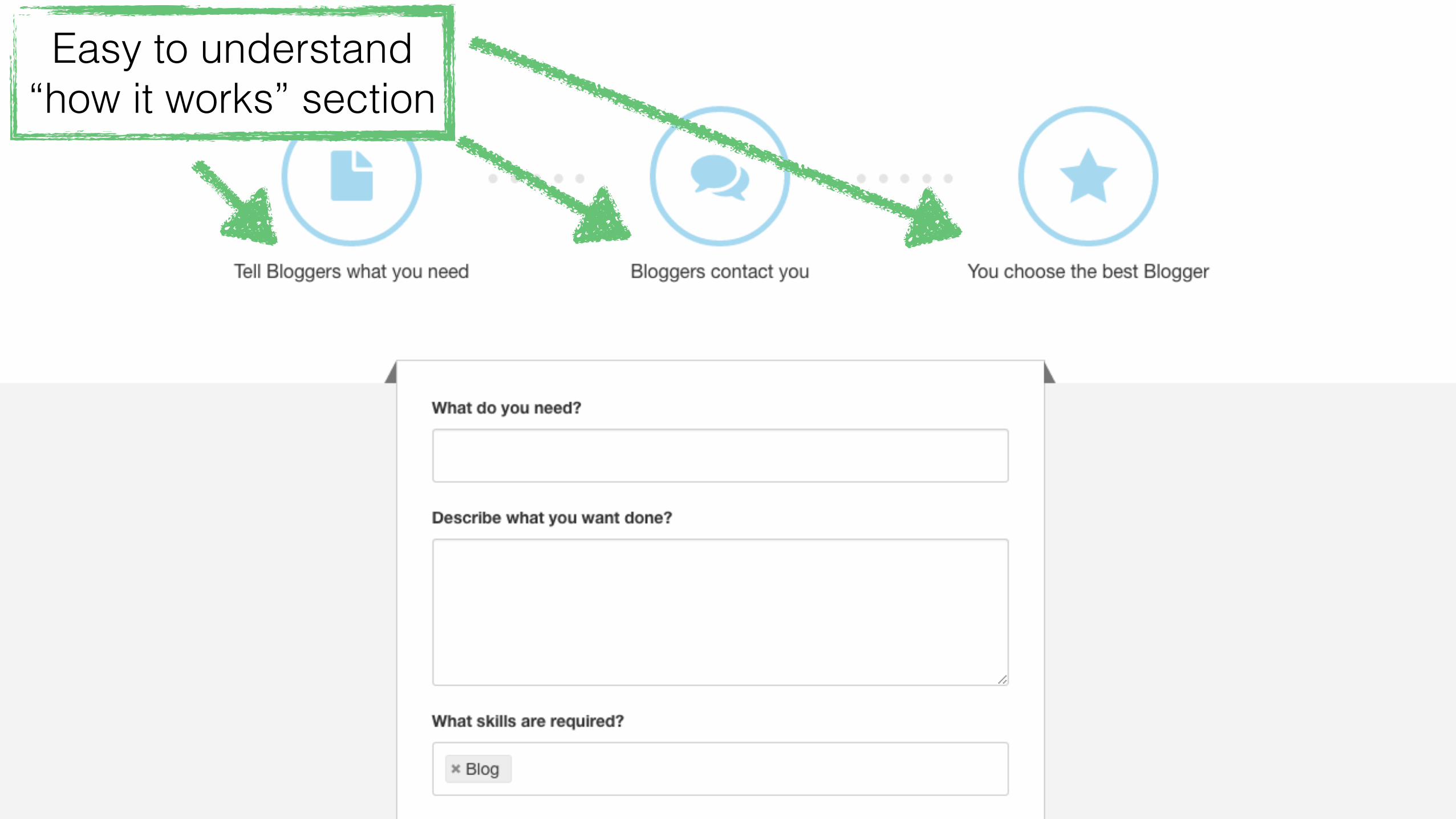
Easy to understand “how it works” section

Easy to understand “how it works” section
Prominent form with no distractions.

Easy to understand “how it works” section
Prominent form with no distractions.
This user experience is amazing. I bet Freelancer makes a LOT of money from
their emails.

Let’s keep going
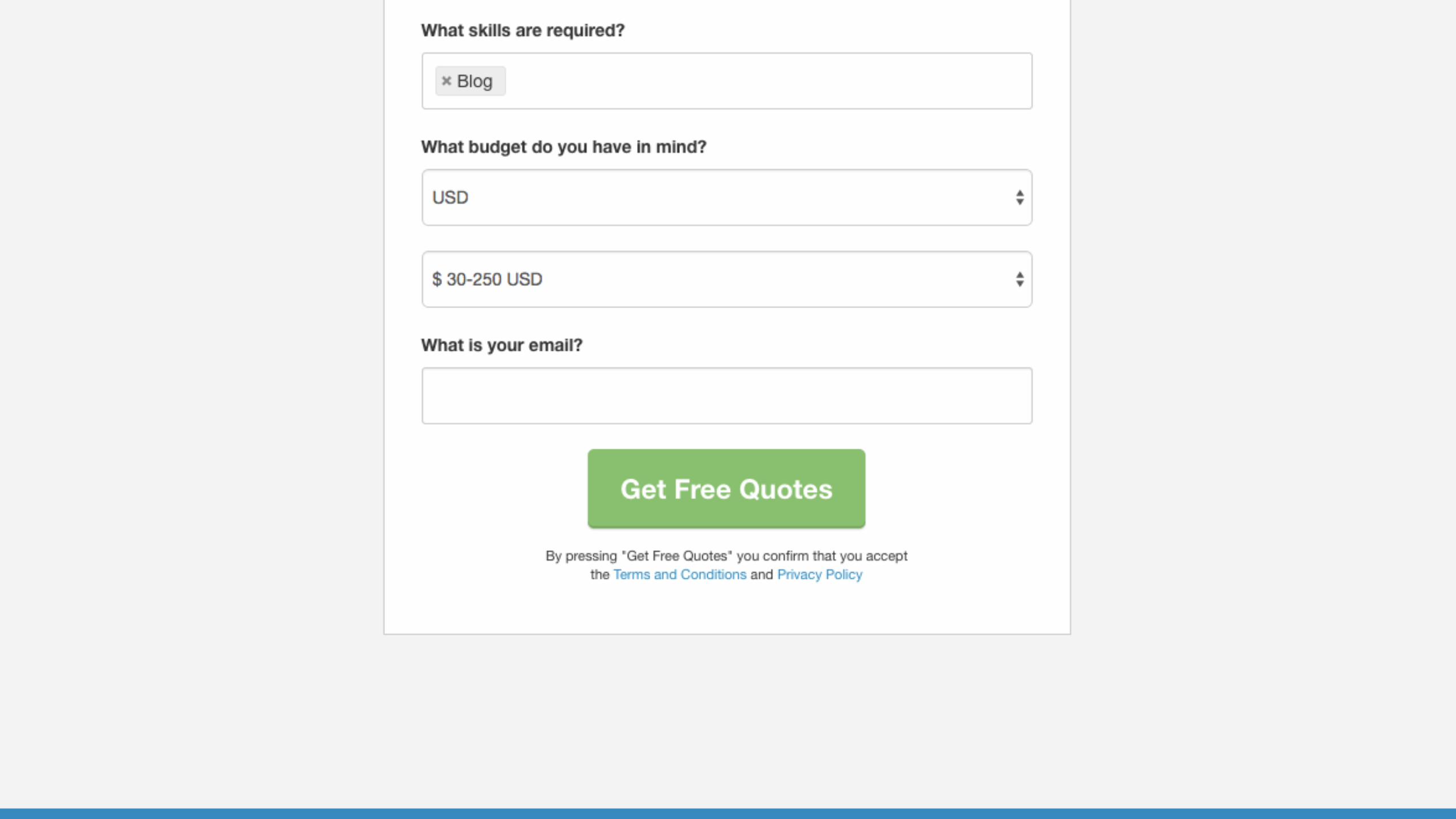

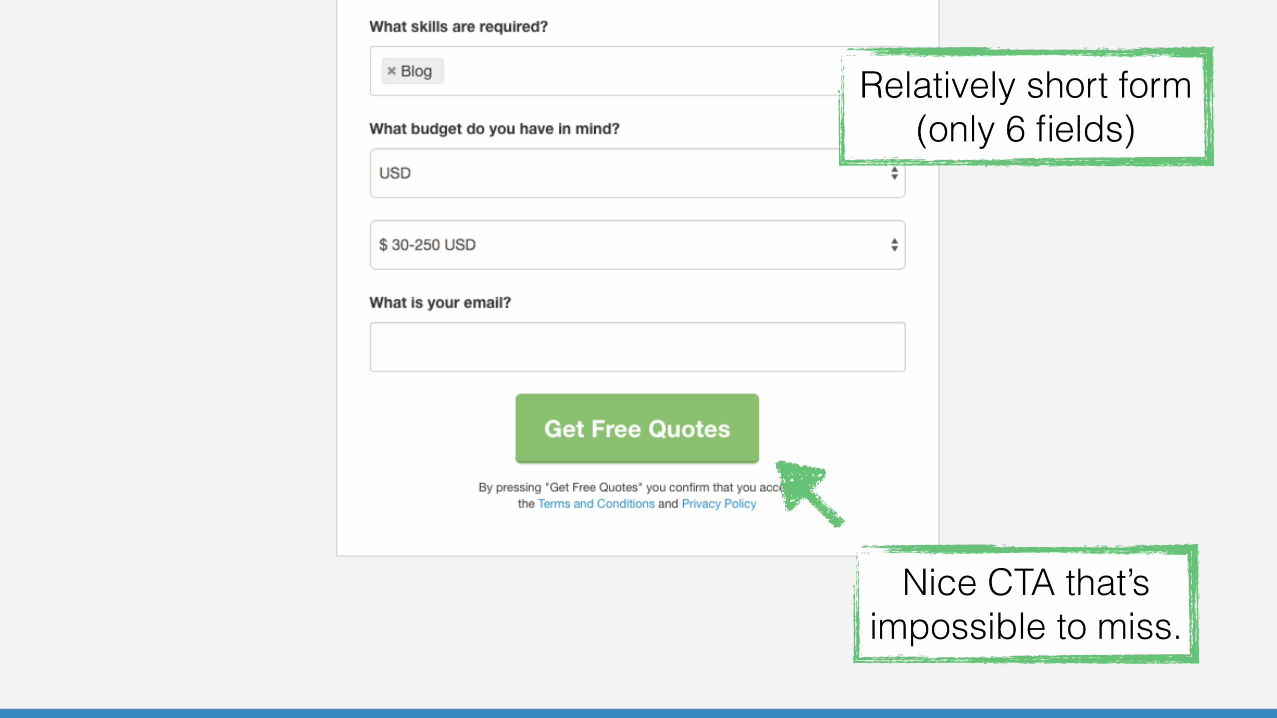
Relatively short form (only 6 fields)
Relatively short form (only 6 fields)
Nice CTA that’s impossible to miss.

Relatively short form (only 6 fields)
Nice CTA that’s impossible to miss.
Come on… you KNOW my email!

Relatively short form (only 6 fields)
Nice CTA that’s impossible to miss.
Come on… you KNOW my email!
This makes me sad, we were doing so well :(

Let’s keep going
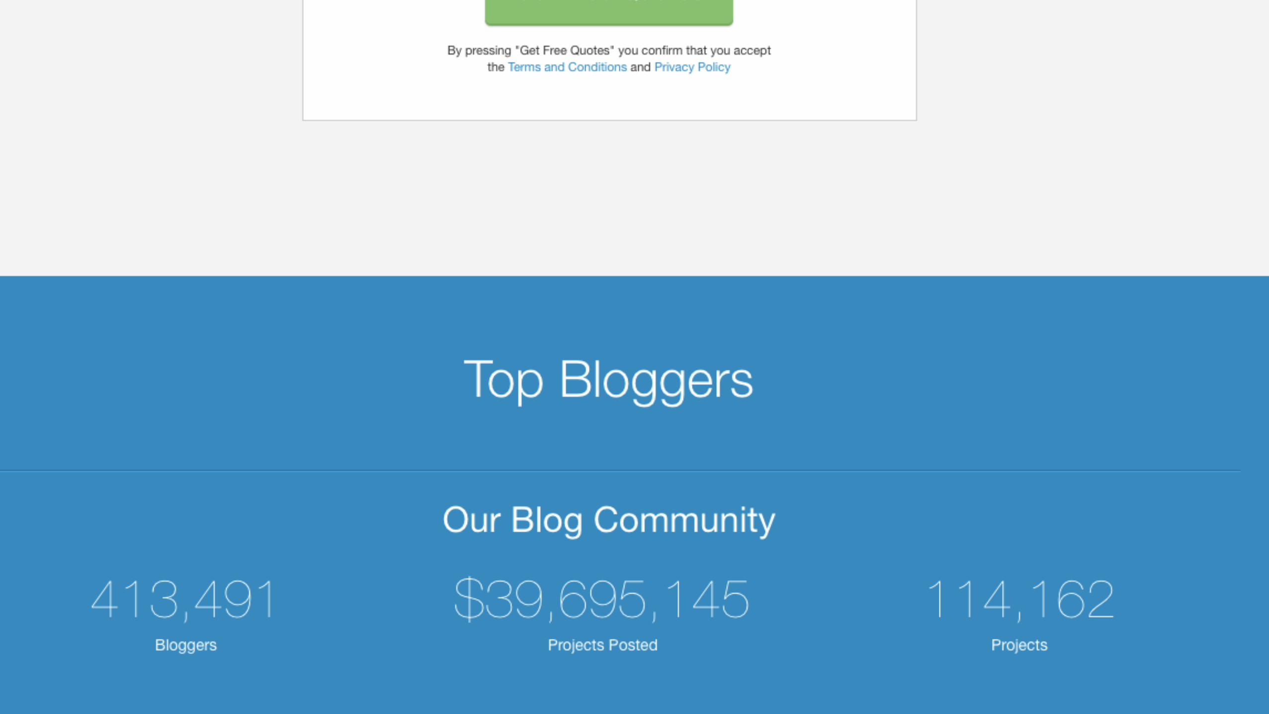

Relevant and impressive stats — nicely done.


Great helper copy.

These guys know what they’re doing…

These guys know what they’re doing…


Adds credibility

Adds credibility
Clicking this scrolls you to the top (so you can fill out the form).

Adds credibility
I wish this animated back up instead of refreshing
the page. I thought this opened a new tab for a second.
Clicking this scrolls you to the top (so you can fill out the form).


Back in our email

Back in our email
What happens if I click this?


Wow, another personalized landing… just for Website Designers!

Wow, another personalized landing… just for Website Designers!
Same structure, different content. This is perfect.

Wow, another personalized landing… just for Website Designers!
Same structure, different content. This is perfect.
We were going to stop here, but check this out…


When you enter your email information…

2 new fields appear
When you enter your email information…

2 new fields appear
When you enter your email information…
… and if they recognize your email address, they ask
you to log in!

2 new fields appear
When you enter your email information…
… and if they recognize your email address, they ask
you to log in!
This is brilliant.

2 new fields appear
When you enter your email information…
… and if they recognize your email address, they ask
you to log in!
This is brilliant.
I could log in directly if you passed my email address
from the email ;)

Freelancer.com’s email marketing efforts must drive a ton of money. This would
explain such an outstanding experience.
Emails these great are rare to find and always a delight to interact with.