frequency tables & univariate charts
TRANSCRIPT
Chapter 3:
Frequency Tables &Univariate Charts
Stephanie DodsonJuly 16, 2013

Frequency TablesFrequency Tables
Frequency tables show the number of times attributes are observed in a data set.
To generate a frequency table in SPSS, use the following steps:
1) Pull down Analyze menu.2) Move cursor over Descriptive Statistics.3) Click on Frequencies.4) Move one of more variables from alphabetical list on left to “Variable” list in the
center.

Generating a frequency table in SPSS
1) Selec t analyze , ” de scr ipt ive “ “s ta t i s t i c s , ” f requenc ie s . ”“1) Selec t analyze , ” de scr ipt ive “ “s ta t i s t i c s , ” f requenc ie s . ”“
2) Add var iable s f rom
le f t to l i s t in center .

Questions About 1980 Questions About 1980 GSS Young AdultsGSS Young Adults
What percent of GSS young adults had no religious affiliation?
How strong were the attachments to organized religion of 1980 GSS young adults?
What percent of 1980 GSS young adults grew up in two-parent households? In one-parent households? In no-parent households?
What was the most common number of siblings reported by 1980 GSS young adults? How many were only children?
What kinds of educational degrees did 1980 GSS young adults have?

Questions About 1980 GSS Questions About 1980 GSS Young AdultsYoung Adults
How did they break down in terms of sex and race?
What percent grew up in rural areas? In small towns? In big cities?
What percent were working full-time?
Were most already married? Were some already divorced?
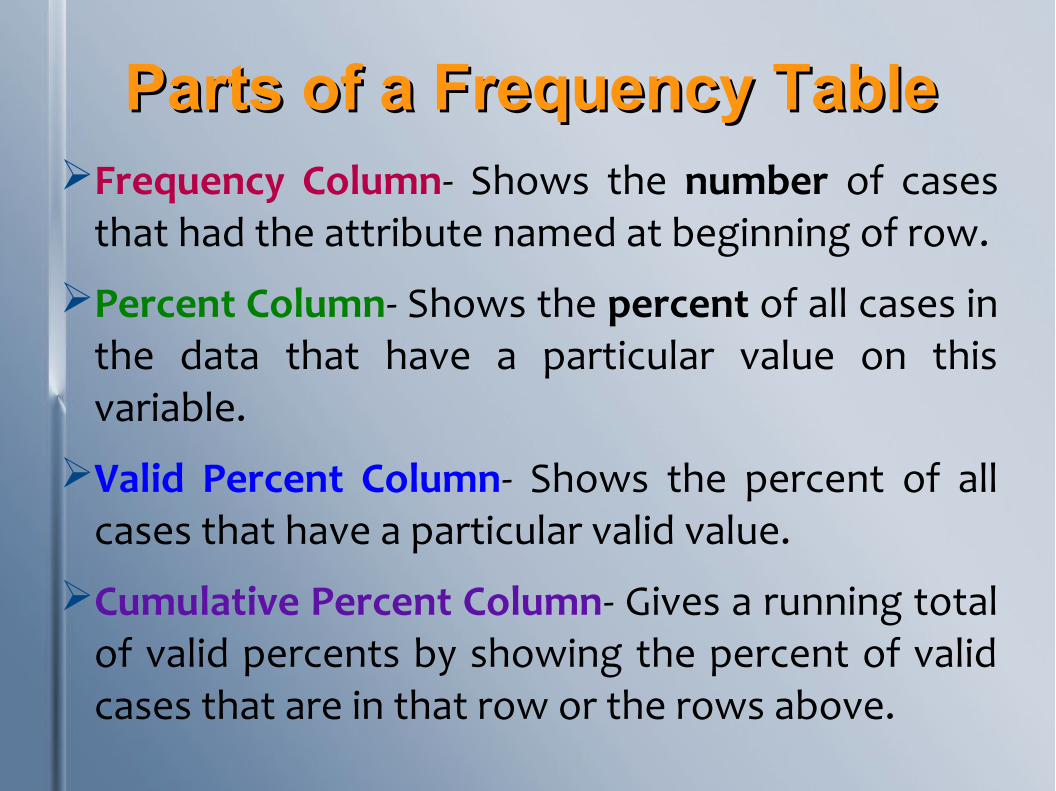
Parts of a Frequency TableParts of a Frequency TableFrequency Column- Shows the number of cases
that had the attribute named at beginning of row.
Percent Column- Shows the percent of all cases in the data that have a particular value on this variable.
Valid Percent Column- Shows the percent of all cases that have a particular valid value.
Cumulative Percent Column- Gives a running total of valid percents by showing the percent of valid cases that are in that row or the rows above.

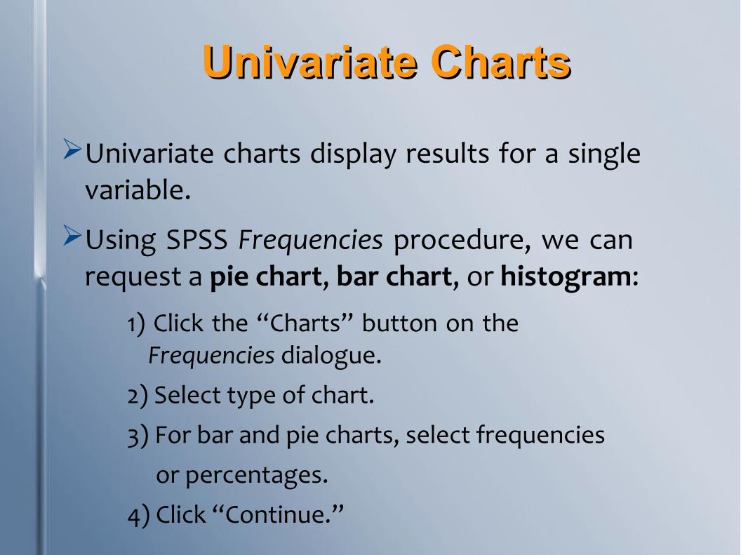
Univariate ChartsUnivariate Charts
Univariate charts display results for a single variable.
Using SPSS Frequencies procedure, we can request a pie chart, bar chart, or histogram:
1) Click the “Charts” button on the Frequencies dialogue.
2) Select type of chart.3) For bar and pie charts, select frequencies or percentages.4) Click “Continue.”

Pie ChartsPie ChartsPie charts are nominal charts, which means they
can be used to illustrate distribution of cases on nominal, ordinal, or interval/ratio variables.
Attributes must be different from one another.
Pies with too many variables are difficult to comprehend and are therefore less useful.

Useful...

Less useful...

Bar ChartsBar Charts Bar charts, like pie charts, are nominal charts. They communicate
information using height of bars.
Most frequently used to visually show distribution of cases on nominal or ordinal variables.
Because bars appear along horizontal line, bar charts can communicate order of attributes better than circular pie charts.
Horizontal axis does not represent a numeric scale. Thus, distance between bars does not reflect difference between attributes.
No gap needed for unused attributes.
In SPSS, Chart Editor can be used to add data labels.

Bar Chart with numbers

Bar Chart with percentages
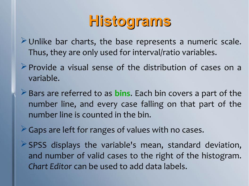
HistogramsHistogramsUnlike bar charts, the base represents a numeric scale.
Thus, they are only used for interval/ratio variables.
Provide a visual sense of the distribution of cases on a variable.
Bars are referred to as bins. Each bin covers a part of the number line, and every case falling on that part of the number line is counted in the bin.
Gaps are left for ranges of values with no cases.
SPSS displays the variable's mean, standard deviation, and number of valid cases to the right of the histogram. Chart Editor can be used to add data labels.

Histogram

Other Univariate ChartsOther Univariate ChartsSPSS can generate a range of charts, including line charts,
area charts, scatterplots, dot plots, high-low charts, boxplots, and dual y-axis charts.
To produce a chart in SPSS, pull down “Graphs” menu and select “Chart Builder.”
Box Plot
Line Chart
Scatterplot

1980 GSS Young Adults:1980 GSS Young Adults:What do we now know?What do we now know?
RELIGION:
89.3% belonged to some religion, while 10.7% reported no religious affiliation.
Protestantism and Catholicism were the most common religions.
31.9% reported strong religious affiliation, while 57.2% said it was not very strong.
Only 1.5% belong to a non-Judeo-Christian religion.

1980 GSS Young Adults:1980 GSS Young Adults:What do we now know?What do we now know?
EDUCATION:
Two thirds of twenty-somethings had only a high school degree at time of survey.
About one in seven had a bachelors or graduate degree.
Some were still in school when they took the survey.
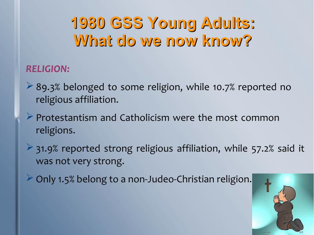
1980 GSS Young Adults:1980 GSS Young Adults:What do we now know?What do we now know?
RELIGION:
89.3% belonged to some religion, while 10.7% reported no religious affiliation.
Protestantism and Catholicism were the most common religions.
31.9% reported strong religious affiliation, while 57.2% said it was not very strong.
Only 1.5% belong to a non-Judeo-Christian religion.

ReferencesReferences
Szafran, R. (2012). Answering questions with
statistics. Thousand Oaks, CA: Sage
Publications.