gdiaz final-mag 2
TRANSCRIPT
KEEP 2 KEEP 3
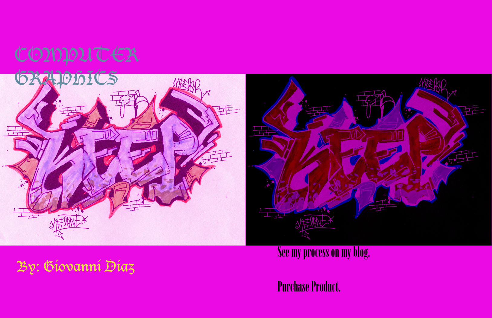
COMPUTER GRAPHICS
By: Giovanni DiazSee my process on my blog.
Purchase Product.
KEEP 4 KEEP 5
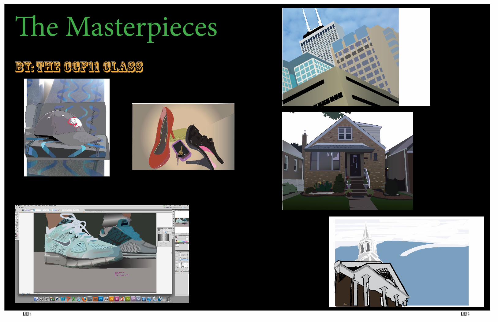
The MasterpiecesBy: The CGF11 Class
KEEP 6 KEEP 7
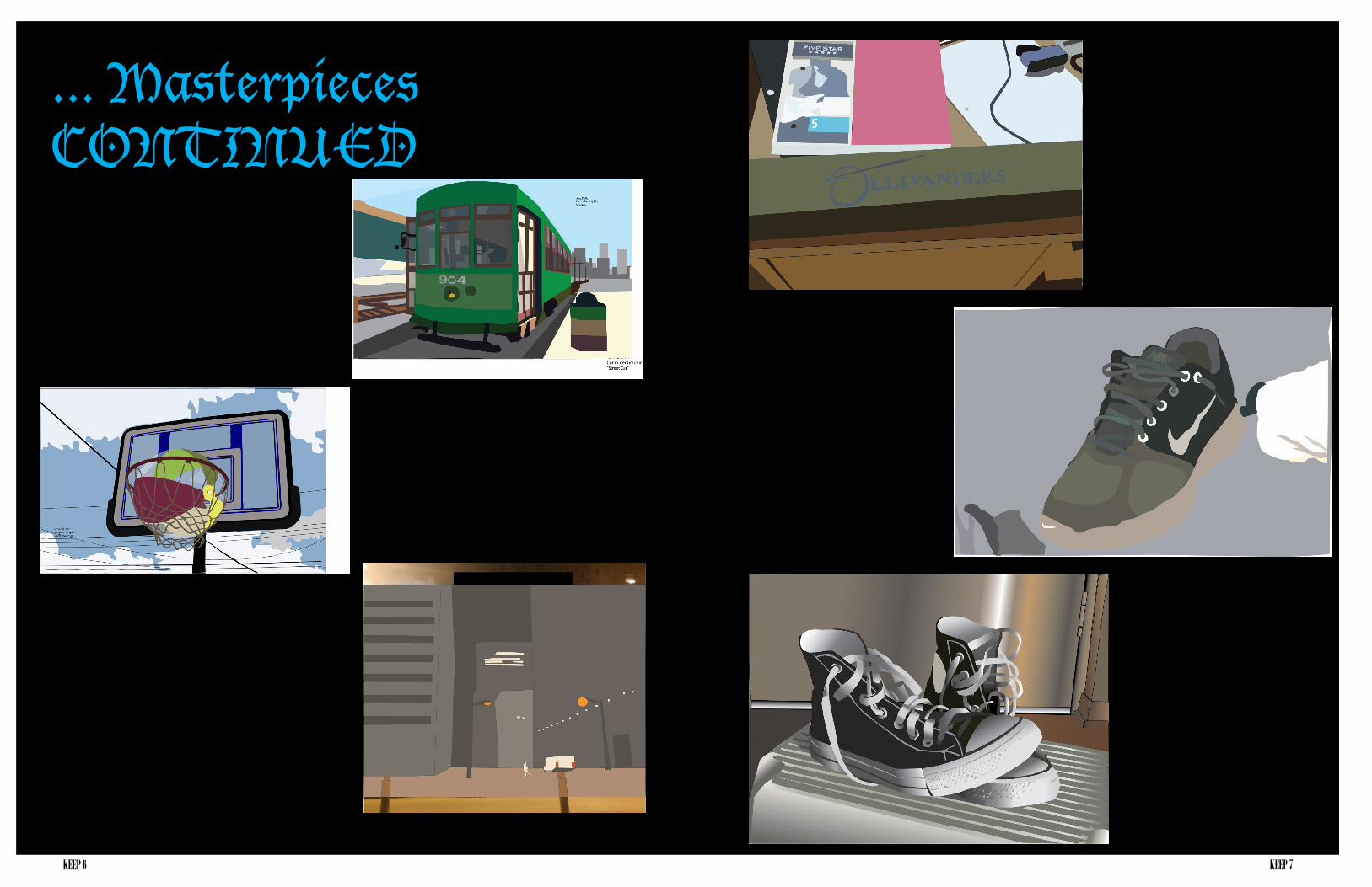
... Masterpieces CONTINUED

KEEP 8 KEEP 9
WOW HAT Fall Into FashionBy: Jordan Juarez BY: Synthia Wesley
Academically I am going into a business major. I am not very confident that i will stay in this major because honestly i have no clue what i want to do. Business was just the general major i was most interested in so...ya.
Now The VariationS...With this one I changed the lines to a bunch of different cool brush strokes that I like. I changed the outline color to make it jump off the page. I didn’t focus on the sets however I want my audience to focus their attention on the hat its self and the designs on the seats.
My name is Synthia Wesley. I am currently, what I would refer to myself as, a "FreshMORE". I say this because I am an unusual Fresh-man, for I currently have 26 credit hours-- TOO many to be considered a complete Freshman, and just a shy of 4 credits to be a Sophmore.
Craft:Using various tools, I have learned in this class, I created 4 two page spreads of my shape drawings. I used tools such as the Gradient tool, the Shape tool, etc.
Composition: Much of this layout was created to depict my art that I created in this class in the best way pos-sible. I tried not to use a very dominant background image, or color because I didn't want it to over power my art.
Concept:For these layouts, I really wanted the viewer to concentrate solely on my art. In order of importance I would want them to see, my art, headline, line body

KEEP 10 KEEP 11
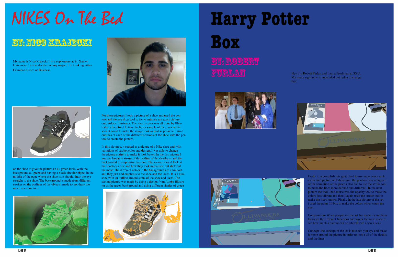
Nikes On My FeetBy: Roxy Waisunec
CONVERSEBy: Allison Horn
CraftI used the pen tool and played around with the gradients in Adobe Illustrator.
CompositionThe shoes are placed in the center since they are the main focus, and there is a sense of dimension that is created by the shoes sitting on the step stool and by the door in the back-ground. I wanted to play around with the gradients because I feel it really helps the image look closer to real life so that the lights and shadows are blended together rather than looking all choppy.
My name is Roksanna Wasiunec but most people call me Roxy. This is my first year here at SXU. I am majoring in graphic design. my dream job would be to design album covers and posters for bands. the reason i would love that job is because i love both creat-ing and music so that would be the perfect job for me! ( the picture is of me at a concert).
Craft: For this project we had to pick an image that we took and copy it in Adobe Illustrator. The way we did this was we made two layers. One layer was the picture that you see above and the second layer was all the pen marks that I made by layering the different parts onto the shoes. The way this illustration was able to come together was I would start at the background and work forward. The first move I made was the background (picture seen above). After that I would close that layer i just made so I could still see the original picture. After that I started to work on the shoe in the background (picture seen above). I went through the same steps for both the shoes, adding details in at the very end. The last step was to add gradients. Gradients really helped with making the image appear 3-D and realistic.
Composition: For this image i wanted to take advantage of the space. I decided to try and fill the whole page with the shoes because I wanted the shoes to be the main focus of the image. When looking at this image the veiw-ers eye naturally will go left to right because the way the shoes are arranged make your eye veer in that direction. The shoes that’s in front is much brighter than the shoe in back which also helps out compositionally making the shoe in front more important than the one in back.
Concept: The concept of this picture is shoes on concrete. The picture is actually of my sister and her boy-friend walking on the sidewalk. She asked me to take a picture of their matching blue Nike shoes, so I got low to the ground and snapped a picture.
ConceptI tried to make the image look as close as I can to reality so that people can recognize the converse and think they look realistic.
KEEP 12 KEEP 13
NIKES On The BedBy: Nico Krajecki
Harry Potter BoxBy: Robert Furlan
Craft- to accomplish this goal I had to use many tools such as the first picture will show you, the pen tool was a big part of the formation of the piece i also had to use the stroke tool to make the lines more defined and different . In the next picture the tool I had to use was the opacity tool to make the colors less vibrant and then I again used the stroke tool to make the lines known. Finally in the last picture of the set i used the paint fill box to make the colors which catch the eye.
Composition- When people see the art Ive made i want them to notice the different functions and layers the were made to see how much a picture can be altered with a few clicks.
Concept- the concept of the art is to catch you eye and make it move around the picture in order to look t all of the details and the lines
My name is Nico Krajecki I’m a sophomore at St. Xavier University. I am undecided on my major; I’m thinking either Criminal Justice or Business.
For these pictures I took a picture of a shoe and used the pen tool and the eye drop tool to try to animate my exact picture onto Adobe Illustrator. The shoe’s color was all done by Illus-trator which tried to take the best example of the color of the shoe it could to make the image look as real as possible. I used outlines of each of the different sections of the shoe with the pen tool to create the picture.
In this pictures, it started as a picture of a Nike shoe and with variations of stroke, color and design, I was able to change the picture entirely to make it look better. In the first picture I used a change in stroke of the outline of the shoelaces and the background to emphasize the shoe. The viewer should look at the shoelaces first and how they look unrealistic but stick out the most. The different colors in the background are unimport-ant, they just add emphasis to the shoe and the laces. It is a nike shoe with an outline around some of the shoe and laces. The second picture was made by using a design from Adobe Illustra-tor as the green background and using different shades of green
on the shoe to give the picture an all green look. With the background all green and having a black circular object in the middle of the page where the shoe is, it should draw the eye straight to the shoe. The background is made from different strokes on the outlines of the objects, made to not draw too much attention to it.
Hey i’m Robert Furlan and I am a Freshman at SXU. My major right now is undecided but i plan to change that.
KEEP 14 KEEP 15
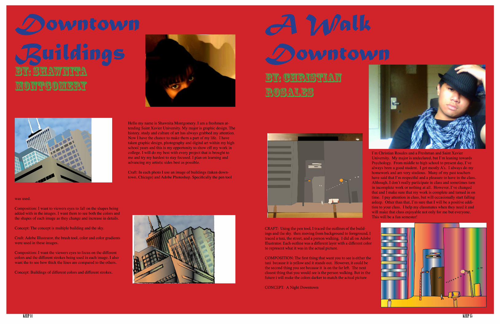
Downtown BuildingsBy: Shawnita Montgomery
A Walk DowntownBy: CHristian Rosales
Hello my name is Shawnita Montgomery. I am a freshmen at-tending Saint Xavier University. My major is graphic design. The history, study and culture of art has always grabbed my attention. Now I have the chance to make them a part of my life. I have taken graphic design, photography and digital art within my high school years and this is my opportunity to show off my work in college. I will do my best with every project that is brought to me and try my hardest to stay focused. I plan on learning and advancing my artistic sides best as possible.
Craft: In each photo I use an image of buildings (taken down-town, Chicago) and Adobe Photoshop. Specifically the pen tool
I’m Christian Rosales and a Freshman and Saint Xavier University. My major is undeclared, but I’m leaning towards Psychology. From middle to high school to present day, I’ve always been a good student. I get mostly A’s. I always do my homework and am very studious. Many of my past teachers have said that I’m respectful and a pleasure to have in the class. Although, I don’t really participate in class and sometimes turn in incomplete work or nothing at all. However, I’ve changed that and I make sure that my work is complete and turned in on time. I pay attention in class, but will occasionally start falling asleep. Other than that, I’m sure that I will be a positive addi-tion to your class. I help my classmates when they need it and will make that class enjoyable not only for me but everyone. This will be a fun semester!
was used.
Composition: I want to viewers eyes to fall on the shapes being added with in the images. I want them to see both the colors and the shapes of each image as they change and increase in details.
Concept: The concept is multiple building and the sky.
Craft: Adobe Illustrator, the brush tool, color and color gradients were used in these images.
Composition: I want the viewers eyes to focus on the different colors and the different strokes being used in each image. I also want the to see how thick the lines are compared to the others.
Concept: Buildings of different colors and different strokes.
CRAFT: Using the pen tool, I traced the outlines of the build-ings and the sky. then moving from background to foreground, I traced a taxi, the street, and a person walking. I did all on Adobe Illustrator. Each outline was a different layer with a different color to represent what it was in the actual picture.
COMPOSITION: The first thing that want you to see is either the taxi because it is yellow and it stands out. However, it could be the second thing you see because it is on the far left. The next closest thing that you would see is the person walking. But in the future i will make the colors darker to match the actual picture
CONCEPT: A Night Downtown

KEEP 16 KEEP 17
By: Tom Zwarycz
THE CRIBVisual Arts Center
By: Lovette Fernandez
In this work, I imported an image taken from my phone (Nexus One) into Adobe Illustrator. The original image can be seen above. After importing, I traced over the image creating boxes and other shapes that represented parts of the original image. I used the line and rectangle tools in order to create these shapes. I then used the eyedropper tool capture the correct color and used the gradi-
ent tool to add depth and shade where needed. Actual screen shots of the progress of this work can be seen below. Each day’s work is separated into different layers in the Illustra-tor file in order to easily locate a specific shape if needed. This project took a combined total of about 9 hours from start to finish.
My name is Tom Zwarycz. I went to Saint Laurence High School and I live in Chicago. I have taken 4 years of art in high school, one year being a computer graphics design class. I enjoy art and I also enjoy graphics design.
'm Lovette Fernandez, and I'm currently a senior student at Saint Xavier University, Chicago Illinois, majoring in Computer Studies and minoring in Business Administration. I finished my associates degree at Moraine Valley Community College last May 2010 and graduated Cum Laude. I finished my elementary school and high school at Paco Catholic school in the Philip-pines and graduated with honors. I believe that education is really important, because it helps us to be the person we want to be in life. Until next time! :)
I used my Nikon S60 camera to take a picture of the Visual Arts Center. I took a picture from an angle so when I place my picture on Adobe Illustra-tor it is going to be easier for me to zoom in and out of the picture. I used the pen tool, eyedropper tool to trace my art work. First, I put the VAC picture in a folder then opened Adobe Illustrator to make a new page and saved it on the folder where the VAC picture is. The two files has to be on the same folder because if not it is not going to work fine.
Second, I created a layer where the original picture is then another layer for my picture art. Third, I started tracing the outline of my picture by using the pen tool, because it is always easier to work from the background to the foreground, so I can be sloppy to the area where the foreground is going to over-lap the background. Fourth, I traced the details of the pic-ture and used the eyedropper tool to fill in colors closest to the original hue of the VAC picture. Fifth, I traced the
bricks one by one and used the eyedropper tool to mimic the original color of the bricks. For this exercise, I'm trying to render the reality of my artwork from the original picture. I took off the tree on the side, because I think it is not that important. Also, I added the bricks on the upper foreground of the building one by one like what I did on the bricks. The concept of my artwork is our school's Visual Arts Center. I think it is interesting because it gives different angles and I can control the eyes of my viewer to go to different direction.
KEEP 18 KEEP 19
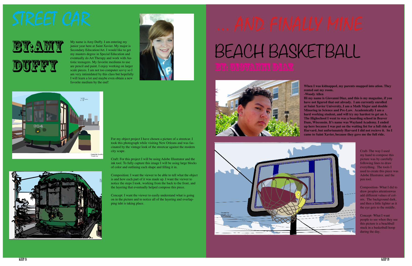
... AND FINALLY MINEBEACH BASKETBALLBy: Giovanni Diaz
STREET CARBy:Amy Duffy
When I was kidnapped, my parents snapped into ation. They rented out my room.-Woody AllenHi my name is Giovanni Diaz, and this is my magazine, if you have not figured that out already. I am currently enrolled at Saint Xavier University, I am a Math Major and double Minoring in Science and Pre-Law. Academically I am a hard working student, and will try my hardest to get an A. The Highschool I went to was a boarding school in Beaver Dam, Wisconsin. It’s name was Wayland Academy. I ended up here because I was put on the waiting list for a full ride at Harvard, but unfortunately Harvard I did not recieve it. So I came to Saint Xavier, because they gave me the full ride.
My name is Amy Duffy. I am entering my junior year here at Saint Xavier. My major is Secondary Education/Art. I would like to get my masters degree in Special Education and eventually do Art Therapy and work with Au-tistic teenagers. My favorite mediums to use are pencil and paint. I enjoy working on larger scale pieces. I am not too computer savvy so I am very intimidated by this class but hopefully I will learn a lot and maybe even obtain a new favorite medium by the end!
For my object project I have chosen a picture of a streetcar. I took this photograph while visiting New Orleans and was fas-cinated by the vintage look of the streetcar against the modern city scape.
Craft: For this project I will be using Adobe Illustrator and the ink tool. To fully capture this image I will be using large blocks of color and outlining each shape and filling it in.
Composition: I want the viewer to be able to tell what the object is and how each part of it was made up. I want the viewer to notice the steps I took, working from the back to the front, and the layering that eventually helped compose this piece.
Concept: I want the viewer to easily understand what is going on in the picture and to notice all of the layering and overlap-ping taht is taking place.
Craft- The way I used my hand to compose this picture was by carefully following lines to draw everything. The tools I used to create this piece was Adobe Illustrator, and the pen tool. Composition- What I did to draw peoples attentionwas add different values of col-ors. The background dark, and then a little lighter as it the eye gets to the middle.
Concept- What I want people to see when they see this picture is a beachball stuck in a basketball hoop during the day.
KEEP 20 KEEP 21
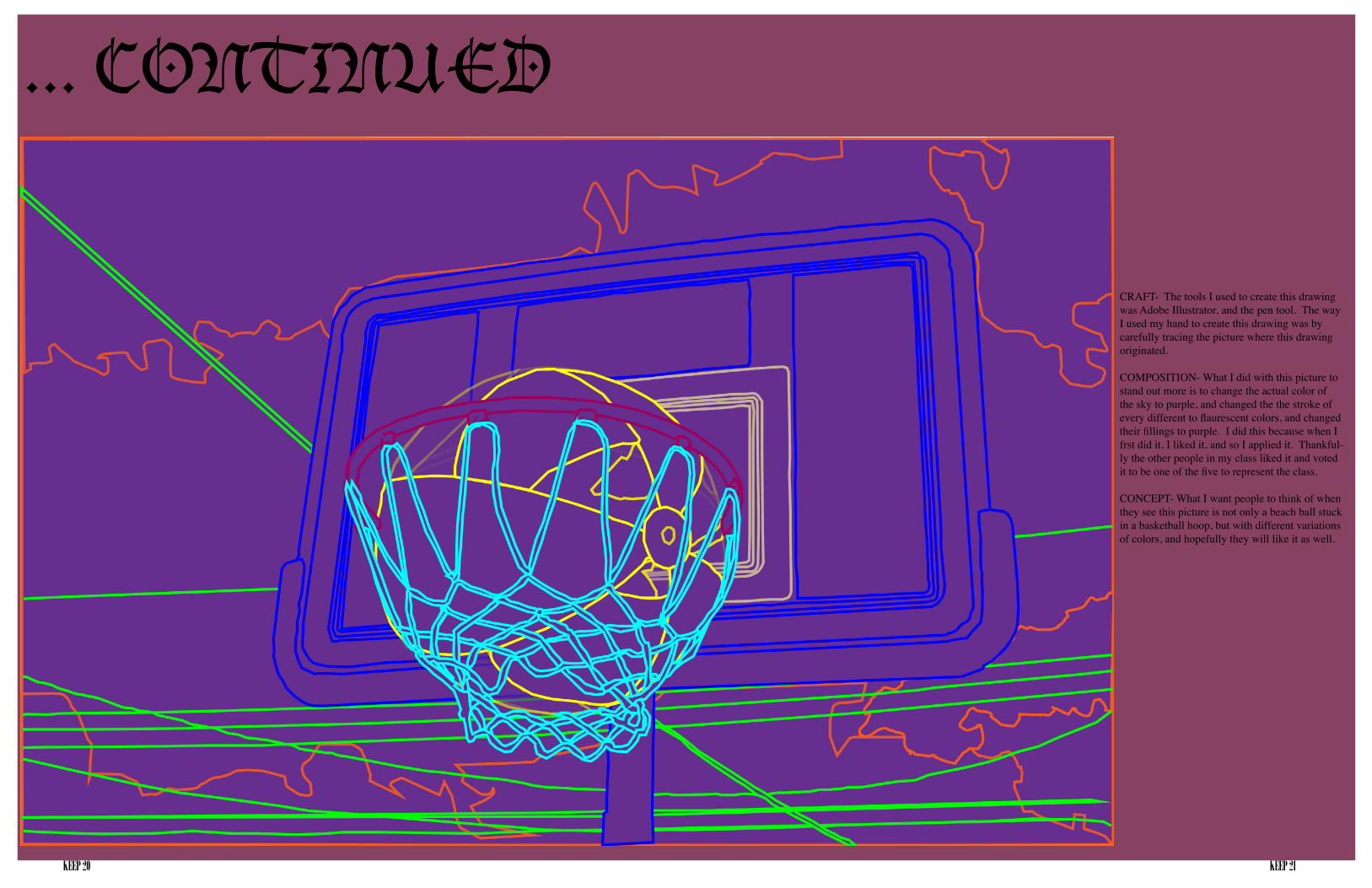
... CONTINUED
CRAFT- The tools I used to create this drawing was Adobe Illustrator, and the pen tool. The way I used my hand to create this drawing was by carefully tracing the picture where this drawing originated.
COMPOSITION- What I did with this picture to stand out more is to change the actual color of the sky to purple, and changed the the stroke of every different to flaurescent colors, and changed their fillings to purple. I did this because when I frst did it, I liked it, and so I applied it. Thankful-ly the other people in my class liked it and voted it to be one of the five to represent the class.
CONCEPT- What I want people to think of when they see this picture is not only a beach ball stuck in a basketball hoop, but with different variations of colors, and hopefully they will like it as well.
KEEP 22 KEEP 23
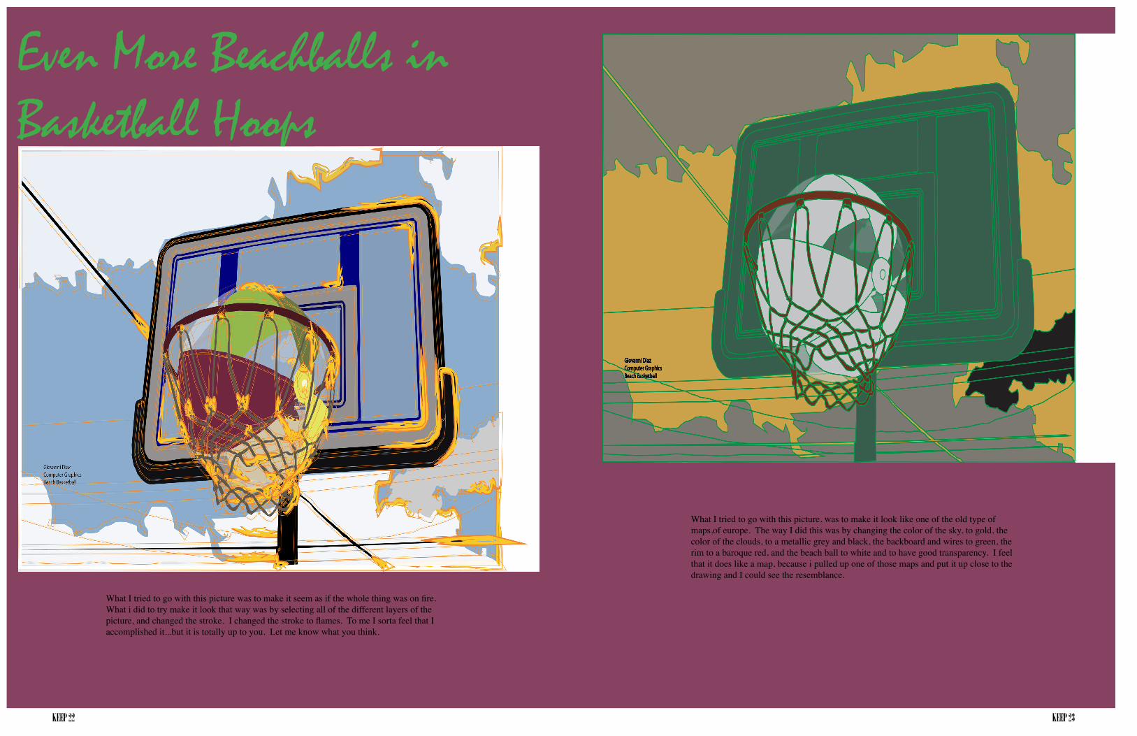
Even More Beachballs in Basketball Hoops
What I tried to go with this picture was to make it seem as if the whole thing was on fire. What i did to try make it look that way was by selecting all of the different layers of the picture, and changed the stroke. I changed the stroke to flames. To me I sorta feel that I accomplished it...but it is totally up to you. Let me know what you think.
What I tried to go with this picture, was to make it look like one of the old type of maps,of europe. The way I did this was by changing the color of the sky, to gold, the color of the clouds, to a metallic grey and black, the backboard and wires to green, the rim to a baroque red, and the beach ball to white and to have good transparency. I feel that it does like a map, because i pulled up one of those maps and put it up close to the drawing and I could see the resemblance.
KEEP 24 KEEP 25
T E A P O T S
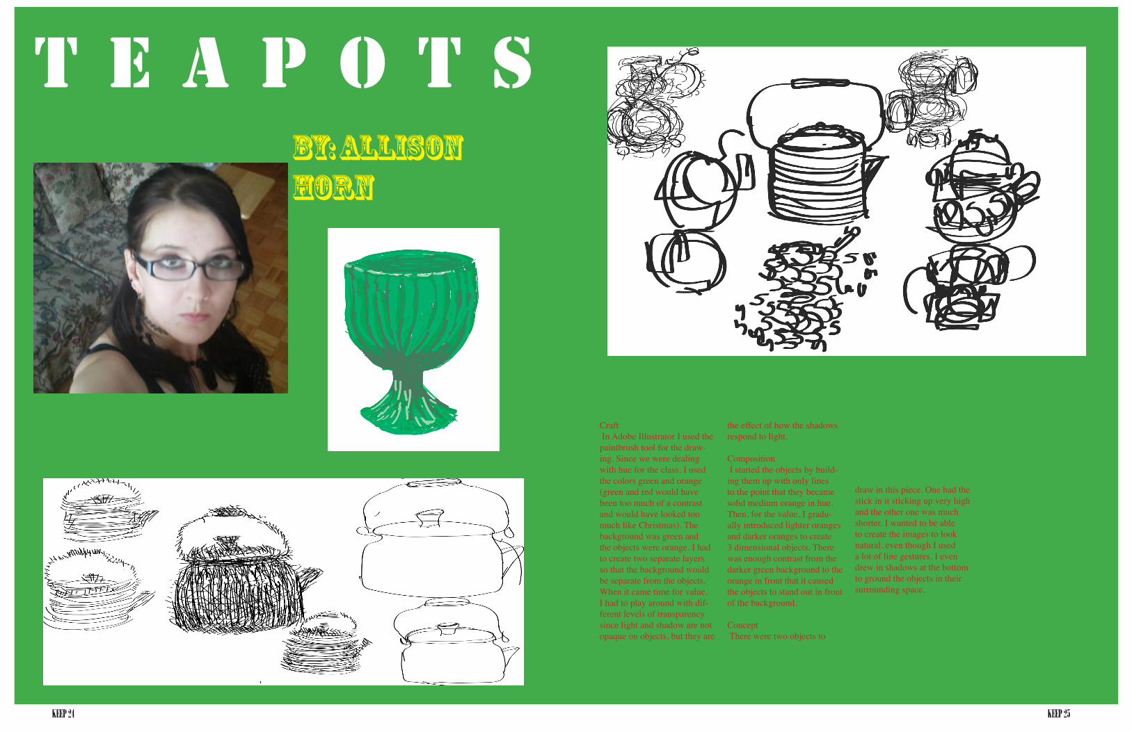
Craft In Adobe Illustrator I used the paintbrush tool for the draw-ing. Since we were dealing with hue for the class, I used the colors green and orange (green and red would have been too much of a contrast and would have looked too much like Christmas). The background was green and the objects were orange. I had to create two separate layers so that the background would be separate from the objects. When it came time for value, I had to play around with dif-ferent levels of transparency since light and shadow are not opaque on objects, but they are
By: Allison Horn
the effect of how the shadows respond to light.
Composition I started the objects by build-ing them up with only lines to the point that they became solid medium orange in hue. Then, for the value, I gradu-ally introduced lighter oranges and darker oranges to create 3 dimensional objects. There was enough contrast from the darker green background to the orange in front that it caused the objects to stand out in front of the background.
Concept There were two objects to
draw in this piece. One had the stick in it sticking up very high and the other one was much shorter. I wanted to be able to create the images to look natural, even though I used a lot of line gestures. I even drew in shadows at the bottom to ground the objects in their surrounding space.
KEEP 26 KEEP 27
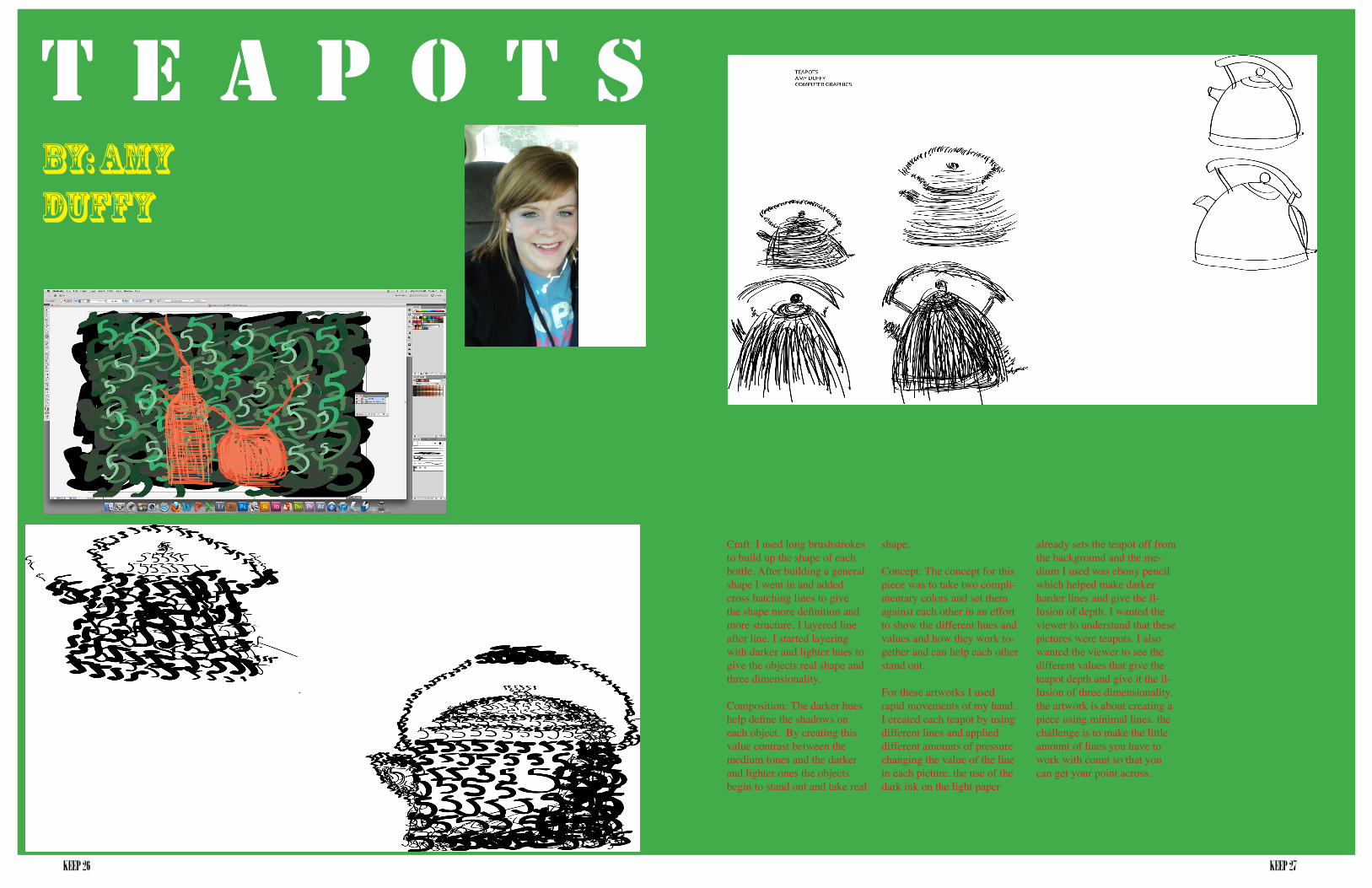
Craft: I used long brushstrokes to build up the shape of each bottle. After building a general shape I went in and added cross hatching lines to give the shape more definition and more structure. I layered line after line. I started layering with darker and lighter hues to give the objects real shape and three dimensionality.
Composition: The darker hues help define the shadows on each object. By creating this value contrast between the medium tones and the darker and lighter ones the objects begin to stand out and take real
T E A P O T SBy: Amy Duffy
shape.
Concept: The concept for this piece was to take two compli-mentary colors and set them against each other in an effort to show the different hues and values and how they work to-gether and can help each other stand out.
For these artworks I used rapid movements of my hand. I created each teapot by using different lines and applied different amounts of pressure changing the value of the line in each picture. the use of the dark ink on the light paper
already sets the teapot off from the background and the me-dium I used was ebony pencil which helped make darker harder lines and give the il-lusion of depth. I wanted the viewer to understand that these pictures were teapots. I also wanted the viewer to see the different values that give the teapot depth and give it the il-lusion of three dimensionality. the artwork is about creating a piece using minimal lines. the challenge is to make the little amount of lines you have to work with count so that you can get your point across.
KEEP 28 KEEP 29
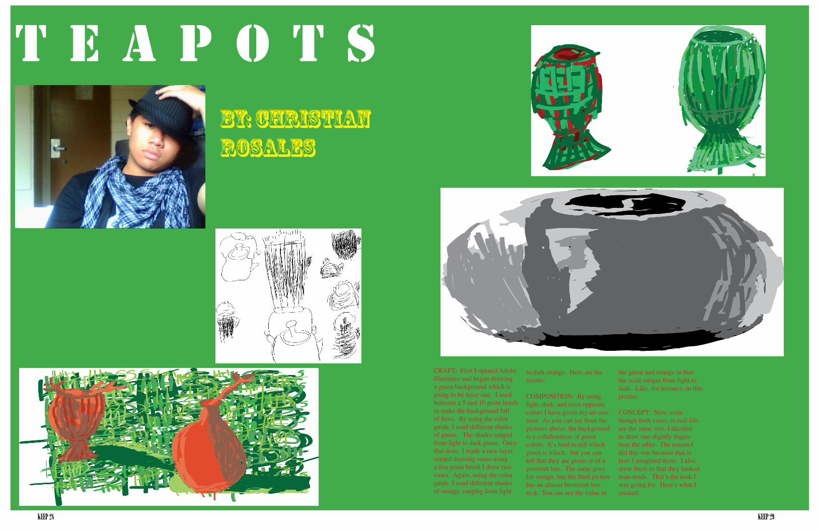
CRAFT: First I opened Adobe Illustrator and began drawing a green background which is going to be layer one. I used between a 5 and 10 point brush to make the background full of fives. By using the color guide, I used different shades of green. The shades ranged from light to dark green. Once that done, I made a new layer, started drawing vases using a five point brush I drew two vases. Again, using the color guide, I used different shades of orange, ranging from light
T E A P O T SBy: Christian Rosales
to dark orange. Here are the results:
COMPOSITION: By using light, dark, and even opposite colors I have given my art con-trast. As you can see from the pictures above, the background is a collaboration of green colors. It’s hard to tell which green is which, but you can tell that they are green or of a greenish hue. The same goes for orange, but the third picture has an almost brownish hue to it. You can see the value in
the green and orange in that the scale ranges from light to dark. Like, for instance, in this picture:
CONCEPT: Now, even though both vases, in real life, are the same size, I decided to draw one slightly bigger than the other. The reason I did this was because that is how I imagined them. I also drew them so that they looked man-made. That’s the look I was going for. Here’s what I created:
KEEP 30 KEEP 31
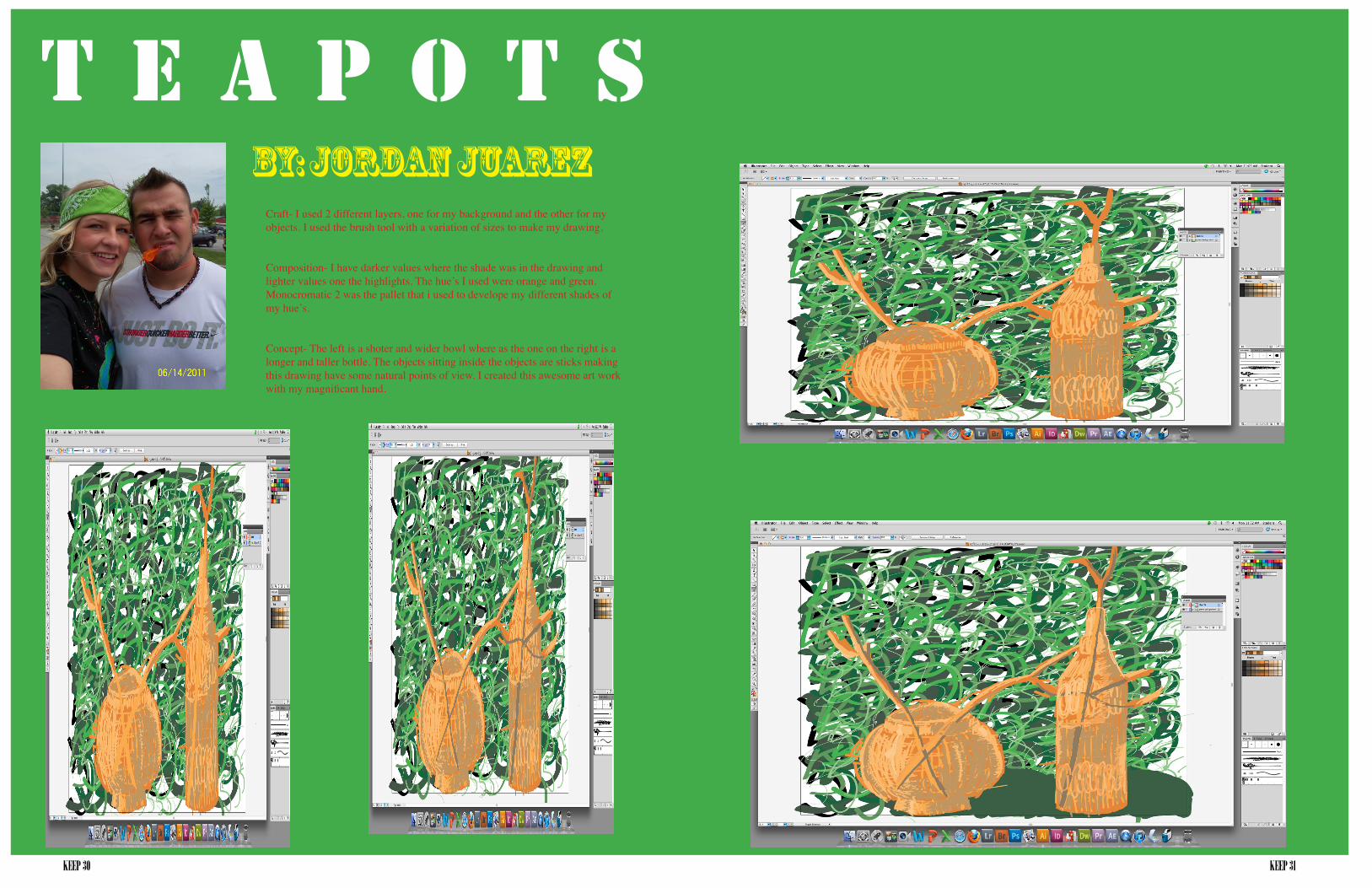
Craft- I used 2 different layers, one for my background and the other for my objects. I used the brush tool with a variation of sizes to make my drawing.
Composition- I have darker values where the shade was in the drawing and lighter values one the highlights. The hue’s I used were orange and green. Monocromatic 2 was the pallet that i used to develope my different shades of my hue’s.
Concept- The left is a shoter and wider bowl where as the one on the right is a longer and taller bottle. The objects sitting inside the objects are sticks making this drawing have some natural points of view. I created this awesome art work with my magnificant hand.
T E A P O T SBy: Jordan Juarez
KEEP 32 KEEP 33
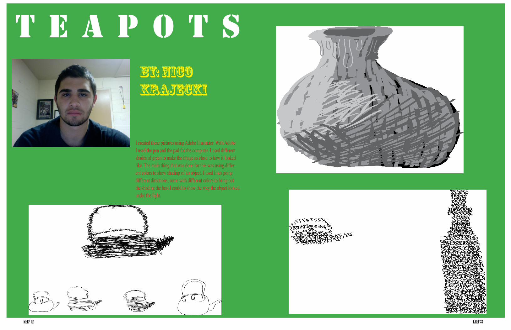
I created these pictures using Adobe Illustrator. With Adobe I used the pen and the pad for the computer. I used different shades of green to make the image as close to how it looked like. The main thing that was done for this was using differ-ent colors to show shading of an object. I used lines going different directions, some with different colors to bring out the shading the best I could to show the way the object looked under the light.
T E A P O T SBy: Nico Krajecki

KEEP 34 KEEP 35
Craft: For the following images I use Adobe Illustrator. The tools for this were the paint brush, color guide (using mul-tiple forms of color) and the the brush stroke. Also a glass bottle and small round vase was used, and a bright light to give the objects shades.
Composition: I want my audience to see the growth of my images as they develop more color and detail. I way their eyes to fall on the shades and shadows as well as the shapes outline. Focus on the Hue’s and values of the images. The images were created for my computer graphics class recently and I want my growth or skills to be noticed as I try to advance my work to my best.
Concept: The main focus of these im-ages are about a glass bottle and a small round vase with lots of shadows.
T E A P O T SBy: Shawnita Montgomery
KEEP 36 KEEP 37
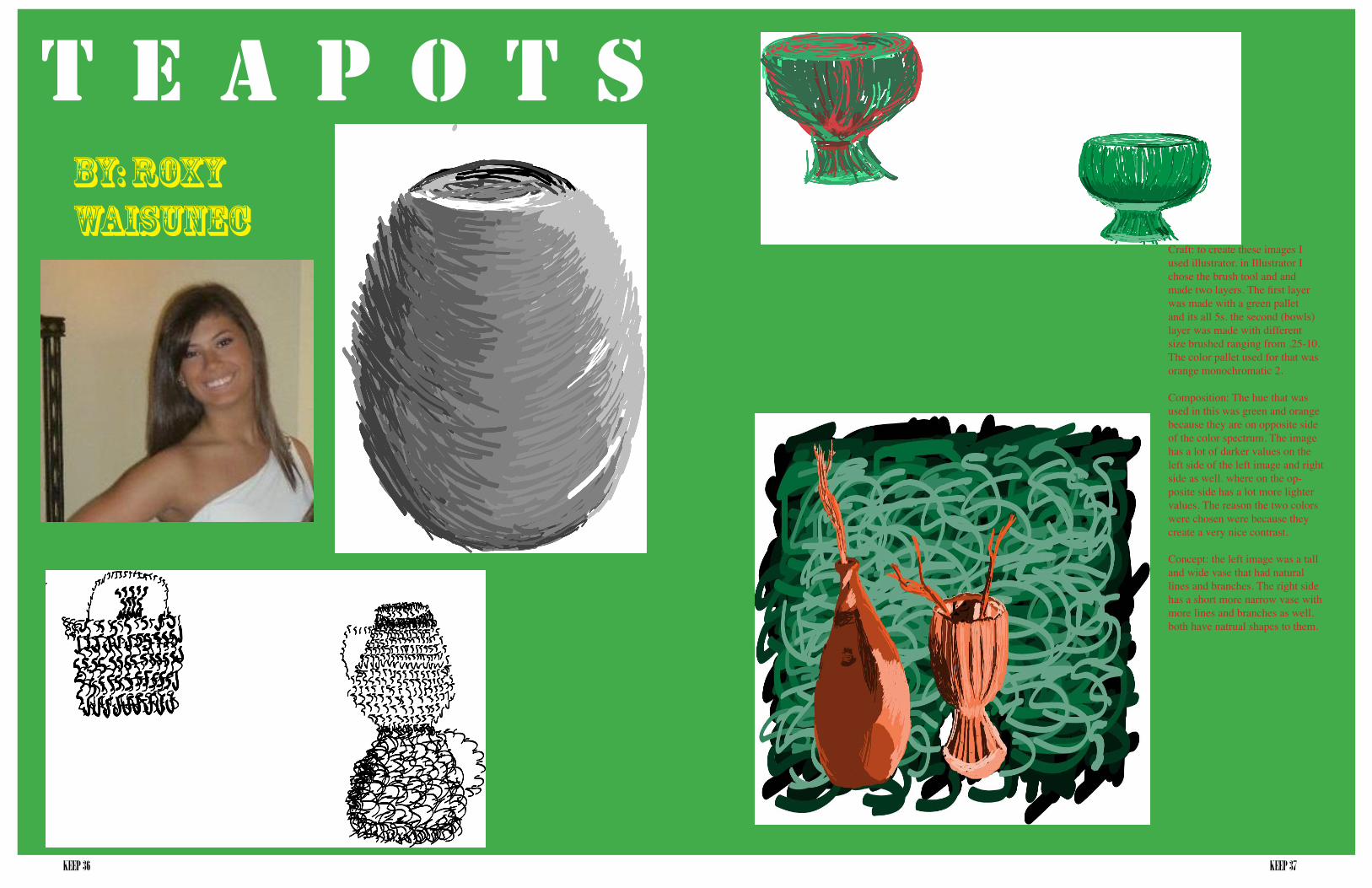
Craft: to create these images I used illustrator. in Illustrator I chose the brush tool and and made two layers. The first layer was made with a green pallet and its all 5s. the second (bowls) layer was made with different size brushed ranging from .25-10. The color pallet used for that was orange monochromatic 2.
Composition: The hue that was used in this was green and orange because they are on opposite side of the color spectrum. The image has a lot of darker values on the left side of the left image and right side as well. where on the op-posite side has a lot more lighter values. The reason the two colors were chosen were because they create a very nice contrast.
Concept: the left image was a tall and wide vase that had natural lines and branches. The right side has a short more narrow vase with more lines and branches as well. both have natrual shapes to them.
T E A P O T SBy: Roxy Waisunec

KEEP 38 KEEP 39
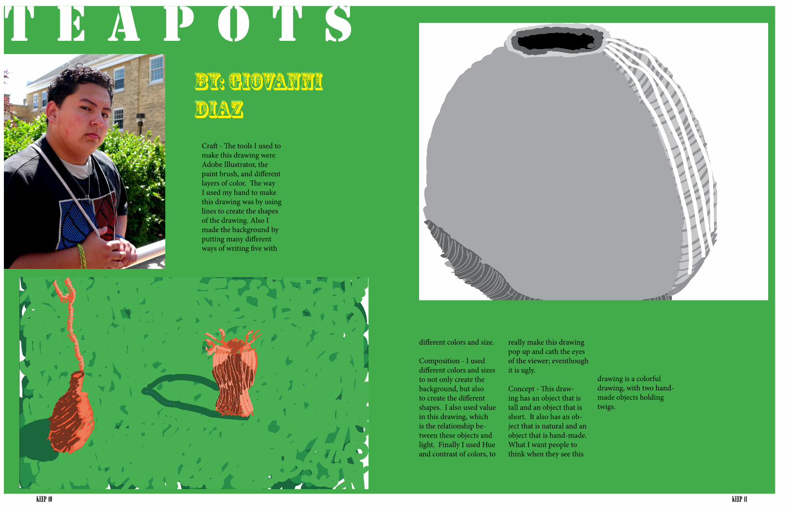
Craft - The tools I used to make this drawing were Adobe Illustrator, the paint brush, and different layers of color. The way I used my hand to make this drawing was by using lines to create the shapes of the drawing. Also I made the background by putting many different ways of writing five with different colors and size.
Composition - I used different colors and sizes to not only create the background, but also to create the different shapes. I also used value in this drawing, which is the relationship be-tween these objects and light. Finally I used Hue and contrast of colors, to really make this drawing pop up and cath the eyes of the viewer; eventhough it is ugly.
Concept - This drawing has an object that is tall and an object that is short. It also has an object that is natural and an object that is hand-made. What I want people to think when they see this drawing is a colorful drawing, with two handmade objects holding twigs.
The way I set up these pictures, was by organizing them in chronological order. From how the teapots looked like when I took the first picture, and when I finished them.
T E A P O T SBy: Giovanni Diaz
KEEP 40 KEEP 41
T E A P O T SBy: Giovanni Diaz
Craft - The tools I used to make this drawing were Adobe Illustrator, the paint brush, and different layers of color. The way I used my hand to make this drawing was by using lines to create the shapes of the drawing. Also I made the background by putting many different ways of writing five with
different colors and size.
Composition - I used different colors and sizes to not only create the background, but also to create the different shapes. I also used value in this drawing, which is the relationship be-tween these objects and light. Finally I used Hue and contrast of colors, to
really make this drawing pop up and cath the eyes of the viewer; eventhough it is ugly.
Concept - This draw-ing has an object that is tall and an object that is short. It also has an ob-ject that is natural and an object that is hand-made. What I want people to think when they see this
drawing is a colorful drawing, with two hand-made objects holding twigs.