ggobi manual - ggobi data visualization system. · several displays can be open simultaneously and...
TRANSCRIPT
GGobi Manual
Deborah F. Swayne, AT&T Labs – ResearchDi Cook, Iowa State University
Andreas Buja, The Wharton School, University of PennsylvaniaDuncan Temple Lang, University of California at Davis
Hadley Wickham, Iowa State UniversityMichael Lawrence, Iowa State University
September 2006
GGobi is an open source visualization program for exploring high-dimensionaldata. It provides highly dynamic and interactive graphics such as tours, as well asfamiliar graphics such as the scatterplot, barchart and parallel coordinates plots.Plots are interactive and linked with brushing and identification.
It includes 2-D displays of projections of points and edges in high-dimensionalspaces, scatterplot matrices, parallel coordinate, time series plots and bar charts.Projection tools include average shifted histograms of single variables, plots of pairsof variables, and grand tours of multiple variables. Points can be labelled andbrushed with glyphs and colors. Several displays can be open simultaneously andlinked for labelling and brushing. Missing data are accommodated and their patternscan be examined.
1
Contents
1 Introduction 4
2 Tutorial 4
3 Layout and functionality 93.1 The major functions . . . . . . . . . . . . . . . . . . . . . . . . . . . . . . . . . . 93.2 Graphical displays . . . . . . . . . . . . . . . . . . . . . . . . . . . . . . . . . . . 13
4 Data format 154.1 XML . . . . . . . . . . . . . . . . . . . . . . . . . . . . . . . . . . . . . . . . . . . 154.2 CSV files . . . . . . . . . . . . . . . . . . . . . . . . . . . . . . . . . . . . . . . . 15
5 View modes: projections 165.1 1D plots . . . . . . . . . . . . . . . . . . . . . . . . . . . . . . . . . . . . . . . . . 165.2 XY plots . . . . . . . . . . . . . . . . . . . . . . . . . . . . . . . . . . . . . . . . . 175.3 1D Tour . . . . . . . . . . . . . . . . . . . . . . . . . . . . . . . . . . . . . . . . . 175.4 2D Tour . . . . . . . . . . . . . . . . . . . . . . . . . . . . . . . . . . . . . . . . . 185.5 Rotation: 2D Tour with Three Variables . . . . . . . . . . . . . . . . . . . . . . . 195.6 2x1D Tour . . . . . . . . . . . . . . . . . . . . . . . . . . . . . . . . . . . . . . . . 19
6 Interaction modes 206.1 Scaling of axes . . . . . . . . . . . . . . . . . . . . . . . . . . . . . . . . . . . . . 206.2 Brush: brushing of points and edges . . . . . . . . . . . . . . . . . . . . . . . . . 206.3 Identification . . . . . . . . . . . . . . . . . . . . . . . . . . . . . . . . . . . . . . 236.4 Edit edges . . . . . . . . . . . . . . . . . . . . . . . . . . . . . . . . . . . . . . . . 246.5 Move points . . . . . . . . . . . . . . . . . . . . . . . . . . . . . . . . . . . . . . . 24
7 Tools 267.1 Variable manipulation tool . . . . . . . . . . . . . . . . . . . . . . . . . . . . . . . 267.2 Variable transformation tool . . . . . . . . . . . . . . . . . . . . . . . . . . . . . . 267.3 Sphering . . . . . . . . . . . . . . . . . . . . . . . . . . . . . . . . . . . . . . . . . 277.4 Jittering . . . . . . . . . . . . . . . . . . . . . . . . . . . . . . . . . . . . . . . . . 277.5 Color schemes . . . . . . . . . . . . . . . . . . . . . . . . . . . . . . . . . . . . . . 277.6 Automatic brushing . . . . . . . . . . . . . . . . . . . . . . . . . . . . . . . . . . 287.7 Color & glyph groups . . . . . . . . . . . . . . . . . . . . . . . . . . . . . . . . . 287.8 Subsetting . . . . . . . . . . . . . . . . . . . . . . . . . . . . . . . . . . . . . . . . 297.9 Controls for missing data . . . . . . . . . . . . . . . . . . . . . . . . . . . . . . . 30
8 Multiple datasets 30
9 Edges 31
10 Large data 3110.1 Large N . . . . . . . . . . . . . . . . . . . . . . . . . . . . . . . . . . . . . . . . . 31
2
11 Differences from XGobi 3311.1 Multiple displays . . . . . . . . . . . . . . . . . . . . . . . . . . . . . . . . . . . . 3311.2 Data format . . . . . . . . . . . . . . . . . . . . . . . . . . . . . . . . . . . . . . . 3311.3 Integration . . . . . . . . . . . . . . . . . . . . . . . . . . . . . . . . . . . . . . . 3411.4 Variable selection . . . . . . . . . . . . . . . . . . . . . . . . . . . . . . . . . . . . 3411.5 The variable manipulation tool . . . . . . . . . . . . . . . . . . . . . . . . . . . . 3411.6 Changes in projection, interaction and tools . . . . . . . . . . . . . . . . . . . . . 3511.7 On-line help . . . . . . . . . . . . . . . . . . . . . . . . . . . . . . . . . . . . . . . 35
3
1 Introduction
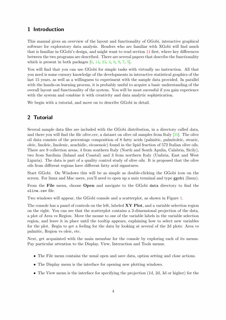
This manual gives an overview of the layout and functionality of GGobi, interactive graphicalsoftware for exploratory data analysis. Readers who are familiar with XGobi will find muchthat is familiar in GGobi’s design, and might want to read section 11 first, where key differencesbetween the two programs are described. There are several papers that describe the functionalitywhich is present in both packages [6, 14, 13, 4, 8, 9, 7, 5].
You will find that you can use GGobi for simple tasks with virtually no instruction. All thatyou need is some cursory knowledge of the developments in interactive statistical graphics of thelast 15 years, as well as a willingness to experiment with the sample data provided. In parallelwith the hands-on learning process, it is probably useful to acquire a basic understanding of theoverall layout and functionality of the system. You will be most sucessful if you gain experiencewith the system and combine it with creativity and data analytic sophistication.
We begin with a tutorial, and move on to describe GGobi in detail.
2 Tutorial
Several sample data files are included with the GGobi distribution, in a directory called data,and there you will find the file olive.csv, a dataset on olive oil samples from Italy [10]. The oliveoil data consists of the percentage composition of 8 fatty acids (palmitic, palmitoleic, stearic,oleic, linoleic, linolenic, arachidic, eicosenoic) found in the lipid fraction of 572 Italian olive oils.There are 9 collection areas, 4 from southern Italy (North and South Apulia, Calabria, Sicily),two from Sardinia (Inland and Coastal) and 3 from northern Italy (Umbria, East and WestLiguria). The data is part of a quality control study of olive oils. It is proposed that the oliveoils from different regions have different fatty acid signatures.
Start GGobi. On Windows this will be as simple as double-clicking the GGobi icon on thescreen. For linux and Mac users, you’ll need to open up a unix terminal and type ggobi (linux).
From the File menu, choose Open and navigate to the GGobi data directory to find theolive.csv file.
Two windows will appear, the GGobi console and a scatterplot, as shown in Figure 1.
The console has a panel of controls on the left, labeled XY Plot, and a variable selection regionon the right. You can see that the scatterplot contains a 2-dimensional projection of the data,a plot of Area vs Region. Move the mouse to one of the variable labels in the variable selectionregion, and leave it in place until the tooltip appears, explaining how to select new variablesfor the plot. Begin to get a feeling for the data by looking at several of the 2d plots: Area vspalmitic, Region vs oleic, etc.
Next, get acquainted with the main menubar for the console by exploring each of its menus.Pay particular attention to the Display, View, Interaction and Tools menus.
• The File menu contains the usual open and save data, option setting and close actions.
• The Display menu is the interface for opening new plotting windows.
• The View menu is the interface for specifying the projection (1d, 2d, 3d or higher) for the
4
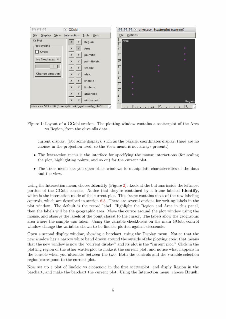
Figure 1: Layout of a GGobi session. The plotting window contains a scatterplot of the Areavs Region, from the olive oils data.
current display. (For some displays, such as the parallel coordinates display, there are nochoices in the projection used, so the View menu is not always present.)
• The Interaction menu is the interface for specifying the mouse interactions (for scalingthe plot, highlighting points, and so on) for the current plot.
• The Tools menu lets you open other windows to manipulate characteristics of the dataand the view.
Using the Interaction menu, choose Identify (Figure 2). Look at the buttons inside the leftmostportion of the GGobi console. Notice that they’re contained by a frame labeled Identify,which is the interaction mode of the current plot. This frame contains most of the row labelingcontrols, which are described in section 6.3. There are several options for writing labels in theplot window. The default is the record label. Highlight the Region and Area in this panel,then the labels will be the geographic area. Move the cursor around the plot window using themouse, and observe the labels of the point closest to the cursor. The labels show the geographicarea where the sample was taken. Using the variable checkboxes on the main GGobi controlwindow change the variables shown to be linoleic plotted against eicosenoic.
Open a second display window, showing a barchart, using the Display menu. Notice that thenew window has a narrow white band drawn around the outside of the plotting area: that meansthat the new window is now the “current display” and its plot is the “current plot.” Click in theplotting region of the other scatterplot to make it the current plot, and notice what happens inthe console when you alternate between the two. Both the controls and the variable selectionregion correspond to the current plot.
Now set up a plot of linoleic vs eicosenoic in the first scatterplot, and disply Region in thebarchart, and make the barchart the current plot. Using the Interaction menu, choose Brush.
5
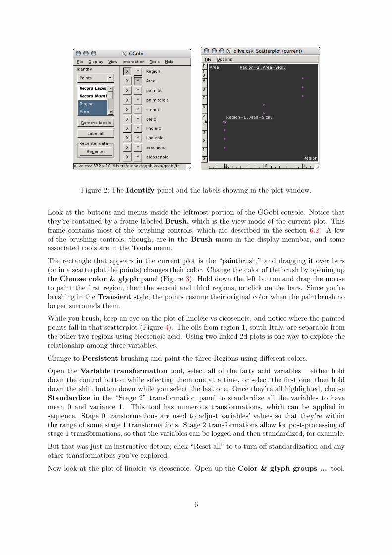
Figure 2: The Identify panel and the labels showing in the plot window.
Look at the buttons and menus inside the leftmost portion of the GGobi console. Notice thatthey’re contained by a frame labeled Brush, which is the view mode of the current plot. Thisframe contains most of the brushing controls, which are described in the section 6.2. A fewof the brushing controls, though, are in the Brush menu in the display menubar, and someassociated tools are in the Tools menu.
The rectangle that appears in the current plot is the “paintbrush,” and dragging it over bars(or in a scatterplot the points) changes their color. Change the color of the brush by opening upthe Choose color & glyph panel (Figure 3). Hold down the left button and drag the mouseto paint the first region, then the second and third regions, or click on the bars. Since you’rebrushing in the Transient style, the points resume their original color when the paintbrush nolonger surrounds them.
While you brush, keep an eye on the plot of linoleic vs eicosenoic, and notice where the paintedpoints fall in that scatterplot (Figure 4). The oils from region 1, south Italy, are separable fromthe other two regions using eicosenoic acid. Using two linked 2d plots is one way to explore therelationship among three variables.
Change to Persistent brushing and paint the three Regions using different colors.
Open the Variable transformation tool, select all of the fatty acid variables – either holddown the control button while selecting them one at a time, or select the first one, then holddown the shift button down while you select the last one. Once they’re all highlighted, chooseStandardize in the “Stage 2” transformation panel to standardize all the variables to havemean 0 and variance 1. This tool has numerous transformations, which can be applied insequence. Stage 0 transformations are used to adjust variables’ values so that they’re withinthe range of some stage 1 transformations. Stage 2 transformations allow for post-processing ofstage 1 transformations, so that the variables can be logged and then standardized, for example.
But that was just an instructive detour; click “Reset all” to to turn off standardization and anyother transformations you’ve explored.
Now look at the plot of linoleic vs eicosenoic. Open up the Color & glyph groups ... tool,
6
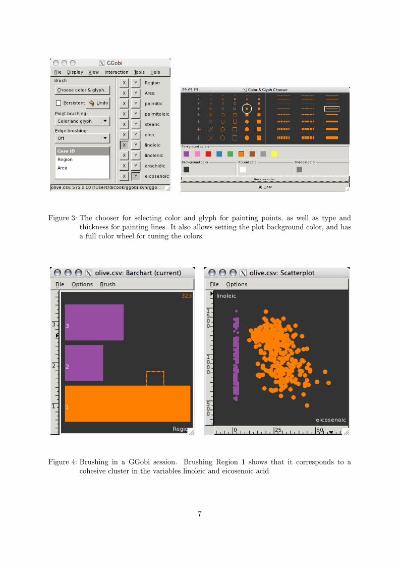
Figure 3: The chooser for selecting color and glyph for painting points, as well as type andthickness for painting lines. It also allows setting the plot background color, and hasa full color wheel for tuning the colors.
Figure 4: Brushing in a GGobi session. Brushing Region 1 shows that it corresponds to acohesive cluster in the variables linoleic and eicosenoic acid.
7
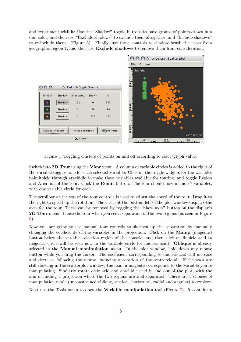
and experiment with it: Use the “Shadow” toggle buttons to have groups of points drawn in adim color, and then use “Exclude shadows” to exclude them altogether, and “Include shadows”to re-include them. (Figure 5). Finally, use these controls to shadow brush the cases fromgeographic region 1, and then use Exclude shadows to remove them from consideration.
Figure 5: Toggling clusters of points on and off according to color/glyph value.
Switch into 2D Tour using the View menu. A column of variable circles is added to the right ofthe variable toggles, one for each selected variable. Click on the toggle widgets for the variablespalmitoleic through arachidic to make these variables available for touring, and toggle Regionand Area out of the tour. Click the Reinit button. The tour should now include 7 variables,with one variable circle for each.
The scrollbar at the top of the tour controls is used to adjust the speed of the tour. Drag it tothe right to speed up the rotation. The circle at the bottom left of the plot window displays theaxes for the tour. These can be removed by toggling the “Show axes” button on the display’s2D Tour menu. Pause the tour when you see a separation of the two regions (as seen in Figure6).
Now you are going to use manual tour controls to sharpen up the separation by manuallychanging the coefficients of the variables in the projection. Click on the Manip (magenta)button below the variable selection region of the console, and then click on linoleic acid (amagenta circle will be seen now in the variable circle for linoleic acid). Oblique is alreadyselected in the Manual manipulation menu. In the plot window, hold down any mousebutton while you drag the cursor. The coefficient corresponding to linoleic acid will increaseand decrease following the mouse, inducing a rotation of the scattercloud. If the axes arestill showing in the scatterplot window, the axis in magenta corresponds to the variable you’remanipulating. Similarly rotate oleic acid and arachidic acid in and out of the plot, with theaim of finding a projection where the two regions are well separated. There are 5 choices ofmanipulation mode (unconstrained oblique, vertical, horizontal, radial and angular) to explore.
Next use the Tools menu to open the Variable manipulation tool (Figure 7). It contains a
8
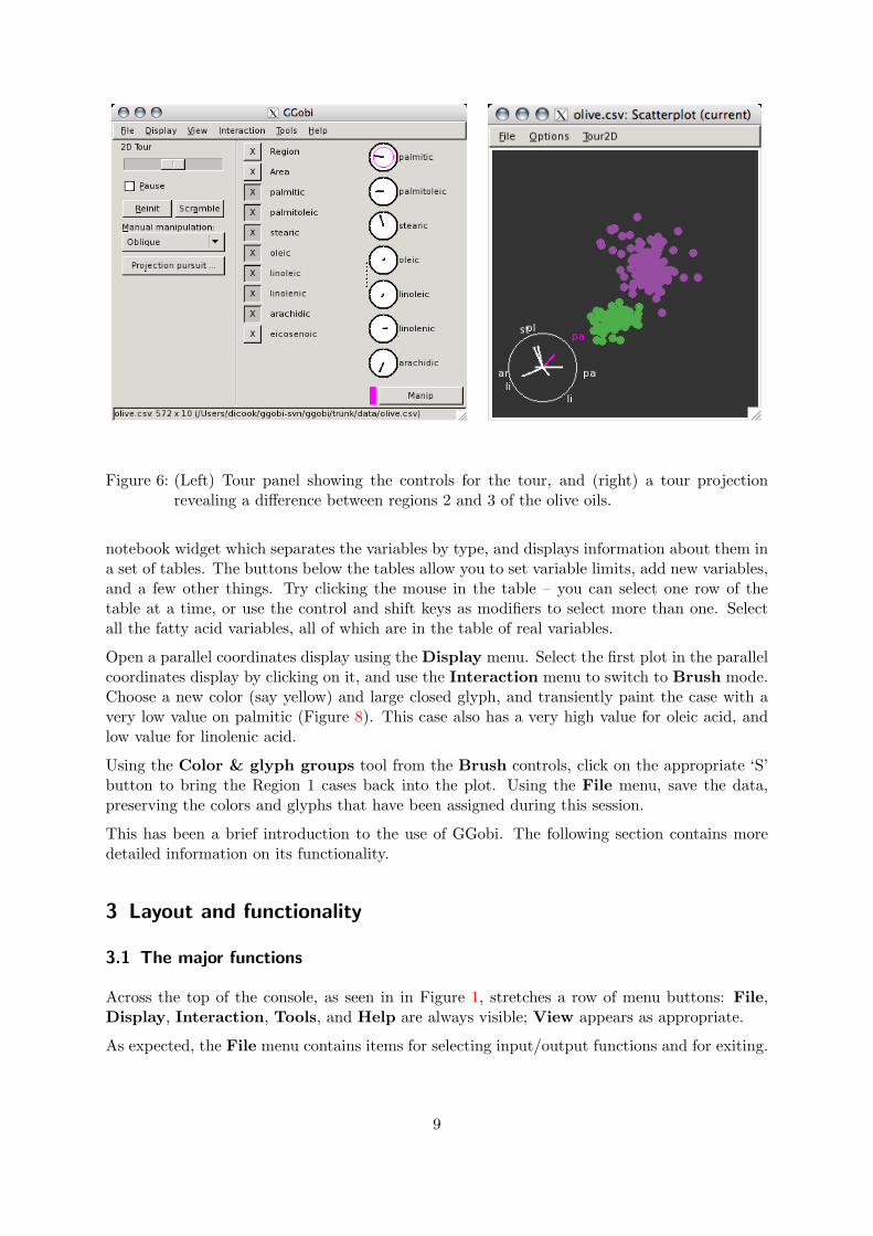
Figure 6: (Left) Tour panel showing the controls for the tour, and (right) a tour projectionrevealing a difference between regions 2 and 3 of the olive oils.
notebook widget which separates the variables by type, and displays information about them ina set of tables. The buttons below the tables allow you to set variable limits, add new variables,and a few other things. Try clicking the mouse in the table – you can select one row of thetable at a time, or use the control and shift keys as modifiers to select more than one. Selectall the fatty acid variables, all of which are in the table of real variables.
Open a parallel coordinates display using the Display menu. Select the first plot in the parallelcoordinates display by clicking on it, and use the Interaction menu to switch to Brush mode.Choose a new color (say yellow) and large closed glyph, and transiently paint the case with avery low value on palmitic (Figure 8). This case also has a very high value for oleic acid, andlow value for linolenic acid.
Using the Color & glyph groups tool from the Brush controls, click on the appropriate ‘S’button to bring the Region 1 cases back into the plot. Using the File menu, save the data,preserving the colors and glyphs that have been assigned during this session.
This has been a brief introduction to the use of GGobi. The following section contains moredetailed information on its functionality.
3 Layout and functionality
3.1 The major functions
Across the top of the console, as seen in in Figure 1, stretches a row of menu buttons: File,Display, Interaction, Tools, and Help are always visible; View appears as appropriate.
As expected, the File menu contains items for selecting input/output functions and for exiting.
9
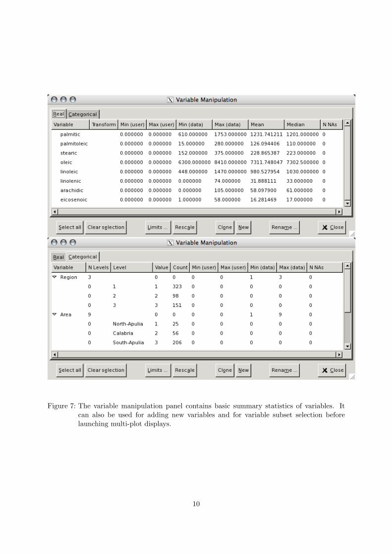
Figure 7: The variable manipulation panel contains basic summary statistics of variables. Itcan also be used for adding new variables and for variable subset selection beforelaunching multi-plot displays.
10
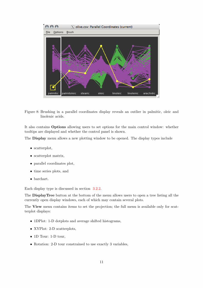
Figure 8: Brushing in a parallel coordinates display reveals an outlier in palmitic, oleic andlinolenic acids.
It also contains Options allowing users to set options for the main control window: whethertooltips are displayed and whether the control panel is shown.
The Display menu allows a new plotting window to be opened. The display types include
• scatterplot,
• scatterplot matrix,
• parallel coordinates plot,
• time series plots, and
• barchart.
Each display type is discussed in section 3.2.2.
The DisplayTree button at the bottom of the menu allows users to open a tree listing all thecurrently open display windows, each of which may contain several plots.
The View menu contains items to set the projection; the full menu is available only for scat-terplot displays:
• 1DPlot: 1-D dotplots and average shifted histograms,
• XYPlot: 2-D scatterplots,
• 1D Tour: 1-D tour,
• Rotation: 2-D tour constrained to use exactly 3 variables,
11
• 2D Tour: 2-D tour,
• 2x1D Tour: a correlation tour; that is, independent 1-D tours on horizontal and verticalaxes,
When you choose a new view, the Interaction mode (described next) is also changed. Eachview is discussed in section 5.
The Interaction menu contains items to set the interaction type. Each View also has its ownset of interactions, and appears on the Interaction menu when selected. The Interaction modesthemselves are:
• Scale: axis scaling,
• Brush: setting point glyphs, edge types, and point and edge colors,
• Identify: labeling points,
• Edit Edges: add points or edges.
• Move Points: direct manipulation of point positions,
When you choose a new interaction mode, the controls at the left of the main window willchange correspondingly: each mode has its own parameters and its own rules for responding tomouse actions in the plotting windows. The interaction modes are discussed in section 6.
The Tools menu gives access to
• a variable manipulation table,
• a variable transformation pipeline,
• a variable sphering panel,
• jittering controls,
• a panel for selecting a new color scheme for drawing, and then for automatically brushingpoints and edges by mapping the color scheme onto a selected variable.
• a panel for brushing and excluding groups of cases,
• subsetting functions for systematic and random subsampling,
• a tool for managing missing values.
Each of these tools is discussed in section 7.
12
3.2 Graphical displays
3.2.1 Current display, current plot
Since there are multiple displays, some of which contain multiple plots, the question arises:Which plot in which display window corresponds to the console? If you select the Scale mode,how can you tell which plot is going to respond?
There is in GGobi a notion of the “current display” and the “current plot.” (We need bothbecause some displays, like the scatterplot matrix, contain multiple plots.) The current plotis the one which is outlined with a thick white border; the current display is the one whichcontains the current plot.
To reset the current plot and display, just click once (left, right or middle) in the plot youwish to address. To understand the effects of this selection, open a few displays and set themin different interaction modes, then click on different plots and see what happens. The whiteborder follows your actions, and the console updates so that its control panel corresponds tothe current display type and view mode.
3.2.2 Display types
Each display type is briefly described here. As mentioned earlier, there are presently five maindisplay types:
The scatterplot display is a window containing a single scatterplot. It has the largest numberof view (projection) modes of any display, and each projection has its own rules for variableselection. The main variable selection interface for the XYPlot modes uses toggle buttons:clicking on the X button selects the variable to plot horizontally, and clicking on Y selects thevariable to plot vertically. (There’s a less obvious variable selection interface as a shortcut:clicking left (right) on the variable label selects the X (Y) variable.) The interface for the 1Dplot is similar: it only shows one column of toggle buttons, so clicking on X selects the variableto be plotted irrespective of the plot orientation. (Using the variable label shortcut, you canchange the plot orientation as you make a variable selection.)
The tour modes, including rotation, all use toggle buttons to select a subset of variables to beavailable for touring, and a column of variable circles, one for each variable in the subset. Thevariable circles can be used to further refine the selection of variables that are actively touring,and they provide some feedback about current projection. The variable selection behavior forthe tour modes will be described in the section for each mode.
The scatterplot matrix is a window containing a symmetric matrix of scatterplots for thechosen variables. The plots along the diagonal are ASHes (Average Shifted Histograms). Thematrix is required to be symmetric, and that constraint affects its variable selection behavior.
• Replace: First select one of the ASH plots along the diagonal to tell GGobi uniquely whichvariable to replace, then click on one of the toggle buttons in the variable selection region.
• Insert: First select one of the plots along the diagonal to tell GGobi uniquely where toinsert the new plot, then click on one of the buttons. (GGobi will not add a variable that’salready plotted.)
13
• Append: Click on one of the buttons to append a new plot after all other plots. (GGobiwill not add a variable that’s already plotted.)
• Delete: No plot selection is required; just select the variable you want to delete.
For the scatterplot matrix display, the variable label “shortcut” works, but it’s simply redun-dant: that is, it makes no difference which button you press.
The parallel coordinates display contains a single parallel coordinates plot, which can bearranged horizontally or vertically. (To understand this plot if you are encountering it forthe first time, imagine deconstructing a high-dimensional scatterplot and arranging its axesin parallel instead of orthogonally. To represent case i, think of drawing a dot on each axis,with the point on axis j being the value of x[i][j], and then connecting the dots into one set ofconnected line segments [11, 18].) The line segments are drawn by default, but you can turnthem off using the display’s Options menu.
By default, the plots are simple dotplots, but they can also be drawn using one of the twomethods for 1D plots: as a textured dot strip or an ASH.
The variable selection behavior works as follows:
• Replace: First select one of the plots, then click on one of the toggle buttons to replaceits plotted variable.
• Insert: First select one of the plots, then click on one of the toggle buttons to insert a newplot before the current plot. (GGobi will not add a variable that’s already plotted.)
• Append: Click on one of the toggle buttons to append a new plot after all other plots.(GGobi will not add a variable that’s already plotted.)
• Delete: No plot selection is required; just select the variable whose plot you want to delete.
For the parallel coordinates display, the variable label “shortcut” works, but it’s simply redun-dant: that is, it makes no difference which button you press.
The time series display contains a row or column of 2-variable plots with a common axis,usually a time variable. By default, the points are connected with line segments.
The behavior of the toggle buttons and labels depends on the state of the Selection modeoption menu in the console.
• Replace: If you want to replace the horizontal (time) variable, no plot selection is required;simply click the X toggle button for the variable you want. To replace a vertical variable,first select the plot you want to change, and then click the Y toggle for the variable youwant. (GGobi won’t let you plot the same variable twice.)
• Insert: Select a plot in the display, and then click on a the Y toggle to add a new plotbefore the current plot.
• Append: Click on one of the Y toggles to append a new plot after all other plots. (GGobiwill not add a variable that’s already plotted.)
14
• Delete: No plot selection is required; just click the Y toggle for the variable in the plotyou want to delete.
The variable label shortcuts can be used in the Time Series display. In general, clicking left(right) corresponds to selecting the X (Y) toggle button.
The barchart display contains a single plot, a barchart if the variable is categorical, and ahistogram if it is real. Variable selection is simple: one variable at a time. An option menu canbe used to switch to a spineplot display style, where all the bars are the same height, and it istheir width that varies instead.
4 Data format
4.1 XML
The richest file format supported by GGobi is an XML format, which is described in The GGobiXML Input Format (XML.pdf), available from the web site. This format allows a great deal ofdetailed specification, such as
• multiple datasets within a single XML file, all available within a single GGobi process;
• multiple variable types, such as categorical, integer, and random uniform;
• rules for linking between datasets;
• rules for specifying edges: line segments connecting pairs of points.
4.2 CSV files
GGobi reads CSV (Comma-Separated Variables) files, with “,” as a field delimiter and carriagereturn as a record delimiter. This is a format that has been made popular by Excel. The fileextension should be .csv.
An example file is:
,Var1,Var2,Var3A,1,F,9C,2,G,NAD,-1,NA,3E,.,F,7F,1,F,-5
The first row contains column labels, and note that it begins with “,” indicating that the firstcolumn contains the row labels. Non-numeric variables are treated as categorical. Missingvalues can be denoted with “NA” or “.”. There are a few example CSV files included with thedistribution.
Note that CSV files are extremely basic: they don’t allow the specification of color or glyph,for example, nor do they allow row ids, so they can’t be used for linking across data sets andthe display of graphs.
15
5 View modes: projections
Selecting any item on the View menu changes the projection of the current display. This causestwo changes: the control panel for the new projection appears to the left of the console window,and defines the appearance and behavior of the variable selection panel.
As an example, start GGobi with some data, and watch what happens in the main GGobiwindow and a a single scatterplot display. When GGobi starts, it’s in XYPlot mode bydefault, so the scatterplot window shows a 2-dimensional projection of the data.
Now select 2D Tour in the View menu.
• The control panel at the left of the console changes, because the 2D Tour has its ownset of interactions.
• The variable selection panel changes, because the variable selection behavior for high-dimensional projection types is quite different than that for low-dimensional projectiontypes.
• The plot in the scatterplot display changes, because it’s now showing a projection of 3variables instead of 2. Furthermore, it’s moving, because a grand tour process is running.
Now we’ll describe each view mode in more detail, starting at the top of the View menu.
5.1 1D plots
The 1D plot can be displayed in two ways: as a textured dot plot or an average shifted histogram,or ASH.
The textured dot plot uses a method described in [17]. This method spreads the data laterally byamounts that are partly constrained and partly random, resulting in a fairly smooth spreadingof the points and minimizing artifacts of the plotting method, such as stripes, clusters, or gaps.
The ASH is due to Scott ([12]), and the code is also his. In this method, several histograms arecalculated using the same bin width but different origins, and the averaged results are plotted.His algorithm has two key parameters: the number of bins, which controls the bin width, andthe number of histograms to be computed. In GGobi, the number of bins is held constant (at200), while the smoothing parameter available on the console controls the number of histograms(which ranges from 1 to 50). The effect is a smoothed histogram – a histogram that allows usto retain case identity so that the plots can be linked case by case to other scatterplots.
Line segments can be added that run between the plotted point and the baseline of the ASH.This is helpful when the smoothing parameter is low, because it helps your eye make out thethe shape of the ASH.
The 1D plot will be arranged horizontally if you select a variable with a left click, and verticallyif you use a middle or right click.
The cycling controls can be used to make GGobi step through the plots automatically, one afteranother.
To activate this view mode from the keyboard, type d or D with the focus in the plot window,or type Control-d or Control-D with the focus in the console.
16
5.2 XY plots
The XY plots are the rudimentary 2 variable scatterplot (or draughtsman plot) displays. Twovariables are chosen, one to be plotted horizontally and the other vertically. The cycling controlscan be used to make GGobi step automatically from one pairwise plot to the next.
To activate this view mode from the keyboard, type x or X with the focus in the plot window,or type Control-x or Control-X with the focus in the console.
5.3 1D Tour
The 1D tour generates a continuous sequence of 1-D projections of the active variable space. Theprojected data are displayed as an average shifted histogram (ASH), horizontally or vertically.The scrollbar at the top of the controls allows the speed of rotation to be adjusted. The pausecheckbox stops and starts the tour. Reinit initializes the tour to the projection (the ASH) ofthe first active variable. Scramble sets the view to a random projection.
Variables can be toggled into and out of the subset of active variables by clicking on the thetoggle buttons. The variable will be immediately removed from the tour.
The variable circles on the right hand side of the control panel add further control for addingor removing variables from the current tour. The active variable space is the subset of variablescurrently selected, and their variable circles are drawn with a bold outline. When a variableis de-selected on the variable circles the variable fades out gradually, to maintain continuity ofmotion.
The reason for the two displays is to make handling of large numbers of variables more con-venient. It might not make sense to include all the variables into a tour at once. The togglebuttons provide an efficient way to interact with the variable list. The variable circles provideinformation about the variables in the tour, how they are project to give the current projection,and information on which variable is the current manip variable. It is possible to select andde-select these variables to fine tune the tour.
The variable projection coefficients can be manually manipulated using manual controls. Toselect the variable to manipulate, click on the purple Manip button and then click on thevariable circle. Horizontal mouse motions in the plot window then alter the coefficient for themanipulation variable, constrained by the values of the coefficients of other active variables(which may also change).
The variable axes and projection coeeficient values can be toggled on or off using the display’s1D Tour menu.
To activate this view mode from the keyboard, type t or T with the focus in the plot window,or type Control-t or Control-T with the focus in the console.
5.3.1 Projection Pursuit
A guided tour is available when the Projection Pursuit button is selected. It is controlledthrough a separate pop-up projection pursuit window, which contains a plot of the projectionpursuit index. When Optimize is selected, the tour is guided by the index rather than pro-ceeding randomly. The numbers displayed to the right of the PP index label are the minimum,
17
current value, and maximum of the index. A selection of indices is available.
5.3.2 1D Tour Options
The display’s 1D Tour menu contains controls for laying out variable circles in the variableselection panel in different ways, and also for toggling variable fading on or off. Variable fadingmeans a variable smoothly fades out when it is de-selected. The alternative is to zero the variableout of view immediately, which creates a discontinuity in the tour motion, but is desirable forsome situations.
5.4 2D Tour
The 2D tour generates a continuous sequence of 2-D projections of the active variable space.The projected data are displayed as a scatterplot. The scrollbar at the top of the controls allowsthe speed of rotation to be adjusted. The pause checkbox stops and starts the tour. Reinitinitializes the tour to the projection of the first two active variables. Scramble sets the viewto a random projection.
Variables can be toggled into and out of the subset of active variables by clicking on the thetoggle buttons. The variable will be immediately removed from the tour.
The variable circles on the right hand side of the control panel add further control for addingor removing variables from the current tour. The active variable space is the subset of variablescurrently selected, and their variable circles are drawn with a bold outline. When a variableis de-selected on the variable circles the variable fades out gradually, to maintain continuity ofmotion.
The variable projection coefficients can be manually manipulated using manual controls. Toselect the variable to manipulate, click on the purple Manip button and then click on thevariable circle. Once a manipulation mode has been selected, horizontal mouse motions in theplot window alter the coefficient for the manipulation variable, constrained by the values of thecoefficients of other active variables (which may also change).
There are 5 manipulation modes: oblique allows unconstrained manipulation, horizontal andvertical constrain manipulation along the axes, radial constrains manipulation to the currentdirection of the variable keeping angle fixed, and angular manipulation allows rotating thevariable axis in the plane of the plot window, keeping the length of the axis fixed.
The variable axes can be toggled on or off using the 2D Tour menu at the top of the displaywindow.
To activate this view mode from the keyboard, type g or G with the focus in the plot window,or type Control-g or Control-G with the focus in the console.
5.4.1 Projection Pursuit
A guided tour is available when the Projection Pursuit button is selected. It is controlledthrough a separate pop-up projection pursuit window, which contains a plot of the projectionpursuit index. When Optimize is selected, the tour is guided by the index rather than pro-
18
ceeding randomly. The numbers displayed to the right of the PP index label are the minimum,current value, and maximum of the index. A selection of indices is available.
Often, sphering the data ahead of time provides more interesting results with the 2D guided tour,especially for the holes and central mass indices. Use the Tools menu and use the Sphering...tool to clone sphered counterparts of the currently active variables to do this.
5.4.2 2D Tour Options
The display’s 2D Tour menu contains controls for laying out variable circles in the variableselection panel in different ways, and also for toggling variable fading on or off. Variable fadingmeans a variable smoothly fades out when it is de-selected. The alternative is to zero the variableout of view immediately, which creates a discontinuity in the tour motion, but is desirable forsome situations.
5.5 Rotation: 2D Tour with Three Variables
The rotation mode is essentially a 2D tour that is restricted to use three variables. Its graphicaluser interface is a subset of the 2D tour interface, with the exception that the three axes areindividually represented by toggle buttons labelled X, Y and Z, principally so that it’s possibleto unambiguously specify the variable to be replaced when selecting a new one.
5.6 2x1D Tour
The 1x1D tour generates 2 independent continuous sequences of 1D projections of 2 activevariable spaces, plotting the results horizontally and vertically generating a scatterplot. Thescrollbar at the top of the controls allows the speed of rotation to be adjusted. The pausecheckbox stops and starts the tour. Reinit initializes the tour to the projection of the first twoactive variables. Scramble sets the view to a random projection.
Variables can be toggled into the tour by clicking on the variable circles. A click with the leftmouse toggles a variable in the horizontal direction, and a click with the middle mouse togglesa variable in the vertical direction. The active variable space is the subset of variables currentlyselected, and their variables circles are drawn with a bold outline. When a variable is toggledout of the tour it fades out gradually, to maintain continuity of motion.
The variable projection coefficients can be manually manipulated using manual controls. Toselect the variable to manipulate, click on the purple Manip button and then click left or righton the variable circle. Once a manipulation mode has been selected, mouse motions in theplot window alter the coefficients for the manipulation variable or variables, constrained by thevalues of the coefficients of other active variables (which may also change).
There are 4 manipulation modes: combined changes both horizontal and vertical manipulationvariable coefficients, equal combined constrains the horizontal and vertical changes to be equal,horizontal and vertical constrain manipulation in the corresponding direction.
The 2x1D Tour menu on the menu bar in the display window contains controls for laying outvariable circles in the variable selection panel in different ways, and also for toggling variablefading on or off. Variable fading means a variable smoothly fades out when it is de-selected.
19
The alternative is to zero the variable out of view immediately, which creates a discontinuity inthe tour motion, but is desirable for some situations.
The variable axes can be toggled on or off using the same menu.
To activate this view mode from the keyboard, type c or C with the focus in the plot window,or type Control-c or Control-C with the focus in the console.
6 Interaction modes
Selecting an item on the Interaction menu changes the interactions available for manipulatingthe current display. These new interactions are visible in the control panel that appears to theleft of the console window. (There may also be cues added to the plot to tell you the interactionof the plot.
6.1 Scaling of axes
You can think of view scaling as if you’re operating a camera and looking at a projection ofthe data in the viewfinder. That is, you aren’t transforming the data itself, just your view ofit. There are two ways to perform view scaling: by using the sliders on the console or by directmanipulation in the plot window.
To activate this interaction from the keyboard, type s or S with the focus in the plot window,or type Control-s or Control-S with the focus in the console.
6.1.1 Sliders
There are two Zoom sliders, one for zooming in and out horizontally and the other for zoomingvertically. Drag a slider, or click in the trough, to zoom. To manipulate both sliders at once,select Fixed aspect.
6.1.2 Direct manipulation
Use the left button to pan move the data freely around the window, and the middle or rightbutton to zoom. Once again, selecting Fixed aspect will hold the aspect ratio constant duringzooming.
6.1.3 Reset
To reset the plot, use the Scale menu in the display’s menubar: it has two entries, allowing panand zoom to be reset separately.
6.2 Brush: brushing of points and edges
Brushing is often performed when only a single display is visible, but it is most interesting anduseful to perform brushing with more than one linked display showing different views of the
20
same data.
To interactively paint points, drag left to move the “brush” within the plotting window, ordrag middle to change the size or shape of the brush while you paint. (If you lose the brushby pulling it outside the plotting window, you can grab it again if you press the left or middlebutton while the cursor is inside the display window.)
To activate this interaction from the keyboard, type b or B with the focus in the plot window,or type Control-b or Control-B with the focus in the console.
6.2.1 Point and edge brushing
If Point brushing is in any state but Off, the brush has a rectangular outline. As the brush ismoved across the points, any points contained by the brush are affected. You may be changingthe color, glyph shape, glyph size, or the “visible” state of the point, depending on the menusetting. The brushing style called “Shadow” deserves a few words: When it is selected, thebrushed points are drawn in a color that’s very close to the background color [1]. The pointsare de-emphasized but they provide context for the rest of the data.
Similarly, if Edge brushing is in any state but Off, the brush includes a crosshair, and asthe brush is moved in the window, any edges (line segments) intersecting either the verticalor horizontal “hair” are affected. You may be changing the color, line type, line thickness, orvisible state of the edge.
If both Point brushing and Edge brushing are on, the brush is drawn as a crosshair insidea rectangle, and both point and edge brushing are performed.
6.2.2 Persistent brushing
If Persistent is selected, then a brushed point or edge retains its new characteristics after thebrush has moved on.
6.2.3 Undo
Clicking on the Undo button restores the characteristics of all points and edges persistentlypainted between the last mouse-down and mouse-up.
6.2.4 Choose color & glyph ...
Clicking on this button opens the Choose color & glyph panel, which can be used to choosethe point color and glyph as well as the edge type for brushing. At the top of the panel, thereis a table of all possible point glyphs and another table of all possible edge types. Clicking ona point glyph sets both the glyph and edge type.
The reason that glyphs and edge types are linked is that points in one display may be linked toedges in another, and then brushing a point with a new glyph may case a linked edge to acquirea new edge type at the same time. (Since there are more point types than edge types for now,it’s clear which edge type to select if a new glyph is chosen, but it isn’t clear which glyph to
21
select if a new edge type is chosen. For that reason, the edge symbols don’t yet respond tobutton clicks.)
Below those tables is a row of rectangles of color which represent the current color scale. Clickingon one of these sets the brushing color. Double-clicking on one of these rectangles, or on thetwo rectangles just below them for the background and accent colors, opens a color selectionwidget with access to the full color map. The Reverse video button allows you to swap thebackground and accent colors.
6.2.5 Linking rules
This list is used to define which of two linking rules is to be used. The default rule, linkingby case identifier, dictates that points representing records that have the same id, as specifiedin the XML description (or in the API), will respond identically to brushing events. Ids areunique within a dataset, so this rule has no effect when only a single dataset is being studied.
If instead the data includes categorical variables, and one of those is selected, the linking logicuses the levels of that variable to link points. When a case is brushed in one display, all caseswith the same value of the categorical variable will change accordingly, in this and all otherdisplays.
For example, look at the algal-bloom.xml data supplied with GGobi. It contains four datasets,one of which contains the levels of a factorial experimental, while another represents the re-sponse. Both include the same categorical variables. Open two scatterplots, one for each ofthose two datasets. In the measurements display, plot algal count against day. In the plot ofexperimental conditions, plot the level of phosphorus against the level of carbon. Prepare tobrush in the plot of experimental conditions. Choose Link by Carbon as the linking rule:Note that you have to select brushing and set the linking rule twice, once when each scatterplotis the current plot. Highlighting the low values of carbon, note that all of the points highlightedin the measurements display are among the lowest in algal count.
6.2.6 Tools of importance for brushing
See section 7.5 for a description of the selection of color schemes, section 7.6 for a descriptionof Automatic Brushing and section 7.7 for a description of a tool for showing and hidingclusters.
6.2.7 Brush menu in display
When the brushing mode is active, the Brush menu in the display’s menu bar contains theseitems:
• Exclude shadowed points: Excluded points aren’t drawn, and the views are scaled withoutthem. Excluding a lot of points from large data sets can improve the performance of manyoperations.
• Include shadowed points: Redraw these points as shadows, and include them in viewscaling.
22
• Un-shadow all points: Restore the points to their usual colors.
• Exclude shadowed edges: As is the case with points, excluding a lot of edges from largedata sets can improve performance.
• Include shadowed edges: Redraw these edges as shadows.
• Un-shadow all edges: Restore the edges to their usual colors.
• Reset brush size: Reset the brush to its default size and position.
• Brush on: When this is not checked, the brush can be freely moved across the plottingwindow and it does not change the points. This is useful if you are plotting a very largenumber of points, and you want to position the brush before painting, because you canmove it much more quickly across the plot.
• Update brushing continuously: Update linked brushing with every mouse motion. Thealternative is to update linked views only when the mouse is released, which is moreefficient when there are a great many points in the plot, or a great many plots on thescreen.
The first few items in that list may affect more than the current display. Because they reallyoperate on the data in the current display, all other displays showing the same data will alsorespond.
6.3 Identification
This mode is used to display labels near points in the plotting window. To see these labels,simply move the cursor inside the plotting window. The label of the point nearest the cursor isdisplayed. The possible labels are
• the record (case) label supplied by the user either in ASCII or XML (the default),
• the record number (the backup default in case no record label was supplied),
• a list of variables and variable values, where the variables are specified in the list widgetabove, or
• the record id.
Identification in one window is instantly reflected in all linked windows. [Some thought isrequired before deciding how or whether this interaction mode should reflect the linking rulesused in brushing.]
To cause a label to become “sticky,” click left when the target label is displayed. The printingstyle changes and the label now remains printed as the cursor moves off, and even remainsprinted as you leave the Identify mode. It is possible to rescale or rotate data, and the stickylabels will continue to be displayed next to their associated points.
To cause a label to become “unsticky,” return to the Identify mode and click left again whenthe target point is nearest the cursor. It is also possible to restore all labels to unsticky status
23
by clicking on the Remove labels button. You can also see all the labels at once by clickingon Label all.
Notice that once a point’s label is sticky, you can click Recenter to make it the center for therotation and tour modes.
To activate this interaction mode from the keyboard, type i or I with the focus in the plotwindow, or type Control-i or Control-I with the focus in the console.
6.4 Edit edges
Here we add points or edges to the datasets by adding them to the displays.
Adding edges: Press the mouse button when the cursor is near the source node, and drag itaround the window. You’ll see a temporary edge between the source and the nearest node,drawn using the current color and “glyph.” When you release the button, one of two thingswill happen: If you pressed the middle or right mouse button, a dialog window will appear withdefault values describing the new edge; if you pressed the left button, the edge will simply beadded with those same default values.
Adding points: Simply click a mouse button when the cursor is where you want the new pointto be located. As above, the middle or right button raises a dialog, and the left button simplyadds the point.
The default values that are assigned are the record label and record id (often the same), andthe variable values (if the dataset being augmented has variables). By default, the record labeland record id are simply the new record number (represented as a string). If this string alreadyexists as a record id, the new record will not be added.
The default variable values are assigned based on where you clicked on the screen and on thecurrent projection. For any variables not part of the current projection, the default value is 0.
Edge and point deletion have not been implemented. For now at least, you’ll have to shadowbrush any unwanted elements to get rid of them.
To activate this mode from the keyboard, type e or E with the focus in the plot window, ortype Control-e or Control-E with the focus in the console.
Note: This mode and the next, “Move Points,” may seem like peculiar, even dangerous, addi-tions to data analysis software. They were initially added for the use of another community ofxgobi users: discrete mathematicians use xgobi an GGobi to visualize graphs. In that context,moving and editing graphs is quite natural – as it sometimes turns out to be in the context ofdata analysis, too.
6.5 Move points
In this mode, points or groups of points can be moved. Move the cursor in the window until it’snearest to the point you want to move, then press any mouse button and drag until the pointis where you want.
The Direction of motion menu allows the movement to be constrained. If the Move brushgroup checkbox is checked, then all points with the same glyph and color as the selected point
24

will be moved with it.
The Undo last and Reset all buttons allow movement to be reversed.
To activate this interaction mode from the keyboard, type m or M with the focus in the plotwindow, or type Control-m or Control-M with the focus in the console.
25
7 Tools
7.1 Variable manipulation tool
This powerful tool is opened by selecting the first entry on the Tools menu. It has severalimportant functions:
• the display of variable statistics,
• variable subset selection for launching multi-plot displays,
• setting variable ranges,
• cloning variables, and
• adding other new variables.
Its first purpose is to report information about each variable. It begins by separating thevariables by type: variables are currently classified as categorical or real, though more typescan be specified in XML. Categorical variables are displayed hierarchically, and the informationreported includes the number of records for each level. For “real” variables, GGobi report thecurrent variable transformation (if any); the minimum, maximum, mean, and median of theraw data; the number of missing values per variable.
Its second purpose is to specify subsets of variables to be plotted when launching a parallelcoordinates or scatterplot matrix display. Variables are selected by highlighting rows, and thecontrol and shift keys are modifiers that allow multiple rows to be highlighted.
These selected variables will also respond to operations contained within the panel: you canreset the variable ranges that are used for projecting the data into the plotting window. Thisallows variables with the same units or potential range (such as percentages) to use the samerange, and facilitates visual comparisons.
The selected variables can also be cloned, and the new variables you create will be added to thetable as well as the console.
There’s another way to add new variables, and that relies on the New ... button, which bringsup a small panel. Use that panel to specify the variable’s name and to set its values: eitherthe row numbers or a set of integers reflecting the assignment of a group identifier to eachcombination of point color and glyph.
7.2 Variable transformation tool
The first step in variable transformation is to specify the variables you want to transform.
There are three stages in the transformation pipeline, with a transformation function in eachstage operating on the output of the previous stage. It’s equally acceptable to use any or all ofthem.
You can think of stage 0 as a domain adjustment stage: if a variable has negative values, forinstance, many transformation functions can’t be applied to it, so you may need to add anincrement to each value.
26
Stage 1 transformations include the Box-Cox family of linear transformations T (X) = (Xλ −1)/λ [2], and you can either type the Box-Cox parameter into the text box and hit return, oruse the spin button to gradually increase or decrease the parameter.
Many of the stage 2 transformations are not linear; they include sorting and ranking.
7.3 Sphering
To sphere one or more variables, first select the variables in the list at the top of the window,then click on Update scree plot.
It’s common to standardize the variables before sphering, that is, use the correlation matrixinstead of the variance-covariance matrix. The check box Use correlation matrix allows forthis option.
Now you’re ready to sphere the selected variables. Working your way down the panel, useyour visual interpretation of the scree plot together with the information in the labeled section“Prepare to sphere” to decide how many principal components you want to create. By default,all the selected variables will be sphered, but you decide that the first few principal componentsaccount for a sufficiently high proportion of the variance. In that case, you can use the spinbutton to the right of the label “Set number of PCs” to decrease the number of principalcomponents you’re going to generate. The variance and condition number are displayed to helpyou make that choice.
Once you’re satisfied with the selected variables and the number of principal components, pro-ceed to the last step. Click on Apply sphering to create new variables and add them GGobi’svariable selection panels. The names of the selected variables will be added to the “spheredvariables” to help you remember which variables you sphered.
7.4 Jittering
Select Variable jittering ... to open a panel that allows random noise to be added to selectedvariables. This ameliorates overplotting in scatterplots of data with many ties.
First specify the variables you wish to jitter. Choose between uniform and normal randomjitter, and then set the degree of jitter using the slider. To rejitter without changing the degreeof jitter, simply click on the Jitter button.
7.5 Color schemes
The Color schemes tool has two purposes: to select a new color scheme, and to automaticallycolor points using the current color scheme.
Preview a new color scheme by selecting from the tree at the left. If you would like to apply it,click on the button “Apply color scheme to brushing colors.” That replaces the current set ofcolors visible in the “Choose color & glyph” menu and used in all the displays.
If you are currently using n colors and the color scheme you have selected has fewer than ncolors, you’ll be prohibited from applying the new scheme. If you want to use that scheme, youmust use brushing to reduce of colors in use.
27
The sample file presently contains 250 or so color schemes, of different types and sizes, andthey’re based on the work of Brewer ([3], www.personal.psu.edu/cab38). The four types repre-sented are
• diverging: used when the range of the coloring variable has a meaningful midpoint;
• sequential: used to highlight a continuous progression of values;
• qualitative: used when the coloring variable is categorical;
• spectral: Brewer’s modifications of the popular spectral scale to reduce its drawbacks.She has made the perceptual steps more uniform, and made the scales more friendly forpeople with color vision impairments.
7.6 Automatic brushing
To paint the data according to the values of a variable, first select a variable in the list at thetop of the tool window. This adds two sets of numbers to the display: along the bottom of thedisplay, at the center of each stripe of color, is shown the number of points that will be drawnwith this color once Apply is pressed. Along the top of the display, at the boundaries betweenthe stripes of color, appear the values of the chosen variable that define the boundaries betweencolors.
There are two methods available for defining the bin boundaries, and a menu for choosingbetween them. The “constant bin width” method simply partitions the range of the selectedvariable into equal-sized sub-ranges, and maps points into those bins. The “constant bin count”method attempts to map the values into n bins of equal size. Since it also tries to assign allequal values into the same bin, it usually doesn’t produce uniform bins if the variable has manyequal values.
To adjust the boundaries between stripes of color, grab one of the sliders, and notice that boththe values and the counts adjust as you move it. The displays will respond as the sliders aremoved: either continuously, or only when you release the mouse. If you your data set has alarge number of cases, continuous updating will lag behind the mouse, so it is probably moreeffective to update only on mouse release.
Try it with the olive oil data used in the tutorial, and select the Area variable. It can be a realtime-saver.
It’s not clear that this tool knows the best way to handle categorical variables yet.
7.7 Color & glyph groups
The Color & glyph groups tool displays a table. Each unique symbol in the data (combinationof color and glyph) occupies a row, and for each row has a toggle button that shadow brushesall points drawn in the corresponding symbol. The three remaining columns report the numberof cases shadow brushed, the rest of the cases, and the total number of cases in the group.
Clicking on one of the little symbol displays will assign the currently selected color and/or glyph(depending on the state of the Point Brushing menu on the Brush control panel) to all the points
28
in the corresponding cluster. If your selection would collapse two clusters into one, it will refuseto go ahead: it seems highly likely that someone might do that by mistake, and unlikely thatthey would do it deliberately. (That choice should be resolved by a dialog, probably, and an’undo’ button should be added.)
The Exclude shadows button at the bottom of the window will exclude all shadow-brushedpoints from consideration in the displays: the views will be scaled without those points, and theywon’t be drawn. (Excluding a lot of points from large data sets can improve the performanceof many operations.) The Include shadows button will bring those points back into the plot,and they’ll be drawn in the shadow color as before.
The Update button updates the contents of the table in case it isn’t responding properly tochanges in the displays as you continue to brush.
See 7.1 to read how you can add a new variable to the existing data which serves as an indicatorfor these “clusters.”
7.8 Subsetting
Select Case subsetting and sampling ... to open a panel that allows subsets to be specifiedin one of six ways.
• Random sample without replacement: Specify the number of cases to be in thesample.
• Consecutive block: Specify the first and last row of the block. (The two controls in thesecond row control the increment used in the control in the first row.)
• Limits: Use the limits defined by the user in the variable manipulation table to definethe subset.
• Every nth case: Specify the interval and the first row.
• Sticky labels: All cases with a “sticky” label will be in the subset. If no points have asticky label, this will have no effect. (See section 6.3 for a description of sticky labels.)
• Row labels: Type in a string, and specify where it should fall (or not fall) in the rowlabels, and whether case should be ignored. Matches will be included in the subset.
Select one of those six, then click on Subset in the bottom row of the panel. If you want tore-include all rows, select the Include all button in the bottom row.
Click the Rescale button to rescale all plots excluding the points not in the subset.
One purpose of subsetting is to allow the use of GGobi on data matrices that are so largethat dynamic and interactive operations begin to become painfully slow. By selecting a smallersubset, a user can work on that subset at a comfortable speed of tour motion and interaction.Another purpose is to do graphical cross-validation: if the feature you see is still there inrepeated subsamples, there’s a good chance it’s not just an artifact of visualization.
29
7.9 Controls for missing data
When your data includes missing values, you can add a new dataset to the current GGobi usingthe button at the top of the Missing data tool. The resulting dataset has the same numberof rows as the original, but it may have fewer variables, since it only uses those variables whichactually have missing values. It has the same variable names, row labels, glyphs and colorsas the original. The difference is this: if the original data in position i, j is missing, the newdataset’s value is 1.0; otherwise it’s 0.0.
Once the new dataset has been created, plots of missingness information can be launched andlinked to plots of the data. The missings plots are pre-jittered to spread the points; the degreeof jittering can be later adjusted with the jittering tool.
Linking missings plots to displays of the data allows us to explore the joint distribution ofmissing values across variables.
7.9.1 Imputation
By default, missing values are assigned a value 10% lower than the minimum non-missing valuefor that variable, but you may sometimes find that to be an inconvenient choice. Use theMissing values panel to assign alternative numbers.
Select the variable or variables whose imputed value you wish to change, then select a methodand fill in the text window if necessary, and click Impute.
Below the list of variables, a notebook widget allows you to specify the type of imputation you’dlike to use.
Random imputation: Sample from the present values for each variable to populate themissing values. If you have done some brushing to partition the cases, you can specify that youwant the sampling to be done using only cases brushed with the same color and glyph.Fixed value: Specify any value to use instead of the default.Percentage below minimum: Specify a value that is x percent below the minimum value.For example, if the variable ranges from 40 to 80, specifying 10 will assign the missings thevalue 40− (10% ∗ 40) = 36.Percentage above minimum: Specify a value that is x percent above the maximum.
Click the resale button when you want to update the view to respond to the new values.
For more complex imputation, consider using rggobi
8 Multiple datasets
Several datasets can be open in GGobi simultaneously. The File menu interfaces reading inadditional data sets. Data tabs corresponding to each open data set appear above the variableselection window on the main controls window, and in various tool windows. The rules forlinking these data sets is described in Section 6.2.5.
Several of the sample datasets included with GGobi use multiple datasets. In most cases, theadditional datasets are used to add edges, but algal-bloom.xml contains four datasets, one of
30
which contains the levels of a factorial experimental, while another represents the response.These two can be linked by variable.
9 Edges
A special case of the use of multiple datasets is use of edges (line segments). There are manyreasons one would want to display line segments in a scatterplot.
There are several datasets with edges distributed with GGobi: algal-bloom.xml, in which edgesare used to structure the display of an analysis of variance; buckyball.xml, data describing agraph – a geometrical object; eies.xml, social network data; pigs.xml, a dataset which includesseveral time variables; prim7.xml, in which line segments are used to illustrate structure in thedata which was found during extensive exploratory data analysis.
We specify specify line segments (edges) for GGobi by the addition of a second dataset in anXML file (or through the API) in which each record has tags for source and destination. Theseedge datasets can still have variables, of course, which might represent variables measured ontransactions or interactions.
A scatterplot which has corresponding edge datasets (which we might call edge sets) will havean Edges menu in its menubar. If there’s a choice of edge sets, you’ll see a cascading menushowing their names. Edges can have “arrowheads” added, to indicate the edge’s direction; it’salso possible to see the arrowheads alone.
Edges can be brushed directly, as described in 6.2.
If the records that define each edge also have variables, then displays of the variables in thoseedge datasets are also possible. A point in the scatterplot of an edge dataset corresponds to thesame record as an edge in another scatterplot. So brushing an edge in one is the virtually thesame action as brushing a point in another.
Two plugins, GraphLayout and ggvis, offer methods for laying out graphs. They are documentedelsewhere.
10 Large data
There exist at least two meanings of “large” in data analysis: large N (number of cases) andlarge P (number of variables).
10.1 Large N
We won’t attempt to define “large,” because it depends so much on your computing hardwareand software, but we do know something about the sources of sluggishness, and some effectiveworkarounds.
First of all, there are inefficiencies in the Windows implementation of gdk, the drawing libraryunderlying the gtk+ toolkit in which GGobi is written. Windows users should restrict themselvesto rectangular glyphs or point glyphs to get the best possible performance. They certainly shouldavoid the use of circles. (We have tried to persuade the folks who port gdk to Windows to do
31
a better job, but we haven’t yet managed to convince them it’s important.) Even in dialects ofUNIX, single-pixel points are drawn faster than other glyphs.
Use subsets when possible, particularly with the rotation and tour methods. Use the Tools-¿Case subsetting and sampling panel to select a sample of the data.
If the touring and rotation methods become too slow, pause the movement and use the Scram-ble button to see different views.
Avoid the 1-D plotting methods in scatterplots; they both become slow as the data gets verylarge. The barchart/histogram display is of course much less affected by N , and is probablyeasier to read because it isn’t affected by overplotting.
There are a few ways to improve brushing performance, most of which involve postponing linkedupdates.
• In Brush mode, open the Reset menu in the main menubar and turn off “Update brushingcontinuously.” In that case, linked windows will only be redrawn when you lift your fingeroff the mouse button. Sometimes you can go even further and perform all your brushingoperations with only a single display open, and open the other displays afterwards.
• Turn off the brush until you have it shaped and positioned.
• Use the API instead of the GUI. Using the rggobi package, for example, you can brusha region in a single command if you can describe it in terms of variable values or indices.
• Working with edges slows down the drawing routines, so you might remove edges duringpoint brushing (or rotation), and then restore them.
32
11 Differences from XGobi
In this section, we summarize the key differences between GGobi and XGobi for those readerswho are already familiar with XGobi.
11.1 Multiple displays
The first thing you’ll notice when you look at a GGobi display is that the plotting window hasbecome separated from the control panels. The main reason for that change is so that a GGobiprocess can have multiple display windows, of the same type or of different types. In additionto the basic scatterplot, GGobi currently has scatterplot matrices, parallel coordinates plots,and time series plots. (See 3.2 for more detail.)
This design change has had far-reaching effects.
First, user interactions available for the simple scatterplot display can now be made availablefor other display types. In xgobi, for instance, there is a parallel coordinates display, but it’snot possible to brush it – in GGobi, it is.
Unfortunately, having multiple displays introduces a new source of ambiguity: you now haveto tell GGobi which display, and which plot within a display, you want to address. Do that bysimply clicking inside the target plot. GGobi will draw a thick white outline around that plotso that you can check which plot your actions will be addressing. The interaction mode controlpanel in the GGobi console should always correspond to the state of the current display, too.We need more user experience before we can tell whether this approach is satisfactory.
The basis for linking has changed, too. All displays of the same data are now linked by default,so it’s no longer necessary to run multiple processes in order to achieve linked displays.
One of the most interesting implications of using multiple displays is that a GGobi process is nolonger restricted to a single data set. The XML file format makes it easy to specify two or moredata matrices in a single file, as described in section 4.1. In addition, it’s possible to add datamatrices using the Read button on the File menu or using R. (The R - GGobi interface will beintroduced below, and it’s more fully described in section ?? and in other documentation.)
The rules for linking in XGobi had evolved into a rather complicated hodge-podge with specialhandling of “row groups,” the “nlinkable” notion to exclude points from linking, and linkingpoints to line segments (edges). This has been replaced with a single set of rules that can bespecified in the XML file. See section 6.2.5 for details.
With multiple displays, too, we no longer have to launch a new process to open missing valueplots – the plots of 1’s and 0’s which represent the presence and absence of data in each cell.
A convenient side effect of multiple displays is that, since each display now sits in a window ofits own, it’s now very simple to adjust the aspect ratio of a plot; this simple operation is veryawkward in XGobi.
11.2 Data format
Before we describe other key changes in the visible design, we’ll introduce the changes in dataformat. The XGobi format, in which a set of files with a common base name is used, is no
33
longer supported. (See section 4 for more detail.) The functions served by the discarded filetypes are usually served now in a different way: for example, XGobi uses the .vgroups file toforce a group of variables to use the same axis ranges. In GGobi, that’s accomplished by settinglimits in the variable manipulation tool.
The new format, in which all the data lives in one file, is written in XML. XML (ExtensibleMarkup Language) is a widely used language for specifying structured documents and data tobe viewed and exchanged. It was initially intended to be read by browsers, but it is also usedto define documents that are read by other software. XML files can be validated automatically,and XML specifications can be easily extended, too, by adding to the set of tags in use.
We strongly favor the XML format, and we won’t try to keep the old format up to date. Forinstance, it’s no longer possible to specify edges in the ascii data format, but they can bespecified in XML – and they can have associated data values.
Several XML data files are included in the sample GGobi data, and the details of their format isdescribed in The GGobi XML Input Format (XML.pdf) which is included as part of the GGobidistribution.
11.3 Integration
Many xgobi users are also users of the SPlus or R statistics software, and have used the S functionwhich launches an xgobi process viewing S data. Once that launch occurred, the resultingprocess was utterly independent of its parent. The XGobi authors did some experiments inthe early 90s to achieve a more intimate connection, but made little headway with S, thoughinterprocess communication was used successfully with ArcView [15, 16].
With GGobi, that problem has been solved, and it’s now possible to have real-time integrationbetween GGobi and a variety of other software environments. An example of this integrationis the embedding of GGobi into R, with the addition of a set of R functions that manipulateGGobi data and displays.
For more details, see section ??.
11.4 Variable selection
There have been a few changes in variable selection. The familiar variable circles are still usedfor high-dimensional projections, but we’ve switched to a simple checkbox interface for plotswhere only one or two variables can be selected simultaneously. In these plots, the rich feedbackprovided by the variable circles is not needed, and may just be confusing to novices.
The basics of the user interface haven’t changed, though: click with the left button to select avariable to be plotted horizontally and the middle (or right) button to plot vertically.
11.5 The variable manipulation tool
The Variable manipulation tool presents summary statistics for each variable. If a variablehas been described in the XML data file as categorical, it also shows the name and count foreach level. The tables can also be used to select variables – not for plotting, but for specifyingvariables subsets when launching a parallel coordinates or scatterplot matrix display.
34
This tool can also be used to specify scaling ranges for variables or groups of variables, and sowe have dispensed with the .vgroups functionality in XGobi.
Variable cloning is another new feature: it appears as a button on the variable selection andstatistics table.
For more detail on this table, see section 7.1.
11.6 Changes in projection, interaction and tools
Brush may be the mode that has changed the most, because GGobi has a much richer notion ofcolor selection than XGobi. Open the Choose color & glyph panel, and then double-click onany element of the color palette to bring up a color selection widget with access to the full colormap. Notice that you can change the background color as well as any of the foreground colors,and notice that changing the glyph also changes the line type to be used in edge brushing.
The Color schemes tool has extended brushing considerably, by allowing a choice of colorschemes and enabling a form of automatic brushing. See 7.5.
Scale has also changed. The direct manipulation shifting and scaling methods work as theydid in XGobi, but we’ve added what we call “Click-style interaction” for more precise control.See section 6.1.
The tour methods in GGobi are still evolving: many things are not yet implemented, but newthings are beginning to appear. In the 1DTour, a projection of several variables is viewed asan average shifted histogram, as described in section 5.3.
The redesign of the tour methods is reflected in the Sphering tool, which also appears inthe most recent versions of XGobi. Instead of automatically sphering variables in projectionpursuit, GGobi requires you to specify which variables to sphere. Since this method makes use ofvariable cloning, it creates new variables, allowing you to look at plots of principal componentsagainst the original data.
See section 7.3 for details.
11.7 On-line help
The on-line help system used in XGobi has been replaced with “tooltips,” so leaving the mouseover a widget for a couple of seconds brings up a phrase describing the function of that widget.If the tooltips annoy you, you can turn then off using a checkbox on the File-¿Options menu.
Web Links
The GGobi web site, http://www.ggobi.org, contains details on downloading and installingsoftware, related documentation, a picture and video gallery.
35
References
[1] Richard A. Becker and William S. Cleveland. Brushing scatterplots. Technometrics, 29:127–142, 1987.
[2] George E P Box and David R Cox. An analysis of transformations. Journal of the RoyalStatistical Society, B-26:211–243, 1964.
[3] Cynthia A. Brewer. Color use guidelines for data representation. In Proceedings of theSection on Statistical Graphics, pages 55–60, Baltimore, 1999. American Statistical Asso-ciation.
[4] A. Buja, D. Asimov, C. Hurley, and J. A. McDonald. Elements of a Viewing Pipelinefor Data Analysis. In W. S. Cleveland and M. E. McGill, editors, Dynamic Graphics forStatistics, pages 277–308. Wadsworth, Monterey, CA, 1988.
[5] A. Buja, D. Cook, D. Asimov, and C. Hurley. Dynamic Projections in High-Dimensional Vi-sualization: Theory and Computational Methods. Technical report, AT&T Labs, FlorhamPark, NJ, 1997.
[6] A. Buja, D. Cook, and D. Swayne. Interactive High-Dimensional Data Visualiza-tion. Journal of Computational and Graphical Statistics, 5(1):78–99, 1996. See alsowww.research.att.com/∼andreas/xgobi/heidel/.
[7] D. Cook and A. Buja. Manual Controls For High-Dimensional Data Projections.Journal of Computational and Graphical Statistics, 6(4):464–480, 1997. Also seewww.public.iastate.edu/∼dicook/research/papers/manip.html.
[8] D. Cook, A. Buja, and J. Cabrera. Projection Pursuit Indexes Based on OrthonormalFunction Expansions. Journal of Computational and Graphical Statistics, 2(3):225–250,1993.
[9] D. Cook, A. Buja, J. Cabrera, and C. Hurley. Grand Tour and Projection Pursuit. Journalof Computational and Graphical Statistics, 4(3):155–172, 1995.
[10] M. Forina, C. Armanino, S. Lanteri, and E. Tiscornia. Classification of olive oils from theirfatty acid composition. In H. Martens and H. Russwurm Jr., editors, Food Research andData Analysis, pages 189–214. Applied Science Publishers, London, 1983.
[11] A. Inselberg. The Plane with Parallel Coordinates. The Visual Computer, 1:69–91, 1985.
[12] David W Scott. Multivariate Density Estimation: Theory, Practice, and Visualization.John Wiley, New York, 1992.
[13] D. Swayne and A. Buja. Missing Data in Interactive High-Dimensional Data Visualization.Computational Statistics, 13(1):15–26, 1998.
[14] D. F. Swayne, D. Cook, and A. Buja. XGobi: Interactive Dynamic Graphics in the XWindow System. Journal of Computational and Graphical Statistics, 7(1):113–130, 1998.See also www.research.att.com/areas/stat/xgobi/.
36

[15] Deborah F. Swayne, Andreas Buja, and Nancy Hubbell. XGobi meets S: Integrating soft-ware for data analysis. In Computing Science and Statistics: Proceedings of the 23rd Sym-posium on the Interface, pages 430–434, Fairfax Station, VA, 1991. Interface Foundationof North America, Inc.
[16] J. Symanzik, D. Cook, N. Lewin-Koh, J. J. Majure, and I. Megretskaia. Linking ArcView3.0 and XGobi: Insight Behind the Front End. Journal of Computational and GraphicalStatistics, 9(3):470–490, 1999.
[17] John Tukey and Paul Tukey. Strips displaying empirical distributions: I. textured dotstrips. Bellcore Technical Memorandum, 1990.
[18] E. Wegman. Hyperdimensional Data Analysis Using Parallel Coordinates. Journal ofAmerican Statistics Association, 85:664–675, 1990.
37