global brand guidelines - elavontellmemore.elavon.com/.../global_brand_guidelines.pdfglobal brand...
TRANSCRIPT

LOREM IPSUM DOLOR1
GLOBAL BRAND GUIDELINESUpdated November 2014
global brand guidelines
elav
on
CONTENTS
Contents
Introduction ............................................... 2
Brand Architecture Brand Elements .................................................... 3
• Logos ................................................................ 4 • Color Versions ................................................ 4 • Background Color .......................................... 5 • Minimum Size ................................................ 5 • Minimum Space ............................................. 5 • Placement ....................................................... 6 • Incorrect Usage .............................................. 6 • Co-branding .................................................... 7 • Design Icons ................................................... 8 • Corporate Color Palette ............................... 9 • Typography ..................................................... 10
Brand Voice and Style • Overview ......................................................... 11 • Voice and Brand Personality ....................... 12 • Copy Tone ....................................................... 13-14 • Specific Usage ................................................ 15 • Proof Points ..................................................... 15 • Photography and Imagery ........................... 16-17 • Digital Design ................................................. 18
2INTRODUCTION
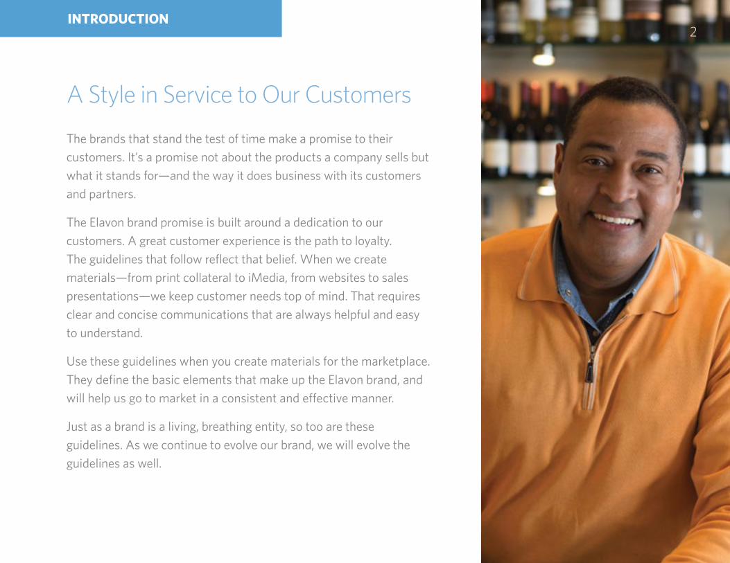
A Style in Service to Our Customers
The brands that stand the test of time make a promise to their customers. It’s a promise not about the products a company sells but what it stands for—and the way it does business with its customers and partners.
The Elavon brand promise is built around a dedication to our customers. A great customer experience is the path to loyalty. The guidelines that follow reflect that belief. When we create materials—from print collateral to iMedia, from websites to sales presentations—we keep customer needs top of mind. That requires clear and concise communications that are always helpful and easy to understand.
Use these guidelines when you create materials for the marketplace. They define the basic elements that make up the Elavon brand, and will help us go to market in a consistent and effective manner.
Just as a brand is a living, breathing entity, so too are these guidelines. As we continue to evolve our brand, we will evolve the guidelines as well.

Brand Elements
To ensure that Elavon marketing efforts are consistent across all business lines, we adhere to a brand system approach. We will consistently deliver a focused, intentional message that creates a positive connection with our customers, our partners, and our employees.
3BRAND ARCHITECTURE
global brand guidelines
elav
on
4BRAND ARCHITECTURE
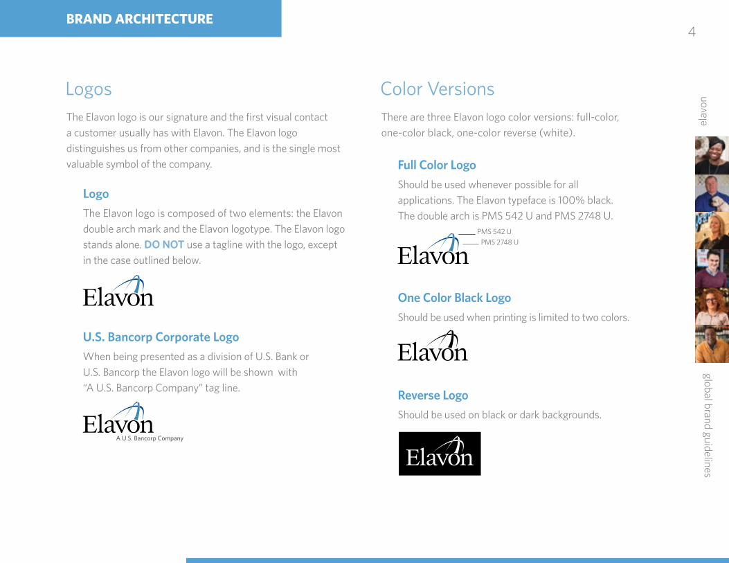
Full Color Logo
Should be used whenever possible for all applications. The Elavon typeface is 100% black. The double arch is PMS 542 U and PMS 2748 U.
One Color Black Logo
Should be used when printing is limited to two colors.
Reverse Logo
Should be used on black or dark backgrounds.
U.S. Bancorp Corporate Logo
When being presented as a division of U.S. Bank or U.S. Bancorp the Elavon logo will be shown with “A U.S. Bancorp Company” tag line.
Logo
The Elavon logo is composed of two elements: the Elavon double arch mark and the Elavon logotype. The Elavon logo stands alone. DO NOT use a tagline with the logo, except in the case outlined below.
Logos The Elavon logo is our signature and the first visual contact a customer usually has with Elavon. The Elavon logo distinguishes us from other companies, and is the single most valuable symbol of the company.
Color Versions There are three Elavon logo color versions: full-color,one-color black, one-color reverse (white).
PMS 542 UPMS 2748 U
A U.S. Bancorp Company

global brand guidelines
elav
on
5BRAND ARCHITECTURE
Full Color Logo
Should be used on a white or light-color background (white is preferred).
Reverse Logo
Should be used on a black or dark-color background (black is preferred).
Background Color Correct use of background colors enhance the impact of the Elavon logo. When placing the logo within an application, optimal legibility should always be your first priority.
NOTE: Always make sure there is enough contrastbetween the background color and the logo.
NOTE: DO NOT place logos on backgrounds or use colors that detract from or DO NOT give enough emphasis to the logo.
Minimum SizeNever reproduce Elavon logos at sizes less than the following Minimum size.
The smallest approved logo is 3/4” wide
Minimum Space The clear space that surrounds the logo ensures that it has optimal visibility and visual impact. As Illustrated, the height of the lower case “v” is the standard unit of measurement for calculating the logo clear space.
3/4” (19.05mm)

global brand guidelines
elav
on
6BRAND ARCHITECTURE
PlacementThe preferred placement of the Elavon logo is the lower right or upper left corner. However, if creative needs demand a different placement, a designer can use his or her discretion, as long as thoughtful rational drives the decision.
DO NOT place full color logo on any background or photo.
DO NOT use a tagline with the logo.
Incorrect UsageDO NOT alter the Elavon logo in any manner.
Do Not Use Tagline with Logo

global brand guidelines
elav
on
7BRAND ARCHITECTURE
Co-Branding (Alternative)
If both brand marks need to be represented, they should be aligned side by side and separated by a black line.
Co-Branding (Preferred)
Elavon is aligned with financial institutions, banks, and other channel partners. As a result, the “An Elavon Payments Partner” tag line will appear with the logos of other entities on a variety of marketing materials.
Co-Branding GuidelinesIf you manage a partner relationship, be thoughtful in contractual negotiations regarding how we handle co-branding and consult with Corporate Communications ([email protected]) to ensure that we can support your request.
For Joint VenturesIf you are working on a joint venture partnership, please work with Corporate Communications from the beginning in order to establish a strong brand foundation for the future of the JV. Co-Brand PartnershipsPartners wishing to cobrand with Elavon may do so in these environments:
1. Via web partner pages on partner websites2. Via collateral that leverages our solution3. Via business cards
We are happy to share our content and templates for co-brand as well, but images must be changed by the partner who is distributing the content. Our image rights are specific to Elavon-use only. White LabelFor our partners who wish to white label, we can share general content for repurposing in partner communications.
It’s not always necessary to use multiple brand marks; in some cases, it’s acceptable to simply use both company’s names, separated by the vertical slash.
FPOPartner Name | Elavon
Partner NameAn Elavon Payments Partner
Partner Name

global brand guidelines
elav
on
BRAND ARCHITECTURE8
Design Icons Design elements help to both enliven the collateral in which they’re included and provide visual identification support. They should never distract from or overwhelm the overall design. When used carefully and with purpose, they can help guide a customer through content, while at the same time reinforcing and differentiating the Elavon brand.
Product/Vertical Market Icons
These icons are used as a visual support on product and vertical market collateral pieces. New icons can be requested for consideration from Corporate Marketing.
Product Icons
Vertical Market Icons
Retail
Travel
Taxi
Cash Advance
Bill Pay
Loyalty
Social Media
Tokenization
NFC MOTO
Terminal
Web-HostedPayments
Simplify Customer Service
ConvergeformerlyVirtualMerchant
Gateway
Payments
Restaurant
Healthcare
Airline
EMV
Mobile Top Up
Currency Conversion
ECS
Hospitality
Public Sector
Education
EBT Online
Cashback
Security
MO/TO
Reporting
Services
QSR
EGC Mobile
global brand guidelines
elav
on
9
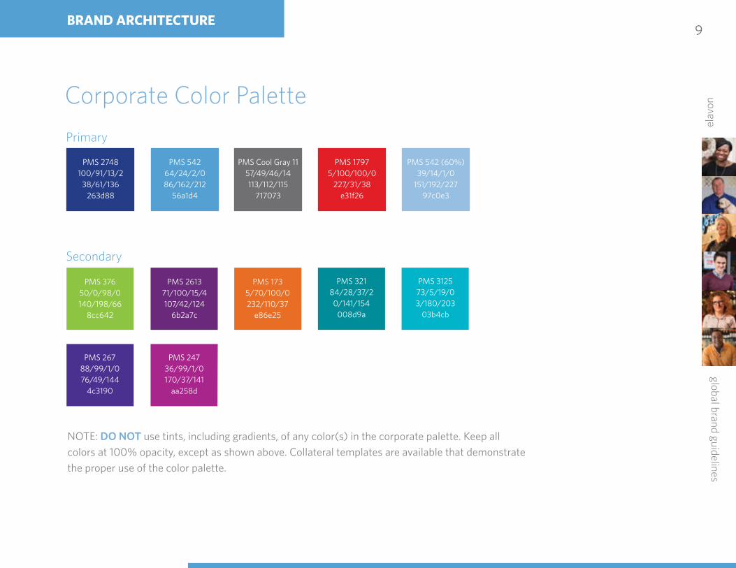
Corporate Color Palette
Primary
Secondary
NOTE: DO NOT use tints, including gradients, of any color(s) in the corporate palette. Keep all colors at 100% opacity, except as shown above. Collateral templates are available that demonstrate the proper use of the color palette.
PMS 2748100/91/13/2
38/61/136263d88
PMS 32184/28/37/20/141/154
008d9a
PMS 37650/0/98/0140/198/66
8cc642
PMS Cool Gray 1157/49/46/14113/112/115
717073
PMS 26788/99/1/076/49/144
4c3190
PMS 1735/70/100/0232/110/37
e86e25
PMS 54264/24/2/086/162/212
56a1d4
PMS 312573/5/19/03/180/203
03b4cb
PMS 261371/100/15/4107/42/124
6b2a7c
PMS 17975/100/100/0
227/31/38e31f26
PMS 24736/99/1/0170/37/141
aa258d
PMS 542 (60%)39/14/1/0
151/192/22797c0e3
BRAND ARCHITECTURE

global brand guidelines
elav
on
10
TypographyThe use of common type fonts in communications materials further enhances Elavon’s brand identity. The company has selected the following approved typefaces, which should be used in all professionally typeset company material: Whitney Semibold and Whitney Medium are the primary typefaces for headlines and subheads. The secondary typefaces to be used for body copy are Whitney Book and Whitney Light. (Calibri is the approved typeface for all communication materials in Poland.) For both primary and secondary typefaces, italics may be used when appropriate.
NOTE: For desktop application using Word or PowerPoint to create documents such as proposals, RFPs, specifications, PowerPoint presentations, etc., use the Calibri font family.
Primary TypefaceUse for headlines and subheads.
Whitney SemiboldABCDEFGHIJKLMNOPQRSTUVWXYZabcdefghijklmnopqrstuvwxyz
Whitney MediumABCDEFGHIJKLMNOPQRSTUVWXYZabcdefghijklmnopqrstuvwxyz
Secondary TypefaceUse for body copy.
Whitney BookABCDEFGHIJKLMNOPQRSTUVWXYZabcdefghijklmnopqrstuvwxyz
Whitney LightABCDEFGHIJKLMNOPQRSTUVWXYZabcdefghijklmnopqrstuvwxyz
Desktop Application TypefaceUse for desktop applications.
CalibriABCDEFGHIJKLMNOPQRSTUVWXYZabcdefghijklmnopqrstuvwxyz
Calibri BoldABCDEFGHIJKLMNOPQRSTUVWXYZabcdefghijklmnopqrstuvwxyz
BRAND ARCHITECTURE

global brand guidelines
elav
on
11
Warm. Welcome. Honest.
The Elavon look and feel is warm, welcoming, and honest. Copy is easy to read and easy to understand. We strive for a friendly clarity in all materials we produce. We’re confident in our abilities to offer the proactive advice and solutions our customers need to succeed, and our materials reflect that feeling.
Imagery is representative of our audience and their customers. The photo guidelines beginning on page 16 provide greater detail but, in general, we prefer full-bleed images and shots of actual Elavon customers, either posed or involved in everyday activities, such as engaging with customers or assisting with purchases. Our imagery should reflect the diversity of our global mix of customers and the vertical markets they represent.
BRAND VOICE AND STYLE

global brand guidelines
elav
on
12
Voice and Brand PersonalityIn talking about voice, it’s helpful to first understand the brand personality. Elavon strives to be strong, sincere, trustworthy, witty, smart, helpful, creative, and proactive.
For additional insight into how these words coalesce into a personality and point of view, we’ve created “The Business Advisor.” This persona helps give our personality dimension, and can serve as a useful guide when crafting content that is helpful, friendly, and direct. Ideally, copy and content should carry the spirit inherent in the persona.
Elavon’s Persona | “The Business Advisor”A business advisor combines the wisdom and experience of a well-seasoned and friendly advocate with the passion and enthusiasm of an engaged business partner. Often a highly trusted individual, he or she has been exposed to a wide variety of industries and has the expertise to navigate the ups and downs of running a business. A business advisor is energized by technology and innovation and always eager to share new discoveries. This is the person business owners trust to grow their business. This is Elavon.
VoiceThe brand personality influences voice across all collateral. Copy must be helpful and presented in a friendly, actionable way. Copy should also be authoritative so that it instills confidence in our customers and prospects, without appearing to be condescending or all knowing.
BRAND VOICE AND STYLE

global brand guidelines
elav
on
13
Copy Tone Considerations• How we speak must reflect our concern and care for our customers’ businesses. It must be
written in a way to ensure that customers know they’re our #1 priority.• Make sure every piece is simple to understand, straightforward, friendly, and helpful.• Copy should be jargon-free and use vocabulary that is both meaningful to customers and
demonstrates our company’s value.• Use customer stories and examples where appropriate to both humanize the Elavon brand and
to provide customers and prospects true and meaningful ways to understand the value of our products and solutions.
Putting the customer first requires that we speak their language. Our content is changing to reflect this:
• When referring to a business that works with us we will refer to them as “customers” (not merchants)
– We understand that there are a handful of business cases where we must continue to use Merchant, i.e. legal documentation and representation of Elavon Merchant Services in Europe, for example. The rule is when speaking to or about a customer in print or conversation, always refer to them as a customer.
• When discussing the services we offer use “payment services” (not merchant services)• Our communications need to be easy to understand, clarify benefits and be jargon-free.
For example, when talking with a small business owner:– Instead of “MID,” you might use “Account Number”– Instead of “Acquirer” use “credit card processor”
BRAND VOICE AND STYLE

global brand guidelines
elav
on
14
Copy Tone GuidelinesAlthough different vertical markets and mediums have distinct requirements, in general, copy for Elavon is:
POSITIVE. We help customers reach goals and dreams. When we share information, be upbeat and affirming.
BRIEF. Respect that customers are busy people. Don’t mistake increased word count for increased value.
WITTY. Deliver fresh takes on the industry, our products, and our services.
SMART. Everything we tell our customers, prospects, partners, and each other must play a role in helping to activate business. That means it must be actionable, insightful, and presented in a useful way.
TRANSPARENT. When we talk to our audience there’s no room for doublespeak or duplicity. Communicate openly and honestly.
Do’s & Don’ts POSITIVE BRIEF WITTY SMART TRANSPARENT
Welcome Letters
Pricing Communications
Security/PCI Communications
User Guides
Collections Letters
Incident Reports/Service Interruptions
Customer/Partner Facing Sales Tools
Digital assets (.com site, etc.)
OPERATIO
NA
L COM
MU
NICATIO
NS
BRAND VOICE AND STYLE
global brand guidelines
elav
on
15
Proof PointsTo provide our customers with confidence in Elavon, it’s important to remind them of our overarching capabilities. Use the proof points below sparingly—remember, we want to create a beneficial, friendly relationship with our customers, not an overly authoritative one, or one in which we may seem to be “too big” to care.
• Stability (years in business)
• Size and scale (global company, number of countries in which we operate, number of customers and partners, number of transactions processed)
• Competency (service levels)
• Solutions oriented (our genuine interest in helping them solve problems and grow)
Specific UsageAppropriate:
• “Elavon has been a leader in global payments for over twenty years”
• “More than a million business customers in over 30 countries trust Elavon to manage payments safely and securely”
• “Helping you do business in more than 100 currencies”
• “Elavon helped my business identify over $X in cost savings last year”
Inappropriate Verbiage (jargon):
• “Extending powerful payment solutions”• “acquiring”, “end-to-end”, “processing
environments”, “acceptance”, “authorization”
Examples:
FROM TO
DCC converts international card purchases into the cardholder’s home currency at the point-of-sale. Elavon can convert up to 48 currencies depending on your country and point-of-sale environment.
Elavon’s currency conversion solution allows cardholders to choose to pay with their home currency at the point-of-sale, and supports up to 48 international currencies.
Elavon’s proprietary international processing platform supports authorization in over 85 currencies to help you realize financial efficiencies and improve your bottom line.
Elavon’s platform allows you to accept payments internationally in over 85 currencies, gaining you efficiencies and saving you expense.
BRAND VOICE AND STYLE
BRAND VOICE AND STYLE16
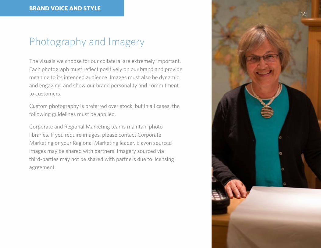
Photography and Imagery
The visuals we choose for our collateral are extremely important. Each photograph must reflect positively on our brand and provide meaning to its intended audience. Images must also be dynamic and engaging, and show our brand personality and commitment to customers.
Custom photography is preferred over stock, but in all cases, the following guidelines must be applied.
Corporate and Regional Marketing teams maintain photo libraries. If you require images, please contact Corporate Marketing or your Regional Marketing leader. Elavon sourced images may be shared with partners. Imagery sourced via third-parties may not be shared with partners due to licensing agreement.

elav
on
17
Primary ImageryCandid-style photography should feature business owners/employees and their customers interacting in authentic ways. If photos show only one face, strive to balance the piece by showing both an owner and customer in separate images. Smiling and laughing subjects reinforce Elavon’s customer-focused equity. Tighter crops help images to feel more personal, indicating the close relationship between owner/employee and their customers. Full bleed photography is also preferred as it helps to create pieces that are more eye-catching and engaging.
Both primary and secondary imagery can reflect any specific vertical it’s representing.
Secondary ImageryAdditional photography needs include transaction imagery, such as card swipes and other forms of transactions, and imagery that portrays the shopping experience. When possible, these images should feature a human interaction. Instead of simply showing a terminal, for example, show a hand interacting with that terminal.
BRAND APPLICATIONS

global brand guidelines
elav
on
18
Digital DesignThe design and copy guidelines in this document refer to digital usages as well as print. The complexities that digital creative can present, however, require some specific guidelines. As we continue to define Elavon’s digital properties, detailed usage guidelines will be included within this style guide.
BRAND APPLICATIONS