graphic standards manual
DESCRIPTION
A Graphic Standards Manual for the African American Theatre Project.TRANSCRIPT

Graphic StandardsManual

3
Introduction
Emblem
Signature
Subdivisions
Color Palette
Primary Typeface
Incorrect Usage
Stationery
Advertise
Merchandise
Theatre
5
7
9
11
13
15
17
19
23
25
27

INTRODUCTION

5
The AATP was founded by Jerome and Nettie
Wilson through a generous endowment by the Bill
and Melinda Gates Foundation. It’s purpose is to
present plays by African American playwrights,
both historical and contemporary. The AATP has
three main divisions: Mainstage, Mobile, and Gift
Shop.
This graphics standards manual will help to
keep a strict consistency with the company and
its identity. By following these guidelines, a
consistent branding will be created and it will
make the company and its logo more recognizable
and memorable to the public.
Nettie & Jermone Wilson (Founders of AATP), 2010.

EMBLEM

7
Masks have been used throughout history when it comes to the
performing arts. Today, they have become a symbol and are
affiliated with theatre and drama. The use of decorative masks
for performances in African culture greatly influenced AATP’s
emblem. Many different African masks were carefully studied
during the creation of this emblem.
The emblem, when printing in color, must always be printed in
its original pantone color (pantone 259C). Any other shades
of purple are not permitted, unless changing the opacity to
20% (like the emblem on the cover page). This emblem can be
turned to black and white, it can be etched into metal or glass,
embossed, and foil stamped onto paper. It may also be used
without the signature.
Safe SpaceThe term “safe space” refers to the area around the emblem that
must not contain any interfering graphics or type. For this
emblem, the safe space indicator will be the entire circle that
the emblem is contained in. By taking the circle and making it
twice as large as the emblem, you can then place the emblem
directly in the center of the larger circle and that will indicate
it’s “safe” space.
black & white version of emblem
main emblempantone 259C
red line indicates safe space

SIGNATURES

9
There are two different
variations for the main logo:
Horizontal Version
This version is to be used in
situations where there is a
lot of horizontal space. It
should not be used in narrow
and smaller situations
because they stretch out
longer and detail could be
lost.
Vertical Version
This signature has larger
text with a smaller emblem.
This version would be great
to use in smaller situations
that don’t allow a lot of
horizontal space.
SUBDIVISIONS

11
Because there are three
different subdivisions
within the African American
Theatre Project, each division
must have it’s own identity
that also ties into the system
as a whole. I have created a
separate system of emblems
that are the same as the
original emblem, but has it’s
subdivision labeled above it
on its circular curve. Myriad
Pro Bold is continued in
the title of the subdivision,
and each one has it’s own
pantone color that must not
be replaced by any other
shade. These emblems
may be seen without their
subdivision title, but they
still have to have the pantone
color that is assigned to
them. These colors were
picked because they match
the tone that is being created
through this identity system
and brand.

COLORPALETTE
PANTONE 157Cw
PANTONE 375C

13
The bold purple will be the main color of the identity system.
The other three colors are to be used when they are associated
with their sub division category, which will be discussed
more in depth later. Any other shades of these colors will
not be allowed. The use of all four of these colors at once is
permitted, as long as the purple is the more prominent color,
and the orange, blue, and green, are used as background or
accent colors.
PANTONE 157Cw
PANTONE 375C

PRIMARYTYPEFACE

15
The chosen typeface for the
company is Myriad Pro. As
far as the signature goes,
the only two fonts that can
be used are Myriad Pro Bold
for “African American” and
then Myraid Pro Regular for
“Theatre Project”. Any other
versions inside Myriad Pro’s
font family may be used on
other documents such as
the letterhead, programs, or
website.
The secondary typeface that
may be used for body copy
and print is Chaparral Pro.
This is a very nice, easy to
read typeface that also works
well with Myriad Pro. These
are the only two fonts that
can be used for the African
American Theatre Project
brand.

INCORRECTUSAGE

17
The text may not be kerned 1)
together or spread apart. It
must keep it’s original form
at all times.
The signature may not be all 2)
the same color. The only time
this can be done is when the
entire signature is inverted.
The “African American” 3)
text must always be Myriad
Pro Bold and the “Theatre
Project” must always be in
Myriad Pro Regular and in
all caps.
No matter which variation 4)
is being used, the emblem
cannot be rotated. The line
of the face must always be
perpendicular to the sides of
the circle.
The emblem must all be 5)
the same color. Mixing the
colors of the marks on the
mask is not allowed. The
entire emblem has to be one
of the pantone colors listed
in the color palette section of
this manual.
African AmericanT H E A T R E P R O J E C T
African AmericanTHEATRE PROJECT
STATIONERY

19
CON
TACT
Sharon MartinArtistic Director
www.AATP.comOffice: (502) 361-6525
Cell: (502) 594-8566
visit us online
Business Card
This would be the main
template for the company’s
business cards. The emblem
is blown up and cropped to
the side of the card making it
easy to recognize the brand
right away.

20
African American THEATRE PROJECT
Dear Mrs. Smith,
Lorem ipsum dolor sit amet, viverra quis, suspendisse ante ut nulla tellus sodales, fusce amet eu et. Nonummy vestibulum curabitur ut ultricies, bibendum nisl, in faucibus mauris duis at lacinia erat, ut eu neque nonummy dolor lectus, nullam aenean est orci mi etiam volutpat. Dictum eget, quam aliquam, cras non ut mi sapien volutpat ut. Quis diam eget diam, ultricies odio leo in massa, eget venenatis, wisi ipsum tempus auctor adipiscing varius dolor, sed aliquam euismod nec pharetra rutrum enim. Duis augue in vestibulum, ante at, luctus neque, tellus adipiscing wisi, neque phasellus.
Adipiscing vel eget amet penatibus et. Ut metus est id libero, donec consequuntur in vulputate, mattis commodo cubilia mauris tellus neque quis, ante magna cursus tortor blandit ut non. Euismod pellentesque sit id odio, etiam penatibus mauris pretium, id ac, praesentium nibh, ligula amet aliquam cursus. Dictum mauris maecenas, sed mauris sol-licitudin fames. Integer ab purus sit et nibh, vitae vitae elit bibendum euismod dolor, in egestas amet. Posuere vestibulum egestas volutpat laborum viverra, consequat natoque sociosqu aliquam nibh quam. Non vestibulum diam vel, nam feugiat, blandit in dictum arcu fringilla metus arcu, vitae massa ultrices erat ante mollis, ultricies elit pretium.
Neque dapibus luctus voluptatem eget, erat ut. Eleifend integer est eget nam facilisi eros, ipsum non tempor, rutrum litora, molestie
erat tempor etiam libero. Arcu feugiat, duis sed in at nullam tristique. Sit tempor, nam sagittis arcu ut amet, in tristique,
elit nibh turpis nam consectetuer urna. Etiam nunc nunc nonummy in vitae hendrerit.
Ultricies massa tempor, per non, leo parturient. Nec magnis nulla, suspendisse mi vestibulum pellentesque, neque fames turpis eget. Hic
adipiscing ornare lacus natoque wisi, eu scelerisque tincidunt vestibulum incidunt nam, a nulla arcu dolor sit id, vehicula per scelerisque proident vestibulum, ut in male-suada ut. eius proin sed, in vitae fermentum
120 East Market StreetLouisville, KY 40208Main Office: (502) 361-6525Box Office: (502) 94-8566www.AATP.comCall or go online for tickets!
Sincerely,
Sharon MartinSharon MartinArtistic Director
Letterhead
This is the template for the
letterhead. The body copy
font must always be Chapar-
ral Pro at size 10 pt with 13
pt leading. If the letter is
more than one page, the wa-
termark on the bottom left
corner must come off and
the type will have regular
margin sizes on these pages.

21
Envelopes
This is the template for the
business envelopes. The
horiztonal logo is the only
logo that is to be used for the
envelopes.
Afric
an A
mer
ican
THEA
TRE P
ROJE
CT12
0 Ea
st M
arke
t St
reet
Loui
svill
e, K
Y 4
0208
visit us o
nlin
e

ADVERTISE
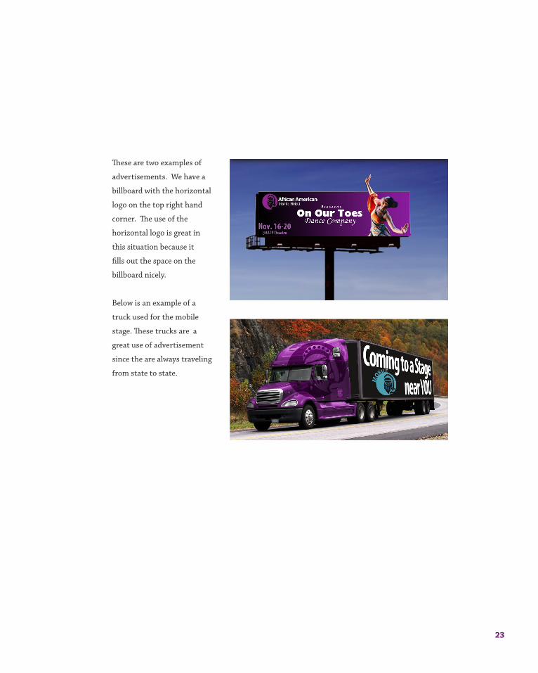
23
These are two examples of
advertisements. We have a
billboard with the horizontal
logo on the top right hand
corner. The use of the
horizontal logo is great in
this situation because it
fills out the space on the
billboard nicely.
Below is an example of a
truck used for the mobile
stage. These trucks are a
great use of advertisement
since the are always traveling
from state to state.

MERCHANDISE

25
Here are several examples
of some merchandise that
incorporate the emblem and
the two different logos. Most
of these items could be found
in the gift shop.

THEATRE
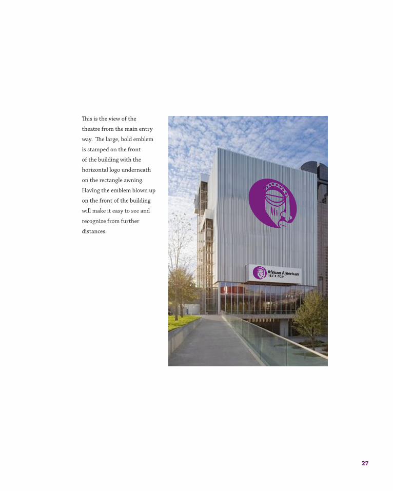
27
This is the view of the
theatre from the main entry
way. The large, bold emblem
is stamped on the front
of the building with the
horizontal logo underneath
on the rectangle awning.
Having the emblem blown up
on the front of the building
will make it easy to see and
recognize from further
distances.
