graphics in r
DESCRIPTION
Graphics in R. XTRANSCRIPT

Graphics in R
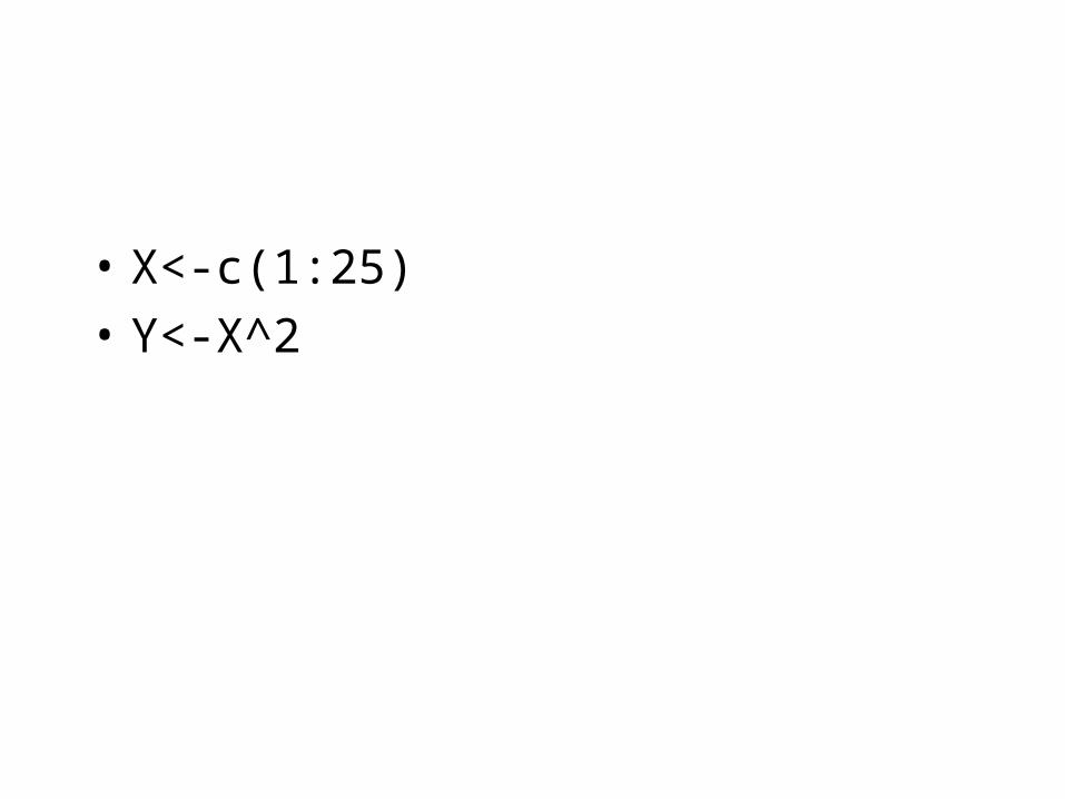
• X<-c(1:25)
• Y<-X^2

Plot(X,Y)#more examples later

plot(X,Y,type="l") # more examples later

plot(X,Y,type="b")

plot(X,Y,type="c")

plot(X,Y,type="o")

plot(X,Y,type="S")
0 100 200 300 400 500
05
00
00
10
00
00
15
00
00
20
00
00
X
Y

Main and labels
• plot(X,Y,main="Fuelconsumption for cars", xlab="weight of car",ylab="cl per mile",cex.lab=1.5, sub ="source: Källa",cex.main=2)
• Xlab creates label for X
• Ylab creates label for Y• Sub creates subtitle• cex.lab decides size of text on labels• cex.main decides size of text on header

5 10 15 20 25
01
00
20
03
00
40
05
00
60
0
Fuelconsumption for cars
source: Källaweight of car
cl p
er m
ile

• plot(X,Y)
• It is problematic to use function ”title” for writing labels because it writes over original labels
• title(main="Fuelconsumption for cars", xlab="weight of car",ylab="cl per mile”)


• par(mfrow=c(2,2)) #Multiple graphs in one picture. Choose your own dimensions i with
• # To illustrate different points is given by pch
• X<-c(1,2,3,4,5)
• Y<-X^2
• plot(X,Y, pch=1, main=" turned squares")
• plot(X,Y, pch=2, main ="triangel")
• plot(X,Y, pch=3,main="plus")
• plot(X,Y, pch=4,main="X")


plot symbols : points (... pch = *, cex = 3 )
0
1
2
3
4
5
6
7
8
9
10
11
12
13
14
15
16
17
18
19
20
21
22
23
24
25
**
.
oo
OO
00
++
--
||
%%
##

Get your own symbols
• plot(X,Y, pch="*",main=”starplot")
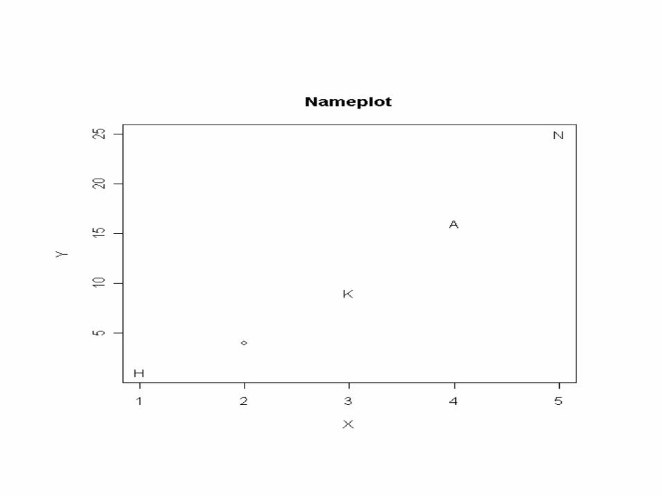
• Or choose your own string
• z<-c("H", "Å", "K", "A", "N")
• plot(X,Y, pch=z,main="Nameplot")
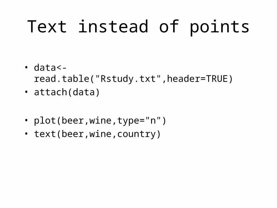
Text instead of points
• data<-read.table("Rstudy.txt",header=TRUE)
• attach(data)
• plot(beer,wine,type="n")
• text(beer,wine,country)


Regression
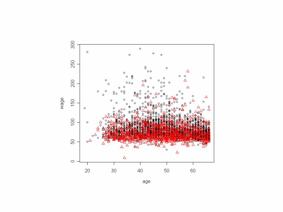
• library(foreign)• lnu91<-read.dta("lnu91.dta")• gender<-lnu91$y10• wage<-lnu91$y472• age<-lnu91$y11• lnu<-data.frame(wage,age,gender)• lnu<-na.omit(lnu)• rm(lnu91)• rm(age,wage,gender)• lnu<-subset(lnu, age<67 & wage<300&wage>0)• attach(lnu)• plot(age,log(wage))• abline (lm(log(wage) ~ age )) #regressionslinje


Show different subgroups
plot(age,wage,col=as.numeric(gender))
• Col sets colour.
• R has over 650 different colours. Get a list with colors()
• plot(age,wage,col=as.numeric(gender),pch=as.numeric(gender))
• Pch sets different characters
• Use replace to get the ”right” number


Saving graphs
• In pdf• pdf("myfile.pdf")• plot(X,Y)……………
• dev.off()
• In postscript• postscript("myfile.eps“, horizontal=FALSE) (A4)• plot(x,y) ……………• dev.off()
• In JPEG• jpeg("myfile.jpeg")• plot(X,Y)……• dev.off()
• Similar is available for png and bmp

Drawing functions
• curve(atan(x),-25,25)
• z<-seq(-25,0,0.01)
• a <-seq(0,25,0.01)
• z2<-c(rep(-1.57,length(z)))
• a2<-c(rep(1.57,length(a)))
• lines(a,a2,lty=2)
• lines(z,z2,lty=2)
• title(main="arctan")


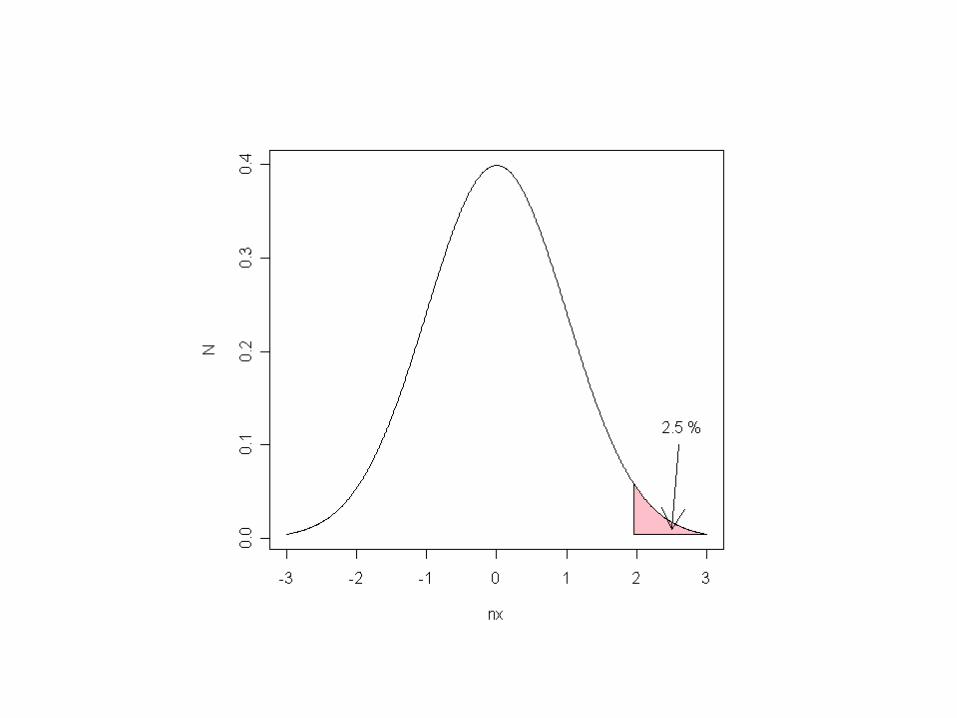
Plotting normaldistribution
• For educationalpurposes (Picture on next slide)
• nx<-seq(-3,3,0.01)
• N<-dnorm(nx)
• plot(nx,N,type="l")
• polygon(c(nx[nx>=1.96],1.96),c(N[nx>=1.96],N[nx==3]),col="pink")
• arrows(2.6,0.1,2.5,0.01)
• text(2.65, .12,"2.5 %")

Histogram
• hist(wage)
• hist(wage,breaks=40)
• hist(wage,breaks=40,freq=FALSE)
• hist(wage,breaks=seq(0,300,20))
• It is possible to cheat R with!!!
• hist(wage,breaks=c(0,25,50,75,100,125,500),freq=TRUE)
• With normal distribution curve
• hist(wage,breaks=40, prob=TRUE)
• x <- seq(0,400,1)
• lines(x,dnorm(x,mean(wage),sd(wage)))


Normal distributed?
• qqnorm(wage)
• qqline(wage)
• qqnorm(log(wage))
• qqline(log(wage))


Barchart• occu<-
c(rep("Steelworker",320),rep("Chef",250),rep("Gardner",200),rep("Constructionworker",130))
• barplot(occu) #doesn’t work• occ.table <- table(occu)• farger<-c("gold1", "gold2", "gold3", "gold4 ") #Chooses a string with
colournames)• barplot(occ.table,col=farger)• barplot(occ.table,col=farger)• barplot(occ.table,col=farger,horiz=TRUE,main="occupations",xlab="
Frequency")• Source for further barcharts issuses• http://ww2.coastal.edu/kingw/psyc480/html/barplot_tips.html


Barcharts continuing
• Gender<-rep(c("man","man","woman","woman","woman","man","man","man","woman","man"),time=90) #creates Gender variabel
• Occ.table2<-table(Gender,occu)
• Occ.table2<-table(Gender,occu) #legend gives ”box”
• barplot(Occ.table2,legend=T,ylim=c(0,400))
• # Bedside gives pairwise, ylim sets range of y
• barplot(Occ.table2,legend=T,ylim=c(0,250),beside=T)


Piechart
• seq(0.4,1.0,length=4)
• 0.4 0.6 0.8 1.0
• pie(occ.table, col=gray(seq(0.4,1.0,length = 4)))
• Radius decides how big radius is to be
• Too change background colour:
• par(bg="pink") # sets to pink until changed
• pie(occ.table, col=gray(seq(0.4,1.0,length = 4)))


Different sizes of the symbols
• Different sizes of the symbols is given by
• Q<-c(7,3,4,5,12) #gives different sizes for the coordinates
• symbols(X,Y,squares = Q)
• # Färglägger
• W<-c(2,3,6,3,6)
• symbols(X,Y,squares = Q,fg=W)
• symbols(X,Y,squares = Q,bg=W)
• symbols(X,Y,squares = Q,bg=W,fg=W)
• Country<-c ("Sweden", "Iceland", "Denmark", "Finland", "Norway")
• text(X,Y,Country)


Different kinds of lines
• par(mfrow=c(2,1))
• plot(X,Y, type=“l”,lty=0, main= “blank line”)
• plot(X,Y, type=“l”,lty=1, main= “solid line”)
• plot(X,Y, type=”l”,lty=2, main= “dashed line”)
• plot(X,Y, type=”l”,lty=3, main= “dotted line”)
• plot(X,Y, type=”l”,lty=4, main= “dotdash line”)
• plot(X,Y, type=”l”,lty=5, main= “longdash line”)
• plot(X,Y, type=”l”,lty=6, main= “twodash line”)


