health reform across the states: increased insurance
TRANSCRIPT
Health Reform Across the States: Increased Insurance Coverage and Federal Spending on the Exchanges and Medicaid
Timely Analysis of Immediate Health Policy Issues March 2011
Matthew Buettgens, John Holahan and Caitlin Carroll
SummaryWith the enactment of the Health Care and Education Reconciliation Act of 2010 on March 30, 2010, the Patient Protection and Affordable Care Act (ACA) became law, fundamentally changing health insurance and access to health care in the United States. Using the Urban Institute’s Health Insurance Policy Simulation Model (HIPSM), we estimate important effects of the ACA at the state level: the increase in insurance coverage, coverage and subsidies in the new nongroup health benefit exchanges, Medicaid enrollment and costs under the expansion and total new federal spending on Medicaid and subsidies. We provide results by state, by region and by two useful groups of states. Key results are also displayed on maps. For ease of comparison, we simulate the ACA as if fully implemented in 2011 and contrast the results with HIPSM’s prereform baseline results for 2011. These results complement an earlier policy brief that analyzed the national impact of health reform as if implemented in 2010.1
We estimate that:
• Full implementation of the ACA would lead to a 10.3 percentage point decrease in the national uninsurance rate for the nonelderly, roughly equivalent to 28 million fewer uninsured Americans. Although every state would enjoy a decline in uninsurance, the magnitude of the decrease varies significantly by state, ranging from a 1.1 percentage point decrease in Massachusetts to a 16.9 percentage point decrease in Texas.
• State-level income distributions and employer-sponsored insurance (ESI) eligibility levels affect the impact of health reform. States where lower income levels allow for higher Medicaid and exchange subsidy eligibility would see a greater decline in uninsurance rates. Likewise, states with low ESI eligibility would see a larger decrease in uninsurance than states with high ESI eligibility.
• The percent of nonelderly covered through nongroup health exchanges would vary by state. Massachusetts has the lowest coverage through nongroup exchanges at 5.4 percent, while North Dakota covers 13.9 percent of its population through the nongroup exchange, with a national average of 8.9 percent. We also observe regional
differences, ranging from 7.1 percent in New England to 10.3 percent of the nonelderly in West North Central states. The variation reflects differences in income distribution and the level of ESI coverage.
• Under the ACA, exchange subsidies would total approximately $33 billion, with the majority going to those below 200 percent of the federal poverty level (FPL). Subsidies per nonelderly person, a useful measure for comparing subsidy amounts between states, are highest in the Pacific states and lowest in New England.
• Nationally, there would be 4.9 million new Medicaid enrollees who are eligible for Medicaid under current law, accounting for 8.3 percent of total new Medicaid enrollment under the ACA. Regionally, newly enrolled current eligibles make up the smallest share of total Medicaid enrollment in New England, 5.4 percent and the largest share in the mountain states, 10.5 percent. States with the highest ratio of ESI eligible residents see the lowest percentages of their total Medicaid enrollment made up by newly enrolled current eligibles, as do states with a high proportion of residents under 138 percent of the FPL.
• There would be 12.3 million newly eligible Medicaid enrollees nationwide, representing approximately a fifth of total enrollment.2 This enrollment is driven by newly eligible adult nonparents, who account for 10.0 million of the newly eligible Medicaid enrollees. Children and adult parents make up a smaller proportion of newly eligible Medicaid enrollees. Due to the Children’s Health Insurance Program (CHIP), children are already covered through a high-income threshold, so fewer gain eligibility with the general Medicaid expansion.
• Newly eligible Medicaid enrollees are less expensive, on average, than current enrollees. Although new eligibles make up about 20 percent of total enrollees, they only account for 15.4 percent of costs. This is because the newly eligible adults would be, on average, cheaper to cover than currently enrolled adults. Without reform, most states do not have an income eligibility threshold for adult nonparents, and many of those that do have
Timely Analysis of Immediate Health Policy Issues 2
IntroductionWith the enactment of the Health Care and Education Reconciliation Act of 2010 on March 30, 2010, the Patient Protection and Affordable Care Act became law, fundamentally changing health insurance and access to health care in the United States. This brief provides state-level estimates of three important aspects of reform. First, while all states would see an increase in insurance coverage under the ACA, the current insurance markets in the various states differ considerably. Thus, the coverage effects of the ACA would vary significantly between states. We present state-level estimates of the percent of the nonelderly who would be uninsured without health reform and the uninsured rate among the nonelderly under the ACA. The effect of health reform on insurance coverage within a state is the difference of these two, the percentage point decline in the uninsured rate. We examine state and regional patterns in this decline.
Second, we examine coverage and subsidy costs in the new nongroup health benefit exchanges. We provide state estimates of the number of nonelderly covered in the exchanges and how the distribution of exchange coverage would vary by income group. The share of exchange coverage for those below 400 percent of the federal poverty level is particularly significant because the large majority of these would receive subsidies. This share is a result of several factors, such as the availability of ESI in addition to the distribution of income in a state. We then present income-based premium and cost-sharing subsidies in total
dollars, in dollars per nonelderly person and in dollars per person with subsidized coverage. Subsidy dollars per nonelderly person provides a measure of the level of federal subsidies flowing into a state, controlling for differences in state population. The amount of subsidy dollars per subsidized person allows comparisons between states of how much an average subsidized person would cost.
Third, we present estimates of Medicaid/CHIP enrollment and costs under the Medicaid expansion, giving separate figures for adult nonparents, adult parents, children and those made newly eligible by the expansion. For each estimate, we provide results by state, region and two groups of states. Key results are also displayed on maps.
Lastly, we consider the Medicaid costs of new enrollees and estimate the share paid by the federal government. We combine this with the total exchange subsidies to estimate the total federal dollars flowing to the states.
The results presented here complement state-by-state estimates of Medicaid coverage and spending released in 2010.3 That work dealt exclusively with Medicaid and used two take-up rate scenarios to forecast Medicaid enrollment for 2014 to 2019. This report presents 2011 estimates, as described in the Methods section below. We present state-level results from a full HIPSM simulation of the ACA. Medicaid enrollment is not based on fixed a priori take-up rates as in the earlier work but is simulated as described below in Methods. We focus on new federal dollars paid to states for
exchange subsidies as well as Medicaid rather than on total Medicaid spending.
MethodsTo estimate the effects of health reform and the individual mandate, we use the Urban Institute’s Health Insurance Policy Simulation Model.4 HIPSM simulates the decisions of businesses and individuals in response to policy changes, such as Medicaid expansions, new health insurance options, subsidies for the purchase of health insurance and insurance market reforms. The model provides estimates of changes in government and private spending, premiums, rates of employer offers of coverage and health insurance coverage resulting from specific reforms.5
We simulate the main coverage provisions of the ACA as if they were fully implemented in 2011 and compare results to the HIPSM baseline results for 2011 prior to implementation of these reforms. This approach differs from that of the Congressional Budget Office or the CMS actuaries who by necessity provide 10-year estimates. Our approach permits more direct comparisons of reform with the prereform baseline and of various reform scenarios with each other. The key coverage provisions of the ACA and their implications for coverage and costs were summarized in an earlier policy brief providing a nationwide analysis of the ACA based in 2010.6
To simulate state-level results, we made the following enhancements to the model not reflected in earlier documentation:
• Two years of CPS data (survey years 2009 and 2010) were pooled together
closed their enrollment. Therefore, the adult nonparents currently enrolled gained eligibility through disability and medical need.
• There would be $82.3 billion in new federal spending on Medicaid and exchange subsidies flowing to the states. There would be considerable state variation since factors affecting both the exchanges and Medicaid are involved.
West Virginia would receive $498 in new federal spending
for every nonelderly person in the state, while Iowa would
receive only $171. A full analysis of the economic impact of
the ACA on states would have to include the distributional
effects of Medicare payment cuts, new taxes on payroll and
unearned income and taxes on insurers, drugs and medical
device manufacturers.

Timely Analysis of Immediate Health Policy Issues 3
to increase state sample size. Results for large states are based on a larger number of surveyed households than results for small states and thus have greater accuracy. Note that the CPS oversamples small states, so the number of observations is not necessarily proportional to state size. Our standard for state-level estimates was at least 100 unweighted observations; most are based on far larger numbers.
• Medical expenditures were adjusted to reflect state-level differences in health care pricing and utilization as measured in the National Health Expenditure Accounts.7
• Private health insurance premiums reflect both the state-level differences in expenditures from the previous item and state-specific differences in the risk pools of enrollees for a given type of insurance.
• The ACA was inspired in its general form by the comprehensive health reforms enacted in Massachusetts. The HIPSM results for Massachusetts without the ACA take into account some important provisions of that state’s health reform law, though we did not comprehensively model it.
There are significant differences between insurance markets in the various states, particularly in the individual and small group markets. We did not model 51 different regulatory regimes with their various rules for premium rating, benefit package requirements and so on. The distribution of premiums in a given state is influenced both by the underlying levels of health care pricing and utilization and by the market conditions in that state. As noted, we take into account the former. For most states, the resulting distribution of average premiums is similar to that published in sources such as the MEPS-Insurance Component. However, some differences appear to be driven by differences in the structure of insurance plans and other market factors in certain states.
Modeling the private insurance market and typical plan structures available
in a given state is a significant effort. We are starting to supplement the baseline used in this brief with special baselines focused on certain states. An important example was a simulation in 2009 of numerous health reform options for New York.8 State-level estimates from the national version of HIPSM should not be considered a substitute for versions tailored to a specific state in answering technical state policy questions, particularly regarding implementation of the new health insurance exchanges.
We calibrate the behavior of our model so that a standard expansion of Medicaid and CHIP achieves take-up rates consistent with the empirical literature.9 These baseline take-up rates for the uninsured are between 60 and 70 percent, depending on person type and income group. The ACA contains important provisions that would increase take-up. States are required to establish a web site capable of determining eligibility for Medicaid and automatically enrolling eligibles. Hospitals would be able to make presumptive eligibility determinations. There would be other new requirements for simplifying enrollment and renewal of Medicaid and CHIP. We estimate a take-up rate of about 73 percent for the uninsured who are newly eligible. This rate is higher than the baseline rate due to outreach and enrollment simplification provisions in the ACA, as well as a modest indirect effect of the individual mandate as observed in health reform in Massachusetts. Our Medicaid take-up is consistent with the enhanced outreach scenario in Holahan and Headen.10
To estimate modified adjusted gross income (MAGI) as defined in the ACA, we deduct the following from gross income: Social security, SSI, workers’ compensation, veterans’ benefits, child support and public assistance. We also impute child care expenses for families and deduct them up to the $5,000 cap defined in the tax law. Some other deductions which are part of MAGI, such as those for some types of pension benefits, cannot be computed and would
be difficult to reliably impute based on CPS data. These additional deductions are unlikely to affect our results materially.
Finally, we emphasize that the estimates in this paper assume a uniform implementation of the ACA. There are many important implementation decisions within a state’s authority. Few of these decisions have been made; when they are, we will be able to incorporate them into future estimates. Also, there is value in comparing the effects of a consistent policy across states.
Results
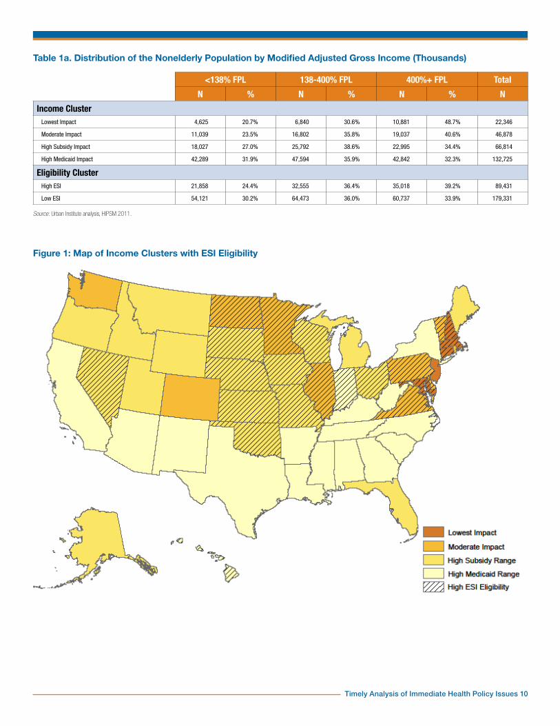
State Characteristics Relevant to the ACASeveral groupings of states will be useful in our analysis. The first is based on the state distributions of modified adjusted gross income as defined in the ACA. Since these are of independent interest and, as far as we know, have not been published elsewhere, we include a full table with cutoffs at 138 and 400 percent of the FPL (Table 1). These cutoffs are the eligibility levels for the Medicaid expansion and exchange subsidies respectively. There are distinct regional patterns. For example, in New England, nearly half of the nonelderly are at 400 percent of the FPL or above. Twenty-one percent are in the Medicaid eligibility range and 31 percent are between 138 and 400 percent of the FPL. Compare this with East South Central states, where 34 percent are below 138 percent of poverty, 38 percent between 138 and 400 percent and 28 percent above 400 percent.
Using cluster analysis, we separate states into four groups that have proven useful in analyzing our results. Lowest impact states are those in which about half of nonelderly adults are at or above 400 percent of the FPL. These states have a significantly lower share of the nonelderly in the Medicaid and exchange subsidy income groups (Table 1a), so these programs would be expected to have a somewhat lower impact. These states are Connecticut, Maryland, Massachusetts, New Hampshire and New Jersey (Figure 1). Moderate impact states
Timely Analysis of Immediate Health Policy Issues 4
have about 40 percent of nonelderly adults at or above 400 percent of the FPL and 30 to 40 percent between 138 and 400 percent of the FPL. These are Colorado, Delaware, D.C., Illinois, Minnesota, North Dakota, Pennsylvania, Rhode Island, Vermont, Virginia and Washington. High subsidy impact states have more nonelderly adults between 138 and 400 percent of the FPL than in either of the other two categories and have less than a third below 138 percent of the FPL. Thus, they have a particularly large population that could potentially be affected by exchange subsidies. These are Alaska, Florida, Idaho, Iowa, Kansas, Maine, Michigan, Missouri, Montana, Nebraska, Nevada, Ohio, Oklahoma, Oregon, South Dakota, Utah, Wisconsin and Wyoming. Finally, High Medicaid impact states have about a third of all nonelderly adults below 138 percent of the FPL, a higher proportion than the other groups. These also generally have a larger-than-average share in the 138 to 400 percent range as well. These are Alabama, Arizona, Arkansas, California, Georgia, Hawaii, Indiana, Kentucky, Louisiana, Mississippi, New Mexico, New York, North Carolina, South Carolina, Tennessee, Texas and West Virginia.
Also, we identify states as having low or high ESI eligibility depending on whether less than 60 percent of nonelderly adults are eligible for ESI, that is, are potential policyholders (Figure 1). Those ineligible for ESI are either not in the work force or hold jobs—particularly part-time jobs—which would not have ESI as a benefit even if other workers in the firm were offered ESI. Low ESI eligibility states are Alabama, Alaska, Arizona, Arkansas, California, Colorado, Florida, Georgia, Idaho, Kentucky, Louisiana, Maine, Michigan, Mississippi, Montana, New Jersey, New Mexico, New York, North Carolina, Oregon, Rhode Island, South Carolina, Tennessee, Texas, Utah, Washington, West Virginia and Wyoming. High ESI eligibility states are Connecticut, Delaware, D.C., Hawaii, Illinois, Indiana, Iowa, Kansas, Maryland, Massachusetts, Minnesota, Missouri, Nebraska, Nevada, New
Hampshire, North Dakota, Ohio, Oklahoma, Pennsylvania, South Dakota, Vermont, Virginia and Wisconsin. Figure 1 overlays income and ESI eligibility groups. An interesting pattern emerges. High ESI eligibility states generally occur either in a cluster of low- and moderate-impact states along the Eastern seaboard or in a cluster of moderate-impact and high subsidy impact states in the Midwest.
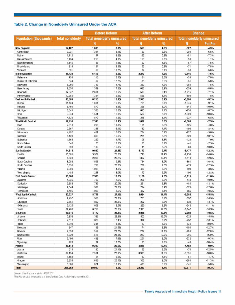
Insurance CoverageNationally, the ACA would decrease the number of uninsured nonelderly persons by just under 28 million, a decrease of 10.3 percentage points (Table 2). There would, however, be considerable variation by state. Massachusetts would see little change (a decrease of 1.1 percentage points) because the ACA was to a large extent based on the health reforms already operating in Massachusetts. As a result of these reforms, the state had a low uninsured rate to begin with. The states with the largest decreases would be Texas and New Mexico (16.9 and 16.0 percentage points, respectively). These states currently have much higher than average uninsured rates (29 and 28 percent, compared with a national average of 19 percent).
There are clear regional patterns in how health insurance coverage would change under the ACA. New England states would see an average decrease in the uninsured rate of only 4.3 percentage points, while West South Central states would see an average decrease of 15.8 percentage points and South Atlantic states a decrease of 12.3 percentage points. Figure 2 maps these differences. Massachusetts, the only state that has already enacted comprehensive health reform, stands out as the only state with a decrease in uninsurance under 2 percentage points. There is a large band of states which would see the greatest gains in insurance coverage under reform across the Southwestern and Southeastern states. North of this grouping, the Midwest and Northeast would experience more modest
decreases in uninsurance, along with Washington and California.
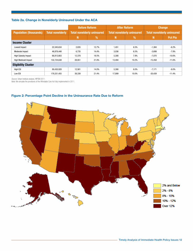
There are also significant differences across income clusters as well as between ESI eligibility clusters (Table 2a). High Medicaid-impact and high subsidy-range states would see a much larger decrease in the uninsured rate than the other two groups (11.6 and 10.6 percentage points, respectively). Lowest impact states would see a decrease of only 6.2 percentage points. Low ESI eligibility states would see a decrease of 11.4 percentage points, in contrast with 8.0 percentage points for high ESI eligibility states. Health reform has the most effect in states with the lowest availability of ESI.
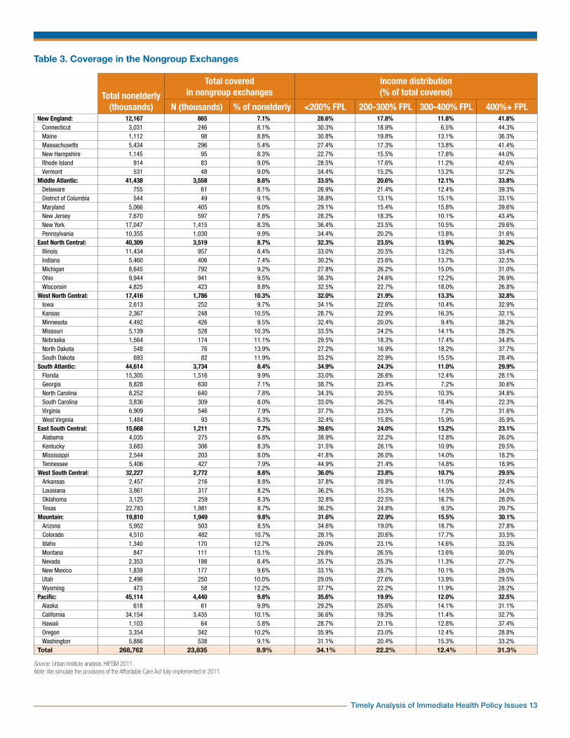
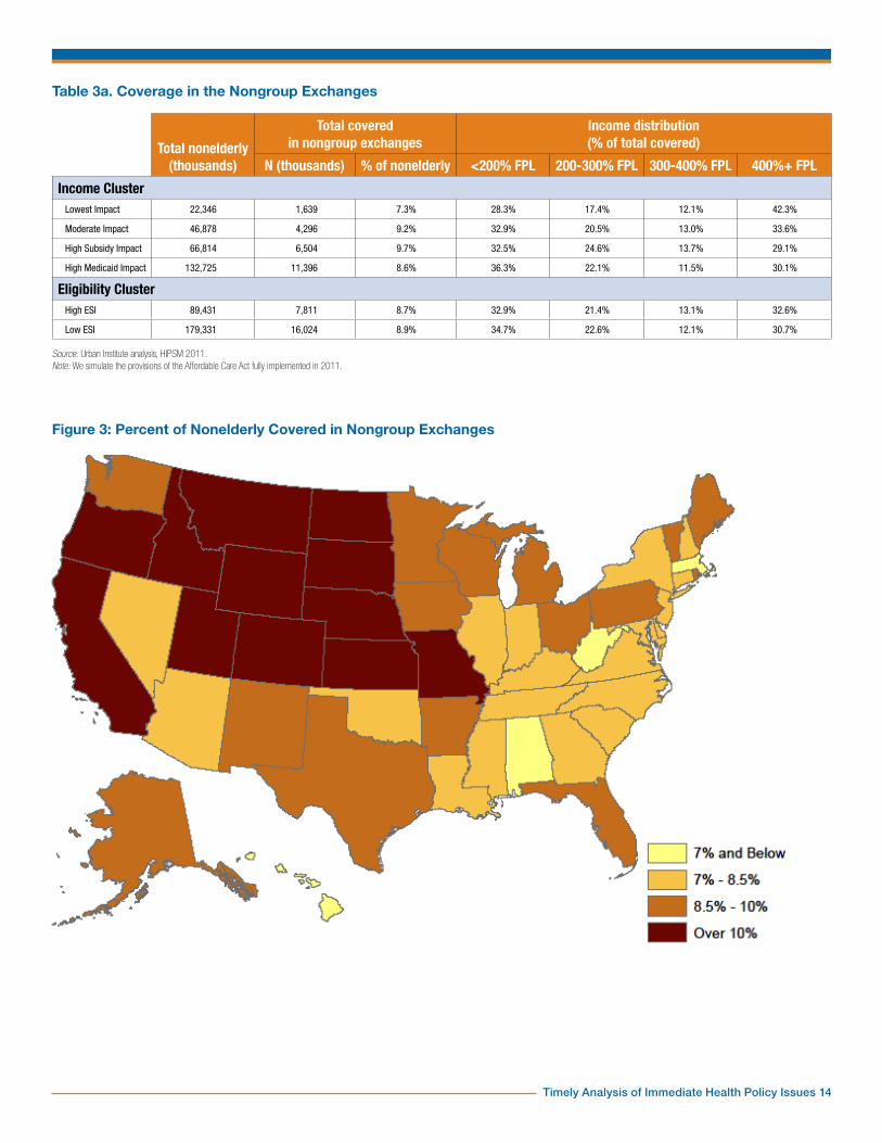
The Nongroup ExchangesNationally, 8.9 percent of the nonelderly would be covered through the nongroup health exchanges (Table 3). State by state, the percentage varies from 5.4 percent in Massachusetts to 13.9 percent in North Dakota. Groups of states that would have similar changes in rates of insurance coverage often have very different rates of exchange enrollment. For example, Georgia and Montana would experience large changes in insurance under reform, with 12.6 and 12.7 percentage point increases, respectively. However, while Georgia will cover only 7.1 percent of its population through the nongroup exchange, Montana covers 13.1 percent.
There are regional patterns in nongroup exchange enrollment. New England and East South Central states would have the lowest proportion of the nonelderly covered in their nongroup exchanges, with 7.1 and 7.7 percent, respectively. Mapping the percentages of the nonelderly with exchange coverage, we see the regions with the highest shares are West North Central, Mountain and Pacific. High rates of exchange coverage are also found in Florida, some Middle Atlantic states and some New England states. West North Central states would have the highest, 10.3 percent, closely followed by Mountain and Pacific states, both with 9.8 percent. The lowest rates are in Massachusetts, West

Timely Analysis of Immediate Health Policy Issues 5
Virginia and Hawaii. Massachusetts has very high ESI availability and a lower than average share of people in the exchange premium subsidy income range. West Virginia has a large proportion of nonelderly adults eligible for Medicaid under the expansion. The gain in coverage under reform for West Virginians is due more to the Medicaid expansion in this state than on average.
In Table 3, we also show the income distribution of those enrolled in the exchange. The share of enrollees above 400 percent of the FPL is particularly significant; it gives a good indication of how much of the exchange risk pool is not subsidized. The exchanges would likely be an attractive option for those already enrolled in nongroup coverage, and many currently uninsured who are not offered ESI would take exchange coverage to comply with the mandate even if their income is too high to qualify for subsidies.11 There is a little unsubsidized coverage of persons below 400 percent of the FPL, mostly those using employee choice vouchers. Regionally, the share above 400 percent varies from 41.8 percent in New England to 23.1 percent in the East South Central states.
High subsidy impact states, not surprisingly, would have the highest percentage of the nonelderly enrolled in nongroup exchanges, 9.7 percent (Table 3a). Lowest impact states would have only 7.3 percent of the nonelderly in the exchanges, due in part to the fact that these states have the lowest share of residents in the subsidy-eligible income group. High Medicaid impact and moderate impact states would be closer to average, with 8.6 and 9.2 percent, respectively. The percent of those in the exchange above 400 percent of the FPL would vary from 30.1 percent for high subsidy impact states to 42.3 percent for lowest impact states.
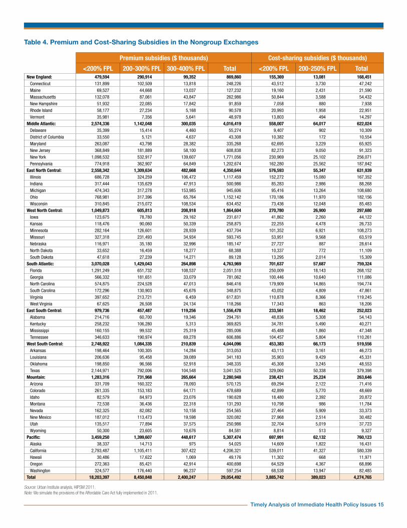
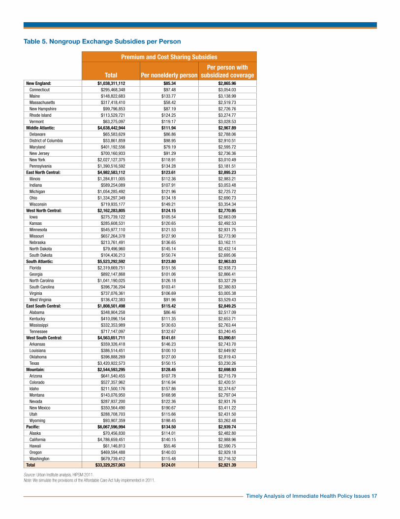
In Table 4, we show the amount of premium and cost-sharing subsidies that would be paid to low-income exchange enrollees in each state. Nationally, $29 billion would be paid in premium subsidies and $4.3 billion in cost-sharing
subsidies. Since subsidy amounts are computed using a sliding scale of percent-of-income thresholds, most of the spending is on the lowest eligible income groups. Sixty-three percent of premium subsidy dollars would go to those below 200 percent of the FPL and 29 percent to those between 200 and 300 percent of the FPL.12 Similarly, 91 percent of cost-sharing subsidy dollars would go to those below 200 percent of the FPL.
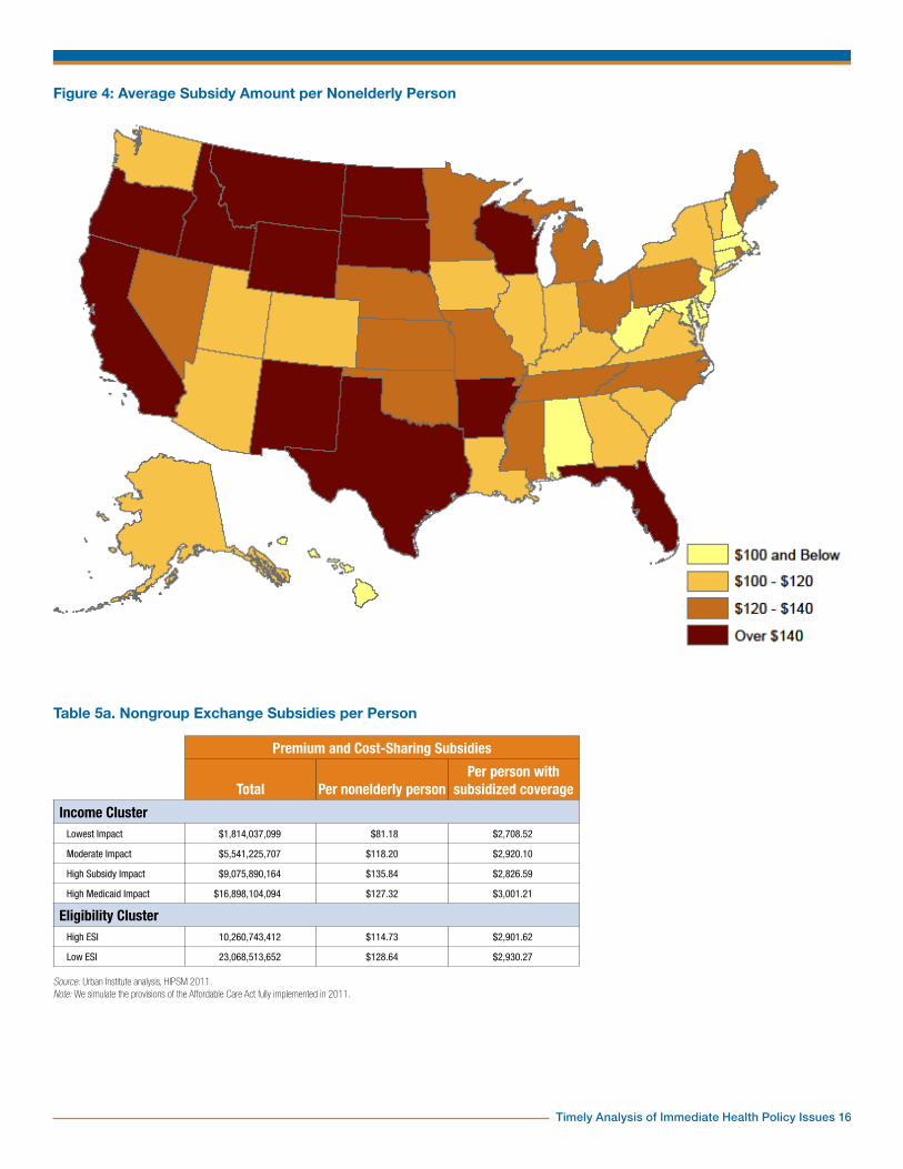
In Table 5, we show the total exchange subsidies that would be received by residents of each state, that is, the sum of premium and cost-sharing subsidies from Table 4. Due to the differences in state populations, these totals are unsuitable for comparisons between states. For that purpose we give two averages. First, the subsidy amount per nonelderly person measures the per capita subsidy dollars that would flow into a state. Second, the subsidy amount per person covered by a subsidized policy shows how many subsidy dollars would be received by a typical low-income person in a state’s exchanges.
The lowest subsidies per nonelderly person would be in New England and the Middle Atlantic states and the highest subsidies per nonelderly person would be among West South Central, Mountain and Pacific states. This variation is largely a result of the share covered by exchanges (Table 3) and the income distribution within the subsidy eligibility range, that is, 138 to 400 percent of the FPL. For example, the Mountain region has the same share of exchange coverage as the Pacific region, but its subsidies per nonelderly person would be only $128, as opposed to $135 in the Pacific. The Pacific region has a larger share of exchange coverage below 200 percent of the FPL than the Mountain region (Table 3). As we have seen in Table 4, the bulk of subsidies go to those in this income group. A map of average subsidies per nonelderly person shows the high and low regions that we have identified. Florida and Vermont appear as isolated high subsidy states.13
Subsidy amounts per subsidized person are more uniform across states. Subsidy income thresholds vary by income, so
differences in the income distribution between 138 and 400 percent of the FPL would be an important factor in these average subsidy amounts. State differences in underlying medical costs and premiums are an equally important factor. Since the federal government pays the difference between a benchmark premium and a percentage of income, states with higher medical costs and premiums will be eligible for higher subsidies, all else being equal. A third factor is ESI availability. There are significant state differences in who would be barred from subsidies due to an affordable ESI offer. These three factors interact and in some ways balance each other, dampening the differences between states.
Among income groups, high subsidy impact and high Medicaid impact states would have the highest subsidies per nonelderly person ($136 and $127 respective) and lowest impact states the lowest ($81). High ESI eligibility states would also have significantly lower subsidy dollars per nonelderly person ($115 versus $129). Differences in subsidy amounts per subsidized person are too small to give a significant pattern for either income or ESI eligibility clusters.
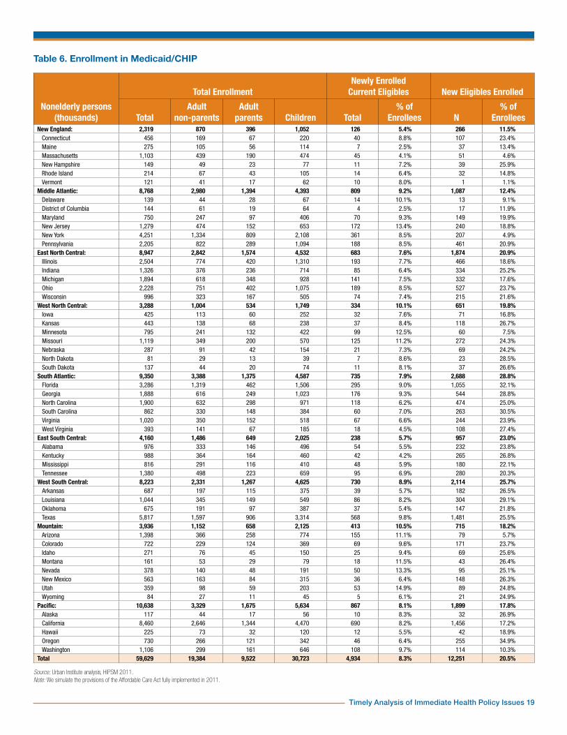
The Medicaid ExpansionTable 6 provides a state-by-state overview of enrollment in Medicaid and CHIP. Nationally, about a fifth of enrollees would be newly eligible under the Medicaid expansion. The rest were previously eligible—and the large majority were enrolled before reform. Because of the high income eligibility thresholds for children in the CHIP program in most states, few children would gain eligibility (Table 7). Less than 100,000 of the 12.3 million newly eligible enrollees would be children. These children are mostly in states with Medicaid/CHIP income thresholds for children at 200 percent of the FPL or less (not shown in tables).14 Even for states with thresholds far above 138 percent of the FPL, the difference in income definition under the ACA would gain eligibility for a small number of children. Eligibility thresholds for adult parents
Timely Analysis of Immediate Health Policy Issues 6
are generally lower than for children, so more would gain eligibility. Few states have general income eligibility thresholds for adult nonparents and enrollment is closed in many of these. Most adult nonparents currently enrolled in Medicaid obtained eligibility through special programs (e.g., disability or medically needy). Thus, the large majority of newly eligible Medicaid enrollees are adult nonparents (10.0 million out of 12.3 million).
For state comparisons, we will focus on the percent of Medicaid/CHIP enrollees who are made newly eligible by the expansion as well as percentages of newly enrolled current eligibles. This gives information about the mix of enrollees in public coverage and has important implications for costs, as we shall see. There are two kinds of factors to distinguish. First, current eligibility rules in the various states and, second, factors that make new eligibles more or less likely to enroll in Medicaid versus other insurance coverage options, including remaining uninsured. Current Medicaid and CHIP eligibility rules are complex and vary greatly for children, parents and adult nonparents. Also, the ACA standardizes the definition of income, modified AGI as defined in the law, to be used in the eligibility test. The states with the 20 lowest percentages of enrollees who are newly eligible are nearly all—except for Pennsylvania and Michigan—among the 25 states with the highest eligibility thresholds for parents in 2009.15 A few states have fairly generous Medicaid thresholds for adult nonparents as well, namely Arizona, Delaware, New York, Vermont and Hawaii.
Some states offer more limited coverage than standard Medicaid benefits to adults through Section 1115 waivers. Those who have such coverage and have MAGI below 138 percent of the FPL would qualify for the newly eligible federal match rate. For this reason, we count these as newly eligible. The state with the lowest share of new eligibles among enrollees is Vermont. That state offers full Medicaid benefits to parents up to 191 percent of the FPL and to
childless adults up to 160 percent. The second lowest is Massachusetts, which has already enacted comprehensive health reform. Pennsylvania has a more limited coverage program up to 213 percent of the FPL. Enrollment was closed by 2009, but there are enough existing enrollees to place that state among the 20 lowest. In fact, the 11 states with the lowest percentages all have programs with relatively high thresholds available to adult nonparents.
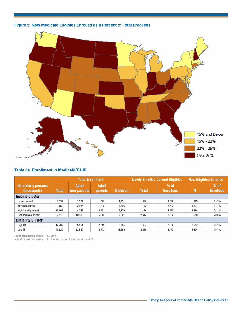
Regionally, New England and the Middle Atlantic have the lowest percentages of new eligibles among enrollees (11.5 and 12.4 percent) and the South Atlantic and West South Central states have the highest (28.8 and 25.7 percent). The Southern and Western regions are fairly uniformly low in their thresholds for adult parents and few have any general income eligibility programs for adult nonparents. Thus, higher than average shares of their Medicaid/CHIP enrollees are new eligibles. Exceptions such as Arizona and Washington stand out (Figure 5).
Unsurprisingly, regions with the most aggressive Medicaid enrollment outreach have the lowest percentages of newly enrolled current eligibles. New enrollment of current eligibles is lowest in eastern regions, with the lowest proportion in New England at 5.4 percent. At the other end of the spectrum, Mountain and West North Central states would see a large percentage of their Medicaid enrollment made up by residents who are eligible under current law. Individual states, however, do not necessarily conform to a regional pattern. Middle Atlantic states stand out as an example as this region contains the states with both extremes of enrollment (D.C. with 2.5 percent and New Jersey with 13.4 percent, respectively). There is little variation in new enrollment of current eligibles by income and ESI clusters, although there is a noticeable pattern. The percent of newly enrolled current eligibles increases with income levels (8.0 to 9.0 percent) and decreases with higher ESI eligibility (8.4 to 8.0 percent).
There is also a pattern across income clusters in new eligible enrollment. The
share of enrollees who are new eligibles is only 15.7 percent for the lowest impact states. It is 17.7 percent for moderate impact states and 20.0 percent for high Medicaid impact states. High subsidy impact states have a noticeably higher share: 25.1 percent. This is due to generally low prereform eligibility for adults in this cluster. Additionally, the share of new eligibles in high subsidy impact states is higher than that in high Medicaid impact states due to the presence of California, Arizona and New York in the latter.
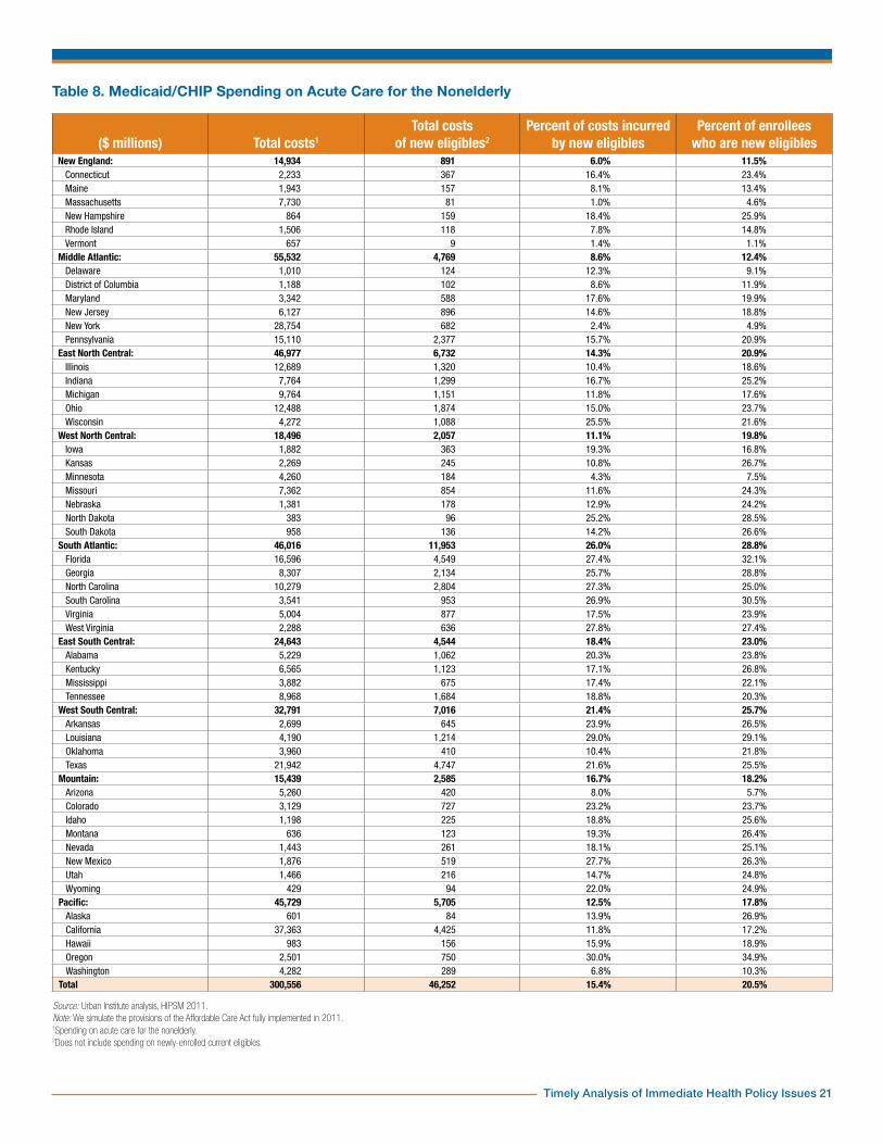
In Table 8, we show the Medicaid/CHIP spending on acute care for the nonelderly by state. Note that while nearly a fifth of enrollees would be newly eligible (Table 6), only 15.4 percent of costs would be incurred by the newly eligible. Nearly all of the newly eligible would be adults (Table 7), and these would be significantly cheaper to cover than current adult enrollees. The reason is that most current adult enrollees gain eligibility through such pathways as disability or medically needy that are closely associated with high health care costs.16 For most states, the percent of costs incurred by new eligibles is less than the percent of newly eligible enrollees. There are exceptions, though. In states with Medicaid or Section 1115 Waiver programs for childless adults, many of those who would be newly-eligible in other states are already enrolled. The remainder would not necessarily be less expensive to cover on average.17
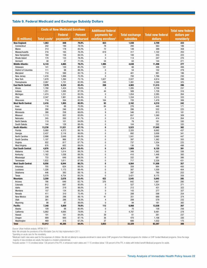
Total New Federal Spending on StatesWe now estimate the total federal spending on Medicaid and exchange subsidies that would go to each state (Table 9). We first show the total costs of new Medicaid enrollees and then estimate the share paid by the federal government. For newly eligible enrollees, we used a federal match rate of 90 percent. In the law, this is initially 100 percent but phases down over time to 90 percent. Some states have Section 1115 waiver programs for adults with benefits more limited than standard Medicaid. Under the ACA,
Timely Analysis of Immediate Health Policy Issues 7
those with MAGI under 138 percent of the FPL would be enrolled in standard Medicaid and counted as new eligibles. For new enrollees who were eligible before reform, the current match rates were used. These vary by state. For Section 1115 enrollees in seven states—Arizona, Delaware, Hawaii, Maine, Massachusetts, New York and Vermont—an enhanced match of 90 percent was used.18 These are likely to be underestimates because we use the Medicaid rates for children as well. Some would be covered under separate CHIP programs at a higher match rate. However, only the expenses of the newly enrolled and newly eligible are included here, and the vast majority of these are adults. Very few children would gain eligibility through the expansion because existing CHIP income thresholds are higher, though the change in the income definition to MAGI would gain eligibility for a few. Total exchange subsidies are repeated from Table 5.
Two estimates in Table 9 are directly comparable across states: the percent of Medicaid costs for new enrollees reimbursed by the federal government and the total federal Medicaid and subsidy dollars per nonelderly person. The percent reimbursed varies from about 70 percent in Minnesota and Washington to nearly 90 percent. It cannot be higher than 90 percent given our methodology. Minnesota and Washington have low federal medical assistance percentage (FMAP) rates (50 and 50.94 percent respectively), a low percentage of Medicaid enrollees who are newly eligible (7.5 and 10.3 percent) and Medicaid programs open to low-income adults, both parents and nonparents. In contrast, four states with very high percentages—Kentucky, Louisiana, Mississippi and West Virginia—have high FMAP rates (70 to 76 percent), high percentages of enrollees who are newly eligible (22 to 29 percent) and no Medicaid programs for adult nonparents. Regionally, the lowest federal match rates would be in New England, the Middle Atlantic and the Pacific (79 to 80 percent) and the highest would be
in East South Central and South Atlantic regions (87 to 88 percent).
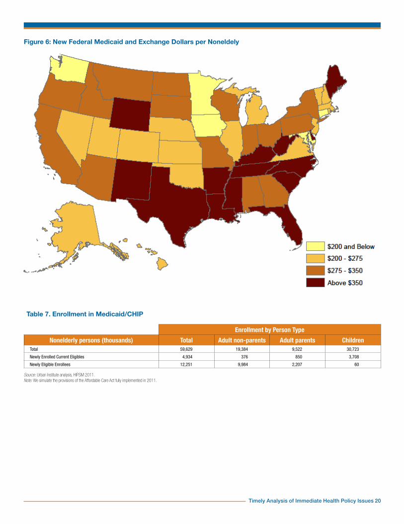
The regions at the extremes of new federal Medicaid and subsidy dollars per nonelderly person are the same as for federal match rates. Namely, the lowest per capita federal dollars would go to New England, West North Central and Pacific states ($223 to $267), and the highest would go to the East and West South Central regions ($382 and $391). The state with the highest per capita federal dollars would be West Virginia ($498). That state has a high current FMAP rate (74 percent) and a high percentage of new eligibles among Medicaid enrollees (27.4). West Virginia has high shares of people in both the Medicaid and exchange subsidy eligibility ranges (Table 1).
The state with the lowest per capita federal dollars would be Iowa ($171). Nearly 40 percent of the nonelderly in this state would have MAGI above 400 percent of the FPL and would thus be ineligible for Medicaid and subsidies. Iowa also has a low FMAP rate (63 percent) and extended Medicaid eligibility with standard benefits for adult parents up to 116 percent of the FPL.
The states which would receive the highest per capita new federal dollars are concentrated in the East South Central and West South Central regions and the contiguous states of West Virginia and Florida (Figure 6). Additionally, Maine and Wyoming both receive per capita subsidies noticeably different from their respective regional patterns. Many of the New England states would be below $275 as well as a cluster of Mountain and West North Central states from Nevada through Nebraska. Washington, Minnesota, Iowa and Connecticut stand out as isolated low per capita dollar states. We have seen how Washington differs from its neighbors regarding Medicaid (Figure 5).
The lowest and moderate impact states have noticeably lower federal reimbursement percentages and per capita new federal dollars than the high subsidy and high Medicaid impact states
(Table 9a). There is little difference in the reimbursement rates for high and low ESI states, but there is a difference in new federal dollars per capita.
SummaryUninsurance rates would decrease in all 50 states and in Washington, D.C. Under the ACA, every state contributes to a national decline of 28 million nonelderly uninsured persons. Factors such as current insurance markets and demographic makeup play an important role in shaping the effects of the ACA reform, as the considerable state variation from the national average shows. Massachusetts, for example, has already enacted comprehensive health reform and therefore sees only a small decrease in its uninsured population. Low state ESI eligibility amplifies the effects of the ACA, as does a state income distribution that results in a high eligibility rate for Medicaid and exchange subsidies.
Enrollment in the nongroup health exchanges depends on current employer-sponsored insurance eligibility as well as state income distributions. A high enrollment in the nongroup exchange tends to correspond with low Medicaid eligibility and vice versa. This can be seen in West Virginia, which has a larger than average proportion of nonelderly persons eligible for Medicaid and as a result the proportion eligible for exchange subsidies is smaller. Nongroup enrollment is also decreased where there are high levels of ESI eligibility in a state because persons with an affordable ESI offer cannot receive subsidies in the exchanges. A main driver of nongroup enrollment is the percent of the nonelderly who are eligible for exchange subsidies. This pattern is reflected in the Mountain states, many of which are in the high subsidy impact and have high levels of nongroup exchange enrollment.
Nongroup exchange subsidies are sensitive to coverage levels, income distributions and state
Timely Analysis of Immediate Health Policy Issues 8
specific medical costs. Income distribution within states is also an important determinant of subsidy amounts, as is the availability of ESI. Since a large proportion of exchange subsidies go to those below 200 percent of the FPL, a larger share of exchange coverage of this income group will also lead to increased subsidies. Looking at subsidies per subsidized person, or the average cost of a subsidized person, the interaction between level of exchange enrollment and percent of exchange enrollment below 200 percent of the FPL does not fully explain the regional variation. Factors such as medical costs and premium levels can change subsidies per subsidized person and contribute to the different levels among states.
The Medicaid expansion, which mainly affects adult nonparents, on average attracts cheaper and healthier enrollees. Of the 12.3 million newly eligible enrollees, 10.0 million of them are adult nonparents. These new enrollees have lower associated costs because, on average, they do not have the same health
issues that allowed adult nonparents to enroll previously. Adult parents see a relatively small but substantial (2.2 million) increase in Medicaid coverage due to the new ACA income eligibility definitions as well as increased income thresholds. Children are largely unaffected by the Medicaid expansion due to the high income eligibility threshold associated with CHIP. In addition to the new eligibles, all states would experience increased enrollment of the currently eligible. State income clusters and ESI eligibility are important determinants of new enrollment of current eligibles. There is a consistent decline in the percent of newly enrolled current eligibles as income levels decline and as ESI eligibility increases.
State variation in the proportion of newly eligible Medicaid enrollees is affected by current Medicaid programs for adults. The regional similarities in Medicaid/CHIP eligibility rules are generally reflected in the proportion of newly eligible enrollees in those regions. However, states that currently have programs targeting adult
nonparents tend to be exceptions. In the Southwest, for example, eligibility thresholds for adults tend to be low, so they would have a large number of new eligibles. Arizona, however, has a relatively high threshold for adult parents and a program for adult nonparents. This leads to a small proportion of newly eligible enrollees in that state.
There would be $82.3 billion total new federal Medicaid and exchange subsidy dollars flowing to the states. State differences in this amount reflect the factors discussed above for both the exchanges and Medicaid, as well as differences in current FMAP rates. Even after adjusting for population, differences across states are considerable. West Virginia would receive $498 in new federal spending for every nonelderly person in the state, while Iowa would receive only $171. States with the highest new spending per capita would be heavily concentrated in the South, while states with the lowest spending would be mainly in the Northeast and Midwest.

Timely Analysis of Immediate Health Policy Issues 9
Table 1. Distribution of the Nonelderly Population by State and Modified Adjusted Gross Income (Thousands)
<138% FPL 138-400% FPL 400%+ FPL TotalN % N % N % N
New England: 2,567 21.1% 3,770 31.0% 5,829 47.9% 12,167Connecticut 600 19.8% 857 28.3% 1,574 51.9% 3,031
Maine 278 25.0% 425 38.2% 409 36.8% 1,112
Massachusetts 1,165 21.4% 1,612 29.7% 2,656 48.9% 5,434
New Hampshire 181 15.9% 367 32.1% 596 52.1% 1,145
Rhode Island 239 26.2% 291 31.9% 383 41.9% 914
Vermont 103 19.4% 217 40.9% 211 39.7% 531Middle Atlantic: 10,501 25.3% 14,040 33.9% 16,897 40.8% 41,438
Delaware 189 25.1% 265 35.0% 301 39.9% 755
District of Columbia 160 29.5% 151 27.7% 233 42.8% 544
Maryland 1,043 20.6% 1,585 31.3% 2,437 48.1% 5,066
New Jersey 1,635 21.3% 2,418 31.5% 3,617 47.2% 7,670
New York 5,039 29.6% 5,753 33.7% 6,255 36.7% 17,047
Pennsylvania 2,434 23.5% 3,869 37.4% 4,053 39.1% 10,355East North Central: 10,904 27.1% 15,125 37.5% 14,279 35.4% 40,309
Illinois 3,032 26.5% 4,133 36.1% 4,270 37.3% 11,434
Indiana 1,601 29.3% 2,090 38.3% 1,769 32.4% 5,460
Michigan 2,505 29.0% 3,093 35.8% 3,046 35.2% 8,645
Ohio 2,721 27.4% 3,824 38.5% 3,398 34.2% 9,944
Wisconsin 1,044 21.6% 1,984 41.1% 1,797 37.2% 4,825West North Central: 4,281 24.6% 6,590 37.8% 6,546 37.6% 17,416
Iowa 594 22.8% 1,034 39.6% 984 37.7% 2,613
Kansas 633 26.7% 934 39.5% 800 33.8% 2,367
Minnesota 971 21.6% 1,608 35.8% 1,914 42.6% 4,492
Missouri 1,453 28.3% 1,870 36.4% 1,816 35.3% 5,139
Nebraska 354 22.6% 623 39.8% 587 37.5% 1,564
North Dakota 112 20.5% 216 39.5% 219 40.0% 548
South Dakota 164 23.7% 303 43.8% 225 32.5% 693South Atlantic: 12,907 28.9% 16,305 36.5% 15,401 34.5% 44,614
Florida 4,518 29.5% 5,691 37.2% 5,096 33.3% 15,305
Georgia 2,682 30.4% 3,213 36.4% 2,933 33.2% 8,828
North Carolina 2,542 30.8% 2,964 35.9% 2,746 33.3% 8,252
South Carolina 1,152 30.0% 1,527 39.8% 1,157 30.2% 3,836
Virginia 1,505 21.8% 2,347 34.0% 3,057 44.2% 6,909
West Virginia 508 34.3% 562 37.9% 413 27.8% 1,484East South Central: 5,354 34.2% 5,883 37.5% 4,431 28.3% 15,668
Alabama 1,309 32.4% 1,524 37.8% 1,202 29.8% 4,035
Kentucky 1,230 33.4% 1,364 37.0% 1,089 29.6% 3,683
Mississippi 1,022 40.2% 943 37.0% 580 22.8% 2,544
Tennessee 1,794 33.2% 2,052 38.0% 1,559 28.8% 5,406West South Central: 10,581 32.8% 11,988 37.2% 9,658 30.0% 32,227
Arkansas 850 34.6% 1,031 41.9% 577 23.5% 2,457
Louisiana 1,302 33.7% 1,302 33.7% 1,257 32.6% 3,861
Oklahoma 852 27.3% 1,231 39.4% 1,042 33.4% 3,125
Texas 7,577 33.3% 8,425 37.0% 6,782 29.8% 22,783Mountain: 5,536 27.9% 7,523 38.0% 6,750 34.1% 19,810
Arizona 2,024 34.0% 2,046 34.4% 1,882 31.6% 5,952
Colorado 994 22.1% 1,595 35.4% 1,921 42.6% 4,510
Idaho 342 25.5% 628 46.8% 370 27.6% 1,340
Montana 220 26.0% 332 39.2% 295 34.8% 847
Nevada 604 25.7% 997 42.4% 752 31.9% 2,353
New Mexico 692 37.6% 623 33.9% 524 28.5% 1,839
Utah 567 22.7% 1,113 44.6% 817 32.7% 2,496
Wyoming 93 19.6% 190 40.2% 191 40.3% 473Pacific: 13,348 29.6% 15,802 35.0% 15,963 35.4% 45,114
Alaska 158 25.6% 256 41.4% 204 33.0% 618
California 10,624 31.1% 11,739 34.4% 11,790 34.5% 34,154
Hawaii 341 31.0% 434 39.4% 327 29.6% 1,103
Oregon 926 27.6% 1,262 37.6% 1,166 34.8% 3,354
Washington 1,299 22.1% 2,111 35.9% 2,477 42.1% 5,886Total 75,979 28.3% 97,028 36.1% 95,755 35.6% 268,762
Source: Urban Institute analysis, HIPSM 2011.
Timely Analysis of Immediate Health Policy Issues 10
Table 1a. Distribution of the Nonelderly Population by Modified Adjusted Gross Income (Thousands)
<138% FPL 138-400% FPL 400%+ FPL Total
N % N % N % N
Income ClusterLowest Impact 4,625 20.7% 6,840 30.6% 10,881 48.7% 22,346
Moderate Impact 11,039 23.5% 16,802 35.8% 19,037 40.6% 46,878
High Subsidy Impact 18,027 27.0% 25,792 38.6% 22,995 34.4% 66,814
High Medicaid Impact 42,289 31.9% 47,594 35.9% 42,842 32.3% 132,725
Eligibility ClusterHigh ESI 21,858 24.4% 32,555 36.4% 35,018 39.2% 89,431
Low ESI 54,121 30.2% 64,473 36.0% 60,737 33.9% 179,331
Source: Urban Institute analysis, HIPSM 2011.
Figure 1: Map of Income Clusters with ESI Eligibility
Timely Analysis of Immediate Health Policy Issues 11
Table 2. Change in Nonelderly Uninsured Under the ACA
Before Reform After Reform ChangePopulation (thousands) Total nonelderly Total nonelderly uninsured Total nonelderly uninsured Total nonelderly uninsured
N % N % N Pct PtsNew England: 12,167 1,083 8.9% 556 4.6% -527 -4.3%
Connecticut 3,031 397 13.1% 197 6.5% -200 -6.6%Maine 1,112 147 13.2% 66 5.9% -81 -7.3%Massachusetts 5,434 216 4.0% 158 2.9% -58 -1.1%New Hampshire 1,145 136 11.9% 50 4.3% -87 -7.6%Rhode Island 914 124 13.6% 53 5.8% -71 -7.8%Vermont 531 62 11.7% 32 6.1% -30 -5.6%
Middle Atlantic: 41,438 6,416 15.5% 3,270 7.9% -3,146 -7.6%Delaware 755 116 15.4% 64 8.5% -53 -7.0%District of Columbia 544 67 12.2% 35 6.5% -31 -5.8%Maryland 5,066 743 14.7% 363 7.2% -380 -7.5%New Jersey 7,670 1,342 17.5% 683 8.9% -659 -8.6%New York 17,047 2,814 16.5% 1,599 9.4% -1,215 -7.1%Pennsylvania 10,355 1,334 12.9% 526 5.1% -808 -7.8%
East North Central: 40,309 6,210 15.4% 2,515 6.2% -3,695 -9.2%Illinois 11,434 1,814 15.9% 768 6.7% -1,046 -9.1%Indiana 5,460 870 15.9% 326 6.0% -544 -10.0%Michigan 8,645 1,363 15.8% 613 7.1% -750 -8.7%Ohio 9,944 1,591 16.0% 562 5.7% -1,028 -10.3%Wisconsin 4,825 572 11.9% 246 5.1% -327 -6.8%
West North Central: 17,416 2,340 13.4% 1,037 6.0% -1,303 -7.5%Iowa 2,613 296 11.3% 171 6.6% -125 -4.8%Kansas 2,367 365 15.4% 167 7.1% -198 -8.4%Minnesota 4,492 461 10.3% 234 5.2% -227 -5.0%Missouri 5,139 803 15.6% 284 5.5% -520 -10.1%Nebraska 1,564 229 14.7% 106 6.8% -123 -7.9%North Dakota 548 75 13.6% 33 6.1% -41 -7.5%South Dakota 693 110 15.9% 41 5.9% -69 -10.0%
South Atlantic: 44,614 9,650 21.6% 4,173 9.4% -5,477 -12.3%Florida 15,305 3,979 26.0% 1,741 11.4% -2,238 -14.6%Georgia 8,828 2,006 22.7% 892 10.1% -1,114 -12.6%North Carolina 8,252 1,596 19.3% 734 8.9% -861 -10.4%South Carolina 3,836 768 20.0% 289 7.5% -479 -12.5%Virginia 6,909 1,033 14.9% 439 6.3% -594 -8.6%West Virginia 1,484 268 18.0% 77 5.2% -190 -12.8%
East South Central: 15,668 2,983 19.0% 1,168 7.5% -1,815 -11.6%Alabama 4,035 707 17.5% 266 6.6% -440 -10.9%Kentucky 3,683 735 20.0% 251 6.8% -484 -13.1%Mississippi 2,544 539 21.2% 214 8.4% -325 -12.8%Tennessee 5,406 1,003 18.5% 437 8.1% -566 -10.5%
West South Central: 32,227 8,747 27.1% 3,664 11.4% -5,083 -15.8%Arkansas 2,457 558 22.7% 201 8.2% -357 -14.5%Louisiana 3,861 822 21.3% 292 7.6% -530 -13.7%Oklahoma 3,125 608 19.5% 260 8.3% -348 -11.1%Texas 22,783 6,758 29.7% 2,911 12.8% -3,847 -16.9%
Mountain: 19,810 4,172 21.1% 2,088 10.5% -2,084 -10.5%Arizona 5,952 1,328 22.3% 802 13.5% -526 -8.8%Colorado 4,510 829 18.4% 372 8.2% -457 -10.1%Idaho 1,340 244 18.2% 110 8.2% -134 -10.0%Montana 847 182 21.5% 74 8.8% -108 -12.7%Nevada 2,353 557 23.7% 274 11.7% -283 -12.0%New Mexico 1,839 515 28.0% 220 12.0% -295 -16.0%Utah 2,496 433 17.3% 201 8.0% -232 -9.3%Wyoming 473 84 17.7% 35 7.3% -49 -10.4%
Pacific: 45,114 9,299 20.6% 4,818 10.7% -4,482 -9.9%Alaska 618 130 21.1% 53 8.5% -78 -12.5%California 34,154 7,561 22.1% 3,930 11.5% -3,631 -10.6%Hawaii 1,103 104 9.5% 53 4.8% -51 -4.7%Oregon 3,354 683 20.4% 303 9.0% -380 -11.3%Washington 5,886 821 13.9% 480 8.2% -341 -5.8%
Total 268,762 50,900 18.9% 23,289 8.7% -27,611 -10.3%
Source: Urban Institute analysis, HIPSM 2011.Note: We simulate the provisions of the Affordable Care Act fully implemented in 2011.
Timely Analysis of Immediate Health Policy Issues 12
Table 2a. Change in Nonelderly Uninsured Under the ACA
Before Reform After Reform Change
Population (thousands) Total nonelderly Total nonelderly uninsured Total nonelderly uninsured Total nonelderly uninsured
N % N % N Pct Pts
Income ClusterLowest Impact 22,345,634 2,835 12.7% 1,451 6.5% -1,384 -6.2%
Moderate Impact 46,878,448 6,735 14.4% 3,036 6.5% -3,699 -7.9%
High Subsidy Impact 66,813,663 12,378 18.5% 5,308 7.9% -7,070 -10.6%
High Medicaid Impact 132,724,638 28,951 21.8% 13,494 10.2% -15,458 -11.6%
Eligibility ClusterHigh ESI 89,430,928 12,561 14.0% 5,390 6.0% -7,171 -8.0%
Low ESI 179,331,455 38,338 21.4% 17,899 10.0% -20,439 -11.4%
Source: Urban Institute analysis, HIPSM 2011.Note: We simulate the provisions of the Affordable Care Act fully implemented in 2011.
Figure 2: Percentage Point Decline in the Uninsurance Rate Due to Reform
Timely Analysis of Immediate Health Policy Issues 13
Table 3. Coverage in the Nongroup Exchanges
Total nonelderly (thousands)
Total covered in nongroup exchanges
Income distribution (% of total covered)
N (thousands) % of nonelderly <200% FPL 200-300% FPL 300-400% FPL 400%+ FPLNew England: 12,167 865 7.1% 28.6% 17.8% 11.8% 41.8%
Connecticut 3,031 246 8.1% 30.3% 18.9% 6.5% 44.3%Maine 1,112 98 8.8% 30.8% 19.8% 13.1% 36.3%Massachusetts 5,434 296 5.4% 27.4% 17.3% 13.8% 41.4%New Hampshire 1,145 95 8.3% 22.7% 15.5% 17.8% 44.0%Rhode Island 914 83 9.0% 28.5% 17.6% 11.2% 42.6%Vermont 531 48 9.0% 34.4% 15.2% 13.2% 37.2%
Middle Atlantic: 41,438 3,558 8.6% 33.5% 20.6% 12.1% 33.8%Delaware 755 61 8.1% 26.9% 21.4% 12.4% 39.3%District of Columbia 544 49 9.1% 38.8% 13.1% 15.1% 33.1%Maryland 5,066 405 8.0% 29.1% 15.4% 15.8% 39.6%New Jersey 7,670 597 7.8% 28.2% 18.3% 10.1% 43.4%New York 17,047 1,415 8.3% 36.4% 23.5% 10.5% 29.6%Pennsylvania 10,355 1,030 9.9% 34.4% 20.2% 13.8% 31.6%
East North Central: 40,309 3,519 8.7% 32.3% 23.5% 13.9% 30.2%Illinois 11,434 957 8.4% 33.0% 20.5% 13.2% 33.4%Indiana 5,460 406 7.4% 30.2% 23.6% 13.7% 32.5%Michigan 8,645 792 9.2% 27.8% 26.2% 15.0% 31.0%Ohio 9,944 941 9.5% 36.3% 24.6% 12.2% 26.9%Wisconsin 4,825 423 8.8% 32.5% 22.7% 18.0% 26.8%
West North Central: 17,416 1,786 10.3% 32.0% 21.9% 13.3% 32.8%Iowa 2,613 252 9.7% 34.1% 22.6% 10.4% 32.9%Kansas 2,367 248 10.5% 28.7% 22.9% 16.3% 32.1%Minnesota 4,492 426 9.5% 32.4% 20.0% 9.4% 38.2%Missouri 5,139 528 10.3% 33.5% 24.2% 14.1% 28.2%Nebraska 1,564 174 11.1% 29.5% 18.3% 17.4% 34.8%North Dakota 548 76 13.9% 27.2% 16.9% 18.2% 37.7%South Dakota 693 82 11.9% 33.2% 22.9% 15.5% 28.4%
South Atlantic: 44,614 3,734 8.4% 34.9% 24.3% 11.0% 29.9%Florida 15,305 1,516 9.9% 33.0% 26.6% 12.4% 28.1%Georgia 8,828 630 7.1% 38.7% 23.4% 7.2% 30.6%North Carolina 8,252 640 7.8% 34.3% 20.5% 10.3% 34.8%South Carolina 3,836 309 8.0% 33.0% 26.2% 18.4% 22.3%Virginia 6,909 546 7.9% 37.7% 23.5% 7.2% 31.6%West Virginia 1,484 93 6.3% 32.4% 15.8% 15.9% 35.9%
East South Central: 15,668 1,211 7.7% 39.6% 24.0% 13.2% 23.1%Alabama 4,035 275 6.8% 38.9% 22.2% 12.8% 26.0%Kentucky 3,683 306 8.3% 31.5% 28.1% 10.9% 29.5%Mississippi 2,544 203 8.0% 41.8% 26.0% 14.0% 18.2%Tennessee 5,406 427 7.9% 44.9% 21.4% 14.8% 18.9%
West South Central: 32,227 2,772 8.6% 36.0% 23.8% 10.7% 29.5%Arkansas 2,457 216 8.8% 37.8% 28.8% 11.0% 22.4%Louisiana 3,861 317 8.2% 36.2% 15.3% 14.5% 34.0%Oklahoma 3,125 259 8.3% 32.8% 22.5% 16.7% 28.0%Texas 22,783 1,981 8.7% 36.2% 24.8% 9.3% 29.7%
Mountain: 19,810 1,949 9.8% 31.6% 22.9% 15.5% 30.1%Arizona 5,952 503 8.5% 34.6% 19.0% 18.7% 27.8%Colorado 4,510 482 10.7% 28.1% 20.6% 17.7% 33.5%Idaho 1,340 170 12.7% 29.0% 23.1% 14.6% 33.3%Montana 847 111 13.1% 29.8% 26.5% 13.6% 30.0%Nevada 2,353 198 8.4% 35.7% 25.3% 11.3% 27.7%New Mexico 1,839 177 9.6% 33.1% 28.7% 10.1% 28.0%Utah 2,496 250 10.0% 29.0% 27.6% 13.9% 29.5%Wyoming 473 58 12.2% 37.7% 22.2% 11.9% 28.2%
Pacific: 45,114 4,440 9.8% 35.6% 19.9% 12.0% 32.5%Alaska 618 61 9.9% 29.2% 25.6% 14.1% 31.1%California 34,154 3,435 10.1% 36.6% 19.3% 11.4% 32.7%Hawaii 1,103 64 5.8% 28.7% 21.1% 12.8% 37.4%Oregon 3,354 342 10.2% 35.9% 23.0% 12.4% 28.8%Washington 5,886 538 9.1% 31.1% 20.4% 15.3% 33.2%
Total 268,762 23,835 8.9% 34.1% 22.2% 12.4% 31.3%
Source: Urban Institute analysis, HIPSM 2011.Note: We simulate the provisions of the Affordable Care Act fully implemented in 2011.
Timely Analysis of Immediate Health Policy Issues 14
Table 3a. Coverage in the Nongroup Exchanges
Total nonelderly (thousands)
Total covered in nongroup exchanges
Income distribution (% of total covered)
N (thousands) % of nonelderly <200% FPL 200-300% FPL 300-400% FPL 400%+ FPL
Income ClusterLowest Impact 22,346 1,639 7.3% 28.3% 17.4% 12.1% 42.3%
Moderate Impact 46,878 4,296 9.2% 32.9% 20.5% 13.0% 33.6%
High Subsidy Impact 66,814 6,504 9.7% 32.5% 24.6% 13.7% 29.1%
High Medicaid Impact 132,725 11,396 8.6% 36.3% 22.1% 11.5% 30.1%
Eligibility ClusterHigh ESI 89,431 7,811 8.7% 32.9% 21.4% 13.1% 32.6%
Low ESI 179,331 16,024 8.9% 34.7% 22.6% 12.1% 30.7%
Source: Urban Institute analysis, HIPSM 2011.Note: We simulate the provisions of the Affordable Care Act fully implemented in 2011.
Figure 3: Percent of Nonelderly Covered in Nongroup Exchanges
Timely Analysis of Immediate Health Policy Issues 15
Table 4. Premium and Cost-Sharing Subsidies in the Nongroup Exchanges
Premium subsidies ($ thousands) Cost-sharing subsidies ($ thousands)
<200% FPL 200-300% FPL 300-400% FPL Total <200% FPL 200-250% FPL TotalNew England: 479,594 290,914 99,352 869,860 155,369 13,081 168,451
Connecticut 131,899 102,509 13,818 248,226 43,512 3,730 47,242
Maine 69,527 44,668 13,037 127,232 19,160 2,431 21,590
Massachusetts 132,078 87,061 43,847 262,986 50,844 3,588 54,432
New Hampshire 51,932 22,085 17,842 91,859 7,058 880 7,938
Rhode Island 58,177 27,234 5,168 90,578 20,993 1,958 22,951
Vermont 35,981 7,356 5,641 48,978 13,803 494 14,297Middle Atlantic: 2,574,336 1,142,048 300,035 4,016,419 558,007 64,017 622,024
Delaware 35,399 15,414 4,460 55,274 9,407 902 10,309
District of Columbia 33,550 5,121 4,637 43,308 10,382 172 10,554
Maryland 263,087 43,798 28,382 335,268 62,695 3,229 65,925
New Jersey 368,849 181,889 58,100 608,838 82,273 9,050 91,323
New York 1,098,532 532,917 139,607 1,771,056 230,969 25,102 256,071
Pennsylvania 774,918 362,907 64,849 1,202,674 162,280 25,562 187,842East North Central: 2,558,342 1,309,634 482,668 4,350,644 576,593 55,347 631,939
Illinois 686,728 324,259 106,472 1,117,459 152,272 15,080 167,352
Indiana 317,444 135,629 47,913 500,986 85,283 2,986 88,268
Michigan 474,343 317,278 153,985 945,606 95,416 13,264 108,680
Ohio 768,981 317,396 65,764 1,152,142 170,186 11,970 182,156
Wisconsin 310,845 215,072 108,534 634,452 73,436 12,048 85,483West North Central: 1,049,873 605,813 208,918 1,864,604 270,780 26,900 297,680
Iowa 123,675 78,780 29,162 231,617 41,862 2,260 44,122
Kansas 118,476 90,060 50,339 258,875 22,255 4,478 26,733
Minnesota 282,164 126,601 28,939 437,704 101,352 6,921 108,273
Missouri 327,318 231,493 34,934 593,745 53,951 9,568 63,519
Nebraska 116,971 35,180 32,996 185,147 27,727 887 28,614
North Dakota 33,652 16,459 18,277 68,388 10,337 772 11,109
South Dakota 47,618 27,239 14,271 89,128 13,295 2,014 15,309South Atlantic: 3,070,028 1,429,043 264,898 4,763,969 701,637 57,687 759,324
Florida 1,291,249 651,732 108,537 2,051,518 250,009 18,143 268,152
Georgia 566,332 181,651 33,079 781,062 100,446 10,640 111,086
North Carolina 574,875 224,528 47,013 846,416 179,909 14,865 194,774
South Carolina 172,296 130,903 45,676 348,875 43,052 4,809 47,861
Virginia 397,652 213,721 6,459 617,831 110,878 8,366 119,245
West Virginia 67,625 26,508 24,134 118,266 17,343 863 18,206East South Central: 979,736 457,487 119,256 1,556,478 233,561 18,462 252,023
Alabama 214,716 60,700 19,346 294,761 48,836 5,308 54,143
Kentucky 258,232 106,280 5,313 369,825 34,781 5,490 40,271
Mississippi 160,155 99,532 25,319 285,006 45,488 1,860 47,348
Tennessee 346,633 190,974 69,278 606,886 104,457 5,804 110,261West South Central: 2,748,922 1,084,335 210,839 4,044,096 453,383 66,173 519,556
Arkansas 198,464 100,305 14,284 313,053 43,113 3,161 46,273
Louisiana 206,636 95,458 39,089 341,183 35,903 9,429 45,331
Oklahoma 198,850 96,566 52,918 348,335 45,308 3,245 48,553
Texas 2,144,971 792,006 104,548 3,041,525 329,060 50,338 379,398Mountain: 1,283,316 731,968 265,664 2,280,948 238,421 25,224 263,646
Arizona 331,709 160,322 78,093 570,125 69,294 2,122 71,416
Colorado 261,335 153,183 64,171 478,689 42,899 5,770 48,669
Idaho 82,579 84,973 23,076 190,628 18,480 2,392 20,872
Montana 72,538 36,436 22,318 131,293 10,798 986 11,784
Nevada 162,325 82,082 10,158 254,565 27,464 5,909 33,373
New Mexico 187,012 113,473 19,598 320,082 27,968 2,514 30,482
Utah 135,517 77,894 37,575 250,986 32,704 5,019 37,723
Wyoming 50,300 23,605 10,676 84,581 8,814 513 9,327Pacific: 3,459,250 1,399,607 448,617 5,307,474 697,991 62,132 760,123
Alaska 38,337 14,713 975 54,025 14,609 1,822 16,431
California 2,793,487 1,105,411 307,422 4,206,321 539,011 41,327 580,339
Hawaii 30,486 17,622 1,069 49,176 11,302 668 11,971
Oregon 272,363 85,421 42,914 400,698 64,529 4,367 68,896
Washington 324,577 176,440 96,237 597,254 68,538 13,947 82,485Total 18,203,397 8,450,848 2,400,247 29,054,492 3,885,742 389,023 4,274,765
Source: Urban Institute analysis, HIPSM 2011.Note: We simulate the provisions of the Affordable Care Act fully implemented in 2011.
Timely Analysis of Immediate Health Policy Issues 16
Table 5a. Nongroup Exchange Subsidies per Person
Premium and Cost-Sharing Subsidies
Total Per nonelderly personPer person with
subsidized coverage
Income ClusterLowest Impact $1,814,037,099 $81.18 $2,708.52
Moderate Impact $5,541,225,707 $118.20 $2,920.10
High Subsidy Impact $9,075,890,164 $135.84 $2,826.59
High Medicaid Impact $16,898,104,094 $127.32 $3,001.21
Eligibility ClusterHigh ESI 10,260,743,412 $114.73 $2,901.62
Low ESI 23,068,513,652 $128.64 $2,930.27
Source: Urban Institute analysis, HIPSM 2011.Note: We simulate the provisions of the Affordable Care Act fully implemented in 2011.
Figure 4: Average Subsidy Amount per Nonelderly Person
Timely Analysis of Immediate Health Policy Issues 17
Table 5. Nongroup Exchange Subsidies per Person
Premium and Cost Sharing Subsidies
Total Per nonelderly personPer person with
subsidized coverageNew England: $1,038,311,112 $85.34 $2,865.96
Connecticut $295,468,348 $97.48 $3,054.03Maine $148,822,683 $133.77 $3,138.99Massachusetts $317,418,410 $58.42 $2,519.73New Hampshire $99,796,853 $87.19 $2,726.76Rhode Island $113,529,721 $124.25 $3,274.77Vermont $63,275,097 $119.17 $3,028.53
Middle Atlantic: $4,638,442,944 $111.94 $2,967.89Delaware $65,583,629 $86.86 $2,788.06District of Columbia $53,861,859 $98.95 $2,910.51Maryland $401,192,556 $79.19 $2,595.72New Jersey $700,160,933 $91.29 $2,736.36New York $2,027,127,375 $118.91 $3,010.49Pennsylvania $1,390,516,592 $134.28 $3,181.51
East North Central: $4,982,583,112 $123.61 $2,895.23Illinois $1,284,811,005 $112.36 $2,983.21Indiana $589,254,089 $107.91 $3,053.48Michigan $1,054,285,492 $121.96 $2,725.72Ohio $1,334,297,349 $134.18 $2,690.73Wisconsin $719,935,177 $149.21 $3,354.34
West North Central: $2,162,283,805 $124.15 $2,770.95Iowa $275,739,122 $105.54 $2,663.09Kansas $285,608,531 $120.65 $2,492.53Minnesota $545,977,110 $121.53 $2,931.75Missouri $657,264,378 $127.90 $2,773.90Nebraska $213,761,491 $136.65 $3,162.11North Dakota $79,496,960 $145.14 $2,432.14South Dakota $104,436,213 $150.74 $2,695.06
South Atlantic: $5,523,292,592 $123.80 $2,963.03Florida $2,319,669,751 $151.56 $2,938.73Georgia $892,147,868 $101.06 $2,866.41North Carolina $1,041,190,025 $126.18 $3,327.29South Carolina $396,736,204 $103.41 $2,380.83Virginia $737,076,361 $106.69 $3,005.38West Virginia $136,472,383 $91.96 $3,529.43
East South Central: $1,808,501,498 $115.42 $2,849.25Alabama $348,904,258 $86.46 $2,517.09Kentucky $410,096,154 $111.35 $2,653.71Mississippi $332,353,989 $130.63 $2,763.44Tennessee $717,147,097 $132.67 $3,240.45
West South Central: $4,563,651,711 $141.61 $3,090.61Arkansas $359,326,418 $146.23 $2,743.70Louisiana $386,514,451 $100.10 $2,649.92Oklahoma $396,888,269 $127.00 $2,819.43Texas $3,420,922,573 $150.15 $3,230.26
Mountain: $2,544,593,295 $128.45 $2,698.93Arizona $641,540,455 $107.78 $2,715.79Colorado $527,357,962 $116.94 $2,420.51Idaho $211,500,176 $157.86 $2,374.67Montana $143,076,950 $168.98 $2,797.04Nevada $287,937,200 $122.36 $2,931.76New Mexico $350,564,490 $190.67 $3,411.22Utah $288,708,703 $115.66 $2,431.50Wyoming $93,907,359 $198.45 $3,262.48
Pacific: $6,067,596,994 $134.50 $2,939.74Alaska $70,456,830 $114.01 $2,482.80California $4,786,659,451 $140.15 $2,988.96Hawaii $61,146,813 $55.46 $2,590.75Oregon $469,594,488 $140.03 $2,929.18Washington $679,739,412 $115.48 $2,716.32
Total $33,329,257,063 $124.01 $2,921.39
Source: Urban Institute analysis, HIPSM 2011.Note: We simulate the provisions of the Affordable Care Act fully implemented in 2011.
Timely Analysis of Immediate Health Policy Issues 18
Table 6a. Enrollment in Medicaid/CHIP
Nonelderly persons (thousands)
Total Enrollment Newly Enrolled Current Eligibles New Eligibles Enrolled
TotalAdult
non-parentsAdult
parents Children Total% of
Enrollees N% of
EnrolleesIncome Cluster
Lowest Impact 3,737 1,377 529 1,831 338 9.0% 585 15.7%
Moderate Impact 9,050 2,956 1,398 4,696 773 8.5% 1,601 17.7%
High Subsidy Impact 13,866 4,746 2,251 6,870 1,180 8.5% 3,484 25.1%
High Medicaid Impact 32,975 10,305 5,343 17,327 2,644 8.0% 6,580 20.0%
Eligibility ClusterHigh ESI 17,707 5,854 2,819 9,034 1,424 8.0% 3,557 20.1%
Low ESI 41,922 13,530 6,703 21,689 3,510 8.4% 8,694 20.7%
Source: Urban Institute analysis, HIPSM 2011.Note: We simulate the provisions of the Affordable Care Act fully implemented in 2011.
Figure 5: New Medicaid Eligibles Enrolled as a Percent of Total Enrollees
Timely Analysis of Immediate Health Policy Issues 19
Table 6. Enrollment in Medicaid/CHIP
Nonelderly persons (thousands)
Total EnrollmentNewly Enrolled
Current Eligibles New Eligibles Enrolled
TotalAdult
non-parentsAdult
parents Children Total% of
Enrollees N% of
EnrolleesNew England: 2,319 870 396 1,052 126 5.4% 266 11.5%
Connecticut 456 169 67 220 40 8.8% 107 23.4%Maine 275 105 56 114 7 2.5% 37 13.4%Massachusetts 1,103 439 190 474 45 4.1% 51 4.6%New Hampshire 149 49 23 77 11 7.2% 39 25.9%Rhode Island 214 67 43 105 14 6.4% 32 14.8%Vermont 121 41 17 62 10 8.0% 1 1.1%
Middle Atlantic: 8,768 2,980 1,394 4,393 809 9.2% 1,087 12.4%Delaware 139 44 28 67 14 10.1% 13 9.1%District of Columbia 144 61 19 64 4 2.5% 17 11.9%Maryland 750 247 97 406 70 9.3% 149 19.9%New Jersey 1,279 474 152 653 172 13.4% 240 18.8%New York 4,251 1,334 809 2,108 361 8.5% 207 4.9%Pennsylvania 2,205 822 289 1,094 188 8.5% 461 20.9%
East North Central: 8,947 2,842 1,574 4,532 683 7.6% 1,874 20.9%Illinois 2,504 774 420 1,310 193 7.7% 466 18.6%Indiana 1,326 376 236 714 85 6.4% 334 25.2%Michigan 1,894 618 348 928 141 7.5% 332 17.6%Ohio 2,228 751 402 1,075 189 8.5% 527 23.7%Wisconsin 996 323 167 505 74 7.4% 215 21.6%
West North Central: 3,288 1,004 534 1,749 334 10.1% 651 19.8%Iowa 425 113 60 252 32 7.6% 71 16.8%Kansas 443 138 68 238 37 8.4% 118 26.7%Minnesota 795 241 132 422 99 12.5% 60 7.5%Missouri 1,119 349 200 570 125 11.2% 272 24.3%Nebraska 287 91 42 154 21 7.3% 69 24.2%North Dakota 81 29 13 39 7 8.6% 23 28.5%South Dakota 137 44 20 74 11 8.1% 37 26.6%
South Atlantic: 9,350 3,388 1,375 4,587 735 7.9% 2,688 28.8%Florida 3,286 1,319 462 1,506 295 9.0% 1,055 32.1%Georgia 1,888 616 249 1,023 176 9.3% 544 28.8%North Carolina 1,900 632 298 971 118 6.2% 474 25.0%South Carolina 862 330 148 384 60 7.0% 263 30.5%Virginia 1,020 350 152 518 67 6.6% 244 23.9%West Virginia 393 141 67 185 18 4.5% 108 27.4%
East South Central: 4,160 1,486 649 2,025 238 5.7% 957 23.0%Alabama 976 333 146 496 54 5.5% 232 23.8%Kentucky 988 364 164 460 42 4.2% 265 26.8%Mississippi 816 291 116 410 48 5.9% 180 22.1%Tennessee 1,380 498 223 659 95 6.9% 280 20.3%
West South Central: 8,223 2,331 1,267 4,625 730 8.9% 2,114 25.7%Arkansas 687 197 115 375 39 5.7% 182 26.5%Louisiana 1,044 345 149 549 86 8.2% 304 29.1%Oklahoma 675 191 97 387 37 5.4% 147 21.8%Texas 5,817 1,597 906 3,314 568 9.8% 1,481 25.5%
Mountain: 3,936 1,152 658 2,125 413 10.5% 715 18.2%Arizona 1,398 366 258 774 155 11.1% 79 5.7%Colorado 722 229 124 369 69 9.6% 171 23.7%Idaho 271 76 45 150 25 9.4% 69 25.6%Montana 161 53 29 79 18 11.5% 43 26.4%Nevada 378 140 48 191 50 13.3% 95 25.1%New Mexico 563 163 84 315 36 6.4% 148 26.3%Utah 359 98 59 203 53 14.9% 89 24.8%Wyoming 84 27 11 45 5 6.1% 21 24.9%
Pacific: 10,638 3,329 1,675 5,634 867 8.1% 1,899 17.8%Alaska 117 44 17 56 10 8.3% 32 26.9%California 8,460 2,646 1,344 4,470 690 8.2% 1,456 17.2%Hawaii 225 73 32 120 12 5.5% 42 18.9%Oregon 730 266 121 342 46 6.4% 255 34.9%Washington 1,106 299 161 646 108 9.7% 114 10.3%
Total 59,629 19,384 9,522 30,723 4,934 8.3% 12,251 20.5%
Source: Urban Institute analysis, HIPSM 2011.Note: We simulate the provisions of the Affordable Care Act fully implemented in 2011.
Timely Analysis of Immediate Health Policy Issues 20
Figure 6: New Federal Medicaid and Exchange Dollars per Noneldely
Table 7. Enrollment in Medicaid/CHIP
Enrollment by Person Type
Nonelderly persons (thousands) Total Adult non-parents Adult parents ChildrenTotal 59,629 19,384 9,522 30,723
Newly Enrolled Current Eligibles 4,934 376 850 3,708
Newly Eligible Enrollees 12,251 9,984 2,207 60
Source: Urban Institute analysis, HIPSM 2011.Note: We simulate the provisions of the Affordable Care Act fully implemented in 2011.
Timely Analysis of Immediate Health Policy Issues 21
Table 8. Medicaid/CHIP Spending on Acute Care for the Nonelderly
($ millions) Total costs1
Total costs of new eligibles2
Percent of costs incurred by new eligibles
Percent of enrollees who are new eligibles
New England: 14,934 891 6.0% 11.5%Connecticut 2,233 367 16.4% 23.4%Maine 1,943 157 8.1% 13.4%Massachusetts 7,730 81 1.0% 4.6%New Hampshire 864 159 18.4% 25.9%Rhode Island 1,506 118 7.8% 14.8%Vermont 657 9 1.4% 1.1%
Middle Atlantic: 55,532 4,769 8.6% 12.4%Delaware 1,010 124 12.3% 9.1%District of Columbia 1,188 102 8.6% 11.9%Maryland 3,342 588 17.6% 19.9%New Jersey 6,127 896 14.6% 18.8%New York 28,754 682 2.4% 4.9%Pennsylvania 15,110 2,377 15.7% 20.9%
East North Central: 46,977 6,732 14.3% 20.9%Illinois 12,689 1,320 10.4% 18.6%Indiana 7,764 1,299 16.7% 25.2%Michigan 9,764 1,151 11.8% 17.6%Ohio 12,488 1,874 15.0% 23.7%Wisconsin 4,272 1,088 25.5% 21.6%
West North Central: 18,496 2,057 11.1% 19.8%Iowa 1,882 363 19.3% 16.8%Kansas 2,269 245 10.8% 26.7%Minnesota 4,260 184 4.3% 7.5%Missouri 7,362 854 11.6% 24.3%Nebraska 1,381 178 12.9% 24.2%North Dakota 383 96 25.2% 28.5%South Dakota 958 136 14.2% 26.6%
South Atlantic: 46,016 11,953 26.0% 28.8%Florida 16,596 4,549 27.4% 32.1%Georgia 8,307 2,134 25.7% 28.8%North Carolina 10,279 2,804 27.3% 25.0%South Carolina 3,541 953 26.9% 30.5%Virginia 5,004 877 17.5% 23.9%West Virginia 2,288 636 27.8% 27.4%
East South Central: 24,643 4,544 18.4% 23.0%Alabama 5,229 1,062 20.3% 23.8%Kentucky 6,565 1,123 17.1% 26.8%Mississippi 3,882 675 17.4% 22.1%Tennessee 8,968 1,684 18.8% 20.3%
West South Central: 32,791 7,016 21.4% 25.7%Arkansas 2,699 645 23.9% 26.5%Louisiana 4,190 1,214 29.0% 29.1%Oklahoma 3,960 410 10.4% 21.8%Texas 21,942 4,747 21.6% 25.5%
Mountain: 15,439 2,585 16.7% 18.2%Arizona 5,260 420 8.0% 5.7%Colorado 3,129 727 23.2% 23.7%Idaho 1,198 225 18.8% 25.6%Montana 636 123 19.3% 26.4%Nevada 1,443 261 18.1% 25.1%New Mexico 1,876 519 27.7% 26.3%Utah 1,466 216 14.7% 24.8%Wyoming 429 94 22.0% 24.9%
Pacific: 45,729 5,705 12.5% 17.8%Alaska 601 84 13.9% 26.9%California 37,363 4,425 11.8% 17.2%Hawaii 983 156 15.9% 18.9%Oregon 2,501 750 30.0% 34.9%Washington 4,282 289 6.8% 10.3%
Total 300,556 46,252 15.4% 20.5%
Source: Urban Institute analysis, HIPSM 2011.Note: We simulate the provisions of the Affordable Care Act fully implemented in 2011.1Spending on acute care for the nonelderly.2Does not include spending on newly-enrolled current eligibles.
Timely Analysis of Immediate Health Policy Issues 22
Table 9. Federal Medicaid and Exchange Subsidy Dollars
($ millions)
Costs of New Medicaid Enrollees Additional federal payments for
existing enrollees3
Total exchange subsidies
Total new federal dollars
Total new federal dollars per nonelderlyTotal costs1
Federal payments2
Percent reimbursed
New England: 1,063 848 79.8% 823 1,038 2,709 223Connecticut 242 190 78.5% 78 295 563 186Maine 213 178 83.2% 72 149 399 358Massachusetts 216 165 76.3% 619 317 1,102 203New Hampshire 184 156 84.5% 0 100 255 223Rhode Island 170 133 78.4% 0 114 247 270Vermont 38 27 71.5% 54 63 144 271
Middle Atlantic: 6,143 4,865 79.2% 1,995 4,638 11,498 277Delaware 141 120 85.2% 121 66 306 406District of Columbia 111 98 88.3% 0 54 152 279Maryland 710 590 83.1% 0 401 991 196New Jersey 1,416 1,066 75.3% 0 700 1,766 230New York 1,678 1,260 75.1% 1,627 2,027 4,914 288Pennsylvania 2,087 1,731 82.9% 248 1,391 3,369 325
East North Central: 7,579 6,324 83.4% 208 4,983 11,515 286Illinois 1,790 1,424 79.6% 0 1,285 2,709 237Indiana 1,251 1,095 87.5% 44 589 1,728 316Michigan 1,474 1,231 83.5% 0 1,054 2,285 264Ohio 2,347 1,981 84.4% 0 1,334 3,315 333Wisconsin 716 594 82.9% 164 720 1,478 306
West North Central: 2,416 1,955 80.9% 93 2,162 4,210 242Iowa 116 88 75.9% 84 276 448 171Kansas 290 246 85.0% 0 286 532 225Minnesota 388 258 66.6% 9 546 813 181Missouri 1,113 932 83.8% 0 657 1,590 309Nebraska 245 200 81.7% 0 214 414 264North Dakota 119 101 84.8% 0 79 181 330South Dakota 144 128 88.4% 0 104 232 335
South Atlantic: 13,230 11,521 87.1% 0 5,523 17,045 382Florida 5,080 4,372 86.1% 0 2,320 6,692 437Georgia 2,437 2,116 86.8% 0 892 3,008 341North Carolina 2,998 2,649 88.4% 0 1,041 3,690 447South Carolina 1,107 966 87.2% 0 397 1,362 355Virginia 932 817 87.7% 0 737 1,554 225West Virginia 676 602 89.0% 0 136 738 498
East South Central: 4,876 4,311 88.4% 0 1,809 6,120 391Alabama 1,149 1,014 88.2% 0 349 1,362 338Kentucky 1,162 1,038 89.3% 0 410 1,448 393Mississippi 733 649 88.5% 0 332 981 386Tennessee 1,832 1,611 87.9% 0 717 2,328 431
West South Central: 8,056 6,944 86.2% 0 4,564 11,508 357Arkansas 705 624 88.5% 0 359 984 400Louisiana 1,326 1,173 88.4% 0 387 1,559 404Oklahoma 446 393 88.1% 0 397 790 253Texas 5,579 4,754 85.2% 0 3,421 8,175 359
Mountain: 3,209 2,678 83.4% 422 2,545 5,645 285Arizona 786 649 82.7% 376 642 1,667 280Colorado 812 697 85.8% 0 527 1,224 271Idaho 249 219 88.0% 0 212 431 322Montana 157 134 85.2% 0 143 277 327Nevada 411 310 75.4% 0 288 598 254New Mexico 336 296 88.1% 41 351 688 374Utah 361 286 79.3% 4 289 579 232Wyoming 98 87 88.6% 0 94 181 382
Pacific: 7,340 5,859 79.8% 112 6,068 12,038 267Alaska 109 88 80.9% 0 70 158 256California 5,882 4,695 79.8% 0 4,787 9,481 278Hawaii 191 161 84.0% 39 61 261 237Oregon 689 600 87.1% 36 470 1,106 330Washington 469 315 67.2% 37 680 1,032 175
Total 53,912 45,305 84.0% 3,653 33,329 82,287 306
Source: Urban Institute analysis, HIPSM 2011.Note: We simulate the provisions of the Affordable Care Act fully implemented in 2011.1Spending on acute care for the nonelderly.2 Medicaid match rules were used for the expenses of children. We did not attempt to separate enrollment in stand-alone CHIP programs from Medicaid programs for children or CHIP-funded Medicaid programs. Since the large majority of new enrollees are adults, this leads to a modest underestimate.
3Includes section 1115 enrollees below 138 percent of the FPL in enhanced match states and 1115 enrollees below 138 percent of the FPL in states with limited-benefit Medicaid programs for adults.

Timely Analysis of Immediate Health Policy Issues 23
Table 9a. Federal Medicaid and Exchange Subsidy Dollars
($ millions)
Costs of New Medicaid Enrollees Additional federal payments for
existing enrollees3
Total exchange subsidies
Total new federal dollars
Total new federal dollars per nonelderlyTotal costs1
Federal payments2
Percent reimbursed
Income ClusterLowest Impact 2,768 2,167 78.3% 697 1,814 4,678 209
Moderate Impact 7,056 5,721 81.1% 468 5,541 11,730 250
High Subsidy Impact 14,259 12,067 84.6% 361 9,076 21,504 322
High Medicaid Impact 29,829 25,350 85.0% 2,127 16,898 44,376 334
Eligibility ClusterHigh ESI 14,229 11,804 83.0% 1,459 10,261 23,524 263
Low ESI 39,683 33,501 84.4% 2,194 23,069 58,763 328
Source: Urban Institute analysis, HIPSM 2011.Note: We simulate the provisions of the Affordable Care Act fully implemented in 2011.1Spending on acute care for the nonelderly.2 Medicaid match rules were used for the expenses of children. We did not attempt to separate enrollment in stand-alone CHIP programs from Medicaid programs for children or CHIP-funded Medicaid programs. Since the large majority of new enrollees are adults, this leads to a modest underestimate.
3Includes section 1115 enrollees below 138 percent of the FPL in enhanced match states and 1115 enrollees below 138 percent of the FPL in states with limited-benefit Medicaid programs for adults.
Timely Analysis of Immediate Health Policy Issues 24
Notes1 Matthew Buettgens, Bowen Garrett
and John Holahan, “America under the Affordable Care Act” (Washington, DC: The Urban Institute, 2010).
2 This is lower than the 16.0 million projected by CBO and 15.9 million projected by Holahan and Headen primarily because it is a 2011 estimate rather than a forecast for 2019. John Holahan and Irene Headen, “Medicaid Coverage and Spending in Health Reform: National and State-by-State Results for Adults at or Below 133% Poverty” (Washington, DC: The Urban Institute, 2010), http://www.kff.org/healthreform/8076.cfm.
3 Holahan and Headen, 2010.
4 For more about HIPSM and a list of recent research using it, see http://www.urban.org/uploadedpdf/412154-Health-Microsimulation-Capabilities.pdf. A more technical description of the construction of the model can be found in Bowen Garrett, John Holahan, Irene Headen and Aaron Lucas, “The Coverage and Cost Impacts of Expanding Medicaid” (Washington, DC: The Kaiser Commission on Medicaid and the Uninsured, 2009), http://www.urban.org/url.cfm?ID=411905.
5 HIPSM uses data from several national data sets: the March Current Population Survey (CPS) Annual Social and Economic Supplement, the February CPS Contingent Work and Alternative Employment Supplement, the Medical Expenditure Panel Survey (MEPS), the Statistics of Income (SOI) Public Use Tax File and the Statistics of U.S. Business. Distributions of coverage are based on March CPS data with adjustments for the Medicaid undercount.
6 Buettgens, Garrett and Holahan, 2010.
7 National Health Expenditure Accounts, CMS Office of the Actuary. https://www.cms.gov/NationalHealthExpendData/
8 Blumberg, et al., “Achieving Quality, Affordable Health Insurance for All New Yorkers: An Analysis of Reform Options,” (Washington, DC: The Urban Institute, 2009) http://www.urban.org/url.cfm?ID=411925
9 See, for example, Bowen Garrett, John Holahan, Allison Cook, Irene Headen and Aaron Lucas, “The Coverage and Cost Impacts of Expanding Medicaid” (Washington, DC: The Urban Institute, 2009), http://www.kff.org/medicaid/upload/7901.pdf.
10 Holahan and Headen, 2010.
11 There are other reasons why the unsubsidized might enroll in the exchanges, e.g., those eligible for employee choice vouchers.
12 There will be some below 138 percent of the FPL who are eligible for subsidies, namely legal immigrants who have been residents less than five years. They are not eligible for Medicaid.
13 Florida, as we have seen, would see the largest decline in its uninsurance rate of any state. The decline is noticeably higher than that of any of its neighbors. Much of the gain in coverage is in the nongroup exchanges, so we should not be surprised that it stands out here as well. Vermont has substantially higher than average per capita health costs and would have a significantly higher than average share of its exchange enrollment in the subsidy eligibility
range. Average per capita health costs are from National Health Expenditure Accounts, CMS Office of the Actuary.
14 “Income eligibility levels for children’s regular Medicaid and children’s CHIP-funded Medicaid expansions by annual incomes as a percent of the federal poverty level (FPL), December 2009,” http://www.statehealthfacts.org, Kaiser Family Foundation and “Income eligibility levels for children’s separate CHIP programs by annual incomes as a percent of the federal poverty level (FPL), December 2009,” http://www.statehealthfacts.org, Kaiser Family Foundation
15 “Medicaid and state funded coverage income eligibility limits for low-income adults, 2009,” http://www.statehealthfacts.org, Kaiser Family Foundation
16 For more detailed figures at the national level, see Matthew Buettgens, Bowen Garrett and John Holahan, “America under the Affordable Care Act” (Washington, DC: The Urban Institute, 2010)
17 Delaware and Hawaii, two states in which the share of expenses incurred by the newly eligible would be much higher than the share of newly eligible enrollees, have Medicaid-level benefit programs for childless adults and also have per capita health care costs significantly higher than the national average.
18 For further details on the separation of federal and state Medicaid costs, see Holahan and Headen (2010).
Timely Analysis of Immediate Health Policy Issues 25
The views expressed are those of the authors and should not be attributed to any campaign or to the Robert Wood Johnson Foundation, State Coverage Initiatives or the Urban Institute, its trustees or its funders.
About the Authors and AcknowledgmentsMatthew Buettgens, Ph.D., is a senior research methodologist, John Holahan, Ph.D., is director and Caitlin Carroll is a research assistant in the Urban Institute’s Health Policy Center. This research was funded by the Robert Wood Johnson Foundation. The authors are grateful to Enrique Martinez-Vidal for helpful comments.
About the Urban InstituteThe Urban Institute is a nonprofit, nonpartisan policy research and educational organization that examines the social, economic and governance problems facing the nation. For more information, visit www.urban.org.
About the Robert Wood Johnson FoundationThe Robert Wood Johnson Foundation focuses on the pressing health and health care issues facing our country. As the nation’s largest philanthropy devoted exclusively to improving the health and health care of all Americans, the Foundation works with a diverse group of organizations and individuals to identify solutions and achieve comprehensive, meaningful and timely change. For more than 35 years, the Foundation has brought experience, commitment and a rigorous, balanced approach to the problems that affect the health and health care of those it serves. When it comes to helping Americans lead healthier lives and get the care they need, the Foundation expects to make a difference in your lifetime. For more information, visit www.rwjf.org.
About State Coverage InitiativesThe State Coverage Initiatives (SCI) program provides timely, experience-based information and assistance to state leaders in order to help them move health care reform forward at the state level. SCI offices an integrated array of policy and technical assistance services and products to help state leaders with coverage expansion efforts, as well as with broader health care reform. Our team of policy experts tailors its approach to meeting state decision makers’ needs within the context of each state’s unique fiscal and political environment. SCI is a national program of the Robert Wood Johnson Foundation administered by AcademyHealth. For more information about SCI, visit www.statecoverage.org.