heat maps and thiessen polygons -...
TRANSCRIPT
Dr. Adam Sundberg HIS 317: Mapping History
Spatial Analysis: Heat Maps & Thiessen Polygons A Cholera Case Study
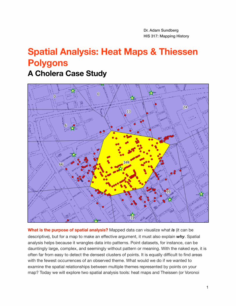
What is the purpose of spatial analysis? Mapped data can visualize what is (it can be descriptive), but for a map to make an effective argument, it must also explain why. Spatial analysis helps because it wrangles data into patterns. Point datasets, for instance, can be dauntingly large, complex, and seemingly without pattern or meaning. With the naked eye, it is often far from easy to detect the densest clusters of points. It is equally difficult to find areas with the fewest occurrences of an observed theme. What would we do if we wanted to examine the spatial relationships between multiple themes represented by points on your map? Today we will explore two spatial analysis tools: heat maps and Theissen (or Voronoi
�1
polygons. These tools will help us harness point data to make an argument about disease and space.
Introduction: Today we will explore John Snow’s map of the 1854 London cholera outbreak. Snow’s thematic map of cholera victims in the Soho neighborhood was not without precedent in medical cartography, but it was nevertheless an effective method of arguing that a spatial relationship existed between cholera victims and the Broad Street pump. Using GIS, we can explore alternate methods of visualizing these relationships using modern spatial analysis tools.
Instructions:
1. Create a new folder, "Week 8" and save it to your directory. Download and transfer files from the google drive.
2. Open QGIS. Add a basemap layer. Now, add the raster file “SnowMap.” The file has already been georeferenced to the Soho neighborhood of London. Take a moment to observe some of the notable changes to the city that have occurred since 1854. If you would like to see an ungeoreferenced, high resolution image of Snows Map for comparison in your image browser, it is in your folder marked “snow_map.png.”
3. Next, add the vector layer “Cholera_Death.” If the point symbols are not visually striking enough, change the symbology to make the contrast more apparent.
4. What kind of data does this layer contain? Does each point represents a person who died? Does it represent a location where multiple people died? Use the "identify features" tool to see what each point represents.
�2
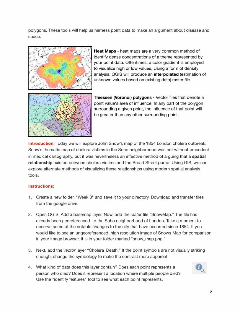
Heat Maps - heat maps are a very common method of identify dense concentrations of a theme represented by your point data. Oftentimes, a color gradient is employed to visualize high or low values. Using a form of density analysis, QGIS will produce an interpolated (estimation of unknown values based on existing data) raster file.
Thiessen (Voronoi) polygons - Vector files that denote a point value's area of influence. In any part of the polygon surrounding a given point, the influence of that point will be greater than any other surrounding point.
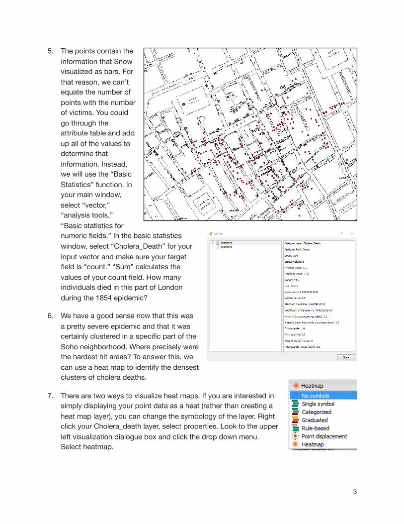
5. The points contain the information that Snow visualized as bars. For that reason, we can’t equate the number of points with the number of victims. You could go through the attribute table and add up all of the values to determine that information. Instead, we will use the “Basic Statistics” function. In your main window, select “vector,” “analysis tools,” “Basic statistics for numeric fields.” In the basic statistics window, select “Cholera_Death” for your input vector and make sure your target field is “count.” “Sum” calculates the values of your count field. How many individuals died in this part of London during the 1854 epidemic?
6. We have a good sense now that this was a pretty severe epidemic and that it was certainly clustered in a specific part of the Soho neighborhood. Where precisely were the hardest hit areas? To answer this, we can use a heat map to identify the densest clusters of cholera deaths.
7. There are two ways to visualize heat maps. If you are interested in simply displaying your point data as a heat (rather than creating a heat map layer), you can change the symbology of the layer. Right click your Cholera_death layer, select properties. Look to the upper left visualization dialogue box and click the drop down menu. Select heatmap.
�3
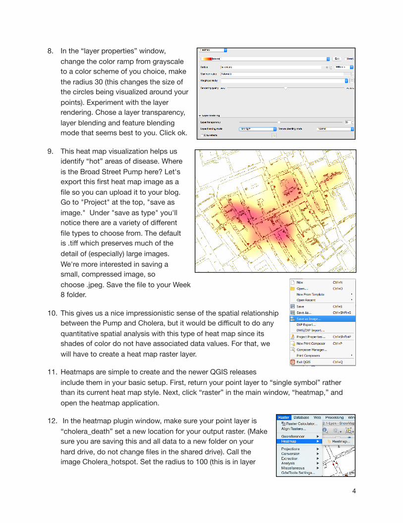
8. In the “layer properties” window, change the color ramp from grayscale to a color scheme of you choice, make the radius 30 (this changes the size of the circles being visualized around your points). Experiment with the layer rendering. Chose a layer transparency, layer blending and feature blending mode that seems best to you. Click ok.
9. This heat map visualization helps us identify “hot” areas of disease. Where is the Broad Street Pump here? Let's export this first heat map image as a file so you can upload it to your blog. Go to "Project" at the top, "save as image." Under "save as type" you'll notice there are a variety of different file types to choose from. The default is .tiff which preserves much of the detail of (especially) large images. We're more interested in saving a small, compressed image, so choose .jpeg. Save the file to your Week 8 folder.
10. This gives us a nice impressionistic sense of the spatial relationship between the Pump and Cholera, but it would be difficult to do any quantitative spatial analysis with this type of heat map since its shades of color do not have associated data values. For that, we will have to create a heat map raster layer.
11. Heatmaps are simple to create and the newer QGIS releases include them in your basic setup. First, return your point layer to “single symbol” rather than its current heat map style. Next, click “raster” in the main window, “heatmap,” and open the heatmap application.
12. In the heatmap plugin window, make sure your point layer is “cholera_death” set a new location for your output raster. (Make sure you are saving this and all data to a new folder on your hard drive, do not change files in the shared drive). Call the image Cholera_hotspot. Set the radius to 100 (this is in layer
�4
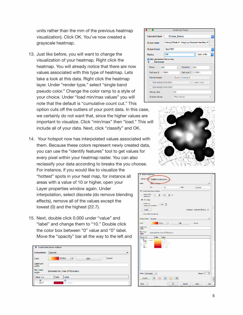
units rather than the mm of the previous heatmap visualization). Click OK. You’ve now created a grayscale heatmap.
13. Just like before, you will want to change the visualization of your heatmap. Right click the heatmap. You will already notice that there are now values associated with this type of heatmap. Lets take a look at this data. Right click the heatmap layer. Under “render type,” select “single band pseudo color.” Change the color ramp to a style of your choice. Under “load min/max values” you will note that the default is “cumulative count cut.” This option cuts off the outliers of your point data. In this case, we certainly do not want that, since the higher values are important to visualize. Click “min/max” then “load.” This will include all of your data. Next, click “classify” and OK.
14. Your hotspot now has interpolated values associated with them. Because these colors represent newly created data, you can use the “identify features” tool to get values for every pixel within your heatmap raster. You can also reclassify your data according to breaks the you choose. For instance, if you would like to visualize the “hottest” spots in your heat map, for instance all areas with a value of 10 or higher, open your Layer properties window again. Under interpolation, select discrete (do remove blending effects), remove all of the values except the lowest (0) and the highest (22.7).
15. Next, double click 0.000 under “value” and “label” and change them to “10.” Double click the color box between “0” value and “0” label. Move the “opacity” bar all the way to the left and
�5
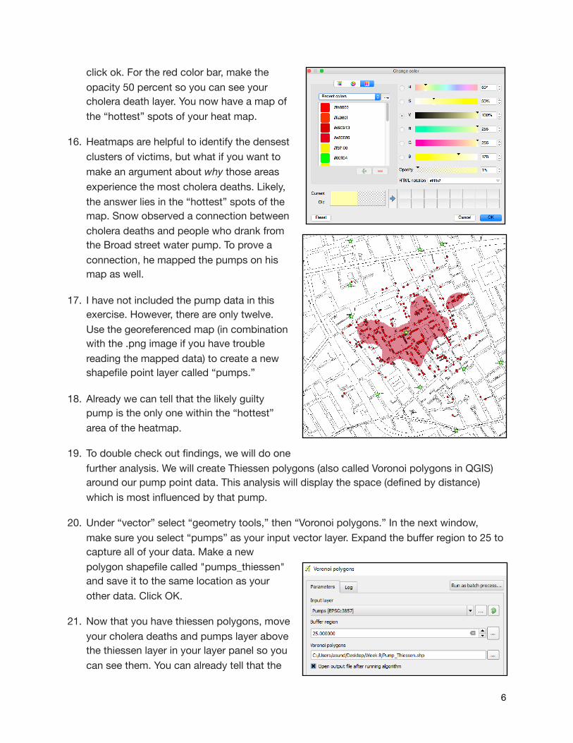
click ok. For the red color bar, make the opacity 50 percent so you can see your cholera death layer. You now have a map of the “hottest” spots of your heat map.
16. Heatmaps are helpful to identify the densest clusters of victims, but what if you want to make an argument about why those areas experience the most cholera deaths. Likely, the answer lies in the “hottest” spots of the map. Snow observed a connection between cholera deaths and people who drank from the Broad street water pump. To prove a connection, he mapped the pumps on his map as well.
17. I have not included the pump data in this exercise. However, there are only twelve. Use the georeferenced map (in combination with the .png image if you have trouble reading the mapped data) to create a new shapefile point layer called “pumps.”
18. Already we can tell that the likely guilty pump is the only one within the “hottest” area of the heatmap.
19. To double check out findings, we will do one further analysis. We will create Thiessen polygons (also called Voronoi polygons in QGIS) around our pump point data. This analysis will display the space (defined by distance) which is most influenced by that pump.
20. Under “vector” select “geometry tools,” then “Voronoi polygons.” In the next window, make sure you select “pumps” as your input vector layer. Expand the buffer region to 25 to capture all of your data. Make a new polygon shapefile called "pumps_thiessen" and save it to the same location as your other data. Click OK.
21. Now that you have thiessen polygons, move your cholera deaths and pumps layer above the thiessen layer in your layer panel so you can see them. You can already tell that the
�6
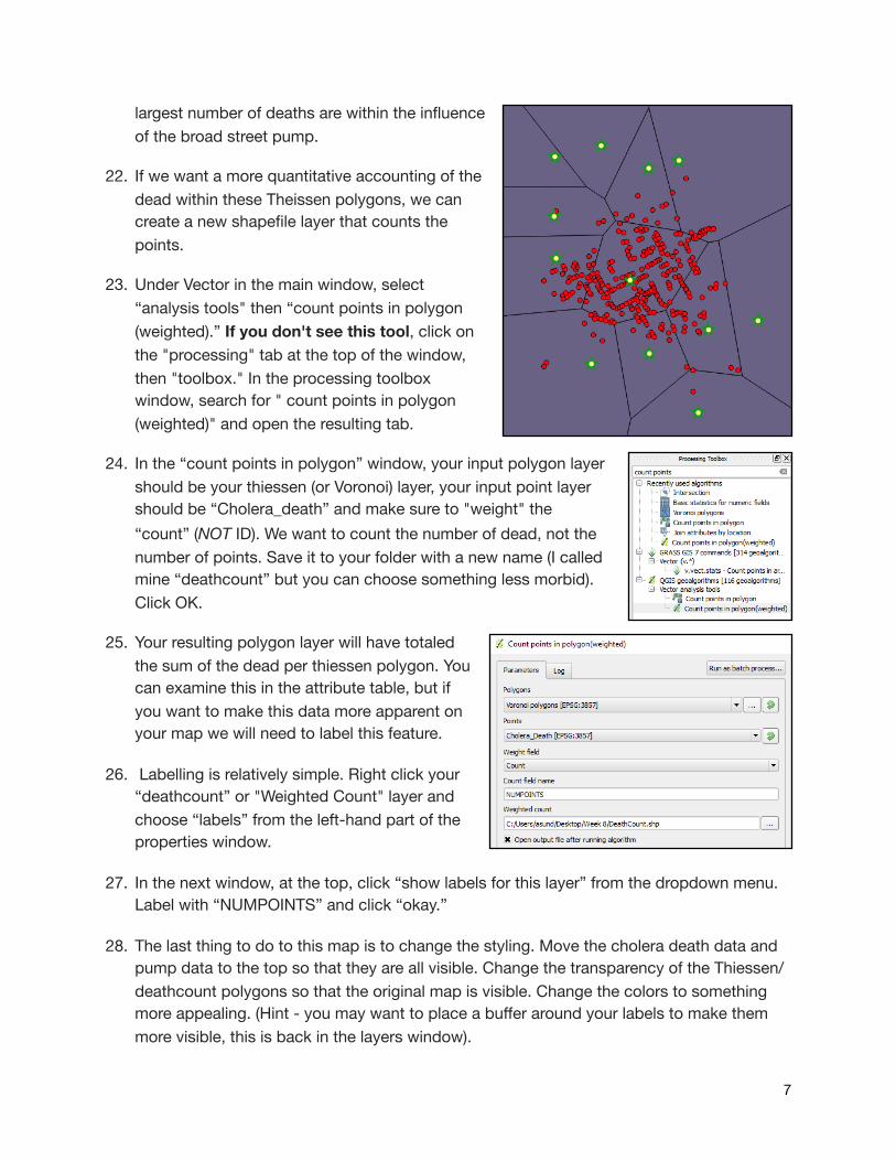
largest number of deaths are within the influence of the broad street pump.
22. If we want a more quantitative accounting of the dead within these Theissen polygons, we can create a new shapefile layer that counts the points.
23. Under Vector in the main window, select “analysis tools" then “count points in polygon (weighted).” If you don't see this tool, click on the "processing" tab at the top of the window, then "toolbox." In the processing toolbox window, search for " count points in polygon (weighted)" and open the resulting tab.
24. In the “count points in polygon” window, your input polygon layer should be your thiessen (or Voronoi) layer, your input point layer should be “Cholera_death” and make sure to "weight" the “count” (NOT ID). We want to count the number of dead, not the number of points. Save it to your folder with a new name (I called mine “deathcount” but you can choose something less morbid). Click OK.
25. Your resulting polygon layer will have totaled the sum of the dead per thiessen polygon. You can examine this in the attribute table, but if you want to make this data more apparent on your map we will need to label this feature.
26. Labelling is relatively simple. Right click your “deathcount” or "Weighted Count" layer and choose “labels” from the left-hand part of the properties window.
27. In the next window, at the top, click “show labels for this layer” from the dropdown menu. Label with “NUMPOINTS” and click “okay.”
28. The last thing to do to this map is to change the styling. Move the cholera death data and pump data to the top so that they are all visible. Change the transparency of the Thiessen/deathcount polygons so that the original map is visible. Change the colors to something more appealing. (Hint - you may want to place a buffer around your labels to make them more visible, this is back in the layers window).
�7
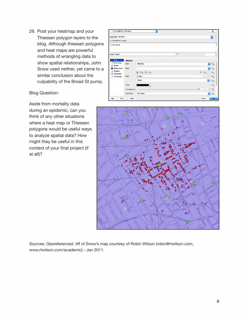
29. Post your heatmap and your Thiessen polygon layers to the blog. Although thiessen polygons and heat maps are powerful methods of wrangling data to show spatial relationships, John Snow used neither, yet came to a similar conclusion about the culpability of the Broad St pump.
Blog Question:
Aside from mortality data during an epidemic, can you think of any other situations where a heat map or Thiessen polygons would be useful ways to analyze spatial data? How might they be useful in this context of your final project (if at all)?
Sources: Georeferenced .tiff of Snow’s map courtesy of Robin Wilson ([email protected], www.rtwilson.com/academic) - Jan 2011.
�8