how effective is the combination & ancillary texts
TRANSCRIPT

By Bridget O’Connor
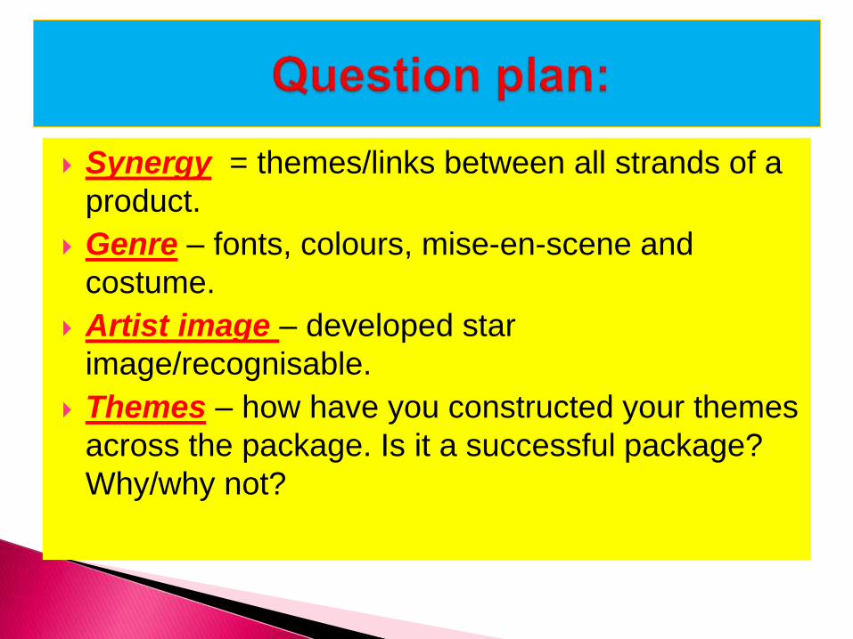
Synergy = themes/links between all strands of a
product.
Genre – fonts, colours, mise-en-scene and
costume.
Artist image – developed star
image/recognisable.
Themes – how have you constructed your themes
across the package. Is it a successful package?
Why/why not?
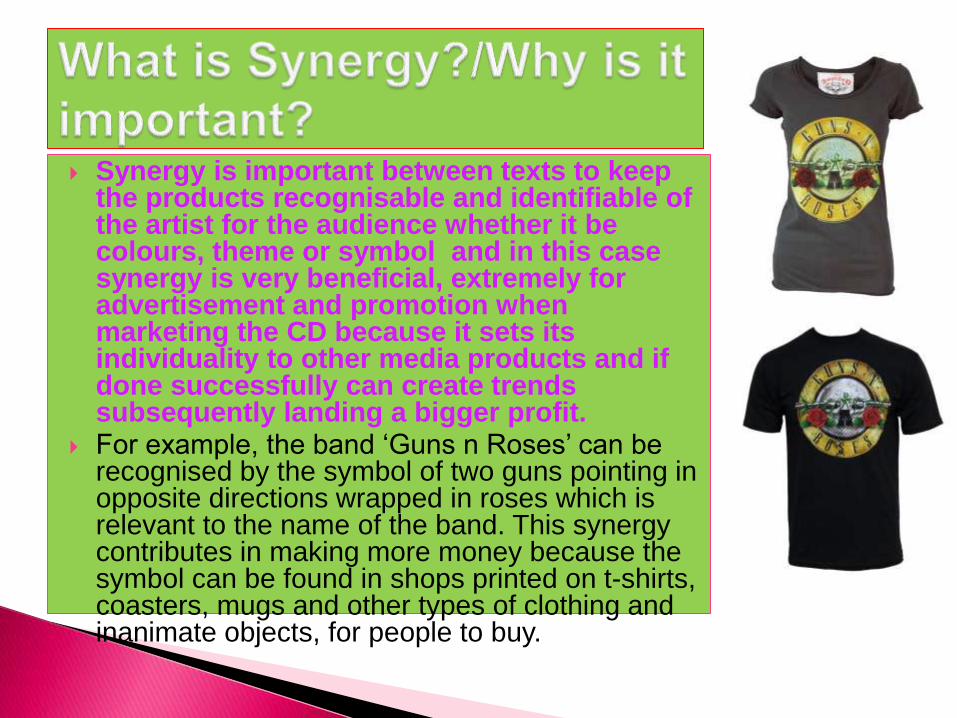
Synergy is important between texts to keep the products recognisable and identifiable of the artist for the audience whether it be colours, theme or symbol and in this case synergy is very beneficial, extremely for advertisement and promotion when marketing the CD because it sets its individuality to other media products and if done successfully can create trends subsequently landing a bigger profit.
For example, the band ‘Guns n Roses’ can be recognised by the symbol of two guns pointing in opposite directions wrapped in roses which is relevant to the name of the band. This synergy contributes in making more money because the symbol can be found in shops printed on t-shirts, coasters, mugs and other types of clothing and inanimate objects, for people to buy.
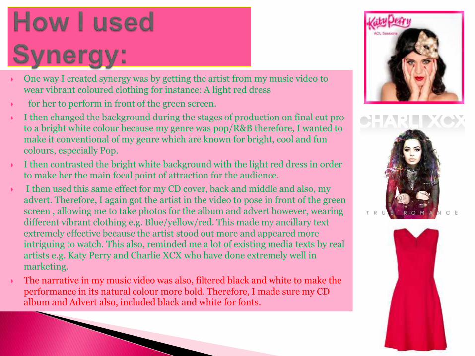
One way I created synergy was by getting the artist from my music video to wear vibrant coloured clothing for instance: A light red dress
for her to perform in front of the green screen.
I then changed the background during the stages of production on final cut pro to a bright white colour because my genre was pop/R&B therefore, I wanted to make it conventional of my genre which are known for bright, cool and fun colours, especially Pop.
I then contrasted the bright white background with the light red dress in order to make her the main focal point of attraction for the audience.
I then used this same effect for my CD cover, back and middle and also, my advert. Therefore, I again got the artist in the video to pose in front of the green screen , allowing me to take photos for the album and advert however, wearing different vibrant clothing e.g. Blue/yellow/red. This made my ancillary text extremely effective because the artist stood out more and appeared more intriguing to watch. This also, reminded me a lot of existing media texts by real artists e.g. Katy Perry and Charlie XCX who have done extremely well in marketing.
The narrative in my music video was also, filtered black and white to make the performance in its natural colour more bold. Therefore, I made sure my CD album and Advert also, included black and white for fonts.

Genre is the name given to all the seperate styles of media for instance: Rock/pop/indie/rap/r&b/folk and so on
in order for genre to work it needs the use of Mise-en-scene that are the props and locations used for the video/album/ advert, vital to link it with the genre, for example if I were making a video to fit the rock genre I would then use props such as guitars (acoustic/electric), drums, microphone and dress them in black and often gothic clothing and possibly make-up or masks. I would then locate them in an abandoned building or somewhere derelict to add to the cool and powerful genre or perhaps locate them somewhere that is more suited to the story of the song. Genre also, needs colours, fonts and costumes to create the identification between the different types of genre.
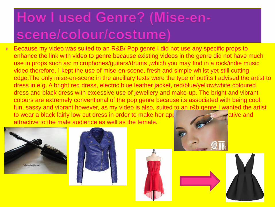
Because my video was suited to an R&B/ Pop genre I did not use any specific props to
enhance the link with video to genre because existing videos in the genre did not have much
use in props such as: microphones/guitars/drums ,which you may find in a rock/indie music
video therefore, I kept the use of mise-en-scene, fresh and simple whilst yet still cutting
edge.The only mise-en-scene in the ancillary texts were the type of outfits I advised the artist to
dress in e.g. A bright red dress, electric blue leather jacket, red/blue/yellow/white coloured
dress and black dress with excessive use of jewellery and make-up. The bright and vibrant
colours are extremely conventional of the pop genre because its associated with being cool,
fun, sassy and vibrant however, as my video is also, suited to an r&b genre I wanted the artist
to wear a black fairly low-cut dress in order to make her appear more so provocative and
attractive to the male audience as well as the female.

In order to make the link to genre I needed a good font that would fit the look. My
genre was r&b/ pop yet more so, pop and so when researching the different types of
Pop artist CD covers and actually analysing what type of fonts they used they were
always very diverse from one another which made it rather hard to pick one clear
font to match pop, however, I decided on:
‘A lover’s quarrel’- I chose this font
particularly because it’s very pretty,
curly, flowery and unique which can
be linked to the pop and indie
genre. I used this font for the artist
name and found it worked very well
and looked good overall.
‘Didot’- I chose this font specifically because I felt it was a
strong, bold and powerful font and this could link to the
qualities of R&B genre when considering exsitng R&B
artists such as: Beyonce who is a owerful and successful
R&B artist. I used Didot for the album name and felt it
worked very well and effectively.
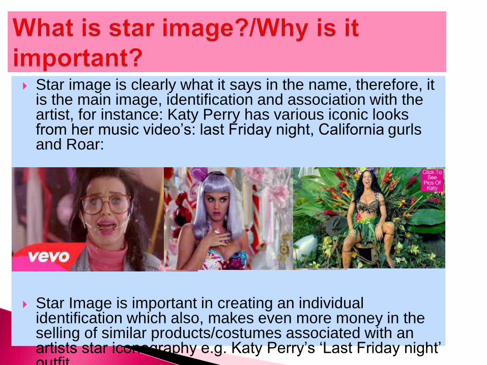
Star image is clearly what it says in the name, therefore, it is the main image, identification and association with the artist, for instance: Katy Perry has various iconic looks from her music video’s: last Friday night, California gurlsand Roar:
Star Image is important in creating an individual identification which also, makes even more money in the selling of similar products/costumes associated with an artists star iconography e.g. Katy Perry’s ‘Last Friday night’ outfit.
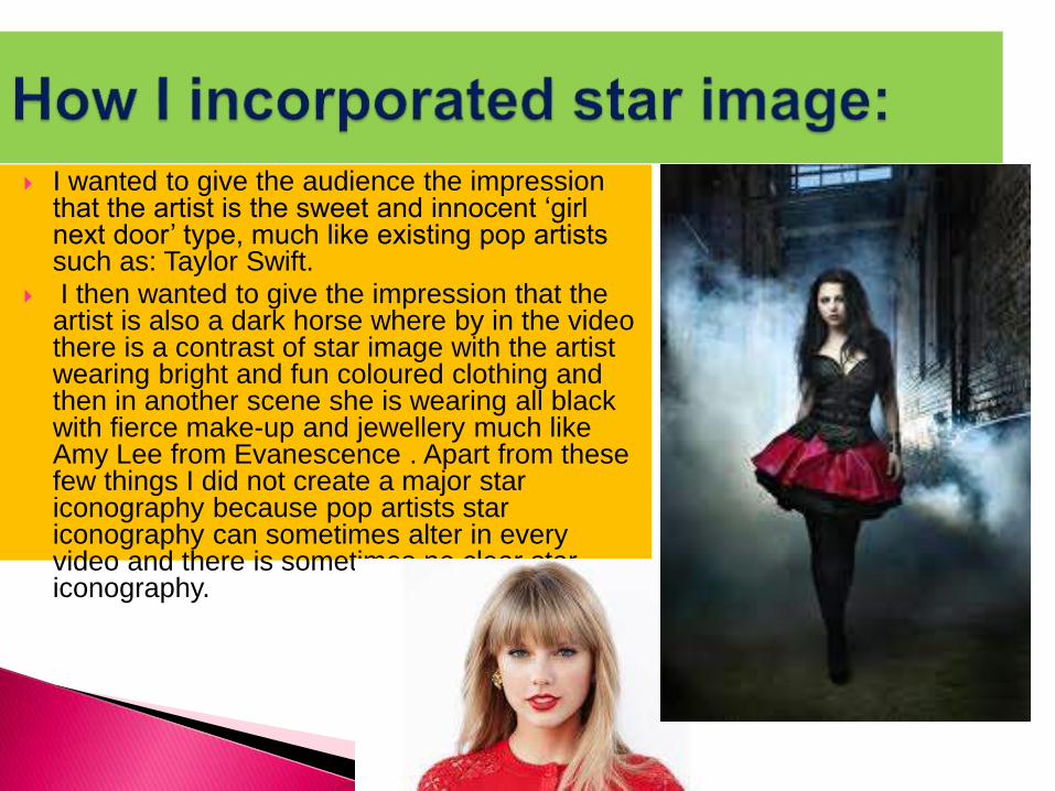
I wanted to give the audience the impression that the artist is the sweet and innocent ‘girl next door’ type, much like existing pop artists such as: Taylor Swift.
I then wanted to give the impression that the artist is also a dark horse where by in the video there is a contrast of star image with the artist wearing bright and fun coloured clothing and then in another scene she is wearing all black with fierce make-up and jewellery much like Amy Lee from Evanescence . Apart from these few things I did not create a major star iconography because pop artists star iconography can sometimes alter in every video and there is sometimes no clear star iconography.
A theme is a type of imagery/colour that is
apparent throughout and which links things
together e.g. I am using a theme for this
PowerPoint but in terms of ancillary texts it is
colours/fonts etc. This is important because a
theme can be very effective for media texts
because if the theme works it looks awesome
however, if it doesn’t work it can ruin the whole
thing.

I wanted to keep the theme very elegant, fresh, simple yet
effective and in complete relation to the genre therefore, I used
a lot of white for the background contrasted with the artist
wearing bright colours in order to make sure the artist stood out
and this theme was used throughout. Also, because the
narration in my video was filtered in black and white I wanted to
incorporate these colour into my fonts too. Lastly, The photo’s I
took on a canon camera were edited on Photoshop in order to
make them more vibrant, bright and contrasting therefore, her
lips look very pink and so on the advert I made sure I used
these three colours in particular to make everything match and
link.
Overall, the combination of my main product and
ancillary texts are very effective because it adds to
the whole identity of the artist and marketisation of
the work of the artist. Therefore, if the music
video, album and advert does not have synergy,
genre, artist image and themes it doesn't work,
however, I have used all of these in my texts
therefore, I believe mine does.