how effective is the combination of your main product and ancillary text?
TRANSCRIPT

How effective is the combination of your main product and ancillary text?

• The combination of our main product which is the trailer ‘Decimation’ and my ancillary text which is a film poster and film magazine cover is very effective through the close synergy between the fonts, characters and colours/settings. We downloaded our font from the internet because we were restricted by the fonts available to us in motion. We felt that our font needed to be unique and have connotations with our genre being sci-fi related and futuristic. The font foreshadows a faded feeling with the dissolving effect on each of the letters.

Fonts
• During our research on film posters and film magazine covers in contrast to the film trailer itself, I found that they have a clear link with the fonts. After looking at the Inception film trailer and the magazine cover and poster, I found that they used the same font and it was all in capital letters. We took this into consideration and made the fonts on all the ancillary texts the same as the trailer for synergy. I think this is very effective as the audience will realise and recognise that they the trailer, poster and film magazine go together. This is good as it will be a effective way of marketing because they spot it, if they didn’t spot it I think it would be a disadvantage on the trailer as they would not know what the film trailer to the film poster and magazine cover is.
• I also think that the fonts are clear and bold which too connote a genre signifier to the audience, the colour of silver shows sci-fi futurist connotations and the capital bold letters show the braveness and makes a statement to the audience that we’ll hopefully remember I think overall the font is a great way of attracting audiences’
attention allows them to connect with the ancillary texts and the trailer itself.
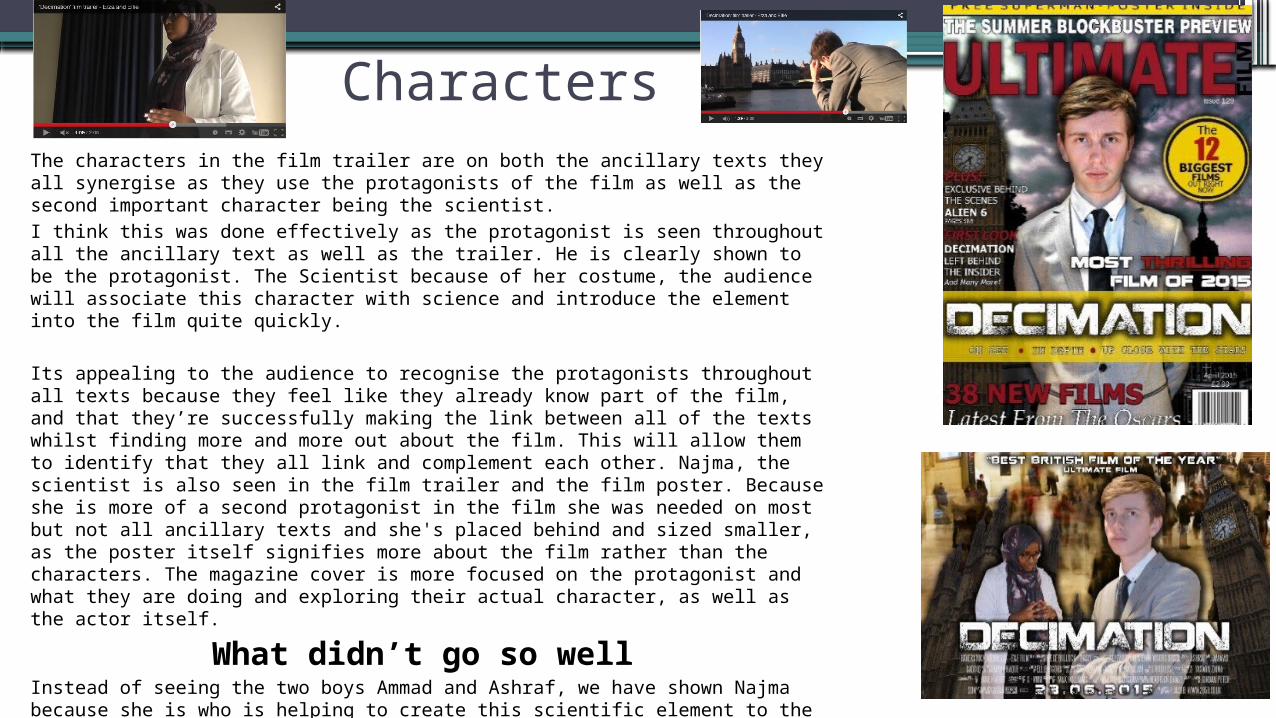
CharactersThe characters in the film trailer are on both the ancillary texts they all synergise as they use the protagonists of the film as well as the second important character being the scientist.I think this was done effectively as the protagonist is seen throughout all the ancillary text as well as the trailer. He is clearly shown to be the protagonist. The Scientist because of her costume, the audience will associate this character with science and introduce the element into the film quite quickly.
Its appealing to the audience to recognise the protagonists throughout all texts because they feel like they already know part of the film, and that they’re successfully making the link between all of the texts whilst finding more and more out about the film. This will allow them to identify that they all link and complement each other. Najma, the scientist is also seen in the film trailer and the film poster. Because she is more of a second protagonist in the film she was needed on most but not all ancillary texts and she's placed behind and sized smaller, as the poster itself signifies more about the film rather than the characters. The magazine cover is more focused on the protagonist and what they are doing and exploring their actual character, as well as the actor itself.
What didn’t go so well Instead of seeing the two boys Ammad and Ashraf, we have shown Najma because she is who is helping to create this scientific element to the film due to her costume. Originally we had the other characters photographed to be included on the poster and when we did we had feedback on them and we realised that the protagonist was to be exposed to the audience the most and the audience need to get a sense of the narrative and genre straight away. It took a couple of attempts making various ancillary texts with different characters and photographs until we came up with our final one which we think works the best. The costumes have also been kept consistent throughout the whole trailer and ancillary texts in order to make it easier for the audience to identify them and realise that they all link together.

Colours/setting
The colours and setting in the film trailer in comparison to the film poster and magazine cover all complement each other as it is establishing the main setting of London city with the Big Ben at the back of all of it. This is effective to the audience as they will establish that these three text all link together straight away, Big ben is regognised everywhere across the world, its iconic to London so when the audience see settings like Big Ben across all of our produced its easy to recognise that the film is set in London. The colours that are used are blue, black, white, grey and brown; these all are key conventions of a dark settings dispiritedAnd glum narrative signifier . The colours and setting also establish genre signifiers and connote what the film will be based on. These elements give glimpse on what the film is on so for example, capturing the Big Ben and the houses of Parliament shows that it’s based on a political society where they all have high occupations and are maybe involved in conflict. This overall connotes to the audience that it is a sci-fi/thriller/action film as it’s serious due to things like his posture and facial expressions along with the clouds and darkened atmosphere.
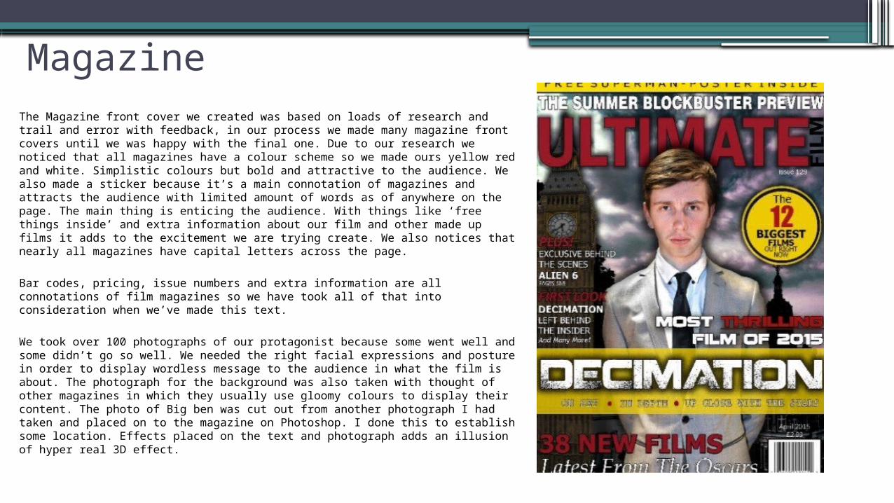
MagazineThe Magazine front cover we created was based on loads of research and trail and error with feedback, in our process we made many magazine front covers until we was happy with the final one. Due to our research we noticed that all magazines have a colour scheme so we made ours yellow red and white. Simplistic colours but bold and attractive to the audience. We also made a sticker because it’s a main connotation of magazines and attracts the audience with limited amount of words as of anywhere on the page. The main thing is enticing the audience. With things like ‘free things inside’ and extra information about our film and other made up films it adds to the excitement we are trying create. We also notices that nearly all magazines have capital letters across the page.
Bar codes, pricing, issue numbers and extra information are all connotations of film magazines so we have took all of that into consideration when we’ve made this text.
We took over 100 photographs of our protagonist because some went well and some didn’t go so well. We needed the right facial expressions and posture in order to display wordless message to the audience in what the film is about. The photograph for the background was also taken with thought of other magazines in which they usually use gloomy colours to display their content. The photo of Big ben was cut out from another photograph I had taken and placed on to the magazine on Photoshop. I done this to establish some location. Effects placed on the text and photograph adds an illusion of hyper real 3D effect.
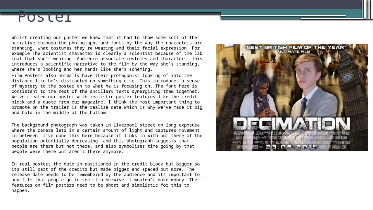
PosterWhilst creating our poster we knew that it had to show some sort of the narrative through the photographs and fonts by the way the characters are standing, what costumes they’re wearing and their facial expression. For example The scientist character is clearly a scientist because of the lab coat that she’s wearing. Audience associate costumes and characters. This introduces a scientific narrative to the film by the way she's standing, where she’s looking and her hands like she’s scheming. Film Posters also normally have their protagonist looking of into the distance like he’s distracted on something else. This introduces a sense of mystery to the poster on to what he is focusing on. The font here is consistent to the rest of the ancillary texts synergising them together. We’ve created our poster with realistic poster features like the credit block and a quote from our magazine. I think the most important thing to promote on the trailer is the realise date which is why we’ve made it big and bold in the middle at the bottom.
The background photograph was taken in Liverpool street on long exposure where the camera lets in a certain amount of light and captures movement in-between. I've done this here because it links in with our theme of the population potentially decreasing and this photograph suggests that people are there but not there, and also symbolises time going by that people were there but aren't there anymore.
In real posters the date in positioned in the credit block but bigger so its still part of the credits but made bigger and spaced out more. The release date needs to be remembered by the audience and its important to any film that people go to see it otherwise it wouldn’t make money. The features on film posters need to be short and simplistic for this to happen.

Conclusion Overall I believe that the combination of the film trailer, film poster and the film magazine cover all are very effective as it highlights the main conventions of a film such as the settings, the colours used, the characters and the fonts of the titles and intertitles. The help of researching different film trailers and posters like ‘In Time’ and ‘Inception’ too allowed us to focus on the minor details in order to make it all perfect and complement each other, which is what we achieved. I think that we managed to apply is all clearly to the audience as its suitable for what they are seeing and reading in all three media texts. They all synergise together and contain similar features to not confuse the audience