how to design an infographic part 2
TRANSCRIPT
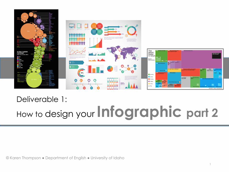
Deliverable 1:
How to design your Infographic part 2
© Karen Thompson ● Department of English ● University of Idaho1

How to apply principles of
Gestalt Design2
ContinuationClosureFigure and GroundProximityAlignmentSimilarity and Anomaly
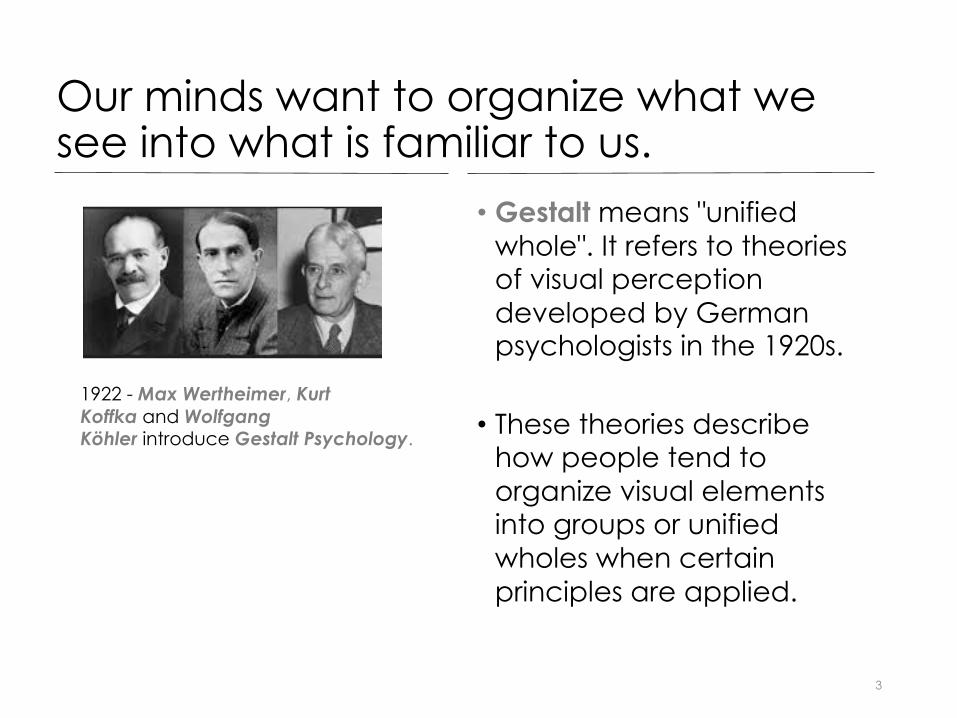
Our minds want to organize what we see into what is familiar to us.
• Gestalt means "unified whole". It refers to theories of visual perception developed by German psychologists in the 1920s.
• These theories describe how people tend to organize visual elements into groups or unified wholes when certain principles are applied.
3
1922 - Max Wertheimer, Kurt Koffka and Wolfgang Köhler introduce Gestalt Psychology.
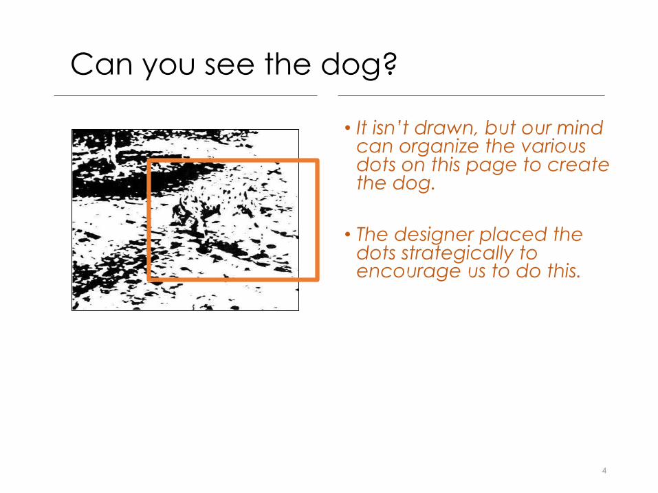
Can you see the dog?
• It isn’t drawn, but our mind can organize the various dots on this page to create the dog.
• The designer placed the dots strategically to encourage us to do this.
4

Gestalt Principle 1: Continuation
•Continuation is how the shape of a design encourages our eye to see movement and depth.
• It is NOT how our eyes move down or across the layout of an infographic.
5

Example: Continuation
• Infographic using principle of continuation in the shape of the freeway.
6

Gestalt Principle 2: Closure
•When a shape is incomplete – not completely closed, we perceive the whole by filling in the missing information.
7

Gestalt Principle 3: Figure / Ground• Our eyes differentiate an
object from its surrounding area or background.
• A form or shape is perceived as a figure, while the surrounding area is perceived as the ground.
8
This drawing plays with aspects of figure/ground organization, by how the edges of the shape our perceptions to help us see a tree, gorilla, and lion.
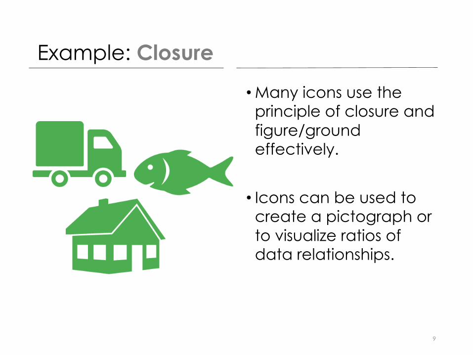
Example: Closure
•Many icons use the principle of closure and figure/ground effectively.
• Icons can be used to create a pictograph or to visualize ratios of data relationships.
9

Gestalt Principle 4: Proximity
•We perceive items as being closely related when they are aligned to be in proximity to one another.
10

Example: Proximity
• Proximity means grouping things that are similar together.
• This Infographic is using principle of proximity.
11

Gestalt Principle 5: Alignment
12

Gestalt Principle 6: Similarity & Anomaly
•Objects that look similar are perceived as a group or pattern.
•An object can be emphasized to be dissimilar to others.
• In this example, color is used to do that.
13
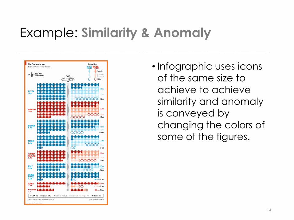
Example: Similarity & Anomaly
• Infographic uses icons of the same size to achieve to achieve similarity and anomaly is conveyed by changing the colors of some of the figures.
14
How to apply principles of
Color Theory15

Basic Color Theory
•Color Harmony
•Color Wheels
•Color Meaning
16
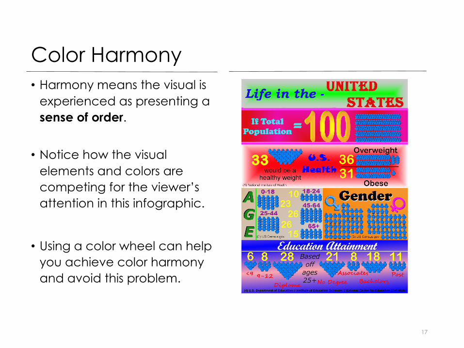
Color Harmony
17
• Harmony means the visual is experienced as presenting a sense of order.
• Notice how the visual elements and colors are competing for the viewer’s attention in this infographic.
• Using a color wheel can help you achieve color harmony and avoid this problem.

Color Wheels
•A color wheel is a tool for combining colors.
• The following slides provide some basic formulas for using a color wheel.
18

Monochromatic Color Scheme
• This color scheme uses one color but varies the saturation or density of the color.
19
A monochromatic color scheme is an easy way to achieve color harmony.
It will not be as vibrant, however, as using a complementary color scheme.

Analagous Colors
• These are any three colors next to each other on the color wheel.
20
Using an analogous color scheme is also an easy way to achieve color harmony.
It will be more vibrant than a monochromatic scheme, but less vibrant than a complementary one.

Complementary Colors
21
These are colors that are opposite one another on a color wheel.
Complementary colors create a vibrant visual experience but are the most difficult to use.
If you use complementary colors, choose no more than three different colors.

Help with Color
•Color Generators
•Color Schemes
•Color Checkers
22
Use Free Stuff
See links to free color tools under tools and resources for this project.

Color Conveys Meaning
• How people perceive the meaning of color varies somewhat by culture.
• Know your audience and how they will likely perceive the meaning of the colors you use.
• You want the color choices to support the the data story your infographic is telling.
23

Color Meaning
• Notice how the red background color in this infographic supports the data story about this disease before vaccines were available.
• Notice too how the emphasis is on the data to tell this story with a minimal amount of text from a neutral point of view.
24
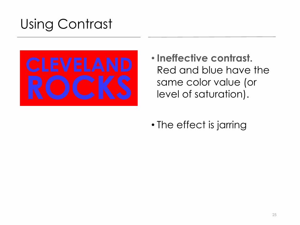
Using Contrast
• Ineffective contrast. Red and blue have the same color value (or level of saturation).
• The effect is jarring
25
Using Contrast
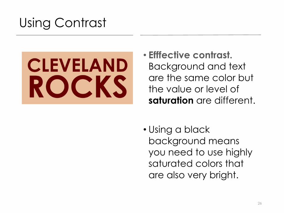
• Efffective contrast. Background and text are the same color but the value or level of saturation are different.
• Using a black background means you need to use highly saturated colors that are also very bright.
26

Using Contrast
• Example of an infographic using black background with visual elements that are both bright and highly saturated.
27

Visual Interest
•When using traditional graphics such as pie or bar charts, visualize the data in non-traditional ways that do not distort the meaning.
•Notice how these pie chats use non-traditional elements but do not distort the data.
28

Visual Silliness
•Creating pointy cones or using 3-D for bar charts is not the same as creating visual interest.
• It’s just creating visual silliness. Avoid this.
29

• As of Fall 2016, students may not use source visuals that graphically represent the data in standard ways such as charts or graphs.
• You may use charts or graphs to help you visualize the data, but these must be created by you.
30
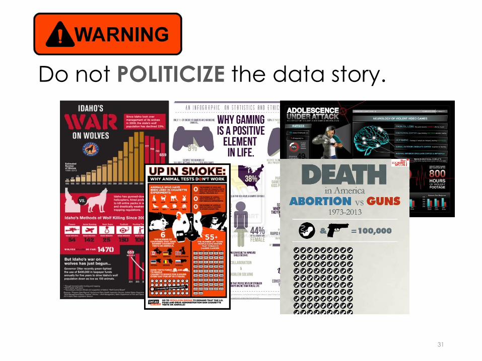
Do not POLITICIZE the data story.
31

Create the data story in your infographic from a position of neutrality.
32