individual graphs in excel. go to intranet/interventions/ cico t2 put in time frame and click boxes...
TRANSCRIPT

Individual Graphs in Excel

Go to Intranet/Interventions/ CICO T2Put in time frame and click boxes “Has CICO Record” and “Report
Mode.”

A list of names with daily scores will come up. Save the search, name the file, save (some may say submit).

Double click on the download and it will put the information into an excel spreadsheet.

Delete any unnecessary columns. Add Daily Goal Row

Add “#N/A” to any empty boxes. Pick a student and highlight name and scores. Click on Charts and pick line graph#4.

The following graph will appear in the spreadsheet.

Click on the graph and got to the top of the page and go under “Chart.” Click “Move Chart” to put the graph on it’s own page.

To add additional series, go to the top of the page and go under “charts.” Click on Source data. The following screen will appear.
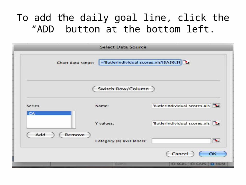
To add the daily goal line, click the “ADD” button at the bottom left.
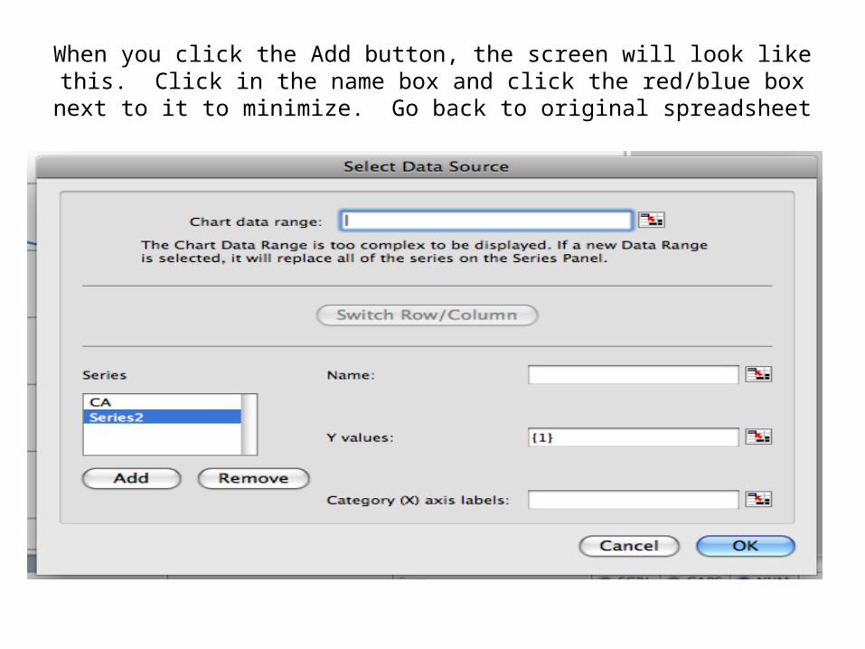
When you click the Add button, the screen will look like this. Click in the name box and click the red/blue box next to it to minimize.
Go back to original spreadsheet

Push the Daily Goal Box Only!Click back on the red/blue box to maximize

When you maximize the screen, the Source Data box will come back. Now click in the “Y Value box and clear it out. Click the red/blue box to minimize again. Go to spreadsheet (which is
on a tab at the bottom of the page).

Highlight all of the daily scores (all the 80’s). Click the red/blue box to maximize.
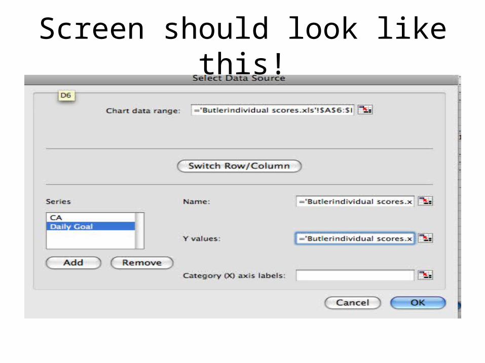
Screen should look like this!

We need to add values (dates) to the “X axis labels” at the bottom. Click on the X axis label box and minimize by clicking the
red/blue box. Go to spreadsheet

Highlight the Date Row (you can start from either side). Click the red/blue button to maximize.

The Source Data Chart should look like this:Press OK
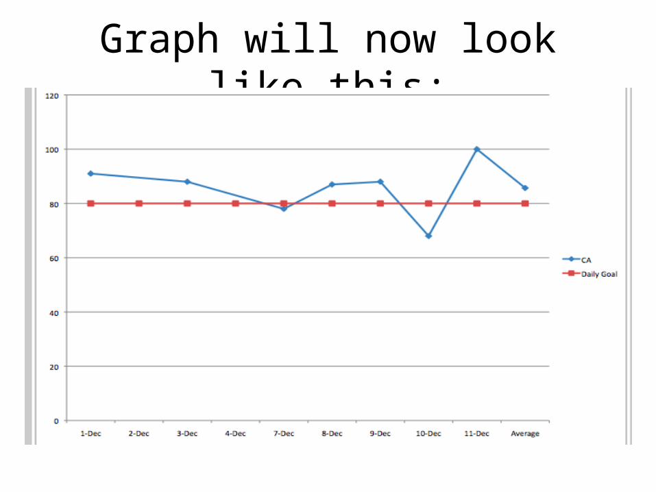
Graph will now look like this:

Double click on the “120” on the left hand side.

This screen will appear. Click on the scale option on the left hand side. Change the 120 to 100.

Double click on any of the blue dots that connects the lines.

This screen will appear. Click on labels, show value, and pick location to show value.

Your graph should look like this

The formatting palette allows you to name the graph and move the legend.

REPEAT AND SAVE!!!!
You need to repeat the process for each individual graph.