induction 3 evaluation
TRANSCRIPT
Induction 3: JUSTIFICATION FOR TV Logo
The TV programme that my logo is for – the setting, the characters and the type of storylines the
programme might have. My TV programme is about a school that has its own challenges in many different ways. It could be fro students taking drugs to fighting or to do with students personal life’s but still have to include the school for the students safety. My TV programme is mainly for teenagers and parents because it will be broadcasted at 8pm on a Tuesday night, this is a suitable time for teenagers or people that have to go work the next morning because it is on at a reasonable time. The show has many different stories to it, it could be from children partying, crime, drugs, or sex. The programme is aimed to show parents what is going on in school. This programme shows the ability of students from different races, to different ages and from different genders working together.
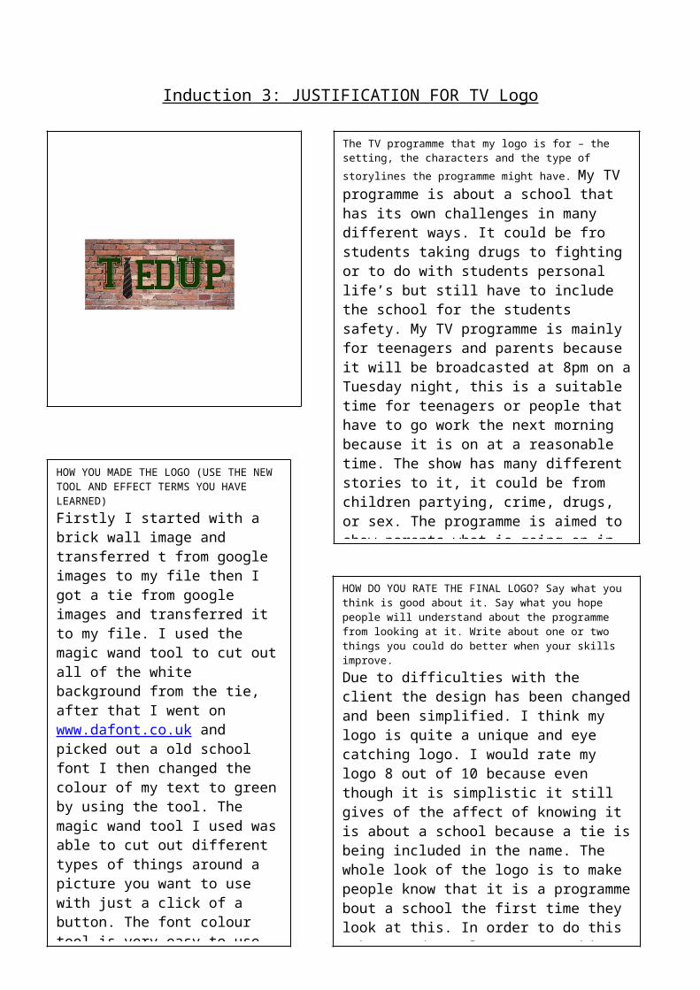
HOW YOU MADE THE LOGO (USE THE NEW TOOL AND EFFECT TERMS YOU HAVE LEARNED)
Firstly I started with a brick wall image and transferred t from google images to my file then I got a tie from google images and transferred it to my file. I used the magic wand tool to cut out all of the white background from the tie, after that I went on www.dafont.co.uk and picked out a old school font I then changed the colour of my text to green by using the tool. The magic wand tool I used was able to cut out different types of things around a picture you want to use with just a click of a button. The font colour tool is very easy to use all you do is pick your font and the size then change the colour with the font colour.
HOW DO YOU RATE THE FINAL LOGO? Say what you think is good about it. Say what you hope people will understand about the programme from looking at it. Write about one or two things you could do better when your skills improve.
Due to difficulties with the client the design has been changed and been simplified. I think my logo is quite a unique and eye catching logo. I would rate my logo 8 out of 10 because even though it is simplistic it still gives of the affect of knowing it is about a school because a tie is being included in the name. The whole look of the logo is to make people know that it is a programme bout a school the first time they look at this. In order to do this I have made my logo eye catching with big bold font. To make my logo better I could possibly make it more colourful and maybe add a few more pictures which are eye catching and symbolise a school.