information visualization and presentation - mse -...
TRANSCRIPT
1
Information Visualizationand Presentation
Based on slides fromMarti Hearst and Jeff Heer
2
What is Information Visualization?
“Transformation of the symbolic into the geometric”
(McCormick et al., 1987)
“... finding the artificial memory that best
supports our natural means of perception.''
(Bertin, 1983)
The depiction of information using spatial or graphical
representations, to facilitate comparison, pattern
recognition, change detection, and other cognitive skillsby making use of the visual system (Hearst 03).
3
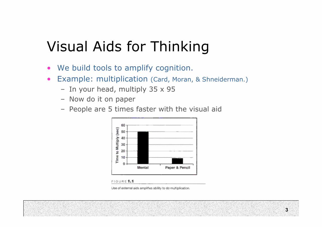
Visual Aids for Thinking
• We build tools to amplify cognition.
• Example: multiplication (Card, Moran, & Shneiderman.)
– In your head, multiply 35 x 95
– Now do it on paper
– People are 5 times faster with the visual aid
4
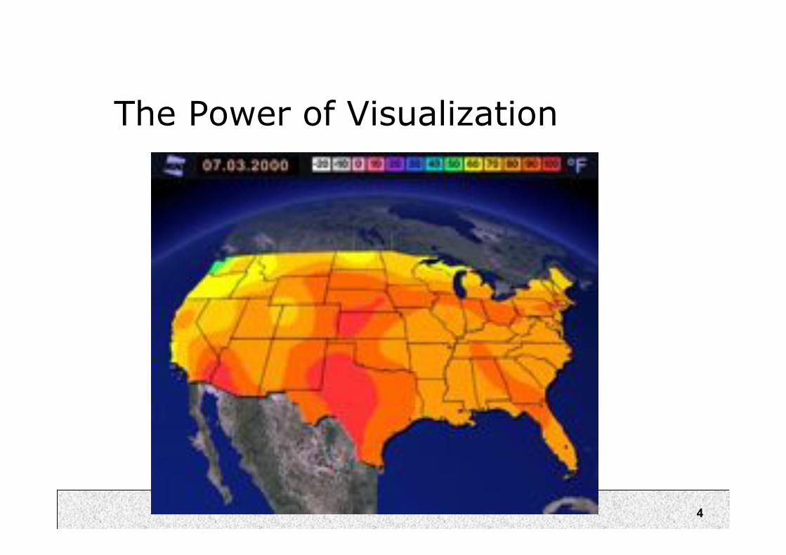
The Power of Visualization
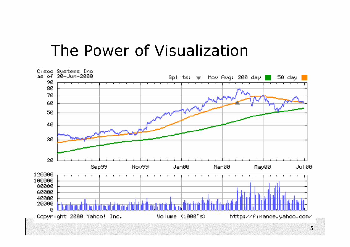
5
The Power of Visualization
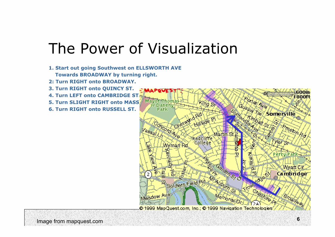
6Image from mapquest.com
The Power of Visualization1. Start out going Southwest on ELLSWORTH AVE
Towards BROADWAY by turning right.
2: Turn RIGHT onto BROADWAY.
3. Turn RIGHT onto QUINCY ST.
4. Turn LEFT onto CAMBRIDGE ST.
5. Turn SLIGHT RIGHT onto MASSACHUSETTS AVE.
6. Turn RIGHT onto RUSSELL ST.
7
8
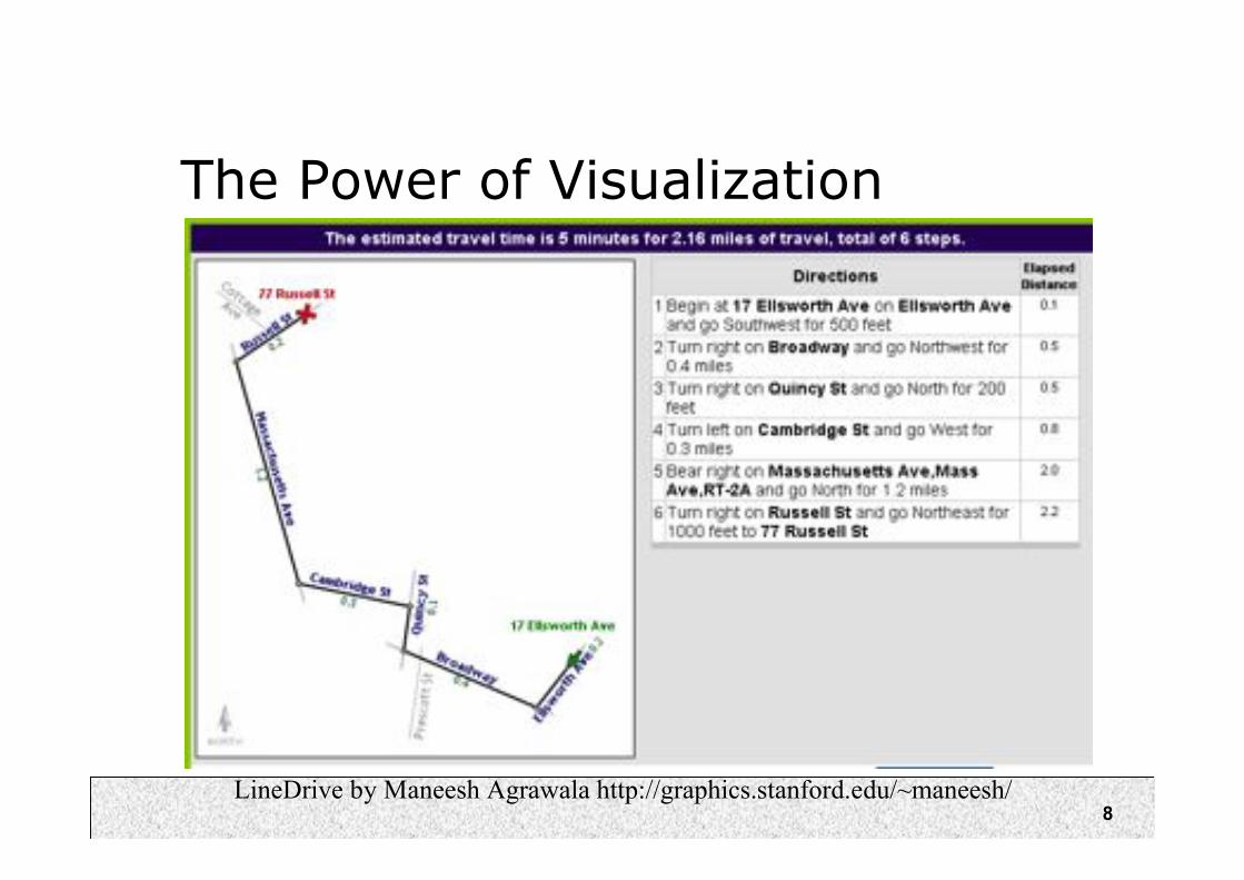
The Power of Visualization
LineDrive by Maneesh Agrawala http://graphics.stanford.edu/~maneesh/
9
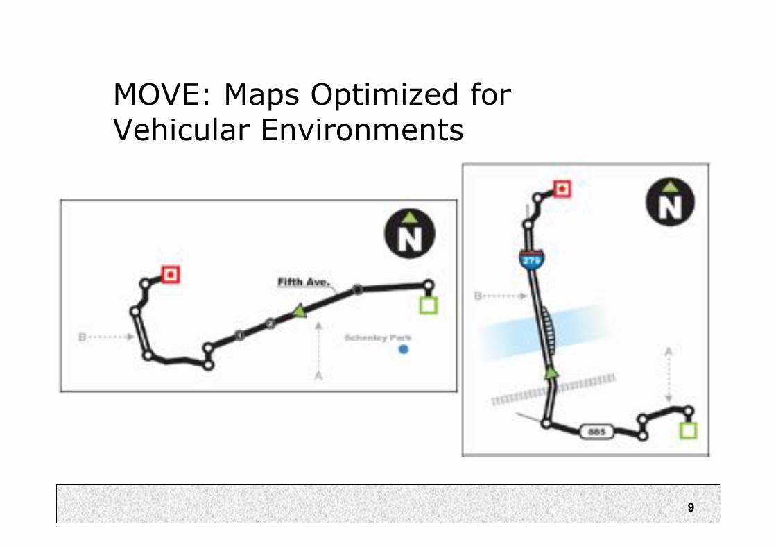
MOVE: Maps Optimized forVehicular Environments
10
Visualization for Problem Solving
Mystery: what is causing a cholera
epidemic in London in 1854?

11
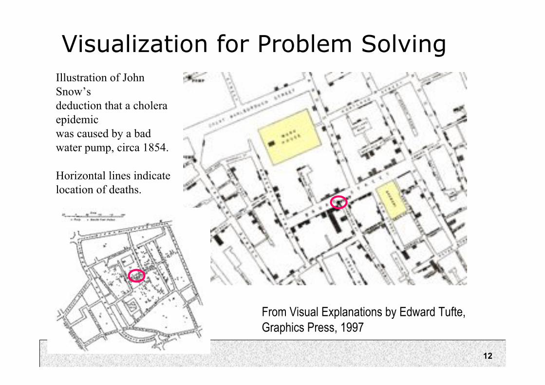
Visualization for Problem Solving
From VisualExplanations byEdward Tufte,Graphics Press,
1997
Illustration of JohnSnow’sdeduction that acholera epidemicwas caused by a badwater pump, circa1854.
Horizontal lines
indicate location ofdeaths.
12
Visualization for Problem Solving
From Visual Explanations by Edward Tufte,
Graphics Press, 1997
Illustration of John
Snow’s
deduction that a cholera
epidemic
was caused by a bad
water pump, circa 1854.
Horizontal lines indicate
location of deaths.
13
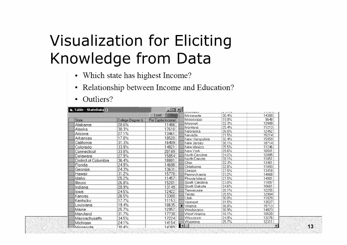
Visualization for ElicitingKnowledge from Data
14
Visualization for ElicitingKnowledge from Data

15
Visualization for Clarification
• London Subway MapExample
• Abstract away details foreasier understanding

16
London Underground Map 1927
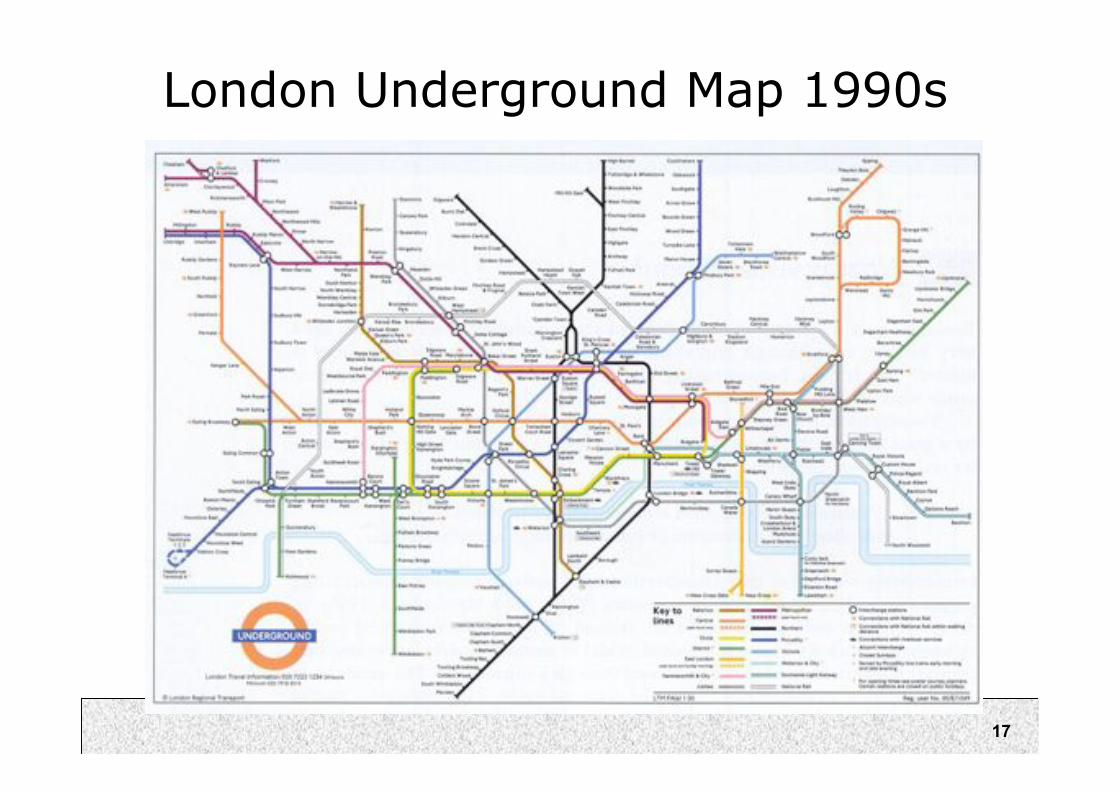
17
London Underground Map 1990s

18From http://www.ideography.co.uk/
19
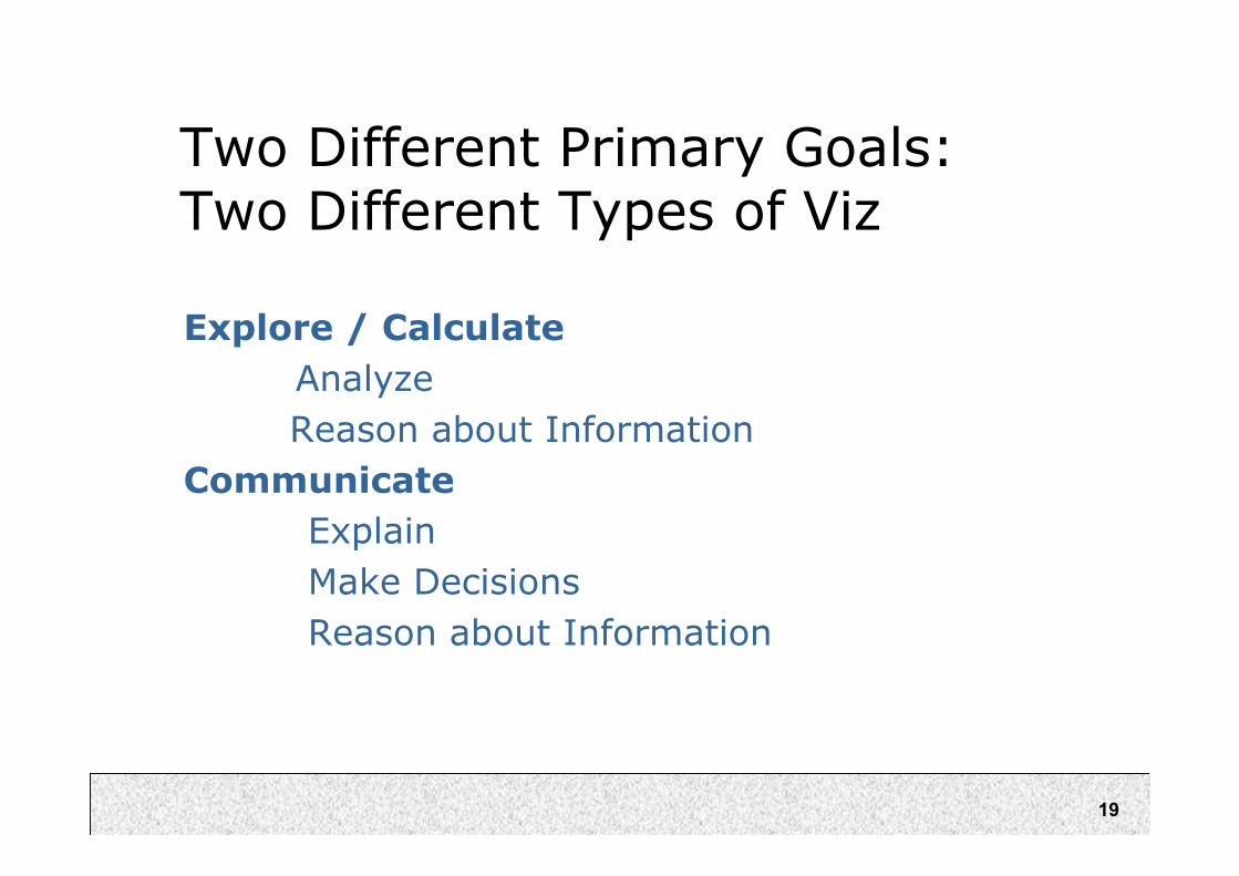
Two Different Primary Goals:Two Different Types of Viz
Explore / Calculate
Analyze
Reason about Information
Communicate
Explain
Make Decisions
Reason about Information

20
Goals of Information Visualization
In more detail, visualization should:
– Make large datasets coherent
(Present huge amounts of information compactly)
– Present information from various viewpoints
– Present information at several levels of detail
(from overviews to fine structure)
– Support visual comparisons
– Tell stories about the data

21
Human Perceptual Facilities
Use the eye for pattern recognition; people are good at
scanning
recognizing
remembering images
Graphical elements facilitate comparisons via
length
shape
orientation
texture
Animation shows changes across time
Color helps make distinctions
Aesthetics make the process appealing

22
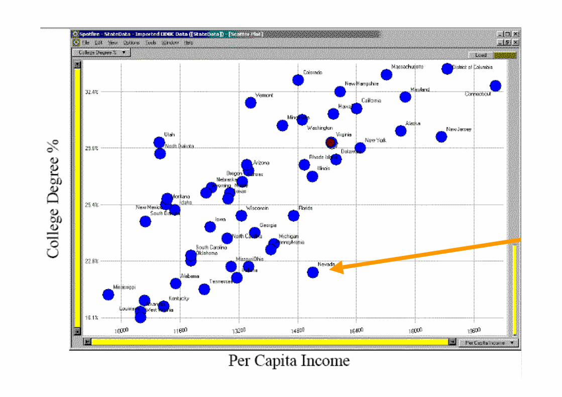
Example #1: SpotFire

23
Key Ideas in SpotFire
• Fast filtering via sliders
• Zooming (screen real estate)
• Multiple variables
– x,y axis, object shape + color
• Details on demand
• Commercialized by SpotFire Inc,used heavily by pharmaceuticals

24
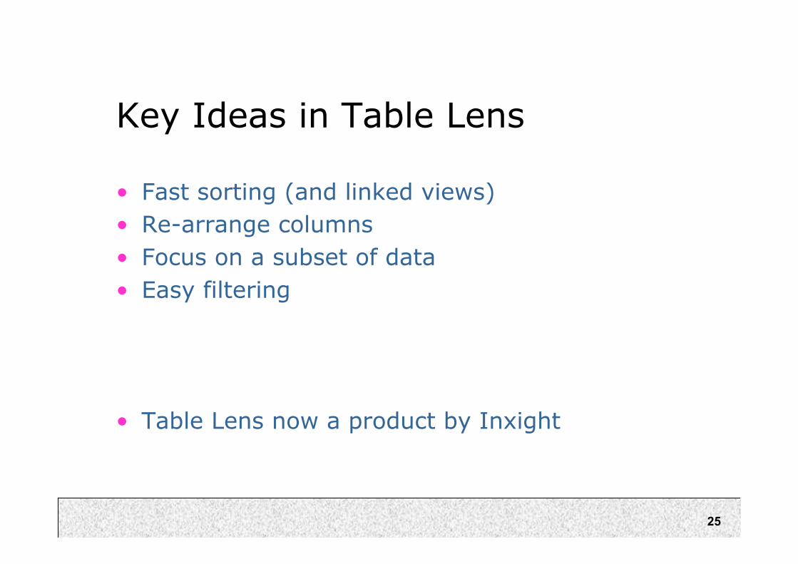
Example #2: Table Lens
25
Key Ideas in Table Lens
• Fast sorting (and linked views)
• Re-arrange columns
• Focus on a subset of data
• Easy filtering
• Table Lens now a product by Inxight

26
Example 3: Tree Maps
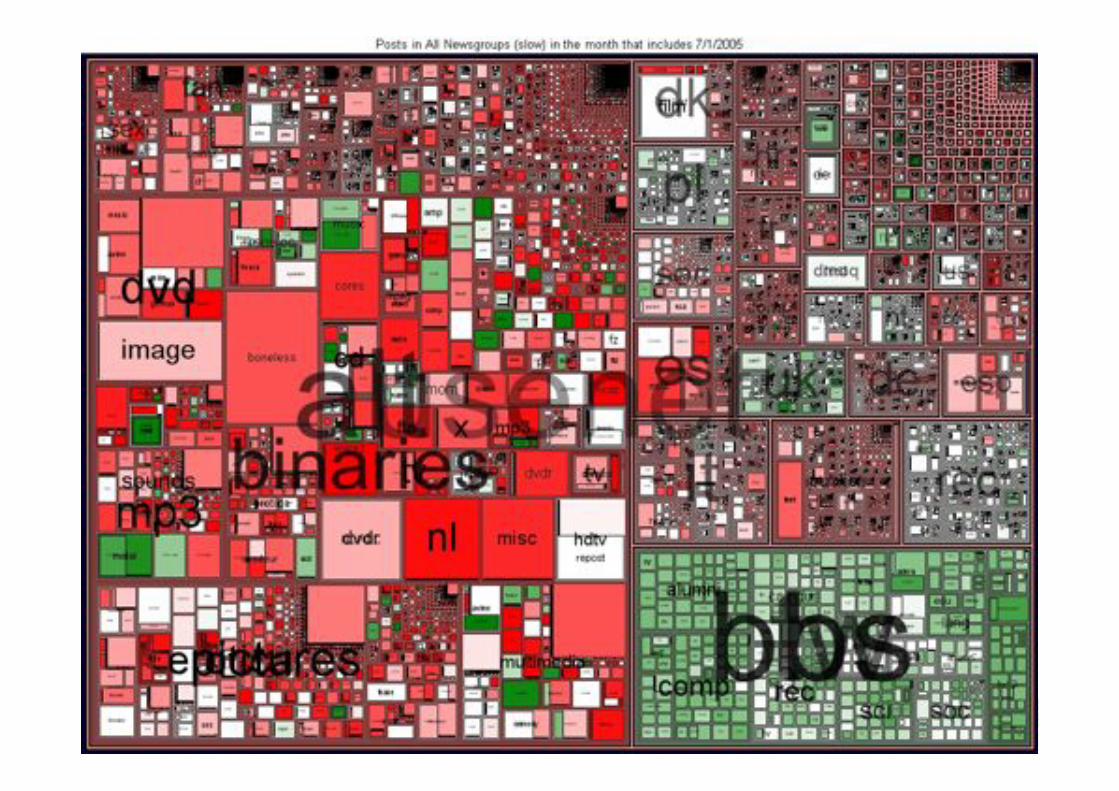
27
Example 3: Tree Maps
28
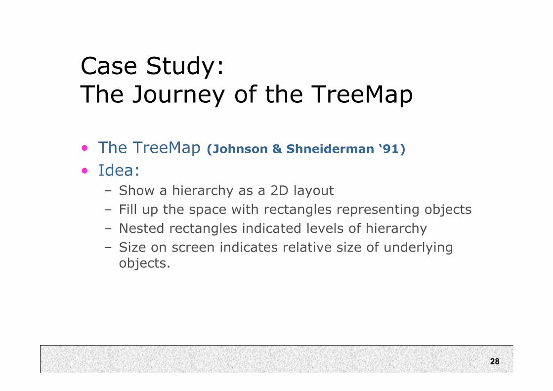
Case Study:The Journey of the TreeMap
• The TreeMap (Johnson & Shneiderman ‘91)
• Idea:
– Show a hierarchy as a 2D layout
– Fill up the space with rectangles representing objects
– Nested rectangles indicated levels of hierarchy
– Size on screen indicates relative size of underlyingobjects.
29
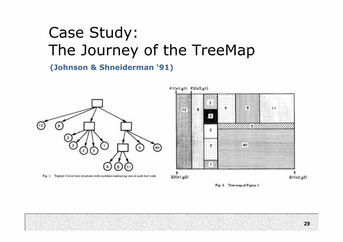
Case Study:The Journey of the TreeMap(Johnson & Shneiderman ‘91)

30
(Jo
hn
so
n &
Sh
neid
erm
an
‘9
1)
31
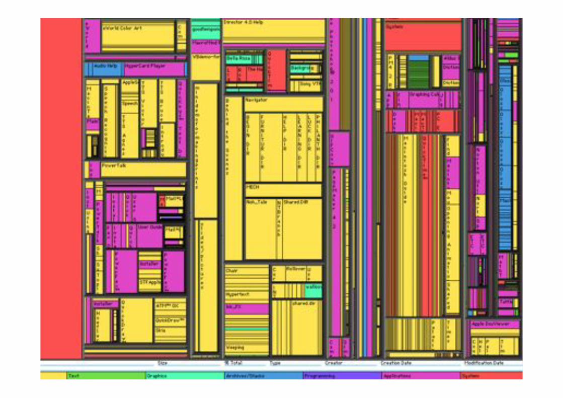
Early Treemap Applied to File System

32
Treemap Problems
• Too disorderly
– What does adjacency mean?
– Aspect ratios uncontrolled leads to lots ofskinny boxes that clutter
• Hard to understand
– Must mentally convert nesting to hierarchy descent
• Color not used appropriately
– In fact, is meaningless here
• Wrong application
– Don’t need all this to just see the largest files in the OS
33
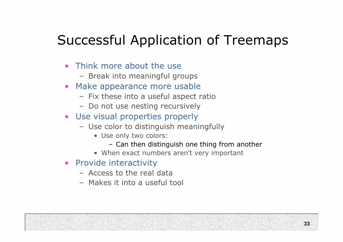
Successful Application of Treemaps
• Think more about the use
– Break into meaningful groups
• Make appearance more usable
– Fix these into a useful aspect ratio
– Do not use nesting recursively
• Use visual properties properly
– Use color to distinguish meaningfully• Use only two colors:
– Can then distinguish one thing from another
• When exact numbers aren’t very important
• Provide interactivity
– Access to the real data
– Makes it into a useful tool
34
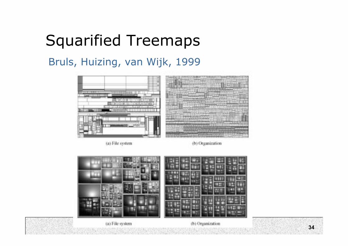
Squarified Treemaps
Bruls, Huizing, van Wijk, 1999

35
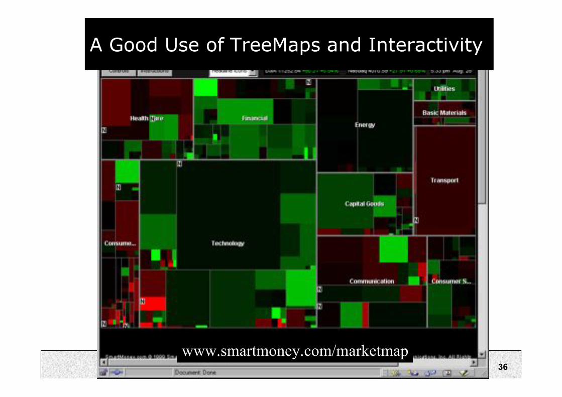
Improved, Usable TreeMaps
• Analysis:
– http://www.smartmoney.com/maps
• Communication:– http://www.peets.com/selector_coffee/coffee_selector.asp
36
A Good Use of TreeMaps and Interactivity
www.smartmoney.com/marketmap

37
Treemaps in Peets site
38
Analysis vs. Communication
• MarketMap’s use of TreeMaps allows forsophisticated analysis
• Peets’ use of TreeMaps is more forpresentation and communication
• This is a key contrast

39
Example 3: Tree Maps
40
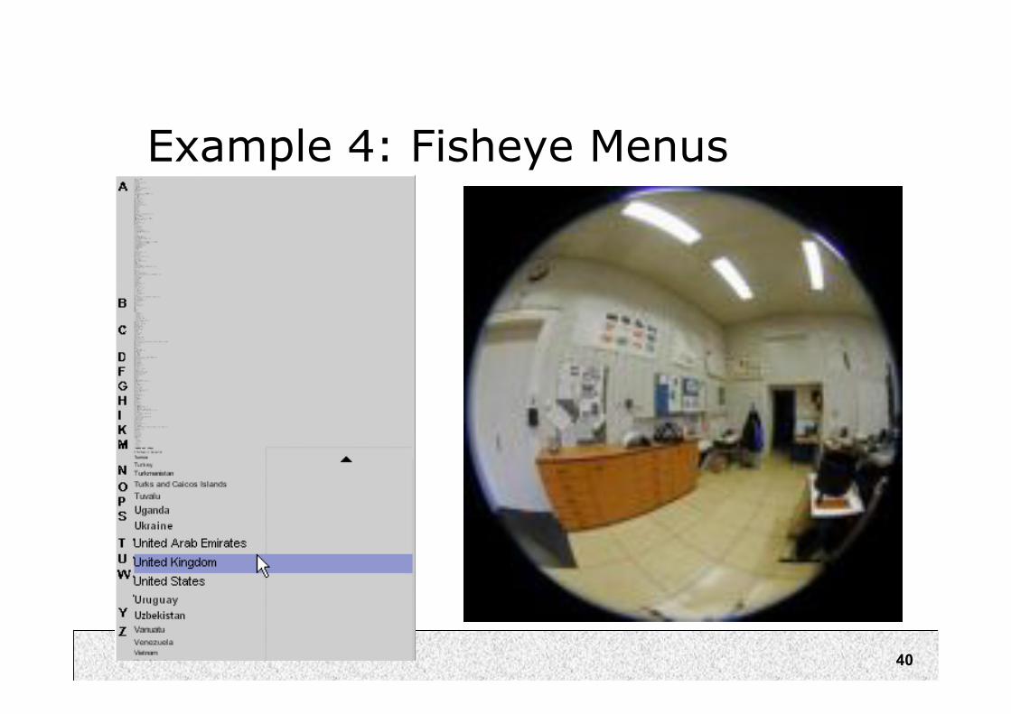
Example 4: Fisheye Menus
41
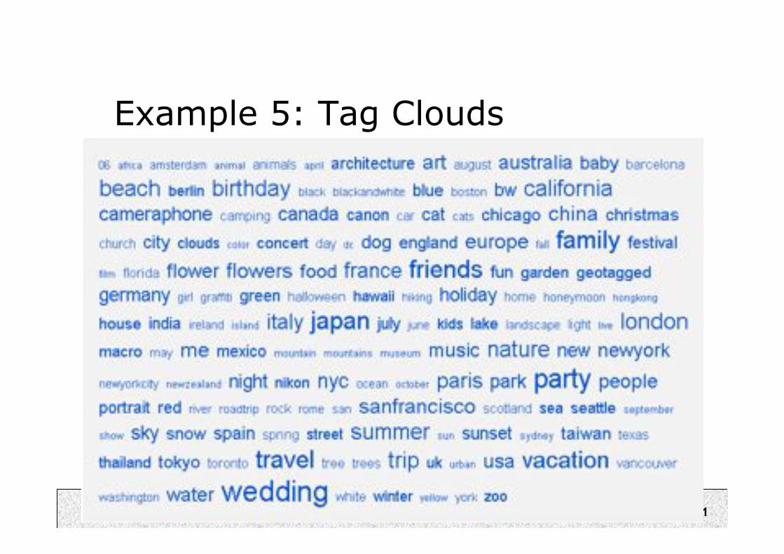
Example 5: Tag Clouds
42
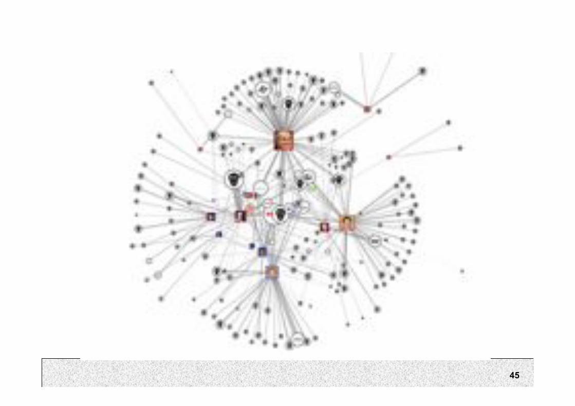
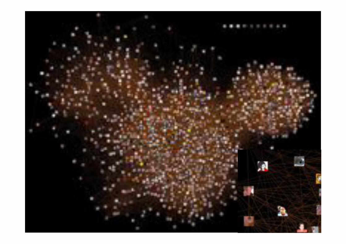
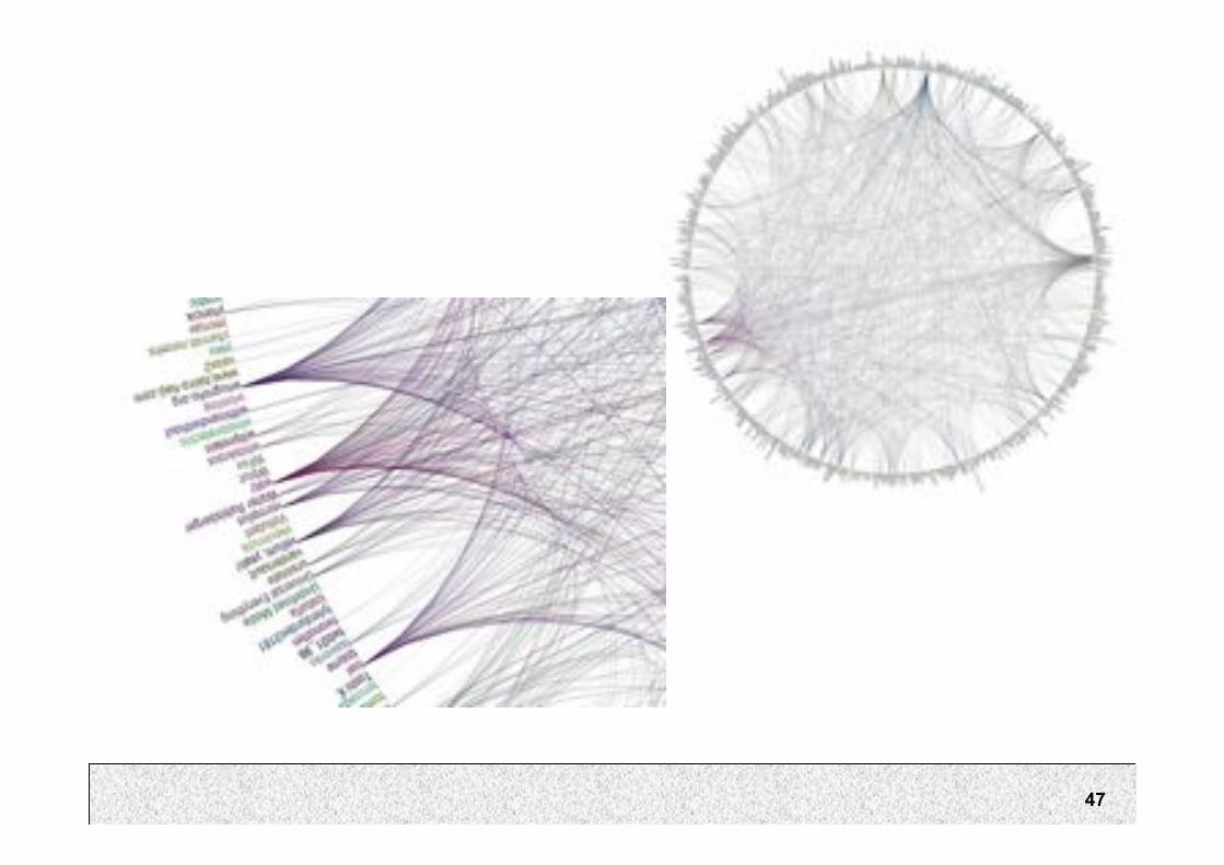
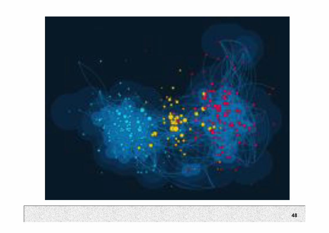
Visualising relationships
• Friendship networks
• Food chain networks
• Economic networks
• Terrorist networks

43

44
45
46
47
48
49

50

51
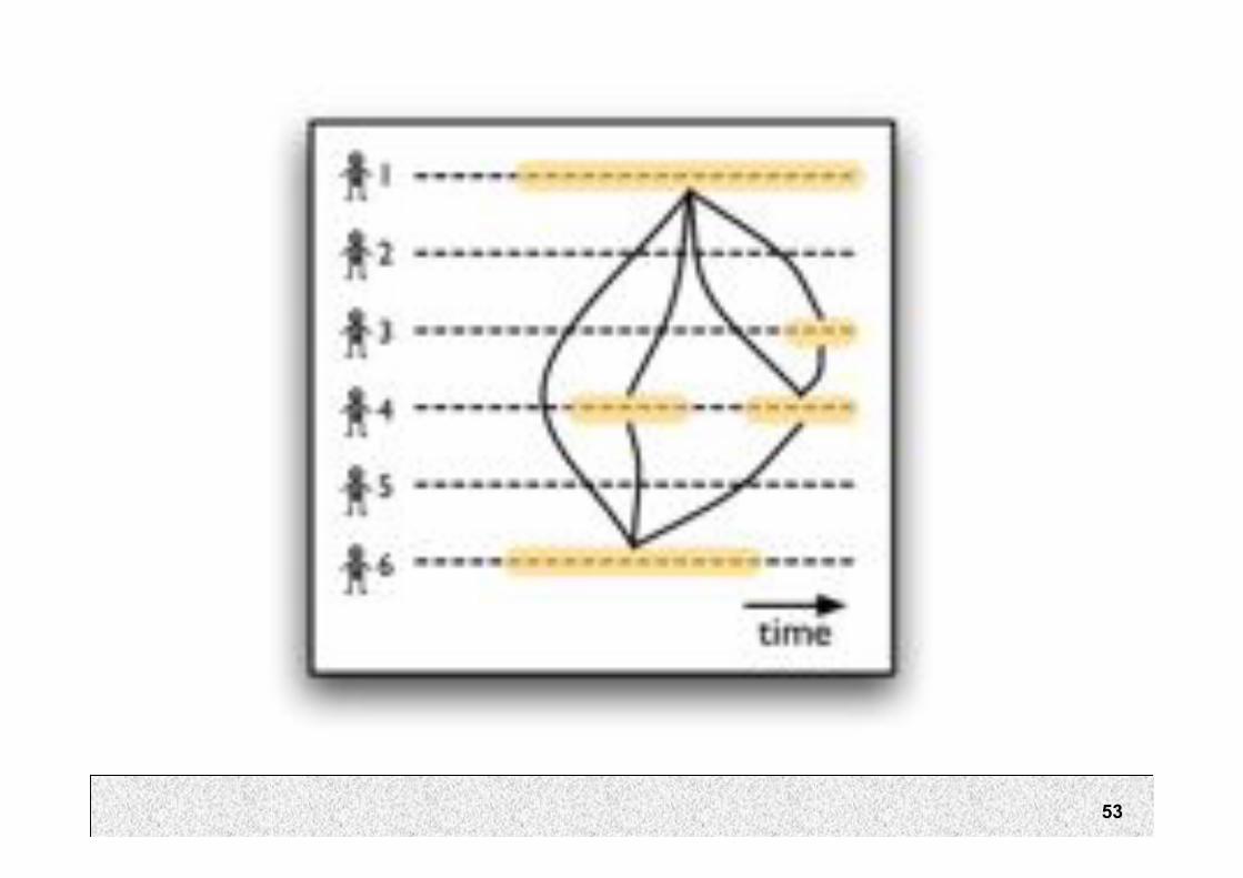
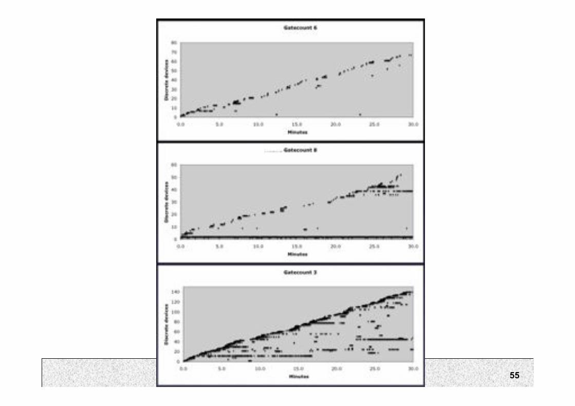
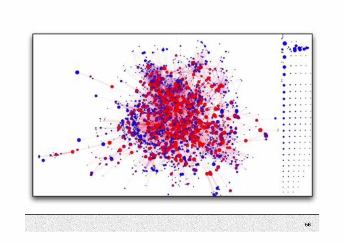
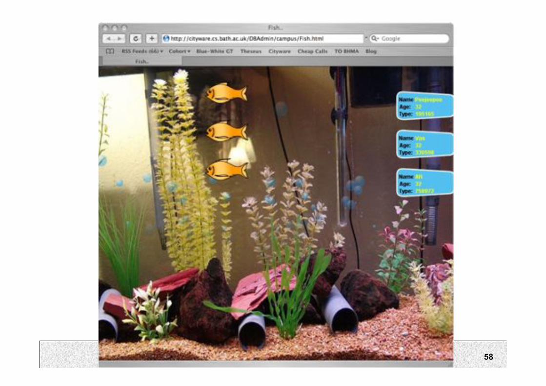
Project 3
• Come up with novel visualisations of BluetoothEncounters.
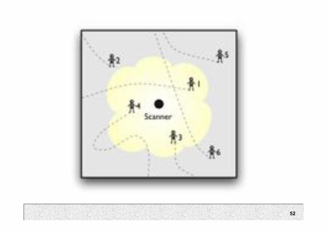
52
53

54
55
56

57
58
59
Recap of Key Principles
• Overview first, zoom and filter,details on demand
• Focus + context
• Brushing and linking
• Make every pixel count
• Meaning of– Colour
– Size
– Layout / proximity
– Transparency

60
InfoViz Toolkits
• Tableau Software
• prefuse
– http://prefuse.org/gallery/

61
Some Issues
• Few usability tests demonstrating infoviztechniques work well (and by how much)
• Rapidly growing area
• Interested in seeing more?– http://www.style.org/
– http://prefuse.org/gallery/
– http://www.bewitched.com/research.html
– http://services.alphaworks.ibm.com/manyeyes/home
– http://www.visualcomplexity.com/vc/
62
Summary
• Information visualization for quickly exploringand explaining large sets of data
– Overview first, zoom and filter,details on demand
– Focus + context
– Brushing and linking
– Make every pixel count

63
Admin
• P3 is out!
• Visualise Bluetooth encounters