interface type and screen design - department of ee
TRANSCRIPT

H. C. So Page 1 Semester B 2018-2019
Interface Type and Screen Design Interface Type Design Menu Fill-in Form Natural Language Command Language Window & Icon
Screen Design

H. C. So Page 2 Semester B 2018-2019
Menu
List of options from which user selects the desired choice

H. C. So Page 3 Semester B 2018-2019
Menu
Advantages:
Self-explanatory: Easy to learn - make both the semantics (what can be done) and the syntax (how to do it) explicit
Require little human memory: Users need not to remember command names as the interface always presents all valid options; Menus rely on recognition rather than recall memory
Few keystrokes: Typing effort is minimal ⇒ less user error
Easy error handling: Limited set of valid inputs at any one time
Enhancements are visible: If we add new functions into the system, they will appear on the menu screen

H. C. So Page 4 Semester B 2018-2019
Menu
Disadvantages:
Inefficient: In a complex menu system with many choices on each screen and many levels in the hierarchy ⇒ Difficult to find the desired function
Inflexible: Menus also force a user through set sequences of steps; The dialog is system rather than user controlled to a greater extent
Impractical for numerous choices: If there are too many options at any one time, this may make a menu dialog style to become too complex ⇒ Difficult to read & respond
Take up screen space: It will compete with other aspects of a display
Can we overcome the disadvantages of menu?

H. C. So Page 5 Semester B 2018-2019
Menu Menu Types:

H. C. So Page 6 Semester B 2018-2019
Menu Single Menus: Simplest form Linear Sequence: Guide users through a sequence of
choices, always in the same order and regardless of the choices made by the user
Tree Structure: The sequence of menus depends on the
choices made by user. This structure is conventional which allows only one way to reach each menu
Acyclic Network: Some or all menus in the tree may be
reachable by more than one sequence choices Cyclic Network: Special traversals may allow the user to
jump around the menu tree, e.g., Web

H. C. So Page 7 Semester B 2018-2019
Menu
Single menu
Allow users to choose between 2 or more items, or multiple selections Remain permanent or in a pop up mode
1. Binary menu: allow users to choose between 2 options e.g., choice of “Yes” or “No”
Radio button

H. C. So Page 8 Semester B 2018-2019
Menu
2. Multiple item menu: allow users to choose between >2 options E.g., choice of marital status
3. Multiple selection menu: allow selection of multiple items Convenient for handling
multiple choices since user is able to scan the full list of items while deciding

H. C. So Page 9 Semester B 2018-2019
Menu 4. Pull-down menu: always available to the user by
making selections on a top menu bar Allow keyboard shortcuts, e.g., expert can use
“Ctrl C” for copying

H. C. So Page 10 Semester B 2018-2019
Menu 5. Pop-up menu: appear on a display in response to a
click with a pointing device 6. Fisheye menu: allow rapid selection in a very large
menu

H. C. So Page 11 Semester B 2018-2019
Menu
7. Two-dimensional menu: a multiple column menu which allows rapid selection among numerous items

H. C. So Page 12 Semester B 2018-2019
Menu
8. Embedded menu: items are embedded in text or graphics
Permit items to be viewed in context & eliminate the need for a distracting & screen-wasting enumeration of items
Keep users focused on their tasks & on objects of interest
Not in an orderly enumeration of menu items
After clicking selected item, relevant information is displayed
e.g., appear in hypertext including Web pages

H. C. So Page 13 Semester B 2018-2019
Menu

H. C. So Page 14 Semester B 2018-2019
Menu Combinations of multiple menus
1. Linear menu sequence: guide users through a series of choices in which they see a sequence of menus:

H. C. So Page 15 Semester B 2018-2019
Menu 2. Simultaneous menus: present multiple active menus
at the same time and allow users to enter choices in any order

H. C. So Page 16 Semester B 2018-2019
Menu 3. Tree-structured menu: form categories of similar
items to create a tree structure

H. C. So Page 17 Semester B 2018-2019
Menu 4. Menu map menu: avoid “getting lost” particularly in
a menu tree with a large number of levels or depth
H. C. So Page 18 Semester B 2018-2019
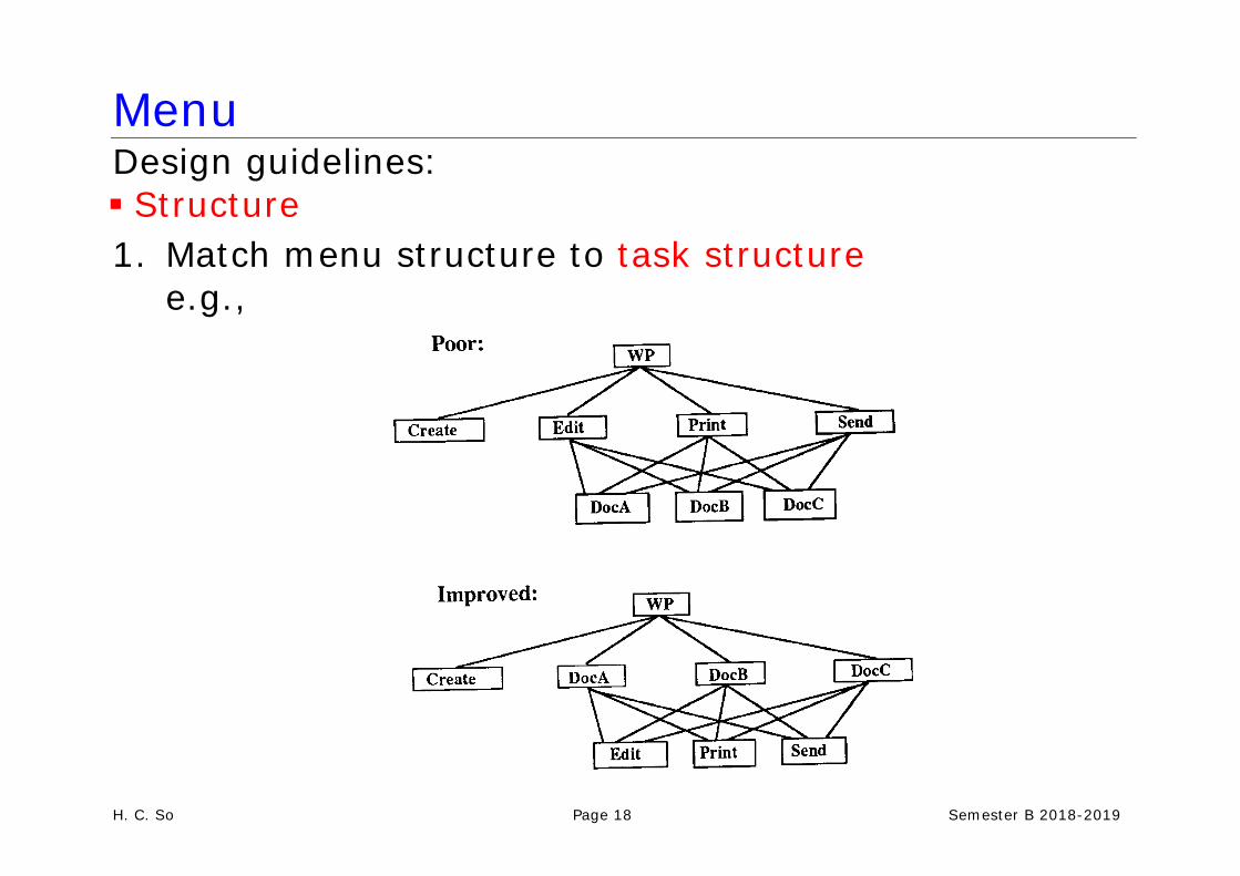
Menu Design guidelines:
Structure
1. Match menu structure to task structure e.g.,

H. C. So Page 19 Semester B 2018-2019
Menu After invoking WP, user selects Edit, followed by DocA
After editing the document, user must then close DocA in order to get back to the second-level menu and select Print to print
After choosing Print, user is again presented with the directory menu and must choose DocA again
2. Provide easy way to tailor menu to task structure
It is because default menu structure may not be optimal in all cases e.g., report of a science student will involve many equations, he can edit the report using WORD more efficiently by putting the equation editor on menu bar

H. C. So Page 20 Semester B 2018-2019
Menu 3. Depth-breadth (number of items per level) trade-off via
considering decision-making time (user response time) & execution time (the time to execute a command)

H. C. So Page 21 Semester B 2018-2019
Menu
Long user response time if Inexperience user Choice items are complex Choice items are not grouped ⇒less breadth is desirable
Long execution time when System response time is long Selection mechanism takes more time ⇒more breadth is desirable

H. C. So Page 22 Semester B 2018-2019
Menu

H. C. So Page 23 Semester B 2018-2019
Menu
4. For full-screen text menu, present menu choice lists vertically

H. C. So Page 24 Semester B 2018-2019
Menu 5. Consider pie-menu for one- or two-level mouse-
driven menu hierarchies
Why the pie-menu is better in this scenario?

H. C. So Page 25 Semester B 2018-2019
Menu
6. Consider graying out or deletion of inactive menu items (depend on user experience)

H. C. So Page 26 Semester B 2018-2019
Menu
7. Use familiar terminology, but ensure that items are distinct from one another
“Day”or “6:00a.m. – 6:00p.m.” is more precise?

H. C. So Page 27 Semester B 2018-2019
Menu
8. Labels should be brief, consistent in grammatical style & placement, & matched with corresponding menu titles

H. C. So Page 28 Semester B 2018-2019
Menu 9. Consider menu choice descriptors, e.g., look-ahead &
microhelp (increase satisfaction & decrease error)

H. C. So Page 29 Semester B 2018-2019
Menu Choice ordering
Convention: months of the year, days of the week, numbers, sizes
Frequency of use: choices are listed in order of expected frequency of use, e.g., Help: users are expected to most often consult “Index”
Order of use: choices are listed in the order users are expected to use them in a sequence
Categorical: choices are grouped according to semantic property
Alphabetic: choices are simply listed in alphabetic
order

H. C. So Page 30 Semester B 2018-2019
Menu

H. C. So Page 31 Semester B 2018-2019
Menu
Choice selection 1. For keyboard-driven menu:
Cursor: advantage- ease of learning & comfort,
disadvantage- slow for many items
Mnemonic letters: advantages - fast, no change when adding new items (e.g., “e” for “edit”)
Numbers: fast, need change if adding new items
Non-mnemonic letters: fast, need change if adding
new items

H. C. So Page 32 Semester B 2018-2019
Menu

H. C. So Page 33 Semester B 2018-2019
Menu Never start with zero
Left justification
Well labelled selection field appears below the
choices Best: combine cursor movement with mnemonic
letter codes Provide menu select defaults when possible

H. C. So Page 34 Semester B 2018-2019
Menu Examples:

H. C. So Page 35 Semester B 2018-2019
Menu
2. Distinguish between “choose one” and “choose many” menus (allow users to choose the choices in one pass).
3. Provide menu selection feedback

H. C. So Page 36 Semester B 2018-2019
Menu Invocation
1. Permanent menus are more preferred
2. Pop-up or user invoked menus for expert users & situation where screen space is small

H. C. So Page 37 Semester B 2018-2019
Menu Navigation
1. Establish conventions for menu design & apply them consistently on all menu screens within a system

H. C. So Page 38 Semester B 2018-2019
Menu
2. 2. Use menu maps, or place markers as navigation aids in complex menu systems
Menu map is the overview of menu hierarchy
Place marker is a symbol to signify the position

H. C. So Page 39 Semester B 2018-2019
Menu 3. Facilitate backward navigation or allow jumps to
previous and main menu
Layout
1. Menu designers should establish guidelines for consistency of at least these menu components:
Title - centered or left justification is acceptable
Item - item is left justified with item number or letter preceding the item description; blank lines (& other methods, such as box or border) should be used to separate meaningful groups of items
Instructions / error messages - should be identical in each menu, & should be placed in same position

H. C. So Page 40 Semester B 2018-2019
Fill-in Form Similar to paper fill-in form Field for typing in data Caption for each field to indicate data type Possible data types: user-typed strings, user choices from a list, default values, required and optional values, & dependent values

H. C. So Page 41 Semester B 2018-2019
Fill-in Form Advantages:
Self-explanatory
Require little memory
Efficient use of screen real estate: traditional menu system asks only one question per screen; with fill-in form, multi-questions can be asked on one screen
Accommodate parameters with many possible input values
Provide context: because there are usually several or many fill-in fields on a single screen, users can get a broad context information
Enhancements are visible

H. C. So Page 42 Semester B 2018-2019
Fill-in Form Disadvantages:
Assume knowledge of valid input e.g., “Married:__” (Y/N)? or (S/M)?. e.g., “Size” UK or US standards?
Assume typing skill ⇒ more user error
Assume knowledge of special keys: in keyboard driven case, users need to use “Tab”, “Cursor key”, “Return”, “Backspace”
Inflexible: most fill-in forms make it difficult to fill in fields in any order other than the order in which the fields appear
Can we overcome the disadvantages of fill-in form?

H. C. So Page 43 Semester B 2018-2019
Fill-in Form Design guidelines: Organization & layout
1. Organize the form to support task
e.g., if the fill-in form is an online version of the paper form ⇒ both layouts should be similar, such as credit card application form
e.g., search engine ⇒ allow user to input information in a flexible order, such as “human computer interaction” = “computer human interaction”

H. C. So Page 44 Semester B 2018-2019
Fill-in Form 2. Organize groups
of items by: \
Categorical grouping
Sequence of uses: order of the fields aligns with familiar order
Frequency of uses: most frequently filled-in fields located at the top of groups, e.g., document name
Relative importance: most important fields located at the top of groups; optional fields should appear at the bottom

H. C. So Page 45 Semester B 2018-2019
Fill-in Form 3. Use white space to
create balance and symmetry
4. Separate logical
groups by spaces, lines, color or other visual cues

H. C. So Page 46 Semester B 2018-2019
Fill-in Form Caption & field design
1. For single fields, place the caption to left; for listed fields place the caption above, left justified above alpha lists, right justified above numeric lists
2. Provide distinctive field
group & section headings in complex form

H. C. So Page 47 Semester B 2018-2019
Fill-in Form
3. Distinguish captions from fields
4. Brief, familiar &
descriptive captions
e.g., Telephone Number or Phone ?
e.g., First line of street address or Address Line 1 ?
5. Indicate when fields are
optional

H. C. So Page 48 Semester B 2018-2019
Fill-in Form

H. C. So Page 49 Semester B 2018-2019
Fill-in Form Input format
1. Provide system completion of unambiguous partial input
e.g., “Ja” or “1” ⇒January e.g., “Jun” ⇒ June
2. When user moves the cursor to the next field, the
completed information in the previous field should be displayed
3. Provide default whenever possible 4. Should be case blind

H. C. So Page 50 Semester B 2018-2019
Fill-in Form
5. Avoid complex rules for entering data in various fields of a form e.g., provide relevant fields which depend on users

H. C. So Page 51 Semester B 2018-2019
Fill-in Form 6. Meaningful groupings to break up long input formats
e.g., Break the input into groups of three to four characters separate by space, dashes, etc., e.g., "EMP-SAL-235" is better than "EMPSAL235" Poor Improved DATE:____________ (e.g.1/12/90) DATE:____________ (e.g.011290)
DATE: __/__/__ (e.g.011290)
TIME:____________ (e.g.8:15AM) TIME:____________ (e.g.0815am)
DATE: __:__pm (e.g.0815am)
CARD #:____________________ (1234567891234567) CARD #:____________________ (1234-5678-9123-4567)
CARD #:____-____-____-____ (1234567891234567)

H. C. So Page 52 Semester B 2018-2019
Fill-in Form
7. For display of fields:
Alphabetic fields are customarily left justified on entry & on display
Numeric fields may be left justified on entry but then become right justified on display
Avoid entry & display of leftmost zeros in numeric fields
Numeric fields with decimal points should line up on the decimal points
Special attention on Phone number: (_ _ _) _ _ _ _ _ _ _ _ ID: (_) _ _ _ _ _ _ (_) Time: _ _ : _ _: _ _ Date: _ _ / _ _ / _ _ _ _

H. C. So Page 53 Semester B 2018-2019
Fill-in Form
Prompt & instruction
1. Prompt should be brief & unambiguous
2. Place prompts to right of fields or in Microhelp line at the bottom of the screen
3. Use consistent terminology & consistent grammatical form & style instructions

H. C. So Page 54 Semester B 2018-2019
Fill-in Form

H. C. So Page 55 Semester B 2018-2019
Fill-in Form Navigation
1. When a form is first entered, position the cursor in default position
2. Vertical groups are preferable than horizontal
3. Allow forward & backward movement
4. Provide titles & page number or place maker

H. C. So Page 56 Semester B 2018-2019
Fill-in Form Error Handling 1. Allow user to edit individual
character in fields 2. Error messages for
unacceptable values 3. Place cursor in error field 4. Provide semantic &
syntactic information in errors messages, e.g. Illegal date (poor) Characters not accepted in
date field (syntactic) February dates range from
1 to 29 (semantic)

H. C. So Page 57 Semester B 2018-2019
Natural Language
Allows user to express requests to a software applications in their native language A keyboard as an input device & a screen as an output device are assumed, although voice input & output are possible

H. C. So Page 58 Semester B 2018-2019
Natural Language
Advantages:
Powerful, fast & efficient: a simple command can set many functions
Flexible & user controlled
Use small screen space
Easy to learn & remember

H. C. So Page 59 Semester B 2018-2019
Natural Language
Disadvantages: Assume typing skill ⇒ more user error
Enhancements are invisible
Vagueness & ambiguity: makes it very difficult for a
machine to understand ⇒ may need to lengthy confirmation & clarification dialogs (In real word, much of our half of the conversation involves repeating & clarifying with our conversation parties)
Expensive to implement

H. C. So Page 60 Semester B 2018-2019
Natural Language Design guidelines:
1. Use consistent familiar terminology & simple brief grammatical form
e.g., “This is what I...” & “Your request...”)
2. Provide cooperative responses
e.g., handling simple errors: july or june for “jule”
3. Provide an optional clarification dialog
4. Distinguish between user input & system output with white space & visual cues
5. Provide a way to view dialog history
6. Provide instruction for navigation

H. C. So Page 61 Semester B 2018-2019
Natural Language Example:

H. C. So Page 62 Semester B 2018-2019
Command Language Original, traditional style of human-computer interface
User types in requests through an artificial language with its own unique semantics, vocabulary & syntax, e.g., “ping”, “rm”, “ls”
Advantages:
Powerful, fast & efficient: a few keystrokes can express complex command
Flexible & user controlled
Use minimal screen space
Disadvantages:
Difficult to learn & remember
Assume typing skill
Enhancements are invisible

H. C. So Page 63 Semester B 2018-2019
Command Language Design guidelines: 1. Provide consistency in syntax
e.g., VolB!FileA! & FileA!VolB! 2. Use action-object syntax, e.g., “del file.doc” 3. Avoid arbitrary punctuation 4. Allow defaulting of optional parameters 5. Command name abbreviation: simple & consistent

H. C. So Page 64 Semester B 2018-2019
Command Language

H. C. So Page 65 Semester B 2018-2019
Windows & Icons
Advantages:
Easy to learn & remember
Flexible, easily reversible actions
Provide context, instant, visual feedback
Less error prone
Disadvantages:
Can be inefficient e.g., file copying in a directory with many files
May be difficult to design recognizable icons: e.g., How to design the icons, especially for actions, such as, "save", "quit", "change" or "undo"

H. C. So Page 66 Semester B 2018-2019
Windows & Icons
Types of icons Resemblance: depict the underlying concept through
an analogous image Exemplar: represents a typical
example of a class of objects Symbolic: used to convey an
underlying referent that is at a higher level of abstraction than the image
Arbitrary: an arbitrary image ⇒ must be learned

H. C. So Page 67 Semester B 2018-2019
Windows & Icons Design guidelines:
1. Choose a consistent icon design scheme
e.g., In “Poor”, “magnify” is designed by depicting a before & after representation; “cut” is designed by depicting tool that is used to accomplish operation; “paint” is designed by depicting action
In “Improved”, all are designed by depicting the tool that is used to accomplish the operation

H. C. So Page 68 Semester B 2018-2019
Windows & Icons
2. Design icons to be concrete & familiar
3. Design icons in a set to be visually & conceptually distinct

H. C. So Page 69 Semester B 2018-2019
Windows & Icons 4. Avoid excessive
detail in icon design
5. Design icons to communicate object relations & attributes whenever possible
6. Accompany icons with names

H. C. So Page 70 Semester B 2018-2019
Screen Design Layout design guidelines:
1. Include ONLY/ALL information essential to decision making
2. Start in the upper-left corner (eye-tracking studies show that the eye tends to go to the upper-left corner of a display)
3. Consistent format
4. Group items logically (user can easily locate the items or fields)

H. C. So Page 71 Semester B 2018-2019
Screen Design 5. Provide symmetry &
balance through the use of white space
6. Avoid heavy use of all uppercase letters
7. Distinguish captions & fields

H. C. So Page 72 Semester B 2018-2019
Screen Design Text design guidelines:
1. Message
Should be brief & concise (1) Design the level of detail according to users'
knowledge & experience (2) Express message in the affirmative (3) Should be constructive, not critical (4) Should be specific & comprehensible (5) Should imply that user is in control (6) When message implies a necessary action, use
words in message consistent with that action e.g.,There is no entry on the field?
The field is empty? Please fill in the field?

H. C. So Page 73 Semester B 2018-2019
Screen Design

H. C. So Page 74 Semester B 2018-2019
Screen Design 2. Instructional prompts Place prompts when &
where needed (1) Design the level of
detail according to the users’ knowledge & experience (2) Use active voice (3) Avoid negatives (4) Order prompts
chronologically (5) Format prompts using
white space or other visual cues (6) Apply consistency (7)

H. C. So Page 75 Semester B 2018-2019
Screen Design 3. Instructions
Make text simple & clear
Use short sentences & simple & familiar words
Keep paragraphs & separate them by at least one blank line
Avoid hyphenation
Avoid right justifying with unequal spacing

H. C. So Page 76 Semester B 2018-2019
Screen Design 4. Screen number
Right justify integers
Decimal-align real numbers
Avoid leading zero whey unnecessary & non-standard
Break up long numbers into groups of 3 to 4 digits
Use standard separators when they apply; otherwise use spaces

H. C. So Page 77 Semester B 2018-2019
Screen Design 5. Font
Use Georgia or Verdana (Georgia and Verdana are the screen display versions of Times New Roman and Arial, respectively; Note the difference between printing on a paper, >600dpi and displaying on a screen 72-120 pixels per inch)
Use 10 point to 12 point type
Avoid bold or italic in body type, except for a few words for emphasis
Use upper case only for the first word of sentences, proper names, etc.
G
Use left alignment
Use dark text on a light background

H. C. So Page 78 Semester B 2018-2019
Screen Design Illustration: a 12-point letter “o” is displayed in Times New Roman and Georgia. If we enlarge them:
In Times New Roman, there are two places where
pixels touch only at their corners while Georgia has a smoother appearance Size of Georgia is a bit larger
⇒ Georgia is a screen friendly font especially for small font sizes

H. C. So Page 79 Semester B 2018-2019
Screen Design 6. Color
Color adds an extra dimension to an interface & can help the user understand complex information structures
No consumption on the dimension of screen
Can be used to highlight exceptional events RGB color model:

H. C. So Page 80 Semester B 2018-2019
Screen Design Design guidelines:
Aware concept of color in different cultures:

H. C. So Page 81 Semester B 2018-2019
Screen Design Make sure there is sufficient contrast between text and
background colors e.g., avoid text and background colors that differ only in blue because human is less sensitive to this color
Offer expires 07/31/03. Offer available to new High Speed Internet subscribers only. May not be used in conjunction with any other offer. Service is not available in all areas.

H. C. So Page 82 Semester B 2018-2019
Screen Design Offer expires 07/31/03. Offer available to new High Speed Internet subscribers only. May not be used in conjunction with any other offer. Service is not available in all areas. Use color sparingly; design first in monochrome &
optimize other aspects of screen layout & design, then add color only where it adds value
Be consistent with color association in a system Use color to draw attention Use color to indicate status

H. C. So Page 83 Semester B 2018-2019
Use of Color Use color to communicate organization and establish
relationship

H. C. So Page 84 Semester B 2018-2019
Screen Design 7. Information presentation Static information Initialized at the
beginning of a session; it does not change during the session May be either numeric
or textual, e.g., power indicator
Dynamic information Change during a session & the changes must be
communicated to the system user May be either numeric or textual, e.g., clock

H. C. So Page 85 Semester B 2018-2019
Screen Design Analogue & digital presentation Digital presentation Can be compact: take up little screen space Precise values can be communicated Analogue presentation Easier to get an “at a glance” impression of a value Possible to show relative values Easier to see exceptional/extreme data values

H. C. So Page 86 Semester B 2018-2019
Screen Design 8. Visual organization1 Four design principles:
Proximity Group related content items close together Separate unrelated items
Alignment Place related items along an imaginary line Align items of equal importance and indent
subordinate items Consistency Make related items look the same Maintain high degree of uniformity in layout with a
page and uniformity in layout across pages
Contrast Make different items look different

H. C. So Page 87 Semester B 2018-2019
Screen Design Any improvement?

H. C. So Page 88 Semester B 2018-2019
Screen Design Better? Which principle is used?

H. C. So Page 89 Semester B 2018-2019
Screen Design
Which principle is used?

H. C. So Page 90 Semester B 2018-2019
Screen Design Good alignment maximizes the number of unbroken virtual lines
Which one is better?

H. C. So Page 91 Semester B 2018-2019
Screen Design Avoid centered alignment for lines that are of nearly equal length
Which one is better?

H. C. So Page 92 Semester B 2018-2019
Screen Design

H. C. So Page 93 Semester B 2018-2019
Screen Design

H. C. So Page 94 Semester B 2018-2019
Screen Design Which principle is used?

H. C. So Page 95 Semester B 2018-2019
Screen Design Sound interesting?

H. C. So Page 96 Semester B 2018-2019
Screen Design Better? Which principle is used?

H. C. So Page 97 Semester B 2018-2019
Screen Design Which principle(s) is/are used?

H. C. So Page 98 Semester B 2018-2019
Screen Design Which principle(s) is/are used?