item #5 commuter connections state of … connections state of the commute survey 2016 ... commuter...
TRANSCRIPT

ITEM #5
COMMUTER CONNECTIONS STATE OF THE COMMUTE SURVEY
2016
Technical Survey Report
Prepared for:
Metropolitan Washington Council of Governments
Prepared by:
LDA Consulting Washington, DC 20015
(202) 548-0205
In conjunction with:
CIC Research, Inc. San Diego, CA
September 20, 2016
Commuter Connections 2016 State of the Commute Survey Report-Draft September 20, 2016
i
EXECUTIVE SUMMARY
Introduction
This report presents the results of the State-of-the-Commute (SOC) survey conducted for the Commuter Connec-tions program of the Metropolitan Washington Council of Governments (COG).1 Commuter Connections provides a wide range of transportation information and assistance services in the Washington metropolitan area to inform commuters of the availability and benefits of alternatives to driving alone and to assist them to find alternatives that fit their commute needs. COG administers these services, called Transportation Emission Reduction Measures (TERMs), as part of a regional effort to reduce vehicle trips, vehicle miles of travel, and emissions resulting from commute travel.
The SOC survey serves several purposes. First, it documents trends in commuting patterns, such as commute mode shares and distance traveled, and prevalent attitudes about transportation services that are available in the region. Second, the SOC survey collects data needed to estimate the impacts of several Commuter Connections’ TERMs that might influence the population-at-large. Third, the survey examines how other commute alternative programs and marketing efforts might influence commuting behavior in the region. Finally, the survey explores commuters’ opinions about and interest in current transportation initiatives.
The 2016 survey was conducted in two components, a telephone survey, consistent with the method used for SOC surveys between 2001 and 2013, and an Internet survey, which will provided an Internet baseline to facilitate a future transition from an all-telephone survey method to the lower-cost Internet approach. Both components were conducted with employed adult residents. A total of 5,903 interviews were completed for the survey, 5,029 from the telephone survey and 874 through the Internet survey.
Upon completion of the interviews, the telephone and Internet survey data were combined and responses were expanded to represent the employed population of the jurisdictions that make up the Washington metropolitan region. The results also were adjusted to align survey results to known race/ethnicity and age distributions. Adjust-ments for employment counts and race/ethnicity had been applied in past SOC surveys, but the age adjustment was new in 2016. Analysis of the raw telephone survey data indicated a significant under-representation of young respondents and over-representation of respondents who were 55 years of age or older, compared with American Community Survey (ACS) data compiled by the U.S. Census. ACS population statistics for combinations of employ-ment status, race/ethnicity, and age by jurisdiction were used to calculate values that expanded the sample to counts of employed residents with correct representations by age and race/ethnicity.
Following is a summary of results on the following topics. Particularly notable findings are marked in bold type for emphasis:
Commute patterns
Commute changes and commute satisfaction
Telework
Availability of transportation options
Quality of life and transportation satisfaction
Awareness of commute advertising and services
Awareness of use of commuter assistance resources
Employer-provided commuter assistance services
1 Commuter Connections is administered through the National Capital Region Transportation Planning Board (TPB) at COG and funded through the District Department of Transportation, the Maryland Department of Transportation, and the Virginia De-partment of Transportation, with state and federal funds.

Commuter Connections 2016 State of the Commute Survey Report-Draft September 20, 2016
ii
Commute Patterns
The share of commute trips made by driving alone fell 10 percentage points between 2004 and 2016. Use of transit and telework continued to increase.
Commuters made about six in ten (61.0%) of their weekly commute trips by driving alone. Drive alone contin-ued to be the most popular commute mode in the Washington metropolitan region, but the drive alone mode share continued the long-term decline from 71.4% in 2004 to 61.0% in 2016. This represented a drop of 10 percentage points over the 12-year period.
Alternative modes accounted for an increasing share of commute trips in 2016. Transit was used for two in ten (20.1%) weekly commute trips, about the same as in 2010 and three percentage points above the 16.8% mode share observed in the 2004 SOC survey. The 2016 bike/walk mode share of 3.3% was slightly above the share from previous years. The 5.4% carpool/vanpool mode share represented a continued decline from the peak 7.1% mode share estimated in the 2007 survey.
Use of telework/compressed work schedules continued the upward trend observed since the 2004 SOC sur-vey; the share of weekday trips eliminated by these modes has nearly than tripled over the past 12 years, from 3.6% of weekday commute trips to 10.2% in 2016.
Commuters exhibited generally consistent mode patterns; 67% used the same commute mode all of their work days and 81% used the same mode four or five days. More than one-third (37%) of regional workers used an alternative mode (carpool, vanpool, transit, bike/walk) as their primary mode, that is, the mode they used most days in a typical week. An additional 4% of commuters used an alternative mode as a secondary mode (one or two days per week).
About three-quarters of the 20.1% transit mode share was in a train (14.3% Metrorail and 0.9% commuter rail). The remaining one-quarter (4.9%) of transit trips were made by bus. Among respondents who carpooled or vanpooled, regular carpooling dominated. Three-quarters of carpool/vanpool trips were in regular carpools (4.1% of total 5.4% carpool/vanpool use). Casual carpools/”slugs” accounted for two in ten carpool/vanpool trips and one in ten trips in this mode group was made by vanpool.
Four in ten (40%) commuters who used alternative modes to get to work walked to the transit station/stop or location where they met a carpool/vanpool partner, 12% took transit, and 1% bicycled to the meeting point. One-quarter (26%) drove alone and parked their car during the day.
Alternative mode use was much higher for respondents who lived and/or worked in the central portion of the region than for those who lived/worked outside the regional core.
Only four in ten (41%) commuters who lived in the Inner Core area (Alexandria, Arlington, and District of Co-lumbia) drove alone. This was much lower than the 65% drive alone rate for the Middle Ring (Fairfax, Mont-gomery, and Prince George’s counties) and the 75% rate for the Outer Ring (Calvert, Charles, Frederick, Loudoun, and Prince William counties). The mode pattern for employment area was similar; fewer than half (44%) of commuters who worked in the Inner Core area drove alone, dramatically lower than the drive alone rates for Middle Ring workers (75%) and Outer Ring workers (80%).
The average commute distance increased; commute time also has grown marginally, but most commuters build extra time in their schedules to account for traffic, roadway incidents, and transit service disruptions.
The 2016 average commute distance was 17.3 miles, an increase over the 16.0 to 16.3 mile averages meas-ured in previous SOC surveys. The average commute time also lengthened; the 39 minute average time in 2016 was five minutes longer than the 34 minute average observed 12 years earlier in the 2004 SOC survey.
Almost eight in ten (81%) commuters added extra time to their commute to account for travel time variability due to traffic, roadway incidents, and/or transit service disruptions. On average, respondents added 12 extra minutes to their commute time. When compared to the total typical travel time of 39 minutes, this means that about 30% of the average commute time was related to variability of travel time.

Commuter Connections 2016 State of the Commute Survey Report-Draft September 20, 2016
iii
Commute Changes, Commute Ease, and Commute Satisfaction
While many commuters were long-time users of their mode, commuters continued to shift among modes.
Commuters who drove alone to work had used this mode an average of 10.3 years and nearly half (45%) had been driving alone for 10 years or more. Only 22% started driving alone within the past three years. By con-trast, 33% of train riders, 35% of bike/walk commuters, 53% of bus riders, and 59% of carpoolers started using these modes within the past three years.
About one-third (37%) of commuters who started using a new alternative mode within the past three years previously drove alone to work. Twenty percent of alternative mode users previously rode a train and 9% pre-viously used a bus. Eleven percent carpooled or vanpooled before switching to their current alternative mode and 7% previously rode a bicycle or walked. About two in ten did not have a previous mode to report because they were not working in the Washington region then or had only ever used their current mode.
Commuters who shifted to alternative modes did so primarily to save money (14%) or save time (12%) or be-cause they had a change in their personal circumstances, such as changing jobs or work hours (14%), losing access to a personal vehicle (11%), or changing job locations (8%).
Commuting got more difficult in the past year for a sizeable share of commuters. And many respondents consid-ered commuting factors when making job or home location decisions and took actions to improve their com-mutes.
About two in ten (16%) respondents said their commute was easier than one year ago, but 22% said their commute was more difficult. Respondents who traveled more than 20 minutes to work were particularly likely to report a more difficult commute than last year. Respondents who had made a home or work location change in the past year were more likely to report an easier commute (38%) than were commuters who did not make a move (10%). This suggests a move could have played a role in improving the commute.
One-third (35%) of respondents who moved said they considered a commuting factor, such as the ease or cost of commuting to the new location, when making their location decision. Nearly four in ten (39%) said commute ease was more important than other factors or was the only factor in their decisions.
More than four in ten (43%) respondents who made a home or work location change considered how close their new location would be to transportation services such as Park & Ride lots, HOV/Express lanes, protected bike lanes, and transit stations/stops. Respondents for whom commute factors were most important also were more likely to have explored access to new transportation services and 63% of respondents who said commuting was the only factor they considered said they had explored what services would be available at the new location.
Some respondents were more likely than were others to consider transportation access options: 1) respond-ents who lived or worked in the Inner Core, 2) respondents who used an alternative mode to commute, 3) re-spondents who moved from outside the Washington region, 4) respondents with limited access to a personal vehicle, and 5) respondents who were younger than 35 years old.
Six in ten commuters were satisfied with their current commute, but satisfaction declined since 2013 and not all commuters were equally satisfied.
Six in ten (58%) commuters rated their commute satisfaction as a 4 or 5 on a 5-point scale, where 5 meant very satisfied. But 19% said they were not satisfied (rating of 1 or 2). Commute satisfaction in 2016 also was lower than in 2013, when 64% of respondents were satisfied with their trip to work.
Metrorail riders and drive alone commuters reported the lowest satisfaction in 2016; 48% of commuters who rode Metrorail to work and 57% of commuters who drove alone said they were satisfied compared with 70% of commuter rail riders, 66% of carpoolers/vanpoolers and bus riders. Commute satisfaction by mode was generally similar in 2016 to that in 2013, with one notable exception – train riders were much less satisfied in 2016. In 2016, 48% of Metrorail riders gave a 4 or 5 rating for their commute, 19 percentage points lower than

Commuter Connections 2016 State of the Commute Survey Report-Draft September 20, 2016
iv
the 67% who were satisfied in 2013. And 70% of commuter rail riders were satisfied in 2016, a drop of 18 per-centage points from the 88% who were satisfied in 2013.
Commute satisfaction also differed by where the respondent lived and worked. Respondents who lived in the Inner Core were more satisfied (64% satisfied) than were respondents who lived in the Middle Ring (58%) or Outer Ring (53%). But respondents who worked in the Outer Ring were more satisfied (69%) than were re-spondents who worked in the Middle Ring (62%) or Inner Core (51%).
Commute satisfaction declined dramatically as commute length increased. Nearly all (97%) respondents who commuted 10 minutes or less gave a 4 or 5 rating for satisfaction. When the commute was between 21 to 30 minutes, satisfaction dropped to 66% and when travel time exceeded 60 minutes, only 22% rated their com-mute a 4 or 5.
Respondents’ commute satisfaction was influenced by the ease of the commute. Three quarters (73%) of re-spondents who said they had an easier commute than last year and 65% who said their commute had not changed are satisfied with their commute, compared with only 31% who said their commute had become more difficult.
Telework
The percentage of workers who telework grew between 2013 and 2016, continuing a steady upward trend ob-served since 2004. But even with this growth, potential exists for additional teleworking.
Nearly one-third (32%) of regional commuters said they teleworked at least occasionally. “Commuters” were defined as workers who were not self-employed and would otherwise travel to a worksite outside their homes if not teleworking. These teleworkers represented 887,000 regional workers.
The percentage of regional telework has more than doubled since 2004 and telework incidence grew in nearly every demographic and occupational segment in which telework was feasible.
The 2016 survey showed that an additional 18% of all commuters who did not telework “could and would” telework if given the opportunity. These respondents said their job responsibilities would allow them to tele-work and they would like to telework. Of these interested respondents, about two-thirds would like to tele-work “occasionally;” the remaining one-third would like to telework “regularly.” These potential teleworkers totaled 518,000 regional workers.
The percentage of commuters who said their jobs were incompatible with telework dropped, from 65% in 2004 to 41% in 2016. Because it seems unlikely that the regional composition of jobs changed substantially, these results suggest a shift in commuters’ perception of their ability to perform work away from their primary work location. This could be related to increasing availability of communication and computer technology or perhaps from a broader definition of what work was “telework-compatible.”
The share of respondents who self-defined as “teleworkers” likely underrepresented the true share of telework activity in the region because 13% of regional commuters worked at home occasionally, but did not consider themselves teleworkers.
Half of respondents who said they were not “teleworkers” but who had telework-appropriate jobs said they had worked at home all day on a regular work day at least once in the past year. These respondents repre-sented 367,000 commuters or about 13% of all commuters in the region. When added to the 32% of commut-ers who self-defined as teleworkers, the total percentage of commuters who telework/work at home at least occasionally rises to 45%.
The average work at home frequency of these “non-teleworkers” was low, about seven days per year, or 0.14 days per week. By contrast, self-defined teleworkers teleworked an average of 1.38 days per week.
On a typical work day, approximately 255,000 regional workers telework/work at home. About 4% of the tele-work/work at home days would be from commuters who do not consider themselves teleworkers occasionally working at home.

Commuter Connections 2016 State of the Commute Survey Report-Draft September 20, 2016
v
The “typical day” telework count likely underestimates the true traffic-reduction benefit because commuters telework/work at home more often on days when traffic is likely to be heavier or more difficult than normal. Eight in ten (80%) “non-teleworkers” who occasionally worked at home and 91% of teleworkers said they were somewhat likely or very likely to work at home on a day when traffic in the region is likely to be dis-rupted by a weather event or major/special event in the region. So teleworking/work at home likely provides a higher than average benefit for regional traffic conditions on days when traffic is likely to be at its worst
The percentage of teleworkers who worked under “formal” telework arrangements exceeded the percentage who teleworked under informal arrangements with supervisors.
About 30% of all respondents (both teleworkers and non-teleworkers) said their employer had a formal tele-work program and 23% said telework was permitted under informal arrangements between a supervisor and employee. Formal programs were most common at Federal agencies and among respondents who worked for large employers.
More than half (56%) of teleworkers teleworked under a formal arrangement. This represented a significant shift from 2004, when only 32% of teleworkers had a formal agreement. This appears to signal a greater ac-ceptance of formal telework.
Teleworkers got information on telework from a variety of sources.
The largest source of telework information, by far, was “special program at work/employer,” named by 73% of respondents. This percentage has been steady since the 2010 SOC survey, but was considerably higher than in 2007, when only 55% of teleworkers cited their employer as the source of information.
Nine percent of teleworkers said they received telework information directly from Commuter Connections or MWCOG, about the same percentage as mentioned Commuter Connections/MWCOG in 2013 and higher than in 2010 (6%) and 2007 (7%).
Availability of and Attitudes Toward Transportation Options
Most respondents report access to some transit service in their home area.
Respondents were asked if bus and/or train service operated in the area where they lived and where they worked. More than eight in ten (89%) said that some transit service served their home area. A similar percent-age (86%) said service operated where they worked.
Half (51%) of respondents said they lived less than ½ mile from a bus stop and 66% said they lived less than one mile away. Train station access was less convenient; only 17% lived less than one mile from a train station. The average distances were 1.5 miles to the nearest bus stop and 6.1 miles to the nearest train station.
Respondents who lived in the Inner Core area said the closest bus stop was an average of 0.4 miles away and a train station was 1.7 miles away. Eighty-four percent of commuters in this area lived less than ½ mile from a bus stop.
One in ten respondents region-wide had used an HOV lane for their trip to work and a similar share had used an Express lane. Respondents who used HOV/Express lanes saved an average of 20 minutes on their commute and 48% said availability of the lanes influenced their mode choice.
Three in ten (30%) respondents said there was an HOV lane along their route to work. One-third of these com-muters had used the lanes. This equated to about 9% of commuters region-wide. Fewer respondents (15%) had access to Express lanes, but more than half of respondents who had the lanes available had used them, representing 8% of all commuters region-wide.
Respondents who used the HOV/Express lane for commuting estimated that they saved an average of 20 minutes for each one-way trip when they used the lanes. HOV/Express lane users who lived in the outer juris-dictions of the region saved an average of 29 minutes one-way.

Commuter Connections 2016 State of the Commute Survey Report-Draft September 20, 2016
vi
Nearly half (48%) of respondents who used HOV/Express lanes for commuting said availability of the lanes in-fluenced their mode choice decision. The role of the lanes on mode choice is borne out by a comparison of rideshare mode use with and without HOV/Express lanes. The carpool/vanpool mode share was 9% for com-muters who had access to an HOV/Express lane for commuting, compared with 5% for commuters who did not have access.
Quality of Life and Transportation Satisfaction
Two-thirds of respondents gave a high rating for quality of life in the Washington region. They were less satisfied with the region’s transportation system and transportation satisfaction had declined since 2013.
Sixty-four percent of respondents gave a high quality of life (QOL) rating; 20% gave a rating of 5 (Excellent) and 44% rated QOL as a 4. But only 36% of respondents reported being satisfied with the regional transportation system (rating of 4 or 5). Three in ten said they were dissatisfied (rating of 1 or 2). Commuters also were slightly less satisfied with regional transportation than they were in either 2013, when 44% of commuters were satisfied, or in 2010, when 40% of regional commuters rated their transportation satisfaction as a 4 or 5.
Respondents’ ratings for quality of life appeared somewhat related to their satisfaction with transportation, with QOL ratings increasing with increasing satisfaction with transportation. Three-quarters (75%) of respond-ents who were satisfied with transportation rated QOL a 4 or 5, compared to 49% of respondents who were not satisfied with transportation.
Transportatation satisfaction appeared to be related to numerous factors, including home and work locations, commute mode and distance, and proximity to public transit.
Respondents who lived in the Inner Core gave a higher rating for transportation satisfaction than did other respondents; 44% of Inner Core respondents rated transportation satisfaction as a 4 or 5, compared with 36% of Middle Ring respondents and 28% of Outer Ring respondents.
Respondents who drove alone and those who rode transit gave lower ratings for transportation satisfaction than did carpoolers/vanpoolers and bike/walk commuters. Only 34% of drive alone commuters, 38% of train riders, and 41% of bus riders were satisfied, compared with 47% of carpoolers and 61% of commuters who biked/walked to work.
Transit riders were substantially less satisfied in 2016 than they had been in 2013. In 2013, 58% of train riders and the same share of bus riders had been satisfied. Satisfaction of drive alone commuters also fell, but the drop was smaller, from 41% to 34%. Respondents who carpooled/vanpooled and those who biked/walked were equally satisfied in 2016 as they had been in 2013.
Respondents’ satisfaction with transportation appeared linked to their satisfaction with their commute to work. Half (50%) of respondents who were satisfied with their trip to work also were satisfied with the re-gional transportation system. Conversely, only 12% of respondents who were dissatisfied with their commute were satisfied with transportation. The length of the commute also was a factor, with transportation satisfac-tion declining as commute length increased; 48% of respondents who commuted 10 minutes or less were sat-isfied, compared with 20% of respondents who traveled more than an hour to work.
And respondents who lived closer to transit gave higher marks for transportation satisfaction than did re-spondents who lived farther away. About four in ten respondents who lived less than one mile from a bus stop were satisfied with transportation, compared with about three in ten respondents who lived between 1.0 and 2.9 miles away, and about one-quarter of respondents who lived 3.0 or more miles away.
Commuters recognized both personal and societal benefits of alternative mode use and commuters who used alternative modes made productive use of their travel time.
When asked what personal benefits alternative modes users received from using alternative modes, 80% of respondents named at least one benefit. Nearly six in ten (59%) respondents said that use of alternative modes could reduce traffic congestion.

Commuter Connections 2016 State of the Commute Survey Report-Draft September 20, 2016
vii
Respondents noted three benefits related to environmental concerns. Almost four in ten (36%) said commut-ers who use alternative modes help the environment, indicating some recognition that use of alternative modes has an impact of environmental quality. Twelve percent reported reducing greenhouse gases as a ben-efit and 9% said saving energy, benefits related to sustainability.
Nine in ten (89%) respondents who used alternative modes for their commute said they received personal benefits from using these modes. Saving money topped the list; 33% of alternative mode users mentioned this benefit. Respondents also cited benefits that had a connection to quality of life. Two in ten (22%) respondents said use of alternative modes helped them avoid stress or relax while commuting and 18% said they could use their travel time productively when they used an alternative mode. About one in ten said they got exercise or health benefits (13%) or arrived at work on time (10%).
More than half of respondents who carpooled, vanpooled, or rode transit to work said they performed work-related tasks during the commute; 37% performed work-related tasks “most days” and 15% performed work-related tasks “some days.” Conducting work-related business during the commute was more common among transit riders; 57% of train riders and 59% of bus riders said they performed work-related tasks during their commute.
Awareness of Commute Advertising
General awareness of commute information advertising remained high; about seven in ten could cite a specific message.
More than half (54%) of all respondents said they had seen, heard, or read advertising for commuting in the six months prior to the survey and 67% of these respondents could cite a specific advertising message. Both the general recall and specific message recall were approximately the same as were observed in the 2013 survey (55% general recall and 67% message recall).
Half (49%) of respondents who had heard ads could name the sponsor. WMATA was named by 23% as the advertising sponsor. Commuter Connections was named by 13%, about the same percentage as named Commuter Connections in 2013 (12%).
Commute advertising appears to influence commuters’ consideration of travel options.
One-quarter (25%) of respondents who saw or heard advertising said they were more likely to consider ridesharing or public transportation after seeing or hearing the advertising. This was essentially the same rate as was noted in the 2013 (25%) and 2010 SOC surveys.
Respondents who were using alternative modes were more likely to be influenced by the advertising. About 52% of bus riders, 28% of train riders, and 27% of carpoolers/vanpoolers said they were more likely to con-sider using an alternative after hearing the ads, compared with only 20% of respondents who drove alone. There did not seem to be any relationship with commute distance or time; commuters who traveled short dis-tances and those who traveled long distances to work were about equally likely to say they were more willing to use alternative modes after hearing the ads.
About 9% of respondents who recalled an advertising message said they took some action after hearing the ad to try to change their commute. About 3% sought more information, but 3% who recalled ad messages tried or started using a new alternatie mode. While these respondents equal only about one percent of the total commuter population, they represent more than 30,000 commuters. Half (48%) of the respondents who started using a new alternative mode drove alone before making the switch. The other half had been using a different alternative mode.

Commuter Connections 2016 State of the Commute Survey Report-Draft September 20, 2016
viii
Awareness of Commute Assistance Resources
About half of regional commuters were aware of commute information and assistance resources.
About half (53%) of respondents said they knew of a telephone number or web site they could use to obtain commute information. Awareness of regional commute information resources fell from the 66% rate meas-ured in the 2010 SOC survey, but the current level of 53% awareness is still higher than the rates in 2004 (46%), and 2007 (51%).
Awareness was substantially higher among respondents who saw or heard commute advertising in the past year (61%) than for respondents who did not recall advertising (44%). And commuters who had heard of Com-muter Connections reported higher awareness of regional commute resources (59%) than did commuters who were not aware of Commuter Connections (44%).
About 22% of respondents could name a specific number or web site; 13% named a Metro/WMATA phone number or website and 1% mentioned Metro/WMATA, but did not specify the number or website. One percent named a phone number or website administered by Commuter Connections.
Awareness of Commuter Connections continues to be high.
In 2016, 61% of all regional commuters said they had heard of an organization in the Washington region called Commuter Connections. This was about the same rate as was measured in 2013 (62%) and 2010 (64%), but still considerably higher than the 53% who knew of Commuters Connections in 2007.
One in ten (11%) respondents who knew of Commuter Connections had contacted the program or visited a Commuter Connections or MWCOG website in the past year. These commuters represented about 7% of all employed residents of the region.
Most local jurisdiction services were known to at least a quarter of their target populations.
Respondents were asked about local commute assistance services provided in the counties where they lived and worked. Awareness of these programs ranged from 9% to 51% of respondents who were asked the ques-tions. Four of the ten local programs were known to at least a third of the target area respondents and two other programs were known to about one-quarter of target area respondents.
Use of the services ranged from 1% to 10% of the target audience. Use was generally higher for programs in outer jurisdictions and for programs associated with transit agencies or with a strong transit component. The relationship to the location in region was likely because outer jurisdiction commuters encountered more con-gestion in their travel and had longer commute times and distances, which could encourage them to seek op-tions for travel to work.
Commuter Assistance Services Provided by Employers
Availability of worksite commute assistance services remained stable between 2013 and 2016, but had declined since 2010.
Fifty-five percent of respondents said their employers offered one or more alternative mode benefits or services to employees at their worksites. This was about the same share as in 2013 (57%), but a drop from the 61% noted in the 2010 survey, suggesting that employers that cut back the services during the economic re-cession had not yet re-introduced those services.
The most commonly offered services were SmarTrip/subsidies for transit/vanpool, available to 37% of re-spondents, and information on commuter transportation options, available to 27% of respondents. Nearly one-quarter (23%) of respondents said their employers offered services for bikers and walkers and 21% said their employers offered preferential parking.
Respondents who worked for Federal agencies were most likely to have benefits/services available (84%), compared with 44% to 57% of respondents who worked for other types of employers. Respondents who worked for large firms also reported greater access to benefits/services than did respondents who worked for small firms. And benefits/services were far more common among respondents who worked in the Inner Core

Commuter Connections 2016 State of the Commute Survey Report-Draft September 20, 2016
ix
area; 70% of these respondents had access to services compared with 47% who worked in the Middle Ring and 35% who worked in the Outer Ring.
SmartBenefit transit/vanpool subsidies, information on commute options, and bikeshare memberships were the most widely used commuter assistance services, used, respectively, by 59%, 30%, and 25% of respondents who had access to the services.
Most commuters continue to have free worksite parking.
The majority of respondents (64%) said their employers offered free, on-site parking to all employees, about the same percentage as had reported free parking in 2013 (63%), in 2010 (63%), 2007 (65%), and 2004 (66%). An additional 6% of respondents said their employers did not provide free parking to all employees, but that they personally had free parking.
Federal agency workers and respondents who worked for non-profit organizations were least likely to have free parking at work; only 44% of Federal workers and 54% of non-profit workers had free parking, compared with 70% who worked for private firms and 74% who worked for state/local governments. Free parking also was much less common in the Inner Core; only 31% of Inner Core workers had free parking, compared with 83% of Middle Ring workers and 90% of Outer Ring workers.
The availability of commute benefits/services was inversely related to the availability of free parking at the worksite. Less than half (46%) of respondents who said free parking was offered to all employees said their employers also offered commute benefits/services that would encourage or help them use alternative modes for commuting. By contrast, 72% of respondents who said free parking was not available reported having ac-cess to commute benefits/services at work.
Worksite commuter assistance services appeared to encourage use of alternative modes.
Driving alone was less common for respondents who had access to benefits/. Only 55% of respondents with these services drove alone to work, compared with 76% of respondents whose employers did not provide these services.
Respondents whose employers did not offer free parking also used alternative modes at much higher rates. Only about four in ten (42%) respondents who did not have free parking drove alone, compared with 80% of respondents who had free parking.

Commuter Connections 2016 State of the Commute Survey Report-Draft September 20, 2016
x
TABLE OF CONTENTS
SECTION 1 – INTRODUCTION 1
SECTION 2 – SURVEY AND SAMPLING METHODOLOGY 2
Overview 2
Questionnaire design 2
Sample Areas and Sampling methodology 3
Survey Administration 4
Weighting of Survey Data 5
SECTION 3 - SURVEY RESULTS 7
Comparisons to Past SOC Surveys 7
Geographic Analysis 8
3-A Characteristics of the Sample 9
- Demographic characteristics 9 - Home and work locations 14 - Employment characteristics 16
3-B Commute Patterns 18
- Number of days worked per week and work hours 18 - Current commute mode 19 - Primary commute mode by demographic group 24 - Length of commute 29 - Non-standard work schedules 33 - Alternative mode use characteristics 34
3-C Recent Commute Changes, Ease of Commute, and Commute Satisfaction 36
- Commute mode shifts and mode shift motivations 36 - Ease of commute 39 - Commute satisfaction 45
3-D Telework 49
- Current and potential teleworking 49 - Telework/work at home frequency and “episodic” telework 55 - Telework patterns 57

Commuter Connections 2016 State of the Commute Survey Report-Draft September 20, 2016
xi
Table of Contents (cont.)
3-E Availability of and Attitudes Toward Transportation Options 62
- Public transportation 62 - High occupancy vehicle (HOV)/Express lanes 66 - Park and Ride lots 71 - Attitudes toward transportation options 71
3-F Quality of Life, Transportation Satisfaction, and Benefits of Alternative Mode Use 74
- Quality of life 74 - Transportation satisfaction 75 - Benefits of alternative mode use 81
3-G Awareness of Commute Advertising and Services 86
- Commute advertising recall 86 - Commute advertising impact 88
3-H Awareness and Use of Commuter Assistance Resources 90
- Awareness of commuter assistance numbers/websites 90 - Awareness and use of Commuter Connections 92 - Awareness and use of local commuter assistance programs 97
3-I Employer-Provided Commuter Assistance Services 99
- Alternative mode benefits/ services 99 - Flexible work schedules and work schedule incentives 104 - Parking facilities and services 108 - Impact of commute assistance services and parking 110
Appendix A – Survey Data Expansion 115
Appendix B – Final Dialing Disposition 121
Appendix C – Survey Questionnaire 122
Appendix D – Instructions and Definition of Terms 156
Appendix E – Comparison of Key SOC Results – 2016, 2013, 2010, 2007, 2004, 2001 159

Commuter Connections 2016 State of the Commute Survey Report-Draft September 20, 2016
xii
LIST OF TABLES AND FIGURES Tables Page
1 Race/Ethnic Background 10
2 Vehicles per Adult Household Member by Respondent Home Area and Age 14
3 Home and Work Locations 15
4 Work Location by Home Location 16
5 Employer Size 17
6 Occupation 17
7 Primary Mode by Age 23
8 Primary Mode by Sex 24
9 Primary Mode by Race/Ethnic Group 24
10 Primary Mode by Annual Household Income 25
11 Primary Mode by Number of Vehicles in the Household 25
12 Primary Mode by State of Residence and State of Employment 26
13 Primary Roadways Used to Get to Work – Commuters who Carpool/Vanpool or Ride Transit 28
14 Commute Distance by Primary Mode 30
15 Commute Distance by Home and Work Area 30
16 Primary Mode by Use of Non-Standard Schedules 34
17 Means of Getting from Home to Alternative Mode Meeting Place 35
18 Distance Traveled from Home to Alternative Mode Meeting Place 35
19 Commute Compared to Last Year, by Made a Change in Home or Work Location 40
20 Importance of Commute Ease Relative to Other Factors Considered in Home or Work 43
Location Changes
21 Summary of Current and Potential Telework 51
22 Telework by Demographic Characteristics 52
23 Telework by Commute Distance and Home/Work Area 53
24 Telework by Employment Characteristics 54
25 Formal or Informal Telework Arrangements by Employer Type 60
26 Formal or Informal Telework Arrangements by Employer Size 60
27 Transit Service Operating in Home Area and Work Area 62
28 Mean Distance from Home to Bus Stop and Train Station By Type of Transit Service 63
Operating in Home Area
29 Bus and Train Service by Home Area 64
30 Availability and Use of HOV / Express Lanes by Residence Jurisdiction 69

Commuter Connections 2016 State of the Commute Survey Report-Draft September 20, 2016
xiii
List of Tables and Figures (continued)
Tables Page
31 Reasons for Not Using Carpool/Vanpool to Work 72
32 Reasons for Not Using Transit to Work 73
33 Ratings for Transportation Satisfaction by Sex, Race/Ethnicity, and Income 78
34 Personal Benefits of Alternative Mode Use by Primary Alternative Mode 84
35 Recall of Advertising Sponsors 87
36 Advertising Sources/Media 88
37 Recall of Regional Commuter Assistance Telephone Number or Website 92
38 Commuter Connections Program Referral Sources 94
39 Awareness of Regional GRH Program by Primary Commute Mode 95
40 Awareness of Regional GRH Program by Home and Work Area 96
41 Commuter Benefits/Services Available by Employer Type 102
42 Commuter Benefits/Services Available by Employer Size 103
43 Commuter Benefits/Services Available by Work Area 103
44 Likely to Shift Work Start Time Outside Peak Period by Amount of Schedule Flexibility Permitted 105
45 Likely to Shift Work Start Time Outside Peak Period by Home and Work Area 106
46 Likely to Shift Work Start Time Outside Peak Period by Commute Mode and Distance 108
47 Parking Facilities/Services Offered by Employers – 2016, 2013, 2010, 2007, 2004 108
Figures Page
1 Geographic Sub-areas – Inner Core, Middle Ring, Outer Ring 8
2 Respondent Age Distribution 9
3 Respondent Age by Home Area 9
4 Annual Household Income 10
5 Household Size – Overall and Adult Residents 11
6 Household Vehicles 11
7 Household Vehicles by Home Area 12
8 Vehicles per Adult Household Member – Region-wide and by Home Area 12
9 Vehicles per Adult Household Member by Respondent Age 13
10 Home and Work Locations – Inner Core, Middle Ring, and Outer Ring 15
11 Employer Type 16
12 Total Weekdays Worked and Weekdays Worked Outside the Home 18
13 Weekly Commute Trips by Mode – 2016 19
14 Primary Modes and Secondary Modes 20
15 Average Days Modes Used 21

Commuter Connections 2016 State of the Commute Survey Report-Draft September 20, 2016
xiv
List of Tables and Figures (continued)
Figures (continued) Page
16 Composition of Alternative Mode Groupings – Modes Used 1+ Days per Week 22
17 Weekly Trips by Mode – 2016, 2013, 2010, 2007, 2004 23
18 Primary Mode by Home Area 27
19 Primary Mode by Work Area 27
20 Commute Distance (miles) 29
21 Commute Distance (minutes) 29
22 Extra Travel Time (minutes) to Ensure On-time Arrival 31
23 Total Travel Time and Extra Time to Ensure On-time Arrival by Commute Mode 32
24 Arrival Time at Work 33
25 Non-Standard Schedule Types Used 33
26 Duration of Mode Use 36
27 Previous Mode of Current Alternative Mode Users 37
28 Motivations to Start Using Current Mode Alternative Mode 38
29 Commute Easier, More Difficult, or Same as Last Year – 2010, 2013, and 2016 39
30 Commute Easier, More Difficult, or Same as Last Year – By Commute Length (minutes) 40
31 Home or Work Move Shortened Distance or Time from Home to Work 41
32 Factors Considered in Home or Work Location Changes 42
33 Importance of Commute Factors by if Move Shortened Distance or Time from Home to Work 43
34 Access to Transportation Services Considered when Making Home or Work Move 44
35 Satisfaction with Commute 45
36 Satisfaction with Commute by Home and Work Area 46
37 Satisfaction with Commute by Ease of Commute 47
38 Satisfaction with Commute by Primary Commute Mode 47
39 Satisfaction with Commute by Length of Commute 48
40 Percentage of Commuters who Telework – 2004, 2007, 2010, 2013, 2016 49
41 Potential for Telework Among Non-teleworkers 50
42 Telework Status Distribution 50
43 Frequency of Telework – 2010, 2013, and 2016 55
44 Frequency of Work at Home in the Past Year – Non-teleworkers 56
45 Work at Home Frequency During Major Regional Events – Teleworkers and Non-teleworkers 57
46 Length of Time Teleworking 58
47 Formal and Informal Telework Arrangements 58
48 Telework Arrangements – 2004, 2007, 2010, 2013, 2016 59
49 Sources of Information About Telework – 2007, 2010, 2013, 2016 61
50 Distance from Home to Bus Stop and Train Station 63

Commuter Connections 2016 State of the Commute Survey Report-Draft September 20, 2016
xv
List of Tables and Figures (continued)
Figures (continued) Page
51 Distance from Home to Bus Stop by Home Area 65
52 Commute Mode by Distance from Home to Bus Stop 65
53 Commute Mode by Distance from Home to Train Station 66
54 Availability and Use of HOV/Express Lanes 67
55 Travel Time Saving of HOV/Express Lane Users 67
56 Availability and Use of HOV/Express Lanes by Home Area 68
57 Primary Commute Mode by Availability of HOV / Express Lanes 70
58 HOV Influence on Choice of Commute Mode and Time Saved by HOV Lane Use by Home Area 70
59 Awareness of Park & Ride Lots Along Route to Work by Home Area 71
60 Ratings for Quality of Life in the Washington Metropolitan Region 74
61 Quality of Life by Home Area 75
62 Ratings for Transportation Satisfaction 75
63 Ratings for Transportation Satisfaction by Home Area 76
64 Quality of Life by Transportation Satisfaction 77
65 Ratings for Transportation Satisfaction by Age 77
66 Ratings for Transportation Satisfaction by Primary Commute Mode 79
67 Ratings for Transportation Satisfaction by Commute Travel Time 79
68 Ratings for Transportation Satisfaction by Distance from Home to Bus Stop and Train Station 80
69 Satisfaction with Regional Transportation by Commute Satisfaction 81
70 Regional/Community Benefits of Alternative Mode Use – 2010, 2013, 2016 82
71 Personal Benefits of Alternative Mode Use – 2013 and 2016 83
72 Frequency of Work-Related Tasks During Commute Time 85
73 Commute Information/Advertising Messages Recalled 86
74 Awareness of Regional Commute Information Resources 90
75 Awareness of Regional Commute Information Resources – By Respondent Age 91
76 Summary of Recall of Regional Commute Information Phone Number of Website 91
77 Awareness of Commuter Connections (Prompted or Unprompted) 93
78 Awareness of Commuter Connections by Commute Travel Distance (miles) 93
79 Awareness of Regional GRH Program – 2004, 2007, 2010, 2013, 2016 95
80 Awareness of Who Sponsored Regional GRH Program 97
81 Heard of/Used Local Jurisdiction Commute Assistance Program 98
82 Employee Reports Access to any Worksite Benefits/Services - 2004, 2007, 2010, 2013, 2016 99
83 Alternative Mode Benefits/Services Available at Worksites – 2010, 2013, 2016 100
84 Use of Employer Provided Benefits/Services 101
85 Transit Financial Benefit Types 101

Commuter Connections 2016 State of the Commute Survey Report-Draft September 20, 2016
xvi
List of Tables and Figures (continued)
Figures (continued) Page
86 Extent of Work Schedule Flexibility Permitted 104
87 Likely to Shift Work Start Time Outside Peak Period to Receive Incentive 105
88 Likely to Shift Work Start Time Outside Peak Period by Respondent Age 107
89 Likely to Shift Work Start Time Outside Peak Period by Respondent Annual Household Income 107
90 On-site Free Parking Availability by Employer Type, Employer Size, and Work Location 109
91 Commuter Benefits/Services Offered by Free Parking Available 110
92 Primary Commute Mode by Commuter Services/Benefits Reported Offered 111
93 Primary Commute Mode by Free Parking Available at Work 112
94 Drive Alone and Transit Use by Combination of Free Parking and Commute Benefits/Services 112
Commuter Connections 2016 State of the Commute Survey Report-Draft September 20, 2016
1
SECTION 1 – INTRODUCTION This report presents the results of the State-of-the-Commute (SOC) survey conducted for the Commuter Connec-tions program of the Metropolitan Washington Council of Governments (COG).2 Commuter Connections provides a wide range of transportation information and assistance services in the Washington metropolitan area to inform commuters of the availability and benefits of alternatives to driving alone and to assist them to find alternatives that fit their commute needs. COG administers these services, called Transportation Emission Reduction Measures (TERMs), in a regional effort to reduce vehicle trips, vehicle miles of travel, and emissions resulting from commute travel.
COG has a strong interest in evaluating the effectiveness of its commuter services programs. In 1997 Commuter Connections established an evaluation framework that outlined a methodology and data collection activities to evaluate several of its commuter programs. This framework was updated and revised six times, in 2001, 2004, 2007, 2010, 2013, and 2016, to include several enhancements.3 A major addition to the 2001 framework was the State of the Commute (SOC) survey, a random sample survey of employed persons in the Washington metropoli-tan region.
The SOC survey serves several purposes. First, it documents trends in commuting patterns, such as commute mode shares and distance traveled, and prevalent attitudes about public transportation and other transportation ser-vices that are available to commuters in the region. Second, the SOC survey collects data needed to estimate the impacts of Commuter Connections’ Telework Assistance and Mass Marketing, two TERMs that might influence the population-at-large as well as commuters who directly participate in Commuter Connections’ programs. Third, the survey examines how other commute alternative programs and marketing efforts might influence commuting be-havior in the region. Finally, the survey explores commuters’ opinions about and interest in current transportation initiatives.
This report summarizes the survey methodology and presents key survey results. The report is divided into two sections following this introduction:
Section 2 – Description of the survey and sampling methodology
Section 3 – Presentation of the survey results
Following these main sections are five appendices dealing with survey procedures. They include: Appendix A – Survey weighting and data expansion, Appendix B – Dialing dispositions, Appendix C – Survey questionnaire, Ap-pendix D – Instructions and definitions of terms, and Appendix E – Comparison of key SOC Results – 2016, 2013, 2010, 2007, and 2004.
2 Commuter Connections is administered through the National Capital Region Transportation Planning Board (TPB) at COG and funded through the District Department of Transportation, the Maryland Department of Transportation, and the Virginia De-partment of Transportation, with state and federal funds. 3 For more information on the evaluation framework in effect at the time of this survey, readers may refer to Transportation Emissions Reduction Measures (TERMs) Revised Evaluation Framework – FY2015 –FY2017, available from COG.

Commuter Connections 2016 State of the Commute Survey Report-Draft September 20, 2016
2
SECTION 2 – SURVEY AND SAMPLING METHODOLOGY
Overview
The geographic scope of COG’s responsibility encompasses the 11 independent cities and counties that make up the Washington metropolitan region. All households within this geographic area that had at least one employed person residing in the household were eligible for selection in the study.
The 2016 State of the Commute (SOC) survey was conducted in two components. The first was a telephone survey, consistent with the method used for surveys between 2001 and 2013. The second was an Internet survey, which provided an Internet baseline to facilitate a future transition from an all-telephone survey method to the lower-cost Internet approach. Both components were conducted with employed residents. Upon completion of the in-terviews, responses were expanded to represent the commute patterns of residents in the independent cities and counties that make up the Washington metropolitan region.
A minimum of 455 random telephone or cell phone interviews were conducted in each of the 11 jurisdictions of the study area, resulting in 5,029 completed telephone interviews. An addition, 874 interviews were collected through the Internet survey, for a regional total of 5,903 completed interviews.
The survey was designed to meet multiple objectives, including commute trend analysis and evaluation of Trans-portation Emission Reduction Measures (TERMs) administered by COG’s Commuter Connections Program. Wher-ever possible, questions used in previous TDM studies were replicated to allow for trend analysis. Additionally, the survey included questions related to the Telework and Mass Marketing TERMs.
Questionnaire Design
LDA Consulting, CIC Research, and COG/TPB staff prepared the survey questionnaire, with input from a TDM Evalu-ation Group comprised of representatives from the District of Columbia, Maryland, and Virginia. The 2016 SOC questionnaire was based on the questionnaire used in 2013. Wherever possible, the study team retained the 2013 questions to allow trend analysis, but changes were made when the revisions were expected to add substantially to the accuracy of the data or to update question or response language for 2016. Several questions were deleted from the 2013 survey to shorten the interview time and make room for new questions of current topical interest, such as episodic telework, quality of life, and transportation satisfaction.
In early December, 2015, before the full survey was conducted, the consultants completed a pretest of the tele-phone questionnaire to check the initial survey administration and interview responses. The pretest resulted in 188 completed interviews, 102 by landline and 86 by cell phone. After examining the responses to these inter-views, the study team finalized the survey instrument at the end of December.
The survey instrument was programmed for telephone administration using Computer Assisted Telephone Inter-viewing (CATI) with predictive dialing for landline calls. The consultants used manual dialing for cell phone calls to comply with Federal Communication Commission (FCC) regulations implemented on July 10, 2015. A separate, equivalent questionnaire was prepared for the Internet survey using Voxco’s Computer Assisted Web Interviewing (CAWI) software. This survey included all the questions on the telephone survey, but some questions were refor-matted for use in visual media. A limited number of landline telephone calls also were sent to an Interactive Voice Response (IVR) system, which left a recorded message about the study on potential respondents’ answering ma-chines, requesting the respondent to complete the survey on the Internet survey site. A copy of the English version of the telephone questionnaire is included in Appendix C. Spanish and Internet versions of the questionnaire are available upon request.

Commuter Connections 2016 State of the Commute Survey Report-Draft September 20, 2016
3
Sample Areas and Sampling Methodology
Telephone Survey
The 2016 SOC survey was conducted with a random sample of residents in the 11-jurisdiction Washington, DC re-gion. Eligible respondents were 18 years of age or older, employed, and residing within the study area. To ensure sufficient sample in each jurisdiction for analysis purposes, survey quotas were set at a minimum of 455 telephone interviews in each jurisdiction, for a minimum of 5,005 interviews region-wide. This sample size represents a de-crease from the 2013 level of 575 completed surveys per jurisdiction (total of 6,325 interviews). The reduction in the telephone sample was made to shift some resources to the Internet portion of the survey. The 2016 telephone sample provides nearly as high a level of confidence as did the 2013 telephone survey for all regional analysis - 95% + 1.38% in 2016 versus 95% + 1.23% in 2013. This reduction in telephone sample did not affect the reliability of comparisons with previous SOC survey results.
Sample points for the telephone survey were chosen randomly from the database developed by the consultants using an overlapping, dual frame sampling design. That is, the telephone sample was drawn randomly from two separate sample groups: landline phone numbers, and cell phone numbers. In 2010, only landline sample points were surveyed. Because the proportion of cell phone only (CPO) households (i.e., households that do not have a landline) has increased substantially in recent years, and because these households have been found to have dif-ferent demographics from those with landlines (younger, more non-white, lower income), the study team included cell phones as well as landlines in the 2013 and 2016 studies.
Landline Telephones – Sample points were randomly selected for the landline survey from the database licensed to CIC Research, Inc. (CIC) by Marketing Systems Group (MSG), and were generated internally through CIC’s ran-dom digit dialing sampling system, GENESYS. The GENESYS system generated telephone numbers from all working prefixes by county, and, where prefixes overlapped counties, by ZIP code. These sample points were then loaded into the CATI system and used to complete the landline surveys.
Cell Phones – For the cell phone survey, sample points with cell phone prefixes were specified by CIC and gener-ated through GENESYS. Due to overlapping cell phone assignments between Fairfax County and the City of Alexan-dria, another national sample vendor, Survey Sampling, was used to provide sample for the City of Alexandria. The cell phone survey goal was to complete at least 15% of all telephone interviews with cell phone users (750 total interviews across the region). Instead of using the predictive dialer, CIC used a completely manually dialing process for cell phone calls, to comply with FCC regulation.
Interviews in the cell phone sample included both CPO respondents as well as respondents who had both a land-line and cell phone, thus the completed samples for individual jurisdictions had different proportions of CPO households, but jurisdictions with the highest proportions of CPO households also had the highest share of CPO interviews completed in their sample. A detailed list of dialing results for the survey is provided in Appendix B. Internet Survey
The Internet survey also collected interviews for a random sample of employed adult residents in the 11-jurisdic-tion region, but using a different method than for the telephone survey. Potential Internet survey respondents were requested to participate in the survey through a postcard, sent through the U.S. mail service. The postcard described the survey and requested their participation, provided the URL address for the survey website and two entry passwords, and informed residents that MWCOG was offering $5.00 Amazon gift cards to the first 500 partic-ipants.
To achieve a balanced sample of responses throughout the region, the consultants used an address-based method to select a random sample of households to receive the survey invitation. The address-based list included both physical mailing addresses and post-office box addresses for residents who receive their mail at central post office locations. The Internet survey targeted a total of 900 interviews, with 300 in each of three regional sub-areas that had been used in the 2013 SOC survey as key analysis sub-regions:

Commuter Connections 2016 State of the Commute Survey Report-Draft September 20, 2016
4
“Inner Core” – City of Alexandria, VA; Arlington County, VA; and the District of Columbia “Middle Ring” – Fairfax County, VA; Montgomery County, MD; and Prince George’s County, MD “Outer Ring” – Calvert County, MD; Charles County, MD; Frederick County, MD; Loudoun County, VA; and Prince
William County, VA The addresses selected for the survey were distributed in proportion to the employed population in each survey sample area. Anticipating a response rate of approximately 2.5%, to obtain approximately 900 completed inter-views, the consulting team proposed mailing to 36,000 households, with separate targeted quotas for each area.
Survey Administration
Telephone Survey
The telephone survey was conducted in CIC’s telephone survey facility, with landline calls made using predictive dialing and cell phone calls using manual dialing. Interviews were conducted using the Voxco CATI system, an inte-grated survey system encompassing both CATI and Web applications, which simplifies survey management while boosting interviewer performance. Before beginning the full survey effort, CIC conducted an interviewer-training session. Items included in the session were:
Explanation of the purpose of the study
Identification of the group to be sampled
Overview of COG and its function
Review of the definition and instruction sheet to familiarize interviewers with the terminology
Verbatim reading of the questionnaire
Paper/CATI review of skip-patterns to familiarize interviewers with questionnaire flow
Practice session on the CATI system in full operational mode
Additional training for experienced interviewers who were assigned to cell phone interviewing Interviews for the main survey began on January 6, 2016 and were completed on April 27, 2016. All landline calls were made to the respondents’ home numbers. Cell phone calls included an initial question to confirm that the respondent was in a location that was safe to continue the call. Weekday calls were made from 2:45 p.m. to 8:45 p.m. local time and weekend calls from 11:00 a.m. to 7:30 p.m. local time on Saturday and from 11:00 a.m. to 5:00 p.m. on Sunday.
CIC interviewers conducted a minimum of four call attempts for landline telephones at different times and over different days throughout the data collection period, while cell phones were limited to a maximum of three call attempts. Bilingual interviewers surveyed all Spanish-speaking respondents using the Spanish version of the ques-tionnaire. A total of 55 interviews (1.0% of total interviews) were conducted in Spanish; 21 interviews on landlines and 34 on cell phones.
CIC adopted measures to assure confidentiality of responses and all interviewing was conducted with survey su-pervisors present. Supervisors were responsible for overseeing the CATI server, checking quotas, editing call-back appointment times, monitoring interviews, answering questions, and reviewing completed surveys. To ensure quality control, survey supervisors monitored a minimum of 10% of each surveyor’s interviews. Other quality as-surance logical checks were applied as the survey data was collected.
Overall, the landline interviews took an average of 18.0 minutes to complete in 2016 as compared with 17.0 minutes in 2013. In 2016, the cell phone interviews took an average of 20.2 minutes to complete, longer than the 2013 length of 18.5 minutes. A total of 5,029 interviews were conducted for the telephone survey (4,278 with landline users and 751 with cell phones users). The during-survey refusal rate for the 2016 landline survey was 8.0
Commuter Connections 2016 State of the Commute Survey Report-Draft September 20, 2016
5
percent4 compared with 9.0 percent in 2013, 14.3 percent in 2010, and 14.8 percent for the 2007 study. The re-fusal rate for the 2016 cell phone survey was 20.9 percent compared with 18.0 percent in 2013.
A high number of call attempts were needed for the project (369 per completed interview). This is likely due to higher use of personal answering machines, caller-ID services, and other technical services that make it possible for respondents to screen telephone calls and avoid answering calls from unknown persons, effecting a “soft refusal” to the survey. Two additional factors during 2016 contributed to the high number of call attempts. First, to ensure compliance with FCC regulations, the consultants did not pre-screen the landline sample. Second, the survey field-work coincided with the 2016 national primary elections, so potential respondents might have been less willing to answer their telephones due to the increased number of political robo-calls that they received during the survey period. Internet Survey
Preparation for the Internet survey included design and printing of the high-quality, two-color 4.25” x 6” survey invitation postcards. The wording on the postcards invited employed persons 18 years of age or older to partici-pate in the survey by accessing the survey website link and entering one of the two passwords printed on the card. The invitation to take the survey was also printed in Spanish. To reduce postal costs, COG staff used its non-profit postal rates and arranged for printing and mailing of the postcards in the Washington, DC area by a local firm con-tracted by COG.
In an online survey, respondents do not have the benefit of the interviewer to clarify responses. Thus, the online survey included instructions to assist respondents with questions in the interview. Additionally, the study team provided a toll-free 1-888 telephone number and an online “Help” email address to obtain assistance with survey administration.
Because response rates could differ by sample area, the mailing of the Internet survey invitation was accomplished in two waves. An initial order of 18,000 postcards was mailed around February 1, 2016, with an even sample distri-bution among jurisdictions. The Wave 2 mailing would adjust the distribution of postcards mailed to increase the percentage of postcards sent to low-response areas and decrease the percentage sent to high-response areas.
Review of Wave 1 responses indicated that response rates for the Outer Ring were substantially lower than for the Inner Core and Middle Ring sample areas and well below the targeted 2.5%. To increase both the overall response count and responses for the Outer Ring, the consultants proposed three changes: 1) increasing the proportion of postcards sent to the Outer Ring, increasing the total Wave 2 mailing from 18,000 to 23,000 postcards, and re-wording the postcard message for the Outer Ring to name the Outer Ring jurisdictions directly, rather than simply refer to “the Washington metropolitan region.” On April 24, 23,000 postcards were mailed in the second wave us-ing the following distribution: 3,750 in the Inner Core, 6,750 in Middle Ring, and 12,500 in the Outer Ring.
When data collection was completed, telephone and Internet survey data were merged into a single file for analy-sis. Because the telephone and Internet surveys were conducted from the same employed adult population, the consultants performed an intermediate step to identify and remove from the Internet file any respondent that was also in the telephone file. This process involved matching telephone numbers to postal addresses and comparing the phone number of Internet respondents with numbers used in the telephone survey. Eight Internet surveys matched completed interviews from the telephone survey; these were deleted as duplicate interviews, leaving a total of 874 completed Internet interviews.
Weighting of Survey Data
A two-part sample weighting process was implemented to ensure that the survey results were representative of each of the 11 study areas and of the region as a whole. First, a pre-weight adjustment was made to equalize selec-tion probabilities related to multiple telephone (landline and cell phone) access for telephone survey respondents.
4 Refusal rates are calculated as the number of initial refusals plus the number terminated during the interview, divided by the total sample, excluding Not in Service. See Appendix B.

Commuter Connections 2016 State of the Commute Survey Report-Draft September 20, 2016
6
Second, results for the combined telephone/Internet data were aligned to counts of employed residents in each of the 11 sample jurisdiction and to align survey results to known race/ethnicity and age distributions.
Adjustments for employment counts and race/ethnicity had been applied in past SOC surveys, but the age adjust-ment was new in 2016. Analysis of the raw survey data indicated a significant under-representation of respondents who were younger than 35 years of age and over-representation of respondents who were 55 year of age or older, compared with the American Community Survey (ACS) data compiled by the U.S. Census.
Population statistics obtained from the ACS for combinations of employment status, race/ethnicity, and age by jurisdiction were used to calculate expansion values for each jurisdiction in the survey sample to expand the sam-ple to counts of employed residents with correct representations by age and race/ethnicity. Age categories in-cluded 18-34 years, 35-44 years, 45-54 years, and 55 years and older. Race/ethnicity categories included Black, His-panic, White and Other. Details of the weighting/expansion process are found in Appendix A.
In past SOC surveys, the expansion to the employed population had applied employment numbers obtained from the Bureau of Labor Statistics, Local Area Unemployment Statistics (LAUS) and ACS data for the race/ethnicity ad-justment. The need for available employment statistics broken down simultaneously by race/ethnicity and age necessitated the change from the LAUS/ACS combination to all-ACS figures.

Commuter Connections 2016 State of the Commute Survey Report-Draft September 20, 2016
7
SECTION 3 – SURVEY RESULTS
This section of the report presents the key findings of the survey. To align the sampled survey results with pub-lished numbers for the study area, the data were expanded to represent the number of employed residents of the metropolitan region and to correct for under- or over-representation of some racial/ethnic groups and age groups in the sample. The expansion methodology, described in Appendix A, allows the proper representation of em-ployed residents in each of the 11 jurisdictions in the survey area. Each table and figure shows the raw number of respondents (e.g., n=__) who answered the question, but the percentage results presented in the tables and fig-ures show percentages expanded to the total working population.
Note also that the term “respondent,” when used in the text of the document, refers to expanded data, unless otherwise noted. Other terms, such as “commuter,” “employee,” “worker,” and “resident,” also are used, when it is necessary or helpful to distinguish subsets of the total surveyed population. The term “alternative mode” refers to any non-drive alone mode of travel, including public transit (bus, Metrorail, commuter train), carpool/casual carpool, vanpool, bicycle/bike, walk and telework. In some analysis cases, telework also and compressed work schedules also are considered alternative modes, because they eliminate the need to make commute trips.
The results in this section generally follow the order of sections in the survey questionnaire.
3-A Characteristics of the sample
3-B Commute patterns
3-C Recent commute changes, commute ease, and commute satisfaction
3-D Telework
3-E Availability of and attitudes toward transportation options
3-F Quality of life, transportation satisfaction, and benefits of alternative modes
3-G Awareness of commute advertising and services
3-H Awareness of use of commuter assistance resources
3-I Employer-provided commuter assistance services
Comparisons to Past SOC Surveys
Where relevant, survey results are compared for sub-groups of respondents. Survey results also are compared with corresponding data from previous SOC surveys, where the comparison is notable. A comparison of key results to past SOC surveys also is presented in Appendix E.
The 2016 survey surveyed residents of 11 jurisdictions. This also was the sample area for the 2013, 2010, and 2007 surveys, but the 2004 surveys surveyed employed residents of 12 jurisdictions. Stafford County, VA was removed from the 2007 SOC survey because it was no longer part of the federally-designated COG non-attainment area. Thus, the sampled areas in 2016, 2013, 2010, and 2007 are not identical to the area covered in the 2004 survey.
In 2007, COG examined the possible implications of the change in the survey area and concluded that eliminating Stafford County from the survey area did not represent a significant issue for comparison of 2007 results to results of earlier surveys. This was primarily because Stafford County accounted for a very small proportion of the overall weighted sample. In 2004, Stafford County accounted for only 2.0% of the region’s resident workers and an even smaller share, just 0.8%, of all workers destined for the 12-jurisdiction area.
COG compared key variables (e.g., travel mode, commute distance, telework percentage, etc.) for Stafford County with values for the 12-jurisdiction region. In most cases, Stafford County results were not statistically different from the regional averages. Thus, removing Stafford County would not have changed the overall regional results in 2004, even if Stafford had constituted a larger share of the total worker population of the region. For a few varia-

Commuter Connections 2016 State of the Commute Survey Report-Draft September 20, 2016
8
bles (e.g., travel distance, travel time), the results for Stafford were statistically different from the regional aver-ages, but removing Stafford from the sample did not change the overall regional average significantly, due to the small contribution of Stafford’s results to the regional average.
Geographic Analysis
The SOC analysis focused primarily on the region as a whole. However, for some questions, the analysis examined results for individual jurisdictions or other geographic sub-areas of the region. The primary sub-area categorization divided the region into three categories roughly representing concentric rings around the central core (Figure 1).
Figure 1 Geographic Sub-Areas – Inner Core, Middle Ring, Outer Ring
The Inner Core area includes the City of Alexandria (VA), Arlington County (VA), and the District of Columbia. The Middle Ring, surrounding the core, includes Fairfax County (VA), Montgomery County (MD), and Prince George’s County (MD). The Outer Ring includes Calvert County (MD), Charles County (MD), Frederick County (MD), Loudoun County (VA), and Prince William County (VA).
Frederick County
Loudoun County
Montgomery County
Prince George’s County
Prince William County
Charles County
Calvert County
Washington, DC Arlington
County
City of Al-exandria
Fairfax County
Outer Ring*
Middle Ring*
Inner Core*
*Lines showing ring areas are an approximation of the geographical areas within each ring.

Commuter Connections 2016 State of the Commute Survey Report-Draft September 20, 2016
9
3-A CHARACTERISTICS OF THE SAMPLE At the end of the survey interview, respondents were asked a series of questions about their age, race/ethnicity, sex, income, household size, vehicle ownership, home and work locations, type of employer, size of employer, and occupation. These results are presented first, to define characteristics of the sample.
Demographic Characteristics
Age
About one-third (34%) of respondents were younger than 35 years of age, 46% were between 35 and 54 years old, and 20% were 55 years of age or older (Figure 2). Note that the age distribution was adjusted during the sample weighting process, so this distribution was exactly representative of the region.
Figure 2 Respondent Age Distribution
(n = 5,682)
The age distributions varied substantially by where in the region the respondents lived (Figure 3). Respondents who lived in the Inner Core area were considerably younger than those who lived in the Middle Ring and Outer Ring.5 Nearly half (45%) of Inner Core respondents were under 35 years of age, compared with 32% of respondents who lived in the Middle Ring and 30% who lived in the Outer Ring.
Figure 3 Respondent Age by Home Area – Inner Core, Middle Ring, and Outer Ring
(Inner Core n = 1,593, Middle Ring n = 1,596, Outer Ring n = 2,493)
5 Section 3 introduced the three geographic “ring” designations defined for the survey analysis. The Inner Core area includes the City of Alexandria, Arlington County, and the District of Columbia. The Middle Ring includes Fairfax, Montgomery, and Prince George’s counties. The Outer Ring includes Calvert, Charles, Frederick, Loudoun, and Prince William counties.
0%
20%
40%
60%
80%
100%
18-24 years 25-34 years 35-44 years 45-54 years 55-64 years 65 or more years
9%
25% 23% 23%15%
5%
0%
20%
40%
60%
80%
100%
Inner Core Middle Ring Outer Ring
45%
32% 30%39%
47%52%
16%21% 18%
Under 35 years 35 to 54 years 55 and older

Commuter Connections 2016 State of the Commute Survey Report-Draft September 20, 2016
10
Race/Ethnicity
Whites and African-Americans represented the two largest racial/ethnic groups of survey respondents, 45% and 23% respectively (Table 1). Respondents who self-identified as Hispanic/Latino accounted for about 14% and Asians/Pacific Islanders represented 13% of the total.
Table 1
Race/Ethnic Background
(n = 5384)
Ethnic Group Percentage Ethnic Group Percentage
White/Caucasian 45% Asian/Pacific Islander 13%
African-American 23% Other/Mixed 5%
Hispanic/Latino 14%
Sex
Respondents were about evenly divided between males (51%) and females (49%). Income
Figure 4 presents the distribution of respondents’ annual household income. Three-quarters (75%) reported in-comes of $80,000 or more and half (52%) had incomes of $120,000 or more.
Figure 4 Annual Household Income
(n = 4,467)
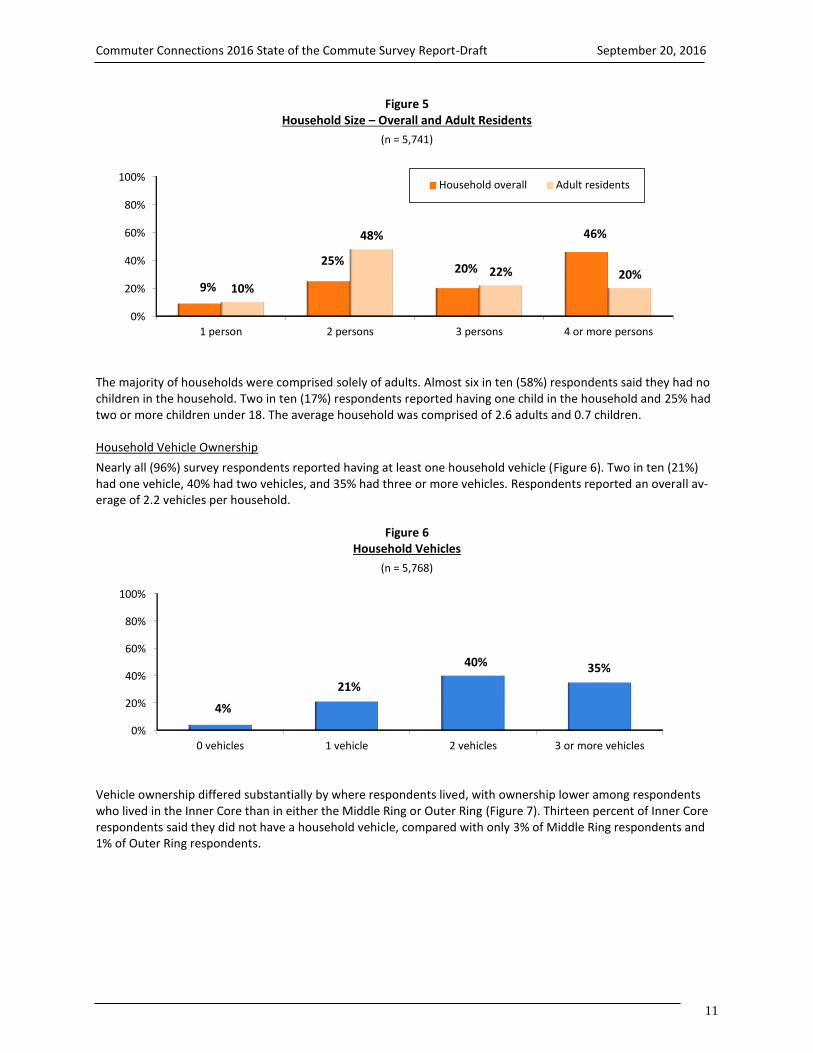
Household Size and Composition
Nine percent of respondents said they were the only member of their household and 25% of respondents lived with one other person (Figure 5). The remaining respondents lived with at least two other household members. On average, respondents’ households included 3.3 persons.
0% 20% 40% 60% 80% 100%
9% 16% 23% 20% 13% 19%
< $40,000 $40,000-$79,999 $80,000-$119,999 $120,000-$159,999 $160,000-$199,99 $200,000 +
52%
Commuter Connections 2016 State of the Commute Survey Report-Draft September 20, 2016
11
Figure 5 Household Size – Overall and Adult Residents
(n = 5,741)
The majority of households were comprised solely of adults. Almost six in ten (58%) respondents said they had no children in the household. Two in ten (17%) respondents reported having one child in the household and 25% had two or more children under 18. The average household was comprised of 2.6 adults and 0.7 children. Household Vehicle Ownership
Nearly all (96%) survey respondents reported having at least one household vehicle (Figure 6). Two in ten (21%) had one vehicle, 40% had two vehicles, and 35% had three or more vehicles. Respondents reported an overall av-erage of 2.2 vehicles per household.
Figure 6 Household Vehicles
(n = 5,768)
Vehicle ownership differed substantially by where respondents lived, with ownership lower among respondents who lived in the Inner Core than in either the Middle Ring or Outer Ring (Figure 7). Thirteen percent of Inner Core respondents said they did not have a household vehicle, compared with only 3% of Middle Ring respondents and 1% of Outer Ring respondents.
0%
20%
40%
60%
80%
100%
0 vehicles 1 vehicle 2 vehicles 3 or more vehicles
4%
21%
40% 35%
0%
20%
40%
60%
80%
100%
1 person 2 persons 3 persons 4 or more persons
9%
25%20%
46%
10%
48%
22% 20%
Household overall Adult residents

Commuter Connections 2016 State of the Commute Survey Report-Draft September 20, 2016
12
Figure 7 Household Vehicles By Home Area
(Inner Core n = 1,614, Middle Ring n = 1,622, Outer Ring n = 2,352)
Inner Core area residents also were much less likely than were respondents who lived in other areas to have two or more vehicles per household. But this was due in part to their smaller household sizes; only 30% of Inner Core respondents lived in a household with three or more adult members (age 18 or older), compared with 45% of Mid-dle Ring respondents and 45% of Outer Ring respondents.
Vehicles Available Per Adult Household Member – The number of vehicles in the household is not a true measure of vehicle availability, however. Respondents who shared a vehicle with other household members might not have the vehicle available to them on a regular basis for their travel. Figure 8 presents the distribution of vehicle availa-bility, taking into account both the number of household vehicles and number of adult household members. As noted before, 4% of respondents were car-free, but an additional 31% were “car-lite,” defined as having fewer ve-hicles than adult household members. Two in ten (19%) had between 0.1 and 0.5 vehicles per adult member, or at most one vehicle for every two adult members. Another 12% had between 0.6 and 0.9 vehicles per household member. On average, respondents had 0.90 vehicles per adult household member.
Figure 8 Vehicles Per Adult Household Member – Region-wide and by Home Area
(Region-wide n = 5,734, Inner Core n = 1,607, Middle Ring n = 1,613, Outer Ring n = 2,514)
0%
20%
40%
60%
80%
100%
Inner Core Middle Ring Outer Ring
13%3% 1%
45%
17%9%
29%
44% 40%
13%
36%
50%
0 vehicles 1 vehicle 2 vehicles 3 or more vehicles
0%
20%
40%
60%
80%
100%
Region-wide Inner Core Middle Ring Outer Ring
4%13%
3% 2%
19%
36%
17%7%
12% 8%14% 13%
65%
43%
66%
78%
0 vehicles 0.1 - 0.5 vehicle/adult 0.6 - 0.9 vehicles/adult 1+ vehicles/adult

Commuter Connections 2016 State of the Commute Survey Report-Draft September 20, 2016
13
As also shown in Figure 8, vehicle availability per adult was considerably lower among respondents who lived in the Inner Core than for those who lived in the Middle Ring or Outer Ring jurisdictions. Only four in ten (43%) Inner Core respondents had a vehicle for each adult in the household, compared with 66% of respondents in the Middle Ring and 78% in the outer Ring. On average, Inner Core respondents had 0.68 vehicles per adult resident of the household. Among Middle Ring and Outer Ring respondents, the household averages were 0.91 and 1.05 vehicles per adult, respectively.
Younger respondents also were much more likely to be car-free or car-lite (Figure 9). Seven percent of respondents who were under 35 years old did not have a household vehicle and 39% had less than one vehicle for every two members of the household. Only half (54%) of respondents in the youngest age group had a vehicle for every adult in the household. Vehicle availability was much higher among older populations. Among respondents who were 35 to 54 years old, 69% had a vehicle for every adult in the household; 72% of respondents who were 55 or older had a vehicle for each adult in the household.
Figure 9 Vehicles Per Adult Household Member by Respondent Age
(Under 35 years n = 711, 35 to 54 years n = 2,782, 55 years and older n = 2,189)
Vehicles Available Per Adult Household Member by Home Area and Age – As illustrated by Figures 8 and 9, re-spondents who lived in the urban center of the region and respondents who were young were less likely to have personal vehicles regularly available for their travel. But was age or the location in the region the more important variable influencing their vehicle availability? Table 2 presents the percentages of respondents who were car-free (no household vehicle), car-lite (less than one vehicle per adult household member), and fully car available (one or more vehicles per adult household member) by the combination of their home location and age.
In each of the three home areas, respondents who were younger than 35 years old were less likely to have a vehi-cle always available to them than were older respondents. That is, young respondents were more likely to be ei-ther car-free or car-lite than were older respondents. Among Inner Core respondents, only 32% of respondents who were younger than 35 years had a vehicle for each adult in the household, compared with 51% of those who were between 35 and 54 years old and 57% of respondents who were 55 or older.
Age differences in vehicle availability also were evident among Middle Ring and Outer Ring respondents, but less striking than for the Inner Core. Nearly six in ten (58%) Middle Ring respondents who were under 35 years old had a vehicle for each adult household member, compared with about seven in ten respondents who were 35 years or older. And nearly three-quarters of Outer Ring respondents who were under 35 years old had a vehicle always available for their travel, versus eight in ten for older respondents who lived in the Outer Ring. This suggests that while age is a factor influencing vehicle availability, home location is more important.
0%
20%
40%
60%
80%
100%
Under 35 years 35 to 54 years 55 years and older
7% 4% 3%
25%15% 14%14% 12% 11%
54%
69% 72%
0 vehicles 0.1 - 0.5 vehicle/adult 0.6 - 0.9 vehicles/adult 1+ vehicles/adult

Commuter Connections 2016 State of the Commute Survey Report-Draft September 20, 2016
14
Table 2 Vehicles Per Adult Household Member by Respondent Home Area and Age
Shading indicates statistically higher percentages)
Home Area and Age Car-free
(0 vehicles)
Car-lite (0.1-0.9 vehicles
per adult)
Car available (1 + vehicles
per adult)
Inner Core
Under 35 years (n = 212) 17% 52% 32%
35 to 54 years (n = 749) 11% 38% 51%
55 years and older (n = 618) 10% 33% 57%
Middle Ring
Under 35 years (n = 218) 4% 38% 58%
35 to 54 years (n = 719) 2% 28% 69%
55 years and older (n = 643) 2% 25% 73%
Outer Ring
Under 35 years (n = 272) 2% 25% 73%
35 to 54 years (n = 1,285) 1% 18% 81%
55 years and older (n = 907) 1% 18% 81%
Home and Work Locations
Table 3 presents the distribution of respondents by their home and work states and counties. About equal shares of respondents lived in Maryland (44%) and Virginia (44%). The remaining 12% of respondents lived in the District of Columbia. Because the survey only interviewed employed residents of the 11-jurisdiction area, no respondents lived outside these areas.
Work locations were more evenly divided. The largest number of respondents worked in Virginia (39%), but the District of Columbia and Maryland, with 31% and 26% of respondents respectively, were close behind in their share of employment. Note that work location percentages for Maryland and Virginia include only counties in the COG 11-jurisdiction region. Maryland and Virginia locations outside this region are counted in the “other” cate-gory.
Four jurisdictions accounted for residences of seven in ten respondents: Fairfax County (22%), Montgomery County, MD (19%), Prince George’s County, MD (17%), and the District of Columbia (12%). The top five jurisdictions represented eight in ten of the work locations: District of Columbia (31%), Fairfax County (19%), Montgomery County (15%), Prince George’s County (7%), and Arlington County (7%).

Commuter Connections 2016 State of the Commute Survey Report-Draft September 20, 2016
15
Table 3 Home and Work Locations
State/County Home Location
(n = 5,903)
Work Location* (n = 5,884)
District of Columbia 12% 31%
Maryland Counties 44% 26%
Montgomery Co. 19% 15%
Prince Georges Co. 17% 7%
Frederick Co. 4% 2%
Charles Co. 3% 1%
Calvert Co. 1% 1%
Virginia Counties 44% 39%
Fairfax Co. 22% 19%
Arlington Co. 5% 7%
Prince William Co. 8% 5%
Loudoun Co. 6% 4%
Alexandria City 3% 4%
Other N/A 4%
Home and Work Areas – More than half of respondents (58%) lived in the Middle Ring (Figure 10). The remaining respondents were about evenly divided between the Inner Core (20%) and Outer Ring (22%). Work locations, by contrast, were divided primarily between the Inner Core (42%) and Middle Ring (42%). Only 16% of respondents worked in an Outer Ring jurisdiction.
Figure 10 Home and Work Locations – Inner Core, Middle Ring, and Outer Ring
(Home area n = 5,903, Work area n = 5,884)
0%
20%
40%
60%
80%
100%
Home Area Work Area
20%
42%
58%
42%
22%16%
Inner Core Middle Ring Outer Ring

Commuter Connections 2016 State of the Commute Survey Report-Draft September 20, 2016
16
Work Area by Home Area – Most respondents worked either in the geographic area where they lived or in an area closer to the center of the region (Table 4). More than eight in ten (85%) Inner Core respondents also worked in the Inner Core. About six in ten Middle Ring respondents worked in the Middle Ring and about half (48%) of Outer Ring residents worked in their home area. Outer Ring residents were most likely to travel to another jurisdiction to work; 29% traveled inbound to the Middle Ring and 23% traveled inbound to the Inner Core. Among Middle Ring residents, 35% traveled to the Inner Core. Only a small share of respondents made a “reverse commute” to a more distant ring; 15% of Inner Core and 8% of Middle Ring residents traveled outbound.
Table 4 Work Location by Home Location
Home Area
Work Area
Inner Core Middle Ring Outer Ring
Inner Core (n = 1,651) 85% 13% 2%
Middle Ring (n = 1,656) 35% 57% 8%
Outer Ring (n = 2,577) 23% 29% 48%
Employment Characteristics
Type and Size of Employer
Type – Respondents were asked the type of employer for which they worked and the number of employees at their worksites. These results are shown in Figure 11 and Table 5, respectively. Nearly half (48%) of respondents worked for a private sector employer, Federal government agencies employed 22%, state and local agencies em-ployed 11%, and 13% worked for a non-profit organization. The remaining 6% said they were self-employed.
Figure 11 Employer Type
(n = 5,610)
Federal agency22%
State/local agency11%
Non-profit13%
Private sector48%
Self-employed6%

Commuter Connections 2016 State of the Commute Survey Report-Draft September 20, 2016
17
Size – The majority of respondents worked for employers that were either very small or very large (Table 5). Al-most half (48%) worked for firms with 100 or fewer employees. One-quarter (24%) worked for employers that em-ployed 1,000 or more employees.
Table 5 Employer Size
(n = 4,953)
Number of Employees Percentage Number of Employees Percentage
1-25 27% 101-250 13%
26-50 11% 251-999 15%
51-100 10% 1,000+ 24%
Occupations
Respondents represented many occupations (Table 6). About six in ten respondents worked in a professional (36%) or executive/managerial occupation (23%). Other common occupations included administrative support (10%), sales (7%), and technical and related support (6%).
Table 6 Occupation
(n = 5,246)
Occupation Percentage Income Percentage
Professional 36% Protective services 3%
Executive/managerial 23% Transportation/equipment 2%
Administrative support 10% Military 1%
Sales 7% Handlers, helpers, laborers 1%
Technicians/support 6% Private household occupations 1%
Service 4% Other* 3%
Precision craft, production 3%
* Each response in Other category was mentioned by less than 1% of respondents.

Commuter Connections 2016 State of the Commute Survey Report-Draft September 20, 2016
18
3-B COMMUTE PATTERNS An important section of the survey questioned respondents on their weekly commute patterns. Commute ques-tions in the survey included:
Number of days worked per week
Current commute mode
Length of commute
Use of alternative work schedules
Alternative mode characteristics
Number of Days Worked Per Week and Work Hours
Work Days and Work at Home Days
More than eight in ten (84%) respondents worked five weekdays per week (Figure 12). Seven percent worked four weekdays, 6% worked three weekdays, and 2% worked one or two weekdays. One percent worked all their work days on weekends. Respondents were assigned to work an average of 4.7 weekdays per week. The average was less than five days per week because some respondents worked part-time and some worked one or more of their work days on the weekend.
Figure 12 Total Weekdays Worked and Weekdays Worked at a Location Outside the Home
(n = 5,903)
Work at Home – Respondents who worked at least one weekday were asked on how many of those days they traveled to a work location outside their homes, in essence, how many days they commuted to an outside work-place. Figure 12 also shows the results of this question. Nine in ten (92%) traveled to an outside work location at least one weekday per week. Two-thirds (65%) commuted to an outside work location five weekdays, 12% com-muted four days per week,10% commuted three days per week, and 5% commuted to an outside work location one or two days per week.
Eight percent said they never commuted to a work location outside their homes, that is, they worked all of their workdays at home. Slightly more than half of these respondents (5%) said they were self-employed and had no other work location. The remaining 3% said they teleworked from home every day they worked. These two groups of respondents were not asked further questions about commute patterns, but were included in questions about awareness of commute advertising and demographics. Additionally, respondents who teleworked full-time were asked questions about their telework experience.
0%
20%
40%
60%
80%
100%
0 days 1 or 2 days 3 days 4 days 5 days
1% 2% 6% 7%
84%
8% 5%10% 12%
65%
Total Mon-Fri work days Work at location outside home

Commuter Connections 2016 State of the Commute Survey Report-Draft September 20, 2016
19
0% 20% 40% 60% 80% 100%
CWS/TW
Bike / Walk
Bus
Carpool / Vanpool
Train
Drive Alone
10.2%
3.3%
4.9%
5.4%
15.2%
61.0%
Current Commute Mode
Respondents were asked what modes they used to travel to work each weekday (Monday-Friday) during the sur-vey week. If they were sick, on holiday or vacation, or otherwise absent from work one or more days during the week, they were asked to report how they likely would have traveled to work on those days. Figures 13 and 14 pre-sent two views of modal distribution. Weekly Work Days by Mode in 2016
Figure 13 presents mode shares as a percentage of commuters’ weekly work days for five traditional “on the road” mode groups: drive alone, train (Metrorail/commuter rail), carpool/vanpool, bus, and bike/walk. The figure also includes the mode share for telework and compressed work schedule. These are not actually travel modes, but are included to show the percentage of weekly work trips eliminated through use of these work schedule options.
Figure 13 Weekly Commute Trips by Modes – 2016
(n = 5,503)
Commuters drove alone to work on about six in ten (61.0%) of their total work days. They rode on a train for 15.2% of work days and used a bus for 4.9%. Respondents carpooled or vanpooled to work on 5.4% of work days and biked or walked on 3.3% of days.
Compressed work schedule days off and telework days (CWS/TW) eliminated 10.2% of weekly work trips. These days are officially assigned as part of the work week and commuters would make a trip if they did not use these work arrangements. If the telework and compressed schedule days off were excluded, to estimate the “on the road” mode share of commute trips that actually were made, the percentage use of each of the five travel modes increased. Without telework and CWS, the drive alone share would rise to 67.9% of weekly commute trips. The weekly commute trip distribution would be:
Drive alone 67.9% Train 16.9% Carpool / vanpool 6.0% Bus 5.5% Bike/walk 3.7%

Commuter Connections 2016 State of the Commute Survey Report-Draft September 20, 2016
20
Frequency of Current Mode Use
Figure 14 shows mode split for 2016 as the percentage of respondents who used each mode as their “primary” mode, defined as the mode used most days per week. The figure also shows the percentages of respondents who used each mode as secondary mode, meaning they used it one or two days per week, in addition to another mode that they used most days of the week.
Figure 14 Primary Modes and Secondary Modes
(n = 5,503)
Primary Mode – Most respondents worked five or more days per week, so primary mode generally equated to use three or more days per week. For a small percentage of respondents who worked fewer than five days or who used more than two modes, the primary mode could be used just two days per week.
As with mode split by weekly trips, the most common primary mode was drive alone, used by 63% of respondents. The second most common primary mode, used by 16% of respondents, was train. Six percent said they primarily rode in a carpool, “casual” carpool (slug), or vanpool and 6% primarily rode a bus. Three percent of respondents primarily biked or walked and 7% primarily teleworked. Secondary Modes – Figure 14 also shows the percentage of respondents who used the modes as their secondary mode, typically one or two days per week. The mode with the greatest secondary use was telework; 11% of re-spondents said they teleworked one or two days per week. Four percent of respondents drove alone as a second-ary mode and 4% had a compressed schedule day off one or two days per week. All other modes were used by just 1% of respondent as a secondary mode.
0% 20% 40% 60% 80% 100%
CWS
TW
Bike / Walk
Bus
Carpool / Vanpool
Train
Drive Alone
0%
7%
3%
6%
6%
16%
63%
4%
11%
1%
1%
1%
1%
4%
Primary Secondary
+4% secondary
+1% secondary
+1% secondary
+1% secondary
+4% secondary
+11% secondary
+1% secondary

Commuter Connections 2016 State of the Commute Survey Report-Draft September 20, 2016
21
The 63% percentage of respondents who primarily drove alone to work was higher than the percentage of total work days on which commuters actually drove alone (61.0%). The difference was largely due to the incidence of telework and compressed work schedule as secondary schedules. Mean Days Used
Figure 15 details the average number of days each mode was used. All modes were used at least three days per week on average. Commuter rail, driving alone, Metrorail, and casual carpool all were used at least four days per week. This is consistent with other results in the survey, which showed that 81% of commuters used a single mode four or more of their commute days and 67% used a single mode all of their commute days.
Figure 15 Average Days Modes Used
(Commuter Rail n = 66, Drive Alone n = 3,844, Metrorail n = 700, Casual Carpool n = 50, Walk n = 127, Bus n = 319, Carpool n = 267, Bicycle n = 103; Note Vanpool not included due to insufficient sample size; multiple responses permitted)
Mode Use within Mode Groups
Figure 16 shows relative use of individual modes within the three alternative mode groups: train, carpool/vanpool, and bike/walk.
Train – The train mode group was comprised of Metrorail and three commuter rail companies: MARC (Maryland commuter rail), Virginia Railway Express (VRE), and Amtrak. Metrorail dominated this category, with 94% of train riders using this mode (14.3% of total 15.2% train ridership). The balance of train ridership was in commuter rail (0.9% of total train use).
Carpool/Vanpool – Among respondents who carpooled or vanpooled, regular carpooling dominated. Three-quar-ters of carpool/vanpool trips were in regular carpools (4.1% of total 5.4% carpool/vanpool use). Casual car-pools/”slugs” accounted for two in ten carpool/vanpool trips. One in ten trips in this mode group (0.4% of 5.4% total) was made by vanpool.
Bike/Walk – Walking accounted for about six in ten trips in the bike/walk mode group (2.0% of 3.3% bike/walk use).
0.0
1.0
2.0
3.0
4.0
5.0
CommuterRail
Drive Alone Metrorail CasualCarpool
Walk Bus Carpool Bicycle
4.54.3
4.1 4.13.9
3.7 3.73.4

Commuter Connections 2016 State of the Commute Survey Report-Draft September 20, 2016
22
Figure 16 Composition of Alternative Mode Groupings – Modes Used 1+ Days per Week
(n = 5,503)
Weekly Trips by Mode in 2016, 2013, 2010, 2007, and 2004
Figure 17 presents mode shares as a percentage of weekly commute trips for 2016 and for the previous four SOC surveys: 2013, 2010, 2007, and 2004. The share of drive alone trips was the lowest rate of the SOC surveys since 2004. Use of telework/compressed work schedules continued the upward trend observed since the 2004 SOC sur-vey; the share of weekday trips eliminated by these modes has nearly than tripled over the past 12 years, from 3.6% of weekday commute trips to 10.2% in 2016. Trends for other mode groups were less definitive. Transit re-gained the high mode share observed in 2010 (20.2%). The carpool/vanpool mode share fell in 2016 back to the level observed in 2004. Bike/walk mode share grew in 2016 when compared with past SOC surveys. Mode Use by Age of Respondent
In interpreting the mode share trend since 2004, it is important to note that some of the differences observed, particularly those between 2013 and 2016, could be affected by a change in the survey weighting method. As ex-plained in Section 2, the unweighted age distribution of respondents participating in the 2016 SOC Survey showed a substantial under-representation of respondents who were younger than 35 years of age and an over-represen-tation of respondents 55 years and older, when compared with the American Community Survey (ACS) data com-piled by the U.S. Census.
To align the data to the correct age distribution of the region, the 2016 weighting methodology added an age ad-justment factor. The 2016 weighting change is relevant particularly for comparisons with 2013 because a review of the 2013 SOC data against the ACS suggests young respondents also were under-represented in the 2013 survey, although to a much lesser extent than in 2016. Thus, the higher 2016 mode shares for transit and bike/walk, in par-ticular, could be related to different age profiles for the 2013 and 2016 surveys.
0% 5% 10% 15% 20%
Bike/Walk
Carpool/vanpool
Train
Casual CP – 0.9%; Vanpool – 0.4%
Metrorail – 14.3%
Regular CP – 4.1%
Commuter Rail – 0.9%
Walk – 2.0%
Bike – 1.3%

Commuter Connections 2016 State of the Commute Survey Report-Draft September 20, 2016
23
Figure 17 Percentage of Weekly Trips by Mode – 2016, 2013, 2010, 2007, and 2004
(Including telework and compressed schedules) As illustrated below, respondents who were younger than 35 years old were less likely to drive alone and more likely to use the bus or train or to walk than were older respondents (Table 7). Use of these modes was consistent for respondents in the other age groups. Carpool/vanpool use was approximately equal among all age groups.
Table 7 Primary Mode by Age
(Note: row totals might not add to 100% because telework is not included; Shading indicates statistically higher percentages)
Age
(n=__)
Primary Commute Mode
Drive Alone
Carpool / Vanpool
Bus Train Bike / Walk
Under 35 years old 711 55% 5% 8% 20% 6%
35-44 years old 1,099 66% 6% 3% 14% 3%
45-54 years old 1,683 67% 7% 4% 13% 2%
55 years or older 2,189 66% 5% 5% 15% 3%
0% 20% 40% 60% 80% 100%
Drive alone
Transit
Carpool/Vanpool
Bike/Walk
TW/CWS
71.4%
16.8%
5.9%
2.2%
3.6%
66.9%
17.7%
7.1%
2.6%
5.7%
64.2%
20.2%
7.0%
2.3%
6.3%
65.8%
17.3%
6.7%
2.2%
8.0%
61.0%
20.1%
5.4%
3.3%
10.2%
2004 (n = 6,851)
2007 (n = 6,168)
2010 (n = 6,050)
2013 (n = 5,892)
2016 (n = 5,503)

Commuter Connections 2016 State of the Commute Survey Report-Draft September 20, 2016
24
Primary Commute Mode by Demographic Group
Analysis of survey data showed some modest differences in choice of primary mode (mode used most days per week) among other demographic groups. Tables 8 through 11 present distributions of primary mode by respond-ent sex, ethnic group, income, vehicle availability, and location of residence and employment. Note that telework percentages are excluded from the tables, so row totals will not add to 100%. Sex
Male respondents were more likely than were females to carpool/vanpool and to bike/walk to work. There were no significant differences in mode use rates for other modes; men and women were equally likely to drive alone, ride a bus, or ride a train (Table 8).
Table 8 Primary Mode by Sex
(Note: row totals might not add to 100% because telework is not included) Shading indicates statistically higher percentages)
Sex
(n=__)
Primary Commute Mode
Drive Alone
Carpool/ Vanpool
Bus Train Bike / Walk
Female 2,911 63% 4% 7% 15% 2%
Male 2,903 62% 7% 5% 16% 5%
Ethnic Group
Table 9 shows primary mode distribution for respondents of the three primary race/ethnic groups. Hispanic re-spondents were more likely to carpool/vanpool than were respondents in other groups. White and African-Ameri-can respondents drove alone more than did other respondents. African-American respondents were statistically more likely to use the train than were either White or Hispanic respondents. Bus use was highest among Hispanic and African-American respondents.
Table 9 Primary Mode by Race/Ethnic Group
(Note: row totals might not add to 100% because telework is not included) Shading indicates statistically higher percentages)
Ethnic Group
(n=__)
Primary Commute Mode
Drive Alone
Carpool / Vanpool
Bus Train Bike / Walk
Hispanic 331 58% 12% 8% 15% 3%
White 4,107 64% 4% 4% 15% 4%
African-American 1,028 64% 5% 7% 19% 1%

Commuter Connections 2016 State of the Commute Survey Report-Draft September 20, 2016
25
Income
Table 10 presents primary mode by annual household income. Differences in mode use by income were not clearly defined. Respondents who had incomes in the middle income groups ($60,000 - $119,999) rode a train mode often than did other income groups but use of other modes showed no clear increasing or decreasing patterns by in-come.
Table 10 Primary Mode by Annual Household Income
(Note: row totals might not add to 100% because telework is not included; Shading indicates statistically higher percentages)
Income
(n=__)
Primary Commute Mode
Drive Alone Carpool/ Vanpool
Bus Train Bike / Walk
Less than $40,000 267 67% 7% 10% 9% 4%
$40,000 – 59,999 300 60% 6% 7% 13% 6%
$60,000 – 79,999 398 61% 5% 7% 21% 1%
$80,000 – 99,999 332 59% 5% 3% 19% 10%
$100,000 – 119,999 632 64% 4% 3% 20% 4%
$120,000 – 139,999 484 60% 5% 11% 14% 2%
$140,000 – 159,999 442 64% 5% 4% 18% 2%
$160,000 – 179,999 350 64% 6% 6% 15% 2%
$180,000 – 199,999 300 68% 4% 1% 14% 2%
$200,000 + 962 61% 6% 3% 19% 3%
Vehicles Available –Table 11 shows the primary mode distribution by the number of vehicles per adult resident in the respondent’s household. Not unexpectedly, respondents who lived in a car-free household and those who had fewer cars than adult residents were less likely to drive alone and more likely to commute by bus, train, and bike/walk than were those with one or more vehicles.
Table 11 Primary Mode by Number of Vehicles Per Adult in the Household (Note: row totals might not add to 100% because telework is not included;
Shading indicates statistically higher percentages)
Number of Vehicles per Adult
(n=__)
Primary Commute Mode
Drive Alone*
Train Bus Carpool/ Vanpool
Bike/ Walk
0 vehicles 239 19% 31% 25% 2% 18%
0.1 to 0.5 vehicles 649 41% 26% 11% 8% 8%
0.6 – 0.9 vehicles 383 61% 17% 5% 9% 3%
1 vehicle or more 4,054 73% 12% 3% 4% 2%
* Drive alone includes motorcycle, taxi, Uber, and Lyft, in addition to driving personal vehicle

Commuter Connections 2016 State of the Commute Survey Report-Draft September 20, 2016
26
As the number of vehicles per adult in the household increased, driving alone increased from a low of 19% to a high of 73% and use of bus and train declined significantly. Carpooling was most common for respondents who were “car-lite,” with at least one vehicle in the household, but fewer vehicles than adult residents. Some of these respondents likely carpool with another member of the household. Residence and Employment Location
Residence State – Respondents’ commute modes differed by where they lived (Table 12). About two-thirds of Mar-yland (65%) and Virginia (67%) residents primarily drove alone to work, while only one-third (35%) of District of Columbia residents primarily used this mode to commute. District residents were significantly more likely to use bus, train, and bike/ walk to work than were residents of Maryland or Virginia. Maryland residents used train more than did Virginia residents. Other mode shares for Maryland and Virginia residents were statistically the same.
Table 12 Primary Mode by State of Residence and State of Employment
(Note: row totals might not add to 100% because telework is not included; Shading indicates statistically higher percentages)
State
(n=__)
Primary Commute Mode
Drive Alone
Carpool/ Vanpool
Bus Train Bike / Walk
State of Residence
District of Columbia 553 35% 4% 12% 30% 16%
Maryland 2,372 65% 6% 4% 17% 2%
Virginia 2,562 67% 6% 6% 11% 2%
State of Employment
District of Columbia 1,710 38% 6% 8% 37% 6%
Maryland 1,656 76% 6% 4% 6% 3%
Virginia 2,036 73% 5% 5% 6% 2%
Employment State – Table 12 also displays primary mode by state of employment. Respondents who worked in the District of Columbia drove alone to work at about half the rate of those who worked in Virginia or Maryland. District workers were twice as likely to ride a bus and to bike/ walk to work as were Maryland and Virginia workers. Train use also was dramatically higher among respondents working in the District than for other respondents.
Home Area “Ring” – Mode use differed even more by how close the respondent lived to the center of the region. Figure 18 displays primary mode as a function of respondents’ residence area, in the “ring” designation defined earlier. Only four in ten (41%) commuters who lived in the Inner Core area, which includes the District of Columbia and two Virginia jurisdictions, drove alone. This was much lower than the drive alone rates for the Middle Ring (65%) and the Outer Ring (75%) and only slightly higher than the 35% drive alone share noted in Table 12 for the District of Columbia alone. Transit use in the Inner Core also was nearly as high as for the District of Columbia alone. This suggests that the two Inner Core Virginia jurisdictions were more similar to the District of Columbia in travel mode characteristics than they were to other Virginia jurisdictions.

Commuter Connections 2016 State of the Commute Survey Report-Draft September 20, 2016
27
Figure 18 Primary Mode by Home Area
(Inner Core n = 1,528, Middle Ring n = 1,546, Outer Ring n = 2,413)
Work Area Ring – Figure 19 displays primary mode as a function of respondents’ employment area. The mode pat-tern for employment area was similar to that for the residence area, but more pronounced. Fewer than half (44%) of commuters who worked in the Inner Core area drove alone. This was dramatically lower than the drive alone rates for the Middle Ring and Outer Ring; in both of these areas about eight in ten workers drove alone. Transit use was high in the Inner Core, but much lower for commute trips to Middle Ring and Outer Ring worksites. This pat-tern obviously reflects both the availability of transit infrastructure in the Inner Core areas as well as the inbound focus of transit service during peak commuting hours.
Figure 19 Primary Mode by Work Area
(Inner Core n = 2,406, Middle Ring n = 1,758, Outer Ring n = 1,306)
0%
20%
40%
60%
80%
100%
Drive alone Transit Bike/walk TW/CWS Car/vanpool
41% 38%
11%6% 4%
65%
21%
2%7% 5%
75%
8%1%
7% 9%
Core Middle-ring Outer-ring
Home Jurisdiction Area
0%
20%
40%
60%
80%
100%
Drive alone Transit Bike/walk TW/CWS Car/vanpool
44%39%
6% 5% 6%
75%
10%
2%8% 5%
80%
3% 2%9% 6%
Core Middle-ring Outer-ring
Work Jurisdiction Area

Commuter Connections 2016 State of the Commute Survey Report-Draft September 20, 2016
28
Primary Roads Used on the Trip to Work
The SOC survey added a new question in 2013 to identify the major roadways that commuters use to get to work. This question will primarily be used for MWCOG planning purposes, but the results are briefly summarized in Table 13 for commuters whose primary mode was carpool/vanpool or public transit. These commuters did not drive alone, so the question identified roads on which traffic was most likely to be reduced when commuters chose non-drive alone modes of travel.
Table 13 Primary Roadways Used to Get To Work – Commuters who Carpool/Vanpool or Ride Public Transit
(Carpool/Vanpool n = 281, Public Transit n = 967;
Primary Roadway Carpoolers / Vanpoolers
Public Transit Riders
Maryland / District of Columbia)
I-495 – Capital Beltway (MD) 12% 11%
I-270 (MD) 8% 7%
I-295 (MD/DC) 5% 8%
I-95 (MD) 5% 3%
US-295 – Baltimore Washington Parkway (MD) 2% 3%
I-695 – Southeast-Southwest Freeway (DC) 2% 2%
U.S. Route 50 – John Hanson Highway (MD) <1% 4%
Virginia
I-395 Shirley Highway (VA) 18% 13%
I-95 (VA) 14% 4%
I-66 Outside the Beltway (VA) 10% 7%
U.S. Route 50 – Lee Jackson Highway (VA) 10% 6%
I-66 Inside the Beltway (VA) 8% 6%
I-495 – Capital Beltway (VA) 7% 5%
George Washington Parkway (VA) 3% 6%
U.S. Route 1 – Jefferson Davis Highway (VA) 3% 3%
VA Route 29 – Lee Highway (VA) 3% 1%
Dulles Toll Road – VA Route 267 (VA) 2% 1%
Overall, the route used by most alternative mode commuters was I-395 (Shirley Highway) in Virginia. Nearly two in ten (18%) of all regional carpoolers/vanpoolers said they used this route on their trip to work and 13% of all re-gional transit riders said they would use this route on days they drove to work. At least one in ten regional carpool-ers/vanpoolers named each of four other routes; I-95 in Virginia, the Capital Beltway in Maryland, I-66 in Virginia, or U.S. Route 50 in Virginia.
Other common routes that transit rider would use on days they drove to work included the Capital Beltway in Mar-yland and Virginia, I-295 in Maryland/District of Columbia, I-270 in Maryland, I-66 in Virginia, U.S. Route 50 in Vir-ginia, and the George Washington Parkway (VA). At least 5% of transit riders named each of these roads.

Commuter Connections 2016 State of the Commute Survey Report-Draft September 20, 2016
29
Length of Commute
Number of Miles
Commuters in the sample had a wide range of commute distances, ranging from less than one mile to more than 100 miles, with an overall average of 17.3 miles one-way. More than a third of respondents (37%) commuted fewer than 10 miles one-way (Figure 20). Almost three in ten (28%) traveled between 10 and 19 miles. One in ten (9%) traveled 40 or more miles.
Figure 20 Commute Distance (miles)
(n = 4,766)
Commute Travel Time
Survey respondents commuted, on average, about 39 minutes one-way. Three in ten (29%) respondents com-muted 20 minutes or less and 44% commuted between 21 and 45 minutes (Figure 21). Slightly more than one-quarter (27%) traveled more than 45 minutes, with 13% traveling more than one hour one-way.
Figure 21 Commute Time (minutes)
(n = 5,036)
The reported average commute distance increased in 2016 when compared with previous SOC surveys. Between 2004 and 2013, the average one-way distance ranged only from 16.0 to 16.3 miles. The 2016 distance of 17.3 miles was notably higher than these previous distances. The average commute time also lengthened, but only margin-ally. The 39 minutes traveled in 2016 was just three minutes longer than the 36 minutes measured in 2013 and 2010, four minutes longer than the 2007 time (35 minutes) and five minutes longer than the 34 minutes observed in 2004.
0% 10% 20% 30% 40% 50% 60% 70% 80% 90% 100%
18% 19% 17% 11% 17% 9% 9%
<5 miles 5-9.9 miles 10-14.9 miles 15-19.9 miles 20-29.9 miles 30-39.9 miles 40+ miles
0% 10% 20% 30% 40% 50% 60% 70% 80% 90% 100%
9% 20% 21% 23% 14% 13%
10 minutes or less 11-20 minutes 21-30 minutes 31-45 minutes 46-60 minutes More than 60 minutes

Commuter Connections 2016 State of the Commute Survey Report-Draft September 20, 2016
30
Commute Distance By Mode
Survey respondents’ travel distance varied by the type of transportation they used to commute (Table 14). Com-muter rail riders traveled the farthest, 29.1 miles one-way. Commuters who carpooled and those who rode a bus to work also traveled farther than the 17.3 mile regional average. Commuter rail, Metrorail, and bus riders spent the longest time commuting, at least 47 minutes one-way.
Table 14 Commute Distance by Primary Mode
Primary Commute Mode* Average Distance (mi.) Average Time (min.)
(n=__) Average (n=__) Average
Commuter rail 49 29.1 mi. 59 72 min.
Carpool 248 19.0 mi. 259 42 min.
Bus 229 18.4 mi. 267 47 min.
Drive alone 3,359 17.7 mi. 3,417 35 min.
Metrorail 484 15.0 mi. 614 48 min.
Bike 67 4.4 mi. 68 22 min.
Walk 107 1.2 mi. 108 17 min.
* Vanpool is excluded due to very small sample size.
Commute Distance By Home and Work Location
Respondents’ travel distance also varied by where they lived and where they worked (Table 15). Respondents who lived in the Inner Core traveled the shortest distance to work, an average of 8.2 miles one-way. Respondents who lived in the Middle Ring commuted considerably farther, 17.5 miles. And respondents who lived in the Outer Ring traveled an average of 25.4 miles one-way, three times the distance of Inner Core residents.
Table 15 Commute Distance by Home and Work Area
Primary Commute Mode Average Distance (mi.) Average Time (min.)
(n=__) Average (n=__) Average
Home Area
Inner Core 1,317 8.2 mi. 1,406 31 min.
Middle Ring 1,306 17.5 mi. 1,432 35 min.
Outer Ring 2,143 25.4 mi. 2,198 45 min.
Work Area
Inner Core 2,080 16.1 mi. 2,235 44 min.
Middle Ring 1,560 16.4 mi. 1,634 36 min.
Outer Ring 1,115 23.6 mi. 1,151 35 min.

Commuter Connections 2016 State of the Commute Survey Report-Draft September 20, 2016
31
Commute distances by work area were less varied. Respondents who worked in the Inner Core traveled an average of 16.1 miles and Middle Ring workers traveled about the same distance, 16.4 miles. Respondents who worked in the Outer Ring traveled much farther, 23.6 miles one way.
Inner Core area residents had the shortest travel time; they traveled an average of 31 minutes one-way. But, while the Inner Core respondents traveled fewer minutes to work than did other respondents, they did not have propor-tionately shorter travel times; Middle Ring residents traveled only four minutes longer than did Inner Core resi-dents and Outer Ring residents traveled just 14 minutes longer. This was likely due to the higher transit and bike/walk use among Inner Core respondents; transit and bike/walk trips, while short in distance, tend to be longer in time.
By contrast with the home area results, respondents who worked in the Inner Core had the longest commute times, an average of 44 minutes one-way. Middle Ring workers and Outer Ring workers commuted 36 minutes and 35 minutes, respectively. The higher travel time for Inner Core workers likely was due to their higher use of transit for commuting and the greater congestion they would encounter in their commute. Both the time and distance differences noted for home area comparisons were statistically different. Extra Time “Cushion” to Ensure On-time Arrival
The survey instructed respondents to report their “typical” commute time. But travel times can vary from one day to another, due to traffic, roadway incidents, transit service disruptions, and other factors. To explore the impact of travel time uncertainty on commuting, the survey asked respondents how many extra minutes they build into their typical commute time to ensure that they “nearly always” would arrive at work on time (Figure 22).
Figure 22 Extra Travel Time (minutes) to Ensure On-time Arrival
(n = 4,995)
Almost eight in ten (81%) survey respondents added some time to their commute time to account for travel time variability. Three in ten (31%) respondents added between 1 and 10 minutes, 28% added between 11 and 20 minutes, 14% added between 21 and 30 minutes, and 8% added more than 30 minutes. On average, respondents added 12 extra minutes to their commute time. When compared to the total typical travel time of 39 minutes, this means that about 30% of the average commute time was related to variability of travel time.
Figure 23 shows the average minutes of travel time that respondents who used each commute mode estimated was “extra” time in their commute.
No extra time19%
1 to 10 min31%
11 to 20 min28%
21 to 30 min14%
31 min or more8%

Commuter Connections 2016 State of the Commute Survey Report-Draft September 20, 2016
32
0 20 40 60 80
Commuter rail
Metrorail
Bus
Carpool
Drive alone
Bike
Walk
55
34
29
28
20
14
13
17
14
18
14
15
7
4
72
48
47
42
35
21
17
Base time
Extra time
Figure 23 Total Travel Time and Extra Time to Ensure On-time Arrival by Commute Mode
(Commuter rail n = 59, Metrorail n = 614, Bus n = 267, Carpool n = 259, Drive alone n = 3,417, Bike n = 68, Walk n = 108)
Commuters who rode transit, who carpooled, and those who drove alone added similar absolute amounts of time to their commute to account for travel time variability. Bus riders built in an average of 18 minutes, commuter rail riders added 17 minutes, drive alone commuters added 15 minutes, and carpoolers and Metrorail riders each added 14 minutes to their commute time.
Although the absolute extra minutes did not vary substantially across these modes, the percentage that they rep-resented of total travel time did vary. The extra time allocated by drive alone commuters and bus riders repre-sented about 40% of their total travel time and carpoolers’ extra time was 33% of their total travel time. By con-trast, the 14 minutes that Metrorail riders added for travel time variability was 29% of their total travel time. And the 17 minutes extra time for commuter rail riders was just 24% of the total travel time. Train modes, which travel on separate guideways, are not affected by roadway traffic congestion, but travel time still can vary due to disrup-tions in train operations. Work Arrival Time
More than half (52%) of all respondents typically arrived at work between the hours of 7:00 am and 8:59 am (Fig-ure 24). But another 19% arrived between 9:00 am and 9:59 am, so they would be traveling during the peak com-muting time. Thirteen percent arrived at work before 7:00 am.
Travel time minutes

Commuter Connections 2016 State of the Commute Survey Report-Draft September 20, 2016
33
Figure 24 Arrival Time at Work
(n = 4,595)
Non-Standard Work Schedules
Non-Standard Work Schedules Used
Figure 25 shows the distribution of work schedules for respondents who said they commuted to an outside work location. Eight in ten (79%) of these respondents said they worked a “standard” full-time schedule, defined as five or more days per week. Fourteen percent of respondents worked part-time and the remaining respondents worked a compressed work schedule, in which they worked a full-time work week in fewer than five days per week. Four percent worked a 9/80 schedule (80 hours over nine days in two weeks), 2% worked a 4/40 schedule, with four 10-hour days per week, and 1% worked another compressed schedule.
Figure 25 Non-Standard Schedule Types Used
(n = 5,893)
Other CWS1%
4/40 CWS2%
9/80 CWS4%
Part-time14%
Standard full-time79%
0% 10% 20% 30% 40% 50% 60% 70% 80% 90% 100%
13% 21% 31% 19% 10% 1% 5%
12:01 - 6:59 a.m. 7:00 - 7:59 a.m. 8:00 - 8:59 a.m. 9:00 - 9:59 a.m.
10:00 a.m. - 5:59 p.m. 6:00 p.m. - 12 midnight Varies from week to week
Peak period 7:00 – 9:59 am
71%

Commuter Connections 2016 State of the Commute Survey Report-Draft September 20, 2016
34
Primary Mode by Non-Standard Schedule
Use of non-standard work schedules sometimes has been assumed to reduce the use of alternative modes for commuting, by making it more difficult to maintain a carpool or vanpool or by reducing the possibility of using transit for early or late hour commuting. But as seen from Table 16, respondents who worked a compressed sched-ule actually drove alone less and had higher rates of bike/walk and train use than did respondents who worked a standard, non-compressed, schedule. Compressed schedule workers used carpool/vanpool and bus at the same rates as did employees who worked a standard schedule.
Table 16 Primary Mode by Use of Non-Standard Schedules
(Note: row totals might not add to 100% because telework is not included; Shading indicates statistically higher percentages)
Type of Schedule
(n=__)
Primary Mode
Drive Alone
Carpool/ Vanpool
Bus Train Bike / Walk
Compressed schedule 446 55% 4% 6% 23% 5%
Standard schedule 4,122 66% 6% 5% 16% 3%
Alternative Mode Use Characteristics
Carpool and Vanpool Occupancy
The average number of occupants in respondents’ carpools and vanpools was 2.5 and 7.5 people, respectively. Overall average pool occupancy was 2.7. Carpool occupancy remained relatively stable over the past 12 years, at about 2.4 to 2.6 occupants per vehicle since 2004. In 2016, about two-thirds (65%) of carpoolers rode with just one other person.
The 2016 vanpool average of 7.5 occupants was well below the 2013 average of 10.8, but was about the same as the average estimated in 2010 (7.6). The survey-to-survey variability could be related to the small sample size for vanpools; in the 2016 survey, only 20 respondents said they rode in a vanpool and past SOC vanpool sample sizes were similarly small. Access Mode to Alternative Mode Meeting Points
Table 17 presents how carpoolers, vanpoolers, and transit riders traveled to where they met their rideshare part-ners or where they started their transit trip. About four in ten respondents walked (40%) to the meeting place. Twelve percent said they were picked up at home by the carpool or vanpool driver and 5% always drove the pool vehicle or rode with a household member, so they left together. Twelve percent of respondents rode transit to the meeting point and 3% said they were dropped off, for example by a spouse or other household member. Two per-cent bicycled to the meeting point.
The remaining one-quarter of respondents said they drove to the meeting point, such as a Park & Ride lot or the home of a carpool rider, but left their cars at that location. This is significant, because a large proportion of auto emissions are produced during the first few miles of a vehicle trip, when the engine is cold. Even though these trips generally were short, they have an environmental impact.
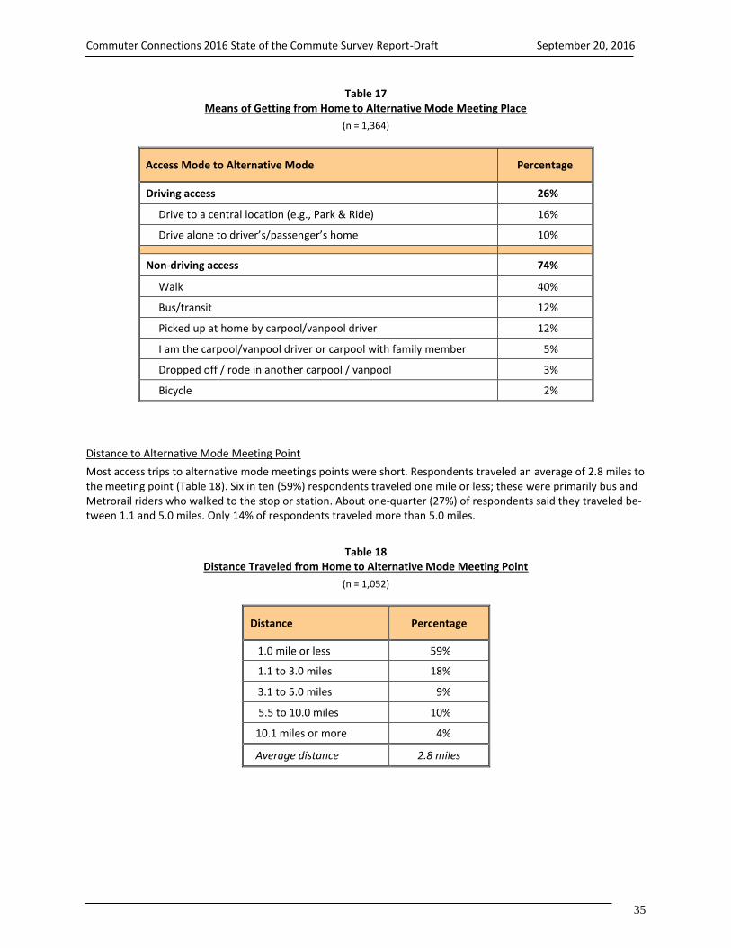
Commuter Connections 2016 State of the Commute Survey Report-Draft September 20, 2016
35
Table 17 Means of Getting from Home to Alternative Mode Meeting Place
(n = 1,364)
Access Mode to Alternative Mode Percentage
Driving access 26%
Drive to a central location (e.g., Park & Ride) 16%
Drive alone to driver’s/passenger’s home 10%
Non-driving access 74%
Walk 40%
Bus/transit 12%
Picked up at home by carpool/vanpool driver 12%
I am the carpool/vanpool driver or carpool with family member 5%
Dropped off / rode in another carpool / vanpool 3%
Bicycle 2%
Distance to Alternative Mode Meeting Point
Most access trips to alternative mode meetings points were short. Respondents traveled an average of 2.8 miles to the meeting point (Table 18). Six in ten (59%) respondents traveled one mile or less; these were primarily bus and Metrorail riders who walked to the stop or station. About one-quarter (27%) of respondents said they traveled be-tween 1.1 and 5.0 miles. Only 14% of respondents traveled more than 5.0 miles.
Table 18 Distance Traveled from Home to Alternative Mode Meeting Point
(n = 1,052)
Distance Percentage
1.0 mile or less 59%
1.1 to 3.0 miles 18%
3.1 to 5.0 miles 9%
5.5 to 10.0 miles 10%
10.1 miles or more 4%
Average distance 2.8 miles

Commuter Connections 2016 State of the Commute Survey Report-Draft September 20, 2016
36
3-C RECENT COMMUTE CHANGES, EASE OF COMMUTE, AND COMMUTE
SATISFACTION The SOC survey also examined recent changes in commuting, in particular:
Commute mode shifts and motivations for making commute changes
Ease of commute compared to one year ago
Satisfaction the current commute
Commute Mode Shifts and Mode Shift Motivations
Length of Time Using Mode
Respondents were asked how long they had used each mode they reported using one or more days per week. Re-sults are shown in Figure 26 for commuters who drove alone, rode a train, rode a bus, biked/walked, and car-pooled. Commuters who drove to work had used this mode the longest, an average of 10.3 years. Nearly half (45%) of drive alone commuters used this mode 10 years or more and 65% had been driving alone for five or more years. Only 22% started using this mode less than three years ago.
Figure 26 Duration of Mode Use
(Drive alone n = 2,774, Train n = 671, Bus n = 273, Bike / Walk n = 209, Carpool n = 290)
Alternative mode users had used these modes for shorter times on average, but a substantial portion of alterna-tive mode users still were long-term users. One-third of train riders, 18% of bus riders, 14% of bike/walk commut-ers and 11% of carpoolers had used these modes for 10 or more years.
0%
20%
40%
60%
80%
100%
Less than 3 years 3-4.9 years 5 - 9.9 years 10 years or more
22%
13%
20%
45%
33%
12%
23%
32%35% 36%
15% 14%
53%
19%
10%
18%
59%
15% 15%11%
Drive alone Train Bike / walk Bus Carpool
Average Duration
Drive alone: 10.3 years Train: 8.1 years
Bike/walk: 4.4 years Bus: 4.9 years
Carpool: 4.0 years

Commuter Connections 2016 State of the Commute Survey Report-Draft September 20, 2016
37
0% 20% 40% 60% 80% 100%
Only used this mode
Not in DC region then
Drive alone
Train
Bus
Carpool/vanpool
Bike/Walk
5%
16%
37%
20%
9%
11%
7%
Carpoolers and bus riders were most likely to have started using these modes recently; 59% of commuters who carpooled and 53% of bus riders started using these modes within the past three years. One-third of bike/walk commuters and train riders started these modes less than three years ago. Modes Used Before Starting Current Alternative Modes
Nearly half (49%) of all respondents who were using an alternative mode at the time of the survey said they started using that mode within the past three years. These respondents were asked what modes they used before starting the new alternative mode (Figure 27). Respondents were permitted to select multiple previous modes, so the total of the percentages will add to more than 100%. Slightly more than one-third (37%) of alternative mode users made a shift from driving alone. Twenty percent of alternative mode users previously rode a train and 9% previously used a bus. Eleven percent carpooled or vanpooled before switching to their current alternative mode and 7% previously rode a bicycle or walked.
Figure 27 Previous Mode of Current Alternative Mode Users
Respondents who Used Current Alternative Mode Three Years or Less
(n = 523, multiple responses permitted)
Two in ten said they were not working or were not working in the Washington metropolitan region then (16%) or that they had never used another mode (5%). While some of these respondents might have started using their cur-rent mode within the past three years, they did not have a previous mode to report (Figure 27).
The inset box in the Figure 27 shows the share of previous drive alone use by alternative mode used. Carpoolers were more likely than were other mode users to have shifted from driving alone; 47% were driving alone before starting to use this mode. About one-third of train riders and 19% of bus riders shifted from driving alone. One-quarter of commuters who switched to bike or walk previously drove alone to work.
Shifted from Driving Alone
Carpoolers – 47%
Walkers/bikers – 25%
Bus riders – 19%
Train riders – 34%
Previous Mode

Commuter Connections 2016 State of the Commute Survey Report-Draft September 20, 2016
38
Reasons for Using Alternative Modes
Respondents who had been using an alternative mode for three years or less were asked why they began using those modes. The reasons are listed in Figure 28, divided into three broad categories of motivations:
Personal benefits – benefits the respondent would expect to receive by using an alternative mode Commute program – commute assistance services the respondent received that encouraged or assisted use
of the alternative mode Personal circumstances – personal circumstances or changes experienced by the respondent
Current alternative mode users cited motivations in each of the three categories. The most common personal ben-efit reasons were to save money (14%), save time (12%), or avoid congestion (6%). In the commute program cate-gory, 4% noted that parking at work was too expensive. Personal circumstances reasons included changing jobs or work hours (14%), not having a vehicle available (11%), and that the employer/worksite moved (8%).
Figure 28 Motivations to Start Using Current Alternative Mode
(Note: Scale extends only to 30% to highlight difference in responses) (n = 504, multiple responses permitted)
0% 5% 10% 15% 20% 25% 30%
Save money
Save time
Avoid congestion
Get exercise
Avoid / reduce stress
Tired of driving
Parking too expensive
Found carpool partner
Express lanes available
Changed jobs/work hours
No vehicle available
Employer / worksite moved
Moved to new residence
Close to work/pick-up location
Personal circumstances/health
Didn't like previous transportation
14%
12%
6%
3%
3%
3%
4%
3%
2%
14%
11%
8%
4%
4%
2%
2%
Personal Benefit Motivations
Personal Circumstances Motivations
Commute Program Motivations

Commuter Connections 2016 State of the Commute Survey Report-Draft September 20, 2016
39
Ease of Commute
Respondents who commuted at least one day per week were asked if their commute time was easier, more diffi-cult, or about the same as it was a year prior. Six in ten (62%) respondents said their commute was about the same as a year ago (Figure 29). About two in ten (22%) said their commute was more difficult and 16% said their com-mute was easier. The results for 2016 were very similar to the 2010 and 2013 results.
Figure 29 Commute Easier, More Difficult, or About the Same as Last Year – 2010, 2013, and 2016
(2010 n = 6,049, 2013 n = 5,717, 2016 n = 5,142)
Change in Commute Ease by Home and Work Location
Respondents were about equally likely to report a more difficult commute regardless of where they lived in the region. Twenty-two percent of respondents who lived in the Inner Core and 22% of Middle Ring respondents said their commute was more difficult, compared with 24% of Outer Ring residents. By contrast, 25% of commuters who worked in the Inner Core area reported a more difficult commute, compared with 21% of commuters who worked in the Middle Ring and 16% who worked in the Outer Ring. Change in Commute Ease by Travel Time
Figure 30 displays the shares of commuters who reported that their commute was more difficult, about the same, and easier, by the amount of time they spent commuting. Among commuters who had very short commutes – 10 minutes or less – more than seven in ten said their commute was about the same as it was a year ago and 22% said it was easier; only 5% said it was more difficult. The share of commuters who reported an easier commute or the same commute declined as commute time increased and the share who said they had a more difficult commute increased steadily. Among commuters who traveled more than 45 minutes to work, 35% said their commute was more difficult.
0%
20%
40%
60%
80%
100%
Easier About the same More difficult
12%
63%
25%17%
60%
23%16%
62%
22%
2010 2013 2016
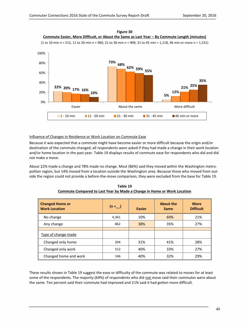
Commuter Connections 2016 State of the Commute Survey Report-Draft September 20, 2016
40
Figure 30 Commute Easier, More Difficult, or About the Same as Last Year – By Commute Length (minutes)
(1 to 10 min n = 512, 11 to 20 min n = 960, 21 to 30 min n = 909, 31 to 45 min = 1,118, 46 min or more n = 1,531)
Influence of Changes in Residence or Work Location on Commute Ease
Because it was expected that a commute might have become easier or more difficult because the origin and/or destination of the commute changed, all respondents were asked if they had made a change in their work location and/or home location in the past year. Table 19 displays results of commute ease for respondents who did and did not make a move.
About 22% made a change and 78% made no change. Most (86%) said they moved within the Washington metro-politan region, but 14% moved from a location outside the Washington area. Because those who moved from out-side the region could not provide a before-the-move comparison, they were excluded from the base for Table 19.
Table 19 Commute Compared to Last Year by Made a Change in Home or Work Location
Changed Home or Work Location
(n =__)
Easier About the
Same More
Difficult
No change 4,361 10% 69% 21%
Any change 862 38% 35% 27%
Type of change made
Changed only home 204 31% 41% 28%
Changed only work 512 40% 33% 27%
Changed home and work 146 40% 32% 29%
These results shown in Table 19 suggest the ease or difficulty of the commute was related to moves for at least some of the respondents. The majority (69%) of respondents who did not move said their commutes were about the same. Ten percent said their commute had improved and 21% said it had gotten more difficult.
0%
20%
40%
60%
80%
100%
Easier About the same More difficult
22%
73%
5%
20%
68%
12%17%
62%
21%16%
59%
25%
10%
55%
35%
1 - 10 min 11 - 20 min 21 - 30 min 31 - 45 min 46 min or more

Commuter Connections 2016 State of the Commute Survey Report-Draft September 20, 2016
41
About one-quarter (27%) of respondents who moved said they had a more difficult commute. But a larger percent-age (38%) said their commute had improved. This percentage also was much higher than the 10% of respondents whose commute was easier without a move. This suggests a move could have played a role in improving or wors-ening a commute, but that the move more often improved the commute.
The table also shows a breakdown of change in commute conditions by the type of move made: home only, work only, or both home and work. Respondents who changed either only their work location or both their home and work locations were more likely to have improved their commute (40%) than were respondents who made only a home location change (31%). Move as Factor in Shortening Commute Distance or Time – Respondents who had moved were asked if the resi-dential or job location change had shortened either the distance or time they traveled between home and work. One-third (32%) said the move had shortened both the distance and time (Figure 31). For 9%, the move shortened only the distance and 8% said it had shortened the time, but not the distance. The remaining 51% said the move had not affected either the distance or time.
Figure 31 Home or Work Move Shortened Distance or Time from Home to Work
(n = 835)
Commuting as a Factor in Location Change Decisions – Anecdotal reports suggest that some commuters might move their residences and/or seek new jobs at least in part to make their commute easier or less costly. Several survey questions explored the influence commute factors might play in influencing commuters’ home or work lo-cation decisions. Respondents who said they made a change were asked what factors they considered in making the change and how important to their decision the ease of the trip to work had been compared with other factors they considered. Figure 32 displays the decision factors respondents mentioned.
More than one-third (35%) of respondents cited a commute-related concern as a factor they considered in the moving decision. One-quarter cited the length of the commute and 19% mentioned the ease or difficulty of the commute. One in ten considered the range of commuting options available at the new location and 7% said com-mute cost had been a factor.
Half of respondents noted a job or career concern as a factor in their decision. Income (19%), career advancement (16%), and job satisfaction (15%) topped the list in this category. About one-quarter of respondents named resi-dential factors, such as the cost of living (13%), quality of the neighborhood (9%), closeness to family/friends (7%), the size of the house (6%), and cost of the house (5%).
0%
20%
40%
60%
80%
100%
Shortened onlydistance
Shortened only time Shortened distanceand time
Didn't shorten eitherdistance or time
9% 8%
32%
51%

Commuter Connections 2016 State of the Commute Survey Report-Draft September 20, 2016
42
Figure 32 Factors Considered in Home or Work Location Changes
Respondents who Made a Change in Work or Residence Location)
(Note: Scale extends only to 30% to highlight difference in responses) (n = 863, multiple responses permitted)
Five groups of respondents were more likely to cite commute factors as part of their decision process, presumably because they expected to encounter a more difficult commute with their move or because they wanted to im-prove their commute with the move:
Respondents who lived in the Inner Core and Middle Ring – 37% of Inner Core and 35% of Middle Ring resi-dents noted commute factors, compared with 31% of Outer Ring respondents.
Respondents who worked in the Middle Ring – 39% of Middle Ring respondents named commute factors, compared with 33% of Inner Core and 33% of Outer Ring workers.
Respondents who changed their home location – 43% of respondents who moved only their home and 40% who moved both work and home considered commute factors, compared with 30% of respondents who moved only their work location. Likely, some respondents who moved only their work location would have been required to make the job move to continue their employment, so did not have a vote in the decision.
0% 10% 20% 30%
Length of commute
Ease/difficulty of commute
Commuting options available
Cost of commute
Cost of living
Quality of neighborhood
Closeness to family/friends
Size of house
Cost of house
Income, salary
Career advancement
Job satisfaction
Job transfer
Laid off, no job, job ended
Job opportunities for spouse
Job requirement, no choice
25%
19%
9%
7%
13%
9%
7%
6%
5%
19%
16%
15%
6%
3%
3%
2%
Commute Factors
Job / Career Factors
Residential Factors

Commuter Connections 2016 State of the Commute Survey Report-Draft September 20, 2016
43
0% 20% 40% 60% 80% 100%
Only factor
More important
Same importance
Less importance
84%
64%
44%
32%
16%
36%
56%
68%
Shortened time or distance Didn't shorten time or distance
Respondents who moved from within the Washington region – 36% of respondents who moved within the region named commute factors, compared with 26% of respondents who moved from outside the region. Job factors were far more important to respondents who moved from out of the region; 63% of these re-spondents named job factors, compared with 49% of respondents who moved from within the region.
Respondents who were younger than 35 years old – 40% of respondents who were younger than 35 named commute factors, compared with 31% of respondents who were between 35 and 54, and 23% of respond-ents who were 55 or older.
Respondents who moved were asked how important commute factors had been to their decisions, relative to other factors they considered (Table 20). Four in ten respondents said commute factors were more important than other factors (26%) or were the only factors they considered (13%). About 42% said commute factors were about equally important. Only 19% said commuting factors were less important. Table 20 also lists the responses for pre-vious SOC surveys. It is clear that commuting has been an important factor for several years.
Table 20 Importance of Commute Ease Relative to Other Factors Considered in Home or Work Location Changes
Respondents who Made a Change in Work or Residence Location (2016 n = 789, 2013 n = 850, 2010 n = 887, 2007 n = 981)
Importance of Commute Ease 2016 SOC 2013 SOC 2010 SOC 2007 SOC
Commute ease was the only factor 13% --- --- ---
More important than other factors 26% 28% 29% 30%
About the same importance as other factors 42% 46% 38% 44%
Less important than other factors 19% 26% 33% 27%
Importance of Commute Factors and Length of Commute – As illustrated by Figure 33, respondents who said that commuting was an important factor were more likely to have a shorter commute after making the move than were respondents who said commuting was not as important to their decision.
Figure 33 Importance of Commute Factors by If Move Shortened Distance or Time from Home to Work
(Commute factors were: Only factor n = 84, More important n = 150, Same importance n = 317, Less important n = 220)
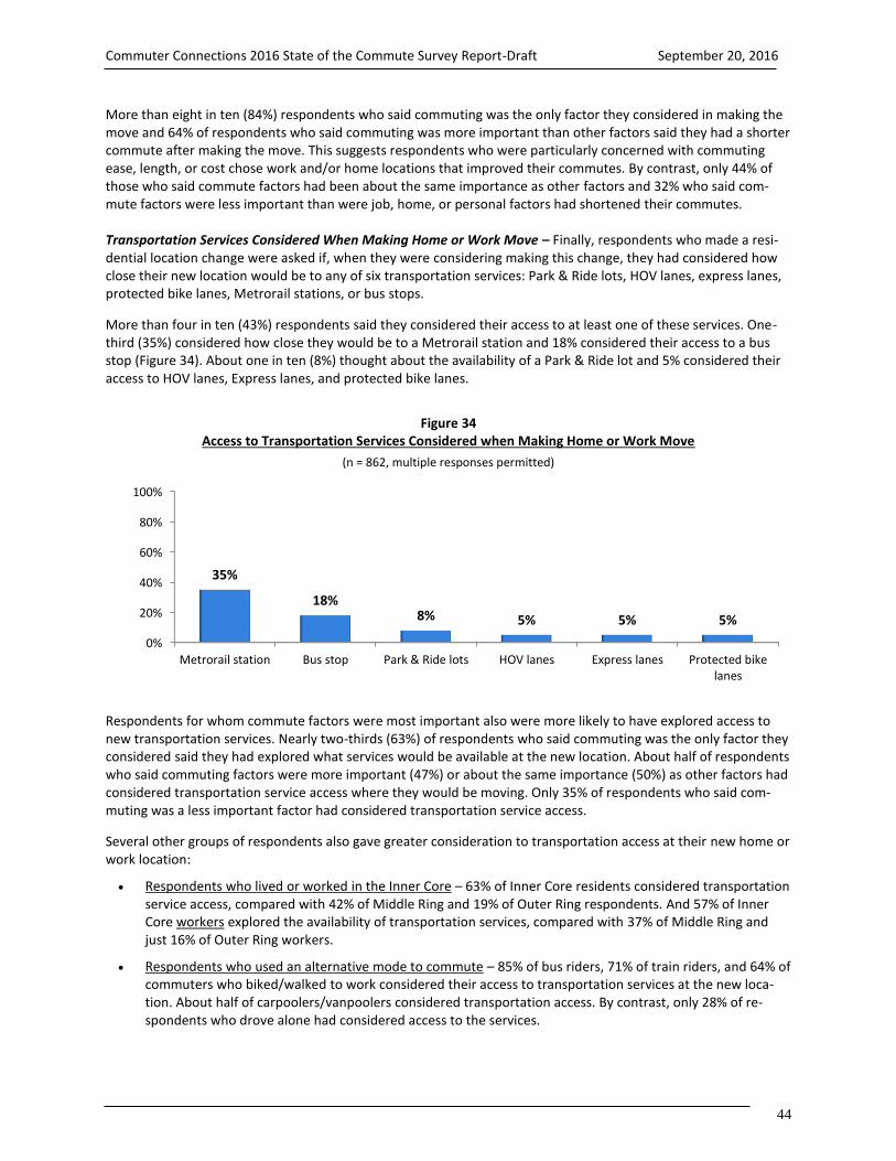
Commuter Connections 2016 State of the Commute Survey Report-Draft September 20, 2016
44
More than eight in ten (84%) respondents who said commuting was the only factor they considered in making the move and 64% of respondents who said commuting was more important than other factors said they had a shorter commute after making the move. This suggests respondents who were particularly concerned with commuting ease, length, or cost chose work and/or home locations that improved their commutes. By contrast, only 44% of those who said commute factors had been about the same importance as other factors and 32% who said com-mute factors were less important than were job, home, or personal factors had shortened their commutes. Transportation Services Considered When Making Home or Work Move – Finally, respondents who made a resi-dential location change were asked if, when they were considering making this change, they had considered how close their new location would be to any of six transportation services: Park & Ride lots, HOV lanes, express lanes, protected bike lanes, Metrorail stations, or bus stops.
More than four in ten (43%) respondents said they considered their access to at least one of these services. One-third (35%) considered how close they would be to a Metrorail station and 18% considered their access to a bus stop (Figure 34). About one in ten (8%) thought about the availability of a Park & Ride lot and 5% considered their access to HOV lanes, Express lanes, and protected bike lanes.
Figure 34 Access to Transportation Services Considered when Making Home or Work Move
(n = 862, multiple responses permitted)
Respondents for whom commute factors were most important also were more likely to have explored access to new transportation services. Nearly two-thirds (63%) of respondents who said commuting was the only factor they considered said they had explored what services would be available at the new location. About half of respondents who said commuting factors were more important (47%) or about the same importance (50%) as other factors had considered transportation service access where they would be moving. Only 35% of respondents who said com-muting was a less important factor had considered transportation service access.
Several other groups of respondents also gave greater consideration to transportation access at their new home or work location:
Respondents who lived or worked in the Inner Core – 63% of Inner Core residents considered transportation service access, compared with 42% of Middle Ring and 19% of Outer Ring respondents. And 57% of Inner Core workers explored the availability of transportation services, compared with 37% of Middle Ring and just 16% of Outer Ring workers.
Respondents who used an alternative mode to commute – 85% of bus riders, 71% of train riders, and 64% of commuters who biked/walked to work considered their access to transportation services at the new loca-tion. About half of carpoolers/vanpoolers considered transportation access. By contrast, only 28% of re-spondents who drove alone had considered access to the services.
0%
20%
40%
60%
80%
100%
Metrorail station Bus stop Park & Ride lots HOV lanes Express lanes Protected bikelanes
35%
18%8% 5% 5% 5%

Commuter Connections 2016 State of the Commute Survey Report-Draft September 20, 2016
45
Respondents who moved from outside the Washington region – 53% of respondents who moved from out-side the region considered access to transportation services, compared with 42% for respondents who moved within the region. This result might suggest intra-region movers already knew what services would be available, but that respondents who were moving into the region had to seek out this information.
Respondents who had limited access to a personal vehicle – 62% of respondents who were car-free (no household vehicles) and 57% who had no more than one car for every two adults in the household (0.1 – 0.5 vehicles per adult) considered transportation options. By contrast, just 36% of respondents who had a vehi-cle for every adult in the household explored transportation service access.
Respondents who were younger than 35 years old – 50% of respondents who were younger than 35 consid-ered what transportation services would be available, compared with 39% of respondents who were be-tween 35 and 54, and 23% of respondents who were 55 or older. This result likely is related to younger re-spondents being less likely to have a personal vehicle available, as well as their greater presence in the Inner Core area of the region.
Commute Satisfaction
The 2016 survey included a question that had been asked in 2010 and 2013, about how satisfied commuters were with their trip to work. As shown in Figure 35, in 2016, 58% rated their commute satisfaction as a “4” or “5” on a 5-point scale, where “5” meant “very satisfied. Twenty-three percent gave a rating of 3 and about two in ten rated their satisfaction as either a “1 – not at all satisfied (9%) or 2 (10%).
Commute satisfaction in 2016 was slightly lower than that measured in the 2013 and 2010 SOC surveys. In 2013, 64% reported being satisfied. In 2010, 62% of commuters were satisfied with their commutes.
Figure 35 Satisfaction with Commute
(2010 n = 6,033, 2013 n = 5,692, 2016 n = 5,217)
0% 20% 40% 60% 80% 100%
5 - Very satisfied
4
3
2
1 - Not at all satisfied
38%
24%
22%
9%
7%
36%
28%
20%
9%
7%
31%
27%
23%
10%
9%
2010
2013
2016
Satisfied
2010 – 62%
2013 – 64%
2016 – 58%

Commuter Connections 2016 State of the Commute Survey Report-Draft September 20, 2016
46
Commute Satisfaction by Home and Work Location
Respondents who lived in the Inner Core were notably more satisfied with their commute than were respondents who lived in the Middle Ring or Outer Ring areas (Figure 36). But respondents who worked in the Outer Ring were more satisfied than were respondents who worked in the Inner Core and Middle Ring.
Figure 36 Satisfaction with Commute by Home and Work Area
Percent Rating Commute a 4 or 5
(Home Area – Inner Core n = 1,458, Middle Ring n = 1,480, Outer Ring n = 2,279) (Work Area – Inner Core n = 2,322, Middle Ring n = 1,689, Outer Ring n = 1,189)
Commute Satisfaction by Ease of Commute Compared with a Year Ago
Respondents’ level of satisfaction with their commute was influenced by the ease of their commutes. More than seven in ten (73%) respondents who said had an easier commute than last year and 65% who said their commute had not changed were satisfied with their commute, compared to only 31% who said their commute had become more difficult (Figure 37).
0% 20% 40% 60% 80% 100%
Inner Core
Middle Ring
Outer Ring
Inner Core
Middle Ring
Outer Ring
28%
30%
21%
28%
29%
23%
36%
28%
32%
23%
33%
46%
4 5 - Very satisfied
Work Location
Home Location

Commuter Connections 2016 State of the Commute Survey Report-Draft September 20, 2016
47
Figure 37 Satisfaction with Commute by Ease of Commute
Percent Rating Commute a 4 or 5
(Easier commute n = 620, Commute about the same n = 3,239, More difficult commute n = 1,283)
Commute Satisfaction by Commute Mode
As evidenced by Figure 38, 97% of bikers/walkers reported high commute satisfaction. Commuter train riders, car-poolers/vanpoolers, and bus commuters were about equally satisfied, with about two-thirds rating their commute as a 4 or 5. Drive alone commuters and Metrorail riders reported the lowest satisfaction; 57% of commuters who drove alone and 48% who rode Metrorail said they were satisfied.
Figure 38 Satisfaction with Commute by Primary Commute Mode
Percent Rating Commute a 4 or 5
(Bike/walk n = 180, Commuter train n = 62, Carpool/Vanpool n = 283, Bus n = 284, Drive alone n = 3,552, Metrorail n = 634)
0% 20% 40% 60% 80% 100%
Easier commute
Commute about the same
More difficult commute
28%
30%
21%
45%
35%
10% 4 5 - Very satisfied
0% 20% 40% 60% 80% 100%
Bike/walk
Commuter train
Carpool / vanpool
Bus
Drive alone
Metrorail
18%
45%
33%
38%
25%
33%
79%
25%
33%
28%
32%
15%
4 5 - Very satisfied

Commuter Connections 2016 State of the Commute Survey Report-Draft September 20, 2016
48
Commute satisfaction by mode was generally similar in 2016 as in 2013, with one notable exception – train riders were much less satisfied in 2016 than in 2013. In 2016, 48% of Metrorail riders gave a 4 or 5 rating for their com-mute, 19 percentage points lower than the 67% who were satisfied in 2013. And 70% of commuter rail riders were satisfied in 2016, a drop of 18 percentage points from the 88% who were satisfied in 2013. Commute Satisfaction by Travel Time
Commute satisfaction declined steadily and significantly as the amount of time a commuter traveled increased (Figure 39). Nearly all (97%) commuters who had commutes of 10 minutes or less gave a 4 or 5 rating for commute satisfaction. When the commute was between 11 and 20 minutes, 84% were satisfied. At 21 to 30 minutes, satis-faction dropped to 66%. Only about half (49%) of commuters who traveled 31 to 45 minutes were satisfied and satisfaction dropped to 35% for travel times of 46 to 60 minutes. When travel time exceeded 60 minutes, only 22% rated their commute a 4 or 5.
Figure 39 Satisfaction with Commute by Length of Commute (minutes)
Percent Rating Commute a 4 or 5
(1-10 min n = 507, 11-20 min n = 957, 21-30 min n = 901, 31-45 min n = 1,113,
46-60 min n = 765, More than 60 min n = 753)
0% 20% 40% 60% 80% 100%
10 minutes or less
11-20 minutes
21-30 minutes
31-45 minutes
46-60 minutes
More than 60 minutes
12%
31%
36%
33%
25%
15%
85%
53%
30%
16%
10%
7%
4 5 - Very satisfied

Commuter Connections 2016 State of the Commute Survey Report-Draft September 20, 2016
49
3-D TELEWORK The SOC survey also explored respondents’ telework experience. For purposes of this survey, teleworkers were defined as “wage and salary employees who at least occasionally work at home or at a telework or satellite center during an entire work day, instead of traveling to their regular work place.”
This definition specifically excluded workers who worked at client sites outside of the Washington region and workers, such as sales or equipment repair staff, who traveled to multiple customer locations during the course of the day. The definition also excluded respondents who worked a portion of the normal workday at home, for ex-ample while waiting for a delivery, but traveled to the regular workplace for another part of the day. These situa-tions are not generally considered telework for transportation-related purposes. This section presents telework results for 2016 and, in some tables, results for previous SOC surveys.
Current and Potential Telework
Respondents who Currently Telework
Respondents were read the above definition of telework and asked if they would consider themselves teleworkers based on this definition. Three in ten (30%) regional workers said they teleworked, either regularly or occasionally. This represented about 887,200 workers region-wide.
Teleworkers accounted for a higher percentage, 32%, of “commuters,” regional workers who would travel to a main work location on non-telework days. Using the commuter base excludes workers who were self-employed and for whom home was their only workplace. These self-employed workers would not make commute trips to an outside work location, thus, excluding them from the calculation of teleworkers reflects a more realistic picture of the role of telework in eliminating commute trips.
The 32% telework percentage represents a steady growth over the telework percentage from the 2004 survey, when only 13% of employees teleworked (Figure 40). The percentage growth also equals significant growth in the total number of teleworkers, from 318,000 in 2004 to 887,000 in 2016 (Figure 40).
Figure 40 Percentage of Commuters who Telework – 2004, 2007, 2010, 2013, 2016
(2004 n = 6,851, 2007 n = 6,168, 2010 n = 6,050, 2013 n = 5,892, 2016 n = 5,503)
Interest in Telework
Commuters who worked at a location outside their homes and who did not telework at the time of the survey were asked if their job responsibilities would allow them to work at a location other than their main work place, at least occasionally. Four in ten (40%) said they had telework-appropriate job responsibilities (Figure 41).
0%
20%
40%
60%
80%
100%
2004 2007 2010 2013 2016
13%19%
25% 27%32%
Number of Regional Teleworkers
318,000 456,000 600,000 675,000 887,000

Commuter Connections 2016 State of the Commute Survey Report-Draft September 20, 2016
50
These respondents were then asked if they would want to telework. A large share of these respondents said they would be interested in telework on either an occasional basis or a regular basis. These interested respondents equaled about 518,000 commuters (18% of all commuters).
Figure 41 Potential for Telework Among Non-teleworkers
(n = 3,605)
These results suggest that even as the number of teleworkers has grown in the Washington metropolitan region, additional telework potential exists. Figure 42 summarizes the telework status of all respondents who were “com-muters,” that is, not self-employed/work at home full-time.
Figure 42 Telework Status Distribution
(n = 5,503)
Telework now, 32%
Could and would telework regularly,
6%
Could and would telework
occasionally, 12%
Could telework, not interested, 9%
Job not telework appropriate, 41%
887,000 current teleworkers
518,000 “could and would”
telework
0%
20%
40%
60%
80%
100%
Job NOT TWappropriate
Don't know ifTW
appropriate
Job IS TWappropriate
Interested inregular TW
Interested inoccasional
TW
Notinterested in
TW
58%
2%
40%
9%18% 13%
Commuters who don’t telework Commuters with telework-appropriate jobs

Commuter Connections 2016 State of the Commute Survey Report-Draft September 20, 2016
51
About 887,000 regional commuters (32%) teleworked at the time of the survey. An additional 18% of commuters “could and would” telework, that is, they had job responsibilities that could be done away from the main work place and they would be interested in teleworking, if given an opportunity. These commuters represented about 518,000 potential teleworkers. The remaining commuters said they would not be interested in teleworking (9%) or that their job responsibilities could only be performed at the main workplace (41%).
Table 21 presents the 2016 results shown above, with additional comparisons for 2013, 2010, 2007, and 2004. The percentage of current plus potential telework has grown dramatically from 29% in 2004 to 50% in 2016.
Table 21 Summary of Current and Potential Telework
Respondents who are not Self-Employed/Work at Home
Telework Status 2016 SOC
(n = )
2013 SOC (n = 5,892)
2010 SOC (n = 6,050)
2007 SOC (n = 6,168)
2004 SOC (n = 6,896)
Currently teleworking 32% 27% 25% 19% 13%
Not teleworking 68% 73% 75% 81% 87%
- Job responsibilities allow telework and INTERESTED in telework (“could and would”)
18% 18% 21% 24% 16%
- Job responsibilities allow telework, but NOT INTERESTED in telework
9% 11% 9% 6% 6%
- Job responsibilities would NOT allow telework
41% 44% 45% 51% 65%
Interestingly, the percentage of commuters who said their jobs were incompatible with telework dropped from 65% in 2004 to 41% in 2016. Because it seems unlikely that the composition of jobs changed substantially in the region, this result suggests a shift in commuters’ ability or perception of their ability to perform work away from their primary work location; a larger share of commuters believed they could telework. This could be related to increasing availability of communication and computer technology, such as broadband internet, lower cost tele-phone options, and computer networking, or perhaps from greater understanding of telework options and a broader definition of what responsibilities were “telework-compatible.” Telework by Personal Characteristics
Telework was not distributed equally by demographic group. Table 22 compares the incidence of telework by re-spondents’ sex, race/ethnicity, age, and income. The third column shows the percentage of each demographic group who teleworked at the time of the survey (e.g., 34% of women and 29% of men). The last column shows the percentage of commuters in the group who “could and would” telework if given the opportunity (e.g., additional 18% of women and 19% of men would telework). Note that the “could and would” percentages should be com-pared against the 18% of all commuters in the region who “could and would” telework.
Some demographic groups teleworked more than did others. For example, 34% of female respondents teleworked, compared with 29% of males and 37% of Whites teleworked, compared with 27% of African-Americans and 24% of Hispanics. Use of telework appeared to increase with age up to the 35-44 years old group, peaking at 39% then declining as age increased further. And there was a strong pattern of increasing telework as income increased; 37% of workers with household incomes between $100,000 and $139,999 teleworked, compared with only about 9% of workers with incomes below $30,000, 11% of workers with incomes between $30,000 and $59,999, and 24% of respondents with incomes of $60,0000 to $99,999. Four in ten (43%) respondents with annual household incomes of $180,000 or more teleworked.
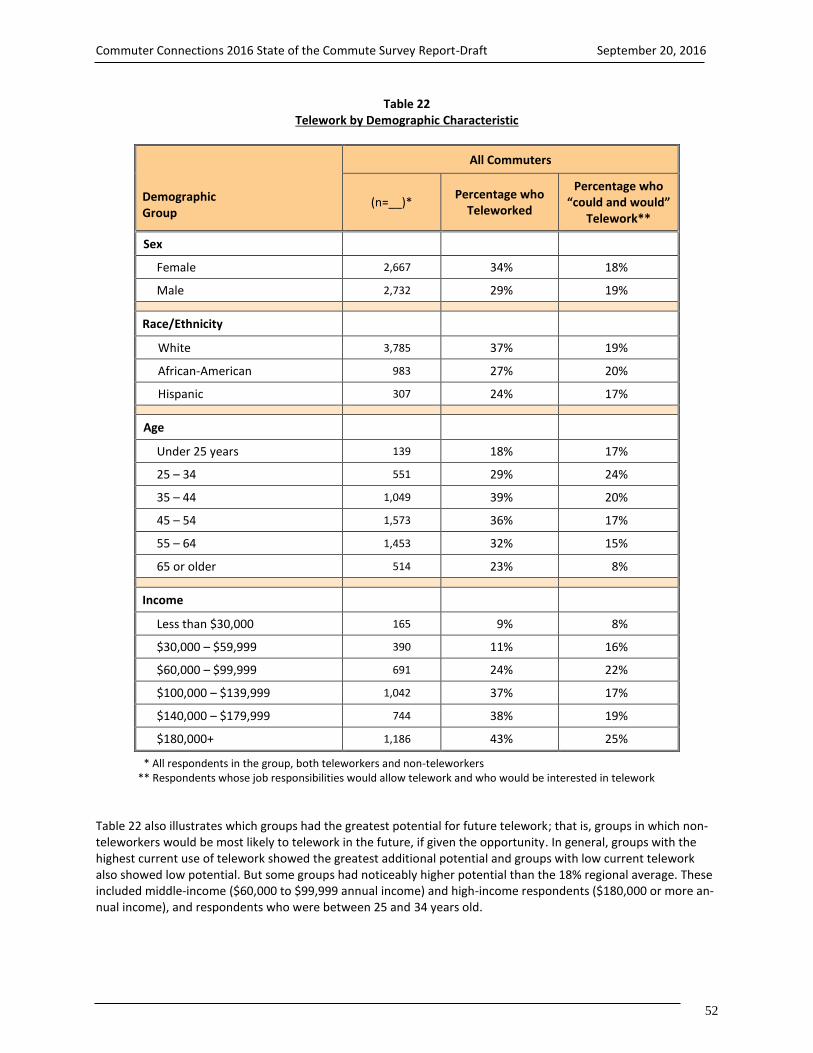
Commuter Connections 2016 State of the Commute Survey Report-Draft September 20, 2016
52
Table 22 Telework by Demographic Characteristic
Demographic Group
All Commuters
(n=__)* Percentage who
Teleworked
Percentage who “could and would”
Telework**
Sex
Female 2,667 34% 18%
Male 2,732 29% 19%
Race/Ethnicity
White 3,785 37% 19%
African-American 983 27% 20%
Hispanic 307 24% 17%
Age
Under 25 years 139 18% 17%
25 – 34 551 29% 24%
35 – 44 1,049 39% 20%
45 – 54 1,573 36% 17%
55 – 64 1,453 32% 15%
65 or older 514 23% 8%
Income
Less than $30,000 165 9% 8%
$30,000 – $59,999 390 11% 16%
$60,000 – $99,999 691 24% 22%
$100,000 – $139,999 1,042 37% 17%
$140,000 – $179,999 744 38% 19%
$180,000+ 1,186 43% 25%
* All respondents in the group, both teleworkers and non-teleworkers ** Respondents whose job responsibilities would allow telework and who would be interested in telework
Table 22 also illustrates which groups had the greatest potential for future telework; that is, groups in which non-teleworkers would be most likely to telework in the future, if given the opportunity. In general, groups with the highest current use of telework showed the greatest additional potential and groups with low current telework also showed low potential. But some groups had noticeably higher potential than the 18% regional average. These included middle-income ($60,000 to $99,999 annual income) and high-income respondents ($180,000 or more an-nual income), and respondents who were between 25 and 34 years old.

Commuter Connections 2016 State of the Commute Survey Report-Draft September 20, 2016
53
Telework also increased with increasing commute distance (Table 23). Only 22% of respondents who lived less than five miles from work teleworked, while four in ten (40%) respondents who commuted 40 miles or more tele-worked. Among respondents who lived between five and 39 miles away, about three in ten teleworked. Respond-ents who lived in the Inner Core or Middle Ring areas teleworked at higher rates than did Outer Ring respondents. A similar pattern was observed for telework by work area; respondents who worked in the Inner Core and Middle Ring teleworked at higher rates than did respondents who worked in the Outer Ring. The greatest potential for future telework among these groups was for respondents with commute distances slightly longer than the regional average (17.3 miles) and commuters who lived or worked in the Inner Core area.
Table 23 Telework by Commute Distance and Home/Work Area
Commute Characteristic
All Commuters
(n=__)* Percentage Who
Teleworked
Percentage who “could and would”
Telework**
Commute Distance
Less than 5 miles 776 22% 19%
5 – 19 miles 2,074 31% 20%
20 – 39 miles 1,308 32% 21%
40 miles + 606 40% 16%
Home Area
Inner Core 1,528 32% 24%
Middle Ring 1,546 33% 17%
Outer Ring 2,413 28% 17%
Work Area
Inner Core 2,406 37% 22%
Middle Ring 1,758 30% 17%
Outer Ring 1,306 22% 16%
* All respondents in the group, both teleworkers and non-teleworkers ** Respondents whose job responsibilities would allow telework and who would be interested in telework
Telework by Employment Characteristics
The survey data also showed some differences in the telework and potential telework distribution by employment characteristics (Table 24). Federal agency employees teleworked at a much higher rate (45%) than the regional av-erage and much higher than did employees who worked for non-profit organizations (33%), private employers (31%), and state/local agencies (14%).
Generally, use of telework increased with increasing employer size. Four in ten (43%) respondents who worked for employers with 1,000 or more employees teleworked and 36% of respondents who worked for employers with between 251-999 employees teleworked, compared with only about two in ten respondents who worked for em-ployers with between 1 and 100 employees.

Commuter Connections 2016 State of the Commute Survey Report-Draft September 20, 2016
54
Table 24 Telework by Employment Characteristics
Employment Characteristic
All Commuters
(n=__)* Percentage Who
Currently Telework
Percentage who “could and would”
Telework**
Employer Type
Federal agency 1,352 45% 20%
Non-profit organization 647 33% 24%
Private employer 2,487 31% 17%
State/local agency 688 14% 21%
Employer Size
1 – 25 1,197 21% 16%
26 – 100 1,021 22% 23%
101 – 250 644 30% 18%
251 – 999 791 36% 25%
1,000+ 1,276 43% 18%
Occupation
Executive, manager 1,203 41% 24%
Technicians/related support 339 39% 21%
Professional 1,835 38% 17%
Administrative support 427 29% 20%
Sales 258 15% 18%
Protective service 158 15% 13%
Precision craft, production 153 9% 8%
Other service 157 4% 18%
* All respondents in the group, both teleworkers and non-teleworkers ** Respondents whose job responsibilities would allow telework and who would be interested in telework
Some occupations also had higher telework rates than average, including executive/managerial (41%), technicians (39%), and professionals (38%). Common occupations with below average telework rates included sales (15%), pro-tective services (15%), precision craft/ production (9%), and other service, such as restaurant workers (4%).
Again, the relative percentages of non-teleworkers who could and would telework if given the opportunity gener-ally mirrored the relative percentages of respondents who teleworked in each group. Groups with statistically higher potential than the 18% average included non-profit organization employees (24%), employees of firms with between 26 and 100 employees, and firms with between 251 and 999 employees (25%). Potential also was high among respondents in executive/management and technician occupations.

Commuter Connections 2016 State of the Commute Survey Report-Draft September 20, 2016
55
Telework/Work at Home Frequency and “Episodic” Telework
The frequency with which respondents teleworked is detailed in Figure 43. About 17% of respondents who said they teleworked did so less than one time per month. One-quarter (25%) said they teleworked a few times each month. Nearly six in ten (58%) said they teleworked at least one day per week. On average, teleworkers used this arrangement about 1.38 days per week. This overall average frequency is about the same as observed in the 2013 survey and an increase from the 1.3 days per week average observed in the 2010 SOC survey.
Figure 43 Frequency of Telework – 2010, 2013, and 2016
(2010 n = 1,529, 2013 n = 1,559, 2016 n = 1,874)
Frequency of Work at Home Among Non-Teleworkers
The percentage of respondents who self-defined as “teleworkers,” based on the definition they were read, likely underrepresented the true share of telework activity in the region. The research team considered the possibility that some commuters who occasionally worked at home might not consider themselves “teleworkers.” To test this premise, the 2016 SOC survey asked a follow-up question of respondents who said they were not “teleworkers” but who had telework-appropriate jobs to determine how many actually had worked at home all day on a regular workday during the past year.
Half of these respondents had worked at home at least once in the past year (Figure 44). These respondents repre-sented about 13% of all commuters region-wide or a total of 367,000 commuters. When added to the 32% of com-muters who self-defined as teleworkers, the total percentage of commuters who telework/work at home at least occasionally rises to 45%.
The average work at home frequency of these “non-teleworkers” was quite low. Self-defined teleworkers tele-worked an average of 1.38 days per week. By contrast, “non-teleworkers,” worked at home an average of seven days per year or about 0.14 days per week (7 telework days per year / 50 work weeks per year = 0.14 telework days per week).
0%
20%
40%
60%
80%
100%
Less than 1 day /month
1-3 times per month 1 day per week 2 days per week 3 or more days perweek
22%
30%
19%12%
17%17%
26% 25%
11%
21%17%
25% 23%
15%20%
2010 2013 2016
Telework 1 or more days per week
2010 – 48% 2013 – 57% 2016 – 58%

Commuter Connections 2016 State of the Commute Survey Report-Draft September 20, 2016
56
Figure 44 Frequency of Work at Home in the Past Year – Non-teleworkers
(n = 1,353)
When the average telework frequency for respondents who self-identified as teleworkers and the work-at-home frequency of non-teleworkers are applied to the estimated numbers of regional commuters, it equates to approxi-mately 255,000 regional workers teleworking/working at home on a typical workday. About 4% of the tele-work/work at home days would be from commuters who do not consider themselves teleworkers occasionally working at home.
Total telework/work at home days per week = 1,275,400 weekly days
Teleworkers = 887,000 teleworkers x 1.38 days per week = 1,224,000 weekly days
Non-teleworkers work at home = 367,000 non-teleworkers x 0.14 days per week = 51,400 weekly days
Total commuters teleworking on a typical day = 255,000 (1,275,400 weekly days / 5 days per week)
“Episodic” Telework
The teleworking calculation above for a “typical weekday” might underestimate the true traffic-reduction benefit if commuters telework/work at home on days when traffic is likely to be heavier or more difficult than normal. To examine this situation, both non-teleworkers and teleworkers were asked the following question:
Thinking about a day when traffic in the region is likely to be disrupted due to a snowstorm or a major or special event, how likely are you to [telework, work at home] that day to avoid the traffic? Are you very likely, somewhat likely, or not likely?
Among “non-teleworkers” who occasionally worked at home, 54% said they were very likely to work at home on a “major event” day and 26% were somewhat likely (Figure 45). An even higher percentage of teleworkers tele-worked on those days; 77% said they were very likely to work at home on a major event day and 14% were some-what likely. So teleworking/work at home likely provides a higher than average benefit for regional traffic condi-tions on days when traffic is likely to be at its worst.
0% 20% 40% 60% 80% 100%
0 days (never worked at home)
1-2 days
3-4 days
5-6 days
7-9 days
10 or more days
50%
14%
8%
11%
4%
13%
Worked at home at least one day in the past year =
367,000 “non-teleworking” commuters

Commuter Connections 2016 State of the Commute Survey Report-Draft September 20, 2016
57
Figure 45 Work at Home Frequency During Major Regional Events – Teleworkers and Non-teleworkers
(Teleworkers n = 1,609, Non-teleworkers who work at home occasionally n = 705)
Non-teleworkers who occasionally worked at home also were asked how likely they were to work at home on a day when they had a personal event, such as a sick child or home delivery, or when they needed uninterrupted time to complete a work assignment. Four in ten (39%) said they were very likely to work at home in this case and 33% were somewhat likely. The benefit of telework on these days would be primarily to the commuter in his/her ability to balance work and personal responsibilities.
Telework Patterns
Respondents who self-defined as “teleworkers” were questioned about their telework characteristics including: telework location, length of time teleworking, access mode to telework locations outside the home, use of infor-mal or formal telework arrangement, and source of telework information. Telework Locations
Nearly all (97%) teleworkers said they teleworked exclusively from home. Two percent named another telework location, such as a satellite office, library or community center, or Telework Center and 1% said they teleworked from both home and from another location. Teleworkers who teleworked from locations outside their homes trav-eled an average distance of 6.3 miles to the telework location. A large majority (87%) of these respondents drove alone to the telework location. The remaining 13% used an alternative mode. Length of Time Teleworking
Thirty-six percent of teleworkers started teleworking within the past two years and 12% started within the past year (Figure 46). Three in ten (29%) had been teleworking more than five years. On average, respondents had been teleworking about 58 months, approximately the same duration as was estimated in 2013 (59 months), but the trend overall has been for longer telework duration. The average telework duration was just 42 months in the 2004 survey and 53 months in 2007. In the 2004 survey, nearly half (49%) of teleworkers had started teleworking within the past two years.
0%
20%
40%
60%
80%
100%
teleworkers Non-teleworkers
9%20%
14%
26%
77%
54%
Not likely Somewhat likely Very likely

Commuter Connections 2016 State of the Commute Survey Report-Draft September 20, 2016
58
Figure 46 Length of Time Teleworking
(n = 1,822)
Formal or Informal Telework Arrangement
Teleworkers were asked if they teleworked under a formal program or through an informal arrangement with a supervisor. Respondents who said they were not teleworkers were asked if their employer had a telework pro-gram, even though the respondent did not use it.
More than half (53%) of all respondents said their employers allowed some telework, either under a formal pro-gram (30%) or an informal arrangement (23%) (Figure 47). The remaining respondents said their employers did not have any telework program (41%) or that they didn’t know about any program (6%).
Figure 47 Formal and Informal Telework Arrangements
All respondents and Teleworkers vs Non-Teleworkers
(All workers n = 5,487, Teleworkers n = 1,882, Non-teleworkers n = 3,605)
0% 20% 40% 60% 80% 100%
All workers
Teleworkers
Non-teleworkers
30%
56%
19%
23%
43%
14%
41%
0%
60%
6%
1%
7%
Formal Informal No program Don't know
More than 5 years29%
25-60 months35%
12-24 months24%
Less than one year12%

Commuter Connections 2016 State of the Commute Survey Report-Draft September 20, 2016
59
Figure 47 also presents the distribution of telework availability among teleworkers and non-teleworkers. Telework-ers were much more likely than were other respondents to work for an employer with a formal telework program. More than half (56%) of teleworkers said they teleworked under a formal arrangement and 43% teleworked under an informal arrangement with their supervisor. This represents a continued shift from 2004, when only 32% of tel-eworkers had a formal agreement. This appears to signal a greater acceptance of formal telework.
By contrast, only 19% of non-teleworkers said their employers had a formal telework program and 14% said tele-work was permitted under informal arrangements. Two-thirds said the employer had no program (60%) or they didn’t know if a program existed (7%). Telework Arrangements 2004 through 2016 – Figure 48 shows the incidence of telework arrangement in 2004, 2007, 2010, 2013, and 2016. The share of employees that reported telework availability increased substantially between 2004 and 2010, but leveled off at that point. In the 2004 SOC survey, only 35% of respondents noted that their employer allowed telework, either formal or informal. In 2007, the share had risen to 41%. By 2010, more than half of respondents said their employer offered some telework option and this percentage has been relatively stable since 2010. Telework program growth between 2004 and 2010 was primarily in the share of formal pro-grams. In 2004, telework arrangements were more often informal, while by 2010, the proportions had reversed and formal telework arrangements predominated.
Figure 48 Telework Arrangements – 2004, 2007, 2010, 2013, 2016
(2004 n = 6,896, 2007 n = 6,168, 2010 n = 5,854, 2013 n = 5,892, 2016 n = 5,487)
Telework Arrangement by Employer Type – The availability of telework arrangements varied widely by respond-ents’ employer types. Formal programs were most common among respondents who worked for a Federal govern-ment agency (Table 25). Nearly seven in ten (69%) respondents who worked for Federal agencies said their em-ployers had formal programs, compared to only about 25% of respondents who worked for non-profit organiza-tions, 18% who worked for private employers, and 20% who were employed by state/local agencies. Respondents who worked for non-profit organizations or private employers were most likely to have informal telework. More than a third of non-profit employees and 30% of private sector employees said their employers permitted informal telework. State/local government agencies were least likely to permit telework under any arrangement. Less than four in ten (38%) of these respondents said their employer allowed employees to telework at all.
0%
20%
40%
60%
80%
100%
No program/DK Informal Formal
65%
20%15%
59%
22% 19%
46%
25% 29%
49%
21%
30%
47%
23%30%
2004 2007 2010 2013 2016

Commuter Connections 2016 State of the Commute Survey Report-Draft September 20, 2016
60
Table 25 Formal or Informal Telework Arrangements By Employer Type
Program Type
Federal Agencies (n = 1,352)
Non-profit Organizations
(n = 647)
Private Employers (n = 2,478)
State/local Agencies (n = 688)
No telework program / Don’t know if program exists
23% 40% 53% 62%
Telework permitted 77% 60% 48% 38%
Formal program 69% 25% 18% 20%
Informal arrangement 8% 34% 30% 18%
Telework Arrangement by Employer Size – Respondents who worked for large employers were most likely to have access to a telework program and to have access to a formal program (Table 26). Almost three-quarters of these respondents said their employer had either a formal program (59%) or permitted informal telework (15%). By con-trast, less than four in ten respondents who worked for employers with 50 or fewer employees had access to ei-ther formal (11%) or informal (26%) telework.
Table 26 Formal or Informal Telework Arrangements By Employer Size
Program Type
1-50 Employees (n = 1,688)
51-100 Employees
(n = 530)
101-250 Employees
(n = 644)
251-999 Employees
(n = 791)
1,000+ Employees (n = 1,276)
Formal program 11% 20% 27% 37% 59%
Informal arrangement 26% 25% 26% 26% 15%
No program 63% 55% 47% 37% 26%
Sources of Telework Information
Respondents who teleworked were asked how they learned about telework and if they received telework infor-mation from Commuter Connections or from MWCOG. The largest source of information, by far, was “special pro-gram at work/employer,” named by more than seven in ten (73%) of respondents (Figure 49). This percentage was about the same as in the 2013 survey (73%) and 2010 survey (71%), but considerably higher than in the 2007 sur-vey, in which only 55% of teleworkers cited their employer as the source of information.

Commuter Connections 2016 State of the Commute Survey Report-Draft September 20, 2016
61
Figure 49 Sources of Information About Telework – 2007, 2010, 2013, 2016
(n = 1,882, multiple responses permitted)
Ten percent of respondents said they “initiated the request on their own” and 9% learned of telework through “word of mouth.” Nine percent of teleworkers said they received telework information directly from Commuter Connections or MWCOG. This was a about the same percentage as mentioned Commuter Connections/MWCOG in 2013 (10%), but slightly higher that the percentages in the 2010 (6%) and 2007 (7%) surveys.
0% 20% 40% 60% 80% 100%
Other
Word of mouth
Commuter Connections
Initiated on my own
Program at work/employer
3%
9%
9%
10%
73%
2%
7%
10%
17%
73%
3%
5%
6%
15%
71%
3%
13%
7%
23%
55%
2007
2010
2013
2016

Commuter Connections 2016 State of the Commute Survey Report-Draft September 20, 2016
62
3-E AVAILABILITY OF AND ATTITUDES TOWARD TRANSPORTATION OPTIONS The third major section of the State of the Commute Survey examined the availability of transportation options, such as transit, and respondents’ attitudes toward these options.
Public Transportation
Respondents who worked outside their homes were asked if bus and/or train service was available in the areas where they lived and where they worked. Respondents also were asked how far their homes were from the near-est bus stop and the nearest train station. Transit Service Operating
Nine in ten (89%) respondents said that some form of public transit was available in their home area (Table 27). Six in ten (61%) said both bus and train service were provided, 25% said bus service was available, but not train, and 3% said train service was available, but not bus service. The remaining 11% of respondents said either that no bus or train companies provided service or that they did not know of any service.
Table 27 Transit Service Operating in Home Area and Work Area
(Home area n = 5,239, Work area n = 5,239)
Transit Service Operating Home Area Percentage
Work Area Percentage
Bus and train 61% 60%
Bus only - no train service 25% 23%
Train only – No bus service 3% 3%
No transit in area / don’t know transit 11% 14%
The percentage who said that transit service was available in their work area was approximately the same as for the home area. Six in ten (60%) reported availability of both bus and train service, one-quarter (23%) said they had access only to bus service, and 3% reported access only to train services. Fourteen percent said that no transit ser-vice was offered where they worked. Distance to Bus Stop and Train Station
The results presented above reflect respondents’ perception of transit availability; they are not an objective meas-ure of transit availability or level of transit access. A respondent who is willing to drive to a bus stop or rail station might consider service that operates within five miles of his home to be “in my home area,” while another re-spondent who lives within one mile could feel that “no transit operates.” The survey also did not address other factors that might enter into a respondent’s assessment of the practical feasibility of using transit, such as the di-rectness of the trip or the time needed to make the trip. Thus, some respondents might have considered these fac-tors in assessing whether “service is provided” and others might have excluded them from their assessment.

Commuter Connections 2016 State of the Commute Survey Report-Draft September 20, 2016
63
To assess a measure of the closeness of transit, all respondents, including those who said no transit operated, were asked the distance from their homes to the nearest bus stop and nearest train station. Half (51%) of the re-spondents said they lived less than one-half mile from a bus stop and 66% said they lived less than one mile (Figure 50). Among respondents who could provide a distance to a bus stop, the average distance was 1.5 miles. But re-spondents who said bus service was available in their home area lived only 1.0 miles from the closest stop.
Figure 50 Distance from Home to Bus Stop and Train Station
(Bus stop n = 5,238, Train station n = 5,239)
Train stations were farther away for most respondents. Only 7% said they lived less than one-half mile from a Metrorail or commuter rail station and only 17% lived less than one mile. Six in ten (60%) said they lived three or more miles from the nearest train station. On average, respondents who provided a distance lived 6.1 miles away; respondents who reported that train service was available lived 3.3 miles from the station.
Table 28 compares transit access distances for the four “bus available – train available” categories. Again, it is im-portant to emphasize that “service provided” is defined by respondents’ perception of service availability.
Table 28 Mean Distance from Home to Bus Stop and Train Station By Type of Transit Service Operating in Home Area
(Bus and train n = 2,481; Bus only n = 1,498; Train only n = 101; No bus or train n = 574)
Service Provided
Distance to Bus Stop
Distance to Train Station
Bus and train provided 0.8 miles 3.2 miles
Bus only - no train service provided 1.5 miles 10.7 miles
Train only – No bus service provided 4.4 miles 5.6 miles
No bus or train service / don’t know transit 5.8 miles 14.2 miles
Respondents who said that both bus and train service operated reported the shortest distance to both bus and train transit access points; they lived 0.8 miles from the nearest bus stop and 3.2 miles from the nearest train sta-tion. Respondents who said only bus operated in their home area lived an average of 1.5 miles from a bus stop and
0%
20%
40%
60%
80%
100%
Bus Stop Train Station
51%
7%15%
10%13%
23%
5%13%
5%
16%
4%
20%
7%11%
0.1-0.4 mi 0.5-0.9 mi 1.0-2.9 mi 3.0-4.9 mi 5.0-9.9 mi 10.0 mi + DK

Commuter Connections 2016 State of the Commute Survey Report-Draft September 20, 2016
64
10.7 miles from a train station. Among respondents who reported only access to train, the average bus stop dis-tance was 4.4 miles, considerably farther than in the “bus only” category. But the train station distance of 5.6 miles was much shorter than for respondents who said they did not have transit service at home. Finally, respondents who reported no service at all in the area where they lived estimated longer average distances for both bus access (5.8 miles) and train access (14.2 miles) than did other respondents. Transit Service Provided by Home Area
The analysis examined reported availability of transit services by respondents’ home location within the “ring” des-ignations defined earlier: Inner Core (City of Alexandria, Arlington County, and the District of Columbia), Middle Ring (Fairfax, Montgomery, and Prince George’s counties), and Outer Ring (Calvert, Charles, Frederick, Loudoun, and Prince William counties).
Both bus and train services were more available in the central part of the region than in the outer jurisdictions (Ta-ble 29). In the Inner Core, 98% of respondents said some transit service operated in their home area and 80% said that both bus and train operated. Within the Middle Ring, 65% of respondents said both bus and train operated and another 26% reported access to either bus or train, but not both. Transit availability dropped off markedly in the Outer Ring; only 73% of these respondents said any service operated and only 30% said they had access to both bus and train.
Table 29 Bus and Train Service by Home Area
Transit Operating Inner Core (n = 1,468)
Middle Ring (n = 1,486)
Outer Ring (n = 2,285)
Bus and train 80% 65% 30%
Bus only - no train service 16% 23% 39%
Train only – No bus service 2% 3% 4%
No bus or train service / don’t know service 2% 9% 27%
Distance to Transit by Home Area
Figure 51 presents the distribution of distance for the three area rings. Eighty-four percent of respondents in the Inner Core reported living less than one-half mile from a bus stop, compared to 53% of respondents in the Middle Ring, and 13% of respondents in the Outer Ring. Only 4% of Inner Core respondents lived one or more miles from a bus stop, compared with 59% of Outer Ring respondents. It is also notable that 17% of Outer Ring respondents said they did not know the distance to the nearest bus stop.
The average transit access distance was the shortest for respondents who lived in the Inner Core; just 0.4 miles to the nearest bus stop and 1.7 miles to the nearest train station. Respondents in the Middle Ring said they traveled 1.0 miles to the nearest bus stop and 4.7 miles to the nearest train station. Respondents who lived in the Outer Ring reported that the nearest bus stop was an average of 4.3 miles away and train was 14.9 miles away.

Commuter Connections 2016 State of the Commute Survey Report-Draft September 20, 2016
65
Figure 51 Distance from Home to Bus Stop by Home Area
(Inner Core n = 1,468, Middle Ring n = 1,486, Outer Ring n = 2,285)
Commute Mode by Distance to Bus Stop – As might be expected, the transit commute mode share declined with increasing distance from a bus stop (Figure 52). About three in ten (31%) commuters who lived less than one-half mile from a bus stop primarily commuted by bus or train. As the distance from home to a bus stop increased, the transit share fell steadily. When the nearest bus stop was 10 miles from home, only 4% of respondents commuted by transit, a drop of 27 percentage points compared with respondents who lived less than one-half mile away.
Figure 52
Commute Mode by Distance from Home to Bus Stop
(Less than 0.5 mi n = 2,199, 0.5-0.9 mi n = 653, 1.0-2.9 mi n = 744, 3.0-4.9 mi n = 311, 5.0-9.9 mi n = 388, 10.0 mi or more n = 359)
0%
20%
40%
60%
80%
100%
0-0.4 mi 0.5-0.9 mi 1.0-2.9 mi 3.0-4.9 mi 5.0-9.9 mi 10 mi or more
54%
68%74%
82% 81%87%
31%
19% 15%10% 8% 4%
Drive alone Transit
+33%
-27%
0% 20% 40% 60% 80% 100%
Inner Core
Middle Ring
Outer Ring
84%
53%
13%
9%
19%
11%
3%
13%
22%
1%
9%
37%
3%
6%
17%
Less than 0.5 mi 0.5-0.9 mi 1.0-2.9 mi 3.0 mi or more Don't know
Distance from Home to Nearest Bus Stop

Commuter Connections 2016 State of the Commute Survey Report-Draft September 20, 2016
66
The drop in transit use was mirrored by a corresponding increase in driving alone. As Figure 52 shows, the drive alone rate for commuters who lived more than 10 miles from a bus stop was 87%, compared with 54% for com-muters who lived less than one-half mile from a bus stop. This represents a 33 percentage point increase for driv-ing alone.
Drive alone use also increased and transit use decreased with increasing distance from home to a train station (Fig-ure 53). Among commuters who lived less than one-half mile from a train station, only 43% drove alone and 47% used transit. Among commuters who lived 10 miles or more from the nearest train station, the drive alone rate was 76%, an increase of 33 percentage points, and the transit share was 13%, a drop of 34 percentage points.
Figure 53 Commute Mode by Distance from Home to Train Station
(Less than 0.5 mi n = 311, 0.5-0.9 mi n = 487, 1.0-2.9 mi n = 1,078, 3.0-4.9 mi n = 508, 5.0-9.9 mi n = 683, 10.0 mi or more n = 1,540)
High Occupancy Vehicle (HOV)/Express Lanes
Availability and Use of HOV / Express Lanes
The survey also examined availability and use of High Occupancy Vehicle (HOV) and Express Lanes. One-third (33%) of respondents said one or both of these types of facilities were available along their route to work: 18% had ac-cess to HOV only, 12% had access to both HOV and Express lanes, and 3% said only Express Lanes were available.
One-third of commuters who said an HOV lane was available along the route to work had used it. This equaled about 9% of commuters region-wide. More than half of commuters who reported access to an Express Lane along the route to work had used it, representing 8% of commuters region-wide.
0%
20%
40%
60%
80%
100%
0-0.4 mi 0.5-0.9 mi 1.0-2.9 mi 3.0-4.9 mi 5.0-9.9 mi 10 mi or more
43% 41%
57%
73% 75% 76%
47%41%
27%19%
14% 13%
Drive alone Transit
+33%
-34%
Distance from Home to Nearest Train Station

Commuter Connections 2016 State of the Commute Survey Report-Draft September 20, 2016
67
Figure 54 Availability and Use of HOV/Express Lane
(n = 5,239)
Respondents who regularly used an HOV/Express Lane for commuting estimated that using the lane saved them an average of 20 minutes for each one-way trip. One-third (35%) said they saved 10 minutes or less and a similar share (34%) saved between 11 and 20 minutes (Figure 55). The remaining HOV users were approximately evenly split between saving 21 to 30 minutes (17%) and saving more than 30 minutes one-way (14%).
Figure 55 Perceived Travel Time Saving of HOV/Express Lane Users (Estimated by Users)
(Note that actual time saving could be different from the respondent-estimated, perceived time saving)
(n = 537)
HOV/Express Lanes by Home Area – Figure 56 shows availability and use of HOV/Express lanes by respondents’ home location within the three “ring” categories. Commuters were more likely to have HOV lanes available on their route to work if they lived in Middle Ring (32%) or Outer Ring (36%) jurisdictions than if they lived in the Inner Core (19%). The pattern was similar for availability of Express Lanes; 16% of Middle Ring and 17% of Outer Ring residents said they were available, compared with 9% of Inner Core residents.
0%
20%
40%
60%
80%
100%
31 min or more21 - 30 min11 - 20 min10 min or less
14%17%
34%35%
0% 20% 40% 60% 80% 100%
HOV lane
Express Lane
9%
7%
21%
8%
70%
85%
Available and used Available, not used Not available

Commuter Connections 2016 State of the Commute Survey Report-Draft September 20, 2016
68
Figure 56 Availability and Use of HOV/Express Lanes by Home Area
(HOV lane available – Inner Core n = 1,468, Middle Ring n = 1,486, Outer Ring n = 2,285) (HOV lane used (respondents with lanes available) – Inner Core n = 382, Middle Ring n = 458, Outer Ring n = 678)
(Express lane available – Inner Core n = 1,468, Middle Ring n = 1,486, Outer Ring n = 2,285) (Express lane used (respondents with lanes available) – Inner Core n = 162, Middle Ring n = 233, Outer Ring n = 307)
Commuters who lived in the Outer Ring also used HOV lanes at a considerably higher rate than did commuters in other areas. More than four in ten (42%) Outer Ring respondents who had access to HOV lanes said they used them, compared with about 25% of Middle Ring respondents and the same share of Inner Core respondents. Outer Ring respondents also used Express Lanes at a high rate; 49% who said the lanes were available had used them. But Express Lane use was nearly as high (46%) among Middle Ring respondents. About one-quarter (23%) of Inner Core respondents who said Express Lanes were available had used the lanes.
Table 30 shows availability and use of HOV/Express Lanes by respondents’ home county or city. Virginia residents generally had higher availability than did residents of Maryland or the District of Columbia. At least three in ten respondents in each of the five Virginia jurisdictions said an HOV lane was available; in Prince William County, half (52%) of respondents reported having access. By comparison, the highest rates of HOV lane availability outside Virginia were 35% for respondents who lived in Frederick County, MD and 26% for Montgomery County, MD resi-dents. Only 8% of respondents from the District of Columbia reported having access to the lanes along their route to work.
Virginia residents also had higher availability of Express Lanes than did residents of Maryland or the District of Co-lumbia. One-third of Prince William residents and 28% of Fairfax residents said Express Lanes were available and two in ten Alexandria residents had access. In Maryland, about one in ten respondents of Prince George’s (10%) and Montgomery counties said lanes were available.
Table 30 also shows the use of HOV and Express Lanes for respondents who said they had lanes available. HOV lane use was highest for residents of Prince William County (47%), Loudoun County (40%), District of Columbia (36%), Frederick County (32%) and Calvert County (31%). At least three in ten respondents who lived in these juris-dictions and had HOV lanes available had used them. Highest use of Express Lanes was found in Prince William County (55%), Montgomery County (52%), Frederick County (47%), Calvert County (46%), Fairfax County (45%), and Prince George’s County (42%).
0%
20%
40%
60%
80%
100%
HOV Available Used HOV Express lane Available Used express lane
19%25%
9%
23%32%
25%16%
46%
36%42%
17%
49%
Inner Core Middle Ring Outer Ring

Commuter Connections 2016 State of the Commute Survey Report-Draft September 20, 2016
69
Table 30 Availability and Use of HOV / Express Lanes By Residence Jurisdiction
Home Jurisdiction (County/City)
All Respondents Respondents Use Lanes When Available
(n=___) HOV
Available Express
Available HOV
(n = )* HOV Use
Express (n=_)*
Express Use
Virginia jurisdictions
Prince William Co 496 52% 34% 273 47% 182 55%
Fairfax Co 525 46% 28% 250 27% 144 45%
Alexandria City 445 42% 19% 184 28% 84 22%
Loudoun Co 480 36% 14% 188 40% 65 39%
Arlington Co 487 32% 13% 157 16% 53 17%
Maryland jurisdictions
Frederick Co 445 35% 6% 160 32% 27 47%
Montgomery Co 499 26% 9% 125 24% 49 52%
Prince George’s Co 462 21% 10% 83 19% 40 42%
Charles County 439 7% 5% 33 23% 20 3%
Calvert County 425 5% 4% 24 31% 13 46%
District of Columbia 536 8% 5% 41 36% 26 31%
* Respondents in the jurisdiction who have an HOV / express lane available along their route to work.
HOV/Express Lane Influence on Commute Mode Choice – The data suggest HOV/Express lanes had an impact on choice of commute modes. Nearly half (48%) of respondents who used the lanes for commuting said availability of the lane influenced their choice of commute mode. The influence on carpooling, in particular, is best illustrated by the drive alone and carpool/vanpool mode shares when HOV/Express lanes were available and when they were not (Figure 57).
About 9% of respondents who said an HOV/Express lane was available along their route to work carpooled or vanpooled to work, compared with 5% of respondents who did not have access. Transit use also was slightly higher when an HOV/Express lane was available. Conversely, the drive alone rate for respondents who had access to HOV/Express lanes was 66%, slightly lower than the 68% for respondents who did not have access to the lanes.
Figure 57 also shows the bike/walk mode shares by HOV/Express lane availability. The bike/walk share was 5% for respondents who did not have access to HOV/Express lanes, compared with essentially 0% for respondents with access. This difference is explained by comparing the geographic associations of bike/walk commuting and HOV/Express access. Bike/walk commuting is primarily concentrated in the Inner Core, while HOV/Express lanes are located primarily in the Middle Ring and Outer Ring areas.

Commuter Connections 2016 State of the Commute Survey Report-Draft September 20, 2016
70
Figure 57 Primary Commute Mode by Availability of HOV/Express Lanes
(HOV/Express Available n = 1,653, HOV/Express Not Available n = 3,398)
Various HOV studies have suggested that the influence of HOV lanes is due to both the amount of time saved by HOV lanes and the reliability of travel time that HOV lanes afford. On average, HOV/Express lane users saved 20 minutes one-way in their commute time.
Figure 58 presents average time saving for each of the three ring designations. About four in ten HOV/Express lane users who lived in the Inner Core reported HOV/Express lane availability influenced their mode choice and they saved an average of 13 minutes one-way. HOV/Express lanes’ influence on mode choice was higher for respond-ents who lived in the Middle Ring and Outer Ring; 46% of Middle Ring respondents and 50% of Outer Ring re-spondents said the HOV/Express lanes influenced their commute mode choice. They also reported greater time saving in their commute; 19 minutes and 29 minutes one-way, respectively.
Figure 58 HOV Influence on Choice of Commute Mode and Time Saved by HOV Lane Use By Home Area
(All Region n = 645, Inner Core n = 126, Middle Ring n = 190 Outer Ring n = 329)
0%
20%
40%
60%
80%
100%
Drive alone Transit Carpool/vanpool Bike/walk
66%
22%
9%0%
68%
19%
5% 6%
HOV/Express Available HOV/Express Not Available
0%
20%
40%
60%
80%
100%
All Region Inner Core Middle Ring Outer Ring
48%39%
46% 50%
Average one-way time saving
20 minutes 13 minutes 19 minutes 29 minutes

Commuter Connections 2016 State of the Commute Survey Report-Draft September 20, 2016
71
Park and Ride Lots
Figure 59 depicts respondents’ awareness of the locations of Park and Ride (P&R) lots along their route to work. Thirty-eight percent of respondents across the region said they knew the locations of P&R lots along their commut-ing route. About four in ten (43%) did not know the locations. The remaining (19%) said there were no P&R lots along their route to work. But awareness/availability of lots varied substantially by home location. Only 19% of re-spondents who lived in the Inner Core knew of a P&R lot on their route, while 36% of respondents who lived in the Middle Ring and 60% of respondents in the Outer Ring knew of a lot along their route to work.
Figure 59 Awareness of Park & Ride Lots Along Route to Work By Home Area
(All region n = 5,239, Inner Core n = 1,468, Middle Ring n = 1,486, Outer Ring n = 2,285)
Seventeen percent of those who knew Park and Ride lot locations had used these lots when commuting during the past year. These respondents represented 6% of total respondents in the survey, about the same as the 7% of re-spondents who reported using P&R lots in the 2013 SOC survey.
Use of P&R lots was more common among respondents who lived in the Outer Ring (33%) than for respondents who lived in the Middle Ring (15%) or Inner Core (12%). But respondents who worked in the Inner Core used P&R lots at a much higher rate than did other respondents. More than one-quarter (27%) of Inner Core workers who knew of a lot used it in the past year, compared with just one in ten respondents who worked in the Middle Ring (11%) or Outer Ring (9%).
Attitudes Towards Transportation Options
Carpool/Vanpool Barriers
Respondents who did not carpool or vanpool to work were asked why they did not use these modes. Table 31 shows respondents’ barriers to rideshare use, grouped into three categories: service availability, service character-istics, and personal preferences/needs.
The most common reason, cited by more than four in ten (43%) respondents was one of service availability; that they didn’t know anyone with whom to carpool or vanpool. Only a small share of respondents noted concerns or barriers related to service characteristics. The most common concern in this category was that carpooling and vanpooling take too much time, but this was noted by only 6% of respondents.
0%
20%
40%
60%
80%
100%
Know P&R location Don't know location No P&R lots
38% 43%
19%19%
52%
29%36%
48%
16%
60%
25%15%
All region Inner Core Middle Ring Outer Ring

Commuter Connections 2016 State of the Commute Survey Report-Draft September 20, 2016
72
Table 31 Reasons for Not Using Carpool / Vanpool to Work
(n = 4,871, multiple responses permitted)
Reasons Percentage
Service Availability
Don’t know anyone to carpool/vanpool with 43%
Service Characteristics
Takes too much time 6%
Doesn’t save time 4%
Bus/train/carpool partner could be unreliable/late 3%
Personal Preferences/Needs
Work schedule irregular 18%
Need car for emergencies/overtime/flexibility 10%
Need car before/after work 8%
Need my car for work 7%
Live close to work, can walk, use other mode 6%
Don’t like to ride with strangers, prefer to be alone 6%
Prefer to use bus / Metro / train 5%
Just not interested / not convenient 2%
Other * 8%
Respondents noted greater barriers related to personal preferences/needs. The most common reason was an ir-regular schedule, cited by 18% of respondents. About one in ten said they needed a personal vehicle for emergen-cies or flexibility (10%), for trips before or after work (8%), or to accomplish work responsibilities that required use of a vehicle (7%). Six percent of respondents lived too close to work to make carpooling or vanpooling attractive and 6% did not want to ride with strangers or preferred to be alone during commuting. Transit Barriers
Respondents who did not use a bus or train for commuting were asked why they did not use transit. Table 32 shows respondents’ barriers to transit use, grouped in the three reason categories: service availability, service characteristics, and personal preferences/needs.
More than half (55%) of respondents said they did not use transit because they did not have train service available and 41% said bus service was not available in either the home or work area. Respondents also noted bus/train ser-vice characteristics as barriers to transit use, in particular that transit “takes too much time,” mentioned by 25% of respondents. Small percentages of respondents noted issues with cost, convenience, or reliability. Common rea-sons in the personal preferences/needs category included needing a vehicle for work or before or after work, that the trip was too long, and having an irregular work schedule.

Commuter Connections 2016 State of the Commute Survey Report-Draft September 20, 2016
73
Table 32 Reasons for Not Using Transit to Work
(n = 4,176, multiple responses permitted)
Reasons Percentage
Service Availability *
No train service available in home/work area 55%
No bus service available in home/work area 41%
Service Characteristics
Takes too much time 25%
Too expensive 5%
Bus/train could be unreliable/late 5%
Have to wait too long for service 4%
Have to transfer/too many transfers 3%
Inconvenient 2%
Personal Preferences/Needs
Need my car for work 7%
Need car before/after work 7%
Trip is too long/distance too far 5%
Work schedule irregular 5%
Don’t like to ride with strangers, prefer to be alone 4%
Commute is too short 3%
Prefer to drive, want freedom / flexibility 3%
Prefer another alternative mode 2%
Other 11%
* Respondents who said no train or bus service is available also were permitted to answer other reasons why they could not use bus or train

Commuter Connections 2016 State of the Commute Survey Report-Draft September 20, 2016
74
3-F QUALITY OF LIFE, TRANSPORTATION SATISFACTION, AND BENEFITS OF
ALTERNATIVE MODES
The 2016 SOC survey included a series of questions to explore residents’ impressions of the role transportation plays in creating a livable area and in their opinions on transportation needs in the Washington region. These ques-tions focused on:
Quality of life Satisfaction with transportation in the region Benefits of using alternative modes for commuting
Quality of Life
The survey first asked respondents to rate quality of life (QOL) in the Washington metropolitan region, using a five-point scale in which 1 meant “poor” and 5 meant “excellent. Across the region, nearly two-thirds of respondents gave a high QOL rating; 20% gave a rating of 5 (Excellent) and 44% rated QOL as a 4 (Figure 60). One-quarter gave a rating of 3. Only 9% gave a low rating (1 or 2).
Figure 60 Rating for Quality of Life in Washington Metropolitan Region
(n = 5,111, excludes “don’t know” responses)
Quality of Life by Home Location
Quality of life differed slightly by where in the region the respondent lived. Figure 61 presents the percentages of commuters in each of the three regional areas who rated their quality of life as a 4 or 5. Respondents who lived in the Inner Core area gave the highest rating; 72% of respondents in this area rated their quality of life as a 4 or 5. About 63% of respondents who lived in the Middle Ring rates quality of life as a 4 or 5. Respondents who lived in the Outer Ring gave the lowest ratings; 57% rated quality of life as a 4 or 5.
0% 20% 40% 60% 80% 100%
5 - Excellent
4
3
2
1 - Poor
20%
44%
27%
6%
3%
4 or 5 Rating
64%

Commuter Connections 2016 State of the Commute Survey Report-Draft September 20, 2016
75
0% 20% 40% 60% 80% 100%
Inner Core
Middle Ring
Outer Ring
6%
10%
12%
22%
27%
31%
72%
63%
57%
Low QOL (1 or 2) Moderate QOL (3) High QOL (4 or 5)
Figure 61 Quality of Life by Home Area
Percentage Rating QOL as Low (1 or 2), Moderate (3), or High (4 or 5)
(Inner Core n = 1,442, Middle Ring n = 1,462, Outer Ring n = 2,207)
Transportation Satisfaction
The survey next asked commuters to rate their satisfaction the transportation network in the Washington metro region (Figure 63). Only 36% of respondents reported being satisfied, indicated by a rating of 4 or 5 (Very satisfied). Three in ten said they were dissatisfied (rating of 1-not at all satisfied or 2). Commuters also appeared to be slightly less satisfied than they were in either 2013, when 44% of commuters were satisfied, or in 2010, when 40% of regional commuters rated their transportation satisfaction as a 4 or 5.
Figure 62 Ratings for Transportation Satisfaction – Rating of 4 or 5
(2010 n = 6,420, 2013 n = 5,486, 2016 n = 5,093)
0% 20% 40% 60% 80% 100%
5 - Very satisfied
4
3
2
1 - Not at all satisfied
13%
27%
34%
17%
9%
16%
28%
31%
15%
10%
11%
25%
34%
19%
11%
2010
2013
2016
Satisfied
2010 – 40%
2013 – 44%
2016 – 36%

Commuter Connections 2016 State of the Commute Survey Report-Draft September 20, 2016
76
Transportation Satisfaction by Home Location
Respondents who lived in the Inner Core gave a higher rating for transportation satisfaction than did respondents in either the Middle Ring or Outer Ring (Figure 63). Forty-four percent of Inner Core respondents rated their satis-faction with transportation as a 4 or 5, compared with 36% of Middle Ring respondents and 28% of Outer Ring re-spondents.
Figure 63 Ratings for Satisfaction with Regional Transportation By Home Area
(Inner Core n = 1,449, Middle Ring n = 1,460, Outer Ring n = 2,184)
As noted in Figure 62, transportation satisfaction region-wide fell between 2013 and 2016 from 44% to 36%. Satis-faction also dropped in each of the three home areas. In 2013, 58% of Inner Core residents were satisfied with the transportation system, 14 percentage points higher than in 2016. Declines in satisfaction were less extreme in the Middle Ring and Outer Ring areas. Transportation satisfaction among Middle Ring respondents declined from 44% in 2013 to 36% in 2013, a drop of eight percentage points. In the Outer Ring, satisfaction fell from 34% in 2013 to 28% in 2016, a drop of six percentage points.
Transportation Satisfaction and Quality of Life
Quality of life is defined by many factors, including education, safety, economic and recreation opportunities, and other factors. But the survey data suggest quality of life also is related to transportation satisfaction. Figure 64 shows quality of life ratings as a function of transportation satisfaction.
As shown by the first bar in the chart, 49% of respondents who were not satisfied with transportation in the region (rating of 1 or 2) rated regional quality of life as a 4 or 5 (Excellent). The middle bar shows that 65% of respondents who gave a middle rating of “3” for transportation satisfaction gave a high rating for quality of life. The third bar shows that 75% of respondents who gave high ratings (4 or 5) to transportation satisfaction also rated QOL highly. Quality of life ratings increased notably with increasing satisfaction with transportation.
0%
20%
40%
60%
80%
100%
Inner Core Middle Ring Outer Ring
20%30%
39%36% 34% 33%
44%36%
28%
1 or 2 (dissatisfied) 3 4 or 5 (satisfied)

Commuter Connections 2016 State of the Commute Survey Report-Draft September 20, 2016
77
Figure 64 Quality of Life by Transportation Satisfaction Percentage Rating QOL as a 4 or 5 (Excellent)
(Transportation Satisfaction: rating of 1 or 2 n = 1,617, rating of 3 n = 1,712, rating of 4 or 5 n = 1,681)
Transportation Satisfaction by Demographic Characteristics
The analysis of transportation satisfaction examined the results for all commuters region-wide, but also for various sub-segments of the commuting population. Results of these inquiries are presented below for:
Demographic characteristics – age, income, sex, race/ethnicity, and employment status Travel characteristics – commute mode, commute travel time, and home proximity to transit
Age – There did not appear to be a strong relationship between transportation satisfaction and respondent age (Figure 65). The youngest respondents (18 to 24 years) and oldest respondents (65 years and older) reported higher satisfaction with the regional transportation system than did respondents in other age groups, but the per-centage of respondents who were satisfied were not statistically different among respondent groups between 25 year and 64 years old.
Figure 65 Ratings for Transportation Satisfaction by Age
Percentage Rating Satisfaction as a 4 or 5 (Very satisfied)
(18 to 24 n = 137, 25 to 34 n = 525, 35 to 44 n = 979, 45 to 54 n = 1,464, 55 to 64 n = 1,344, 65 and older n = 470)
0%
20%
40%
60%
80%
100%
Not satisfied with transportation(1 or 2)
Neither satisfied nor dissatisfiedwith transportation (3)
Satisfied with transportation (4or 5)
49%
65%75%
0% 20% 40% 60% 80% 100%
18 to 24 years
25 to 34 years
35 to 44 years
45 to 54 years
55 to 64 years
65 years and older
47%
33%
38%
33%
35%
43%

Commuter Connections 2016 State of the Commute Survey Report-Draft September 20, 2016
78
Sex, Race/Ethnicity, and Household Income –Table 33 presents transportation satisfaction results by three demo-graphic characteristics: sex, race/ethnicity, and annual household income. Male and female respondents rated transportation satisfaction equally, but Hispanic respondents (51% satisfied) and African-America respondents (38% satisfied) were more satisfied than were White respondents (32%). Satisfaction also varied by respondents’ income. More than four in ten respondents with annual household incomes under $80,000 rated their satisfaction as a 4 or 5, compared with about one-third of respondents with higher incomes.
Table 33 Ratings for Transportation Satisfaction by Sex, Race/Ethnicity, and Income
Percentage Rating Satisfaction as a 4 or 5 (Very satisfied) (Shaded percentages indicate statistically higher values)
Demographic Characteristic Percentage
Satisfied
Sex
Female (n = 2,451) 37%
Male (n = 2,575) 36%
Race/Ethnicity
Hispanic (n = 282) 51%
White (n = 3,518) 32%
African-American (n = 913) 38%
Income
Less than $40,000 (n = 231) 45%
$40,000 to $79,999 (n = 618) 43%
$80,000 to $119,999 (n = 846) 35%
$120,000 to $159,999 (n = 816) 35%
$160,000 to $199,999 (n = 572) 32%
$200,000 or more (n = 828) 34%
Transportation Satisfaction by Travel Characteristics
Transportation Satisfaction by Commute Mode – In 2016, respondents who drove alone gave the lowest ratings for transportation satisfaction; only 34% of drive alone commuters were satisfied (Figure 66). Transit riders also gave relatively low ratings; about four of ten train and bus riders were satisfied. Just under half (47%) of carpool-ers/vanpoolers rated the transportation system as a 4 or 5. Commuters who biked or walked to work gave the highest rating, with about six in ten respondents in this mode group being satisfied.
Figure 66 also shows satisfaction ratings by mode from the 2013 SOC survey. Carpool/vanpool and bike/walk com-muters were as satisfied in 2016 as in 2013. Drive alone commuters were less satisfied in 2016, although the drop was not dramatic. But train and bus riders were substantially less satisfied. In 2016, 38% of train riders rated their satisfaction as a 4 or 5, a 20 percentage point drop from 2013, when 58% of train riders said they were satisfied. The drop in satisfaction also was notable for bus riders; 41% were satisfied in 2016, 17 percentage points below the 58% satisfaction level of 2013.

Commuter Connections 2016 State of the Commute Survey Report-Draft September 20, 2016
79
Figure 66 Ratings for Transportation Satisfaction By Primary Commute Mode
Percentage Rating Satisfaction as a 4 or 5 (Very satisfied)
(Drive alone n = 3,439, Carpool/vanpool n = 282, Bus n = 283, Train n = 687, Bike/walk n = 176)
Transportation Satisfaction by Commute Travel Time – There was a clear pattern between increasing commute travel time and declining transportation satisfaction (Figure 67). Satisfaction fell as the length of the commute in-creased, from a high of 48% satisfaction for respondents who had very short commutes of 10 minutes or less, to 32% for respondents who traveled between 31 and 60 minutes, and to 20% for respondents who traveled more than an hour to work.
Figure 67 Ratings for Transportation Satisfaction By Commute Travel Time (minutes)
Percentage Rating Satisfaction as a 4 or 5 (Very satisfied)
(1-10 min n = 491, 11-20 min n = 930, 21-30 min n = 875, 31-45 min n = 1,089, 46-60 min n = 749, More than 60 min n = 748)
0%
20%
40%
60%
80%
100%
Drive alone Train Bus Carpool/vanpool Bike/walk
41%
58% 58%
43%
60%
34%38% 41%
47%
61%
2013 2016
0%
20%
40%
60%
80%
100%
1-10 min 11-20 min 21-30 min 31-45 min 46-60 min More than 60min
48% 45%41%
32% 32%
20%

Commuter Connections 2016 State of the Commute Survey Report-Draft September 20, 2016
80
Transportation Satisfaction by Proximity to Transit – Transportation satisfaction also appeared related to a re-spondent’s proximity to bus and train stops (Figure 68). Respondents who lived closer to transit gave higher marks for transportation satisfaction than did respondents who lived farther away. About four in ten respondents who lived less than one mile from a bus stop were satisfied with transportation, compared with about three in ten re-spondents who lived between 1.0 and 2.9 miles away, and about one-quarter of respondents who lived 3.0 or more miles away. A similar pattern was evident for distance from a train station, except that nearly half (49%) of respondents who less than 0.5 miles from a train station rated transportation satisfaction as a 4 or 5.
Figure 68 Ratings for Transportation Satisfaction By Distance from Home to Bus Stop and Train Station (miles)
Percentage Rating Satisfaction as a 4 or 5 (Very satisfied)
(Bus stop Distance – Less than 0.5 mi n = 2,167, 0.5-0.9 mi n = 642, 1.0-2.9 mi n = 726, 3.0-4.9 mi n = 302, 5.0-9.9 mi n = 380, 10.0 mi or more n = 339)
(Train station Distance – Less than 0.5 mi n = 307, 0.5-0.9 mi n = 484, 1.0-2.9 mi n = 1,063, 3.0-4.9 mi n = 502, 5.0-9.9 mi n = 665, 10.0 mi or more n = 1,490)
Transportation Satisfaction by Commute Satisfaction
As shown earlier in this report in Figure 35, about 58% of respondents region-wide said they were satisfied with their commute. But only 36% were satisfied with the regional transportation system. This implies that most com-muters had found an acceptable commute option, but that many still felt the regional transportation was lacking, perhaps because they were considering both work and non-work travel in making their transportation satisfaction ratings.
However, as illustrated in Figure 69, respondents’ satisfaction with their commute certainly appears related to their satisfaction with transportation in the region. Among respondents who rated their trip to work as 1 or 2 (dis-satisfied), 62% also were dissatisfied with the regional transportation system and only 12% were satisfied. Con-versely, among respondents who rated their commute as a 4 or 5 (satisfied), only 17% were dissatisfied and 50% reported being satisfied.
0%
20%
40%
60%
80%
100%
Home to bus distance Home to train distance
42%49%
37% 40%31%
38%
27%
38%
24%
36%31%
26%
Less than 0.5 mi 0.5-0.9 mi 1.0-2.9 mi 3.0-4.9 mi 5.0-9.9 mi 10.0 mi or more

Commuter Connections 2016 State of the Commute Survey Report-Draft September 20, 2016
81
Figure 69 Satisfaction with Regional Transportation by Commute Satisfaction
(Commute Rating 1 or 2 n = 1,063, Commute Rating 3 n = 1,116, Commute Rating 4 or 5 n = 2,905)
Benefits of Alternative Mode Use
Questions also were added to the 2010 SOC survey to assess commuters’ opinions about the benefits generated by commuters’ use of alternative modes. First, all respondents were asked, “What impacts or benefits does a commu-nity or region receive when people use alternative modes?” Then, respondents who used alternative modes were asked two questions about the personal benefits of alternative modes:
You said you [bicycle, walk, carpool, vanpool, ride public transportation] to work some days. What benefits have you personally received from traveling to work this way?
On days that you [carpool, vanpool, ride public transportation] to work, how often do you do you read or write work-related material or check work messages on the way to work?
Societal Benefits of Alternative Mode Use
When asked what benefits a region or community receives from use of alternative modes, 80% of respondents named at least one benefit. Nearly six in ten (59%) respondents said that use of alternative modes could reduce traffic congestion and 36% said it could reduce pollution or help the environment (Figure 70). Twelve percent cited reduced greenhouse gases and 9% mentioned reduced energy use. Smaller percentages of respondents noted other benefits.
The figure also shows responses to this question from the 2010 and 2013 SOC surveys. The responses for 2016 were similar to the 2010 and 2013 results, except that the shares of respondents who mentioned less traffic and reducing pollution have dropped since 2010 and the share who noted that use of alternative modes was good for the economy rose.
0%
20%
40%
60%
80%
100%
Commute rating - 1 or 2 Commute rating - 3 Commute rating - 4 or 5
62%
36%
17%
26%
42%33%
12%
22%
50%
Regional transportation- 1 or 2 Regional transportation - 3 Regional transportation - 4 or 5
Percent satisfied with regional transportation

Commuter Connections 2016 State of the Commute Survey Report-Draft September 20, 2016
82
Figure 70 Regional/Community Benefits of Alternative Mode Use – 2010, 2013, 2016
Asked of All Commuters
(2010 n = 6,050, 2013 n = 5,718, 2016 n = 5,239)
Personal Benefits of Alternative Mode Use
When respondents who used alternative modes for their commute were asked what personal benefits they re-ceived from using these modes, 89% named at least one benefit (Figure 71). Saving money or receiving a financial incentive that reduced their transportation cost topped the list of personal benefit; 33% of alternative mode users mentioned this benefit. Respondents mentioned two other benefits that have a financial implication: No need for a car (8%) and reduced wear and tear on car (3%).
Respondents also cited benefits that have a connection to quality of life. Two in ten (22%) respondents said use of alternative modes helped them avoid stress or relax while commuting and 6% said they could avoid traffic. Two in ten (18%) said they could use their travel time productively when they used an alternative mode. About one in ten said they got exercise or health benefits (13%), arrived at work on time (10%), or had companionship on their com-mute (7%).
0% 20% 40% 60% 80% 100%
Less traffic, less congestion
Reduce pollution
Reduce greenhouse gases
Save energy
Good for the economy
Safety / less road rage
Less wear & tear on roads
Companionship / sense of community
Reduce accidents
Reduce government costs
64%
45%
11%
5%
3%
4%
6%
2%
3%
4%
59%
39%
8%
15%
2%
5%
4%
3%
2%
1%
59%
36%
12%
9%
7%
6%
4%
4%
3%
3%
2010
2013
2016

Commuter Connections 2016 State of the Commute Survey Report-Draft September 20, 2016
83
Figure 71 Personal Benefits of Alternative Mode Use – 2013 and 2016
Asked Only of Alternative Mode Users
(2013 n = 1,575, 2016 n = 1,555)
Differences in Personal Benefits by Alternative Mode – Saving money was a common personal benefit named by all alternative mode users, but particularly so for commuters who carpooled/vanpooled, rode a bus, or biked/walked; about four in ten respondents in these mode groups named saving money as a benefit (Table 34). Saving money also was a benefit named by train riders, but to a lesser extent than for other mode users; about one-quarter of train riders mentioned this benefit. Avoiding stress and using travel time productively also were common benefits across mode categories, but with bus and train riders noting these benefits at a higher rate than did respondents who carpooled/vanpooled or bike/walked to work.
Other personal benefits named by alternative mode users differed by the modes they used. Respondents who pri-marily carpooled or vanpooled reported saving time and having companionship during the commute. Commuters who bicycled or walked to work also mentioned saving time, but they overwhelmingly noted getting exercise as a benefit. Both bus and train riders mentioned not needing a car. And train riders and bike/walk commuters said their choice of commute mode helped the environment.
0% 20% 40% 60% 80% 100%
Save money/receive subsidy
Avoid stress/relax
Use time productively
Get exercise, health benefits
Arrive on time
No need for car
Have companionship
Save time, faster
Less traffic, avoid traffic
Reduce wear & tear on car
Help environment/save energy
Reduce grenhouse gas
Use HOV lane
No need to park
39%
26%
17%
10%
11%
7%
7%
5%
2%
7%
5%
2%
2%
0%
33%
22%
18%
13%
10%
8%
7%
7%
6%
3%
3%
3%
2%
2%
2013
2016

Commuter Connections 2016 State of the Commute Survey Report-Draft September 20, 2016
84
Table 34 Personal Benefits of Alternative Mode Use by Primary Alternative Mode
(Carpool/Vanpool n = 283, Bus n = 288, Train n = 692, Bike/Walk n = 180 (Shaded percentages indicate statistically higher values)
Personal Benefit Carpool/ Vanpool
Bus Train Bike/Walk
Save money 40% 36% 24% 41%
Have companionship during commute 23% 5% 3% 0%
Avoid stress, relax 15% 22% 27% 17%
Use travel time productively 13% 23% 18% 13%
Save time, travel faster 13% 3% 5% 13%
Arrive at work on time 9% 6% 12% 7%
Save gas, save energy 7% 7% 7% 7%
Less wear and tear on car 6% 2% 4% 1%
No need for a car 2% 7% 11% 3%
Get exercise 1% 3% 6% 73%
Help environment, reduce greenhouse gas 1% 2% 9% 9%
* Each response in the “Other category” mentioned by less than one percent of respondents.
Productive Use of Personal Travel Time
The third question in this series about travel benefits explored the idea that commuters who use alternative modes can make productive use of their travel time. Commuters who carpooled, vanpooled, or rode transit to work were asked how often they read or wrote work-related material or checked work messages on the way to work. Having time to catch up on work tasks could make their time at the worksite more productive and less stressful. As shown in Figure 72, half of these commuters performed work-related tasks during the commute; 37% performed work-related tasks “most days” and 15% performed work-related tasks “some days.”
Conducting work-related business during the commute was more common among transit riders than carpoolers. Nearly six in ten (57%) train riders and 59% of bus riders said they perform work-related tasks during their com-mute, compared with 30% of carpoolers.

Commuter Connections 2016 State of the Commute Survey Report-Draft September 20, 2016
85
Figure 72 Frequency of Work-Related Tasks During Commute Time
Asked Only of Alternative Mode Users
(n = 1,349)
Most days, 37%
Some days, 15%
Rarely, never, 44%
Always drive CP/VP,
4%

Commuter Connections 2016 State of the Commute Survey Report-Draft September 20, 2016
86
3-G AWARENESS OF COMMUTE ADVERTISING AND SERVICES
Commute Advertising Recall
The next set of questions in the survey inquired about respondents’ awareness of commute information advertis-ing. More than half (54%) of all respondents said they had seen, heard, or read advertising about commuting in the six months prior to the survey. This was about the same percentage as the percentages estimated in the 2013 (55%), 2010 (58%), and 2007 (51%) SOC surveys. Message Recall
These respondents were then asked what messages they recalled from this advertising. Two-thirds (67%) could cite a specific message, a similar share as could recall a message in 2013 (67%), 2010 (70%), and 2007 (65%). Figure 73 lists specific messages respondents in the 2016 survey remembered and the percentage of respondents who cited each message. The messages are divided into three categories: general rideshare messages, commute ser-vices messages, and regional infrastructure initiatives.
Figure 73 Commute Information/Advertising Messages Recalled
(Note: Scale extends only to 20% to highlight difference in responses)
(n = 3,318)
0% 5% 10% 15% 20%
Use bus/train
Carpool/vanpool
Reduces traffic
Help environment
Save money
Saves time
Less stressful
New trains/buses coming
Call for CP/VP info
Contact Commuter Connections
Guaranteed Ride Home
Ride bike to work / bike issues
Regional commute services available
Employer will give financial incentive
Capital Bikeshare
HOT lanes, express lanes
HOV lanes
13%
4%
2%
2%
2%
2%
2%
9%
8%
7%
6%
2%
2%
2%
2%
5%
5%
General Rideshare Messages
Commute Services Messages
Regional Infrastructure Initiatives

Commuter Connections 2016 State of the Commute Survey Report-Draft September 20, 2016
87
General Rideshare Messages – The top reason noted overall, was a general rideshare message, “use the bus, train, Metrorail,” recalled by 13% of respondents. About 4% recalled a general message of “carpool or vanpool.” Small shares of respondents mentioned rideshare benefit messages: reduces traffic (2%), helps the environment (2%), saves money (2%), saves time (2%), and less stressful (2%). Commute Program/Service Messages – The most common messages recalled in the commute services category were new trains or buses are coming (9%) and that you can call for carpool/vanpool information (8%). Seven per-cent of respondents mentioned “contact Commuter Connections,” higher than the 4% who gave this response in 2013. Six percent of respondents mentioned Guaranteed Ride Home, about the same as the 5% who volunteered this response in 2013. Regional Infrastructure Initiatives – Commuters also mentioned two existing or new regional infrastructure initia-tives. Five percent said they had heard a message about the High Occupancy Toll (HOT) or Express lanes that opened in 2012 on the Capital Beltway in Virginia and in 2014 on I-95 in Virginia and 5% had heard a message about High Occupancy Vehicle (HOV) lanes that operate on various roads in the region. Recall of Advertising Sponsors
About half (49%) of respondents who could cite an advertising message said they remembered who sponsored the ad (Table 35). The Washington Metropolitan Area Transit Authority (WMATA, Metro) was named by 23% of re-spondents, an increase from the 17% who noted this sponsor in 2013. Commuter Connections or COG were named by 13%, about the same percentage as gave this response in 2013 (12%). The Virginia Department of Transporta-tion was named by 3% of respondents. One percent of respondents named each of the District Department of Transportation, Arlington County Commuter Services, Uber, the Maryland Department of Transportation, and the Washington Area Bicycling Association. Many other organizations also were named in 2016, but each was named by less than one percent of respondents.
Table 35 Recall of Advertising Sponsors
(n = 2,346)
Advertising Sponsor Percentage
Metro, WMATA 23%
Commuter Connections, MWCOG 13%
Virginia Dept. of Transportation (VDOT) 3%
District Department of Transportation 1%
Arlington County Commuter Services 1%
Uber 1%
Maryland Department of Transportation (including Mary-land State Highway Administration, Maryland MTA)
1%
WABA, Washington Area Bicycling Association 1%
Don’t remember, don’t know 51%
Other * 8%
* Each response in the “Other category” mentioned by less than one percent of respondents.

Commuter Connections 2016 State of the Commute Survey Report-Draft September 20, 2016
88
Advertising Sources/Media
Table 36 presents the primary sources or media through which respondents heard, saw, or read commute adver-tising. The most common 2016 source was radio; a third of respondents who recalled an ad said they heard it on the radio. Other common sources named in 2016 included sign on a transit vehicle or at a bus stop or Metro sta-tion (22%), television (21%), newspaper (14%), and roadside billboard (10%). Smaller shares of respondents cited other sources.
Table 36
Advertising Sources/Media
Advertising Source/Media* 2016 SOC (n = 2,341)
2013 SOC (n = 2,457)
2010 SOC (n = 2,756)
2007 SOC (n = 2,275)
2004 SOC (n = 4,133)
Radio 34% 33% 40% 35% 55%
Sign on transit vehicle, bus stop, Metro station 22% 25% 22% 20% 9%
Television 21% 18% 24% 25% 25%
Newspaper 14% 20% 18% 22% 12%
Roadside billboard/ad 10% 9% 5% 2% 2%
At work 7% 5% 6% 5% <1%
Website/internet 6% 2% 2% 2% 2%
Postcard in the mail 4% 5% 3% 3% 1%
Smart phone / Tablet 3% 1% --- --- ---
Social media 2% --- --- --- ---
Other ** 5% 3% 4% 3% 4%
* Might add to more than 100% because multiple responses were permitted.
** Each response in the “Other category” mentioned by less than one percent of respondents.
Table 36 also shows sources or media named in previous SOC surveys. The 2016 sources generally were similar to those noted in previous years, with two exceptions. Radio was named by a much higher share of respondents in 2004 (55%) than in later years, while roadside billboards have grown as a source. Digital sources such as Internet, smart phones/tablets, and social media also have grown as sources; in 2016, 11% of respondents named one of these sources, compared with just 1% in 2004.
Commute Advertising Impact
Persuasiveness of Advertising Messages
The advertising appeared to have an effect for some respondents. One-quarter (25%) of respondents who had seen, heard, or read advertising said they were more likely to consider ridesharing or using public transportation after seeing or hearing the advertising, about the same percentage as noted this willingness in 2013 (25%) and 2010 (24%), but higher than the 18% share from the 2007 SOC survey.
Persuasiveness of Messages by Commute Mode, Distance, and Time – The respondents who were most per-suaded by the advertising were those who already used alternative modes. About 52% of bus riders, 28% of train riders, and 27% of carpoolers/vanpoolers said they were more likely to consider using an alternative after hearing the ads, compared with only 20% of respondents who drove alone. There did not seem to be any relationship with

Commuter Connections 2016 State of the Commute Survey Report-Draft September 20, 2016
89
commute distance or time; commuters who traveled short distances and those who traveled long distances to work were about equally likely to say they were more willing to use alternative modes after hearing the ads.
Persuasiveness of Messages by Commute Ease and Satisfaction – An interesting result was that ad receptivity was highest among respondents who were satisfied with the regional transportation system and satisfied with their commutes. More than one-third (37%) of respondents who were satisfied with the regional transportation said they were more willing to consider alternative modes after hearing the ads, compared with only 14% of those who gave a 1 or 2 rating for transportation system satisfaction. Similarly, 27% of commuters who were satisfied with their current commutes said they were persuaded by the ads, compared with 14% of those who were not satisfied with their commutes.
Perhaps counter-intuitively, commuters who reported that their commute was easier than last year were much more likely to say they were persuaded by the ads than were commuters whose commutes had become more dif-ficult; 37% of commuters with an easier commute were more willing to use alternative modes after hearing the ads, compared with 21% of commuters who had a more difficult commute and 21% of commuters whose com-mutes had not changed. Commute Actions Taken After Hearing or Seeing Commute Advertising
Respondents who recalled advertising messages were asked if they had taken any actions to try to change how they commute since seeing or hearing the ads. About 9% of these respondents said they took an action. Three per-cent said they sought information or services for commuting through the Internet, a local or regional commute organization, or from a transit agency. One percent said they registered for a regional or local commute service (e. g., Guaranteed Ride Home) or started using an HOV lane to get to work.
Three percent (62 respondents) of the respondents who recalled an ad message said they tried or started using an alternative mode for commuting. About half (52%) tried riding a train, 29% started or tried carpooling, and 22% started riding a bus to work. Two in ten started bicycling or walking (18%) or teleworking (18%) and 7% tried vanpooling. While these respondents equaled only about 1% of respondents, they represent more than 30,000 commuters region-wide. Influence of Ads on Commute Change Actions
More than six in ten (61%) of respondents who took an action to change their commute said the advertising they saw or heard encouraged the action. And respondents who made a mode change had driven alone for 48% of their commute trips before they made the change. This suggests that the advertising, although having a small impact on mode shifts, is acquainting drive alone commuters with other commuting opportunities and encouraging them to seek more information on these options.

Commuter Connections 2016 State of the Commute Survey Report-Draft September 20, 2016
90
3-H AWARENESS AND USE OF COMMUTER ASSISTANCE RESOURCES The survey also explored respondents’ awareness of commute/travel assistance services available to commuters in the Washington metropolitan region through regional and local organizations. All respondents were asked an un-prompted question about regionally-available telephone numbers or websites that provided commute infor-mation. They then were asked they had heard of Commuter Connections, the organization that provides services throughout the Washington metropolitan region. Respondents also were asked about local commute information organizations providing services in the areas where they lived and worked.
Awareness of Commuter Assistance Numbers/Websites
Respondents first were asked if they were aware of a telephone number or web site they could use to obtain infor-mation on ridesharing, public transportation, HOV/Express lanes, and telework in the Washington region. About half (53%) of respondents said they knew such a number existed. The remaining respondents either said there was not such a phone number or website (20%) or that they did not know if a phone number or web site existed (27%).
Awareness of regional commute information resources continued to fall since 2010, when 66% of respondents said they knew of a telephone number of website (Figure 74).
Figure 74 Awareness of Regional Commute Information Resource
(2004 n = 7,200, 2007 n = 6,600, 2010 n = 6,629, 2013 n = 6,335, 2016 n = 5,903)
Awareness by Population Sub-Group
Awareness was substantially higher among respondents who said they saw or heard commute advertising in the past year (61%) than for respondents who did not recall advertising (44%). And commuters who had heard of Com-muter Connections reported higher awareness of regional commute resources (59%) than did commuters who were not aware of Commuter Connections (44%). Employer worksite commute programs also appeared to boost awareness of regional commute services; 60% of respondents who said their employers offered commute services at the worksite knew of a regional commute information resources, compared with 44% of those who said no com-mute services were offered at work.
Awareness by Commute Mode – Awareness was higher among commuters who used an alternative mode for commuting. Just over half (51%) of drive alone commuters knew of a regional information number or website, compared with 57% of commuters who carpooled or vanpooled, 63% of those who rode a bus, 55% who rode a train, and 57% who biked/walked to work.
Awareness by Home/Work Location and Demographics – Awareness of a regional information resource was con-sistent for residents of the three “ring” sub-areas (Inner Core – 55%, Middle Ring – 53%, Outer Ring – 52%). But
0%
20%
40%
60%
80%
100%
2004 2007 2010 2013 2016
46%51%
66% 62%53%

Commuter Connections 2016 State of the Commute Survey Report-Draft September 20, 2016
91
Inner Core and Middle Ring workers were more aware of a regional phone number or website; 55% of Inner Core and 54% of Middle Ring workers knew of a regional commute resource, compared with 47% of Outer Ring workers.
Men and women were equally aware of regional resources and there was no clear pattern of awareness with household income. But differences were noted for respondents of different race/ethnicity and age groups. Aware-ness was higher among White (55%) and African-American (57%) respondents than Hispanic (47%) respondents. Awareness also was higher among older respondents (Figure 75). About half of respondents who were younger than 45 years of age knew of a regional resource, compared with 58% of respondents who were 45 or older.
Figure 75 Awareness of Regional Commute Information Resources by Respondent Age
(18-24 years n = 144, 25-34 years n = 567, 35-44 years n = 1,099, 45-54 years n =1,683, 55 year and older n = 2,189)
Recall of Web Sites and Phone Numbers
Respondents who said there was a regional resource were asked if they had used the number and what was the number or website. About four in ten respondents who said a commute resource was available had used it. The commuters represented about 22% of all regional commuters (Figure 76).
Figure 76 Summary of Awareness and Use of Regional Commute Information Phone Number or Website
(n = 5,903)
0%
20%
40%
60%
80%
100%
18-24 years 25-34 years 35-44 years 45-54 years 55 years and older
50% 49% 52%58% 58%
No number or website in
region20%
Not sure27%
Aware and used22%
Aware/not used31%

Commuter Connections 2016 State of the Commute Survey Report-Draft September 20, 2016
92
Table 37 summarizes the awareness/use of numbers/websites, as percentages of the regional commuter popula-tion. About 13% of respondents said they had used a specific WMATA phone number or website and 1% men-tioned WMATA or Metro, but did not specify the number or site. Commuter Connections was second only to WMATA as a regional information source, named by about 1% of all respondents. Respondents named 36 addi-tional organizations that they had contacted to obtain commuter information. Each of these was named by less than 0.3% of all respondents, but collectively they were used by 5% of the regional population. The count of out-side resources continued to grow; in 2010, respondents named 20 sources other than WMATA and Commuter Connections/COG. This suggests commuters were more aware of resources and/or that more resources were avail-able in 2016 than in 2010.
Table 37 Recall and Use of Regional Commuter Assistance Telephone Number or Website
(n = 5,903, multiple responses permitted for numbers/websites used)
Number or Web site Percentage
Believe no phone number/web site exists 20%
Don’t know if a phone number exists 27%
Aware of number/web site, didn’t use it 31%
Aware of number/web site and used it 22%
Telephone numbers used:
1-800-745-RIDE (7433) Commuter Connections
202-637-7000 Metro, WMATA
0.4%
5.3%
Web sites recalled:
www.mwcog.org
www.commuterconnections.org
www.commuterconnections.com
wwww.wmata.com
www.MetroOpensDoors.com
WMATA website (unspecified)
www.HOVcalculator.com (VDOT)
VDOT website/VDOT.com
0.3%
0.3%
0.2%
7.6%
0.9%
0.3%
0.6%
0.4%
Other 5.0%
Awareness and Use of Commuter Connections
The questionnaire also explored respondents’ awareness of the Commuter Connections program. As noted earlier, some commuters named Commuter Connections as a regional information source that they had used without be-ing prompted with the organization’s name. But when directly asked if they have heard of an organization in the Washington region called Commuter Connections, a total of 61% of commuters knew of the program, about the same as were aware in 2013 (Figure 77).

Commuter Connections 2016 State of the Commute Survey Report-Draft September 20, 2016
93
Figure 77 Awareness of Commuter Connections (Prompted or Unprompted)
(2004 n = 7,200, 2007 n = 6,600, 2010 n = 6,629, 2013 n = 6,335, n = 5,903)
Awareness of Commuter Connections by Population Sub-Group
Awareness by Home/Work Location – Awareness of Commuter Connections was higher outside of the Inner Core; 64% of Middle Ring residents and 68% of Outer Ring residents had heard of Commuter Connections, while only 48% of Inner Core residents said they knew of the program. A similar but less striking difference in awareness was found for work location; 65% of Middle Ring workers and 63% of Outer Ring workers knew of Commuter Connec-tions, compared with 58% of Inner Core workers.
Awareness by Commute Mode and Distance – Awareness of Commuter Connections differed by respondents’ commute mode, but with a different pattern than was noted earlier for awareness of an unnamed “regional infor-mation resource.” Commuters who drove alone were more likely to know Commuter Connections than were alter-native mode users. Almost two-thirds (64%) of drive alone commuters knew of Commuter Connections, compared with 58% of carpoolers/vanpoolers and 57% of bus riders. Awareness was lower still for commuters who rode a train (52%) or walked or biked to work (37%).
Awareness of Commuter Connections also showed a relationship to the distance a commuter traveled to work (Figure 78). Only 49% of respondents who traveled less than five miles to work knew of Commuter Connections, compared with about two-thirds of respondents who traveled between 5 and 20 miles and 71% of respondents who commuted 30 miles or more.
Figure 78 Awareness of Commuter Connections By Commute Travel Distance (miles)
(Under 5 mi n = 777, 5 – 9.9 mi n = 927, 10 – 19.9 mi n = 1,127, 20 – 29.9 mi n = 793, 30 mi or more n = 1,122)
0%
20%
40%
60%
80%
100%
2004 2007 2010 2013 2016
66%
53%64% 62% 61%
0%
20%
40%
60%
80%
100%
Under 5 miles 5 - 9.9 mi 10 - 19.9 mi 20 - 29.9 mi 30 mi or more
49%
66% 62% 65%71%

Commuter Connections 2016 State of the Commute Survey Report-Draft September 20, 2016
94
Referral Sources to Commuter Connections Program
Table 38 displays the methods by which respondents reported learning about Commuter Connections in 2016, with comparisons to sources named in 2013, 2010, 2007, and 2004. In 2016, about four in ten (41%) respondents cited the radio as their source of information and 13% named television. Word of mouth / referrals (9%), sign/bill-board (7%), employer (6%), newspaper ads or articles (5%), and Internet (5%) were other common sources. Ten percent said they didn’t remember how they heard about Commuter Connections. The referral sources have re-mained essentially the same since 2007.
Table 38 Commuter Connections Program Referral Sources
Information Source 2016 SOC (n =3,875)
2013 SOC (n = 4,046)
2010 SOC (n = 4,398)
2007 SOC (n = 3,614)
2004 SOC (n = 4,133)
Radio 41% 42% 48% 43% 56%
Television 13% 14% 15% 16% 19%
Word of mouth, friend, co-worker 9% 10% 9% 8% 5%
Sign/billboard 7% 7% 7% 7% 5%
Newspaper ads/article 5% 6% 6% 7% 4%
Internet 5% 6% 4% 3% 2%
Employer 6% 5% 4% 4% 2%
Sign on transit vehicle, bus stop 2% 3% 4% 2% N/A
Mail/postcard/brochure 4% 2% 1% 1% 1%
Don’t know 10% 11% 11% 14% 10%
Although radio and television have declined as referral sources since 2004, they continued to play a role in raising respondents’ awareness of Commuter Connections. Respondents who said they recalled hearing commute adver-tising were much more likely to know of Commuter Connections than were those who did not recall hearing or seeing advertising; more than seven in ten (72%) respondents who recalled hearing or seeing advertising knew of Commuter Connections, while only 49% of respondents who did not recall advertising knew of Commuter Connec-tions.
Respondents who knew of Commuter Connections were asked if they contacted the program or visited a Com-muter Connections or COG website in the past year. Eleven percent of respondents who knew of Commuter Con-nections had contacted the program, representing about 7% of all employed residents of the region. Awareness of Regional Guaranteed Ride Home (GRH)
Since 1997, Commuter Connections has offered Guaranteed Ride Home to eliminate alternative mode users’ fear of being without transportation in the case of an emergency. The program provides free rides in a taxi or rental car in the event of an unexpected personal emergency or unscheduled overtime.
Survey respondents who did not work at home all the time were asked if they knew of a regional GRH program available for commuters who rideshare or use public transportation. Two in ten (21%) thought there was such a program, 39% said there was no such program, and the remaining 40% were unsure (Figure 79). Awareness of GRH in 2016 was slightly less than was found in the 2010 and 2007 SOC surveys. But awareness was considerably lower than the awareness in 2004, when 59% of respondents said a regional GRH program existed.

Commuter Connections 2016 State of the Commute Survey Report-Draft September 20, 2016
95
Figure 79 Awareness of Regional GRH Program – 2004, 2007, 2010, 2013, 2016
(2004 n = 6,867, 2007 n = 6,071, 2010 n = 6,084, 2013 n = 5,738, 2016 n = 5,266)
Awareness of regional GRH was strongly tied to respondents’ awareness of Commuter Connections; 29% of com-muters who said they had heard of Commuter Connections knew a regional GRH program existed, compared with only 7% of commuters who did not know Commuter Connections. Awareness of GRH by Commute Mode – Respondents who rode a commuter train to work were much more likely than were other commuters to know about GRH (Table 39). But carpoolers/vanpoolers also had higher than aver-age awareness of the program.
Table 39 Awareness of Regional GRH Program by Primary Commute Mode
Current Primary Mode 2016 SOC 2013 SOC 2010 SOC 2007 SOC 2004 SOC
Drive alone (2016 n = 3,577) 19% 21% 27% 26% 61%
Carpool/vanpool (2016 n = 283) 25% 29% 39% 29% 66%
Bus (2016 n = 288) 20% 34% 32% 22% 52%
Metrorail (2016 n = 634) 23% 23% 31% 26% 55%
Commuter train (2016 n = 62) 57% 70% 67% 56% 55%
Bike/walk (2016 n = 180) 16% 16% 26% 15% 43%
Awareness of GRH by Home and Work Location – Table 40 displays awareness of GRH services by respondents’ home and work areas. Respondents who lived in the Outer Ring demonstrated higher awareness of GRH than did either Middle Ring or Inner Core residents. An opposite pattern was clear for work location; respondents who worked in the Inner Core area were more likely to know about GRH than were respondents who worked in either the Middle Ring or Outer Ring sub-areas.
0%
20%
40%
60%
80%
100%
Yes GRH exists No GRH program Don't know
59%
31%
10%
26%
44%
30%27%
39%34%
23%
36%41%
21%
39% 40%
2004 2007 2010 2013 2016

Commuter Connections 2016 State of the Commute Survey Report-Draft September 20, 2016
96
Table 40 Awareness of Regional GRH Program by Home and Work Area
Location – Ring Designation Percentage
Home Location
Inner Core (n = 1,476) 17%
Middle Ring (n = 1,495) 20%
Outer Ring (n = 2,295) 26%
Work Location
Inner Core (n = 2,345) 24%
Middle Ring (n = 1,705) 19%
Outer Ring (n = 1,199) 18%
GRH Program Sponsor – Respondents who said they believed there was a regional GRH program were asked who sponsored this service. More than one-third (36%) said Commuter Connections or COG/Council of Governments sponsored the program (Figure 80). This was higher than the 28% who mentioned Commuter Connections as the sponsor in the 2013 SOC survey. Small shares of respondents mentioned other sponsors.
Figure 80 Awareness of Who Sponsored Regional GRH Program
Of Respondents who said a Regional GRH Program Existed
(n = 1,259)
0% 20% 40% 60% 80% 100%
Commuter Connections / COG
Metro / WMATA
Employer
VRE
Other
Don't know
36%
2%
4%
1%
5%
52%

Commuter Connections 2016 State of the Commute Survey Report-Draft September 20, 2016
97
Awareness and Use of Local Commuter Assistance Programs
Many of the commute services offered in the Washington region are promoted, supported, or administered by local commute program organizations. Ten organizations operate as program partners with Commuter Connec-tions, each serving a designated geographic area. To test awareness and use of these programs, respondents who lived in an organization’s service area were asked if they had heard of the organization and if they had used any services of the program. Commuters who worked in different jurisdictions than where they lived also were asked about the organization in their work area.
Figure 81 presents the percentage of respondents who said they had heard of each of the ten organizations, when prompted with the organization’s name. Awareness of these programs ranged from 9% to 51% of respondents who were asked about the organization. Four of ten programs were known to at least a third of the target area respondents and two other programs were known to about one-quarter of target area respondents.
Figure 81 Heard of/Used Local Jurisdiction Commute Assistance Program
(Prince William n = 589; Loudoun n = 625, Frederick n = 531, Arlington n =816, Southern Maryland n = 972; Prince George’s n = 730, Montgomery n = 827, Alexandria n = 638, Fairfax n = 1,156, District of Columbia n = 1,880)
(Red highlighting for 2013 and 2016 awareness totals denotes statistically higher percentage)
One program, Loudoun County Office of Transportation, recorded higher awareness in 2016 (50%) than in 2013 (43%). Awareness declined for three programs, TransIT Services of Frederick County, Tri-County Council in South-ern Maryland, and Fairfax RideSources. All other programs had 2016 awareness levels approximately the same as in 2013.
0% 20% 40% 60% 80% 100%
Prince William (PRTC/Omni Match)
Loudoun Co Office of Transportation
TransIT Services of Frederick Co
Arlington Co Commuter Services
Tri-County Council (Southern MD)
RideSmart (Prince Georges)
Montgomery Co Commuter Services
Alexandria Rideshare
Fairfax RideSources
goDCgo (District of Columbia)
41%
41%
40%
37%
25%
22%
18%
13%
10%
8%
10%
9%
7%
8%
2%
2%
1%
2%
2%
1%
Aware, have not used Aware AND used
Awareness
2016 2013
51% 56%
50% 43%
47% 56%
45% 44%
27% 38%
24% 24%
19% 20%
15% 16%
12% 16%
9% 11%

Commuter Connections 2016 State of the Commute Survey Report-Draft September 20, 2016
98
Respondents who knew of a local organization were asked if they had contacted it. Figure 81 also shows these re-sults. Use ranged from 1% to 10% of respondents who lived or worked in the service area. Ten percent of respond-ents who lived or worked in the PRTC/Omni Match area had contacted this organization. Programs in Loudoun County, Arlington County, and Frederick County also had high use rates (7% to 9%).
With the exception of Arlington County Commuter Services, both awareness and use were generally higher for programs in outer jurisdictions (Frederick, Loudoun, and Prince William). The relationship to the location in the region is likely because outer jurisdiction commuters encounter more congestion in their travel and have longer commute times and distances, which would encourage them to seek options for travel to work.
Use also was higher for programs that are strongly associated with transit agencies (Frederick, Loudoun, Prince William, and Arlington). This connection might be due to higher visibility of the services and/or to the broader range of services that these programs offer. In the other jurisdictions, the commuter information program is less integrated with the organizations that provide transit service.
It also is important to note that both name recognition and service use for any of these programs is complicated by the interwoven nature of these programs with Commuter Connections. For many years, all of the programs have been jointly branded with Commuter Connections, with the majority of commute program advertising being dis-seminated through regional “mass marketing” umbrella campaigns administered by Commuter Connections. Few of the local programs conduct commuter level outreach with brand name recognition as a goal. So it is not surpris-ing that awareness of specific program names is low in some areas.
Additionally, several key services that the programs promote (e.g., regional rideshare matching, Guaranteed Ride Home, Bike-to-Work Day), are publicly administered by and branded as Commuter Connections’ programs. So, while each of the local programs offers independently-sponsored services, some of their most visible services would be associated with Commuter Connections.

Commuter Connections 2016 State of the Commute Survey Report-Draft September 20, 2016
99
3-I EMPLOYER-PROVIDED COMMUTER ASSISTANCE SERVICES Finally, the SOC survey inquired about commute assistance services and benefits that might be offered to employ-ees at their worksites, either by employers or a building management company. Respondents were asked about three types of services:
Alternative mode support benefits and services Flexible work schedules Parking facilities and services
This section presents results regarding respondents’ availability and use of these services in 2016. Results also are presented for some questions from previous SOC surveys.
Alternative Mode Benefits/Services
Slightly less than six in ten (55%) respondents said their employers offered one or more commuter benefits or ser-vices (Figure 82). This was essentially the same rate as for 2013 (57%), and 2007 (54%), and 2007 (53%). But it rep-resented a drop from the 2010 result, suggesting that employers that cut back the services during the economic recession had not yet re-introduced those services. Note also that these percentages represent employees’ per-ceptions or awareness of service availability. They could under-represent the true availability of services if employ-ees were unaware of some services that actually were offered.
Figure 82 Employee Reports Access to any Worksite Benefits/Services – 2004, 2007, 2010, 2013, 2016
(2004 n = 6,866, 2007 n = 6,071, 2010 n = 5,899, 2013 n = 5,524, 2016 n = 5,086)
Individual Benefits/Services Offered
The percentages for individual commute services offered are shown in Figure 83. A third (32%) of respondents said their employers offer one or two of these services, 23% said their employers offer three or more of the services.
The most commonly offered services were SmarTrip/other subsidies for transit/vanpool, available to 37% of re-spondents, and information on commuter transportation options, available to 27% of respondents. Nearly a quar-ter (23%) of respondents said their employer offered services for bikers and walkers and 21% said their employer offered preferential parking. Twelve percent said their employer offered GRH. Carpool subsidies were available to about 8% of employees. Two vehicle-sharing services, carshare membership and bikeshare membership, were mentioned by 5% and 6% of respondents, respectively.
0%
20%
40%
60%
80%
100%
2004 2007 2010 2013 2016
53% 54%61% 57% 55%

Commuter Connections 2016 State of the Commute Survey Report-Draft September 20, 2016
100
Availability of most services was about the same in 2016 as in 2013 and in 2010. However, access to transit/vanpool subsidies fell between 2010 and 2013. As this service represents the largest cost commitment for most employer commute programs, it reinforces the conclusion that employers that stopped offering commute assistance services could have done so to reduce costs. Availability of carshare and bikeshare, two services added to the SOC questionnaire in 2013, continued to grow.
Figure 83 Alternative Mode Benefits/Services Available at Worksites – 2010, 2013, 2016
(2010 n = 5,899, 2013 n = 5,524, 2016 n = 5,086)
Respondents whose employers offered incentives/support services were asked if they had ever used these ser-vices. Overall, 51% of respondents who said commute services were available had used a service. This percentage represented 29% of all workers who were not self-employed.
The most commonly used benefit/service was transit/vanpool subsidies, used by 59% of respondents whose em-ployers offered this service (Figure 84). Three in ten respondents who had access to commute information had used it and bikeshare membership was used by one-quarter who said it was available. About two in ten respond-ents whose employers offered bicycling or walking services (17%), Guaranteed Ride Home (15%), carshare mem-berships (15%), and preferential parking (15%) had used these services. One in ten (12%) respondents had used a carpool subsidy when it was offered.
0% 20% 40% 60% 80% 100%
Carshare
Bikeshare
Carpool subsidy
Guaranteed Ride Home
Preferential parking for CP/VP
Bicycling / walking services
Info on travel options
Transit/vanpool subsidy
5%
6%
8%
12%
21%
23%
27%
37%
4%
3%
7%
13%
21%
24%
28%
38%
0%
0%
7%
14%
21%
24%
26%
45%
2010
2013
2016

Commuter Connections 2016 State of the Commute Survey Report-Draft September 20, 2016
101
Figure 84 Use of Employer-Provided Benefits/Services
Of Employees Who had Access to Services
(Transit/vanpool subsidy n = 1,962, Information on travel options n = 1,425, Bikeshare membership n = 291, GRH n = 643, Bicycling / walking services n = 1,284, Carshare membership n = 226, Preferential parking n = 1,078, Carpool subsidy n = 407)
Form of Transit Financial Benefits – Respondents who said their employer offered a transit/vanpool financial ben-efit were asked about the form of the benefit. The most common form of the financial benefit was an employee-paid pre-tax deduction program; 35% of respondents reported this type of benefit (Figure 85). About one-quarter (27%) of respondents said it was a direct cash payment or employer-paid SmartBenefits account. Ten percent re-ported that the employer offered SmarTrip cards or travel vouchers. Nearly three in ten (28%) said they knew a financial benefit was available, but didn’t know the specific type of benefit.
Figure 85 Transit Financial Benefit Types
(n = 1,967)
0% 20% 40% 60% 80% 100%
Transit/vanpool subsidy
Info on travel options
Bikeshare membership
Bicycling / walking services
Guaranteed Ride Home
Carshare membership
Preferential parking for CP/VP
Carpool subsidy
59%
30%
25%
17%
15%
15%
15%
12%
Employer-paid direct cash
payment, 27%
SmarTrip card, travel voucher,
10%
Don't know, 28%
Pre-tax deduction (employee paid),
35%
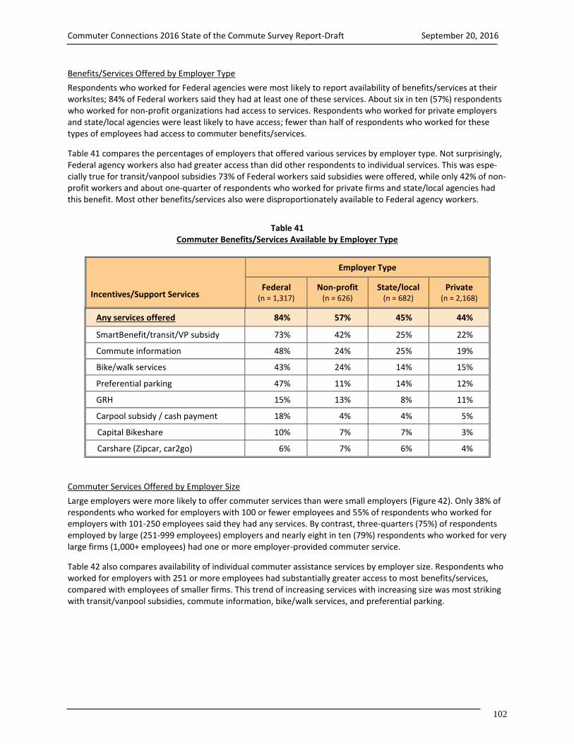
Commuter Connections 2016 State of the Commute Survey Report-Draft September 20, 2016
102
Benefits/Services Offered by Employer Type
Respondents who worked for Federal agencies were most likely to report availability of benefits/services at their worksites; 84% of Federal workers said they had at least one of these services. About six in ten (57%) respondents who worked for non-profit organizations had access to services. Respondents who worked for private employers and state/local agencies were least likely to have access; fewer than half of respondents who worked for these types of employees had access to commuter benefits/services.
Table 41 compares the percentages of employers that offered various services by employer type. Not surprisingly, Federal agency workers also had greater access than did other respondents to individual services. This was espe-cially true for transit/vanpool subsidies 73% of Federal workers said subsidies were offered, while only 42% of non-profit workers and about one-quarter of respondents who worked for private firms and state/local agencies had this benefit. Most other benefits/services also were disproportionately available to Federal agency workers.
Table 41 Commuter Benefits/Services Available by Employer Type
Incentives/Support Services
Employer Type
Federal (n = 1,317)
Non-profit (n = 626)
State/local (n = 682)
Private (n = 2,168)
Any services offered 84% 57% 45% 44%
SmartBenefit/transit/VP subsidy 73% 42% 25% 22%
Commute information 48% 24% 25% 19%
Bike/walk services 43% 24% 14% 15%
Preferential parking 47% 11% 14% 12%
GRH 15% 13% 8% 11%
Carpool subsidy / cash payment 18% 4% 4% 5%
Capital Bikeshare 10% 7% 7% 3%
Carshare (Zipcar, car2go) 6% 7% 6% 4%
Commuter Services Offered by Employer Size
Large employers were more likely to offer commuter services than were small employers (Figure 42). Only 38% of respondents who worked for employers with 100 or fewer employees and 55% of respondents who worked for employers with 101-250 employees said they had any services. By contrast, three-quarters (75%) of respondents employed by large (251-999 employees) employers and nearly eight in ten (79%) respondents who worked for very large firms (1,000+ employees) had one or more employer-provided commuter service.
Table 42 also compares availability of individual commuter assistance services by employer size. Respondents who worked for employers with 251 or more employees had substantially greater access to most benefits/services, compared with employees of smaller firms. This trend of increasing services with increasing size was most striking with transit/vanpool subsidies, commute information, bike/walk services, and preferential parking.

Commuter Connections 2016 State of the Commute Survey Report-Draft September 20, 2016
103
Table 42 Commuter Benefits/Services Available by Employer Size (number of employees)
Incentives/Support Services
Employer Size
1-100 (n = 2,089)
101-250 (n = 640)
251-999 (n = 779)
1,000+ (n = 1,269)
Any services offered 38% 54% 75% 79%
SmartBenefit/transit/VP subsidy 20% 36% 52% 63%
Commute information 14% 24% 39% 48%
Bike/walk services 10% 18% 35% 43%
Preferential parking 8% 13% 29% 44%
GRH 11% 13% 10% 14%
Carpool subsidy / cash payment 3% 7% 10% 16%
Capital Bikeshare 3% 5% 11% 9%
Carshare (Zipcar, car2go) 2% 6% 10% 7%
Services Offered by Employer Location
Finally, the analysis examined availability of services by respondents’ work locations, divided into the three “ring” designations described earlier: Inner Core (Alexandria, Arlington, and the District of Columbia), Middle Ring (Fair-fax, Montgomery, and Prince George’s), and Outer Ring (Calvert, Charles, Frederick, Loudoun, and Prince William). Inner Core respondents had greater access to benefits/services than did other respondents (Table 43). Seven in ten Inner Core workers said they had commute services, while only about half (47%) of Middle Ring workers and 35% of Outer Ring workers had services available.
Table 43 Commuter Benefits/Services Available by Work Area
Incentives/Support Services
Work Area
Inner Core (n = 2,276)
Middle Ring (n = 1,648)
Outer Ring (n = 1,145)
Any services offered 70% 47% 35%
SmartBenefit/transit/VP subsidy 57% 25% 10%
Commute information 31% 26% 16%
Bike/walk services 32% 17% 11%
Preferential parking 23% 21% 13%
GRH 13% 11% 11%
Carpool subsidy / cash payment 10% 7% 5%
Capital Bikeshare 10% 3% 1%
Carshare (Zipcar, car2go) 7% 5% 2%

Commuter Connections 2016 State of the Commute Survey Report-Draft September 20, 2016
104
The higher share of Inner Core workers with commute services was primarily due to their much greater access to transit subsidies; 57% of Inner Core workers reported this service was offered, while only 25% of Middle Ring and 10% of Outer Ring workers said it was available. This largely mirrors the availability of transit service; employers in areas with limited transit operating would understandably be less likely to offer this service. Inner Core workers also had substantially higher access to bike/walk services. Again, this difference reflects the greater access to bike/walk infrastructure in the Inner Core area, when compared with the Middle Ring and Outer Ring areas.
Differences in availability of other commute services were less pronounced, particularly between Inner Core and Middle Ring workers. The percentages of Inner Core and Middle Ring workers with access to commute infor-mation, preferential parking, GRH, carpool subsidies, and carshare memberships were similar. Outer Ring workers had lower availability of nearly all services than did commuters who worked closer to the region’s urban center.
Flexible Work Schedules and Work Schedule Incentive
Availability of Flexible Work Schedules
Some employers permit employees to work a “flexible” work schedule, in which they can choose their work start and end times, so long as they meet a minimum number of weekly or daily work hours. The survey included sev-eral questions to explore the availability and extent of these schedules. Six in ten (60%) commuters said their em-ployers offered at least some degree of work schedule flexibility and 80% of respondents who had access to the schedule had used it.
Respondents who said their employers offered a flexible work schedule were asked how much earlier or later they were permitted to arrive at work, compared with the standard start time as their worksites. Over half (53%) of these employees said they could adjust their start time by more than 60 minutes and 18% were permitted to ad-just their schedule up to 60 minutes. One in ten had up to 30 minutes of flexibility and 8% could adjust their sched-ule for up to 15 minutes. The remaining 11% of respondents said the amount of flexibility varied or was deter-mined “within reason.”
Figure 96 Extent of Work Schedule Flexibility Permitted
(n = 2,780)
Work hour flexibility was more common among respondents who worked in the Inner Core; 66% of Inner Core re-spondents said their employer offered flexible schedules, while only 57% of Middle Ring and 50% of Outer Ring workers were permitted to adjust their schedules. Flexible schedules also were more likely to be offered by large employers; about 71% of respondents who worked for employers with more than 250 employees offered flexible schedules, compared with just over half (54%) of respondents who worked for smaller firms. And flexible sched-ules were most likely to be available to Federal agency workers (73%) and least likely to be offered to state/local government workers (37%).
0% 20% 40% 60% 80% 100%
8% 10% 18% 53% 11%
Up to 15 minutes Up to 30 minutes Up to 60 minutes More than 60 minutes Varies / flexible within reason

Commuter Connections 2016 State of the Commute Survey Report-Draft September 20, 2016
105
Interest in Incentive to Shift Work Schedule Outside of Peak Period
The 2016 survey included a new question to assess interest in a financial incentive for commuters who would shift their work start time to arrive before or after the peak commuting period. Commuters who had work schedule flexibility and who arrived at work between 7:00 am and 9:59 pm were asked:
“If you could receive $3 per day for each day that you arrive at work before 7:00 am or at 10:00 am or later, how likely would you be to make this change in your work schedule?”
More than half of commuters who were asked the question expressed some interest in the incentive. About 26% said they would be “very likely” to make the schedule change to take advantage of the incentive and 26% said they would be “somewhat likely” (Figure 87).
Figure 87 Likely to Shift Work Start Time Outside Peak Period to Receive Incentive
(n = 2,004) Interest by Extent of Work Schedule Flexibility – Respondents’ willingness to change their schedule to receive the incentive was inversely-related to the amount of flexibility their employer permitted (Table 44).
Table 44 Likely to Shift Work Start Time Outside Peak Period by Amount of Work Schedule Flexibility Permitted
Schedule Flexibility
Not Likely / Don’t know
Somewhat Likely
Very Likely
Somewhat or Very Likely
Up to 15 minute (n = 105) 38% 19% 43% 62%
Up to 30 minutes (n = 163) 46% 27% 27% 54%
Up to 60 minutes (n = 336) 45% 35% 20% 55%
More than 60 minutes (n = 232) 51% 24% 25% 49%
Varies (n = 232 47% 27% 26% 53%
Don’t know, 3%
Not likely, 45%
Somewhat likely, 26%
Very likely, 26%

Commuter Connections 2016 State of the Commute Survey Report-Draft September 20, 2016
106
Respondents who were allowed a maximum 15 minute schedule adjustment were notably more likely to consider changing their schedule; 62% said they were somewhat or very likely and 43% were very likely. Among respond-ents with 30 or 60 minutes of adjustment, about 55% were likely to change their schedule. Respondents who had the greatest opportunity to change their schedule, with more than one hour of adjustment permitted, were least likely to be interested in making the schedule change to receive the incentive. Interest by Home and Work Location – Respondents who lived in the Middle and Outer Ring sub-areas expressed slightly greater interest in the incentive than did respondents who lived in the Inner Core and greater “very likely” interest (Table 45). Overall interest was similar across work locations, except that higher shares of Middle Ring and Outer Ring respondents said they were “very likely” to make the schedule change, while “somewhat likely” was a more common Inner Core worker response.
Table 45 Likely to Shift Work Start Time Outside Peak Period by Home and Work Area
Home and Work Area
Not Likely / Don’t know
Somewhat Likely
Very Likely
Somewhat or
Very Likely
Home Area
Inner Core (n = 700) 52% 28% 20% 48%
Middle Ring (n = 608) 47% 24% 29% 53%
Outer Ring (n = 763) 46% 28% 26% 54%
Work Area
Inner Core (n = 1,074) 49% 29% 22% 51%
Middle Ring (n =648) 48% 23% 29% 52%
Outer Ring (n =346) 47% 21% 32% 53%
Interest by Demographic Sub-group – Interest in the work schedule incentive was stronger among Hispanic and African-American respondents; 64% of Hispanics and 62% of African-Americans said they were likely to adjust their work schedule to receive the incentive, compared with 45% of Whites. Female respondents were more interested (58%) than were male respondents (46%). In addition, respondents who did not have children in the household were more interested (55%) than were respondents who had one or more children at home (49%).
Younger respondents expressed substantially greater interest in the incentive than did older respondents (Figure 88). Two-thirds (67%) of respondents who were under 35 years of age said they would be likely to shift their sched-ule to receive the incentive and 35% would be very likely. Both overall likelihood and strong likelihood (very likely) declined with increasing age. Among respondents who were 55 or older, only 36% said they would be likely to make a schedule adjustment and 19% would be very likely. These results might suggest that young respondents were more motivated by the financial incentive than older respondents. Another explanation could be that older respondents had greater personal constraints on their time, which made it less feasible for them to make such schedule adjustments.

Commuter Connections 2016 State of the Commute Survey Report-Draft September 20, 2016
107
Figure 88 Likely to Shift Work Start Time Outside Peak Period by Respondent Age
(Uner 35 years years n = 268, 35-44 years n = 448, 45-54 years n =626, 55 year and older n = 663) The data also indicated a strong relationship between interest in the incentive and respondent income, with inter-est declining steadily as income increased (Figure 89). Three-quarters (76%) of respondents with household in-comes of less than $60,000 per year said they would be likely to shift their schedule to receive the incentive and 40% would be very likely. Among respondents with incomes of between $60,000 and $159,999, about six in ten were likely to make the change. Among respondents with incomes of $160,000 or more, only 43% would be likely to make a schedule adjustment and just 19% would be very likely.
Figure 89 Likely to Shift Work Start Time Outside Peak Period by Respondent Annual Household Income
Under $60,000 n = 112, $60,000-$119,999 n = 432, $120,000-$159,999 n = 349, $160,000 or more n = 716) Interest by Commute Mode and Commute Distance – Respondents who commuted primarily by bus reported no-tably higher interest in the incentive than did respondents who used any other mode (Table 46). Nearly two-thirds (65%) of bus riders were at least somewhat likely to make the schedule change to receive the incentive and 42% said they were very likely. Interest was similar among carpoolers, train, riders, and respondents who drove alone to work, with about half of these commuters saying they were likely to make the schedule change. Bike/walk com-muters expressed the least interest.
0%
20%
40%
60%
80%
100%
Under 35 years 35-44 years 45-54 years 55 years or older
32% 25% 25% 17%
35%
28%19%
19%
67%
53%44%
36%
Very likely
Somewhat likely
0%
20%
40%
60%
80%
100%
Under $60,000 $60,000-$119,999 $120,000-$159,999 $160,000 or more
36% 32%22% 24%
40%28%
33%19%
76%
60% 55%43%
Very likely
Somewhat likely

Commuter Connections 2016 State of the Commute Survey Report-Draft September 20, 2016
108
Table 46 Likely to Shift Work Start Time Outside Peak Period by Commute Mode and Commute Distance
Not Likely / Don’t know
Somewhat Likely
Very Likely
Somewhat or
Very Likely
Commute Mode
Bus (n = 138) 36% 22% 42% 64%
Carpool (n = 127) 46% 32% 22% 54%
Train (n = 389) 48% 28% 24% 52%
Drive alone (n = 1,126) 49% 24% 27% 51%
Bike/walk (n = 87) 54% 28% 18% 46%
Commute Distance
Less than 10 mi (n = 699) 50% 25% 25% 50%
10 – 19.9 mi (n = 479) 51% 26% 23% 51%
20 or more mi (n = 730) 44% 27% 29% 56%
Commuters who traveled farther to work also expressed greater interest (Table 46). More than half (56%) of com-muters who traveled 20 or more miles to work were somewhat or very interested, compared with about half of respondents who traveled shorter distances.
Parking Facilities and Services
Respondents also were asked about the parking services available at their worksites. These results are displayed in Table 47 for 2013, 2010, 2007, and 2004.
Table 47 Parking Facilities / Services Offered by Employers – 2016, 2013, 2010, 2007, 2004
Parking Facilities and Services 2016 SOC (n =5,093)
2013 SOC (n = 5,524)
2010 SOC (n = 5,819)
2007 SOC (n =5,426)
2004 SOC (n = 6,866)
Free on-site parking (all employees) 64% 63% 63% 65% 66%
Free off-site parking (some employees)* 6% ---- ---- ---- ----
Free off-site parking 1% 2% 2% 4% 3%
Employee pays all parking charges 24% 23% 22% 21% 21%
Employee/employer share parking charge 5% 7% 7% 7% 6%
Parking discounts for CP/VP** 14% 14% 16% 15% 14%
* Follow-up question about parking offered to some employees was added in 2016 ** Percentages of parking discounts for CP/VP are calculated on a base of respondents who do not have free parking availa-
ble. These sample sizes are (2016 n = 1,148, 2013 n = 1,438, 2010 n = 1,610; 2007 n = 1,674; 2004 n = 1,752)

Commuter Connections 2016 State of the Commute Survey Report-Draft September 20, 2016
109
The majority of respondents (64%) across the region said their employers provided “free parking for all employ-ees” at the worksite. One percent said the employer offered “free parking off-site.” An additional 6% of respond-ents said their employers did not provide free parking to all employees, but that they personally had free parking. This follow-up question was not asked prior to the 2016 survey, so no data were available for previous years.
About three in ten said they paid at least part of the cost of parking; 24% paid the total cost and 5% paid a portion of the cost with the balance paid by their employers. The availability of free parking has remained relatively stable over the past 12 years. Parking by Employer Type, Employer Size, and Work Location – Figure 90 displays free parking availability by em-ployer type, employer size, and the location of the respondents’ worksite. Federal agency workers and respond-ents who worked for non-profit organizations were least likely to have free parking at work. About 44% of re-spondents who worked for Federal agencies and 54% of respondents who worked for a non-profit said their em-ployers provided free on-site parking to all employees. By contrast, 74% of respondents who worked for state and local agencies and 70% of private sector employees said they had free parking.
Figure 90 On-site Free Parking Availability by Employer Type, Employer Size, and Work Area
(Employer Type – Federal n = 1,317, Non-profit n = 626, Private n = 2,169, State/local n = 682)
(Employer Size – 1-100 n = 2,091, 101-250 n = 641, 251-999 n = 779, 1,000+ n = 1,269)
(Work Area – Inner Core n = 2,277, Middle Ring n = 1,647, Outer Ring n = 1,146)
0% 20% 40% 60% 80% 100%
Federal agency
Non-profit organization
Private employer
State / local agency
1 - 100 employees
101 - 250 employees
251 - 999 employees
1,000 or more employees
Inner Core
Middle Ring
Outer Ring
44%
54%
70%
74%
71%
65%
53%
47%
31%
83%
90%
Employer Type
Employer Size
Work Area

Commuter Connections 2016 State of the Commute Survey Report-Draft September 20, 2016
110
Respondents who worked for large employers were less likely to have free parking. About half of respondents who were employed by employers with 251 or more employees had free parking, compared with at least two-thirds of respondents who worked for employers with 250 or fewer employees. Dramatic differences in availability of free parking also were noted for respondents who worked in different parts of the region. Only three in ten (31%) Inner Core workers said their employers offered free parking to all employ-ees, compared to more than eight in ten (83%) respondents who worked in the Middle Ring and nine in ten (90%) respondents who worked in the Outer Ring. Availability of Commuter Assistance Services/Benefits Offered by Availability of Free Parking
The availability of commute benefits/services was inversely related to the availability of free parking at the worksite. As shown in Figure 91, less than half (46%) of respondents who said free parking was offered to all em-ployees said their employers also offered commute benefits/services that would encourage or help them use alter-native modes for commuting. By contrast, 72% of respondents who said free parking was not available reported having access to commute benefits/services at work.
Figure 91 Commuter Benefits/Services Offered by Free Parking Available
(Free parking available n = 3,136, NO free parking n = 1,830)
Impact of Commute Assistance Services and Parking
Commute Mode by Commute Assistance Benefits/ Services Offered
Figure 92 presents the share of commuters who used various commute modes by whether or not commute assis-tance benefits/services were available at their worksites. Respondents who had access to alternative mode bene-fits/services were less likely to drive alone (55%) than were respondents whose employers did not provide these services (76%).
Train use was particularly higher for respondents with commute services; 23% of respondents whose employers offered commute benefits/services rode the train to work, compared with 9% of respondents whose employers did not offer these services. Bus use among respondents who had access to commute benefits/services was twice as high (8%) as for respondents with no services (4%). Carpool/vanpool and bike/walk mode shares did not differ substantially for the “with services” and “without services” cases.
0% 20% 40% 60% 80% 100%
Free parking offered
NO free parking
46%
72%
54%
28%
Commute services offered
Commute services NOT offered

Commuter Connections 2016 State of the Commute Survey Report-Draft September 20, 2016
111
Figure 92 Primary Commute Mode by Commute Benefits/Services Offered
(Services offered n = 2,909, Services not offered n = 2,152)
These differences are significant at the 95% confidence level, but it is not possible to say that the availability of these services was the only reason, or even the primary reason, for differences in mode use. As noted before, em-ployers in the Inner Core were much more likely than were employers in the Middle Ring and Outer Ring to offer commuter assistance services and drive alone rates were much lower for respondents who worked in the Core (41%) than for respondents who worked in either the Middle Ring (65%) or Outer Ring (75%).
However, respondents who worked in the Inner Core also could be faced with greater impediments to driving alone. For example, Inner Core workers commuted an average of 44 minutes one-way, compared with 36 minutes for Middle Ring workers and 35 minutes for Outer Ring workers. And respondents who worked in the Inner Core also might experience greater congestion levels and have greater availability of commute options, such as transit, than would be experienced by workers outside this area. Any of these factors might have been at least as im-portant in influencing respondents’ commute mode choices. Commute Mode by Parking Services Offered
Figure 93 presents a comparison of mode use rates for respondents who had free on-site parking at work and those who either had to pay for parking. The difference in drive alone rates for these two groups was dramatic; 80% of respondents whose employers offered free parking drove alone, compared with only 42% of respondents who did not have this benefit.
Respondents who had to pay for parking used all alternative modes at higher rates than did respondents with free parking. The difference was especially striking for use of transit; train mode share was nearly six times as high for respondents who had to pay to park as for respondents who had free parking. Bus use also was much higher for respondents who did not have free parking. Many other surveys and research studies have documented the im-portant role parking availability and cost play in commute decisions.
0% 20% 40% 60% 80% 100%
Drive alone
Train
Bus
Carpool/Vanpool
Bike/walk
55%
23%
8%
6%
4%
76%
9%
4%
5%
3%
Services offered
Services not offered

Commuter Connections 2016 State of the Commute Survey Report-Draft September 20, 2016
112
Figure 93 Primary Commute Mode by Free Parking Available at Work
(No free parking n = 1,830, Free parking offered n = 3,138)
Commute Mode by Commute Benefits/Services and Parking Services in Combination
Finally, Figure 94 presents a comparison of drive alone and public transit use by the combination of free parking and commute benefits/services. The top section of the figure shows the mode shares at worksite where free on-site parking was offered and commute benefits/services were and were not available. The bottom section shows the mode shares when free parking was not available and commute benefits/services were and were not offered.
Figure 94 Drive Alone and Transit Mode Use by Combination of Free Parking and Commute Benefits/Services Offered
(Free parking, no commute services n = 1,648, Free parking, with commute services n = 1,468)
(No free parking, no commute services n = 443, No free parking, with commute services n = 1,383)
0% 20% 40% 60% 80% 100%
Drive alone
Train
Bus
Carpool/Vanpool
Bike/walk
42%
34%
9%
7%
5%
80%
6%
4%
5%
3%
NO free parking
Free parking offered
0% 20% 40% 60% 80% 100%
Free parking, no commute services
Free parking, with commute services
No free parking, no commute services
No free parking, with commute services
85%
74%
55%
37%
6%
14%
31%
47%
Drive alone
Transit

Commuter Connections 2016 State of the Commute Survey Report-Draft September 20, 2016
113
The drive alone mode share declined steadily across the four cases, indicating that both parking cost and commute services influenced commuters’ choice of driving alone. When parking was free and no commute services were available, 85% of respondents drove alone to work. The drive alone rate dropped to 74% among respondents who had free parking, but when commute services were added.
When no free parking was available, the drive alone rate was 55% even when no commute services were offered. This was fully 30 percentage points below the rate when parking was free and commute services were not offered, suggesting that parking charges can have a substantial impact on drive alone mode share, even in the absence of commute services. But when commute services were added, on top of parking charges, the drive alone mode share fell an additional 18 percentage points, to 37%, indicating that commute services also play a motivating role in commute mode choice.
The reverse pattern was clear for use of public transit. When free parking was offered, 6% of respondents used public transit when no commute benefits/services were available and 14% used public transit when they had ac-cess to commute benefits/services. At worksites where parking was not free, 31% of respondents used transit when they did not have access to commute benefits/services and 47% used transit when commute benefits/ser-vices were offered.
The figure does not show mode shares for bike/walk or for carpool/vanpool. Bike/walk mode use showed differ-ences by access to both parking and commute services. For respondents who reported free parking, bike/walk mode use was 4% when commute benefits/services were offered, compared with 2% without services. When park-ing was not free, bike/walk mode use was 5% when services were available, compared with 3% for the no com-mute benefits/services case. Carpool/vanpool mode use was essentially the same across the four parking/service categories, ranging only from 5% to 6%.

Commuter Connections 2016 State of the Commute Survey Report-Draft September 20, 2016
114
APPENDICES Appendix A – Survey Data Expansion Appendix B – Final Dialing Disposition Appendix C – Survey Questionnaire Appendix D – Instructions and Definitions of Terms Appendix E – Comparison of Key 2016 SOC Results with 2013, 2010, 2007, and 2004 SOC Results

Commuter Connections 2016 State of the Commute Survey Report-Draft September 20, 2016
115
APPENDIX A SURVEY DATA WEIGHTING AND EXPANSION The 2016 SOC Survey was conducted using an overlapping, dual frame sampling design. That is, a random sample was drawn from two separate sample groups – cellular phone respondents and landline phone respondents. Sur-vey responses were adjusted for the overlap in the dual frame sampling and then, expanded numerically by expan-sion factors. The expansion factors were applied to each survey interview to align them with published, employ-ment, race/ethnic and age group information for each of the 11 study areas. The procedure for the dual frame sampling adjustment, expansion to employment, and weighting for race/ethnic and age distribution for the 11-area, Washington, DC, metropolitan region is described below.
Beginning in 2013, the project team included cell phone users as eligible respondents, in addition to landline phone users. This method was continued for the 2016 SOC Survey. The dual frame sampling design was a change from the 2010 study, which surveyed only landline respondents. The change was necessary, however, because the proportion of “cell phone only” (CPO) households, that is, households that do not have a landline phone, has greatly increased in the past few years and now is estimated at 30% region-wide. Cell phone survey research has shown that CPO households have different demographics from those with landline phones – younger, higher share of non-White, and lower incomes - thus their travel patterns also could be different.
After the survey fieldwork was completed, the dataset was prepared for pre-weighting, a necessary step to ac-count for the use of dual frame sampling. This pre-weight calculation adjusts for the possibility that a respondent could have access to a landline only, to a cellphone only, or to both a landline and cellphone. Respondents who have access to both a landline and cellphone would have a higher probability of being selected for the survey, be-cause they have two possible contact phone numbers. The calculation for the pre-weighting step is described be-low. Figure A-1 shows the overlap of the two sample groups.
A pre-weighting factor is calculated for both the landline and cell phone sample groups. The factor is comprised of two components. The first component adjusts for the ratio of individuals to phones. That is, for each sample group, a number is calculated to express the ratio between the number of adults to the number of phone lines. For cell phones, one adult is assumed to be the owner and only user of the cell phone, resulting in the first, pre-weight component equaling one. For landlines, multiple adults may use the same landline or landlines within the house-hold, resulting in a first, pre-weight component equaling the calculated ratio.
The second component adjusts for the increase in the probability of selection for respondents who have both cell phones and landlines, since the sample groups are not mutually exclusive. This adjustment calculation uses the number of interviews within the overlap (interviews where the respondent indicates both landline and cell phone access), creating two adjustment proportions, where: λl + λc = 1.
Landline Only
Cell Only
Both Landline and Cell Phone Landline Telephone Frame
Figure A-1 - Overlapping Dual Frame Sample
Cellular Telephone Frame

Commuter Connections 2016 State of the Commute Survey Report-Draft September 20, 2016
116
The adjustment factor for landlines, λl, is calculated by taking the number of interviews made by landline within the overlap and dividing by the total number of interviews within the overlap. The adjustment factor for cell phones, λc, is calculated by taking the number of cell phone interviews within the overlap and dividing by the total number of interviews within the overlap. The formula for the two pre-weight calculations is shown below: Landline Pre-weight Dual Frame Sample: # Adults x λl # Landlines Cell Phone Pre-weight Dual Frame Sample: 1 Adult x λc
1 Cell Phone Following the initial data expansion, the project team carried out a series of statistical analysis calculations to test survey results for race/ethnicity and age groups to known employment information using the same categories. Performing chi-squared calculations, the majority of race/ethnicity and age distributions by jurisdictions were found to be significantly different when compared to the published American Community Survey (ACS) tables. Based upon this information, expansion factors accounting for employment, race/ethnicity, and age groups were applied to survey results.
Table A-1 shows the number of employed workers living in each of the 11 areas and the number of employed per-sons surveyed. After determining the dual frame adjustment, these figures were used in computing the initial ex-pansion factors applied to each survey response.
Table A-1 – Estimate of Workers by Survey Area and Expansion Factors
Survey Area Estimated Em-
ployed Workers Totals from ACS
Number of Working Persons
Interviewed
Dual Frame Adjustment
Factor
Initial Adjustment and Expansion
Factors
Alexandria City, VA 95,514 506 737 130
Arlington Co., VA 150,232 549 810 185
Calvert Co., MD 44,833 474 904 50
Charles Co., MD 76,316 485 914 83
District of Columbia 340,300 599 844 403
Fairfax Co., VA 630,828 587 859 734
Frederick Co., MD 125,423 514 904 139
Loudoun Co., VA 182,830 563 892 205
Montgomery Co., MD 570,272 569 857 665
Prince George’s Co., MD 493,283 509 869 568
Prince William Co., VA 230,692 548 918 251
Total 2,940,524 5,903
The ACS was used to calculate the expansion factor of employed persons by race/ethnicity and by age group. Divid-ing the ACS estimate by the number of interviews after the dual frame adjustment yielded the employment expan-sion factor by jurisdiction. These factors were then applied to each survey response, allowing the survey results to be expanded to the employment totals for each of the 11 areas. The expansion methodology also adjusted the sample for race/ethnicity and age bias. Race/ethnicity corrections had been applied to previous SOC survey, but the age adjustment was added in 2016 to correct for an age bias identified during the initial analysis.

Commuter Connections 2016 State of the Commute Survey Report-Draft September 20, 2016
117
Two tables from ACS were used for the development of expansion factors, Tables B01001 and B23002. Table B01001 contained more complete information for all jurisdiction residents by race/ethnicity and by age groups for persons 18 year of age and older, however not by employed persons. Table B23002 contained information for em-ployed residents for persons 16 years of age and older, and race/ethnicity broken down by age groups, but some race/ethnicity groups were missing, and age categories were not completely broken down into the desired age groups. Using Table B01001 as the base, a percentage of employment was developed from Table B23002 for each race/ethnicity by age groups by jurisdiction and applied to Table B01001 counts. The resulting estimates of em-ployment for residents 18 years of age and over by race/ethnicity were finalized and applied to the SOC Survey responses. The final expansion factors are shown in Table A-2 below.
Table A-2 – Race/Ethnicity and Age Weighting Factors by Survey Area
Race/Ethnicity and Age Weighting Factors
Survey Area 18 – 34 Years
35 – 44 Years
45 – 54 Years
55+ Years
Alexandria City, VA 6,899 4,642 3,742 2,465
Black 18,802 12,090 9,646 10,801
White 6,228 3,818 2,424 1,258
Hispanic 6,113 3,470 1,757 1,359
Other 6,899 4,642 3,742 2,465
Arlington Co., VA
Black 3,639 2,283 2,146 1,474
White 43,879 19,383 15,535 15,460
Hispanic 8,646 4,971 3,549 2,243
Other 13,405 6,700 4,133 2,784
Calvert Co., MD
Black 1,584 1,120 1,570 1,106
White 9,547 7,356 10,888 8,690
Hispanic 475 297 327 139
Other 478 382 612 261
Charles Co., MD
Black 8,593 9,081 9,246 3,922
White 10,098 7,082 10,369 8,655
Hispanic 1,493 913 657 297
Other 1,926 1,816 1,298 870
District of Columbia
Black 38,112 23,130 27,937 26,450
White 80,363 30,416 19,911 23,776
Hispanic 16,190 8,465 5,524 3,263
Other 18,637 8,955 5,208 3,964
Fairfax Co., VA
Black 18,226 14,038 14,455 10,145
White 84,275 66,221 84,452 89,216
Hispanic 38,462 26,083 19,028 11,191
Other 53,935 41,709 34,157 25,234
Table A-2 continued on following page
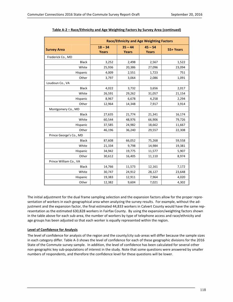
Commuter Connections 2016 State of the Commute Survey Report-Draft September 20, 2016
118
Table A-2 – Race/Ethnicity and Age Weighting Factors by Survey Area (continued)
Race/Ethnicity and Age Weighting Factors
Survey Area 18 – 34 Years
35 – 44 Years
45 – 54 Years
55+ Years
Frederick Co., MD
Black 3,252 2,498 2,567 1,522
White 25,936 20,386 27,096 23,094
Hispanic 4,009 2,551 1,723 751
Other 3,797 3,064 2,086 1,091
Loudoun Co., VA
Black 4,022 3,732 3,656 2,017
White 26,591 29,262 31,057 21,154
Hispanic 8,967 6,678 4,258 2,294
Other 12,964 14,348 7,917 3,914
Montgomery Co., MD
Black 27,635 21,774 21,341 16,174
White 60,544 48,976 66,906 79,726
Hispanic 37,585 24,982 18,662 11,667
Other 46,196 36,240 29,557 22,308
Prince George’s Co., MD
Black 87,608 66,052 75,268 59,558
White 21,334 9,798 14,984 19,381
Hispanic 34,942 19,775 11,577 5,907
Other 30,612 16,405 11,110 8,974
Prince William Co., VA
Black 14,766 11,573 12,161 7,172
White 30,747 24,912 28,127 23,648
Hispanic 19,383 12,911 7,964 4,020
Other 12,382 9,604 7,021 4,302
The initial adjustment for the dual frame sampling selection and the expansion factors allow for the proper repre-sentation of workers in each geographical area when analyzing the survey results. For example, without the ad-justment and the expansion factor, the final estimated 44,833 workers in Calvert County would have the same rep-resentation as the estimated 630,828 workers in Fairfax County. By using the expansion/weighting factors shown in the table above for each sub-area, the number of workers by type of telephone access and race/ethnicity and age groups has been adjusted so that each worker is equally represented within the region. Level of Confidence for Analysis
The level of confidence for analysis of the region and the county/city sub-areas will differ because the sample sizes in each category differ. Table A-3 shows the level of confidence for each of these geographic divisions for the 2016 State of the Commute survey sample. In addition, the level of confidence has been calculated for several other non-geographic key sub-populations of interest in the study. Note that some questions were answered by smaller numbers of respondents, and therefore the confidence level for these questions will be lower.
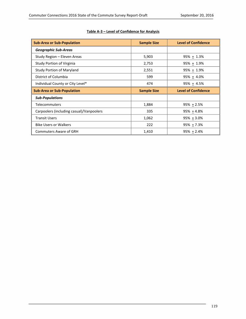
Commuter Connections 2016 State of the Commute Survey Report-Draft September 20, 2016
119
Table A-3 – Level of Confidence for Analysis
Sub-Area or Sub-Population Sample Size Level of Confidence
Geographic Sub-Areas
Study Region – Eleven Areas 5,903 95% + 1.3%
Study Portion of Virginia 2,753 95% + 1.9%
Study Portion of Maryland 2,551 95% + 1.9%
District of Columbia 599 95% + 4.0%
Individual County or City Level* 474 95% + 4.5%
Sub-Area or Sub-Population Sample Size Level of Confidence
Sub-Populations
Telecommuters 1,884 95% + 2.5%
Carpoolers (including casual)/Vanpoolers 335 95% + 4.8%
Transit Users 1,062 95% + 3.0%
Bike Users or Walkers 222 95% + 7.3%
Commuters Aware of GRH 1,410 95% + 2.4%

Commuter Connections 2016 State of the Commute Survey Report-Draft September 20, 2016
120
Figure A-2. Weighting and Expansion for Working Households Example: Montgomery County, MD Objective: Apply the survey results (569 respondents) to the American Community Survey Statistics (570,272) for Montgomery County, MD, to equally represent employed individuals by race/ethnicity and age groups.
_______ Note: 1. 857 x 665.428 = 570,272 individuals. 2. Final expansion estimates for workers by race/ethnicity and by age group for Montgomery County. 3. Sum of Race/Ethnicity and Age Groups represents workers in Montgomery County.
Survey Results
569 Respondents
1 Initial
Expanded Survey Results
570,272 Individuals
570,272 / 857 = 665.428
3
Adjusted, Expanded, and Weighted
Survey Results
570,272 Individuals
2 Black 86,924 18–34 years 171,960 Hispanic 92,896 35-44 years 131,972 White 256,152 45-54 years 136,465 Other 134,300 55+ years 129,875
Dual Frame Adjustment 857 Pre-Weight
Develop ACS Ex-pansion Factor
Apply Race/Eth-nicity/
Age Expansion Factor

Commuter Connections 2016 State of the Commute Survey Report-Draft September 20, 2016
121
APPENDIX B – DIALING DISPOSITIONS
Dialing Disposition
Landline Calls Cell Phone Calls Total
Count Percent Count Percent Count Percent
Answering Machine 121,542 15.6% 19,695 59.4% 141,237 17.4%
No Answer 10,758 1.4% 576 1.7% 11,334 1.4%
Call Backs 19,355 2.5% 2,334 7.0% 21,689 2.7%
Busy 191,265 24.6% 502 1.5% 191,767 23.6%
Over quota 119 0.0% 48 0.1% 167 0.0%
Total Lives 343,039 44.0% 23,155 69.8% 366,194 45.1%
Not in service 356,495 45.8% 989 3.0% 357,484 44.0%
Business 19,250 2.5% 720 2.2% 19,970 2.5%
Fax 20,306 2.6% 22 0.1% 20,328 2.5%
Refusals 30,991 4.0% 5,410 16.3% 36,401 4.5%
Other language 1,080 0.1% 219 0.7% 1,299 0.2%
Terminates during interview 626 0.1% 137 0.4% 763 0.1%
Terminates – screened out 2,071 0.3% 1,168 3.5% 3,239 0.4%
Never available 367 0.0% 56 0.2% 423 0.1%
Blocked Number 327 0.0% 298 0.9% 625 0.1%
Minor’s Cell Phone 54 0.0% 244 0.7% 298 0.0%
Total Deads 431,567 55.4% 9,263 27.9% 440,830 54.3%
Total Completed Interviews 4,278 0.6% 751 2.3% 5,029 0.6%
Total Sample Used 778,884 100.0% 33,169 100.0% 812,053 100.0%
Number of Dialing At-tempts
1,793,172 62,307 1,855,479
Average Dialed per Com-pleted Interview
419 83 369
Average Dialed per Sample 2.30 1.88 2.28

Commuter Connections 2016 State of the Commute Survey Report-Draft September 20, 2016
122
APPENDIX C – SURVEY QUESTIONNAIRE NOTE – COMBINED LANDLINE AND CELL PHONE SCREENERS TOGETHER ALL RESPONDENTS WILL BE ASKED IF THEY ARE ON A CELL PHONE INTRO AND SCREENING QUESTIONS LANDLINE INTRODUCTION Hello. My name is . I’m calling (from CIC Research) on behalf of the Metropolitan Washington Council of Govern-ments . We’re talking to residents of Maryland, Virginia, and the District of Columbia about their travel to work. (IF NECESSARY: This is a genuine survey. No attempt will be made to sell you anything. Your answers will be kept completely con-fidential and will be used only together with those of other respondents.) Is now a good time? (IF YES, CONTINUE TO QSA) (IF NO, ARRANGE CALL BACK) CELLPHONE INTRODUCTION Hello. My name is . I’m calling (from CIC Research) on behalf of the Metropolitan Washington Council of Govern-ments. We’re talking to residents of Maryland, Virginia, and the District of Columbia about their travel to work. SCREENING QUESTIONS (Cell phone safety, Age, Employment, Home location) SA Did I reach you on a cell phone for this call?
1 Yes 2 No (SKIP TO S4) 9. DK/Refused (THANK AND TERMINATE)
SB Are you in a place where it is safe to talk?
1 Yes – CONTINUE INTERVIEW WITH QSB2 2 No – SAY: I’ll call back another time (TERMINATE) 9 Refused (THANK & TERMINATE)
SB2 Are you driving right now?
1 Yes – ASK QSC 2 No – CONTINUE INTERVIEW WITH QS2
SC I’d like to schedule a time to call you back either on this number or on a landline phone number. Which would you
prefer?
1 Schedule callback 2 Call back on landline phone (record phone number) 3 Cell phone used for business only (THANK & TERMINATE, CODE AS BUSINESS) 9 Refused (THANK & TERMINATE)
S3 Are you an employed person who is at least 18? By employed, I mean a wage or salaried employee, military, or self-
employed…
1 Yes (SKIP TO Q1) 2 No (THANK AND TERMINATE)
S4 Are you an employed person who is at least 18? By employed, I mean a wage or salaried employee, military, or self-
employed…
1 Yes (SKIP TO Q1) 2 No (ASK QS5)

Commuter Connections 2016 State of the Commute Survey Report-Draft September 20, 2016
123
S5 Is anyone else in your household employed either full-time or part-time?
1 Yes (ASK FOR THAT PERSON AND REPEAT INTRO, THEN GO BACK TO QS4 OR ARRANGE CB) 2 No (THANK AND TERMINATE)
1 Are you employed full-time or part-time? IF RESPONDENT SAYS HE/SHE WORKS MORE THAN ONE JOB, SAY “Do you work full-time or part-time at your primary job?”
1 Employed full-time (CONTINUE) 2 Employed part-time (CONTINUE) 3 Not employed, keeping house, retired, disabled, full-time student, looking for work (GO BACK TO QS5) 8 Don’t know 9 Refuse (THANK & TERMINATE)
1a What is your home zip code?
________________ HOME CLASSIFICATION AUTOCODE COUNTY FOR CHANTILLY
IF Q1a = 20151, AUTOCODE Q2 = 6 (Fairfax), THEN SKIP TO Q3 IF Q1a = 20152, AUTOCODE Q2 = 8 (Loudoun), THEN SKIP TO Q3
AUTOCODE ALEXANDRIA (EXCEPT 22311) IF Q1a = 22301, 22302, 22304, 22305, OR 22314, AUTOCODE Q2 = 1 (Alexandria), THEN SKIP TO Q3 IF Q1a = 22303, 22306, 22307, 22308, 22309, 22310, OR 22315, AUTOCODE Q2 = 6 (Fairfax), THEN SKIP TO Q3
AUTOCODE TAKOMA PARK, MD, TAKOMA DC IF Q1a = 20903, 20910, 20912, 20913, AUTOCODE Q2 = 9 (Montgomery), THEN SKIP TO Q3 IF Q1a = 20011 OR 20012, AUTOCODE Q2 = 5 (DC), THEN SKIP TO Q3
AUTOCODE LAUREL IF Q1a = 20707 OR 20708, AUTOCODE Q2 = 10 (Prince Georges), THEN SKIP TO Q3 IF Q1a = 20723 OR 20724, AUTOCODE Q2 = 12 (Other –out of area), THEN THANK AND TERMINATE
AUTOCODE SILVER SPRING (EXCEPT 20903) IF Q1a = 20901, 20902, 20904, 20905, 20906, OR 20910, AUTOCODE Q2 = 9, THEN SKIP TO Q3
AUTOCODE STERLING IF Q1a = 20164, 20165, OR 20166, AUTOCODE Q2 = 8 (Loudoun), THEN SKIP TO Q3
AUTOCODE FAIRFAX AND FALLS CHURCH CITIES IF Q1a = 22030, 22041, 22042, 22043, 22044, OR 22046, AUTOCODE Q2 = 6 (Fairfax), THEN SKIP TO Q3
AUTOCODE WALDORF (EXCEPT Q20601) IF Q1a = 20602 OR 20603, AUTOCODE Q2 = 12 (Other - out of area), THEN THANK AND TERMINATE
AUTOCODE MANASSAS, MANASSAS PARK IF Q1a = 20110 OR 20113, AUTOCODE Q2 = 11, THEN SKIP TO Q3
IF Q1a = ANY OTHER ZIP CODE, ASK Q2 QUOTA SCREENER – NEED 600 IN EACH OF 11 AREAS 1 - 11

Commuter Connections 2016 State of the Commute Survey Report-Draft September 20, 2016
124
2 In what county (or Independent City) do you live now? (DO NOT READ)
1 Alexandria City, VA 2 Arlington Co., VA 3 Calvert Co., MD 4 Charles Co., MD 5 Washington, DC (District of Columbia) 6 Fairfax Co., VA (City of Falls Church, City of Fairfax) 7 Frederick Co., MD (City of Frederick) 8 Loudoun Co., VA (South Riding) 9 Montgomery Co., MD (City of Rockville, City of Gaithersburg, City of Takoma Park, Silver Spring) 10 Prince George’s Co., MD(City of Greenbelt, City of College Park, City of Bowie) 11 Prince William Co., VA (City of Manassas, City of Manassas Park) 12 Other (SPECIFY) (THANK AND TERMINATE) 88 Don’t know (THANK AND TERMINATE) 99 Refused (THANK AND TERMINATE)
IF Q2 = 5, HMST = 1 (District of Columbia) IF Q2 = 3, 4, 7, 9, OR 10, HMST = 2 (Maryland) IF Q2 = 1, 2, 6, 8, OR 11, HMST = 3 (Virginia) 3 In what county (or independent city) do you work? (IF “ALL OVER”, ASK: Where do you work the most?) (DO NOT
READ)
1 Alexandria City (VA) 2 Anne Arundel Co. (MD) 3 Arlington Co. (VA) 4 Calvert Co. (MD) 5 Charles Co. (MD) 6 Washington, DC (District of Columbia) 7 Fairfax Co. (VA) 8 Fairfax City (VA) 9 Falls Church City (VA) 10 Frederick Co. (MD) 11 Howard Co. (MD) 12 Loudoun Co. (VA) 13 Manassas City (VA) 14 Manassas Park City (VA) 15 Montgomery Co. (MD) 16 Prince George’s Co. (MD) 17 Prince William Co. (VA) 18 Stafford Co. (VA) 19 Baltimore County (MD) 20 Carroll County (MD) 21 Other 88 Don’t know 99 Refuse
IF Q3 = 6, WKST = 1 (District of Columbia) IF Q3 = 2, 4, 5, 10, 11, 15, 16, 19, OR 20, WKST = 2 (Maryland) IF Q3 = 1, 3, 7, 8, 9, 12, 13, 14, 17, OR 18, WKST = 3 (Virginia) IF Q3 = 21, 88, OR 99, WKST = 9 (Unknown)

Commuter Connections 2016 State of the Commute Survey Report-Draft September 20, 2016
125
COMMUTE PATTERNS / WORK SCHEDULE / TW STATUS Now, I’d like to ask you some questions about your commute to and from work. If you have more than one job, just tell me about your primary job. 4 First, in a TYPICAL week, how many days are you assigned to work?
days ____ “0”, not currently working 9 Refused (THANK AND TERMINATE)
IF Q4 = 0 AND RESPONDENT WAS REACHED ON CELL PHONE, THANK AND TERMINATE IF Q4 = 0 AND RESPONDENT WAS REACHED ON LANDLINE PHONE, GO BACK TO QS5 5 How many of those days are weekdays (Monday-Friday)?
days ____ “0”, (CODE AS WKALL, THEN SKIP TO Q56d1) 9 Refused (THANK AND TERMINATE)
6 And how many weekdays do you commute to a work location outside your home? (IF RESPONDENT SAYS, “VARIES
BY WEEK” OR “DON’T KNOW”, PROMPT “What would you say would be most typical?” IF RESPONDENT STILL SAYS “DON’T KNOW,” CODE AS 8)
10 None (CONTINUE TO Q8) 1 One 2 Two 3 Three 4 Four 5 Five 8 Don’t know (SKIP TO Q61) 9 Refuse (SKIP TO Q61)
IF Q1 = 2 (work part-time) AND Q6 = 1, 2, 3, 4, OR 5, SKIP TO Q13 IF Q1 = 1 OR 8 AND Q6 = 1, 2, 3, 4, OR 5, SKIP TO Q11 8 So to be sure I understand, you work at home every weekday you work. Is that right?
1 Yes (CONTINUE) 2 No (INTERVIEWER PROMPT, “SO YOU COMMUTE TO A WORK LOCATION OUTSIDE YOUR HOME ONE OR MORE
WEEKDAYS, IS THAT CORRECT?) GO BACK TO Q5) 9 Are you self-employed with your primary work location at home?
1 Yes (PROGRAMMER, CODE AS HOMEALL, THEN SKIP TO INSTRUCTIONS BEFORE Q15) 2 No (CONTINUE)
10 Do you telecommute every weekday you work?
1 Yes (PROGRAMMER, CODE AS TELEALL, SKIP TO INSTRUCTIONS BEFORE Q13) 2 No (SPECIFY SITUATION, THEN THANK AND TERMINATE)
11 Do you work a compressed schedule, for example, a full-time work week in fewer than five days?
1 Yes (CONTINUE) 2 No (SKIP TO INSTRUCTIONS BEFORE Q13)

Commuter Connections 2016 State of the Commute Survey Report-Draft September 20, 2016
126
12 What type of schedule do you work? (DO NOT READ, UNLESS NEEDED TO CLARIFY)
1 4/40 (4 10-hour days per week, 40 hours) 2 9/80 (9 days every 2 weeks, 80 hours) 3 3/36 (3 12-hour days per week, 36 hours - police, fire, hospitals) 4 N/A 5 Work 5 or more days per week, 35 or more hours per week (RECODE Q11 = 2) 6 Other (SPECIFY)
INSTRUCTIONS BEFORE Q13 IF TELEALL (FROM Q10), AUTOCODE Q13 = 1, THEN SKIP TO Q13a 13 Now I want to ask you about telecommuting, also called teleworking. For purposes of this survey, “telecommuters”
are defined as “wage and salary employees who at least occasionally work at home or at a telework or satellite center during an entire work day, instead of traveling to their regular work place.” Based on this definition, are you a tele-commuter?
1 Yes 2 No (SKIP TO Q14d) 9 DK/Ref (SKIP TO Q14d)
13a Does your employer have a formal telecommuting program at your workplace or do you telecommute under an infor-mal arrangement between you and your supervisor?
1 Formal program 2 Informal arrangement 3 N/A 9 DK/Ref
IF TELEALL AND Q5 = 1, AUTOCODE Q14 = 4, THEN SKIP TO INSTRUCTIONS BEFORE Q15 IF TELEALL AND Q5 = 2, AUTOCODE Q14 = 5, THEN SKIP TO INSTRUCTIONS BEFORE Q15 IF TELEALL AND Q5 = 3, 4, OR 5, AUTOCODE Q14 = 6, THEN SKIP TO INSTRUCTIONS BEFORE Q15
14 How often do you usually telecommute? (DO NOT READ)
1 Occasionally for special project 2 Less than one time per month/only in emergencies (e.g., sick child, snowstorm) 3 1-3 times a month 4 1 day a week 5 2 days a week 6 3 or more times a week 7 other (SPECIFY) 9 DK/Ref.
14a Thinking about a day when traffic in the region is likely to be disrupted due to a snowstorm or major or special event,
how likely are you to telecommute to avoid the traffic? Are you very likely, somewhat likely, or not likely to telecom-mute on that day?
1 Very likely 2 Somewhat likely 3 Not likely 9 Not sure
SKIP TO INSTRUCTIONS BEFORE Q15

Commuter Connections 2016 State of the Commute Survey Report-Draft September 20, 2016
127
QUESTIONS FOR NON-TELEWORKERS 14d Does your employer have a formal telecommuting program at your workplace or permit employees to telecommute
under an informal arrangement with the supervisor?
1 Yes, formal program 2 Yes, informal arrangement 3 No 9 DK/Ref
14e Would your job responsibilities allow you to work at a location other than your main work place at least occasionally?
1 Yes 2 No (SKIP TO INSTRUCTIONS BEFORE Q15) 9 DK/Ref (SKIP TO INSTRUCTIONS BEFORE Q15)
14f Would you be interested in telecommuting on an occasional or regular basis?
1 Yes, occasional basis 2 Yes, regular basis 3 No 9 DK/Ref
14g Thinking about a day when traffic in the region is likely to be disrupted due to a snowstorm or a major or special
event, how likely are you to work at home that day to avoid the traffic? Are you very likely, somewhat likely, or not likely?
1 Very likely 2 Somewhat likely 3 Not likely 9 Not sure
14h And how likely are you to work at home when you have a personal event, such as a sick child or a home delivery, or need uninterrupted time to complete a work assignment? (IF NECESSARY, REPEAT SCALE: “Are you very likely, some-what likely, or not likely to work at home on a day like this?”
1 Very likely 2 Somewhat likely 3 Not likely 9 Not sure
14k In the past year, about how many days did you work at home all day on a regular work day, instead of traveling to
your main work place?
1 0, never worked at home 2 1 - 2 days 3 3 - 4 days 4 5 - 6 days 5 7 - 9 days 6 10 or more days 9 Not sure

Commuter Connections 2016 State of the Commute Survey Report-Draft September 20, 2016
128
CURRENT COMMUTE PATTERNS INSTRUCTIONS BEFORE Q15 IF HOMEALL FROM Q9, DON’T ASK Q15. AUTO FILL Q15, RESPONSE 18 = Q5, THEN SKIP TO Q61 IF TELEALL FROM Q10, DON’T ASK Q15. AUTO FILL Q15, RESPONSE 2 = Q5, THEN SKIP TO INSTRUCTIONS BEFORE Q34 15 Now thinking about LAST week, how did you get to work each day. Let’s start with Monday? … How about Tuesday?
… Wednesday? …. Thursday? …. Friday?
IF RESPONDENT MENTIONS MORE THAN ONE MODE ON ANY DAY, PROMPT FOR THE MODE USED FOR THE LONGEST DISTANCE PORTION OF THE TRIP. IF RESPONDENT SAYS DRIVE ALONE TO TRANSIT, CARPOOL, VANPOOL, OR BIKE AND DRIVE ALONE IS LONGEST DISTANCE, CODE TRANSIT, CARPOOL, VANPOOL, OR BIKE MODE, RATHER THAN DRIVE ALONE.
IF Q12 = 1, 2, OR 3 AND RESPONDENT DOES NOT MENTION "CWS day off" (RESPONSE 1), ASK: “You said you typi-cally work a compressed work schedule. Did you have a compressed work schedule day off last week?”
IF Q14 = 4, 5, OR 6 AND RESPONDENT DOES NOT MENTION "Telecommute" (RESPONSE 2), ASK: “You said you typi-cally telecommute one or more days per week. Did you telecommute last week?”
IF RESPONDENT SAYS TRAVEL TO WORK IN A CAR, TRUCK, OR VAN, SAY, Were you alone in the vehicle? IF YES, REPORT RESPONSE 3. IF NO, SAY, “Including yourself, how many people were in the vehicle?” IF 2-4, RECORD RESPONSE 5, IF 5, PROBE TO ASK ABOUT VANPOOL, THEN CODE RESPONSE 5 OR 7 AS APPROPRIATE, IF 6 OR MORE, RECORD AS RESPONSE 7
IF ALL WEEKDAYS IN Q5 ARE ACCOUNTED FOR BY MODES 1-15 IN Q15 BEFORE ALL WEEKDAYS ARE COUNTED, ASK: You said you typically work only (number of weekdays reported in Q5) per week. Were the weekdays I haven’t asked you about regular days off for you last week? IF RESPONSE IS YES, CATI WILL AUTOFILL REMAINING DAYS WITH CODE 16; OTHERWISE CONTINUE AND RECORD MODES USED FOR THOSE DAYS
IF RESPONDENT MENTIONS “SICK, VACATION, HOLIDAY” (RESPONSE 17) FOR ANY DAY, CODE RESPONSE 17, THEN ASK “If you had worked that day, how would you likely have traveled to work?” AND CODE ADDITIONAL MODE RESPONSE FOR THAT DAY. KEEP RESPONSE 17 IN FINAL DATABASE
Go to Work
Mode/Day of Week Mon Tues Wed Thur Fri
1 Compressed work schedule day off 1 1 1 1 1 2 Telecommute/telework 2 2 2 2 2 3 Drive alone in your car, truck, or van 3 3 3 3 3 4 Motorcycle 4 4 4 4 4 5 Carpool, including carpool w/family member, dropped off 5 5 5 5 5 6 Casual carpool (slugging) 6 6 6 6 6 7 Vanpool 7 7 7 7 7 8 Buspool (incl commuter bus, subscription bus, “Bridj”) 8 8 8 8 8 9 Rode a bus (public Bus, shuttle) 9 9 9 9 9 10 Metrorail 10 10 10 10 10 11 MARC (MD Commuter Rail) 11 11 11 11 11 12 VRE 12 12 12 12 12 13 AMTRAK/other train 13 13 13 13 13 14 Bicycle (including Capital Bikeshare, CABI) 14 14 14 14 14 15 Walk 15 15 15 15 15 16 Regular day off (non-CWS) 16 16 16 16 16 17 Sick, vacation, holiday, work out of area, etc. (prompt for
travel on non sick, vacation day) 17 17 17 17 17
18 Work at home – self-employed 18 18 18 18 18 19 Taxi, Uber, Lyft, Split 19 19 19 19 19 20 N/A 21 N/A 88 N/A

Commuter Connections 2016 State of the Commute Survey Report-Draft September 20, 2016
129
IF Q15 NE 14 ANY DAY, SKIP TO Q16 IF Q15 = 14 (bicycle) FOR ANY DAY AND (Q2 = 1, 2, 5, OR 9 OR Q3 = 1, 3, 6, OR 15), ASK Q15a, OTHERWISE, SKIP TO Q16 15a On the day(s) that you biked to work, did you ride a Capital Bikeshare bike or a personal bike that you own or bor-
rowed?
1 Capital Bikeshare bike 2 Personal bike (including borrowed from friend or family member) 9 DK, ref
15b How long is your typical daily commute one way? Please tell me both how many miles and how many minutes. First,
how many miles? (IF LESS THAN 1 MILE, RECORD AS 0.5)
Number of miles 888 Don’t know 999 Refuse
16 And how many minutes?
Number of minutes Time varies _________________________
888 Don’t know 999 Refuse
16a How many extra minutes do you build into your typical commute time to ensure that you nearly always arrive at work
on time? (PERMIT WHOLE NUMBERS ONLY, NO DECIMAL PLACES)
Number of minutes 888 Not sure 999 Left blank
17a At what time do you typically arrive at work? (IF RESPONDENT SAYS SCHEDULE VARIES, ASK WHAT IS MOST TYPICAL.
CODE 12 (varies) ONLY IF RESPONDENT CANNOT OFFER A TYPICAL TIME.)
1 12:01 am – 5:59 am 2 6:00 am – 6:29 am 3 6:30 am – 6:59 am 4 7:00 am – 7:29 am 5 7:30 am – 7:59 am 6 8:00 am – 8:29 am 7 8:30 am – 8:59 am 8 9:00 am – 9:29 am 9 9:30 am – 9:59 am 10 10:00 am – 5:59 pm 11 6:00 pm – 12 midnight 12 Varies from week to week 99 DK / Refused
DEFINE Q15 MODES USED (ALLOW MULTIPLE MODES) – AUTOCODE ONLY:
CWDAYS = SUM OF Q15, RESPONSE 1 TWDAYS = SUM OF Q15, RESPONSE 2 DADAYS = SUM OF Q15, RESPONSE 3, 4, 19 CPDAYS = SUM OF Q15, RESPONSE 5, 6 VPDAYS = SUM OF Q15, RESPONSE 7 BUDAYS = SUM OF Q15, RESPONSES 8, 9 MRDAYS = SUM OF Q15, RESPONSE 10 CRDAYS = SUM OF Q15, RESPONSE 11, 12, 13 BKDAYS = SUM OF Q15, RESPONSE 14 WKDAYS = SUM OF Q15, RESPONSE 15

Commuter Connections 2016 State of the Commute Survey Report-Draft September 20, 2016
130
IF CWDAYS > 0, Q15 MODE = 1 COMPRESSED SCHEDULE IF TWDAYS > 0, Q15 MODE = 2 TELECOMMUTE IF DADAYS > 0, Q15 MODE = 3 DRIVE ALONE IF CPDAYS > 0, Q15 MODE = 4 CARPOOL IF VPDAYS > 0, Q15 MODE = 5 VANPOOL IF BUDAYS > 0, Q15 MODE = 6 BUS IF MRDAYS > 0, Q15 MODE = 7 METRORAIL IF CRDAYS > 0, Q15 MODE = 8 COMMUTER TRAIN) IF BKDAYS > 0, Q15 MODE = 9 BICYCLE IF WKDAYS > 0, Q15 MODE = 10 WALKING
DEFINE PRIMARY MODE
SET PRMODE = Q15 MODE WITH HIGHEST NUMBER OF DAYS. IF TIE FOR HIGHEST NUMBER, CHOOSE PRIMARY MODE IN THIS PRIORITY ORDER: 5 (VANPOOL), 4 (CARPOOL), 7 (METRORAIL), 6 (BUS), 8 (COMMUTER TRAIN), 9 (BICYCLE), 10 (WALKING), 2 (TELECOMMUTE), 3 (DRIVE ALONE). DO NOT SELECT COMPRESSED SCHEDULE (1) AS PRIMARY MODE
DEFINE CALTDAYS = TOTAL Q15 DAYS USING MODES 5, 6, 7, 8, 9, 10, 11, 12, 13, 14, 15 USE OF ALTERNATIVE MODES IN Q18, <MODE Q15> = ALL MODES 3, 4, 5, 6, 7, 8, 9, 10, 11, 12, 13, 14, 15, 19 NAMED IN Q15 18 How long have you been using <MODE Q15> to get to work? (DO NOT READ)
IF MORE THAN ONE <MODE Q15>, REPEAT FOR OTHER <MODE Q15> ADD TO BRIEFING DOCUMENT INSTUCTIONS IF RESPONDENT SAYS, “DO YOU MEAN HOW LONG HAVE I BEEN USING <MODE Q15, THIS TYPE OF TRANSPORTATION> OR HOW LONG I’VE BEEN IN THIS PARTICULAR <MODE Q15, bus route, carpool, vanpool, etc.>,” INTERVIEWER SHOULD SAY, “USING <MODE Q15, this type of transportation>.
CODE MONTHS FOR EACH MODE CURRENTLY USED IF LESS THAN ONE MONTH, CODE 1 MONTH IF RESPONDENT SAYS “always used,” “only used,” or “no other choice / no other option” FOR ANY <MODE Q15>, CODE MONTHS AS 888. IF RESPONDENT SAYS, “don’t know” FOR ANY <MODE Q15>, CODE MONTHS AS 999
Number of months 1 N/A 2 N/A _____ 3 Drive alone _____ 4 Motorcycle _____ 5 Carpool _____ 6 Casual carpool (slugging) _____ 7 Vanpool _____ 8 Buspool (incl commuter bus, subscription bus, “Bridj”) _____ 9 Bus _____ 10 Metrorail _____ 11 MARC _____ 12 VRE _____ 13 AMTRAK, other train _____ 14 Bicycle _____ 15 Walk _____ 16 N/A 17 N/A 18 N/A 19 Taxi, Uber, Lyft, Split _____

Commuter Connections 2016 State of the Commute Survey Report-Draft September 20, 2016
131
DEFINE RECENT MODE = Q18 MODE WITH FEWEST MONTHS IF TIE FOR RECENT MODE, DESIGNATE BOTH MODES AS RECENT MODE Skip Q19a – Q20 (reasons for change) if respondent has never used another mode IF Q18 = 888 FOR RECENT MODE, AUTOCODE Q19a = 20, THEN SKIP TO Q28 Skip Q19a – Q20 (reasons for change) if RECENT MODE duration is more than 3 years IF RECENT MODE Q18 DURATION IS GREATER THAN 36 MONTHS, SKIP TO Q28 19a Before starting to <RECENT MODE Q15> to work, what type or types of transportation did you use to get to work?
(ALLOW MULTIPLE MODES 1 – 15 AND 19. DO NOT ACCEPT MULTIPLES FOR 20-21 OR 99)
IF Q12 = 1, 2, OR 3 AND RESPONDENT DOES NOT MENTION "CWS day off" (RESPONSE 1), ASK: “You said you typi-cally work a compressed work schedule now. Did you work a compressed schedule at that time?”
IF Q14 = 4, 5, OR 6 AND RESPONDENT DOES NOT MENTION "Telecommute" (RESPONSE 2), ASK: “You said you typi-cally telecommute one or more days per week now. Did you telecommute at that time?”
(DO NOT READ OTHER RESPONSES) 1 Compressed work schedule 2 Telecommute 3 Drive alone in your car, truck, van 4 Motorcycle 5 Carpool, including carpool with family member, dropped off 6 Casual carpool (slugging) 7 Vanpool 8 Buspool (incl commuter bus, subscription bus, “Bridj”) 9 Bus 10 Metrorail 11 MARC 12 VRE 13 AMTRAK, other train 14 Bicycle (including Capital Bikeshare, CABI) 15 Walk 16 N/A 17 N/A 18 N/A 19 Taxi, Uber, Lyft, Split 20 Always used, only used <RECENT MODE Q15> 21 Not working then, not in DC area then 99 Don’t know, refused

Commuter Connections 2016 State of the Commute Survey Report-Draft September 20, 2016
132
20 What were the reasons you began using <RECENT MODE Q15>? (DO NOT READ; CHECK ALL THAT APPLY) (Probe for the 3 most important and only record 3) (OKAY NOT TO SHOW INFREQUENT INCIDENCE RESPONSES ON SCREEN – CODE AS OTHER THEN CODE TO PROPER CATEGORIES IN POST-PROCESSING)
Personal circumstances/preferences 1 Changed jobs/work hours 2 Moved to a different residence 3 Employer or worksite moved 4 Spouse started new job 5 Save money 6 Save time 7 Gas prices too high 8 Tired of driving 9 Prefer to drive, wanted to drive 10 Safety 11 No vehicle available 12 Car became available, additional car in household 13 To stay with family/children 14 HOV lanes available 50 Express lanes available 15 Congestion (other) 16 Always used 17 Close to work or transportation pick up/drop off location 18 Afraid of or didn’t like previous form of transportation 19 Stress 20 Weather 21 Bought hybrid vehicle 22 Convenient (NOT AN ANSWER, PROBE FOR WHY IT’S CONVENIENT) 23 To get exercise 24 Concerned about the environment, global warming
Commute Services/Programs 25 New option that became available 26 Protected bike lanes available 27 Pressure or encouragement from employer, special program at work 28 GRH 29 Ozone action/Code Red days 30 No parking 31 Parking expense, parking cost too high 32 Found carpool partner (Commuter Connections ridematch, ZimRide, Avego, craigslist, other) 33 NuRide (VA carpool incentive) 34 SmartTrip/SmartBenefit, transit subsidy, vanpool subsidy, Commuter Choice Maryland 35 ‘Pool Rewards
Information/Promotion 36 Advertising 37 Initiated request/looked for information on my own 38 Info. from Commuter Connections/Council of Governments/COG/800 number 39 Commuter Connections Website 40 Other Website 41 Word of mouth/recommendation 42 Information from transit agency 43 Saw highway sign 44 Yellow pages 45 Other 88 Don’t know 99 Refuse

Commuter Connections 2016 State of the Commute Survey Report-Draft September 20, 2016
133
ALTERNATIVE MODE PATTERNS IF Q15 = 5, 6, 7, CONTINUE, OTHERWISE, SKIP TO Q29 28 Now I’d like to ask you about your current car/van pool (FROM Q15). Including yourself, how many people usually
ride in your carpool or vanpool? (IF MORE THAN 1 ANSWER IN Q15, SELECT 1 USING THIS PRIORITY: vanpool, car-pool, casual carpooling/slug)
total people in pool (must be more than 1) IF Q15 = 5, 6, 7, 8, 9, 10, 11, 12, OR 13, CONTINUE USING THE MOST COMMON ALTERNATIVE MODE, OTHERWISE, SKIP TO
INSTRUCTIONS BEFORE Q34 29 How do you get from home to where you meet your <Q15 ALT MODE: carpool, vanpool, bus, or train>?
1 Picked up at home by car/van pool (SKIP TO INSTRUCTIONS BEFORE Q34) 2 Drive alone to driver’s home or drive alone to passenger’s home 3 Drive to a central location, like park & ride, or train or subway station 4 Dropped off or another car/van pool 5 Bicycle 6 Motorcycle 7 Walk 8 I am the driver of car pool/van pool (SKIP TO INSTRUCTIONS BEFORE Q34) 9 Bus/transit 10 other (SPECIFY)
30 How many miles is it one way from your home to where you meet your <Q15 ALT MODE: carpool, vanpool, bus, or
train>? (IF LESS THAN 1 MILE, ENTER 0.5)
miles TELECOMMUTE INSTRUCTIONS BEFORE Q34 IF TELEALL, ASK Q34, BUT DO NOT READ INTRO TO Q34, SKIP DIRECTLY TO Q34 IF Q13 = 1 OR Q15 = 2 ANY DAY, CONTINUE WITH INTRO TO Q34, OTHERWISE, SKIP TO INTRO BEFORE Q44 INTRO TO Q34: Now I have a few more questions about telecommuting. 34 How long have you been telecommuting?
_______ months (CONVERT YEARS TO MONTHS) 999 Don’t know/refused

Commuter Connections 2016 State of the Commute Survey Report-Draft September 20, 2016
134
IF TELEALL, AUTOCODE Q36 = 1, THEN SKIP TO Q42 36 Where do you work when you telecommute? Do you work at home, in a telework center, a satellite office provided
by your employer, or someplace else? (IF NECESSARY: Telework Centers are facilities located around the Washington area where employees can work closer to home some or all of the time.)
1 Home (SKIP TO Q42) 2 Telework Center 3 Both home and Telework Center 4 Satellite office provided by employer 5 Both home and satellite office 6 Business service center (Kinkos) or other “retail” location 7 Both home and business service center (Kinkos) or other “retail” location 8 Library or community center 9 Both home and library or community center 10 Executive office suites 11 Both home and executive office suites 12 other location (SPECIFY) ____________
IF Q36 = 3, 5, 7, 9, OR 11, CONTINUE, OTHERWISE, SKIP TO Q38 37 How many days per week, on average, do you telecommute from the location outside your home?
__________ days per week 38 How many miles is it one way from your home to this location?
_________ miles (ALLOW ONE DECIMAL) 39 And how do you get from home to this location? (DO NOT READ RESPONSES)
1 N/A 2 N/A 3 Drive alone 4 Motorcycle 5 Carpool, including carpool with family member, dropped off 6 Casual carpool (slugging) 7 Vanpool 8 Buspool (incl commuter bus, subscription bus, “Bridj”) 9 Bus 10 Metrorail 11 MARC 12 VRE 13 AMTRAK, other train 14 Bicycle (including Capital Bikeshare, CABI) 15 Walk 16 N/A 17 N/A 18 N/A 19 Taxi, Uber, Lyft, Split 99 DK/Ref

Commuter Connections 2016 State of the Commute Survey Report-Draft September 20, 2016
135
42 How did you find out about telecommuting?” (DO NOT READ)
1 Advertising (radio, newspaper or TV) 2 Special program at work/employer provided information 3 Initiated request on my own 4 Information from Commuter Connections / COG (Council of Governments) 5 Word of mouth 6 Newspaper or magazine article 7 Commuter Connections Website 8 Other Website 9 County or jurisdiction program 10 Other (SPECIFY) 99 DK/Ref
IF Q42 = 4 OR 7, AUTOCODE Q43 = 1, THEN SKIP TO INTRO BEFORE Q44 43 Did you receive any information about telecommuting from Commuter Connections or from the Metropolitan Wash-
ington Council of Governments?
1 Yes 2 No 9 DK/Ref
IF TELEALL, SKIP TO Q61 AVAILABILITY OF TRANSPORTATION OPTIONS INTRO BEFORE Q44: Next, I want to ask you about transportation services that might be available in your area. 44 Regardless of whether or not you use them, do any train or bus companies provide service in the area where you live?
How about train? And bus?
Service in Home Area 1 – Yes 2 – No 3 – Don’t know
1 Bus
2 Train
44a About how far from your home is the nearest bus stop? (NOTE IF MILES OR BLOCKS)
Number of miles Number of blocks _____________________ 999 Don’t know
44b How far from your home is the nearest train station? (NOTE IF MILES OR BLOCKS)
Number of miles Number of blocks _____________________ 999 Don’t know
44c Do any train or bus companies provide service in the area where you work? How about train? And bus?
Service in Work Area 1 – Yes 2 – No 3 – Don’t know
1 Bus
2 Train

Commuter Connections 2016 State of the Commute Survey Report-Draft September 20, 2016
136
INSTRUCTIONS BEFORE Q45 IF SUM OF (CPDAYS + VPDAYS + BUDAYS + MRDAYS + CRDAYS) = 0 OR 1, SKIP TO Q46 IF SUM OF (CPDAYS + VPDAYS + BUDAYS + MRDAYS + CRDAYS) = 2, 3, 4, OR 5, ASK Q45 IF Q45 IS ASKED, USE THE FOLLOWING STATEMENT, DEPENDING ON NUMBE OF DA/CP/VP DAYS IF SUM OF (DADAYS + CPDAYS + VPDAYS) = 4 OR 5, INSERT “What Interstate highways or major U.S. or state routes do you
use on your trip to work?” IF SUM OF (DADAYS + CPDAYS + VPDAYS) = 1, 2, OR 3, INSERT, “On days that you drive or ride to work in a personal vehicle,
what Interstate highways or major U.S. or state routes do you use?” IF SUM OF (DADAYS + CPDAYS + VPDAYS) = 0, INSERT, “If you were to drive to work, what Interstate highways or major U.S.
or state routes would you use?” 45 [What Interstate highways or major U.S. or state routes do you use on your trip to work?;
On days that you drive or ride to work in a personal vehicle, what Interstate highways or major U.S. or state routes do you use?; If you were to drive to work, what Interstate highways or major U.S. or state routes would you use?]
IF RESPONDENT MENTIONS ANY OF: CAPITAL BELTWAY (I-495), I-95, US ROUTE 1, US ROUTE 29, OR US ROUTE 50, ASK “Is that in Maryland or Virginia?” IF RESPONDENT MENTIONS USING I-66 IN VIRGINIA, ASK “Is that inside the Beltway or outside the Beltway?”
Interstates 1 Capital Beltway (I-495) (MD) 2 Capital Beltway (I-495) (VA) 3 I-66 OUTSIDE the Beltway (VA) 4 I-66 INSIDE the Beltway (VA) 5 I-95 (MD) 6 I-95 (VA) 7 I-270 (MD) 8 I-295 (DC / MD) 9 I-395 (VA) 10 I-695 (DC - Southeast-Southwest Freeway, Southwest Expressway) 11 I-695 (MD - Baltimore Beltway)
Major State / US Routes
12 BW Parkway (US 295, Baltimore-Washington Parkway - MD) 13 Dulles Toll Road (Dulles Greenway, Route 267) 14 GW Parkway (George Washington Parkway) 15 ICC (Inter-County Connector, Route 200) 16 US Route 1 (MD) 17 US Route 1 (VA - Richmond Highway, Jefferson Davis Highway) 18 US Route 29 (MD - Colesville Road, Columbia Pike) 19 US Route 29 (VA – Lee Highway) 20 US Route 50 (MD – John Hanson Highway) 21 US Route 50 (VA – Lee Jackson Highway, Arlington Blvd, Fairfax Blvd) 22 US Route 301 (MD)
98 No Interstate or U.S. or state routes 99 Other (specify) ____________________________________________

Commuter Connections 2016 State of the Commute Survey Report-Draft September 20, 2016
137
IF Q45 = ONLY 10, 11, 12, 15-19, 22, 98, OR 99, SKIP TO Q46 DEFINE APPLICABLE Q45 ROADS – ANY OF 1-9, 13, 14, 20, 21
IF Q45 = 1 OR 2, Q45 ROADS = 1 (the Beltway) IF Q45 = 3 OR 4, Q45 ROADS = 2 (I-66) IF Q45 = 5 OR 6, Q45 ROADS = 3 (I-95) IF Q45 = 7, Q45 ROADS = 4 (I-270) IF Q45 = 8, Q45 ROADS = 5 (I-295) IF Q45 = 9, Q45 ROADS = 6 (I-395) IF Q45 = 13, Q45 ROADS = 7 (the Dulles Toll Road) IF Q45 = 14, Q45 ROADS = 8 (the GW Parkway) IF Q45 = 20 OR 21, Q45 ROADS = 9 (Route 50)
IF Q45 = ANY APPLICABLE Q45 ROADS, CONTINUE CHECK COUNT OF APPLICABLE ROADS IF ONLY ONE Q45 ROAD WAS NAMED, AUTOCODE Q45a = Q45 ROAD NAME, THEN ASK Q45b FOR THAT ROAD IF TWO OR MORE Q45 ROADS WERE NAMED, ASK Q45a, NAMING ALL APPLICABLE Q45 ROADS, THEN ASK Q45b 45a You mentioned using [Q45 ROAD NAMES: the Beltway, I-66, I-395, I-95, I-270, I-295, the GW Parkway, the Dulles Toll
Road, Route 50,]. Thinking about your trip TO work, which of these roads do you get on first?
1 The Beltway (I-495) 2 I-66 3 I-95 4 I-270 5 I-295 6 I-395 7 Dulles Toll Road (Dulles Greenway, Route 267) 8 GW Parkway (George Washington Parkway) 9 Route 50 (John Hanson Highway or Lee Jackson Highway, Arlington Blvd, Fairfax Blvd)
45b Where do you get on [Q45a ROAD NAME]?
OPEN-END IN PRE-TEST, WILL USE SHORT LIST OF PRE-CODED EXITS FOR MAIN SURVEY CHECK COUNT OF APPLICABLE ROADS IF ONLY ONE APLICABLE Q45 ROAD WAS NAMED, AUTOCODE Q45c = Q45 ROAD NAME, THEN ASK Q45d FOR THAT ROAD IF TWO APLICABLE ROADS WERE NAMED, AUTOCODE Q45c AS THE OTHER APPLICABLE Q45 ROAD, THEN ASK Q45d IF THREE OR MORE OF THE APLICABLE ROADS WERE NAMED, ASK Q45c, THEN ASK Q45d 45c Still thinking about the roads you mentioned, which is the last on your route to work?
1 Capital Beltway (I-495) 2 I-66 3 I-95 4 I-270 5 I-295 6 I-395 7 Dulles Toll Road (Dulles Greenway, Route 267) 8 GW Parkway (George Washington Parkway) 9 Route 50 (John Hanson Highway or Lee Jackson Highway, Arlington Blvd, Fairfax Blvd)
45d Where do you get off [Q45c ROAD NAME, the Beltway, I-66, I-395, I-95, I-270, I-295, Route 50, the GW Parkway, the
Dulles Toll Road]? OPEN-END IN PRE-TEST, WILL USE SHORT LIST OF PRE-CODED EXITS FOR MAIN SURVEY

Commuter Connections 2016 State of the Commute Survey Report-Draft September 20, 2016
138
46 Is there a special HOV (High Occupancy Vehicle) lane or express lane along your route to work? (IF RESPONDENT SAYS YES AND DOES NOT VOLUNTEER HOV OR EXPRESS LANE, ASK IS THAT AN HOV LANE OR AN EXPRESS LANE?)
1 HOV lane only 2 Express lane only 3 Both HOV lane and express lane 4 No, HOV/express not available (SKIP TO Q52) 9 Refuse/Don't know (SKIP TO Q52)
IF Q15 = 15 ANY DAY, AUTOCODE Q47 = 3 AND Q47a = 3, THEN SKIP TO Q52 IF Q46 = 1 OR 3, ASK Q47 IF Q46 = 2 OR 3, ASK Q47a 47 Do you ever use the HOV lane to get to or from work?
1 Yes 2 No 3 No, not asked – walk to work 9 Refused/Don't know
47a Do you ever use the express lane to get to or from work?
1 Yes 2 No 3 No, not asked – walk to work 9 Refused/Don't know
IF Q47 = 1 OR Q47a = 1, ASK Q50 IF Q47 = 2, 3, OR 9 AND Q47a = 2, 3, OR 9, SKIP TO Q52 50 How much time does the HOV or express lane save you in your one-way trip to or from work?
___________ minutes 999 DK/Ref.
51 Did the HOV or express lane influence your decision to use your current way of commuting?
1 Yes 2 No 9 Refused/Don't know
52 Do you know the locations of Park ‘n Ride lots along the route that you take to work?
1 Yes 2 No (SKIP TO INSTRUCTIONS BEFORE Q54) 3 There aren’t any (SKIP TO INSTRUCTIONS BEFORE Q54) 8 Don’t know (SKIP TO INSTRUCTIONS BEFORE Q54) 9 Refuse (SKIP TO INSTRUCTIONS BEFORE Q54)
53 In the past year have you used Park ‘n Ride lots when commuting to work?
1 Yes 2 No 9 DK/Ref.

Commuter Connections 2016 State of the Commute Survey Report-Draft September 20, 2016
139
ATTITUDES TOWARD TRANSPORTATION MODES INSTRUCTIONS BEFORE Q54 If Q15 = 8, 9, 10, 11, 12, 13 OR Q29 = 9, SKIP TO INSTRUCTIONS BEFORE Q56 If (Q44, bus = 2 OR 3) OR (Q44c, bus = 2 OR 3), AUTOCODE Q54 = 1 If (Q44, train = 2 OR 3) OR (Q44c, train = 2 OR 3), AUTOCODE Q54 = 2 IF BOTH RESPONSES 1 AND 2 ARE AUTOCODED IN Q54 (no bus and no train service), DO NOT READ Q54, SKIP TO INSTRUCTIONS BEFORE Q56 54 You said earlier that you don’t ride public transit (public transportation) regularly for your commute to work. Why
not? (DO NOT READ, ACCEPT MULTIPLE RESPONSES)
1 No bus service available (in home area or in work area/bus too far away 2 No train service available (in how area or in work area/train too far away) 3 Don’t know if service is available/don’t know location of bus stops / train stations 4 Need my car for work 5 Need car before or after work 6 Need car for emergencies/overtime 7 It might not be safe/I don’t feel safe on bus or at bus stops 8 It might not be safe/I don’t feel safe on trains or train stations 9 Bus / train is unreliable/late 10 Trip is too long/distance too far 11 Takes too much time 12 Don’t like to ride with strangers 13 Prefer to be alone during commute 14 Work schedule irregular 15 Too expensive 16 Buses are too uncomfortable/crowded 17 Trains are too uncomfortable/crowded 18 Buses or trains too dirty 19 Have to transfer/too many transfers 20 Had a bad experience with the bus or train in the past 21 Have to wait too long for the bus or between buses 22 Have to wait too long for the train or between train 23 Other (specify) ___________________________ 99 DK/Ref
INSTRUCTIONS BEFORE Q56 If Q15 = 5, 6, 7 OR Q29 = 1, 4, 8, SKIP TO Q56a1 56 You said that you do not use a carpool or vanpool for your trip to work. Why don’t you carpool or vanpool? (DO NOT
READ, ACCEPT MULTIPLE RESPONSES)
1 Don’t know anyone to carpool/vanpool with 2 Need my car for work 3 Need car before or after work 4 Need car for emergencies/overtime 5 It might not be safe/I don’t feel safe 6 Carpool/vanpool partners are/could be unreliable/late 7 Trip is too long/distance too far 8 Takes too much time 9 Doesn’t save time 10 Don’t like to ride with strangers 11 Prefer to be alone during commute 12 Work schedule irregular 13 Too expensive 14 Had a bad experience with carpooling/vanpooling in the past 15 Other (specify) ___________________________ 99 DK/Ref

Commuter Connections 2016 State of the Commute Survey Report-Draft September 20, 2016
140
56a1 Now I have a question about the benefits of traveling by carpool, vanpool, bus, or train. What impact or benefit does a community or region receive when people use these types of transportation? (DO NOT READ)
1 Less traffic, less congestion 2 Reduce air pollution, help the environment 3 Reduce greenhouse gases, reduce carbon footprint 4 Save energy 5 Less wear and tear on roads 6 Reduce accidents, improve travel safety 7 Reduce government costs 8 Less stress, less road rage 9 Other (specify) _____________________________________________ 88 No benefits 99 Don’t know
INSTRUCTIONS BEFORE Q56b IF CALTDAYS = 0, SKIP TO Q56e IF WKDAYS > 0, ASK Q56b, INSERTING “bicycle” IF BKDAYS > 0, ASK Q56b, INSERTING “walk” IF CPDAYS > 0, ASK Q56b, INSERTING “carpool” IF VPDAYS > 0, ASK Q56b, INSERTING “vanpool” IF BUDAYS > 0 OR MRDAYS > 0 OR CRDAYS > 0, ASK Q56b, INSERTING “ride public transportation” IF MULTIPLE ALT MODES ARE APPLICABLE FOR Q56b, SELECT THE ALT MODE WITH THE GREATEST NUMBER OF DAYS; IN THE CASE OF A TIE, USE THE FOLLOWING PRIORITY: bicycle, walk, vanpool, ride public transportation, carpool 56b You said you [bicycle, walk, carpool, vanpool, ride public transportation] to work some days. What benefits have you
personally received from traveling to work this way? (DO NOT READ)
1 Save money 2 Avoid stress 3 Not need to have a car 4 Less wear and tear on car 5 Use travel time productively (e.g., read, work, sleep) 6 Have companionship when they travel 7 Arrive at work on time, less likely to be late 8 Get exercise, health benefits 9 Help the environment 10 Reduce greenhouse gases, reduce carbon footprint 11 Can use HOV lane 12 Other (specify) _____________________________________________ 88 No benefits 99 Don’t know
IF CPDAYS = 0 AND VPDAYS = 0 AND BUDAYS = 0 AND MRDAYS = 0 AND CRDAYS = 0, SKIP TO Q56e IF CPDAYS > 0, ASK Q56d, INSERTING “carpool” IF VPDAYS > 0, ASK Q56d, INSERTING “vanpool” IF BUDAYS > 0 OR MRDAYS > 0 OR CRDAYS > 0, ASK Q56d, INSERTING “ride public transportation” IF MULTIPLE ALT MODES ARE USED, ASK ABOUT ALL THAT APPLY: carpool, vanpool, ride public transportation, BUT ASK Q56d ONLY ONCE FOR ALL MODES TOGETHER

Commuter Connections 2016 State of the Commute Survey Report-Draft September 20, 2016
141
56d On days that you [carpool, vanpool, ride public transportation] to work, how often do you do you read or write work-related material or check work messages on the way to work? Do you do these activities most days, some days, or rarely? (DO NOT READ RESPONSES 4 OR 9; IF RESPONDENT SAYS HE/SHE CAN’T DO THE ACTIVITY BECAUSE HE/SHE IS ALWAYS THE DRIVER OF THE CARPOOL OR VANPOOL, CODE AS RESPONSE 4. IF RESPONDENT SAYS NEVER, CODE RESPONSE 3)
1 Most days 2 Some days 3 Rarely, never 4 Always drive carpool or vanpool 9 Don’t know
TRANSPORTATION SATISFACTION AND CURRENT COMMUTE COMPARED TO LAST YEAR 56d1 Next, I have a few questions regarding quality of life and transportation in the Washington region. Overall, how
would you rate the quality of life in the Washington region? Please use a scale of 1 to 5 where “1” means poor and “5” means excellent.
IF RESPONDENT ASKS WHAT QUALITY OF LIFE MEANS, ADD: “Quality of life” means “the general well-being of resi-dents taking into consideration such things as employment opportunities, the economy, personal safety, housing, educational and entertainment opportunities, and so forth.”
(Don’t Poor Excellent Know) Scale: 1 2 3 4 5 9
56e How satisfied you are with the transportation system in the Washington metropolitan region? “Transportation sys-
tem” means all the services and options available to travel around the region and the quality of those services, includ-ing roads, buses and trains, and services for bicycling, walking, carpooling, and so forth.” Please use a scale of 1 to 5 where “1” means not at all satisfied and “5” means very satisfied.
Not at all Very (Don’t satisfied satisfied Know) Scale: 12 3 4 5 9
56f Overall, how satisfied are you with your trip to work? (REPEAT SCALE ONLY IF NECESSARY:“Use a scale of 1 to 5,
where “1” means not at all satisfied and “5” means very satisfied.”)
Not at all Very (Don’t satisfied satisfied Know) Scale: 12 3 4 5 9
57 Would you say your commute is easier, more difficult, or about the same now as it was one year ago?
1 Easier 2 More difficult 3 About the same 4 Not applicable 9 DK/Ref
60 Have you changed your work or home location in the last year? IF YES, AND RESPONDENT DOES NOT VOLUTEER
INFORMATION, ASK, “Did you change your home or work location?”
1 Yes, changed home location 2 Yes, changed work location 3 Yes, changed both home and work locations 4 No (SKIP TO Q61) 9 DK/Ref. (SKIP TO Q61)

Commuter Connections 2016 State of the Commute Survey Report-Draft September 20, 2016
142
60a Was your previous location also in the Washington metropolitan region?
1 Yes 2 No 9 DK/Refused
60b What factors did you consider in your decision to make this change? (DO NOT READ, ACCEPT MULTIPLE RESPONSES)
Commute Factors 1 Length of commute (distance or time) 16 Ease or difficulty of commute 2 Cost of commuting 3 Commuting options that would be available (e.g., transit)
Residential Factors
4 Quality of schools, stay in same school system 5 Cost of house 6 Cost of living 7 Size of house 8 Quality of neighborhood 9 Closeness to family or friends 10 Entertainment, shopping, services nearby
Job Factors
11 Income, salary 12 Job satisfaction 13 Career advancement 14 Job opportunities for spouse
15 Other (SPECIFY) ____________________________ 19 DK/Refused
IF Q60b ONLY RESPONSE = 1 AND/OR 16 (ease, length of commute), AUTOCODE Q60c = 4, THEN SKIP TO Q60f 60c How important to your decision was the ease of your trip to work compared to the other factors you just mentioned?
Was it less important than other factors, more important, or about the same importance?
1 Less important 2 More important 3 About the same importance 4 Commute ease/difficulty, length of commute was the only factor mentioned 9 DK/Refused
60f Did the change shorten either the distance or time from your home to work? IF YES, AND RESPONDENT DOES NOT
VOLUNTEER INFORMATION, ASK, “Did it shorten the distance, the time, or both?”
1 Shortened the distance 2 Shortened the time 3 Shortened BOTH distance and time 4 Didn’t shorten distance or time 9 DK/Refused

Commuter Connections 2016 State of the Commute Survey Report-Draft September 20, 2016
143
60g When you were considering making this change, did you consider how close your new location would be to any of the following transportation services? How about … (READ 1-6, ACCEPT MULTIPLES FOR 1-6; CODE 8 IF RESPONDENT ANSWERS NO TO ALL OF 1-6)
1 Park & Ride lots 2 HOV lanes 3 Express lanes 4 Protected bike lanes 5 Metrorail stations 6 Bus stops 8 None of these 9 DK/Refused
AWARENESS OF ADVERTISING 61 Have you heard, seen, or read any advertising about commuting in the past year?
1 yes 2 no (SKIP TO Q81) 9 DK/Ref (SKIP TO Q81)
62 What messages do you recall from this advertising? (DON’T READ, ACCEPT MULTIPLE RESPONSES) (OKAY NOT TO SHOW INFREQUENT INCIDENCE RESPONSES ON SCREEN – CODE AS OTHER THEN CODE TO PROPER CATEGORIES IN POST-PROCESSING)
1 None (SKIP TO Q81) 2 That you should rideshare, carpool, vanpool) (NOT ACCEPTABLE ANSWER; PROBE FOR WHY AND RECORD
ELSEWHERE) 3 That new trains and/or buses are coming 4 That you can call for carpool or vanpool info 5 Call 1-800-745-RIDE / call Commuter Connections 6 Commuter Choice Maryland 7 Contact the Commuter Connections website (www.commuterconnections.org, www.commuterconnec-
tions.com) 8 It saves money 9 It saves time 10 It is less stressful 11 Guaranteed Ride Home (GRH) 12 Employer would give me SmartTrip/SmartBenefit benefits 13 It would help the environment 14 It reduces traffic 15 It saves wear and tear on the car 16 Ozone Action Days / Code Red Days 17 Telecommuting / telework 18 HOV lanes 19 Regional services/programs are available to help with commute 20 Use the bus or train, use Metrobus, Metrorail 21 Way to Go, Way to Go Arlington, Car Free Diet 22 Virginia MegaProjects, Dulles rail extension 23 HOT lanes / express lanes / toll roads 24 Inter-County Connector (ICC) 25 Bike to work Day 26 Car Free Day 27 Capital Bikeshare 28 Transit fare increase 29 Toll rate increase 30 Carshare, Zip car, Car2Go, Hertz on Demand 31 Other (SPECIFY) 99 DK/Ref. (SKIP TO Q81)

Commuter Connections 2016 State of the Commute Survey Report-Draft September 20, 2016
144
63 What organization or group sponsored the ad you recall? (DO NOT READ, ACCEPT MULTIPLE RESPONSES)
1 Commuter Connections 2 Metropolitan Washington Council of Governments, MWCOG, COG 3 Metro, WMATA 4 MARC, Maryland Commuter Rail 5 VRE, Virginia Railway Express 6 VDOT (Virginia Department of Transportation) 7 DDOT (District of Columbia Department of Transportation) 8 MDOT (Maryland Department of Transportation) 9 VDRPT, Virginia Department of Rail and Public Transportation 10 Maryland State Highway Administration 11 MTA, Maryland Mass Transit Administration 12 WABA, Washington Area Bicycling Association 13 Arlington County Commuter Services 14 Loudoun County (Transit / Commuter services) 15 goDCgo 16 Federal government, federal agency (DOD, US DOT) 17 Other (specify) __________________ 99 DK/Ref.
64 And where did you see, hear, or read this advertisement? (DO NOT READ, ACCEPT MULTIPLE RESPONSES)
1 Commuter Connections website 2 Other website, internet (specify _______________________) 3 Radio 4 TV 5 Postcard in mail 6 Newspaper 7 In train station 8 On train or bus 9 At work 10 Billboard, poster, road sign 11 Facebook / Twitter (social media) 12 Smart phone / tablet (text message, email, ad) 13 Other (___________) 19 DK/Ref.
IF HOMEALL, SKIP TO Q81 IF TELEALL, SKIP TO Q81 IF WKALL, SKIP TO Q81 Attitude changes/actions taken after hearing ads 65 After seeing or hearing this advertising, were you more likely to consider ridesharing or public transportation?
1 Yes 2 No 9 DK/Ref

Commuter Connections 2016 State of the Commute Survey Report-Draft September 20, 2016
145
66 After seeing or hearing this advertising, did you take any actions to try to change how you commute? IF YES, ASK “What actions did you take? (DO NOT READ, ACCEPT MULTIPLES FOR 2-18, DO NOT ACCEPT MULTIPLES FOR 1 OR 99)
No action 1 Didn’t take any action (SKIP TO Q81)
Sought information 2 Looked for commute information on the internet 3 Asked friend, family member, or co-worker for commute information (referral) 4 Contacted a local or regional organization for commute information 5 Looked for a carpool or vanpool partner 6 Called a transit operator to ask about schedules or routes 7 Asked employer about services (telework, SmartTrip SmartBenefit),
Started participating in commute service/program 8 Registered for guaranteed ride home (GRH) program 9 Started using HOV lane to get to work
Tried another way of getting to work, started using another form of transportation 10 Tried or started driving alone to work 11 Tried or started carpooling to work 12 Tried or started vanpooling to work 13 Tried or started using bus to get to work 14 Tried or started using train to get to work 15 Tried or started bicycling or walking to work 16 Tried or started telecommuting/teleworking
Other 17 Changed personal situation (moved, new job) 18 Other action (specify____________) 99 DK/Ref (SKIP TO Q81)
68 Did the advertising you saw or heard encourage you to take this action?
1 Yes 2 No 9 DK/Ref
IF Q66 = ANY OF 11, 12, 13, 14, 15, OR 16, CONTINUE IF Q66 NE 11, 12, 13, 14, 15, OR 16, SKIP TO Q81 Collect info on mode/modes used before trying/starting new alt mode Autofill mode duration for respondents currently using alternative mode (Q15) named in Q66 IF Q66 EQ 11 AND Q15 = 5 OR 6, AUTOFILL Q71 = “still using,” THEN SKIP TO Q72a IF Q66 EQ 12 AND Q15 = 7, AUTOFILL Q71 = “still using,” THEN SKIP TO Q72a IF Q66 EQ 13 AND Q15 = 8 OR 9, AUTOFILL Q71 = “still using,” THEN SKIP TO Q72a IF Q66 EQ 14 AND Q15 = 10, 11, 12, OR 13, AUTOFILL Q71 = “still using,” THEN SKIP TO Q72a IF Q66 EQ 15 AND Q15 = 14 OR 15, AUTOFILL Q71 = “still using,” THEN SKIP TO Q72a IF Q66 EQ 16 AND Q15 = 2, AUTOFILL Q71 = “still using,” THEN SKIP TO Q72a

Commuter Connections 2016 State of the Commute Survey Report-Draft September 20, 2016
146
71 How long did you <ALT MODE FROM Q66> to work? (IF MORE THAN ONE ALT MODE NOTED IN Q66, ASK DURATION FOR ALL)
_______ months (CONVERT YEARS TO MONTHS) _______ less than one month _______ 991 occasionally (tried one, emergency use) (SKIP TO Q81) _______ 999 still using 999 DK/Ref.
IF Q66 = MORE THAN ONE OF 11, 12, 13, 14, 15, 16, THEN CHOOSE ALT MODE USED LONGEST TIME FOR Q72a. IF MORE THAN ONE ALT MODE USED SAME AMOUNT OF TIME, CHOOSE BOTH MODES. 72a Before trying <ALT MODE FROM Q66> to work, what type or types of transportation did you use to get to work?
(ACCEPT MULTIPLE RESPONSES, PROGRAMMER, LIST MODES FOR USE IN Q72b)
FOR EACH MODE MENTIONED IN Q72a, ASK… 72b About how many days per week did you use <MODE FROM Q72a>?
IF SUM OF DAYS FROM Q72b NE Q5, ASK “And how did you commute on other days you were assigned to work?” ACCEPT OPTION OF “didn’t work, regular day off.”
IF Q12 = 1, 2, OR 3 AND RESPONDENT DOES NOT MENTION "CWS day off" (RESPONSE 1), ASK: “You said you typi-cally work a compressed work schedule now. Did you work a compressed schedule at that time?”
IF Q14 = 4, 5, OR 6 AND RESPONDENT DOES NOT MENTION "Telecommute" (RESPONSE 2), ASK: “You said you typi-cally telecommute one or more days per week now. Did you telecommute at that time?”
Mode/Day typically used per week Number of days using mode 1 Compressed work schedule day off 1 2 3 4 5 2 Telecommute 1 2 3 4 5 3 Drive alone in your car, taxi 1 2 3 4 5 4 Motorcycle 1 2 3 4 5 5 Carpool, including carpool with family
member, dropped off 1 2 3 4 5 6 Casual carpool (slugging) 1 2 3 4 5 7 Vanpool 1 2 3 4 5 8 Buspool (incl commuter bus, subscription bus, “Bridj”) 1 2 3 4 5 9 Bus 1 2 3 4 5 10 Metrorail 1 2 3 4 5 11 MARC 1 2 3 4 5 12 VRE 1 2 3 4 5 13 AMTRAK, other train 1 2 3 4 5 14 Bicycle (including Capital Bikeshare, CABI) 1 2 3 4 5 15 Walk 1 2 3 4 5 16 Didn’t work, regular days off 1 2 3 4 5 17 N/A 18 N/A 19 Taxi, Uber, Lyft, Split 1 2 3 4 5 20 N/A 21 Not working then, not in DC area then 5 99 Don’t know, refused 5

Commuter Connections 2016 State of the Commute Survey Report-Draft September 20, 2016
147
AWARENESS OF COMMUTE PROGRAMS/SERVICES Now I have a few questions about services that might be available to commuters in your home or work areas. 81 Is there a phone number or website you can use to obtain information on ridesharing, public transportation, HOV
lanes, express lanes, and telecommuting in the Washington region?
1 Yes 2 No (SKIP TO Q86) 9 DK/Ref (SKIP TO Q86)
82 Have you used this number or website in the past year?
1 Yes 2 No (SKIP TO Q86) 8 Don’t know (SKIP TO Q86) 9 Refuse (SIP TO Q86)
83 What was that number or website (DON’T READ, ACCEPT MULTIPLES FOR 1-20, DO NOT ACCPET MULTIPLES WITH
99)
1. 800-745-RIDE (7433) Commuter Connections (COG) 2. 888-730-6664 PRTC, Potomac Rappahannock Transportation 3. 703-324-1111 Fairfax County RideSources 4. 301-770-POOL Montgomery County Commuter Services 5. 240-777-RIDE Montgomery County Commuter Services 6. 202-637-7000 WMATA, METRO (Washington Metro. Area Transit Author-
ity) 7. www.mwcog.org Commuter Connections (COG) 8. www.commuterconnections.org Commuter Connections (COG) 9. www.commuterconnections.com Commuter Connections (COG) 10. www.vre.org Virginia Railway Express (VRE) 11. www.commuterdirect.com Arlington County Commuter Services 12. www.commuterpage.com Arlington County Commuter Services 13. 703-228-RIDE Arlington County Commuter Services 14. www.maryland.com Maryland Mass Transit Admin. (MTA)
MARC Commuter Rail 15. www.wmata.com WMATA, Metro 16. www.HOVcalculator.com VDOT 17. www.commuterchoicemaryland.com Maryland Mass Transit Admin (MTA) 18. 866-RIDE-MTA (1-800-743-3682) Maryland Mass Transit Admin (MTA) 19. www.metroopensdoors.org WMATA, Metro 20. Other (SPECIFY) _____________________________________________________ 99 Don’t remember (SKIP TO Q86)

Commuter Connections 2016 State of the Commute Survey Report-Draft September 20, 2016
148
86 IF Q83 = 1, 7, 8, OR 9, CODE Q86 = 1, THEN SKIP TO Q87 IF Q20 = 38 OR 39, CODE Q86 = 1, THEN SKIP TO Q87 IF Q42 = 4 OR 7, CODE Q86 = 1, THEN SKIP TO Q87 IF Q43 = 1, CODE Q86 = 1, THEN SKIP TO Q87 IF Q62 = 5 OR 7, CODE Q86 = 1, THEN SKIP TO Q87 IF Q63 = 1, CODE Q86 = 1, THEN SKIP TO Q87 IF Q64 = 1, CODE Q86 = 1, THEN SKIP TO Q87
Have you heard of an organization in the Washington region called Commuter Connections?
1 Yes 2 No (SKIP TO Q88c) 8 Don’t know (SKIP TO Q88c) 9 Refuse (SKIP TO Q88c)
87 [IF Q86 WAS AUTOCODED = 1, START Q87 WITH: You mentioned knowing about Commuter Connections.]
How did you learn about Commuter Connections? (DO NOT READ; ACCEPT MULTIPLE RESPONSES)
1 TV 2 Magazine 3 Newspaper ad 4 Newspaper article 5 Sign/billboard 6 Mail/postcard 7 Brochure 8 Transportation fair/special event 9 Radio 10 Employer 11 Library 12 Phonebook, yellow pages 13 Word of mouth (family, friend, co-worker) 14 Internet/Web 15 InfoExpress kiosks 16 Ozone Action/Code Red days 17 Smart phone / tablet (text, email, ad) 18 Other __________________ 88 Don’t know 99 Refuse
IF Q82 = 1 AND Q83 = 1, 7, 8, OR 9, AUTOCODE Q88a = 1, THEN SKIP TO Q88c. IF Q20 = 38 OR 39, AUTOCODE Q88a = 1, THEN SKIP TO Q88c IF Q42 = 4 OR 7, AUTOCODE Q88a = 1, THEN SKIP TO Q88c IF Q43 = 1, AUTOCODE Q88a = 1, THEN SKIP TO Q88c IF Q64 = 1, AUTOCODE Q88a = 1, THEN SKIP TO Q88c 88a Have you contacted Commuter Connections in the past year or visited a website sponsored by this organization?
1 Yes 2 No 8 Don’t know 9 Refuse

Commuter Connections 2016 State of the Commute Survey Report-Draft September 20, 2016
149
Define Local Program for Q88c – Q88e 88c SET ORGANIZATIONS TO ASK ABOUT IN Q88c-Q88e (DO NOT READ) IF Q2 = 1 OR Q3 = 1 (Alexandria), INSERT Alexandria LocalMotion as <PROGRAM> in Q88c – Q88e IF Q2 = 2 OR Q3 = 3 (Arlington), INSERT Arlington County Commuter Services or The Commuter Store as <PROGRAM> in Q88c
– Q88e IF Q2 = 3 OR Q3 = 4 (Calvert), INSERT Tri-County Council for Southern Maryland as <PROGRAM> in Q88c – Q88e IF Q2 = 4 OR Q3 = 5 (Charles), INSERT Tri-County Council for Southern Maryland as <PROGRAM> in Q88c – Q88e IF Q2 = 6 OR Q3 = 7, 8, OR 9 (Fairfax Co, Ffx City, Falls Church), INSERT Fairfax County RideSources as <PROGRAM> in Q88c –
Q88e IF Q2 = 7 OR Q3 = 10 (Frederick), INSERT TransIT Services of Frederick County as <PROGRAM> in Q88c – Q88e IF Q2 = 8 OR Q3 = 12 (Loudoun), INSERT Loudoun County Office of Transportation Services as <PROGRAM> in Q88c – Q88e IF Q2 = 9 OR Q3 = 15 (Montgomery), INSERT Montgomery County Commuter Services, Bethesda Transportation Solutions, or
North Bethesda Transportation Center as <PROGRAM> in Q88c – Q88e IF Q2 = 10 OR Q3 = 16 (Prince Georges), INSERT Ride Smart as <PROGRAM> in Q88c – Q88e IF Q2 = 11 OR Q3 = 13, 14, OR 17 (Prince William, Manassas, Manassas Park), INSERT PRTC OmniMatch as <PROGRAM> in
Q88c-Q88e IF Q2 = 5 OR Q3 = 6 (District of Columbia), INSERT goDCgo <PROGRAM> in Q88c-Q88e
1 Alexandria LocalMotion 2 Arlington County Commuter Services, The Commuter Store 3 Tri-County Council of Southern Maryland (Calvert, Charles) 4 Fairfax County RideSources 5 TransIT Services of Frederick County 6 Loudoun County Commuter Services 7 Montgomery County Commuter Services, Bethesda Transportation Solutions, North Bethesda Transportation
Center 8 Ride Smart (Prince Georges Commuter Solutions) 9 PRTC OmniMatch (Prince William) 10 goDCgo (District of Columbia)
88d Have you heard of an organization or service called <PROGRAM>? IF YES AND Q88c = 2 OR 7, CLARIFY WHICH PROGRAM OR PROGRAMS ARE KNOWN. THEN CODE THAT/THOSE
PROGRAMS IN 88d
1 Alexandria LocalMotion 2 Arlington County Commuter Services, The Commuter Store 3 Tri-County Council of Southern Maryland (Calvert, Charles) 4 Fairfax County RideSources 5 TransIT Services of Frederick County 6 Loudoun County Commuter Services 7 Montgomery County Commuter Services, Bethesda Transportation Solutions, North Bethesda Transportation
Center 8 Ride Smart (Prince Georges Commuter Solutions) 9 PRTC OmniMatch (Prince William) 10 goDCgo (District of Columbia) 88 Don’t know (SKIP TO Q88h) 99 Refuse (SKIP TO Q88h)

Commuter Connections 2016 State of the Commute Survey Report-Draft September 20, 2016
150
ASK Q88e FOR ANY RESPONSE CODED YES IN Q88d 88e Have you contacted <Q88d PROGRAM OR SERVICE> in the past year or visited its website?
1 Alexandria LocalMotion 2 Arlington County Commuter Services, The Commuter Store 3 Tri-County Council of Southern Maryland (Calvert, Charles) 4 Fairfax County RideSources 5 TransIT Services of Frederick County 6 Loudoun County Commuter Services 7 Montgomery County Commuter Services, Bethesda Transportation Solutions, North Bethesda Transportation
Center 8 Ride Smart (Prince Georges Commuter Solutions) 9 PRTC OmniMatch (Prince William) 10 goDCgo (District of Columbia) 88 Don’t know 99 Refuse
EMPLOYER SERVICES IF HOMEALL SKIP TO Q113 IF TELEALL SKIP TO Q113 89 Next please tell me if your employer makes any of the following commute services or benefits available to you. How
about…. ,? ASK ABOUT EACH SERVICE. IF NECESSARY, ASK “Does your employer make it available?
IF RESPONDENT SAYS HE/SHE IS THE OWNER OF THE COMPANY OR IS SELF-EMPLOYED, CODE ALL RESPONSES = 8, THEN SKIP TO Q102
Service 1 - Avai-lable
3 - Not available
8 – Owner/ Self-employed
9 - Don’t know
1 Information on commuter transportation options
2 Special parking spaces for carpools or vanpools
3 SmarTrip, SmartBenefit or other subsidies for public transportation or vanpooling
4 Cash payments or other subsidies for carpooling
5 Facilities or programs for employees who bike or walk to work
6 Guaranteed rides (GRH) home in case of emer-gencies or unscheduled overtime
7 Carshare membership (Zipcar, Car2Go)
8 Bikeshare membership (Capital Bikeshare)
9 Work schedule with flexible start and end times

Commuter Connections 2016 State of the Commute Survey Report-Draft September 20, 2016
151
IF ANY Q89 SERVICES ARE CODED AS 1 (offered), ASK Q89a FOR THOSE SERVICES. 89a And which of those services have you used. Have you used…. ? And how about…? ASK ABOUT EACH SERVICE THAT
WAS CODED AS 1 (offered) in Q89. DO NOT ASK ABOUT SERVICES CODED AS 3, 8, OR 9.
ASK ABOUT SERVICES CODED AS 1 (OFFERED)
Service 1 - Used 2 – Not used
3 - Not available
8 – Owner/ Self-employed
9 - Don’t know
1 Information on commuter transportation options
2 Special parking spaces for carpools or vanpools
3 SmarTrip, SmartBenefit or other subsidies for public transportation or vanpooling
4 Cash payments or other subsidies for carpooling
5 Facilities or programs for employees who bike or walk to work
6 Guaranteed rides (GRH) home
7 Carshare membership
8 Bikeshare membership
9 Work schedule with flexible start and end times
IF Q89, SERVICE 3 (transit/vanpool subsidy) = 1, ASK Q89b 89b Which of the following best describes the transit or vanpool benefit that is available to you? (READ RESPONSES 1-3;
ACCEPT MULTIPLES FOR 1-3)
1 Employer-paid direct cash payment 2 Pre-tax deduction for employee-paid transit or vanpool costs 3 Another arrangement (please describe) __________ 9 Not sure, prefer not to answer
IF Q89, SERVICE 9 (flexible work schedule) = 1 (available), ASK Q89c 89c You said your employer allows some work schedule flexibility. Compared with the standard start time at your
worksite, how much earlier or later does your employer allow you to arrive at work?
1 Up to 15 minutes 2 16 - 30 minutes 3 31 - 60 minutes 4 More than 60 minutes 3 Other arrangement (please describe) __________ 9 Not sure, prefer not to answer
IF Q89, SERVICE 9 = 1 (available) AND Q17a = 4, 5, 6, 7, 8, OR 9 (arrive between 7:00 and 9:59 am), ASK Q89d 89d If you could receive $3 per day for each day that you arrive at work before 7:00 am or at 10:00 am or later, how likely
would you be to make this change in your work schedule? Would you be very likely, somewhat likely, or not likely?
1 Very likely 2 Somewhat likely 3 Not likely 9 Not sure
90 Does your employer make free on-site parking available to all employees at your worksite?
1 Yes (SKIP TO Q90b) 2 No 9 Don’t know/Ref

Commuter Connections 2016 State of the Commute Survey Report-Draft September 20, 2016
152
90a Does your employer make free on-site parking available to you?
1 Yes 2 No (SKIP TO Q91) 9 Don’t know/Ref (SKIP TO Q102)
90b Have you used this free parking?
1 Yes 2 No 9 DK/Ref
SKIP TO Q102 91 Does your employer pay part of your parking cost or do you have to pay the entire cost if you drive to work?
1 Employer pays part/employee pays part 2 Employee pays all 3 Free offsite parking 9 DK/Ref
92 Does your employer offer parking discounts for carpools or vanpools?
1 Yes 2 No (SKIP TO Q102) 9 Don’t know/Ref (SKIP TO Q102)
92a Have you used this parking discount?
1 Yes 2 no 9 DK/Ref
GUARANTEED RIDE HOME 102 Do you know if there is a regional GRH or Guaranteed Ride Home program available in the event of unexpected emer-
gencies and unscheduled overtime for commuters who rideshare or use public transportation?
1 Yes, there is 2 No, there isn’t (SKIP TO Q113) 9 DK/Ref (SKIP TO Q113)
104 Who sponsored or offered the service? (DO NOT READ)
1 Commuter Connections/Council of Governments/COG 2 Employer 3 VRE 4 TMA (TyTran) 5 Other ____________________ 9 Don’t know/Refuse

Commuter Connections 2016 State of the Commute Survey Report-Draft September 20, 2016
153
DEMOGRAPHICS My last few questions are for classification purposes only. None of this information will be used to identify you personally. 113 In total, how many motor vehicles, in working condition, including automobiles, trucks, vans, and highway motorcy-
cles are owned or leased by members of your household?
vehicles 88 Don’t know 99 Refuse
114 How many persons live in your home? Please count yourself, family and friends, and anyone who may be unrelated
to you such as live-in housekeepers or boarders.
persons
88 Don’t know 99 Refuse
IF Q114 = 88 OR 99 AND RESPONDENT IS IN CELL SAMPLE, SKIP TO Q115 IF Q114 = 88 OR 99 AND RESPONDENT IS IN LANDLINE SAMPLE, SKIP TO Q115a IF Q114 = 1 AND RESPONDENT IS IN CELL SAMPLE, AUTOCODE Q114a = 1, THEN SKIP TO Q115 IF Q114 = 1 AND RESPONDENT IS IN LANDLINE SAMPLE, AUTOCODE Q114a = 1, THEN SKIP TO Q115a IF Q114 > 1, ASK Q114a 114a And, including yourself, how many of these household members are 18 or older?
household members 888 Don’t know 999 Refuse
IF RESPONDENT IS IN CELLPHONE SAMPLE, CONTINE TO Q115 IF RESPONDENT IS IN LANDLINE SAMPLE, SKIP TO Q115a 115 Is your cell phone your only phone or do you also have a regular landline telephone at home?
1 Cell is only phone (SKIP TO INSTRUCTIONS BEFORE Q115b) 2 Has regular landline phone at home (CONTINUE) 9 DK/Refused (SKIP TO INSTRUCTIONS BEFORE Q115b)
115a Not including cell phones, how many different landline telephone numbers (not phone handsets) are there in your
home? Please don’t count any numbers that are always connected to a fax machine or computer modem or that are only used for business.
# of landline phone numbers INSTRUCTION BEFORE Q115b IF cellphone sample AND Q114 = 1 (1-person HH), AUTOCODE Q115c = 1, THEN SKIP TO Q121 IF landline sample AND Q114 = 1 (1-person HH), SKIP TO Q115c IF Q114 > 1 (1-person HH), ASK Q115b 115b How many members of your household have cell phones?
# of cell phones in the household SKIP TO Q121

Commuter Connections 2016 State of the Commute Survey Report-Draft September 20, 2016
154
115c Do you have a cell phone?
1 Yes 2 No 9 DK/Ref.
121 Which of the following groups includes your age? (READ CHOICES 2 – 7 ONLY. CODE RESPONSE 1 IF VOLUNTEERED
BY RESPONDENT))
1 Under 18 2 18 - 24 3 25 - 34 4 35 - 44 5 45 - 54 6 55 - 64 7 65 or older 9 Refused (DON’T READ)
122 Do you consider yourself to be any of the following: Latino, Hispanic, or Spanish?
1 Yes 2 No 9 DK/Ref.
123 Now I want to ask you about your race. Which one of the following best describes your racial background. Is it . . .
(READ CHOICES 1-5; SELECT ONE RESPONE ONLY)
1 White 2 Black or African-American 3 American Indian or Alaska Native 4 Asian 5 Native Hawaiian or Other Pacific Islander 6 Other (SPECIFY) ____________ 9 Refused
MOVED Q118 – Q120a – DID NOT RENUMBER Instructions before Q118 IF TELEALL OR HOMEALL SKIP TO Q119 118 About how many employees work at your worksite? Is it . . . (READ CHOICES)
1 1 – 25 2 26-50 3 51-100 4 101-250 5 251-999 6 1,000 or more 9 DK/Ref.
119 What is your occupation? IF HOMEALL, AUTOCODE Q120 = 5, AUTOCODE Q120a = Q1a, THEN SKIP TO Q124

Commuter Connections 2016 State of the Commute Survey Report-Draft September 20, 2016
155
120 What type of employer do you work for? Is your employer a federal agency, a state or local government agency, a non-profit organization or association, or a private employer?
1 Federal agency 2 State, or local government agency 3 Non-profit organization/association 4 Private sector employer 5 Self-employed (AUTOCODE ONLY) 6 Other (SPECIFY) ____________________________________ 9 DK/Ref.
120a What is your zip code at work? 124 Last, is your household’s total annual income $100,000 or more?
1 No, less than $100,000 (ASK Q124a) 2 Yes, $100,000 or more (SKIP TO Q124b) 9 Refused (DON’T READ) (SKIP TO INSTRUCTIONS BEFORE Q124c)
124a Please stop me when I reach the category that best represents your household’s total annual income. Is it . . . (READ
CHOICES)
1 less than $20,000 3 $20,000 - $29,999 4 $30,000 - $39,999 5 $40,000 - $59,999 6 $60,000 - $79,999 7 $80,000 - $99,999 9 Refused (DON’T READ)
SKIP TO Q125 124b Please stop me when I reach the category that best represents your household’s total annual income. Is it . . . (READ
CHOICES)
1 $100,000 - $119,999 2 $120,000 - $139,999 3 $140,000 - $159,999 4 $160,000 - $179,999 5 $180,000 - $199,999 6 $200,000 to $249,000 7 $250,000 or more 9 Refused (DON’T READ)
Thank you very much for your time and cooperation!
Q125 (RECORD SEX:) 1 male 2 female (RECORD LANGUAGE OF INTERVIEW:) 1 English 2 Spanish (RECORD PHONE OF INTERVIEW:) 1 Landline 2 Cell phone

Commuter Connections 2016 State of the Commute Survey Report-Draft September 20, 2016
156
APPENDIX D – INSTRUCTIONS AND DEFINITIONS OF TERMS Day off/compressed work schedule. This is a non-standard or flexible (flex) schedule: 4/40 (4 10-hour days per week for a total of 40 hours) 9/80 (9 days every 2 weeks for a total of 80 hours) 3/36 (3 12-hour days per week for a total of 36 hours per week, usually worked by police, firemen, hospital em-
ployees, etc. Flex-hours (core hours with flexible start & stop times)
Telecommuting. You telework or telecommute if you work at your home, telework center, or satellite office other than your normal worksite, during your regular work time. Either formal or informal.
Drive Alone. Does not include Taxi. You drive alone if you travel from your home to work by driving your car, truck, without a passenger.
Motorcycle. Includes moped or scooter. This is broken out separately from Drive Alone.
Carpool. You carpool if you arrive at your worksite by automobile, truck or van with 2 to 6 occupants. The carpool has a regular arrangement between the occupants. May also include occupants that are being dropped off at other worksites or companies. And may include family members.
Casual carpooling (slugging). Casual carpools are carpools that are formed on a day-to-day basis to take advantage of HOV lanes. They are most popular for commuters coming from Virginia to downtown Washington. People who want rides park at a few well-established but unofficial parking areas in VA and line up to wait for drivers. People who want riders cruise by that location and pick up as many as the car will hold. There are pick-up loca-tions in Washington for the evening trip as well, but drivers and riders do not generally carpool home together.
Vanpool. 7-15 occupants commuting to and from work by automobile. May also include occupants that are being dropped off at other worksites or companies.
Buspool. A buspool is a large vanpool - generally 16+ people regularly riding together. It differs from a bus in that the riders “subscribe” or sign up to ride and have a reserved seat. Includes “Bridj”
Rode a bus. You are a bus commuter if you ride a local, public or commuter bus (Metrobus, ART-Arlington Transit, The Bus, Ride-On, Fairfax Connector, Fairfax CUE, Loudon County Commuter Bus Service, PRTC OmniRide, Omni-Link, DASH or any other public bus).
Metrorail. The Washington, DC, northern Virginia and Maryland subway, also known as Metro, that is operated by the Washington Metropolitan Area Transit Authority (WMATA). It’s mostly underground, but does also run above ground in some areas. The lines are known by color, Red, Blue, Orange, Green and Yellow Lines.
MARC (MD Commuter Rail). MARC Train Service is a commuter rail system whose service areas include Harford County, Maryland; Baltimore City; Washington D.C.; Brunswick, Maryland; Frederick, Maryland and Martinsburg, West Virginia. MARC Train Service operates Monday through Friday only.
VRE (Virginia Railway Express). The VRE provides commuter rail service from the Northern Virginia suburbs to Al-exandria, Crystal City and downtown Washington, D.C., along the I-66 and I-95 corridors. Services began in 1992.
Amtrak/ other train. Just like the Amtrak train here.
Bicycle. Includes rental bike services such as Capital Bikeshare and CABI. Non-motorized.
Taxi. Should include dropped off by taxi or other “livery” service, if the passenger is the only passenger. Includes Uber, Lyft, Split.

Commuter Connections 2016 State of the Commute Survey Report-Draft September 20, 2016
157
Other Terms Used: Carshare, Zip car, Car2Go, Hertz on Demand. Programs for very short term car rental.
GRH Guaranteed Ride Home (otherwise known as GRH) provides commuters who regularly carpool, vanpool, bike, walk or take transit to work with a reliable ride home when one of life’s unexpected emergencies arises. Com-muters will be able to use GRH to get home for unexpected personal emergencies and unscheduled overtime up to FOUR times per year.
Flexible work schedule/“Flex-time”. Employees select their own starting and finishing times within a set daily pe-riod of time, e.g., between 7am and 7pm, to make up the hours they need to work daily. Flex-time is generally not available to staff who are required to work shifts.
HOT lane. “high occupancy tolls” where single occupancy vehicles can pay to use the HOV lanes.
HOV lane. “high occupancy vehicle” lane/ carpool lane/ diamond lane/ express lane.
InfoExpress Kiosks offered a regional network of information and services for area commuters. InfoExpress kiosks were equipped with touch screen monitors & easy to use interface. Even though the kiosks were removed from the Washington, DC area in January 2008, a respondent may remember using one.
Inter-County Connector (ICC). A construction project linking central and eastern Montgomery County and north-western Prince George's County with a state-of-the-art, multi-modal east-west highway that limits access and accommodates the movement of passengers and goods.
Miles traveled in Q17. Distance from home to work not including side trips, unless they are regular stops (e.g., dropping off a child at day care).
Ozone Action Days / Code Red Days. An alert system where the National Weather Service (NWS) and/or Washing-ton Metropolitan Council of Governments (MWCOG) issues a forecast for high ozone and heat.
SmarTrip and SmartBenefits are a tax-free commute benefit that companies can offer to employees in the Wash-ington metropolitan area. SmarTrip is a permanent, rechargeable fare card and is embedded with a special com-puter chip that keeps track of the value of the card. Instead of receiving transit benefits as paper Metrochek cards, the benefit is loaded to the SmarTrip account. SmartBenefits replace the old Metrochek program and are claimed electronically each month.
Teleworking. Also known as telecommuting, means using information technology and telecommunications to re-place work-related travel. Simply put, it means working at home or closer to home. With teleworking, employ-ees work at home or perhaps at a local telework center one or more days per week.
Telework Centers. Federally funded facilities located around the Washington area that allow government and non-government employees to work closer to home some or all of the time.
Virginia MegaProjects, Dulles rail extension. A series of large-scale transportation improvements designed to ease congestion and provide better travel choices in Northern Virginia.
Way to Go, Way to Go Arlington, Car Free Diet. Arlington, Virginia's project to leave your car at home – choosing instead to ride transit, bike, walk or telework – you can save money, improve your health and clean our environ-ment.
Purpose of survey: The State of the Commute Survey is conducted every three years in the Washington Metropolitan area on behalf of the Washington Metropolitan Council of Governments. The purpose of the study is to provide an updated view of commuting in the Washington D.C. area for transportation policymakers from Washington D.C., Maryland and Virginia. The study responses will be expanded to represent the commute patterns for employed households within the eleven jurisdictions of the study area. The results will be used to measure current commute patterns and program effectiveness, as well as commuter awareness and attitudes.

Commuter Connections 2016 State of the Commute Survey Report-Draft September 20, 2016
158
Contact person: Mr. Nicholas W. Ramfos, Chief of Alternative Commute Programs Metropolitan Washington Council of Governments (COG) Commuter Connections 777 North Capitol Street NE, Suite 300 Washington DC 20002 202-962-3200 How we got your number: When trying to reach households in the Metropolitan Washington, D.C. area and the surrounding region, we start with your area code and the 3-digit prefix that begins your phone number. Then, a computer randomly selects the last 4 digits to make up a 7-digit phone number. We have no name or address, nor will we ask for one. We are just trying to gather information from households in your area. Why did you contact my cell phone? More than one-in-three Americans have only a cell phone, and do not have landline telephone service. We want to make sure that our survey is not bias towards groups that have landlines, in other words, we want to be sure to include the opinions of the whole working population in our transportation study. You work for: CIC Research, Inc. San Diego, CA (800) 892-2250 or (858) 637-4000 Supervisors: Dave Harper, Susan Landfield, and Gylten Loki-Bega

Commuter Connections 2016 State of the Commute Survey Report-Draft September 20, 2016
159
APPENDIX E – COMPARISON OF KEY SOC RESULTS 2016, 2013, 2010, 2007, AND 2004
Commute Patterns
Current mode split – Percentage of weekly commute trips (including CWS and TW days)
2016 2013 2010 2007 2004
DA/Motorcycle 61.0% 65.8% 64.2% 66.9% 71.4% Carpool 5.0% 6.5% 7.0% 6.9% 5.6% Vanpool 0.4% 0.2% 0.1% 0.2% 0.3% Bus 4.9% 4.7% 5.7% 4.9% 4.4% Metrorail 14.3% 11.6% 13.5% 12.0% 11.5% Commuter Rail 0.9% 1.0% 1.0% 0.8% 0.9% Bike/walk 3.3% 2.2% 2.3% 2.6% 2.2% Compressed work schedule 1.1% 1.0% 0.6% 0.6% 0.7% Telework 9.1% 7.0% 5.7% 5.1% 2.3%
Regular mode use – Percentages of weekly “on the road” commuter trips (excluding telework/CWS)
2016 2013 2010 2007 2004
DA/Motorcycle 67.9% 71.5% 68.4% 71.0% 74.1% CP/VP 6.0% 7.3% 7.5% 7.6% 6.1% Bus 5.5% 5.1% 6.0% 5.2% 4.7% Train 16.9% 13.7% 15.5% 13.5% 12.8% Bike/walk 3.7% 2.4% 2.5% 2.7% 2.3%
Average length of commute
2016 2013 2010 2007 2004
Distance 17.3 mi 16.0 mi 16.3 mi 16.3 mi 16.2 mi Time 39 min 36 min 36 min 35 min 34 mi
Work compressed schedules
2016 2013 2010 2007 2004
No 93% 93% 94% 96% 95%
Yes 7% 7% 6% 4% 5%
4/40 compressed schedule 2% 3% 2% 1% 2% 9/80 compressed schedule 4% 3% 4% 3% 3% Other compressed schedule 1% 1% --- --- ---
Carpool/Vanpool occupancy
2016 2013 2010 2007 2004
Carpool/slug 2.5 2.4 2.5 2.5 2.6 Vanpool 7.5 10.8 7.6 9.9 10.0

Commuter Connections 2016 State of the Commute Survey Report-Draft September 20, 2016
160
Access mode to rideshare/transit modes
2016 2013 2010 2007 2004
Picked-up at home 12% 16% 10% 12% 15% Drive to driver’s home 10% 10% 10% 10% 11% Drive to central location 16% 19% 18% 18% 18% Another pool/dropped off 3% 2% 3% 1% 1% Walk 40% 34% 35% 35% 39% Drive CP/VP 5% 6% 11% 10% 6% Bus/transit 12% 13% 12% 12% 9%
Average access distance (mi) 2.8 mi 2.9 mi 2.6 mi 3.1 mi 3.1 mi
Reasons for using alternative modes – commuters who used alternative modes.
2016 2013 2010 2007 2004
Changed jobs 14% 18% 15% 18% 16% Save money 14% 16% 18% 18% 14% Save time 12% 12% 10% 13% 18% No parking / parking expense 4% 6% 4% 9% 3% No vehicle available 11% 11% 10% 8% 11% Moved residence 4% 10% 7% 8% 9% Avoid congestion 6% 5% 4% 5% 7% Convenient / close to work 4% 5% 8% 4% 1% Gas prices too high 1% 3% 0% 4% 0% Tired of driving 3% 2% 5% 4% 6%
Commute Changes, Ease of Commute, and Commute Satisfaction
Length of time using current alternative modes – commuters who use alternative modes
2016 2013 2010 2007 2004
1 – 11 months 18% 16% 18% 17% 23% 12 – 24 months 22% 17% 11% 21% 23% 25 – 36 months 9% 8% 11% 10% 9% 37 – 60 months 16% 16% 13% 13% 12% More than 60 months 34% 43% 47% 39% 33%
Average duration (months) 72 90 83 80 70

Commuter Connections 2016 State of the Commute Survey Report-Draft September 20, 2016
161
Switching among modes – Modes used previously by commuters who use alternative modes now. Not all shifts to alt modes are from drive alone. Some shifting occurs from one alt mode to another
2016 2013 2010 2007 2004
Not in Washington area then 16% 12% 10% 15% 17% Always used this mode 5% 19% 5% 23% 12% Made a change from another mode 75% 69% 85% 62% 71% Previous modes used (respondents who shifted from another mode – multiple responses permitted))
Drive alone 37% 49% 53% 55% 56% Train 20% 22% 23% 20% 12% Carpool/Vanpool 11% 9% 4% 10% 10% Bus 9% 14% 14% 15% 15% Bike/walk 7% 6% 6% 6% 8%
Commute easier, more difficult, or same as one year ago – all regional commuters
2016 2013 2010 2007 2004
Easier 16% 17% 12% 14% 14% More difficult 22% 23% 25% 27% 29% About the same 62% 59% 62% 57% 54%
Satisfied with trip to work – all regional commuters
2016 2013 2010 2007 2004
Rating of 1 – not at all satisfied 9% 6% 7% N/A N/A Rating of 2 10% 10% 9% N/A N/A Rating of 3 23% 20% 22% N/A N/A Rating of 4 27% 28% 24% N/A N/A Rating of 5 – very satisfied 31% 36% 38% N/A N/A
Telework
Telework incidence in region – all commuters (workers who are not self-employed and working only at home)
2016 2013 2010 2007 2004
% regional workers who telework 32.0% 26.5% 25.0% 18.7% 12.8% Home-based teleworkers 98% 99% 97% 95% 95%
Employer telework programs – all regional commuters + FT teleworkers
2016 2013 2010 2007 2004
Employees with formal program 30% 30% 29% 19% 15% Employees with informal TW 23% 21% 25% 22% 20% No telework program at work 47% 49% 46% 59% 65%

Commuter Connections 2016 State of the Commute Survey Report-Draft September 20, 2016
162
Potential for additional regional telework – all regional commuters
2016 2013 2010 2007 2004
Non-TW (percent of commuters) 68% 73% 75% 81% 87% Job tasks allow TW (“could TW”) 27% 29% 30% 30% 25% Interested in TW (“could and would TW”) 18% 18% 21% 24% 19%
Telework frequency – teleworkers
2016 2013 2010 2007 2004
< once per month 17% 17% 22% 18% 22% 1 – 3 times per month 25% 26% 30% 26% 32% 1 day per week 23% 25% 19% 18% 15% 2 days per week 15% 11% 12% 16% 12 3 or more times per week 20% 21% 17% 22% 19%
Mean (days per week) 1.4 1.4 1.3 1.5 1.3
Length of time teleworking – teleworkers
2016 2013 2010 2007 2004
Less than one year 12% 14% 16% 14% 22% One to two years 24% 27% 22% 29% 27% More than two years 64% 59% 62% 58% 51%
How learned about telework – teleworkers
2016 2013 2010 2007 2004
Program at work/employer 73% 73% 71% 55% 56% Word of mouth 9% 7% 5% 13% 18% Initiated request on my own 10% 17% 15% 23% 16% Commuter Connections/COG 9% 10% 6% 7% 5%
Awareness/Attitudes Toward Transportation Options
HOV lane availability and use – all regional commuters
2016 2013 2010 2007 2004
Commuters with HOV lane on route to work 30% 29% 30% 29% 29% Use HOV lanes 34% 34% 27% 27% 8%
Commuters with Express lane on route 15% --- --- --- --- Use Express lanes 53% --- --- --- ---
Ave time saving – one way trip (min) 20 min 24 min 23 min 21 min 25 min
Park & Ride awareness and use – all regional commuters
2016 2013 2010 2007 2004
Know locations of P&R lots 38% 38% 45% 38% 40% Used P&R in past year 6% 7% 9% 7% 7%

Commuter Connections 2016 State of the Commute Survey Report-Draft September 20, 2016
163
Reasons for not riding bus or train – commuters who did not use bus or train)
2016 2013 2010
No train service, don’t know service 55% 69% --- No bus service, don’t know service 41% 49% 31% Trips takes too much time 25% 20% 32% Need car for work 7% 7% 11% Need car before or after work 7% 5% 9% Trip too long – distance too far 5% 6% 8% Work schedule irregular 5% 5% 10% Bus unreliable/late 5% 4% 3% Too expensive 5% 4% 5% Don’t like riding with strangers, 4% 2% 4% prefer to be alone
Reasons for not riding bus – commuters who didn’t use bus (note that after 2007, one question was asked about reasons for not using transit)
2016 2013 2010 2007 2004
Trips takes too much time N/A N/A N/A 31% 32% Need car for work N/A N/A N/A 16% 15% No bus service, don’t know service N/A N/A N/A 19% 16% Work schedule irregular N/A N/A N/A 8% 8% Trip too long – distance too far N/A N/A N/A 10% 7% Bus unreliable/late N/A N/A N/A 5% 5% Need car before or after work N/A N/A N/A 9% 5% Don’t like riding with strangers, N/A N/A N/A 6% 4% prefer to be alone Too expensive N/A N/A N/A 0% 0%
Reasons for not riding train – commuters who didn’t use train (after 2007, one question was asked about reasons for not using transit)
2016 2013 2010 2007 2004
No train service, don’t know service N/A N/A N/A 30% 38% Trips takes too much time N/A N/A N/A 22% 21% Need car for work N/A N/A N/A 16% 14% Trip too long – distance too far N/A N/A N/A 6% 6% Work schedule irregular N/A N/A N/A 7% 5% Need car before or after work N/A N/A N/A 8% 4% Don’t like riding with strangers, N/A N/A N/A 5% 2% prefer to be alone Too expensive N/A N/A N/A 4% 4%

Commuter Connections 2016 State of the Commute Survey Report-Draft September 20, 2016
164
Reasons for not carpooling/vanpooling – regional commuters who don’t currently CP or VP
2016 2013 2010 2007 2004
Don’t know anyone to CP/VP with 43% 47% 45% 48% 47% Work schedule irregular 18% 23% 28% 18% 20% Need car for emergencies 10% --- --- --- --- Need car before or after work 8% 7% 11% 11% 7% Need car for work 7% 8% 10% 9% 12% Takes too much time 6% 5% 5% 5% 4% Don’t like riding with strangers, 6% 4% 6% 4% 4% prefer to be alone Doesn’t save time 4% 3% 2% 5% 5%
Quality of Life and Transportation Satisfaction
Rating for quality of life in Washington metropolitan region – all regional commuters
2016 2013 2010 2007 2004
Rating of 1 – not at all satisfied 3% N/A N/A N/A N/A Rating of 2 6% N/A N/A N/A N/A Rating of 3 27% N/A N/A N/A N/A Rating of 4 44% N/A N/A N/A N/A Rating of 5 – very satisfied 20% N/A N/A N/A N/A
Satisfied with transportation in Washington metropolitan region – all regional commuters
2016 2013 2010 2007 2004
Rating of 1 – not at all satisfied 11% 10% 9% N/A N/A Rating of 2 19% 15% 17% N/A N/A Rating of 3 34% 31% 34% N/A N/A Rating of 4 25% 28% 27% N/A N/A Rating of 5 – very satisfied 11% 16% 13% N/A N/A
Societal benefits of alternative mode use – all regional commuters
2016 2013 2010 2007 2004
Less traffic/congestion 59% 59% 64% N/A N/A Reduce pollution 36% 39% 45% N/A N/A Reduce greenhouse gases 12% 8% 11% N/A N/A Save energy 9% 15% 5% N/A N/A Good for economy 7% 2% 3% N/A N/A Safety/less road rage 6% 5% 4% N/A N/A Less wear/tear on roads 4% 4% 6% N/A N/A Companionship/sense of community 4% 3% 2% N/A N/A Reduce accidents 3% 2% 3% N/A N/A Reduce government costs 3% 1% 4% N/A N/A

Commuter Connections 2016 State of the Commute Survey Report-Draft September 20, 2016
165
Personal benefits of alternative mode use – commuters who use alternative modes for commuting
2016 2013 2010 2007 2004
Save money/receive subsidy 33% 39% N/A N/A N/A Avoid stress/relax 22% 26% N/A N/A N/A Use time productively 18% 17% N/A N/A N/A Get exercise, health benefit 13% 10% N/A N/A N/A Arrive at work on time 10% 11% N/A N/A N/A No need for car 8% 7% N/A N/A N/A Have companionship 7% 7% N/A N/A N/A Save time, faster 7% 5% N/A N/A N/A Less traffic, avoid traffic 6% 2% N/A N/A N/A Reduce wear/tear on car 3% 7% N/A N/A N/A Help environment/save energy 3% 5% N/A N/A N/A Reduce greenhouse gas 3% 2% N/A N/A N/A Use HOV lane 2% 2% N/A N/A N/A No need to park 2% 0% N/A N/A N/A
Advertising/Messages
Heard, seen, or read commute advertising in past 6 months – all respondents (includes both commuters and respondents who work at home/telework from home full-time)
2016 2013 2010 2007 2004
Yes 54% 55% 58% 51% 55% Ad messages recalled
Use bus/train, Metro 13% 15% 14% 18% 7% New buses/trains coming 9% 7% 6% 7% 7% You can call for CP/VP info 8% 8% 11% 14% 17% Call CC, CC web site 7% 4% 4% 4% 6% GRH 6% 5% 9% 6% 12% HOV lanes 5% 0% 3% 3% 2% HOT/Express lanes 5% --- --- --- --- It would help the environment 2% 3% 6% 5% 2% It reduces traffic 2% 3% 4% 5% 3% It saves money 2% 2% 5% 3% <1% It saves time 2% 2% 2% 3% 2% Telecommuting 1% 2% 2% 3% 3%
Attitudes/actions after hearing/seeing commute ads (respondents who remembered ads)
2016 2013 2010 2007 2004
More likely to consider RS/transit 25% 25% 24% 18% 18% Took actions to change commute 3% 3% 4% <1% 2%
Advertising encouraged action taken 61% 84% 83% 67% 68% (of respondents who took action)
Actions taken (all regional commuters) Sought commute info (internet, family, 1% 1% 2% 0.7% 1.6% commute organization, other source) Tried alt mode 1% 2% 1% 0.1% 0.2%

Commuter Connections 2016 State of the Commute Survey Report-Draft September 20, 2016
166
Awareness and use of regional commute info phone/web site – all respondents
2016 2013 2010 2007 2004
Know regional number/web site 53% 62% 66% 51% 46%
Know of CC (prompted or unprompted) – all respondents
2016 2013 2010 2007 2004
Yes – unprompted --- 3% 2% 2% 6% Yes – prompted 61% 62% 62% 53% 66%
CC services recalled (respondents aware of CC) GRH N/A N/A 26% 19% 40% CP/VP, ridematch info N/A N/A 30% 24% 28% Help finding CP/VP partners N/A N/A 30% 22% 16% Transit information N/A N/A 9% 6% 5% Telecommute info N/A N/A 0% 1% 2%
Employer Services
Employer offers parking services – all non-self-employed commuters
2016 2013 2010 2007 2004
Free on-site parking (all employees) 64% 63% 63% 65% 66% Free on-site parking (some employees) 6% N/A N/A N/A N/A Free off-site parking 1% 2% 2% 4% 3% Employee pays full parking charge 24% 23% 22% 21% 21% Employer pays part of parking charge 5% 7% 7% 7% 6% CP/VP parking discount (when parking 14% 14% 16% 15% 14% is not free)
Employer offers TDM services – all non-self-employed commuters
2016 2013 2010 2007 2004
Employer offers any services 55% 57% 61% 54% 53%
Discount/free transit pass 37% 38% 45% 33% 31% Information on commute options 27% 28% 26% 20% 22% Bike/ped facilities or services 23% 24% 24% 17% 14% Preferential parking for CPVP 21% 21% 21% 16% 16% GRH 12% 13% 14% 12% 12% CP financial incentive 8% 7% 7% 5% 4% Bikeshare 6% 3% N/A N/A N/A Carshare 5% 4% N/A N/A N/A

Commuter Connections 2016 State of the Commute Survey Report-Draft September 20, 2016
167
Respondent used TDM services (respondents who have access to services)*
2016 2013 2010 2007 2004
Discount/free transit pass 59% 57% 54% 41% 41% Information on commute options 30% 34% 33% 46% 45% Bikeshare 25% 4% N/A N/A N/A Bike/ped facilities or services 17% 19% 18% 12% 16% GRH 15% 20% 26% 25% 25% Carshare 15% 15% N/A N/A N/A Preferential parking for CPVP 15% 18% 18% 20% 20% CP financial incentive 12% 18% 16% 15% 18%
Demographics
States of Residence and Employment – all respondents
Residence 2016 2013 2010 2007 2004
District of Columbia 12% 12% 12% 12% 11% Maryland 44% 44% 44% 45% 45% Virginia 44% 44% 44% 43% 44% Employment 2016 2013 2010 2007 2004
District of Columbia 31% 31% 34% 30% 29% Maryland 26% 29% 27% 32% 32% Virginia 39% 37% 37% 36% 37% Other/Ref 4% 3% 2% 2% 2%
Employer type – all respondents
2016 2013 2010 2007 2004
Federal agency 22% 22% 24% 20% 22% State/local government 11% 12% 12% 12% 13% Non-profit organization 13% 12% 13% 11% 10% Private sector 48% 43% 41% 47% 49% Self-employed 6% 11% 10% 10% 7%
Employer size – all respondents
2016 2013 2010 2007 2004
1 – 25 employees 27% 27% 25% 26% 25% 26 – 50 employees 11% 10% 8% 10% 12% 51 – 100 employees 10% 11% 11% 12% 12% 101 – 250 employees 13% 13% 13% 13% 13% 251 – 999 employees 15% 14% 16% 15% 15% 1,000 employees 24% 25% 27% 24% 25%

Commuter Connections 2016 State of the Commute Survey Report-Draft September 20, 2016
168
Age – all respondents
2016* 2013 2010 2007 2004
Under 24 9% 5% 4% 4% 7% 25 – 34 25% 12% 13% 16% 21% 35 – 44 23% 22% 24% 28% 28% 45 – 54 23% 31% 31% 30% 27% 55 – 64 15% 23% 22% 18% 14% 65 or older 5% 7% 6% 4% 3%
*In 2016 survey, data were weighted to account for under-representation of respondents under 35 years old and over-representation of respondents 55 and older. Data for previous surveys were not weighted for age.
Sex – all respondents
2016 2013 2010 2007 2004
Female 49% 55% 56% 54% 55% Male 51% 45% 44% 46% 45%
Income – all respondents
2016 2013 2010 2007 2004
Under $30,000 5% 5% 4% 6% 6% $30,000 – $39,999 4% 3% 4% 5% 8% $40,000 – $59,999 7% 9% 9% 12% 14% $60,000 – $79,999 9% 11% 10% 14% 17% $80,000 – $99,999 8% 8% 9% 15% 16% $100,000 – $119,999 15% 15% 15% 14% 14% $120,000 – $139,999 10% 12% 12% 9% 7% $140,000 – $159,999 10% 11% 10% 7% 5% $160,000 – $179,999 7% 7% 7% 18% 13% $180,000 – $199,999 6% 8% 5% ---- ---- $200,000 or more 19% 11% 15% ---- ----
Ethnic/Racial background – all respondents
2016 2013 2010 2007 2004
Hispanic/Latino 14% 13% 11% 9% 6% White 45% 50% 53% 62% 64% Black/African-American 23% 25% 23% 22% 23% Asian 13% 10% 10% 4% 5% Other/Mixed 5% 2% 3% 3% 2%