jessica clark thesis
TRANSCRIPT

THE EFFECTS OF INCOME INEQUALITY ON SOCIETY
by
Jessica Lee Clark
Bachelor of Arts, the College of Saint Benedict, 2008
Master of Science, the University of North Dakota, 2015
A Thesis
Submitted to the Graduate Faculty
of the
University of North Dakota.
in partial fulfillment of the requirements
for the degree of
Masters of Science in Applied Economics
Grand Forks, North Dakota
May
2015

ii
This thesis, submitted by Jessica Clark in partial fulfillment of the requirements for the
Degree of Master of Science in Applied Economics from the University of North Dakota, has
been ready by the Faculty Advisory Committee under whom the work has been done and is
hereby approved.
This thesis is being submitted by the appointed advisory committee as having met all of
the requirements of the School of Graduate Studies at the University of North Dakota and is
hereby approved.

iii
PERMISSION
Title The Effects of Income Inequality on Society
Department Applied Economics
Degree Master of Science in Applied Economics
In presenting this thesis in partial fulfillment of the requirements for a graduate degree
from the University of North Dakota, I agree that the library of this University shall make it
freely available for inspection. I further agree that permission for extensive copying for scholarly
purposes may be granted by the professor who supervised my thesis work or, in her absence, by
the chairperson of the department or the dean of the School of Graduate Studies. It is understood
that any copying or publication or other use of this dissertation or part thereof for financial gain
shall not be allowed without my written permission. It is also understood that due recognition
shall be given to me and to the University of North Dakota in any scholarly use which may be
made of any material in my thesis.
Jessica Clark
May 1st, 2015

iv
TABLE OF CONTENTS
LIST OF FIGURES……………...……………………………………………...………….……..v
LIST OF TABLES……………….……….……………………………………………….……...vi
ACKNOWLEDGMENTS………..……………………………………………………….….….vii
ABSTRACT………………………...…………………………………………………..………viii
CHAPTER
I. INTRODUCTION…………...……………………………………………………..1
II. DATA AND METHODOLOGY………………………………………......…….….5
Measures…………..………………………………………………………7
Variable Correlations…………………………………………………….13
III. RESULTS…………………………………..……………………………….……..20
Regression Results……….…...………………………………………….20
State Fixed Effects Models…...………………………………………….24
Robustness Checks……………………………………………………….27
The Great Recession……………………………………………..27
Income per Capita….…………………………………………….29
Population Density….……………………………………………30
Unemployment….………………………………………………..32
IV. DISCUSSION..………………………………………………………………...…..35
REFERENCES…………………………………..………………………………………………37

v
LIST OF FIGURES
Figure Page
1. A Map of the Gini Coefficient by U.S. County ............……...……………………………..11
2. Income Inequality and Age-Adjusted Mortality, by Year ..………………………...………22
3. Income Inequality and Diabetes Prevalence, by Year ……..………………………...……..23
4. Income Inequality and STD Rates, by Year …………..…..….……………………...……..24

vi
LIST OF TABLES
Table Page
1. Data Sources…………………………………...............……………………………………..6
2. Summary Statistics………………………………………...…..……………………….……..8
3. Correlations, Regression Equation 1…...…………………….…………………………..….15
4. Correlations, Regression Equation 2……………………..…..……………………….……..16
5. Correlations, Regression Equation 3……………………..…..……………………….……..18
6. Correlations, Regression Equation 4……………………..…..……………………….……..19
7. Regression Results for the Effect of the Gini Coefficient on Health
Indicators…..……………………….…………………………………………………...…..21
8. Regression Results from State Fixed Effect Models………...……………...…………..…..26
9. Regression Results, Given the Economic Crisis.………………………...……………...…..28
10. Regression Results, Given Income per Capita at the State Level...……...……………...…..30
11. Regression Results, Given Population Density at the State Level…...……..…………...…..32
12. Regression Results, Given the Unemployment Rate………………...……..…………...…..34

vii
ACKNOWLEDGMENTS
I wish to express my sincere appreciation to the members of my advisory committee for
their guidance and support during my time in the master’s program at the University of North
Dakota. I would especially like to thank Dr. Xiao Yang, whose support and insight during the
process of my research was invaluable. Finally, I would like to thank my husband and family.
Your support and encouragement made it possible for me to be where I am today.

viii
ABSTRACT
This study is an examination of the relationship between income inequality and numerous
indicators that capture the physical health of the citizens, additionally controlling for numerous
other confounding factors. The analysis contributes to the literature by examining this
relationship at a more disaggregated level within the Unites States than previous studies. This
approach may help us to explore any impacts of income inequality on health that are lost in
aggregation. The analysis also includes the most recent recession and adds to the literature the
impact of inequality on health during a period of economic crisis. Results suggest that there is a
strong relationship between income inequality and health indicators at the U.S. county level, and
that the health of American citizens is negatively affected by increasing disparities in income.
Even when controlling for the economic recession, income per capita, population density, and
the unemployment rate, this relationship is still significant.

1
CHAPTER I
INTRODUCTION
Income inequality is perhaps the greatest economic issue of our time. Both nationally
and internationally, this topic has garnered an increasing amount of attention in recent years. In
the United States, income inequality has steadily been on the rise since the 1970s, and has seen
huge increases in the last twenty years (Alvaredo et al, 2013). As of 2013, the top 1 percent of
American households earned 18 percent of all pre-tax income (Alvaredo et al, 2013). As of
2010, the top 1 percent of American households owned 35 percent of the country’s private
wealth. This is more than the wealth of the bottom 90 percent combined (Allegretto, 2011).
Similarly, as of 2007, the top 1 percent of American households owned 38 percent of all stock
market wealth, and the top 10 percent of American households owned 81 percent of all stock
market wealth (Allegretto, 2011). This is significant, as the increased wealth of the top 1 percent
has had a noticeable effect on the overall income inequality in the United States (Atkinson,
Piketty, and Saez 2011). These realities beg several questions. First, while a certain amount of
income inequality is inevitable in a capitalist economy, at what point does income inequality
begin to have a negative effect on society? And more specifically, within the United States, is
the overall strength and health of society and its members weakened by increasing disparities in
income?
In recent years, many studies have been devoted to examining the topic of income
inequality. These studies have examined this issue across nations3,6,13,15,23
, within nations 16,17
and within the United States6,7,8,9,10,11,12,14,20
. A number of studies have shown a correlation
2
between income inequality and various health indicators, such as rates of
mortality8,9,10,12,13,14,16,17,19
, diabetes mortality20
, and sexually transmitted diseases7. Many of
these studies were conducted at the state9,10,11,12
or national22
level, or among metropolitan
statistical areas (MSAs)14
. However, it is not clear that these relationships hold at all levels of
locality throughout the United States. MSAs, for example, are metro areas consisting of an
urban center, and any adjacent counties that have a high degree of social and economic
integration with that urban center. MSAs have, by definition, a population of 10,000 or more,
and as such, do not account for rural areas.
Deaton (2003) examined in depth the literature addressing the effect of income inequality
on health. After reviewing numerous of studies on the topic, his overall conclusion was that
income inequality has a negative impact on health indicators, with an increased effect in
developing countries. In these developing nations, the disparity between rich and poor
constitutes large differences in living conditions. The poor have increased mortality rates
because of inadequate sanitation, unhealthy working and living environments, poor nutrition,
high rates of crime, among many others reasons. In many of these poor nations there is no social
safety net to ensure a minimum standard of living. In contrast, we see smaller ranges of income
inequality in rich nations. The distance between “have” and “have nots” is smaller. In rich
countries, the poor still experience less favorable working and living environments, poor
nutrition, and are often cannot escape from neighborhoods with high rates of crime; however the
severity of these is diminished.
The main objective of this paper is to reexamine the relationship between income
inequality and health at the United States county level, for the years 2006 to 2010. This time
period includes the most recent economic recession, which began in December 2007 and ended

3
in June 2009. The addition of this economic event will add to the depth of the analysis, as the
effects of income inequality have not yet been examined for this time period.
Very few studies have examined the impact of income inequality at the U.S. county level.
McLaughlin and Stokes (2002) and LaClere and Soobader (2000) examined this relationship
using data from the late 1980s and early 1990s, 1988 to 1992 and 1989 to 1991 respectively.
These studies are the only two published studies that have examined this relationship at the
county level. In this current study, I will test the relationship between county-level income
inequality and health indicator data, from 2006 to 2010 at the U.S. county level, while
additionally accounting for demographic and socioeconomic characteristics as well. Unlike
McLaughlin and Stokes (2002) and LaClere and Soobader (2000), the data I use in my analysis
is more recent and also includes the most recent economic recession. This is important, as
income inequality was much higher in 2006-2010 compared to 1988-1992. Additionally, there
have been large changes in income inequality in the United States throughout the 1990s and
2000s, and no currently published studies account for this in their analysis.
Additionally, my research will differentiate itself from the current literature by including
a wider variety of variables than previous studies. McLaughlin and Stokes (2002) examined the
influence of minority racial concentration on the relationship between inequality and mortality. I
will also examine this relationship; however, I will include numerous other variables as well.
LaClere and Soobader (2000) examined the effect of county-level income inequality on the self-
reported health of Whites and Blacks in three age groups. Again, my research will also examine
the relationship between income inequality and health, while including numerous other variables.
This research will close a gap in the literature, and attempt to answer questions that had
previously gone unanswered.

4
Based on the literature, my null hypothesis is that the relationship between income
equality and health indicators is negative, and moderately strong. As referenced earlier, Deaton
(2003) determined that income inequality has a negative impact on health indicators; with
income inequality having a larger effect in developing nations. Put another way, we would
expect the Gini coefficient to have an increased effect on health in poor nations, since the Gini
coefficient value is higher for those nations. In contrast, for rich nations such as the United
States, the Gini coefficient value is smaller, and thus we would expect a diminished impact on
health indicators. Several studies have found that the effect of income inequality on health was
substantially diminished after controlling for race, education, and individual income. This study
controls for these variables, in addition to many others, and therefore, we also expect the effect
of income inequality on health to diminish after controlling for these variables.
5
CHAPTER II
DATA AND METHODOLOGY
Due to the scarcity of county-level data in the United States, the data required for this
analysis came from a variety of sources; all of which were U.S. federal government departments
and agencies. Roughly one-third of the variables are from the 2006 – 2010 American
Community Survey. Another one-third of the variables are from the Centers for Disease Control,
with the remaining one-third of variables coming from the Department of Commerce, the Census
Bureau, and the National Archive of Criminal Justice Data. All of the data sources have rigorous
standards for data integrity, and because of this, we can be confident in the accuracy of the data.
The goal of this study was to find county-level data for the time period of January 1, 2006
to December 31, 2010, for each of these years individually. However, due to confidentiality
constraints and a lack of annual data for some measures, the data was only available for the
combined 2006 to 2010 time period for one of the four dependent variables, and four of the ten
independent variables. In the case of infant mortality, divorce rates, and injury death dates, the
data is only available at the county level in grouped time periods. This is due to confidentiality
constraints, in order to protect personal privacy of people who live in counties with low
populations. In the case of the Gini coefficient and education, this data is simply not gathered at
the county level on an annual basis. Finally, due to a lag in the time between when the data is
gathered and published, it was not possible to gather more recent data especially on such a wide
variety of topics.

6
Table 1 summarizes the variables that were used in this study, provides a brief
description, and also provides the data sources for those variables.
Table 1. Data Sources
Variable name Variable Description Data Source
Dependent Variables
Mort Age-Adjusted Mortality Rate CDC Wonder, Mortality Data
Infant* Infant Mortality Rate CDC: National Center for Health Statistics
Diabetes Diabetes Prevalence CDC: Behavioral Risk Factor Surveillance
System
STD STD Rate CDC: National Center for HIV/AIDS, Viral
Hepatitis, STD, and TB Prevention (NCHHSTP)
Independent Variables
Demographics
Black Percentage of population that is
black American Community Survey, 2006 - 2010
College*
Percentage of population with
education attainment of college
degree or above
American Community Survey, 2006 - 2010
Income
Gini* Gini Coefficient American Community Survey, 2006 - 2010
Control Variables
Family & Household Support
Divorce* Percentage of households with
separation or divorce American Community Survey, 2006 - 2010
Safety
Crime Violent, property and drug-related
crimes per capita National Archive of Criminal Justice Data
Injury* Injury death rate County Health Rankings & Roadmaps, CDC
Wonder, Mortality Data
Physicians Physicians per capita U.S. Census Bureau
Robustness Check Variables
Income Income per capita, by state U.S. Dept. of Commerce, Bureau of Economic
Analysis
Popdensity Population density, by state U.S. Census Bureau, Census of Population &
Housing
Unemployment Unemployment rate Bureau of Labor Statistics
Data is at the U.S. county level, unless otherwise noted.
* This data is for the combined period of 2006 – 2010, not for individual years within this period

7
The following four equations are the preliminary regressions that will be used in this
study. These equations are based on the structure established by Deaton (2003). The dependent
variables are the four health indicators we will be testing. The dependent variables are, in order
of equation, the age-adjusted mortality rate, the infant mortality rate, the diabetes prevalence
rate, and sexually transmitted disease (STD) cases per capita. The explanatory variables are, in
order, percentage of population that is black, percentage of population with educational
achievement of a college degree of higher, the rate of divorce/separation, the crime rate, the
injury death rate, and physicians per capita, with 𝜀𝑖 as the error term. We have excluded the
crime rate and the injury death rate from equations 3 and 4. This is appropriate, as these
variables do not have an impact on diabetes prevalence or STD cases.
𝑀𝑜𝑟𝑡𝑖 = 𝛽0 + (𝛽1 ∗ 𝐺𝑖𝑛𝑖𝑖) + (𝛾1𝑏𝑙𝑎𝑐𝑘𝑖 + 𝛾2𝑐𝑜𝑙𝑙𝑒𝑔𝑒𝑖 + 𝛾3𝑑𝑖𝑣𝑜𝑟𝑐𝑒𝑖 + 𝛾4𝑐𝑟𝑖𝑚𝑒𝑖 +𝛾5𝑖𝑛𝑗𝑢𝑟𝑦𝑖 + 𝛾6𝑝ℎ𝑦𝑠𝑖𝑐𝑖𝑎𝑛𝑖) + 𝜀𝑖
(1)
𝐼𝑛𝑓𝑎𝑛𝑡𝑖 = 𝛽0 + (𝛽1 ∗ 𝐺𝑖𝑛𝑖𝑖) + (𝛾1𝑏𝑙𝑎𝑐𝑘𝑖 + 𝛾2𝑐𝑜𝑙𝑙𝑒𝑔𝑒𝑖 + 𝛾3𝑑𝑖𝑣𝑜𝑟𝑐𝑒𝑖 + 𝛾4𝑐𝑟𝑖𝑚𝑒𝑖 +𝛾5𝑖𝑛𝑗𝑢𝑟𝑦𝑖 + 𝛾6𝑝ℎ𝑦𝑠𝑖𝑐𝑖𝑎𝑛
𝑖) + 𝜀𝑖
(2)
𝐷𝑖𝑎𝑏𝑒𝑡𝑒𝑠𝑖 =𝛽0 + (𝛽1 ∗ 𝐺𝑖𝑛𝑖𝑖) + (𝛾1𝑏𝑙𝑎𝑐𝑘𝑖 + 𝛾2𝑐𝑜𝑙𝑙𝑒𝑔𝑒𝑖 + 𝛾3𝑑𝑖𝑣𝑜𝑟𝑐𝑒𝑖 + 𝛾4𝑝ℎ𝑦𝑠𝑖𝑐𝑖𝑎𝑛𝑖) + 𝜀𝑖
(3)
𝑆𝑇𝐷𝑖 = 𝛽0 + (𝛽1 ∗ 𝐺𝑖𝑛𝑖𝑖) + (𝛾1𝑏𝑙𝑎𝑐𝑘𝑖 + 𝛾2𝑐𝑜𝑙𝑙𝑒𝑔𝑒𝑖 + 𝛾3𝑑𝑖𝑣𝑜𝑟𝑐𝑒𝑖 + 𝛾4𝑝ℎ𝑦𝑠𝑖𝑐𝑖𝑎𝑛𝑖) + 𝜀𝑖 (4)
Measures
In Table 2, are the summary statistics for the dependent and independent variables,
broken down by category. All of the variables have 15,690 observations, with the exception of
the age-adjusted mortality rate and crimes per capita. For the age-adjusted mortality, these
observations were suppressed by the CDC due to confidentiality constraints. Mortality data is
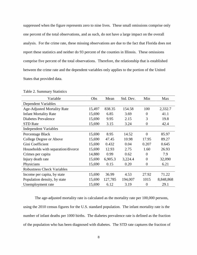
8
suppressed when the figure represents zero to nine lives. These small omissions comprise only
one percent of the total observations, and as such, do not have a large impact on the overall
analysis. For the crime rate, these missing observations are due to the fact that Florida does not
report these statistics and neither do 93 percent of the counties in Illinois. These omissions
comprise five percent of the total observations. Therefore, the relationship that is established
between the crime rate and the dependent variables only applies to the portion of the United
States that provided data.
Table 2. Summary Statistics
Variable Obs Mean Std. Dev. Min Max
Dependent Variables
Age-Adjusted Mortality Rate 15,497 838.35 154.58 100 2,332.7
Infant Mortality Rate 15,690 6.85 3.69 0 41.1
Diabetes Prevalence 15,690 9.95 2.15 3 19.8
STD Rate 15,690 3.15 3.24 0 42.4
Independent Variables
Percentage Black 15,690 8.95 14.52 0 85.97
College Degree or Above 15,690 47.45 10.98 17.95 89.27
Gini Coefficient 15,690 0.432 0.04 0.207 0.645
Households with separation/divorce 15,690 12.93 2.75 1.60 26.93
Crimes per capita 14,880 0.99 0.62 0 7.9
Injury death rate 15,690 6,905.3 3,224.4 0 32,090
Physicians 15,690 0.15 0.20 0 6.21
Robustness Check Variables
Income per capita, by state 15,690 36.99 4.53 27.92 71.22
Population density, by state 15,690 127,785 194,007 1015 8,848,868
Unemployment rate 15,690 6.12 3.19 0 29.1
The age-adjusted mortality rate is calculated as the mortality rate per 100,000 persons,
using the 2010 census figures for the U.S. standard population. The infant mortality rate is the
number of infant deaths per 1000 births. The diabetes prevalence rate is defined as the fraction
of the population who has been diagnosed with diabetes. The STD rate captures the fraction of

9
the population who were diagnosed with one of the following sexually transmitted diseases:
gonorrhea, chlamydia, early latent syphilis, or primary and secondary syphilis. The STD rate has
been modified from the original version, so that it now reflects the number of STD cases per
1,000 people. This is due to the fact that the STD rate is so low, that at a per person rate it was
difficult to interpret constructively. The percentage black variable is the percentage of the
population who identifies their primary race as black. The education variable captures the
fraction of the population who has an associates, bachelors, masters, professional, or doctoral
degree.
The Census Bureau defines the Gini index as “a statistical measure of income inequality
ranging from 0 to 1. A measure of 1 indicates perfect inequality, i.e., one household having all
the income and rest having none. A measure of 0 indicates perfect equality, i.e., all households
having an equal share of income.”24
The equation for the Gini coefficient is as follows:
𝐺𝑖𝑛𝑖 =2
𝜇𝑛2+ ∑ 𝑖𝑋𝑖
𝑛
𝑖=1
− 𝑛 + 1
𝑛
where μ is the population mean, 𝑛 is the weighted number of observations, and 𝑋𝑖 is the
weighted income of individual 𝑖, which is weighted by individual 𝑖’s rank in the income
distribution.24
The Gini coefficient data was gathered from the 2006 – 2010 American
Community Survey (ACS). The ACS surveys households in each month from January to
December, and asks participants about income received during the previous 12 months. Each
year’s survey covers 23 months, from January of the previous year to November of the survey
year. In total, the 5-year ACS used in this report covers the 71-month period from January 2005
through November 2010. Due to the way that this information is gathered, it was not possible to
find the Gini coefficient by county for each year between 2006 and 2010. Ideally, we would

10
hope to obtain Gini coefficient data for each county on an annual basis. Unfortunately, this data
is not available. The second best option would be to obtain Gini coefficient data for each county
in the United States for the year 2006. This data is also unavailable. The third best option, and
the approach taken for this study, is to use Gini coefficient data for the time period of 2006 to
2010. This data is available at the county level for each year individually, and as such, allows us
to draw conclusions about the effect of income inequality on health during this time period.
Throughout this paper, the phrase “a one-unit increase in the Gini coefficient” will be
continually referred to in the interpretations of the regression results. It is important to
understand what this implies. Since the Gini coefficient ranges from zero to one, with one
indicating perfect inequality, and zero indicating perfect equality, a one unit increase in the Gini
coefficient implies moving from an economy with perfect inequality to an economy with perfect
equality. In the United States, for the time period of 2006 to 2010, the Gini coefficient ranges
from 0.21 to 0.65. Therefore, we will never see a one-unit increase in the Gini coefficient in this
study. However, it is referred to so that the real-world effects of changes in the Gini coefficient
can be clearly understood. While the Gini coefficient may have a range of approximately 0.4
during this time period, there is no guarantee that it will not change in the future. By providing
the impact of the Gini coefficient given a change from zero to one, it is then possible to calculate
the impact of the Gini coefficient given any smaller range of movement.
In Figure 1, is a map of the Gini coefficient for all counties in the United States. There
are distinct trends in the data. There is a horizontal band along the central part of the United
States where income inequality is relatively low. This area of low income inequality also
extends into the northern Midwest and Northeast. Additionally, there are small pockets of low
income inequality counties in the Northwestern United States. We see most of the high income

11
inequality counties in the South, although there are also small pockets in South Dakota. These
pockets correlate almost exactly with counties that are completely encompassed by Native
American reservations. There are also pockets of income inequality near large cities outside of
the Deep South, such as Newark/New York City, Boston, Detroit, Chicago, Las Vegas, Los
Angeles.
Figure 1: A Map of the Gini Coefficient by U.S. County
The fraction of households with separation or divorce was also gathered from the 2006 –
2010 American Community Survey. The crime rate is defined as the number of total crimes
(violent, property, or drug-related) per capita. Similar to the age-adjusted mortality rate, the
injury death rate is calculated as the injury mortality rate per 100,000 persons, using the 2010
census figures for the U.S. standard population. The data for physician per capita was gathered
from the U.S. Census Bureau, and is based on information from the American Medical

12
Association’s Physician Masterfile. Physicians are added to this registry when they enter
accredited medical schools, upon entry into an accredited post-graduate residency training
program, or when they obtain a license from a U.S. licensing jurisdiction.
The variables used in the robustness checks are income per capita, population density,
and the unemployment rate. Income per capita was provided by the American Community
Survey. The income per capita variable has been modified from the original version, so that it
now reflects income per capita in thousands of dollars. For example, the income per capita of
North Dakota in 2010 was $42,462. This has been modified so it now reads as 42.462, in
thousands of dollars. This modification helps us more clearly interpret the results of the
regression equations. Income per capita is derived by dividing the total income of people 15
years old and over in a geographic area by the total population in that area. In this case, the
geographic areas are each individual U.S. state. It was necessary to gather this data at the state
level in order to properly perform the robustness check. Similarly, population density data was
gathered at the state level as well; for the same reason. The population density data was
provided by the U.S. Census Bureau. Population density is calculated by dividing the total
number of people living in a particular U.S. state by the total population in that state. Just like
the income per capita variable, population density has also been modified into population density
per thousand. In this case, it is population density as 1,000 people per square mile instead of 1
person per square mile. So a one unit increase in population density implies an increase of 1,000
people per square mile. Again, this helps us more clearly interpret the results of the regression
equations. The unemployment rate was gathered from the Bureau of Labor Statistics. It is based
on the results of the Current Population Survey (CPS), a sample of 60,000 American households.

13
Variable Correlations
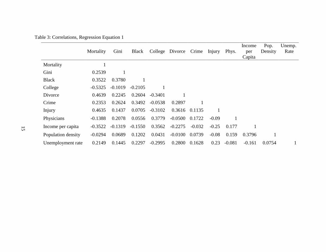
Table 3 outlines the correlation between the main dependent and explanatory variables,
for regression equation 1. As we can see, the Gini coefficient has a correlation of 25% with age-
adjusted mortality. The fraction of the population who is black has a moderately strong positive
correlation with mortality and the Gini coefficient, at 35% and 38% respectively. College
education is negatively correlated with mortality. The correlation is somewhat strong, at 53%.
The divorce rate and the injury death rate have a 46% correlation with age-adjusted mortality.
For the latter, this is rather self-evident as one is comprised of the other. The correlation between
crime rate and infant mortality is low, at 24%. The variable physicians per capita has a weak
negative correlation with age-adjusted mortality at 14%. Income per capita has a 35%
correlation with age-adjusted mortality, and is negatively correlated. Population density has a
very weak negative correlation with age-adjusted mortality, at 3%. Lastly, the correlation
between the unemployment rate and age-adjusted mortality is moderate, at 21%.
In Table 4, is the correlation between the main dependent and explanatory variables, for
regression equation 2. As we can see, the Gini coefficient has a correlation of 19% with infant
mortality. Of the four dependent variables, the Gini coefficient has the weakest correlation with
the infant mortality rate. The fraction of the population who is black has a moderately strong
positive correlation with infant mortality, at 33%. The fraction of the population who is black
has a moderately strong positive correlation with the Gini coefficient, at 37%. This correlation is
very similar to the correlations observed between these variables and age-adjusted mortality.
College education is negatively correlated with infant mortality. The correlation is weak, at
21%. The divorce rate and the injury death rate also have a 21% correlation with the infant
mortality rate. The correlation between crime rate and infant mortality is very low, at 14%. The

14
correlation between physicians per capita and infant mortality is nearly non-existent, at 0.7%. In
fact, the correlation between physicians per capita and all of the other variables is quite weak.
Income per capita has a 15% correlation with age-adjusted mortality, and is negatively
correlated. Population density has a very weak correlation with age-adjusted mortality, at 1%.
And lastly, the correlation between the unemployment rate and age-adjusted mortality is weak, at
13%. Of the four dependent variables, the unemployment rate has the weakest correlation with
infant mortality.
15
Table 3: Correlations, Regression Equation 1
Mortality Gini Black College Divorce Crime Injury Phys.
Income
per
Capita
Pop.
Density
Unemp.
Rate
Mortality 1
Gini 0.2539 1
Black 0.3522 0.3780 1
College -0.5325 -0.1019 -0.2105 1
Divorce 0.4639 0.2245 0.2604 -0.3401 1
Crime 0.2353 0.2624 0.3492 -0.0538 0.2897 1
Injury 0.4635 0.1437 0.0705 -0.3102 0.3616 0.1135 1
Physicians -0.1388 0.2078 0.0556 0.3779 -0.0500 0.1722 -0.09 1
Income per capita -0.3522 -0.1319 -0.1550 0.3562 -0.2275 -0.032 -0.25 0.177 1
Population density -0.0294 0.0689 0.1202 0.0431 -0.0100 0.0739 -0.08 0.159 0.3796 1
Unemployment rate 0.2149 0.1445 0.2297 -0.2995 0.2800 0.1628 0.23 -0.081 -0.161 0.0754 1
15

16
Table 4: Correlations, Regression Equation 2
Infant Gini Black College Divorce Crime Injury Phys.
Income
per
Capita
Pop.
Density
Unemp.
Rate
Infant 1
Gini 0.1861 1
Black 0.3321 0.3736 1
College -0.2145 -0.1001 -0.2128 1
Divorce 0.2145 0.2219 0.2616 -0.3351 1
Crime 0.1377 0.2599 0.3403 -0.0520 0.2750 1
Injury 0.2191 0.1590 0.0843 -0.3152 0.3693 0.1167 1
Physicians 0.0069 0.2093 0.0591 0.3717 -0.0430 0.1688 -0.07 1
Income per capita -0.1456 -0.1302 -0.1557 0.3570 -0.2223 -0.032 -0.25 0.1761 1
Population density 0.0136 0.0718 0.1229 0.0394 -0.0041 0.0756 -0.06 0.1609 0.3768 1
Unemployment rate 0.1262 0.1468 0.2332 -0.3018 0.2858 0.1614 0.242 -0.0744 -0.161 0.0791 1
16

17
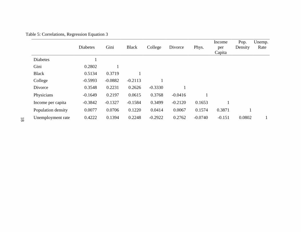
In Table 5, is the correlation between the main dependent and explanatory variables, for
regression equation 3. The Gini coefficient has a correlation of 28% with diabetes. The fraction
of the population who is black has a strong positive correlation with diabetes, at 51%. This
correlation is much higher for diabetes than it is for age-adjusted mortality and infant mortality.
The correlation between the fraction of the population who is black and the Gini coefficient is
very similar to the correlation observed between these variables and age-adjusted mortality, at
37%. College education is strongly negatively correlated with diabetes, at 60%. The divorce rate
has a 35% correlation with diabetes. The variable physicians per capita has a weak negative
correlation with age-adjusted mortality, at 16%. Income per capita has a 38% correlation with
age-adjusted mortality, and is negatively correlated. Population density has a very weak
correlation with age-adjusted mortality, at 0.7%. Lastly, the correlation between the
unemployment rate and age-adjusted mortality is moderately strong, at 42%. Of the four
dependent variables, the unemployment rate has the strongest correlation with diabetes.
In Table 6, is the correlation between the main dependent and explanatory variables, for
regression equation 4. For equation 4, the Gini coefficient has a correlation of 39% with the
STD rate. Of the four dependent variables, the Gini coefficient has the strongest correlation with
the STD rate. The fraction of the population who is black has a very strong positive correlation
with STDs, at 72%. College education is negatively correlated with mortality and this
relationship is quite weak. The divorce rate has a 23% correlation with STDs. The variable
physicians per capita has a weak correlation with the STD rate, at 14%. Similarly, income per
capita also has a 14% correlation with age-adjusted mortality, and is negatively correlated.
Population density has a very weak correlation with age-adjusted mortality, at 3.6%. And lastly,
the correlation between the unemployment rate and age-adjusted mortality is weak, at 22%.
18
Table 5: Correlations, Regression Equation 3
Diabetes Gini Black College Divorce Phys.
Income
per
Capita
Pop.
Density
Unemp.
Rate
Diabetes 1
Gini 0.2802 1
Black 0.5134 0.3719 1
College -0.5993 -0.0882 -0.2113 1
Divorce 0.3548 0.2231 0.2626 -0.3330 1
Physicians -0.1649 0.2197 0.0615 0.3768 -0.0416 1
Income per capita -0.3842 -0.1327 -0.1584 0.3499 -0.2120 0.1653 1
Population density 0.0077 0.0706 0.1220 0.0414 0.0067 0.1574 0.3871 1
Unemployment rate 0.4222 0.1394 0.2248 -0.2922 0.2762 -0.0740 -0.151 0.0802 1
18

19
Table 6: Correlations, Regression Equation 4
STD Gini Black College Divorce Phys.
Income
per
Capita
Pop.
Density
Unemp.
Rate
STD 1
Gini 0.3909 1
Black 0.7152 0.3719 1
College -0.0936 -0.0882 -0.2113 1
Divorce 0.2342 0.2231 0.2626 -0.3330 1
Physicians 0.1380 0.2197 0.0615 0.3768 -0.0416 1
Income per capita -0.1408 -0.1327 -0.1584 0.3499 -0.2120 0.1653 1
Population density 0.0360 0.0706 0.1220 0.0414 0.0067 0.1574 0.3871 1
Unemployment rate 0.2227 0.1394 0.2248 -0.2922 0.2762 -0.0740 -0.151 0.0802 1
19

20
CHAPTER III
RESULTS
Regression Results
I then estimate the four equations by Ordinary Least Squares (OLS) regression. The full
results of the OSL regression estimation are reported in Table 7. The results in each column
indicate the estimated regression coefficients on the four different health indicators: the age-
adjusted mortality rate, the infant mortality rate, the diabetes prevalence rate, and the STD
prevalence rate. All coefficients but two are statistically significant in influencing age-adjusted
mortality, the infant mortality rate, diabetes prevalence rates and STD rates. The two exceptions
are crime on infant mortality, and physicians per capita on the age-adjusted mortality rate. These
regression results show that income inequality has a strong effect on these health indicators. For
every unit increase in the Gini coefficient, we expect an approximately 273 additional deaths per
100,000 people per year, for age-adjusted mortality. For infant mortality, we expect an
approximately 3.5 additional deaths per 1000 live births per year, for every unit increase in the
Gini coefficient. For diabetes, we expect an approximately 5.4 additional diagnoses of diabetes
per capita, for every unit increase in the Gini coefficient. And for STD rates, we expect
approximately .011 additional cases of STDs per 1,000 people, for every unit increase in the Gini
coefficient.

21
Table 7: Regression Results for the Effect of the Gini Coefficient on Health Indicators
(1) (2) (3) (4)
Mortality Infant Diabetes STDs
Gini 273.01*** 3.47*** 5.40*** 11.20***
(29.20) (0.86) (0.36) (0. 538)
Black 1.81*** 0.069*** 0.053*** 0.148***
(0.07) (0.002) (0.0009) (0.001)
College -4.82*** -0.035*** -0.094*** 0.016***
(0.10) (0.003) (0.001) (0.002)
Divorce 10.03*** 0.070*** 0.62*** 0.062***
(0.40) (0.012) (0.005) (0.007)
Crime 15.80*** -0.035
(1.71) (0.049)
Injury 0.013*** 0.0002***
(0.0003) (9.5e-06)
Physicians -8.24 0.68*** -0.25*** 0.836***
(5.29) (0.16) (0.07) (0.101)
_cons 698.74*** 4.33*** 10.85*** -4.72***
(14.09) (0.42) (0.17) (0.26)
N 14,687 14,880 15,690 15,690
R² 47.80 16.0 52.96 53.77
RMSE 112.7 3.42 1.47 2.2
Note: Standard errors in parentheses
= "* p<0.10 ** p<0.05 *** p<0.01"
Figure 2 shows the relationship between the age-adjusted mortality rate and income
inequality levels. It demonstrates that as counties become more unequal, the age-adjusted
mortality rate increases. It is important to note that since the Gini coefficient for each of these
years is the average of the Gini coefficient over the entire period, any changes between years are
solely attributable to differences in the age-adjusted mortality rate. In every year from 2006 to
2010, we can see a clear difference in the age-adjusted mortality rate between income inequality
quartiles. In 2006, the difference in the mortality rate for the highest income inequality quartile

22
compared to the lowest income inequality quartile was 102.12 per 100,000. This is 102 excess
deaths per 100,000 people due to the difference in income inequality quartiles. In 2007, this
difference was 105; in 2008 it was 94, in 2009 it was 95, and in 2010 this difference was 99.
Therefore, for the period of 2006 to 2010, there were 496 excess deaths per 100,000 people, due
to difference in income inequality quartiles.
Figure 2: Income Inequality and Age-Adjusted Mortality, by Year
Figure 3 shows the relationship between diabetes prevalence and income inequality
levels. It demonstrates that as counties become more unequal, the diabetes prevalence rate
increases. While the difference in income inequality quartiles is not as pronounced for diabetes,
was it was for age-adjusted morality, we can still see a distinct difference in diabetes prevalence
rates between the quartiles. Diabetes prevalence rates increase slightly every year between 2006
and 2010. In 2006, the highest rate of diabetes per county was 10 percent but by 2010, it was

23
11.45 percent. We can see that diabetes prevalence is increasing overall during this time period.
In 2010, the difference in the diabetes prevalence rate for the highest income inequality quartile
compared to the lowest income inequality quartile was 1.5 percent. This is a 14.22 percent
increase from lowest income inequality quartile to the highest.
Figure 3: Income Inequality and Diabetes Prevalence, by Year
Figure 4 shows the relationship between the STD rate and income inequality levels. It
demonstrates that as counties become more unequal, the STD rate increases dramatically. In
every year from 2006 to 2010, we can see a clear distinction in the age-adjusted mortality rate,
given the income inequality level. The most distinct difference is between the lowest income
inequality quartile and the highest income inequality quartile. For each year from 2006 to 2009,
the difference in the STD rate per 1,000 people for the highest income inequality quartile
compared to the lowest income inequality quartile was 3.33. This is a 95 percent increase from

24
lowest income inequality quartile to the highest. Similarly, there is a 59 percent increase from
the highest income inequality quartile to the second highest income inequality quartile. This is a
large increase in STD rates for a relatively small change in income inequality.
Figure 4: Income Inequality and STD Rates, by Year
State Fixed Effects Model
We then use a fixed effects model to explore the relationship between independent and
outcome variables across states. Each state may have its own characteristics that influence the
independent variables, and in using a fixed effects model, we can assess the net effect of the
predictors on the outcome variables. State fixed effects partially controls for where people
choose to live. Individuals who possess job skills that are in demand could choose to seek
employment in more desirable areas to live. This could be geographic areas with better school, a
stronger social safety net, perhaps better health outcomes, among many others attributes. In

25
Table 8 below, results from the initial regression equations are listed in columns labeled A, and
results from the fixed effects model are listed in columns labeled B. As the regression results
indicate, most of the parameter estimates and the statistical significance change only slightly.
This is with the exception of the effect of income inequality on age-adjusted mortality and
diabetes. After removing the influence of the individual states, for every unit increase in the
Gini coefficient, we expect an approximately 131 additional deaths per 100,000 people per year,
for age-adjusted mortality. This means the effect of income inequality on health indicators is
roughly halved by controlling for state fixed effects. After removing the influence of the
individual states, for every unit increase in the Gini coefficient, we expect an approximately 2.7
additional diabetes diagnoses. Similar to the state fixed effects for age-adjusted mortality, this is
nearly half of the amount it was in the original regression. We can also see that controlling for
state fixed effects has a minimal impact on the infant mortality rate, and STD rates per 1,000
people. The results also indicate that the fit of the model increases after controlling for state
fixed effects. The R-squared value increases for each one of the four health indicator models.

26
Table 8: Regression Results from State Fixed Effect Models
(1A) (1B) (2A) (2B) (3A) (3B) (4A) (4B)
Mortality Mortality Infant Infant Diabetes Diabetes STDs STDs
Gini 273.01*** 131.5*** 3.47*** 3.30*** 5.40*** 2.74*** 11.20*** 10.34***
(29.20) (29.92) (0.86) (0.92) (0.36) (0.32) (0. 538) (0.537)
Black 1.81*** 1.17*** 0.069*** 0.06*** 0.053*** 0.04*** 0.148*** 0. 16***
(0.07) (0.09) (0.002) (0.003) (0.0009) (0.001) (0.001) (0.0017)
College -4.82*** -3.78*** -0.035*** -0.03*** -0.09*** -0.06*** 0.016*** 0.005**
(0.10) (0.11) (0.003) (0.003) (0.001) (0.001) (0.002) (0.002)
Divorce 10.03*** 8.8*** 0.070*** 0.1*** 0.62*** 0.052*** 0.062*** 0.048***
(0.40) (0.42) (0.012) (0.01) (0.005) (0.004) (0.007) (0.007)
Crime 15.80*** 25.0*** -0.035 0.13**
(1.71) (1.82) (0.049) (0.055)
Injury 0.013*** 0.01*** 0.0002*** 0.0002***
(0.0003) (0.0003) (9.5e-06) (9.90e-06)
Physicians -8.24 0.09 0.68*** 0.78*** -0.25*** -0.36*** 0.836*** 1.49***
(5.29) (5.23) (0.16) (0.16) (0.07) (0.06) (0.101) (0.098)
_cons 698.74*** 729.85*** 4.33*** 3.78*** 10.85*** 10.76*** -4.72*** -3.86***
(14.09) (14.71) (0.42) (0.45) (0.17) (0.16) (0.26) (0.264)
N 14,687 14,687 14,880 14,880 15,690 15,690 15,690 15,690
R² 47.80 53.60 16.0 19.1 52.96 68.93 53.77 60.61
RMSE 112.7 106.46 3.42 3.36 1.47 1.2 2.2 2.04
Note: Standard errors in parentheses
= "* p<0.10 ** p<0.05 *** p<0.01"
26

27
Robustness Checks
The Great Recession
We then test whether the economic crisis had a noticeable effect on the relationship
between the Gini coefficient and the four health indicators, using a fixed effects regression. We
will do so using the following equations.
𝑀𝑜𝑟𝑡𝑖 = 𝛽0 + (𝛽1 ∗ 𝐺𝑖𝑛𝑖𝑖) + (𝛽2 ∗ 𝑐𝑟𝑖𝑠𝑖𝑠) + (𝛾1𝑏𝑙𝑎𝑐𝑘𝑖 + 𝛾2𝑐𝑜𝑙𝑙𝑒𝑔𝑒𝑖 + 𝛾3𝑑𝑖𝑣𝑜𝑟𝑐𝑒𝑖 +𝛾4𝑐𝑟𝑖𝑚𝑒𝑖 + 𝛾5𝑖𝑛𝑗𝑢𝑟𝑦𝑖 + 𝛾6𝑝ℎ𝑦𝑠𝑖𝑐𝑖𝑎𝑛𝑖) + 𝜀𝑖
(5)
𝐼𝑛𝑓𝑎𝑛𝑡𝑖 = 𝛽0 + (𝛽1 ∗ 𝐺𝑖𝑛𝑖𝑖) + (𝛽2 ∗ 𝑐𝑟𝑖𝑠𝑖𝑠) + (𝛾1𝑏𝑙𝑎𝑐𝑘𝑖 + 𝛾2𝑐𝑜𝑙𝑙𝑒𝑔𝑒𝑖 + 𝛾3𝑑𝑖𝑣𝑜𝑟𝑐𝑒𝑖 +𝛾4𝑐𝑟𝑖𝑚𝑒𝑖 + 𝛾5𝑖𝑛𝑗𝑢𝑟𝑦𝑖 + 𝛾6𝑝ℎ𝑦𝑠𝑖𝑐𝑖𝑎𝑛𝑖) + 𝜀𝑖
(6)
𝐷𝑖𝑎𝑏𝑒𝑡𝑒𝑠𝑖 = 𝛽0 + (𝛽1 ∗ 𝐺𝑖𝑛𝑖𝑖) + (𝛽2 ∗ 𝑐𝑟𝑖𝑠𝑖𝑠) + (𝛾1𝑏𝑙𝑎𝑐𝑘𝑖 + 𝛾2𝑐𝑜𝑙𝑙𝑒𝑔𝑒𝑖 +𝛾3𝑑𝑖𝑣𝑜𝑟𝑐𝑒𝑖 + 𝛾4𝑝ℎ𝑦𝑠𝑖𝑐𝑖𝑎𝑛𝑖) + 𝜀𝑖
(7)
𝑆𝑇𝐷𝑖 = 𝛽0 + (𝛽1 ∗ 𝐺𝑖𝑛𝑖𝑖) + (𝛽2 ∗ 𝑐𝑟𝑖𝑠𝑖𝑠) + (𝛾1𝑏𝑙𝑎𝑐𝑘𝑖 + 𝛾2𝑐𝑜𝑙𝑙𝑒𝑔𝑒𝑖 + 𝛾3𝑑𝑖𝑣𝑜𝑟𝑐𝑒𝑖 +𝛾4𝑝ℎ𝑦𝑠𝑖𝑐𝑖𝑎𝑛𝑖) + 𝜀𝑖
(8)
The full results of the OLS regression estimation of the effect of the economic crisis are
reported in Table 9. The coefficient for the economic crisis indicator variable is statistically
significant in influencing age-adjusted mortality and the diabetes prevalence rates. However, it
is not statistically significant in influencing the infant mortality rate or the STD rate. These
regression results demonstrate that during years of the economic crisis, we expect an
approximately 693 additional deaths per 100,000 people per year. During non-economic crisis
years, the expected number of deaths is actually higher, at 720 deaths per 100,000 people per
year. While this seems counterintuitive, this fact has been well established in the literature.21
Within the United States, nursing homes for the elderly are consistently understaffed when the
economy is healthy. During this period, low-skilled workers quit their nursing home jobs, and
transition into other industries where there are higher wages and better benefits. As a result, the

28
elderly receive a lower quality of care and death rates increase in nursing homes during periods
of economic expansion. These regression results also indicate that infant mortality, diabetes
prevalence, and STD rates stay relatively the same, whether the economy is in the midst of a
recession or not.
Table 9: Regression Results, Given the Economic Crisis
(1) (2) (3) (4)
Mortality Infant Diabetes STDs
Gini 273.05*** 3.47*** 5.40*** 11.20***
(29.14) (0.86) (0.34) (0.54)
Black 1.81*** 0.069*** 0.053*** 0.148***
(0.07) (0.002) (0.0009) (0.001)
College -4.82*** -0.035*** -0.094*** 0.016***
(0.10) (0.003) (0.001) (0.002)
Divorce 10.03*** 0.070*** 0.62*** 0.062***
(0.40) (0.012) (0.004) (0.007)
Crime 15.80*** -0.035
(1.71) (0.049)
Injury 0.013*** 0.0002***
(0.0003) (9.49e-06)
Physicians -8.26 0.68*** -2.50*** 0.836***
(5.29) (0.16) (0.06) (0.10)
Crisis -13.86*** 3.09e-17 -0.91*** -1.74e-17
(1.90) (0.57) (0.02) (0.036)
_cons 707.01** 4.33*** 10.29*** -4.72***
(14.11) (0.42) (0.17) (0.26)
N 14,687 14,880 15,690 15,690
R² 47.99 16.06 57.27 53.77
RMSE 112.54 3.42 1.41 2.20
Note: Standard errors in parentheses
= "* p<0.10 ** p<0.05 *** p<0.01"
29
Income per Capita
We then perform a robustness check, incorporating income per capita at the state level.
The full results of the OLS regression estimation of the effect of per capita income are reported
in Table 10. The coefficient for income per capita at the state level is statistically significant on
all four health indicators. It is statistically significant at the one percent level in influencing the
age-adjusted mortality rate, the infant mortality rate and STD rates, and is statistically significant
at the five percent level in influencing diabetes prevalence rates. These regression results
indicate that for every thousand dollar increase in the income per capita at the state level, we
expect approximately 3.5 less deaths per 100,000 people per year. In other words, we expect
more affluent states to have slightly lower age-adjusted mortality rates. This makes intuitive
sense, as richer states have citizens that can afford better healthcare, more nutritious food,
perhaps have lower levels of stress, among many other factors that contribute to mortality.
For infant deaths, we expect that for every thousand dollar increase in the income per
capita at the state level, we expect approximately 0.02 less infant deaths per 1000 births. This is
a fairly negligible amount. The expected change in the diabetes rate is also fairly negligible
given income per capita at the state level. For every thousand dollar increase in the income per
capita at the state level, we expect approximately 0.07 less diabetes diagnoses per capita. And
finally, for STD rates, we expect that for every thousand dollar increase in the income per capita
at the state level, we expect approximately 0.3 less STD cases 1,000 people. This tells us that
income per capita at the state level has a minimal influence on infant mortality, diabetes
prevalence and STD rates, but does have a larger impact on the age-adjusted mortality rate.

30
Table 10: Regression Results, Given Income per Capita at the State Level
(1) (2) (3) (4)
Mortality Infant Diabetes STDs
Gini 238.89*** 3.27*** 4.62*** 10.87***
(29.20) (0.86) (0.35) (0.54)
Black 1.73*** 0.068*** 0.052*** 0.148***
(0.07) (0.002) (0.0009) (0.001)
College -4.46*** -0.033*** -0.086*** 0.020***
(0.10) (0.003) (0.001) (0.002)
Divorce 9.59*** 0.067*** 0.052*** 0.058***
(0.40) (0.011) (0.005) (0.007)
Crime 17.05*** -0.029
(1.70) (0.050)
Injury 0.012*** 0.0002***
(0.0003) (9.56e-06)
Physicians -1.54 0.72*** -0.116* 0.89***
(5.26) (0.16) (0.0001) (0.102)
Incomecapita -3.54*** -0.021*** -0.07** -0.3***
(0.22) (0.007) (0.003) (0.004)
_cons 835.69*** 5.13*** 13.53*** -3.58***
(16.39) (0.49) (0.20) (0.305)
N 14,687 14,880 15,690 15,690
R² 48.69 16.12 54.84 53.92
RMSE 111.77 3.42 1.44 2.20
Note: Standard errors in parentheses
= "* p<0.10 ** p<0.05 *** p<0.01"
Population Density
We also perform a robustness check, using the same original regression equations, but
additionally for population density at the state level. Population density may have a direct
relationship with population health, for a number of different reasons. For one, high population
density, can lead to a more rapid spread of disease and illnesses. Additionally, there are more

31
traffic accidents and higher rates of violent crime in areas with high population density.
However, high population density is also associated with higher quality healthcare facilities, such
as specialists, level-one trauma centers, and large research hospitals. These facilities are almost
exclusively located in large urban centers, not only to serve larger populations, but also due to
the fact that they are often associated with large research universities. One would expect that
living within close proximity to high-quality healthcare facilities would decrease mortality.
However, despite this, we cannot say with certainty which one of these relationships dominates
the other. It is for this reason that we see the sign of the coefficient fluctuating between negative
and positive, yet always around zero, for the four health indicators.
The full results of the OLS regression estimation of the effects of population density are
reported in Table 11. The coefficient for population density at the state level is statistically
significant all four health indicators. It is statistically significant at the one percent level in
influencing the age-adjusted mortality rate, diabetes prevalence, and STD rates, and at the five
percent level in influencing the infant mortality rate. These regression results indicate that for
every increase in the population density of 1,000 people per square mile, we expect
approximately 0.00002 less deaths per 100,000 people per year. In other words, we expect states
with a higher population density to have slightly lower age-adjusted mortality rates. The
expected change in the infant mortality rate, given population density at the state level, is also
fairly negligible. We see similar results for diabetes prevalence and STD cases per 1,000 people.
This implies that while the relationship between population density and health indicator variables
are statistically significant, the real-world impact is so small; it is virtually non-existent.

32
Table 11: Regression Results, Given Population Density at the State Level
(1) (2) (3) (4)
Mortality Infant Diabetes STDs
Gini 273.40*** 3.47*** 5.40*** 11.2***
(29.18) (0.86) (0.36) (0.54)
Black 1.83*** 0.069*** 0.053*** 0.150***
(0.07) (0.002) (0.0009) (0.001)
College -4.82*** -0.035*** -0.094*** 0.017***
(0.10) (0.003) (0.001) (0.002)
Divorce 10.03*** 0.069*** 0.62*** 0.06***
(0.40) (0.012) (0.005) (0.007)
Crime 15.92*** -0.033
(1.71) (0.049)
Injury 0.013*** 0.0002***
(0.0003) (9.50e-06)
Physicians -5.75 7.24*** -2.17*** 1.0***
(5.34) (0.16) (0.07) (0.102)
Popdensity -0.00002*** -2.85e-07** -2.3e-07*** -1.1e-06***
(4.80e-06) (1.45e-07) (6.18e-08) (9.20e-08)
_cons 701.0 *** 4.37*** 10.87*** -0.46***
(14.10) (0.42) (0.17) (0.26)
N 14,687 14,880 15,690 15,690
R² 47.84 16.08 53.00 54.20
RMSE 112.69 3.42 1.47 2.19
Note: Standard errors in parentheses
= "* p<0.10 ** p<0.05 *** p<0.01"
Unemployment Rate
We also perform a robustness check, using the same original regression equations, but
additionally for the unemployment rate at the county level. It is important to check the
relationship between the unemployment rate and health indicator variables, since in the United
States, these two items are invariably linked. According to the United States Census Bureau, as

33
of 2010, roughly half of all Americans obtain health insurance through an employer. In this
same year, ten percent of Americans purchased health insurance directly, approximately one-
third of Americans were enrolled in a public health insurance program, and another ten percent
went uninsured5. It has been well-documented in the literature that within the United States,
people who lack health insurance are more likely to die and have worse health outcomes than
those with health insurance26
. Since there is a clear relationship between employment and health
insurance exists, this robustness check can provide us with information that the relationship
between the Gini coefficient and health indicators cannot.
The full results of the OLS regression estimation are reported in Table 12. The
coefficient for the unemployment rate is statistically significant all four health indicators. These
regression results indicate that for every unit increase in the unemployment rate, we expect
approximately 3.3 less deaths per 100,000 people per year. In other words, we expect states
with a higher unemployment rates to have slightly lower age-adjusted mortality rates. While this
seems to conflict with what the literature has established about employment and health, we also
need to account for the fact that unemployment increases during periods of recession. As we
saw earlier, mortality actually decreased during the economic recession of 2007 to 2009.
Therefore, I believe the negative relationship between the unemployment rate and mortality takes
into account the effects of the economic crisis on age-adjusted mortality. Since these two
relationships have opposing effects, I believe the regression results demonstrate that the impact
of the economic crisis on mortality is stronger than the effect of the unemployment rate on
mortality.
For infant deaths, we expect that for every increase in the unemployment rate, there will
be approximately 0.03 less infant deaths per 1000 births. This is a fairly negligible amount. The
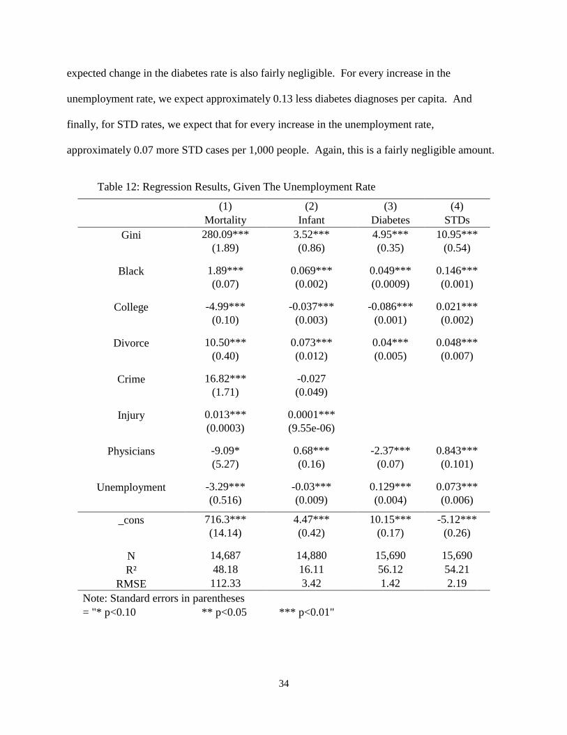
34
expected change in the diabetes rate is also fairly negligible. For every increase in the
unemployment rate, we expect approximately 0.13 less diabetes diagnoses per capita. And
finally, for STD rates, we expect that for every increase in the unemployment rate,
approximately 0.07 more STD cases per 1,000 people. Again, this is a fairly negligible amount.
Table 12: Regression Results, Given The Unemployment Rate
(1) (2) (3) (4)
Mortality Infant Diabetes STDs
Gini 280.09*** 3.52*** 4.95*** 10.95***
(1.89) (0.86) (0.35) (0.54)
Black 1.89*** 0.069*** 0.049*** 0.146***
(0.07) (0.002) (0.0009) (0.001)
College -4.99*** -0.037*** -0.086*** 0.021***
(0.10) (0.003) (0.001) (0.002)
Divorce 10.50*** 0.073*** 0.04*** 0.048***
(0.40) (0.012) (0.005) (0.007)
Crime 16.82*** -0.027
(1.71) (0.049)
Injury 0.013*** 0.0001***
(0.0003) (9.55e-06)
Physicians -9.09* 0.68*** -2.37*** 0.843***
(5.27) (0.16) (0.07) (0.101)
Unemployment -3.29*** -0.03*** 0.129*** 0.073***
(0.516) (0.009) (0.004) (0.006)
_cons 716.3*** 4.47*** 10.15*** -5.12***
(14.14) (0.42) (0.17) (0.26)
N 14,687 14,880 15,690 15,690
R² 48.18 16.11 56.12 54.21
RMSE 112.33 3.42 1.42 2.19
Note: Standard errors in parentheses
= "* p<0.10 ** p<0.05 *** p<0.01"

35
CHAPTER IV
DISCUSSION
In this study, we demonstrate that the health of American citizens is negatively affected
by increasing disparities in income, even when controlling for confounding factors. Income
inequality is a valuable predictor of the age-adjusted mortality, infant mortality, diabetes
prevalence, and rates of STDs. Counties with higher levels of income inequality experience
higher mortality rates, diabetes diagnoses and rates of STDs than do counties with lower income
inequality. This study extends previous research on the topic to the United States county level,
and finds that these results apply across the country.
Our results also indicate that characteristics inherent to the individual states play a role in
income inequality’s effect on health indicators. The impact of income inequality on health
indicators becomes more limited, and is roughly halved, by controlling for state fixed effects.
We also demonstrate that the economic crisis had a noticeable effect on the relationship
between income inequality and age-adjusted mortality. Expected age-adjusted mortality
decreases during the years of the economic recession, due in large part to an influx of low-skill
workers transitioning into jobs caring for the elderly in nursing homes. Infant mortality rates,
diabetes prevalence, and STD rates stay relatively the same, even if the health of the economy
changes.
The relationship between income inequality and the four health indicators still holds even
when accounting for income per capita at the state level. However, we expect that when
controlling for income inequality at the county level, counties located in more affluent states will

36
have lower age-adjusted mortality rates, fewer infant deaths, fewer diabetes diagnoses, and lower
rates of STDs.
Population density at the state level has a significant but minimal effect on the
relationship between income inequality and the four health indicators. We expect that states with
higher population densities have slightly lower mortality rates, infant mortality rates, and
diabetes rates, and slightly higher STD rates.
Finally, we demonstrate that the unemployment rate has a significant effect on age-
adjusted mortality, and a negligible effect on infant mortality rates, diabetes prevalence, and STD
rates. We would expect counties with higher unemployment rates have slightly lower age-
adjusted mortality rates. This may be due in part to an increase of low-skill workers
transitioning into nursing homes jobs during periods of economic recession. Infant mortality
rates, diabetes prevalence, and STD rates stay relatively the same, even changes in the
unemployment rate.
These findings highlight the significance of income inequality in our society, and provide
an insight into the characteristics we can expect from a more unequal society. In the years since
2010, income inequality has continued to increase within the United States. As we have seen, an
increase in income inequality directly correlates with higher mortality rates, additional diagnoses
of diabetes, and higher rates of STDs. The hope is that readers and policymakers alike will use
these conclusions to identify targets for policy intervention; policies which will hopefully turn
the tide on this growing problem. We can no longer pretend that income inequality is an abstract
term without real-world consequences. The impacts are clear, and they are adversely affecting
the health and lives of the most vulnerable American citizens.

37
REFERENCES
1. Allegretto, S. (2011). The State of Working America 2011: Through Volatility and Turmoil,
The Gap Widens. Economic Policy Institute, (Issue Brief No. 292).
2. Alvaredo, F., Atkinson, A., Piketty, T., & Saez, E. (2013). The Top 1 Percent in International
and Historical Perspective. Journal of Economic Perspectives, Vol. 27(3), Pages 3-20.
3. Atkinson, A., Piketty, T., & Saez, E. (2011). Top Incomes in the Long Run of History. Journal
of Economic Literature, 49(1), 3–71-3–71.
4. Deaton, A. (2003). Health, Inequality, and Economic Development. Journal of Economic
Literature, XLI, 113-158.
5. DeNavas-Walt, C., Proctor, B., & Smith, J. (2011). Income, Poverty, and Health Insurance
Coverage in the United States: 2010. U.S. Census Bureau, Current Populations Reports:
Consumer Income.
6. Fajnzylber, P., Lederman, D., & Loayza, N. (2000). Crime and Victimization: An Economic
Perspective. Economía 1, no. 1, 219-302.
7. Harling, G., Subramanian, S., Bärnighausen, T., & Kawachi, I. (2013). Income inequality and
sexually transmitted in the United States: Who bears the burden? Soc Sci Med, Feb
2014(102), 174-82.
8. Judge, K., Mulligan, J., & Benzeval, M. (1998). Reply to Richard Wilkinson. Soc. Sci. Med,
47, 983–85.

38
9. Kaplan, G., Pamuk, E., Lynch, J., Cohen, R., & Balfour, J. (1996). Inequality in Income and
Mortality in the United States: Analysis of Mortality and Potential Pathways. Brit. Med .,
312, 999–1003.
10. Kawachi, I., Kennedy, B., & Prothrow-Stith, D. (1997). Social Capital, Income Inequality,
and Mortality. American Journal of Public Health, 87, 1491–98.
11. Kennedy, B., Kawachi, I., & Prothrow-Stith, D. (1996). Income distribution and mortality:
Cross sectional ecological study of the Robin Hood index in the United States. BMJ, 312,
1004-1007.
12. Kennedy, B., Kawachi, I., & Prothrow-Stith, D. (1996). Important Correction. BMJ, 312.
13. LaClere, F., & Soobader, M. (2000). The effect of income inequality on the health of selected
US demographic groups. American Journal of Public Health, 90, 1892-1897.
14. Lynch, J., Kaplan, G., Pamuk, E., Cohen, R., Heck, K., Balfour, J., & Yen, I. (1998). Income
Inequality and Mortality in Metropolitan Areas of the United States. American Journal of
Public Health, 88, 1074–80.
15. Lynch, J., Davey-Smith, G., Hillemeier, M., Shaw, M., Raghunathan, T., & Kaplan, G.
(2001). Income Inequality, Psychosocial Environment and Health: Comparisons across
Wealthy Nations. Lancet, 358, 194–200.
16. McLaughlin, D., & Stokes, C. (2002). Income Inequality and Mortality in US Counties: Does
Minority Racial Concentration Matter? American Journal of Public Health, 92, 99-104.
17. Mellor, J., & Milyo, J. (2001). Reexamining the Evidence of an Ecological Association
between Income Inequality and Health. J. Health, Politics, Policy, Law, 26, 487–522.

39
18. Mujica, O., Castillo-Salgado, C., Bacallao, J., Loyola-Elizondo, E., Christina Schneider, M.,
Vidaurre, M., & Alleyne, G. (2000). Income Inequality and Suicide Risk in the Americas.
Pan-American Health Org.
19. Murthi, M., Guio, A., & Drèze, J. (1995). Mortality, Fertility, and Gender Bias in India: A
District Level Analysis. Population Devel. Rev. 21, 745–82.
20. Pickett, K., Kelly, S., Brunner, E., Lobstein, T. & Wilkinson, R. (2005). Wider income gaps,
wider waistbands? Epidemiological Community Health, 59, 670–674.
21. Piketty, T. (2001). Income Inequality in France, 1901-1998. Journal of Political Economy,
111, 1004-1042.
22. Piketty, T., & Saez, E. (2003). Income Inequality in the United States, 1913-1998. Quarterly
Journal of Economics. 118, 1-39. (Tables and Figures Updated to 2013 in Excel format,
January 2015).
23. Stevens, H., Miller, D., Page, M., & Filipski, M. (2011). The Best of Times, the Worst of
Times: Understanding Pro-cyclical Mortality. National Bureau of Economic Research,
Inc., NBER Working Papers, 17657.
24. Jones Jr., A., & Weinberg, D. (2000). The Changing Shape of the Nation’s Income
Distribution: 1947 - 1998. U.S. Census Bureau, P60-204.
25. Wilkinson, R. (1996). Unhealthy Societies: The Affliction of Inequality. London: Routledge.
26. Wilper, A., Woolhandler, S., Lasser, K., Mccormick, D., Bor, D., & Himmelstein, D. (2009).
Health Insurance and Mortality in US Adults. American Journal of Public Health,
99(12), 2289-2295.