kg4vis: a knowledge graph-based approach for visualization
TRANSCRIPT
© 2022 IEEE. This is the author’s version of the article that has been published in IEEE Transactions on Visualization andComputer Graphics. The final version of this record is available at: 10.1109/TVCG.2021.3114863
KG4Vis: A Knowledge Graph-Based Approach for VisualizationRecommendation
Haotian Li, Yong Wang, Songheng Zhang, Yangqiu Song and Huamin Qu
United States
Great Britain
ChinaRussia
Germany
JapanFrance
South Korea
ItalyAustralia
0
20
40
60
80
100
120
O N Q P AF AI AH AG
0
5k
10k
15k
20k
25k
30k
35k ONQPAFAIAHAG
1960 1970 1980 1990 2000 20102
3
4
5
6
7 PakistanBhutanSri LankaBangladeshIndiaNepal
Discretized Continuous
Features
Categorical Features
VisualizationDesignChoices
Feature Extraction Visualization Recommendation
DFCF CF
DD D D
VV V
Knowledge Graph Construction
Embedding Learning
Embedding-based Inference
Rule Generation
Huns
Saracens
Malians
ItaliansByzantines
Mayans
Burm
esePortugueseBerbers
FranksBritons
IndiansPersiansEthiopiansKoreans
Malay
Khm
erIncasM
agyarsSpanish
Celts
Aztecs
TeutonsVikings
Chinese
Mongols
TurksSlavs
JapaneseVietnam
eseG
oths
HunsMalians
ByzantinesBurmese
FranksIndians
EthiopiansMalay
MagyarsCelts
TeutonsChinese
TurksVietnamesePortuguese
Slavs
0
0.2
0.4
0.6
0.8
1
0-4 5-14 15-24 25-34 35-49 50-59 60-69 70-84 85+0
5
10
15
20
Col11Col3
Jan 112015
Jan 25 Feb 8 Feb 22 Mar 8 Mar 22 Apr 5
−1000
−500
0
dcab
0 200 400 600 800 1000
0
50
100
150 rtreebox2djsts-quadtreep2-gridrbush-bulkrbush-incrementalbox-intersectbrute-forcep2-sweepsimple-quadtreejsts-strtree
Bar Values in a column is not sorted
Box Values are not evenly distributed
Line The column is not the only one in dataset
Scatter Values in a column are numerical
Histogram Outlier exists in a column (3Std)
Data Columns
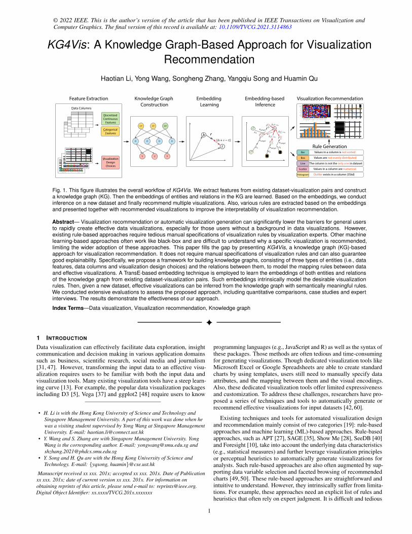
Fig. 1. This figure illustrates the overall workflow of KG4Vis. We extract features from existing dataset-visualization pairs and constructa knowledge graph (KG). Then the embeddings of entities and relations in the KG are learned. Based on the embeddings, we conductinference on a new dataset and finally recommend multiple visualizations. Also, various rules are extracted based on the embeddingsand presented together with recommended visualizations to improve the interpretability of visualization recommendation.
Abstract— Visualization recommendation or automatic visualization generation can significantly lower the barriers for general usersto rapidly create effective data visualizations, especially for those users without a background in data visualizations. However,existing rule-based approaches require tedious manual specifications of visualization rules by visualization experts. Other machinelearning-based approaches often work like black-box and are difficult to understand why a specific visualization is recommended,limiting the wider adoption of these approaches. This paper fills the gap by presenting KG4Vis, a knowledge graph (KG)-basedapproach for visualization recommendation. It does not require manual specifications of visualization rules and can also guaranteegood explainability. Specifically, we propose a framework for building knowledge graphs, consisting of three types of entities (i.e., datafeatures, data columns and visualization design choices) and the relations between them, to model the mapping rules between dataand effective visualizations. A TransE-based embedding technique is employed to learn the embeddings of both entities and relationsof the knowledge graph from existing dataset-visualization pairs. Such embeddings intrinsically model the desirable visualizationrules. Then, given a new dataset, effective visualizations can be inferred from the knowledge graph with semantically meaningful rules.We conducted extensive evaluations to assess the proposed approach, including quantitative comparisons, case studies and expertinterviews. The results demonstrate the effectiveness of our approach.
Index Terms—Data visualization, Visualization recommendation, Knowledge graph
1 INTRODUCTION
Data visualization can effectively facilitate data exploration, insightcommunication and decision making in various application domainssuch as business, scientific research, social media and journalism[31, 47]. However, transforming the input data to an effective visu-alization requires users to be familiar with both the input data andvisualization tools. Many existing visualization tools have a steep learn-ing curve [13]. For example, the popular data visualization packagesincluding D3 [5], Vega [37] and ggplot2 [48] require users to know
• H. Li is with the Hong Kong University of Science and Technology andSingapore Management University. A part of this work was done when hewas a visiting student supervised by Yong Wang at Singapore ManagementUniversity. E-mail: [email protected]
• Y. Wang and S. Zhang are with Singapore Management University. YongWang is the corresponding author. E-mail: [email protected] [email protected]
• Y. Song and H. Qu are with the Hong Kong University of Science andTechnology. E-mail: {yqsong, huamin}@cse.ust.hk
Manuscript received xx xxx. 201x; accepted xx xxx. 201x. Date of Publicationxx xxx. 201x; date of current version xx xxx. 201x. For information onobtaining reprints of this article, please send e-mail to: [email protected] Object Identifier: xx.xxxx/TVCG.201x.xxxxxxx
programming languages (e.g., JavaScript and R) as well as the syntax ofthese packages. Those methods are often tedious and time-consumingfor generating visualizations. Though dedicated visualization tools likeMicrosoft Excel or Google Spreadsheets are able to create standardcharts by using templates, users still need to manually specify dataattributes, and the mapping between them and the visual encodings.Also, these dedicated visualization tools offer limited expressivenessand customization. To address these challenges, researchers have pro-posed a series of techniques and tools to automatically generate orrecommend effective visualizations for input datasets [42, 60].
Existing techniques and tools for automated visualization designand recommendation mainly consist of two categories [19]: rule-basedapproaches and machine learning (ML)-based approaches. Rule-basedapproaches, such as APT [27], SAGE [35], Show Me [28], SeeDB [40]and Foresight [10], take into account the underlying data characteristics(e.g., statistical measures) and further leverage visualization principlesor perceptual heuristics to automatically generate visualizations foranalysts. Such rule-based approaches are also often augmented by sup-porting data variable selection and faceted browsing of recommendedcharts [49, 50]. These rule-based approaches are straightforward andintuitive to understand. However, they intrinsically suffer from limita-tions. For example, these approaches need an explicit list of rules andheuristics that often rely on expert judgment. It is difficult and tedious
1
to compile a complete rule list due to the necessity of significant manualeffort. Also, the rules may not be generalizable to different datasets orvisualization choices. With the increase of the input data dimensions,there will be explosive combinations of visualization recommendations.
ML-based approaches (e.g., VizML [19], Data2Vis [13], and Deep-Drawing [45]) often train a machine learning model (especially a deeplearning model) to directly learn the visualization rules from examplesof dataset-visualization pairs. For instance, Data2Vis [13] leverages anLSTM-based neural translation model, which is trained on a Vega-Litevisualization corpus, to achieve the automatic generation of data visu-alizations. There has been an increasing trend to apply deep learningtechniques to visualization generation and recommendation [42, 60],since they do not require users to manually specify the rules of visual-ization recommendation. The contexts of the data and visualization areimplicitly encoded by the trained models. However, these deep learn-ing models often work as a black box [18]. Thus, it is often difficultfor users, to understand why a specific visualization is recommended,which further affects their trust in the recommended visualizations.
Motivated by the limitations of prior studies, we aim to achievevisualization recommendation that requires no manual specificationsof visualization rules and also guarantees good explainability of therecommendations to general visualization users. It is a non-trivial taskand little research has been conducted in this direction.
In this paper, we propose KG4Vis, a Knowledge Graph-based ap-proach for Visualization recommendation. Similar to ML-based ap-proaches for visualization recommendation, our approach also distillsthe rules for visualization design from existing examples such as thedataset-visualization pairs collected in VizML [19]. Knowledge graphsare widely used in the natural language processing field for different pur-poses such as question answering and product recommendation [24,57]and have shown great potential in modeling the relationship betweendifferent entities (i.e., knowledge). Such knowledge is often seman-tically understandable to human users. Inspired by this, we exploredhow a knowledge graph can be constructed to model visualization rulesand further apply it to achieve effective visualization recommenda-tions. Specifically, we extract an extensive list of data features for eachdataset and further build a knowledge graph based on three types ofentities: data features, data columns and visualization design choices.The directed links between two types of entities indicate different se-mantic meanings, e.g., “(One feature) is a data feature of (a specificdata column)”, “(One data column) is visually encoded by (a specificvisualization design choice)”. Then, we employ TransE [4] to learnthe embeddings of both relations and entities by using the dataset-visualization pair examples. These embeddings essentially encode thevisualization generation rules presented in the examples. Given a newdataset input, our approach can directly infer the relevant rules andrecommend effective visualizations for the dataset, which intrinsicallyprovides two desirable advantages. First, users can trace back to the rel-evant rules to understand why a specific visualization is recommended,thereby enhancing their trust in the visualization recommendations(explainability) and improving their knowledge of visualization princi-ples. Also, the whole recommendation process is data-driven and fullyautomated (no manual specification of visualization rules).
We investigated the effectiveness and usability of our approachthrough both quantitative and qualitative evaluations. Specifically, toverify the knowledge graph model choice, we compared the visual-ization recommendation accuracy of knowledge graph models withthat of other knowledge graph models. Further, we conducted in-depthinterviews with 12 visualization experts to assess whether our recom-mendation rules and recommended visualizations are meaningful tohuman users. We also showcased the visualization recommendationrules and the recommended visualizations to provide support for theeffectiveness of KG4Vis.
In summary, the major contributions of this paper are as follows:• We present KG4Vis, a novel knowledge graph-based approach
for visualization recommendation, which is essentially a data-driven approach and explainable to human users. To the bestof our knowledge, this is the first time that a knowledge graphis employed to model visualization principles and recommend
effective visualizations.• We conduct extensive evaluations, including qualitative compar-
isons with other models, case studies on different types of chartsand in-depth expert interviews, which demonstrates the effective-ness and explainability of our approach.
• We summarize the detailed lessons we have learned during thedevelopment of KG4Vis, which, we hope, can benefit subsequentwork on applying knowledge graphs in the visualization field.
2 RELATED WORK
Our related work can be categorized into three groups: visualizationrecommendation, knowledge graph-based recommendation and knowl-edge graph embedding.
2.1 Visualization RecommendationVisualization has been widely used for exploratory data analysis anddecision making in various domains including stock trading [39], on-line education [23] and urban planning [15]. However, most existingtools for creating visualizations heavily rely on users’ manual specifica-tions [19]. To facilitate visualization usage by users with no backgroundof visualization, many researchers have recently explored the automatedvisualization recommendation using rule-based methods and machinelearning (ML)-based methods [19, 51].
Rule-based visualization recommendation methods are mainly basedon manually-specified rules for mapping data to visual encodingsaccording to previous studies on human perception on visualiza-tions [2, 9, 21]. Representative studies include APT [27], SAGE [35],Show Me [28] and Voyager2 [50]. Though rule-based visualizationrecommendation methods have been widely studied their disadvantagesare also obvious. Since the rules are proposed or summarized by hu-mans, the effort of constructing a thorough list of rules is enormousand the following update of rules can be hard [34].
On the contrary, ML-based approaches have been investigated forvisualization recommendation to address the limitation of rule-basedmethods. For example, DeepEye [26] and Draco [30] have been pro-posed to augment existing rules proposed by experts with learning thepreference of visualizations and then ranking recommended visual-izations. Hu et al. [19] and Qian et al. [34] fed features of datasetsto Neural Networks (NNs) to infer how the datasets are representedby visualizations. These models have advanced the performance ofvisualization recommendations. However, these methods often use adeep learning approach and the “black-box” nature of these modelsmakes it hard to interpret the recommended results.
In this paper, we aim to propose a visualization recommendationmethod based on a knowledge graph to leverage the advantages ofboth rule-based and ML-based methods. It can recommend satisfactoryvisualizations and also make the reasons behind the recommendationstransparent to users by providing explainable recommendation rules.
2.2 Knowledge Graph-based RecommendationIncorporating knowledge graphs (KGs) in recommender systems is anemerging research direction in recent years [16]. KGs are structured rep-resentations of human knowledge and consist of entities and relationsbetween entities [20]. KG-based recommendation algorithms have twomajor advantages: effectively modeling different latent relations be-tween entities [16] and providing explainable recommendation resultsbased on the graph structure [41]. According to Guo et al. [16], thereare mainly three types of methods for KG-based recommender systems,embedding-based methods [54, 57], path-based methods [52, 59] andunified methods [41, 44].
Among these three types of methods, our recommendation algorithmis closer to embedding-based methods. We explicitly learn the embed-dings of entities and relations in our KG and conduct recommendationsbased on the embeddings.
2.3 Knowledge Graph EmbeddingKnowledge graph embedding (KGE) represents the entities and rela-tions in a KG with low-dimensional embedding vectors so that various
2
© 2022 IEEE. This is the author’s version of the article that has been published in IEEE Transactions on Visualization andComputer Graphics. The final version of this record is available at: 10.1109/TVCG.2021.3114863
entities and relations can be easier to handle in downstream tasks [43],such as link prediction [38, 46] and triplet classification [4, 46].
According to prior studies [17, 43], KGE methods can mainly becategorized into 3 classes: translational models, tensor decompositionmodels and neural models. Translational models aim to model therelations between two entities as a translation in space. The most rep-resentative method under this category is TransE [4]. It assumes thatthe embedding of a tail entity should be the sum of the embedding ofa head entity and a translation vector which is the relation betweenthem. A more detailed introduction to TransE is provided in Section 3.Following TransE, a series of translational methods have been proposed.For example, TransR [25] represents relations in different spaces andconducts translation with a relation after projecting entities to the corre-sponding space. RotatE [38] employs rotation in the complex space torepresent relations between entities. Another class of KGE models aimsto extract the embeddings of entities by applying tensor decompositionto model the graph structures [17], for example, RESCAL [32] andDistMult [53]. Recently, many neural models have also been proposedfor KGE including SME [3] and ConvE [12].
In our paper, due to its efficiency and intuitiveness, an improvedversion of the widely recognized embedding approach (i.e., TransE [4])is applied in our model to learning the embedding vectors of entitiesand relations in our KG.
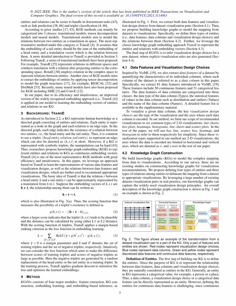
3 BACKGROUND: TRANSEAs introduced in Section 2.2, a KG represents human knowledge as adirected graph consisting of entities and relations. Each entity is repre-sented as a node in the graph and each relation is an edge type. In thedirected graph, each edge indicates the existence of a relation betweentwo entities, i.e., the head entity and the tail entity. Thus, it is commonto use a triplet, (head entity,relation, tail entity), to represent an edge,which can also be denoted as (h,r, t) in short. However, if a KG isrepresented with symbolic triplets, the manipulation can be hard [43].Thus, researchers propose knowledge graph embedding (KGE) to rep-resent entities and relations in KGs as continuous embedding vectors.TransE [4] is one of the most representative KGE methods with greatefficiency and intuitiveness. In this paper, we leverage an approachbased on TransE to learn the representations of various data features andvisualization designs, as well as the relations between data features andvisualization designs, which are further used to recommend appropriatevisualizations. The basic idea of TransE is that the relation r betweena head entity h and a tail entity t can be approximately represented bya translation from h to t. Suppose the embedding vectors of h,r, t areh,r, t, the relationship among them can be written as
h+ r≈ t, (1)
which is also illustrated in Fig. 3(a). Thus, the scoring function thatmeasures the possibility of a triplet’s existence is defined as
g(h,r, t) =−||h+ r− t||1/2, (2)
where a larger score indicates that the triplet (h,r, t) tends to be plausibleand the distance can be calculated by using either L1 or L2 distance.With the scoring function of triplets, TransE applies a margin-basedranking criterion as the loss function in embedding learning:
L = ∑(h′,r,t ′)∈S′
ReLU(γ +g(h′,r, t ′)−g(h,r, t)), (3)
where γ > 0 is a margin parameter and S and S′ denotes the set oftraining triplets and the set of negative triplets, respectively. Intuitively,we can consider the loss function which aims to make the differencebetween scores of training triplets and scores of negative triplets aslarge as possible. Here the negative triplets are generated by a randomreplacement of the head entity or the tail entity in a training triplet. Inthe training process, TransE applies gradient descent to minimize theloss and optimize the learned embeddings.
4 METHOD
KG4Vis consists of four major modules: feature extraction, KG con-struction, embedding learning, and embedding-based inference, as
illustrated in Fig. 1. First, we extract both data features and visualiza-tion design choices from dataset-visualization pairs (Section 4.1). Then,we propose building knowledge graphs to model the mapping fromdatasets to visualizations. Specifically, we define three types of entities(i.e., data features, data columns and visualization design choices) andthe relations between them (Section 4.2). Further, we leverage theclassic knowledge graph embedding approach TransE to represent theentities and relations with embedding vectors (Section 4.3).
The final step of KG4Vis is to infer visualization design choices for anew dataset, where explicit visualization rules are also generated (Sec-tion 4.4).
4.1 Data Features and Visualization Design ChoicesInspired by VizML [19], we also extract data features of a dataset byquantifying the characteristics of its individual columns, where eachcolumn of the dataset is referred to as a data column in this paper.Specifically, we extract 81 data features introduced in VizML [19].These features include 50 continuous features and 31 categorical fea-tures. The data features of data columns are categorized into threeclasses: the data type of the data column (Types), the statistical featuresof values in the data column such as distribution and outliers (Values)and the name of the data column (Names). A detailed feature list isavailable in the supplementary material.
To visualize a given data column, the key visualization designchoices are the type of the visualization and the axes where each datacolumn is encoded. In our method, we limit our scope of recommendedvisualizations to six common types of 2-D visualizations: bar charts,box plots, heatmaps, histograms, line charts and scatter plots. In therest of the paper, we will use bar, line, scatter, box, heatmap, andhistogram to refer to them respectively for simplicity. Since these vi-sualization types supported in our method are 2-D visualizations, theaxes where the data is encoded are limited to horizontal and verticalaxes, which are denoted as x- and y-axis in the rest of our paper.
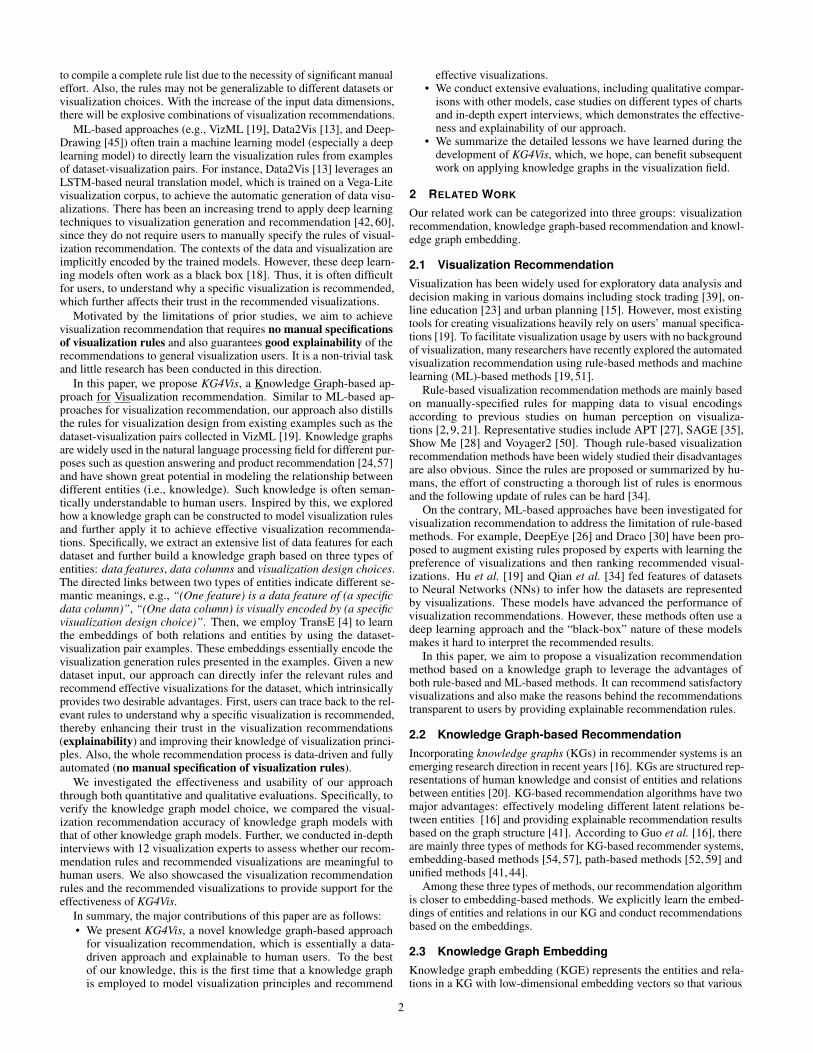
4.2 Knowledge Graph ConstructionWe build knowledge graphs (KGs) to model the complex mappingfrom data to visualizations. According to our survey, there are noexisting studies on constructing knowledge graphs for visualizationrecommendations. We propose defining four types of entities and threetypes of relations among entities to delineate the mapping from a datasetto appropriate visualizations. By leveraging a large number of existingdataset-visualization pairs in real practice, our knowledge graphs cancapture the widely-used visualization design principles. An overalldescription of the knowledge graph construction is shown in Fig. 1 andan example is shown in Fig. 2.
0 0.2 0.4 0.6 0.8 1−4
−3
−2
−1
0
1
2
3 y
Data type:Quantitative
Position: X-axis
Features of Column x
Mean of Values: in thep-th interval
Outlier:1.5IQR
Type: Scatter
Position: Y-axis
Features of Column y
Number of Values: in theq-th interval
xy
0-0.28
0.010.41
...
...0.96-0.32
0.98-0.02
11.12
Dataset-visualization Pair Extracted Features
Column x
Type: Scatter
Type:Scatter
Data type:Quantitative
Mean of Values: in thep-th interval
Outlier:1.5IQR
Number of Values: in theq-th interval
Knowledge Graph
Column y
Position:X-axis
Position:Y-axis
Fig. 2. This figure shows an example of the transformation from adataset-visualization pair to a part of the KG. Only a part of features andentities are shown. Red nodes represent visualization design choices.Blue nodes represent data columns. Green and yellow nodes representdiscretized data features and continuous data features, respectively.
Definition of Entities. The first step of building our KG is to definethe entities. Since the purpose of KG is to represent the relationshipbetween data features, data columns and visualization design choices,they are naturally considered as entities in the KG. Generally, an entityin KG represents a categorical value, for example, a person or a place.Thus, a data column, a visualization design choice or a categorical datafeature can be directly represented as an entity. However, defining theentities for continuous data features is challenging, since continuous
3
features are hard to be handled by KG. One possible method is toassign each concrete value of a continuous data feature to an entity, forexample, we create two entities to represent that the length of a datacolumn is 5 and the length of a data column is 6, respectively. However,the number of entities will inflate and then the KG will become sparsesince the number of possible concrete values is large and the numberof edges between an entity of a value and entities of data columns willbe small. Learning the embeddings of a sparse KG with an enormousnumber of entities can consume lots of computational power and thelearned embeddings can be of low quality [58]. Thus, we propose todivide each continuous data feature into different intervals, and regardeach discretized continuous data feature with a specific value intervalas an entity in the KG.
There are many commonly used discretization strategies such asKMeans discretization, uniform discretization and quantile discretiza-tion. However, they suffer from a common pitfall: these discretizationmethods only consider the distribution of values of all data pointsand cannot take extra information (e.g., predictive attributes) intoconsideration. Thus, inspired by Ming et al. [29], we apply a dis-cretization method based on the minimum description length princi-ple (MDLP) [14] to discretize the continuous data features. With MDLP,the visualization type is able to be used as extra criteria when discretiz-ing continuous data features. Besides the consideration of visualizationtypes, it can automatically decide how many intervals are generatedbased on the distribution of data and the minimum size of each interval.This is another advantage of MDLP, especially compared with otherapproaches like KMeans, where the number of intervals should beexplicitly given. With the discretized continuous data features gen-erated by MDLP, we treat each interval of a feature as an entity. Insummary, we overall have four classes of entities, visualization designchoices (EV ), discretized continuous data features (EDF ), categoricaldata features (ECF ) and data columns (ED). The detailed list of entitiesis available in Table 1.
Definition of Relations. After introducing four classes of entities,we further defined three classes of relations as shown in Table 1. First,we have a class of relations that connect data columns to visualizationdesign choices (RD→V ) and represent “(one data column) is visuallyencoded with (a specific visualization design choice)”. To be specific,there are two relations that belong to this class: 1) a data column(often together with other data column(s)) is visualized as a specificvisualization type, e.g., bar; 2) a data column is encoded on the x-axisor y-axis. The complete list of this type of relations and correspondingentities is in the first section of Table 1. The second and third classes ofrelations both describe the mapping from data features to data columns.Thus, the semantic meaning of relations in these two classes can bedescribed as “(one feature) is a data feature of (a specific data column)”.The second class of relations are those linking categorical data featuresto data columns (RCF→D). For this class of relations, we group thecategorical data features according to their semantic meanings andconstruct 13 relations, for example, “the general data type of (one datacolumn) is (categorical)”. A detailed list of relations in this class isin the second section of Table 1. The third class of relations aim tomodel the mapping from discretized continuous data features to datacolumns (RDF→D). We define a relation for each continuous featureand there are 50 relations in total, which is equal to the number ofcontinuous features as described in Section 4.1. An example is “thenumber of unique values in (one data column) is (between 0 and 30)”.
After defining the entities and relations, we extract triplets fromexisting dataset-visualization pairs. These triplets serve as the edgesthat link different entities to form a graph. For a data column d with itsdata feature set Fd , a set of triplets are extracted as {( fi,ri,d)| fi ∈ Fd},where ri ∈ RCF→D∪RDF→D is the corresponding relation from fi tod. Similarly, for the set of visualization design choices Vd of the datacolumn d, we extract another set of triplets {(d,rn,vn)|vn ∈Vd}. Thus,all the triplets associated with the data column d can be denoted as{( fi,ri,d)| fi ∈ Fd}∪{(d,rn,vn)|vn ∈ Vd}. By combining the tripletsassociated with all the data columns, we gain the knowledge graph thatwill be used for visualization recommendation.
Table 1. This table shows the definition of relations and their relatedentities. The first section presents RD→V and EV . The second section ofthe table illustrates RCF→D and ECF . The third section shows RDF→D andEDF . IQR is the interquartile range and Std is the standard deviation.
Class Relations Corresponding Entities
RD→VVisualization type of the column is bar, box, heatmap, histogram, line,
scatterThe column is encoded on x-axis, y-axis
RCF→D
The general data type of the data inthe column is
categorical, quantitative, temporal
The specific data type of the data inthe column is
string, integer, decimal, datetime
The name of the data column con-tains
“x”, “y”, “time”, digit, whitespace,“$”,“C”, “£”, “U”
Outlier exists in the column accord-ing to criteria
1.5IQR rule, 3IQR rule, 3Std rule,(1%, 99%) rule
Values are normal at (p < 0.01), (p < 0.05)Values are sorted/are monotonic/are in linear space/are in log space/are unique, missing value is in thecolumn, the column is the only col-umn in dataset
{relation} is true, {relation} isfalse (relation refers to a relationin the left.)
The column name starts with upper case, lower case
RDF→DContinuous features (e.g., numberof unique values in the column)
Value of the continuous feature isin the 1st, ..., m-th interval (m >
1) (e.g., number of unique valuesin the column is in the 4th interval)
4.3 Embedding LearningIn this section, learning to represent entities and relations by embeddingvectors with TransE is introduced. The major advantage of usingembeddings to represent entities and relations is that the manipulationof them in KG [43] is convenient, which greatly benefits our subsequentinference and explicit rule generation.
In our approach, we adopt an improved TransE with self-adversarialnegative sampling (denoted as TransE-adv) [38] due to its efficiencyand intuitiveness [43]. The major advantage of adopting self-adversarialnegative sampling is that it can effectively improve the learning effi-ciency by considering the current embedding model and eliminatingobviously false triplets. According to Sun et al. [38], each negativesample is assigned a weight which indicates its probability of beingtrue when using the current embeddings. The weight is calculated as
w(h′,r, t ′
)=
exp(αg(h′,r, t ′))∑(h′i,r,t
′i )∈S′ exp(αg(h′i,r, t
′i ))
, (4)
where (h′,r, t ′) is a negative sample, S′ is the collection of negativesamples, α is the temperature of sampling [1] and g is the scoringfunction. Based on the weight of negative samples, a negative samplingloss function is applied in the training of TransE-adv, which is asfollows:
L =− logσ (γ +g(h,r, t))
− ∑(h′,r,t ′)∈S′
w(h′,r, t ′
)logσ
(−g(h′,r, t ′)− γ
), (5)
where σ is the Sigmoid function and γ is the margin.The overall procedure of embedding learning in our approach is as
below. First, the embeddings of entities and relations are initialized.Then in each step, we randomly sample a batch of training triplets andgenerate negative samples accordingly. Then a weight value is assignedto each negative sample according to Equation 4. With the batch oftraining triplets and negative triplets, the loss of current embeddings iscalculated as Equation 5. Finally, the loss is used for the optimizationof embeddings in each step.
4.4 Inference with EmbeddingsIn the previous step, the embeddings of entities and relations in theKG are learned. In this section, we introduce the method of leveraging
4
© 2022 IEEE. This is the author’s version of the article that has been published in IEEE Transactions on Visualization andComputer Graphics. The final version of this record is available at: 10.1109/TVCG.2021.3114863
these embeddings to infer how to visually encode a new data columnwhich has multiple data features.
As indicated by Equation 1, the tail entity’s approximate embed-ding equals the sum of the embedding of a given head entity and theembedding of the relation between them. Based on this assumption,we propose a method to infer the final visualization design choice ofa data column in a new dataset. We first extract rules indicating themapping from data features to visualization design choices. Then, weaggregate all the rules to decide the final visualization design choices.Here each rule has a structure like “If the data column has {a datafeature}, then the data column can be represented by {a visual de-sign choice}”, where the data feature refers to a categorical featureor a discretized continuous feature. For the rest of this paper, eachrule will be denoted as “a data feature→ a visual design choice” forsimplicity. In each rule, the part before “→”, i.e., “a data feature”, isalso called the condition of the rule. To derive such kind of rules fromKG with embeddings, for each data feature entity fi ∈ EDF ∪ECF , weconduct translations twice. The first translation is to approximate theembedding of an imaginary data column dim which is only connectedby fi. The embedding of dim is computed as fi + r j, where r j is theembedding of the relation connects fi to dim. The second translation isto infer how dim will be visually represented under a specific relationrtarget ∈ RD→V by computing fi + r j + rtarget . After two translations,we can extract a rule as fi→ vn with a score defined as follows:
g fi→vn =−||fi + r j + rtarget −vn||, (6)
which indicates how much vn is preferred given fi. More specifically,the rule also reflects the possibility that fi→ vn is correct. Then, byusing the rules, we can calculate the average score of all the relationsthat link a data feature fi ∈ Fnew to a design choice vn as follows:
g(dnew,rtarget ,vn) =1|Fnew| ∑
fi∈Fnew
g fi→vn . (7)
This computation can also be viewed as an aggregation of all ruleswhose conditions are fulfilled by the current data column. Then, forevery visualization design choice, the aggregation is computed to getthe score of recommending it. After obtaining scores of all possibledesign choices, we compare them and select the visualization choicewith the highest score as the inferred visualization choice for dnew. Forexample, when we decide whether dnew should be encoded on whichaxis, g(dnew,raxis,vx−axis) and g(dnew,raxis,vy−axis) can be computedwith Equation 7. If g(dnew,raxis,vy−axis)> g(dnew,raxis,vx−axis), thenwe recommend to encode dnew on y-axis.
After inferring the visualization type and the axis that will be used foreach data column, we need to collectively consider the inference resultsof all the columns of a dataset and further assemble valid visualizationsfor the dataset. Thus, we need to propose a set of post-processing rulesaccording to the visualization grammar (e.g., Vega-lite and Plotly) toguarantee that valid visualizations are generated. For example, in Plotly,among all the six visualization types, box plots and histograms onlyrequire specifications on one axis while other types requires specifica-tions on both x-axis and y-axis. Thus, if any data column in a datasetis inferred to be visualized in histogram or box plots, all columns willbe visualized on either x- or y-axis. Otherwise, we plot all columnsaccording to their inferred axes. Since our method will assign a scoreto different visualization choices (e.g., bar and line), it is possible for usto recommend several different visualizations with top k visualizationchoices according to their scores.
5 EVALUATION
This section introduces the evaluation of our method from the follow-ing perspective: evaluation setup, quantitative evaluations and qual-itative evaluations. Qualitative evaluations consist of case studies,expert interviews and a comparison between generated and empiri-cal rules. The source code of KG4Vis, the visualization corpus usedin the evaluations and the supplementary material are available inhttps://kg4vis.github.io/.
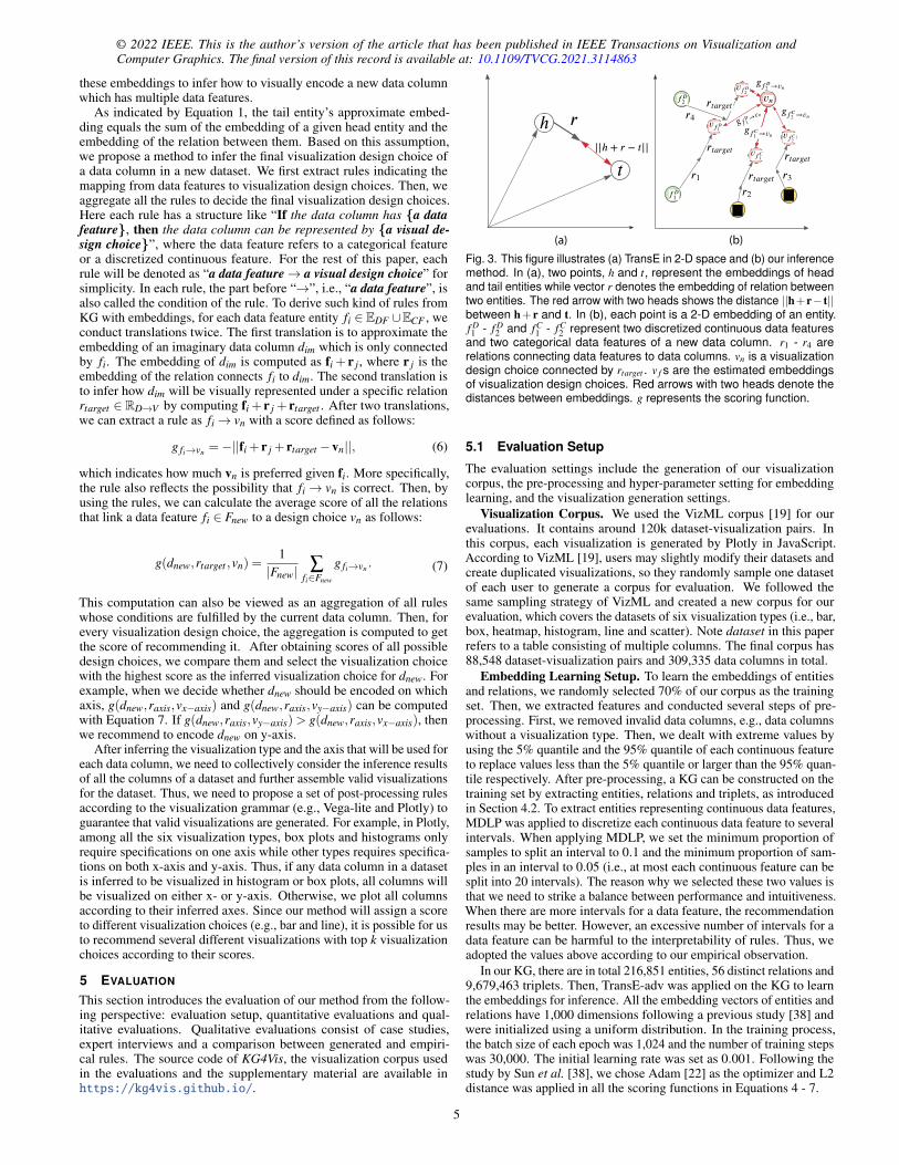
(a) (b)
Fig. 3. This figure illustrates (a) TransE in 2-D space and (b) our inferencemethod. In (a), two points, h and t, represent the embeddings of headand tail entities while vector r denotes the embedding of relation betweentwo entities. The red arrow with two heads shows the distance ||h+r− t||between h+ r and t. In (b), each point is a 2-D embedding of an entity.f D1 - f D
2 and fC1 - fC
2 represent two discretized continuous data featuresand two categorical data features of a new data column. r1 - r4 arerelations connecting data features to data columns. vn is a visualizationdesign choice connected by rtarget . v f s are the estimated embeddingsof visualization design choices. Red arrows with two heads denote thedistances between embeddings. g represents the scoring function.
5.1 Evaluation Setup
The evaluation settings include the generation of our visualizationcorpus, the pre-processing and hyper-parameter setting for embeddinglearning, and the visualization generation settings.
Visualization Corpus. We used the VizML corpus [19] for ourevaluations. It contains around 120k dataset-visualization pairs. Inthis corpus, each visualization is generated by Plotly in JavaScript.According to VizML [19], users may slightly modify their datasets andcreate duplicated visualizations, so they randomly sample one datasetof each user to generate a corpus for evaluation. We followed thesame sampling strategy of VizML and created a new corpus for ourevaluation, which covers the datasets of six visualization types (i.e., bar,box, heatmap, histogram, line and scatter). Note dataset in this paperrefers to a table consisting of multiple columns. The final corpus has88,548 dataset-visualization pairs and 309,335 data columns in total.
Embedding Learning Setup. To learn the embeddings of entitiesand relations, we randomly selected 70% of our corpus as the trainingset. Then, we extracted features and conducted several steps of pre-processing. First, we removed invalid data columns, e.g., data columnswithout a visualization type. Then, we dealt with extreme values byusing the 5% quantile and the 95% quantile of each continuous featureto replace values less than the 5% quantile or larger than the 95% quan-tile respectively. After pre-processing, a KG can be constructed on thetraining set by extracting entities, relations and triplets, as introducedin Section 4.2. To extract entities representing continuous data features,MDLP was applied to discretize each continuous data feature to severalintervals. When applying MDLP, we set the minimum proportion ofsamples to split an interval to 0.1 and the minimum proportion of sam-ples in an interval to 0.05 (i.e., at most each continuous feature can besplit into 20 intervals). The reason why we selected these two values isthat we need to strike a balance between performance and intuitiveness.When there are more intervals for a data feature, the recommendationresults may be better. However, an excessive number of intervals for adata feature can be harmful to the interpretability of rules. Thus, weadopted the values above according to our empirical observation.
In our KG, there are in total 216,851 entities, 56 distinct relations and9,679,463 triplets. Then, TransE-adv was applied on the KG to learnthe embeddings for inference. All the embedding vectors of entities andrelations have 1,000 dimensions following a previous study [38] andwere initialized using a uniform distribution. In the training process,the batch size of each epoch was 1,024 and the number of training stepswas 30,000. The initial learning rate was set as 0.001. Following thestudy by Sun et al. [38], we chose Adam [22] as the optimizer and L2distance was applied in all the scoring functions in Equations 4 - 7.
5
Bar Values in a column is not sorted Commemorative Substantive Significant
0
20
40
60
80
100
Passed Both ChambersReported by CommitteePassed One ChamberPublic LawNo Action
0 -- 2 2--4 4--6 6--8 8--10 10--12 12--140
2
4
6
8
10
12 change in pop (experimental 1)change in snail population (control 1)change in population (control 2)change in pop (experimental 2)Bar All values in a column are unique
Jan-12M
ar-12M
ay-12Jul-12Sep-12
Nov-12
Jan-13M
ar-13M
ay-13Jul-13Sep-13
Nov-13
Jan-14M
ar-14M
ay-14Jul-14Sep-14
Nov-14
Jan-15M
ar-15M
ay-15Jul-15Sep-15
Nov-15
Jan-16M
ar-16M
ay-16Jul-16Sep-16
Nov-16
150
200
250
300
Buying RateSelling Rate
100 200 300 400 500
0.08
0.1
0.12
0.14
RandomForestClassifier,max_features='sqrt'2RandomForestClassifier,max_features=None2
Line Values are monotonic
Line The data type of a column is decimal
Line The column is not the only one in dataset
5 10 15 20
100
150
200
Speed
0 0.2 0.4 0.6 0.8 1−4
−3
−2
−1
0
1
2
3 yScatter Values in a column are numerical
Scatter Outlier exists in a column (1.5IQR)
A
20
40
60
80
Propelled Distance (cm)
5
6
7
8
9
Box Values are not evenly distributed
Box The entropy of values is large
A
a b
c
e
d
f
g h
Propelled Distance (cm)
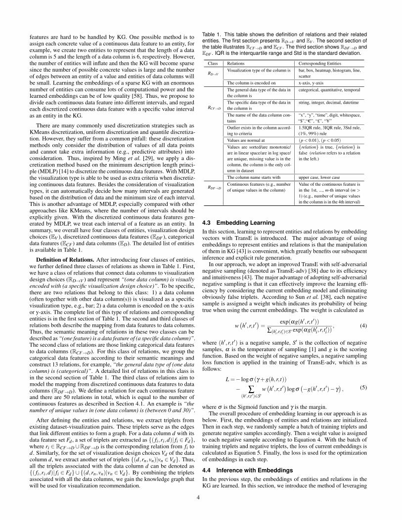
Fig. 4. This figure shows a gallery of recommended visualizations in (a)-(h) and related rules with high scores. The listed rules are only a smallsubset of all rules applied in the recommendation of corresponding visualizations. Due to limited space, we only present rules of 4 visualizationtypes, bar charts, box plots, line charts and scatter plots.
5.2 Quantitative EvaluationTo evaluate our embedding learning method, we conducted experiments.As stated in Section 4.1, we have two major tasks: 1) the inference ofvisualization types and 2) the inference of axis to be encoded on for adata column. To make our evaluation reliable, we conducted a 5-foldcross-validation and report results of different methods.
Metrics. In our inference method, each visualization design choiceis given a score and then ranked in descending order. Thus, to compre-hensively evaluate our method, we utilized two widely used metrics,the average rank of correct design choices (denoted as MR) and theproportion of correct visualization design choices ranked in the toptwo inferred design choices (denoted as Hits@2) [4] to evaluate theperformance of visualization types. Since the inference on the axis isbinary (i.e., either x- or y-axis), we evaluated it by accuracy.
Baseline Models. The baseline embedding learning models usedin our quantitative evaluation were TransE and RotatE [38]. TransEhere refers to TransE without self-adversarial negative sampling. Thereason why we selected TransE without self-adversarial negative sam-pling as a baseline is that we would like to confirm self-adversarialnegative sampling can advance the performance of embedding learningby comparing TransE-adv with TransE. Another baseline model is Ro-tatE. By comparing TransE-adv with RotatE, we would like to makesure TransE-adv can achieve a satisfactory performance compared toone of the state-of-the-art KGE models. As introduced in Section 2.3,RotatE models the relationship between two entities as a rotation in thecomplex space and has a different scoring function which is defined asg(h,r, t) =−‖h◦ r− t‖, where ◦ indicates element-wise product. Theinference method of KG4Vis can still apply to the embedding learnedby RotatE by replacing the scoring function of TransE with that ofRotatE.
Results. According to the results in Table 2, TransE-adv outper-forms other embedding learning models on both visualization typeinference and axis inference.
Table 2. This table shows the result of our quantitative evaluation onembedding learning methods. The best results are in bold. Overall,TransE-adv outperforms others. Among all metrics, a smaller MR indi-cates better performance while larger accuracy and Hits@2 are better.
Axis Visualization TypeAccuracy MR Hits@2
TransE-adv 0.7350 1.9567 0.7489TransE 0.7214 1.9718 0.7445RotatE 0.7193 1.9608 0.7458
5.3 Qualitative EvaluationIn this section, we evaluate KG4Vis by conducting case studies, expertinterviews and comparing the generated rules with empirical rules.
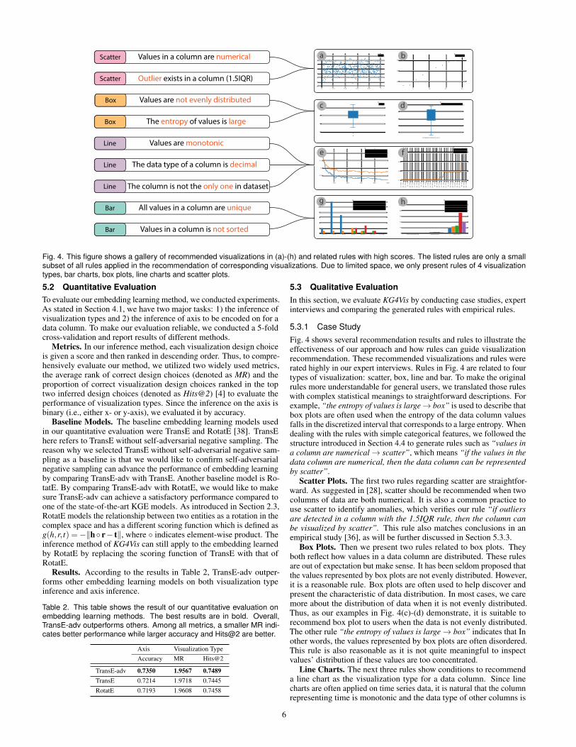
5.3.1 Case StudyFig. 4 shows several recommendation results and rules to illustrate theeffectiveness of our approach and how rules can guide visualizationrecommendation. These recommended visualizations and rules wererated highly in our expert interviews. Rules in Fig. 4 are related to fourtypes of visualization: scatter, box, line and bar. To make the originalrules more understandable for general users, we translated those ruleswith complex statistical meanings to straightforward descriptions. Forexample, “the entropy of values is large→ box” is used to describe thatbox plots are often used when the entropy of the data column valuesfalls in the discretized interval that corresponds to a large entropy. Whendealing with the rules with simple categorical features, we followed thestructure introduced in Section 4.4 to generate rules such as “values ina column are numerical→ scatter”, which means “if the values in thedata column are numerical, then the data column can be representedby scatter”.
Scatter Plots. The first two rules regarding scatter are straightfor-ward. As suggested in [28], scatter should be recommended when twocolumns of data are both numerical. It is also a common practice touse scatter to identify anomalies, which verifies our rule “if outliersare detected in a column with the 1.5IQR rule, then the column canbe visualized by scatter”. This rule also matches conclusions in anempirical study [36], as will be further discussed in Section 5.3.3.
Box Plots. Then we present two rules related to box plots. Theyboth reflect how values in a data column are distributed. These rulesare out of expectation but make sense. It has been seldom proposed thatthe values represented by box plots are not evenly distributed. However,it is a reasonable rule. Box plots are often used to help discover andpresent the characteristic of data distribution. In most cases, we caremore about the distribution of data when it is not evenly distributed.Thus, as our examples in Fig. 4(c)-(d) demonstrate, it is suitable torecommend box plot to users when the data is not evenly distributed.The other rule “the entropy of values is large→ box” indicates that Inother words, the values represented by box plots are often disordered.This rule is also reasonable as it is not quite meaningful to inspectvalues’ distribution if these values are too concentrated.
Line Charts. The next three rules show conditions to recommenda line chart as the visualization type for a data column. Since linecharts are often applied on time series data, it is natural that the columnrepresenting time is monotonic and the data type of other columns is
6
© 2022 IEEE. This is the author’s version of the article that has been published in IEEE Transactions on Visualization andComputer Graphics. The final version of this record is available at: 10.1109/TVCG.2021.3114863
decimal. Also, according to [36], line is the best choice to representthe correlation between two series of data. Thus, the column which issupposed to be visualized by line charts should not be the only columnin the dataset. These rules are also applied on both our generatedvisualizations in Fig. 4(e)-(f).
Bar Charts. The last two rules for bar charts are also intuitive.When we use bar charts, an axis often represents a series of categor-ical data [28] like countries or brands. It is quite common that thesecategorical values are unique, for example, the values on x-axes ofour generated visualizations in Fig. 4(g)-(h). Furthermore, as the val-ues shown in blue bars and red bars in Fig. 4(g) suggest, the valuesrepresented by bars can often be unsorted.
These rules and visualizations show that our method can derivemeaningful rules in a data-driven manner and then recommend appro-priate visualizations. Furthermore, the unexpected but reasonable rulesfor box plots demonstrate that our method has the potential to help re-searchers identify implicit rules which map data features to appropriatevisualization design choices.
5.3.2 Expert InterviewsTo further verify the effectiveness of recommended design choices andthe correctness of generated rules, we conducted expert interviews.
Tasks. In our expert interviews, we designed three tasks to evaluatethe quality of rules and recommended visualizations.
1. We presented the experts with the top five rules of each visualiza-tion type and asked them to give each rule a score ranging from1 (the least reasonable) to 5 (the most reasonable).
2. The experts are presented with 30 datasets and the correspondingtop two recommended visualizations by our approach. They wereasked to give each recommended visualization a score rangingfrom 1 (the least reasonable) to 5 (the most reasonable). Hereonly the visualization type and the arrangement of x- and y-axeswere required to be considered since other design choices (e.g.,the position of the legend, color usage) are not in our scope.
3. We presented 30 datasets to experts and let them select the top twovisualization types from all six types supported by our approachto visualize the current dataset.
Among three tasks, Task 1 was designed to verify the correctness ofindividual rules on visualization types and Task 2 aimed to evaluatethe overall quality of recommended visualizations including the visual-ization type and axes where data columns are encoded. Task 3 was asupplementary task to collect experts’ preferred design choices. In alltasks, the sequences of visualization types or datasets were randomized.
Datasets. In our expert interviews, we presented 30 rules and 30datasets to experts in total. In the selection of rules presented in Task1, we first pruned rules of the same fi and only kept the strongestrule of each feature entity. To be more specific, after the pruning,we only kept rules with the top five highest scores in { fi → vn|vn ∈all visualization types} for a specific fi. Then, we presented the topfive rules for each visualization type to participants for verification.For Task 2 and Task 3, we randomly sampled 5 valid datasets for eachvisualization type. Here a valid dataset is defined as a dataset that canbe correctly rendered by Plotly. In the questionnaire of our interview,we followed the study by Hu et al. [19] to show a screenshot of the first10 rows and the first 10 columns of each dataset to participants. Foreach dataset, we presented the top two recommended visualizations toexperts since the mean rank of correct visualization types is about 2according to Table 2. The recommended visualizations were exportedas images with resolutions of 700×450.
Participants and Procedure. We invited 12 researchers (4 females,agemean = 25.42, agestd = 1.93) who have conducted research in datavisualization for at least 1 year. Due to the current COVID-19 pandemic,all expert interviews were conducted through online meetings. Thelength of an expert interview was about 1 hour. Before starting theinterview, we collected experts’ consent for collecting their feedbackand recording audio. Each expert interview started with a 5-min briefintroduction to our entire project. After that, experts were asked tofinish the three tasks. For Task 2 and Task 3, to ensure that expertsprovide effective feedback for each question, they were only allowed to
submit their answers on each dataset after 10 seconds. After finishingall three tasks, experts were asked to provide general comments on ourapproach including the advantages and disadvantages.
Feedback on the Generated Rules. Overall, our generated rulesare appreciated by experts. An expert commented that “some rulesare inspiring” and another expert said the rules are “straightforwardand easy to understand”. The rules with the highest average scores areshown in Fig. 4. All the rules with the lowest (< 2) average scores areshown in Table 3.
Table 3. This table shows the five rules of the lowest scores. Most of therules of low scores are related to the names of columns.
Feature Type ScoreOnly one word is in the column name. Heatmap 1.3333The column name is started with an lower case. Heatmap 1.6667The column name is less than 5 characters. Heatmap 1.6667No upper case is in the column name. Heatmap 1.6667A digit is in the the column name. Scatter 1.8333
In Table 3, we conclude that most of the rules with low scores arerelated to the names of columns, which also matches experts’ com-ments, for example, “it is not suitable to use names of columns todecide how the column should be visualized” and “hard to convince thecolumn name’s rule has a relationship with heatmap”. After a carefulinspection on these rules, we found that most of the rules related tocolumn names are highly related to the grammar or the default settingof Plotly. Though they are useful in the prediction of visualization typeson datasets crawled from Plotly, they may not be able to convince gen-eral users. For example, in our extracted rules, there are several rulesrelated to Heatmap like the number of words in the column name, thenumber of characters in the column name and lack of uppercase in thecolumn name. They truly make sense when the datasets are from Plotlysince lots of datasets visualized by heatmaps have columns named usingfew lower-case letters such as “x” or “y”. However, it is quite doubtfulif these rules can be generalized to other datasets so our participantsconsidered them as unreasonable rules. This type of unreasonable rulesare mainly led by the characteristic of our dataset-visualization corpusand this issue will be further discussed in Section 6.1.2.
Feedback on Recommended Visualizations. According to experts’feedback, our recommended visualizations are thought to be of highquality and can lower the burden of manually creating visualizationswhen exploring the dataset and designing visualizations. For example,an expert concludes our approach as an “automated method to visualizedataset without human intervention, which can ease the human work-load”. In user interviews, we presented 2 recommended visualizationsfor each dataset and these visualizations are separately rated by experts.To evaluate the overall reasonable level of our recommendation on onedataset, we use the higher score between two scores of recommendedvisualizations on a dataset as the final score. The average final scoreof our recommendation is 3.7944, which shows that the experts thinkmost of our recommended visualizations are reasonable. Detailed scoredistribution of visualization types is also shown in Fig. 6. From Fig. 6,we can learn that our approach performs well on bar, histogram, lineand scatter but performs relatively worse on box and heatmap. Thecases with the highest scores are shown in Fig. 4.
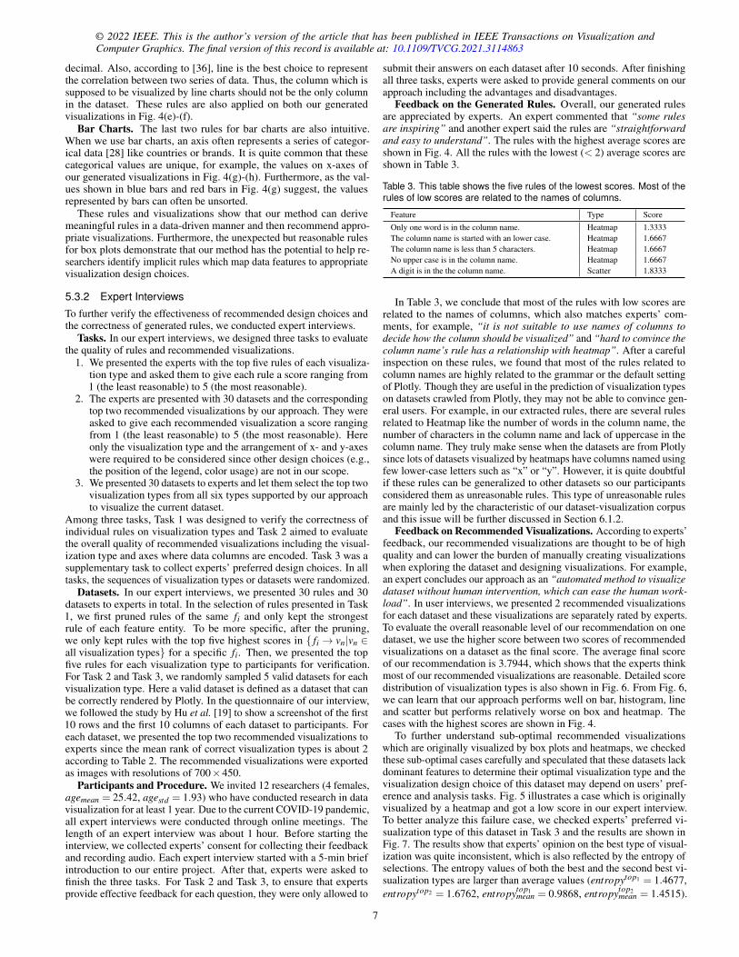
To further understand sub-optimal recommended visualizationswhich are originally visualized by box plots and heatmaps, we checkedthese sub-optimal cases carefully and speculated that these datasets lackdominant features to determine their optimal visualization type and thevisualization design choice of this dataset may depend on users’ pref-erence and analysis tasks. Fig. 5 illustrates a case which is originallyvisualized by a heatmap and got a low score in our expert interview.To better analyze this failure case, we checked experts’ preferred vi-sualization type of this dataset in Task 3 and the results are shown inFig. 7. The results show that experts’ opinion on the best type of visual-ization was quite inconsistent, which is also reflected by the entropy ofselections. The entropy values of both the best and the second best vi-sualization types are larger than average values (entropytop1 = 1.4677,entropytop2 = 1.6762, entropytop1
mean = 0.9868, entropytop2mean = 1.4515).
7
(b) Raw Dataset
0 10 20 30 40 500
20
40
60
80 zx
(a) Sub-optimal Recommended visualization
Fig. 5. This figure shows (a) a sub-optimal recommended visualizationidentified in expert interviews and (b) the first 10 rows of its raw dataset.
To handle this kind of dataset, it is possible to further consider users’preferences and their specific tasks in our inference method to achievebetter recommendation results, which is left as our future work.
Fig. 6. Average scores of recom-mended visualizations. The verti-cal lines on the top of the bars de-note the standard deviation values.
Fig. 7. Experts’ preferred visu-alization types of the dataset inFig. 5(b).
5.3.3 Comparison between Generated and Empirical RulesOne advantage of our method is that our recommendation results areexplainable through a set of extracted rules and can be easily understoodby users. So it is necessary to verify whether the extracted rules byour approach can align well with other empirical studies. According toour survey, Saket et al. [36] have done a crowdsourced experiment toevaluate the effectiveness of five basic visualizations (i.e., table, line,bar, scatter, and pie) that has a large overlap of visualization types withour study. Therefore, we choose to compare the generated rules byour method with the empirical rules from this study. Three out of fivegeneral guidelines of this study [36] are related to our research:
1. Bar charts are suitable for identifying clusters;2. Line charts are appropriate when finding correlations;3. Scatter plots should be used to find anomalies.
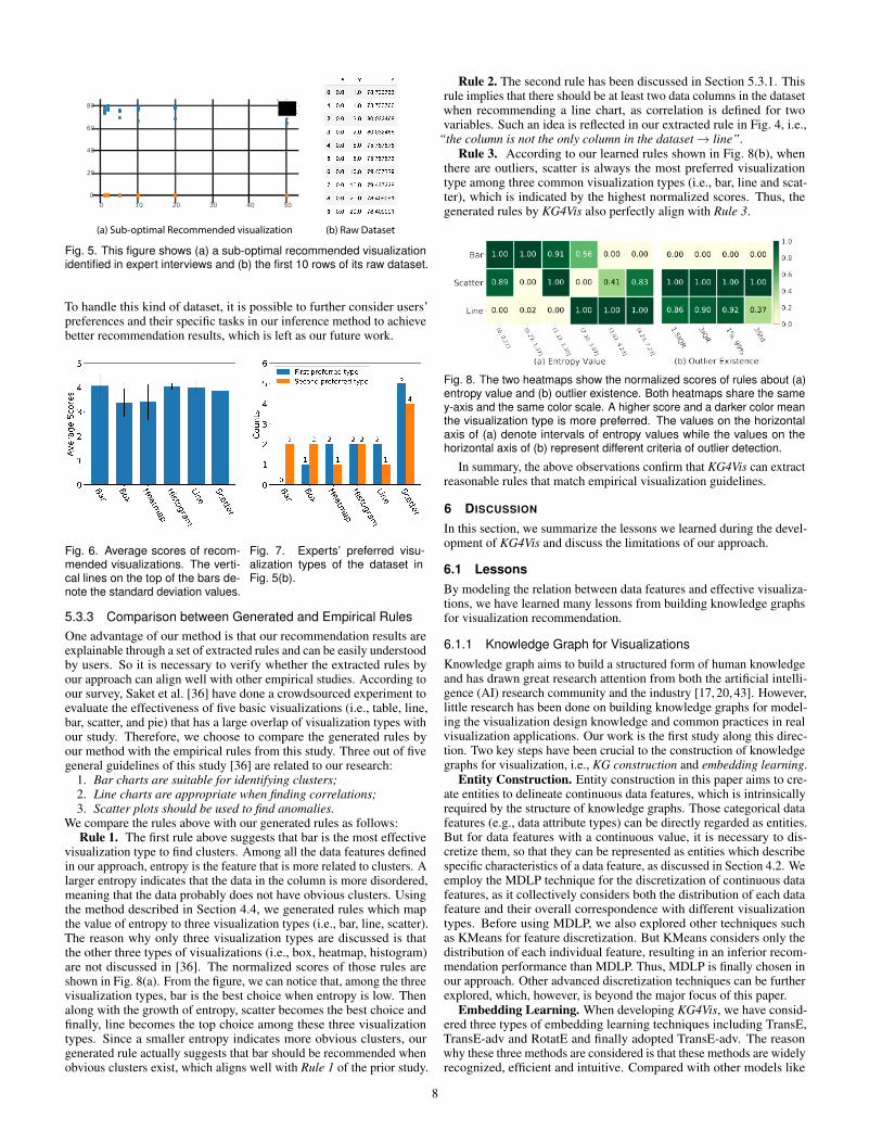
We compare the rules above with our generated rules as follows:Rule 1. The first rule above suggests that bar is the most effective
visualization type to find clusters. Among all the data features definedin our approach, entropy is the feature that is more related to clusters. Alarger entropy indicates that the data in the column is more disordered,meaning that the data probably does not have obvious clusters. Usingthe method described in Section 4.4, we generated rules which mapthe value of entropy to three visualization types (i.e., bar, line, scatter).The reason why only three visualization types are discussed is thatthe other three types of visualizations (i.e., box, heatmap, histogram)are not discussed in [36]. The normalized scores of those rules areshown in Fig. 8(a). From the figure, we can notice that, among the threevisualization types, bar is the best choice when entropy is low. Thenalong with the growth of entropy, scatter becomes the best choice andfinally, line becomes the top choice among these three visualizationtypes. Since a smaller entropy indicates more obvious clusters, ourgenerated rule actually suggests that bar should be recommended whenobvious clusters exist, which aligns well with Rule 1 of the prior study.
Rule 2. The second rule has been discussed in Section 5.3.1. Thisrule implies that there should be at least two data columns in the datasetwhen recommending a line chart, as correlation is defined for twovariables. Such an idea is reflected in our extracted rule in Fig. 4, i.e.,
“the column is not the only column in the dataset→ line”.Rule 3. According to our learned rules shown in Fig. 8(b), when
there are outliers, scatter is always the most preferred visualizationtype among three common visualization types (i.e., bar, line and scat-ter), which is indicated by the highest normalized scores. Thus, thegenerated rules by KG4Vis also perfectly align with Rule 3.
Fig. 8. The two heatmaps show the normalized scores of rules about (a)entropy value and (b) outlier existence. Both heatmaps share the samey-axis and the same color scale. A higher score and a darker color meanthe visualization type is more preferred. The values on the horizontalaxis of (a) denote intervals of entropy values while the values on thehorizontal axis of (b) represent different criteria of outlier detection.
In summary, the above observations confirm that KG4Vis can extractreasonable rules that match empirical visualization guidelines.
6 DISCUSSION
In this section, we summarize the lessons we learned during the devel-opment of KG4Vis and discuss the limitations of our approach.
6.1 LessonsBy modeling the relation between data features and effective visualiza-tions, we have learned many lessons from building knowledge graphsfor visualization recommendation.
6.1.1 Knowledge Graph for VisualizationsKnowledge graph aims to build a structured form of human knowledgeand has drawn great research attention from both the artificial intelli-gence (AI) research community and the industry [17, 20, 43]. However,little research has been done on building knowledge graphs for model-ing the visualization design knowledge and common practices in realvisualization applications. Our work is the first study along this direc-tion. Two key steps have been crucial to the construction of knowledgegraphs for visualization, i.e., KG construction and embedding learning.
Entity Construction. Entity construction in this paper aims to cre-ate entities to delineate continuous data features, which is intrinsicallyrequired by the structure of knowledge graphs. Those categorical datafeatures (e.g., data attribute types) can be directly regarded as entities.But for data features with a continuous value, it is necessary to dis-cretize them, so that they can be represented as entities which describespecific characteristics of a data feature, as discussed in Section 4.2. Weemploy the MDLP technique for the discretization of continuous datafeatures, as it collectively considers both the distribution of each datafeature and their overall correspondence with different visualizationtypes. Before using MDLP, we also explored other techniques suchas KMeans for feature discretization. But KMeans considers only thedistribution of each individual feature, resulting in an inferior recom-mendation performance than MDLP. Thus, MDLP is finally chosen inour approach. Other advanced discretization techniques can be furtherexplored, which, however, is beyond the major focus of this paper.
Embedding Learning. When developing KG4Vis, we have consid-ered three types of embedding learning techniques including TransE,TransE-adv and RotatE and finally adopted TransE-adv. The reasonwhy these three methods are considered is that these methods are widelyrecognized, efficient and intuitive. Compared with other models like
8
© 2022 IEEE. This is the author’s version of the article that has been published in IEEE Transactions on Visualization andComputer Graphics. The final version of this record is available at: 10.1109/TVCG.2021.3114863
TransR [25] and RESCAL [32], these three models have lower timeand space complexity [43]. Also, their methods of modeling relationsare intuitive. They model relations between entities as translation orrotation in the space. This can help users better interpret the learnedembeddings and generated rules.
6.1.2 Data-driven Visualization Recommendation
Similar to the ML-based methods for visualization recommendation [13,19], KG4Vis also learns from existing visualization examples and doesnot require users to manually specify a list of visualization rules. Ourevaluations above have demonstrated the usefulness and effectivenessof KG4Vis. It benefits from two main perspectives and can be furtherimproved: the corpus of dataset-visualization pairs and explainability.We will also further clarify its pros and cons compared with othervisualization recommendation approaches in this section.
Corpus. KG4Vis is a data-driven approach for visualization rec-ommendation, which intrinsically depends on dataset-visualizationpairs. KG4Vis is built on the VizML corpus [19] to constructknowledge graphs for visualizations. In the past few years, therehas been an increasing number of open-sourced visualization cor-pora [6–8, 11, 19, 33, 55]. These visualization corpora have madedata-driven visualization recommendations or automated visualizationdesigns feasible. On the other hand, we also noticed that these corporasuffer from some drawbacks, including the dependence on specificvisualization grammar and limited visualization types, for example, theVizML corpus [19] and the Vega-Lite corpus [33]. More high-qualitycorpora with diverse visualization examples will further benefit thedata-driven approaches for visualization recommendation.
Explainability. The visualization recommendations by KG4Vis canbe explained by a set of rules, which is highly appreciated by users asshown in our user study. These rules explicitly inform users of commonvisualization practices and are helpful for users without a backgroundof visualization to know why specific visualizations are recommendedfor a given dataset. Meanwhile, we also noticed two important issuewithin those rules that may hinder them from quickly understandingthe rules: the feature complexity and the number of rule conditions.First, some data features are not that straightforward to general userswho may have no knowledge of some data features. For example, ourdata features include the moments1 of the distribution of a data column.The moments are used to describe the shape of data distribution and arewidely applied in visualization recommendation approaches [10, 19].However, the detailed statistical meaning of moments may be unclearto some users and the related rules may confuse them. Thus, it may benecessary to strike a balance between expressiveness and intuitivenesswhen choosing data features. Also, how to present the rules to users inan automatic and more understandable way is worth further exploration.
Second, the number of conditions in one rule can also affect the intu-itiveness and expressiveness of rules. A rule with multiple conditions ismore expressive but less understandable for general users. Meanwhile,a rule with only one condition is more straightforward but not sufficientto capture the characteristics of data columns, negatively affecting thevisualization recommendation. To address this issue, we have proposedthe approach described in Section 4.4 to consider multiple conditionscomprehensively by aggregating all the valid one-condition rules andfurther recommend visualization design choices. With this approach,we are able to present users with understandable rules with one condi-tion and also guarantee an effective visualization recommendation.
Pros and Cons. Compared with existing rule-based and ML-basedvisualization recommendation methods, KG4Vis has its pros and cons.Compared with the rule-based methods (e.g., APT [27], Show Me [28]),KG4Vis is also explainable, but has better extendability, since KG4Viscan derive rules automatically from an existing corpus of dataset-visualization pairs. Meanwhile, the corresponding limitation of KG4Visis that the quality and coverage of the rules depend on the dataset-visualization corpus, as discussed previously. Similar to other ML-based methods (e.g., Data2Vis [13], VizML [19]), KG4Vis can alsoachieve data-driven and real-time (average time is 0.07s per dataset)
1https://en.wikipedia.org/wiki/Moment (mathematics)
visualization recommendation for a new dataset. Furthermore, it guar-antees the explainability of the recommendation by utilizing the derivedrules. However, the performance of KG4Vis is slightly lower than theneural network used in VizML [19] (MR of the visualization type is1.7755), which can be further improved. The major reason may be thatKG4Vis does not delineate non-linear relations between data featuresand design choices as well as neural networks.
6.2 Limitations
Our evaluations in Section 5 have demonstrated the effectiveness ofKG4Vis. However, it is not without limitations.
Limited Visualization Design Choices. For visualization designchoices, we mainly consider the visualization types and the arrangementof x-/y-axes. However, there are more advanced visualization designchoices when making charts, for example, the ratio of the chart and theusage of color. The major reason why we do not consider these designchoices is as below. Some advanced design choices such as the usageof colors require more professional knowledge [56], which may notbe able to be learned in the current corpus. For example, accordingto our observation, most of the visualizations in our corpus do notdefine colors explicitly and only use the default color scale of Plotly. Toaddress this issue, some corpora containing other design choices can beused to augment the current KG. The KG used in KG4Vis can be easilyextended by connecting the entities of data features, design choicesand data columns. But when more data features and design choices areintroduced, the number of triplets in the KG will grow linearly and alonger training time should be expected.
Evaluations. Though we have conducted extensive evaluationsfor our methods, one limitation of our evaluations is that we conductinterviews with only 12 experts. However, it is not very feasible toconduct our interviews at a larger scale, for example, using AmazonMTurk. The main reason is that participants are asked to verify thecorrectness of our generated rules, which requires that the participantsshould have enough knowledge in visualization design to judge therules. Thus, we believe that this task is not suitable for MTurk workers,as they are not necessarily visualization experts.
7 CONCLUSION AND FUTURE WORK
We propose KG4Vis, a knowledge graph (KG)-based approach toachieve automated and explainable visualization recommendation,which can effectively capture the visualization knowledge from dataset-visualization pairs and provide users with meaningful rules to helpthem understand the visualization recommendation results. KG4Visconsists of four key modules: feature extraction, KG construction, em-bedding learning and embedding-based inference. First, expressivedata features are extracted for dataset-visualization pairs. Then, webuild a KG with three types of nodes, i.e., data features, data columnsand visualization design choices. Further, TransE-adv is employed tolearn the embeddings of entities and relations. Based on the learnedembeddings, we finally propose an inference method that can recom-mend visualizations for new datasets and generate visualization rulesfor explaining the recommendation results. We conducted extensiveevaluations to demonstrate the effectiveness of KG4Vis, including casestudies, expert interviews and comparisons between the generated rulesby our approach and empirical rules from a prior study.
In future work, we plan to explore how to incorporate cross-columnfeatures in our KG without increasing the need for computational power.Also, we would like to further investigate how to incorporate differentuser requirements and preferences to achieve personalized visualizationrecommendations to different users. Furthermore, it will be interest-ing to extend the proposed KG-based visualization recommendationapproach to other types of visualizations such as infographics.
ACKNOWLEDGMENTS
This research was supported by the Singapore Ministry of Education(MOE) Academic Research Fund (AcRF) Tier 1 grant (Grant number:20-C220-SMU-011). We would like to thank the experts in our expertinterviews and anonymous reviewers for their feedback.
9
REFERENCES
[1] D. H. Ackley, G. E. Hinton, and T. J. Sejnowski. A learning algorithm forboltzmann machines. Cognitive Science, 9(1):147–169, 1985.
[2] J. Bertin. Semiology of Graphics - Diagrams, Networks, Maps. ESRI,2010.
[3] A. Bordes, X. Glorot, J. Weston, and Y. Bengio. A semantic matchingenergy function for learning with multi-relational data - application toword-sense disambiguation. Machine Learning, 94(2):233–259, 2014.
[4] A. Bordes, N. Usunier, A. Garcıa-Duran, J. Weston, and O. Yakhnenko.Translating embeddings for modeling multi-relational data. In Proceedingsof the 27th Annual Conference on Neural Information Processing Systems2013, pp. 2787–2795, 2013.
[5] M. Bostock, V. Ogievetsky, and J. Heer. D3 data-driven documents. IEEETransactions on Visualization and Computer Graphics, 17(12):2301–2309,2011.
[6] J. Chen, M. Ling, R. Li, P. Isenberg, T. Isenberg, M. Sedlmair, T. Moller,R. S. Laramee, H.-W. Shen, K. Wunsche, et al. Vis30k: A collection offigures and tables from ieee visualization conference publications. IEEETransactions on Visualization and Computer Graphics, 2021.
[7] X. Chen, W. Zeng, Y. Lin, H. M. Al-Maneea, J. Roberts, and R. Chang.Composition and configuration patterns in multiple-view visualizations.IEEE Transactions on Visualization and Computer Graphics, 27(2):1514–1524, 2021.
[8] Z. Chen, Y. Wang, Q. Wang, Y. Wang, and H. Qu. Towards automatedinfographic design: Deep learning-based auto-extraction of extensibletimeline. IEEE Transactions on Visualization and Computer Graphics,26(1):917–926, 2020.
[9] W. S. Cleveland and R. McGill. Graphical perception: Theory, experimen-tation, and application to the development of graphical methods. Journalof the American Statistical Association, 79(387):531–554, 1984.
[10] C. Demiralp, P. J. Haas, S. Parthasarathy, and T. Pedapati. Foresight:Recommending visual insights. arXiv preprint arXiv:1707.03877, 2017.
[11] D. Deng, Y. Wu, X. Shu, M. Xu, J. Wu, and S. F. Y. Wu. Visimages: Alarge-scale, high-quality image corpus in visualization publications. arXivpreprint arXiv:2007.04584, 2020.
[12] T. Dettmers, P. Minervini, P. Stenetorp, and S. Riedel. Convolutional2d knowledge graph embeddings. In Proceedings of the 32nd AAAIConference on Artificial Intelligence, pp. 1811–1818, 2018.
[13] V. Dibia and C. Demiralp. Data2vis: Automatic generation of data visu-alizations using sequence-to-sequence recurrent neural networks. IEEEComputer Graphics and Applications, 39(5):33–46, 2019.
[14] U. M. Fayyad and K. B. Irani. Multi-interval discretization of continuous-valued attributes for classification learning. In Proceedings of the 13thInternational Joint Conference on Artificial Intelligence, pp. 1022–1029,1993.
[15] Z. Feng, H. Li, W. Zeng, S. Yang, and H. Qu. Topology density map forurban data visualization and analysis. IEEE Transactions on Visualizationand Computer Graphics, 27(2):828–838, 2021.
[16] Q. Guo, F. Zhuang, C. Qin, H. Zhu, X. Xie, H. Xiong, and Q. He. A surveyon knowledge graph-based recommender systems. CoRR, abs/2003.00911,2020.
[17] A. Hogan, E. Blomqvist, M. Cochez, C. d’Amato, G. de Melo, C. Gutier-rez, J. E. L. Gayo, S. Kirrane, S. Neumaier, A. Polleres, et al. Knowledgegraphs. arXiv preprint arXiv:2003.02320, 2020.
[18] F. Hohman, M. Kahng, R. Pienta, and D. H. Chau. Visual analytics in deeplearning: An interrogative survey for the next frontiers. IEEE Transactionson Visualization and Computer Graphics, 25(8):2674–2693, 2018.
[19] K. Z. Hu, M. A. Bakker, S. Li, T. Kraska, and C. A. Hidalgo. Vizml: A ma-chine learning approach to visualization recommendation. In Proceedingsof the 2019 CHI Conference on Human Factors in Computing Systems, pp.1–12, 2019.
[20] S. Ji, S. Pan, E. Cambria, P. Marttinen, and P. S. Yu. A survey onknowledge graphs: Representation, acquisition and applications. CoRR,abs/2002.00388, 2020.
[21] Y. Kim and J. Heer. Assessing effects of task and data distribution on theeffectiveness of visual encodings. Computer Graphics Forum, 37(3):157–167, 2018.
[22] D. P. Kingma and J. Ba. Adam: A method for stochastic optimization. InProceedings of the 3rd International Conference on Learning Representa-tions, 2015.
[23] H. Li, M. Xu, Y. Wang, H. Wei, and H. Qu. A visual analytics approach tofacilitate the proctoring of online exams. In Proceedings of the 2021 CHIConference on Human Factors in Computing Systems, pp. 1–17, 2021.
[24] B. Y. Lin, X. Chen, J. Chen, and X. Ren. Kagnet: Knowledge-awaregraph networks for commonsense reasoning. In Proceedings of the 2019Conference on Empirical Methods in Natural Language Processing andthe 9th International Joint Conference on Natural Language Processing,pp. 2829–2839, 2019.
[25] Y. Lin, Z. Liu, M. Sun, Y. Liu, and X. Zhu. Learning entity and relationembeddings for knowledge graph completion. In Proceedings of the 29thAAAI Conference on Artificial Intelligence, pp. 2181–2187, 2015.
[26] Y. Luo, X. Qin, N. Tang, and G. Li. Deepeye: Towards automatic datavisualization. In Proceedings of the 34th IEEE International Conferenceon Data Engineering, pp. 101–112, 2018.
[27] J. D. Mackinlay. Automating the design of graphical presentations ofrelational information. ACM Transactions on Graphics, 5(2):110–141,1986.
[28] J. D. Mackinlay, P. Hanrahan, and C. Stolte. Show me: Automatic pre-sentation for visual analysis. IEEE Transactions on Visualization andComputer Graphics, 13(6):1137–1144, 2007.
[29] Y. Ming, H. Qu, and E. Bertini. Rulematrix: Visualizing and understandingclassifiers with rules. IEEE Transactions on Visualization and ComputerGraphics, 25(1):342–352, 2019.
[30] D. Moritz, C. Wang, G. L. Nelson, H. Lin, A. M. Smith, B. Howe, andJ. Heer. Formalizing visualization design knowledge as constraints: Ac-tionable and extensible models in draco. IEEE Transactions on Visualiza-tion and Computer Graphics, 25(1):438–448, 2019.
[31] T. Munzner. Visualization analysis and design. CRC press, 2014.[32] M. Nickel, V. Tresp, and H. Kriegel. A three-way model for collective
learning on multi-relational data. In Proceedings of the 28th InternationalConference on Machine Learning, pp. 809–816, 2011.
[33] J. Poco and J. Heer. Reverse-engineering visualizations: Recovering visualencodings from chart images. Computer Graphics Forum, 36(3):353–363,2017.
[34] X. Qian, R. A. Rossi, F. Du, S. Kim, E. Koh, S. Malik, T. Y. Lee, andJ. Chan. Ml-based visualization recommendation: Learning to recommendvisualizations from data. CoRR, abs/2009.12316, 2020.
[35] S. F. Roth, J. Kolojejchick, J. Mattis, and J. Goldstein. Interactive graphicdesign using automatic presentation knowledge. In Proceedings of the1994 CHI Conference on Human Factors in Computing Systems, pp. 112–117, 1994.
[36] B. Saket, A. Endert, and C. Demiralp. Task-based effectiveness of basic vi-sualizations. IEEE Transactions on Visualization and Computer Graphics,25(7):2505–2512, 2019.
[37] A. Satyanarayan, R. Russell, J. Hoffswell, and J. Heer. Reactive vega: Astreaming dataflow architecture for declarative interactive visualization.IEEE Transactions on Visualization and Computer Graphics, 22(1):659–668, 2015.
[38] Z. Sun, Z. Deng, J. Nie, and J. Tang. Rotate: Knowledge graph embed-ding by relational rotation in complex space. In Proceedings of the 7thInternational Conference on Learning Representations, 2019.
[39] K. W. Tsang, H. Li, F. M. Lam, Y. Mu, Y. Wang, and H. Qu. Tradao: Avisual analytics system for trading algorithm optimization. In Proceedingsof the 2020 IEEE Visualization Conference, pp. 61–65, 2020.
[40] M. Vartak, S. Rahman, S. Madden, A. Parameswaran, and N. Polyzotis.Seedb: Efficient data-driven visualization recommendations to supportvisual analytics. In Proceedings of the VLDB Endowment, vol. 8, p.2182–2193, 2015.
[41] H. Wang, F. Zhang, J. Wang, M. Zhao, W. Li, X. Xie, and M. Guo.Ripplenet: Propagating user preferences on the knowledge graph forrecommender systems. In Proceedings of the 27th ACM InternationalConference on Information and Knowledge Management, pp. 417–426,2018.
[42] Q. Wang, Z. Chen, Y. Wang, and H. Qu. Applying machine learningadvances to data visualization: A survey on ml4vis. arXiv preprintarXiv:2012.00467, 2020.
[43] Q. Wang, Z. Mao, B. Wang, and L. Guo. Knowledge graph embedding: Asurvey of approaches and applications. IEEE Transactions on Knowledgeand Data Engineering, 29(12):2724–2743, 2017.
[44] X. Wang, X. He, Y. Cao, M. Liu, and T. Chua. KGAT: knowledge graphattention network for recommendation. In Proceedings of the 25th ACMSIGKDD International Conference on Knowledge Discovery & Data Min-ing, pp. 950–958, 2019.
[45] Y. Wang, Z. Jin, Q. Wang, W. Cui, T. Ma, and H. Qu. Deepdrawing: A deeplearning approach to graph drawing. IEEE Transactions on Visualizationand Computer Graphics, 26(1):676–686, 2019.
10
© 2022 IEEE. This is the author’s version of the article that has been published in IEEE Transactions on Visualization andComputer Graphics. The final version of this record is available at: 10.1109/TVCG.2021.3114863
[46] Z. Wang, J. Zhang, J. Feng, and Z. Chen. Knowledge graph embedding bytranslating on hyperplanes. In Proceedings of the 28th AAAI Conferenceon Artificial Intelligence, pp. 1112–1119, 2014.
[47] M. O. Ward, G. Grinstein, and D. Keim. Interactive data visualization:foundations, techniques, and applications. CRC Press, 2010.
[48] H. Wickham. A layered grammar of graphics. Journal of Computationaland Graphical Statistics, 19(1):3–28, 2010.
[49] K. Wongsuphasawat, D. Moritz, A. Anand, J. Mackinlay, B. Howe, andJ. Heer. Voyager: Exploratory analysis via faceted browsing of visualiza-tion recommendations. IEEE Transactions on Visualization and ComputerGraphics, 22(1):649–658, 2015.
[50] K. Wongsuphasawat, Z. Qu, D. Moritz, R. Chang, F. Ouk, A. Anand,J. D. Mackinlay, B. Howe, and J. Heer. Voyager 2: Augmenting visualanalysis with partial view specifications. In Proceedings of the 2017 CHIConference on Human Factors in Computing Systems, pp. 2648–2659,2017.
[51] A. Wu, W. Tong, T. Dwyer, B. Lee, P. Isenberg, and H. Qu. Mobilevisfixer:Tailoring web visualizations for mobile phones leveraging an explainablereinforcement learning framework. IEEE Transactions on Visualizationand Computer Graphics, 27(2):464–474, 2021.
[52] Y. Xian, Z. Fu, S. Muthukrishnan, G. de Melo, and Y. Zhang. Rein-forcement knowledge graph reasoning for explainable recommendation.In Proceedings of the 42nd International ACM SIGIR Conference onResearch and Development in Information Retrieval, pp. 285–294, 2019.
[53] B. Yang, W. Yih, X. He, J. Gao, and L. Deng. Embedding entities andrelations for learning and inference in knowledge bases. In Proceedingsof the 3rd International Conference on Learning Representations, 2015.
[54] Y. Ye, X. Wang, J. Yao, K. Jia, J. Zhou, Y. Xiao, and H. Yang. Bayes em-bedding (BEM): refining representation by integrating knowledge graphsand behavior-specific networks. In Proceedings of the 28th ACM Inter-national Conference on Information and Knowledge Management, pp.679–688, 2019.
[55] L.-P. Yuan, W. Zeng, S. Fu, Z. Zeng, H. Li, C.-W. Fu, and H. Qu. Deepcolormap extraction from visualizations. arXiv preprint arXiv:2103.00741,2021.
[56] L.-P. Yuan, Z. Zhou, J. Zhao, Y. Guo, F. Du, and H. Qu. Infocolorizer:Interactive recommendation of color palettes for infographics. arXivpreprint arXiv:2102.02041, 2021.
[57] F. Zhang, N. J. Yuan, D. Lian, X. Xie, and W. Ma. Collaborative knowledgebase embedding for recommender systems. In Proceedings of the 22ndACM SIGKDD International Conference on Knowledge Discovery andData Mining, pp. 353–362, 2016.
[58] F. Zhao, H. Sun, L. Jin, and H. Jin. Structure-augmented knowledge graphembedding for sparse data with rule learning. Computer Communications,159:271–278, 2020.
[59] H. Zhao, Q. Yao, J. Li, Y. Song, and D. L. Lee. Meta-graph based recom-mendation fusion over heterogeneous information networks. In Proceed-ings of the 23rd ACM SIGKDD International Conference on KnowledgeDiscovery and Data Mining, pp. 635–644, 2017.
[60] S. Zhu, G. Sun, Q. Jiang, M. Zha, and R. Liang. A survey on auto-matic infographics and visualization recommendations. Visual Informatics,4(3):24–40, 2020.
11