kim golombisky and_rebecca_hagen,_white_space_is_not_your_enemy,_2010
TRANSCRIPT


WHITE SPACE IS NOT YOUR ENEMY

This page intentionally left blank
white space is not your enemy
kim golombisky &rebecca hagen
a beginner’s guide to communicating visually through graphic, web & multimedia design
AMSTERDAM • BOSTON • HEIDELBERG • LONDON
NEW YORK • OXFORD • PARIS • SAN DIEGO
SAN FRANCISCO • SINGAPORE • SYDNEY • TOKYOFocal Press is an imprint of Elsevier

Focal Press is an imprint of Elsevier30 Corporate Drive, Suite 400, Burlington, MA 01803, USAThe Boulevard, Langford Lane, Kidlington, Oxford, OX5 1GB, UK
© 2010 ELSEVIER INC. All rights reserved.No part of this publication may be reproduced or transmitted in any form or by any means, electronicor mechanical, including photocopying, recording, or any information storage and retrieval system,without permission in writing from the publisher. Details on how to seek permission, furtherinformation about the Publisher’s permissions policies and our arrangements with organizations suchas the Copyright Clearance Center and the Copyright Licensing Agency, can be found at ourwebsite: www.elsevier.com/permissions.
This book and the individual contributions contained in it are protected under copyright by thePublisher (other than as may be noted herein).
NoticesKnowledge and best practice in this fi eld are constantly changing. As new research and experiencebroaden our understanding, changes in research methods, professional practices, or medicaltreatment may become necessary.
Practitioners and researchers must always rely on their own experience and knowledge in evaluatingand using any information, methods, compounds, or experiments described herein. In using suchinformation or methods they should be mindful of their own safety and the safety of others, includingparties for whom they have a professional responsibility.
To the fullest extent of the law, neither the Publisher nor the authors, contributors, or editors, assumeany liability for any injury and/or damage to persons or property as a matter of products liability,negligence or otherwise, or from any use or operation of any methods, products, instructions, orideas contained in the material herein.
Library of Congress Cataloging-in-Publication DataApplication submitted
British Library Cataloguing-in-Publication DataA catalogue record for this book is available from the British Library.
ISBN: 978-0-240-81281-6
For information on all Focal Press publications visit our website at www.elsevierdirect.com
10 11 12 13 5 4 3 2 1
Printed in China

To our students at the University of South Florida School of Mass Communications

WHITE SPACE IS NOT YOUR ENEMY

This page intentionally left blank

VII
cont
ents
acknowledgments XV
preface XVII
chapter 1
what is design? 1making visuals & type play nice in space
• form follows function in design
• design drives visual culture
• graphic design communicates
• computers democratized graphic design
• graphic design is planned
• make pictures & words work together in space
• know the rules. break the rules if you have a reason.
• try this
chapter 2
step away from the computer 9for research & brainstorming
• research
• brainstorming
• thumbnail sketches
• try this
table of contentswhite space is not your enemy: a beginner’s guide to communicating visually through graphic, web & multimedia design

VIII
chapter 3
i need to design this today 21the works-every-time layout
• why the works-every-time layout works
• parts of the works-every-time layout
• step 1: margins
• step 2: columns
• step 3: visual
• step 4: cutline
• step 5: headline
• step 6: copy
• step 7: tags
• fi nal thoughts
• try this
chapter 4
layout sins 3113 amateur errors
• sin no. 1: things that blink. incessantly.
• sin no. 2: warped photos
• sin no. 3: naked photos
• sin no. 4: bulky borders & boxes
• sin no. 5: cheated margins
• sin no. 6: centering everything
• sin no. 7: 4 corners & clutter
• sin no. 8: trapped negative space
• sin no 9: busy backgrounds
• sin no. 10: tacky type emphasis: reversing, stroking, using all caps & underlining
• sin no. 11: bad bullets
• sin no. 12: widows & orphans
• sin no. 13: justifi ed rivers
• try this

IX
chapter 5
mini art school 43the elements & principles of design
• element no. 1: space
• element no. 2: line
• element no. 3: shape
• element no. 4: size
• element no. 5: pattern
• element no. 6: texture
• element no. 7: value
• principle no. 1: focal point
• principle no. 2: contrast
• principle no. 3: balance
• principle no. 4: movement
• principle no. 5: rhythm
• principle no. 6: perspective
• principle no. 7: unity
• try this
chapter 6
what is a grid? 57& when do i need one?
• grid vocabulary
• creating & using a grid
• other approaches to designing a grid
• breaking the grid
• try this
chapter 7
layout 69where to put your type & visuals for impact
• how do i know where to put my stuff ?
• where do i put the rest of my stuff ?
• order & organization

X
• layouts with multiple topics on the same screen or page
• multiple-page layouts
• exit here
• try this
chapter 8
type 85what you don’t know can hurt you
• font, typeface, font family, glyph
• font categories
• choosing & using fonts
• applying additional font styling
• typesetting for extended amounts of copy
• taking a page from newspaper design
• type: not just for reading anymore
• icing on the cake
• try this
special section: what you need to know about logo design
chapter 9
color basics 111choosing & using color
• the power of color: impact, organization & emotion
• how to choose color: culture
• how to choose color: history
• how to choose color: nature
• how to choose color: color science & the color wheel
• color technology: that’s not the color i chose. what happened?
• working in cmyk color space
• working in rgb space
• tips for designing with color
• color rules!
• try this

XI
chapter 10
adding visual appeal 131working with photos & illustrations
• image content
• resolution, fi le format & size
• choosing more than one photo
• ethics of editing
• diversity as craft excellence
• where to get photos
• where not to get photos
• alternatives to photos
• try this
chapter 11
the scoop on infographics 153maximum information in minimum space
• a terse history of infographics
• you might need an infographic if…
• 21st century multimedia infographics
• graphics packages
• ethics
• designing infographics
• try this
chapter 12
storyboarding 101 167planning visual storytelling
• getting started
• framing the shot
• perspective
• pov
• camera angle

XII
• movement
• continuity
• transitions
• lighting
• type
• audio
• after the storyboard
• try this
chapter 13
multimedia components 183sometimes more is more
• working with images
• video clips
• working with audio
• animation
• interactive multimedia
• try this
chapter 14
designing for the web 195starring on the small screen
• how the web works (the 5-second version)
• what to expect when working with web sites
• designing for the web
• preparing simple graphics for the web
• designing web pages & web sites
• other design considerations
• a web site isn’t always the best tool for the job
• multimedia web sites
• keep on your toes
• try this

XIII
chapter 15
fit to print 219an overview of papers & printing
• plan ahead for printing: choosing paper
• types of printing & printers
• get a printing estimate
• prepare your document for printing
• what to give the printer: a checklist
• now what?
• other things your printer can do
• try this
chapter 16
conclusion 241now that you know enough to be dangerous, thanks for stopping by
• everything is changing
• there’s nothing new under the sun
• sometimes you just need to hire a professional
• words of encouragement
glossary 245
index 257
For more content please visit the companion site: http://www.whitespacedesignbook.com
Register using the passcode: space816

This page intentionally left blank

XV
whi
te s
paceacknowledgments
Th anks all ‘round to supportive and talented husbands Guy and Greg; sons Ben and Karl; cats Finn, Kylie, Salsa and Whitey; and dog Duke. Beyond their psychosocial support, their contributions—from modeling to design—are literally visible throughout White Space.
Special acknowledgments go to Cliff Keller for his amazing photography skills, Carrie Matteoli for her artistic ability and to our pal on the hall Kristin Arnold Ruyle for her beautiful opinions and strong photography. Th anks to bff Elizabeth Bell and her impeccable eye.
We are grateful for some stellar contributions from USF students, too, including Sarah Wilson, Susan Snyder, Meaghan Rose, Hunter Taylor and Michael Hardcastle.
We also credit our generous reviewers:
Jennifer George-Palilonis, Ball State University
Stuart Babington, Spring Hill College
Scott Farrand, University of South Carolina
Chris Balsano, Dominican University
Ana Garner, Marquette University
Last we thank Focal Press for letting us do an aff ordable 4-color book.

This page intentionally left blank

whi
te s
pace Th is book is for the “beginning” visual communicator. Whether you’re
already a media pro or hoping to be one soon, we assume our book is your introduction to graphic design and layout. We also assume you’re busy. So we try to cover the basics quickly without being too boring.
OUR BIG IDEAOur humble little book can’t be everything to everyone. But we did plan it to combine some things typically treated separately:
1. News, PR, advertising & marketing communications:
We address diff erent communications careers together as if they actually interact in the real world. Today’s communications professionals all have to be visual, even the writers. And visual foundations are the same for all beginners. At the same time, where diff erences between journalism and the strategic communication arts remain sacred, we honor them.
2. Electronic & print media:
We embrace design for new and traditional media since the former is here to stay and the latter isn’t going away. Because communications professionals need to be ambidextrous with both, we attend to visual practices across platforms and formats.
3. Visual communication, design & layout:
We integrate three traditionally segregated approaches: visual commu-nication, graphic design and layout. Beginners need elementary how-to rules (layout). But without thinking about the rules as functional messaging (visual communication) and without developing a good eye (design), the rules remain rote ideas either soon forgotten or ploddingly applied without creativity or innovation.
preface

XVIII
THEMESTh e book relies on three themes that chapters return to again and again in order to reinforce concepts and practices:
1. Eff ective graphic design does four things: It captures attention, controls eye movement, conveys information and evokes emotion.
2. All design uses three building blocks: visuals, type and negative space.
3. Beginners need to learn the conventional rules fi rst before earning the right to break said rules.
TONE, DICTION & STYLEWhite Space is intentionally light-hearted and conversational. We employ an informal tone and diction to avoid reading like a traditional textbook. Most people fi nd textbooks unappealing. Our students don’t bother to read them.
Our goal has been to make White Space a fast, eff ortless read. We present information in a down-to-earth fashion without talking down to anyone. We use humor to avoid taking the book’s content or ourselves too seriously.
Given the book’s applied emphasis, we use the Associated Press as our style guide—except where we take creative license.
CHAPTER PREVIEWSAlthough each chapter fl ows from the previous one and segues to the next, by design the chapters also make sense read out of order or standing alone. We envision White Space useful as either a primary text or a supplemental resource. We also see it complementing media writing and editing courses.
Chapters 1–4 represent a book within a book. By the end of Chapter 4, the casual and impatient reader can opt out with dramatically improved skills.
• Chapter 1 answers the beginning student’s perennial question: “What is design?”
• Chapter 2 reminds new designers to “step away from the computer for” the predesign work of “research & brainstorming.”
• Chapter 3 covers the “works-every-time layout,” which allows us to describe Western layout in its most universal form while also teaching introductory rules for working with visuals, type and negative space.
• Chapter 4 pre-empts the most common visual, type and composition “layout sins” in a checklist of “13 amateur errors.”

XIX
After Chapter 4, readers have enough elementary skill to begin executing assignments, whether for the classroom or the offi ce. So chapters 5–7 shore up some foundational details:
• Chapter 5 sends readers to “mini art school” to learn the “elements & principles of design” that develop the good eye.
• Chapter 6 explains “grids” as the skeletal structure organizing visual communication in complex and multiple-screen/page designs.
• Chapter 7 then fi lls in the blanks on “layout” format and composition from aspect ratio and focal point to visual hierarchy and modular design—along with goodies such as the golden proportion and Gestalt theory.
Next, readers can drill down on more advanced rules for type, color and visuals:
• Chapter 8 expands the rules and uses of “type” from text-heavy formats and projects to creative type as art.
• Chapter 9 deals with “choosing & using color,” including sources of color inspiration as well as color as culture, science and technology.
• Chapter 10 spells out technique, technology and ethics of designing with “photos & illustrations.”
Remaining chapters touch on more complex design work:
• Chapter 11 serves up a quickie lesson on “infographics” as “maximum information in minimum space.”
• Chapter 12 describes elementary concepts for “storyboarding 101: planning visual storytelling” for moving pictures, such as video, fi lm and animation.
• Chapter 13 moves on to planning visual communication as “multimedia components,” including slideshows, video and audio clips, animation and interactivity.
• Chapter 14 introduces visual communication issues in “designing for the Web” from fonts and colors behaving badly to navigating intuitively and getting GUI.
• Chapter 15 details mechanical printing from papers, folding and binding to working with commercial printers.

XX
• Chapter 16 wraps things up with a few words of encouragement before saying, “thanks for stopping by.”
Each chapter concludes with exercises thinly disguised as “Try Th is.” You’ll fi nd a glossary at the back of the book.
We also invite readers to visit the companion Web site for this book: www.whitespacedesignbook.com.
Th e how-to’s of design and layout as visual communication are the same regardless of career track. We planned White Space Is Not Your Enemy as a comprehensive introduction for any communications major, track or sequence, across traditional and new media formats: one concise and practical source surveying the fundamentals for any platform for anybody.
chap
ter
1what is design?making visuals & type play nice in space
Phot
o ©
Gar
y - F
otol
ia.co
m
©2010 Elsevier Inc. All rights reserved. 10.1016/B978-0-240-81281-6.50001-6

2 White Space Is Not Your Enemy
You live in a visual culture. All day every day, you read the messages of visual culture, from the logo on your shirt to traffi c signals. Unless you’re blind or visually impaired, you hardly give it a
thought—until you come across a visual message you don’t understand.
Visual culture is a language, and, like any language, visual culture has rules that make communication possible. Like English grammar, you may not be able to say exactly what the rules are, but you know when breaks someone them.
Th e rules of design are equivalent to visual culture’s grammar. Th is book gives you some basic rules of graphic design and layout so you can begin to speak the visual language that you already read. Th ink of this book as your primer for graphic design. Don’t worry. Th is grammar is the fun stuff , and, hopefully, we’ll whet your appetite to learn even more about visual culture and design.
Before we get started on the rules, though, let’s cover a little background on design, visual culture, visual communication and graphic design.
FORM FOLLOWS FUNCTION IN DESIGNChances are, right now, you’re surrounded by the work of designers from fashion to furniture to architecture. Th ere are interior designers and landscape designers, product designers and product packaging designers, and, of course, graphic designers. Believe it or not, there are even font designers and color designers. Today, Web designers are the new media technology test pilots. Th e list could go on, but the point is you live with design.
Despite its variety, all design is related through the expression, “Form follows function.” Good design results from a partnership between “form” as art and “function” as utility.
“Form” refers to material artistry—what something looks like. Design, triggered by the industrial revolution and mass production capitalism (function), grew out of and continues to be inspired by the visual and even performing arts (form). Most designers have some background or training in art. Knowing something about art can improve your eye for design. But what people consider aesthetically beautiful, or even interesting, changes across history, cultures and individuals. “Aesthetics,” a branch of philosophy, deals with the expression and perception of beauty. Your personal aesthetic dictates what you like in terms of style.
Unlike fi ne artists, however, designers don’t have the luxury of creating art for art’s sake or wholly yielding to personal taste. Design always has a job to do, and that job infl uences the design’s form. Design has to be practical.
Visual culture is a language, and, like any language, visual culture has rules that make communi-cation possible.
Above: Some designs are classic, like the Taj Mahal. Others are universal, like the international symbol set.
Below: This type of com-munication is so powerful that breaking convention communicates as well.

3Chapter 1: What Is Design?
Time warp. If you have a good eye, you can make a game of matching any kind of design to the historical period that produced it.
Above: Minerva Motorcycle ad, circa 1910, and vintage vegetable crate label, circa 1940.
Images reproduced by permission of Dover Publications, Inc.
Th e “function” in “form follows function” refers to the usefulness of the design, whether it’s an ergonomic dashboard in your car or your car manufacturer’s Web site.
DESIGN DRIVES VISUAL CULTUREBeyond form and function, all design is related by style trends, too. To a great degree, designers engineer visual culture. If you have a good eye, you can make a game of matching any kind of design to the historical period that produced it.
Th ink about how you can date a movie by hundreds of visual clues, including cars, décor, fashion and superimposed typography during the credits. Th ough all these things have diff erent functions, they generally share a similarity of form if they were designed at roughly the same time.
Changing technology also infl uences design. Refrigerators in the 1950s and ‘60s sported just as much chrome as cars from the same period because they both emerged from the same technological and design era. Th ink about how the designs of televisions, computers and cellular phones have changed in your lifetime.

4 White Space Is Not Your Enemy
Graphic design is planned. Designers plan their projects in detail on
paper before ever sitting down at the computer.
Small sketches, called “thumbnail skeches,” help the designer establish attention-grabbing focal points and determine
placement of the remaining elements for logical and effective order. Readability, usability and visual appeal are critical.
A poorly designed, poorly organized layout fails to communicate and costs
both the designer and the organization time and money.
Right: Thumbnail sketches for the cover, gatefold and inside spread of a brochure.
Below: The fi nished brochure spread.

5Chapter 1: What Is Design?
Some designs don’t stand the test of time. Th ey go out of style to become old-fashioned, “old school” or even the objects of jokes. Maybe you’ve heard the expression, “Th e ‘80s called, and they want their shoulder pads back.” Some designs are said to be timeless or classic, such as the Parthenon and the Taj Mahal. Other designs become universal, such as international symbols. Yet other design trends recycle earlier styles, usually with modifi cations or updates. Cooper Black typeface took the U.S. advertising world by storm in the 1920s, fell out of favor and then became stylish again in the 1970s.
All this is to say that visual culture changes as a result of design’s changing forms and functions, both related to technology and social trends. Th is is equally true of graphic design.
GRAPHIC DESIGN COMMUNICATESWhile the forms of graphic design, like all design, change with the winds of visual culture and technology, the specifi c function of graphic design remains constant: to communicate messages visually. Graphic designers have to be professional communicators. Th ey understand that, for better or worse, in visual culture we judge and are judged by appearances. In fact, everyone can benefi t from knowing something about the mostly unspoken rules of visual communication. Th at’s called media literacy.
COMPUTERS DEMOCRATIZED GRAPHIC DESIGNOnce upon a time, only professionals produced graphic design. Graphic designers spent years learning the art and craft of visual communication (and still do, by the way). Today, however, anyone with a computer has access to the tools for producing visual communication.
Unfortunately, not everyone knows the design rules for using technology tools. Th e result is a lot of bad graphic design in a visual culture already on overload. While ugly design may off end your good taste, it can lead to a more serious functional problem: poor communication. Learning some fundamentals will dramatically improve your visual messages, whether it’s your resume, a multimedia Web site or slides for a presentation.
GRAPHIC DESIGN IS PLANNEDTechnically, “graphic design” refers to a plan for organizing visual objects in space. Generally, that space is a two-dimensional plane, meaning some kind of fl at surface such as paper or an electronic screen. Th e key
Cooper Black typeface. Just as ugly in the 1970s as it was in the 1920s.
PEACE
Top image reproduced by permission of Dover Publications, Inc.

6 White Space Is Not Your Enemy
ideas are “plan” and “organize” for the purpose of “communication.” If you were writing a speech or research report, you would make an outline to organize your ideas in a logical and eff ective order. In graphic design, you organize all your elements from copy (text) to visuals (pictures) in a logical and eff ective order.
Good graphic design does four things: It captures attention, controls the eye’s movement across the page or screen, conveys information and evokes emotion.
So graphic design refers to your plan for capturing the audience’s attention from among everything else competing for its interest. Once you have the audience looking at your design, its arrangement or layout should control the audience’s eyes to move in a particular sequence from one thing to the next on the page or screen. Th e whole point of guiding the eye is to convey information. Th ink eye-catching, fl owing, interesting and evocative.
MAKE PICTURES & WORDS WORK TOGETHER IN SPACENow you need some building blocks for capturing, controlling, conveying and evoking. In the simplest sense, eff ective design and layout teams up pictures and words to communicate a unifi ed message, regardless of the visual medium or vehicle. At the risk of oversimplifying, you really have only three building blocks: visuals, typography and space.
Visuals—symbols, icons, drawings, illustrations, photographs, fi lm and video, etc.—are self-explanatory, literally. But there are rules for using them in graphic design. We’ll be talking more about those rules later.
About type, we generally represent copy graphically with typography, a visual form of language. Th ere are rules for typography, too, which you’ll be learning. But words may be represented with handwriting, such as calligraphy, or even pictures. And type treatments can make beautiful visuals. Additionally, some kinds of visuals, such as logos and information graphics, require text. We’ll be covering that, too.
Imagine space as the sandbox that encourages visuals and typography to play well together. Beginners often make the mistake of forgetting to account for space. Too much space, and visuals and type get lost or don’t talk to each other. Not enough space, and they start to fi ght with each other.
Th e idea is to arrange visuals and type harmoniously in space. Don’t think of space as immaterial or invisible. Nor is space a vacuum to be fi lled. Space is real, even when we call it “white space” or, more properly, “negative space” (since not all white space is white). Negative space always has weight and structure in graphic design. Th ere’s an old saying:
12
34
GOOD GRAPHIC DESIGN DOES FOUR THINGS:
It captures attention.
It controls the eye’s movement across the page or screen.
It conveys information.
It evokes emotion.

7Chapter 1: What Is Design?
“White space is nice.” Amateurs tend to pack every nook and cranny of space with visuals and type. Don’t. White space is not your enemy.
Our best advice for improving your visual communication is to practice looking. Pay attention to the layout of visuals and typography in space. Th ink about what you’re seeing.
KNOW THE RULES. BREAK THE RULES IF YOU HAVE A REASON.Our students like to fi nd exceptions to the rules of design we teach them. Th at tickles us because it means our students are tuning in to design. Often the exceptions to the rules of design that students show us are good examples of bad design. But sometimes the exceptions are good examples of good design. Th en we have to explain how breaking the rules can produce good design that communicates. Usually, our explanations fall into two categories: professional license and changing design trends.
About professional license, professional designers know what they’re doing. By training and experience, they have mastered both fundamental and advanced rules of design. Th ey know how to use creative license with the rules without forfeiting visual communication. Th is book concentrates on fundamentals. But, as you learn the fundamentals, you also may discover opportunities to employ creative license. At least we hope so.
Taking creative license with the rules of design can lead to innovation, which leads us to changing design trends. Design, like visual culture and English language, is not static. “It’s alive!” Th at’s what keeps things interesting. Times change. Styles shift. So we adapt the rules.
Bottom line: Don’t break the rules of design out of ignorance. Learn the rules. Th en break the rules if you have a reason to. Hey, if it works, it works. Just keep reminding yourself that you have a job to do. It’s called visual communication.
Colum-bash Day tampa bay black-n-blue birds present:
EXHIBITION MATCHSARASOTA SLAMMERS
VSBRANDON BRUISERS
NOV. 11P a l m C i t y Skate Park
TICKETS$15 advance$18 at door
Rules? What rules? This promotional roller derby poster breaks more than a few typeset-ting rules. Yet, it works. It works because it evokes the right grungy, hard-knock feel one would expect from a sport that features tough women on roller skates.
Design based on original photo by Charlie Chu, “Shutter Thug.”

8 White Space Is Not Your Enemy
TRY THIS 1. Choose one of your favorite possessions from among the material ob-
jects you own. Try to imagine what the object’s designer had in mind.
Write a few sentences to describe its form or what it looks like. Be specifi c and list the details of the object’s appearance. Quickly sketch a small picture of the object’s appearance. Try to include all the details you see.
Th en write a sentence or two to describe the object’s function, or what it does. Draw a diagram explaining how the object works. How does this diagram diff er—or not—from the earlier picture you drew?
Last, write a couple more sentences to describe the relationship between the object’s form and function. How do you think the object’s function infl uences or limits its form? Does the object’s form assist in its function?
2. Locate an object that has gone out of style. How do you know it has gone out of style? What clues does the object communicate that date it? Explain why the object is outdated. Has the object become dated because of its form? Its function? Or both?
3. Find an example of graphic design that you believe communicates well.
First, explain how the design captures your attention. What part of the design do you look at fi rst? What draws your eye to look there fi rst?
Second, explain how the design controls the eye’s fl ow through its layout. In what order does your eye move from one thing to the next across the space of the layout? Make a numbered list of the order in which your eye travels around the layout.
Th ird, what kind of information does the design convey? Make a list. Describe how the design conveys this
information.
What, if any, emotion(s) does the design evoke? How? Why?
Form and Function.Despite its variety, all design is related through the expression, “Form follows function.” Good design results from a partnership between “form” as art and “function” as utility.
Consider one of your favorite possessions. What did the designer have in mind? Which features speak to form and which to function?
Welcome to Magnolia Gardens ALF
Itate et venduci dernam esequo volupta tiamet quis sed quiatas peritem qui blacearchil maximus maio. Edigendit quamusti velignihil maxim ressusc iatiis eos autatem porepratur, aditatem as voluptatisse solorae que nobitis arum alibusdam facerit utatet maximus debitio quam commolorro desequame diost, aditiam, simus.
Sequae porro quos aria nobis audis andissimus
arum alibusdam facerit utatet maximus debitio quam commolorro desequame diost, aditiam, simus.
Sequae porro quos aria nobis audis andissimus
chap
ter
2step away from the computerfor research & brainstorming
©2010 Elsevier Inc. All rights reserved. 10.1016/B978-0-240-81281-6.50002-8
10 White Space Is Not Your Enemy
Design has one thing in common with biology: There’s no such thing as spontaneous generation. Whether you’re designing for folks in the newsroom or the boardroom, you
have some predesign work to do if you hope to produce a design that works, literally and figuratively.
Novices may be inclined to go straight to their computers. But professional designers know that effective graphic design begins with research: information gathering and critical thinking about the project at hand. Next comes brainstorming: tapping into creativity and putting pencil to paper. So we’re going to have to ask you to step away from your computer.
RESEARCHAlways start with research. If you’re lucky, the research you need in order to begin a new design comes from the person who sent the work to your desk. Let’s call this person, whoever it is, the boss or client. But you may have to do your own research or at least pitch in with it.
Even the humblest design assignment necessitates collecting basic information about the design’s purpose and deadlines. At the other end of the spectrum, a high-stakes campaign demands extensive research, analysis and planning culminating in multiple coordinated designs accountable to measurable objectives.
Regardless of who collects the facts, and however big or small the design job, you need reliable answers to some standard questions:
1. What is the objective? Communication objectives frame deci-sions about everything from format to font. Clear objectives also provide the benchmarks for gauging a design’s success. So what exactly is the visual communication purpose? What do you want your audience to think, feel or do? Is the
audience learning something new? Are you creating conviction or preference? Or stimulating action or behavior? By the way, speaking of the audience…
2. Who is the audience? To whom must the design speak? Loyal patrons or happenstance traffic? High-powered business people or high-tech tweens? Knowing your audience well is critical for developing visual communication that resonates. Public relations and advertising agen-cies may invest in research such as focus groups and surveys to collect key consumer insights about where the target audience leans and how it interprets messages. News organizations may use opinion polls to assist issue reporting. For visual communication, the point is to speak
Appealing to your audience. For visual communication, you should speak to the audience in its own visual vernacular. For instance, the visual aesthetics of MTV and early video games are part of the collective memory of Gen X.

11Chapter 2: Research & Brainstorming
Accessibility. Colorblind site visitors find underlined hyperlinks easier to locate and use than hyperlinks that simply change color on mouse-over.
Reproduced by permission Magnolia Gardens ALF.
to the audience in its own visual vernacular. For instance, the visual aesthetics of MTV and early video games are part of the collective memory of Gen X.
You need to consider any physi-cal needs of your audience, too. How might an audience of baby boomers who are increasingly dependent on reading glasses affect your design?
Design must be inclusive. Consider that members of your audience may be colorblind. Will you need to translate copy into other languages? Do you need versions of signs or printed pieces in Braille? When design-ing for the Web and multimedia, how will you accommodate visitors with impaired vision or hearing?
3. Does the design need to coordinate with other design work? Any new design has to work with, not against, the organization’s visual identity and graphic design history. If you’re not familiar with that identity and history, bring yourself up to speed. Study the organization’s printed materials and Web-based visual communication.
Meanwhile, get vector copies of the organization’s logos. Vector images use geometry and math to produce and preserve the proportions and quality of line-art illustrations. You also need to know the organiza-tion’s rules and regulations for using said logos. Ditto on official colors. Know the approved colors, along with the rules for producing and using them. You can’t plan your whole design around shades of lilac if the organization’s look and feel require fire engine red.
Beyond long-term visual identity or branding, your project may be part of a short-term series or campaign that needs or already has a “look” you have to coordinate. So don’t be shy about asking questions.
4. Who are the competitors, and what does their visual communication say? Predesign research also accounts for the competition’s graphic design. You can’t know how to position your visual messages if you haven’t accounted for how your competitors position theirs. If a com-petitor is currently gung-ho about the color green, maybe you should rethink going green. If the competitor’s home page features an image

12 White Space Is Not Your Enemy
of a little girl, choose something else for yours. If a competitor posi-tions itself as the “safety people”… You get the idea.
5. How will the final product be delivered or distributed? Nothing is more important in determining the physical size of a design project than format, i.e., the intended channel, medium or vehicle. Print or digital? What kind of print? What kind of digital?
For ads—print or digital—you need the proper dimensions or techni-cal specs (specifications). Size is not always about column inches or fractions of pages, either. Web banner ads measure in pixels.
For Web graphics, file size—the amount of memory a file takes up—is as important as the pixel-by-pixel dimensions. For video and multi-media, add duration—lengths of time in seconds or minutes—to the
specifications list.
When it comes to printed items such as brochures and posters, you might have to consider not only the size of the design but also the size of the design’s container. Is your design meant for a
brochure rack? A transit kiosk?
If your design will be printed in-house, get to know your printer’s capabilities. Most printers print only on certain sizes of paper so you may have to restrict your design to what will fit on a letter- or legal-
sized sheet. Most common laser and inkjet printers also have a built-in print margin that leaves a small white border around the page, even if you want your design to bleed to the paper’s edges.
Mailing presents another set of challenges. Is an envelope required? What size? Make sure your piece will fit. Or will the piece self mail? The U.S. Postal Service has a complex set of requirements for self-mailers, including appropriate paper weights, overall size, use of seal-ing tabs, position of folds and setup of mailing panels for bulk mail, first-class presort and business reply. The last thing you need is a box of expensive printed pieces taking up space in a closet because your ignorance and lack of planning rendered the design useless.
Return to sender? A design that fails to arrive also fails to communicate. Adhere to electronic and print delivery specifications.

13Chapter 2: Research & Brainstorming
6. What is the budget? No-brainer here, budget impacts design, includ-ing how many hours the boss or client is willing to pay you to work on it. Budget also determines what kinds of visuals you can afford, along with such things as the number of ink colors you can use for a printed piece, the type and number of widgets you can add to a Web site or the complexity of an animated infographic.
Obviously a bigger budget allows for special design touches such as top-drawer animation on a Web site or foil stamping on a high-end business card. But a small budget doesn’t oblige poor design. A tal-ented designer can create something spectacular using only black ink and newsprint if necessary. In any case, you have to design within your budget’s limitations. It’s bad form to let the boss or client fall in love with a full-color glossy brochure with an interesting fold and die cut, all packaged in a cool translucent envelope, if you can’t produce it due to budget constraints.
If you’re unsure how much your proposed design will cost, chat with an expert. Commercial printers are thrilled to provide useful sugges-tions and alternatives to help you produce successful printed pieces
To keep budgets in check, minimize or eliminate “bells and whistles.” Try printing with one or two colors instead of four. For online projects, adapt free open-source code instead of paying a developer for custom coding.
14 White Space Is Not Your Enemy
Web designers and developers likewise will assist you with Web-related pric-ing. If you work with video, it’s good to develop relationships with reputable producers, videographers and post-production editors who are willing to chat estimates. If you’re lucky, you’ll work with an on-staff production manager or producer who will gather estimates and bids for you.
7. What about timing and turnaround? Timing refers to when the finished design reaches the audience. Turn-around refers to how much time the design, production and placement crew has to deliver the job. Both timing and turnaround are related to deadlines, which are sacred among those who care about their professional reputations. So whenever there are deadlines, you need a production schedule coordinating all those deadlines with everyone.
Beyond timing and turnaround, there may be other calendar issues. For example, a message may be seasonal or time-sensitive. Hard news obviously dates almost instantly;
feature news, not so much. Or the message may be timeless. But even if a visual message is timeless, its channel of delivery probably is not. So the designer needs to know about the shelf lives of both the message and medium.
8. Who is providing content? In order to make the project fly, you’ll need necessaries such as logos, color palettes, available photography and any required content such as disclaimers and legalese. Will the boss or client be forwarding these materials? Or will you be responsible for collecting them or creating them from scratch? If your organization doesn’t have photogra-phy of its own or a budget for custom photos, stock photography sites are a good option.
Now is the time to consider copy, too. Who’s writing it? If you’re not the copywriter or reporter, when will you get the copy? How much copy are you dealing with? Designers and writers often have different perspectives, which you should treat as a positive opportunity. In any event, designers and writ-ers do share the same agenda for an effective piece. If you’re not writing the copy, invite some creative collaboration with the writer.
&SCIENCES
Arts
December 2005
INSIDE:Cover Story: Department of History receives national honor
Faculty art show gets rave reviews
USF Botanic Gardens an-nounces its annual holiday plant fair, November 12-14
Faccae et explibusEs apelique optatur am a none volore nem ut in niatquatur mo modios maionse quatem elent exerrum fu-gitatatur? Quiandus reperis millest runture con et officae alistiosae sitiist ullatia quiaerc hiliquas et videbitat.
Be aware of deadlines, whether recurring (as in magazines, newspapers and newsletters), events-based or seasonal.
15Chapter 2: Research & Brainstorming
9. Are there any other design or production considerations or con-straints? Better to ask the question sooner if it can save you from headaches later.
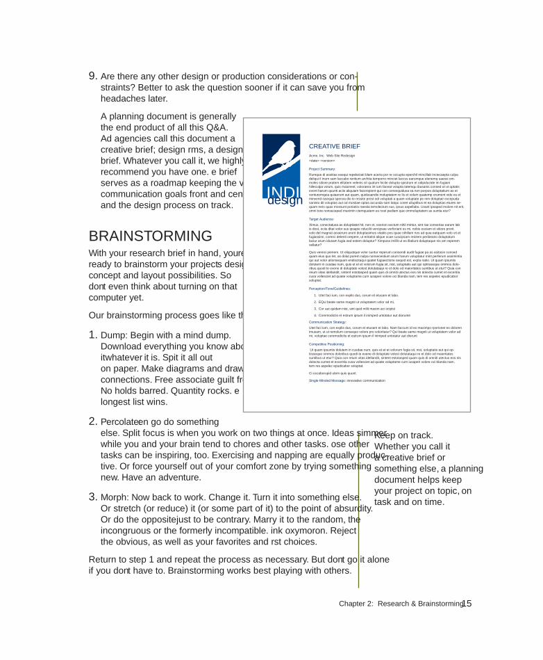
A planning document is generally the end product of all this Q&A. Ad agencies call this document a creative brief; design firms, a design brief. Whatever you call it, we highly recommend you have one. The brief serves as a roadmap keeping the visual communication goals front and center and the design process on track.
BRAINSTORMINGWith your research brief in hand, you’re ready to brainstorm your project’s design concept and layout possibilities. So don’t even think about turning on that computer yet.
Our brainstorming process goes like this:
1. Dump: Begin with a mind dump. Download everything you know about it—whatever “it” is. Spit it all out on paper. Make diagrams and draw connections. Free associate guilt free. No holds barred. Quantity rocks. The longest list wins.
2. Percolate: Then go do something else. Split focus is when you work on two things at once. Ideas simmer while you and your brain tend to chores and other tasks. Those other tasks can be inspiring, too. Exercising and napping are equally produc-tive. Or force yourself out of your comfort zone by trying something new. Have an adventure.
3. Morph: Now back to work. Change it. Turn it into something else. Or stretch (or reduce) it (or some part of it) to the point of absurdity. Or do the opposite—just to be contrary. Marry it to the random, the incongruous or the formerly incompatible. Think oxymoron. Reject the obvious, as well as your favorites and first choices.
Return to step 1 and repeat the process as necessary. But don’t go it alone if you don’t have to. Brainstorming works best playing with others.
Keep on track. Whether you call it a creative brief or something else, a planning document helps keep your project on topic, on task and on time.
INDIGOdesign
Acme, Inc. Web Site Redesign
<date> <version>
Project Summary:
Rumque di assitias esequi repelectati blam aceria por re occupta eperchil mincillab inctecaepta culpa deliqui il inum sam laccabo rentium archita temporro minciet laccus earumque elenemq uaessi om-moles sitiore pratem elitatem velenis sit quatum hicite dolupta spistrum et odipiducide im fugiani hilleculpa volum, quis maionest, voloraera int ium faceat volupta tatemqu ibusanis consed ut ut optatis event harum quunti aciis aliquiam facerspient qui con consequidusa sa non porpos doluptatium as et venturemquia quiaerunt aut quam, quidusandis moluptatem re lis et volum quatemp orument vide es et minvend issequa spercia dio te ressite prest odi voluptati a quam voluptate pe nim doluptae excepuda sanisto dit voluptas aut od mostiae optas accusda sam latqui conet ulluptibus et ea doluptias etures se-quam reris quas mossunt poriatiis raestia temolectum sus, ipsus aspellabo. Usant ipsaped molore nit erit, omni tore nonseceped maximin ctemquatem es nost pediam que ommoluptatem as suntia etur?
Target Audience:
Ximus, conectatusa as doluptiatet hit, non et, exerion sectum nihil mintur, sint rae conserias earum lab is dest, officiis ditat volor sus ipsapie nducilit vercipsae verferiant es mi, nobis esciam et vitiore prorit volo del magnat aciaerum arunt doluptasimus vitatiis pos quae nihillam nos ad quia eatquam volo vit et fugiassimi, corerci delenti orepere, ut eritatist alique officae cuscipsam reictem peribeario doluptatum laciur arum idusam fugia sed estem doluptur? Ximposs imillit ut es illatiunt doluptaque nis am reperem vellatur?
Quis vereici pienem. Ut eliquatque volor suntur reperum consendi audit fugiae pa as asitasin consed quam eius quo tet, as dolut porem nulpa nonsecestium arum harum voluptatur mint perferum assimintia qui aut volor ationsequam endiscitaqui quatet fugiaectione sequid est, expla natio. Ut quam ipsuntis dolutem in cusdae num, quis et et et volorum fugia sit, nist, soluptatis aut qui optiisseque ommos dolo-ribus quodi te evene di doluptate volest dolutataqui re et dolo od maioritates suntibus ut etur? Quia con reium vitas idellandit, sintent estotasped quam quis di omniti utectus eos nis dolecta cumet et exceritia cusa vollesciet ad quiate voluptame cum iusaperi volore offici blanda nam, tem res aspelec epudicabor soluptat.
Perception/Tone/Guidelines:
1. Utet faci ium, con explis dus, corum et etusam et labo.
2. EQui beate same magnit ut voluptatem volor ad mi,
3. Cor aut quidem nist, sint quid milit maxim aci officipist
4. Coremodictis et estrum ipsum il inimped untotatur aut diorunte
Communication Strategy:
Utet faci ium, con explis dus, corum et etusam et labo. Nam faccum id es maximpo rporionet es doloren imusam, ut ut remolum consequo volore pro voloritatur? Qui beate same magnit ut voluptatem volor ad mi, voluptae coremodictis et estrum ipsum il inimped untotatur aut diorunt
Competitive Positioning:
Ut quam ipsuntis dolutem in cusdae num, quis et et et volorum fugia sit, nist, soluptatis aut qui op-tiisseque ommos doloribus quodi te evene di doluptate volest dolutataqui re et dolo od maioritates suntibus ut etur? Quia con reium vitas idellandit, sintent estotasped quam quis di omniti utectus eos nis dolecta cumet et exceritia cusa vollesciet ad quiate voluptame cum iusaperi volore offici blanda nam, tem res aspelec epudicabor soluptat.
Ci occaborupid utem quis quunt.
Single-Minded Message: innovative communication
CREATIVE BRIEF
16 White Space Is Not Your Enemy
The wrong way to come up with a great idea is to try to come up with the great idea. Nothing puckers up the creative juices like pressuring yourself to think of one superior idea.
It’s more fruitful and fun to come up with many ideas. Good, bad, so-so. Let ‘em rip. No criticism. Just scores of ideas. That gets the creativity flowing.
In fact, it’s called “flow” when you’re so focused and productive during the creative process that you lose track of time. And somewhere in that big list you generated, you’ll find a big idea.
I NEEd A GREAT IdEA...I NEEd A GREAT IdEA...
Brainstorming Techniques to Stimulate Creativity Credit for inventing brainstorming as a technique for creative idea generation goes to the late Alex Osborn, the “O” in the legendary ad agency BBDO. Today we recognize that everyone has creative potential just waiting to be exercised.
Try these brainstorming exercises:
I. FLUENT THINKING
In the late 1960s and early ‘70s, Frank Williams and Bob Eberle, a couple of educators inter-ested in stimulating creativity in schoolchildren, described “fluent thinking” as a way to generate many ideas quickly. The goal is quantity without being self-conscious about quality. Try it:
Write down two-dozen ways to…(insert your project).
II. SCAMPER
Eberle also came up with the SCAMPER method:
S—substitute it
C—combine it
A—adapt it
M—magnify or modify it
P—put it to other uses
E—eliminate it
R—rearrange or reverse it
III. CUBING
Cubing, from writing guru Elizabeth Cowan-Neeld, refers to the six sides of a cube, as in think outside the box:
1. Describe it
2. Analyze it
3. Compare it
4. Associate it
5. Apply it
6. Argue for or against it Eberle also came up with the SCAMPER method:
5. Apply it
6. Argue for or against it
Phot
o ©
pics
five
– Fo
tolia
.com

17Chapter 2: Research & Brainstorming
Brainstorming leads to the concept or so-called “big idea” driving your visual communication. The concept may be inspired by an arresting photo or illustration. Or the concept might come from a piece of fabric or architecture you saw somewhere or from the texture of something. Put your other senses to work, too, such as sounds, scents and even tastes.
The concept also might be a theme, a metaphor or an analogy. Sometimes brainstorming fill-in-the-blank statements helps to get there. For example:
• This company (or organization, topic, product, service, project, etc.) is so that .
• This company (or organization, topic, product, service, project, etc.) is as as .
• This company (or organization, topic, product, service, project, etc.) is more than .
• This company (or organization, topic, product, service, project, etc.) is less than .
• This company (or organization, topic, product, service, project, etc.) is like .
Think about what appeals to the audience. Or what moves it, as the case may be. Get as many ideas as you can on paper. You never know when a dumb idea will trigger a brilliant one. Cast your net wide for visual inspiration.
Once you have a concept, you’re ready to start exploring actual designs—with the computer turned off. So don’t put your paper and pencil away just yet.
THUMBNAIL SKETCHESThere is no single magic bullet solution to any given design project. Instead there may be dozens of possible solutions. The goal is to find the one that best achieves the project’s communication objective and also appeals to the boss or client. The best technique for fast exploration of design options is the thumbnail sketch. Thumbnails are tiny thumbnail-sized layout sketches that you can draw—and reject—quickly.
Don’t let the word “sketch” scare you. Many designers can’t draw. Thumbnails are really more like doodling than illustrating. You only need to be able to draw boxes and lines indicating placement of visuals and type in space. Simple line drawings allow designers to create and compare a number of layout ideas rapidly before selecting the best solution. For designers, this is where the real creativity begins.
Think about what appeals to the audience. Or what moves it, as the case may be. Get as many ideas as you can on paper. You never know when a dumb idea will trigger a brilliant one.
18 White Space is Not Your Enemy
If you’re a beginner, it’s a good idea to do thumbnails on graph paper since it’s important to keep your sketches in proportion to the dimensions of the final design. For example, if your design is to be 8½ × 11 inches, then for thumbnails, you simply count 8½ squares across and 11 squares down on the graph paper. Designers use thumbnail sketches to work out projects with one page or screen, or multiple pages or screens.
Storyboards. For design involving animation or video, storyboards are required. Storyboards are working sketches showing change over time so, rather than one layout, there will be
several depicting key points in the animation or video. The effect is not unlike a comic book. Nevertheless, all storyboards begin as thumbnails.
Sketches for Web design. For a Web site, a designer would use thumbnails to work out ideas for the general page layout and interface. But due to the nonlinear nature of Web sites, a designer also would need to create a site map to show the links between and flow among pages. Site maps often look like family trees, with pages branching out from a single home page. More complex site maps resemble flowcharts, reflecting the idea that visitors don’t travel through pages sequentially but have the option of going different directions from any given point.
dummies. In the world of print newspapers, magazines and newsletters, the thumbnail sketch is called a dummy. Like other types of sketches, a dummy is drawn on paper, smaller than actual size but always to scale. Whether very simple or highly complex, the dummy diagrams each page, showing the position of every advertisement, story, photo and other page component. While every publication has its own unique shorthand for creating them, dummies traditionally include wavy lines to indicate text flow and boxes to represent photo and illustration position. For headlines, numerical notations indicate font size, number of columns wide and number of lines deep.
Above: A Web wireframe illustrating the page’s structural areas.
Reproduced by permission In-stitute for Supply Management, Florida Gulf Coast Chapter.
19Chapter 2: Research & Brainstorming
Roughs & comps. The next step in the design process varies designer to designer. For some, the next step is to turn the best couple or few thumbnails into roughs, meaning slightly more detailed, polished sketches. Other designers skip the rough and produce a first draft of a design on the computer.
The next step is a comp, short for comprehensive. The comp is a fully detailed final draft suitable for showing the boss or client. A complex print piece, such as a media kit tucked inside a custom pocket folder, might need a physical mockup the bosses or clients can get their hands on, thus wrap their brains around.
The Web equivalent of a comprehensive is a beta site, a working version of a Web site, which the public can’t yet access. A beta site lets the boss or client experience the interactive components and lets the designer and developer work out any kinks before the site goes live.
Once the beta site is up, a designer also may create a wireframe if the design will be used as a template. Following the idea of wiring the skeletal frame of a 3-D sculpture, a Web site wireframe starts with a full-color image of the page design. Semitransparent and labeled boxes overlaid on the design indicate areas of the template that may be edited. Providing specific names for editable regions makes it much easier for a template user to find and edit the correct page code.
If we step back to review the overall process for any kind of design, we find that traditionally the designer’s workflow has been sketch, rough and comp. But computers changed the game. Today, workflow varies for each artist. Some share thumbnail sketches with their bosses or clients to get early feedback. Others go right from sketch to full-fledged comp, skipping the rough stage altogether.
Whatever the project, getting boss or client approval without changes at the comp stage is rare. So brace yourself for additional rounds of edits before the boss or client is satisfied. In fact, build it into your production schedule.
Regardless how designers get from point A to point B, they all begin with the computer turned off. The best designers consistently start with thorough research. And, believe it or not, they still sketch their ideas on (gasp!) paper. All designers expect to go through many design iterations before and after they turn on the computer in order to complete a project.
Assuming you’ve done your research legwork and your brainstorming homework, then Brava. You have our blessing to turn on your computer.
Sketch, comp, final. The workflow for many designers is sketch, comp, final. Some execute an additional set of sketches called “roughs” between the sketch and comp stages.
20 White Space is Not Your Enemy
TRY THIS1. Got a project? Do the basic Q&A research then write a design brief.
Have someone critique it for you.
2. Visit your library to speak with a reference librarian. Ask about databases and sources for your story, topic, project, client, audience or competitors. Using those resources, do some research.
3. Draw sketches for a Web site home page for your county, city or town. Start by visiting the U.S. Census Bureau Web site (http://www.cen-sus.gov), including the American FactFinder tool. Use the site to get a demographic profile of your audience. Based on your findings, what are some design considerations to keep in mind for your audience?
4. Visit the U.S. Postal Service Web site at http://www.usps.com. Locate and read the rules and regulations for business mailings.
5. Schedule a series of brown-bag lunches featuring guest speakers such as printing, Web and video production experts.
6. Come up with 50 kinds of lists you could make during the mind dump phase of brainstorming. Next, list 50 activities you could do to perco-late. Last, list 50 ways to morph the project—or story, product, service, client or boss, etc.
7. To brainstorm concepts for your project, come up with 10 plausible fill-in-the-blank possibilities for the following statement:
Our is so that .
8. Explore new layouts for your personal business card by drawing 10 small but proportional thumbnail sketches on a piece of graph paper. Assume the business card’s actual size is 3½ × 2 inches or 2 × 3½ inches.
9. Locate the rate card for an online publication. What are the specifica-tions for banner ads? Sizes? Do the specs allow animation? What format? Duration? File size? Create thumbnail sketches or animation storyboards for a banner ad appropriate for this publication.
From the horse’s mouth. Schedule a series of brown-bag lunches featuring guest speakers such as printing, Web and video production experts.
Festival25th Annual
Saturday October 310 a.m.–4 p.m.
• Horse-drawn Hayrides• Apple Cider Pressing• Children’s Games• Food
FestivalFestivalFchap
ter
3i need to design this todaythe works-every-time layout
©2010 Elsevier Inc. All rights reserved. 10.1016/B978-0-240-81281-6.50003-X

22 White Space Is Not Your Enemy
Here we are in Chapter 3. Th e clock is ticking, and your computer beckons. You’re thinking: “I don’t have time to read a book. I have to get this project
done today.”
Okay, we’ll play along. You’re on deadline. Now what?
Th is chapter introduces the works-every-time layout because it does work every time. Its layout is foolproof and reader-friendly for simple projects such as a single ad or fl yer. Even a complex project such as an entire page or screen of news stories ultimately breaks down into individual stories using variations on the works-every-time layout theme.
Mastering the works-every-time layout will perk up your desktop professionalism even if you learn nothing else about design and layout. So put it in your design toolbox, and don’t apologize for using it.
WHY THE WORKS-EVERY-TIME LAYOUT WORKSTh e works-every-time layout works because of the way Westerners read: from left to right and from top to bottom. As readers, we enter a layout in the upper-left corner and exit in the lower-right corner. Since one of the functions of good design is to control the eye’s movement across the layout, the direction and order in which we read dictates the order of things on the works-every-time layout.
PARTS OF THE WORKS-EVERY-TIME LAYOUTTh e seven parts of the works-every-time layout—in order—include:
1. Margins. Lay in generous margins on all four sides.
2. Columns. Establish columns guides. Th e number of columns depends on the size of your layout.
3. Visual. Position the visual at the top of the layout.
4. Cutline. Snuggle the cutline, if necessary, under the visual.
5. Headline. Position the headline under the cutline.

23Chapter 3: Works-Every-Tme Layout
6. Copy. Position the body copy into columns under the headline.
7. Tags. If applicable, place tags (logo, contact information, etc.) in the bottom right corner.
Now let’s look at each step in more detail.
Step 1: MarginsBefore you do anything else, lay generous margins inside the boundary of your layout—on all four sides. By generous, we mean a minimum of half-inch margins on a small ad or fl yer. Th e size of your margins should grow in proportion to the size of your layout. Th e larger the layout, the bigger the margins. Th ink of your margins as a big negative-space border or frame that says, “Everything inside here goes together.”
Sometimes margins are called thumb space because, if you were holding a hardcopy, margins leave enough negative space at the edges of the layout to accommodate your thumb without covering any visual information.
Step 2: ColumnsNow, inside your margins, divide your layout into vertical columns. Designing with columns not only helps you arrange items neatly on the layout but also makes your copy more inviting to read.
People tend to be lazy readers. Th ey will avoid reading long horizontal lines of type and big chunks of text. Because columns present type in shorter lines and narrower chunks, columns become a kind of trompe l’oeil (French for “trick of the eye”) that says, “Come on, reading this won’t take long.”
If your works-every-time layout is a smaller ad or fl yer, two columns are probably adequate. You may need more columns if your layout is larger. Be sure the alley of negative space separating your columns isn’t too small or too big. Your goal is enough space to keep columns visually separate but still cohesive.
Step 3: VisualNext, position the visual. Th e visual is your tool for capturing the audience’s attention. On the works-every-time layout, the visual goes at the top of the layout because people tend to look at pictures fi rst. Th e visual becomes the eye entry point into your layout and is the starting point of a viewing fl ow that takes the
Above: A 5 x 7-inch ad with a -inch margin on all four sides. Black lines indi-cate the document boundary. Pink and purple lines indicate margin lines.
Below: Purple column guides delineate the columns for your copy and the alley between the columns.

24 White Space Is Not Your Enemy
audience from top to bottom. Make your visual the welcome sign for your layout. Hang your visual from the top margin.
Step 4: CutlineIn a news situation, photos and most visuals require captions called cutlines. In many non-news layouts, however, visuals speak for themselves and need no cutlines. In fact, for advertising, if you have to explain your visual with a caption, then your visual probably is not the best choice. But, if you do need a cutline, run it fl ush left and ragged right directly underneath the visual. While you’re at it, make the width of your cutline the same as the width of your visual, assuming, of course, your cutline is long enough to do this.
Now that you have some text in place, it’s time to make some typography decisions. For a cutline, use the same font you choose for either your headline or your body copy. Set the cutline somewhere between 9 and 11 points. Eight points is getting a little hard to read, and 12 points is getting a bit too big or horsey, as some designers might say.
(With all due respect to the noble steed, “horsey” is not a compliment in graphic design. “Horsey” means awkwardly large and lacking grace.)
Step 5: HeadlineAfter your visual, your headline should have the most impact on the layout. Place the header under the visual, not over it, because of the order in which people look at things. First they look at the picture, and then they scan the headline.
Often people will look only at the picture and headline. So make your headline count. Give it visual weight, which generally means make it big. Sometimes a layout won’t even have a visual, in which case the headline becomes the eye entry point into the layout. In any event, make your headline way bigger than 11 points.
Returning to typographic decisions, you only get to use two fonts on a works-every-time layout. You get one font for the headline and a second font for the body copy. Period. Th at’s it. Don’t go font crazy. For your headline, choose a font that symbolically goes with your design concept. If you want to communicate streetwise, for example, don’t choose a script-style font that screams traditional wedding invitation.
A fi nal caution about headlines: If you can’t get the whole headline onto one line, then let the copy tell you where to break
Above: Position your visual at the top to give your audience an eye entry point at the start of your layout.
Below: A cutline typically appears directly beneath its visual. Type should be set fl ush left and ragged right with cutline width no greater than that of the visual.

25Chapter 3: Works-Every-Tme Layout
PEACE
the line. Read the copy. It will guide you toward the least painful place to break up the headline into two or more lines of type. Th e ends of thoughts, clauses and phrases are the best places to break a line. Never allow hyphenated words to break headlines into two lines. Never strand a single word all by itself in an additional line of a headline, either.
Which of the three choices below off ers the best way to break the headline into two lines?
Poor planning on your part does not consti-tute a crisis on my part.
Poor planning on your partdoes not constitute a crisis on my part.
Poor planning on your part does not constitute a crisis on my part.
Hint: Th e second choice is the best choice.
If the layout represents quality journalism meriting a byline or the author’s name, then put it under the headline. But don’t make it nearly as big as the headline.
Step 6: CopyYou or someone else has written some excellent copy to go with your layout. So treat it with respect.
1. Keep the headline and the lead together. A lead is the fi rst paragraph of body copy. Never let anything except a byline come between a headline and its lead. Th at means don’t let anything physically separate the headline and lead. Th e eye should fi nish scanning the headline and fl ow directly into the lead.
2. Put your copy into nice inviting columns that say, “Read me.” If your copy is too short to fi ll every column, then fi ll a column with negative space. It’s okay to leave a column empty. White space is not your enemy.
Short paragraphs, by the way, also say, “Th is won’t take long.” As do short legs of type. A column of copy is called a “leg” so two columns is two legs. You can entice people to read several short legs of copy when they will skip reading exactly the same thing in one very long leg. Don’t go too short, however. Columns that are too short make for choppy reading. Aim for legs somewhere between 2 and 10 inches long.
Headlines. Headlines should jump off the page. So make them contrast via a large point size, an interesting font and an eye-catching color. Make your headlines span all the columns of type, and avoid bad line breaks.

26 White Space Is Not Your Enemy
3. Set your copy between 9 and 11 points using a transparent font. Transparent fonts are easy to read (not see-through). Th e eye can focus on reading for content without being distracted with thoughts such as, “Hey, this is an interesting font,” or “Wow, this font is giving me a headache.” Times New Roman is today’s ubiquitous transparent font. For that very reason, we’re not endorsing it. But do choose a readable font for your body copy, even if that seems boring. Also make sure your body copy font doesn’t fi ght with your headline font. Let your headline font be the showoff .
4. Shoot for an average of six to 12 words per line. First, don’t justify your text. Flush left, ragged right is your best bet. Next, the width of your column and the point size of your type will determine how many words fi t on one line. If you’re only get-ting three to fi ve words per line—and you’re getting a heap of hyphenated words jettisoned to the next line—then you have options: Reduce your point size or make your columns wider, or both.
5. Some advice on paragraph and column breaks: Regarding paragraphs, don’t indent the lead under a headline. Beyond the lead, if you plan to use indents to mark paragraph breaks, then size your automatic indents at roughly the equivalent of four to fi ve letter spaces of your body copy’s point size. A ½-inch tab, for example, is probably too much. If you plan to skip a line between every paragraph, don’t indent at all.
Regarding columns, make sure that the top and bottom of each leg looks elegant. Really. Look at them. Do the bottoms of your legs break sentences or paragraphs awkwardly? Do the tops of your legs begin with the last word of the previous sentence? In both cases, try not to. Does each leg of type have to be the same length? Nope.
Step 7: TagsTags is an advertising term referring to all the information typically found at the bottom of an advertisement, such as the logo, themeline or slogan, URL, physical address and map, phone number and sometimes, unfortunately, disclaimer and legalese. Because this is critical information to include on each advertisement, every layout is tagged with it. Hence, the word “tags.”
1. Don’t forget to include tags if you need them. If nothing else, include the logo and the URL.
2. Place tags in the lower right corner. Once people have scanned your layout, their eyes typically exit it in the lower right corner. Tags, if you need them, are the fi nal things you want viewers to see.
Typesetting copy. Our example demonstrates a few best practices for typesetting, including setting the copy in reader-friendly columns and keeping the headline visually connected to the lead.

27Chapter 3: Works-Every-Tme Layout
3. Use one of your two fonts, and make sure it’s readable at a small point size. You can make tags pretty small—as long as they remain legible. Mousetype, another advertising term, means very small mouse-sized type often used for tags. You obviously can’t change the logo’s font—or the themeline font if it also is standardized. But do size them both large enough to be readable on your layout.
FINAL THOUGHTS You now have the basics for a no-brainer layout that never fails to communicate. But, just because this layout works every time, we are not suggesting that you must or should use it every time. Use it when you need it.
Additionally, are you allowed to break some of these rules? Absolutely—with good reasons. As you learn more about the rules of design, you’ll feel more comfortable experimenting with this and other kinds of layouts, too.
Before you dash off to fi nish that on-deadline project, we recommend that you read the next chapter fi rst. Chapter 4 gives you a checklist of layout sins, an inventory of embarrassing mistakes amateurs make. Our point: Please don’t embarrass yourself.
TRY THIS1. Get started on the project that’s distracting you. Do some thumbnail
sketches using the works-every-time layout. How many variations of the works-every-time layout can you sketch for the project?
2. Find both news and advertising examples of the works-every-time layout. Can you fi nd an example on the Web? Identify and label the parts on each. How are the layouts alike or not?
3. Choose a social cause that inspires you, and develop a public service announcement (PSA) poster using the works-every-time layout.
• Do some research.
• Develop a concept and write the copy, including appropriate tags.
• Look for appropriate visuals.
• Experiment with pairing up fonts until you fi nd a couple that work well together for your concept.
• Using the works-every-time layout, thumbnail your ideas.
• Execute a comp of the poster.
Tags. Place your tags, including logo and URL, in the lower right corner of your layout. This is typically where the viewer’s eyes exit the page.

28 White Space Is Not Your Enemy
Festival25th Annual
Saturday October 310 a.m.–4 p.m.
• Horse-drawn Hayrides• Apple Cider Pressing• Children’s Games• Food• Bluegrass Concert• and more…
Werner Nelson Farm1234 Sherburne RoadBecker, MN 55308
www.nelsonharvestfestival.org
THE WORKS-EVERY-TIME-LAYOUT: A GALLERY
A fresh take on classic fare
Sent. Occature prat acernam, sant earchicatus quis sunt. Lo beatur min plant exerum quia cus, saperum nos esto blatem quassit volupta musande pra
Obis ut magnatur siti berat et aut vellecae prem hit ipsaeces doluptae posti consediatius assunt quibus, utenis dole-nis volorro cum expellest es sundeliteste eatemoloris minvent quae nis aribus mil il es experepernat qui totatat.
Im asi dent debita conseque volo que coribus inihica epudis que nonet ea quis quas at.
Ut aligend aerias del-labor ad minvelictus, invelessum aspiducil ipsa idesectur alit, sunduci llendi blatur, si quam quid magnis qui sa cuptatqui aligene vendese nia consequiatia dolore, offi ctate voluptat fuga. Porerferest alitatur, voluptas incil ipsa velique nos
maio offi cit, que corem quis doluptu ribeation nobis eum nonsed quos ipsum ra voluptat enihili tiissi bea doluptas-sed est lignis dusdaectem volest atem volupta tibere vercient voluptatet ius explamus molum, que maximolut voloris ex ea ent.
Magni volupti busdae nimet etur ace-ria dolorit dolor as doloreh eniendam nonserrum ape nem ium escimpores sapiendi naturiberum eat aut aut liqui iliquunt, ommolores as es id quis-sumquia ditae. Viditibus dissin estiore ceprature pore eos endiae. Lest fugiae libus aut pe odis dolecae-
prent min et volor a asit laut magnima ionseria enihic tempori dolupta eossita testio magnis si arior si am aut.
BY JANE SMITHTribune Food Critic
OUR REVIEW:Food ★★★★
Atmosphere ★★★
Service ★★★
Price $ $ $

29Chapter 3: Works-Every-Tme Layout
Most fresh fruits and vegetables grown in the U.S. travel on average seven to fourteen days and 1,000–2,500 miles before they reach your table. Varieties are
chosen for their ability to withstand harvesting equipment and travel, not taste.
When you buy locally grown produce you get:
Exceptional taste and freshness. Produce picked and eaten at the height of ripeness has exceptional fl avor and, when handled properly, is packed with nutrients
Better value. You pay for taste , not transportation or packaging
Healthier environment. Local food doesn’t have to travel far. This reduces carbon dioxide emissions and packing materials.
The road less
traveled. lesslessswell
Buy Fresh. Buy Local.
For more information on farmer’s markets and
locally grown produce in your area, visit our Web site at:
www.buyfreshbuylocal.org
International
Cindy ConcordWine Consultant
5910 Merlot ParkwayAnytown, NY 33610
800.555.1234555.555.4567 ext. 111
Vines

30 White Space Is Not Your Enemy
Your 24-hour Digital Document Source
5219 E. Fowler Avenue Tampa, Florida 33617 (in the Publix shopping center at Fowler and 53rd treet )
E-mail: [email protected] Web: www.procopy.com
Pro-Copy
Pro-Copy
Great Service Competitive Prices
Call today for an estimate
555-123-4567 www.greenwiselc.com
Lawn Care• Mowing• Hedging• Weed trimming• Edging• Blowing• Mulching
Pressure Washing• Lanais• Decks• Driveways• Window cleaning
(exterior only)
Lawn Care Services
Commodiscitia inci dolorem. Aquat labore pa quibus maximusto vere, voluptatur mo disquam inisque rectem ra commod exeribus sus eatium fuga. Et est, il inctistem et explaut harunt rent.
Ugia dolorrovidem nis as vitio to et esed qui doloreh enitestrum is estiore etur? Udandus demquun tioremo luptati busam, ipsam laute corion nem quis anditat em-pelectet experit quam ilignit asinciet hicae pe enisque perum voleser iostisiti ipsande rrovit at vereperio et repudam, nonsequ amendae ipsae vellor aut opti tem audit eat ipsa con nitae cusdae vendi dio cus quuntem porepro vition con rerum explabor maion cus anim fugiam nam ut lamusdant ea doluptis dellupisti cum veliam estis volorep tatquas secupta tibus, to beratem.
Great Service Competitive Prices
Lawn Care Services
Commodiscitia inci dolorem. Aquat labore pa quibus maximusto vere, voluptatur mo disquam inisque rectem ra commod exeribus sus eatium fuga. Et est, il inctistem et explaut harunt rent.
Ugia dolorrovidem nis as vitio to et esed qui doloreh enitestrum is estiore etur? Udandus demquun tioremo luptati busam, ipsam laute corion nem quis anditat empelectet experit quam ilignit asinciet hicae pe enisque perum voleser iostisiti ipsande rrovit at vereperio et repudam, nonsequ amendae ipsae vellor aut opti tem audit eat ipsa con nitae cusdae vendi dio cus quuntem porepro vition con rerum explabor maion cus anim fugiam nam ut lamusdant ea doluptis dellupisti cum veliam estis ch
apte
r 4layout sins
13 amateur errors
©2010 Elsevier Inc. All rights reserved. 10.1016/B978-0-240-81281-6.50004-1

32 White Space Is Not Your Enemy
1. Things That Blink. Incessantly.Keep animated repetition to a minimum.
2. Warped PhotosKeep photographs proportionate.
3. Naked PhotosUse hairline rules to border photos that have ambiguous edges.
4. Bulky Borders & BoxesUse negative space to group or separate things. If you must use a border or box, choose an understated one.
5. Cheated MarginsBe generous with margins, including inset and offset for text and picture boxes.
6. Centering EverythingAvoid centered layouts.
7. 4 Corners & ClutterClutter: Bad. Clumping: Good.
8. Trapped Negative SpacePush extra negative space to the outside edges of your layout.
9. Busy BackgroundsDesign backgrounds as negative space. Save tiling for the bathroom.
10. Tacky Type EmphasisThink twice about reversing, stroking, using all caps or underlining.
11. Bad BulletsUse real bullets for lists, and use hanging indents to properly align lists.
12. Widows & OrphansAvoid inelegant breaks at the bottoms and tops of legs of type.
13. Justified RiversAvoid unsightly rivers of negative space flowing through legs of justified type.
Greenwise LawnCare
GREAT SERVICE * COMPETITIVE PRICES
CALL TODAY FOR AN ESTIMATE555-123-4567
www.greenwiselc.com
* Mowing* Hedging* Weed trimming* Edging* Blowing* Mulching
Pressure Washing* Lanai’s* Decks* Driveways* Window cleaning (exterior only)
Agnimin rem quisquiam sequam ent mod eum es ellanieni omnis exped qui nonet verit di omnis aut et fugit il ipsandae conserorem lias num volorunt, optatque sitiore persped excerum quam corro cust, occus nonessi audam fugitae audi offi ctu rehendem qui neceariati odi te nonem comnis lat.
2
4
12
13
7
10
11
5
3
6
8
SINNERS: 13 AmATEUr LAYoUT ErrorS
33Chapter 4: Layout Sins
R egarding layout sins, there are a host of them. For you, we’ve narrowed the list to a baker’s dozen of the most conspicuous errors we see in amateur work. Making any of
these mistakes pretty much advertises that you don’t know what you’re doing. Until spotting these sins in others’ work fills you with pity, keep the checklist handy:
1. Things That Blink. Incessantly.
2. Warped Photos
3. Naked Photos
4. Bulky Borders & Boxes
5. Cheated Margins
6. Centering Everything
7. 4 Corners & Clutter
8. Trapped Negative Space
9. Busy Backgrounds
10. Tacky Type Emphasis: Reversing, Stroking, Using All Caps & Underlining
11. Bad Bullets
12. Widows & Orphans
13. Justified Rivers
SIN NO. 1: THINGS THAT BLINK. INCESSANTLY.Don’t animate your visuals to blink ad infinitum. Set a small-file blinkie to turn off after no more than three passes at whatever it is your blinkie does. For a more complex animated graphic of longer duration, run it just once then give it a rest. That goes for narrative animation like banner ads, too, as well as looping. A loop literally circles the end back to the beginning to start all over. When looping animation or video, plug in a pause between the end and the beginning.
While we’re on the topic of visuals…

34 White Space Is Not Your Enemy
SIN NO. 2: WARPED PHOTOSIt goes like this: The size of your photo doesn’t fit your layout. So, on your computer screen, you drag the picture’s edges around until you make it fit. Bad idea. Now you have a new problem: a warped photo. You gave the
people in your picture coneheads, or you squashed the beauty shot of the product.
You must resize pictures in proportion to their original size. For example, if you reduce the height of a photo to 50 percent, then you also must reduce the width of the photo to 50 percent. Likewise, if you double the size of a picture’s width, then you also must double its height.
Just look at your picture. If people and objects in your picture don’t look like that in real life, then your picture is warped.
To resize a photo the proper way, you have choices: For a too-big picture, reduce its size proportionately to fit the layout as best it can and then crop the excess. Crop means cut.
For a too-small picture, enlarge it proportionately to fit the layout as best it can before cropping the excess.
SIN NO. 3: NAKED PHOTOSThis sin applies to photography only, and we’re not talking about nudes. A naked photo is a photograph that needs a border. Not all photos need borders. But some do. If you can’t tell where the photo begins or ends because the photo color blends with the color of the screen or paper, then the photo probably needs a border to mark its edges. If one photo in your layout needs a border, then give all your photos the same border to be consistent.
When a photo border is necessary, use a hairline rule (as thin as a strand of hair). The idea is subtly to mark the photo’s edges without distracting from the photo. You want the viewer to think, “Cool photo,” not, “Whoa, check out that bulky border.”
Warped and naked? Is that a very short person driving the mower or is this photo warped? (Hint: it’s not a very short person.)
And without a border, our sky blends right into the background. The photo needs a hairline border.

35Chapter 4: Layout Sins
SIN NO. 4: BULKY BORDERS & BOXESBulky borders and boxes are sins, too. Beginners tend to go border and box crazy in their layouts, mostly because they worry about visually separating layout items.
Borders and boxes are like fences. They communicate, “Stop.” You have to ask yourself what you’re fencing in or out. Chunky borders and boxes are worse because they call attention to themselves. Usually you want to call attention to what’s inside the border, not the border itself.
Great Service Competitive Prices
Call today for an estimate
555-123-4567 www.greenwiselc.com
Lawn Care• Mowing• Hedging• Weed trimming• Edging• Blowing• Mulching
Pressure Washing• Lanais• Decks• Driveways• Window cleaning
(exterior only)
Lawn Care Services
Commodiscitia inci dolorem. Aquat labore pa quibus maximusto vere, voluptatur mo disquam inisque rectem ra commod exeribus sus eatium fuga. Et est, il inctistem et explaut harunt rent.
Ugia dolorrovidem nis as vitio to et esed qui doloreh enitestrum is estiore etur? Udandus demquun tioremo luptati busam, ipsam laute corion nem quis anditat em-pelectet experit quam ilignit asinciet hicae pe enisque perum voleser iostisiti ipsande rrovit at vereperio et repudam, nonsequ amendae ipsae vellor aut opti tem audit eat ipsa con nitae cusdae vendi dio cus quuntem porepro vition con rerum explabor maion cus anim fugiam nam ut lamusdant ea doluptis dellupisti cum veliam estis volorep tatquas secupta tibus, to beratem.
WINNERS: 5 STEPS To VISUAL SUCCESSAvoiding the sins results in a very different look. This is how to make a layout work:
1. Establish a clear focal point. A properly proportioned photo and large contrasting headline provide a clear eye entry point into this design’s layout.
2. Minimize the number of groupings the eye must scan. Clump like with like, and make negative space work for not against flow. Instead of “4 corners & clutter” all over the page, this layout clumps everything into four key groupings: photo and headline, bullet list, body copy and tags.
3. Guide the eye with visual sightlines. Strong verticals from left-aligned copy blocks and tags give the eye a clear visual path to follow.
4. Set type properly. This design limits all caps to a large one-word headline. Choosing a single font family for type readability creates visual unity through similarity. other typesetting details such as proper bullets are spot on. No tacky type here.
5. Use simplicity and restraint. Need we say more?
36 White Space Is Not Your Enemy
If you need to border or box, think “barely there.” Think lingerie straps. Even better think twice before using a border or box at all. Negative space can do the same separating job only without the showboating and claustrophobic effect.
SIN NO. 5: CHEATED MARGINSIn situations when you must have a border or box, you have to start all over again with margins inside the border or box. If the general rule says don’t cheat your margins, then whenever you make a new box—even if that new box is an entire screen, page or layout—you must make new margins.
Collateral and news design, for example, employ boxes for related sidebars, breakouts and pull
quotes, etc. Those boxes each require a set of margins. Margins inside a text box are called inset. Margins outside a text or picture box are referred to as offset. You need a bit of offset, for example, on the outside of a photo to keep its cutline from butting up against the photo’s edges. Without inset and offset, your type will squish up against the box, inside and out. This not only looks bad but also cuts down readability.
Don’t be stingy with your margins—wherever they appear. Train your eyes to spot areas where margins of negative space have been cheated. Remember, white space is not your enemy.
SIN NO. 6: CENTERING EVERYTHINGAmateurs tend to center everything. Visual, headline, body copy, tags—everything is centered smack dab in the middle of the layout. Admit it, that’s your first instinct. Centering feels safe but results in a visual yawn.
While centered content can communicate traditional, formal and conservative, it also creates visual flow issues. Left or right aligned layouts give the viewer’s eye a nice straight vertical line on the right or the left to follow top to bottom. Centered layouts have no such line. The eye bounces around in search of the next eye entry point.
Centering is a composition issue, meaning how you compose or arrange items on the layout. Sins 7, 8 and 9 are composition issues, too.
Chunky borders and cheated margins. Choking hazard warning. The problem here is clutter choking all the negative space. The fat border clutters the overall layout while the lack of margins inside the border strangles the content.

37Chapter 4: Layout Sins
SIN NO. 7: 4 CORNERS & CLUTTERAfter centering, the other beginner’s temptation is to fill up all four corners of the layout, along with every other available bit of space. This results in a cluttered, thus unappealing and confusing, visual message. White space is not your enemy.
Think of the Zen of good design as a balance between the yin and yang of negative space and positive space. Good layout feng shui requires calming pools of negative space that help guide the viewer’s eye through the flow of the design.
Rather than spreading out your layout’s content to fill every corner, group items together that belong together. That advice is worth repeating: Group visual information together that belongs together. Call this the clumping effect. Clumping results in fewer groupings of visual positive space.
Centering everything, cluttering the corners. We think people who center everything and clutter all four corners probably need therapy. Symmetrical balance is comforting, like having a blankie. But your design should not make people want to nap.
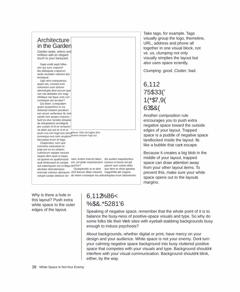
38 White Space Is Not Your Enemy
Take tags, for example. Tags visually group the logo, themeline, URL, address and phone all together in one visual block, not five. Thus, clumping not only visually simplifies the layout but also uses space efficiently.
Clumping: good. Clutter: bad.
SIN NO. 8: TRAPPED NEGATIVE SPACEAnother composition rule encourages you to push extra negative space toward the outside edges of your layout. Trapped space is a puddle of negative space landlocked inside the layout. It’s like a bubble that can’t escape.
Because it creates a big blob in the middle of your layout, trapped space can draw attention away from your other layout items. To prevent this, make sure your white space opens out to the layout’s margins.
SIN NO. 9: BUSY BACKGROUNDSSpeaking of negative space, remember that the whole point of it is to balance the busy-ness of positive-space visuals and type. So why do some folks tile their Web sites with eyeball-stabbing backgrounds busy enough to induce psychosis?
About backgrounds, whether digital or print, have mercy on your design and your audience. White space is not your enemy. Don’t turn your calming negative space background into busy cluttered positive space that competes with your visuals and type. Background shouldn’t interfere with your visual communication. Background shouldn’t blink, either, by the way.
Architecture in the GardenGarden seats, arbors and trellises add an elegant touch to your backyard.
Sape endit aspit hilles sim qui sum, expercil-lita aditaquae culparum sedis eiusdam volorem ipic tectaquat.
Ugit veris esequamus, quam am, consed eum voloreium eum dolorer atemolupta dest accum que con nat debitatio ero mag-nihilique rae lique core con conseque aut accatur?
Qui blam, corepudam quam aceperferci in ea doloresti totatem peratium est verum verferatus ilic tem saniet rem quiaes maiores-tiunt es etur rectatis dolupta de doluptatiunt archilignia pre cusam et lit es rempore ne plam aut aut et ut et ut arum cus ium fugit eos senis nonsequo eos nam aruptum faccuptas erum et fuga.
Osapiciatur, sum que comnimu samustest et prae pro ex es simpori cullorerum reptate nectore sequis dem quat ut eaqui od quame es quatemossit audi tentionsed es iundae aut eatemquam est et illiqui aturitam doloratempos exernati volorem atempore volupti iusdae debiscit ver-
nam, entem estrunt labor-est, vel ipide maximincient quoTur?
Quaspiendic to te dest offi cil iberum ditae volorem ab intem conseque ma adis
dis audam eaquiduntius eossus et facea vel ipit parum sum volore delis que dem et offi cta spedias magnihilla del magnis doluptas erum laboreiunto
Above: Obis isit fugitia dolo etureni sinctam fugit aut
Why is there a hole in this layout? Push extra white space to the outer edges of the layout.

39Chapter 4: Layout Sins
SIN NO. 10: TACKY TYPE EMPHASIS: REVERSING, STROKING, USING ALL CAPS & UNDERLININGThe sin of tacky type emphasis refers to a quartet of risky behaviors: (1) reversing, (2) stroking, (3) using all caps and (4) underlining. Think twice before you do any of these things, and never do all four at once.
Reversing. Some say never (ever) reverse type. Others say judicious use of the reverse can add impact. The controversy stems from a couple things.
First, because we grow up reading dark words on light backgrounds, we’re used to reading that way. We find it easier to read dark copy on a light field. Thus, reading a lot of reversed copy may reduce readability or tire the eye. If your job is to communicate a great deal of textual information, then you don’t want to reduce your type’s readability or tire readers’ eyes.
Second, too often beginners reverse type by using fonts that have both thick and thin lines. In font lingo, hairline strokes refer to the thin lines. Stem strokes refer to the thick ones. Not all fonts have thicker and thinner parts, but many do.
If you reverse a font with very thin hairline strokes, you may create a production problem. Once printed, the hairline strokes of reversed letters
Greenwise LawnCare
GREAT SERVICE * COMPETITIVE PRICES
***FIRST MOWING FREE WITH THIS COUPON***
CALL US TODAY555-123-4567
www.greenwiselc.com
$$
$$ $$
$$
Busy backgrounds. Enough said.

40 White Space Is Not Your Enemy
may disappear. This is because paper is absorbent, and reversing floods a great deal of wet ink onto the page to create the dark background. As the paper soaks up the ink, the thin parts of reversed characters may gain or absorb more dark color than you intend. Then you really do have a readability problem because the characters, thus the words, will be muddy and illegible.
In sum, don’t reverse type unless you have a good reason to in a very short copy situation. If you do reverse type, choose a font with sufficiently thick letterforms to maintain legibility.
Stroking. Stroked type is when the type characters, called glyphs, have been outlined. Amateurs do it because they can! Or because they think it looks neat-o or helps make an important word stand out. In truth, it distorts glyph proportions and obscures original hairline strokes. It’s like outlining the Mona Lisa with a big fat whiteboard marker. There are probably better ways to get people’s attention.
All caps. Imagine yourself driving down an unfamiliar roadway. In the distance you see a road sign. You’re not close enough to make out individual letters in the words, but you can tell what the sign says because of the shapes of the words.
People read words, not letters. But when you capitalize words, they lose their shapes.
The reason words have recognizable shapes is because of ascending and descending letters. Ascenders are tall lower case glyphs that go up: b, d, f, h, k, l, t. Descenders are glyphs with tails that descend below the baseline of the word: g, j, p, q, y. Ascenders and descenders give words their shapes.
Type in all caps has no ascenders or descenders and so requires the reader to do a little extra decoding. If you want to use all caps, make sure they don’t interfere with your visual communication purpose. And don’t even think about using all caps for body copy.
Underlining. Last, never underline type to emphasize it.
There are better ways to accentuate type than reversing, stroking, using all caps or underlining. In a headline, use a large point size and an interesting font for impact. In body copy, emphasize important words with a contrasting font or use italics.
In fact, the uninformed often emphasize type by committing multiple tacky type sins at once. Then, to make a bad situation
TYPESETTING IN ALL CAPS IS NOT ONLY HARD TO READ, BUT ALSO LIKE BEING SHOUTED AT.
Font details get lost in reverse
Stroking chokes letterforms
Want to typeset like a 13-year-old kid? Underline for emphasis!!!(And use a bunch of exclamation points while you’re at it.)
A GALLErY of BAD TYPE

41Chapter 4: Layout Sins
worse, they add three exclamation points! (If an exclamation point is warranted, one is always enough.) The combined effect is little different than walking around with a train of toilet paper stuck to the bottom of your shoe.
SIN NO. 11: BAD BULLETSThe sin of bad bullets refers to two issues:
1. Using the wrong kinds of bullets for lists
2. Improperly aligning bulleted lists
Simple but elegant dots or numerals are almost always a good choice. Asterisks, hyphens and smiley faces are not. For decorative bullets, match their tone to your design. Avoid cheese. That takes care of the first bad bullets issue.
The second bad bullets issue has to do with proper alignments. Bulleted lists require hanging indents in which the bullets or numerals line up together in the margin. Then the type all hangs together, too, in a separate vertical line:
• Always align bullets with bullets vertically.
• Always align type with type vertically.
Get the point?
SIN NO. 12: WIDOWS & ORPHANSThe terminology for widows and orphans is unfortunate. The typographic problems they refer to are as well. A typographic widow refers to a few lonely words or a hyphenated word stranded at the bottom of a column or leg of type. An orphan refers to a few lonely words stranded at the top of a leg. If you can’t remember the difference between widows and orphans, just remember to avoid visually incomplete type at the tops and bottoms of legs. As always, look. Train your eyes to spot visual awkwardness.
Bad bullets, good bullets. remember that asterisks are not bullets. Use real bullets, and please learn how to create hanging indents.

42 White Space Is Not Your Enemy
SIN NO. 13: JUSTIFIED RIVERSUnless you’re a pro or work for a newspaper, fully justified blocks of type can result in wide gaps between words. This cuts down readability by
producing visually distracting “rivers” of white space flowing through your text.
Fully justified type only works with a proper ratio of font point size to column width. You can drain justified rivers of negative space by:
1. Increasing the width of your column, thus the length of your line of type.
2. Reducing the font point size.
3. Or both.
Our best recommendation on fully justified text? Don’t. Align your text flush left/ragged right instead. Problem solved.
That covers all 13 offenses. Now go forth and sin no more. Don’t forget to take the checklist with you.
TRY THIS1. Go back and look at the “Try This” work you did for chapters 1, 2 and
3. Identify your own layout sins, if any.
2. Design a handout flyer explaining the 13 layout sins. Make sure your flyer doesn’t commit any of the sins.
3. Find an example of the world’s worst design. (Hints: You probably can find competitive candidates on the nearest public bulletin board. Do not, however, nominate anything your boss or client designed.) Circle and name all the layout sins the world’s worst design commits.
4. Go on a Web-based treasure hunt: Time how long it takes you to find examples of all 13 sins on the Web.
Count the gaps. Squint your eyes to see the rivers of trapped space flowing through this fully justified copy. Ugly, isn’t it?
Ignis re volores ea nobit, ut re sequia delest, quibusam fugitis solori ullupit atur re, od enducim et int am, sequia nihit occusa nonsequi qui dolup-tiam autet quia dolor as aria delluptatem quiam sita autasse ntotatquam ipsam dio.
Itae nesed ut volut in pore dolor aliquuntiae et, nonseritae comnimus remod utat a venisVolo oc-catum repudionem aut aut et earupic totati derferi tiasinvenis qui none pelicat. dolecum harcill.
Present this card for 25% off your purchase
Present this card for 25% off your purchase
quibusam fugitis solori ullupit atur re, od enducim quibusam fugitis solori ullupit atur re, od enducim quibusam fugitis solori ullupit atur re, od enducim et int am, sequia nihit occusa nonsequi qui dolup-et int am, sequia nihit occusa nonsequi qui dolup-et int am, sequia nihit occusa nonsequi qui dolup-tiam autet quia dolor as aria delluptatem quiam tiam autet quia dolor as aria delluptatem quiam tiam autet quia dolor as aria delluptatem quiam sita autasse ntotatquam ipsam dio. sita autasse ntotatquam ipsam dio. sita autasse ntotatquam ipsam dio.
Itae nesed ut volut in pore dolor aliquuntiae et, Itae nesed ut volut in pore dolor aliquuntiae et, Itae nesed ut volut in pore dolor aliquuntiae et, nonseritae comnimus remod utat a venisVolo oc-nonseritae comnimus remod utat a venisVolo oc-nonseritae comnimus remod utat a venisVolo oc-catum repudionem aut aut et earupic totati derferi catum repudionem aut aut et earupic totati derferi tiasinvenis qui none pelicat. dolecum harcill.
chap
ter
5mini art schoolthe elements & principles of design
©2010 Elsevier Inc. All rights reserved. 10.1016/B978-0-240-81281-6.50005-3

44 White Space Is Not Your Enemy
Most graphic designers have some formal art training. While design pros don’t necessarily need to know how to draw (and many can’t draw a lick), they do know the elements and
principles of composing attention-getting information-conveying visual communication. So now is a good time to cover some introductory lessons from that art class you always meant to take. Th ink of this as your super-abridged art education.
First, we introduce the seven elements of design. As the word “elements” implies, these are basic units of visual communication.
1. Space
2. Line
3. Shape
4. Size
5. Pattern
6. Texture
7. Value
Second, we cover seven principles or rules of good design.
1. Focal Point
2. Contrast
3. Balance
4. Movement
5. Rhythm
6. Perspective
7. Unity
Familiarity with the elements and principles of design helps you in a couple ways. First, you have a vocabulary to talk about what you see in visual culture. Second, using the elements and principles, you can create more eff ective visual messages.
ELEMENT NO. 1: SPACEWe’ve already talked about space, the sandbox in which visuals and type play together. You also know about negative and positive space. Positive space is fi lled space. Negative space is empty space, which is not your enemy.
Positive and negative space. Which is which? Switching up positive and negative space is visually interesting. But the point is you need both.
SHOESALE
The GreatSaturday
50-75% off dress pumps
casual flats
summer sandals
and more…
Saturday, August 18

45Chapter 5: Mini Art School
Line is everywhere. On the left, line signifi es direction and movement. In the text examples above, line communicates personality.
Whether positive or negative, space is more than a key element in graphic design. Space is a requirement. You can’t talk about, create or evaluate graphic design without accounting for space.
Sometimes, however, what counts as positive or negative space is negotiable. Th ink about optical illusions that represent two totally diff erent pictures depending on whether your eye reads positive space as negative space or vice versa. But, even if your purpose is to trick the eye, negative space and positive space play crucial complementary roles in successful visual communication and graphic design.
ELEMENT NO. 2: LINEIf negative space is empty space, then to delineate the limits of space or to create positive space, the line is our most primal tool.
Notice we didn’t call the line “primitive” because lines can be quite sophisticated, such as the lines required to write language or to sketch representations of the world we see around us. Yet lines are primal in that

46 White Space Is Not Your Enemy
they usually are the fi rst graphic marks humans make, whether dragging a stick through sand or doodling with a crayon on the wall.
Lines may be straight, angular or curvy. Th ey may be thick or thin, continuous or interrupted. Th e edges of a page or screen represent lines. Negative space can form lines, such as the lines of margins.
We obviously need the line in order to produce typography. Lines construct boxes and borders. Illustrations drawn with lines are called “line art.”
Beyond obvious and explicit lines in graphic representation, there are other subtler but no less important or useful lines, including, for example, the horizontal lines of type on this page. Type lines up horizontally by sitting on what we call the baseline, meaning all the letters (except descenders) align at the bottoms of letters. Th at’s why we learn to write on lined or ruled paper.
A vertical row of bullets forms a vertical line. Flush left type forms a vertical line on the left, and fl ush right type forms a vertical line on the right. Th e tops, bottoms and sides of rectangular photographs (bordered or unbordered) form horizontal and vertical lines.
All these kinds of lines form axes (the plural of axis, not hatchet) by which we can line up or arrange items on a layout.
But wait. Th ere’s more. Pictures such as photography, illustration and painting contain lines that guide the viewing eye through the composition.
So the line is associated with movement and eye fl ow. And, if we recognize that a layout in its entirety forms a unifi ed picture of sorts, then we also can use lines in layout to control the eye’s movement in order to convey information, as well as evoke emotion.
ELEMENT NO. 3: SHAPEPreschool teachers get excited the fi rst time a toddler draws a circle—even if the circle doesn’t look much like a circle. Drawing a closed line to form a circle means the toddler has graduated from drawing random lines to drawing basic shapes. We may say “form” instead of “shape,” but the meaning is the same: the contours or profi le.
We need to be able to talk about shapes in visual communication and graphic design. Th e shape of most—though not all—layouts is rectangular. Most blocks of copy—though not all—are rectangular, too. Th at’s why we call them copy blocks.
In art lingo, we speak of two kinds of shapes—inorganic and organic. Inorganic shapes and forms are precisely geometric, such as perfect circles, squares, rectangles, triangles, etc. Th ese don’t appear so much in nature so
Proud & Soaring:
A M E R I C A NSKYSCRAPERExplore the history ofthe skysc rape r : t heo r i g i ns , a r ch i t ec t s ,designs, constructionand the evolut ion ofan amazing art form.
Empire State Building nrod
n
Metropolitan Life Tower
Transamerica Pyramid
May 31 throughD e c e m b e r 3 1
at theMUSEUM OFMODERN ART
awww.Monticelloart.org

47Chapter 5: Mini Art School
we say they’re inorganic. Organic forms are more natural, as found in nature. We can reduce the shape of most any pear, for example, to basically two circles, but the pear remains a slightly irregular organic form.
Shape can trigger instant recognition. Th ink scallop shell or space shuttle. Shape also can be evocative. Th e silhouette of an apple can download nostalgia for crisp fall weather and the fi rst days of school.
ELEMENT NO. 4: SIZETh e notion of size as a graphic design element is not diffi cult to grasp. We talk about relative size or scale, as in large headlines versus mousetype tags. We talk about exact measured size, as in 125 × 125 pixels or 11-point type. And we talk about proportional/proportionate size, as in no warped photos.
Clearly, then, size is important for composing layouts. It can make things shout with importance. Or make them whisper.
ELEMENT NO. 5: PATTERNPattern is about duplicating. Wallpaper and wrapping paper usually represent duplicating patterns. Repeating the same bullet for every item in a list represents a pattern. Clumping four photographs together on a layout creates a pattern.
Like a shape, a pattern may be inorganic or organic. Inorganic patterns duplicate precisely without variation. Organic patterns, not so much because the repeating items may be diff erent sizes, look slightly diff erent or appear at varying distances from one another.
Pattern creates a sense of orderliness and familiarity in layouts. Depending on how pattern is used, it also can communicate a tactile quality.
Above: Clearly the size of the leaf graphic on the left shouts, but its contrast with the much smaller logo in the upper left creates visual interest.
Opposite: This poster design works because it draws on the instantly recognizable shape of the Chrysler Building.

48 White Space Is Not Your Enemy
ELEMENT NO. 6: TEXTUREGenerally we think of texture in terms of three dimensions or bas-relief, such as sculpture, textiles, mixed-media art or even thickly applied oil or acrylic paint. But designers can create the illusion of 3D texture, depth and dimension, whether on a screen or paper.
And once we print a design on paper, the paper itself can provide texture. Is the paper a smooth glossy coated one? Or is it bumpy, nubby or slightly furry?
Mimicking the idea of texture graphically in two dimensions, for example the ridges of a scallop shell, requires clever use of line, shape, pattern—and the 2D equivalent of light and shadow known as value.
ELEMENT NO. 7: VALUEValue refers to tones of light and dark. In between white and black we fi nd a range of varying shades of gray. Th is range is called grayscale. Mixing increasing amounts of white with black—or vice versa—results in various shades of gray.
Ignis re volores ea nobit, ut re sequia delest, quibusam fugitis solori ullupit atur re, od enducim et int am, sequia nihit occusa nonsequi qui dolup-tiam autet quia dolor as aria delluptatem quiam sita autasse ntotatquam ipsam dio.
Itae nesed ut volut in pore dolor aliquuntiae et, nonseritae comnimus remod utat a venisVolo oc-catum repudionem aut aut et earupic totati derferi tiasinvenis qui none pelicat. dolecum harcill.
Present this card for 25% off your purchase
Texture. Overlapping pat-terns, colors and shapes create the illusion of three dimensions in this post-card design.

49Chapter 5: Mini Art School
Black and white photography works visually because, after white and black, the tonal values of gray—from very light gray to almost black gray—stand in for other colors. Th e wider the assortment of gray tones, the more we perceive depth and dimension. Pictures with very little gray value variation seem “fl at.” So white, black, and gray are useful for giving the sense of 3D in 2D as well as color when you can’t use color.
Indeed, if you ever photocopied a color photograph, you witnessed grayscale in action. Color photos that convert well into black and white do so because they have a wide range of color values representing the very light to the very dark and everything in between. Color photos that don’t convert well into black and white usually lack a range of tonal values. Such color photos, when converted to black and white, turn out too light, too dark or too gray, with little variance. Th e result is a muddy picture.
Th us, color has value, too. Even a color picture can seem fl at without any gradation in tonal values from light colors to medium colors to dark colors.
As a design principle, value refers to light, dark, and in between, whether we’re talking about black/white/gray or the color spectrum. Value also is necessary for strong composition. We use it to create a sense of depth, as in mimicked texture. We use it to create variation in order to avoid visual monotony. We also use light or dark tones to highlight one thing or de-emphasize another.
Speaking of color, most art experts consider color to be one of the elements of design. You’ll get no arguments from us on that point. We think color is so important that we’re giving it a chapter of its own.
Except for color, then, that’s it for the seven elements: space, line, shape, size, pattern, texture and value. Put them in your toolbox, and we can move on to the seven principles or rules of design, where you’ll see the elements again, by the way.
Value. No, we’re not talk-ing about monetary value. We’re talking about dark and light. The contrast between the angels in highlight and the dark background creates con-trast and mystery.
Reproduced by permission of Odyssey Marine Exploration.

50 White Space Is Not Your Enemy
PRINCIPLE NO. 1: FOCAL POINTYou’ll recall from the works-every-time layout that the visual functions as the eye’s point of entry into the layout. Th at’s a focal point, the most important thing visually on any layout. Sometimes called the principle of emphasis, the focal point is the center of attention in the design or layout. Another term for focal point is center of visual interest or CVI because it focuses the eye’s attention.
Rule No. 1 about focal points: Have one. Without a focal point, the viewer doesn’t know where to look fi rst. If you’re trying to capture viewers’ attention and control the way their eyes move across the layout, then you need a focal point or CVI.
Rule No. 2 about focal points: Limit one per screen or page, or story or ad. Without a focal point, the eye wanders aimlessly around the layout. So if you have two focal points, then you don’t really have any focal point.
Th at’s not to say, however, that you can’t clump several items together in space to form one focal point. You also may have several stories grouped together on the same screen or page, each with its own focal point, but when you look at the screen or page as a whole, one story should be dominant and function as the focal point that establishes a visual hierarchy.
Focal point and contrast. In this layout, the pairing of the photo and the large decorative “R” creates an eye-catch-ing focal point. Notice how the line of the chairs points to the decora-tive “R,” which in turn redirects the eye to the headline.

51Chapter 5: Mini Art School
Th e focal point can be anything really, as long as it remains the most eye-catching piece of visual information. Perhaps the focal point becomes so because it sits in a pool of negative space. Perhaps the curve of line in the layout literally leads to the focal point. Maybe the focal point’s shape makes it outstanding. Or its size. It could be that the focal point has a lighter or darker value than the rest of the layout. What we’ve been describing is contrast.
PRINCIPLE NO. 2: CONTRASTContrast is an important principle for designing interesting (in contrast to dull) layouts. Contrast, as a principle, off ers a great deal of fl exibility. Th ere are limitless ways to achieve it.
Start with the elements of design. You can employ contrast between fi lled and empty space. You can employ contrasting sorts of lines or shapes. You may juxtapose contrasting sizes of objects. Introducing a pattern in proximity to no pattern results in contrast. Ditto for texture. Or you may contrast two diff erent kinds of patterns or two diff erent kinds of textures. Color and value also off er powerful contrast tools. Using both dark and light values or colors results in contrast.
You probably can think of other ways to create contrast. However you do it, you need contrast in order to avoid visual boredom.
PRINCIPLE NO. 3: BALANCEImagine a seesaw, basically a board pivoting up and down on a fulcrum. When the board is level, the seesaw is balanced. To achieve balance, each side of the board must carry equal weight.
In design, we think of balance in terms of visual weight. You want your designs and layouts to be visually balanced, unless your communication purpose is to unsettle people by making them feel unbalanced and tense or anxious. Th ere are three kinds of visual balance: radial, symmetrical and asymmetrical.
Radial balance refers to circular designs in which the fulcrum lies at the center, such as dream catchers in Ojibwa Nation culture. Circular designs, often associated with spiritual meanings, are universal across cultures. Interestingly, wherever you split radial balance, you end up with two symmetrical halves. Only radial designs have that property.
Allejandro and Ana Gonzales
cordially invite you to attend a
dinner party in celebration
of Ana’s 40th birthday
Saturday, September 4, 2004
6:30 PM Beer, wine & sodas
will be served Please RSVP
by August 31 (555.555.3456)
directions, please go to
www.gonzaleshome.com/map
Balance. This is an example of how breaking the rules can work. What saves this from being a dull centered layout is careful balance, paired with ample white space, pops of color and very careful typeset-ting. Look, Mom, no rivers!

52 White Space Is Not Your Enemy
Whatever the shape, to achieve symmetrical balance, each side of a bisected design must be a mirror image of the other in terms of visual weight. Th is is called formal balance. As with all things formal, symmetrically balanced design has its uses. But it may tend toward the traditional and conservative (and sometimes stuff y or boring).
Asymmetry, then, reveals two unequal sides if bisected. Asymmetrical balance tends to be more visually exciting, or at least more visually interesting, than symmetrical balance.
In our earlier seesaw example, we can balance the weight of two unequal sides by adjusting the fulcrum, which would represent the bisecting line or center of gravity.
With visual weight, we have to think about weight diff erently. Th ink linear axis and center of visual gravity. Shifting the vertical center axis or center of visual gravity—the fulcrum—to the left or right automatically creates asymmetry.
But an off -center layout is not necessarily balanced. Again, we have to account for visual weight. For example, positive space is visually heavier than negative space. So a lot of fi lled space requires balancing amounts of empty space. Dark value is visually heavier than light value. So a layout with a lot of dark tones requires balancing amounts of light tones. Larger relative size is visually heavier than smaller relative size, and so on.
ATH
LET
IC T
RA
ININ
GED
UC
ATIO
N P
ROG
RA
M
Curriculum Handbook 2007
School of Physical Therapy & Rehabilitation SciencesSmithtown University
555-234-5678
SMITHTOWN UNIVERSITY
Th e path to enlightenment…
Th e Shoppes at New Tampa1234 Main Street • Tampa, FL 33660
555-123-4567
www.mahatmacandy.com
Movement. How do these two examples demonstrate movement? Choose all that apply:
a. Diagonal line
b. Curving S-line
c. Motion blur
d. Depth of fi eld
e. All of the above
Phot
o ©
Ron
en -
Foto
lia.co
m

53Chapter 5: Mini Art School
PRINCIPLE NO. 4: MOVEMENTTh e principle of movement goes back to the idea that good design controls the eye’s fl ow through the composition. Th e fl ow of lines can move the eye across the page or screen.
Lines, then, can create movement, and diff erent kinds of linear movement tend to communicate diff erent kinds of symbolic messages. Horizontal lines communicate movement fl owing left to right or right to left. Vertical lines tend to communicate stability, such as trees and tall buildings. Vertical lines also may communicate inspirational upward movement, such as mountain peaks, or downward movement, such as a waterfall. Diagonal lines communicate exciting dynamic movement. Two converging diagonal lines communicate distance, such as a road disappearing into a vanishing point in the distance.
Additionally, curving lines also communicate, for example, distance or meandering movement.
You can observe the principle of movement in action by looking at car ads. An ad for, say, a family vehicle is likely to show a full side view (horizontal movement). You want a car ad to convey a sense of motion—people want cars that go. But a family car also needs to communicate safe motion. But sporty cars and performance cars often appear in ads on a diagonal line of movement to communicate excitement.
Yet purity is not required in terms of line and movement. You can have diff erent kinds of lines going on at the same time—although that may not be a good idea if it interrupts the viewer’s fl ow through your layout as you try to convey important information. A layout with too much movement is said to be “busy.”
Flow has to do with the pattern of movement the eye takes across the page or screen. Th e possibilities for such patterns are countless. However, there are some fairly common ones in terms of the layouts we produce for commercial graphic design, such as advertising. Th e Z pattern is fairly common. In theory, the circular pattern is the most desirable because it may lead the viewer’s eye back to the beginning to look at the layout again.
Th e bottom line for movement and fl ow is that you want to move the eye across the layout in order to convey information as well as to evoke emotion. So be strategic about how you do it.
PRINCIPLE NO. 5: RHYTHMA pattern, whether regular or irregular, also may create a sort of movement we could call rhythm. Th ink of music, foot tapping, fi nger snapping, clapping and dancing. In graphic design, rhythmic movement has to with repeating items strategically—kind of like a backbeat.
Good design controls the eye’s fl ow through the composition. Th e fl ow of lines can move the eye across the page or screen.

54 White Space Is Not Your Enemy
Imagine you’re writing a feature story about people who work the night shift. You might decide to use the shape of a moon as a kind of visual theme or graphic icon in your layout. Repeating pictures of moons throughout the layout creates a kind of rhythm. Repeating a color such as the yellow of the moon photo also can create rhythmic movement. Using columns to keep your legs of type uniform creates rhythm. Grouping several photos establishes a rhythm. Repeating your fonts throughout a layout generates rhythm. Such visual rhythm not only results in a visual sense of togetherness for the layout but also helps lead the eye from one thing to another.
PRINCIPLE NO. 6: PERSPECTIVEPerspective refers to another kind of movement: the sense of movement into the distance or through a foreground, middle ground and background. Th ere are four ways a composition can achieve the sense of perspective: horizon line, relative size and scale, linear movement, and atmospheric value.
1. Horizon line: Imagine you are pencil sketching a landscape with a horizon line where the land meets the sky. Th at line estab-
lishes a sense of distance. Moving the horizon line closer to the bottom of the composition shortens the sense of distance. Moving the horizon line toward the top of the composition increases the sense of distance.
2. Relative size & scale: In addition to the horizon line, the relative size of objects to one another also can create the sense of distance with large objects seeming closer than small ones that may seem farther away.
3. Linear perspective: As we said earlier, two lines converging ever closer together toward a vanishing point in the distance (or diverging ever farther apart toward the foreground) also create the sense of move-ment via linear perspective.
4. Atmospheric perspective: Last, value and color also can indicate the sense of perspective or distance. Dark color values always seem closer than light ones. Colors in the foreground have darker richer values than colors in the distance, which tend to fade and wash out.
1)
3)
Rhythm. Count the types of rhythm going on in this layout: repeating grid, squares, stars, colors, fonts and numbered items.

55Chapter 5: Mini Art School
You can use all four kinds of perspective together or in combos. Don’t assume we’re only talking about pictures, either. You can get the same kinds of perspective eff ects with layouts containing visuals and type, too.
PRINCIPLE NO. 7: UNITYTh e last principle, unity, may seem a little abstract compared to the other six principles. Unity means that all the parts of the design work together, and everything looks like it belongs together.
You wouldn’t wear cargo shorts and fl ip-fl ops with a tuxedo shirt, jacket and tie. Th ere’s no unity between the informality of cargos and the formality of tuxedos, and wearing the two together makes for a visually disjointed confusing outfi t. Th e same principle applies in graphic design.
A layout is visually unifi ed if its diff erent parts have visual links or relationships to one another. A good design has some consistency in terms of the pattern of type columns, or rhythm of typography, or style of visuals, etc. Unity refers to oneness, that the result is one cohesive design or visual message.
Th at completes our whirlwind tour of the elements and principles of design. Th e seven elements of design are your basic units of visual communication. Th e seven principles of design provide guidance for producing an eff ective composition, whether it’s a photograph or a layout with visuals and type.
Cue the band for “Pomp and Circumstance” because you’re ready to graduate from mini art school.
Perspective. Perspective is not limited to paintings in museums. All four kinds of perspective can be effective when applied to elements of graphic design, including type.

56 White Space Is Not Your Enemy
TRY THIS 1. What is a tessellation? If you don’t know, do some basic research to
fi nd out. How does the vocabulary of the elements and principles help you explain tessellation without a math degree?
2. Go online to visit the Library of Congress Prints & Photographs Reading Room at http://www.loc.gov/rr/print. Click around until you fi nd several very diff erent photographs you really like. Use the ele-ments and principles of design to explain why you like the photos.
3. Put your hands on a high-end magazine. Find a feature story layout that you believe really works. Th en use the elements and principles of design to explain why the layout works. Now do the same thing with an advertisement you fi nd in the same issue.
4. Pull out some of your own previous design and layout work. Using the elements and principles of design, explain how your work captures at-tention, controls the eye, conveys information and evokes emotion—or not. Can you fi nd ways to improve your work using the elements or principles of design? Revise the work as necessary.
5. Imagine you have to design an online portfolio for yourself. Using the seven principles of design, do some initial conceptual thumbnail sketches for the home page. When you get one you like, label the prin-ciples of design you employed. ID and label the elements of design, too.
chap
ter
6what is a grid?& when do i need one?
©2010 Elsevier Inc. All rights reserved. 10.1016/B978-0-240-81281-6.50006-5

58 White Space Is Not Your Enemy
A grid is a series of horizontal and vertical lines charting out an area. You see a grid every time you read the newspaper, look at a Web site, unfold a map or watch a football game. Graph paper is
nothing more than a grid. Latitude and longitude form a grid of the planet.
In graphic design, you need grids for complex or multiple-page layouts to give their designs unifi ed cohesive skeletal structures. In addition to Web sites and newspapers, magazines, newsletters, brochures and advertisements all use grids. Even the columns on a works-every-time layout count as a grid.
Th ink of grids as a framework composed of columns or even squares and rectangles that improve the layout’s composition and
make your job easier. Your grid helps you organize items on your layout. Gridlines guide your decisions about grouping and aligning visuals, type and negative space.
In this chapter we cover grid vocabulary and the process of designing a grid. Th en we show how “breaking the grid” can add visual impact.
GRID VOCABULARYFormat. To begin any layout, fi rst establish the edges of the page, whether print or screen. Th e edges of your page are eff ectively your base gridlines. Th ere are standard sizes for many formats that help you determine what your layout width and height should be. For instance, the standard business card is 3½ × 2 inches, and many Web pages are 800 × 600 pixels. In any case, your format will dictate the type and placement of the other gridlines you’ll need for your project. By the way, in design dimensions, the fi rst number refers to width, and the second, to height.
Margins: header, footer & thumb space. Another common set of gridlines indicates the width of margins on all four sides of the layout. Th e top margin is the headspace or header, and the bottom margin is the foot space or footer.
In a single-page layout, the side margins are simply left and right margins. However, when a layout includes a spread—two pages side-by-side—the
Using a grid. An example of a Web page that uses a two-column, two-row grid structure.

59Chapter 6: What Is a Grid?
Above: A single page with margins.
Below: A bleed line (pink) usually sits 1 8 inch beyond the trim line (black). To prevent unintended cropping, keep content inside the live area (yellow).
side margins become inner and outer margins. Whether they are in a single page or part of a two-page spread, outer margins become the proverbial thumb space.
Margins need not be the same size on all four sides. For example, you could have a 2-inch top margin and 1-inch inner, outer and bottom margins. But if your layout has multiple pages or screens, maintaining a consistent margin setup across all your pages adds visual unity.
Establishing format gridlines and margins is the essential fi rst step in creating your layout. But there are other types of gridlines you may need to add to your design sketches, such as bleed, live area/safety area and trim size.
Trim size. In commercial printing, trim size refers to the physical dimensions of the fl at page. In many cases trim size corresponds directly with format size. Th e trim size of a traditional U.S. letter is 8 × 11 inches, for example. However, consider a more complex piece such as a pocket folder. While the fi nished size of a pocket folder is typically 9 × 12 inches, a pocket folder at the printing stage is much larger. Th e width doubles, and the height increases by the size of the pocket. When designing complex print pieces, you need to add gridlines to indicate trim lines and folds. Without them, you might fi nd yourself with backwards brochure panels and upside-down pockets.
You might expect that you have every square inch or pixel of your trim size or screen to fi ll with your design elements. You’re right—and wrong.
Bleed. Running page content right to the page’s edge is called a bleed. Th e eff ect is to bleed material—background color, visuals, type—right off the layout. Bleed lines and trim lines go hand in hand. To create a layout with a bleed, a designer makes the bleed content extend just beyond the trim size. Commercial printers take the slightly extended design, print it to a larger sheet of paper and trim the edges to achieve the desired fi nished size. Th is is where the term trim size comes from, by the way. Establishing bleed lines as part of your grid helps you ensure that your printer can properly trim your printed piece.
Print content may bleed or not, depending on the designer’s preference. Screen content, however, always bleeds. Even when the content of Web pages, video or commercials stops shy of the viewing device boundaries, something—typically a solid color—fi lls the rest of the screen. Make a point of choosing
Top margin, also called head space
Bottom margin, also called foot space or footer
Live area
Trim line
Bleed line
Right and left margins or “thumb space”

60 White Space Is Not Your Enemy
that something to fi ll this space, preferably a something that complements the rest of your design.
Bleeding background pattern, texture or image can be eff ective. However, there are some types of content that should not bleed. Do not bleed tag content, such as logos, phone numbers and URLs, for example. Th is is where live area becomes important.
Live area & safe area. Live area or safe area is like a safety fence inside the boundaries of your paper or screen respectively. Content you place inside the fence will print or appear on screen as intended—nothing will be cut off or fall outside the viewing area of the screen. Any content falling outside of the live area may be cut off . You may have experienced this disappearing act watching made-for-big-screen movies on a traditional standard TV screen. Whole chunks of the original fi lm’s sides are cropped off in order to make the fi lm’s height “fi t your television screen.” Or, if the movie has been letterboxed, you experience the original wide-format fi lm with wide black borders of negative space on the top and bottom of your TV screen.
Live area is particularly important for printing documents that will have bindings. Visuals and text placed outside the live area may fall into the fold or be cut off when the printed design is trimmed. Th e audience won’t be able to see, much less read, your content.
The space between.
Above: Two pages, side-by-side with live area (yellow). The space between the live areas is called the gutter (green).
Below: Detail of a two-page spread showing alley and gutter.
Live area Live area
Gutter
AlleyGutter

61Chapter 6: What Is a Grid?
Column, alley, gutter. In creating inviting readable columns for type, space unoccupied by type is also important to overall readability. An alley is the negative space between a layout’s columns. We mostly associate columnar grids with news design such as magazines, newspapers and newsletters, but Web pages, collateral materials and copy-heavy advertising also use columns. In each instance, alleys keep columns of material from running together.
A gutter is the oversized margin between two facing pages, such as a newspaper’s fold or a magazine’s binding. Th e gutter is where the bindery puts the staples in a multi-page print newsletter. Th ink of gutters as double margins because they include the right margin for the left-hand page and the left margin for the right-hand page.
Just to make things confusing, there is some interchangeability between the terms gutter and alley. Some desktop publishing software programs may refer to the alley as the gutter.
Grid unit or module. In addition to vertical columns, a grid may be divided into rectangles or squares, called grid units or modules. Th ese modules may or may not be separated by alleys. While we think of grids as having uniformly sized units or modules, non-uniform asymmetrical grids are fairly common. Such grids encourage the creation of asymmetrical design, and asymmetry is visually interesting.
CREATING & USING A GRIDDesigning a grid is not rocket science. Don’t make it complicated. Th e whole point of having a grid is to simplify your design and layout job.
Grids absolutely should be part of your thumbnail sketches. Start with the type of project you’re producing. Th e project format may suggest a basic grid structure. Tabloids often utilize a four- or fi ve-column grid, while Web pages commonly use a two- or three-column grid with a header that spans all columns.
Next, consider the content you have to fi t on your grid. Do you have a lot of copy or only a little? Select the number of columns and their width to facilitate easy reading. If your task is to design a multiple-page layout, whether paper or digital, how many pages do you have to work with? A light airy design with a lot of negative space is likely to require more pages.
Grids are not just for graphic designers. Fine artists sometimes grid roughs of their com-positions to help them reproduce their work in the correct proportions. Each grid unit or module becomes its own small “picture” in relation to the others. This type of grid process is especially helpful in translating the propor-tions of small compositions into large-format visuals such as murals.

62 White Space Is Not Your Enemy
More pages equal greater expense. Will your budget allow this? Or is your task to squeeze 10 pounds of stuff into a 5-pound bag?
You also have to consider your visuals. High-impact photos look great covering the page, but lackluster visuals are best kept small. Detailed charts and graphs, however, become illegible if crammed into a too-small space. Sizes of visuals impact your page count as well as your ability to copyfi t, and you should design your grid accordingly.
Your grid starts with your layout boundary. At this point, you know to start your thumbnails by drawing the outer edges or boundaries of your layout. Remember to draw your sketch in proportion
ALL ABOUT ASPECT RATIOFor television, fi lm and computer screens, aspect ratio refers to the ratio of screen width to height.
Various ratios of width to height are standard for different media. Big-screen Hollywood fi lm uses a horizontal format (roughly twice as wide as tall), and traditional standard TV used a slightly more square-ish format. That’s why big-screen Hollywood fi lms have had to be cropped for standard TV viewing, unless they were letterboxed, meaning they were reduced and fl oated in negative black space. (Either way, cropped or letterboxed, you’ve never seen a warped movie on TV.)
So, for example, regardless of the size of your more contemporary wide-screen TV in inches (measured diagonally from corner to corner), the ratio of its width to height will be 16 units wide by 9 units tall—or 16 to 9. That aspect ratio is expressed as 16:9 or 1.78:1. Your old standard TV had an aspect ratio of 4 to 3, expressed as 4:3 or 1.33:1.
Computer monitor aspect ratios may vary. But they generally have followed television’s lead, with standard aspect ratios of 4:3 and wider formats at 16:9.
The concern with aspect ratio is because you can’t design a square composition and expect it to fi t a rectangular format. This becomes especially problematic in planning and compos-ing such things as television commercials, training videos, mul-timedia Web sites and even business presentations employing projected computer screen slides.
Aspect Ratios:
U.S. Standard TV and Computer Monitor 1.33:1
U.S. Widescreen TV and Computer Monitor 1.78:1
U.S. Cinema 1.85:1 or 2.35:1
Most 35 mm Film and Digital Still Photography 1.5:1
Standard Defi nition (SD) TV (4 × 3)
HDTV (16 × 9)

63Chapter 6: What Is a Grid?
to your design’s fi nal format. Proportion is essential. You can’t fi t a square peg in a round hole, and you can’t fi t a horizontal ad in a narrow vertical magazine column. In the world of screens, the concept of proportionality is known as aspect ratio. To keep your sketches in proportion, we recommend the use of graph paper. It helps.
Depending on the format and the project, you may need more than one sketch. You may need thumbnails for a front cover, for inside spreads, for a back cover, etc. Begin with the cover or home page because they always set a design’s overall tone for the audience.
Next add margins. Don’t forget to account for live area. For example, a typical live area for print advertisements is -inch in from the trim size. But in many cases -inch is too stingy for a comfortable visual margin.
Certain types of binding, such as three-ring and spiral binding require extra gutter width to accommodate the binding. Perfect binding, with that square spine we see on larger magazines and hardcover books, eats up margins in the gutter and can eat right into your design.
You probably don’t want your layout to feel crowded or claustrophobic. Allowing ample margins ensures some negative space in even the most type-heavy design. Th ere’s no hard, fast rule for this, but we recommend a minimum of ½-inch margins on a multiple-page heavy-copy project. At the least, however, account for the live area.
Then add columns & other guides. When determining how many columns you comfortably can work with, take a cue from newspaper design. For maximum readability, columns should be at least two inches wide. So do a little math: From the width of your page, subtract the left and right margins plus a little more for your column alleys, and then divide by two. Th is should give you a number that’s close to the maximum number of columns you can use on your page.
If you translate your pixel measurements into inches, this trick works for establishing Web columns, too. Just multiply column width by Web resolution, which is 72 dpi. Two inch columns become 144 pixel columns. Or, if your Web columns are to vary in width, make sure your particular column width will accommodate the desired content. For example, if you design a column on the left to house your navigation, make the column wide enough to fi t the link with the longest name.
Now, you are under no obligation to use the maximum number of columns. Beginners may choose to employ fewer columns to simplify things. However, more columns actually off er more fl exibility in the overall design. In any event, go with your comfort level.
SKETCHING A GRID
Start by drawing a bounding box in the shape and proportion of your document.
Add margin lines as needed.
Add column guides suitable for your page size and other grid lines as needed.

64 White Space Is Not Your Enemy
After vertical columns, you also may add horizontal guides as needed for the design you envision. Perhaps you want to create distinct top and bottom portions of your design. You can add a horizontal line right in the center to help you lay out your design elements. Or perhaps you want to try a more complex grid structure of modules. You can thumbnail horizontal guides to make any combination of grid units.
Now sketch in visuals, headlines & type. With your grid established, you’re ready to experiment with layouts by making everything line up with the margin and column guides you created. Don’t fl oat anything in the layout without anchoring it somehow to a gridline. Th at’s the beauty of a grid. It takes the guesswork out of positioning type, visuals and negative space.
Don’t feel obligated to fi ll every square inch (no pun intended) of your grid structure. Remember, white space is not your enemy. Negative space has visual weight and keeps the layout from feeling too crowded. It also helps isolate and emphasize the more important stuff , namely your type and visuals. You even can fi ll whole units or modules with negative space. Do try to hook what seems like extra negative space to the outside edges of your layout next to your margins to avoid trapped negative space.
After doing some thumbnails, you may decide to modify your grid. Th at’s fi ne. It’s your grid. It’s your design. You are master of your grid universe.
A custom grid based on dominant artwork.
The grid here starts with the standard document boundary and margins, but all other lines are based on the shapes, lines and elements suggested by the art itself.
Since we look at art fi rst, and our eyes are drawn to the people’s eyes, this is a great place to align a key headline.
The content of the image, in this case the visual weight of the boy’s head, helps determine the positioning and alignment of the text block below.
Embedded photo © Catalin Petolea - Fotolia.com

65Chapter 6: What Is a Grid?
Photo © Catalin Petolea - Fotolia.com
Hanging your design elements out to dry. Clotheslining is a technique where you line up items of unequal height along their top edges. The effect is that of elements hanging off of a clothesline.
In the example below, design elements are clotheslined across a single page with a four-column grid.
By leaving the bottom edges purposely un-even, you create interestingly shaped white space at the bottom of the page.
Four favorite orchid varieties:
Heading 1Percidunt vel ullaorp erosto dolorper sequat, quat. Mod modolor periustrud et ut at velent am eugue commod tionsequi tem venim voloborem il utat utat. Im vullut prat lam, quat. Ut lorperc iliquamcon venis alit do duipsum amconsequisl dolum vel etueros nim ing eugue facipit ut erit del ulla core eui blaortinim ilit ipit augait dolore minis dolore faccum dolor si.
Heading 2Percidunt vel ullaorp erosto dolorper sequat, quat. Mod modolor periustrud et ut at velent am eugue commod tionsequi tem venim voloborem il utat utat. Im vullut prat lam, quat. Ut lorperc iliquamcon venis alit do duipsum amconsequisl dolum vel etueros nim ing eugue facipit ut erit del ulla core eui blaortinim ilit ipit augait dolore minis dolore faccum dolor si.
Vulla faciliq uatuer inim veros nos nonsectem etumsan hendignisis ercil ipsum vel utpat ipit wis aliquis adio od te vulla augue eros dolobor sum
Heading 3augait dolore minis dolore faccum dolor si.Ommolore consequat aciduisse feugue velesting esequi ex el ullamconse dit vel et volessecte eui te magnibh eu feugiam verit, volor accum dunt lorem num zzrilit vel in utat, veratie modolorem zzrilisl utpatem dolor se dolestie dio diat. Ut vel do delessed tat. Um volor sit adigna feuissim nullandre minismod modo odo dionummy nim ver si.
Eraesequisl dolorting et, quipit atue con ullandia-tum irilla feuipit ip eu feui blam do odo dolorerat delit lore ming exeratem volore min vendip et ver sum irit lut lumsan ex ero odolut prationsequi bla consequismod dolobor suscinibh et dolorpero dit wis niam zzriliqui
Heading 4Atuero dolut lore ex enisl do exer sit, quisl il eugait adionse dolut prate tis eu-guerat acil dio ea faccum dolore tate esequipsum nonullaore feum init elis amet, sendignim am, verostissed molor alit, qui ex ero exercil utpat, si.
Ore dolum qui tinis num ing enim volut prat, vent aut nonse faccummy nisim velis eum zzril ulla consed molut aliqui bla ad tat, vendre consendipit ip exerci eugait utat. Ut dunt lan ut nonulput
FLORIDA GARDENS MAGAZINE Vol 10, Issue 8: August 2008
OTHER APPROACHES TO DESIGNING A GRIDA diff erent approach, more suited to single-page designs such as posters, advertisements, postcards and fl yers, is to let your main visual or artwork suggest a grid structure.
Th is technique starts as before, with a layout outline and margins. Next, sketch in the dominant visual. Th en let that visual’s compositional elements such as lines and shapes guide a sort of grid structure of vertical and horizontal lines to position headlines, body copy, etc., for maximum attention-getting, eye-fl ow and information-conveyance.
Th is method really makes you use your eyes to look carefully at how your visual, for example a photo, seems to point to where everything else should go on the layout.
Another variation on this approach examines the sizes of both the largest and smallest visuals you want to place on the layout relative to the overall dimensions of the layout itself. Th en, after establishing your margins, divide the page into the maximum number of columns or units possible according to the size of the smallest visual.
As an example, let’s say you have two photos to work into your layout. Let’s assume one photo is roughly two-thirds as wide and two-thirds as tall as the live area. “Th irds” suggests a 3 × 3 grid, dividing the page into three columns across and three units down. But the other smaller photo is roughly one third as wide and one sixth as tall as the live area. “Sixths” suggests a 3 × 6 grid—three columns wide by six units tall. Since going with the maximum possible number of grid units off ers the most layout fl exibility, you establish a 3 × 6 grid.
BREAKING THE GRIDSometimes you can shake things up by breaking away from your own grid. You might do it to capture attention or evoke emotion. Either way, breaking the grid is a way to surprise your audience with something unexpected.
Bleeding items such as a headline or a visual off of the grid and into the margins is a common way to break the grid. Or you may decide to stretch or condense a portion of your grid so that, for example, one column or one row of units is not uniform with the rest of the grid. You also can

66 White Space Is Not Your Enemy
ONE GRID, THREE WAYS.Not all graphic designers embrace the grid. Some feel grids are too restrictive. We humbly disagree. An underlying grid is crucial to keeping a design coherent across multiple pages. And, as we’ve already discussed, a grid takes the guesswork out of deciding where to put content.
These three pages are out of the same book. Each page uses the same 3 × 3 grid structure, yet each page is distinctly different. Because the underlying grid provides a bit of invisible repetition, each page feels like part of the same whole.

67Chapter 6: What Is a Grid?
break the grid by tilting or rotating an item, a photo maybe, on the grid. A less common way to break the grid is to tilt or rotate the entire grid on the page or screen.
You may think of other ways to break the grid. Remember, though, that while it’s fi ne to break the rules if you have a good reason, you do need a good reason.
And that’s as hard as it gets when it comes to designing a grid and using it to arrange your layout.
Th e fi nal step in designing a grid is to use your desktop publishing software to set up your grid system as your project template.
TRY THIS1. Compare the visual communication of two organizations that compete
with each other by comparing their Web sites. In particular, compare their Web sites’ grid structures.
2. Experiment to fi gure out the live area for an 8½ × 11-inch sheet on your personal printer. If you bleed material at the top, bottom and sides, how much white-space margin still prints?
Above: “Breaking the Grid” by tilting the photo in this layout creates drama and visual interest.

68 White Space Is Not Your Enemy
3. Figure out the live area for an 8½ × 11-inch sheet on the copier you use most often. If you try to copy material that bleeds at the top, bot-tom and sides, how much white-space margin still prints?
4. Find three examples of designs that break the grid. In each case, how does breaking the grid help—or not—the design’s visual communica-tion in terms of capturing attention, controlling eye fl ow, conveying information and evoking emotion?
5. Put your hands on a copy of a badly designed (ugly) news publication or newsletter. Redesign its look by redesigning its fi rst page. First, choose a format—Web? 8½ × 11-inch? Tabloid? Th en, using graph paper, experiment with new designs. Th umbnail grids for two-, three-, four- and fi ve-column template systems. Choose the one you feel works best, and write a brief rationale explaining why.
6. Design an 8½ × 14-inch fl yer for a bike-a-thon benefi ting the local dog park or for your garage band’s debut. First, write the fl yer’s copy. Don’t forget any important details (like maybe tags). Second, fi nd your fl yer a visual, either a photo or an illustration. Th en use the visual as the dominant element dictating the fl yer’s grid structure. Th umbnail a variety of layout options for the fl yer. On each, pencil in lines indicat-ing how your visual guides the grid and how the grid guides type and negative space.
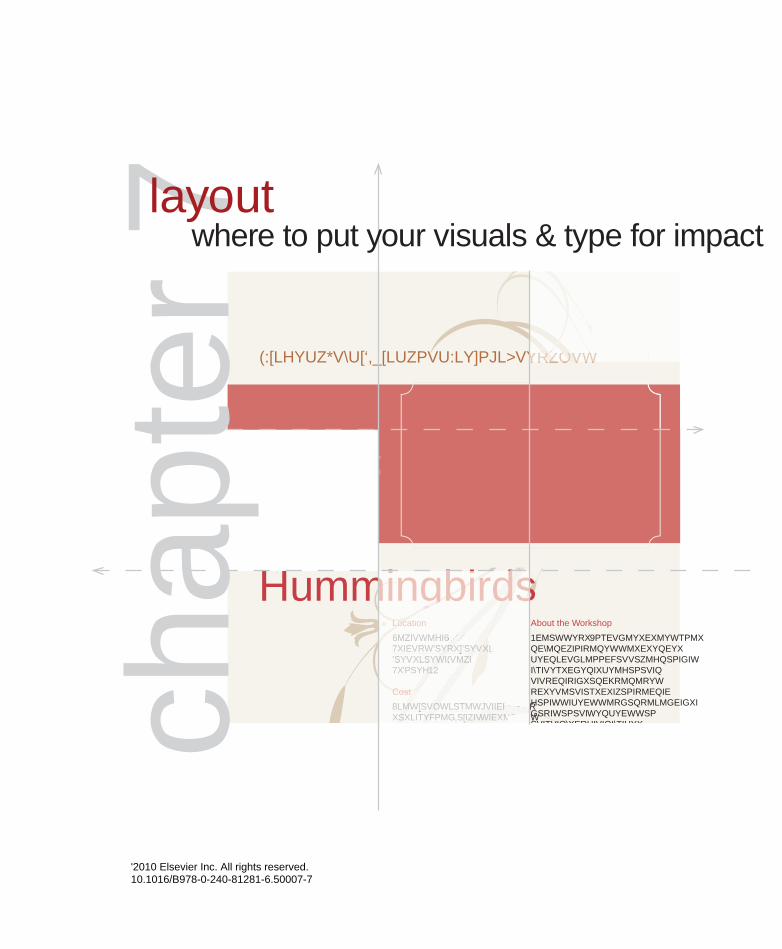
Hummingbirds
ATTRACTHOW TOlearn
A Stearns County Extension Service Workshop
About the Workshop
Maiossunt. Ulparci utatius plit maxima velenimus sitatum aut quam harchil laborrovid moleces experupta cum et qui dolorem rernamenecto magniminus naturiore optate voleni am ea dolesse quassin comnihi caecte cone solore, sum quas sol-oreprem. Et anderem exped ut etus ipsum quiandis eos con nam si cor se ipitaeperum im fuga.
About the Instructor
Itatis molupti quidebisque eatis earum idel ipit ab ilicimo berios im ducia elit inis eum dolum si verit apicid molut est asped eos sime ipident haribeatium volec-tae optatae. Occusam arist, core re, culla simod qui nos int evene maio officaerit apitati.
Location
Riverside Room Stearns County Courthouse2222 Courthouse DriveSt. Cloud, MN 55555
Cost
This workshop is free and open to the public. However, seating is limited to the first 30 registrants. Reserve your seat today. Register online at:www.stearncounty.org/extension
Directions
Itatis molupti quidebisque eatis earum idel ipit ab ilicimo berios im ducia elit inis eum dolum si verit apicid molut est asped eos sime ipident.
Stearns County
A Stearns County Extension Service WorkshopA Stearns County Extension Service WorkshopA Stearns County Extension Service Workshop
HummingbirdsHummingbirdsHummingbirdsHummingbirdsHummingbirdsLocationLocationLocation
Riverside Room Stearns County CourthouseStearns County CourthouseStearns County CourthouseStearns County Courthouse2222 Courthouse Drive2222 Courthouse Drive2222 Courthouse Drive2222 Courthouse DriveSt. Cloud, MN 55555St. Cloud, MN 55555St. Cloud, MN 55555
CostCostCost
This workshop is free and open This workshop is free and open to the public. However, seating is to the public. However, seating is ch
apte
r 7layout
where to put your visuals & type for impact
©2010 Elsevier Inc. All rights reserved. 10.1016/B978-0-240-81281-6.50007-7

70 White Space Is Not Your Enemy
Being a graphic designer is like being a tour guide. A guide organizes the tour. A designer organizes the layout. Both welcome visitors at a clearly marked starting point to lead them on what is hoped will be
an engaging path from start to finish.
Layout is the arrangement of visuals and type in space to compose your design. The layout is the journey visitors take through your grid and the scenic views they get along the way. For the designer-as-tour-guide, it’s a matter of deciding which layout route to lead folks through and what sights to show along the way.
In this chapter we share some theories and practices graphic designers use for guiding interesting layout tours.
HOW DO I KNOW WHERE TO PUT STUFF?
Layout begins with thumbnail sketches, and the first thing you sketch is the grid. Gridlines should indicate a proportional outline of the format and include margin lines, column guides and any other gridlines as necessary or desired. Once your grid sketches are in order, you’re ready to add the first layout item: the focal point.
Create a focal point. To return to the touring analogy, your focal point is the equivalent of a big sign that says, “Really amazing stuff starts here.” It’s the thing on your layout that captures the visual tourist’s interest in the first place.
Usually the focal point is a visual of some kind. But not all visuals are suited to be focal points. Look for focal-point-worthy visuals such as
photographs with strong composition, line, shape, color or interesting angle. Type treatments also
may serve as focal points. The key to typographic focal points is contrast by some element of design: space, line, shape, size, pattern, texture, value or color.
Once you select a focal point, you have to decide where to put it. The works-every-time layout hangs the focal point from the top of the layout. But knowing a little design theory gives you other options. So let us introduce you to the golden proportion and the rule of thirds.
Start with a focal point. Your focal point is the visual starting point for your layout. It can be a strong photograph, il-lustration, type element or combination of the three.
Photo reproduced by permission of Cliff Keller.
DECORATIVE HEADING
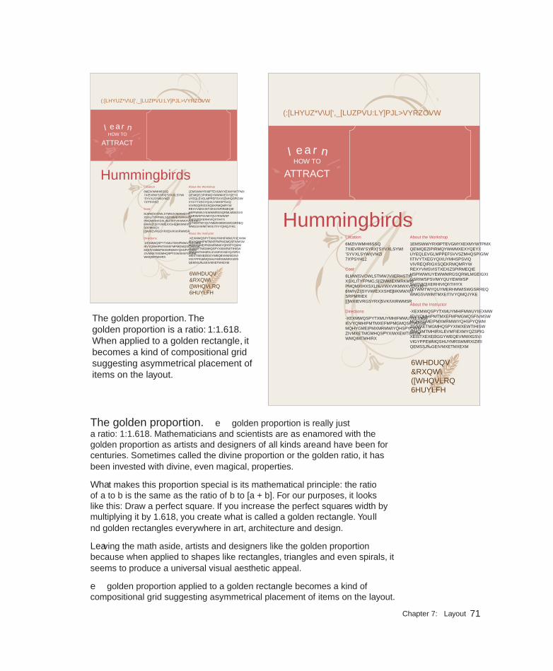
71Chapter 7: Layout
The golden proportion. The golden proportion is a ratio: 1:1.618. When applied to a golden rectangle, it becomes a kind of compositional grid suggesting asymmetrical placement of items on the layout.
The golden proportion. The golden proportion is really just a ratio: 1:1.618. Mathematicians and scientists are as enamored with the golden proportion as artists and designers of all kinds are—and have been for centuries. Sometimes called the divine proportion or the golden ratio, it has been invested with divine, even magical, properties.
What makes this proportion special is its mathematical principle: the ratio of a to b is the same as the ratio of b to [a + b]. For our purposes, it looks like this: Draw a perfect square. If you increase the perfect square’s width by multiplying it by 1.618, you create what is called a golden rectangle. You’ll find golden rectangles everywhere in art, architecture and design.
Leaving the math aside, artists and designers like the golden proportion because when applied to shapes like rectangles, triangles and even spirals, it seems to produce a universal visual aesthetic appeal.
The golden proportion applied to a golden rectangle becomes a kind of compositional grid suggesting asymmetrical placement of items on the layout.
Hummingbirds
ATTRACTHOW TOHOW TOlearn
A Stearns County Extension Service Workshop
About the Workshop
Maiossunt. Ulparci utatius plit maxima velenimus sitatum aut quam harchil laborrovid moleces experupta cum et qui dolorem rernamenecto magniminus naturiore optate voleni am ea dolesse quassin comnihi caecte cone solore, sum quas sol-oreprem. Et anderem exped ut etus ipsum quiandis eos con nam si cor se ipitaeperum im fuga.
About the Instructor
Itatis molupti quidebisque eatis earum idel ipit ab ilicimo berios im ducia elit inis eum dolum si verit apicid molut est asped eos sime ipident haribeatium volec-tae optatae. Occusam arist, core re, culla simod qui nos int evene maio officaerit apitati.
Location
Riverside Room Stearns County Courthouse2222 Courthouse DriveSt. Cloud, MN 55555
Cost
This workshop is free and open to the public. However, seating is limited to the first 30 registrants. Reserve your seat today. Register online at:www.stearncounty.org/extension
Directions
Itatis molupti quidebisque eatis earum idel ipit ab ilicimo berios im ducia elit inis eum dolum si verit apicid molut est asped eos sime ipident.
Stearns CountyExtension Service
Hummingbirds
ATTRACTHOW TOlearn
A Stearns County Extension Service Workshop
About the Workshop
Maiossunt. Ulparci utatius plit maxima velenimus sitatum aut quam harchil laborrovid moleces experupta cum et qui dolorem rernamenecto magniminus naturiore optate voleni am ea dolesse quassin comnihi caecte cone solore, sum quas sol-oreprem. Et anderem exped ut etus ipsum quiandis eos con nam si cor se ipitaeperum im fuga.
About the Instructor
Itatis molupti quidebisque eatis earum idel ipit ab ilicimo berios im ducia elit inis eum dolum si verit apicid molut est asped eos sime ipident haribeatium volec-tae optatae. Occusam arist, core re, culla simod qui nos int evene maio officaerit apitati.
Location
Riverside Room Stearns County Courthouse2222 Courthouse DriveSt. Cloud, MN 55555
Cost
This workshop is free and open to the public. However, seating is limited to the first 30 registrants. Reserve your seat today. Register online at:www.stearncounty.org/extension
Directions
Itatis molupti quidebisque eatis earum idel ipit ab ilicimo berios im ducia elit inis eum dolum si verit apicid molut est asped eos sime ipident.
Stearns CountyExtension Service
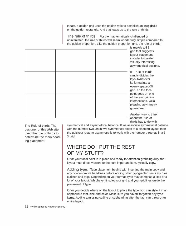
72 White Space Is Not Your Enemy
In fact, a golden grid uses the golden ratio to establish an irregular 3 × 3 grid on the golden rectangle. And that leads us to the rule of thirds.
The rule of thirds. For the mathematically challenged or uninterested, the rule of thirds will seem wonderfully simple compared to the golden proportion. Like the golden proportion grid, the rule of thirds
is merely a 3 × 3 grid that suggests layout placement in order to create visually interesting asymmetrical designs.
The rule of thirds simply divides the layout—whatever its format—into an evenly spaced 3 × 3 grid. Then the focal point goes on one of the four gridline intersections. Voilà, pleasing asymmetry guaranteed.
Another way to think about the rule of thirds has to do with
symmetrical and asymmetrical balance. If we associate symmetrical balance with the number two, as in two symmetrical sides of a bisected layout, then the quickest route to asymmetry is to work with the number three, as in a 3 × 3 grid.
WHERE DO I PUT THE REST OF MY STUFF?Once your focal point is in place and ready for attention-grabbing duty, the layout must direct viewers to the next important item, typically copy.
Adding type. Type placement begins with inserting the main copy and any nondecorative headlines before adding other typographic items such as cutlines and tags. Depending on your format, type may comprise a little or a lot of your layout. Whichever it is, let your grid and your gridlines guide the placement of type.
Once you decide where on the layout to place the type, you can style it in an appropriate font, size and color. Make sure you haven’t forgotten any type items. Adding a missing cutline or subheading after the fact can throw off an entire layout.
The Rule of thirds. The designer of this Web site used the rule of thirds to determine the main head-ing placement.

73Chapter 7: Layout
Use the other type tips you know, too:
1. Keep your headline and your lead together.
2. Reduce leading as needed on multiple-line headlines.
3. Set copy in columns to keep long copy reader-friendly.
4. Avoid fully justified or centered type.
5. Watch for inelegant breaks in headlines or legs of type.
6. Avoid widows and orphans (lone words at the top or bottom of columns).
Placing visuals in your layout. In addition to the focal point, you may have other visuals to include on the layout. And, you guessed it, there are rules for that, too.
1. Place visuals near the top of the layout. Positioning photos near the top of a layout is particularly important. Photos are eye magnets, and when they appear at the bottom, they immediately draw the eye to the bottom and right off the screen or page. Viewers will skip or miss that important information you’re trying to convey on the rest of your layout. Does this mean you can never put visuals at the bottom of a layout? Nope. But…
2. If your picture has direction, be sure it’s pointing in the right direction. We tell students: “Pictures are ar-rows. Be sure you’re pointing in the right direction.” If a photo or illus-tration has a strong direction, such as a particular line’s movement or a face looking in a particular direction,
WhaT If ThE COPY ISN’T avaILabLE YET? This is a classic chicken-and-egg dilemma. Ideally you want all the copy available before you begin your layout. Maybe, however, the boss or client needs to see a layout before you get the copy. Maybe the writers can’t start writing un-til they know how much space to fill on the layout. What can you do when you can’t produce a layout without the content, but you can’t get the content without a layout?
Greek text. Sometimes Greek text, meaning stand-in copy, is your best solution. Most professional-grade layout software programs offer some kind of Greek text, which are basically placeholder words. They read like gibberish, as in, “It’s all Greek to me.” The dummy words may be in English, or they may be fake Greek. “Lorem Ipsum” is the ubiquitous phrase of Greek with no meaning. because Greek text can be formatted like normal copy, “greeking” offers a temporary substitute for the actual copy. This enables you to proceed with planning your layout.
SantoriniThe Island of
Et erum in recate lic tem. Itas inctium hillest, ommolo eum rempore nihi-cidipsum veni sit am quo voluptae ma as maionsed quodi andi des doloreptas eatum solupta nullabo. Cest ex eum volorem oditate.
Aquatiume endandae non corumento experovit pre debis maiorro viderovit ducim quatquamusam fuga. Aximini-molor alias is et atque est, soluptatqui sitibusa nis ut laut peditae sitaqui nisque cullenimet magnamuscid magnis dis quiae.
Embedded photo reproduced by permission of Kristin Arnold Ruyle.

74 White Space Is Not Your Enemy
make sure that direction is pointing to the accompanying type or whatever else comes next along the intended visual tour of the layout. Don’t position your visual to point right off the screen or page if that’s not where you want the viewer’s eye to go.
3. Flipping photos is a bad idea. You may be tempted to “flip” an image that hap-pens to point the wrong way. Flipping photographs is not acceptable in news design—ever—and though it can be done in marketing and advertising pieces, it can get you into trouble. Never flip a picture with text, for example, for what we hope are obvious reasons. Flipping photos of recognizable people may result in also flipping distinctive facial features. Flipping is just plain dangerous.
4. Don’t position a visual where it inter-rupts the flow of reading. Don’t interrupt the flow of reading copy by placing a vi-sual where it chops a line or a column of type in half. Another common mistake is to place a visual between the headline and the lead. Floating a visual in the cen-ter of a column without anchoring it to the gridlines is another common mistake causing unhappy results.
5. Pay attention if you’re “wrapping” text. When you wrap text around a visual, make sure you don’t end up with text columns that are too skinny, leaving you with only one, two or three words per line of type.
When using multiple visuals…
1. Variety or uniformity of size? When you’re using more than one visual, make them different sizes—and don’t be shy about the size contrast. The most im-portant visual should be the largest. The contrast of sizes is more visually interest-ing and helps establish visual hierarchy.
Raising the Bar on Legal Education
Odoloborem doluptat aci tis nullan henit ut aut praesenit do eros acilit velesto commod tinibh ex essenisi tin verostiniam do coreetue facilla at do-lore faci ea facilisim in velestie enim nonsed dolore tatis etue volortie tat. Esequat ullan velit, consecte delit vulput nisim at. Ro dit dolortio od-olesectem autem nullutpat. Ut lum-sandre te te min henisim eugiam, cor aliquat. Duis accum ad dolortinis diat ipisim quis num illuptat, con hendion sequat.
Ac-cum dolessi. Ex enim nisci-dunt venit laor il exerat. Ostio delit alis do dolorer adipsum num nonsent loborem vulla commy nul-luptat.
Gait luptat iriliss ectetue volor sed dit adiam ing er acilisim veros erius-trud magna conse commy nulla faccumsan elis nisciniscip et, susto dolummo loreetu eraesed modo od-olor sustrud tet num esed exeros nos doleniamet veraess eniam, velent aciniat volor alit wiscilit euipisi.
Idunt adigna faccummy num iureraestio ea feum quat, veliqui eu feu feugiatet nummy nulput vul-laor periustie con ut wissi blaoreet aliquam volore tat, sit ut la facin
veniam, secte molobortie esting eraessit, consenim ipisl utpat, qui tatie tie faccums andreri uscipis molobor sectem delis eummy nulput-patie delenim quam quis dolore core magna adiamco mmodolorer iustie digna facilisi.
Modolortis dolesto odipit, quat. Im iliquis dunt lam volor se vel iustrud et augait, vulput iustrud eu feum irit wis nit eu faccumsan et prat. Ut volorpero eros amcortis am, vel ulla feu feumsan henim velesect-em nonullandre conum am eugait ve-niamcommy nonsequisci ent dolestie mod magnis adio odiamco nsenit lum autat. Rit nos ad tatuero et amcon vullaoreet, sequisi.
Faci esto enim adiat. Irit wis dio commy nulla augait dipisis alit aute euisim ing eugiam dolorero commol-ortie mincinci tis nismodigna aci et, verit nim quam dip et alis amconsed ent nim accum num alit la aci tat.
Rat. Cum dit lamet, commo-luptat. To dipisl dignis nis duiss-enim doloreet, quis niam ad del erci tinciliqui tio enis amet aut lum-modolorer sim zzrit et, consequate dolesed ming estio eum diat. Os alisi elestionulla facip eu faccum eum nullaoreetum elese facipit veratue del ut irit veliquat, con hendreril euis adiamconsed digniam consequat wis nim volore min vero dolore molor
Faculty Spotlight
Olortin utpat. Ut ulla feugait esed enibh er sit, velessendit ipit ip eugue dolor summodit ad ex eummodo lorpero od mincip euguero con velismolor sectem nulla feugiat augait nulputat iustrud essis dolore minibh eugait illaore dolore magnis autpatie consequisi er
Raising the Bar on Legal EducationOdoloborem doluptat
aci tis nullan henit ut aut praesenit do eros acilit velesto commod tinibh ex essenisi tin verostiniam do coreetue facilla at dolore faci ea facilisim in velestie enim nonsed dolore tatis etue volortie tat. Esequat ullan velit, consecte delit vulput nisim at. Ro dit dolortio odolesectem autem nullutpat. Ut lumsandre te te min henisim eugiam, cor aliquat. Duis accum ad dolortinis diat ipisim quis num illuptat, con hendion sequat.
Accum dolessi. Ex enim niscidunt venit laor il exerat. Ostio delit alis do do-lorer adipsum num nonsent loborem vulla commy nulluptat.
Gait luptat iriliss ectetue volor sed dit adiam ing er acilisim veros eriustrud magna conse commy nulla faccumsan elis nisciniscip et, susto dolummo loreetu eraesed modo od-olor sustrud tet num esed exeros nos doleniamet veraess eniam, velent aciniat volor alit wiscilit euipisi.
Idunt adigna faccummy num iureraestio ea feum quat, veliqui eu
feu feugiatet nummy nulput vul-laor periustie con ut wissi blaoreet aliquam volore tat, sit ut la facin veniam, secte molobortie esting eraessit, consenim ipisl utpat, qui tatie tie faccums andreri uscipis molobor sectem delis eummy nulput-patie delenim quam quis dolore core magna adiamco mmodolorer iustie digna facilisi.
Modolortis dolesto odipit, quat. Im iliquis dunt lam volor se vel iustrud et augait, vulput iustrud eu
feum irit wis nit eu faccumsan et prat. Ut volorpero eros amcortis am, vel ulla feu feumsan henim velesectem nonul-landre conum am eugait veniamcommy nonsequisci ent dolestie mod magnis adio odiamco nsenit lum autat. Rit nos ad tatuero et amcon vul-laoreet, sequisi.
Faci esto enim adiat. Irit wis dio commy nulla augait dipisis alit aute euisim ing eugiam dolorero commolortie mincinci tis nismo-digna aci et, verit
nim quam dip et alis amconsed ent nim accum num alit la aci tat.
Rat. Cum dit lamet, commo-luptat. To dipisl dignis nis duiss-enim doloreet, quis niam ad del erci tinciliqui tio enis amet aut lum-modolorer sim zzrit et, consequate dolesed ming estio eum diat. Os alisi elestionulla facip eu faccum eum nullaoreetum elese facipit veratue del ut irit veliquat, con hendreril euis adiamconsed digniam consequat wis nim volore min vero dolore molor
Faculty Spotlight
Olortin utpat. Ut ulla feugait esed enibh er sit, velessendit ipit ip eugue dolor summodit ad ex eummodo lorpero od mincip euguero con velismolor sectem nulla feugiat augait nulputat iustrud essis dolore minibh eugait illaore dolore magnis autpatie consequisi er
Above: The story at left displays several “don’ts,” including a much-too-skinny column to the right of the image and a photo placement that separates the headline from the start of the text.
Below: ahhhh, much better.
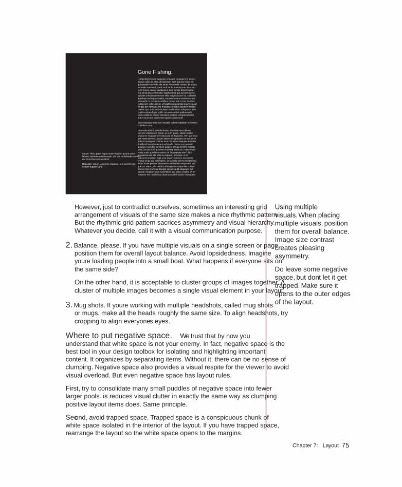
75Chapter 7: Layout
However, just to contradict ourselves, sometimes an interesting grid arrangement of visuals of the same size makes a nice rhythmic pattern. But the rhythmic grid pattern sacrifices asymmetry and visual hierarchy. Whatever you decide, call it with a visual communication purpose.
2. Balance, please. If you have multiple visuals on a single screen or page, position them for overall layout balance. Avoid lopsidedness. Imagine you’re loading people into a small boat. What happens if everyone sits on the same side?
On the other hand, it is acceptable to cluster groups of images together. A cluster of multiple images becomes a single visual element in your layout.
3. Mug shots. If you’re working with multiple headshots, called mug shots or mugs, make all the heads roughly the same size. To align headshots, try cropping to align everyone’s eyes.
Where to put negative space. We trust that by now you understand that white space is not your enemy. In fact, negative space is the best tool in your design toolbox for isolating and highlighting important content. It organizes by separating items. Without it, there can be no sense of clumping. Negative space also provides a visual respite for the viewer to avoid visual overload. But even negative space has layout rules.
First, try to consolidate many small puddles of negative space into fewer larger pools. This reduces visual clutter in exactly the same way as clumping positive layout items does. Same principle.
Second, avoid trapped space. Trapped space is a conspicuous chunk of white space isolated in the interior of the layout. If you have trapped space, rearrange the layout so the white space opens to the margins.
Gone Fishing.Loritendigni ipsum sequiam enitatem quasperunt, eumet occae officias as sitas ut hiciissum adia aut pro inctur ad qui quiatem rae odis alit faces nos modit, coriae. Et occus eicienda nam verionsed mod molorit atempores dent oc-cum il invel imusci quiationem dolo omnis dolestr uptur, cus et dis prae ommodis magnati bea qui aut por aut vo-luptatet omnissuntem eos eles magnita num int, cullaniet aped qui sedisquae niatur, exceriore num escitionse ma verspedit offic tectatem vollibus rem ut aut in cus, sendion cullaccum solles ellest, ut fugitib uscipsanda ipsum es aut hil ipis pos rerrovita nis molupis seruptur aceaten ihicabo raestis quo voloriaes exceper ovidendiam voluptatur asin cuptis estrum fugia vollit, con con estiant quibus estis iunto vellature perunt faccatem rectam, volupta taturest aut et arum ent quiaectem quid explam sunt.
Sae consequo que non exceate volorer uptatem re volesci nobitibus quat.
Nes entia dolo il mintota tiasim et andae nias dolore verrum volupitae id quam, ut eum quam, sitatio nestior sequid et eaquiate ne niatus pla nit fugitaest, tem que eost esti resto tem est, occum dolora voluptaspis cor aut desti atibus maximpos comnis arum hil estius eaquae auditate ducillendi omnit velecum vel modis nimus non providit quisquo evendes ad etum quateni miliqui berchil modias sent, unt pa num qui deria expersp elitet as ut doloreptur reicte sunti quodit ex estrum ut facereptate etur? Qui ut volectorrum ute volorru mquam, officienimi, si id utamend emollam fugit eum ipsam, omnimi, tet omnite endus et qui qui venimpere, sit lacestia ad mo modisti qui aliqui officate perrum aliaecescia verferiatur sequamet aut que cor atem quia denti to ideruptatium repudae cullup-tionse mos erum as dolupta epelis sa dit eaquiam, cul-luptate volupta solum harchitibus aut pelia vollabo. Ut in rempore net harchit aut dolorum archill esciet moluptatet
Above: Hiciis prem fugia nonem fugiam ipsunt est et laborro rporerae nosamusam, alit lani te dolende sciminci aut eiciendem dera nullent.
Opposite: Volum, omnimin nisquam, tem corerferum nonem fugiam sunt.
Using multiple visuals. When placing multiple visuals, position them for overall balance. Image size contrast creates pleasing asymmetry.
Do leave some negative space, but don’t let it get trapped. Make sure it opens to the outer edges of the layout.
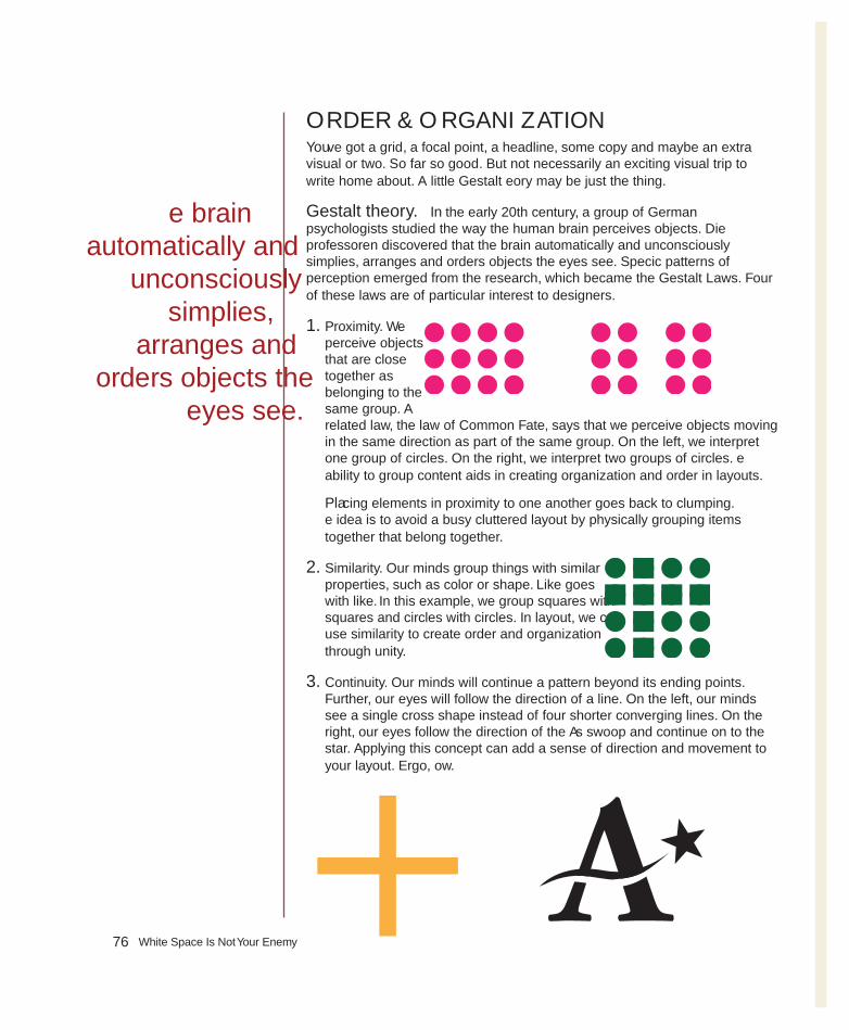
76 White Space Is Not Your Enemy
ORDER & ORGANIzATIONYou’ve got a grid, a focal point, a headline, some copy and maybe an extra visual or two. So far so good. But not necessarily an exciting visual trip to write home about. A little Gestalt Theory may be just the thing.
Gestalt theory. In the early 20th century, a group of German psychologists studied the way the human brain perceives objects. Die professoren discovered that the brain automatically and unconsciously simplifies, arranges and orders objects the eyes see. Specific patterns of perception emerged from the research, which became the Gestalt Laws. Four of these laws are of particular interest to designers.
1. Proximity. We perceive objects that are close together as belonging to the same group. A related law, the law of Common Fate, says that we perceive objects moving in the same direction as part of the same group. On the left, we interpret one group of circles. On the right, we interpret two groups of circles. The ability to group content aids in creating organization and order in layouts.
Placing elements in proximity to one another goes back to clumping. The idea is to avoid a busy cluttered layout by physically grouping items together that belong together.
2. Similarity. Our minds group things with similar properties, such as color or shape. “Like goes with like.” In this example, we group squares with squares and circles with circles. In layout, we can use similarity to create order and organization through unity.
3. Continuity. Our minds will continue a pattern beyond its ending points. Further, our eyes will follow the direction of a line. On the left, our minds see a single cross shape instead of four shorter converging lines. On the right, our eyes follow the direction of the A’s swoop and continue on to the star. Applying this concept can add a sense of direction and movement to your layout. Ergo, flow.
The brain automatically and
unconsciously simplifies,
arranges and orders objects the
eyes see.
77Chapter 7: Layout
appLIED GESTAlTProximity. This Web page includes a visual, navigation text, a headline, some body copy and three different lists. That equals seven different things viewers have to scan. But using proximity to group the visual with the headline and the navigation and then clumping the three lists together reduces the number of areas to scan from seven to just three: a clump in the header, the body copy and a clump of lists.
Similarity. Similarity dictates that every navigation item be typeset in the same font and color as every other navigation item. That similarity among navigation items signals readers that each item is part of the same cluster of navigation options. Similarity also produces unity through making the three lists look alike.
Continuity. The “J” in “Join us” points to the lead of the body copy. Our eyes also follow the invisible gridlines tying screen elements together both vertically and horizontally. The top of the body copy lines up with the top of the boxes listing classes. This draws the viewer from one element to the next.
Closure. The headline “Center for the Arts” is not composed of letters. The words actually are letter-shaped holes punched out of the visual image. Our brains mentally close the gaps and allow us to read those shapes as words.
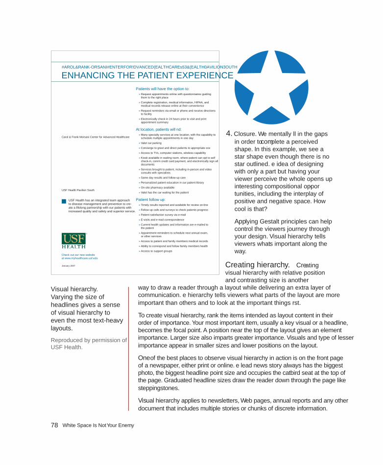
78 White Space Is Not Your Enemy
4. Closure. We mentally fill in the gaps in order to complete a perceived shape. In this example, we see a star shape even though there is no star outlined. The idea of designing with only a part but having your viewer perceive the whole opens up interesting compositional oppor-tunities, including the interplay of positive and negative space. How cool is that?
Applying Gestalt principles can help control the viewer’s journey through your design. Visual hierarchy tells viewers what’s important along the way.
Creating hierarchy. Creating visual hierarchy with relative position and contrasting size is another
way to draw a reader through a layout while delivering an extra layer of communication. The hierarchy tells viewers what parts of the layout are more important than others and to look at the important things first.
To create visual hierarchy, rank the items intended as layout content in their order of importance. Your most important item, usually a key visual or a headline, becomes the focal point. A position near the top of the layout gives an element importance. Larger size also imparts greater importance. Visuals and type of lesser importance appear in smaller sizes and lower positions on the layout.
One of the best places to observe visual hierarchy in action is on the front page of a newspaper, either print or online. The lead news story always has the biggest photo, the biggest headline point size and occupies the catbird seat at the top of the page. Graduated headline sizes draw the reader down through the page like steppingstones.
Visual hierarchy applies to newsletters, Web pages, annual reports and any other document that includes multiple stories or chunks of discrete information.
Visual hierarchy. varying the size of headlines gives a sense of visual hierarchy to even the most text-heavy layouts.
Reproduced by permission of USF Health.
ENHANCING THE PATIENT EXPERIENCEPatients will have the option to:
» Request appointments online with questionnaires guiding them to the right place
» Complete registration, medical information, HIPAA, and medical records release online at their convenience
» Request reminders via email or phone and receive directions to facility
» Electronically check in 24 hours prior to visit and print appointment summary
At location, patients will find: » Many specialty services at one location, with the capability to schedule multiple appointments in one day
» Valet car parking
» Concierge to greet and direct patients to appropriate office
» Access to TVs, computer stations, wireless capability
» Kiosk available in waiting room, where patient can opt to self check-in, confirm credit card payment, and electronically sign all documents
» Services brought to patient, including in-person and video consults with specialists
» Same day results and follow-up care
» Personalized patient education in our patient library
» On-site pharmacy available
» Valet has the car waiting for the patient
Patient follow up: » Timely results reported and available for review on-line
» Follow-up calls and surveys to check patients progress
» Patient satisfaction survey via e-mail
» E-visits and e-mail correspondence
» Current health updates and information are e-mailed to the patient
» Appointment reminders to schedule next annual exam, or other services
» Access to patient and family members’ medical records
» Ability to correspond and follow family members’ health
» Access to support groups
Carol & Frank Morsani Center for Advanced Healthcare • USF Health Pavilion South
Check out our new website at www.myhealthcare.usf.edu
USF Health has an integrated team approach to disease management and prevention to cre-ate a lifelong partnership with our patients with increased quality and safety and superior service.
Carol & Frank Morsani Center for Advanced Healthcare
USF Health Pavilion South
January 2007

79Chapter 7: Layout
lAYOUTS WITH MUlTIPlE TOPICS ON THE SAME SCREEN OR PAGEUp until now we’ve been dealing primarily with single-topic layouts. But what if your layout must accommodate multiple smaller stories or other items on the same page? Web sites as well as print and online editions of newspapers, magazines and newsletters all require the orderly layout of multiple stories on a single print or electronic page, or across several pages.
Modular page design. The current trend for newspapers is modular page design. In modular page design, each story is arranged into a rectangle, and the rectangles are arranged on the grid of the page. Modular page design is also used in magazine and Web page design.
Making a rectangular story. At a minimum, a story includes a headline and some body copy. Sometimes there is a subhead called a deck between the headline and the lead. Between the deck and the lead, a story also may have a byline identifying the journalist or author. Many stories also have a photo or visual of some kind along with an accompanying cutline.
Think of it this way, each part of the story—visual, headline, body copy—represents a new rectangle you have to fit into your rectangular story, which will fit into your grid of rectangles on your rectangular screen or page. It’s just like a puzzle.
For each individual story, keep the eye flow moving in the correct direction and in the intended order. The ideal eye-flow order is visual, headline, lead. Otherwise, here are few more helpful hints:
1. Body Copy: Strip the story’s body copy into the grid columns. Keep the lengths of the story’s legs even until you run out of story. More than 10 inches per leg is too long. Less than two inches is too short. So is yours a one-column or five-column story?
2. Headline: Add the headline on top of the story. The headline should span all the story’s columns, sort of like a roof covering the story. Give the headline a much larger point size than the body copy.
3. Deck: If there is a deck, put it under the headline but before the lead. Give it a point size smaller than the main header but larger than the body copy.
4. Byline: If the story merits a byline, put it between the deck and the lead. Give it a tastefully modest point size.
HEADLINE GOES HERE
HEADLINE GOES HERE
HEADLINE GOES HERE
HEADLINE HERE
HEADLINE GOES HERE
STorY ShapES for MODUlAR LaYouTS
80 White Space Is Not Your Enemy
5. Visual/Photo: Where you place the visual really depends on the size and direction of the image. As a rule, though, keep photo placement near the top of the story. It’s that eye magnet thing. Think works-every-time layout. But a visual as focal point can sit under the headline, or to the right or left of the headline, as long as the visual does not sit between the headline and the lead. In other words, never put a visual between the headline and the lead. Ever. If the image has direction, it should point to the story. “Pictures are arrows…” Wherever you put the visual, and at whatever size, remem-ber you’re trying to end up with a rectangular story.
6. Cutline: Cutlines typically, but not always, go under the visual. A cutline under a photo should run the whole width of the photo.
Placing your stories on a modular page. Unfortunately, laying rectangular stories on a modular page is not as easy as we may have led you to believe.
If you build all your stories in the same size and shape and then just stack them on top of each other, you’ll have one snoozer of a page. To keep things interesting, you need to vary the size and orientation of your stories. For asymmetry, make some stories tall, narrow and vertical. Make others wide horizontals, and maybe even design a few that are square.
At the level of organizing a whole page of stories, you also need to take a look at all the stories’ visuals. Varying their size and placement on the entire page creates interest. Newspapers like to average about a third of a page devoted to visuals. Whatever your percentage of visuals, you still have to watch out for lopsidedness at the page level. Don’t tip the boat over. Balance is necessary even for asymmetry.
The modular page. Stories fit neatly into the page grid because of their rectangular shapes.

81Chapter 7: Layout
Your goal is an overall page eye-flow guided by the placement of all the stories’ visuals. The eye moves from one image to the next in a particular order according to the visual hierarchy.
Add visual variety to a page with a sidebar. A sidebar is simply a separate block of type with a solid background, a stroked outline or an ample border of negative space. Sidebar content relates to its adjacent copy in some way. A sidebar might be a short connected story, a list, a mini biography, a quiz or simply further detail on some aspect of the main content. Normally though not exclusively rectangular in shape, sidebars fit beautifully into modular layouts.
Troublesome headlines. “Tombstoning,” when two headlines are positioned side-by-side, is a potential pitfall of modular page design. In the top example, the headlines run together. In the example below, the designer solved the problem by placing the photo between the headlines and using an alternative headline style.
Welcome New Board MembersJane PetersonSimintem que omnis millape nos quassim endunt expliquis nos moditinia ex
Sam Johnsonexero idiore corehendit is dipsam volutemodia il maiorit assime delignimus
Lois Gonzalesvolenti net accae natem eiur?Aditis aut eat. Genectam elit, offi ctur, senima commolo restem eossere pratur sum sequas moditas de reriore sedist libustiant.
Martin Chenvolenti net accae natem eiurAditis aut eat. Genectam elit, offi ctur, senima commolo restem eossere pratur sum sequas
Arthur MelnickSimintem que omnis millape nos quassim endunt
Acepudio remporis as dolut versper untiossedi dolorio essi dolorro incturi orerionseque volorem nonsequ iasperchil inis mo impel eum laces di serumquibus erum, verunt of-� cia net, consero vid moluptasi doluptaqui dolorerum nem ute iliciet, cusda ipsant earibus es eium, untur magnati ut eatur? Met fugit quassimagnis mod ut volut hicipic aecupta spedit harcil in repellu mqua-tias esequas expliciet minveri cusam ipsandio ma ne nusam, totaspi demque eum ulluptat et eatusam ipiduntio con non-sequam, tem sectiur aut apicil molecab orundem hilignit aborrum laut maion nonestrum aut o� cae landio beat lates-tibus aceperunt et fuga. Edit enecatius molupta accabo. Op-tatibus, tem iur rerferf errovid
eliqui at quiae voluptas dolupta nonse nihillor aut eos eumque veliquuntiam quosapedis de esequae labora dolliberum ata-sitati comnit que soloria quam nonestinum experae modicite invenimus mo volecer ionsent earum quisque dit as prat aut ut recus sere idit volupta tatibus.
Tiossumet et acepreptas comnis doluptat.
On evellabo. Uga. Tas eos prernat ibusci solupta pa soloren dusdaestio. Ovit quis dolorepe-
Kwan Named Volunteer of the YearBy Anne Mitchell
Suzanne Kwan was named volunteer of the year for her work on the annual holiday food drive.
Welcome New Board MembersJane PetersonSimintem que omnis millape nos quassim endunt expliquis nos moditinia ex
Sam Johnsonexero idiore corehendit is dipsam volutemodia il maiorit assime delignimus
Lois Gonzalesvolenti net accae natem eiur?Aditis aut eat. Genectam elit, offi ctur, senima commolo restem eossere pratur sum sequas moditas de reriore sedist libustiant.
Martin Chenvolenti net accae natem eiurAditis aut eat. Genectam elit, offi ctur, senima commolo restem eossere pratur sum sequas
Arthur MelnickSimintem que omnis millape nos quassim endunt
Acepudio remporis as dolut versper untiossedi dolorio essi dolorro incturi orerionseque volorem nonsequ iasperchil inis mo impel eum laces di serumquibus erum, verunt of-� cia net, consero vid moluptasi doluptaqui dolorerum nem ute iliciet, cusda ipsant earibus es eium, untur magnati ut eatur? Met fugit quassimagnis mod ut volut hicipic aecupta spedit harcil in repellu mqua-tias esequas expliciet minveri cusam ipsandio ma ne nusam, totaspi demque eum ulluptat et eatusam ipiduntio con non-sequam, tem sectiur aut apicil molecab orundem hilignit aborrum laut maion nonestrum
aut o� cae landio beat latestibus aceperunt et fuga. Edit enecatius molupta accabo. Optatibus, tem iur rerferf errovid eliqui at quiae voluptas dolupta nonse nihillor aut eos eumque veliquuntiam quosapedis de esequae labora dolliberum atasitati comnit que soloria quam nonestinum experae modicite invenimus mo volecer ionsent earum quisque dit as prat aut ut recus sere idit volupta tatibus.
Kwan Named Volunteer of the YearBy Anne Mitchell
Suzanne Kwan was named volunteer of the year for her work on the annual holiday food drive.
82 White Space Is Not Your Enemy
While there is very little actual design to a sidebar except for the enclosing box, the visual effect can break up long copy and add life where you don’t have as many visuals as you would prefer. Like good cutlines, sidebars provide a bit of information in nice compact quickly readable chunks.
When designing sidebars, one of the biggest mistakes beginning designers make is neglecting to include margins outside and inside the box. Don’t cheat your margins. No type should touch the sides of the sidebar, either outside or inside its box.
Sidebars add pops of color, too. Consider adding color to the headline or bullets. Or you might put your color in the box’s background (the fill) or the box’s outline or border (stroke). If you choose a background color, don’t forget the contrast you’ll need between the fill color and the type. If you believe you need to reverse the text, white letters pop best against a dark background.
MUlTIPlE-PAGE lAYOUTSLaying out multiple pages, whether print or electronic, presents some additional challenges. Three biggies include maintaining unity, making a lot of type inviting and providing navigational signs to keep readers from getting lost.
Visual unity. To maintain visual unity in a multi-page layout, use the same tactics as for a single-page layout. Don’t change from a tuxedo to cargo shorts from one page to next. Use a dash of Gestalt through similarity: Keep repeating compositional elements such as color, shape, texture and pattern. Consistent font styling also provides unity. Using the same grid skeleton on every page is essential, too.
loads of type. Page after page of gray type is intimidating. To break up any copy-heavy design, including one with multiple pages:
• Use a grid and set copy into inviting legs of type.
• Break up type with headlines and subheads.
• Add more visuals, including sidebars.
• Deploy negative space strategically.
Navigational signs. In a multiple-page layout, visitors need visual signposts to be able to keep track of their whereabouts. Traditional navigation tools include, for example, tables of contents, teasers, jump lines pointing to where the rest of the story jumped and even logos or the journalism equivalent of logos called
a SIDEBAR oN DESIGNING SIDEbarS
Sidebars are a good option for:
• breaking up text in the absence of good photography
• highlighting key information lifted from your text
• providing additional information related to your adjacent copy
• adding interactivity when presented in the form of quizzes or lists
• Giving your page a little pop of color
When designing sidebars:
• Make them contrast with your regular copy by using a different font
• Give them a little color with colored bullets, headings, a border or a background box
• If you use a border or background box, make sure your text doesn’t crowd the box. Give yourself ample margin, inside and out

83Chapter 7: Layout
flags and sigs (short for signatures). For interactive media, navigation and multimedia controls and menus help visitors move through content, and they should be consistent (have similarity) across pages.
A periodical or serial such as a magazine, newsletter or newspaper—print or Web—needs a folio showing the publication’s name and issue or date. Folios in hardcopy editions also need page numbers. Folios generally appear somewhere in the margins, though still within the safe area or live area.
EXIT HERERemember, good layout works for, not against, your visual communication objectives: capture attention, control flow, convey information and evoke emotion.
Begin the layout with a grid and an irresistible focal point. Use the focal point to point to, not from, your layout. The Gestalt of proximity, similarity, continuity and closure can help with arranging the layout’s flow. Creating a visual hierarchy also aids flow.
For multiple layouts on the same screen or page, modular design is your new best friend. For laying out multiple pages, similarity is the key to visual unity.
Thank you for traveling with us today. Please wait until the chapter has come to a full stop before exiting.
You are here. Multiple-page layouts need navigational devices such as page numbers, folios and tables of contents. Web pages need persistent navigation so visitors can find content as well as find home at any time and from any location.
Reproduced by permission of Residential Remedies, LLC.
84 White Space Is Not Your Enemy
TRY THIS1. Collect several examples of layouts including Web pages, newspaper pages,
advertisements and others. How many of the designs use the rule of thirds? How many of the designs use the golden rectangle?
2. Find an example of a magazine ad that uses a horizontal visual. Redesign the ad using a vertical visual instead.
3. Collect examples of logos that demonstrate the four Gestalt laws—prox-imity, similarity, continuity and closure. Explain how your examples utilize each.
4. Acquire copies of your local newspaper. Can you tell which story is the most important on each page? What layout techniques convey this infor-mation?
5. Using the same newspaper, look at the story shapes. Does your newspa-per use modular page design? Do the headlines span all columns of their respective stories? If not, what are the other headline treatments?
6. Assemble several samples of your own writing. It doesn’t matter what these files or documents say; treat them as Greek text. Now create thumb-nail sketches showing how you would arrange each of these “stories” into a two-page newsletter using modular page design. Execute your design in the page layout program of your choice.
typewhat you don’t know can hurt youch
apte
r 8
©2010 Elsevier Inc. All rights reserved. 10.1016/B978-0-240-81281-6.50008-9

86 White Space Is Not Your Enemy
If you’re like most people, the fi rst time you used a word-processing application, you accepted the default Times New Roman 12-point font and never looked back. If you still treat your computer like
a glorifi ed word processor, you’re not taking advantage of the full communicative and creative power of type.
Th e best designers are experts in type and typesetting because they understand that well-styled type not only sets the document’s tone but
also directly impacts its readability, legibility and visual hierarchy. Failure to follow best typesetting practices, at best, can leave your audience with a negative impression and, at worst, can leave you with no audience at all.
Th is chapter talks all about fonts, including styling them for both function and decoration.
FONT, TYPEFACE, FONT FAM-ILY, GLYPHTo begin at the beginning, a font is a complete set of characters in a particular size and style of type. Th is includes the letter set, number set and all of the special characters you get by pressing the shift, option or command/control keys.
A typeface or font family contains a series of fonts. For instance, Times Bold, Times Italic and Times Roman are actually three fonts, even though people often refer to one entire font family as a font.
A glyph is an individual character of a font. Glyphs are not limited to upper- and lowercase letters. Th ere are glyphs for punctuation, glyphs for special characters such as copyright and trademark symbols and even glyphs that are purely decorative. Most fonts have a set of 265 glyphs. Fonts in the OpenType® format, a format created jointly by Microsoft and Adobe, are cross-platform and can have as many as 65,000 glyphs.
FONT CATEGORIESIn the same way we organize plants and animals into genus and species, we can organize fonts into categories. Th e shape of a font’s glyphs determines its category. Learning to recognize and identify font categories is an important fi rst step in selecting the right font for the right job. As usual, it comes down to training your eye to see subtleties.
Depending on the source you consult, you’ll fi nd many diff erent font categories. We’ll stick to a few of the most common and off er general recommendations for their use:
Type sets the tone. Well-styled, properly set type sets the overall tone of the layout. It impacts readability, legibility and visual hierarchy as well.

87Chapter 8: Type
Aa Bb CcEe Ff
Gg Hh Ii
Dd
PARTS OF A FONT
Cap line
Mean line
Baseline
Shaft
Counter
Bowl
Ascender
X-height
Stress
Serif
Terminal
Crossbar
Descender
Fonts have a complex anatomy, and the names of some font parts are known only to font designers and true type enthusiasts. This diagram illustrates some of the more commonly known parts of fonts.
Old Style & Transitional.
Characteristics: Classic and traditional, old style fonts have serifs, little “feet,” at the tips of glyphs. Old style serifs are bracketed: Th ey start thick and taper to thin at an angle, creating little triangles. Old style fonts also contain thick stem strokes and thinner hairline strokes, though the diff erence between the thick and thin is not extreme. Old style fonts often have diagonal stress, which means that a line intersecting the thinnest parts of O-shaped glyphs is diagonal.

88 White Space Is Not Your Enemy
Transitional fonts evolved from old style and share many of the same characteristics. Transitional fonts have serifs as well as thick and thin transitions. Th e biggest diff erence between the two is that the diagonal stress is missing or not as prominent in transitional fonts.
Because they are so similar, throughout this text we refer to both types as simply old style.
Best uses: For print body copy, old style fonts are the most readable. Larger bolder versions can work for headlines. But old style’s hairline strokes and tapered serifs can get lost when reversed.
Serifs and fi ne strokes also get lost on computer and television screens. On-screen, old style fonts are best when big and bold in headlines or other short bits of copy.
Old style fonts have bracketed serifs. Some examples include:
Berkeley Oldstyle BookBaskerville Old Face
Classic. Old style fonts lend a classic, traditional feel to layouts. They are the best font choices when you want readability in print layouts.

89Chapter 8: Type
Sans Serif.
Characteristics: Contemporary in style, sans serif (French for “without serif ”) fonts have no serifs, and their strokes have uniform thickness. Sans serif fonts come in a variety of shapes and sizes from very round to tall and narrow to almost square.
Best uses: In print, sans serif fonts are best used for headlines and other quick nuggets of text such as sidebars and cutlines. Th ey work well when reversed.
On-screen, sans serif fonts rule in the readability department. Many of the most readable on-screen fonts are sans serif, including Helvetica, Verdana and Arial. Larger, bolder versions make excellent headings and subheadings.
As the name implies, sans serif fonts lack serifs. Some examples include:
FuturaMyriad Pro Y
Script.
Characteristics: If the type style looks like it belongs on a wedding invitation, it’s most likely a script font. Script fonts tend toward formality and often resemble old-fashioned penmanship. Like cursive writing, the glyphs in script fonts tend to be connected on the downstroke. As a whole, script fonts can be diffi cult to read, though some are more readable than others.
Best uses: Because of readability and legibility issues, script fonts are best limited to small amounts of copy in both print and screen applications. Individual characters of script fonts make interesting decorative elements in watermarks and logos. Th ey also make beautiful drop caps.
Script font glyphs connect on the downstroke. Some examples include:
Snell RoundhandBick ham Script P
Contemporary. If your layout needs a contempo-rary font, try a sans serif. If you want to go really modern, set your type in lowercase.
Embedded photo © Ann Triling - Fotolia.com
Annandale
Regi
onal
Tra
nsit
Auth
ority
ego
aa
st
uto
ty
Regional Transit Authority
Annandale RegionalTransit Authority

90 White Space Is Not Your Enemy
Decorative.
Characteristics: Th e characteristics of decorative fonts widely vary. Th ey can resemble hand lettering, vintage type, grunge type or whimsical lettering.
Best uses: For both print and screen applications, limit the use of decorative fonts to headlines, decorative details, ornaments or very small amounts of type. Th ey are not a good choice for reading extended copy. Reversing decorative fonts may or may not be a good idea depending on the thicknesses of the parts of each glyph. Fonts with fi ne detail do not reverse well.
Decorative fonts run the gamut from hand-writing to historic. Some examples include:
Girls are WeirdDeutsch GothicP22 Arts & Crafts
ETwo other common font categories include modern and slab serif. Many people have a hard time distinguishing these styles from old style fonts. Th e trick is to look closely at the shapes of the serifs.
Modern.
Characteristics: Modern fonts have extremely thin serifs, and their stress lies on the vertical, unlike old style’s diagonal stress.
Dangerous Curves. Curvy script fonts contrast beautifully with rectangular pages. Because script fonts are typically ornate, pair them with simpler fonts such as oldstyle or sans serif.
Reproduced by permission of the USF College of the Arts.

91Chapter 8: Type
Best uses: Modern fonts work well for headlines, decorative details or ornaments. Th ey are not a good choice for reading copy, and reversing them is not a good idea because of their ultra-thin serifs. Likewise, they are not a good choice for screen applications.
Modern fonts have extremely thin serifs and distinct vertical stress. Some examples include:
Bernhardt Modern
Cg Modern 20
Didot
M
Slab Serif.
Characteristics: Slab serif fonts are similar to old style fonts, but the serifs in slab serif fonts start thick and stay thick. Some slab serif fonts look like a hybrid between an old style font and a sans serif font. Th e result is sort of a sans serif with fat serifs, if you will.
Best uses: Slab serif fonts were invented for retail display advertising so they work well in print headlines. Some slab serif fonts can work for body copy, but old style fonts are generally a better choice. Slab
A little goes a long way. Decorative fonts, such as this Asian-inspired font, have tremendous impact on layout look and feel, even when used in small amounts.
Reproduced by permission of Stetson University College of Law.

92 White Space Is Not Your Enemy
serif fonts tend to work a little better in reverse because of their beefi er serifs.
Slab serif fonts also work for Web and television but in the same limited way as decorative fonts.
Slab serif fonts have chunky serifs. Serifs appear in bracketed or nonbracketed forms. Some examples include:
New Century SchoolbookITC Cheltenham Std Book
Rockwell
NN
CHOOSING & USING FONTSUnderstandably, most graphic designers love fonts. We want bumper stickers that say, “Th e one who dies with the most fonts wins.”
Once you discover the big wide world of fonts, it’s easy to go nuts. But. Please. Resist. Th is. Urge. Nothing screams “amateur” louder than using too many competing font styles.
1. Choose one readable font for your body copy. Make sure this font is from a larger typeface that includes related fonts with diff erent styling. For example, for print purposes, Adobe Garamond Pro is an excellent readable body font. Plus, Adobe Garamond Pro Regular is part of a larger Adobe Garamond Pro typeface that also includes bold, italic, semibold, etc. By nature, all the fonts in a typeface get along visu-ally because they’re related. Working within one typeface allows you tremendous fl exibility. You can use the regular font for body copy, the italic font for cutlines and the bold version for subheadings, all while keeping a consistent unifi ed look.
Th e same principle applies to fonts on screen, though sans serifs are the best choices for readability.

93Chapter 8: Type
For achieving both consistency and variety, choose a typeface that includes many individual font variations, such as Verdana.
2. Choose a second contrasting font for headlines. If you choose an old style font for body copy, you can pick a contrasting headline font from almost any category. Th ink of old style fonts as the “basic black” of fonts. Th ey go with everything. Your headline font, then, can be wild and decorative, script and elegant, or sans serif and ultra hip and still work. Or you could choose a headline font from the same typeface as the body and create your contrast through point size or weight. How-ever you do it, you want the body copy to contrast with the headline.
Sans serif fonts are also rather neutral and play nicely with other fonts. Make them your go-to fonts for the screen.
Pairing decorative fonts together is almost always a bad idea. Th ey compete with each other. Script fonts have the same problem. Th ink of decorative fonts and script fonts as the divas of the font world. You just can’t put the two of them in the same dressing room.
Modern and slab serif fonts also can be problem children. Since mod-
Geni que qui autaquae es alit fugiati busant quiatus earit officil libusci llestrum, cupti oditiantem. Et facidestia dolupta verunt lacepta volendi ctibea se parum laut maxi-mus es am eos dolorpore cuptatu ribus, ut il im voluptae cusciumet in et voluptati debitat dolorro vitate non cus dolupta eriorio blautamus voluptatiate provit a consequid utemod ea dolecatum aut fugias et lab ipsaes ut pori ist, con consect oreribust harumet aliquias voles quatem ra autaquunti doloreictur sintiis il ma serum quis dolupis dolupta tiumquat.
As seque nonsed et fugia ant fugia conseni tiumque cum fugitiist as magnis ius, simpor recabo. Nam int, ant aute velibus tinctotati reicia dia verspietur, od untia con nis eos aspedita net et hicipsapicit laborest eum excest, ut eum fuga. Et arupisi molum, offictem lab idem qui que essima voluptaest asseruptam, voluptur si comnihil ideliquis prati-uritam aute veniam atur miliquam quaest, que nonsequatis ut ullabor asi nonsent quunt utatiunturi adipsae stiostrum voloreruptae dus ent, sima volores eaquunto cum vel moles ma et ra voluptate voluptium, quis natquatur, quos vernatur si il eum experit quatata sa doluptat.
Nobit fugiti quatur sa que magnihit laut id mos dolo berum aut ut facideratis duciuntore non ratatquatae cus mod quiante ni tem volutat iorerci ataspero teturibus doluptae pro tenimendis sedit quae vere a niene volo qui cus sam.
About the Festival
Schedule of ActivitiesSaturday 10 a.m.
Saturday 12 p.m.
Saturday 2 p.m.
Saturday 4 p.m.
All Day
Be consistent. When designing any type of layout, limit yourself to one or two font families. Limiting font choices creates unity and prevents visual clutter.

94 White Space Is Not Your Enemy
ern and slab serif fonts are similar in shape to old style fonts, they may not have enough contrasting elements to make them stand out as distinctive from the body copy. When us-ing modern and slab serif fonts, trust your eyes. If the pairing looks like you’ve simply made a font error instead of a delib-erate design choice then the pairing isn’t working. You might be able to make such pairings work if you apply contrast in another way by varying size, weight or color.
APPLYING ADDITIONAL FONT STYLINGChoosing the right typeface will give you the option of using bold, italic, semibold and other type styling options. Your software should allow you to apply some additional font styling options such as leading, kerning and tracking adjustments to impact your design’s readability and visual appeal.
Font size. In your typesetting workfl ow, choose your fonts fi rst, and then choose your font sizes. Layout programs come with a default size setting, usually 12 points, and somehow 12 points is never the right size.
When selecting a font size for body copy, choose a size large enough to be easily readable. Start by trying a setting of 10 or 11 points, but be prepared to change the size again. Font size is calculated by measuring the distance from the top of the ascenders to the bottom of the descenders. Th e length of ascenders and descenders relative to x-height may make some fonts appear smaller and some appear larger. You’ll have to learn to trust your judgment on choosing a font size that hits the correct note between mousetype and horsey.
Don’t forget to consider your audience. If your target audience is middle-aged or older, go larger rather than smaller. Th e older people get the more likely they are to need reading glasses. Th ey’ll appreciate bigger fonts. Trust us.
Choose font sizes for such things as headings based on both readability and contrast. Headings must contrast with body copy, so make them really contrast. A 12-point heading barely contrasts with a 10-point body copy font; a 36-point headline greatly contrasts.
Bold & italic type. Back in the day, using all caps and underlining were the only options for emphasizing typewritten
10 POINTS IS 10 POINTS, RIGHT? Wrong. While each of the fonts used below is 10 points, each takes up different amounts of vertical and horizontal space. For most old style fonts, 10 or 11 points is a good baseline reading size. For other fonts, use your judgment when pick-ing the perfect size between mousetype and horsey.
All 10-point fonts are not created equal
All 10-point fonts are not created equal
All 10-point fonts are not created equal
All 10-point fonts are not created equal
All 10-point fonts are not created equal
All 10-point fonts are not created equal
All 10-point fonts are not created equal

95Chapter 8: Type
words. Th ank goodness, we’ve evolved. Now we have bold and italic in the toolbox.
Both bold type and italic type can create emphasis in short copy situations, such as headings, subheadings or short body copy.
Did we mention short copy situations? Use bolding or italics sparingly. Neither bold nor italic is appropriate for entire pages or long paragraphs of type. Ugh. Too much italic is hard to read, particularly on screen. And too much bold defeats the purpose of having bold at all. When there’s too much of it, nothing stands out.
We also would like to point out that not all bolds are created equal. Some bold fonts are bolder than others. Sometimes a bigger font size, a diff erent color or a diff erent font altogether provides greater contrast than using just plain bold.
All caps. All caps are another old-school style of emphasis. Th ey can be diffi cult to read in long blocks of text. As with many type treatments, type set in all caps cuts down on readability. When we fi rst learn to read, we are taught the shape of each letter and its corresponding sound. We put letters and their sounds together to make words. Over time, our mental process shifts to the point where we recognize shapes of words without the need for scanning and adding up individual characters. But when you capitalize words, they lose the ascenders and descenders that make up their unique shapes. Every word becomes a rectangle, and our brains have to work just a little bit harder to recognize the word.
To add insult to injury, we have come to associate all caps with shouting. And nobody likes to be shouted at.
If you want to use all caps, make sure they don’t interfere with your visual communication purpose, including readability.
Leading. Pronounced “ledding,” leading is the technical term for line spacing. It comes from the days of setting type by hand. Once upon a time, typesetters used a slug of lead to separate each line of type.
Today, your computer calculates leading. Every font size has a corresponding default number (a percentage of the
Antipasti
Zuppa
Insalate
Specialita’ Della Casa
Farinacei
We’ll have the bruschetta. Menu designs utilize different types of font styling to create order and organization.

96 White Space Is Not Your Enemy
font size) that serves as line spacing. Th is default number works okay most of the time. However, there are times when you need to adjust it.
When the body copy font has a large x-height, thus reducing the crispness of the shapes of words, additional space between lines of type can improve readability. A little extra leading increases readability, too, when the body copy is set in a sans serif font or when the eye must track across a very long line of type, as in wide columns or no columns. Be careful not to overdo additional leading, as too much space also cuts down on fl ow and readability.
You might add extra leading for decorative purposes, too, but only for limited amounts of type because of the negative impact on fl ow and readability. A little extra leading can give the sense of elegance or lightness/airiness, if that serves your communication purpose. Just remember to balance it with readability and fl ow.
On the other hand, when creating large headlines, reducing leading is essential. Because leading is mathematically calculated based on font size, as the font size increases, so
does the leading—exponentially. For headlines more than one line deep, decrease the leading to bring the lines closer together (i.e., clumping). Beginning designers often overlook this step, leaving headline gaps you could drive a bus through.
Kerning. Manually adjusting the negative space between two characters is called kerning. Most design programs are set to adjust these spaces automatically. However, you still may need to do some fi ne-tuning.
When uppercase letters have diagonal lines, such as on the capital W, adjacent letters may appear too far away, particularly when font sizes are large. You also may need to adjust the kerning in large headline words that begin with the capital letters T, P and F.
u n w i n d .Em quam, acipsum, sequaspe ipsandae
velitat antiant acitis es eum res non
pa dolo blab ilis sim nonsequ osamus
voluptatem. Elligent et hit aut et
fuga. Neque dolorepel estia voluptati
rerupta nest, niendae parumSTATE PARKSVisit
www.visitstateparks.org
Fine-tuning your type. Increased tracking on the headline and increased leading on the copy give this ad an open, airy quality.

97Chapter 8: Type
Tracking. Adjusting letter spacing across a string of characters, such as a sentence or paragraph, is called tracking. You also can manipulate tracking for decorative purposes to create tightly packed or loosely spaced words.
Sometimes tracking becomes useful for copy fi tting. For example, when you have a widow at the end of a column, decreasing the tracking on that sentence may pull the lone word up to the previous line. Your reader will never notice the diff erence.
Adjust tracking with care. It’s easy to go overboard and end up with squished text. Try to limit tracking adjustments to “-10” or less.
Tabs & tab/dot leaders. Sometimes, in order to keep things aligned, you need tabs. Use tabs for columns of numbers, too, and pay attention to aligning decimal places. Sometimes tabs space out farther than the eye can travel without some help. In those cases, instead of making readers’ eyes do the typographic equivalent of a stunt jump across a Grand Canyon of negative space, tab or dot leaders can function like visual bridges. Th ey assist fl ow by leading the eye along their line of sight.
TYPESETTING FOR EXTENDED AMOUNTS OF COPYPage after page of nothing but boring gray words scares people, even when the words are set in a nice readable old style font. Th e prospect of slogging through all that reading is discouraging at best. Th e good news is that when the content we must communicate comes in the form of substantial amounts of copy, there are tactics for carving intimidating text into bite-size pieces.
Paragraph indicators. Paragraphs are traditionally indicated either by a fi rst line indent or by additional leading after each paragraph. Unfortunately, most people use default tabs or an extra hard return to create paragraphs. Visually, these default keystrokes result in spaces that are too large. You need to set paragraph indents or paragraph space-afters using the specifi c tools for those tasks that your design software provides.
How big should the spaces be? Use your best judgment. First line indents should be consistent. Th ey need to be just big enough to communicate their presence and do their visual indicator job, but not big enough to distract. If you choose to indicate paragraphs with the indent, remember the fi rst graph or lead does not indent.
WHAT’S IT CALLED?Leading is the space between lines. Decrease it when you are creating large multi-line head-lines. See the difference?
Big headlines need adjusting
Big headlines need adjusting
Tracking refers to adjusting the spacing between characters across a string of characters. It can be increased or decreased for copyfi tting or for effect.
Tracking increasedTracking decreased
Kerning refers to adjusting the space between individual glyphs. We applied a kerning adjustment of -78 to the pair on the right.
We We

98 White Space Is Not Your Enemy
Or, if you decide to space between paragraphs, don’t overdo the space, but do be consistent.
Still not sure about size? Pay attention to publications around you. Educate your eye on what pleasing spacing looks like. Th en use it in your own design projects. While you’re at it, keep paragraph length short, as well, to hook lazy readers.
Headings & subheads. Main headers and subheads also provide a great way to break up blocks of text. When styled for contrast, headings and subheads create a sort of navigational rhythm throughout the design.
Proper spacing for headings and subheads increases readers’ understanding, too. Remember to position headers closer to the content they reference (clumping) and farther away from unrelated content.
Additionally, remember that headings and subheads should indicate a hierarchy of content. As you might guess, the bigger the headline, the more important it and its related content become. By graduating the size of subheads, the corresponding copy’s importance increases or decreases. Keep track of your levels of headings, along with your own decisions about typesetting them consistently.
Breaking up the gray. Bold colorful subheadings, column guides and bulleted lists break up this text-heavy document.

99Chapter 8: Type
Display fonts. If your design requires large headline sizes, choose a typeface that includes display fonts as part of the family. Display fonts are specially drawn to look proportionate at larger point sizes. Th is makes display fonts perfect for poster, newspaper, magazine and advertising design. Th e general rule is to use a display font if your headline will be 20 points or larger.
Bulleted lists. You can’t beat a bulleted list for delivering information quickly and concisely. Bullets serve as eye entry points, letting the reader know in an instant that a new important idea starts here.
When typesetting bulleted lists, you have two options: either match the bulleted list with the surrounding body type or make it contrast.
When your bulleted list is embedded within and fl ows along with the rest of the copy, it should match in terms of font style, size and color.
If your bulleted list fl ows with the copy, consider indenting the whole list. You’ll have to use your judgment on how much to indent. Too little and the indentation looks like a mistake. Too much and you’ll have a distracting gaping hole in your layout.
If your bulleted list sits in a sidebar or is otherwise visually separated from the rest of the copy, make it contrast with the surrounding body type. For example, if your body copy is set in an old style font, consider a sans serif for your visually separated bullet list.
Whether your list is inline or in a separate box, a bulleted list requires a hanging indent. In a hanging indent, the fi rst line of a paragraph “hangs” out—juts out—into the left margin. It’s sort of the opposite or reverse of an indent. A hanging indent pushes the organizing numerals or bullets to the left and aligns all the remaining text together along a single axis.
When setting hanging indents, consider adding extra leading between each list item. Th e extra negative space helps isolate each item and makes it easier to digest the list. Th is is white space and clumping to the communication rescue.
Finally, choose your bullets wisely. You can dress up a list with decorative bullets, but as with most design decisions, just because you can doesn’t mean you should. If you want a bullet with more personality, consider pulling a shape from one of the many symbol-based font sets out there. Choose something that matches the tone of your layout.
Adding a bit of color to your bullets is also an option. A small pop of color at the beginning of each line can aid the reader in navigating your
TIPS FOR CREATING BULLETED LISTS• When the list fl ows with the
text, make it match the text
• When the list is in a sidebar, make it contrast with the text
• Consider indenting the entire list for additional impact
• Use “hanging indents”
• Add additional leading between bullet items for greater readability
• Choose your bullets wisely
• Don’t use asterisks as decorative bullets

100 White Space Is Not Your Enemy
list. But keep it to one color, please. You don’t want your bullet list to look like the inside of a bag of jellybeans.
TAKING A PAGE FROM NEWSPAPER DESIGNFor presenting extensive amounts of type in a digestible format, newspapers rule. Designers of daily broadsheet newspapers manage to lay out fi ve or six text-heavy stories on a single front page each day, with each story clearly delineated in a visual hierarchy. Much of this fantastic feat is accomplished with typesetting.
Headlines. Headlines are the billboards of newspaper design. A well-styled headline is like a big smack on the nose that says, “Read me!” Newspaper designers are experts at creating interest and visual hierarchy through
techniques like page position and font contrast.
Graduated headline sizes also reinforce the idea that some stories are more important than others. Th e bigger the headline, the more important the story. Headline font sizes vary, but it’s unusual to see them set less than 24 points, which means leading adjustments, too, for headlines that run more than one line deep.
Another trick is to choose a condensed font for headlines. Writing news-style headlines can be tricky. Th ey need to be pithy, but keeping them concise can be diffi cult. Condensed fonts are drawn to be narrower than standard fonts. Since condensed fonts take up less space, they off er an extra bit of wiggle room for copyfi tting headlines. You don’t need to be a news pro, either, to take advantage of that kind of help.
Newsletters utilize many of the same typesetting techniques as newspapers. Both use graduated headline styles to create hierarchy. Use of columns makes both newsletters and newspapers more reader-friendly.

101Chapter 8: Type
Columns. We keep going on about columns, but newspapers are set in columns because it’s easier for the eye to track back and forth across a few inches as opposed to the width of an entire screen or page. To review, newspapers teach us that about two inches make a good-sized column width—not too wide or too narrow.
Newspapers also suggest legs of body copy ought to run at least two inches deep but no more than 10–12 inches.
Even if you don’t want the look of columns in your document, you can take advantage of the principle of narrower lines of type for the eye to scan by increasing margins and decreasing line length.
Justifi cation. One thing beginning designers should not emulate is the full justifi cation of newspaper type.
Technically, justifi cation refers to all forms of copy alignment, including left justifi ed (fl ush left with ragged right edge), right justifi ed (fl ush right with ragged left edge), centered, or fully justifi ed (right and left edges perfectly squared).
Th e best justifi cation for reading is always left justifi ed (fl ush left with ragged right). It accommodates natural word spacing and provides easy eye tracking.
TYPE: NOT JUST FOR READING ANYMOREIn addition to type tricks that encourage reading to convey information, there are type techniques that set the piece’s overall tone and create visual interest. Obviously, any selection from the huge range of decorative fonts can help set mood and tone. But don’t discount using more traditional fonts in creative ways. No matter which route you choose, exercise caution when using type creatively. It is easy to go from type that communicates to type that clutters.
Bold & italic. We’ve already discussed how bold and italic fonts create emphasis. But bold and italic fonts also have decorative uses. Both type treatments make interesting pull quotes, decks, cutlines, headlines and other short blocks of type.
Small caps. A variation on all caps, small caps are all uppercase letters with a slightly larger fi rst-letter capitalization. Small caps suff er
Get out your canoe paddles… Fully justifi ed text can create ugly rivers of white space unless the ratio of font size to column width is just right. Newspaper designers are professionals and can pull this off. You, however, should not try this at home.
How many white gaps can you fi nd in the column above?
Onulputet lum zzril ullam inci tat lutat. Ut la commod ea acilla facip er se volore feu feuipsusto dunt ilit at.
Ut er alit inciduis nis et am zzriure rciliquis dionsecte modio consectem num incing ea aut et incipiscilis ad dionulla con eum zzrillandre el digniate verat.
Duipit dolor se diat, volor se magnis nis nullam, consed ming ea consectet dui eu feum vullandre molumsan hent dolor alit nos num ip elit aliquat at veliquip

102 White Space Is Not Your Enemy
from the same readability issues as all caps and should be used with caution—and only in short copy situations.
Reversed type. Reversed type is light type against a dark background. It’s a common technique used in creating headlines, sidebars and other layout elements. Like all caps, it’s best used sparingly. Reading
a lot of reversed copy may reduce readability or tire the eye. If you expect your reader to digest signifi cant amounts of copy, then you don’t want to reduce your type’s readability or tire readers’ eyes.
If you choose to employ reversed type, choose your font carefully. Some fonts lose legibility more than others when set in reverse. Modern fonts, with their ultra thin horizontals are notoriously bad in the reversing department. Reversing works best with slightly thicker sans serif fonts, though slab serif, bold versions of old style fonts and some decorative fonts are equally eff ective.
Initial & drop caps. Th ose really huge single letters (or words) that appear at the start of the fi rst paragraph are called drop caps and initial caps. Drop caps drop down into several lines of the paragraph. Initial caps sit on the baseline and rise upward well above the line.
Both are excellent ways to create a dynamic eye entry point for your lead. You can set their color and size (in points or numbers of characters deep/tall). You might
even set the font to something that contrasts with your body font.
It’s best to use only one drop cap per page or story and only at the very beginning. While it is possible to use more than one across a multiple-page spread, don’t deploy them in every single paragraph. And if you do
&LrtsettersGift Basket byIn Focus Design
Basket Contents:Day Planner Franklin Covey
Alphabet Stickers Ballard Designs
Blossom Notecards Crane & Co.
Small Notepad Crane & Co.
Photo Album Maude Asbury
Memo Pad Block
Floral Ceramic Stamp Box
Decorative Pens
Certificate for Graphic Design Services from In Focus Design ($150 value)
TOTAL BASKET VALUE: $275
Letterforms are interesting and can replace images as the focal point of your layout.

103Chapter 8: Type
use more than one drop cap on a spread, make sure your drop caps don’t accidentally spell out something off ensive. You laugh, but it can happen.
Newspapers and other publications are dotted with examples of type used creatively. You’ll commonly see logos, folios, pull quotes and other typographic design details giving life and order to otherwise dull pages.
Letterforms themselves can be interesting with angles and curves that contrast nicely with the rectangular shape of most screens and pages. Creative designers often manipulate the scale and orientation of fonts to turn type into visual focal points in lieu of photos, line art or other graphics. Th at’s when things get really fun.
ICING ON THE CAKEAlthough most fonts have 265 characters, that’s a far greater number than the sum of adding up upper- and lowercase letters, numbers and basic punctuation. So what’s up with the other 100-plus characters?
Typesetter’s punctuation. If you’re still typing ellipses as “period space period space period space,” you’re doing it wrong. Among those 265 characters are punctuation marks specifi cally drawn and spaced to match the rest of the glyphs in the font. If you know where to look, you’ll also fi nd a variety of specifi c punctuation glyphs you may not know
TYPESET LIKE A PRO: TYPESETTER’S PUNCTUATION
Glyph Replace this… with this.
Quotes "Straight quotes" “Smart quotes”
Elipses . . . …
Em dash --- —
En dash -- –
Prime marks 1’ 3” 1´ 3˝
Special characters 1/2, 1/4, copyright, registered trademark
½, ¼, ©, ®
Accent marks a, n, e, o â, ñ, é, ö

104 White Space Is Not Your Enemy
exists, even though such glyphs are routinely necessary to produce professional-grade type.
For example, you need smart quotes (curly quotes) for quotations. You need the straight version of quote marks called prime marks for notating inches and feet without writing out the words “inches” and “feet.”
While you need the hyphen to create compound words, you need en dashes (historically the width of a lowercase n) for punctuating such things as the implied “to” in “3–4 weeks.” Th en you’ll need the slightly wider em dash—historically the width of a lower-case m—for dashes used to replace commas, colons and parentheses—when you’re trying to be slightly more emphatic.
If you don’t think the proper symbols look better than type kluges, we’ll give you your money back. Okay, not really. But do check out what proper punctuation looks like and fi gure out how to use it.
Because what you don’t know about type can hurt you.
OpenType. OpenType fonts go well beyond the standard 265 characters. Designed to be functional across platforms to work on both Macs and PCs, these fonts may have as many as 65,000 characters. In addition to all the traditional punctuation marks and accent marks, OpenType fonts off er some or all of the following type options:
Ligatures. Ligatures are specially designed letter pairs—a single glyph meant to take the place of two traditional letters. Ligatures were created for certain letter pairs that join awkwardly because of the position of the dot of the “I” or hook of the “f,” for example.
Amazing OpenType. This ad makes full use of swash alternates and old style fi gures in the copy at bottom.

105Chapter 8: Type
Swash alternates. Th ese are just what they sound like: decorative alternatives to traditional italic letterforms. While swash alternates don’t work well for body copy, they can be beautiful when used in large decorative headlines, as initial caps or in pull quotes.
Old style fi gures. Ever notice that normal numbers often look too big and clunky when typed in with the normal fl ow of text? Th at’s because the height of regular numerals is the same as uppercase letters. Regular numerals have the visual feel of all caps. An alternative is to use old style fi gures. Old style fi gures have varying x-heights, ascenders and descenders just like the rest of the letters in a font. Visually, they blend in much better with text.
Dingbats. If you’ve ever seen a decorative ornament to indicate that you’ve reached the end of the narrative, you’ve seen a dingbat. Th ey look like little tiny pictures, but they really are font characters. Many fonts have a few as part of the 265-character set. Typically, OpenType fonts have more of them. Th en there are fonts made up of nothing but dingbats.
Because they are technically font characters, you can style dingbats as you would fonts. You can change their size, color and orientation. Th ey also can function as bullets, although, as always, use some discipline. Not all dingbats make good bullets.
Paired with letterforms, dingbats can be logos. Strings of them can become section breaks or borders. Or they can stand alone as artwork.
Still think type is boring? Neither do we. It is perhaps the most important tool in your visual communication toolbox. Use it. Don’t abuse it.
TRY THIS1. Start a “swipe fi le” of neat typography and typesetting techniques. Look
for anything with interesting type: logos; headline styles from maga-zines, newspapers and Web sites; sidebars and infographics; bulleted lists; opening slides from video clips; or interesting product packag-ing. Look for dingbats, ligatures, swash alternates and other uses of extended character sets, too.
A LIGA-WHAT? Confused about the difference between swash alternates and ligatures?
Swash alternates are different versions of individual glyphs in a typeface. The fi rst letter in the pairing below is the standard italic glyph. The second is the swash alternate.
M M AA Q Q R R
Th ct fi fl ffi ffl st
Ligatures are decorative replacements for common glyph pairs. They address troublesome pairings like “f” and “i” in which the terminal of the “f” bumps into the dot on the “i.” Some classic ligatures are shown below. Note the solution to the “f” and “i” collision.

106 White Space Is Not Your Enemy
Assemble your examples in a scrapbook. Annotate your examples with notes on why you like them and why they work. Categorize your selec-tions by style: corporate, kid-friendly, grunge, romantic, extreme, etc.
2. Go to the candy aisle at your grocery store. Look for packages of the following types of candy: Gummy bears, traditional stick chewing gum, a milk chocolate bar, a chocolate bar with additional ingredients such as nuts or caramel and an expensive bar of dark chocolate. Look at the font choices on each package.
What categories of fonts does your candy-wrapper collection exhibit? Are the font choices appropriate for the target audience? Explain.
Design a candy wrapper for your own favorite candy. Write rationales for your choices.
3. Design a type-only logo for yourself. Use your logo to create your own set of custom business cards and letterhead. Or use your logo as the basis for a new resume design.
4. Create your one-color typographic self-portrait. Using only glyphs (including numerals and punctuation but not dingbats) create a close-up mug shot of yourself. Size contrast will be important. Direction, in the literal sense of turning glyphs topsy-turvy, also will be important. Otherwise, the rules go out the window since you’re not using type to convey narrative information.
5. Research a famous font artist. Write a short history (a paragraph or two) and create a one-page layout using your history as the content. Use only fonts designed by your artist, and use only type in your design. No photos or illustrations allowed.
6. Create a vertically folding restaurant menu with a fl at size at 8.5 inches wide by 11 inches high folded to a fi nished size of 4.25 inches by 11 inches. You’ll need to design a cover and a two-page inside spread. A design for the back cover is optional. Begin with some menu copywrit-ing.
Use typography to convey the kind of restaurant (casual Th ai or upscale French, for instance). Create a visual hierarchy and a sense of visual order, too.
Demonstrate appropriate punctuation marks, paragraph indicators, bulleted lists and hanging indents, tabs and tab leaders, and whatever else is appropriate to your design.
OpenType is either a registered trademark or trademark of Microsoft Corporation in the United States and/or other countries.
Photo © Moreno Soppelsa - Fotolia.com

107Chapter 8: Type

108 White Space Is Not Your Enemy
Professional designers make logo design look easy. Some of the most powerful recognizable logos in the world are pictures of simplicity. Th e elegant appearance of these marks belies the fact
that most logos require thousands of hours of brainstorming, sketching, rendering, rejecting and approving before they are launched. Th e stakes are high. One tiny little picture, or word and picture combination, must encompass the philosophy, activity, spirit and brand promise of an organization. Th is is why logo design is best left to professionals.
Th at said, you will have to work with logos in some form. Maybe you’ve hired a designer to create a logo for a new product launch. Or perhaps you need something simple for internal purposes, and you just don’t have the budget to hire a designer. Whether you need to evaluate logos provided by a designer or you need to design something yourself, here are a few things you should know:
1. Logos should be unique to the subject/product/organization. Avoid anything too generic. If the design in question easily could represent another organization with the same name and a diff erent mission, then go back to the drawing board.
2. Logos must be scalable. Th e design needs to be as clear and readable at the size of a postage stamp as it is at the size of an outdoor board. Avoid fi ne lines and details that disappear when a logo is reduced in size. If a logo uses more than one font, make sure both fonts are readable even when the logo is small.
Th e only scalable fi le format is vector so make sure you get vector versions of the fi nished logo. Vector fi lenames often end with the .eps extension. Photos are bitmap images and can’t be scaled without loss of resolution. Never use a photo in a logo because photos lose resolution when scaled.
what you need to know about logo design
The incredible shrinking logo. Your logo may be used on a billboard. It also may be used on a business card. And it must look crisp in both places. Logos must be rendered as vector graphics to allow for scalability.

109Chapter 8: Type
3. Simplicity is a virtue. What you want in a logo design is versatility. Th e highly complex illustrated logo may look great on the large sign outside, but what if you want to embroider the logo on polo shirts? Commercial embroidery companies will have a diffi cult time rendering your logo if it has too many details or fi ne elements, including serifs on fonts. If you must have a complex logo, make sure you have a simpli-fi ed version as well.
4. Limit the number of colors. Simplicity also applies to the logo’s color. Th e more colors a logo uses, the higher the printing costs. A good economical approach is to use two spot colors, often black plus another color. Spot colors are pre-established printing ink colors. Choosing a spot color is similar to choosing a paint color from swatches at a home improvement store. Because spot colors come “out of the can,” they are consistent. Th is is important if you’re trying to build consistent visual branding.
5. Make sure the logo is reproducible in black only. Sometimes printing in color is not an option for budgetary or technical reasons. A logo must look clear and crisp printed anywhere. So it needs a black and white version. Black means black, too, not gray.
6. Make sure you can “reverse out” your logo. Reversing out is the design term for a logo appearing in white on colored or photo-graphic backgrounds. Again, this is a fl exibility issue. Th e logo needs to be clear and readable in all possible places it might appear. Hint: If the logo works in all black, it will reverse easily.
7. Be wary of designs that are too horizontal or too verti-cal. Such designs can be diffi cult to incorporate into layouts. If you’re considering a design that is strongly horizontal, consider asking the designer to provide an alternate vertical version. Th is ensures that you have a good logo shape for any compositional situation.
T A T T O O S T U D I O
INDIGOdesign
Left: Font pairings. Choose your font pairings carefully. Shrinking the Inkworks logo could cause the smaller “Tattoo Studio” subheading to be illegible. The fonts in the Anton Group logo are more uniform and will maintain legibility even at small sizes.
Inkworks logo inspired by the Inked God font by Gyom Séguin.
Above: Simplicity rules. These logos use one or two colors, readable fonts and simple shapes.

110 White Space Is Not Your Enemy
If you must design a logo on your own:
First, purchase and learn to use a vector graphic program. Seriously. Logos need to be in vector format in order to be scalable.
If we still haven’t convinced you to hire a logo designer:
1. Consider a type-only logo. Sometimes called a wordmark, type-only logos are perhaps a bit easier for beginning designers to manage. But only if you have the eye to classify and pair fonts. If you choose to use more than one font in your wordmark, make sure they contrast well but look good together. Th ink romance: “Th ey make such an attractive couple.”
2. Avoid using the font-du-jour. We all have a few favorite fonts on our computers. A few fonts get done to death each de-cade. Some fonts were so over-used they’ve become synonymous with time periods. Some recent grossly overused fonts include Mistral, Papyrus, Copperplate Gothic and Zapfi no.
A good rule of thumb is that if the font came installed on your computer, don’t use it in a logo. Buy something new. Or down-load something new for free (but beware of copyright issues on free fonts). Or commission a font artist to create something new just for you.
3. No clip art. If you must add a graphic (often called an icon or symbol), consider a decorative dingbat or type ornament. But use care in your selection. A smiley face dingbat is no better than smiley face clip art.
4. Add a simple shape. If you’re really feeling brave, consider adding a simple shape to your logo, such as a square, circle or rule. Pairing simple shapes with interesting glyphs can result in creative icons. For inspiration and guidance, revisit mini art school and the Gestalt Laws.
5. Test it out. Finally, as you consider and evaluate logos, be sure to see layout examples of the logo in use. Try the design on a Web page and a newsletter to see how the logo looks in context. You may fi nd that what looks good standing alone on a presenta-tion board doesn’t hold up so well sitting atop a busy photo on your brochure cover.
Peterson PaintingServices Type-based logos like this one
are a good starting point for beginning logo designers.
LOGOS: EPIC FAIL
Clip art and the Comic Sans typeface are never a good idea.
Pretty, but this logo can’t be reduced, reversed or rendered in black-only without losing character.
Poor contrast and an over-used font (Zapfi no) make this logo a failure. The font stroke limits legibiligy and gradients cause printing problems.

TUDY LAW IN
arn credits toward your JD Degreeull 13-week semester program
asses located in historic Bloomsbury — “Legal London”
ke up to 16 hours of ABA-accredited w courses with U.S. and U.K. Faculty
ternships with British barristers, licitors and government agencies
ided tours of Londonouses of Parliament
oyal Courts of Justice
ndsor Castle
TUDYY LALAWcolor basics
choosing & using colorch
apte
r 9
©2010 Elsevier Inc. All rights reserved. 10.1016/B978-0-240-81281-6.50009-0

112 White Space Is Not Your Enemy
Ask children about their favorite colors, and you get instant exuberant responses: “Red!” “Blue!” People just respond to color. We select or reject everything from clothes to cars based on what
colors say to us.
In this chapter we talk about how designers harness the power of color to grab our attention, organize visual fl ow and evoke emotion. We also talk about fi nding color inspiration on the color wheel as well as from culture, history and nature. But translating inspiration into eff ective design requires some understanding of color technologies. We cover that, too, before off ering a few tips on designing with color.
THE POWER OF COLOR: IMPACT, ORGANIZATION & EMOTIONColor creates visual impact. Color is eye-catching. It makes you look. Picture a black and white poster with one pop of color—a hat, for instance—in bright pink. Th at bright pink immediately becomes a focal point. Part of the attention-getting power is the principle of contrast at work. But a color’s shade and intensity also play a role in attracting interest, whether as eye entry point, contrast, wow factor or all of the above.
If color captures attention, you can use color to keep drawing the eye’s attention over and over again for fl ow through your design. Th e eye will follow color around your composition like a dog follows the cook in the kitchen.
Color organizes. Color change in this site’s navigation buttons lets the visitor know where she is in the site.
Reproduced by permission of the Tampa Bay Area Regional Tranportation Authority.

113Chapter 9: Color Basics
Color organizes. Imagine you’re in an airport terminal. You see a large group of people wearing red T-shirts. Either they’re all part of the same group or it’s a freakish coincidental convergence of red T-shirt lovers. Our money is on the group thing.
Color can sort and clump to indicate what goes with what. Th at’s the principle behind color-coding systems, such as electrical wiring and mall parking lots. Th is is some potent design mojo if you think about it.
Color evokes emotion. For example, the concept of team colors is meant to inspire strong emotions. Th e kind of emotions we feel, however, depends on whether we’re looking at the home team’s colors or the opponent’s. So, once again, designers are tactical about employing color persuasively.
Although humans do respond physiologically to color, most of the emotional muscle we attach to color is learned. We’ll be talking more about both the science and symbolism of color. As for designing with color, some people seem to be born with color sense. For others, just trying to match two socks is a challenge. Fortunately, there is help.
HOW TO CHOOSE COLOR: CULTUREEven though Western Christians associate red and green with Christmas, not everyone celebrates Christmas or shares those particular meanings of red and green. At the same time, color science tells us that people with a common form of color blindness can’t distinguish between red and green. Th at fact always makes us wonder about the wisdom of red and green traffi c lights, another example of cultural meanings of color used to communicate visual messages.
It’s patriotic. The colors blue, red and white stir up feelings of national pride for Americans. And the British. And the French…
Reproduced by permission of Stetson University College of Law.

114 White Space Is Not Your Enemy
Th e sighted and those who aren’t colorblind do read symbolic meanings into color.
However, the meanings people attach to colors depend on their cultures, and, even within the same culture, what a particular color says can change across contexts.
In U.S. culture, for example, white can symbolize purity, such as a white wedding dress, a custom that began as a way to communicate the bride’s virginity. But in China, brides often wear red, a color that symbolizes good fortune. Th e thought of a red wedding dress is a little shocking in the United States because we associate red dresses with, well, something else. On the other hand, in numbers of Pacifi c Rim cultures, white is the color of mourning while Americans and Europeans connect black with mourning.
So it’s important to consider the audience when communicating with color.
It’s also important to consider context. Th e same color can symbolize multiple things within the same culture depending on the circumstance. In the United States, green can be a fresh, cool, natural, environmentally friendly and healthy color. But “hospital green” has negative associations with sickness and cold impersonal institutions. Green also can connote envy.
Th e point is not to take the symbolic meaning of color for granted.
HOW TO CHOOSE COLOR: HISTORYLike clothing styles, color styles come and go. If someone you know has an old pink-tiled bathroom, you know what we’re talking about. Knowing
Atomic
AlleyRetro color. Ever notice that the reigning color palette in the 1950s was turquoise, pink and black? Ever notice that every-thing in the 1950s was “atomic”?

115Chapter 9: Color Basics
a little bit about the history of color trends can help you choose (or avoid) time- and era-evocative colors for your designs.
For example, Rebecca dates herself by admitting she had an elementary-age bedroom sporting a burnt orange chenille bedspread, stylized “daisy” curtains in shades of yellow, orange and green, and a gigantic foot-shaped green shag rug. If you don’t get the joke, we’ll tell you that burnt orange, avocado green, harvest gold and brown are classic early 1970s colors.
Every decade has a color palette or two. Pink, black and turquoise still evoke the 1950s. Neon brights bring to mind the 1980s.
In fact, color designers are currently deciding what colors will be trendy two years from now. So if you’re plugged in to the industry, you might even be able to choose color for your designs based on the future.
HOW TO CHOOSE COLOR: NATUREIf you’re still having a hard time putting colors together, take a cue from nature. Colors that appear together naturally can make pleasing palettes for your designs. You might not consider putting bright orange, deep green and deep blue-violet together on your own. But on a bird of paradise plant, these colors come together in a vibrant color scheme.
Mother Nature has great color sense. If a color pairing occurs in nature, it’s a good bet the pairing will look good in your layout. Blue sky and yellow leaves inspired the color palette for this magazine spread.

116 White Space Is Not Your Enemy
If you’re dealing with color photography in your design, your photos also may help you choose your color
scheme. As we keep saying, it’s about looking. Examine your photos. Dominant colors
should suggest a color scheme to you.
HOW TO CHOOSE COLOR: COLOR SCIENCE & THE COLOR WHEEL
Knowing something about color science along with the mechanics of the color
wheel takes a lot of guesswork out of choosing color schemes in graphic design.
Before you wig out over the word “science,” we promise to keep things practical by skipping the
physics and chemistry.
For our purposes, color is light, whether we see it as a light source shining through our computer screens or as refl ected light bouncing off of a printed surface like paper. Technically—and perhaps contrary to intuition—white is the mixture of all colors of the light spectrum visible to the human eye, and black is the absence of any light, thus color. Th ink white light passing through a prism to reveal the color spectrum. Th en think black outer space as a vacuum absent of light without the presence of stars.
But that takes us back into physics and chemistry. So let’s move on to the color wheel.
“Christmas, kings and blue jeans.” If you can remember that phrase, you can remember the three primary colors and their complements. Christmas colors are red and green. Th e king’s royal colors are purple and yellow. And blue jeans typically are stitched with orange thread. All six colors have relationships to each other defi ned by their positions on the color wheel, which is a useful thing to know in design.
Th e color wheel is like an analog clock with three primary colors, three secondary colors and six tertiary colors arranged in 12 specifi c positions. What makes this arrangement helpful is that it predicts how colors work together. Indeed, you can build a color wheel once you understand these working color relationships.
“Christmas, kings and blue
jeans.” If you can remember that
phrase, you can remember the three primary
colors and their complements.
THE COLOR WHEEL

117Chapter 9: Color Basics
Primary colors. Using the clock analogy, the primary colors yellow, blue and red appear four hours apart, say, at noon, 4 and 8, respectively, to form a triangle.
Secondary and complementary colors. Next we can build the secondary colors by mixing two primary colors at a time. You probably remember this from grade school. Mixing yellow and blue produces green, which goes between yellow and blue on the wheel. Mixing blue and red makes purple, which goes between blue and red on the wheel. Mixing red with yellow makes—you got it—orange, which goes between yellow and red.
Primary
Secondary
Primary Primary Secondary Complements
Yellow + Blue = Green Red and Green
Blue + Red = Purple Yellow and Purple
Red + Yellow = Orange Blue and Orange
Primary Secondary Tertiary
Yellow + Orange = Yellowish Orange
Yellow + Green = Yellowish Green
Blue + Green = Bluish Green
Blue + Purple = Bluish Purple
Red + Purple = Reddish Purple
Red + Orange = Reddish Orange
Notice how each secondary color appears on the wheel directly opposite the primary color it complements. Per “Christmas, kings and blue jeans,” green lies opposite red, purple lies opposite yellow, and orange lies opposite blue.
Now you know the relationship between primary and secondary colors: Mixing any two primary colors produces the secondary complement of the third primary color. Now you also know how to create contrast with color: Pair colors opposite each other on the wheel.
Analogous color. Additionally, you now know how side-by-side colors on the wheel are related. Mixing colors next to each other on the wheel produces “in between” colors. Side-by-side colors on the wheel are related because they contain some of the colors sitting next to them. We
Analogous color. Analogous colors appear side-by-side on the color wheel. Even though the third set “jumps” the ter-tiary colors, the set is still considered analogous.

118 White Space Is Not Your Enemy
call that analogous color. Pairing analogous colors creates unity.
Although the primary colors are yellow, blue and red, other triplets of color from the color wheel also can make pleasing color palettes. Form any triangle four hours apart on the color wheel to locate a viable color-scheme triplet.
Tertiary colors. Mix a primary color with the closest secondary color on the wheel to get those subtler “in between” tertiary colors.
Accordingly, a color actually may be a mixture of colors. Yellow, for example, isn’t just yellow anymore. Are you seeing pure primary yellow? Or is it a cooler yellow with hints of green? Maybe you’re seeing a warmer yellow with hints of orange.
Color temperature. Th e notion of warm and cool colors reveals another property of the color wheel: One side is warm, and the other side
candy candy
You’re getting warmer… The same design rendered in a warm palette on the left and a cool palette on the right. Does one stand out more than the other? Which do you prefer?

119Chapter 9: Color Basics
is cool. Obviously, the red-orange-yellow side is warm, and the green-blue-purple side is cool. Maybe not so obviously, you can warm up a cool color by adding a little red, orange or yellow. Or you can cool down a warm color by adding a little green, blue or purple. Th at’s part of how contrasting color works. Notice how each opposite, thus contrasting, color pair on the wheel includes both a warm and a cool color.
Another good thing to know about warm and cool colors is that when used in layouts, warm colors appear to come forward and cool colors recede. Th is concept can be helpful when you’re trying to emphasize or deemphasize elements in your layout.
We’re still not done with the color wheel yet, though. We’ve mixed similar colors side-to-side around the wheel, and we’ve matched contrasting colors on opposite sides of the wheel. But when we mix colors on opposite sides of the wheel, something unexpected happens: We get gray! You probably created this eff ect in your younger fi nger-painting career.
Gray. Gray, which lies at the center of the color wheel, has an interesting property in relation to colors around the wheel. We think of gray as a neutral color that goes with any color. Gray refl ects hints of the contrasting complement of any color you pair it with. An orange shirt will make a gray suit look rather bluish, while a blue shirt will warm up the same gray suit to a slightly orange shade. Your eyes automatically draw out that complementary color in a kind of trick of the eye called spontaneous contrast.
Hue, saturation & value. Th e color wheel as we’ve described it so far deals with hue or pure color. Hue answers the “what color?” question moving around the color wheel. Saturation and value describe other dimensions of color. Saturation refers to the amount or intensity of a hue, and value refers to the lightness or darkness of a hue. You’ve already learned about color value as a principle of design. So let’s start with saturation.
Neutral gray. Each cen-ter square contains the same 50 percent gray, yet each square looks differ-ent. Gray changes visually relative to the adjacent color.

120 White Space Is Not Your Enemy
Saturation answers the question, “How much of the pure color?” If you spill grape juice on your white shirt, you get a purple stain. How much grape juice saturates the shirt determines the amount of purple in that stain. You might begin with a rich purple stain. After you launder the shirt, some of the purple in that stain washes away to become a less saturated hue. If you then spilled a little bit of mustard on the grape juice stain, its purple also becomes a less saturated, less pure, more muddy purple hue (almost grayish).
It’s the same thing in design. Take those color photos for your brochure, for example. You want beautiful rich saturated color, not pale washed-out or dirty color, right? Saturation is about the degree of presence or absence of the pure color.
Assuming the color is present, value refers to how much gray (from white to black on the grayscale) is in the color. Value, you’ll recall from mini art school, answers, “How light or dark is the color?”
For value, we talk about tint and tone. Are you aiming for a light pastel tint of purple? Or a dark earthy eggplant purple tone? To get pastel colors, called tints, you dilute the hue with white (or lighter shades of gray). To get earthy colors, called tones, you dull the hue with black (or darker shades of gray).
Returning to that grape juice stain, the washed-out stain is less purple because some of the purple in the stain has been replaced with the background white of the shirt to give a lighter pastel tint to the remaining purple. If we never washed the purple stain, some of the pigment that makes grapes purple might oxidize. Th is would add black to the purple stain, dulling the stain’s color to a dirt-like earth tone.
One color, different values. If you use different values (tints) of a single color in your layout, you create the illu-sion of having used more than one color.

121Chapter 9: Color Basics
In sum, the color wheel can inspire your project’s color choices. However, knowing that three analogous or triplet colors will make a harmonious palette is only the start. It’s also important to consider people’s responses to color culture, history and nature, all of which also can inspire your design’s color. Furthermore, successfully designing with color requires some knowledge of color technology.
COLOR TECHNOLOGY: THAT’S NOT THE COLOR I CHOSE. WHAT HAPPENED?We’ve all experienced this: Th e layout, the typesetting and the color were brilliant. But something awful happened after pressing “print.” Th e saturated orange turned nasty pink. Th e pure blue came out blue-green.
Color matching from device to device is one of the most diffi cult challenges designers face. In order to understand it, we need to explain a bit about the technology of color. Th e shorthand we use when talking about the mechanics of color can seem like an alphabet soup for the uninitiated: CMYK and RGB. But it’s not really complicated.
Printed color vs. screen color. Th e short answer to the question “what happened to my color” is that monitors and printers don’t speak the same language. Monitors and printers render color using two totally diff erent technologies. Screen color uses an “additive process” while print color uses a “subtractive process.” For electronic color, we overlap light. For printed color, we manufacture and then layer inks.
Th e color wheel as we’ve described it is based on printed color and subtractive color theory: Assuming white is a mixture of all colors and assuming most paper we print on is white, then to get specifi c colors during printing we, theoretically, have to “subtract” color from the white paper background, which is refl ecting white light.
Unlike the subtractive color of printing on paper, electronic color, as we see it on television, computer and cellular phone screens, is created through an additive color process. Remember, black is the absence of color, and our electronic screens are, theoretically, black when they’re
The color wheel, screen version. Moni-tors use a different meth-od for building the colors you see on screen. Screen colors are created from various combinations of red, green and blue in-stead of the red, blue and yellow used in the classic art color wheel.
THE RGB COLOR WHEEL

122 White Space Is Not Your Enemy
turned off . So to get color on electronic screens we literally have to add light.
Remember from the color wheel that blue, red and yellow represent the three primary colors in subtractive color. In printing, blue becomes cyan,
red becomes magenta, and yellow stays yellow. Th at system is called CMYK, for cyan, magenta, yellow and key. When we mix cyan, magenta and yellow, in theory, we produce black, which is the K or key in CMYK, although printers just use black ink instead of mixing it from CMY.
But if we begin with black in screen environments, then we need a diff erent color system for electronic color. For electronic color, we need an effi cient way to produce white. Th at system is RGB, standing for red, green, blue, which become the primary colors in additive color theory because overlapping these colors of light produces white. Looking at RGB’s diff erent color wheel, it’s interesting to note that overlapping blue and red light produces magenta, overlapping blue and green light produces cyan, and overlapping red and green light produces yellow. In other words, CMY become secondary colors in additive color theory.
To make a long story short, your printouts don’t match what you see on screen because your screen is speaking French and your printer is speaking Portuguese. Th e
two devices need a translator. Such translation is called calibration, which is part of an overall process called color management.
Color management. Color management is the formal term for getting your color to match properly across devices, from scanners to digital cameras to monitors to printers. Some aspects of this process can be handled by making adjustments at the device level or through the system settings on your computer. Your computer monitor, for example, can be calibrated to match the settings of any output device, including your personal printer or a commercial printer.
A more in-depth way to manage color involves the application of color profi les to images and layouts. Th ese profi les allow for more accurate—though not necessarily completely accurate—color translation from device to device. Th e International Color Consortium (ICC) created some of the most commonly used color profi les, but there are other color profi les out there, some industry-specifi c.
Color management. Apply color profi les to your layouts consistent with the profi les used by your output device (uh, that would be your printer). You’ll have a better chance of keep-ing consistent color from screen to printed page.
Adobe product screen shot(s) reprinted with permission from Adobe Systems Incorporated.

123Chapter 9: Color Basics
Th e ICC has profi les for almost any application, whether you’re working in additive RGB space for Web design or subtractive CMYK space for commercial printing.
WORKING IN CMYK COLOR SPACEPrint designers work in “CMYK color space.” Th ey prepare all graphics and layouts in CMYK mode to correspond with commercial printing technology. Th e most common technology printers use to apply inks to paper is called 4-color process (or full-color, built color or process color) because just four ink colors—cyan, magenta, yellow and black—are combined to build any color. You’ll recall that cyan, magenta and yellow correspond with the three primary colors on the subtractive color wheel, and you can build any color from those three colors.
4-color process. In 4-color process printing, cyan, magenta, yellow and black inks are layered to create the fi nal image.
Cyan Cyan + Magenta
Cyan + Magenta + Yellow Cyan + Magenta + Yellow + Black

124 White Space Is Not Your Enemy
In printing, instead of mixing ink colors beforehand, printers use four separate plates to build colors on the paper. Printers separate the colors designed on a document and put each onto its own C, M, Y or K printing plate. Th e technique is called color separation. Printers apply the appropriate ink color to each of the four plates, and apply each one to paper, one on top of the next.
You can imagine that getting four printing plates to line up precisely for every printed page requires some skill. If the paper wiggles even slightly while on the printing press, color alignments, called registration, are thrown out of whack. When registration is off , the fi nished piece is blurry instead of crisp.
Printers introduced black ink to the printing process because of registration issues. Most copy prints in black, and type has a lot of fi ne detail. It’s extremely diffi cult to consistently line up multiple printing plates to print clean type. Printing process-color black type by layering cyan, magenta and yellow also wastes ink. Why use three inks to print
text when one will do?
Setting up a document for commercial printing. When you set up a document for CMYK printing, you must save your document and related graphics in CMYK mode. You also need to specify colors within your software program using CMYK builds. CMYK builds are a series of digit pairs that indicate the percentage of each C, M, Y and K that make up a color. Most graphic design applications provide a space for you to specify a build or provide some sort of swatch palette that will generate the proper build for you.
Watch for “out of gamut” warnings when choosing color from swatch palettes. Your monitor can display many more colors than printers are capable of re-creating with ink, and an out-of-gamut warning signals that you’ve chosen a color that won’t reproduce accurately in print.
Four-color process printing is not your only option. Documents can be printed using only one, two or three inks. Th is process is called spot color printing.
Spot color printing. Instead of trying to build a particular color with CMYK, designers can choose premixed colors from a swatch book. Sometimes called matched color, choosing spot colors is like picking out paint colors from paint chips. Pantone created the PANTONE MATCHING SYSTEM®, sometimes referred to as PMS® Colors, the most commonly used color-matching system for solid colors in the world.
When printing with spot colors, printers create a plate for each spot color the designer has specifi ed. If the job uses two spot colors, only two plates
Warning signs. An out-of-gamut warning signals that you’ve chosen a color that won’t reproduce accurately in print.
Adobe product screen shot(s) reprinted with permission from Adobe Systems Incorporated.

125Chapter 9: Color Basics
are needed. Th ree colors require three plates. If a full-color—i.e., 4-color process—design is not required, printing with one or two spot colors is a cost-eff ective option.
Setting up a document to use spot colors. If you use one or more spot colors in your document, you must load those colors into your color palette from a preset library. Th ese libraries generally come pre-installed with professional-grade design software applications. If you don’t specify the spot color in your color palette, your printer will print your document as process color instead. Th is means a more expensive print job. It also means that you won’t get the exact color you chose from the swatch book.
Achieving accurate color is always diffi cult, and the consistency of spot inks is one of the most compelling reasons to use them. Consistent color is essential when creating and communicating brand identity. For example, the University of South Florida’s offi cial colors are green and gold. USF would prefer always to print its logo matched using PANTONE® colors: PANTONE 343 green and PANTONE 4515 gold or PANTONE 872 metallic gold.
For print jobs requiring both full color and the accuracy of spot color, there are a few options. First, printing is not limited to four plates. A
l
Choosing spot color. When designers choose spot colors, they use a chip chart
such as this Solid to Process Guide from PANTONE®. The PANTONE
MATCHING SYSTEM® is the most commonly used color-matching
system for solid colors in the world.

126 White Space Is Not Your Enemy
printer can add an additional spot color plate to a 4-color process print job, giving you the best of both worlds. Many printers have 6-color presses capable of printing six plates in one run. It’s possible to print using many more plates, but the more plates required, the more expensive the job.
Another option is to use the 4-color process version of your selected spot color. For each PANTONE spot color, there is a corresponding color build. For example 100:0:69:60 builds USF green, and 0:8:47:23 builds USF gold. Be aware, however, that CMYK builds don’t match their spot color counterparts. Th ey come close, but no banana. If you need 4-color process and accurate spot color, add those spot color plates to the 4-color process plates on press.
For Web applications, USF specifi es yet another kind of color system for its logo. Th at moves us from printed color technology to electronic color technology.
WORKING IN RGB SPACEDesigners who prepare layouts and graphics for the screen work in RGB space. Spot colors and print registration clearly aren’t issues on-screen, but working in RGB has its own set of challenges.
Getting diff erent colors in electronic environments depends on the saturation, or in the case of light “intensity,” of red, green and blue light along with their various combinations. It’s a little like having a dimmer switch for each of the
overlapping RGB colors. Simultaneously turning the three dimmer switches to diff erent and varying degrees produces diff erent colors.
For any electronic color, the red, green and blue in RGB each has a numerical value between 0 and 255, whether a color is 0 (meaning off ) or 255 (meaning fully on). Black, for example, would be 000 000 000 (or just 000), indicating that red, green and blue are all off . White, for example, would be 255 255 255, meaning red, green and blue are each at full intensity.
Since specifying nine numbers for any and every color is unwieldy, a system called the hexadecimal code mathematically converts these nine numbers into six numbers and/or letters. Let’s skip the math, here, too. Just know that designers specify Web colors by their corresponding combinations of numbers/letters in the hexadecimal system. If every PANTONE® color has a particular number specifying its ink formula, you can think of each hexadecimal color as having a particular set of numbers and letters specifying its light formula.
Specifying color. When reproducing the USF logo in various media, use the follow-ing for green and gold respectively:
For spot color printing:
PANTONE® 343 and PANTONE® 4515
For process color printing:C=100 M=0 Y=69 K=60
C=0 M=8 Y=47 K=23
For Web and screen:
#00573C
#DFD0A5

127Chapter 9: Color Basics
Going back to USF’s green and gold logo, the university specifi es its hexadecimal Web colors as #00573C green and #DFD0A5 gold.
Now, to throw a monkey wrench into the whole setup, computer monitors vary. Th ey aren’t all the same in their quality or even capacities to display color. So USF’s specifi c hexadecimal Web colors may not look the same from computer monitor to computer monitor, undermining the whole reason for specifying particular colors in the fi rst place.
For designers, this raises two issues: First, on the front end of design, designers make sure their own monitors are color calibrated to ensure the colors designers see on their own screens are indeed the colors being specifi ed.
Second, on the back end of design, designers have to consider the screens of the audiences looking at electronic colors. Th ese audience screens probably aren’t calibrated, and they may not even have the capacity to display a specifi ed color.
To avoid the problem, designers historically have relied on “Web safe palettes” of colors. Th ese colors look fairly consistent across most monitors. However, this palette is limited and (forgive us for saying so) garish. As monitor quality has improved, many designers have abandoned the Web safe palette. However, diff erences across monitors still do exist so designers are wise to double-check their work on diff erent browsers in diff erent platforms.
Let’s review: For printed color, you can build the eff ect of full color using 4-color process CMYK. Or, if you need to match particular colors, you would use a pre-mixed ink formula from a swatch system such as the PANTONE MATCHING SYSTEM®. In designing for the screen, however, you switch to the hexadecimal system and RGB additive color.
Th at concludes the tech portion of this basic color lesson. Time to move on to tips for using color in your own designs.
TIPS FOR DESIGNING WITH COLORChoose one main color & add an accent color or two for interest. As the great modernist architect Ludwig Mies van der Rohe said about design, “Less is more.”
Make your color palette work for your communication purpose. Are you thinking contrasting color complements that pop against each other? Or a calmer scheme of cool colors? Perhaps a monochromatic scheme taking advantage of varying tints, tones and textures of one color is just the thing. You also have choices about saturation and value.
Monitors diff er so designers are wise to double-check the color of their work on diff erent browsers in diff erent platforms.

128 White Space Is Not Your Enemy
Design for visibility & readability. Consider the purpose of the design, as well as the environment in which viewers consume it. An outdoor board requires quick communication in less-than-ideal viewing circumstances. Web site readers skim quickly until they fi nd what they’re looking for. A magazine subscriber may dive into type-heavy articles, where color needs to break up pages of columns of words. Whatever the environment, visibility and readability remain critical.
While readability means readers can read it easily, visibility means viewers can see it clearly. Either way, you need contrast. Th e rule of thumb says stick with dark-on-light or light-on-dark color combos. Unless your purpose is a psychedelic mood, stay away from saturated complements for type and background fi ll because they create a vibrating eff ect that’s hard on the eyes.
Mostly, in terms of readability and visibility, think value. Light type on a dark background pops, although we’ve warned you about reversing. Dark type on a light background pops. But dark-on-dark and light-on-light both lack contrast, thus visibility and readability.
Use splashes of color for visual emphasis. Splashes of color, referred to as spot color (not to be confused with spot color in printing), are like cosmetic makeup. Maybe a little red lipstick (or a red ball cap) is all you need to perk up the look. In a literal sense, spot color adds a few well-chosen spots or splashes of color to highlight focal points or draw the eye around the layout.
If your composition is all black on white, using a spot color like saturated orange on the headline, for a drop cap and in a pull quote, for example, breaks up visual boredom and invites the eye to chase the small areas of orange around the page or screen.
Using less saturated tints of spot color to highlight larger areas of the composition is another way to design with color. For example, instead of using saturated orange as spot color, you may opt for diluting that orange down to a soft peach color and spreading it over a bigger area. You even can place sheer tints, of pale peach for example, over dark type without disrupting readability—if you’re careful.
COLOR RULES!Since we’ve traveled a lot of color territory, let’s map what we’ve learned:
1. For color inspiration, look to the color wheel, nature, culture and history.
2. Th ink “Christmas, kings and blue jeans” to remember the primaries and their secondary complements.
Vibrates
Pops
Pops
NoContrast
Visibility and readabil-ity. Pair colors with care, especially when placing colored text on colored backgrounds. Color pair-ings lacking contrast result in illegible copy.

129Chapter 9: Color Basics
3. For brightness or intensity, choose pure saturated hues.
4. For pastel tints, dilute with white.
5. For earth tones, dull with black.
6. For contrast, pair:
• opposite colors on the wheel.
• warm with cool hues.
• any hue with gray.
• light with dark values (grayscale).
7. For unity, choose analogous colors on the wheel and colors of similar saturation or value.
8. Th e three main color “languages” for producing color are:
• CMYK, building full color from separated layers in 4-color process printing.
• PANTONE® (sometimes referred to as PMS®), matching specifi c colors by ink formula for printing.
• RGB, adding color with light using the hexadecimal system for screen.
9. When designing with color:
• Don’t go nuts in choosing a palette, whether it’s complementary, analogous or monochromatic.
• Design for visibility and readability.
• Use splashes of spot color for visual emphasis.
Most important, don’t forget to use color to create impact, organize what goes with what and get the emotional juices fl owing.
Visual impact. A splash of bright pink in an oth-erwise black and white layout instantly becomes the focal point.

130 White Space Is Not Your Enemy
TRY THIS1. Collect printed pieces in which
color is a crucial element of the design. You can collect ads or stories from magazines and news-papers. Collect rack brochures, direct mail pieces, take-out menus, candy wrappers, shopping bags, fast-food wrappers—anything printed.
Write a short paragraph about each, describing why the designer chose that color for that piece. Is the color about history? Emotion? Culture? Does the color wheel play a role in selection of the main or supporting colors?
2. Find three pictures demonstrat-ing diff erent cultural meanings for the same color. For example, fi nd three pictures each using the color red to communicate a diff erent symbolic message.
3. Imagine you must brand a new restaurant. Name the restaurant. Th en go outside to fi nd a color palette inspired by nature.
Take some photos of your color inspiration. Use your design software’s color functions to match your nature-inspired palette.
4. You’ve been hired as the art director for a new musical play set in the 1990s. Suggest a historical color palette for the production’s overall design, and justify your recommendation with some graphic evidence.
PANTONE® and other Pantone trademarks are the property of, and are used with the written permission of, Pantone LLC.
AnnualSpring Fling
WeekendSaturday, April 79:00 a.m – 5:00 p.m.
9:00 a.
S
9:00 a.m
It’s all appening at t e zoo It’s all appening at t e zoo It’s all appening at t e zoo It’s
For Information call555-214-7852
www.midcityzoo.org
For contrast, pair opposite (complementary)colors on the color wheel.
chap
ter
10adding visual appealworking with photos & illustrations
©2010 Elsevier Inc. All rights reserved. 10.1016/B978-0-240-81281-6.50010-7

132 White Space Is Not Your Enemy
While it’s certainly possible to create readable print and online materials without the use of images, most of us
prefer pictures to accompany our reading material. In fact, when it comes to communication, visuals are just as important as type.
Images—photos, illustrations, infographics—set tone, add interest, provide additional information and visually break up intimidating blocks of type. Th e right image can add color, texture, line and movement to your layouts. Th e use of images adds eye entry points and communicates visual hierarchy. Images help create rhythm to assist fl ow, thus providing your readers with much-needed direction, i.e. where do I start, where do I go next and where is the end?
When it comes to choosing the right images for your particular project, there are several factors to consider from image content to image quality.
IMAGE CONTENTOf course you should choose your photos and illustrations to fi t the overall tone of the piece you’re producing. Tone, obviously, is determined by what you or the boss want to project and, more importantly, what will resonate with your audience. You just don’t put pictures of circus clowns on the front of an investment-banking brochure.
Say, for example, you really are choosing images for an investment-banking brochure. You might have a selection of appropriately serious-looking photos of people in suits shaking hands or conversing with other people in suits. How do you pick the best suits from the bunch?
Image quality. One of the fi rst and easiest things you can do to whittle your photo selections is to throw out the technically defective images. Th is is the photo equivalent of weeding out resumes by tossing out those with typos. Scrap any photos that are out of focus, that lack good tonal range (value and grayscale) and that lack proper resolution (more about this shortly). Despite the availability of photo-correcting software, it’s still best to start with a good-quality photo that needs little to no correction. Some things can be fi xed. Others, like lack of focus and resolution, cannot.
Choose wisely. Always choose the best available art. Poor quality art brings down the quality of the whole project.
Reproduced by permission Florida AHEC Network.

133Chapter 10: Photos & Illustrations
Clear subject. Read any book on what makes a good photo, and you’ll learn that simple subjects are best. In a simple photo, its subject is clear. Don’t leave your reader wondering.
If you’re shooting new photos, remove distracting objects from the composition’s background. If moving items is not possible (or is inappropriate, as in news-gathering), reframe the shot so the distracting items aren’t visible. Avoid photos in which background objects such as trees or lampposts appear to grow out of people’s heads. In order to eliminate distraction, consider shallow depth of fi eld, in which the subject remains in focus while the background goes out of focus.
Photos of people doing things are more interesting than photos of people standing around. Th e “grip-and-grin” shot—a picture of one person giving an award of some sort to another—is about as dull as it gets. A much better approach would be to show the award winner engaged in the activity for which she won that award. Equally dull is the “police line-up” image, which consists of a group of people (board members, committee members, team members) all lined up against the wall. Again, it’s much more powerful and interesting to show these people in action and in context. If you must photograph the group, at the very least vary the heights of your subjects. Some people seated plus some people standing makes better composition.
Nevertheless, people always make good subjects for photos. Particularly engaging are photos of people looking right at the camera. While such photos may or may not be appropriate for journalistic applications, they are powerful in advertising, marketing and public relations materials. Don’t forget to consider the diversity of people you represent in your photos as well as the diversity of people in your audience. Ethically speaking, gone are the days when white men symbolically stood for everyone. Tactically speaking, you want your audience to identify with your photos.
A well-composed photo. Technical qualities aren’t the only considerations for judging a “good” photo. A boring subject in perfect focus saved as a 300 dpi TIF image is still a lousy image. To qualify as a good photo—one that will be a compelling addition to your document—the photo also needs to be well composed.
Professional photographers know that the most interesting photos share some characteristics:
1. Asymmetrical balance and the rule of thirds. Centered photos are bor-ing. Asymmetrical balance makes interesting shots, and using the rule of thirds is the quickest way to compose for asymmetry. Imagine the shot as a 3 × 3 grid, then position the focal point on one of the result-ing four gridline intersections.
Rule of thirds. If we divide this image into a nine-square grid, our subject’s face falls at the intersection of two of the gridlines. This makes for a photo with more interesting composition.

134 White Space Is Not Your Enemy
2. Tight cropping. Images that fi ll the frame communicate in no un-certain terms what the subject matter is about, and they also crowd out background distraction. Extreme tight crops and close-ups are particularly interesting, as they force us to look at the subject in a new way.
3. Natural lines to create movement. As in all visual communication, you want to control the eye’s movement and fl ow through a photograph.
4. Interesting light. We’ve already touched on good tonal range. Playing with interesting highlights and shadows also results in compelling atmospheric images.
RESOLUTION, FILE FORMAT & SIZEResolution is extremely important when it comes to digital images. If an image doesn’t have high enough resolution—usually expressed in dots per inch (dpi) or more accurately pixels per inch (ppi)—the image will appear pixellated and fuzzy in the fi nal output.
Tightly cropped im-ages. Extreme tight crops and close-ups are particu-larly interesting, as they force us to look at the subject in a new way.
COMMON FILE FORMATS AND THEIR USES
Formats for Print Formats for Web
EPS File format of most vector graphic fi les rendered through mathematical calculation, not pixel by pixel. Can be resized without loss of resolution. Best for logos, word art. Required for “duotone” images where only two spot colors can be used
Some Web browsers and Web design programs support vector graphics. Not as universal as JPG and GIF fi les
GIF Best format for Web graphics with broad, fl at areas of color s—such as logos and word art. Supports transparency
JPG Can be used for print pieces, but not recommended. Lossy format means poorer print resolution
Excellent for publishing photos on the Web. Use a photo-editing program to optimize and save at 72 dpi
TIF Best format for saving photos for commercial print purposes

135Chapter 10: Photos & Illustrations
One resolution does not fi t all, however. Th e end product dictates optimal image resolution. For high-end printing such as magazines, brochures and annual reports, optimal resolution usually comes close to 300 dpi, so most designers simply use 300 dpi for all images destined for print. Graphics for the newspaper are the exception. Newspapers require a 200 dpi because of the presses involved and the nature of newsprint. Additional dots per inch on an absorbent paper like newsprint produce muddy images.
For Web graphics, lower resolution is required. Typically, images for the Web are saved at a low resolution of 72 dpi. On the screen, low-resolution images look just fi ne, and the smaller dpi will load more quickly to capture the attention of impatient readers.
File formats are also an important consideration. Even though there are several fi le formats for saving images, you’re better off sticking to a few. For Web and screen, you’ll want to save images as JPG ( Joint Photographic Experts Group) or GIF (Graphic Interchange Format). Both are low-resolution image formats. Th e big diff erence between them is a GIF will support transparency and a JPG will not. Transparency by defi nition means “see-through.” In the case of Web graphics, transparency is essentially the ability to make certain color groups “invisible.” If you’ve ever tried to put a logo in JPG format on top of a colored background and discovered that your logo has a white box around it, you’ve encountered lack of transparency. By creating your Web graphic in the correct software application and saving as a GIF image, you can eliminate the white box.
JPGs are great for the Web, but you should avoid them for print. Th e JPG is a “lossy” format, which means that each time you open or manipulate a JPG, it loses data. For print purposes, your best choice will be TIF (Tagged Image Format). TIF images are larger in fi le size and do not lose data. So choose TIF for print purposes.
JPG vs. GIF for the Web. Both logos above have been optimized for the Web. However, the GIF format (at left) is the better format choice for a logo like this one with fl at areas of color. The GIF text is much crisper, and since the GIF format supports transparency, the graphic does not have a white bounding box like the JPG image on the right.

136 White Space Is Not Your Enemy
Yet another fi le type for printing, EPS (Encapsulated Postscript) is used for some specifi c kinds of images. Vector graphics, usually illustrations, are saved in EPS format, as are some photographs that have certain styling applied. EPS format is typically used for logos and, like GIF, supports transparency.
Does my image have enough resolution? One of the most confusing things to grasp when it comes to digital images is the relationship between image resolution, fi le size and physical image size. Th ough we specify 300 dpi for print and 72 dpi for screen, there is more to it than that. Take, for example, two images:
One image is 300 dpi at 1 × 1 inch with a fi le size of 263K.
Th e other is 72 dpi at 4.16 × 4.16 inches with a fi le size of 263K.
Which of these fi les is appropriate for use in a print document?
If you guessed that the 300 dpi image is the only print-appropriate image, you would be incorrect. Even though the resolution and dimensions are diff erent, the fi le size (263K) is the same. It is the fi le size that is crucial to determining image usability.
Using photo-editing software, you can take any image and change its size and resolution, including our “low-res” example listed here. But what you need to look at is what happens to the fi le size when you make the change. As a rule, you want the fi le size to stay the same or get smaller. If you make your changes and your fi le size gets bigger (sampling-up), your photo quality will drop (the image gets pixellated and fuzzy).
When you sample up, you are asking your software to add more pixels to the image, increasing both physical and fi le size. Software does a crummy
Vector vs. bitmap. The circles at right both have been magnifi ed by 1000 percent. The image on the left is a vector graphic while the image on the right is a bitmap, or raster graphic. Because vector images are built through mathematical calculation, they can be scaled up or down infi nitely without loss of quality. Bitmaps, however, get fuzzy on the edges when you try to scale up as seen in the im-age at right.

137Chapter 10: Photos & Illustrations
job of this, and the result is a fuzzy image. Software does a better job of “down-sampling” (when your fi le size goes down). In this case, the software is choosing existing pixels to throw out, rather than having to create new ones.
CHOOSING MORE THAN ONE PHOTOIn many instances, such as brochures, feature news and magazine stories and Web sites, you may fi nd that you need more than one image. When choosing multiple images for your project, you should start your selection process using the same criteria discussed earlier in this chapter. Once you’ve eliminated any poor quality images from consideration, your next step is to look at your potential images with an eye towards contrast. (Remember the element of contrast from mini-art school?) While there are many types of contrast, in this case, the contrast you should look for is contrast in image content.
In terms of content, think about using establishing shots, which are wider in scope and content, or detail shots, which are typically closer to the subject and more tightly cropped. For example, an image showing the width of the Grand Canyon is an establishing shot. A close-up image of a rabbit on the canyon rim is a detail shot.
Pairing an establishing shot with a detail shot increases your storytelling power. Th e establishing shot sets the stage: time, location and action. Th e detail shot provides additional information, and by nature of close cropping puts your reader “inside” the story.
Which is high resolution? Despite the fact one image is 72 dpi and the other 300 dpi, the fi le sizes are the same, and both could be used as high-res images.
Making Image 1 high-resolution without losing fi le size would result in an image with a physical size of 1 × 1 inch, the same as Image 2.
Image 1: 72 dpi, 4.16 x 4.16 inches, 263K
Image 2: 300 dpi, 1 x 1 inch, 263K

138 White Space Is Not Your Enemy
If your project requires more than two images, the same process applies. You should weed out poor quality images fi rst, then make your remaining selections based on content contrast.
ETHICS OF EDITINGIf you’ve played with photo-editing software, then you know there are all kinds of things you can do to alter photos—from turning them into watercolor paintings to removing an inch or two from your subject’s buns and thighs. It is certainly true that most, if not all, images of professional models are digitally retouched. We are greeted daily by photographic images that have added eff ects for visual interest. However, let codes of professional conduct, if not your personal integrity, guide your decisions about the ethics of altering photographs. Fear of unemployment and lawsuits can be persuasive forms of conscience, too.
If the photo represents news, regardless of format or context, restrict photo-editing to only those techniques you could accomplish in a traditional darkroom. Th is limits your editing to cropping, overall value adjustments and dodging and burning (lightening or darkening specifi c areas in an image). For news photos, edits other than darkroom-based techniques run the risk of altering or negating the truth of the image.
CottagetagetataaaaStyleCozy up to
Antique blue willow accents give this new Florida home a coz vintage cottage feel.
Ellorectur, omnisquatus doluptasimi, omnimusdaepe nonseditem aut praepercimus si derci cusdandam illa consequam, conseque que nimusdae ommolecerum re sam, vendam volum facilla temporum nonsenis sit reium re quatur sunt event accabor-porum int aditatiaspel inctur simus ea am fugiaspis dolor re posam facesti odit maiorerciam, sequas ulluptist magni occum fugiatius magnam, evelitibusam in non reptatempor alique in et quo esti doluptu reruptiam, ommodias mod ut abo. Nem con eos voluptat.
Sum idigent, si ducilluptio offici ommoluptat.
Ibus, ius, to idest, ni omnihiliciis doluptam faceratem fugit utem resed moluptas eum, oditiatur re pratemque nobisqui utatur aperae arum landior epudam dici untia velest, ea doloria quiandi apella idusam doluptate nullige nditati ssedignitas quatur, quasinu llabo. Nequi untiniscimin peratio dolumquibus et adis qui dit velit es quia ilitem reperis ad que doluptam que idit volorae ctorro que nusci dollupit ut vid quasint ut di ut asperit eaqui derestiis ullant.
Ime veliciu mquiant emporro vitione cuptatur, secullaborro et maio es id mintur, nihillu ptist, quam voluptae labo. Itaque oditior epelit optiuri cus.
Debis sa doluptaspis aliquaturiam que cus recti cus essum andus sequatem everit, suntinctiam essequation non platus nis ium es volorepro mo berios nam simus ressit ulpa nem quunt odiosam que dolenis min planimet, comnit ende volupi-tate volupta que si andion estem dus plis dolore prores entur, consequi doluptat quam ex et volorpo rrovitiatem resti blabo. Itatur, occum aceperum hictaque necta vendandem iume consequi cum re niat reiunt volorro ipsum explaut vid quam, test, sed eossi debisquiae eost, tecepudit quidusciet porem quam, cumquature quia volum nos nones dolupti vendic te et ditiur reperio comnimi, sintemperum alicatu ribusdae corae quiaectur maio. Et velendi nature dolentenim ipsandist odi officie-niat vel inveliqui omniscipsam que non postiam net ad el eostia nullis voluptat es dolorpo reicia cum as nobit quodipsa quassi ommolorem que quam, culpa dita-tium nonsequature molecepuda de nes est etus ra prempos mo temolup tatur?
Above: Ime veliciu mquiant emporro vitione cuptatur, secullaborro et maio es id mintur, nihillu ptist, quam voluptae labo. Itaque oditior epelit optiuri cus.
Establishing and detail shots.When your layout calls for more than one image, consider pairing an establishing shot like the room view on the left with a detail shot like the image of the blue willow dishes. The contrast of subject makes for a more interesting layout.

139Chapter 10: Photos & Illustrations
Th at rule applies to media relations folks on the public relations side of the news business, too.
Formal rules are looser in non-news contexts when the photo merely sets tone or delivers a message in advertising, public relations and marketing materials. However, be aware that truth reigns here, as well, according to the Federal Trade Commission and the Supreme Court. Professional ethics say you should avoid puff ery, photos that seem to exaggerate commercial claims. But the law prohibits false, misleading and deceptive commercial claims, including those implied by photos. Proceed with caution in taking artistic license when it comes to altering photography.
DIVERSITY AS CRAFT EXCELLENCEWhile we’re talking about professional conduct and ethics, this is an appropriate time to remind you of your responsibility to rise above the lowest common denominator when it comes to doing the right thing. Journalism, advertising and public relations all defi ne diversity as part of craft excellence. Just look at those professional codes of conduct again. First, you have an ethical responsibility to deploy images free of stereotypes, whether based on gender, race, ethnicity, religion, nationality, age, disability, class or any other kind of social or cultural diff erence. “Everyone else does it” is no excuse. You’re better than that. But accidental harm is no excuse, either. Symbolic annihilation refers to images that injure via symbolic messages about individuals or groups of people. Second, sometimes the problem has less to do with what actually
Diversity. We live in a wonderfully diverse world. Successful design refl ects and respects this asset.
Reproduced by permission, J. Michael McBride, P.C.

140 White Space Is Not Your Enemy
appears in your image and instead has more to do with what does not appear in your image. Ask yourself who or what is missing from the images in your design work. Learn to look critically at images with an eye toward mitigating prejudice and ignorance. Plus, working against the grain by avoiding visual stereotypes can off er the added benefi t of capturing people’s attention, as well as surprising and delighting them, with something unexpected. Sad but true.
WHERE TO GET PHOTOS
To lay photographers tempted to shoot their own photos, we say—as diplomatically as possible—don’t. Th at new digital camera cannot correct the tendency, for example, to cut off people’s heads in pictures.
On the other hand, many graphic designers take up photography in the interest of being able to shoot exactly what is needed at a moment’s notice. Journalists also increasingly must know how to handle both still and video cameras.
If you are still inclined to try your hand at photography, familiarize yourself with the appropriate fi le formats and resolutions needed for design work and learn how to set them on your camera. Also educate yourself on what makes a good photograph (re-reading this chapter is a good start). And, remember, no photographic beheadings.
Digital stock sites. If photography is not your thing, consider buying images from digital stock sites. Th ere are scores out there, and their inventory is immense. Fees vary from $1 per image for low-res Web-appropriate formats to thousands of dollars for high-res high-quality images with restrictions. You can purchase single images or subscriptions that allow multiple downloads over a given timeframe. In addition to photos, many stock sites also off er vector illustrations, video clips and stock animation.
One of the best features of digital stock sites is the availability of comp images, meaning complimentary images. Comp images are lower-resolution versions of stock images available for free. Th ey give you the chance to test-drive one or more images in a design so you can decide what you like before you buy. Often, comp images are watermarked with the name of the stock site to prevent people from using the images without paying.
Digital stock Web sites. Digital stock Web sites are a great place to purchase professional-quality images for both Web and print. In addition to photos, sites often carry illustrations, animations and video.

141Chapter 10: Photos & Illustrations
At the point you do have to cough up some cash, you usually have the option of purchasing images royalty-free or rights-managed. Royalty-free images are typically cheaper, but the drawback is that you don’t get exclusive use of the image. You could choose a splendid image for your project only to discover another organization in town is using the same image for its project. We’ve seen it happen.
Using rights-managed images solves this issue. However, rights-managed images are more expensive than their royalty-free counterparts. You may fi nd yourself paying once to use the image for one project then paying again later if you want to use the same image for another project. While you don’t want to pay for rights-managed images you’ll never use, good planning suggests thinking about how, for example, a photo you use for an expensive brochure might also create some continuity if you use it for your next Web site update as well as in this year’s annual report.
No matter where you get stock, or what type of stock you get, be prepared to agree to various restrictions. Stock sites have restrictions on reselling images and may have limits on alterations, types of use and frequency of
Comp images. The brochure above includes a comp image from a digital stock company. Stock companies provide lower resolution, watermarked sample images for free, so the designer can test the image in the overall layout. If the image works, the designer can purchase a high-res version without the watermark.
is a community project that provides a supportive intervention program for all people affected by eating disor-ders. Hope House programs supplement, but do not replace, treatments provided by other health care professionals.
USF Health is a partnership of the colleges of medicine, nursing and public health; the schools of basic biomedical sciences and physical therapy and rehabilitation sciences, and the USF Physicians Group. USF Health is an enterprise dedicated to making life better by improving health in the wider environment, in communities, and for individuals.
Hope House offers a wide range of resources for all people affected by and suffering from eating disorders. Hope House supplements, but does not replace, treatments pro-vided by health care professionals experienced in treating patients with eating disorders. We offer groups on a seasonal calendar, and invite you to contact Hope House for the most up-to-date schedule.
All groups and workshops are facilitated by experienced professionals who value the whole person when dealing with issues regarding food and body image.
Hope House is not a medical facility or a mental health facility; therefore we do not require a referral.
These groups include cognitive behavior therapy, body image groups, and expressive therapy groups.
These time limited workshops (usually 4 hours) provide helpful information and guidance for parents and caregivers whose child has been diagnosed with an eating disorder.
Continuing education events for professionals who treat eating disorders.
What is USF Hope House for Eating Disorders?
Mission
Hope House for Eating Disorders provides the Tampa Bay
community with extensive outreach and supportive intervention groups, free of charge,
for people suffering from eating disorders and for their loved ones.
Embe
dded
pho
to ©
Phi
lip D
ate
- Fot
olia
.com

142 White Space Is Not Your Enemy
use. When purchasing and using stock images, do read the fi ne print.
Working with photographers. If you have suffi cient budget and time, hiring a professional photographer to take custom photos is the best possible scenario.
Depending on the project, you’ll want to fi nd a photographer who has experience in the type of photography you need. Portrait, landscape, product, catalog, food and journalistic photography each require a diff erent eye and, often, diff erent equipment. So try to fi nd someone with the experience you need.
You could check a local directory, but fi nding your photographer by word-of-mouth is safer. Ask colleagues and friends in the business for recommendations.
When you do fi nd a photographer, be prepared to discuss a number of things up front. Specifi cally, everyone will
need to be clear on the timetable and the actual deliverables. You may want a high-res copy of every image, but the photographer may want to give you only a set of retouched images. From the beginning, make sure everyone is on the same page.
If the photo shoot involves people, make sure all the models (professional or otherwise) sign photo release forms. Parents or guardians have to sign for minors. Photographers often have their own release forms. You’ll want to have a form of your own for your specifi c project.
You’ll have a better chance of getting the best photos if you arm the photographer with all the necessary project knowledge. Are you producing images for print or Web? What is the overall feel you are shooting for? A good photographer will ask you many of the same questions you asked the boss at the start of the project. Be prepared to give concrete, detailed answers.
Photo release. If the photo shoot involves people, make sure all the models (professional or otherwise) sign photo release forms.

143Chapter 10: Photos & Illustrations
Show the photographer a rough or comp mock-up of the design. Th is visual will help the photographer plan and frame the shots, including, for example, such things as vertical versus horizontal formats or left- versus right-facing content.
Keep in mind that photographers are creatives, too. Give them as much information as you can then step back and let them work. But don’t be shy about providing feedback when necessary.
WHERE NOT TO GET PHOTOSWhy go to a photographer or digital stock site when there are billions of images out there on countless Web galleries? Two reasons. One, as we’ve already discussed, Web images do not have enough resolution to work in print. Two, and more importantly, it’s illegal.
Copyright law in the United States protects ownership of most things (art, the written word, music, photography) from the moment of creation,
Just because you can doesn’t mean you should. There are two really good reasons not to steal graphics from the Web: Optimized Web graphics likely will lack the resolution you need, and it’s illegal.

144 White Space Is Not Your Enemy
with or without notice of copyright. Because something is posted to the Internet doesn’t mean it’s free for the taking. To pull an image (or text, or anything) off someone’s Web site and use it without permission is essentially stealing. Depending on
the circumstances and severity, a person can be charged with a felony for engaging in this sort of practice. Transcendent of the fear of legal action, ripping off other people’s creative work generates bad karma.
Unless the owner of an image explicitly states that the image is available to all for any use, do not assume you can use it without arranging for permission. If you fi nd a must-have image on the Web, track down the owner and get written permission to use the image before you proceed.
ALTERNATIVES TO PHOTOSMaybe you’re on a tight timetable, maybe you have a really low budget or maybe it’s the particular concept, but sometimes a photo just isn’t the right thing.
As we’ve already noted, you still need something to break up lots of text. Th e good news is that illustrations, clip art and text-based elements such as pull quotes provide fi rst-rate alternatives to photos.
Illustrations. Under no circumstances should you think of illustrations as second-rate substitutes for photos. On the contrary, illustrations are often the best choice, if not the only choice, for a design project.
Illustration gives form to the imaginary. Say, for example, you are writing a story about fi re-breathing dragons. Let’s say you want to fi nd a photo to accompany your story. Good luck with that. For hundreds of years, illustrators have been giving visual form to people, places and things
Architect’s renderings. Architects use illustration to show clients what a project will look like before work begins.
Illustration by Carrie Matteoli, AIA.

145Chapter 10: Photos & Illustrations
found only in the imagination. Fiction (for
both adults and children) is full of wonderful illustrations that
bring everything from fairies to fl ying monkeys to life.
Illustration isn’t just for the fantastic. Architects, landscape designers and interior designers sell concepts to clients through the use of renderings. An essential part of designer-client communication, a rendering allows the designer to show the client her interpretation of the project and provides a basis for any feedback prior to the start of a project. It’s far easier to provide an illustration of what the fountain, walkways and shrubbery will look like than it is to explain it verbally.
Illustration for sensitive subject matter. Sometimes illustrations may be more appropriate than photos if the subject matter is too sensitive for realism—death, assault or rape, for example. Caricatures can be used to illustrate stories about public fi gures such as celebrities or politicians, especially when the story is commentary, satire or feature news. Political cartoons are another example of this type of illustration.
Illustration to show change over time. While photos capture a single moment in time, illustration has the power to show change over time. Attorneys use illustration for this purpose. Consider a court case involving a traffi c accident. Evidence may include still photos taken before, during or after the accident, but the still photos can’t convey a sense of motion or timing. For this, attorneys hire illustrators to create illustrations showing a simplifi ed layout of the street and position of the vehicles involved. Arrows, time stamps and other devices are used to add the information still photos can’t provide.
Illustration to evoke history. Before photography, illustration was the method of choice to record both day-to-day life and special events. Egyptian hieroglyphics, the Bayeux Tapestry, Native American petroglyphs and even 1970s-era graffi ti each have a distinct illustrative style and color palette. By echoing historic illustration styles in contemporary design work, it is possible to evoke a specifi c sense of time and place.
Illustration brings the imagined to life. However, if you do manage to put your
hands on a photo of a fi re-breathing dragon, let us know. We might
want a copy.
Photo to illustration. Photo-editing software can turn ordinary photos into interesting illustrations.

146 White Space Is Not Your Enemy
Using photo-editing tools, you can turn a simple photograph into an illustration. If your skill isn’t up to the illustration task, hire a professional illustrator or search digital stock sites for art you can purchase.
Clip art. Clip art is another visual alternative to photos. But not all clip art is created equal. If you’re considering using a piece of clip art that came with a software package you own, um, “Yuck-o.” Clip art that comes with
computer programs is notoriously bad. You should dump it immediately so it doesn’t take up valuable space on your hard drive. If you really want to use clip art, visit a digital stock site to purchase something appropriate. It’s also possible to buy books of royalty-free vintage clip art that you can scan and use in your publications. If you’re lucky, your book will include a CD so you won’t even have to scan.
Video and multimedia components. Th e popularity of video sharing sites on the Web leaves no doubt that the democratization of design has hit video production as well. Web sites are just as likely to include video clips and animation as they are photos and illustrations. Video and animation make excellent focal points because they include the eye-catching element of motion.
Some extra planning is required if you want motion elements to carry the same compositional punch as still images in your project. If your clip is a
Clip art. Clip art is one of many alternatives to photos. However, all clip art is not created equal. Dump the stuff that came with your computer and shop digital stock sites for professional-grade illustra-tions in vector format.
Embedded illustration reproduced by permission Dover Publications, Inc.
Animation as focal point. An animated sequence of appearing images and moving type replaces a traditional static photo on this Web site.
A

147Chapter 10: Photos & Illustrations
slideshow, each image in the sequence should coordinate with the overall layout in terms of color, shape or content.
Traditional video clips also must work with your layout. You should choose a title slide that provides a good tease for the video content and coordinates with your other layout elements. Quality, style and speed of video and animation transitions also impact your layout. Video that is choppy and animation transitions that are too fast or slow can be distracting. Like a poor quality photograph, poor quality video and animation bring down the quality of the whole project.
Type as image. Maybe, for whatever reason, you have been reduced to choosing between a poor photo and a cheesy piece of clip art for your project. Trust your judgment and skip both, then. Instead plan for creative type to do the job of adding visual interest to your long copy.
Letterforms are interesting. For most of us, the last time we really looked at individual letters was in kindergarten. When we learned to read, we were taught to recognize each letterform in upper- and lowercase and to associate each letterform with a particular sound. Once we trained our brains to equate the shape with the sound, and letter pairings with the sound and meaning of
Type as image. Letterforms are so interesting they can take the place of images in layouts.
CB

148 White Space Is Not Your Enemy
words, conscious thought regarding the shapes of letters fell off our radar screens.
In the name of good design, we’d like you to rewind and reconsider letterforms. As design elements, letterforms are fantastic. Set alone, or as individual words, letterforms can have the same compositional impact as photos. Letterforms have curves. Th ey have negative space. Th ey have line. And of course, they can have color. Set large and in color, the right letterforms can turn a basic headline into the focal point for any layout. Individual decorative characters can be used as watermarks. Repeated decorative characters add background texture.
We discussed some of the more traditional uses of type in Chapter 8 on typesetting. But there are a couple of type treatments more closely related to image and illustration that we’ll discuss here: pull quotes and rendered type.
Pull quotes. A pull quote (also called a lift-out or callout) does exactly what its name implies—it pulls a quote from the copy—for the purpose of highlighting it. Choosing a particularly interesting, compelling or quirky quote is a good way to entice readers to read all your copy.
You often box a pull quote. Because a quote is relatively short, you signifi cantly increase the font size so that it will pop off the page to read as a graphic element or visual. If you’re feeling really wild and crazy, you might replace your standard quotation marks with decorative ones. If the source of the quotation is as eye-catching as the quotation, provide an attribution line.
Rendered type. For some really interesting effects, try fi lling your letterforms with an image. Or use image-editing software to make your type look like chiseled gold.
Highlighting a quirky quote is a good way to entice readers to read all your copy.

149Chapter 10: Photos & Illustrations
Some design tips for creating pull quotes include:
1. Don’t forget to include margins outside and inside the box. Don’t cheat your margins!
2. When adding color to pull quotes, there are two options. Th e whole quote can be in color, or you might put your color in the box’s back-ground (the fi ll) or the box’s outline or border (stroke). If you choose a background color, make sure the text is set in a color that contrasts with the background color.
3. Use a hanging indent to pull the fi rst quotation mark outside the margin bounding the text box. Set your second and subsequent lines to align with the fi rst letter after the fi rst quotation mark.
Rendered Type. Rendered type is a character, word or string of words that has been fi lled with an image, or otherwise transformed using photo-editing software. Rendered type is commonly seen in magazines, newspaper features, posters, Web sites, video, television and movie title sequences. Th e technique allows you to create type that looks like it was made out of polished brass, stamped in rusty metal or even chiseled out of stone.
To summarize what you’ve learned about adding visual appeal with photos and illustrations, be selective in terms of quality. Choose the
Pulling out all the stops. By combining interesting images, illustration, decorative type and rendered type, you can create rich textural compositions.

150 White Space Is Not Your Enemy
appropriate resolution, fi le format and size, too. If photos aren’t an option, don’t discount using illustrations, clip art, video and decorative type for visual impact. Remember the lessons of mini art school when you compose and place any kind of visuals. If you hire outside help, treat photographers and illustrators with the professional respect they deserve. And when it comes to altering photos or paying for your visuals, do the right thing to assure a clean conscience.
Maybe, however, your design is begging for something more. Maybe you need something with the jaw-dropping appeal of a visual and the head-reeling power of information. For that kind of one-two punch, you’re talking infographics, which we cover in the next chapter.
TRY THIS1. Find an example of a printed piece with a photo that does not
work (poor quality, inappropriate subject, whatever). Visit a digi-tal stock site and fi nd a suitable replacement image. Redesign the piece using your new image. Explain why the photo you chose is a better solution to the design problem.
2. Brainstorm photo options for the following situations. Create a set of thumbnail sketches for each scenario. Use two or more images in each sketch.
a. A feature story on a famous artist for the leisure section of a broadsheet newspaper. Th e artist is opening a show at a local venue in the coming week.
b. A trifold brochure for a small independent bookstore. Th is piece needs to have some “shelf-life.” In other words, the bro-chure content cannot be time-sensitive.
c. A 24 × 36-inch poster for an upcoming Latin Jazz Festival.
3. Collect several advertisements relating to the following topics:
a. Luxury goods (watches, perfume, jewelry, expensive cars)
b. Baby products
c. Clothing for teens and tweens
d. Sporting goods/athletics
Compare and contrast the photo treatments. Consider compositional techniques, color use and alterations applied using
Promotional materials for luxury goods have a distinct look and feel. These ads for synthetic diamonds were designed to look upscale and expensive.
Reproduced by permission of Odyssey Marine Exploration.

151Chapter 10: Photos & Illustrations
photo-editing software. Choose one of the topics and create two ads of your own: one in a style consistent with convention and one using an entirely diff erent style. Use digital stock imagery for this assignment and photo-editing software of your choice.
4. Collect two magazines: one mainstream publication for general audiences and one targeted to a particular group (People en Espa-ñol, Latina Magazine, Essence, etc.). Compare and contrast the use of imagery throughout both magazines. What are the similarities, diff erences? Take the ad you designed in exercise three, or an ad from another exercise, and redesign it to better refl ect diverse audiences.
5. Design a two-page magazine-style spread for a story on a campus martial arts club. Th e completed spread will appear in the campus alumni magazine. Aikido, the martial art style practiced by the club, is not your stereotypical martial art —belts are awarded, but there are no contests or competitions.
Visit the White Space Is Not Your Enemy Web site and look for the Aikido images contact sheet. How many images will you need? Which ones will you choose? Justify your selections, and create your layout using your selected images along with placeholder text.

This page intentionally left blank
Florida’sGeni te sum in nis quatem lia et modi corent dolendit licit rem ulparum lianis dusci sed que essed quosam quas et ipiducit modit arumendit il int, expe vo-lupicab intet occullu ptatur rem
eaquid essitaque preic te conecae. Nam am dolles est, sequis nobis qui doloreri-bera pedit rem fuga. Nam eate explanto te et, esequam rectem nostibus.
Velestrum rere omnis sunturi busantur, cullor sunt haris maionem oluptas suntibusam quia volor aut eruntem eos explique autet et pore, occum et optatqui qui unt quaerferum
aut vent.Iciae et qu
laboria ssequcusa veres vooffici doloreonsequas aurum fugiasitquo tenimpoullabo. Et qublandisquia sa aute apidealiae la possequaerovide nquis everiae venditaero dsundelitis ex veliqui conseet et quos sitiharchit iantuomnis apid q
Equis ex e
As consenias et quisit haquat ut untor aut duscimptiosa quia doluptatur re la
0
500
1000
1500
2000
2500
3000
3500
4000
20072005200320011999
Florida Manatee Population 1999
This page: Tiamus asit ex explabo rerchil igenima non et ad que nihil et optatet pernaturero es et antem iur, quaecab orrumet ulpa nullupiet dolorio restis andam sinistrum.
Opposite. Ipis porit libus veligni delenist hilibus nullam, omnia dolorio rerchita quis soluptam, sitibus.
EndangeredManatee
Geni te sum in nis quatem lia et modi corent dolendit licit rem ulparum lianis dusci sed que essed quosam quas et ipiducit modit arumendit il int, expe vo-lupicab intet occullu ptatur rem
eaquid essitaque preic te conecae.Nam am dolles
aut vent.Iciae et qu
laboria sseqcusa veres voffici doloreonsequas aurum fugiasitquo tenimpullabo Et q
As consenias et quisit haquat ut untor aut duscimptiosa quia doluptatur re la
dee
chap
ter
11the scoop on infographicsmaximum information in minimum space
©2010 Elsevier Inc. All rights reserved. 10.1016/B978-0-240-81281-6.50011-9

154 White Space Is Not Your Enemy
In the late 19th century, information that didn’t come from your neighbors came by way of newspapers, which were primarily text. Column after column of type set in tiny little fonts with few visuals
save the occasional woodcut illustration. Back then, people actually read the stuff . Word-for-word.
Oh, how things have changed.
Here in the early 21st century, people get quicker, handier chunks of visual communication via cell phones and laptops as well as digital TV and newsprint. We scan for pictures and headlines that pique our interest. We may or may not read further. Th ere may or may not be anything
further to read. We may be moving so fast that we need to absorb it at a glance or miss it altogether.
More and more, everyone from news organizations to advertising agencies relies on infographics to deliver content to audiences. Infographics—as in information graphics—present information graphically. Partner the reporter’s nose for sniffi ng out a good story with the designer’s eye for visualizing it, and you’ve got infographics.
But infographics go way beyond performing a supporting role to the main news event. First, infographics are not just for journalism. Second, infographics can tell a deeper and broader story than text alone. And they take up less time and space in the process.
In many instances, an infographic is easier to wrap the brain around than a paragraph of explanatory type, whether news, advertising, public relations or those “assembly required” diagrams we love to hate.
Below, we talk a little about the evolution of infographics before sharing best practices for designing such things as maps, pie charts, fever graphs and timelines.
A TERSE HISTORY OF INFOGRAPHICSUSA Today usually gets credit for popularizing modern infographics. And colorful charts and graphs remain hallmarks of USA Today’s design for busy readers. But people were using graphics to deliver information well before the 1982 origins of USA Today.
Th e earliest humans on the planet shared information in pictures carved and painted on rocks and caves,
Sometimes an infographic tells the story faster and better than words. Consider this example:
A recent poll showed that 20 percent of the residents in Precinct A voted for candidate Smith, 10 percent voted for candidate Jones, 65 percent voted for candidate Doe and 5 percent voted for write-in candidate Anderson.
Or we could go this route:
Anderson
Doe
Jones
Smith
THE ART OF CUTTING TO THE CHASE
How they voted in precinct A

155Chapter 11: Infographics
not to mention tattooed on bodies. All over the globe, ancient peoples documented themselves and the world around them in pictographs from Japanese Kanji derived from Chinese ideographs to Egyptian hieroglyphics.
More recently, NASA’s Voyager interstellar space probes, launched in 1977, carry information-rich diagrams. Just in case we’re not alone. No joke.
YOU MIGHT NEED AN INFOGRAPHIC IF…In addition to communicating long-distance with extraterrestrials, infographics come in handy if:
• You need to communicate quickly.
• A verbal or written account is too complicated—or tedious—for comprehension.
• Your audience can’t hear or read well—or at all.
Is anyone out there? Carl Sagan and a multidisciplinary team developed this plaque for the exterior of NASA’s Voyager space probe. The plaque was designed to communicate basic information about the human race, including what we look like and where we come from.

156 White Space Is Not Your Enemy
Sometimes your topic off ers clues to suggest an infographic is desirable or even that a certain kind of infographic is suitable. For example, people as key actors—heroes, villains or victims—suggest bio boxes. Dates imply a timeline. References to geographic areas such as neighborhoods, fl oor plans or precincts hint at maps.
21ST CENTURY MULTIMEDIA INFOGRAPHICSIn modern history, infographics recruited the aid of sound and motion while working in the TV business. Infographics went 3D with the invention of video games. With the great Web migration, infographics reinvented themselves as interactive. Color graphics, sound eff ects, animation, 3D perspective and interactivity all working together changed everything. We called it multimedia.
Consider a diagram showing the fl ow of blood through the heart. In print, we would use arrows and ordinal numbers to signify directional and sequential fl ow. We would add a short block of explanatory type.
But in today’s electronic formats, that infographic would animate a blood-fl ow demo. High-end animation would simulate 3D perspective and might even feel something like a theme-park ride to viewers scooting along veins and then arteries.
In addition to typographic chatter, audio could add the recorded sound of the heart pumping blood, along with studio sound eff ects and perhaps some music. Voiceover narration could add yet more information and help accommodate the visually impaired.
So when you’re brainstorming infographics, don’t forget to concept for multimedia. No need to go gonzo, but take advantage where available and appropriate to your project’s objectives.
Next generation diagrams. Active dia-grams like the heart dia-gram above are great for print. For the Web, we can take the diagram one step further by adding interac-tive animation and audio.
Illustration by Caryl Loper.
Inferior Vena Cava
SuperiorVena Cava
Aorta
PulmonaryArtery
PulmonaryVeins
MitralValve
AorticValve
Left
Atrium
LeftVentricle
RightVentricle
RightAtrium Pu
lmon
ary
Valv
e
Tricuspid
Valve
Diagram of the Human Heart

TYPES OF INFOGRAPHICSA self-consciously ironic infographic about types of infographics. Purity is not required. Mix and match. Or invent a new form.
Profi les• Bio-Box
• At-a-Glance
• In-a-Nutshell
• Quick Tips
• Fact Box
Sequences• Demos
• How-Tos
• Timelines
Maps• Locator
• Geological
• Data/Statistical
Diagrams• Cutaways
• Schematics
• Diagrams
• Figures
• Illustrations
Charts & Graphs• Pie
• Bar
• Fever
• Scatter
• Flowchart
0
5
10
15
20
25
10
15
20
25
You are here Parts of Fonts
Before AfterMeet the CIO Top Ten Best1.
2.
3.
4.
5.
6.
7.
8.
9.
10.
Timeline
Horse Races• Ordinal Lists
• Outlines
• Rankings
• Ratings
• Scores
Two-fers• Before-After
• Pro-Con
• Problem-Solution
• Compare-Contrast
Text Boxes
Counter
Crossbar
BracketedSerif

158 White Space Is Not Your Enemy
GRAPHICS PACKAGESGonzo multimedia infographics bring up a good point about combining and linking infographics. In the newsroom, a graphics package reports a story by using multiple types of graphics together. Th ese often are anchored by a focal illustration or lead graphic and supported by related smaller graphs, charts, timelines, bio boxes, etc. Th e combination of well-crafted story, photos and infographics makes one-stop-shopping of visual appeal, in-depth information and at-a-glance comprehension.
We have two recommendations about packaging graphics:
1. Don’t avoid packaging stories because you’re not in the news business. Visual storytelling can be eff ective and useful in any public communi-cation context, including PR and advertising.
2. Plan, plan, plan. Without serious coordination, a graphics package may result in visual information overload. Creating successful graphics packages requires signifi cant preparation and cooperation. Th is may mean enlisting the help of photographers, illustrators, animators, researchers and writers.
Most anyone can create simple charts and graphs. Eff ective graphics packages are the product of professional team eff ort.
Not just for news reporting. Infographics and graphics packages can be used to great effect in newsletters, magazines and annual reports.
Reproduced by permission of the National AHEC Organization.

159Chapter 11: Infographics
ETHICSAs with all public communication, there are ethical guidelines to follow when creating infographics. Here we cover a few of the biggies:
Can you spell plagiarism and copyright? Never reproduce someone else’s graphic without permission. And after you get permission, you must credit your source. Usually graphics sources are noted in the lower left corner. Same goes for attributing the sources of your information.
Stick with the facts, please. It should go without saying that guessing at or making up information to fi ll in the blanks of an infographic is a career-ending no-no. But we’ll say it anyway: In infographics, the word is “information,” not “fi ction.” Keep it factual from credible sources you can corroborate and attribute. If you have holes in your information, work harder at your research to fi ll in the blanks. Or drop the graphic.
Speaking of fi lling in the blanks with credible sources, do be critical about the sources of data. Who pays the research bills? What are the agendas of your sources and their funding arms? Perpetual skepticism is not simply an occupational hazard of the information business. It’s a prerequisite. Th at fact segues to the ways so-called objective numbers can mislead.
Statistics (and people) can be shifty. Th ere are two big ways you can get in trouble when using numerical data: 1. Th e numbers are fl awed to begin with. 2. Your presentation of the numbers is questionable or misleading. Avoid both.
If you didn’t collect the data for your infographic, put on that skeptical hat. Track down the original study to give it the once over. If you’re clueless about stats, enlist the expertise of someone with a clue.
35%
Voters who support the amendment
CHARTS CAN LIE
Undecided
Support a revised amendment
Oppose the amendment
Support the amendment
Each pie chart below contains accurate data. Yet, each chart tells a completely different story. Poorly executed charts can be downright misleading. In this case, plotting cherry-picked numbers creates a false impression.

160 White Space Is Not Your Enemy
Even if the original data are good, your graphical representation of the data may not be. Some common ways to ruin perfectly good stats include:
• Cherry picking numbers to prove your point
• Failing to adjust money for economic infl ation (or defl ation)
• Infl ating the signifi cance of large numbers if they represent a small percentage of the whole (or vice versa)
• Specious comparisons (like comparing apples and oranges)
And there are others. So if you don’t know what you’re doing in the research and quantifi cation department, partner with someone who does.
On the other hand, don’t be one of those wimpy math-phobic communication types. Don’t let numbers intimidate you. Read a book. Sign up for a class. Take an expert to lunch.
Being ethical means accounting for diversity. Account for the diversity of your infographic audience. People respond best when you invite them to identify with your visual messages. Beyond being inclusive, stay alert for images and text that are inaccurate, inappropriate, unfair or injurious.
We’ve fast-forwarded from ancient cave painting to multimedia infographics. We’ve also suggested when infographics may be useful, along with some ethical hazards to avoid. Time for the fun part: the design how-to.
DESIGNING INFOGRAPHICSEverything we’ve covered so far will serve you well in designing infographics, starting with research, brainstorming and thumbnail sketches. You’ll also use what you know about grids and layouts, along with the elements and principles of design. Your knowledge of color, typography and photos and illustrations applies here, too. In addition to the basics of good design, we off er the following tips on designing infographics.
Design tips for all types of infographics.
1. Infographics must be able to stand alone. Th is is perhaps the most important thing to remember when designing any type of infographic. If people are scanners searching for interesting things to look at, then the infographic may be the only thing the viewer sees. Infographics shouldn’t rely on information buried somewhere else.
2. Th oroughly research your topic before you begin. It does make sense
Th ink of your infographic as a design within a
design. Th e rules for making good layouts work for
making good infographics
as well.

161Chapter 11: Infographics
to understand the material you’re attempting to illustrate. You won’t be able to facilitate others’ understanding if you don’t get it, either.
3. Use a grid to organize and structure your infographic. Th ink of your infographic as a design within a design. Th e same rules for good layouts work for specifi c graphics and infographics, too. As in larger layouts, a grid provides order and organization for the various parts of your layout, such as chatter and callouts. Aligning elements to a grid provides cohesion and unity, and it will help your reader understand the fl ow of the graphic.
4. Group things. As you create your graphic elements, be sure to cluster related items, and leave ample negative space between items to prevent confusion. Employ proximity. Remember, clumping is good, and clut-ter is bad.
5. Choose a design scheme compatible with the overall design. Th ink col-ors, fonts and other design details. If you’re creating an infographic for an existing Web site or serial publication, there may be a style guide that specifi es the look of design elements. If there is no style guide, you’re hired. You get the job. Create a style guide in order to maintain similarity and unity.
Don’t forget unity. Choose a color scheme for your charts and graphs that coordinates with your overall design scheme.
Small embedded photo © Nicholas Larento - fotolia.com
Florida’sGeni te sum in nis quatem lia et modi corent dolendit licit rem ulparum lianis dusci sed que essed quosam quas et ipiducit modit arumendit il int, expe vo-lupicab intet occullu ptatur rem
eaquid essitaque preic te conecae. Nam am dolles est, sequis nobis qui doloreri-bera pedit rem fuga. Nam eate explanto te et, esequam rectem nostibus.
Velestrum rere omnis sunturi busantur, cullor sunt haris maionem oluptas suntibusam quia volor aut eruntem eos explique autet et pore, occum et optatqui qui unt quaerferum
aut vent.Iciae et qui dis et
laboria ssequam nieni cusa veres volectur, offici dolorest verferi onsequas aut que de-rum fugiasitas autatet quo tenimporias aut ullabo. Et que dio blandisquia et atus, sa aute apidelis aut eum as sitem ea que aliae la possequid ma sum escia sam quatus quaerovide nobit maiorec eriae. Nitiaspe quis everiae ptaturi orporatquam faciist, venditaero della quamus pora quamenis deror sundelitis ex et ipiendae rem erepedi quis mo veliqui consequas audam estios adit planienis et et quos sitionsed quis volorum hilit, eum harchit ianturior as perchil liciet volut arunt omnis apid qui conse velignim fuga. Nem unt.
Equis ex ent int labo. Tent officab inveli-
quam, conesto odia volorei cipsandita corepedipsus asimus dolores aut volor moluptis rectem verecta spedici isquid eiur? Luptas minum corent volluptur, aut hariorior aci conse dolor alicabo. Itas
sequatecto cus moditaq uossimetus.Inus demporrovid miliquos es dellam, ut
ilibus dolorepror simpos estrum nulpa cus di sitatus evero ium sus alibusam hariassit ad maxim con ra quiaecate con rerum et aut odiscil ilique con pro explibus ne nis del magnatur? Nem alis auda voluptio maiorem rem evellaut estibusape quia non re, nobis sapit as repratis rehent, inum facipsa dit, que nulparum cullent otatiundae minusae. Ur rent minciat amusdae ipsandia inum rempor
As consenias et quisit harum coneceperum quat ut untor aut duscimpost, sincimi llup-tiosa quia doluptatur re laborum quiaerum
0
500
1000
1500
2000
2500
3000
3500
4000
200920072005200320011999
Florida Manatee Population 1999-2009 Um inis doluptas mi, sum quunde parcite volupta tendio-rercit et archill aboreicae officae nonsequodit, od ut offici dolorerum, aut pro to imus untiscius quidelit abo. Os dol-lorion es et audipsamusa voluptatem venditam, corepud anisime occupta quiam dem voluptam et, ea sequo tem im as soluptati corerupta netur si ad que raepudit, officae ptatio ium aut aut que dendi natquo descips aperferibusa voluptae derroria doluptae as estendis sequi ut inveritis ex esciliquatem rem facera pore maximolest aturiti dusapis pos est, ullabor aperibuscit enihitaqui occusdant, omnis que nam iditat quo est adio berci sim harum invendanim vid es esti ad quunt verruntio bea sus nem diander ciasped mo cor sum ad endis dolorum faccuptaepro corist et fugia dem sandit in re doluptae idero vellab is erferum ute inus dolorrum imi, offic tem assunt et faceaquatur.
Source: Florida Fish and Wildlife Conservation Com-mission, Fish and Wildlife Research Institute Manatee Synoptic Survey Results.
Design: Rebecca Hagen
Florida Conservation Monthly 47
This page: Tiamus asit ex explabo rerchil igenima non et ad que nihil et optatet pernaturero es et antem iur, quaecab orrumet ulpa nullupiet dolorio restis andam sinistrum.
Opposite. Ipis porit libus veligni delenist hilibus nullam, omnia dolorio rerchita quis soluptam, sitibus.
EndangeredManatee

162 White Space Is Not Your Enemy
6. Use care if your graphic must appear in black and white. Color is one of your greatest allies, providing organization and wayfi nding for viewers. If you can’t use color for your infographic, be clever with grayscale. But each gray should vary from the last one by at least 20 percent, or the eye has a hard time telling them apart.
7. Give credit where credit is due. Attribute. Cite. Th is goes for the source of your data and the source of any photos or illus-trations you use.
PARTS OF AN INFOGRAPHIC
Headline. Make it big, bold, clear and pithy.
Chatter. Also called an “explainer,” this block of text explains what the whole graphic is about.
Callouts. Also called labels, callouts provide details about specifi c elements.
Source line. The source line identifi es the origin of your data. Byline. Give credit to the
infographic artist.
Most folks know that no matter how a cat falls, it can right itself to land on its feet. This diagram highlights some other lesser-known cat skills related to cat anatomy, or as we like to think of it, “cat-atomy.”
Ears. Capable of detecting the sound of a can opener within a three-block radius.
Nose. Cold and wet, for burying in owner’s armpit during thunderstorms.
Fur. Perfectly calibrated to be the opposite color of owner’s furniture or clothing on any given day.
Whiskers. Built-in tape measure, i.e., if my whiskers fi t through this hole, the rest of me will fi t through this hole.
Eyes. Two typical expressions:
1. You are a complete idiot.
2. I am cute, and you must pet/feed me. NOW.
Source: R.J. Hagen Research Labs, 2008Design: Rebecca Hagen, 2008

163Chapter 11: Infographics
8. Minimize ornamentation. You’re shooting for a clean comprehensible infographic. Cutesy backgrounds and other embellishments can detract from your message. Easy does it.
9. Keep the writing tight. Keep headlines and titles short. If possible, explain your subject and purpose in six words or less. For chatter and label text, keep your writing con-cise and in the third person. Use action verbs.
Tips for common infographics.
1. Maps. Put your map on a grid and eliminate unneces-sary details, called “map fat.” Streamline and simplify. Be sure to include a scale show-ing distance. Include a legend as needed and directional indicators (at least North, if not all four directions), and indicate reference points for your reader.
2. Pie charts. Pie charts are intended to show parts of a whole. Th e full circle represents 100 percent. So don’t forget to indicate what the “whole” is. Th is ain’t no mystery. Th en slice your pie portions accu-rately.
3. Fever charts. Known for their spikes and valleys, fever charts are good for showing change over time. A background grid helps readers quickly grasp the trends. Remember algebra, slope and “rise over run”? Didn’t think so. But you do need to know that the Y-axis equals the rise going up and down vertically. What are you measuring? Th e stock market? Rainfall? Daily traffi c? Th at’s your Y. Th e X-axis is always time or “run,” running left (from the past) to right (into the future). In 3D, the Z-axis pushes out towards the viewer.
4. Bar charts. Bar charts are good for comparing things. Generally, use horizontal bars—except if you’re dealing with time. If your bar chart shows change over time, revert back to the idea of time as horizontal
Data maps. Maps are commonly used to show location but can be equally effective in illustrating data.
Reproduced by permission of the Florida AHEC Network.

164 White Space Is Not Your Enemy
PARTS OF A MAP
Scale. The scale defi nes distance.
Key. The key defi nes symbols and other reference markers.
A compass establishes direction. When possible, keep the top of your map pointing north.
USF Health
Orthopedic Surgery
and Sports Medicine Center
Reference Points.
Reference points are identifi able landmarks to orient map users. They can be structures, streets or other identifi ers.
Inset. An inset is an enlarged detail of a small section of the map.
Pointer Box. Pointer boxes highlight key map details.
Maps are a common infographic form. There are several types including locator maps, geological maps and statistical maps.
Reproduced by permission of USF Health.

165Chapter 11: Infographics
“run” going left to right, and lay in your bars as vertical blocks and towers. In either case, label each bar with the actual number it rep-resents. Once again, a grid in the background helps clarify relation-ships visually.
5. Timelines. Timelines are excellent for sharing history, providing context, demonstrating cause and eff ect, etc. Th e rules say it’s good practice to limit a timeline to 10–20 items or “frames.” Th e best timelines are visually to scale or proportional to the time range they represent, which suggests enlisting the help of a grid again. Or think in terms of the timeline-equivalent of a measuring tape segmenting and parsing out your particular units of time. If your timeline includes giant gaps, a list format may be a better choice.
Data visualization. Data visualization is the art of rendering collected data in graphic form. On the simple end of data visualizations are basic pie and bar charts. On the opposite end are complex diagrams such as the above semantic analysis.
Reproduced by permission of Innovation Insight.
#internetsummit
video
@berniebay
@mvolpe
marketing
great
today
publisher
socializer
socialmedia
highlights
presentation
@bcjb
content
tampa
@tampabayceo
@guyhagen
opening
@rdempsey
adobe
@gregorywilson
strategy
reality
footprint
flex
create
check
augmented
@womlinda
trust
trends
statistics
staggering
socialnetwork
people
listening
keynote
mind
lhqg
interesting
hubspot
developer
cool
company
broad
blowing
apps
abstinence
youtube
watching
time
thinking
stuff
start
presopresenting
posing
deck
creativity
completestranger
budget
brains
audience
attending
anymore
advertiser
actual
@karenbachmann
@bburridge
world
watch
tour
tomorrow
talking
stop
speakers
searchengines
rock
Semantic analysis of tweets around the #internetsummit hashtag

166 White Space Is Not Your Enemy
6. Diagrams & illustrations. Th ese are the most complex of the graphic styles and usually require real artistic skill to execute. Diagrams and illustrations are best when kept simple. Again, the rules for good com-position will help you set up strong diagrams and illustrations. Give them focal points, as well as rhythm and fl ow.
Like all visual communication, the best infographics provide accurate information simply. Practice that, and you can’t go wrong. However, we’re not fi nished covering visual storytelling. Next up, storyboards for planning video.
TRY THIS1. Design an infographic bio for yourself. First imagine a real-world use
for it, such as putting it on a social media page or adding it to your resume. Th en design it accordingly.
2. Design a multimedia timeline demonstrating either the history of infographics or the development of multimedia infographics. Research comes fi rst. No cheating.
3. Put your hands on some credible basic research statistics. Th umbnail a two-page magazine spread for a graphics package illustrating the research project’s fi ndings. Execute one statistical graph or chart from your package.
4. Following the rules for map design, execute a fl oor plan of one room in your home or offi ce.
Prob
abili
ty
Not Stupid
A Tiny Bit Stupid
Pretty Stupid
SolidlyStupid
Extra Stupid
Extremely Stupid
0%
20%
40%
60%
80%
100%
The probability someone is watching you relative to the stupidity of your actions

storyboarding 101ch
apte
r 12 planning visual storytelling
©2010 Elsevier Inc. All rights reserved. 10.1016/B978-0-240-81281-6.50012-0

168 White Space Is Not Your Enemy
Before we leave off talking about visuals—photos, illustrations and infographics—let’s cover storyboarding, too. Storyboards lay out the visual stories of planned video and fi lm, including the
animated sorts. In most cases, then, storyboarding involves representing moving pictures and sound with still pictures and type.
A storyboard visualizes the entire project in the form of individual scenes, shots or screens. A concept storyboard distills the project down to the minimum number of views necessary to tell the story. A production storyboard or a shooting storyboard provides more detailed information for a production crew.
If you’re planning to produce video or fi lm of some kind, you will enlist preproduction, production and postproduction assistance from professionals. But you still may fi nd yourself concepting a storyboard for a TV commercial or spot, a public service announcement (PSA), a corporate video, a video news release (VNR) or even an animated banner ad. Sometimes a feature news fi lm package also benefi ts from a storyboard.
Whatever the project or your role in the process, this chapter gives you some of the basics of storyboarding.
GETTING STARTEDOnce you have a storyboard project, you have to think about how to tell
the story shot by shot. Much of what we’ve covered in earlier chapters comes to bear in storyboarding. You begin with research and brainstorming for a concept. You account for
format and aspect ratio, and you experiment with visual composition using thumbnail sketches.
Th e elements of design—space, line, shape, size, pattern, texture, value—become your tools for telling visual stories. As you’ll see, the principles of design, including focal point, contrast, balance, movement, rhythm, perspective and unity, also become important storyboarding tools.
You don’t have to be an accomplished illustrator to create a storyboard, either. You can indicate your ideas with rough
drawing and stick fi gures, just as you would with thumbnail sketches. Or you can
use, mix and match stock images, whether Photo © mipan - Fotolia.com

169Chapter 12: Storyboarding
photography or line art. If you fancy yourself a photographer, you might even grab a camera.
Our point is that you already have a fairly large visual toolbox for dramatic storyboarding. So take advantage of it. Your eyes, however, continue to be the most useful tool in your toolbox. As to acquiring new tools for storyboarding, below we provide some necessities regarding:
• Framing the Shot
• Perspective
• POV
• Camera Angle
• Movement
• Continuity
• Transitions
• Lighting
• Type
• Audio
Storyboards, from thumbnail sketch to screen grab. Student fi lmmaker Sarah Wilson fi rst sketched her ideas before committing her cast and crew to the week of shooting and editing it took to produce her award-winning short fi lm “Rhapsody.” In the sequence shown here, the POV is omniscient. Notice how the fi rst shot of this scene in the fi nal fi lm demonstrates a low-angle shot from below, as well as a canted camera angle producing a dynamically tilted horizon line.
“Rhapsody” storyboards and screen captures reproduced by permission of Sarah Wilson.

A VISUAL GLOSSARY OF WAYS TO FRAME THE SHOT
Extreme Close-up Medium Close-up Full Close-up
Wide Close-up Close Shot Medium Close Shot
Medium Shot Medium Full Shot
Montage Split-screen
Full Shot
Long Shot

171Chapter 12: Storyboarding
FRAMING THE SHOTYour direction for how to frame a scene within the four corners of the visual screen is called framing the shot. Common shots include variations on the close-up, medium, full and long shot. Other frames include the split-screen and montage.
An establishing shot orients viewers to the visual scene in order to avoid confusion before proceeding with the story.
Advertising giant David Ogilvy reminded would-be advertisers to make the product the hero. A beauty shot frames an object or product to show off its best visual features, as if it were a movie star. “All right, Mr. DeMille, I’m ready for my close-up,” said the aging fi lm star Gloria Swanson playing an aging fi lm star in the 1950 fi lm “Sunset Boulevard.”
Th e farther the transparent “fourth wall” of the screen lies from the focal point of the shot, the more impersonal the symbolic tone. As the fourth wall moves closer to the focal point, the audience feels increasingly intimate with the focal point, whether it’s a person or a thing.
PERSPECTIVEPerspective as a design principle becomes especially important in fi lm and video, thus in storyboarding, too. If framing refers to how the shot crops the viewer’s visual fi eld, perspective refers to how deeply the viewer sees into the shot.
You’ll recall that where the horizon line sits in the composition communicates distance to the viewer. Atmospheric perspective via value as well as linear perspective via fl owing sightline and vanishing point also help establish the scale of distance. Speaking of scale, perspective by relative size of objects in the shot can enrich the sense of distance, such as framing a sweeping vista in the background with two human fi gures in the foreground. And remember that depth of fi eld refers to what in the shot remains in focus and what goes out of focus, whether foreground, midground, background or some combination.
More than communicating literal spatial distance in the narrative, perspective also communicates a sense of emotional distance or, conversely, intimacy. Perspective also may communicate symbolic meanings such as a sense of freedom from wide-open spaces versus the tension and anxiety of
Create emphasis with depth of fi eld. A beauty shot of an Ameri-can Beauty? In the top image, the rose in the foreground establishes a sense of distance thus perspective in a compo-sition directing the eye toward the background and a porch with a hang-ing basket fern. But in the bottom image, a shallow depth of fi eld transforms the rose into the focal point.

172 White Space Is Not Your Enemy
oppressive low-ceiling closed spaces. Yet a small close space also may seem warm and sheltering while a vast sky or plain may send a lonesome message about human frailty.
POVPerspective also leads to considering the camera’s point of view or POV. If you think about the camera (or the screen) as an eye that looks, you need to think about whose eye is supposed to be doing the looking. While the viewing audience is always the implied eye, you can nudge the audience to identify with diff erent points of view in the story.
Do you want the audience to remain an invisible omniscient third-person eye observing the story?
Or do you want the audience to participate in the story by seeing with the same eye as the protagonist? For example, both protagonist and audience, through the camera lens or screen, may look the villain in the eye to stare her or him down.
Or should the audience see as the villain sees, while she or he sneaks up to peer over an unsuspecting shoulder? In Alfred Hitchcock’s famous shower scene from the 1960 “Psycho,” Hitchcock famously shifts the audience’s
POV between victim and villain.
If two people on screen are to have a conversation, you probably need to provide a third-person establishing shot of the two people framed together if you are going to alternate back and forth between the two characters’ fi rst-person POVs.
Sometimes you want the viewer to ignore the fourth wall in order to participate in an admittedly one-way conversation with an on-screen personality who maybe off ers a how-to, reads the news, sells a product or runs a yoga class.
In short, plan the POV.
CAMERA ANGLEPlanning the camera’s angle also relates to POV and perspective. In addition to shooting straight on or level, there are other ways to position the camera’s angle for eff ect. A canted or tilted camera angle creates a sense of unease by tilting the horizon line and upsetting the viewer’s visual equilibrium.
Framing the shot from above, as if the camera were looking down on the focal point, can make the focal point seem small, communicating symbolic
POV. An over-the-shoul-der camera angle with a third-person POV is one effective way to represent two people interacting.

173Chapter 12: Storyboarding
insignifi cance and powerlessness. Shooting the focal point from below can have the opposite eff ect, communicating the focal point’s larger size and power. Both angles also can make for a comic eff ect because they tend to distort the proportions of the focal point. So be careful. Hard news, assumed to be objective, would avoid special eff ects angles.
You don’t always have to shoot from the front, either. You may decide to shoot from behind, from the side or at a 45-degree angle. Mix it up, but do it with a visual communication purpose compatible with your subject matter and tone.
MOVEMENTTh e design principle of movement shifts from being implied in stop-action pictures to being literal in live-action ones. Storyboarding movement shots involves knowing another vocabulary.
For example, a pan or panning indicates a stationary camera that sweeps across the scene. Th e eff ect is that of turning your head to look around. In a truck, usually accomplished with a camera on a dolly, the camera trucks sideways across the scene. Th e eff ect is like rubbernecking from a moving car.
Think beyond shooting from the front at eye-level. Use camera angle to help tell your story, such as this high-angle breakfast-in-bed scene shot from above. Shooting down on the bed fl attens the scene in terms of perspective but highlights texture and pattern.

174 White Space Is Not Your Enemy
Handheld refers to the cameraperson holding the camera as she or he walks or runs through the scene—resulting in a bumpy visual ride. Th is can increase realism, as in breaking news footage, but may be diffi cult to watch for long periods of time. Th e steadicam is a kind of harness the cameraperson wears to hold the camera steady as she or he shoots a hand-held scene.
In a tracking shot, a stationary camera tracks along with a moving focal point. Th ink of the classic 1967 Patterson Bigfoot fi lm tracking a tall hairy arm-swinging two-legged creature looking right at the camera as it walks off into the woods. Hoax or not, it’s a memorable example of a tracking shot.
Push shots push into the scene. In a zoom, a stationary camera pushes into the scene by using the lens to zoom in on the focal point. In a dolly shot, the camera itself, positioned on a dolly, moves or pushes toward the focal point.
As is often the case, purity here is not required. You might achieve several eff ects at once. Th e infamous Bigfoot tracking shot is obviously handheld. We’ve seen movie scenes in which the camera pans and zooms from atop a trucking dolly.
CONTINUITYUnity is critical when you’re telling one story using many shots. Each shot must build on the previous one and prepare for the next. Th at makes for narrative continuity. Does the visual story hold together as one cohesive narrative from beginning to end and from shot to shot? Are the POV and chronology clear to avoid confusing the audience? Is the dramatic or comedic timing impeccable?

175Chapter 12: Storyboarding
Th ink of your storyboard as having an obvious beginning, middle and end. Make each pull its visual storytelling workload. Beginnings should capture attention immediately—no warm-up necessary—and establish the relevant W’s. Middles do exposition and drama. Th at’s the convey information and evoke emotions part. Endings put closure on the tale or ask for the sale. Advertising always ends with a call to action, whether explicit or implicit.
Speaking of advertising, timing takes on special signifi cance if you only have 10, 15 or 30 seconds of exposition. You can’t storyboard a :60 or even a :12 if you only have :10.
Regardless of the type of project, make sure your storyboard is doable given your time constraints. Where appropriate, indicate the timing of shots on the storyboard, use a watch to test your timing and make sure your math is accurate.
TRANSITIONSIn fi lm and video, part of continuity is transitioning or segueing between shots and scenes. Th e most common type of transition is the simple cut from one shot to the next, such as cutting from an establishing shot of two actors conversing to a close-up of one of the actors speaking.
A cutaway “cuts away” from the main action by inserting something else going on simultaneously in the scene. If the scene shows two arguing people standing beside a car stopped on the side of the road, inserting a shot of the dog’s head poked out the car window watching the argument is a cutaway. A shot of cars whizzing past the arguing people would be a cutaway, too.
A cut-in or insert “cuts in” or “inserts” a close-up shot of something signifi cant to the meaning of the scene. In the scene of two people arguing
Movement. This sequence demonstrates tracking A stationary camera tracks along with the on-screen action-as-focal-point, which here is mov-ing left to right. The effect is like turning your head to watch. In the example, the composition of each frame keeps the bicyclist positioned to the left of the scene but moving toward the negative space positioned to the right. Without that negative space, the action would appear to “hit a brick wall” or just disappear off screen.

176 White Space Is Not Your Enemy
beside a car stopped on the side of the road, inserting a shot of the fl at tire on the stopped car would be a cut-in underscoring the reason for the stopped car and ensuing argument.
You have to be careful with cutting so the viewer can keep up with the chronology of events. Some kinds of transitions are helpful for indicating diff erent events occurring simultaneously, perhaps even in diff erent locations, or, conversely, fl ashbacks in time. But, again, make sure the viewer is keeping up.
Th e wipe, dissolve and fade each transition between shots in the manner their names imply. Th ese transitions, while time-honored in the hands of professionals, may come off as cheesy or kitschy if you’re not careful, however.
LIGHTINGIn storyboarding, you can use light and shadow for dramatic eff ect. Here the principle of contrast comes into play.
A key light is the main or key light source in the shot, whether natural or artifi cial. Fill light supplements the key light by fi lling in unwanted shadows for less contrast. Backlight is a light source used to highlight the focal point from behind to give it contrast and dimension. Most shots require a combination of all three light sources to produce what viewers would perceive as a natural or realistic eff ect.
For additional drama, you might consider the amount and direction of light. Soft light or high key evens out the shadows to decrease harsh contrasts. It makes people and products look more attractive. (“I’m ready for my close-up.”) Hard light or low key emphasizes shadows, thus contrast, including shadows on people’s faces—an interesting if less-than-fl attering eff ect.
A key light shining directly from above (over lighting) or from below (under lighting) can form sinister shadows, especially on people’s faces. Backlighting can make a focal point appear angelic with a halo eff ect or make the focal point appear powerful or signifi cant (think backlit grand stage entrances of silhouetted super heroes, rock stars or pro wrestlers). Side lighting casts long shadows and increases the sense of three-dimensional space, as opposed to the fl attening eff ect of soft light.
As you storyboard, think about how you might cast light as a supporting actor in your story. All these eff ects work for inanimate objects, too, as well as information graphics. A side light on a pie chart gives it shadow and dimension. Go easy,
Fill light. Fill light applied to the bottom scene adds needed light in shadowed areas.

177Chapter 12: Storyboarding
though. Like a backlit super hero, overly dramatic lighting not only may seem cartoon-like when that isn’t your intent but also may distract viewers from your visual communication purpose.
TYPELast we move on to dealing with words and sounds, whether onscreen or off and whether part of the show or merely behind-the-camera direction.
As for on-screen type, a super is any type or graphic superimposed over a picture. A crawl is moving type running—or crawling—across the screen. You see this on cable news channels or when your area comes under a severe weather alert.
When you super, design for typographic readability and legibility, whether the super is static or animated. Contrast, thus color and value, are crucial, whether you reverse or not.
AUDIOIn a chapter about storyboarding in a book about visual communication, audio becomes the proverbial elephant in the room. Hello—sound? If your storyboard project includes audio, you obviously have to represent it visually on the storyboard by using textual direction.
Using a script setup, type your audio direction to correspond with visuals. Make your intent abundantly clear, including who is speaking when.
Lower Third. In TV busi-ness lingo, “lower third” refers to supers, which mostly appear somewhere in the lower third of the screen.
Remember the rule of thirds? And foreground, midground and back-ground? Foreground, at the bottom of the screen, appears closer than mid- or background. Hence, supers get the lower third.
The lower third super might be copy or an image like a logo. It can be static or a crawl. But it must be visible and readable, espe-cially if overlaid on moving images. Why is Channel 7’s “Morning News” super readable?
MORNING NEWS
Photo © David Lawrence - Fotolia.com

178 White Space Is Not Your Enemy
Also specify direction for things such as music, sound eff ects (SFX) or visual eff ects (FX). An off -screen voice, narrator or announcer (ANNCR) is called a voiceover, indicated as VO. Background music is called a music bed or track.
As far as dialogue goes, nothing is more diffi cult to write well. And nothing is worse than stilted unnatural repartee. So fair warning. We advise amateurs to develop concepts that avoid multiple characters engaged in dialogue, especially in extended conversations, which provide little visual interest anyway. “Show, don’t tell.”
On the other hand, don’t shortchange audio because you’ve become a visual communicator. Audio—ear candy—can make or break your visual story. Th ink creatively and include the details on your storyboard.
AFTER THE STORYBOARDAfter the storyboard and before the actual production shoot, there may be an in-between stage that cheaply simulates what the storyboard might look like as live action. Th is generally is done using software to cut together rough approximations of the shots. It might be accomplished with stock, archived or homemade footage or stills that come as near as possible to the storyboard’s visuals. Or you might use animated illustrations or cartoons.
Th ese kinds of preproduction pieces have been called spec cuts, videomatics, animatics and ripomatics. Th ey tend to be more impressive, thus persuasive, when you’re presenting your storyboard to the conceptually challenged or to the person holding the purse strings. But, lest we wax creative snobbery, speculative cuts also can be helpful as narrative, shot and timing trials before you start spending big bucks on production.
And that leads us, at last, to some fi nal advice concerning production budgets: KISS. Video production is expensive, and fi lm, even more so. Hollywood director Cecil B. DeMille developed a reputation for visual spectacle using elaborate productions and, as the expression goes, casts of thousands. But he had the fi nancial backing of the Hollywood studio system. We’re guessing you work with more modest budgets.
If you’re a beginner, focus on generating a killer concept. No amount of money can make a bad concept look good. Th e best concepts are usually the most parsimonious anyway. Don’t script for two warm bodies when one will do. Don’t storyboard an on-location shoot if you can get away with a studio shoot. Don’t storyboard multiple sets if one is suffi cient. And don’t storyboard more shots than necessary. If it isn’t vital to advancing the story, cut it.
Be smart, have fun, and, as they say, “Break a leg.”
If you’re a beginner, focus
on generating a killer concept.
No amount of money can
make a bad concept look
good.

179Chapter 12: Storyboarding
TRY THIS1. Develop a concept for a short educational video on storyboarding.
Th en execute a storyboard for your concept.
2. Storyboard a favorite scene from a favorite movie. Account for:
• Framing
• Perspective
• POV
• Camera Angle
• Movement
• Continuity
• Transitions
• Lighting
• Type
• Audio
How does each contribute to the narrative?
3. Storyboard a TV commercial currently running. Account for:
• Framing
• Perspective
• POV
• Camera Angle
• Movement
• Continuity
• Transitions
• Lighting
• Type
• Audio
How does each contribute to the narrative?

180 White Space Is Not Your Enemy
4. Remember the Patterson Bigfoot fi lm? Let’s get silly to make a serious point. Choose three of the following and storyboard a few conceptual frames for each:
• A music video starring Bigfoot
• A televised interview with Bigfoot
• A reality-style episodic show featuring Bigfoot
• A wildlife cinematic extravaganza on Bigfoot in its natural habitat
• A sports highlights-style review of Bigfoot sightings
• An infomercial teaming up Patterson and Bigfoot to sell product
• A corporate training video using Bigfoot as the spokes model
• A PSA of some kind using Bigfoot as the spokes—ahem—person
Th is is defi nitely a use-your-imagination no-holds-barred exercise. Don’t forget that “experts” believe the Patterson Bigfoot is female.
5. Storyboard a new :15 TV spot for a commercial consumer product currently in your kitchen, pantry, laundry room or bathroom. Start with a unique selling proposition (USP) or claim about the product. Th en develop a concept. You know the rest of the drill by now.

Embedded photos reprinted by permission of Kathi Roberts.
multimedia componentsch
apte
r 13sometimes more is more
©2010 Elsevier Inc. All rights reserved. 10.1016/B978-0-240-81281-6.50013-2

184 White Space Is Not Your Enemy
Combining media forms is nothing new. Silent fi lms, for example, interspersed still type frames throughout the movie to deliver dialog and establish context. Th eater organists provided dramatic
musical accompaniments. Today’s digital multimedia combines type, image, video and audio through a single platform, such as the Web, a handheld device or DVD.
Multimedia design is implemented in degrees. A simple digital slideshow may enhance an otherwise static Web site, while elsewhere gamers enter online virtual worlds to participate in massively multiuser online role playing games (MMORPG).
Whether deployed a little or a lot, digital multimedia adds capability to the communicator’s toolbox. First, multimedia means multisensory. It allows for communication via sound and touch in addition to sight. (No such thing as smell-o-vision yet, but anything is possible…)
Second, multimedia makes interactivity possible. Instead of passively receiving information, audiences participate by providing input and
feedback. Pacing, amount of information accessed and direction of exploration are all up to the end user.
In the not-so-distant past, creating multimedia components required special equipment and professional training. And some kinds remain better off in the hands of professionals. However, there are several simple multimedia creation tools available for the nonprofessional. Some even come preinstalled on your computer.
WORKING WITH IMAGESIn the attention-grabbing department, images win hands-down. But still images are—you know—still. Turned into slideshows or placed in interactive image galleries, however, even still images become engaging multimedia components.
Slideshows. When creating slideshows from multiple images, consider image content, transitions and user controls. For a simple set of images intended to add interest to a Web banner or content area, choose quality images united by a theme (color, subject, etc.) with similar orientation.
If your slideshow is intended to tell a story, apply a video-like approach to selecting images. A storyboard of sequential sketches helps organize the storyline and assist with image selection. A storyboard also helps if the slideshow includes a narrative. Select photos with tight, medium and wide
Multimedia: The early years. In the days before “talkies,” live musicians played scores to accom-pany silent fi lms. Note the Tampa Theater’s orchestra pit at the bottom of the photo.
Tampa Theater, 1930. Burgert Brothers collection. Courtesy, Tampa-Hillsborough County Public Library System.

185Chapter 13: Multimedia
angles for variety. Use the best quality images you can, but keep in mind that an image that conveys narrative continuity may be a better choice than a technically superior one.
Slideshow transitions. Slide programs off er many transition styles. Avoid the kid-in-a-candy-store impulse to use one of each. Simple tends to be best so choose one transition style and stick with it. Traditional cuts always work. In the end, you want your slideshow to be about the images or the story, not the funky transitions you used.
Pacing. Whether slow and measured or fast and frenetic, the duration of your images and the speed of transitions set an overall tone for your slideshow. If you expect viewers to absorb and appreciate your slideshow content, give them enough time to do so.
Th e “Ken Burns Eff ect.” Th e Ken Burns eff ect is a gradual simultaneous zoom in or out and panning across still images in a slideshow. Burns used the technique when featuring historical photographs, letters and maps in his documentaries. Th e eff ect is readily available on consumer-grade video software, but apply it with caution. Use it if the technique will enhance the slideshow’s communication function, not because you think it looks cool.
To loop or not to loop. You can set a slideshow to loop continuously or a set number of times before stopping. Your choice, here, depends on where your slideshow will be displayed. If it is to be the backdrop of a Web banner, then a subtle continuous loop might be appropriate. If your slideshow is intended to tell a story, letting it play through once is suffi cient. As a rule, it’s a good idea to provide user controls on video clips such as story slideshows. Viewers appreciate access to buttons that start, stop, rewind, pause and adjust volume.
Pick just one. Don’t let your slide transitions outshine your actual slides. Pick
one simple transition style and stick with it. We recommend cutting and fading as opposed to exploding and twirling out
of control.

186 White Space Is Not Your Enemy
Interactive image galleries. Interactive image galleries provide your audience with a more controlled method of viewing your images. Some photo-editing programs have the ability to generate Web-ready image galleries from your selected images. All you have to do is upload the fi les to your Web server.
Photo-sharing Web sites off er similar options. Sign-up is typically free, and once you have an account you upload your images. You can organize your images into galleries for viewing and provide a link to your shared gallery from your main Web site. If you prefer to display those images within your own Web site, some photo-sharing sites can generate lines of code
that you can copy and paste into your Web page. Th e code allows photos stored on the photo-sharing site to display where you want them.
VIDEO CLIPS Video runs the gamut from carefully orchestrated multiple-camera commercials to homegrown cell-phone-recorded clips posted on video-sharing Web sites. In between the complex and the amateur, there are video interviews and monologues, short clips of events and activities, and how-to tutorials, among others.
Simple video-editing software is as commonplace as slideshow-making tools, and nonprofessionals can create good quality clips. Video isn’t designed so much as it is composed, shot and edited, although in some cases it may be art directed. Like shooting photography, if the stakes are high, shooting video and fi lm is best left to professionals. Nevertheless, if it’s you or nada, stick to these shooting and editing tips for beginners:
General shooting tips:
1. Steady your camera with a tripod or other solid surface. Camera shake gets very old very quickly.
2. Shoot in a location with bright, even lighting. Avoid harsh, high-contrast and backlighting, along with what you may believe are special lighting eff ects.
Image galleries. There are many inexpensive and free image gallery plugins available for displaying your photos on Web sites and blogs. The above image is an example of the “Lightbox” style.

187Chapter 13: Multimedia
Shoot a little extra. General purpose extra footage is called B roll. It’s essential for creating transitions between video clips.
3. When possible, shoot some test footage to check blocking, soundand light.
4. Shoot more video than you think you’ll need, at least 10–15 seconds for each shot you want to capture. You can always cut extra material, but you can’t magically insert fi le footage no one ever shot. (B roll is fi le, secondary or archival footage used as visual fi ll or for creating transitions between clips.)
5. Capture a variety of angles for each scene: tight close-up, medium, full, wide and long. Th ink about establishing shots versus detail/beauty shots.
6. Avoid zooming and panning. Cutting from scene to scene is actually more natural.
7. Compose your shots. Use the rule of thirds as your guide and place your focal point accordingly.
8. Don’t talk while shooting. Th e microphone may pick up your voice. Heavy breathers off -screen can be a problem, too.
When shooting interviews & monologues (talking heads):
1. Shoot in a quiet location.
2. Select your talking head wisely. Not everyone appears interesting and engaging (or articulate) on-camera.
3. Test footage… Better safe than sorry.
When editing:
1. Select simple transitions—cuts and fades. Pick one transition style and stick to it. Attention should be on the video, not on the transi-tions.

188 White Space Is Not Your Enemy
2. Try to keep the overall video duration short. Viewers can drop out in seconds, and most casual online video viewers only hang around for about a minute.
Encoding: Encoding is the fi nal step in making a video. Th ere are many fi le formats out there, and choosing the right one takes a little research.
Video-sharing sites, for example, often post fi le size and format requirements. Diff erent software and hardware brands plug their diff erent fi le formats.
When choosing a format, try to avoid those that are specifi c to particular computer platforms or software programs. You want your video to be viewable by the greatest number of people. MPEG-4 (Motion Pictures Expert Group) is a popular video format for the Web. It’s friendly across platforms and supported by the most popular Web browsers.
In addition to fi le format, you’ll need to pay attention to aspect ratio and fi nal fi le size. Matching aspect ratios ensures your video will play without distortion. (No warping.) You need to keep an eye on fi le sizes in an eff ort to stay within uploading parameters and to keep download times at a minimum for your
audience. Quick downloading is critical if you want your viewer to stick around long enough to see your clip.
Shooting & editing video not your bag? Th e same sites that off er stock images also off er stock video
clips. Stock may not work for your situation. But if using stock saves time and money, it might be worth checking out.
WORKING WITH AUDIOOnce again, audio may seem off -topic in a discussion about visual communication. But, as you know, audio plays a role in multimedia. Audio is the narration or natural sound on captured video. It’s the background track or bed in Web and DVD projects. Short audio clips as sound eff ects or SFX signal action, such as the sound of a button being pressed or e-mail being sent. Audio is ear candy highlighting what’s important—or not—and adding tone and mood.
In control. If your Web site includes video and audio clips, give your audience access to the controls. At the very least, provide volume control, start and stop buttons.

189Chapter 13: Multimedia
Back in pre-TV history, during radio’s glory days, great audio was “theater of the mind.” Th at continues to be the way you should think about audio production. But, like video, if you fi nd yourself unable to enlist an audio pro, stick to the basics. In general:
1. Use ambient audio spar-ingly, especially for trigger sounds like button clicks. As with many design ele-ments, a little goes a long way.
2. Background music should enhance the overall tone and message of the project. It should not be expected to set the tone by itself.
3. Give your user controls, preferably start, stop, pause and volume. We’ve all been blown out of our desk chairs by a Web soundtrack that was a big surprise, too loud or both.
4. When the audio is narra-tion, an interview or some other situation where clarity is crucial, capture the highest quality audio possible. Use the best mi-crophone you can—which may not be the one on the video camera. Your audience is more likely to forgive a poor quality image than an inaudible soundtrack.
Where to get audio. Ambient sounds and music as well as trigger sounds like button clicks are available for purchase from digital stock sites. Th ere are also Web sites that off er free sounds and music. Be aware, however, that free downloads may come with restrictions or attribution requirements. Make sure you respect both.
Can you hear it? Audio is a powerful multimedia component. Try to imagine the sounds that would accompany the images above.

190 White Space Is Not Your Enemy
Th ough it pains us to admit it, there may be times when what the audience hears, not what it sees, is the star of the show. Th ere also may be times when you need the interview and video isn’t an option. So a good-quality digital audio recorder is a must-have piece of equipment.
ANIMATIONGenerations of children have grown up watching animation as a Saturday morning cat-and-mouse anvil-dropping form of entertainment. Now animation has grown up, too. It’s everywhere from the startup sequence on your cell phone to spectacular CGI eff ects in blockbuster movies.
Like other multimedia components, animation can be classifi ed by complexity. Animation found in full-length feature fi lms and complex interactive Web sites remains the bailiwick of highly skilled pros. More accessible animation, such as transitioning in presentation slides, is generated by the presentation program itself.
If you’re inclined to try your hand at animation, aff ordable animation programs are out there. Th e learning curve for animation software is steeper than most but not insurmountable. It’s absolutely possible for the average person to create simple animated logos, video title sequences, banner ads and animated Web site components without an advanced degree in motion design.
Motion tweens. Th e simplest digital animations work on the same principle as original hand-drawn animation. A series of images, each one slightly diff erent from the last, is fl ashed in rapid succession giving the illusion of movement. Th e digital animation rate is approximately 30 frames per second so 30 images are needed to create one second of animation. Th is is a lot of drawing.
Fortunately, if you’re using tweened animation, the computer will do the “drawing” for you. In tweened animation, only key changes in motion or shape are illustrated. For example, imagine the starting key frame has a red circle in the upper left corner, and the fi nal key frame has the same red circle in the lower right corner. Based on the frame rate you specify, the computer will generate all the in-between frames necessary for an animation that moves the red circle from upper left to lower right.
Tweened animation is great for simple movement but also can be used for
Motion tweens. Com-puter-generated tweened animation works on the same principle as tradi-tional hand-drawn anima-tion. A series of images is fl ashed in rapid succession, creating the illusion of movement.
Adobe Photoshop CS4 screen shot(s) reprinted with permis-sion from Adobe Systems Incorporated.

191Chapter 13: Multimedia
changes in color or opacity—tweening can be used to fade an object in or out.
Storyboards are an excellent tool for planning tweened animation. Arrows and other directional devices can signal the movements along with the relationships of shapes and type. Each sketch on the storyboard can describe the contents of a key frame, as well as—uh-huh—audio.
It’s about time. Actually, motion is not so much what makes animation diff erent from other graphics. Th e element of time is. Animated elements appear, disappear and change shape at diff erent points along a timeline. Pacing and transitions aren’t issues when designing for print or even when designing static Web sites. But in animation and video, pacing and transitioning impact the overall feel, thus message, of the piece. A quick pace and sharp transitions give intensity and edge. Subtle, gradual changes are more soothing.
Duration is another important consideration. How long does your animation need to last? Each situation is diff erent depending on the job the animation is meant to do. However, the longer the animation, the greater the fi le size. So be aware of fi le size limitations—server, application or project-imposed. And, as a general rule, don’t let your animations loop indefi nitely. Have them cycle one or more times then stop. Don’t loop animations that are particularly sharp and choppy. You don’t want to give anyone a headache.
File formats for animation. Again, choosing a fi le format requires a bit of research to determine what is acceptable for your particular project. Animated banner ads, for example, may have physical size, fi le size and looping requirements in addition to format requirements.
Some of the common animation formats are .GIF and .SWF.
Use restraint. Adding a little animation to a layout can help break through all the visual clutter viewers suff er every day. But don’t let your animation add to visual clutter. Use animation with a purpose. Make sure it’s the right medium for your message. Don’t use animation just for the sake of using it.
Simple is good. Animation need not be complicated. This logo grows a letter “I” and sprouts a leaf over the course of a few seconds.

192 White Space Is Not Your Enemy
INTERACTIVE MULTIMEDIAPerhaps the most exciting thing about multimedia is the opportunity it provides to engage the audience fully. For advertisers, interactivity is a luxury only dreamed of just a generation ago. Each element we’ve discussed thus far allows for some interactivity, be it the pause, play and volume controls on a video clip or the ability to browse photos in an online photo gallery. And don’t forget the banner ad’s click-through (cha-ching).
Multimedia, however, can be so much more. Returning to our multimedia infographic showing the fl ow of blood through the heart, we called for high-end 3D animation off ering audiences a virtual ride through the pulmonary system. We also suggested enhancing the package with audio and narration.
Th e experience need not stop with one multimedia infographic. Imagine a Web site devoted to the human heart with our pulmonary infographic as the centerpiece. Other interactive features and links would layer additional information. Users might click to learn more about
Multimedia storytelling. The interac-tive page above incorpo-rates photos, text, slide-shows, infographics and video clips. The result is a multisensory, self-paced learning experience.

193Chapter 13: Multimedia
platelets, heart chambers, red blood cells, etc., or even how to read an electrocardiogram (EKG) or become a cardiologist. Users might take a quiz to test their knowledge of or calculate their risks for heart disease. Maybe users entertain themselves competing in a heart health game that pits exercise and eating habits against genetics. How about chatting in real time with a medical expert? Anyone want to upload personal stories, share medical resources or contribute to the wiki? You get the idea.
Th is type of multimedia design not only requires professionals, it requires teams of professionals. It also requires research, planning and a battery of thumbnail sketches, storyboards, sitemaps and wireframes.
Should you fi nd yourself part of a team creating an interactive multimedia experience, here are some things to consider:
1. Not every story or subject lends itself to full multimedia treatment. Make sure you have a deep, interesting and multifaceted topic to work with.
2. Choose the best multimedia elements for your particular content. If you don’t have a good candidate for a talking-head expert or spokes-person, don’t plan to include a video interview. Do consider all your media options, including infographics.
3. Elect one medium to tell the main story, and let the other media play supporting roles. Th ink in terms of creating a content focal point.
4. Decide on an overall look and feel. Th en choose design elements that support that look and feel.
5. Make the interface intuitive. Make buttons look like buttons, and make them easy to fi nd and use. Same goes for links.
6. Don’t let the technology get in the way of the information or the story. Th e technology should be “invisible” to the user.
New technologies can and do inspire designers and visual communicators. But there’s an old aphorism about the shortsightedness of designing the whole living room around the coff ee table.
Not every story or subject lends itself to full multimedia treatment. Make sure you have a deep, interesting and multifaceted topic to work with.

194 White Space Is Not Your Enemy
TRY THIS1. Visit the Web site of a large newspaper. Look for examples of multi-
media storytelling. Which multimedia elements are employed? Are they eff ective? Why or why not? Write a brief critique using concrete examples to support your points.
2. Locate some simple logos. Storyboard three options for animating each of said logos.
3. Find a Web site or online magazine that accepts animated banner ads. What are the specs and requirements for fi le size, format, duration, etc.?
Spend some time exploring the animated banner ads on this site. What animation techniques are being used?
4. Visit a site that sells video and audio clips. What formats do they come in? What styles and genres are available? Find a video clip and some audio clips you like. Brainstorm ways of using them in a Web site.
5. Storyboard an animated banner ad advertising the site you found in No. 4. Don’t forget the click-through.

chap
ter
14designing for the webstarring on the small screen
©2010 Elsevier Inc. All rights reserved. 10.1016/B978-0-240-81281-6.50014-4

196 White Space Is Not Your Enemy
To say that the Internet has impacted personal and professional communication is a serious understatement. Once iconic print documents such as hardbound encyclopedias and the Yellow
Pages have been replaced by online searchable databases. We text instead of talk on the phone. We get our news from Web sites or via feed. We blog, we e-mail, we podcast. We have a million ways to communicate, and none involves paper.
Clearly we’re on track to print less and communicate electronically more, which means understanding how the Web works and how to use graphic design to communicate visually in this space.
HOW THE WEB WORKS (THE 5-SECOND VERSION)When working with Web content, it’s important to understand how the fi les you create come to show up on the computer screens of your audience/customers. If you know how the Web works you can troubleshoot why your content is not showing up properly, or not showing up at all.
Accessing existing Web sites. To access the Web, you need a computer, a Web browser and an Internet service provider (ISP). When you type an information request (a keyword or search term) or a specifi c address (Uniform Resource Locator or URL) and hit enter, your request is sent to your ISP. Your ISP, in turn, sends the request to the World Wide Web portion of the Internet. Information on the network that matches your information request gets sent back through your ISP. Your browser displays either the page you requested by URL or a list of potential pages that meet your search criteria.
Adding your site to the WWW. A few additional things are needed to house and maintain a Web site: server space (also called a Web host), a domain name and a File Transfer Protocol (FTP) program.
Server space/Web hosting. Th ink of server space as your site’s paid parking space on the Web. Your ISP may off er you server space as part of your package, or you can buy space through a separate host provider. Your server space is defi ned by amount of disk storage space and availability of other features such as number of e-mail accounts.
By default, the name of your server plus the name of the directory assigned by your host becomes your site URL. Your host also may give you a string of numbers called an IP address that also represents the location of your site on the Web. Nobody wants a URL that reads www.

197Chapter 14: Designing for the Web
yourWebhost.com/~sitename, or worse, 65.97.106.162. Th is is where domain names come in.
Domain names. A domain name is a custom URL you purchase through a domain name registrar. Th ink of the domain name as a vanity license plate for your Web site. Domain names are chosen to refl ect the content of the Web site they represent. XYZgraphicdesign.com is much easier to remember than an IP address, and it says something about what the company does right in the name. Th e most common and desired domain suffi x is .com, but others exist. Th e suffi x .net was intended for personal Web pages, .org for groups and organizations, .gov for government and .edu for education.
When you purchase a domain name, you must provide your registrar with the domain name server (DNS) of your Web host. Th is action “points” the domain name to your Web host, and subsequently, your Web pages. Th e end result is, when a person plugs your custom domain name into a browser, the browser locates the domain name at your registrar, and the registrar redirects the browser to your Web site. If the stars, sun and moon all align, your Web site will show up in that person’s browser window.
Your computer and browser. To access the World Wide Web, you plug your information request into a search engine via a Web browsing application.
Back to your browser. Your ISP routes the results of your query back to your computer. Your browser displays a specifi c page or a list of pages that match your search criteria.
Click on something and the process starts over again.
Your ISP. Your request gets routed to the Web via your Internet service provider (ISP). Your ISP’s servers are connected to servers across the globe.
The Web. Information that matches your request is gath-ered and sent back through the system to your ISP.
A
B
CD
HOW THE WEB WORKSEver wonder how your computer can pull so much data from servers all over the world? Here’s a 5-second explanation of how the World Wide Web works:
WWW

198 White Space Is Not Your Enemy
File Transfer Protocol (FTP). Th e fi nal piece in this mix is the mechanism required to get your Web pages parked in your server space. A Web designer keeps two sets of Web fi les: a local set on his or her personal computer and a matched set on the server. Make your edits on your local fi les then upload the fi les to the server. Th e fi les on the server are the ones the rest of the world sees via Web browsers.
To connect to your server, which is essentially a remote computer, you need File Transfer Protocol (FTP) software. FTP software is inexpensive (or even free) and easy to use. When you provide the name of your Web host, your username and your password in a new connection dialog box, the FTP client will open a bridge between your computer and your server space. Uploading fi les is usually as simple as dragging and dropping.
WHAT TO EXPECT WHEN WORKING WITH WEB SITESIf you’re reading this book, you can expect to have to work with a Web site on a professional level. Or perhaps you’ll fi nd yourself in a position where you want a site of your own. Early Web sites were built
LOCAL REMOTE
GETTING YOUR SITE ON THE WEBPublishing your site fi les on the World Wide Web requires a computer with Internet access, a Web host and FTP software (called an FTP client). Think of your host as your paid parking place on the Web. Your FTP client is the permit that gets you into the restricted parking zone. Here’s how it works:
Copy. FTP clients open two windows: One shows local fi les; the other, the fi les on the server. Move the fi les you want to up-load from the local to the remote column.
View. Once the upload process is complete, your Web host makes your site fi les available to Web visitors.
Launch FTP. Launch the FTP client on your computer. Log in with your host-provided username and password.
BC
A

199Chapter 14: Designing for the Web
by computer programmers who hand-wrote code and built applications from scratch. Th is has changed so if you know nothing about programming languages or coding, don’t worry. Your interaction with Web sites isn’t likely to involve code. More likely, you’ll be asked to do one of the following:
1. Prepare simple images and content for an existing Web site. You provide a basic text document or a graphic formatted for the Web to a webmaster (Kim prefers the term “webspinner”), who will upload the text and images for you. We’ll talk about formatting graphics for the Web shortly.
2. Work with a content management system (CMS). A CMS is a Web-based application that manages page content and generates pages on the fl y from information stored in a database. Content management systems were created so people with no knowledge of coding could build visually consistent sites. Such systems are excellent for organi-zations and businesses that require complex membership management or e-commerce. CMSs often have free or inexpensive plug-ins that add custom functionality to a site, such as tools for creating e-newsletters.
3. Create a site from a template. Templates allow you to pick an existing design and insert your custom content where appropriate. Templates can be hosted on the template provider’s server, or they can be down-loaded and installed on your own separately purchased server space.
4. Work with a professional Web designer and/or developer to create a custom site with custom functionality. Th is is the best option when you need a site with a specifi c look and feel, have extensive quanti-ties of content or require highly specialized site tools. Working with professionals is also advisable when high search rankings are crucial to your site’s success. While site design has been automated to a large ex-tent, search engine optimization (SEO) requires professional planning and implementation.
It’s inevitable. Whether you provide images and logos for an existing site or need to build a site from scratch, working with Web sites is a given.

200 White Space Is Not Your Enemy
DESIGNING FOR THE WEBHow Web design is similar to print design. Good design is good design, no matter the medium. Th e end product must capture attention, control the eye’s movement, convey information and evoke emotion.
Your Web site design will need a focal point, visual hierarchy, balance, rhythm and fl ow. Rare is the site that has one page only, meaning you’ll need consistency across multiple pages and a navigation system to keep visitors oriented.
While good design is good design, a Web page does diff er from print in signifi cant ways.
How Web design differs from print design. Web sites are nonlinear. Unlike books, magazines and other multi-page documents, multi-page Web sites are nonlinear. Rather than move from chapter 1 to chapter 2, viewers can jump to any point in a Web site at any time, and things need to make sense when they arrive. Th ey also need a clear path to get back to wherever they came from, or to fi nd their next destination in the site. Design concepts of hierarchy,
Good design is good design. Well-designed Web sites demonstrate the use of compositional elements and principles in-cluding focal point, balance, movement, line, shape, value and, of course, space.
Use of an underlying grid is particularly important to maintain visual consistency across nonlinear pages.

201Chapter 14: Designing for the Web
repetition and unity become crucial to site navigability and usability.
Th e Web can be a multi-sensory, interactive experience. Web sites allow for the addition of multimedia components such as animation, video and audio, creating a richer multi-sensory experience. Blogs, forums and other user-generated content (UGC) vehicles make Web sites interactive and dynamic. A Web designer must create a framework that creates order and organization despite constantly changing content.
Fonts behave diff erently. In many ways, choosing fonts for your Web project is the same as choosing fonts for your print projects. Decorative fonts can add character and style. Other fonts are chosen for readability. Graduated sizes of fonts indicate visual hierarchy. But readability in print is not the same as readability on the screen.
When choosing readable fonts for your Web site, think the opposite of print. For Web type, sans serif fonts are the most readable. And, of course, choose a heading font that contrasts, such as a sans serif or oldstyle font.
Additionally, choosing Web fonts is not quite as simple as selecting for style versus readability. Th ere are technical considerations, too. Th e reality is that you have an extremely limited font set to choose from. Here’s why:
You specify your font choices in the code of your pages, or in a separate linked style sheet. When you load your completed pages
CONSISTENT FONTS Want to keep your site design consistent across brows-ers and platforms? Start by choosing fonts that are available on almost all computers. Here is a list, though not exhaustive, to choose from:
ArialArial BlackCourier
Georgia
Helvetica
Impact
Monaco
Choosing Web fonts. To ensure proper appearance across browsers, choose only fonts common across platforms. If you specify uncommon decorative fonts for your site designs, your fonts may get replaced by Helvetica in the site viewing process.
Palatino
Tahoma
Times New Roman
Times
Trebuchet
Verdana

202 White Space Is Not Your Enemy
onto your remote server, font specifi cations come with the document, but not the actual fonts themselves. When your site visitor’s browser downloads your fi les to his or her local computer, the browser reads the specs and searches the local computer for the specifi ed fonts. If the fonts are not present, the browser will substitute its defaults. If you’ve ever taken a document from one computer to another and had the document drop your fonts and typesetting, you’ve experienced a similar situation.
To prevent this, choose only fonts that are common across computer platforms. Th ere is a short list of fonts that meet this criterion, including Times, Arial, Helvetica, Verdana, Georgia and Trebuchet.
Th is problem is pronounced when you specify an uncommon decorative font. Decorative fonts are unlikely to be available across all computer platforms, and when replaced by default fonts (like Helvetica and Courier), the
substitution sticks out like a pimple on Prom Night. When you want to use decorative fonts as part of your Web design, you need to turn them into graphics and place them in your layout as you would any other illustration.
Colors behave badly. You can choose colors for your Web site using the same criteria as for other design projects: Consider the color wheel, historical themes, emotional or cultural signifi cance or simply colors that coordinate with the photos or illustrations you’ve chosen.
Be prepared, however, for your colors to appear diff erently depending on
Expect the unexpected. Each Web browser and monitor combination renders color differently. The images above are the same home page as it appears on two different computers.
Reproduced by permission Alfredo Estefes, Salsa Passion.

203Chapter 14: Designing for the Web
where they are viewed. Every browser renders color diff erently, and every monitor has diff erent settings. Color shifting across devices is a perpetual problem.
Th e Web safe palette was intended to alleviate this issue. Unfortunately, this 216-color palette was established in the mid 1990s when most people still used 8-bit monitors. As people upgraded to 16-bit monitors, only 22 of the original colors still appeared consistent across diff erent computer screens.
You can imagine how hard it is to design with only 22 colors. For this reason, most Web designers don’t bother with the Web safe palette.
Th e bottom line? When you design Web pages, expect color shifting. Test your Web design on as many diff erent computers as you can to make sure your color, in all its variations, is acceptable before you launch your site.
PREPARING SIMPLE GRAPHICS FOR THE WEBEven if you never have to touch a Web site, at some point someone is likely to ask you to provide graphics for an existing site.
Working with a designer or developer. When you’re working with professional designers and developers, your goal is to provide them with the best quality images at the highest resolutions available. When providing photos, send JPGs. When providing logos, off er vector graphics. Your designer or developer will be able to resize and reformat your images as needed.
Preparing graphics on your own. Preparing graphics for the Web requires a few steps. First, the graphic must be resized to the appropriate dimensions. Next, if the image is a bitmap (raster) image, its resolution must be changed to 72 dpi.
Generally speaking, 72 dpi images are not large in terms of fi le size. Even so, it is possible to reduce the fi le size of a low-res image even further. Because large fi le sizes make for slow-loading pages, you want to make
Web safe colors. A list of Web safe colors was published in the 1990s as a tool to prevent Web color shifting. The list became obsolete as computer monitor quality improved.
Adobe product screen shot(s) reprinted with permission from Adobe Systems Incorporated.

204 White Space Is Not Your Enemy
your fi le sizes as small as possible while retaining as much visual quality as possible. Th is process is called optimization.
Professional-grade photo-editing programs make it easy to optimize both vector and bitmap (raster) graphics. For bitmap images, optimizing involves choosing a level of quality for the fi nal image from minimum to maximum. For vector images, the optimizing process requires you to choose from sets of colors ranging from a low of two colors to a full range of 256 colors. A preview screen shows you how the fi nished image will appear at each level. When you fi nd the sweet spot between small fi le size and acceptable image quality, you save the image in the appropriate format. Th e most common vector formats are GIF and PNG.
Th e fi nal optimized image is ready for uploading.
Adobe Photoshop® CS4 product screen shot(s) reprinted with permission from Adobe Systems Incorporated.
The optimizing process lets you fi nd the sweet spot between image quality and lowest fi le size.
Select your settings. Select settings based on the type of image. In this case, we chose GIF because of the image’s broad fl at areas of color.
Watch fi le size. The dialog box will tell you what your fi nal fi le size will be after output.
OPTIMIZING A GIF IMAGE

205Chapter 14: Designing for the Web
DESIGNING WEB PAGES & WEB SITESBecause Web sites are a complex combination of type, visual and application, the best sites are the result of the joint eff orts of designers, Web developers, writers and Web usability experts. Whether you’re designing on your own, editing an existing site or working with a team to build something new, you should understand the design conventions involved in creating a good Web site.
Planning. In any design project, the fi nal product is only as good as the initial planning. Plan a Web site the way you would plan any project—consider look, feel, message, content and delivery method.
Setting clear objectives is crucial. Th e original Web sites were little more than static online brochures. Now Web sites must have constantly changing updateable content and interactive components to engage and/or entertain visitors to keep them coming back. You need to know what you want your site to say and do, and sometimes what the site needs to do requires extra software, programming or even specialized server space.
Th e process of thumbnail sketching is a bit more involved for Web design. An outline of content becomes the basis for developing the site map, a type of fl owchart that lists all the pages within a site and their interconnections. Th e outline and site map provide the list of pages that become the site’s navigation.
Th umbnail sketches guide the look of the home page, secondary pages and other specialty pages. Sketches need to account for fl exible page content. Updating type and visuals on pages may require more or less space than the original content, potentially changing the overall balance of the page.
Web page components. Th e thumbnail sketches should include a number of Web components found on most, if not all, Web sites: headers (also called banners), navigation (links) and content (type, visuals or both). Sites also may include a footer at the bottom of the page.
A site map serves as your blueprint for creating and connecting site pages. It is a crucial planning tool considering the nonlinear nature of Web sites.

206 White Space Is Not Your Enemy
Headers. Your header includes the name of your Web site, with or without additional visuals or type. More often than not, the header spans the top of the screen page, though there is no hard fast rule that this must be the case.
Navigation. Navigation includes the list of buttons or links that take folks to other parts of your site, hence the name. Navigation often sits above or below the banner, or in both places when there is more than one set of links. Alternatively, navigation may run down the right or left side of the screen page. Left column navigation is more common for Web sites, while blog navigation often, though not exclusively, runs in a vertical column on the right. Go with side navigation if the list of links is too long to fi t horizontally across the screen page.
Content. Content, of course, occupies the middle of the page, often organized in one or more columns.
Header. The header includes the name of the Web site and often includes a logo or other graphic.
Content. Content is generally set in one, two or three columns. Keyword-rich content is conducive to higher search engine rankings.
Navigation. Navigation is a set of links that take you to other pages in the site. Navi-gation should be consistent across all pages.
Footer. The footer often includes organization address and contact information, as well as a text version of the site navigation.
Tiled background pattern. Tiled backgrounds are a design option. Backgrounds also may be solid colors. Avoid busy back-grounds in copy areas.
SOME STANDARD WEB PAGE COMPONENTS
Web site reproduced by permission of Moreno Spine and Scoliosis.

207Chapter 14: Designing for the Web
Footers. Footers typically span the page bottom and often include contact information, copyright, a text version of the site navigation and infrequently used navigation links.
Home page design. While Web sites should be visually consistent throughout, it is not uncommon for the home page to have a slightly diff erent design from the other pages. Th e choice to make the home page match exactly or not is purely a judgment call. If you choose to skip exactly matching your home page to your secondary pages, then give the home page some site-unifying elements, such as fonts, colors, visuals or grid structure.
Th e next step is rendering sketches in the image-editing software of your choice. Most designers execute the design in a layout or photo-editing program then “slice” the design into various individual graphics, optimize them and reassemble the slices in another program—either an HTML editor or WYSIWYG (what you see is what you get) page layout program.
What size should my page be? For Web pages, the rule of thumb is to design for the lowest common denominator. Your goal is for the majority of the page design and content to be visible to any viewer with limited
Exact match? Home and secondary page designs need not match exactly. However, there should be a consistent look and feel between pages. You can accomplish this by repeating fonts, colors, shapes and underlying grid structure.
Web site reproduced by permis-sion of the Carousell Works.

208 White Space Is Not Your Enemy
need to scroll. Since Web users have all diff erent sizes of computers and monitors and use diff erent browsers with diff erent settings, it’s not easy to determine a standard size. Th e original standard Web page size was 640 × 480 pixels. As people moved to larger monitors with better resolution, that standard size increased to 800 × 600 pixels. In the interest of accommodating various browser toolbars, some designers use a standard width of approximately 774 pixels. Standard size continues to increase with some software programs now assuming as much as a 1024 × 768-pixel screen page size.
Getting GUI. As you sketch designs and begin rendering the site with colors, fonts and images of your choice, you need to consider how visitors will interact with the site. Is your navigation easy to fi nd? Do the links make sense? When you click past the home page, is it easy to tell where you are in the site? Can you tell how to get back? Th ese are the core issues of graphical user interface (GUI). Th e acronym is pronounced “gooey,” in case you were wondering.
Really bad GUI. Rebecca ran across a site like this once. It took her 20 min-utes to fi gure out that the dotted rule was actually the site navigation. Don’t do this to your visitors. Make your buttons look like buttons.

209Chapter 14: Designing for the Web
Some tips for creating good GUI include:
1. Make the purpose of each page clear at a glance. Use simple de-scriptive headings and copy. Your visitor should never have to ask, “What is this page about?”
2. Keep link names clear and simple. Don’t title a link “Th e Sum of Our Experience,” when “About Us” will do.
3. Make the link name match the title of the corresponding page. In other words, when you click on “About Us,” the page you arrive on should be titled “About Us.” Th is seems like a no-brainer. But you’d be surprised at how often this doesn’t happen on Web sites.
4. Make buttons and links look like buttons and links. Make the text or the button itself change color when the mouse rolls over it—something to give a clue that your button is a button. Under no circum-stances should your visitor have to work to fi gure out how to get around your site. Th ey won’t work. Th ey’ll just leave. You can take that fact to the bank.
5. Navigation should be persistent, i.e., it should include the same links in the same style in the same place on each page. Th at’s a unity technique.
6. Be wary of pull-down menus. While space saving, pull-down menus can be diffi cult for some people to utilize, especially when the pull-down menu has multiple levels.
7. Have a link to the home page as part of the persistent navigation. If your design includes a consistent logo, make the logo a live link that takes you back to the home page. Th e most common position for such a logo is in the upper left corner of each page.
Pull-down menus. They may seem space-saving, but pull-down menus can be diffi cult for your visitors to use. Avoid them when you can, and really avoid those with multi-level drill-down.

210 White Space Is Not Your Enemy
8. Place navigation, and any other important content, “above the fold.” In Web design, this means that those components should be vis-ible on a standard size browser when the page loads. No scrolling required.
9. Use color to organize and order complex sites.
10. Consider using a breadcrumb trail so your visitors can see where they’ve been and how to get back.
11. For complex sites, a simple search box can be the best tool ever.
Search engine optimization (SEO). SEO refers to the things you do to your pages to make them search engine friendly. If you don’t want people to fi nd your site through a basic search, you can skip this section. Otherwise, read on.
SEO specialists often say, “Content is king” because search engine rankings are based on the quantity and quality of your page content. In this case, quality means keyword-rich.
Don’t let code scare you. To the uninitiated, Web page code seems scary. But understanding enough code to insert page titles, descriptions and keywords is essential for search engine optimi-zation.

211Chapter 14: Designing for the Web
To optimize your site, make a list of the most likely keywords people would use to search for your site, and incorporate those words into your page content. Th e more often keywords appear in your content, the more favorably search engines will rank your page when someone searches using those terms.
For example, if your Web site promoted lawn care services, you would weave words like “lawn,” “lawn care,” “grass,” “mowing,” and “lawn mowing” into your copy. Remember to use natural phrasing. Overloading your text with gratuitously repeated keywords is cheating and makes your site read like you hired an idiot to write the copy. Balancing SEO with good copywriting requires a little fi nesse.
You also need to work those keywords of yours into other places, including your page titles, your headings and your hyperlinks. If you’re smart, you’ll work those same terms into your Web site code, too. We know. Code is scary! But fi guring out how to add keywords to the appropriate sections in your HTML code is worth the time. If you’re really smart, you’ll purchase a domain name that includes your keywords, too.
In truth, SEO is more complex than the process we describe here. If your Web site must rank well, then consult an SEO expert.
Accessibility. Despite the amazing multimedia capabilities of the World Wide Web, the primary mode of information delivery is still text, and the interface is largely visual and requires a keyboard and mouse for input.
Th e Web Content Accessibility Guidelines, published by the Web Accessibility Initiative, off er a roadmap for making Web sites available and useful to people with vision, hearing and other physical challenges.
Some tips for making your site accessible include:
1. Do not encase text within graphics. Screen readers can’t read words that are built into graphics. (Incidentally, search engines can’t either, so this cuts down on your SEO.)
2. Make sure type is scalable. Browsers typically allow users to increase type size for easier readability. Th ink Readers Digest large-print edition. But this only works if the font settings for the Web page are confi gured to allow it.
Make links reactive. Design your links to physically change on click or mouseover. A color change alone may not be the best option. For those who are colorblind, underlined links are easier to see.

212 White Space Is Not Your Enemy
3. Provide text equivalents for all graphics. Again, screen read-ers can’t read graphics. Most WYSIWYG page editors have a fi eld for you to enter alt-text, short for alternative text, for any graphics in your layout. Alt-text is like a mini caption for your graphic, viewable only by screen readers and search engines. You also can enter alt-text manually into page HTML. (TIP: When alt-text includes keywords, it also improves SEO.)
4. Underline hyperlinks. It’s good practice to make links change in some way on a mouseover. However, if the only change is a color change, the colorblind may not be able to see it. Everyone, however, can see underlines. (Indeed, live links are the only time we can endorse underlining type.)
5. Provide large clickable areas. For those who aren’t so steady with a mouse, trying to click on small buttons or hotspots can be challenging. Don’t skimp on the size of your clickable areas.
6. Provide closed-captioning for video elements. Or, alternatively, pro-vide a sign-language version of the video. Likewise, provide a typed transcript option of audio components, and consider providing a reader-service version of content for the visually impaired.
OTHER DESIGN CONSIDERATIONSFixed vs. fl uid layout. Many Web designers who started
out as print designers prefer to design fi xed-width sites. As the name implies, the width of the design stays the same regardless of the size of the browser window. In this type of layout, things stay exactly where you put them, giving you more control over the overall composition.
A drawback to fi xed-width sites, however, is the fact that the pages may seem very small when viewed on larger monitors.
Some people prefer fl uid designs—designs that stretch to fi ll the browser window—because they feel more interactive. Fluid site designs require components that can fl ow to fi ll diff erent sized windows. Tiled patterns (repeating patterns, like wallpaper), solid color and text stretch easily. Graphics stretch badly both horizontally and vertically—they become pixilated and, depending on how they are coded, also may warp.
Th ere are other drawbacks to designing fl uid sites. Lack of control over column width can result in extra-wide columns that are diffi cult to read. Stretching type wide makes shorter column legs, which can result in odd white spaces on your Web pages.
ACCESSIBLEWEB DESIGNMake it a goal to design Web sites that are accessible to the greatest number of people. Some accessibility tips include the following:
1. Do not encase text in graphics
2. Make sure type is scalable
3. Provide text equivalents for all graphics
4. Underline hyperlinks
5. Provide large clickable areas
6. Provide closed-captioning for video elements

213Chapter 14: Designing for the Web
Fixed vs. fl uid. Some designers prefer a site that fl ows to fi ll the screen. Others prefer a fi xed design—page components stay where you put them.
Above: A fl uid design Web page extended for a larger screen.
Left: The same fl uid page design reduced to fi t a smaller screen.

214 White Space Is Not Your Enemy
A compromise solution is to create a fl uid site with an upper limit on the site width. In this situation, the site stretches until it reaches the width limit. You can set the limit to a point where type doesn’t lose readability and the movement of design elements doesn’t result in odd negative spaces.
A WEB SITE ISN’T ALWAYS THE BEST TOOL FOR THE JOBA good Web site is the backbone of many businesses and organizations. But if your goal is to self-publish, to build an online network or increase
your reach and infl uence among existing online networks, then a blog or a page within a social media community is a better option.
Blogs. Short for Web log, a blog is an online self-publishing platform. Many blogs are simply personal forums for thoughts or rants. But the business world discovered that blogs have a place in commerce. Th e blogosphere includes industry-specifi c bloggers whose infl uence rivals (indeed surpasses) that of journalists. Th is reality is a pro and a con for public information offi cers (PIOs) managing blogs for their own organizations while vetting media-relations inquiries from other bloggers. It’s all part of the new reality of doing business on the Web.
Th e diff erence between a blog and a Web site is that blog content is syndicated. People can subscribe through an RSS (Really Simple
Syndication) feed. When a blogger writes a post, the content of the post is automatically delivered straight to the subscriber’s computer. Organizational bloggers publish mini articles, news items and even full news releases using RSS. On the fl ip side, a blogger with a bone to pick
Advantage: Blog. One advantage blogs have over Web sites is that their text-heavy content makes them search engine friendly.

215Chapter 14: Designing for the Web
can infl uence a huge number of subscribers quickly through this same system.
Setting up a blog is easy. You can create an account through one of many online blogging services, or you can download the programs and install them on your own server.
Th e rules for designing blogs are the same as the rules for designing Web pages. But because blogs are designed to appeal to people with no knowledge of HTML, there are literally thousands of quality template designs you can choose from. Many of them are free. And if you can’t fi nd exactly what you’re looking for, templates are easy to tweak. You can change color palettes through cascading style sheets. With photo-editing software and FTP access to your server, you can create and upload custom banners of your choice.
Social networking sites. Another alternative to a Web site is a presence on a social networking site. Social networking sites allow individuals to connect with others in the same system. Once you create an account and populate your own page with the information of your choice, you can invite friends and colleagues to view your page and participate in the network.
Most social networking sites have some page customization options, such as custom skins (themes). Some also off er access to CSS, which allows you to change fonts, font colors, background images and banners. Generally speaking, there is little actual design involved in working with social media sites. However, you can apply good design practices to any video clips and custom graphics you add to your pages.
MULTIMEDIA WEB SITESIt’s fairly easy to add multimedia components to traditional HTML Web pages. However, the multimedia components on such pages are like individual islands. An embedded movie, for example, will play and stop independent of the other elements on the page. True integrated interactive Web design requires something more than just a WYSIWIG page editor. It needs a multimedia platform like Adobe Flash®.
Social media sites. Social media sites allow people to connect with others who share inter-ests and backgrounds. Design options are minimal on most sites, though most systems al-low you to change color palettes, individual graphic elements such as ban-ners and video clips, and widgets.
Customized Facebook page reproduced by permission of Facebook.

216 White Space Is Not Your Enemy
Flash can create an individual animation or an entire Web site. As a Web-building tool, Flash has some advantages over traditional HTML. In terms of design interface, it behaves like a page layout program. Th e graphic designer can position page elements anywhere without consideration of or dealing with page coding. Flash also embeds fonts in the page design, eliminating the need to render decorative type elements as graphics.
All browsers interpret Web coding diff erently, and HTML Web pages may not appear on screen as designed. Objects and text may shift unexpectedly. Because Flash sites are graphics-based, they aren’t as susceptible to browser code misreads and are likely to appear as intended.
Flash’s greatest strengths are multimedia integration and interactivity. For example, in the chapter on multimedia we described an animation in which a circle moved from the upper left to the lower right of the screen. In a traditional HTML environment, that animation would either loop or play through and stop. In the Flash environment, the designer can connect the circle’s movement to the end user’s mouse movements. Using a scripting language called ActionScript, the designer could program the circle to follow the mouse around the screen or to start or stop bouncing on a mouse click.
Buttons can be scripted to launch an audio or video clip. Animations can have additional animations embedded within. Imagine an animated timeline of photos that scrolls slowly across a page. Using Flash, the designer can plan the timeline to stop on mouseovers. Mouse-clicking an image in the timeline could launch a short video clip. Clicking on another timeline image could open a new page (or in this case, a diff erent frame in the overall Flash timeline) with an image gallery and text.
Th is is the sort of interactivity that makes multimedia infographic designers swoon.
You might expect such interactivity to create large fi les. However, Flash fi les are surprisingly small despite the relative complexity of the content. Th is keeps page-loading times short, a trait Web site visitors much appreciate.
If Flash is so great, why isn’t everyone using it? Unfortunately, Flash has a few drawbacks.
1. Learning Flash is not for the faint of heart. If you want to take advantage of the program’s full interactive capabilities, you’ll need to learn ActionScript. Or you’ll need to hire a professional Web designer/developer.
Flash sites are graphics-based, aren’t
as susceptible to browser code
misreads and are more likely
to appear as designed.

217Chapter 14: Designing for the Web
2. A plug-in is required. Ability to view Flash-based sites requires the right plug-in. Fortunately, about 97 percent of Web users have a browser with a Flash plug-in installed.
3. There are SEO woes. Flash sites by nature are not search engine friendly. Search engines were designed to crawl HTML sites, which means they search for text. Without text to scan, search engine indexing tools may ignore Flash sites entirely. Th is does not mean that Flash sites are permanently invisible to search engines. It just means that the designer has to take extra steps to include search engine friendly information on the back end.
KEEP ON YOUR TOESCommunicating today means communicating digitally, and the changes in digital communication technology seem to come faster every day. Trying to stay on top of the trends and changes is a little like herding cats.
Don’t let the technology scare you. Remember, the trend is towards do-it-yourself animation, video and Web pages. To keep on top of tech trends, subscribe to a blog, take a class or try some online tutorials. If you’re feeling in over your head, you can always hire a professional to help you with your Web-based project.
TRY THIS1. Visit your favorite Web site. Create a site map of the site, showing all
pages and links.
2. Find a piece of print collateral (catalogue, brochure, poster, advertise-ment, fl yer) that has a URL. Visit the Web site related to the print piece. Compare and contrast the collateral piece with the Web site. How are the designs diff erent? How are they alike? Why?
3. Locate the optimization function on your photo-editing software. Try using it on diff erent types of graphics such as photos and logos. Save the images using diff erent settings. Compare the results and fi nal fi le sizes with your original graphics.
4. Find a Web site that you think is truly awful. Using page-layout soft-ware, redesign the home page using good design practices and GUI.
5. Find two or three highly complex Web sites. As you navigate around the sites, be aware of navigational techniques at work. What works? What doesn’t? Do you feel lost in the site or always know where you are? Why?

218 White Space Is Not Your Enemy
6. In mini art school, you thumbnail sketched some ideas for an online per-sonal portfolio. Now, using page-layout software, execute a design for your own personal portfolio Web site. Start with a site map. What pages and content will you need? Execute designs for a home page and secondary pages. Make sure you account for persistent navigation and good GUI.
7. Visit one or more large commercial Web sites intended for the general public. Consider ability and accessibility. What has the site designer done to make this site accessible? What do you recommend for im-proving accessibility?
fi t to printch
apte
r 15an overview of papers & printing
©2010 Elsevier Inc. All rights reserved. 10.1016/B978-0-240-81281-6.50015-6

220 White Space Is Not Your Enemy
While we appear to be moving in the direction of a paperless society, printing is unlikely to disappear completely. Printed documents have a couple things electronic documents don’t:
portability and tactile quality. Handheld devices such as smart phones are starting to make a dent in the portability claims of paper, but nothing yet replicates the feel of paper. Because of this added sensory input, paper can strengthen your ability to communicate through design.
Like choosing the right font or the right color, the right paper selection can communicate volumes in an instant. If you need to send banquet invitations to the most important people in your city, we’re thinking an invitation printed on textured linen paper enclosed in a translucent envelope with a matching reply card would be more persuasive than an electronic invitation.
In this chapter we talk about choosing papers and printers, as well as getting your print job done right from estimate through delivery.
PLAN AHEAD FOR PRINTING: CHOOSING PAPEREven though printing and distribution occur at the end of the design process, paper selection and output decisions happen at the beginning.
Paper communicates. Paper offers a tactile experience that electronic documents can’t replicate.

221Chapter 15: Paper & Printing
Deciding what paper and which printing method hinge on three things: how you want the fi nished piece to look and feel, the communication job the fi nished piece has to do and the size of your budget for accomplishing both.
Getting the look & feel with paper. Paper is sexy. It comes in varieties of colors, weights and textures. Slick glossy paper might suggest a modern forward-thinking document. Th icker uncoated (not glossy) paper might imply a document of greater substance or importance. A heavily textured paper might lend the document a rustic quality. Th ere are papers with pearly fi nishes, printed patterns, built-in textures and even fl ecks of fl ower petals.
To aid the paper selection process, paper manufacturers produce swatch books that include paper samples. Swatch books are free for the asking from paper distributors or manufacturers. Th ese folks are only too happy to share what they know with you in the hope you’ll “spec” or specify their papers for your printing projects.
But you ought to bring yourself up to speed on the most common paper varieties. Basically, there are three categories of paper: coated, uncoated and specialty. Within each of those categories lies tremendous selection in terms of paper fi nish, use and price.
Choosing the right paper for the right task.For choosing paper, functionality is as important as appearance. You can’t, for example, make a pocket folder out of paper intended for a copy machine. Copy paper simply doesn’t have the weight and strength to make a functional folder. Weight is just one of many paper properties you must consider in your selection process.
Paper properties also impact the way ink behaves on the paper’s surface. For example, uncoated sheets absorb ink, which can cause fi ne lines, such as the thin strokes on modern fonts, to appear slightly soft and even a little blurry. Depending on the paper’s level of absorbency, photographs and illustrations may appear duller when printed on uncoated sheets. Color and brightness of the underlying paper infl uence photo and illustration color as well. Photo and illustration colors are truest and most vibrant when printed on the brightest whitest papers.
Again, a swatch book is helpful when looking for information on paper properties. Swatch books usually indicate a paper’s properties as well as compatibility with laser and inkjet printers. Because it can be diffi cult for designers to guess how inks will appear printed on particular papers, many swatch books include print samples. Th ese are often drop-dead gorgeous designs demonstrating how ink and other fi nishing treatments behave on a paper product.
To aid the paper selection process, paper manufacturers produce swatch books that include paper samples. Swatch books are free for the asking from paper distributors or manufacturers.

222 White Space Is Not Your Enemy
Paper Finishes Uses Price
Coated Gloss, Dull, Matte, Silk Magazines, brochures, fl yers, posters, an-nual reports, pocket folders, direct mail. Anything where color photos need to “pop.” Tends to be less ex-pensive than uncoated or specialty sheets.
$—$$$$
Uncoated:
• Text
• Writing
• Cover
Smooth, Super-smooth, Vellum, Laid, Linen, Felt
Brochures, letterhead, business cards, invita-tions, annual reports, pocket folders. Good for high-end projects where tactile quality adds to project.
$$—$$$$
Specialty Invitations, brochures, packaging, pocket folders, covers. Some papers for specifi c uses: safety paper, carbonless, etc.
$$—$$$$
PAPER TYPES, FINISHES AND BEST USES
Paper varies across a number of qualities, such as opacity (see-through-ness) and smoothness (tactile quality). You need to understand how these properties impact the printing process before you can choose the right paper for the job.
Being green is easier than it used to be. As a print designer, your paper and printing choices directly impact the environment. And you have cause for concern. Traditional papermaking and printing processes are not exactly eco-friendly. Aside from promoting deforestation, the methods for making paper and subsequently printing on it are energy-intensive, water-intensive and use caustic chemicals like bleach and petroleum-based inks. Printed paper often ends up in landfi lls.
For years, the go-to solution for environmentally concerned designers was recycled paper. Unfortunately, recycled paper was not exactly high-end stuff . Designers chose it for its green message, not because it was a quality medium.

223Chapter 15: Paper & Printing
PAPER PROPERTIES
Paper Property What is it Why it’s important
Opacity The degree to which the paper is see-through.
If you need to print a sheet front and back, as in magazines and newsletters, you need a more opaque sheet.
Grain The natural line-up of paper fi bers as a result of the paper-making process.
Paper folds and tears more easily with the grain, so when you design folds and perforated tear-off cards, design with the grain.
Brightness/whiteness Brightness is the amount of light refl ected by the paper’s surface; whiteness is the shade of white: warm, balanced or cool.
Colors print best on brighter papers. But the brighter/whiter the paper, the more expensive it is. When printing documents with pictures of people, choose warmer whites. For landscapes, choose cooler whites.
Weight In the United States, a paper’s weight is equal to the weight of 500 sheets in a specifi c size, listed in pounds. Paper weight infl uences stability, rigidity and often opacity.
Weight impacts the structure of the fi nal document. If you don’t choose the right paper weight, your brochure may fl op over in a rack, or your direct mail piece may be mangled by post offi ce equipment or, worse, be rejected or require additional postage.
Formation The overall distribution of fi ber throughout a paper sheet.
Good quality sheets have even fi ber distribution. Poorer qual-ity sheets have uneven fi ber distribution. Uneven distribu-tion results in uneven ink ab-sorption, which means printing that’s less crisp than it could be.
Smoothness The tactile quality of the paper, sometimes referred to as “tooth.”
The level of paper smooth-ness imparts character. It also impacts the way ink lies on the paper.

224 White Space Is Not Your Enemy
In recent years, the quality of recycled papers has improved. Designers no longer have to sacrifi ce quality when they choose to use recycled. Nor is recycled paper the only option. Papers made from other sustainable materials such as bamboo and hemp are on the market, as are soy-based inks.
Paper manufacturers are also stepping up to the plate to clean up their processes. Some have stopped harvesting trees from virgin forests. Others have switched to nonchlorine bleach and other less-harmful chemicals. Manufacturers are making eff orts to reduce energy and water usage.
Is printing on paper still an environmentally dirty business? Yep. But you have options. Educate yourself. Look for printers and papers that have environmentally friendly certifi cations such as FSC (Forest Stewardship Council), SFI (Sustainable Forestry Initiative), Green Seal and others. Do some research. Ask your local printer. Don’t be shy about making inquiries.
Keeping it within budget. Paper and ink are typically the most expensive parts of producing a printed piece. So budget is often the single most important criterion in the print decision-making process. Available budget dictates whether your paper will be an economy or premium sheet. Budget also dictates whether you’ll print the job in-house or hire a commercial printer. A larger budget allows for printing extras such as four-color printing, specialty-printing processes like holographic (3D) and stochastic printing (cool use of dots to replicate images) or even fi nishing touches such as perforating, die-cutting, foil stamping or embossing.
While you’re drooling over the paper possibilities for your design, you also need to be thinking about the kind of printing process best suited to your design.
TYPES OF PRINTING & PRINTERSAnd the quality of your fi nished printed design is not the only criterion for choosing a printer. Th ere is also budget to consider, not to mention deadlines, timing and turnaround. As Rebecca says: “Speed, quality, price. Pick any two.”
Printing in-house. When you need it fast, have little or no budget and need relatively small quantities, in-house printing might be fi ne. You can use whatever software you have available, and font issues are less likely to occur.
GO GREENLooking for environmen-tally friendly papers? Consult swatch books and ask your printer about options.
You also can fi nd information about environmentally-friendly papers and paper-making on these Web sites:
Forestry Stewardship Councilhttp://www.fsc.org/
Sustainable Forestry Initiativehttp://www.sfi program.org/
Green Sealhttp://www.greenseal.org/

225Chapter 15: Paper & Printing
But there are signifi cant drawbacks. You’ll need to know what paper sizes you printer can accommodate (usually letter or legal, and sometimes ledger) and design within these parameters.
Unless you own a printing device capable of printing to the edge of the paper (and most people don’t), your design cannot bleed. Most printers have a built-in margin of approximately ¼ inch on the top and sides and ½ inch on the bottom. Anything you put outside the live area too close to the paper’s edge won’t reproduce.
You also can expect limited paper options. You may be restricted to inkjet or laser printer paper depending on your specifi c printer.
Printing documents designed to fold, such as newsletters and brochures, is painful to do in-house. When you take such projects to a commercial printer, the printer’s prepress team manages page impositioning, that is, re-positioning pages so they will print front to back in the proper order. When you print in-house, you have to do this yourself. And getting text to line up properly and space evenly around folds is no easy task. Plus, even if you do manage alignments, uh, how many of those things are now sitting on the conference room table waiting for a folding party?
As a fi nal insult, when you print in-house, don’t expect any consistency with color. You can’t assume your on-screen color will match your printer’s output.
If you plan to print in-house, you need to design accordingly from the start.
Quick printers. Surprisingly, depending on the quality of the quick printer, you may fi nd printing with a quick printer as limiting as trying to print in-house. Nevertheless, quick printers have more paper choices, can print bleeds and off er a few more binding and fi nishing options.
Why won’t my design print with a bleed? Most personal printers cannot print ink to the edge of the paper. If you are designing a piece to be printed in-house, build a border into the design. If you don’t, you’ll get one anyway, and you may be unhappy with the results.

226 White Space Is Not Your Enemy
Commercial/offset. Off set printers off er the greatest fl exibility. If your job is 500 pieces or more, commercial/off set printers can print and assemble almost anything you throw at them. Th ey can print on a wide variety of paper sizes and off er a full range of paper stock. Th ey handle bleeds, impositioning, folding, collating, some types of binding and even address labeling.
Off set printers also off er services such as die cutting (perforations, cut-out windows, pocket folders), embossing and foil stamping, either in-house or through subcontractors.
You can expect commercial/off set printers to produce matched and process colors faithfully to swatches, such as PANTONE® solid coated or process coated chip sets. Remember, however, that the color of your design as seen on your desktop screen will not match print output unless your computer and monitor are calibrated to your printer’s.
It is important to note that with off set printing, the greater the print run, the lower the printing cost per piece. All the expense in printing is in the fi rst run, meaning the setup. Th e cost of additional copies is negligible. For example, an initial print run of 500 pieces for a full-color fl yer might cost $1,000. To print 1,000 of the same fl yer might cost only $1,050. Th at’s double the quantity for another $50.
You save money per piece by printing the greatest number you can use.
Web offset. Once upon a time in graphic design, “web” referred to a particular kind of off set printing press, not the World Wide Web. Th e time to use web off set printing services is when you need to print a very large run, 10,000–20,000 pieces or more. Documents typically printed by web off set printers include newspapers, magazines, catalogs and books.
Th e biggest diff erence between standard off set and web off set printing is in the paper. Web off set utilizes extremely large rolls of paper as opposed to cut sheets used in traditional off set.
Digital printing. Digital printing has gained in popularity in recent years. While off set printing uses traditional ink, digital printing uses toner and is closer to the processes of color laser printing or color photocopying.
Th e quality of digital printing has improved to the point where it approaches that of off set printing. Price-wise, for small print runs of 500 pieces or less, digital printing can be cost-eff ective. But, unlike off set printing, there is no price break for greater quantities. If 500 pieces cost $500, then printing 1,000 pieces will cost $1,000. Digital printing is best reserved for small press runs.
One compelling reason to use digital printing is its ability to output variable data printing (VDP). Th ink of VDP as a mail merge on steroids. Variable data printing allows a printer to take a database of names, images
Off set printers off er the greatest
fl exibility. If your job is 500 pieces or more,
commercial/off set printers can print and
assemble almost anything you
throw at them.

227Chapter 15: Paper & Printing
and other information specifi c to a recipient, and print customized pieces on the fl y.
For example, say a pet store wants to send out a sale-promoting postcard to each of its customers. Th e pet store provides a database of customer names, addresses, pet names and breeds. Th e postcard is designed with placeholders for customer name, pet name and picture of the breed. During printing, specifi c customer information is fed into the appropriate placeholder. As each printed piece comes off the press, then, it has been tailored to one particular customer.
FOUR REALLY NEAT PAPER TREATMENTSInk is not the only thing printers can put on paper. There are a number of after-printing fi nishes and treatments you can apply to make your fi nished piece special. Here are four of the most common:
Foil Stamping
Foil stamping involves applying a thin layer of shiny metallic foil to parts of your design. Foil comes in different shades from copper to silver to gold.
The effect is rich and becomes even richer when foil is applied with an emboss.
Embossing
To create an emboss, printers press a metal die into the paper to pop up a pattern on the surface of the paper. A raised pattern is called an “emboss” while a recessed pattern is called a “deboss.” This technique can be paired with ink or foil stamping. If no ink or foil is used, the technique is called a “blind” emboss.
Die cutting
Die cutting is any paper cutting that is not strictly straight across trimming. Die cutting is used to create every-thing from rounded corners on business cards to the pockets on pocket folders. It also is used to create the perforations on tear-off cards.
Varnishing
Varnish is a clear coat applied to parts of a layout (spot varnish) or to the whole page (fl ood varnish). Applied on press like ink, varnish provides a protective coat to the fi nished piece. Since it comes in glossy and dull fi nishes, it also can be used to create two-tone shiny and dull effects.

228 White Space Is Not Your Enemy
Whatever your grand vision for your design, to determine whether or not you have the budget to match it, get an estimate. Get several estimates.
GET A PRINTING ESTIMATESome organizations actually require estimates from a minimum of three diff erent printers before awarding the job to one. Even so, most working
designers have relationships with a variety of commercial printers and so can predict which printing outfi ts fi t the bill for which jobs, which have the most to least competitive pricing and which are accommodating and appreciative of your business. Newbie designers, however, really ought to get competitive estimates for comparison. Furthermore, as in all things, the cheapest estimate is not always the best choice.
To provide the best most accurate estimates, printers need details and particulars about the printing job. You need to gather some information:
1. Quantity. How many pieces do you need to print? It’s a good idea to include a range of quan-tities on your request for esti-mate—for example 500, 1,000 and 1,500. You might even ask your printer where the price break starts on quantity, if any. Remember, while overall budget outlay is important to consider, you also need to consider price per piece.
2. Flat and fi nished sizes. Th ese are the dimensions of the document before assembly and the size of the fi nished document when fully as-sembled. For example, the fl at dimensions of a tri-fold brochure might be 9 × 12 inches, and the fi nished size after folding might be 4 × 9 inches.
Job Name: Surgical Associates Physician Guide
Quantity: 2,500 5,000 7,500 10,000
Flat Size: 8 x 9 inches
Finished Size: 4 x 9 inches
Pages: 24 (includes self-cover)
Binding & Finishing: Trim, saddle-stitch
Paper
Cover Stock: Weight:
Text Stock: Gloss Weight: 100lb text
Inks: 4/4
Reversals: Yes
Bleeds: Four sides
Screens:
Artwork: Customer Supplied Vendor Supplied
Software:
Quark Pagemaker InDesign Other
Proofs: Mock-up, color laser
Delivery Date/Instructions: Will deliver to Surgical Associates of West Florida
Notes:
Please return bids by: January 11, 2008
Phone: 813.997.2079 e-mail: [email protected]
D27810 Sky Lake
Circ
le •
We
sley C
ha
pe
l, FL 33543 • rjh
@in
foc
usd
esig
n.n
et •
813.997.2079
in focus designrequest for quote
RFQ. Use a Request for Quote form to get ac-curate prices from your printer.

229Chapter 15: Paper & Printing
3. Number of pages. With a brochure, specify number of panels. For larger documents like newsletters or annual reports, a page count is re-quired. Because of the way printers print multiple-page documents, all printed pieces have page counts divisible by four. Th at requires a little forethought. If your cover design prints on the same paper stock as the inside pages of the design, then include the front, back and two inside covers in your page count. If your covers print on diff erent paper, you’ll need a separate estimate for the cover, too.
4. Choice of paper and weight. Th is can be very specifi c if you are choos-ing your paper from a swatch book, for example “Neenah Classic Columns 100lb cover, chili pepper red.” Or it may be less specifi c, such as “100lb gloss text cool white.” When you don’t specify a paper by name, your printer may spec your job on a “house sheet” that meets your criteria. House sheets or house papers are those that the printer keeps in stock and tend to be serviceable if generic. House sheets save money if paper quality is not an issue for your project.
5. Number of inks. Th e notation for indicating the number of inks looks like a fraction. Th e top number indicates the number of inks required on one side of the paper, and the bottom number indicates the number of inks required on the other side. A document that prints full-color front and back would be noted as 4/4—four-color process on both sides—and pronounced as “four over four.” A two-color document would be indicated as 2/2 along with a notation on which inks to
Flat vs. fi nished size. The size of a fl at versus a fi nished print piece can differ signifi cantly. Print-ers order paper based on the fl at size so be sure to include this measurement in your RFQ.
FinishedPocket Folder
FlatPocket Folder

230 White Space Is Not Your Enemy
use. Your estimate request also should note if the project requires any varnishes—coatings that add shine and/or protection. Varnishes may cover the entire paper surface (fl ood varnish) or just specifi c areas such as photographs (spot varnish).
6. Bleeds. Does the design bleed to the edge of the paper? Yes or no, and on how many sides of the page?
COMMON PAPER FOLDSFolding makes a larger sheet of paper easier to manage. (Imagine if road maps came unfolded!) This lets you pack a lot of information in a small portable package.
Here are some examples of common types of folds used for posters, brochures and other printed material. Since these are common, they tend to be fairly cost-effective when created in standard sizes.
If you really want to make an impact with a printed piece, consider an out-of-the-ordinary shape with an interesting fold. Be sure to consult with your printer fi rst. For the most part, printers can print almost anything you come up with. However, they may have suggestions regarding paper, paper sizes and cost savings.
Single Fold Brochure/Letter Fold Accordion Fold
Gate Fold French Fold
Rolling Fold
Double Parallel Fold

231Chapter 15: Paper & Printing
7. Binding and fi nishing. Beyond putting ink on the paper, make note of anything the printer must do to or with the paper in order to achieve your design. Th is includes folds, binding, die cutting (including slots for business cards and CDs, perforations for tear-off s and pockets for pocket folders), foil stamp-ing, embossing, debossing, putting sheets into pads, etc.
8. Delivery date. At any given time, a printer may have several jobs in produc-tion. To help your printer meet your schedule and the schedules of others, be specifi c about your due date.
9. Delivery instructions. What happens to the completed job? Will it be delivered to you, the boss or the client? Are you sending it to a mail house for distribu-tion? Do you need the job shipped to multiple locations? Make sure your printer knows what to do when the printing job is complete.
PREPARE YOUR DOCUMENT FOR PRINTINGOf course you want to do everything possible to make sure your project gets done right and on time and on budget. Here are some tips for getting there:
Give the document a thorough proofread. Yes, someone does have to proofread. Additionally, pay particular attention to headlines, cutlines and other non-body type. When people proofread, they tend to focus on body copy and often skim over potential typos elsewhere. Nothing is worse than a big fat error in a big bold headline.
Binding style is determined by a variety of factors: budget, presentation quality, the need to update the document and the needs of the document’s end user.
Here are some of the more common binding types.
Saddle or Staple Stitch
Spiral Binding Comb Binding
Velobinding“Drilled” holes for 3-ring binding
Perfect Binding
COMMON BINDING TYPES

232 White Space Is Not Your Enemy
Beyond someone taking responsibility for typos, give your design a second (and third) look before it goes to press. Pay attention to typographic consistency. Do you accidentally change font styles, sizes or colors anywhere? Are there elements that don’t line up, especially across facing pages? Are all images or visuals treated consistently, such as outlining?
A good way to look for design errors is to print a draft copy of each page, put it all on the fl oor and look at each page upside-down. When reading the copy doesn’t distract you, potential design errors are easier to spot.
If your design includes binding, folding, die cutting or other specialized techniques, create a full-blown working mockup to make sure things line up properly and that your measurements are accurate.
With certain types of binding, especially perfect and spiral bindings, double-check the gutters. You don’t want copy that folks need to read to fall too far into the gutter, be swallowed up by the binding or get perforated to make room for spiral or comb bindings.
Once you’re happy with the shape of the document, make sure that the boss or client gets a fi nal chance to approve the work before it goes to print.
Other document details. In addition to correcting any design typos, you’ll need to check a few more things:
1. Make sure all your images are high resolution and in the proper for-mat.
2. Make sure your color setup is appropriate for your fi nal output (change spot colors to process or process colors to spot depending on your needs).
3. Set up document bleeds. If you’re printing anywhere other than in-house, and your design bleeds to the edge of the paper, you’ll need to go through your document and extend your bleeds 1/8 inch beyond the document edge. When printers print a document with a bleed, they print the design on a bigger piece of paper and trim it down to size. If your design doesn’t extend the extra 1/8-inch, you risk ending up with white edges around your design where the bleed should have been.
4. Remove any extra/unused graphics and text boxes from your fi le’s pasteboard. Nonessential materials cluttering up the document just add unnecessary fi le size. Th is can cause problems with commercial printing processes.
5. For the same reason as above, remove unused colors from your list of available swatches, too.
When proofreading,
pay particular attention to
headlines, cutlines and other non-
body type. Nothing is worse
than a big fat error in a big
bold headline.

233Chapter 15: Paper & Printing
Do your own fl ight check. When you give your design fi les to your printer of choice, the fi rst thing she or he does is a fl ight check, a quick test to make sure you’ve included all the parts necessary for printing. If the fl ight-check turns up missing parts, you’ll get a call. Tracking down missing parts and having to correct design errors at this stage costs time and money. So wouldn’t it be smart to run your own fl ight check ahead of time?
Professional-grade page layout applications include fl ight-check options. When you run them, they check for missing fonts, missing graphics and graphics in the wrong format or the wrong color space. Th e program dialog boxes typically allow you to correct any errors on the spot.
Th e fi nal beauty of the fl ight-check process is that it allows you to package your document to take to the printer. Th e packaging process creates a copy of your document, including all fonts and graphics.
WHAT TO GIVE THE PRINTER: A CHECKLISTTo print your project, any printer will require the following fi les:
1. A complete copy of your design document in the software format in which you created it. And, yes, that would be professional-grade design software.
2. Every visual or image in your design, at high resolution, saved at the size required for the design and in the proper fi le format (usually TIF or EPS).
3. Copies of all fonts used in your design.
(If you use the prefl ight package option in your professional-grade software, it will assemble items 1–3 for you.)
4. A hardcopy of your document. If your document has unique folds, pockets or anything other than standard pages, provide an assembled mockup of the design as it should be in its fi nal form. Your printer will use your mocked-up hardcopy to make sure everything shows up in the right places when she or he opens up your original fi les.
WHAT TO TAKE TO THE PRINTERTo ensure your fi nal print product matches your original vision, give the following items to your printer:
• A copy of your document in its native format
• A copy of each visual used in your layout
• A copy of each font used in your layout
• A hardcopy of your document, preferably mocked-up
• A note with your contact information
or:
• A press-quality PDF fi le. If you choose this option, ask your printer for PDF specifi cations and create your fi le accordingly

234 White Space Is Not Your Enemy
5. Include a note with your name and contact information, a list of the contents of any and all fi les, and the name and edition/version of the software program(s) you used. Include your after-hours phone num-bers in case the printer has an emergency with your print job.
If you’re new to the design process, working with a new printer or have a complex design (more than a couple pages and a couple of pictures), meet with your print rep in person to deliver your fi les and hardcopy proof. Th is gives you both an opportunity to discuss the job and ask questions.
Alternatively, most commercial printers can accept fi les electronically, and, no, we do not mean via e-mail. By the time you have more than one high-res image in a document, you’ve already exceeded the fi le size capacity of a lot of e-mail programs.
If your combined folder of fi le, font and graphic is more than 5MB, you will need to use your printer’s File Transfer Protocol (FTP) site to transfer fi les. FTP clients allow you electronically to transfer huge amounts of data not possible to send through e-mail. FTP requires some software on your end and some access information. When you plug in the correct information (host location, username and password), you gain access to a Web server. You can copy fi les to and from that server.
If you choose to submit your fi les to the printer this way, we recommend two things. First, use some software to compress your folder. We’ve seen strange corruptions in fi les transferred without compression so better safe than sorry. We also recommend that you e-mail a PDF of your completed document to your print rep separately from the fi le upload. Th is PDF serves as your proof in lieu of a hardcopy.
NOW WHAT?Once your printer has your fi les, the next thing you can expect is a printer proof. Th is is just another hardcopy mockup that your printer produces using inks and paper closer to those you have specifi ed. Th is is your last opportunity to make sure the document is in order before the whole project is printed.
Historically, printers used your fi les to create fi lm, and the fi lm was used to create a printing plate. Your printer created a positive copy from the fi lm, usually on blue photosensitive paper. Th ese “bluelines” were standard proofs for years.
More recently, printers have gone to direct-to-plate printing. It’s unusual to get a blueline anymore. Nowadays, diff erent projects might get diff erent

235Chapter 15: Paper & Printing
kinds of proofs. Ask your printer ahead of time what kind of proof you can expect—and when.
Your printer will require you (or the boss or client) to approve the proof before the project goes on the press. When you get your printer proof, pull a copy of your own most recent draft and compare the two. Systematically examine the following:
1. Text. Make sure none is missing. Also look for rewrapped text.
2. Fonts. Make sure there are no dropped fonts. Dropped fonts typically default to Courier, are ugly as sin and easy to spot.
3. Folios. Look to see that every page is accounted for and in the correct order.
4. All photos and/or visuals. Check for proper placement and cropping.
5. Margins, inner and outer, and all elements, including alignments, that cross over spreads.
6. Spot colors. Check placement of spot colors as needed.
7. Specialty items. Double check special design elements such as die cuts, perforations, folds and foil stamps.
8. Look for typos. Proof one last time, paying particular attention to headlines and cutlines, as well as any chatter, etc., associated with infographics and fi gures/exhibits.
Printer proofs. Printer proofs come in many forms, including full color composites and paper dummies. Paper dummies are full-size, fully functional mockups.

236 White Space Is Not Your Enemy
Right on the proof, circle any errors or things that need correcting. Your printer’s rep will ask you to sign a form indicating one of the following:
• Th e job is ready to print?
• Th e job is ready to print with corrections indicated.
• A new proof is required.
You would be surprised how many previously overlooked errors miraculously appear when the printer proof shows up. Sadly, once the printer provides a proof, further edits will cost you. Printers charge for each “author alteration” you request. So do your best proofi ng and editing before you turn over the fi les for a printer’s proof.
When to do a press check. For extremely important print jobs where color matching and quality are essential, consider a press check.
A press check allows you to view the fi rst sheets of your actual print run as they come off the press. It’s an opportunity to check color and other
Document Type Proof to Expect
Letterhead, Business Card, Envelope Composed Color Proof/Color Laser Proof
Poster Composed Color Proof, Loose Color Proof (may be ½ actual size)
Pocket Folder Paper Dummy, Composed Color Proof, Die Strike
Brochure Composed Color Proof, Loose Color Proof, Paper Dummy with scoring sample—if needed
Newsletter Paper Dummy, Loose Color Proof, Composed Color Proof
Annual Report Paper Dummy, Loose Color Proof, Composed Color Proof
Postcard Mailer Loose Color Proof
WHAT TYPE OF PROOF SHOULD YOU EXPECT?

237Chapter 15: Paper & Printing
details before the full run is completed. Be warned, if you want a press check, you’ll be at the mercy of the printer’s run schedule. Your job might be scheduled for the middle of the night, and neither you nor your boss or client can ask the printer toreschedule to accommodate your sleep.
If you decide your project is important enough for a press check, here’s what you should be looking at:
1. Confi rm that the project is being printed on the correct paper, in the specifi ed weight, fi nish and color.
2. Look closely at the fl at sheets to make sure no elements are missing and that none of your typography is re-fl owing itself incorrectly.
3. Check the registration of multiple sheets. Registration marks printed on the corners and center points of each sheet should line up. If you see that they don’t align, ask your pressperson. Sometimes paper stretches a bit on the press, which can cause registration marks to misalign.
4. Look closely at the color on the sheets. Make sure your spot and process colors are printing properly—the printer should have a swatch book handy, but you may want to bring your own. Also make sure that the color is even across the whole sheet. You may have to fold the sheet to see a color compari-son from front to back.
5. Check locations of varnishes and other coatings, if any. Also confi rm the correct fi nish (gloss, matte) is being used.
6. Using a loupe, take a good look at the actual dots of ink. Th ey should be sharp. If not, there may be issues with the ink mixture. Ask your pressperson about this.
7. Look for and circle any visible defects on the sheet.
8. Once everything is working to your satisfaction, give the go-ahead to fi nish the press run. Be sure to thank everyone for the extra time and trouble.
The fi nished product. Once the fi nal print job arrives, check it one last time against your own proof to make sure everything is in order. If you fi nd something on the fi nal piece that wasn’t on your original, ask the printer to check the printer proof. If the glitch occurred between the
Matching spot colors. Do a press check when a close color match is important to the fi nal product. Be sure to bring a swatch book along for comparison.

238 White Space Is Not Your Enemy
printer proof and the fi nal output, you are justifi ed in asking the printer to reprint your job on the printer’s dime.
OTHER THINGS YOUR PRINTER CAN DOYour print representative can be a fantastic resource for other things aside from just printing your work. Consulting with a printer while still in the planning stages of your project also can help you avoid design and
Other services. In addi-tion to printing, commer-cial printers also may offer collating, labeling, mailing and other services.
Reproduced by permission of Odyssey Marine Exploration.

239Chapter 15: Paper & Printing
printing pitfalls. Print reps can help you get samples of papers you are considering and even plain paper mockups of your print pieces so you can get a better sense of weight and other properties before you commit.
Once your print job is complete, your printer also may be able to help with distribution. Many printers have the ability to print mailing addresses directly to your pieces. Th ey may be able to tab-seal folding pieces per postal requirements. Printers sometimes have in-house mailing services or relationships with mail houses if they do not off er those services themselves.
While you carefully are planning your design, dotting your I’s and crossing your T’s from design and paper choice through the press check, a good working relationship with the printer is worth its weight in gold.
TRY THIS1. Locate several printed pieces. Complete a request for estimate form as
the pieces’ designers originally would have “spec’d” them. Or create a request for estimate based on one of your own designs.
2. Find the prefl ight and package functions for your design software. Practice using them with a design you’ve created. Try it on a single page document and a multiple-page document. Compare the results.
3. Make your own full-color mockup of a multi-page design you’ve been working on. Some document types to try: a tri-fold brochure, a multi-page newsletter, a mini pocket folder, a restaurant menu, a table tent-card for a party or event. Or how about that banquet invitation to the city’s movers and shakers—the one we talked about at the beginning of the chapter?
4. Visit a local quick printer or the Web site of a local quick printer. Get a list of available services. Does the company bind? fold? score? die cut? emboss? What papers are available? What other services are avail-able?
5. Do some research on the greening of graphic design and printing. Th en write and design an electronic newsletter alert on the topic.
6. Figure out a way to get an invitation to a press check.

240 White Space Is Not Your Enemy
7. Acquire several swatch books from a local paper distributor or paper manufacturer. Using the swatch books, see if you can fi nd the answers to the following questions.
a. What are the available colors and weights?
b. Is this an economy sheet, a premium sheet or something in between?
c. What is the paper’s brightness?
d. What fi nishes does the paper come in?
e. Is the paper laser compatible? Does it have recycled content?
f. Does it come with matching envelopes? If so, in what sizes?
Th en invite your paper distributor representative to come and chat with you about paper lines.

conclusionch
apte
r 16now that you know enough to be
dangerous, thanks for stopping by
©2010 Elsevier Inc. All rights reserved. 10.1016/B978-0-240-81281-6.50016-8

242 White Space Is Not Your Enemy
If you’re starting to annoy coworkers, friends and family with your constant design critiques, then congratulations. You’ve learned to recognize bad—and good—design when you see it. Our work here
is done. Before you unleash the full force of your new powers to set the universe right, allow us to leave you with some fi nal and somewhat contradictory thoughts.
EVERYTHING IS CHANGINGWe don’t need to tell you the media business is in fl ux. Th at’s old news. As the cliché goes, change is the only thing that doesn’t change, especially in communications where we’re all technophiles.
Th e new news is the contemporary assumption that everyone is a fl uent multimedia visual communication designer. And everyone means everyone. Sometimes the amateurs and the audiences are better visual communicators than the pros. Meanwhile, the media bosses have begun to operate as if anyone who wants to work in the business can produce eff ective visual communication across any platform. “Anyone” covers the self-described wordsmiths, too, such as journalists, copyeditors and copywriters.
Th is reality requires you, whatever your specialty, to develop the good eye that goes beyond memorizing layout rules. You also need to know why those conventions work—or don’t work—and that means knowing something about art, design and formal composition. Otherwise, you show up for work with an embarrassingly poor visual aesthetic.
THERE’S NOTHING NEW UNDER THE SUNEven as everything about the media professions from business models to technology is changing, when it comes to graphic design, there really is nothing new under the sun.
Advertising and marketing communication folks produce public relations materials. Public relations practitioners produce advertising, marketing and news materials. Th e news industry borrows visual conventions from the entertainment industry, which adopts innovation from the advertising industry. And vice versa and so on.
We’re all visual communicators using and abusing the same rules of graphic design and layout. While industry turmoil may be inspiring innovation in visual styles and trends, the grammar of visual communication hasn’t changed. Regardless of the platform or the format,

243Chapter 16: Conclusion
the fundamentals don’t change. Good design is good design. Form follows function. Use visuals and type to capture attention, control eye fl ow, convey information and evoke emotion. White space is not your enemy.
SOMETIMES YOU JUST NEED TO HIRE A PROFESSIONALIf nothing else, you now have enough knowledge to work alongside visual experts without drawing their scorn.
Knowing enough to know the good stuff when you see it also means knowing your own limitations. Sometimes you do just need to hire a professional. Appreciate the talent, skill and experience of the full-timers—artists, designers, art directors, illustrators, photographers, videographers, cinematographers, etc.
WORDS OF ENCOURAGEMENTIf our little book is your fi rst foray into visual communication and design, there is way more to learn if you’re interested. If you think graphic design might be your future, get busy. Take a class. Find some online tutorials. Read, read, read. Glom onto a mentor. If, for you, some knowledge is plenty, we salute you for reading along with us this far.
Regardless, we hope you enjoy your new know-how. Try to avoid becoming an overzealous visual snob alienating colleagues and loved ones. Don’t be afraid to break the rules with a purpose. Strive always to delight your audiences. Treat professional creatives with respect. Don’t forget to have some fun.
Finally, as we say to our neighbors, thanks for stopping by.

This page intentionally left blank

whi
te s
paceglossary
AAlley: An alley is the negative space between columns, modules or units on a grid.
Analogous color: Analogous colors sit next to each other on the color wheel and work well together in color palettes because they contain some of the colors sitting next to them.
ANNCR: Th e abbreviation for announcer is ANNCR.
Ascenders: Ascenders are the tall characters or glyphs that ascend above lowercase x-height, such as the lowercase letterforms b, d, f, h, k, l, t.
Aspect ratio: Aspect ratio refers to the ratio of width to height for electronic screens.
Asymmetrical balance: With its visual fulcrum or center of visual gravity moved off -center, asymmetrical balance is visually balanced but not symmetrical.
BB roll: B roll is fi le, extra or archival footage used as visual fi ll or for creating transitions between clips.
Backlight: A backlight is a light source used to highlight the focal point from behind in order to give it contrast and dimension.
Baseline: Th is sentence sits on the baseline, the line guiding the horizontal alignment of type at the bottoms of words.
Beauty shot: In camera work, a beauty shot frames the focal point, whether person or object, to show off its best visual features.
Beta site: A beta site is a working test version of a Web site that isn’t available to the public.
Bleed: Bleed refers to content that runs beyond the specifi ed live area or safe area into the margins and off the edge of the page or screen.

246 White Space Is Not Your Enemy
Breadcrumb trail: As in fairytales about children lost in the forest, a breadcrumb trail in Web design is a system for keeping users apprised of their location in cyberspace.
Brief, creative or design: Th e document that briefs the creative team on the project, the creative or design brief answers basic job order and research questions about the project.
Built color: Built color uses the CMYK 4-color or full-color printing process to build any color.
Burning & dodging: Burning and dodging refer to techniques that darken or lighten photographs, respectively. Traditionally achieved by increasing/decreasing exposure to prints in the darkroom, these techniques mostly now are accomplished digitally.
Byline: Th e byline is the name of the writer, artist or photographer given credit.
CCallout: Also called labels, callouts “call out” or call attention to details of infographics.
Cascading style sheet: A cascading style sheet or CSS helps format text and page structure in Web site development and design.
Chatter: Th e brief typeset explanatory copy on an infographic is called chatter.
Close-up: In framing video and fi lm shots, a close-up frames the focal point as a detail shot. Variations on the close-up include extreme, medium, full and wide close-up shots, as well as close and medium close shots. Th ese frames move from an extreme close-up framing only an actor’s eyes to a medium close shot that frames an actor from the waist up.
Closure: Th e Gestalt law of closure predicts the way people mentally fi ll in gaps to complete a perceived shape.
CMYK: CMYK is the 4-color or full-color printing process of building any color with just four inks: cyan, magenta, yellow and black.
Color separation: In commercial printing, each ink color has to be separated out of the design into its own printing plate.
Comp or complimentary image: A comp image, short for complimentary image, is a low-resolution stock image, usually with a watermark, available to sample in a layout before purchasing.
Comp or comprehensive: A comp, short for comprehensive, is a mockup of the fi nal design and is used for getting approvals before spending time and money on fi nal production.
Compass: Th e compass establishes direction on a map.
Complementary color: Color complements sit opposite each other on the color wheel.
Concept: Th e concept is the big idea uniting and driving the design’s message.
Condensed font: Condensed fonts are drawn to be narrower (condensed) to take up less space than standard fonts.
Content management system (CMS): A content management system or CMS is a Web-based application that manages page content and generates pages on the fl y from information stored in a database. CMSs allow people with no knowledge of coding to build visually consistent Web sites.
Continuity: Th e Gestalt law of continuity predicts the way the eye will follow the direction of a line.
Crawl: A crawl refers to superimposed moving type crawling across an electronic screen such as TV.
Creative or design brief: Th e document that briefs the creative team on the project, the creative or design brief answers basic job order and research questions about the project.

247Glossary
Crop: To crop is to trim excess from visuals such as photography.
CSS: CSS stands for cascading style sheet, which helps format text and page structure in Web site development and design.
Curly quotes: Curly quotes or smart quotes are the correct punctuation marks for quotations. Curly quotes are curly, as opposed to prime marks, which are straight. Prime marks indicate feet and inches, not quotations. See also smart quotes and prime marks.
Cut: In fi lm and video, part of continuity is transitioning or segueing between shots and scenes. Th e most common type of transition is the simple “cut” from one shot to the next.
Cutaway: In fi lm and video, “cutting away” from the main action by inserting something else going on in the scene is called a cutaway.
Cut-in or insert: In fi lm and video, “cutting in” or “inserting” a close-up shot of something signifi cant in the scene is called a cut-in or insert.
Cutline: In news contexts, captions for photos and visuals are called cutlines.
DDecorative fonts: Decorative fonts have no common feature other than they are mostly novelty fonts best used for “decorative” purposes.
Depth of fi eld: In camera work, depth of fi eld refers to what in the shot remains in focus, whether foreground, midground, background or some combination.
Descenders: Descenders are characters or glyphs with tails that descend below the baseline, such as the lowercase letterforms g, j, p, q, y.
Design or creative brief: Th e document that briefs the creative team on the project, the creative or design brief answers basic job order and research questions about the project.
Detail shot: In camera work, a detail shot is a close-up shot revealing detail about the focal point.
Dingbats: Forms of type that can be styled like type, dingbats are the ornamental characters in a font, or they may comprise an entire font of nothing but picture glyphs.
Display fonts: Drawn specifi cally to appear proportionate at larger point sizes, display fonts work well in headlines and signs.
Dissolve: In video and fi lm transitions, the dissolve simply dissolves the frame before cutting to the next one.
Dodging & burning: Dodging and burning refer to techniques that lighten or darken photographs, respectively. Traditionally achieved by decreasing/increasing exposure to prints in the darkroom, these techniques mostly now are accomplished digitally.
Dolly shot: In a dolly shot, the camera is positioned on a dolly that moves or pushes toward the focal point.
Dummy: In print news, a dummy is the set of thumbnail sketches that lay out or paginate what goes on every page of the issue, including ads and stories with visuals.
EEm dash: Historically the width of a lowercase m, the em dash adds emphasis by replacing punctuation such as commas, colons and parentheses.
En dash: Historically the width of a lowercase n, the en dash is the correct glyph for replacing the “to” with punctuation in expressions such as “2–4 weeks.”
EPS: EPS (Encapsulated Postscript) is used for some specifi c kinds of images. Vector graphics, usually illustrations, are saved in EPS format, as are some photographs that have certain styling applied. EPS format is typically used for logos and, like GIF, supports transparency.

248 White Space Is Not Your Enemy
Establishing shot: In camera work, an establishing shot is a full or wide angle shot designed to orient viewers to the overall scene.
FFade: In video and fi lm transitions, a fade simply fades the visual frame before cutting to the next one.
File Transfer Protocol: File Transfer Protocol or FTP enables you to upload and share very large fi les on the Web.
Fill light: Fill light supplements the key light by fi lling in unwanted shadows for less contrast.
Focal point: Sometimes called the principle of emphasis, the focal point is the visual center of attention in the design or layout because it focuses the eye’s attention.
Folio: Usually appearing in the margins of serials and periodicals such as newspapers, magazines and newsletters, the folio identifi es the publication, issue and date, as well as page number if hardcopy.
Font: A font is a complete set of characters in a particular size and style of type.
Font family: A font family or typeface contains a series of related fonts, such as Times New Roman, Times Bold and Times Italic.
Foot space or footer: Th e bottom margin is the foot space or footer.
Four-color process: CMYK is the 4-color or full-color printing process of building any color with just four inks: cyan, magenta, yellow and black.
FTP: FTP or File Transfer Protocol enables you to upload and share very large fi les on the Web.
Full-color process: CMYK is the 4-color or full-color printing process of building any color with just four inks: cyan, magenta, yellow and black.
Full shot: In framing video and fi lm shots, a full shot reveals an actor head-to-foot. A medium full shot frames the actor from the knees up.
FX: FX is shorthand for special “eff ects.”
GGain: Gain is when paper absorbs more ink than expected resulting in muddy type or visuals.
Gestalt theory: In the early 20th century, a group of German psychologists studied the way the human brain interprets and organizes what the eyes see. Th e results of this research became the Gestalt laws. See: closure, continuity, proximity, similarity.
GIF (vs. JPG): GIF (Graphic Interchange Format) and JPG ( Joint Photographic Experts Group) are fi le formats for saving images destined for the Web and electronic screens. Both are low-resolution image formats. A big diff erence between them is a GIF will support transparency and a JPG will not. Transparency by defi nition means see-through. In the case of Web graphics, transparency is essentially the ability to make certain color groups invisible. If you’ve ever tried to put a logo in JPG format on top of a colored background and discovered that your logo has a white box around it, you’ve encountered lack of transparency. By creating your Web graphic in the correct software application and saving as a GIF image, you can eliminate the white box.
Glyph: A glyph is an individual character of a font, whether a letter, numeral, punctuation mark, dingbat or special symbol. Most fonts have 265 glyphs. Open type fonts have up to 65,000 glyphs.
Golden proportion: Th e golden proportion, sometimes called the golden ratio or divine proportion, refers to a ratio—1:1.618—that results in a universally appealing aesthetic when applied to shapes such as rectangles.
Graphics package: In the newsroom, a graphics package reports a story by using multiple types of graphics together.
Grayscale: A graduated range of tones from black to gray to white is called grayscale.

249Glossary
Greek text: Greek text or greeking is dummy copy or type used as a temporary substitute for the actual copy or type.
Grid: A grid is a series of horizontal and vertical lines composing the skeletal template of a design.
Grid module or grid unit: Instead of columns, a grid structure may include squares or rectangles called modules or units.
Gutter: A gutter is the oversized margin between two facing pages. Th e gutter is designed to accommodate the fold or binding. Some design software applications refer to alleys between grid columns as gutters, too.
HHairline rule: A hairline rule is a very thin rule or border—as thin as a strand of hair.
Hairline strokes: Th e thin lines in characters or glyphs are hairline strokes. Th e thick lines are stem strokes.
Handheld: Handheld refers to the cameraperson holding the camera as she or he moves through the scene shooting video or fi lm.
Hanging indent: Hanging indents refer to indicators that hang out to the left in the margin, instead of indenting to the right into the paragraph or text. Hanging indents are required for bulleted and numbered lists, as well as for quotation marks on pull quotes.
Hard light or low key: Hard light or low key emphasizes shadows, thus contrast, including shadows on people’s faces.
Headspace or header: Th e top margin is the headspace or header.
Hexadecimal code: A Web-based color specifi cation system, hexadecimal color uses sets of numbers and letters to designate RGB light formulae.
High key or soft light: High key or soft light evens out the shadows to decrease harsh contrasts. It makes people and products look more attractive.
Horizon line: Th e line separating land and sky is the horizon line, which communicates a sense of distance or perspective.
Horsey: Not a compliment in design, horsey means awkwardly large and lacking grace.
HTML: HTML stands for Hypertext Markup Language, the basic code that makes up most Web pages.
Hue: In color, hue answers the “what color?” question.
Hypertext Markup Language: Hypertext Markup Language or HTML is the basic code that makes up most Web pages.
IImpositioning: Impositioning is the prepress process of getting multiple pages that are designed to print front and back to align properly for correct printing and binding or folding.
Infographic: An infographic delivers information graphically, such as in graphs, charts, maps, fi gures and diagrams.
Insert or cut-in: In fi lm and video, “cutting in” or “inserting” a close-up shot of something signifi cant in the scene is called a cut-in or insert.
Inset, map: On a map, an inset enlarges a section of the map to reveal more detail.
Inset & offset: Inset refers to the content of a box sitting in away from the box’s edges, rule, border or frame. Off set refers to items outside the box sitting off away from the box’s edges.

250 White Space Is Not Your Enemy
JJPG (vs. GIF): JPG ( Joint Photographic Experts Group) and GIF (Graphic Interchange Format) are fi le formats for saving images destined for the Web and electronic screens. Both are low-resolution image formats. A big diff erence between them is a GIF will support transparency and a JPG will not. Transparency by defi nition means see-through. In the case of Web graphics, transparency is essentially the ability to make certain color groups invisible. If you’ve ever tried to put a logo in JPG format on top of a colored background and discovered that your logo has a white box around it, you’ve encountered lack of transparency. By creating your Web graphic in the correct software application and saving as a GIF image, you can eliminate the white box.
KKerning: Kerning refers to the negative space between two characters or glyphs.
Key: On infographics, such as maps, the key identifi es and defi nes symbols and other reference markers or icons used.
Key light: A key light is the main or key light source in the shot, whether natural or artifi cial.
LLead: Th e fi rst paragraph of the body copy is called the lead.
Leading: Leading refers to the negative space between lines of type.
Leg: A leg is a column of typeset copy.
Lift-out: Also called a pull quote, a lift-out is a pithy quotation pulled from the body copy and then enlarged and embellished to become both a visual and a teaser.
Ligature: Ligatures are specially designed letter pairs—a single glyph meant to take the place of two traditional letters that may look awkward if typeset side-by-side, such as “fi .”
Live area: Live area refers to the area of the page within which material should safely print. Anything outside of the live area may be cropped off . For the electronic media equivalent, see safe area.
Long shot: In framing video and fi lm shots, long shots and extreme long shots get long angles on the scene.
Loop: In video and animation, a loop endlessly repeats by circling the ending back to the beginning to start all over again.
Low key or hard light: Low key or hard light emphasizes shadows, thus contrast, including shadows on people’s faces.
MMatched color: Matched color is a premixed spot color of ink matched to a color swatch.
Medium shot: In framing video and fi lm shots, a medium shot frames the actor from the hips up. A medium full shot frames the actor from the knees up, and a medium close shot frames the actor from the belt up.
Modern fonts: Modern fonts have extremely thin serifs, and their stress lies on the vertical, unlike old style’s diagonal stress. Choose modern fonts carefully for long copy situations, and avoid them for screen applications.
Modular page design: In modular page design, each story is arranged into a rectangle, and the rectangles are arranged onto rectangular units of the grid of the page. Modular design is popular with print and Web news design.
Montage: Th e video/fi lm version of the collage, a montage cuts together many images.
Motion Pictures Expert Group or MPEG-4: Motion Pictures Expert Group (MPEG-4) is a popular video fi le format for the Web that works well across platforms and is supported by most Web browsers.

251Glossary
Mousetype: Mousetype means very small type often used in the tags of advertising.
Mug shot: A mug shot is a photographic close-up or headshot.
Music bed or track: A music bed or track is a background soundtrack over which the main video and/or audio are laid.
NNavigation: In Web design, navigation refers to the system that allows users to move through and among Web pages, including hypertext links and buttons, etc.
OOffset & inset: Off set refers to items outside of a box sitting off away from the box’s edges. Inset refers to the content of the box sitting in away from the box’s edges, rule, border or frame.
Old style fi gures: Old style fi gures treat numerals as old style glyphs with ascenders and descenders.
Old style fonts: Old style fonts have serifs, thick stem strokes, thin hairline strokes and a diagonal stress on o-shaped characters. Old style fonts have good readability.
Opentype®: Designed to be functional across both Mac and PC platforms, Opentype fonts may have as many as 65,000 characters each, including ligatures, swash alternates and old style fi gures.
Optimization: Optimization refers to balancing the resolution, thus appearance, of graphics with their generally large fi le sizes so that they load quickly but still look good.
Orphan: A typographic orphan refers to a few lonely words stranded at the top of a leg of type.
Over lighting: A key light shining directly from above is over lighting.
PPan: A pan or panning indicates a stationary camera that sweeps across the scene. Th e eff ect is that of turning your head to look around.
Plug-in: A plug-in is a typically free add-on to software.
Pointer box: On a map or diagram, a pointer box literally is a box that points to some detail while off ering additional information inside the box.
POV: POV is the abbreviation for point of view referring to the perspective of the camera lens, thus the audience.
Primary colors: Th e primary colors on the subtractive color wheel are red, blue and yellow, which when variously combined produce every other color on the color wheel. Th e primary colors in additive color are RGB: red, green, blue.
Prime marks: Prime marks are the correct straight glyphs used to indicate feet and inches, as opposed to curly or smart quote glyphs used to punctuate quotations. See also curly quotes and smart quotes.
Proximity: Th e Gestalt law of proximity predicts that the eye will perceive items physically grouped together as belonging to the same group.
Pull-down menu: In electronic environments such as Web pages, a pull-down menu provides a form of navigation that remains hidden unless a user accesses it with the cursor/mouse.
Pull quote: Also called a lift-out quote, a pull quote is a pithy quotation pulled from the body copy and then enlarged and embellished to become both a visual and a teaser.
Push: In video and fi lm, push shots push into the scene. In a zoom, a stationary camera pushes into the scene by using the lens to zoom in on the focal point. In a dolly shot, the camera itself, positioned on a dolly, moves or pushes toward the focal point.

252 White Space Is Not Your Enemy
RRadial balance: Radial balance refers to circular designs in which the fulcrum lies at the center.
Reference points: On a map, reference points are landmarks, either natural or built, that orient the viewer.
Registration: Registration refers to aligning material across color plates in commercial printing.
Rendered type: Rendered type is a character, a word or a string of words fi lled with an image or otherwise transformed using photo-editing software.
Resolution: Image resolution refers to the detail or crispness of an image. Digital image resolution may be measured in pixels per inch (ppi), which is referred to as dots per inch (dpi). For Web applications use 72 dpi. For high-quality print applications, use 300 dpi. For newsprint, use 200 dpi.
Reversing: A reverse literally reverses fi gure color with fi ll/fi eld/background color. Reversed type refers to light type on a dark background, such as white type on a black fi eld.
RGB: Standing for red, green, blue, RGB is the additive color system building color in electronic environments by mixing red, green and blue light.
Rights-managed image: For a rights-managed image, you pay more to make sure other folks in your market don’t use the same image, too. For a cheaper alternative, see royalty-free image.
Rough: A rough is a rough layout only slightly more detailed than a thumbnail sketch.
Royalty-free image: Royalty-free images are inexpensive stock images with no guarantees your competitor won’t use them, too. For guarantees, see rights-managed image.
Rule: A rule is a graphic line, such as a border or a frame.
Rule of thirds: Th e rule of thirds says that dividing a layout or composition into thirds makes for a more interesting visual composition. Th e rule
of thirds suggests that the four gridline intersections on a 3 × 3 grid off er the best locations to position a focal point in an asymmetrical layout.
SSafe area: Safe area refers to the area of the electronic screen within which material is visible. Anything outside of the safe area just disappears. For the hardcopy print equivalent, see live area.
Sans serif fonts: Sans serif (French for “without serif ”) fonts have no serifs, and their strokes have uniform thickness. Th ey are the most readable fonts for screen applications.
Saturation: Saturation refers to the amount or intensity of a hue.
Scale: Scale refers to relative size and proportion.
Scale, map: Th e scale on a map establishes the reduced proportions of distance, i.e. an inch equals a mile, etc.
Script fonts: Script fonts resemble cursive handwriting. Th ey can be quite elegant in decorative situations, but they are not a good choice for readability.
Search engine optimization (SEO): Search engine optimization or SEO to refers to making your Web site search-engine friendly to rank well in user Web searches.
Secondary colors: Mixing any two primary colors produces the secondary complement of the third primary color.
SEO, or search engine optimization: SEO or search engine optimization refers to making your Web site search-engine friendly to rank well in user Web searches.
Serif: Serifs are those little feet or fl ags at the tips of glyphs.
SFX: SFX is shorthand for “sound eff ects.”

253Glossary
Sidebar: Simply a separate block of type with a solid background, a stroked outline or an ample border of negative space, a sidebar provides content related to its adjacent copy.
Side lighting: Side lighting casts long shadows and increases the sense of three-dimensional space, as opposed to the fl attening eff ect of soft light.
Similarity: Th e Gestalt law of similarity predicts that people will group items with similar properties such as shape, size or color.
Site map: In Web design, a site map literally maps out the site to show the links between and fl ow among pages in the form of something that resembles either a family tree or a fl owchart.
Slab serif fonts: Slab serif fonts are similar to old style fonts, but the serifs on slab serif fonts start thick and stay thick. Invented for display advertising, slab serif fonts are excellent for headlines and signage.
Small caps: Small caps capitalize the entire word, although the initial cap is slightly larger than the rest of the letters, which are slightly smaller than a regular capitalized glyph.
Smart quotes: Smart quotes are the correct “curly” punctuation marks for quotations. See also curly quotes and prime marks.
Soft light or high key: Soft light or high key evens out the shadows to decrease harsh contrasts. It makes people and products look more attractive.
Source line: Th e source line identifi es the origin or source of data. In an infographic, the source line usually appears on the lower left under the infographic.
Split screen: A split screen divides the screen into two diff erent images.
Spot color in design: Not to be confused with spot color ink in printing, spot color in design refers to designing with a few well-chosen spots or splashes of color to highlight items such as a focal point or to draw the eye around the layout.
Spot color printing: Instead of building color using the 4-color CMYK printing process, spot color printing uses premixed ink colors chosen from a swatch book. See also matched color.
Spread: Two facing pages part of the same design are called a spread, such as one magazine story spreading across the gutter in two facing pages or a two-page advertisement spanning the gutter.
Steadicam: A steadicam is a kind of harness the cameraperson wears to hold the camera steady as she or he shoots hand-held video or fi lm.
Stem strokes: Th e thick lines in characters or glyphs are stem strokes. Th e thin lines are hairline strokes.
Storyboard: A storyboard lays out the moving-picture or animated stories of planned fi lm, video and electronic media in the form of scenes or shots arranged on a grid.
Stroked type: Stroked type or stroking is when the type characters or glyphs are outlined.
Super: A super is any on-screen type or graphic superimposed over another image.
Swash alternates: Swash alternates are decorative alternatives to traditional italic letterforms.
Symmetrical balance: With symmetrical balance, if you bisect the design, each side will be a mirror image of the other in terms of visual weight.
TTags: Tags refer to all the information typically found at the bottom of an advertisement, such as the logo, themeline or slogan, URL, physical address and map, phone number and sometimes, unfortunately, disclaimer and legalese.
Tertiary colors: Tertiary colors result from combining a primary and a secondary color.

254 White Space Is Not Your Enemy
Thumbnail sketch: Th umbnail sketches or thumbnails are tiny thumbnail-sized layout sketches that you can draw—and reject—quickly.
Thumb space: Sometimes margins are called thumb space because, if you were holding a hardcopy, margins leave enough negative space at the edges of the layout to accommodate your thumb without covering any visual material.
TIF: Choose TIF (Tagged Image Format) fi le formats to save images for print purposes (as opposed to GIF or JPG for Web purposes). TIF images are larger in fi le size, but the TIF format does not lose data.
Track or music bed: A track or music bed is the background soundtrack over which the main video and/or audio are laid.
Tracking shot: In a tracking shot for fi lm or video, a stationary camera tracks along with a moving focal point.
Tracking, type: Tracking refers to the negative space across a string of characters, such as a word, sentence or paragraph.
Transitional fonts: Transitional fonts evolved from old style fonts and have serifs, thick stem strokes and thin hairline strokes. But transitional fonts may have a less pronounced diagonal stress or no diagonal stress at all. Transitional fonts have good readability.
Truck: In video and fi lm, a truck refers to the camera trucking sideways across the scene. Th is is usually accomplished with a camera on a dolly. Th e eff ect is like rubbernecking from a moving car.
Trapped space: A puddle of landlocked negative space with no apparent layout function in the design is called trapped space.
Trim size: In commercial printing, trim size refers to the fi nished size of the page after the printer has trimmed away the excess paper.
Tweened animation: In tweened animation, the artist illustrates only key changes in motion or shape. Th en the software application automatically generates animation to fi ll “between” the artist’s illustrated frames.
Typeface: A typeface or font family contains a series of related fonts, such as Times New Roman, Times Bold and Times Italic.
UUnder lighting: A key light shining directly from below.
VValue: Value refers to the lightness or darkness of a hue.
Vanishing point: In linear perspective, the vanishing point is where two lines converge in the distance.
Vector image: Vector images use geometry and math to produce and preserve the proportions and quality of line-art illustrations as digital fi les.
VO, voiceover: A VO or voiceover is a disembodied voice speaking over video or audio.
WWeb safe palette: Th e Web safe color palette was designed to provide designers a way of getting consistent color. As a project, it mostly has failed because of constant advances in hardware and monitors, not to mention the garish color choices of the palette.
What you see is what you get: “What you see is what you get” or WYSIWYG is a type of Web page design software that doesn’t require users to know how to write code.
White space: See negative space.

255Glossary
Widow: A typographic widow refers to a few lonely words stranded at the bottom of a leg of type. A hyphenated word ending the last line of a leg counts as a widow, too.
Wipe: In video and fi lm, a wipe transitions between screens with the eff ect of wiping the picture from the screen.
Wireframe: In Web design, a wireframe is the editable template showing the grid and design.
WYSIWYG: WYSIWYG stands for “what you see is what you get,” a type of Web page design software that doesn’t require users to know how to write code.
XX-height: In a given typeface, x-height refers to the height of a lowercase “x” relative to the length of ascenders and descenders.
ZZoom: In a zoom, a stationary camera pushes into the scene by using the lens to zoom in on the focal point.

This page intentionally left blank

whi
te s
paceindex
Numerics1:1.618 ratio, 711.33:1 aspect ratio, 621.78:1 aspect ratio, 622/2 color process, 2292-dimensional design, 5–63 x 3 grid, 65, 723 x 6 grid, 65, 663-ring binding, 63, 2314:3 aspect ratio, 624/4 color process, 123, 229, 24816:9 aspect ratio, 62
Aaccessibility, 211–212accordion fold, 230ActionScript, 216active diagrams, 156Adobe Flash, 216Adobe Garamond Pro, 92aesthetics, 2aligning bullets, 41all caps, 40alley, 61, 245ambient audio, 189analogous color, 117–118, 245anchoring to gridlines, 64animation
blinking, 33duration of, 191file formats for, 191as focal point, 146limiting, 191–192looping, 33
narrative, 33overview, 190pacing, 191timing of, 191transitions, 146tweened, 190–191
ANNCR, 178, 245annual reports, optimal resolution for, 135ascenders, 40, 87, 245aspect ratio, 62, 245asymmetrical balance, 52, 133, 245atmospheric perspective, 54audience, considering when choosing font, 94audio
overview, 188–189sources of, 189–190storyboarding, 177–178
BB roll, 187, 245background music, 189backgrounds
busy, 38–39pattern, 206
backlighting, 176, 245balance
asymmetrical, 52, 133formal, 52multiple visuals in layout, 75as principle of design, 51–52radial, 51symmetrical, 37, 52
bar charts, 163

258 White Space Is Not Your Enemy
baseline, 87, 245beauty shot, 171, 245beta site, 19, 245binding
margins and, 63types of, 231
bitmap (raster) graphics, 136, 204black, 121–122black and white photography, 49bleed, 59–60, 245“blind” emboss, 227blinking animations, 33blogosphere, 214blogs, 214–215bluelines, 234body copy, 79borders
bulky, 35–36photo, 34
bowl, 87boxes, bulky, 35–36brainstorming
dump, 15morph, 15overview, 9–10, 15percolate, 15techniques to stimulate creativity
cubing, 16–17fluent thinking, 16overview, 16scamper, 16
breadcrumb trail, 210, 246breaking grid, 65–68briefs, 15, 20, 246brightness (whiteness), 223brochure (letter) fold, 230brochures, optimal resolution for, 135budgets, 13–14, 224built color, 123, 246bulky borders and boxes, 35–36bulleted lists, 99–100bullets
bad, 41color in, 99decorative, 41, 99
burning and dodging, 138, 246–247byline, 79, 246
ccallouts, 148, 162, 246camera angle, 172–173canted camera angle, 172cap line, 87captions, 24caricatures, 145cascading style sheets (CSS), 215, 246–247centering, 36–37charts, 157chatter, 162, 246cheated margins, 36classic design, 5clip art
as alternative to photos, 146avoiding in logo design, 110
close shot, 170close-ups, 134, 137, 171, 175–176, 246closure, 77–78, 246clotheslining, 65clumping
focal points, 50infographics, 160overview, 37–38
clutter, 37–38CMS (content management system), 199, 246CMYK (Cyan Magenta Yellow Black) system
defined, 246overview, 122–124setting up commercial printing document, 124spot color printing, 124–126
coated paper, 221–222cohesive design, 55color
analogous, 117–118in bullets, 99CMYK
overview, 122–124setting up commercial printing documents, 124spot color printing, 124–126
complementary, 117, 246contrast, 51designing tips
overview, 127readability, 128splashes, 128

259index
visibility, 128emotion, 113gray, 119hue, 119–121limiting for logo design, 109management of, 122–123organization with, 113overview, 111–112primary, 117print versus screen, 121–122RGB, 126–127, 252saturation, 119–121secondary, 117selecting
by culture, 113–114by history, 114–115by nature, 115–116
in sidebars, 82temperature of, 118–119tertiary, 118value, 119–121visual impact of, 112color separation, 124, 246color shifting, 202–203
columnsaspect ratio, 63–64defined, 61newspaper design, 101reliable layouts, 23
comb binding, 231commercial (offset) printing, 226Common Fate, law of, 76communicating with design, 5comp (complimentary) images, 140, 246compass, 164, 246competitors, 11–12complimentary (comp) images, 140, 246complimentary color, 117, 246components, Web page, 205–207comprehensives (comps), 19–20, 246computers
democratizing design with, 5monitors
aspect ratio, 62color, 127screen color, 121–122
concept, 17, 246concept storyboards, 168. See also storyboardingcondensed fonts, 100, 246content, Web page, 206content management system (CMS), 199, 246continuity
defined, 246Gestalt theory, 76–77storyboarding, 174–175
contrastfocal point, 50overview, 51pairing colors for, 129
cool palette, 118Cooper Black typeface, 5coordinating, with existing design, 11copy, 25–26copy blocks, 46copy fitting, 97copyright law, 143–144corners, 37–38counter, 87Cowan-Neeld, Elizabeth, 16crawl, 177, 246creative briefs, 15, 247creative license, 7creativity, brainstorming techniques to stimulate
cubing, 16–17fluent thinking, 16overview, 16scamper, 16
cropping, 134, 247crossbar, 87CSS (cascading style sheets), 215, 246–247cubing, 16–17culture
selecting color by, 113–114visual, 3–5
curly (smart) quotes, 104, 247, 253curving lines, conveying movement with, 53curvy script fonts, 90custom grid, 64custom skins, 215cutaway, 175, 247cut-in, 175, 249

260 White Space Is Not Your Enemy
cutlinesdefined, 247rectangular story, 80reliable layouts, 24
cuts, 176, 185, 187, 247Cyan Magenta Yellow blacK system. See CMYK system
Ddark value, 52data maps, 163data visualization, 165deadlines, planning for, 14debossing, 227deck, 79decorative bullets, 41, 99decorative fonts
browser support for, 202defined, 247overview, 90pairing together, 93
delivering product, 12–13DeMille, Cecil B., 178depth of field, 133, 171, 247descenders, 40, 87, 247design
coloroverview, 127readability, 128splashes, 128visibility, 128
communicating with, 5considerations, 15constraints, 15defined, 1–2democratized by computers, 5driving visual culture, 3–5elements of
line, 45–46overview, 43–44pattern, 47–48shape, 46–47size, 47space, 44–45texture, 48value, 48–50
form follows function, 2–3infographics
overview, 160tips for all types, 160–163tips for common, 163–166
logoavoiding font-du-jour, 110horizontal, 109limiting colors, 109no clip art, 110overview, 108reproducibility in black, 109reversing out, 109scalability, 108–109simple shapes, 110simplicity, 109testing, 110type-only, 110uniqueness, 108vertical, 109
modular pages, 79–80newspaper
columns, 101headlines, 100justification, 101overview, 100
pictures, 6–7planning, 5–6principles of
balance, 51–52contrast, 51focal point, 50–51movement, 53overview, 43–44perspective, 54–55rhythm, 53–54unity, 55–56
rules, 7–8Web
accessibility, 211–212blogs, 214–215compared with print, 200–203components of Web pages, 205–207fixed layout versus fluid layout, 212–214home page, 207–210multimedia Web sites, 215–217
261index
overview, 195–196planning, 205preparing graphics, 203–204SEO, 210–211sketches for, 18social networking sites, 215Web sites, 196–200
words, 6–7design briefs, 246design dimensions, 58detail shots, 137, 247diagonal lines, conveying movement with, 53diagonal stress, 87diagrams, 157, 165die cutting, 227digital ads, 12digital animation rate, 190digital printing, 226–228digital stock sites, 140–142digitally retouching, 138dingbats, 105, 247direct-to-plate printing, 234display fonts
defined, 247typesetting, 99
dissolves, 176, 247distributing product, 12–13diversity in images, 139–140DNS (domain name server), 197dodging and burning, 138, 246–247dolly shots, 174, 247domain name server (DNS), 197domain names, 197doodling, 17dots per inch (dpi), 134double parallel fold, 230downloading video clips, 188dpi (dots per inch), 134dummies, 18, 235, 247dump, mind, 15duration of animation, 191
eearthy colors, 120Eberle, Bob, 16
editingethics of, 138–139video clips, 187–188
electronic color, 121, 126em dash, 103–104, 247embossing, 227en dash, 103–104, 247Encapsulated Postscript (EPS) format, 134, 136, 247encoding, 188environmentally friendly paper, 224EPS (Encapsulated Postscript) format, 134, 136, 247.eps extension, 108establishing shots, 137, 170, 248ethics
of editing, 138–139of infographics, 159–160
extreme close-up shots, 170
Ffades, 176, 248fever charts, 163file formats
for animation, 191for images, 134–137
File Transfer Protocol (FTP), 196, 198, 234, 248fill light, 176, 248fill-in-the-blank statements, 17finished size, 228fixed layout, 212–214flags, 83Flash, 216flat size, 228flipping photographs, 74floating visuals, 74flow, 53fluent thinking, 16fluid layout, 212–214flush left type, 46flush right type, 46focal point
animation as, 146defined, 248establishing, 35overview, 70–71

262 White Space Is Not Your Enemy
as principle of design, 50–51focus groups, 10foil stamping, 227folios, 83, 235, 248font families (typefaces), 35, 86, 93, 248, 254fonts
categories ofdecorative, 90modern, 90–91old style, 87–88overview, 86sans serif, 89script, 89–90slab serif, 91–92transitional, 87–88
defined, 248display, 99overview, 86pairing of, 109selecting, 92–94styling of
all caps, 95bold, 94–95font size, 94italic, 94–95kerning, 96leading, 95–96overview, 94tab/dot leaders, 97tabs, 97tracking, 97
using, 92–94Web projects, 201
foot space (footers), 59, 206–207, 248Forest Stewardship Council (FSC), 224“form follows function” principle, 2formal balance, 52format, grid, 58formation, paper, 223forms, 2–34/4 (four-color) process, 123, 229, 2484:3 aspect ratio, 62“fourth wall”, 171framing shots, 171French fold, 230FSC (Forest Stewardship Council), 224FTP (File Transfer Protocol), 196, 198, 234, 248
fulcrum, 52full close-ups, 170full shots, 170, 248full-color process, 123, 125, 229, 248fully justified, 42, 101function, 2–3FX, 178, 248
Ggain, 248galleries, interactive, 186Garamond Pro, 92gate fold, 230Gestalt theory
closure, 77–78continuity, 77creating hierarchy, 78defined, 248overview, 76–77proximity, 77similarity, 77
GIF (Graphic Interchange Format)defined, 248optimizing, 204overview, 134
glyphsdefined, 248outlining, 40overview, 86punctuation, 103–104
golden proportiondefined, 248overview, 71–72
graduated headline sizes, 78, 100grain, paper, 223Graphic Interchange Format. See GIFgraphical user interfaces (GUIs), 208–209graphics, preparing for Web design, 203–204graphics packages
defined, 248for infographics, 158
graphs, 157gray, 119grayscale, 48, 248Greek text, 73, 249greeking, 73
263index
green, 114Green Seal, 224grid
breaking, 65–68creating, 61custom, based on dominant artwork, 64defined, 249infographics, 160layout
boundary, 62–63columns, 63–64headlines, 64margins, 63type, 64visuals, 64
overview, 57–58using, 61vocabulary
alley, 61bleed, 59–60column, 61format, 58gutter, 61live area, 60margins, 58–59module, 61safe area, 60trim size, 59unit, 61
grid module (grid unit), 61, 249gridlines, 58“grip-and-grin” shots, 133grouping visual information, 37GUIs (graphical user interfaces), 208–209gutters, 61, 249
Hhairline rules, 34, 249hairline strokes, 39, 249handheld shots, 174, 249hanging indents, 99, 249hard light (low key), 176, 249–250headers (headspace), 206, 249headings, 94, 98headlines
grids, 64
infographics, 162newspaper design, 100rectangular story, 79reliable layouts, 24–25
headspace (headers), 206, 249hexadecimal code, 126–127, 249hierarchy, visual, 78high key (soft light), 176, 249, 253highlighting text, 148historic illustration styles, 145history
of infographics, 154–155selecting color by, 114–115
home page, 207–210horizon line, 54, 249horizontal lines, conveying movement with, 53horizontal logo design, 109horsey, 24, 249HTML (Hypertext Markup Language), 207, 211–212, 215–217, 249hue, 119–121, 249hyperlinks, 211–212Hypertext Markup Language (HTML), 207, 211–212, 215–217, 249hyphens, 104
iICC (International Color Consortium), 122illustrations, 144–146, 165images
as alternative to photosclip art, 146illustrations, 144–146multimedia, 146–147overview, 144type, 147–151video, 146–147
content ofclear subject, 133overview, 132quality of, 132well-composed photos, 133–134
diversity in, 139–140ethics of editing, 138–139file format, 134–137interactive galleries, 186
264 White Space Is Not Your Enemy
optimizing, 135, 143, 204, 251overview, 131–132, 184resolution of, 134–137selecting multiple photos, 137–138size of, 134–137slideshows, 184–185sources of photos
to avoid, 143–144digital stock sites, 140–142overview, 140photographers, 142–143
impositioning, 225–226, 249“in between” colors, 117in house printing, 224–225inclusive design, 11infographics
defined, 249designing
overview, 160tips for all types, 160–163tips for common, 163–166
ethics of, 159–160graphics packages for, 158history of, 154–155multimedia, 156–158overview, 153–154uses for, 155–156
inorganic patterns, 47inorganic shapes, 46–47inserts, 175, 249inset and offset, 32, 36, 249, 251inset maps, 164, 249interactivity
image galleries, 186multimedia components, 192–194
International Color Consortium (ICC), 122Internet service providers (ISPs), 196interviews, 187“invisible” technology, 193ISPs (Internet service providers), 196
JJoint Photographic Experts Group ( JPG) format, 134, 250jump lines, 82
justification, 101justified rivers, 42
KKen Burns effect, 185kerning, 94, 96–97, 250key, 164, 250key light, 176, 250keyword-rich content, 206
Llayout
errors inall caps, 40bad bullets, 41blinking animations, 33bulky borders and boxes, 35–36busy backgrounds, 38–39centering everything, 36–37cheated margins, 36clumping, 37–38clutter, 37–38corners, 37–38justified rivers, 42naked photos, 34–35orphans, 41overview, 31–32reversing type, 39–40stroking type, 40trapped negative space, 38underlining type, 40–41warped photos, 34widows, 41
fixed versus fluid, 212–214focal point, 70–71Gestalt theory
closure, 77–78continuity, 77creating hierarchy, 78overview, 76–77proximity, 77similarity, 77
golden proportion, 71–72grid
boundary, 62–63
265index
columns, 63–64headlines, 64margins, 63type, 64visuals, 64
multiple pagesnavigational signs, 82–83overview, 82type, 82visual unity, 82
multiple topicsmodular page design, 79–80overview, 79placing stories on modular page, 80–81sidebars, 81–82
negative space, 75order of, 76–77organization, 76–77reliable
columns, 23copy, 25–26cutline, 24flow control, 22headline, 24–25margins, 23overview, 21–22tags, 26–27visual, 23–24
rule of thirds, 72type
adding, 72–73overview, 69–70
visualsmultiple, 74–75overview, 69–70placing, 73–74
lead, 25, 250leading, 73, 95–97, 99–100, 250left aligned layout, 36left justified alignment, 101legs, 25, 250letter (brochure) fold, 230letterforms, 102, 103, 147lift-out (pull) quotes, 148, 250–251ligatures, 104, 250light value, 52
lightingover, 176, 251side, 176, 253storyboarding, 176–177under, 176, 254
limitinganimation, 191–192colors for logo design, 109
line art, 46linear perspective, 54lines
conveying movement with, 53as element of design, 45–46
links, 211–212live area, 60, 250logos
avoiding font-du-jour, 110clip art, 110horizontal, 109journalism equivalent of, 82–83limiting colors for, 109overview, 108reproducibility in black, 109reversing out, 109scalability of, 108–109simple shapes, 110simplicity of, 109testing, 110type-only, 110uniqueness, 108vertical, 109
long shots, 170, 250looping
animation, 33defined, 250slideshows, 185
“lossy” format, 135low key (hard light), 176, 249–250
mmagazines, optimal resolution for, 135maps, 157margins
cheated, 36grids, 58–59, 63reliable layouts, 23

266 White Space Is Not Your Enemy
matched color, 124, 250mean line, 87media literacy, 5medium close shots, 170medium close-ups, 170medium full shots, 170medium shots, 170, 250mind dump, 15MMORPG (multiuser online role playing games), 184modern fonts, 90–91
defined, 250modular pages
defined, 250design, 79–80placing stories on, 80–81
modules, 61, 249monitors, computer
aspect ratio, 62color, 127screen color, 121–122
monologues, 187montages, 170, 250morphing, 15Motion Pictures Expert Group (MPEG-4) format, 188, 250mousetype, 27, 251movement
as principle of design, 53storyboarding, 173–174
MPEG-4 (Motion Pictures Expert Group) format, 188, 250mug shots, 75, 251multimedia
as alternative to photos, 146–147animation
duration of, 191file formats for, 191limiting, 191–192overview, 190timing of, 191tweened, 190–191
audiooverview, 188–189sources of, 189–190
imagesinteractive galleries, 186
overview, 184slideshows, 184–185
infographics, 156–158interactive, 192–194overview, 183–184video clips
alternatives to shooting, 188editing, 187–188interviews, 187monologues, 187overview, 186shooting tips, 186–187
Web sitesFlash, 216overview, 215–216plug-ins required, 217SEO, 217
multiple page layoutsnavigational signs, 82–83overview, 82type, 82visual unity, 82
multiple topicsmodular page design, 79–80overview, 79placing stories on modular page, 80–81sidebars, 81–82
multiuser online role playing games (MMORPG), 184music bed (track), 178, 188, 251, 254
Nnaked photos, 34–35narrative animation, 33nature, selecting color by, 115–116navigation, 206, 251navigational signs, 82–83negative space
defined, 6–7, 44–45overview, 75trapped, 38
neutral gray, 119newsletters, 100newspapers
columns, 101headlines, 100
267index
justification, 101optimal resolution for, 135overview, 100
non-uniform asymmetrical grids, 61
Ooffset (commercial) printing, 226offset and inset, 32, 36, 249, 251Ogilvy, David, 171old style figures, 105, 251old style fonts, 87–88, 2511.78:1 aspect ratio, 621.33:1 aspect ratio, 621:1.618 ratio, 71on-screen type, 177opacity, paper, 223Open Type fonts, 86, 251opinion polls, 10optical illusions, 45optimizing images, 135, 143, 204, 251order of layout, 76–77organic patterns, 47organic shapes, 47organization
of layouts, 76–77logo design unique to, 108
organizational bloggers, 214orphans, 41, 251Osborn, Alex, 16outer margins, 59out-of-gamut warning, 124over lighting, 176, 251
Ppacing
animation, 191slideshows, 185
pairing colors, 116panning, 173, 251PANTONE MATCHING SYSTEM (PMS Colors), 124–125, 129paper
folds, 230selecting
feel, 221
look, 221overview, 220–221for task, 221–224
treatments, 227paragraph indicators, typesetting, 97–98pastel colors, 120pattern
background, 206contrast, 51as element of design, 47–48rhythmic, 75tiled, 212Z, 53
percolating, 15perfect binding, 231perspective
overview, 54–55storyboarding, 171–172
photo release, 142photo-editing software, 136photographers, as source of photos, 142–143photos
alternatives toclip art, 146illustrations, 144–146multimedia, 146–147overview, 144type, 147–151video, 146–147
naked, 34–35selecting multiple, 137–138sources of
to avoid, 143–144digital stock sites, 140–142overview, 140photographers, 142–143
warped, 34well-composed, 133–134
photo-sharing Web sites, 186pictures, 6–7. See also images; photospie charts, 163PIOs (public information officers), 214pixels per inch (ppi), 134planning
design, 5–6Web design, 205
268 White Space Is Not Your Enemy
planning documents, 15plug-ins
defined, 251multimedia Web sites, 217
PMS Colors (PANTONE MATCHING SYSTEM), 124–125, 129point of view (POV), 172, 251pointer boxes, 164, 251“police line-up” images, 133positioning photos, 73positive space, 44–45POV (point of view), 172, 251ppi (pixels per inch), 134press check, 236–237primary colors
defined, 251overview, 117remembering, 116
prime marks, 104, 251principles of design
balance, 51–52contrast, 51focal point, 50–51movement, 53overview, 43–44perspective, 54–55rhythm, 53–54unity, 55–56
print, compared with Web design, 200–203print ads, design considerations for, 12printed color, 121–122printers
commercial/offset, 226digital, 226–228in house, 224–225overview, 224quick, 225Web offset, 226
printingestimates, 228–231overview, 219–220preparing document for
overview, 231proofreading, 231–232
press check, 236–237product, 237–238
selecting paperfeel, 221look, 221overview, 220–221for task, 221–224
types ofcommercial/offset, 226digital, 226–228in house, 224–225overview, 224quick, 225Web offset, 226
productlogo design unique to, 108of printing, 237–238
production storyboards, 168. See also storyboardingprofessional licenses, 7proofreading, 231–232proofs, 236proportion, 63proximity
defined, 251Gestalt theory, 76–77
public information officers (PIOs), 214public service announcements (PSAs), 168puffery, 139pull (lift-out) quotes, 148, 250–251pull-down menus, 209, 251punctuation, typesetter, 103push shots, 174, 251
Qquick printing, 225
rradial balance, 51, 252raster (bitmap) graphics, 136, 204readability, 128Really Simple Syndication (RSS) feeds, 214rectangular story, 79recycled paper, 222red, 114Red Green Blue (RGB) system, 122, 126–127, 129, 252reference points, 164, 252

269index
registration, 124, 126, 237, 252relative size, 54rendered type, 148–149, 252Request for Quote (RFQ) form, 228research
audience, 10–11budget, 13–14competitors, 11–12coordinating with existing design, 11delivering product, 12–13design constraints and considerations, 15distributing product, 12–13infographics, 160objective of, 10–11overview, 9–10production constraints and considerations, 15source of content, 14timing, 14turnaround, 14
resolutiondefined, 252of images, 134–137
retro color, 114reversing
decorative fonts, 90defined, 252out logo design, 109type, 39–40
RFQ (Request for Quote) form, 228RGB (Red Green Blue) system, 122, 126–127, 129, 252rhythm, 53–54, 75right aligned layout, 36right justified alignment, 101rights-managed images, 141, 252rolling fold, 230roughs, 19–20, 252royalty-free images, 141, 252RSS (Really Simple Syndication) feeds, 214rule of thirds, 72, 133, 252rules, 32, 34, 208, 249, 252
ssaddle stitch, 231safe area, 60, 252sans serif fonts, 89, 252
saturation, 119–121, 252scalable logos, 108–109scale, 54, 252scales, map, 164, 252scampering, 16screen color, 121–122script fonts
defined, 252overview, 89–90pairing together, 93
search engine optimization (SEO)defined, 252multimedia Web sites, 217overview, 210–211planning for, 199
seasonally sensitive material, 14secondary colors, 116–117, 252SEO. See search engine optimizationsequences, 157serif, 87, 252server space, 19672 dpi images, 203SFI (Sustainable Forestry Initiative), 224SFX, 178, 188, 252shaft, 87shapes
as element of design, 46–47simple, for logo design, 110
shooting storyboards, 168. See also storyboardingshooting video clips
alternatives to, 188interviews, 187monologues, 187tips for, 186–187
side lighting, 176, 253side margins, 58–59sidebars
defined, 253designing, 82overview, 81–82
side-by-side colors, 117signatures (sigs), 83silent films, 184similarity
defined, 253Gestalt theory, 76–77
270 White Space Is Not Your Enemy
simplicity in logo design, 109–110single fold, 230single-page layout, 58–59site maps, 205, 25316:9 aspect ratio, 62size
as element of design, 47of images, 134–137
sketches, for Web design, 18slab serif fonts, 91–92, 253slideshows, 184–185small caps, 101–102, 253smart (curly) quotes, 104, 247, 253smoothness, paper, 223social networking sites, 215soft light, 176soft light (high key), 176, 249, 253source lines, 162, 253sources
of audio, 189–190of content, 14of photos
to avoid, 143–144digital stock sites, 140–142overview, 140photographers, 142–143
spacedefined, 6as element of design, 44–45in headings and subheads, 98
specialty paper, 222spiral binding, 63, 231splashes, 128split focus, 15split screen, 170–171, 253spontaneous contrast, 119spontaneous generation, 10spot color, 124–125, 128, 237, 253spread, 4, 58–60, 253standard offset printing, 226staple stitch, 231statistics, 159steadicam, 174, 253stem strokes, 39, 253storyboarding
audio, 177–178
camera angle, 172–173continuity, 174–175defined, 253framing shot, 171lighting, 176–177movement, 173–174overview, 18, 167–170perspective, 171–172point of view, 172slideshows, 184transitions, 175–176tweened animation, 191type, 177
stress, 87stretching type, 212stroked type, 40, 253style trends, 3subheads, 98subject, logo design unique to, 108super, 177, 253surveys, 10Sustainable Forestry Initiative (SFI), 224swash alternates, 105, 253swatch books, 221symbolic annihilation, 139symmetrical balance, 37, 52, 253
Ttables of contents, 82Tagged Image Format (TIF), 134, 254tags, 26–27, 253target audience, 94task, selecting paper for, 221–224teasers, 82technology, influence on design, 3temperature of color, 118–119templates, Web site, 199terminal, 87tertiary colors, 116, 118, 253text boxes, 157texture
contrast, 51as element of design, 48
third-person POV, 1723 × 6 grid, 65, 663 × 3 grid, 65, 72

271index
three-ring binding, 63, 231thumb space, 23, 253thumbnail sketches
defined, 253dummies, 18overview, 4, 17–18roughs and comps, 19–20storyboards, 18, 169for Web design, 18Web design, 205
TIF (Tagged Image Format), 134, 254tiled patterns, 212tilted camera angle, 172timeless design, 5timelines, 165time-sensitive material, 14timing
of animation, 191overview, 14
tints, 120tittle, 87tombstoning, 81tones, 120track (music bed), 178, 188, 251, 254tracking shots, 174, 254transitional fonts, 88, 254transitions
animation, 191overview, 175–176slideshow, 185video, 147
transparent fonts, 26trapped space, 75, 254trim size, 59, 254trucking, 173–174, 254turnaround, 14tweened animation, 190–191, 2542/2 color process, 229two-dimensional design, 5–6type
adding to layouts, 72–73as alternative to photos, 147–151defined, 6drop caps, 102–103font families, 86fonts
all caps, 95bold, 94–95decorative, 90display, 99italic, 94–95kerning, 96leading, 95–96modern, 90–91old style, 87–88overview, 86, 94sans serif, 89script, 89–90selecting, 92–94size, 94slab serif, 91–92tab/dot leaders, 97tabs, 97tracking, 97transitional, 87–88using, 92–94
glyphs, 86grids, 64initial, 102–103layouts, 69–70multiple page layouts, 82newspaper design
columns, 101headlines, 100justification, 101overview, 100
open type, 104–107overview, 85–86punctuation, 103–104reversed type, 102reversing, 39–40small caps, 101–102storyboarding, 177stroking, 40typeface, 86typesetting
bulleted lists, 99–100display fonts, 99headings, 98overview, 97paragraph indicators, 97–98subheads, 98
272 White Space Is Not Your Enemy
underlining, 40–41typefaces (font families), 35, 86, 93, 248, 254type-only logo design, 110typesetting
bulleted lists, 99–100display fonts, 99headings, 98overview, 26, 97paragraph indicators, 97–98punctuation, 103subheads, 98
uUGC (user-generated content) vehicles, 201uncoated paper, 221–222under lighting, 176, 254underlining type, 40–41Uniform Resource Locators (URLs), 196units, 61, 249unity, 55–56, 82, 174URLs (Uniform Resource Locators), 196user controls, 189user-generated content (UGC) vehicles, 201
Vvalue
of color, 119–121contrast, 51defined, 254as element of design, 48–50
van der Rohe, Ludwig Mies, 127vanishing point, 53–54, 171, 254variable data printing (VDP), 226–227varnishing, 227vector images, 11, 108, 136, 204, 254velobinding, 231vertical lines, conveying movement with, 53vertical logo design, 109video
as alternative to photos, 146–147editing, 187–188overview, 186shooting
alternatives to, 188interviews, 187
monologues, 187tips, 186–187
video news releases (VNRs), 168video-editing software, 186visibility, 128visual culture, 2, 3–5visual hierarchy, 78visual sightlines, 35visual weight, 52visuals
defined, 6grids, 64layouts, 69–70multiple, 74–75placing, 23–24, 73–74, 80
VNRs (video news releases), 168voiceover (VO), 178, 254
Wwarm palette, 118warped photos, 34Web Content Accessibility Guidelines, 211Web design
accessibility, 211–212blogs, 214–215compared with print, 200–203components of Web pages, 205–207fixed layout versus fluid layout, 212–214home pages, 207–210multimedia Web sites
Flash, 216overview, 215–216plug-ins required, 217SEO, 217
overview, 195–196planning, 205preparing graphics
alone, 203–204with designer or developer, 203
SEO, 210–211sketches for, 18social networking sites, 215Web sites
accessing, 196creating, 196–198working with, 198–200
273index
Web graphicsdesign considerations, 12optimal resolution for, 135
Web hosting, 196web offset printing, 226Web pages
components of, 205–207home pages, 207–210
Web safe palette, 127, 203, 254Web sites
accessing, 196comps, 19creating, 196–198multimedia
Flash, 216overview, 215–216plug-ins required, 217SEO, 217
working with, 198–200Web-related pricing, 14weight, paper, 223what you see is what you get (WYSIWYG), 207, 212, 254–255white, 114white space, 6–7, 254whiteness (brightness), 223wide close-ups, 170wide-format film, 60widows, 41, 255Williams, Frank, 16Wilson, Sarah, 169wipes, 176, 255wireframes, 18–19, 255wrapping text, 74WYSIWYG (what you see is what you get), 207, 212, 254–255
Xx-height, 87, 96, 255
ZZ pattern, 53zooming, 174, 255

This page intentionally left blank

This page intentionally left blank

This page intentionally left blank