layout & design supplemental lab...
TRANSCRIPT

1
PUBR 367 Layout & Design
Supplemental Lab Tutorials
Contents
Setting up Folders pg. 2
Photoshop pgs. 3-23
Illustrator pgs. 24-35
InDesign-Newsletter pgs. 36- 48
Illustrator Logo Practice pgs. 49-64
InDesign- Id & Brochure pgs. 65- 70
Web Design pgs. 71-96

2
Setting up your Folders 1. Choose a computer which you are going to use for the semester.
2. Find the LayoutDesign Folder. Go to the Start Menu, select Computer.
3. Find New Volume V:
4. Double Click to open the folder.
5. Find the Media Storage folder.
6. Double Click to open the folder.
7. Find the LayoutDesign folder.
8. Double Click to open the folder.
9. In the list at the top of the window, Click New Folder.
10. Give the folder your name (for example: Chris_Goble)
11. Double Click and Open that folder.
12. In this folder create the following folders:
a. Lab
b. PrintCampaign
c. Web
13. Open the Lab folder and create the following folders:
a. Photoshop
b. Illustrator
c. InDesign
d. HTML
e. Dreamweaver
14. Open the PrintCampaign folder and create the following folders
a. PathAd
b. Logo
c. Newsletter
d. Brochure
e. FinalProjects&Report

3
Photoshop Tutorial
This tutorial is designed to help you do simple photo manipulation by resizing the photo,
placing a portion of the image on a background, adding text and a filter to create a
meaningful graphic.
Setting up the Background
1. Open up Photoshop. Click on Start>All Programs.
2. Click on File>New
3. At this point you are setting the picture resolution. Depending upon the
finished product this setting would change. For this project we are making a
graphic the size of a normal video screen. Each project will be different, so
depending upon your output type you will need to select the appropriate
preset. ( For example: if you are creating a full page ad for a magazine you
would select US paper)
4. Click the Preset drop down Menu and select Film and Video.
5. Select NTSC DV Widescreen from the size window. For other projects you
would need to choose an appropriate size for the format of the end product.
Ask for help in making that selection if you are unsure.

4
6. Now in the Name box, call the project YOURNAME_Graphic and Click
okay. A window may pop up about pixel aspect ratio, just click Okay.
7. When dealing with video, you should see some guides pop up. This is
showing you essential area. When creating graphic for video, it is important
to keep primary information inside the inner box.
8. You may also need to turn on the rulers. This will allow you to see the size of
objects you place and where you are placing them. Click on View>Rulers.
9. Understanding the Tool Bar: Adobe Software used what is called Nested
Tools. This means that multiple tools are placed in the same spot on the tool
bar. To access the nested tools you Click and Hold on the corner arrow of the
tool.
That will open the nested tools and you can move and select a new one.

5
Here is a cheat sheet for the nested tools.

6
10. Setting a Background Color:
11. You can select the color in two places. In the tool bar, there is a
Foreground/Background color selector. It is near the bottom of the tool bar.
Select the color by clicking on the foreground color selector. It is the top box.
12. Choose your background color from the color picker by moving the arrows on
the color slider to the appropriate shade of color.
13. Then pick the actual color by clicking on the color you want in the bigger box.
This will place the small circle on the shade of the color you want to use.
14. Click okay.
15. Click on the paint bucket icon. It should be half way down the tool bar. It
might be nested behind the Gradient Tool (Refer to the cheat sheet).
16. Place the cursor on the page and click the mouse.
17. Now the background color is changed and you are ready place the picture.

7
18. Click File>Save and save the psd file in your folder
(NewVolume/MediaStorage/LayoutDesign/YOURNAME/Lab/Photoshop).
Make sure the format dropdown is set to Photoshop.
** Saving the PSD is very important. This is your work file. If you do not save this
file you will not be able to come back in and make changes.
Adjusting the Picture’s Size 1. In the start window. Open up Computer>NewVolume>MediaStorage>
LayoutDesign>tutorialmaterials>photoshop
2. Copy the Ellie.jpg into your folder.
(NewVolume/MediaStorage/LayoutDesign/YOURNAME/Lab/Graphic)
3. Now go back into Photoshop.
4. Click File>Open and open up Ellie.jpg in a separate tab
5. Notice the difference in image sizes. You need to zoom out on your photo so it
appears as the size you need so it will fit in the other background. Your photo
will be a lot larger that your background.
6. Click CTRL + to enlarge the view of the Ellie.jpg to 100%
7. Click on the top of the photo tab and Move it. This will separate it into its own
window so you can see both the background and the picture.

8
8. Look at the size of the red box compared to the photo. With the % the same
whatever we take from the Ellie.jpg will be that large in the red box. So to fix this
we need to adjust the size of the Ellie.jpg down to image size we need it to appear
in the red box.
9. Click Image>Image Size with the Ellie.jpg selected (just click on it to make sure).
10. In the Image Size screen, make sure the Width is set to Percent.
11. The Height will change automatically change as long as the chain icon is there.
12. Now you will have to estimate how much smaller you may need to make the
photo. For this we will use 15%. So change the Width to 15.

9
(In your own project the easiest way to estimate may be to just resize the window.
Use Ctrl – and set the window to look like the size you need. Then use the
percentage at the top of the window to resize the image.)
13. If it is the correct size, use the Rectangular Marquee tool to select the whole
photo..
14. Click Edit>Copy or hit CTRL-C
15. Drag the picture back to the top so it becomes a tab again.

10
16. Click on the YOURNAME_Graphic tab.
17. Click Edit>Paste or CTRL-V
18. The picture will place in the center.
19. To move the photo, make sure Layer 1 is selected and click on the Move Tool.
20. Place the picture on the background in the position you would like.
21. Click File>Save and click Okay to preserve maximum compatibility.
22. Click on the Ellie.jpg tab. And click the X to close it.
23. It will ask you if you want to save it, say NO.

11
Deleting the Background of a Picture
1. Click on the Quick Selection Tool.
2. Make sure the + selection is selected and run the tool along the outline of the
object/person in the picture. You will need to Ctrl + to zoom in to do this.

12
3. You will get some extra area selected. To remove that , select the – selection tool
4. and shrink the size of the brush.
5. Now start clicking on the areas you want to remove. If it goes too far. Change
back to the + tool, shrink the brush size, and click on the area you want back in
the selection.

13
6. Now Click Edit>Copy and then Edit>Paste. This will take the selection and put it
on a new layer.
7. Now click on the eye in Layer one, so that the original picture disappears.
8. You will notice some extra parts of the image that didn’t get removed. You will
now need to use the eraser and clean the picture up.

14
9. You will need to change the brush size and type. Also you will need to zoom in
to make sure the edges of the picture are cleaned up.
10. Once it looks smooth. Click Save.

15
Adding Text To A Graphic 1. Click on the Text tool.
2. Change the Foreground Color to Black, so you can see the text.
3. Click on your graphic in the general area you want to place the text and type your
text.
4. Click and highlight your text.
5. Choose a font, size, justification and color.
6. Also in this section you can warp the text and do 3D effects.

16
7. Click on the move tool and place the text in the position you choose.
8. Now you can add text effects (such as shadow or stroke) by double clicking on
the text layer.
9. An options window will open up. You can click a check box next to an effect
(such as drop shadow) and it will add it to the text.

17
10. You can manipulate the effect by clicking on the word drop shadow. This will
open up the controls window and you can change the drop shadow.
11. Try out a few effects. For my example I am using a drop shadow and a stroke.
12. Click File>Save

18
Adding a Filter to the Picture 1. There may be some instances where you need to add an effect to a picture to
create a certain texture or look. This is one was you can do that,
2. Click on Layer 2 (the layer the edited photo is on)
3. Click on Filters>Filter Gallery
4. The window that opens will allow you to preview the different filters you can
apply to a picture.

19
5. Open up the categories and look at the different style. It will show you what the
picture will look like. Pick one that you like and click okay. For my example I
am using Distort- Diffuse Glow and I turned the graininess to 0, glow amount to 2
and clear amount to 16.
6. Click File>Save

20
Adding Shapes to a Graphic and Overlapping
1. Photoshop can create a number of shapes that you may find useful in your design.
2. Click on the Shape Tool
3. In this you can create simple shapes or lines. Or you can create some custom
shapes that are loaded into the software. Select the Custom Shape Tool.
4. On the top tool bar you can change the color and add a stroke to the image.
5. Also here is where you can select the shape. Click on the arrow by the shape.
6. Now click and the Gear to enter setting. Choose All.
7. The window will show us many types of shapes that you can draw. I am going to
pick the Butterfly.

21
8. Click and hold on the image and drag the mouse out and you will see how the
shape forms. As long as you don’t let go of the mouse button you can manipulate
the shape. Let go of the button when you have what you like.For this I set the
Foreground color to yellow, set a black stroke.
9. Click on the Move Tool and position the shape where you want it.

22
10. Now we will change the order of the layers so that the butterfly is behind Ellie.
Go to the Layers.
11. Click and Hold on the Shape 1 layer and drag it below the Layer 2.
12. Now the image in done. Feel free to go to each layer and experiment. When you
are done, Click Save.

23
Exporting Picture Files 1. You must create image files so this can be viewed outside Photoshop. The PSD
file only works with this program.
2. Click File>Save for Web
3. Depending on the type of media you need the image for, the settings here will
vary. For this exercise, select JPEG High and click Save
4. If your picture has transparency you need to save it as a GIF.
5. Repeat step #1
6. Select GIF 128 Dithered and make sure the Transparency box is checked.
7. Click Save
Photoshop has many other tools and functions. Experiment and ask questions if
there is anything specific you are trying to create.

24
Illustrator Tutorial This tutorial will show you how to use common text and image effects in Illustrator.
1. Go to the Start Menu. Click All Programs. Click on Adobe Illustrator.
2. Click File>New. Then select Print in the New Document Profile drop down.
3. Depending upon the project you are creating will select different sizes for the
project (Artboard). For this we will just go with letter, but for example if you
were making a simple logo you might want to change the orientation to
Landscape and make the size more square.
4. Name the document YOURNAME_Illustrator Practice and click OK. Click
File>Save and save the ai file in your folder
(NewVolume/MediaStorage/LayoutDesign/YOURNAME/Lab/Illustrator). Click
Save. Then in the Options window just Click OK.

25

26
5. Click View>Rulers>Show. This will help you measure and better align your
designs. By default the rulers will come up in Pixels. In Edit>Preferences you
can change the Units to Inches if you wish for other projects. Let’s stay in Pixels
for this.
Manipulating Simple Text by Separating the Letters
6. Now click on the Text Tool.
7. Now go to the document and draw a text box (click and hold) that starts close to
0 and goes to 576 on the horizontal rule.
8. Click into the text box and select High Tower Text in the character box and select
72pt as the size.
9. Type “Practice Text Box”. Then select the Black Selection Arrow tool and move
the text box so that the text is centered at the top of the page.

27
10. When you move the box, you will see a green line appear that will show you
when you have intersected with the middle of the document. These guidelines are
very helpful to pay attention to.
11. Click Type>Create Outlines. This will outline all the text so that we can
manipulate its spacing. .
12. Click Objects>Ungroup. This will allow you to move the letters independently.
If you want to just move words, you can use the black arrow tool and draw a box
around the letters and move them.
13. Now rearrange the words in some way. You may need to Zoom In (CTRL +) to
be able to move the letters.

28
14. You can also resize any letter by clicking on it. To make sure it stays in the right
proportion. Use the bottom right of the box and hold down the shift key as you
click and drag it bigger.
15. Do whatever you like to change this up, you can rotate the letters by hovering
near the bottom right box until you see the arrow change to a two sided curve
arrow or you can select Objec/Transform/Rotate.
16. Make sure the preview box is clicked. Then you can move the angle line to
rotate. Click ok
29
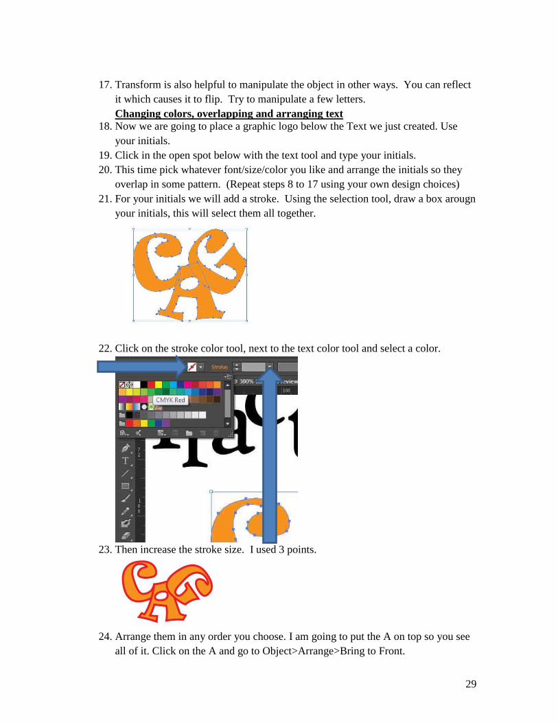
17. Transform is also helpful to manipulate the object in other ways. You can reflect
it which causes it to flip. Try to manipulate a few letters.
Changing colors, overlapping and arranging text
18. Now we are going to place a graphic logo below the Text we just created. Use
your initials.
19. Click in the open spot below with the text tool and type your initials.
20. This time pick whatever font/size/color you like and arrange the initials so they
overlap in some pattern. (Repeat steps 8 to 17 using your own design choices)
21. For your initials we will add a stroke. Using the selection tool, draw a box arougn
your initials, this will select them all together.
22. Click on the stroke color tool, next to the text color tool and select a color.
23. Then increase the stroke size. I used 3 points.
24. Arrange them in any order you choose. I am going to put the A on top so you see
all of it. Click on the A and go to Object>Arrange>Bring to Front.

30
25. Now the whole outline of the A is in front. The arrange control can allow you to
stack the objects in any order so you can see them in the way you want.
26. Click File>Save.

31
Using an image as the Text Fill.
1. In the start window. Open up Computer>NewVolume>MediaStorage>
LayoutDesign>tutorialmaterials>illustrator>
2. Copy the mc-tartan.jpg into your folder. (NewVolume/MediaStorage/
LayoutDesign/YOURNAME/Lab/illustrator)
3. Now go back into Illustrator.
4. Now click File>Place and select mc-tartan.jpg from your folder.
5. Now click in the middle of the page and it will place the image there. It will be
very large. You may want to use the selection tool to move it more into the
center.
6. Click on the Type tool in the tool bar. Click and Type a word (I will type HI) on
top of the image.
7. With the selection arrow, Click on the word and choose a font you like and place
the size to 100 pts.
8. Use the selection tool and while holding down the shift key, click on both the
image and the text.

32
9. Click Object>ClippingMask>Make
10. Now you have an image on the text.
11. You can still edit the text. The only issue is that the image in the background
must be big enough to fill the full size of the text you are creating.
12. If you want to change the image or undo what you did, just click
Object>Clipping Mask>Release.

33
Tracing Simple Objects to Create a Vector Image
1. In the start window. Open up Computer>NewVolume>MediaStorage>
LayoutDesign>tutorialmaterials>illustrator>
2. Copy the bagpipe.jpg into your folder. (NewVolume/MediaStorage/
LayoutDesign/YOURNAME/Lab/illustrator)
3. Now go back into Illustrator.
4. Now we are going to take this jpg and create a drawing from it. This can be
useful if you need a simple image of an object and you can’t draw it freehand.
5. Now click File>Place and select bagpipe.jpg from your folder.
6. Now click towards the bottom of the page and it will place the image there. It
will be very large. You may want to use the selection tool to move it more into
the center. The image may be a bit pixelated and that is fine because we are going
to change it.
7. Now click Object>Image Trace>Make

34
8. Now the image will trace to the Default setting.
9. There is many other trace setting. Try a few.
10. This can be a really useful tool so you can create a simple shape from a JPG from
Google and redesign it and be able to resize it larger which you cannot do with a
JPG .
11. Experiment a bit. There are a number of options under Object that can
manipulate the way the image looks. Try some out.

35
Saving from Illustrator to create a Bitmap(jpg)
1. There are times when you create a graphic completely in Illustrator and need to
place it on a website or online that requires it to be formatted as a Bitmap
(perhaps a JPG). You will need to do this to post your project drafts on Facebook.
2. From this point you need to decide the format. Go to File/Save for Web/ If you
want the background to be white or you have created a background Select JPG
High from the Preset.
3. But if you need the background to be transparent (maybe you are placing it on a
webpage that has a background color already set) Select GIF 129 Dithered and
make sure the Transparency box is checked.
4. Click Save and select (NewVolume/MediaStorage/ LayoutDesign/YOURNAME/
Lab/Illustrator) to save it in.

36
In-Design Newsletter Tutorial This tutorial will serve to introduce you to the In-Design Layout Program but will also
introduce you to basic newsletter layout.

37
Basic Project Setup
1. Open In-Design and choose New Document from the window (if the window
doesn’t open click File/New/ Document).
2. Set the document to Print. Change the Number of pages to 4 and make sure the
check box by Facing Pages is clicked, the page size is set to Letter and the
orientation is set to Portrait.
3. Depending upon the project, you may need to add Columns to the project. For the
newsletter we will create our own columns but for a brochure you would need to
set columns.
38
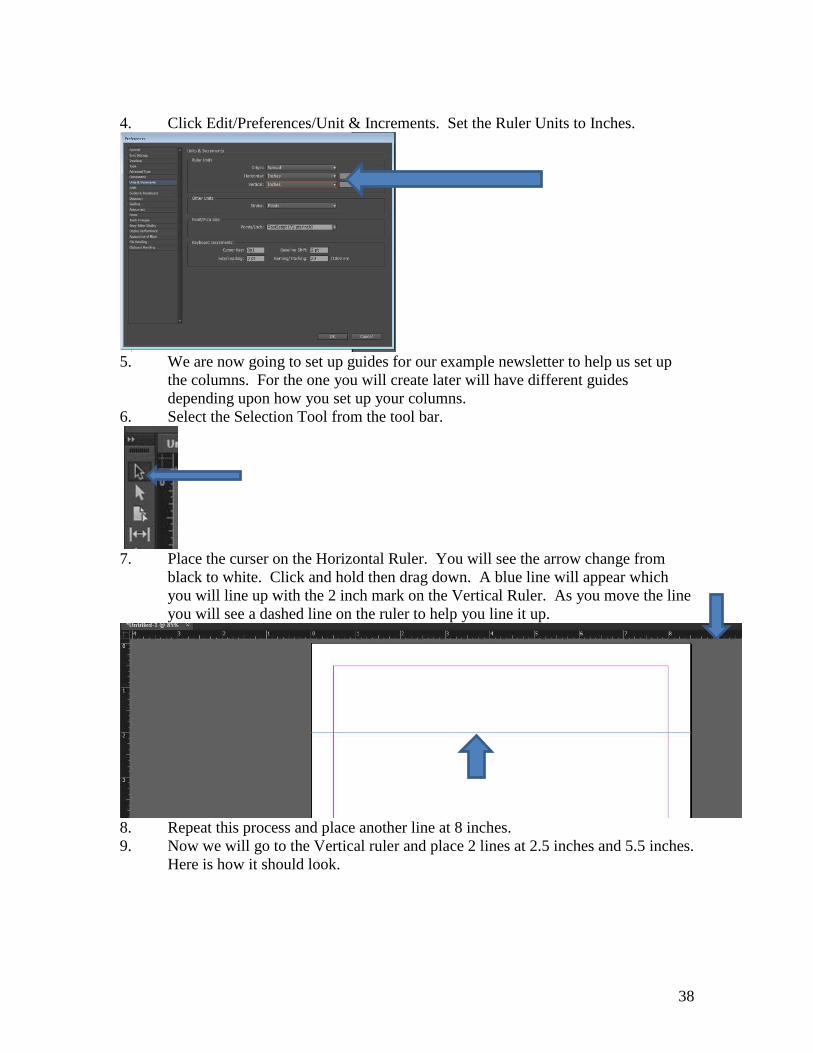
4. Click Edit/Preferences/Unit & Increments. Set the Ruler Units to Inches.
5. We are now going to set up guides for our example newsletter to help us set up
the columns. For the one you will create later will have different guides
depending upon how you set up your columns.
6. Select the Selection Tool from the tool bar.
7. Place the curser on the Horizontal Ruler. You will see the arrow change from
black to white. Click and hold then drag down. A blue line will appear which
you will line up with the 2 inch mark on the Vertical Ruler. As you move the line
you will see a dashed line on the ruler to help you line it up.
8. Repeat this process and place another line at 8 inches.
9. Now we will go to the Vertical ruler and place 2 lines at 2.5 inches and 5.5 inches.
Here is how it should look.

39
10. Nameplate: The top of the first page identifies the title of the newsletter. For this
we will use an Illustrator file in the Tutorial Materials folder. Go to the Start
Menus and Click on Computer. Now open up the project titled Initials.ai using
Illustrator in the tutorial materials folder (New Volume
>MediaStorage>LayoutDesign>InDesign)
11. In Illustrator, Use the Selection tool and draw a box around the logo. That will
select it.
12. Click Edit/Copy. Now click back into In-Design and Click Edit/Paste.
13. Click on the bottom right corner and while holding down the Shift key to preserve
the aspect ratio of the image.

40
14. Shrink the logo so it fits in the top section and move it so in fits into the top left
section sitting on the lines. You can also use the arrow keys to move the object.
15. Placing Text in the project. Click on the text icon in the tool bar.

41
16. Draw a box next to the logo and type “The Newsletter of PUBR 367”
17. Highlight the text. Change the font to Brush Script Std. and the font size to 36
18. And change the orientation to Center.
19. Here is the finished simple nameplate. Click File/Save and save it into the
NewVolume>MediaStorage>LayoutDesing>Lab>Indesign folder as
Newsletter.indd
20. Creating Separation for the Newsletter Sections. Select the line tool from the
tool bar.
21. Click and hold at the intersection of the purple line and the vertical line below the
Nameplate and drag to the opposite intersection.

42
22. Now change the thickness to 3 pts.
23. For the other sections of the newsletter you need to create separation. You can do
that with more simple lines. Place the lines below and make sure they are
separate. Watch for on screen guides that will show you that you are aligning the
lines
24. You can also separate the sections using color backgrounds and other graphic
elements. We will add one later.
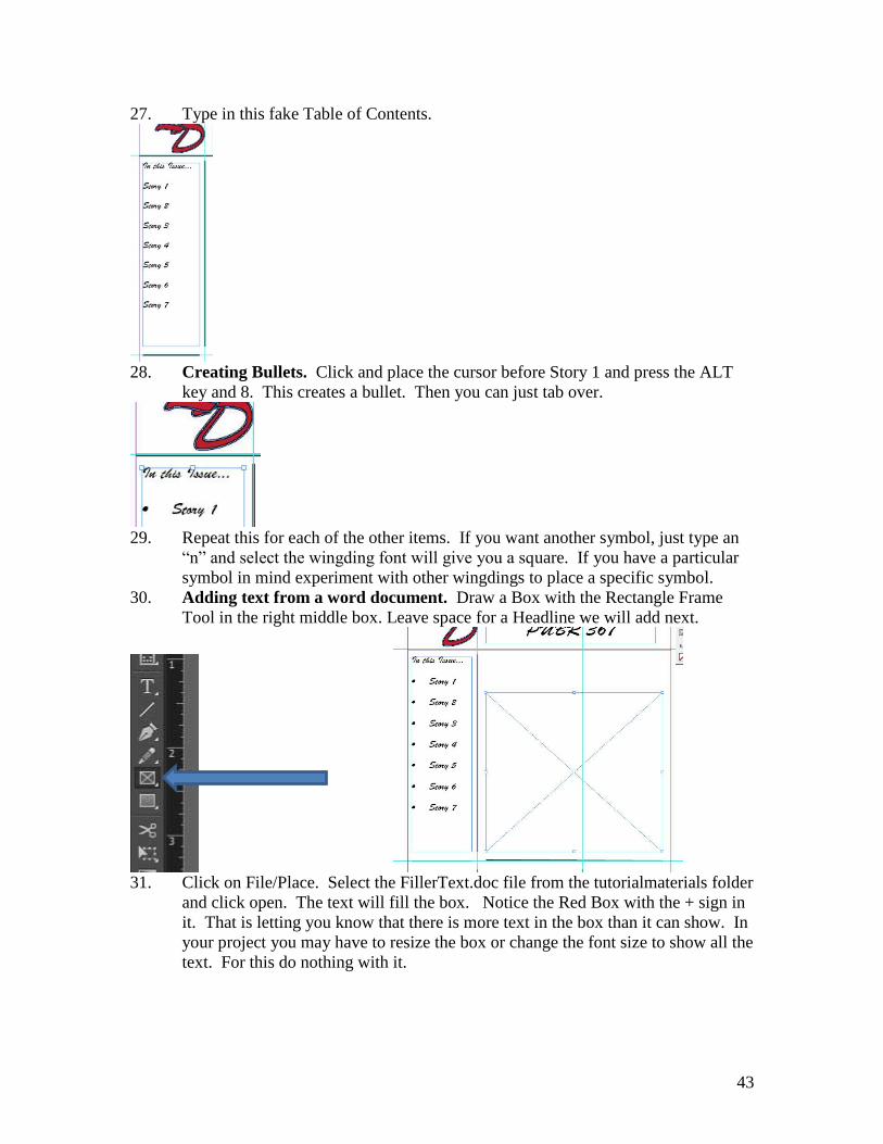
25. Adding Text to the Newsletter. Draw a text box in the Middle Left box and type
“In this Issue…”
26. Highlight the text. Change the font to Brush Script Std. and the font size to 18.
43
27. Type in this fake Table of Contents.
28. Creating Bullets. Click and place the cursor before Story 1 and press the ALT
key and 8. This creates a bullet. Then you can just tab over.
29. Repeat this for each of the other items. If you want another symbol, just type an
“n” and select the wingding font will give you a square. If you have a particular
symbol in mind experiment with other wingdings to place a specific symbol.
30. Adding text from a word document. Draw a Box with the Rectangle Frame
Tool in the right middle box. Leave space for a Headline we will add next.
31. Click on File/Place. Select the FillerText.doc file from the tutorialmaterials folder
and click open. The text will fill the box. Notice the Red Box with the + sign in
it. That is letting you know that there is more text in the box than it can show. In
your project you may have to resize the box or change the font size to show all the
text. For this do nothing with it.

44
32. Select the Rectangle tool (not the Frame Tool) and draw a box on top of the text
and place it on the upper left corner. Make sure the fill and stroke are set to white.
33. Click on Window/Text Wrap. This will open up the Text Wrap window. Select
Text Wrap and change one of the Offset to 0 .125 inch. This will chane them all.

45
34. Draw a box with the Rectangle Frame Tool over the white box you just drew
leaving a bit of a border..
35. Click File/Place and select a picture from the graphics file in the Tutorial
Materials/Indesign. You will see it is too large. Select Object/Fitting/Fit Content
Proportionally.
36. Adding a Headline and Byline. Draw 2 text boxes above the article. One
larger for the headline and a smaller one below it.
37. Type into the larger on, “Random Filler Text” and into the smaller one, “by
Random Reporter” Change the top on to Brush Script Std 45pt font. And the
smaller one just change the font size to 14 pt.
38. Creating the Masthead. The masthead includes date and number of the
publication and usually contact information and publisher. For our example the
masthead will be in the lower left box.

46
39. Create a text box in the lower left area and type” Issue 1, January 2012.
Published by, PUBR 367” and set the font to Brush Script Std. 18 pt font and
Center justified.
40 Adding a Mug Shot and a Caption. It can help to add a personality to a piece
by adding a mug shot. In our newsletter this will go in the middle bottom box.
Draw a box using the Rectangle Frame Tool.
41. Click File/Place and select Deptphoto.jpg from the graphics file in the Tutorial
Materials/Indesign. You will see it is too large. Select Object/Fitting/Fit Content
Proportionally. And center the photo.

47
42. Create a text box below the photo and type “These people teach us?” and change
the font size to 18 pt.
43. Creating a color background. In the bottom right box we are going to create an
upcoming events box.
44. Create a text box and type in the following, “Upcoming Events, 00/00 Event # 1,
00/00 Event #2, 00/00 Event # 3” Change the “Upcoming Events” to the font
Brush Script Std. and 18 pt. Also center the text.
45. On top of the events box, draw a box using the rectangle tool that is larger than
the Text box. Make it red with a black stroke and change the opacity to 50%

48
46. Right click on the box and click Arrange/Send to Back.
47. Now using the random text and other pictures in the file experiment with laying
out the rest of the pages.
48. Exporting to a PDF. Click Save to save the .indd file so you could continue to
work on this. Click File/Export. Make sure the Save as type is Adobe PDF
(print). Save it into your lab In-design folder. In your actual project you would
continue to design the other 3 pages.
49
Illustrator Logo Tutorial This tutorial will show you how to use shapes, type on paths and in shapes, and practice
creating a logo. (Adapted from Graphic Design Essentials by Macario)
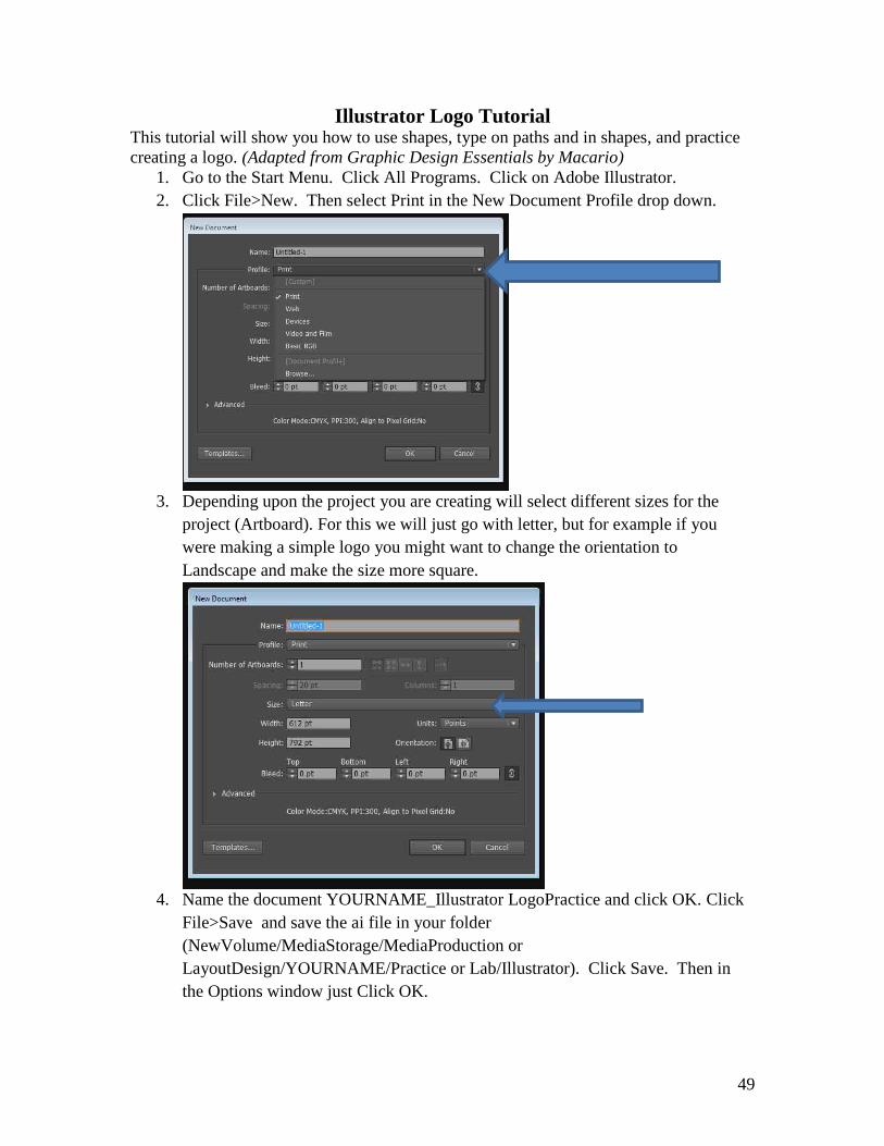
1. Go to the Start Menu. Click All Programs. Click on Adobe Illustrator.
2. Click File>New. Then select Print in the New Document Profile drop down.
3. Depending upon the project you are creating will select different sizes for the
project (Artboard). For this we will just go with letter, but for example if you
were making a simple logo you might want to change the orientation to
Landscape and make the size more square.
4. Name the document YOURNAME_Illustrator LogoPractice and click OK. Click
File>Save and save the ai file in your folder
(NewVolume/MediaStorage/MediaProduction or
LayoutDesign/YOURNAME/Practice or Lab/Illustrator). Click Save. Then in
the Options window just Click OK.

50
5. Creating a Shape/Making it a Path. Change the Units to inches. Click on
Edit>Preferences>Units
6. Set the General Units to inches
7. Click on the Ellipse tool
8. Double Click in the page. This will open up a window to set the size of the shape.
You can click and hold to draw the shape free hand. For this we want to set this
to 4 inches for width and height to make it a perfect circle. Click OK.

51
9. So this will be a path. Change the Fill and Stroke to nothing.
10. Here is what you should have now, an empty path to put text onto.
11. Adding Text to the Path. Select the Type on Path tool.
12. Click on the top point of the circle.

52
13. Type TARGET in all capital letters. Highlight it and change the font to Myriad
Pro, the style to Bold and the size to 18 pts.
14. Click Ctrl C to cop. Then Click after the word target to un-highlight the word.
Then Ctrl V to paste the word all the way around the circle.
15. Notice that the last past does not fit perfectly. Highlight the whole text line and
shrink the font to get it to fit. Once you have changed the font the first time you
will have to re-highlight the text to get the final few letters the same size.
16. 17.4 points worked for this circle to get the text circle to meet.

53
17. Now click on the Black Selection Arrow and click on the circle.
18. Place the cursor over the Scale Tool and Double Click.
19. Change the Uniform Scale number to 85% and Click Copy.
20. Now repeat the process a few more times.
21. This can be useful to create uniform copies of objects.
22. Using the Pen Tool to create a shape and fill it with Text.

54
23. Click on the Pen Tool.
24. With this tool you can draw any straight edged shape by clicking each point.
Make sure the fill is set to no fill (rectangle with the red line) and the stroke set to
black with the size of 2 points.
25. Now, beside the Target circle click on a starting point then move over in a straight
line and click a point to end the line.
26. Now click and complete the arrow shape. You must click on each corner of the
shape you are drawing and end by clicking on the first point you clicked.
27. If you are off on any point, go back to the tool bar and select the White Arrow
(Direct Selection Tool) and you can move a single anchor point and change its
alignment.
28. Filling the Shape With Text: Select the Area Type Tool.

55
29. Click on the highest point inside the arrow and type No where to go but down!
30. Now copy and paste the text to fill the shape.
31. The outline goes away once you put the text into the shape. This can be useful for
a text effect using a shape.
32. Creating a Curved Line and Typing on the Path. Click on the Pen Tool and
make the Fill on color and the Stroke Black.

56
33. Go below the Target Circle (about 6.5 inches in the vertical ruler) and click to
create a point.
34. Move over to about 2 on the Horizontal rule in a straight line and click and hold.
Then while holding, pull the mouse down. You will see it make a curve. Release
the mouse button.
35. Now go out to 4.5 on the Horz Rule and click and hold again. This will create a
line that is opposite of the first. If you are still holding you can manipulate the
curve or just release the button.
36. You can repeat this as many times as you want. To stop all you have to do is
click on the Black Selection Arrow.
37. Just like with the shape, you can use the White Direct Selection arrow to make
adjustments to the line.

57
38. Now click on the Type of Path Tool.
39. Click at the start of the curved line and type Mahalo.
40. Highlight the text and change it to a more fun font. I chose AR CHRISTY and set
an 18 point font. That font may not be on your computer so choose one yourself.
41. Copy and paste the text across the curve.
42. Creating a practice logo by Converting Type to Shapes, redrawing letters
and adding a symbols. Open up a new file. Title it savatar and set it to 7 inches
in width and 5 inches in height.
43. Select the Text Tool. Set the Fill to Black and the Stroke to No Color.

58
44. Set the Font to Eras Bold ITC and the font size to 72.
45. Click half way down vertically and type SAVATAR so it is in the middle of the
page.
46. Like in the earlier tutorial, we are going to convert the Type to Shapes. So using
the Black Arrow, click on the text. Select Type>Create Outlines.
47. Click Object>Ungroup. Now the letters are separate. Click off of the word to
unselect it.
48. Now we are going to customize one of the A’s. Using the Pen tool we will outline
a portion of the A. Select the Pen Tool and set the Fill to No Color and the Stroke
to Black. Size to 1 point.
49. Start at the bottom corner of the A and click with the pen tool.
50. Now click on each corner of the A tracing just the outer A. Look at the image
below to see the shape. You are leaving out the line in the middle. Make sure
you end by clicking on your first point.

59
51. Change the Fill color to Red. This will allow you to see the new shape. After you
look at it change it back to black.
52. With the Black Arrow, click on the line in the middle of the old A.
53. Click Delete to get rid of the old A.
54. Now Click on the Ellipse Tool.

60
55. Double click on the page and create an ellipse that is .15 inches in both width and
height.
56. Click on the Black Arrow tool and move it to the middle of the A we just made.
57. Still using the Black Arrow tool, draw a box around the A to select both parts.
Make sure it only selects the A.
58. Click Object>Group to link the parts together. Now Copy and Paste this twice.
They will stack on top of each of the in the middle of the page.
59. Put each one over the two remaining A’s.

61
60. Just like before, delete the old A’s from behind the new ones.
61. Now we will create 2 swooshes around the word. Click on the Ellipse tool and
draw an ellipse around the word. Make sure the Fill is set to no color and the
Stroke is set to black.
62. Click on the Black Arrow and then choose the rotate tool (Or go to
Object>Transform>Rotate) and rotate the oval so the right end is above the R.
See Below.
63. Choose Object>Lock>Selection so you can trace over it to make the swooshes.
64. Choose the Pen tool and Click on the upper edge of the curve. See Below.
65. Then click and hold on the opposite side of the curve. See Below

62
66. Then Move the cursor and match the line you just created with the curve of the
ellipse.
67. Now put the cursor back on the first point and click and hold. Now move the
mouse and it will create a new line. Move that above the other to create the
finishes swoosh shape. See Below.
68. Click on the Black Selection Arrow and the new shape should be selected.

63
69. We are now going to make the swoosh a different type of color. Go to
Window>Swatch Libraries>Color Books>Panatone metallic coated.
70. This opens up the swatch window. In the search box type 875 for a gold metallic
color.
71. Double Click on the color swatch you just searched. This will change the fill
color of the swoosh and add the color to your color choices.
72. Close the swatch window and change the stroke color to No Color.
73. Now with the swoosh selected, Copy and paste the swoosh to make a new one.

64
74. Select the rotate tool. Hold down the shift key and use the mouse to rotate the
swoosh so it is flipped to a mirror image of the original. By holding the shift key
it rotates the object at an even degree.
75. Now move it and align it with the opposite end of the ellipse so it becomes a true
mirror of the other swoosh.
76. Click on the ellipse and go to Object>Unlock All.
77. Hit the delete key to remove the ellipse.
78. Click Save. These simple techniques with what we looked at last time gives you
only a small portion of what you could do for a logo in Illustrator. Experiment.
65
In-Design ID Package and Brochure Tutorial This tutorial will serve to introduce you to basic Identity Package and Brochure layout.
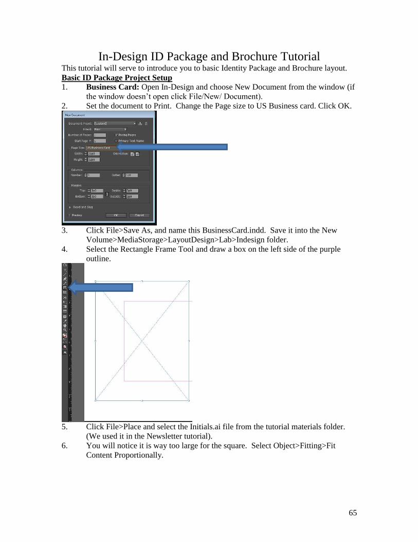
Basic ID Package Project Setup 1. Business Card: Open In-Design and choose New Document from the window (if
the window doesn’t open click File/New/ Document).
2. Set the document to Print. Change the Page size to US Business card. Click OK.
3. Click File>Save As, and name this BusinessCard.indd. Save it into the New
Volume>MediaStorage>LayoutDesign>Lab>Indesign folder.
4. Select the Rectangle Frame Tool and draw a box on the left side of the purple
outline.
5. Click File>Place and select the Initials.ai file from the tutorial materials folder.
(We used it in the Newsletter tutorial).
6. You will notice it is way too large for the square. Select Object>Fitting>Fit
Content Proportionally.

66
7. Now we are going to add text to the card. I am going to just use a font in
InDesign, but for your project you may want to design some text in Illustrator and
just bring it over in the same way we brought the logo over.
8. Draw a text box that fits into the right side of the purple guides on the pallet.
9. Change the font to Brush Script Std. 12 pts and Align Right.
10. Type the following into the text box.

67
11. For your own project, you may want to add other embellishments to the card like
a shape under the text. There are many options you will want to explore in your
design. This practice design is very simple and would not get you a good grade on
your project.
12. Click Save to save the .indd file so you could continue to work on this. Click
File/Export. Make sure the Save as type is Adobe PDF (print). Save it into your
lab In-design folder.
13. Letterhead: For this you need to open a new InDesign project and set it for a
standard size sheet of paper (Letter). Using what you just did, create a simple
letterhead for this class that looks like this…
14. Click Save to save the .indd file so you could continue to work on this. Click
File/Export. Make sure the Save as type is Adobe PDF (print). Save it into your
lab In-design folder.
15. Remember, this practice design is very simple and would not get you a good
grade on your project.
15. Envelope: Open up a new InDesign project and set the size to Width 9.75” and
Height 4.125” This is the size of a standard No. 10 business envelope.
16. Now create a simple envelope that looks like this.

68
17. Click Save to save the .indd file so you could continue to work on this. Click
File/Export. Make sure the Save as type is Adobe PDF (print). Save it into your
lab In-design folder.
18. Again remember, this practice design is very simple and would not get you a good
grade on your project.

69
19. Brochure: Now you will set up a simple 2 page brochure that is a Tri-fold design.
Set to 2 pages without the facing pages checked. 3 columns with a 4p0 gutter. Set the
margins all to 2p0. Make sure the orientation is set to Landscape. Click OK.
20. With a trifold, standard folding changes the order that people look at the different
columns/pages. Here is a guide for how you move thru the pages to help you
place info on the right columns/pages.
21. Many of the skills that we used to create the newsletter and ID package are the
same in the brochure design.

70
22. Using the filler text and the images in the InDesign tutorial materials folder,
create a trifold brochure design. It can be very simple, just practice. Here is what
you should pretend each page is about…
Page #1- Cover page- PUBR 367 Layout & Design and use the logo.
Page #2- Course Overview
Page #3- Class Facilities
Page #4 & 5- Class Projects – That these two pages be one page, this is common in
newsletter design to merge these 2 columns into one big page.
Page #6- Mailer- This should look like you would put a stamp and an address on it to
mail it.
23. Click Save to save the .indd file so you could continue to work on this. Click
File/Export. Make sure the Save as type is Adobe PDF (print). Save it into your
lab In-design folder.

71
Web Design- HTML Tutorial
A web page is a simple text file that contains text along with a set of HTML tags. The
term “HTML” is an acronym that stands for HyperText Markup Language. Hyper is the
opposite of linear. Computer programs used to move in a strictly linear fashion. HTML
does not follow this pattern, and allows a person to viewing the page to jump anywhere
on the World Wide Web at any time. The documents themselves at plain Text (ASCII)
files. Markup is what you do to the text. This means adding special codes or “tags” that
describe how the page should display in a browser. HTML is a computer Language that
describes how a web page should be formatted.
For this tutorial, you will create an HTML document using Notepad (go to START,
select PROGRAMS, and look in ACCESSORIES).
Setting up the file structure It is essential to set up a file structure when creating a web page. A good structure
consists of a main folder (to house files and subfolders) and subfolders (to house the
pieces of the webpage). This is done to alleviate confusion and to allow for a smooth
transfer of the site to a server.
1. Find your folder in the LayoutDesign folder.
2. Open your folder called HTML.
Getting the image files
There are two images you will need for this tutorial. They are located in the Layout
Design folder, in the tutorialmaterials folder under html..
1. Right Click on the images folder in the html folder in tutorialmaterials.
2. Click on Copy.
3. Go back to your HTML folder
4. Right Click and select Paste.

72
Setting up the HTML document
When designing and HTML, you must first set up the document so it is recognized as an
HTML document. The first step is to create a “shell” from which to work.
Every HTML page should include four “tags” or codes that are marked by the < and >
signs. The general format of an HTML tag is:
<tag_name>text</tag_name>
Many tags have a beginning and ending tag. The closing tag contains a “/” and this tells
the browser to stop tagging the text.
The four paired tags necessary in every HTML document are listed below:
<html> Marks the page as HTML text.
<head> Marks the beginning and end of the header for the page.
<title> Marks the beginning and end of the title of the page.
This displays in the title bar of the browser.
<body> Marks the beginning and the end of the body of the page. This
contains the contents of your page as well as special formats (i.e., text
color, link color, background, etc.)
Create a page
1. Click Start, Programs, Accessories, Notepad.
2. Click File, Save As.
3. Key index.htm in the File name text box.
4. Confirm the Text Documents displays in the Save as type text box.
5. Save it in the HTML folder.
6. Key the text into Notepad exactly as it appears in the picture below and Save.

73
Add text and the paragraph tag
HTML does not recognize the returns that you enter in the text editor. To start a new
paragraph you must use the <p> tag. The <p> tag provides a line break and one empty
line to separate paragraphs. It is a good idea to add the align attribute to indicate what
direction (left, right, center) you want the text to appear.
1. Choose Format, Word Wrap so that the text wraps within the window. If
there is a check by Word Wrap it is already selected. The text will not wrap in
the browser exactly like it did in Notepad.
2. Position the cursor on the first line below the <body> tag.
3. Key <p align=left>
4. Key the remaining text between the <body> tags as shown below. Remember
to include the closing </p> tag.
5. Add a bold tag by positioning the cursor in front of the text to be bolded; in
this case (Communication and Theatre Arts).
6. Key <b>
7. Position the cursor after the text and key the closing tag </b>.
8. Choose File, Save to save he page before viewing it in the browser.
View a page
As you create an HTML document, you will want to view it in a browser. The browser
interprets the HTML tags and displays the Web page on the WWW.
1. Open a browser.
2. Click File, Open .
3. Choose Browse and find the index.htm file you just saved.
4. Select it and click Open.
Set body tag attributes
Body tag attributes are used to customize the page. Attributes are special codes within a
tag that modify or enhance the way the tag looks. For example, changing text color or
selecting a background image is all attributes.

74
Change the background color
To change the background color of the page, you must use a background color attribute.
The attribute within the tag is bgcolor=. A color is represented by a hexadecimal code
made up of 6 characters. All hexadecimal codes are written or keyed with a “#” sign in
front of the code and are enclosed inside quotation marks.
1. In Notepad, place the cursor just after the “y” in the <body> tag and press the
space bar.
2. Key in the attribute bgcolor=”#fff000” to change the background to yellow.
The tag should now read like <body bgcolor=”#fff000”>
3. Save it.
4. View it in the Browser.
5. In Notepad, change the value to <body bgcolor=”ffffff”> to reset the
background back to white.
6. Save it and view it in the browser
Add a background image (wallpaper)
The image you add as a background will be repeated or tiled across the page. Common
file formats are .gif and .jpg.
1. Place the cursor before the > in the <body bgcolor=”ffffff”> tag.
2. Press the spacebar and key in the following to insert an image.
background=”images/back.bmp”
The part that says images/ is directing the browser to the sub-folder you
created.
3. Save it and view it.
4. Notice that the image covers up some of the words.
5. In Notepad, delete the background=”images/back.bmp” to return to the
white background.
Change text color Using HTML you can set a default color for the whole page. The text color is set the
same way you just did the background color. This attribute is also contained within the
opening <body> tag.
1. Place the cursor after bgcolor=”ffffff”
2. Key in a space and type text=”ff0000”
3. Save it and view it. The page now has red text.
4. Change the text back to black by replacing ff0000 with 000000.
5. Save it and view it.

75
Insert an image
Whenever you are placing an image on a page it is important to follow the same format
every time. All images should be saved in the images folder first and then placed in the
page.
The following example shows the proper format for inserting an image:
<img src=”images/frontlogo.gif>
img stands for “image”. It tells the browser that there is an image on the page.
src stands for “source”. This is an attribute that tells the browser where to locate
the image frontlogo.gif in the file structure. The images are separate files and not
saved in the HTML.
“images/ is the name of the folder where the image files are stored.
frontlogo.gif is the name (frontlogo) and format (.gif) of the file.
Follow these steps to insert an image at the top of the page.
1. Put the cursor after the <body> tag
2. Press enter to place the insertion point on a separate line.
3. Key <img src=”images/frontlogo.gif”>.
4. Save it and view it.
Place an image
The default placement is left justified. To place the image in the center or the page, you
need to add the paired tag <center> and </center>.
1. Key <center> before <img src=”images/frontlogo.gif”> and </center> after
the tag.
2. Save it and view it. It should look like this:

76
Create a hyperlink
A hyperlink takes you to another file or web page. The tag to create a hyperlink is <a>,
which stands for anchor. It is followed by a hypertext reference comment (href) and the
file name or URL to which you want to link.
1. Place the cursor after the closing </center> tag.
2. Press enter to put the cursor on a blank line.
3. Key the following:
<center><a href=http://www.monm.edu>Visit our Web Site</a></center> 4. Save it and view it.
Insert a break
The break tag, <br>, creates a line break. Use the tag when you need one hard return
but no space between the text. We are going to insert a <br> tag to create space after the
logo and before the hyperlink.
1. Place the cursor after the closing of the </center> tag for the logo and hit
enter.
2. Key <br>.
3. Save it and view it. It should look like this.

77
Create a horizontal rule
The horizontal rule tag, <hr>, places a horizontal line, or rule, across the screen. This
can be an effective visual divider within a page. The <hr> tag is considered an “empty”
tag because it has no closing or ending tag.
1. Place the cursor after the closing </center> tag after the hyperlink.
2. Press enter to put the cursor on a blank line.
3. Key <hr>.
4. Save it and view it. Notice that there isn’t enough space between the link and
the line. We will add a <br> tag to fix that.
5. Place the cursor before the <hr> tag and press enter.
6. Press the up arrow key and put the cursor on the blank line. Compare to the
picture below:
7. Key <br>.
8. Save it and view it.
Insert a heading
Heading tags are used extensively in HTML to create heading of various sizes. The six
heading tags, from largest to smallest, are <h1> through <h6>. Headings like to stand
alone. By default, heading tags add an additional space before and after the heading so
you cannot get other text to position very close to them.
1. Place the cursor after the closing </p> tag and press enter.
2. Key: <h1>Concentrations</h1><br>
3. Compare with below:

78
Now we need to create a second, smaller heading using the level 3 heading.
1. Place the cursor after the <br> tag at the end of the <h1> tag.
2. Press enter to get a blank line
3. Key <h3>Selected Courses</h3>
4. Save it and view it.
5. Compare to below:
Create an unordered list An unordered list is simply a bulleted list. Bulleted list are created using the <ul>
opening and </ul> closing tag. By adding in the <li> tag, the bullet is placed before the
word.
1. Place the cursor after the <br> tag following the “Concentrations” heading.
2. Press enter.
3. Key the following exactly as you see it.
<ul>
<li>Communication and Media
<li>Theatre
</ul>
<br>
4. Save it and view it.
5. Compare to below:

79
Create an ordered list This type of list will number the items. This ordered list requires the <ol> opening tag
and the </ol> closing tag. The number is inserted before the item using the <li> tag.
1. Place the cursor after the <h3>Selected Courses</h3> tag and press enter.
2. Key the following exactly as you see it:
<ol>
<li>Introduction to Communication Studies
<li>Introduction to Theatre
<li>Beginning Acting
<li>Interpersonal Communication
<li>Advanced Public Speaking
<li>Mass Media and Modern society
<li>Radio & Television Production
<li>Writing for the Media
<li>Media Production
<li>Introduction to Technical Theatre
<li>Argumentation
</ol>
<br>
3. Save it and view it.
Now we want to create some space before the final piece of the page is added.
1. Place the cursor after the <br> tag at the end of the ordered list and enter
2. Insert a <hr> tag to create a horizontal line and enter.
3. Insert another <br> and press enter.
4. Key <p>If you have any further questions, please call Dr. Lee McGaan at
extension 2155 or e-mail him at
Create a link to an e-mail address
In addition to linking pages and between parts of a single page, the <a> tag allows you to
link to an e-mail address.
1. Place the cursor right after the line you just keyed.
2. Key the following:
<a href="mailto:[email protected]">[email protected]</a>
3. Insert a closing </p> tag.
4. Save it and view it.

80
Basic HTML Hexidecimal Color Codes
Color Color Code
Red #FF0000
Turquoise #00FFFF
Light Blue #0000FF
Dark Blue #0000A0
Light Purple #FF0080
Dark Purple #800080
Yellow #FFFF00
Pastel Green #00FF00
Pink #FF00FF
Color Color Code
White #FFFFFF
Light Grey #C0C0C0
Dark Grey #808080
Black #000000
Orange #FF8040
Brown #804000
Burgundy #800000
Forest Green #808000
Grass Green #408080
Link to more Hexidecimal Color Codes
http://www.computerhope.com/htmcolor.htm
81
Web Design- Dreamweaver Tutorial Setting up a Dreamweaver Website
1. Find the folder in your lab folder called Dreamweaver. Copy the file folders,
graphics and text, from tutorialmaterials to NewVolume/Media
Storage/LayoutDesign\Lab\Dreamweaver.
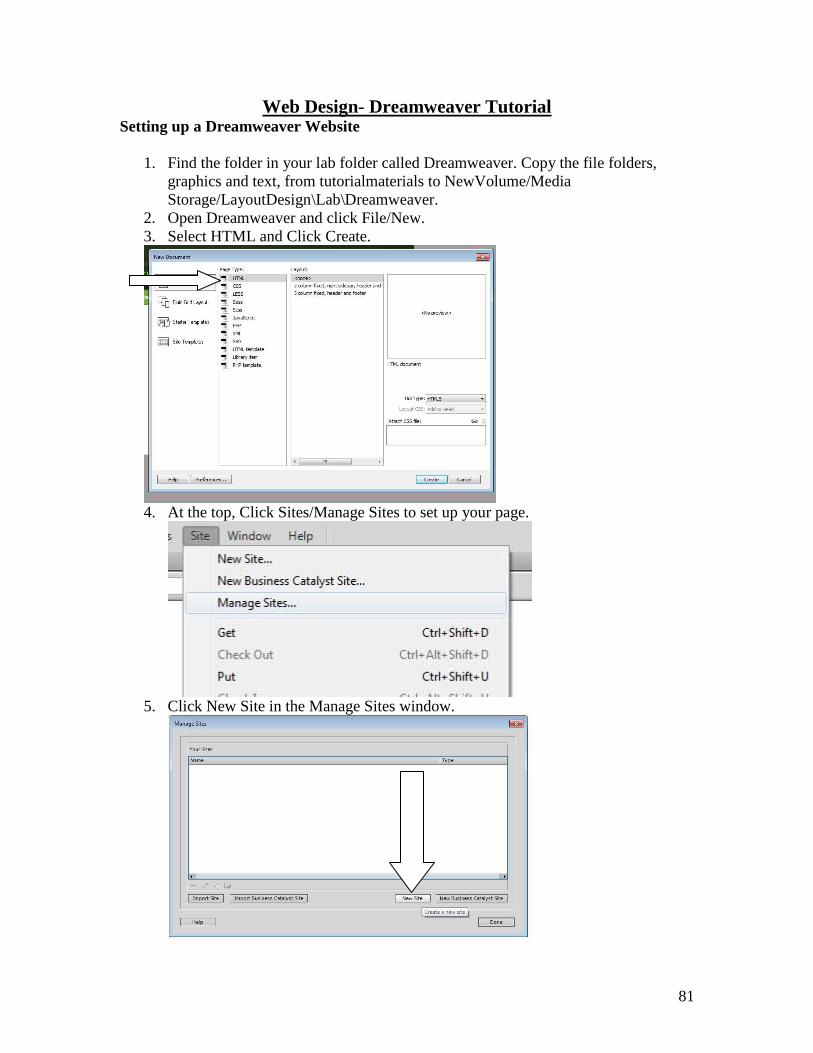
2. Open Dreamweaver and click File/New.
3. Select HTML and Click Create.
4. At the top, Click Sites/Manage Sites to set up your page.
5. Click New Site in the Manage Sites window.

82
6. Give the site a name (for this exercise Curriculum2014)
7. Click on the folder next to the Local Site Folder and browse to your folder and
select NewVolume/Media Storage/LayoutDesign\Lab\Dreamweaver.
(for the other projects you would select the appropriate folder).
Click Save.
8. The Manage Sites window will reappear. Click Done.
9. Your site will now appear in the upper right with the two file folders you copied
listed below that. If it doesn’t, change the right drop down box from Remote View
to Local View. Also click on the + sign next to the green folder under local files.
You should see the two folders you copied earlier. (If the site disappears the next
time you log in, repeat these steps)
Creating a Basic Website
1. Give the webpage a title. Click in the box by the word Title in the Document
toolbar.
2. Type “Monmouth College’s Curriculum-Home Page” This text will appear on
the Tab for the website in IE or Chrome. Go to File>Save and name it index.htm
83
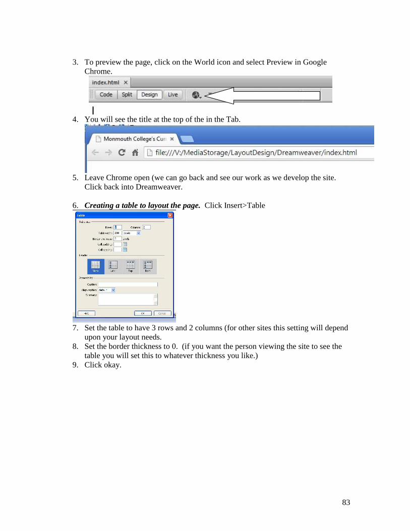
3. To preview the page, click on the World icon and select Preview in Google
Chrome.
4. You will see the title at the top of the in the Tab.
5. Leave Chrome open (we can go back and see our work as we develop the site.
Click back into Dreamweaver.
6. Creating a table to layout the page. Click Insert>Table
7. Set the table to have 3 rows and 2 columns (for other sites this setting will depend
upon your layout needs.
8. Set the border thickness to 0. (if you want the person viewing the site to see the
table you will set this to whatever thickness you like.)
9. Click okay.

84
10. Sizing and Formatting the Table. Click and Drag the bottom right corner box so
that the table fills your screen (1000 Horizontal or Top line/ 650 Vertical or Side
line). If the rulers are not showing on your screen hit Ctrl/Alt/R.
11. Click on the middle vertical dashed line and drag it so it creates a smaller left
column. (put the marker at 150 on the ruler).

85
12. Now we are going to create a header and a footer row. Click on the first
horizontal dashed line and move it to 100. Repeat this process for the second
horizontal line until it reaches 550. Then click on the bottom of the table and
move it back to 650.
13. This is a very basic template for a web page layout. Make sure you center the
entire table on the page so it will stay centered no matter the screen size. Make
sure the entire table is selected (black outline around the table like the above
picture). In the property window at the bottom of the screen, change the Align
drop down to center.

86
14. Creating a Simple Header for the page. Hold down the Ctrl key and click on the
two top cells across. This will select both of them.
15. Click Modify/Table/Merge Cells. This will give you one cell across the top of the
webpage for your header.
16. Click in side that cell and type the header “Monmouth College’s Curriculum” and
click and highlight the text.
17. In the properties window click on the CSS tab below the HTML, you have font
controls. This will only change this text and create a CSS rule for that.
18. Select Gotham in the Font drop down. If you don’t see a font you like when doing
your own site, you can add new fonts thru selecting Manage Fonts.
19. Change the font Size (drop down below the Font) to 36 and Click the center icon.

87
20. You can also make changes to the page through Page Properties. So click on that
button at the bottom right of the screen.
21. Here you can also include a background color or image. Click Background color.
22. You can change the Hue by moving the first bar. If you know the exact color in
Hexidecimal numbers you can just type it in at the bottom. Select a red color for
this exercise. Click on the top right corner of the big box.
23. Also, if you have an exact color you can use the eyedropper to select it off of the
screen.
24. In page properties you can also set margins, set defaults for hyperlinks, ect.
25. Click Okay to exit Page Properties.

88
26. Creating the basic navigation for the page. First we need to decide how many
pages we need. For this exercise you need 4 other pages. ILA, Global
Perspectives, Reflections, and Citizenship.
27. Click File>Save
28. Click on File>Save As and type ila.html Repeat this using these names
gp.html ref.html cit.html
29. All of the pages now appear as tabs at the top of the screen. Click on the x next to
each name and close all of them except index.
30. You can reopen any page by clicking on it in your files window. If you don’t see
all the pages hit the refresh button.
31. Click on the middle left cell in your table.

89
32. Click Insert Table and create a 1 column table with 6 rows. Change the table
width to 150 (so it fits in the column we created). Also, put a border thickness of
1 so we can see the boxes. Click OK. This will be your navigation bar.
33. Ctrl Click on the inner dotted line of the middle left cell (the one you just placed
the table into) to select that cell alone. You will know you did this because in the
bottom of the property window it will say cell.
34. In the Vert drop down box select Top so that that cell will be aligned to the top
vertically. You can also align it Horizontally with the Horz drop down box.
35. Type in our navigation items into the cells of this inner table in this order..
(Home…Intro. to Liberal Arts… Global Perspectives… Reflections…
Citizenship… Contact Us)

90
36. Highlight home and look at the properties window. Do you see the circle that
looks like a gun cross hairs.
37. You can use the folder next to it to browse for your link or you can click and drag
this icon and point it to the page you want to link.
38. And let go on the index.htm file in your file window. Now you have created that
hyperlink.
39. Repeat the process for the rest of the navigation linking them to the appropriate
pages. All except Contact Us.
40. Contact Us is an email link. So highlight Contact Us
41. Click Insert>Email link
42. Type your email address into the E-mail box and click ok.
43. Click File>Save
44. Creating Secondary Navigation. First merge the bottom row. So Ctrl Click on
the two cells in the bottom row and Modify/Table/Merge Cells. Now Click in the
bottom cell.
45. Type in the following exactly. Home | Monmouth College | Contact Us
46. Highlight the text and Make the Font Gotham. .
47. Now select 12 for font size and center the text.
48. Highlight and link the Home to index.htm

91
49. Highlight and link Contact Us to your email address
50. Highlight Monmouth College and Select Insert>Hyperlink.
51. Type into the link box http://www.monm.edu and select _blank from the target
drop down (this will open the link in a new tab, which is a good idea for any
external links you put into a webpage)
52. Click File>Save

92
53. Click File>Save As and individually save over each of the other pages. Click on
File>Save As and select ila.html Repeat this for the rest gp.html ref.html
cit.html
54. Now each of your pages has the same navigation on it. Click on the x next to each
name and close all of them except index.
55. Now if you still have the page open in Chrome. Go to it and hit refresh. If not
Click the world icon and preview the pages. Check your navigation to see if it all
works.
56. Entering Individual Page Content 57. Go to the text file in the folder you created.
(portfolio\dreamweaver\text\TheNewMonmouthCurriculum.doc)
58. Highlight roman numeral I. and click copy.
59. Go back to Dreamweaver on the Index page and Ctrl click in the middle right cell
of the table to select it. Change the vertical alignment to Top and horizontal to
the left in the cell properties window (just like with the nav bar).
60. Click in the cell. Click Edit/Paste to place the text onto the webpage. Delete the
roman numeral I. and the words “The New Monmouth Curriculum” from the text.
61. Highlight the text and change the font to Gotham and the size to 16.
62. Click save and refresh in Chrome and take a look at it..

93
63. Placing a Picture on the page. Go back to Dreamweaver. The placing of
pictures will disturb the spacing of the table, so do not be alarmed we will reshape
the table later.
64. Click the + symbol to open the graphics folder in the files window.
65. Click and hold logo1.jpg and drag it to the beginning of the text.
66. Click on the logo and find the square handle on the bottom right corner of the
picture.
67. Hold the Shift key and Click and drag that handle to resize the picture. This will
maintain the aspect ratio of the picture. Resize it so the width is 200.
94
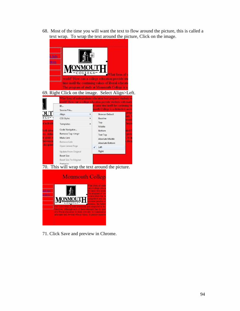
68. Most of the time you will want the text to flow around the picture, this is called a
text wrap. To wrap the text around the picture, Click on the image.
69. Right Click on the image. Select Align>Left.
70. This will wrap the text around the picture.
71. Click Save and preview in Chrome.

95
72. Adding a Hot Spot link to an image. By adding a hot spot the image it becomes
a hyperlink.
73. Click on the image and select the rectangular hot spot tool in the properties
window.
74. Draw a box over the image.
75. Make sure it covers the whole image. Click into the link box in the properties
window
76. Backspace the # symbol off and type in http://www.monm.edu
This will create a link to the Monmouth webpage. Change the target to _blank.
You can link anything to a hotspot (email, other web pages, high quality versions
of the pictures) by simply dragging the crosshairs to the file in the file window.
77. Click Save and preview Chrome.

96
To complete the site. Now create the other four pages. Change the Page Banner,
place the appropriate text, choose pictures and design the rest of the site. Feel free to
change the sites background, font choice, or any other aesthetic choice. Don’t forget
to change the title on each page so that the tab in Chrome is different for each page.