lecture – 3 service process control - nptelnptel.ac.in/courses/110106046/module 5/lecture...
TRANSCRIPT

LECTURE – 3
SERVICE PROCESS CONTROL
Learning objective
• To appreciate the statistical procedures to control service quality

5.6 Cost of Quality for Services
Service organizations incur cost ranging between 25% and 40% of the operating
expenses due to poor quality. Whenever a process fails to satisfy a customer it
results in loss of customer which in turn adds extra cost to an organization. Various
costs of quality can be seen in Table 5.6. It is very important for service
organizations to control quality so that various costs can be minimized.
TABLE 5.6: COSTS OF QUALITY
Cost Category
Definition Bank Example
Prevention Operations/activities that keep failure from happening and minimize detection costs
Quality planning, Recruitment and selection, training programs and Quality improvement projects
Detection or Appraisal
To ascertain the condition of a service to determine whether it conforms to safety standards
Periodic inspection, process control, checking, balancing, verifying collecting quality data
Internal failure
To correct nonconforming work prior to delivery to the customer
Scrapped forms and report, rework, machine downtime
External failure
To correct non-conforming work after delivery to the customer or to correct work that did not satisfy a customer’s special needs
Payment of interest penalties, Investigation time, legal judgments, negative word of mouth and loss of future business
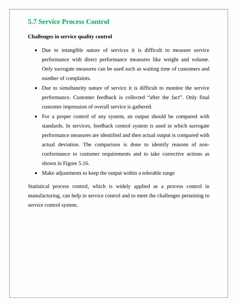
5.7 Service Process Control
Challenges in service quality control
• Due to intangible nature of services it is difficult to measure service
performance with direct performance measures like weight and volume.
Only surrogate measures can be used such as waiting time of customers and
number of complaints.
• Due to simultaneity nature of service it is difficult to monitor the service
performance. Customer feedback is collected “after the fact”. Only final
customer impression of overall service is gathered.
• For a proper control of any system, an output should be compared with
standards. In services, feedback control system is used in which surrogate
performance measures are identified and then actual output is compared with
actual deviation. The comparison is done to identify reasons of non-
conformance to customer requirements and to take corrective actions as
shown in Figure 5.16.
• Make adjustments to keep the output within a tolerable range
Statistical process control, which is widely applied as a process control in
manufacturing, can help in service control and to meet the challenges pertaining to
service control system.
FIGURE 5.16: SERVICE PROCESS CONTROL
5.7.1 Statistical Process Control (SPC)
• A statistical tool to determine whether the service process is performing as
customer expectations?
• Tools called Control Charts (visual display) are used to measure process
performance to determine if the process is in control
• Control charts helps in determining any change in the process performance
• Control charts help in monitoring the performance of processes so that
corrective actions can be initiated on time.
Examples which trigger change in service process due to variations
• An increase in the time to process passport application
• An increase in number of complaints regarding delay in claims by insurance
company
• An increase in number of errors in software code.

5.7.2 Performance measurement
There are two ways to evaluate performance that is to measure variables and to
measure attributes.
Measuring variables means service or product characteristics such as weight,
length and time that can be measured. Variable measurement allows fractional
values. For example, the waiting time of a customer who is put on hold before
actually connected to the call center executive.
Measuring attributes based on service or product characteristics that can be quickly
counted for acceptable performance. Attributes are measured as discrete data.
Attributes measure in terms of whether the service received is good or bad.
Variation and causes of variation in service process
Variation is inherent in the service output. The two main causes of variation are
common causes and assignable causes.
• Common causes of variation: Purely random, unidentifiable sources of
variation that is unavoidable with the process. Random factors of variation
due to machines, tools, operator, which are present as a natural part of
process.
• Assignable causes or special causes: Special causes of variation arise from
external sources that are not inherent in the process.

5.7.3 Sampling and sampling distributions
Any service process produces output, which can be represented for its performance
measure with the help of process distribution. The process distribution is described
by distribution parameters called mean and standard deviation, which can be
determined when complete inspection of process is done with 100 percent
accuracy. It is very time consuming and sometimes costly to inspect for quality
each service instance/process or each stage of service process. So, a sampling plan
is devised comprised of specified sample size to randomly select observations of
process outputs, the time between successive samples and decision rules to
determine when action should be taken. The objective of sampling is to estimate
variable or attribute measure for the output of the process. This measure is used to
assess the performance of the process itself. Sampling will be used to estimate the
parameters of the process distribution using sample statistics such as sample mean
and sample standard deviation or sample range. Sample statistics have their own
distributions called sampling distribution.
5.7.4 Control Charts
A control chart is a visual display used to plot values of a measure of process
performance to determine if the process is in control. Control chart construction is
similar to determining a confidence interval for the mean of the sample. A control
chart has a nominal value also called central line, which can be average or target
desired to be achieved and two control limits based on the sampling distribution of
the quality measure. Control Limits are the statistical boundaries of a process,
which define the amount of variation that can be considered as normal or inherent
variation. The larger value represents the upper control limit (UCL) and the smaller
value represents the lower control limit (LCL). Most commonly used are 3 sigma
control limits (± 3 Standard deviations from the mean). If the process is in control,
a value outside the control limit will occur only 3 time in 1000 (1 - .997 = .003). A

sample statistic that falls between UCL and LCL indicates that the process is
exhibiting common causes of variation. A statistic that falls outside the control
limits indicates that the process is exhibiting assignable causes of variation as
shown in Figure 5.17. But, it is not always true that observations falling outside the
control limits are due to poor quality of service process. It may result due to
change in the procedure of service process. If the performance measure shows
improvement with such observations, then incorporate the cause and reconstruct
the control chart with revised data.
Figure 5.17: Control chart with upper control limit and lower control limit
Depending on the performance measures, the control charts can be of two types;
Variable control chart (X bar chart and range chart) and Attribute control chart
(p chart).
General approach or steps in using quality control chart
• Decide on some measure of service system performance or quality
characteristic of service. The measure can correspond to a population
proportion nonconforming (attribute data) or corresponds to the mean of a
continuous random variable (variable data).

• Collect representative historical data from which estimates of the population
mean and variance for the system performance measure can be made.
• Decide on sample size, and using the estimates of population mean and
variance, calculate +3 standard deviation control limits.
• Graph the control chart as a function of a sample mean values versus time.
5.7.5 X (X bar) Chart and R Chart
• X Chart and R chart is the control chart for variables, used to monitor the mean and the variability of the process distribution.
• It may happen that the variability of the process may cause the process mean to appear off aim. It is also necessary to check that the process variability is not too large. Therefore, X chart will be accompanied by R chart (Range chart).
• The variables can take fractional value such as length, weight or time.
Example
Mean ambulance response time.
R-Chart control limits
Calculate the range of a set of sample data by subtracting the smallest from the largest measurement in each sample. The process variability will result as out of control if any of the ranges fall outside the control limits.
The upper control limit, UCL R, and the lower control limit, LCLR, for R-Chart are presented below
UCLR = D4 R
Center line= R
LCLR = D3 R
Where
R : Average of past R values and the central line of the control chart.
D3, D4: Constraints that provide 3σ limits for a given sample size.

X Chart control limits
X Chart is used to see whether the process is generating output, on average, consistent with average of past sample means.
The upper control limit XUCL and lower control limit, XLCL for X chart are given below.
2X
2X
UCL X A R
Centerline X
LCL X A R
= +
=
= −
where X : central live of the control chart which is average of post sample means or a target value set for a process
A2: Constant to provide 3 σ limits for the sample mean.
Relation of constants D4,D3 and A2 in variable control charts
There is a well-known relationship between range of a sample from a normal distribution of a sample from a normal distribution and the standard deviation of that distribution. This relationship is represented by a random variable, W which is called the relative range as given below.
RW =σ
In practice, usually µand σ are not known. In such case µcan be estimated by the grand average that is average of sample means. Whereas, σ can be estimated using distribution of relative range, W. The parameters of the distribution of W are a function of the sample size of n.
The mean of W is d2. An estimator of σ is σ̂ , which is related to R with following relation.
2
Rˆd
σ=
Where, R is the average range of the m preliminary samples.

Using above relations, the control limits of X chart can be written as
X2
X2
2
22
3UCL X Rd n
3LCL X Rd n
and A is defined as3A
d n
= +
= −
=
To define D3 and D4 , we need an estimator Rσ in the R chart. Since, we have assumed that the variable to be measured is normally distributed; we can estimate
Rσ using an eliminator Rσ̂ from the distribution of relative range.
We can write,
R W= σ
The standard derivation of W, represented by d3, is a known function of n.
So, the standard derivation of R is
R 3dσ = σ
We can estimate Rσ (because σ is unknown) with following relation
R 32
Rˆ dd
σ =
We can rewrite the control limits for R-chart by substituting the estimators of σ are given below
R R
32
R R
32
33
2
33
2
ˆUCL R 3RR 3dd
ˆLCL R 3RR 3dd
wheredD 1 3 andddD 1 3d
= + σ
= +
= − σ
= −
= −
= +
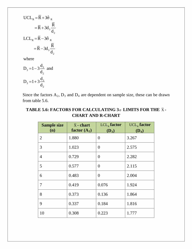
Since the factors A2, D3 and D4 are dependent on sample size, these can be drawn from table 5.6.
TABLE 5.6: FACTORS FOR CALCULATING 3σ LIMITS FOR THE X -CHART AND R-CHART
Sample size (n)
X - chart factor (A2)
RLCL factor (D3)
RUCL factor (D4)
2 1.880 0 3.267
3 1.023 0 2.575
4 0.729 0 2.282
5 0.577 0 2.115
6 0.483 0 2.004
7 0.419 0.076 1.924
8 0.373 0.136 1.864
9 0.337 0.184 1.816
10 0.308 0.223 1.777
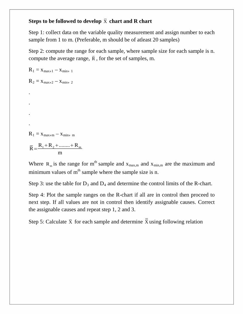
Steps to be followed to develop X chart and R chart
Step 1: collect data on the variable quality measurement and assign number to each sample from 1 to m. (Preferable, m should be of atleast 20 samples)
Step 2: compute the range for each sample, where sample size for each sample is n. compute the average range, R , for the set of samples, m.
R1 = xmax,1 – xmin, 1
R2 = xmax,2 – xmin, 2
.
.
.
.
R1 = xmax,m – xmin, m
1 2 mR R ........ RRm
+ + +=
Where mR is the range for mth sample and xmax,m and xmin,m are the maximum and minimum values of mth sample where the sample size is n.
Step 3: use the table for D3 and D4 and determine the control limits of the R-chart.
Step 4: Plot the sample ranges on the R-chart if all are in control then proceed to next step. If all values are not in control then identify assignable causes. Correct the assignable causes and repeat step 1, 2 and 3.
Step 5: Calculate X for each sample and determine X using following relation

1 2,1 n,11
1,2 2,2 n,22
1,m 2,m n,mm
1 2 mm
x x .............xX
nx x .............x
Xn
.
.
.x x .............x
Xm
X X .............XXm
+=
+=
+=
+=
Where xn,m are the nth data in mth sample, where each sample is of sample size n.
Step 6: Use table to determine A2 and control limits.
Step 7: Plot the sample means. If all the data points are in control, the process is in statistical control in terms of process average and process variability. If any data point is out of control then find assignable causes and return to step 1.
Sometimes, we can find the process exhibit sudden changes or patterns which are not desirable ever though the data points lie within control limits. Such instances can exhibit different patterns as shown in figure 5.18 and they need investigation.
Figure 5.18 (a) presents normal behavior
Figure 5.18 (b) presents the data point out of control limits. Investigate for assignable cause
Figure 5.18 (c) presents increasing or decreasing trend.
Figure 5.18 (d) presents a pattern called run, which is a sequence of observations with a certain characteristic. If a run results due to five or more observations then investigate their cause because in such case the probability is low that such a result has taken place by chance.
Figure 5.18 (e) erratic behavior which needs to be monitored.
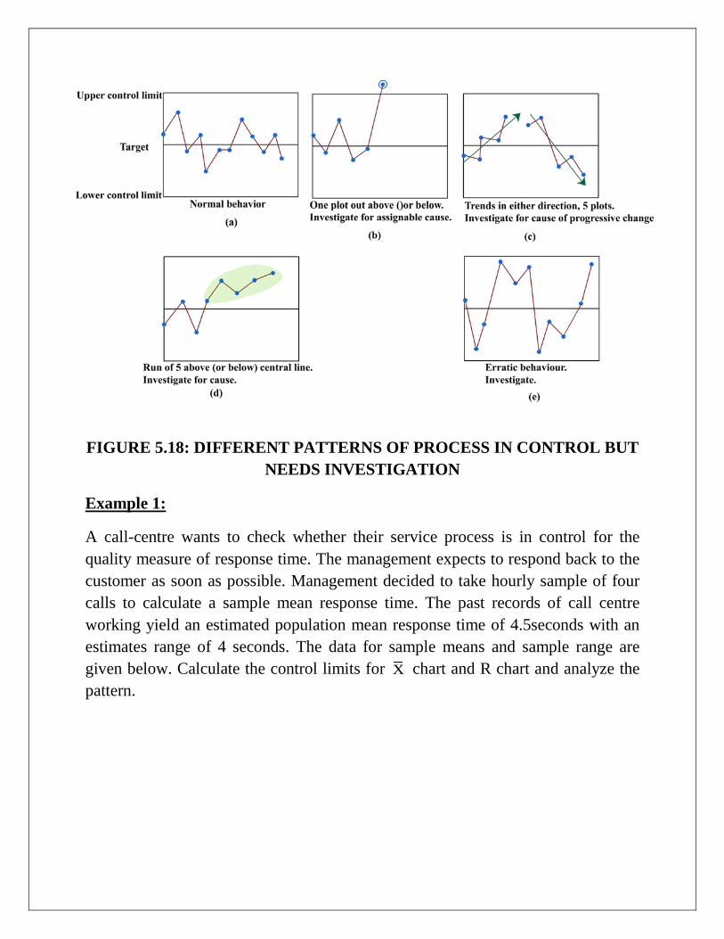
FIGURE 5.18: DIFFERENT PATTERNS OF PROCESS IN CONTROL BUT NEEDS INVESTIGATION
Example 1:
A call-centre wants to check whether their service process is in control for the quality measure of response time. The management expects to respond back to the customer as soon as possible. Management decided to take hourly sample of four calls to calculate a sample mean response time. The past records of call centre working yield an estimated population mean response time of 4.5seconds with an estimates range of 4 seconds. The data for sample means and sample range are given below. Calculate the control limits for X chart and R chart and analyze the pattern.
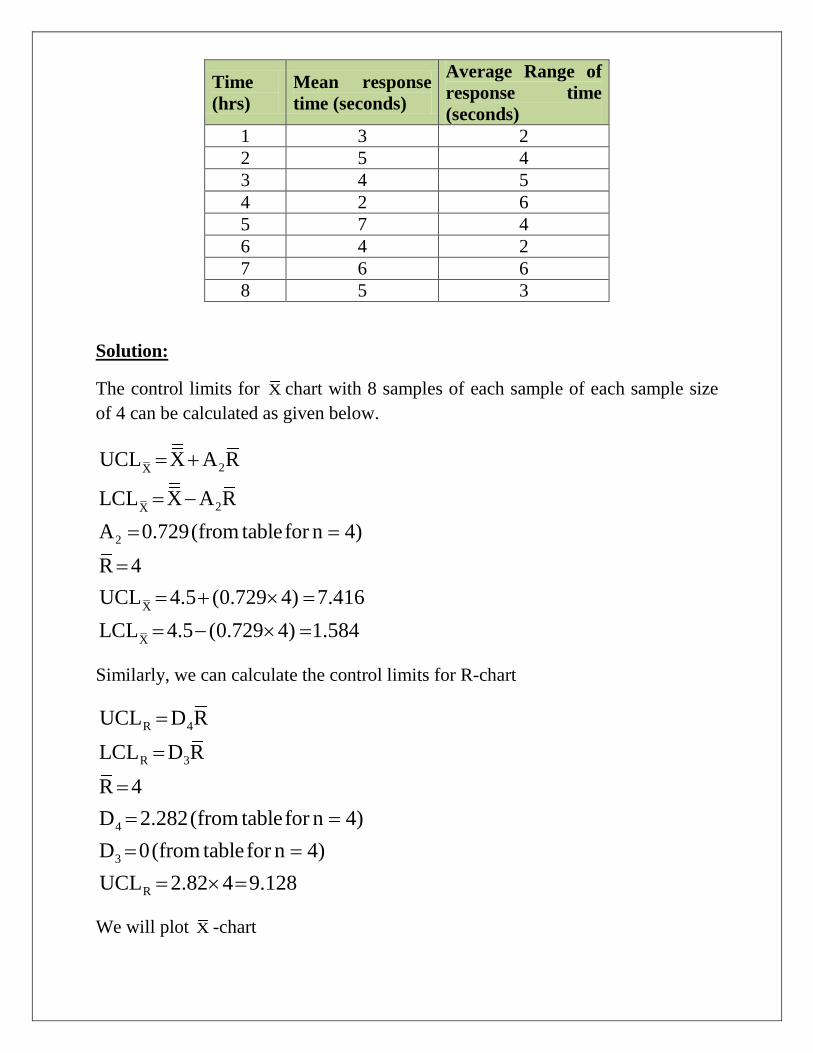
Time (hrs)
Mean response time (seconds)
Average Range of response time (seconds)
1 3 2 2 5 4 3 4 5 4 2 6 5 7 4 6 4 2 7 6 6 8 5 3
Solution:
The control limits for X chart with 8 samples of each sample of each sample size of 4 can be calculated as given below.
2X
2X
2
X
X
UCL X A R
LCL X A RA 0.729(from tablefor n 4)R 4UCL 4.5 (0.729 4) 7.416LCL 4.5 (0.729 4) 1.584
= +
= −
= =
== + × =
= − × =
Similarly, we can calculate the control limits for R-chart
R 4
R 3
4
3
R
UCL D RLCL D RR 4D 2.282(from tablefor n 4)D 0(from tablefor n 4)UCL 2.82 4 9.128
=
=
== == =
= × =
We will plot X -chart

We can see that the process is in control as there is no data point out of control limits.
The process is in control and shows normal behavior.

5.7.6 Attribute control charts or p-charts
p-charts are used for performance characteristic which is counted rather than measured to control the proportion of defective services or product, p-charts are used to
• Accommodate unequal sample sizes. • Sample sizes are usually 50 or greater • Need 20-30 samples to construct the p-chart
Examples
• Proportion of invoices with errors at any retailer. • Proportion of items requiring rework. • Proportion of incorrect saving account statements sent to customers.
Control limits for p-charts
A random sample is selected and that sample is inspected for each item relative to the attribute in terms of yes or no decision. Calculate the sample proportion defective, p.
p is the number of defective units divided by the sample size. Here, yes or no means the output is defective or not. The underlying statistical distribution for such attribute based random variables is based on binomial distribution. But, for large sample sizes for such attribute measure, normal distribution is good approximation. So, we need to define mean and standard deviation to this distribution.
p : average population proportion defective either determined from historical data or a target value.
pσ : the standard deviation of the distribution of proportion defectives, which can be written as given below.
pp(1 p)
n−
σ =
Where n is the sample size.
The control limits for p-chart can be determined using following relations

p p
p p
UCL p Z
LCL p Z
= + σ
= − σ
where Z is normal deviate.
Steps for plotting p-chart
Step 1: Take a random sample of sample size n.
Step 2: Count the number of defective services. Divide the number of defectives by the sample size, n, to get a sample proportion defective p.
Step 3: Take m samples and determine p for all m samples and determine average of p as p .
Step 4: Determine the control limits and plot sample proportion defectives on the p-chart. The plots outside the control limits need investigation for assignable causes.
Example:
A life insurance company registers many complaints from the customers regarding the errors in customers profile at the time of policy issuing the company wants to control the errors and for that samples are taken randomly for 10days with a sample size of 30 applications. The average number of errors or proportion of error for each day is given in the table below.
Day Number of errors
1 5 2 3 3 7 4 10 5 2 6 3 7 6 8 4 9 3 10 4

Management wants to monitor the performance of policy using process using control chart. Analyze the process.
Solution Using the sample data for 10 samples where each sample has sample size of 30. We will calculate p
p
p p
p p
TotalerrorspTotalnumber of observations5 3 7 ........ 4 47 0.157
(10)(30) 300
p(1 p)n
0.157(1 0.157)0.004
30Thecontrol limitsareUCL p Z
0.157 3(0.004)0.17
LCL p Z
0.14
=
+ + + += = =
−σ =
−= =
= + σ
= +== − σ
=
Calculate the sample proportion errors as given in the following table and plot each sample proportion error on the chart.
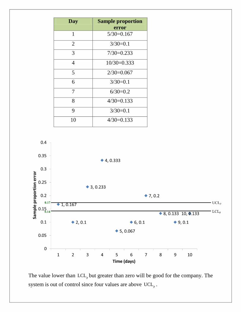
Day Sample proportion error
1 5/30=0.167
2 3/30=0.1
3 7/30=0.233
4 10/30=0.333
5 2/30=0.067
6 3/30=0.1
7 6/30=0.2
8 4/30=0.133
9 3/30=0.1
10 4/30=0.133
The value lower than pLCL but greater than zero will be good for the company. The system is out of control since four values are above pUCL .