line graphs, columns, pie charts and x-y, oh my! an overview of graph types and when to use them
TRANSCRIPT

Line Graphs, Columns, Pie Charts and X-Y, Oh My!
An overview of graph types and when to use them

Line Graphs
• When comparing changes over time
• When comparing changes amongst two or more variables over the same amount of time
• Examples include growth, rates, etc…

Line Graphs

Assumptions in Excel
• That all time comparisons are on equal interval. So there needs to be an equal amount of time between reporting results.
• If not, you can see standardized time intervals that shouldn’t be represented…

0 5 10 15 20 25 300
5
10
15
20
25
30
35
Time (minutes)
Tem
pera
ture
(Cel
sius
)
0 15 20 25 30 40 500
5
10
15
20
25
30
35
Time (minutes)
Tem
pera
ture
(Cel
sius
)

Use x-y scatter plots for non-uniform time intervals
0 10 20 30 40 50 600
5
10
15
20
25
30
35
Time (minutes)
Tem
pera
ture
(Cel
sius
)

Colums Graphs
• Used in a comparison of data
• Can show differences in such factors that are usually not time dependent
• Should include pertinent comparisons (i.e., results of a survey, data totals, etc…

Column Graphs
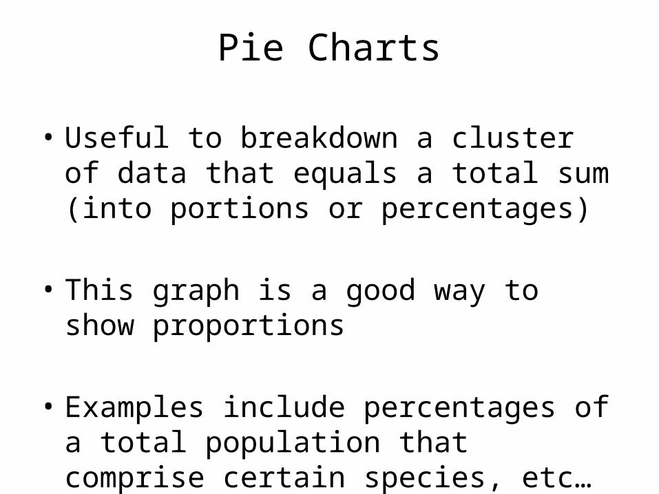
Pie Charts
• Useful to breakdown a cluster of data that equals a total sum (into portions or percentages)
• This graph is a good way to show proportions
• Examples include percentages of a total population that comprise certain species, etc…

Pie Charts

Pie Chart Examples

X-Y Scatter Plots• A direct comparison between two variables
(how one variable may affect another)
• These show a cause and effect relationship in a graphical format
• The more independent variable is on the x axis (controlled variable) with the experimental variable on the y axis

X-Y Scatter Plots

X-Y Scatter Plots

Error Bars• Error bars are important to account for the
range of error in a data set
• In column graphs, they could be denoted as 5% error, or Standard Deviation, or Standard Error
• We will cover this aspect more in depth, but I will show you how to use these on column graphs

Error Bars
What is missing from this column graph?
The error bars here represent a 5% error