lisa whitaker portfolio
DESCRIPTION
Graphic Design PortfolioTRANSCRIPT

Lisa WhitakerGraphic Design Portfolio

ISTD 2013 Brief
The Museum of the Circus concept and branding, including creating a name, logo and applied identity and publicity for the building. Consider it’s displays, activities and programme of events. Whatever approach you adopt ensure you use it as a vehicle to express your typographic skills.
Outcomes
The logo and identity for the museum ‘Circus...The Greatest Museum on Earth’.
A visitors guide which explains the museum concept, experiences and building layout.
The museum signage and way finding.
Proposed app design for both promotion and also interactive museum guide.
Lisa WhitakerISTD Student BriefCircus Museum

The Visitors Guide explains the Museum concept, experiences and building layout.
120gsm uncoated Cairn Eco white
Lisa WhitakerISTD Student BriefCircus Museum

The Visitors Guide also features the Building’s floor plan to navigate the Experiences around the Museum.
A circular building such as The Corn Exchange In Leeds or The Round House in London would lend itself perfectly to this interactive Circus Museum and Experience.
Lisa WhitakerISTD Student BriefCircus Museum
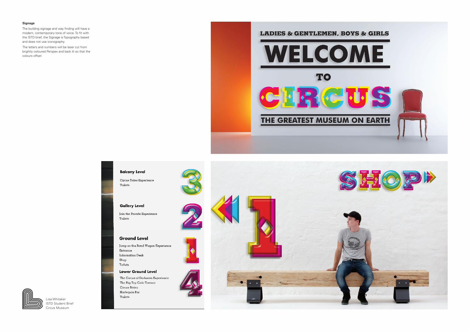
Signage
The building signage and way finding will have a modern, contemporary tone of voice. To fit with the ISTD brief, the Signage is Typography based and does not use iconography.
The letters and numbers will be laser cut from brightly coloured Perspex and back lit so that the colours offset
Lisa WhitakerISTD Student BriefCircus Museum

Lisa WhitakerISTD Student BriefCircus Museum
Circus Museum App
The Circus Museum App can function on three levels:
1. It is available for free download so can be used for promotion and information before a Customer arrives at the Museum.
2. The App can also be an Interactive Visitors Guide whilst at the Museum, providing detailed information about the Museum and the exhibits.
3. The App would also encourage Social Media engagement; sharing the experience and photographs on Social Media sites.

Live Client Brief
To create a brand strategy, logo and promotional material for a creative hub called The Loft Space.
Outcome
A logo and strap line, The Loft Space...Space to Create
The logo can be translated across the seasons with seasonal motifs and colours
Seasonal calendar of events and workshops
Bag and tags for the craft shop
Promotional banners and leaflets
Lisa WhitakerBranding and promotion The Loft Space

Brand Guideline Booklet detailing brand ethos, logo, colours and typeface.
Hot- dog fold booklet to promote The Loft Space at The Marsden Jazz Festival.
Branding across recycled paper bags.
Lisa WhitakerBranding and promotion The Loft Space

Seasonal quarterly calendar detailing events and workshops for the coming three months. Leaflets distributed in Local Community Centres, Libraries and educational establishments. Also shared as a PDF on the Website, Facebook and Twitter.
The seasonal theme was extended to seasonal motifs, bags and tags.
Lisa WhitakerBranding and promotion The Loft Space
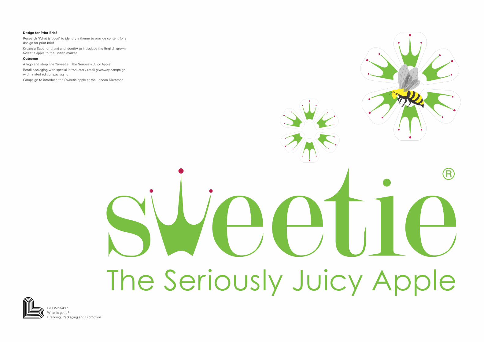
Design for Print Brief
Research ‘What is good’ to identify a theme to provide content for a design for print brief.
Create a Superior brand and identity to introduce the English grown Sweetie apple to the British market.
Outcome
A logo and strap line ‘Sweetie...The Seriously Juicy Apple’
Retail packaging with special introductory retail giveaway campaign with limited edition packaging.
Campaign to introduce the Sweetie apple at the London Marathon
Lisa WhitakerWhat is good?Branding, Packaging and Promotion
®
The Seriously Juicy Apple

Retail packaging with limited edition introductory packaging and give away campaign.
Lisa WhitakerWhat is good?Branding, Packaging and Promotion

London Marathon Sweetie Apple Campaign
Sunday 7th October 2012
12,500 runners
50,000 spectators
Free Sweetie apple giveaway at the Food and Fitness festival
Promotion on banners, leaflets and foil blankets
Lisa WhitakerWhat is good?Branding, Packaging and Promotion

Live Branding Brief
A new visual identity for Slaithwaite Guitar School including a logo and colour pallet, which can be used across a range of promotional material and merchandise to appeal to a broad audience aged from 8 to 58 years old.
Outcomes
A logo and company stationery
A prospectus and range of leaflets to promote the services of the Guitar School to local schools and the community
A range of print collateral aimed at students including Guitar handbook, plectrums and posters
Website design
Lisa WhitakerSlaithwaite Guitar SchoolBranding and Promotion

Slaithwaite Guitar School Prospectus to promote the Guitar School and After School Club to local primary schools.
Lisa WhitakerSlaithwaite Guitar SchoolBranding and Promotion
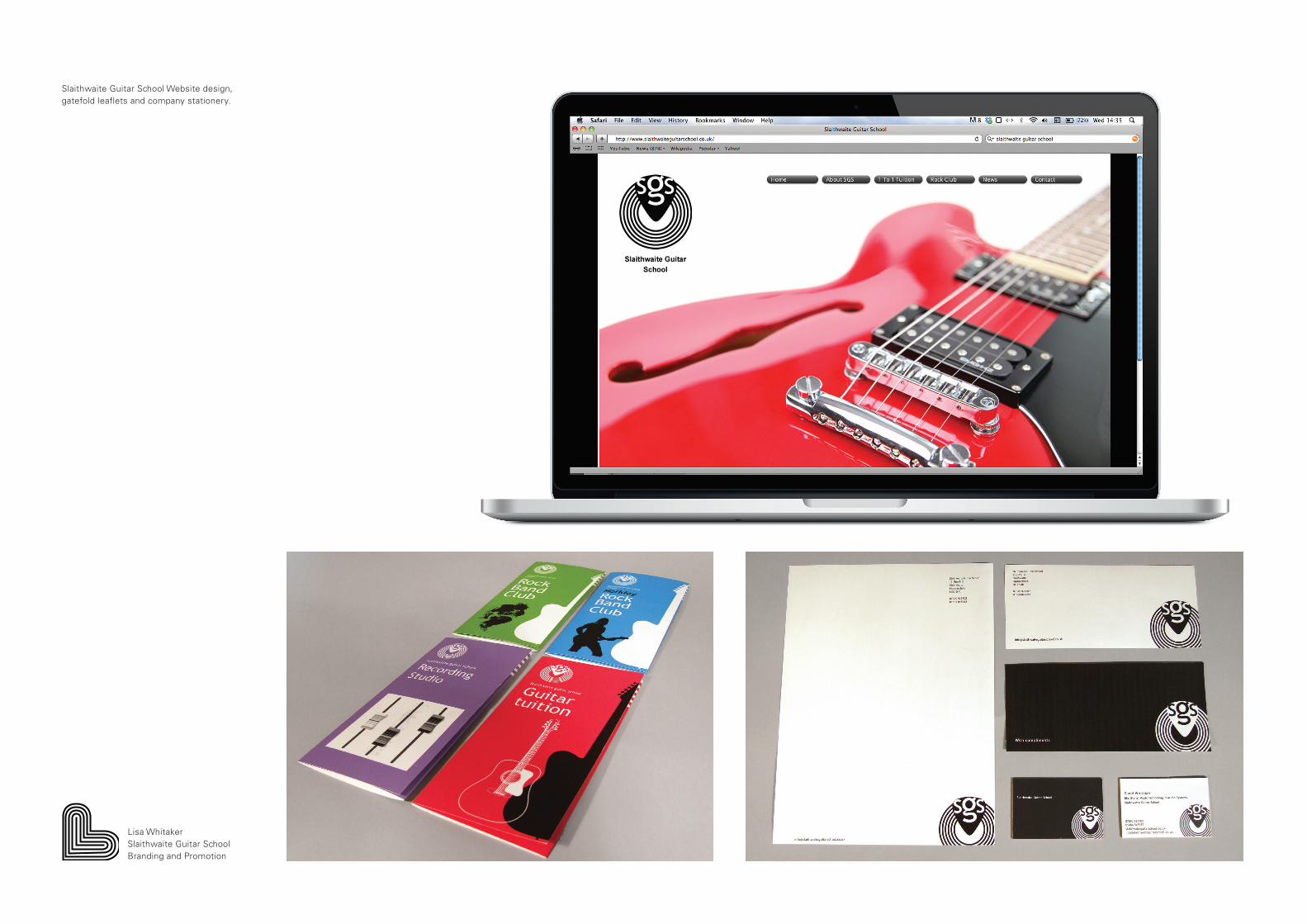
Slaithwaite Guitar School Website design, gatefold leaflets and company stationery.
Lisa WhitakerSlaithwaite Guitar SchoolBranding and Promotion
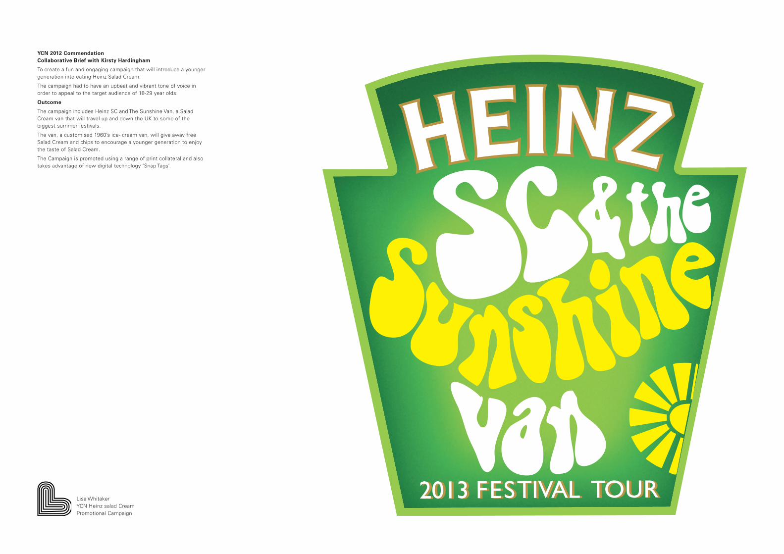
YCN 2012 CommendationCollaborative Brief with Kirsty Hardingham
To create a fun and engaging campaign that will introduce a younger generation into eating Heinz Salad Cream.
The campaign had to have an upbeat and vibrant tone of voice in order to appeal to the target audience of 18-29 year olds.
Outcome
The campaign includes Heinz SC and The Sunshine Van, a Salad Cream van that will travel up and down the UK to some of the biggest summer festivals.
The van, a customised 1960’s ice- cream van, will give away free Salad Cream and chips to encourage a younger generation to enjoy the taste of Salad Cream.
The Campaign is promoted using a range of print collateral and also takes advantage of new digital technology ‘Snap Tags’.
2013 FESTIVAL TOUR2013 FESTIVAL TOURLisa WhitakerYCN Heinz salad Cream Promotional Campaign

Adshel Advertising Campaign
Lisa WhitakerYCN Heinz salad Cream Promotional Campaign

Snap Tag Campaign promoting the SC and The Sunshine Band Festival Tour, sharing and collecting information and sign up to the free festival tickets give away.
Lisa WhitakerYCN Heinz Salad Cream Promotional Campaign

The Campaign has a dedicated website and a fun viral animation which showcases the Campaign song ‘That’s the way I like it’ by KC and The Sunshine Band.
As well as giving away free chips and salad cream at the festivals, a free sample will provide an opportunity to try with other festival food.
Lisa WhitakerYCN Heinz salad Cream Promotional Campaign
Win tickets
TheTour
2013 FESTIVAL TOUR2013 FESTIVAL TOUR
MENU
2013 FESTIVAL TOUR
2013 FESTIVAL TOUR
CHIPS AND
SALAD CREAM
2013 FESTIVAL TOUR
2013
FE
STIV
AL
TO
UR
2013
FE
STIV
AL
TO
UR
2013 FESTIVAL TOUR
2013 FESTIVAL TOUR
2013 FESTIVAL TOUR
2013 FESTIVAL TOUR
2013 FESTIVAL TOUR
2013 FESTIVAL TOUR
2013 FESTIVAL TOUR2013 FESTIVAL TOUR
2013 FESTIVAL TOUR2013 FESTIVAL TOUR
GLASTONBURYLEEDS FESTT IN THE PARK
How do YOU like it?
Liveshare

The Brief
A live competition brief to design an identity for the Leeds College of Art Alumni Association.
The Concept
The concept was inspired by constellations and stars, based on the premise that Leeds College of Art Alumni are a network or system of talented people who shine in their chosen professions. The College is steeped in history so a traditional serif typeface felt the most appropriate choice. This will appeal to the broad target audience as well as communicating the professional and high quality image of the College and the Society.Baskerville provides the most creative and visually pleasing design. Although forming a geometric ‘star shape’, the shapes at the centre evoke a more organic and artistic form.
Lisa WhitakerTypo 2012Type and Layout
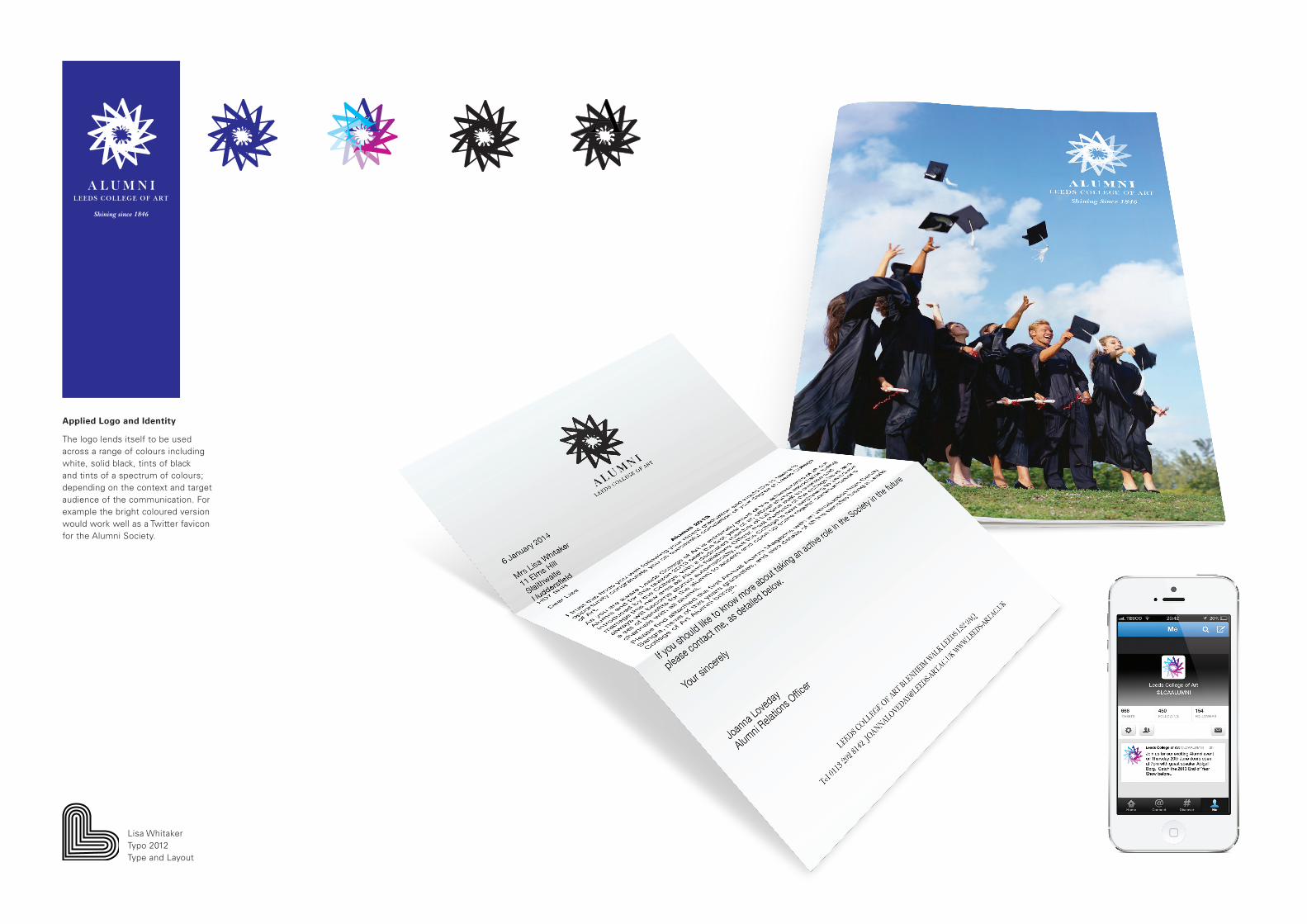
Applied Logo and Identity
The logo lends itself to be used across a range of colours including white, solid black, tints of black and tints of a spectrum of colours; depending on the context and target audience of the communication. For example the bright coloured version would work well as a Twitter favicon for the Alumni Society.
Lisa WhitakerTypo 2012Type and Layout
AA
A L U M N I
AAAA
AAAAAA
LEEDS COLLEGE OF ART
Shining since 1846
AAAAAAAAAAA
AAAAAA
AAAAAAAAAAAA
AAAAAA
A
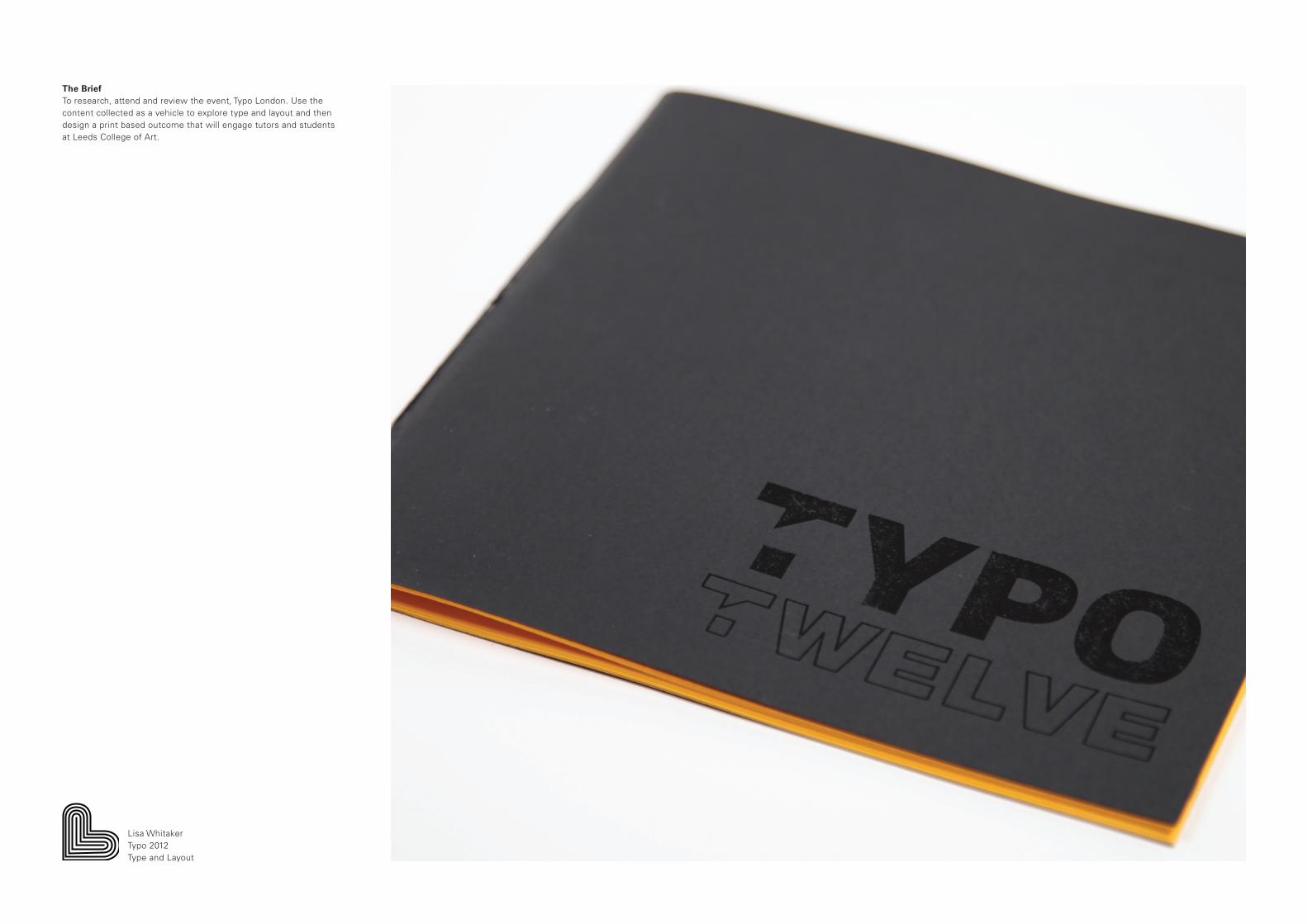
The Brief To research, attend and review the event, Typo London. Use the content collected as a vehicle to explore type and layout and then design a print based outcome that will engage tutors and students at Leeds College of Art.
Lisa WhitakerTypo 2012Type and Layout

The tone of voice is inspirational ’TYPO Gold’ and the outcome uses a spot varnish special print finish, to appeal to designers and students.
The publication includes a summary of Typo, twelve quotes, details about each speaker, a review section and an index of typefaces.
Lisa WhitakerTypo 2012Type and Layout

The brief was an opportunity to explore a range of typefaces and inspiring designers and studios.
The range included a set of twelve posters and a sample style booklet.
Lisa WhitakerTypo 2012Type and Layout

The Brief
A D&AD 2013 Open Brief to create a positive social or environmental impact utilising the power of a Unilever brand. Choose one of the following Unilever Brand’s Lipton, Marmite, Persil or Simple.
Develop your idea with a focus on one of the three objectives:
Improving health and wellbeingReducing environmental impactEnhancing livelihoods
The Campaign
The objective of the Simply Precious Campaign is to reduce environmental impact, through a campaign targeted at women aged 24 to 44, which encourages them to take shorter showers, using the power of the brand, Simple.
It will invite involvement not instruct using the aspirational strap line ‘We believe our planet is precious’. The diamanté’ water drops connote ‘precious’ and ‘forever’, and are used in the campaign in relation to water and the planet to emotionally appeal to the nurturing natures.
Lisa WhitakerD&AD UnileverSimply Precious
SIMPLY...We believe our planet is precious

An in store campaign will be promoted through Advertorials which will provide links to a dedicated website and app.
Lisa WhitakerD&AD UnileverSimply Precious

The Shorter Showers Forever message and In store campaign will be promoted through a series of Adshels.
The Campaign will be promoted in store using Point of Sale touch points. The whole campaign will also take advantage of digital and social media already in place within the Unilever brand.
Lisa WhitakerD&AD UnileverSimply Precious

The website offers the customer simple practical advice on actually taking a shorter shower and other tips on saving hot water.
The App will link with the Campaign and provide a simple shower monitor ,which the customer can calibrate to their own shower to monitor their shower times and water usage.
Lisa WhitakerD&AD UnileverSimply Precious

The Simply Precious Campaign will tour Summer family festivals such as Camp Bestival and Kendal Calling. A Simple Festival Marquee will share the Campaign message, advice and fun demonstrations with festival-goers.
At the Simple Festival Marquee people will be invited to promise to a ‘Shorter Showers Forever’ pledge online and in return will be offered a free ‘shorter’ five minute shower in the Simple Shower Tour Truck.
Lisa WhitakerD&AD UnileverSimply Precious

Branding and Promotion for Tom Bent
The Brief
The brief the branding and promotion of a third year furniture student with a focus on his personal branding and promotion with a view to gaining employment.
This was an opportunity to collaborate and work on a live brief, which resulted in exploring both print and digital based outcomes.
Products | Brand and Identity.
Range | Print — Business Cards, stationery, Look book
Online — Portfolio website
Distribution | Prospective Furniture Makers
Harrogate Flower Show
British Contract Furnishing Association
Logo Concept and Tone of Voice
Tom’s practice is inspired by the Arts and Crafts movement particularly the American Furniture Designer and Maker, Gustav Strickley. This period extolled the virtues of handcrafted objects, simple design and solid, natural materials. The consistent theme across the movement is authenticity and nature. The logo design and identity were heavily inspired by this from the serif typeface, Cheltenham to the oak leaf and acorn logo design.
The motif was designed to be applied across a range of print and online promotional material as well as actually be a ‘mark of quality’ which could be applied in resin to Tom’s furniture.
Lisa WhitakerFurniture MakerBranding and Promotion
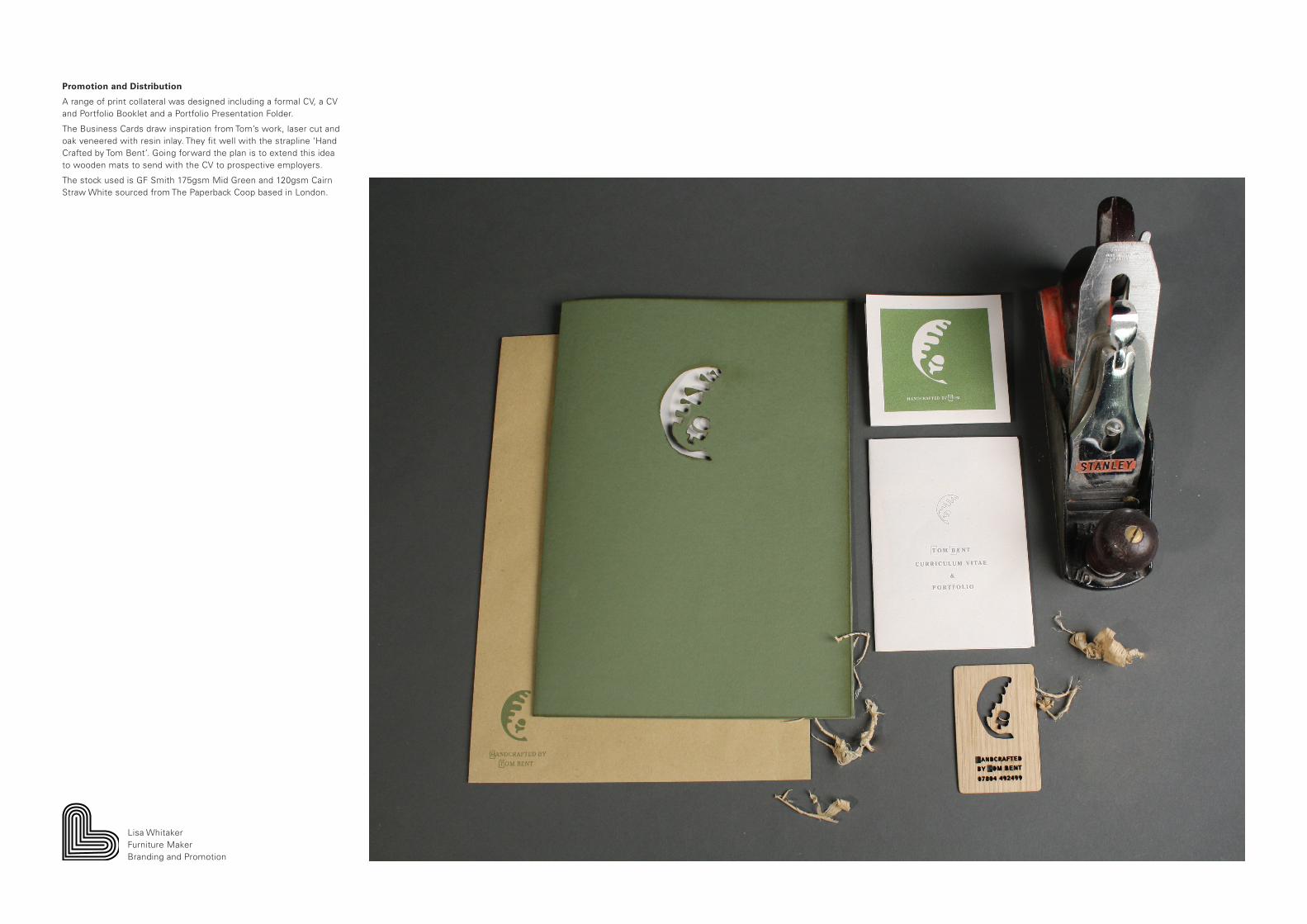
Promotion and Distribution
A range of print collateral was designed including a formal CV, a CV and Portfolio Booklet and a Portfolio Presentation Folder.
The Business Cards draw inspiration from Tom’s work, laser cut and oak veneered with resin inlay. They fit well with the strapline ‘Hand Crafted by Tom Bent’. Going forward the plan is to extend this idea to wooden mats to send with the CV to prospective employers.
The stock used is GF Smith 175gsm Mid Green and 120gsm Cairn Straw White sourced from The Paperback Coop based in London.
Lisa WhitakerFurniture MakerBranding and Promotion

Online Presence
Due to lack of funds it was not possible for Tom to purchase a personal URL or website so we compromised and opened a Cargo Account. I also encouraged Tom to create a slicker email account.
Lisa WhitakerFurniture MakerBranding and Promotion

Promotion at Harrogate Flower Show
The Harrogate Flower Show is a biannual gardening event which features show gardens, gardening shopping and provides space for exhibitors. Tom’s furniture is targeted at an audience with a high disposable income, potentially retired couples looking for a quality hand crafted, unique product.
Tom’s exhibition stand would have the inviting strapline’ Take the weight off your feet’ and in keeping with one of his designs be surrounded by fragrant lavender plants. This will create a calm relaxing area which invites people to chat with Tom and learn more about his furniture and skills.
Lisa WhitakerFurniture MakerBranding and Promotion
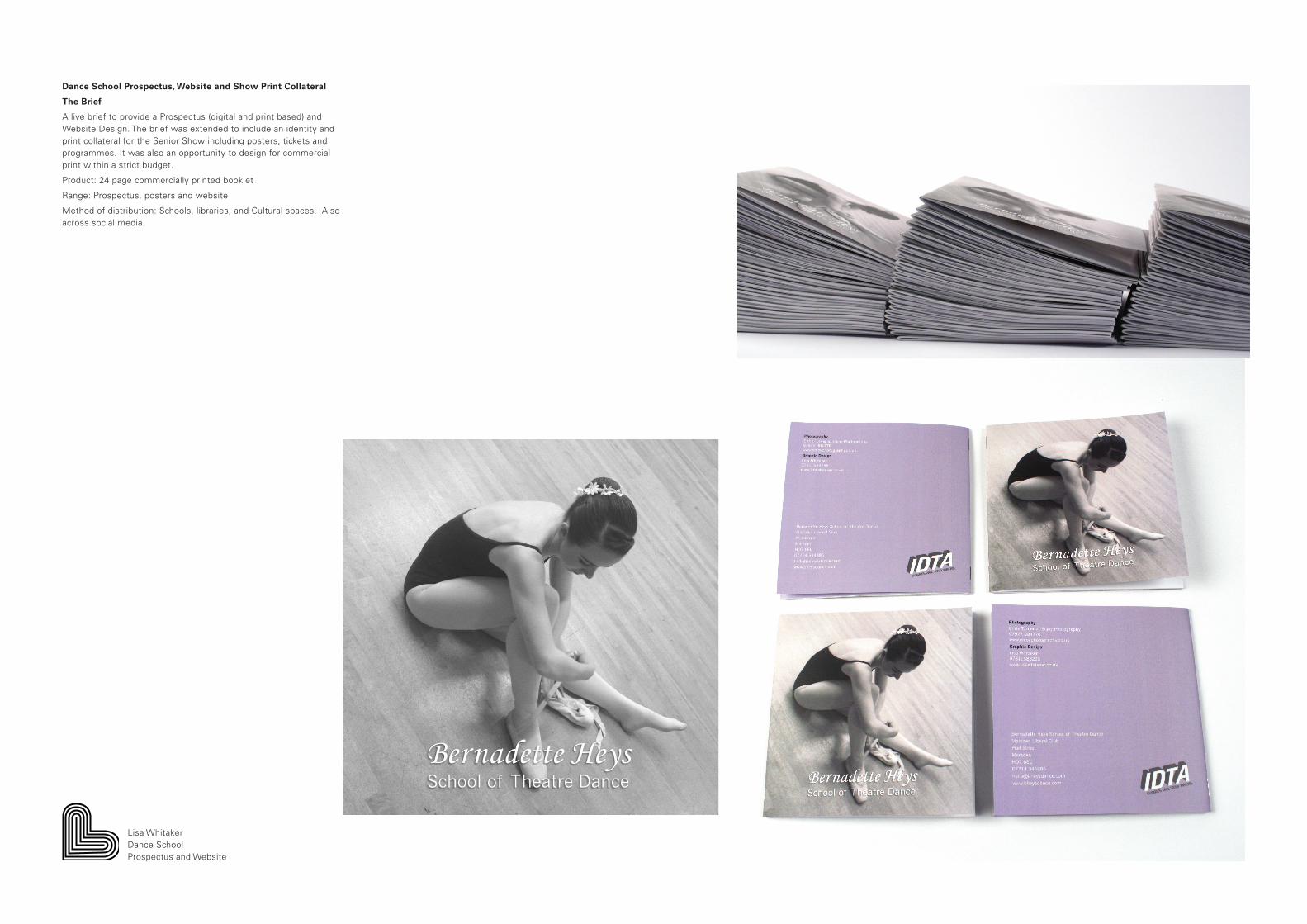
Dance School Prospectus, Website and Show Print Collateral
The Brief
A live brief to provide a Prospectus (digital and print based) and Website Design. The brief was extended to include an identity and print collateral for the Senior Show including posters, tickets and programmes. It was also an opportunity to design for commercial print within a strict budget.
Product: 24 page commercially printed booklet
Range: Prospectus, posters and website
Method of distribution: Schools, libraries, and Cultural spaces. Also across social media.
Lisa WhitakerDance SchoolProspectus and Website
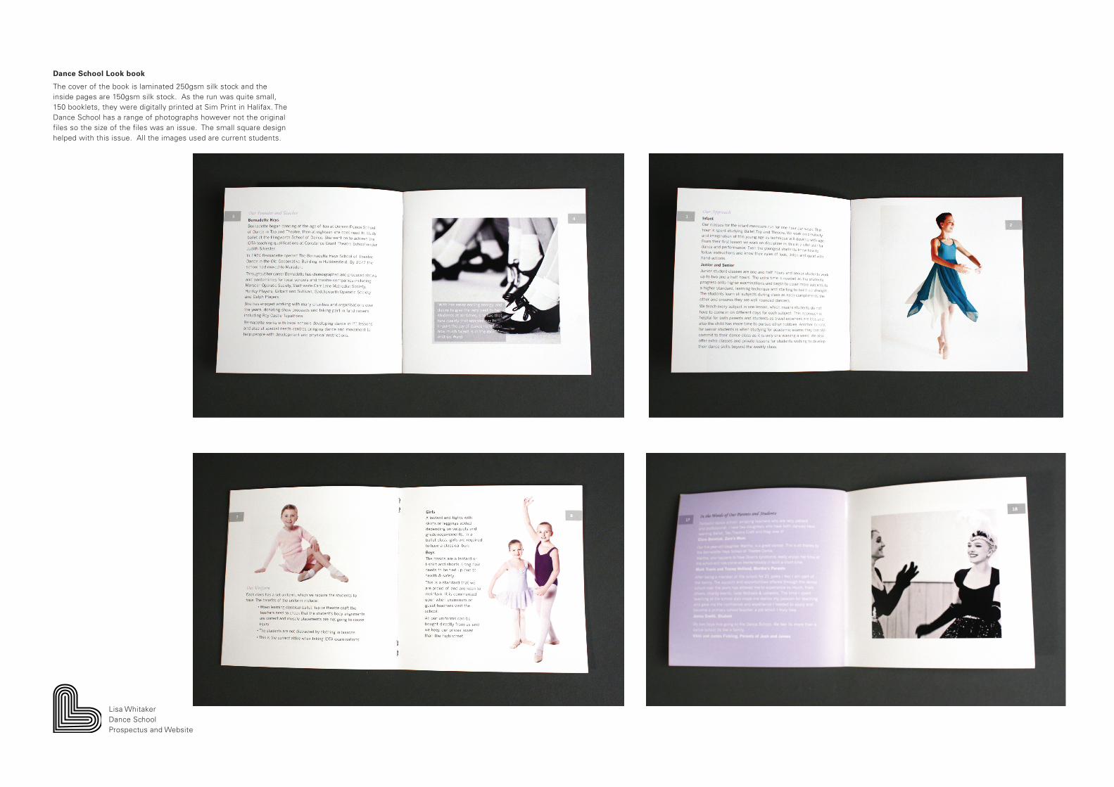
Dance School Look book
The cover of the book is laminated 250gsm silk stock and the inside pages are 150gsm silk stock. As the run was quite small, 150 booklets, they were digitally printed at Sim Print in Halifax. The Dance School has a range of photographs however not the original files so the size of the files was an issue. The small square design helped with this issue. All the images used are current students.
Lisa WhitakerDance SchoolProspectus and Website

Online Presence
The booklet needed contact information so a natural development proved to be persuading the client to invest in a URL and website. The Dance School already has a well liked Facebook page but this did not reach all parents and students as some do not agree with using Social Media. The website also gave the advantage of providing a slicker email address than the current ‘Hotmail’ account thus providing a more professional persona.
In addition I designed some square postcards to promote both the new website and also the Facebook page to current parents and students. This will be a useful platform for the dance school to share news and photographs.
Lisa WhitakerDance SchoolProspectus and Website
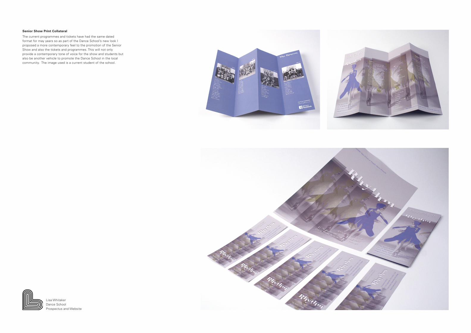
Senior Show Print Collateral
The current programmes and tickets have had the same dated format for may years so as part of the Dance School’s new look I proposed a more contemporary feel to the promotion of the Senior Show and also the tickets and programmes. This will not only provide a contemporary tone of voice for the show and students but also be another vehicle to promote the Dance School in the local community. The image used is a current student of the school.
Lisa WhitakerDance SchoolProspectus and Website
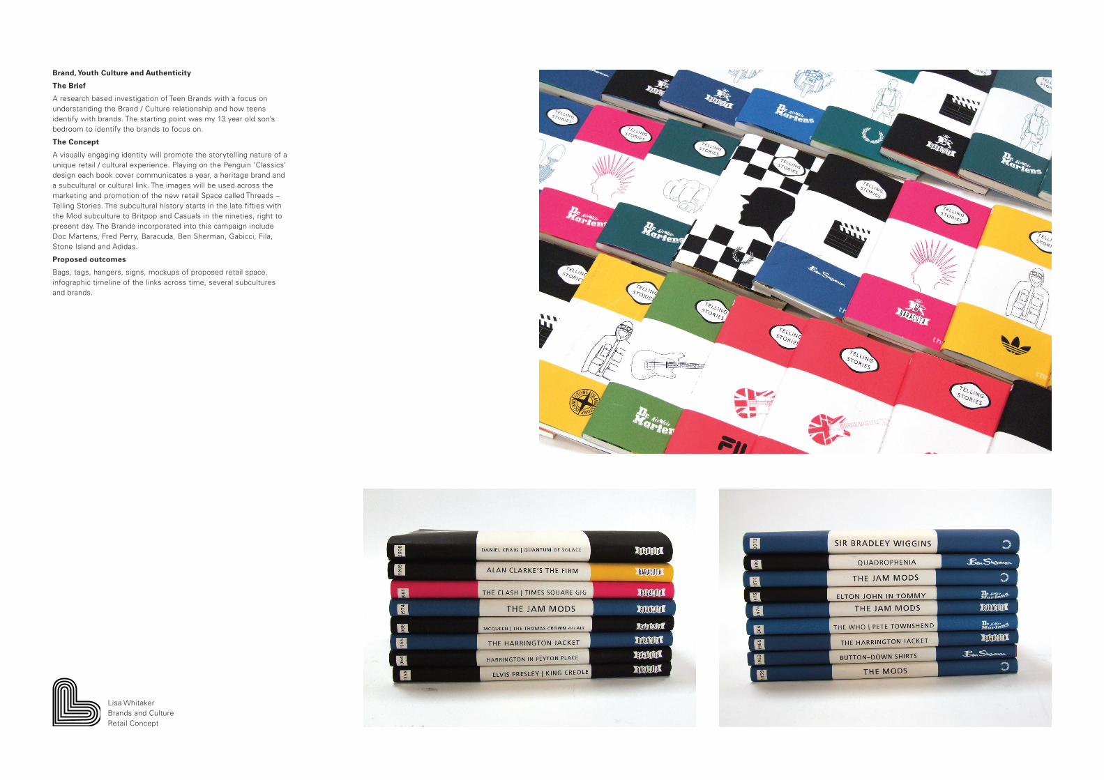
Brand, Youth Culture and Authenticity
The Brief
A research based investigation of Teen Brands with a focus on understanding the Brand / Culture relationship and how teens identify with brands. The starting point was my 13 year old son’s bedroom to identify the brands to focus on.
The Concept
A visually engaging identity will promote the storytelling nature of a unique retail / cultural experience. Playing on the Penguin ‘Classics’ design each book cover communicates a year, a heritage brand and a subcultural or cultural link. The images will be used across the marketing and promotion of the new retail Space called Threads –Telling Stories. The subcultural history starts in the late fifties with the Mod subculture to Britpop and Casuals in the nineties, right to present day. The Brands incorporated into this campaign include Doc Martens, Fred Perry, Baracuda, Ben Sherman, Gabicci, Fila, Stone Island and Adidas.
Proposed outcomes
Bags, tags, hangers, signs, mockups of proposed retail space, infographic timeline of the links across time, several subcultures and brands.
Lisa WhitakerBrands and CultureRetail Concept
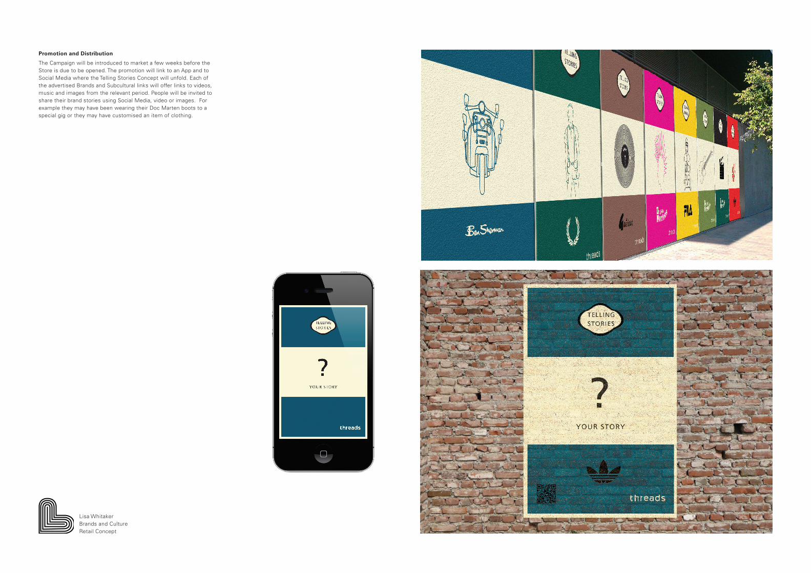
Promotion and Distribution
The Campaign will be introduced to market a few weeks before the Store is due to be opened. The promotion will link to an App and to Social Media where the Telling Stories Concept will unfold. Each of the advertised Brands and Subcultural links will offer links to videos, music and images from the relevant period. People will be invited to share their brand stories using Social Media, video or images. For example they may have been wearing their Doc Marten boots to a special gig or they may have customised an item of clothing.
Lisa WhitakerBrands and CultureRetail Concept

The Retail Space
This unique retail experience is called Threads, Telling Stories and is aimed at 12 to 21 year old teenaged boys and young men. The reason for the broad age range is there is currently a gap in the market for male teen clothing and they currently shop for adult sized clothes.
The experience will be a retail space which curates brands in the same way Urban Outfitters does however it will also incorporate instore and online subcultural threads and links including music, video and a social area to share their own ‘Threads’ or Stories.
The space will offer a comfortable seating area called “Threads n Beats’ to listen to music and share music and stories.
Lisa WhitakerBrands and CultureRetail Concept

In Store
The story telling theme is extended to the clothes tags and bags. Each brand will identify which subcultures or cultures it shares links with using the same colour scheme as the books.
The space will take advantage of new technology including chips in clothes which activate interactive mirrors and also Smart Phones. The aim is to inform young people of the significant subcultural heritage which exists behind brands and encourage them to share their own styles and stories. In doing so it will subtly point to brands which have fake back stories such as Hollister and Superdry by not including them in the range.
The aim would be to create a more affordable ‘teen range’ which will be cheaper then the adult sized counterparts.
Lisa WhitakerBrands and CultureRetail Concept