look book - nebula.wsimg.com
TRANSCRIPT

L O O KB O O K
introducingour new colourslatestcolour inspiration

introducingour new colours
WHETHER YOU ARE UPDATING A SPACE OR PREPARING FOR A SALE, PAINT CAN BE AN EASY AND COST-EFFECTIVE WAY TO TRANSFORM YOUR HOME.
Personal taste plays a meaningful role when choosing colour in the home. There are no rules, just a few pointers to guide you in the right direction.
Whether you have a blank canvas or a pre-loved space, colour can enhance any room, big or small. Our advice is to start with an inspiration – a colour or style that you really love. Once your mind is set, you can then take the next step with our Crown Pure Paint® Samples, which give an accurate representation of colour on the wall. Move it around the room or match to home furnishing and accessories.
newcolours
2
6
7
8
1
3 4
5
contentsWe’ve been making paint for longer than most, so you can be sure that every tin of paint is crafted with over 200 years of knowledge, experience and passion.We’ve compiled our favourite colour schemes charting the latest trends, interior ideas and our product ranges.Our aim is to inspire you to make your mark on your home by choosing colours you truly love.
Aftershow®
Deep inky grey
Powdered Clay®
Soft, elegant terracotta
Spring Bud®
Delicate green
Khaki Twist®
Bold earthy green
TealClassic teal
Chalky WhiteCrisp, contemporary white
Soft Ash®
Sophisticated soft blue witha lavender hue
Runaway®
Muted blue with grey undertones
1
2
3
4
5
6
7
8
test the colourwith Crown Pure Paint® Colour SamplesIf you want to see a large swatch of your favourite colour, Crown Pure Paint® Colour Samples are ideal. Simple to use A5 pre painted swatches of Crown colours, including colours for wood & metal. Perfect to pin to walls, or match to fabrics or wall coverings. See our website to order up to 5 for £2.99 inclusive of delivery*.
*Delivery to UK and NI only
trend colour - terracotta.........................trend colour - teal....................................urban concrete........................................characterful kid’s room...........................statement ceilings....................................timeless monochrome...........................70s revival................................................pairing colours.........................................enhance your space................................create an inviting entrance......................using bold colours....................................sanctuary bathroom...............................using colour in the kitchen......................
4-56-78-910-1112-1314-1718-1920-2324-2728-2930-3132-3334-35
crownpaints.co.uk
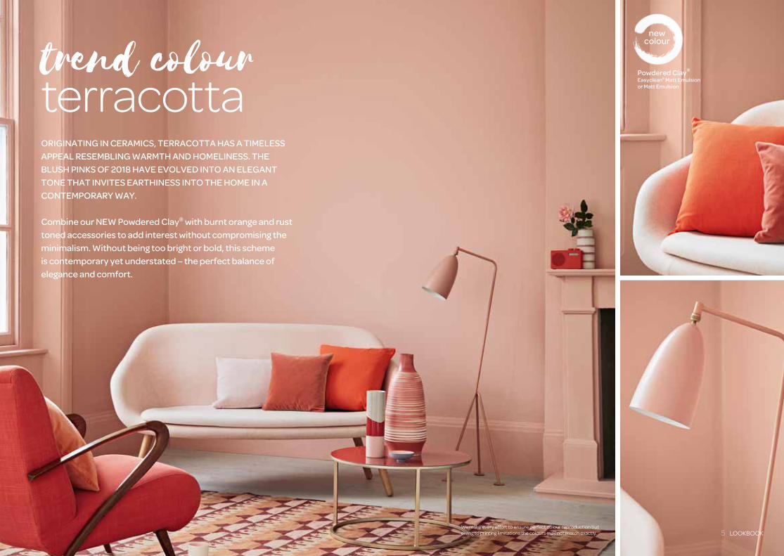
Powdered Clay®
Easyclean® Matt Emulsion or Matt Emulsion
newcolourtrend colour
terracottaORIGINATING IN CERAMICS, TERRACOTTA HAS A TIMELESS APPEAL RESEMBLING WARMTH AND HOMELINESS. THE BLUSH PINKS OF 2018 HAVE EVOLVED INTO AN ELEGANT TONE THAT INVITES EARTHINESS INTO THE HOME IN A CONTEMPORARY WAY.
Combine our NEW Powdered Clay® with burnt orange and rust toned accessories to add interest without compromising the minimalism. Without being too bright or bold, this scheme is contemporary yet understated – the perfect balance of elegance and comfort.
We make every effort to ensure perfect colour reproduction but owing to printing limitations the colours may not match exactly. 5 LOOKBOOK
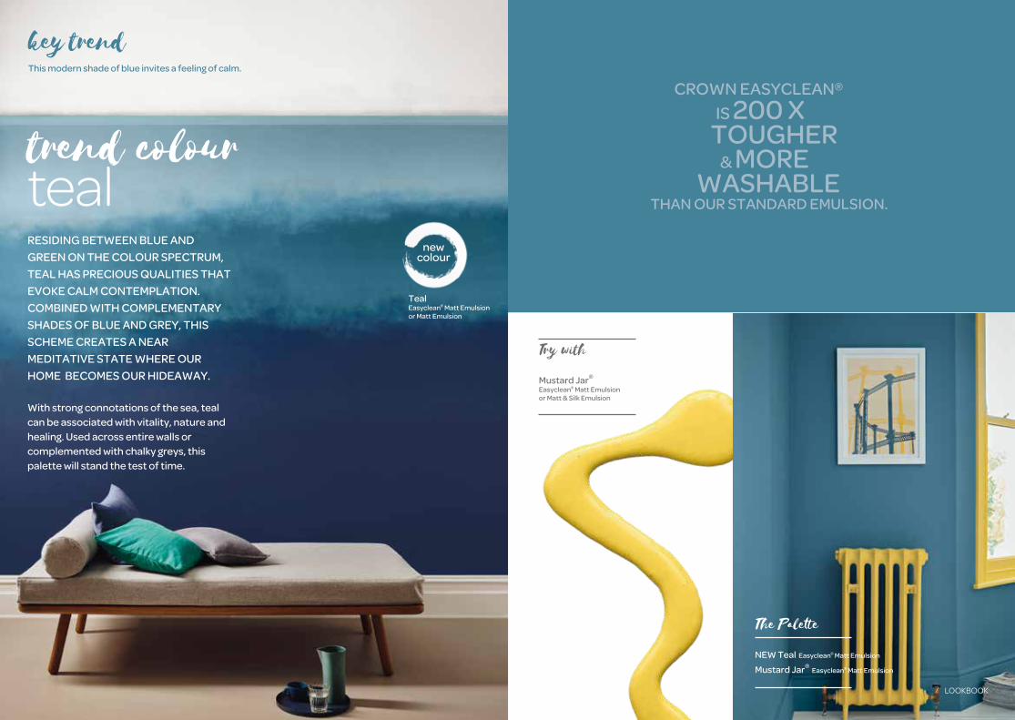
Mustard Jar®
Easyclean® Matt Emulsion or Matt & Silk Emulsion
Try with
NEW Teal Easyclean® Matt Emulsion
Mustard Jar® Easyclean® Matt Emulsion
The Palette
CROWN EASYCLEAN®
IS 200 X TOUGHER & MORE WASHABLE THAN OUR STANDARD EMULSION.
RESIDING BETWEEN BLUE AND GREEN ON THE COLOUR SPECTRUM, TEAL HAS PRECIOUS QUALITIES THAT EVOKE CALM CONTEMPLATION. COMBINED WITH COMPLEMENTARY SHADES OF BLUE AND GREY, THIS SCHEME CREATES A NEARMEDITATIVE STATE WHERE OUR HOME BECOMES OUR HIDEAWAY.
With strong connotations of the sea, teal can be associated with vitality, nature and healing. Used across entire walls or complemented with chalky greys, this palette will stand the test of time.
trend colourteal
key trendThis modern shade of blue invites a feeling of calm.
TealEasyclean® Matt Emulsion or Matt Emulsion
newcolour
7 LOOKBOOK
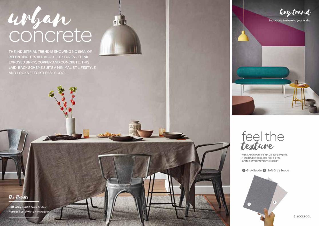
You’ll notice a recurring theme in the industrial aesthetic: texture. Defined by allowing original materials to rein free in a more relaxed environment. You can easily achieve this look with our textured paint, offering a matt appearance with a tactility that resembles natural materials like concrete.
You can add vintage leather upholstery to accentuate the trend and introduce soft cushions and textiles to add warmth. Neutral shades work best for walls – beige, taupe or grey for example.
key trendIntroduce texture to your walls.
feel the texturewith Crown Pure Paint® Colour Samples.A great way to see and feel a large swatch of your favourite colour.
12
Grey Suede Soft Grey Suede1 2
urban concreteTHE INDUSTRIAL TREND IS SHOWING NO SIGN OF RELENTING. IT’S ALL ABOUT TEXTURES - THINK EXPOSED BRICK, COPPER AND CONCRETE. THIS LAID-BACK SCHEME SUITS A MINIMALIST LIFESTYLE AND LOOKS EFFORTLESSLY COOL.
Soft Grey Suede Suede Emulsion
Pure Brilliant White Non Drip Satin
The Palette
9 LOOKBOOK
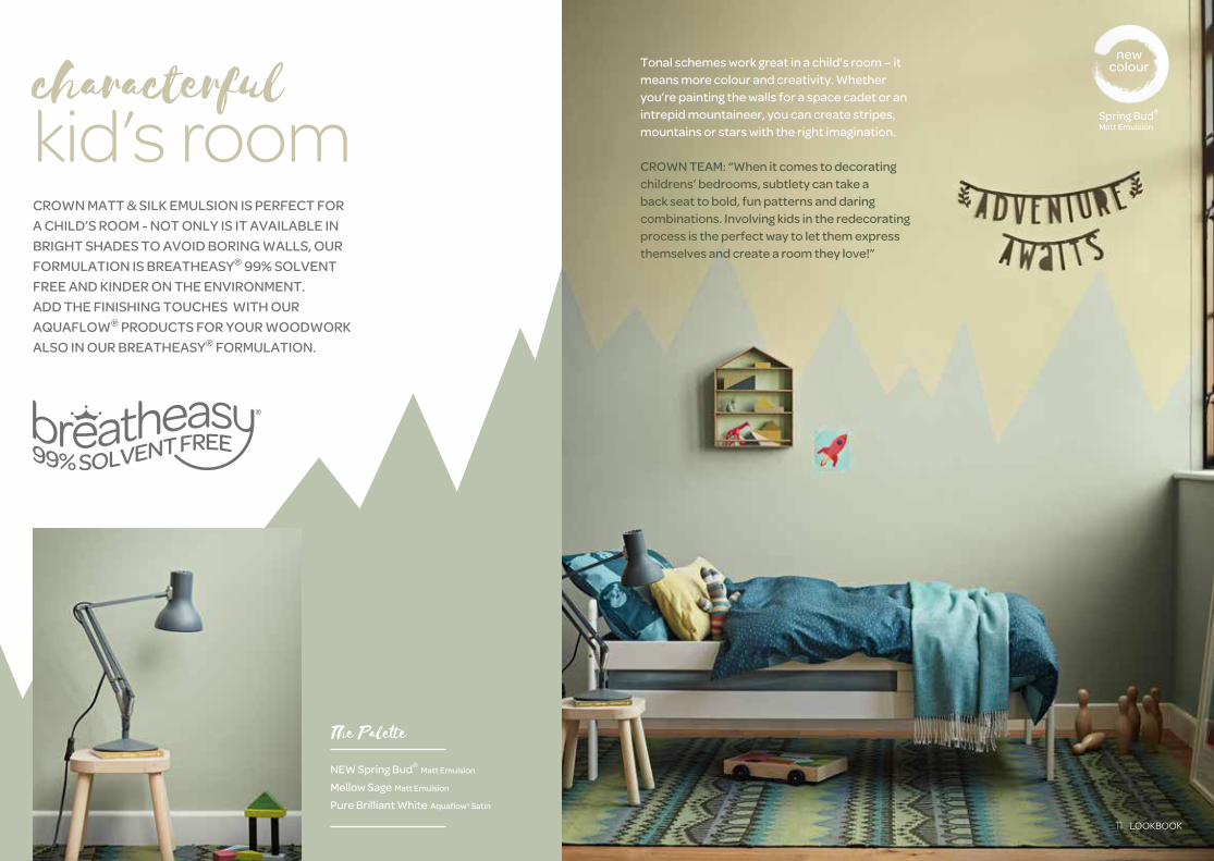
Tonal schemes work great in a child’s room – it means more colour and creativity. Whether you’re painting the walls for a space cadet or an intrepid mountaineer, you can create stripes, mountains or stars with the right imagination.
CROWN TEAM: “When it comes to decorating childrens’ bedrooms, subtlety can take a back seat to bold, fun patterns and daring combinations. Involving kids in the redecorating process is the perfect way to let them express themselves and create a room they love!”
Spring Bud®
Matt Emulsion
newcolourcharacterful
kid’s roomCROWN MATT & SILK EMULSION IS PERFECT FOR A CHILD’S ROOM - NOT ONLY IS IT AVAILABLE IN BRIGHT SHADES TO AVOID BORING WALLS, OUR FORMULATION IS BREATHEASY® 99% SOLVENT FREE AND KINDER ON THE ENVIRONMENT.ADD THE FINISHING TOUCHES WITH OUR AQUAFLOW® PRODUCTS FOR YOUR WOODWORK ALSO IN OUR BREATHEASY® FORMULATION.
NEW Spring Bud® Matt Emulsion
Mellow Sage Matt Emulsion
Pure Brilliant White Aquaflow® Satin
The Palette
11 LOOKBOOK

WHITE HAS BEEN THE DEFAULT CEILING COLOUR FOR SO LONG THAT MOST HOMEOWNERS FAIL TO ACKNOWLEDGE IT AT ALL. BUT PAINTING THE CEILING CAN BE ONE OF THE EASIEST WAYS TO INTRODUCE COLOUR.
Contrary to perception, introducing colour overhead can be a subtle way to add colour to your space. You can significantly alter the mood of the room – use bright, pastel shades to lift the scheme or earthy tones to add warmth. Our advice is to consider your ceiling height - the lower it is, the more impactful it will be.
City Break® Matt Emulsion
Try with
a plain whiteroom doesn’tneed to be plain.
Chalky WhiteEasyclean® Matt Emulsionor Matt & Silk Emulsion
newcolour
Soft Ash®
Matt Emulsion
newcolour
statement ceilings
We make every effort to ensure perfect colour reproduction but owing to printing limitations the colours may not match exactly. 13 LOOKBOOK

MONOCHROME IS ONE COLOUR
PRESENTED IN DIFFERENT
VALUES AND INTENSITIES. AND
OUR CHOSEN COLOUR IS, OF
COURSE, BLACK. THE OPITOME
OF SHARP SOPHISTICATION.
There will always be a place for using bright and vivacious colour in the home, but it’s often the simplest colour combinations that create the most impact. Far from one-dimensional, blacks and whites add depth and interest and are the easiest tones to anchor a scheme.
timelessmonochrome
Rebel Feature Wall Matt Emulsion
Pure Brilliant White Non Drip Satin
The Palette
15 LOOKBOOK
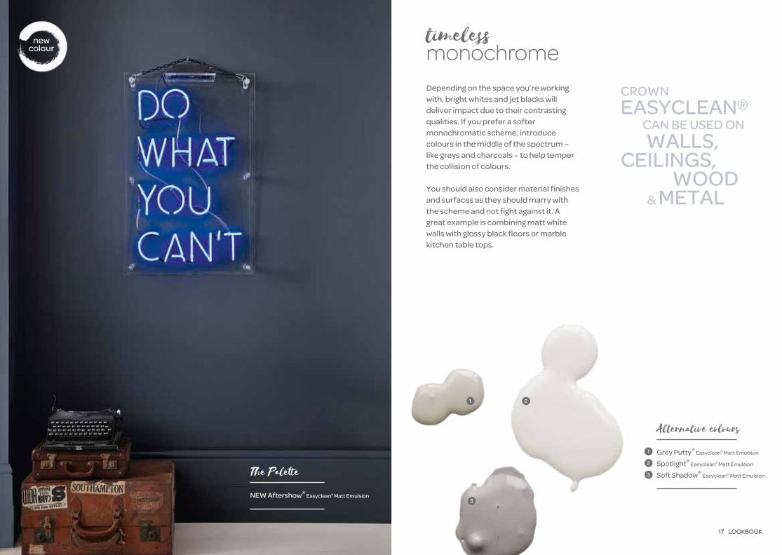
timelessmonochromeDepending on the space you’re working with, bright whites and jet blacks will deliver impact due to their contrasting qualities. If you prefer a softer monochromatic scheme, introduce colours in the middle of the spectrum – like greys and charcoals – to help temper the collision of colours.
You should also consider material finishes and surfaces as they should marry with the scheme and not fight against it. A great example is combining matt white walls with glossy black floors or marble kitchen table tops.
21
3
Grey Putty® Easyclean® Matt Emulsion
Spotlight® Easyclean® Matt Emulsion
Soft Shadow® Easyclean® Matt Emulsion
Alternative colours
1
2
3
CROWN EASYCLEAN® CAN BE USED ON WALLS, CEILINGS, WOOD & METAL
NEW Aftershow® Easyclean® Matt Emulsion
The Palette
newcolour
17 LOOKBOOK

A big aspect of the 70s revival is an appreciation of vintage furniture, in particular dark wood. We recommend the second-hand marketplace for this. There is a wealth of gems out there, waiting to be found.
Dance Fever® Feature Wall Matt Emulsion
Pure Brilliant White Non Drip Satin
The Palette
70 srevivalFROM BOHO CHIC TO RETRO GLAMOUR, THE SEVENTIES STYLE IS MAKING A COMEBACK. THINK HEAVY TEXTILES AND EMBELLISHED TASSELS, THIS SCHEME IS THE OPPOSITE OF SCANDI MINIMALISM.
AND THE COLOUR LEADING THE MARCH? ORANGE.
This trend can be intimidating at first, but it doesn’t require corduroy armchairs or psychedelic patterns, it’s more about sumptuous textiles, graphic prints and fresh foliage – and of course, a confident splash of rich, earthy colour.
21
Dash of Nutmeg® Matt Emulsion
English Fire® Matt Emulsion
Alternative colours
1
2
19 LOOKBOOK
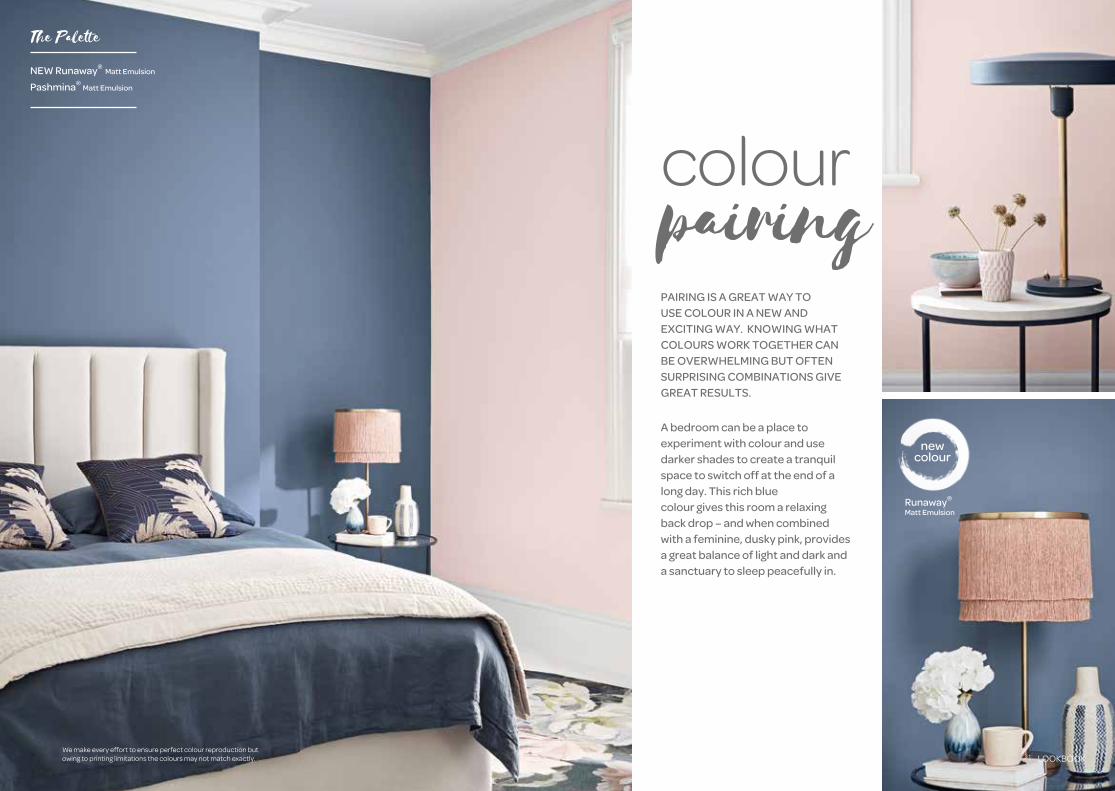
colourpairingPAIRING IS A GREAT WAY TO USE COLOUR IN A NEW AND EXCITING WAY. KNOWING WHAT COLOURS WORK TOGETHER CAN BE OVERWHELMING BUT OFTEN SURPRISING COMBINATIONS GIVE GREAT RESULTS.
A bedroom can be a place toexperiment with colour and use darker shades to create a tranquil space to switch off at the end of a long day. This rich blue colour gives this room a relaxing back drop – and when combined with a feminine, dusky pink, provides a great balance of light and dark and a sanctuary to sleep peacefully in.
Runaway®
Matt Emulsion
newcolour
NEW Runaway® Matt Emulsion
Pashmina® Matt Emulsion
The Palette
We make every effort to ensure perfect colour reproduction but owing to printing limitations the colours may not match exactly. 21 LOOKBOOK

Cloud Burst® Easyclean® Matt Emulsion
Blue Gravel® Easyclean® Matt Emulsion
The Palette
3
key trendNavy blue and blush pink are a popular colour pairing, but you can experiment with tones to find your unique scheme.
You can create natural colour borders using alcoves, shelving, dado or picture rails. If you don’t have these features, simply create a clean line using masking tape. You can also introduce a stencil motif using horizontal and vertical lines of colour, dark or light depending on your taste. You can even use a metallic emulsion for areas of pattern and shimmer.
colourpairing 1
2
Midnight Navy® Feature Wall Matt Emulsion
Grey Putty® Matt Emulsion
Pashmina® Matt Emulsion
Alternative colours
1
2
3
23 LOOKBOOK

CROWN TEAM: “Neutral colours have a natural depth of tone that works well across different styles and make an interesting yet understated background. Whether you aspire for your paint to blend with a minimalist colour scheme, or complement a bold focal furniture piece, selecting a neutral shade doesn’t have to mean compromising on vibrancy and personality”.
Sunday School® Period Collection Flat Matt Emulsion
Sunday School® Period Collection Eggshell
The Palette
LIGHT COLOURS REFLECT LIGHT, DARK COLOURS ABSORB LIGHT. THAT’S SCIENCE. THIS MEANS PALE TONES WILL PUSH LIGHT (AND PERCEIVED SPACE) AWAY FROM YOU.
The key is to introduce light shades, without compromising warmth and character. For a gentle grey, Sunday School® from the Period Collection is a stunning off-white that isn’t clinical. Using the shade in a Flat Matt Emulsion and an Eggshell means it can also be used on wood and metalwork – that includes panelling, skirting boards and radiators.
Parchment Period Collection Flat Matt Emulsion
Alternative colour
enhanceyour space
25 LOOKBOOK

Promenade® Period Collection Flat Matt Emulsion
English Manor® Period Collection Eggshell
The Palette
REMEMBER THAT PALE COLOURS DON’T HAVE TO BE NEUTRALS. THE MUTED COLOUR SPECTRUM RANGES FROM COOL BLUES TO DUSTY PINKS AND BEYOND.
Pale colours also don’t necessarily mean pastels. Our Period Collection has a rich palette of colours, including shades of green and blue that have a dusky quality, making them perfect for a sophisticated scheme, whether it’s period or contemporary.
enhanceyour space
CROWN PERIOD COLLECTION.
MUTED HERITAGE AND CONTEMPORARY COLOUR. INTERIOR FLAT MATT EMULSION & EGGSHELL.
We make every effort to ensure perfect colour reproduction but owing to printing limitations the colours may not match exactly. 27 LOOKBOOK

create aninviting entranceYOU NEVER GET A SECOND CHANCE AT A
FIRST IMPRESSION. THE HALLWAY IS ONE
OF THE HIGHEST TRAFFIC AREAS IN THE
HOME, AND YET IT IS OFTEN NEGLECTED AS A
FUNCTIONAL PASSAGEWAY. HOWEVER, FOR
GUESTS, IT IS THE FIRST THING THEY SEE.
Hallways often lack light so it’s smart to
consider reflective colours that help to open
up the space. This doesn’t mean hallways
are destined to be white. On the contrary,
the hallway is one space in the home where
you can afford to be bolder with colour. Use
our easyclean® formulation to withstand the
demands of daily life.
CROWN EASYCLEAN®
IS 200 X TOUGHER & MORE WASHABLE THAN OUR STANDARD EMULSION.
NEW Chalky White Easyclean® Matt Emulsion
Moonlight Bay® Easyclean® Matt Emulsion
Powder Blue Easyclean® Matt Emulsion
Duck Egg Easyclean® Matt Emulsion
NEW Teal Easyclean® Matt Emulsion
The Palette
29 LOOKBOOK

USING BOLD COLOURS IS A STATEMENT, SO IT’S IMPORTANT
TO CONSIDER WHAT WORKS FOR YOU. WHAT IS THE ROOM
BEING USED FOR?
For example, the room you residein first thing in the morning should
be an energising space. That iswhy our Mustard Jar® Matt Emulsion
works so well here.
using bold
colours
Mustard Jar® Matt Emulsion
Pure Brilliant White Non Drip Gloss
The Palette
ANOTHER IMPORTANT QUESTION IS: WHICH WAY DOES THE ROOM FACE AND HOW MUCH NATURAL LIGHT IS THERE?
Colours change with light, so you should use our Pure Paint® Samples to see how it alters from day to night.
Even in larger spaces, too much of a bright colour can be jarring, so selecting the right shade is crucial. A tip for smaller spaces is to consider a feature wall or trimmings, such as skirting boards and radiators.
Gentle Olive® Matt Emulsion
Tibetan Gold® Non Drip Gloss
Alternative colours
1
2
1
2
Khaki Twist®
Matt Emulsion
newcolour
31 LOOKBOOK

THE BATHROOM SHOULD BE YOUR SANCTUARY IN THE HOME, IT REPRESENTS A ROOM WHERE
YOU CAN SPEND TIME ALONE AND RELAX.
sanctuary bathroom
Tin Bath®
Bathroom Mid Sheen Emulsion
The Palette
Often seen as a functional room in the home, the bathroom can fall victim to the all white bathroom suites and tiles. As a result it is starved of colour.
Crown’s Bathroom range resists steam and condensation to keep walls fresh and crisp, despite daily usage. This means you can afford to introduce more personality with a colour you truly love.
Wheatgrass Bathroom Mid Sheen Emulsion
Alternative colour
33 LOOKBOOK
L O O KB O O K
0 5
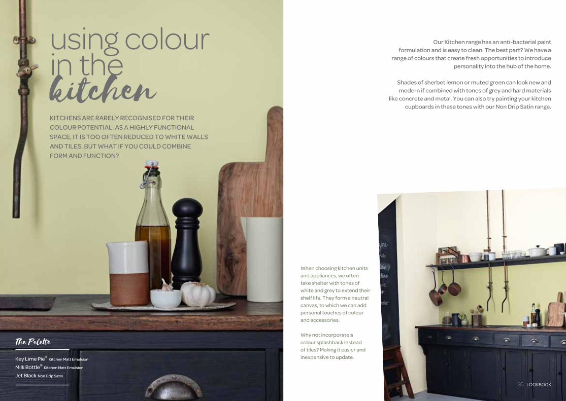
When choosing kitchen units and appliances, we often take shelter with tones of white and grey to extend their shelf life. They form a neutral canvas, to which we can add personal touches of colour and accessories.
Why not incorporate a colour splashback instead of tiles? Making it easier and inexpensive to update.
Our Kitchen range has an anti-bacterial paint formulation and is easy to clean. The best part? We have a
range of colours that create fresh opportunities to introduce personality into the hub of the home.
Shades of sherbet lemon or muted green can look new and modern if combined with tones of grey and hard materials
like concrete and metal. You can also try painting your kitchen cupboards in these tones with our Non Drip Satin range.
KITCHENS ARE RARELY RECOGNISED FOR THEIR COLOUR POTENTIAL. AS A HIGHLY FUNCTIONAL SPACE, IT IS TOO OFTEN REDUCED TO WHITE WALLS AND TILES. BUT WHAT IF YOU COULD COMBINE FORM AND FUNCTION?
using colourin the kitchen
Key Lime Pie® Kitchen Matt Emulsion
Milk Bottle® Kitchen Matt Emulsion
Jet Black Non Drip Satin
The Palette
35 LOOKBOOK

0330 0240281003
FM 543424 ISO 9001
Crown, the Crown Logo, Breatheasy® and all the colours marked TM or ® are trade marks of Crown Brands Ltd.
Crown Paints Ltd. PO Box 37, Hollins Road, Darwen, Lancashire, BB3 0BG. Telephone 01254 704951Crown Paints Ireland Limited, Malahide Road, Coolock, Dublin 17. Telephone 01 8164400 Pl
ease
recy
cle
afte
r use
.
6055349
MyRoomPainterWant to see how a colour looks in your room?Download our free Myroompainter app to visualiseyour colour scheme.
Follow us on
For all products and colours see our latest
Colour Guide.
Colour Guide
crownpaints.co.ukVisit our website for our full range of
colours and more inspiration.
If you want to see how these colours look in your home, try our Matchpots®
available in store or A5 Pure Paint® Colour Samples from crownpaints.co.uk
Matchpots &Pure Paint®
Colour Samples