lucy spraggan- join the club
TRANSCRIPT
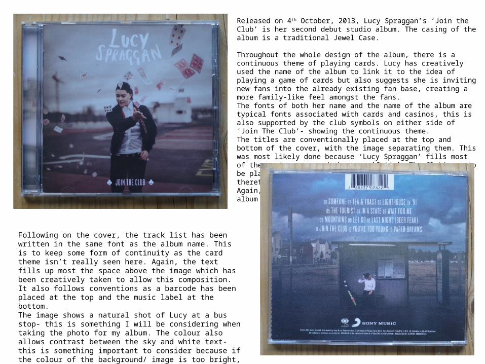
Released on 4th October, 2013, Lucy Spraggan’s ‘Join the Club’ is her second debut studio album. The casing of the album is a traditional Jewel Case.
Throughout the whole design of the album, there is a continuous theme of playing cards. Lucy has creatively used the name of the album to link it to the idea of playing a game of cards but also suggests she is inviting new fans into the already existing fan base, creating a more family-like feel amongst the fans. The fonts of both her name and the name of the album are typical fonts associated with cards and casinos, this is also supported by the club symbols on either side of ‘Join The Club’- showing the continuous theme. The titles are conventionally placed at the top and bottom of the cover, with the image separating them. This was most likely done because ‘Lucy Spraggan’ fills most of the empty space and the top, if ‘Join The Club’ was to be placed underneath, it would become too clustered, therefore is placed at the bottom to fill that space. Again, it keeps with the conventions as the name of the album is in a different font and smaller than her name.
Following on the cover, the track list has been written in the same font as the album name. This is to keep some form of continuity as the card theme isn’t really seen here. Again, the text fills up most the space above the image which has been creatively taken to allow this composition. It also follows conventions as a barcode has been placed at the top and the music label at the bottom. The image shows a natural shot of Lucy at a bus stop- this is something I will be considering when taking the photo for my album. The colour also allows contrast between the sky and white text- this is something important to consider because if the colour of the background/ image is too bright, white text will not be readable.

Inside the album, the theme of cards is lost, slightly. While the images appear to have no relevance, the club is printed on the cd. The CD also continues the blue colour scheme and carries conventions as the music label is placed at the bottom.In the first image, Lucy is conventionally seen, at a long shot, sat with her guitar. The types of shots in this album are all similar as they have quite a large bit of empty space above the subject. This is showing that Lucy is an independent artist and in her own world in a way. These types of images are what I wish to refer to when producing my own. I love the style and simplicity of them, yet they still convey meanings and feelings.
The spine of the album is fairly simplistic as it states the name of the artist and album, using the same font and colour on the cover, and catalogue number can be seen towards the bottom.