magazine research info
TRANSCRIPT

Market Research

Magazines and Their Publishers


Analysis of Similar Magazines
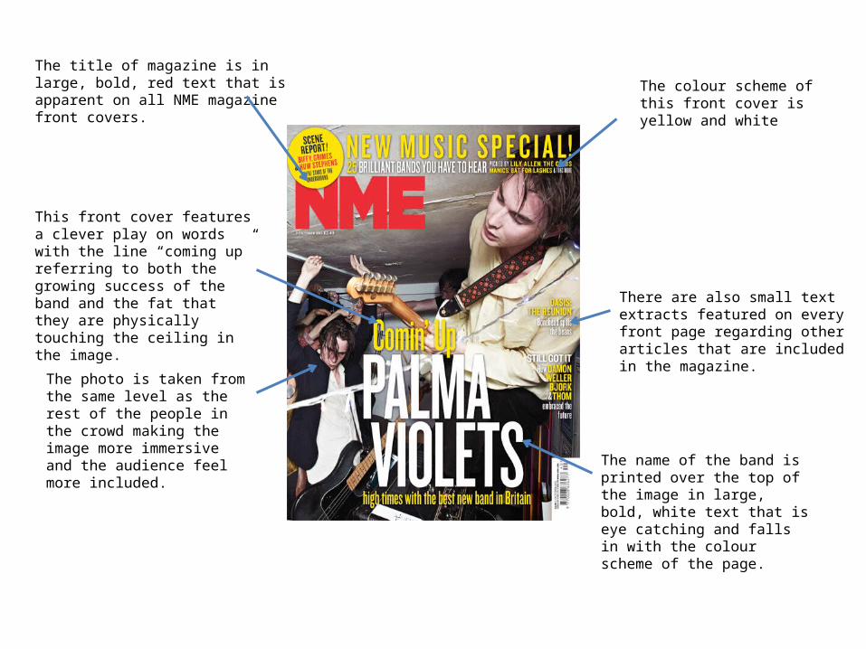
The photo is taken from the same level as the rest of the people in the crowd making the image more immersive and the audience feel more included.
There are also small text extracts featured on every front page regarding other articles that are included in the magazine.
The title of magazine is in large, bold, red text that is apparent on all NME magazine front covers.
The name of the band is printed over the top of the image in large, bold, white text that is eye catching and falls in with the colour scheme of the page.
The colour scheme of this front cover is yellow and white
This front cover features a clever play on words with the line “coming up” referring to both the growing success of the band and the fat that they are physically touching the ceiling in the image.

NME use their contents page to feature an article rather than just having a list of articles and their page numbers. This keeps the flow of the magazine continuous and interesting.
On the left hand side there is an image of an artist. On this occasion it is a photo of Kasabian taken from within a crowd the reader feel more included.
The articles have also been split up and organised into sub-categories (news, radar, reviews, live and features).
At the bottom there is also an advert for a subscription to the magazine.
The title of this page is also more interesting than other magazines’ contents page titles.
The date is also located on the contents page.
The colour scheme of this page is primarily black, white and red however on the advert the text written in yellow is the dominant feature.
This page features an advert for the included gig guide along with its page reference.

This photo is taken using a low angle shot to emphasise the success and significance of the artist.
Key quotes (often pull-quotes) are often in larger, bold text.
There is always a colour scheme unique to each article. In this case, the theme is black, white and red.
The title of the spread stretches across both pages to indicate that both pages are the same article.
The double page spread always contains a photo that takes up either half or all of the background.
What is also interesting about the title is that it is a reference to a Bob Dylan song. This tells the audience a lot about the style of the artist’s music and the inspiration behind it. This combined with the black and white image forces an old fashioned, retro impression of the artist upon the audience.
In this article, all of the informative text is positioned on only one of the pages.
The colour of the title’s text changes as it runs over different coloured backgrounds.
A prop used in this image is an acoustic guitar. This further pushes the old-fashioned, country, solo artist impression upon the audience.

There is a colour scheme apparent on every front cover. In this instance the two main colours are blue and white.
Large photo of the band featured in the main article along with the name of the band. Low angle shot to give power to the artists.
Titles of other articles positioned in smaller text on either side of the front cover.
All texts and images are layered over the top of the name of the magazine however the title is still visible.
Price and barcode
The clothes worn by the band are ordinary clothes that were fashionable during the bands peak period. This combined with the name of the band allows the article to connect with the magazines working class audience.
Intriguing cliff-hanger.
The font used remains constant to the colour scheme of the cover page. Bold, white font is used for the titles and names of the artists whilst blue or grey is used for the information.
A plug is featured to advertise and upcoming tour.
The language used is rather informal which again appeals to the working class audience.
Promotional
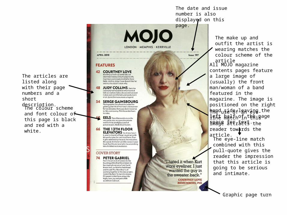
All MOJO magazine contents pages feature a large image of (usually) the front man/woman of a band featured in the magazine. The image is positioned on the right hand side leaving the left half of the page space for text.
The articles are listed along with their page numbers and a short description.
The date and issue number is also displayed on this page.
The use of an eye-line match in this image attracts the reader towards the article.
The eye-line match combined with this pull-quote gives the reader the impression that this article is going to be serious and intimate.
The colour scheme and font colour of this page is black and red with a white.
The make up and outfit the artist is wearing matches the colour scheme of the article
Graphic page turn

Large, eye-catching title that sometimes comes in the form of a pull-quote.
An image of the artist(s) that the article is based around is positioned on either one or both of the pages.
Most of the text and usually all of the actual article is positioned on only one of the pages.
The DPS has a colour scheme that contrasts well with the brown background. The colour used for the titles and small informative text is white whilst there is drops of teal blue on paragraph beginnings.
Informal explicit language that appeals to a younger, working class audience.
Smaller image of the entire band set aside in the top right corner.
Smart-casual clothing that goes with the indie-rock persona Liam (the artist) is trying to portray.
The image is set inside a messy studio which adds to the casual, informal atmosphere.
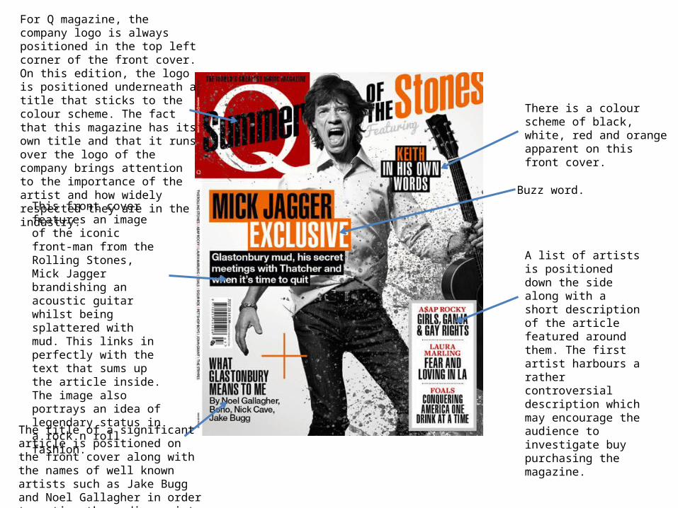
For Q magazine, the company logo is always positioned in the top left corner of the front cover. On this edition, the logo is positioned underneath a title that sticks to the colour scheme. The fact that this magazine has its own title and that it runs over the logo of the company brings attention to the importance of the artist and how widely respected they are in the industry.
There is a colour scheme of black, white, red and orange apparent on this front cover.
This front cover features an image of the iconic front-man from the Rolling Stones, Mick Jagger brandishing an acoustic guitar whilst being splattered with mud. This links in perfectly with the text that sums up the article inside. The image also portrays an idea of legendary status in a rock n roll fashion.
The title of a significant article is positioned on the front cover along with the names of well known artists such as Jake Bugg and Noel Gallagher in order to entice the audience into purchasing the magazine.
A list of artists is positioned down the side along with a short description of the article featured around them. The first artist harbours a rather controversial description which may encourage the audience to investigate buy purchasing the magazine.
Buzz word.

The articles and their page numbers along with a short description are positioned to the left hand side of the page.
Q magazines attempts to attract a wider audience are demonstrated on this cover page with the inclusion of images of artists from different genres of music.
The issue number is displayed at the top of this page.
A large, low angle long shot of the artist Dave Grohl is positioned in the centre of the page. This positioning of the image makes him the focus of the page and highlights his significance in the magazine. The camera angle also gives the artist a sense of dominant power over the audience.
The date on which this article was issued along with the page number is positioned in the bottom right-hand corner of the contents page.
Graphic representations of some double page spreads included in the magazine are placed on the contents page to attract the reader to those articles.
One article in particular is made to stand out from the rest by using an image to accompany the title and a different colour for the text used to describe the article. This implies that this article is the most important in the magazine.
An action shot taken from a low angle of the band Biffy Clyro is used to add some excitement and flow to the magazine.
The Q logo is again positioned in the top left corner of the page. A title for the page is positioned just right of this.
A plug for another magazine is positioned in the top right-hand corner of the page.

All Q magazine double page spreads have the same simplistic theme. This makes for easy reading and allows the audience to immerse themselves in the main content rather than being distracted by bright plugs for other articles or competitions.
The left page is occupied by a close-up shot of the artist Lana Del Rey. The closer items in the photo are blurred out as the camera focuses on the artist. This creates a personal and intimate atmosphere for the audience.
A large print of the first letter of the article takes up over two thirds of the right page. This is very eye-catching and almost instructs the audience to start reading the text.
The page number as well as the date of the magazine is positioned it seems on every page in the bottom corner.
The name of the artist which is also the title of the article is positioned in the top right corner of the page the holds all of the text.