making the cover
TRANSCRIPT
Making the Cover
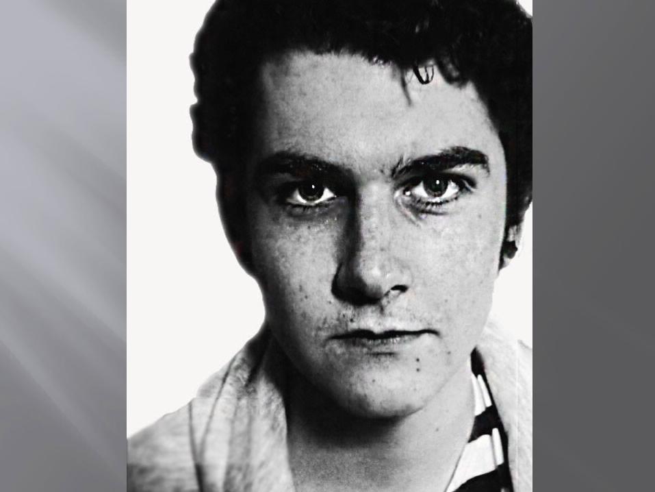
I used this photo, as it is very clear and very close up, for maximum detail. It fits well on the A4 page, and will make a very simple main graphic for the cover.
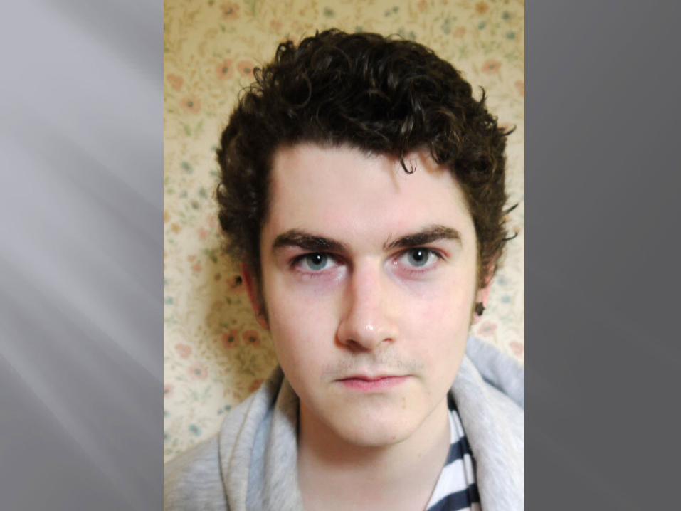
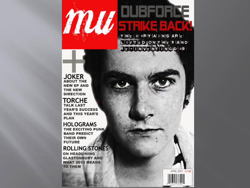
I then cut the background off it, using the Photoshop Magic Wand tool. This was because magazine covers often have a plain white background, and since I wanted to make it in back and white the wallpaper would have looked odd. I then expanded the image, made it black and white, and upped the contrast and lowered the brightness. Then, feeling the photo was a bit plain, I used the Burn tool and the Sharpen tool to give more texture to the skin and make bits look darker. I did this to make the picture have a more grungy, moody look.
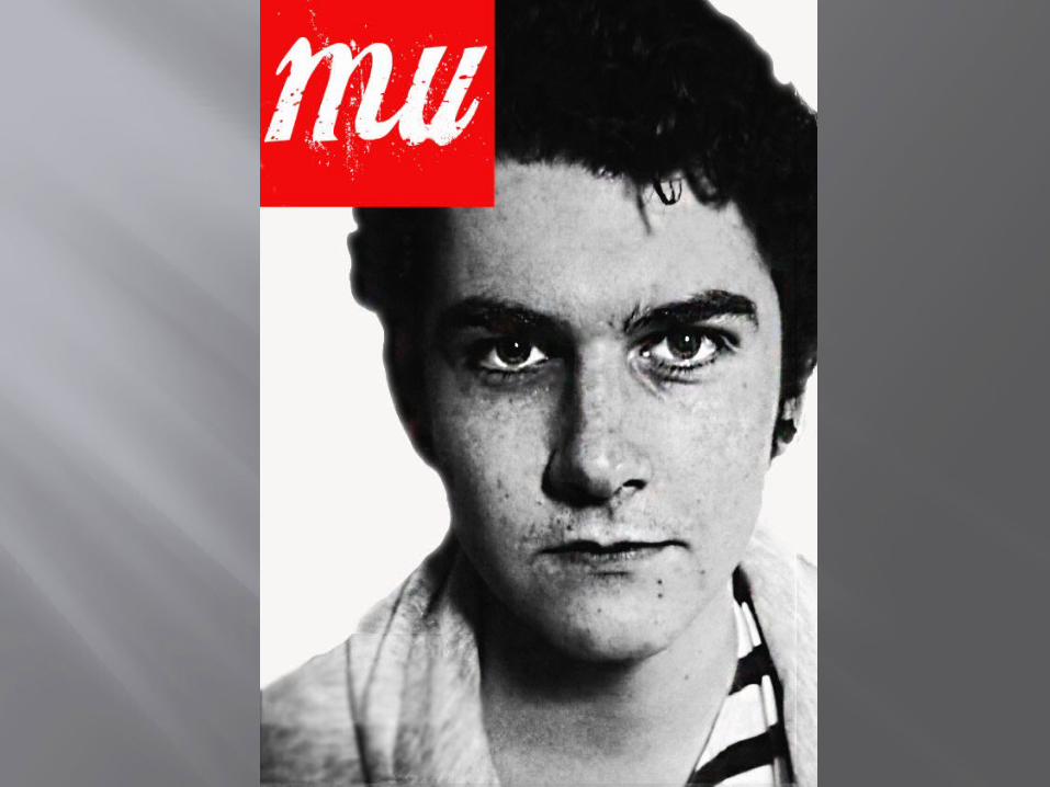
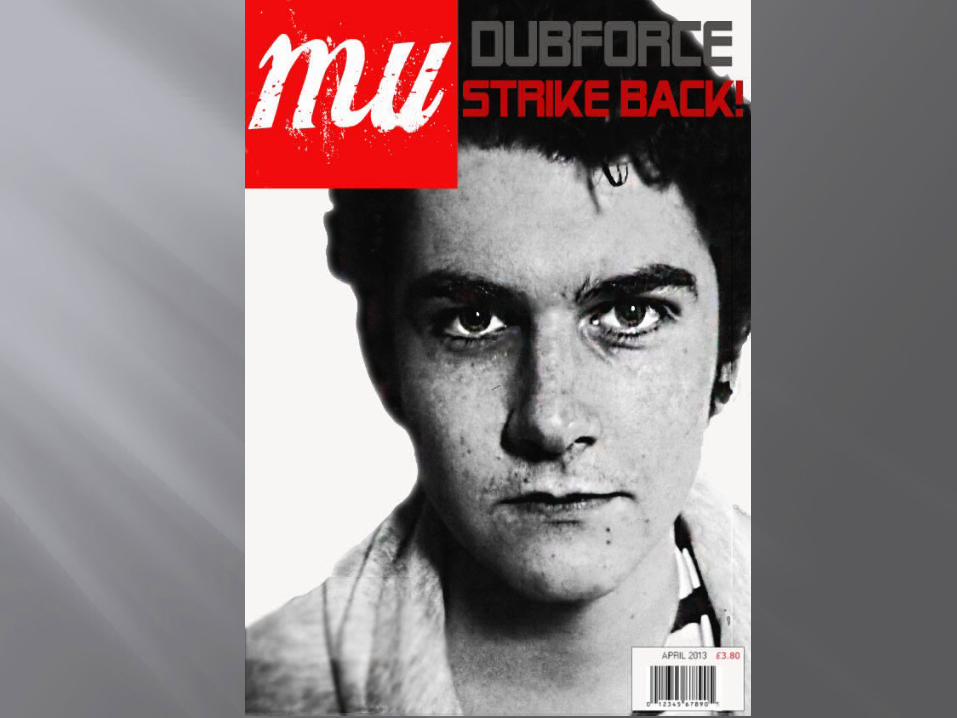
Next I made the magazine logo. To stick to the traditional black, white and red colour scheme, I made a red box, with the magazine name Mu, obviously from ‘music’, splashed in white on top of it. I moved the head and shoulders to fit around the logo better, so none of the facial features were covered, without making the head too small on the page.
Next I put a barcode on the bottom right of the page, and put a date and price on it, to make it more authentic, as most magazines have this. At the top I put the main article title, which related to the picture. I chose a bold, futuristic font to match the genre of music the band plays, and to make an eye catching title. I chose to have one colour for the band name and one for the description of the article, so to make it more colourful and obvious that only DubForce was the band name.
Next I put an article description in distressed typewriter font underneath the main title. I chose this font as it matched the slightly old fashioned, bold and black and white theme of the main picture. I put a large ‘plus’ sign in grey above other articles, as some magazines do. Underneath this, I had band names from other main articles in simple, bold capitals to be readable but not draw attention away from other things on the page too much.
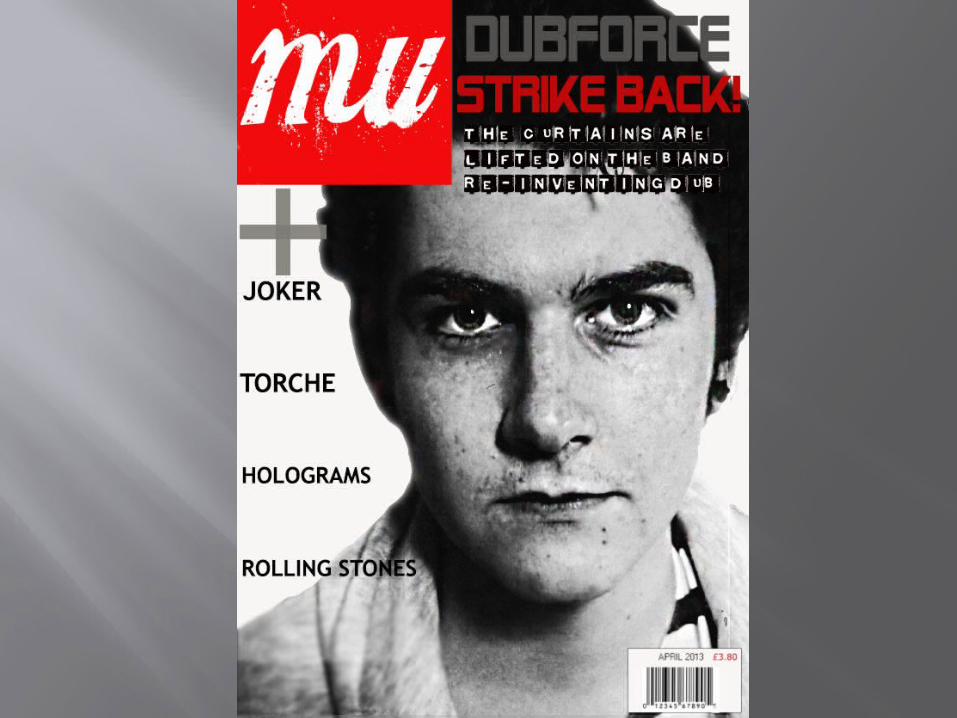
Finally I put a brief outline of each of the articles down the side, making sure they didn’t cover the main picture, as they’d become barely visible.