map editing guide - internet archive
TRANSCRIPT
BLM LIBRARY
88069447
MAP EDITING GUIDE
A Brief Guide to the Review and Editing of Maps and Graphics
Stephen Meszaros
U.S. Department of the Interior
Bureau of Land Management
Arizona State Office
Phoenix, Arizona
2002
GA
108.5 .M49
2002
ERRATA
Note that there are a number of blank pages in this document. All the required information is present
(nothing has been left out). There was a lack of communication between BLM and the printer, resulting
in these blanks. This is of course rather ironic, considering that this is an editing guide! It does point
up the fact that constant oversight is necessary on any project, and even then mistakes do happen.
Obviously editing and review are very important.*
I would invite the reader to utilize the blank pages to take notes or make comments on the material
presented in that immediate section. If you have any questions about this document, you may contact
me at the address indicated on page 34.
The Author
* There is one beneficial result of the blank pages. The reader will note that this document has been printed on paper
that is rather cheap and transparent - resulting in quite a bit of “bleed-through” of the images. By printing on only
one side of the page, this problem has been alleviated to some degree.
QA /O'&.S
,rv^°i
MAP EDITING GUIDE
A Brief Guide to the Review and Editing
of Maps and Graphics
Stephen Meszaros
U.S. Department of the Interior
Bureau of Land Management
Arizona State Office
Phoenix, Arizona
2002
Denver Federal Center P.O. Box 25047 Denver, Colorado 30225

V « ! ‘
£ . • •: - !U 'v-
; *>- & X» : v .
-
ABSTRACT
Various techniques for reviewing and editing maps are demonstrated. Special subject edits and
the review of graphics are also briefly discussed.
iii

AUTHOR’S NOTE
This document may be considered as both an extension and a supplement to an earlier work by
the author, Cartographic Notebook: A Brief Guide to some aspects of Cartographic Design (U.S.
Department of the Interior, Bureau of Land Management, Arizona State Office, Phoenix, Arizona,
2001). The extension is “Part I: Editing Techniques” wherein various methods of reviewing and editing
maps are discussed. The supplement is “Part II: Special Edits” which adds to the data presented in the
Cartographic Notebook. Please consult that publication for more detailed information on map design
and construction.
v

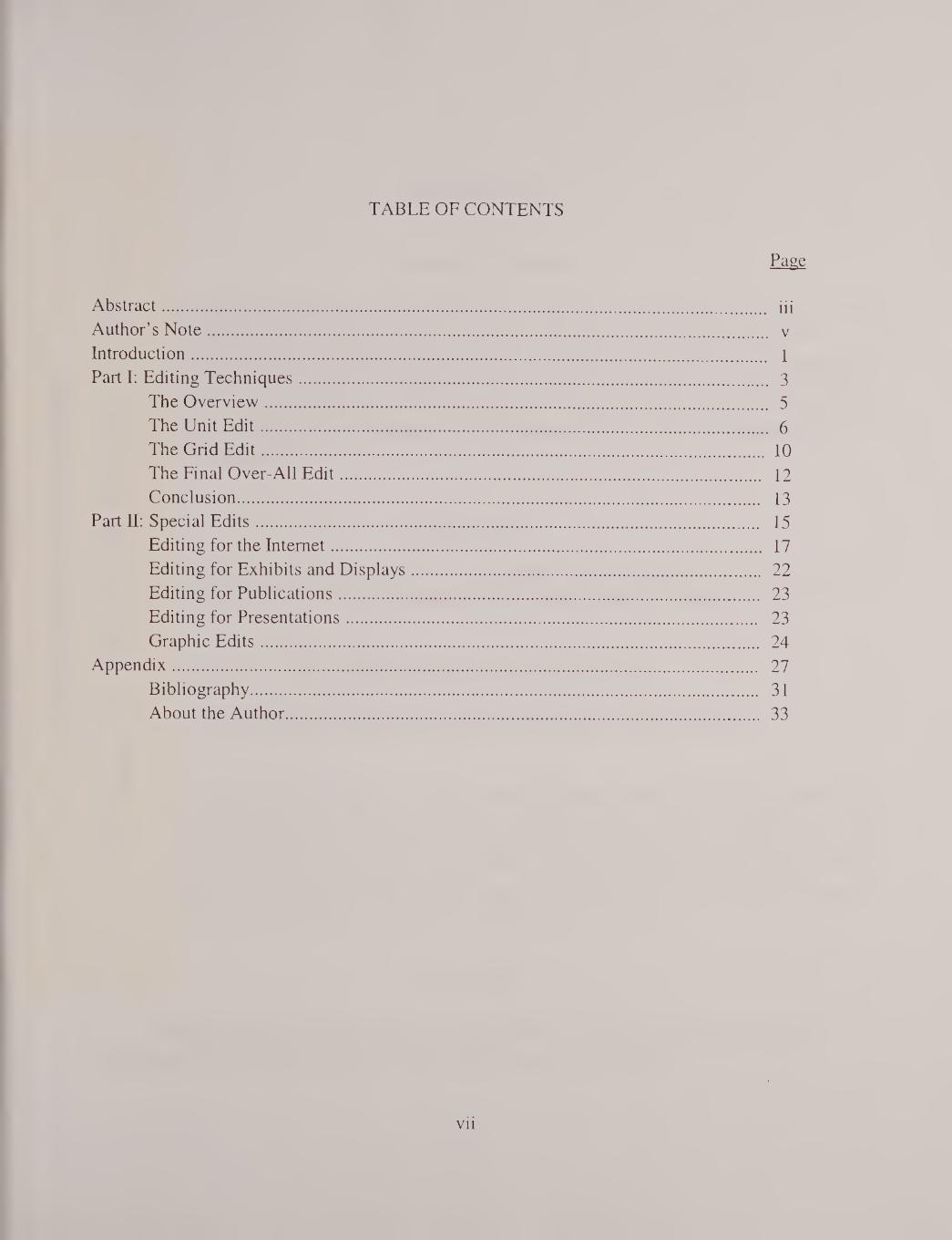
TABLE OF CONTENTS
Page
Abstract. iii
Author’s Note. v
Introduction. 1
Part I: Editing Techniques. 3
The Overview. 5
The Unit Edit. 6
The Grid Edit. 10
The Final Over-All Edit. 12
Conclusion. 13
Part II: Special Edits. 15
Editing for the Internet. 17
Editing for Exhibits and Displays. 22
Editing for Publications. 23
Editing for Presentations. 23
Graphic Edits. 24
Appendix. 27
Bibliography. 31
About the Author. 33
vii

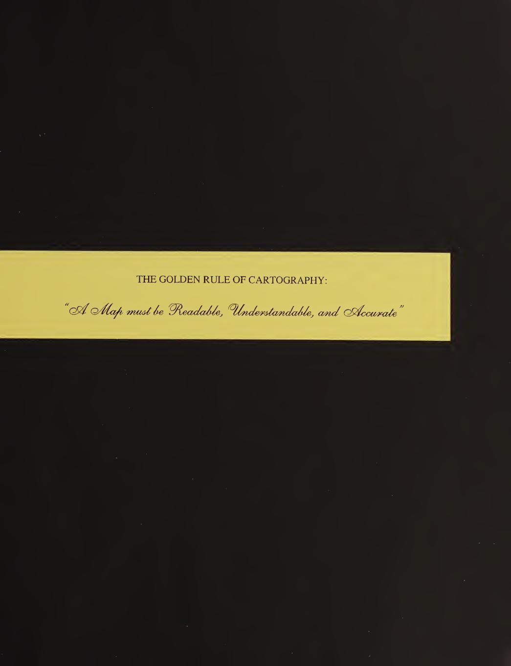
THE GOLDEN RULE OF CARTOGRAPHY:
Q/fia/i must ie ^dleada/de, rs/a>h/u/i/<', and Ctydcavxate

INTRODUCTION
The Need for Editing
All maps that are going to be printed, used in presentations, or exhibited to the public - in any
manner - should be edited. This also applies to graphics and other visuals destined for mass
distribution. As with any other type of human endeavor, mistakes, inconsistencies, and oversights can
creep into the map making process. A rigorous review and edit of the maps by competent personnel
should be able to eliminate most, if not all, of these errors. This is especially important today, with the
wide-spread use of computer mapping programs by people who are not trained or experienced in
professional cartography.
What to Edit
In the editing of a map, to make sure it is successful, three attributes must be taken into account.
I refer to this as The Golden Rule of Cartography, which may be stated as follows:
THE GOLDEN RULE OF CARTOGRAPHY
A Map must be Readable, Understandable, and Accurate.
First, the map must be readable. The text should be large enough to see, the line weights bold
enough to be visible, and the design not so complex or cluttered that it is, in fact, unreadable. Second,
the map must be understandable. It should be designed for the educational and experience level of the
target audience, so that they will be able to understand it. Finally, the map must be accurate. All data
presented upon it has to be correct and as current as possible, otherwise it will be a failure. These are
the three items - the Golden Rule - that need to be examined in a map edit.
How to Edit
Keeping in mind The Golden Rule of Cartography, the following pages describe some
techniques for map editing so that the maps will be of an acceptable quality.
1


2

Part 1: EDITING TECHNIQUES
3

THE OVERVIEW
The first step in map editing is to take an overall look at the map - in its entirety - to become
familiar with it. This is the “Overview.” What is the general appearance of the map? Is it clear and
clean? Is it “straight” on the page (not crooked)? Are the tones and/or colors clear, and can they be
differentiated? Does the map contain its required elements? Mandatory map elements would include:
a title, legend, scale, location diagram, and coordinate system of some type. Other desirable map
elements might include a north arrow {mandatory if north is not toward the top of the map), an
organization logo and/or organization information (including the map date), and a disclaimer - if
required. Looking a bit closer, is the line work clean and crisp; does the text appear to be evenly
spaced and of a readable size?
Regarding some of the major map elements, the title should be the largest text on the page and
should adequately express the purpose or content of the map. The legend essentially explains the items,
or symbols, used on the map. All symbols (including tones and/or colors) on the map must appear -
and be explained - in the legend. They should also be the same size in the map and legend, to avoid
confusion by the reader. The scale may ideally be shown in both English and metric units, to
accommodate all map users. The location diagram should show the site of the map within a larger
geographical area that is familiar to the target audience.
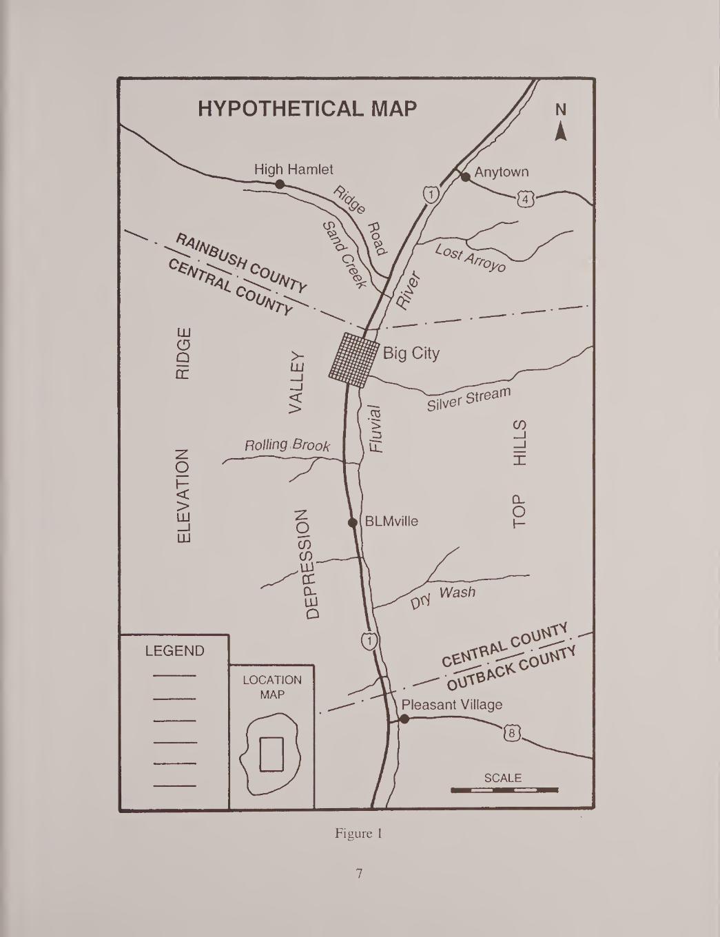
After viewing the map in the preliminary Overview stage, we are now ready to examine it in
more detail. Figure 1 shows a hypothetical map that will be “dissected” using various reviewing
techniques in the following pages.
5


THE UNIT EDIT
One of the most powerful methods of systematically reviewing a map is to use the “Unit Edit”
technique. This is actually nothing more than examining each of the individual map components or units
in turn, to make sure that they are complete and correct. Examples of map components would include
the following: the transportation net, cultural features, political divisions, hydrologic features, physical
relief, land ownership or management status, and a host of other possibilities. In fact, this list includes
whatever is displayed on the map. As an example, let’s start a unit edit of the map shown in Figure 1.
It would be logical to begin with the physical landscape of the area (mountains, valleys, rivers &
lakes, etc.) and then proceed to the cultural features upon this landscape (cities, towns, roads, etc.).
However, for ease of graphic reproduction in this document, I am going to use only line and point
sources as examples.
Let’s examine the road net first. Figure 2a shows the system of roads extracted from the
complete map in Figure 1. Of course, when editing a map you won’t be able to see just the roads as
depicted here. This figure is meant to indicate that you will be concentrating upon the roads only, and
ignoring all the other map components. First, is the road net complete? Are there any that “disappear”
part way through the map? Are there any “gaps?” Is the highway hierarchy system (federal roads,
state roads, county roads, multi-lane roads, paved roads, dirt roads, etc.) adequately indicated by line
boldness, style, and/or color? And are these all displayed and explained in the legend? Are all the
highways appropriately numbered and/or named? Is this information accurate? These are the kinds of
questions you will need to ask as you edit the road net. Finally, be aware of how this highway system
interfaces with the rest of the map elements. Make sure that none of the roads appear to “drive” over
high mountain peaks or into lakes!
Moving on to cultural features - which in this example we will take to mean as cities, towns,
and villages - examine Figure 2b. Here we have again extracted these features “graphically,” although
you will be doing it “mentally” for your edit. Are the appropriate cities and towns shown, considering
the overall purpose of the map? Are their names spelled correctly? Does the text size and boldness
correlate properly with their population and/or importance? Is the text placed correctly with respect to
the town locations and is it easily readable? Finally, do these cities and towns relate “logically” to the
other map elements, such as roads and rivers?
Next let’s consider political divisions - see Figure 2c. This is the separation of the landscape
6
7


into legal parcels, utilizing boundary lines. Common examples include national boundaries, state
boundaries, county boundaries, city boundaries, etc. There are however an almost infinite number of
divisions that may be utilized on maps: Indian reservation boundaries, hunting boundaries, census tract
boundaries, the list goes on and on. (And this does not even include scientific boundaries such as
geologic units, soil types, vegetation communities, etc.) The accurate placement of all these boundaries
and the differentiation of the types of lines showing them is paramount in map construction. Making
sure that they are current is also of vital importance. Again, coordination of political divisions with the
other map elements must be achieved.
Finally, let’s look at hydrologic features - rivers, lakes, ponds, etc. - as the last of our map
components to be considered - see Figure 2d. Which of these should be shown on the map, and at
what detail? For example, we would probably include rivers and larger streams, but how about smaller
creeks and even rivulets? Of course, the detail of the drainage system depends upon the purpose of the
map. This is one more element that must be examined closely. Also, you don’t want to find that some
of the streams are flowing “over” mountain ridges or “out of’ their stream banks! Consequently, the
relationship of the hydrologic features to the relief and other map components must be examined along
with their specific edit.
The previous four map samples were meant to be examples of the use of the “unit edit method”
of map editing. Of course, many other elements will need to be selected and reviewed for a successful
edit. In each case the specific component should be reviewed individually first, then its relationship to
the other map elements present must be analyzed. Following the unit edit a more in-depth review may
be undertaken, if we are to accomplish a complete systematic edit. This is the “grid edit technique” and
is discussed in the following section.
8

Figure 2
9


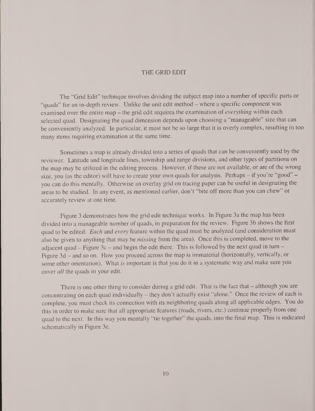
THE GRID EDIT
The “Grid Edit” technique involves dividing the subject map into a number of specific parts or
“quads” for an in-depth review. Unlike the unit edit method - where a specific component was
examined over the entire map - the grid edit requires the examination of everything within each
selected quad. Designating the quad dimension depends upon choosing a “manageable” size that can
be conveniently analyzed. In particular, it must not be so large that it is overly complex, resulting in too
many items requiring examination at the same time.
Sometimes a map is already divided into a series of quads that can be conveniently used by the
reviewer. Latitude and longitude lines, township and range divisions, and other types of partitions on
the map may be utilized in the editing process. However, if these are not available, or are of the wrong
size, you (as the editor) will have to create your own quads for analysis. Perhaps - if you’re “good” -
you can do this mentally. Otherwise an overlay grid on tracing paper can be useful in designating the
areas to be studied. In any event, as mentioned earlier, don’t “bite off more than you can chew” or
accurately review at one time.
Figure 3 demonstrates how the grid edit technique works. In Figure 3a the map has been
divided into a manageable number of quads, in preparation for the review. Figure 3b shows the first
quad to be edited. Each and every feature within the quad must be analyzed (and consideration must
also be given to anything that may be missing from the area). Once this is completed, move to the
adjacent quad - Figure 3c - and begin the edit there. This is followed by the next quad in turn -
Figure 3d - and so on. How you proceed across the map is immaterial (horizontally, vertically, or
some other orientation). What is important is that you do it in a systematic way and make sure you
cover all the quads in your edit.
There is one other thing to consider during a grid edit. That is the fact that - although you are
concentrating on each quad individually - they don’t actually exist “alone.” Once the review of each is
complete, you must check its connection with its neighboring quads along all applicable edges. You do
this in order to make sure that all appropriate features (roads, rivers, etc.) continue properly from one
quad to the next. In this way you mentally “tie together” the quads, into the final map. This is indicated
schematically in Figure 3e.
10
Figure 3
11


THE FINAL OVER-ALL EDIT
After the unit and grid edits have been accomplished, it is advisable to have one more over-all
look at the map. This should be a general review of the appearance of the map and its various
components in their entirety. Spot checks of critical or complex areas can also be done at this time. If
possible, it is useful to have another person experienced in cartography and/or graphics take a look at
the map. A “second pair of eyes” is very handy in spotting any errors that may have been missed.
Actually it’s also not a bad idea to have a coworker from another professional field view the map.
Sometimes map editors, because they are concentrating on technical details, can miss an otherwise “big
picture” mistake. In effect, they “miss the forest while looking at the trees!”
If it’s not possible to have a second person complete a quick review of the map, you should at
least do a brief edit on a different day. In fact, if this is done several days later, it is even better.
Approaching the map with a fresh mind and outlook at this time can, on occasion, expose errors and
inconsistencies that may have been missed during the first edit.
12
CONCLUSION
When editing a map (or graphic) the reviewer should examine not only its individual
components, but also view the map in its entirety. Concerning the components, all the separate details
must be correct. Regarding the entirety, all the components must function together smoothly and
accurately. Making sure that this happens is the overall purpose of map editing.
Lastly, although a map is not usually considered “a work of art” its appearance should be
pleasing to the eye. If the final result can combine technical accuracy with attractiveness, a superior
map will have been produced.
13


14
Part II: SPECIAL EDITS
15


EDITING FOR THE INTERNET
The same editing methods and cartographic rules (the “Golden Rule of Cartography”) apply to
Internet maps and graphics. However, it is very important to examine these visuals after they have
been scanned and placed on the Web, to make sure that they have made the “transition.” As a case in
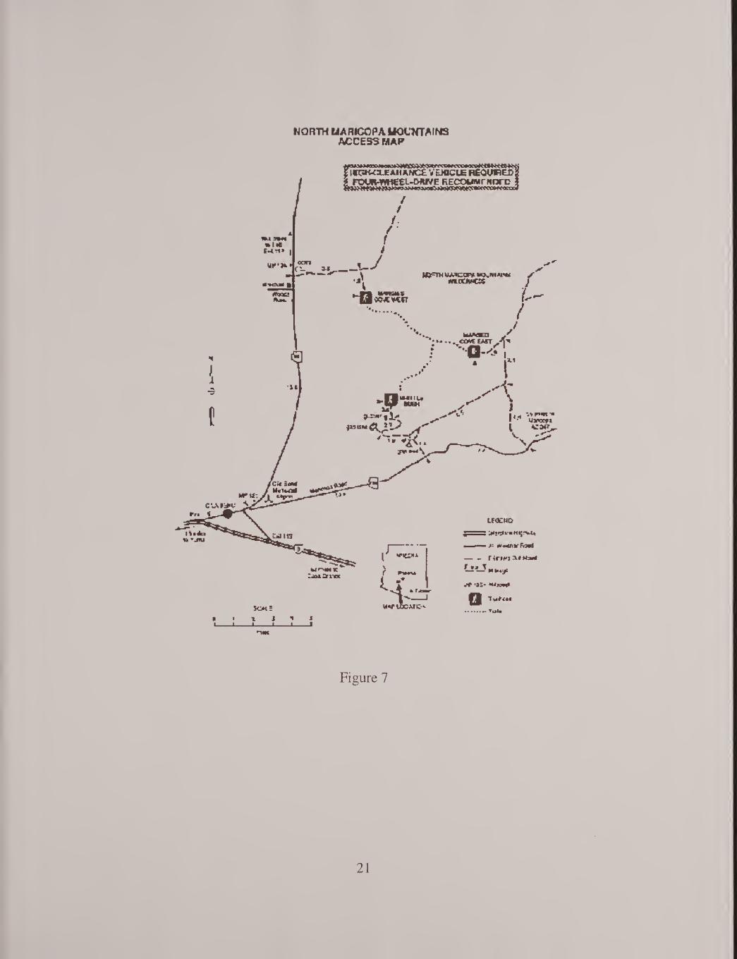
point, Figure 4 shows an original map that was used for a handout (reduced here to 70%). Figure 5
displays the same map as seen on the BLM Arizona public web page. It is obvious that the Internet
version is of poor quality and, in fact, most of the text is not even readable. Figure 6 is another original
handout (again reduced to 70%). Figure 7 is the Internet version. In this computer visual practically
nothing is readable and even the lines are of very poor quality.
It is rather amazing that these maps (and others like them) have been allowed to remain on the
web page for a considerable amount of time, without correction! This points up the fact that maps and
graphics must be edited, both before and after they are placed on the Internet.
17


TABLE TOP MOUNTAINS ACCESS MAP
26 mites to Gila Bend
VEKOL VALLEY EXIT NO. 144
g FOUR-WHEEL-DRIVE g Y, VEHICLE REQUIRED
^ * Vekol Ranch , (Private) C JsSlStl
TABLE TOP VflLDERNESS
LEGEND
■ 1 — Interstate Highway
i All Weather Road
— -Primitive Dirt Road
— —T Mileage
Trailhead
■ Trails mites
• Tucson
MAP LOCATION
Figure 4
18
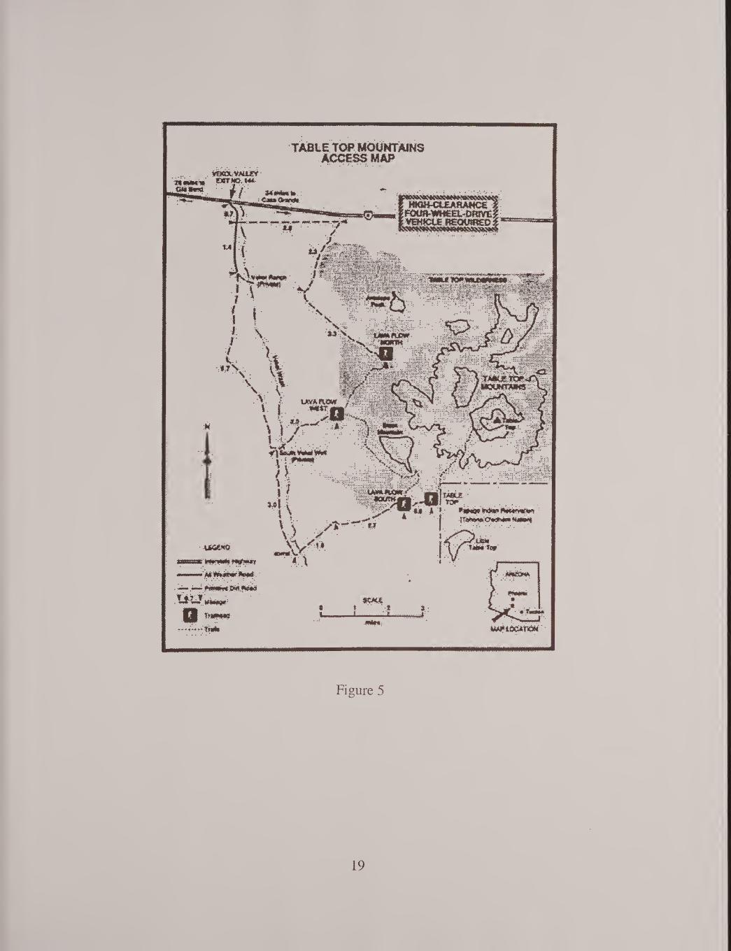
TABLE TOP MOUNTAINS ACCESS M AP
UttMO
ipWlI rPuTjpiy
•mmmm' . '
•■--■■• -* -' - *<-•■ -* • -**1" nwwfi iw.T’WH
Vvmm
.,**.1 trail
ǣǣ t .NH:
fftftwwrOWNn* M«wawj
(JM TmmTc*
■*mam-
■W#tQC*tW''
Figure 5
19


NORTH MARICOPA MOUNTAINS ACCESS MAP
z HIGH-CLEARANCE VEHICLE REQUIRED?
1t5 miles to Yuma
SCALE
• Tucson
MAP LOCATION
LEGEND
Interstate Highway
All Weather Road
— — Primitive Dirt Road
MP 135* Milepost
Trailhead
• Trails
miles
Figure 6
20
WORTH U A RICO PA MOUNTAINS ACCESS MAP
Figure 7
21


EDITING FOR EXHIBITS AND DISPLAYS
The same reviewing methods and “The Golden Rule of Cartography” apply to exhibits and
displays. However, in this case the map should be considered as a type of “display graphic.” The
viewer will be observing it briefly from a distance - perhaps several feet away - so some specific
criteria must be taken into account.
Size and Boldness: Because the map is being viewed from a distance, all lines need to be bold
enough to be seen. Text should appear at a size that is easily readable - ideally no smaller than 24
point (see the Appendix). Colors and/or tones must also be easily distinguishable.
Content: All the necessary map elements must be present to make the map readily
understandable. These would certainly include the title (always the largest text), the legend, scale
(absolutely necessary), and a location diagram. Various coordinates, organization information, the date,
and a disclaimer (if necessary) may be appropriate.
Simplicity: Since the map will be viewed for a brief period of time (while the visitor is at the
display looking at it), it must be relatively simple and straightforward in getting the message across. The
average person is not going to stand for a long period of time, analyzing a complex visual. Extraneous
material must be omitted. If more detailed information is necessary (as an adjunct to the main map
subject) it should be made available as a handout.
To summarize, maps and graphics used in displays and exhibits should be easily readable from
a distance, inclusive in their content, and “straight to the point” in their subject presentation.
22

EDITING FOR PUBLICATIONS
The editing techniques explained in the first part of this document were specifically designed for
publication edits. Publication maps and graphics are more fully covered in Cartographic Notebook:
A Brief Guide to some aspects of Cartographic Design (see the “Author’s Note” on page v). In
general, “The Golden Rule of Cartography” always applies: A Map must be Readable,
Understandable, and Accurate (see the Introduction).
EDITING FOR PRESENTATIONS
Presentations follow many of the same graphic rules as those for exhibits and displays,
mentioned previously. The maps and graphics must be of an adequate size and boldness to be visible,
even from the back row of the audience. They need to be inclusive, containing all the required
information in each separate visual. They should also be as simple as possible so that the viewer is able
to comprehend the information being presented, in the short time that the visual is projected onto the
viewing screen. These are the factors that the reviewer must consider, when editing material for
presentations.
Additional information may be found in the Cartographic Notebook (especially the
“Appendices” section) referred to in the “Author’s Note.”
23


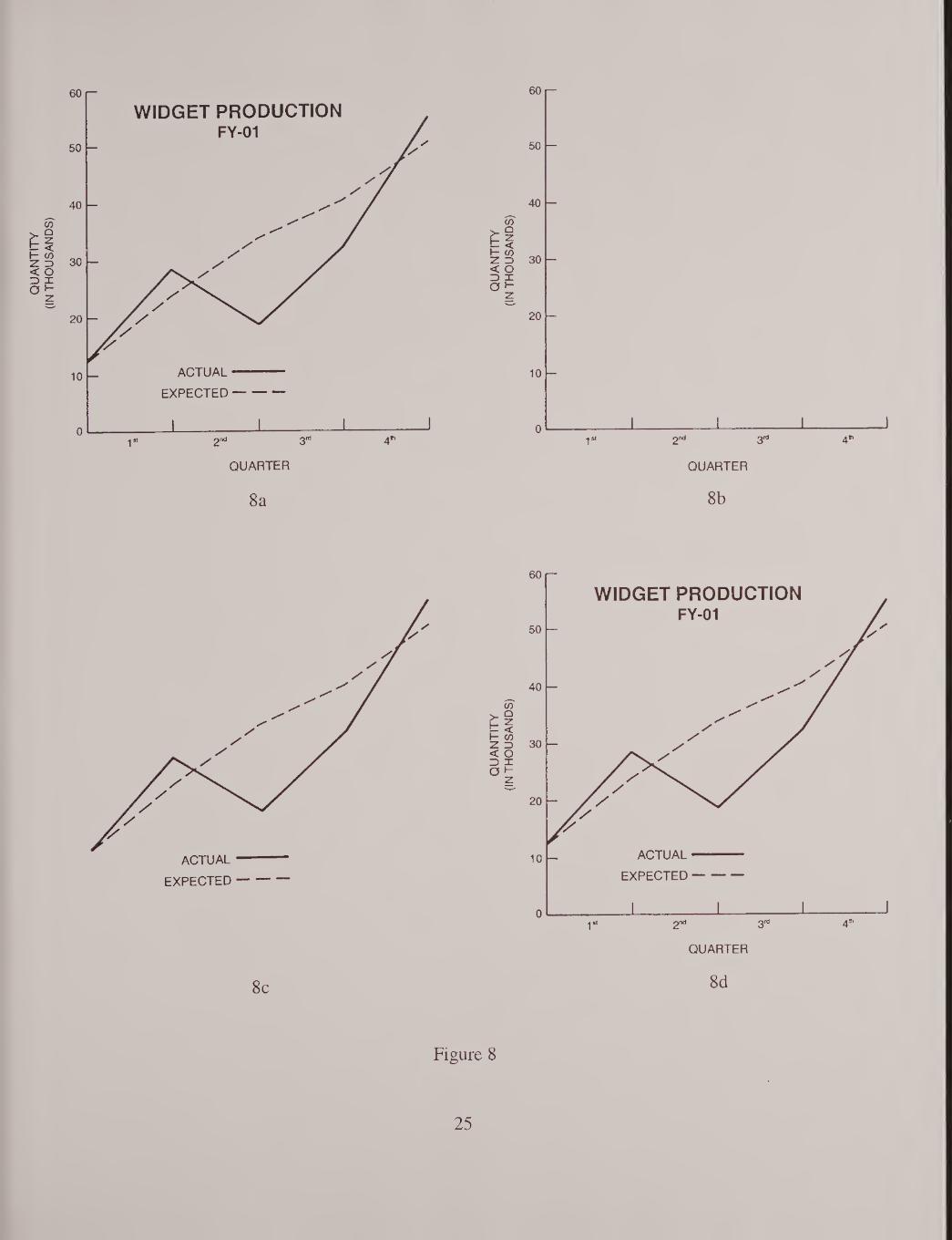
GRAPHIC EDITS
The editing of various types of graphics utilizes many of the same techniques described
previously in this document. The key is in employing a systematic approach to the review of these
visuals, and adjusting the approach to fit the unique character of each one. As an example, let’s briefly
evaluate the simple graph illustrated in Figure 8.
First take a general look at the graph to become familiar with it, as shown in Figure 8a. I find it
useful to edit first the outside and then the inside of the figure. This helps to break it up into its
component parts, for detailed analysis. So, Figure 8b displays just the outside of the graph. Observe
the axis labels. Are they appropriate and spelled correctly? Examine the tick marks on both axes. Are
they drafted adequately, with regard to length, boldness, and spacing? Now move on to the interior of
the graph, in Figure 8c. Inspect the data line by itself. It should be quite prominent, since it is the whole
reason for the graph. Is it drafted at an acceptable level of quality? Finally, view the graph in its
entirety again - Figure 8d. Since you are now familiar with it, having examined its component parts,
does it seem to make sense - that is, does the information the graph presents seem logical? (If there is
any question, the originator of the illustration should be consulted.) Does the title adequately express
the meaning of the figure? And, is all the text and linework of an appropriate size and boldness to
succeed in the purpose of the illustration (whether it be for publication, presentation, or exhibit)?
This was an example of a review of a very simple figure. Undoubtedly the graphics that you
will be examining will be more complex. The important thing to remember is to use a systematic
approach in your edit. Finally at the end, ask the question “ Does this visual seem logical?” Common
sense is the best editing tool of all!
24
QUARTER
8a 8b
ACTUAL
EXPECTED -
8c 8d
Figure 8
25


26

APPENDIX
27

TYPE SIZES
4 POINT TYPf Point Type
5 POINT TYPE Point Typ«
b point type Point Type - smallest acceptable mapping size type
7 POINT TYPE Point Type
8 point type Point Type - ideal smallest mapping size type
9 POINT TYPE Point Type
10 POINT TYPE Point Type
11 POINT TYPE Point Type
12 POINT TYPE Point Type
14 POINT TYPE Point Type - smallest acceptable slide / vug rap h size type
16 POINT TYPE Point Type
18 POINT TYPE Point Type - ideal smallest slide / vugraph size type
20 POINT TYPE Point Type
24 POINT TYPE Point Type - smallest acceptable display /
exhibit size type
30 POINT TYPE Point Type
36 POINT TYPE Point Type
29

BIBLIOGRAPHY
There are a number of excellent books available on cartography. The list below mentions a few
of them.
Elements of Cartography by Arthur H. Robinson, et al.
Cartography: Thematic Map Design by Borden D. Dent
Cartographic Design and Production by J. S. Keates
Introductory Cartography by John Campbell
Cartography: Visualization of Spatial Data by M. J. Kraak and F. J. Ormeling
Maps and Diagrams by F.J. Monkhouse and H.R. Wilkinson
Mapping by David Greenhood
31

ABOUT THE AUTHOR
Stephen Meszaros has been involved in the cartographic and graphic field for over 45 years.
(He began actively drawing maps in grade school, on everything from note paper, to flattened paper
bags, to old window shades!) Steve graduated from Delaware Literary Institute & Franklin Central
School, in upstate New York, with School and Regents Diplomas in Science & Mathematics. He also
received the school Geography Prize. At Syracuse University he took his Bachelor’s Degree in
Geography, specializing in cartography and physical geography. This was followed by 4 years in the
U.S. Air Force as a Drafting and Cartographic Supervisor for the Aerospace Cartographic and
Geodetic Service, based in Kansas. During this time he spent a year in Brazil and 6 months in Vietnam.
Following military service Steve completed a Master’s Degree in Geography at Arizona State
University, concentrating on regional geography and historical & contemporary geographic thought.
Steve’s civil service career began with the U.S. Geological Survey at the Center of
Astrogeology in Arizona, the Water Resources Division in California, and the Special Mapping Center
at USGS Headquarters in Virginia. In these positions he was a scientific illustrator, cartographer, and
map editor. This was followed by 10 years with NASA as a visual information specialist for the
Goddard Space Flight Center in Maryland and the Ames Research Center / Dryden Flight Research
Facility in California. During this period of time Steve took a 6 month break in government service to
become the Chief of the Public Affairs Office at Kitt Peak National Observatory in Arizona. For the
past 14 years he has been a visual information specialist for the Arizona State Office of the Bureau of
Land Management.
Steve’s maps and visuals are used across the United States. His displays and exhibits have
been shown in the U.S. and Europe, and his slide sets are featured world-wide. Most major astronomy
textbooks contain his illustrations, as do many popular-level space science books and journals. His
work has appeared on television and the World Wide Web (and one of his visuals has even been made
into a jigsaw puzzle!)
Steve has been the recipient of many honors throughout his career, including the prestigious
NASA Outstanding Service Award. He is the author of over 20 publications for NASA and the
astronomical and educational community. Following retirement from the government with over 30
years of service, Steve plans to continue his work as a consultant to NASA and various universities.
33


CONTACTING THE AUTHOR
The author may be contacted through the Bureau of Land Management at the following
address:
Bureau of Land Management
955 / Engineering
222 North Central Avenue
Phoenix, Arizona 85004
34
NOTES


NOTES
NOTES


NOTES
☆ U.S. GOVERNMENT PRINTING OFFICE: 2002 — 773-079 / 43009 Region No. 8