mapping ethnicity: color use in depicting ethnic distribution
TRANSCRIPT

12 Number 40, Fall 2001 cartographic perspectives
Mapping Ethnicity: Color Use inDepicting Ethnic Distribution
Jenny Marie JohnsonUniversity of Illinois at
Urbana-Champaign
ROLE OF THE ORGANIZATION
Color effects are in the eye of the beholder.Yet the deepest and truest secrets of color effects are, I know,
invisible even to the eye, and are beheld by the heart alone.(Itten 1970)
Maps are made for a specific purpose, or set of purposes. No individual cartographer or cartography-producing organization produces a map just for the sake of producing a map. People and organizations have agendas; maps tell stories. Map stories are told through symbols and colors. Colors have meaning. Perhaps color choice is intended to indi-cate an organization’s attitudes toward the phenomena being mapped. Color on maps of ethnic groups can be evaluated inter-textually by plac-ing the maps into the context of their producers and the time of their production. The colors, and their meanings, that are used to represent particular groups will reflect the map producer’s attitudes toward the ethnic groups. If these attitudes are unknown, they could be hypoth-esized by evaluating color usage. Color choices may act as indicators of opinions otherwise unexpressed.
uch of the thinking about the role that organizations play in produc-ing supposedly scientific maps was done by Harley (1988) during
the latter half of his career. He began this work by examining antiquarian maps in a context far greater than the normal “map as beautiful object”. Instead he examined them with the idea that the maps were artifacts produced by agents of organizations with particular goals and objectives. Harley wrote that the knowledge contained in maps was used to maintain the status quo and that this practice continues into the present. Maps must be “interpreted as socially constructed perspectives on the world, rather than the ‘neutral’ or ‘value free’ representations” that they previously had seemed (Harley 1988, 58).
These ideas, which Harley applied to maps created in the fifteenth through seventeenth centuries, were applied generally in “Deconstructing the Map.” Maps are products of more than just simple rules of form and composition, of scientific fact gathering and logical display. Even the most scientific of maps are the products of the “norms and values of the order of social tradition.” (Harley 1989, 2) These norms and values vary between cultures and societies, thus the rules of cartography will also vary. But two unspoken rules seem to be common across all cultures: ethnocentrism and hierarchicalization of space. Harley does not feel that these rules are con-scious acts but instead are manifestations that are taken for granted; one’s own place or culture is always at the center of the universe, and in a naïve way, the places of those who are higher in society are more important than of those who are low.
Cartography deploys its vocabulary accordingly so that it embodies a systematic social inequality. The distinctions of class and power are en-gineered, reified and legitimated in the map by means of cartographic signs. The rule seems to be ‘the more powerful, the more prominent.’ To those who have strength in the world shall be added strength in the
“Maps are products of more than just simple rules of form and composition, of scientific
fact gathering and logicaldisplay.”
brought to you by COREView metadata, citation and similar papers at core.ac.uk
provided by Cartographic Perspectives (E-Journal - North American Cartographic Information Society,...
cartographic perspectives 13Number 40, Fall 2001
map. Using all of the tricks of the cartographic trade — size of symbol, thickness of line, height of letter, hatching and shading, the additions — . . . maps, like art, become a mechanism “for defining social relation-ships, sustaining social rules, and strengthening social values.”(Harley 1989, 7)
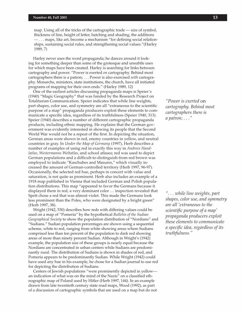
Harley never uses the word propaganda; he dances around it look-ing for something deeper than some of the grotesque and unsubtle uses for which maps have been created. Harley is searching for links between cartography and power. “Power is exerted on cartography. Behind most cartographers there is a patron; . . . Power is also exercised with cartogra-phy. Monarchs, ministers, state institutions, the church, have all initiated programs of mapping for their own ends.” (Harley 1989, 12)
One of the earliest articles discussing propaganda maps is Speier’s (1940) “Magic Geography” that was funded by the Research Project on Totalitarian Communication. Speier indicates that while line weights, part shapes, color use, and symmetry are all “extraneous to the scientific purpose of a map” propaganda producers exploit these elements to com-municate a specific idea, regardless of its truthfulness (Speier 1940, 313). Speier (1940) describes a number of different cartographic propaganda products, including ethnic mapping. He explains that the German gov-ernment was evidently interested in showing its people that the Second World War would not be a repeat of the first. In depicting the situation, German areas were shown in red, enemy countries in yellow, and neutral countries in gray. In Under the Map of Germany (1997), Herb describes a number of examples of using red in exactly this way in Andrees Hand-latlas, Westermanns Weltatlas, and school atlases; red was used to depict German populations and a difficult-to-distinguish-from-red brown was employed to indicate “Kaschubes and Masures,” which visually in-creased the amount of German-controlled territory (Herb 1997, 96-97). Occasionally, the selected red hue, perhaps in concert with value and saturation, is not quite as prominent. Herb also includes an example of a 1918 map published in Vienna that included German and Polish popula-tion distributions. This map “appeared to favor the Germans because it displayed them in red, a very dominant color … inspection revealed that Spett chose a red that was almost violet. This made the Germans look less prominent than the Poles, who were designated by a bright green” (Herb 1997, 38).
Wright (1942, 530) describes how reds with differing values could be used on a map of “Pomeria” by the hypothetical Bulletin of the Sudian Geographical Society to show the population distribution of “Nordians” and “Sudians.” Sudian population percentages are shown using a sequential scheme, white to red, ranging from white showing areas where Sudians comprised less than ten percent of the population to dark red showing areas of more than ninety percent Sudian. Although in Wright’s (1942) example, the population size of these groups is nearly equal because the Nordians are concentrated in urban centers while Sudians are predomi-nantly rural. The distribution of Sudians is shown in shades of red, and Pomeria appears to be predominantly Sudian. While Wright (1942) could have used any hue in his example, he chose for a Sudian journal to use red for depicting the distribution of Sudians.
Centers of Jewish populations “were prominently depicted in yellow—an indication of what was on the mind of the Nazis” on a classified eth-nographic map of Poland used by Hitler (Herb 1997, 144). In an example drawn from late twentieth century state road maps, Wood (1992), as part of a discussion of cartographic symbols that are used on a map but do not
“Power is exerted oncartography. Behind mostcartographers there isa patron; . . .”
“. . . while line weights, part shapes, color use, and symmetry are all ‘extraneous to thescientific purpose of a map’ propaganda producers exploit these elements to communicate a specific idea, regardless of its truthfulness.”

14 Number 40, Fall 2001 cartographic perspectives
appear in the legend, states that North Carolina is white while a “yellow tint [is] used for ‘other states.’” (p. 99) Yellow is an interesting hue choice for indicating “other” because it is highly visible as well as being one of the better remembered hues (Saunders 1961, 7).
The production of ethnic maps could be included in Harley’s idea of connecting maps to the power of an organization. Maps showing ethnic groups often follow color practices, similar to these uses of red and yel-low, while attempting to not be overt propaganda pieces. Usually maps of ethnic group locations fall within the bounds of good cartographic “taste” and do not exaggerate cartographic elements.
Beyond studies of color production and physiological/physical/visual perception of color, little research has been done in geography/cartog-raphy on connotations attached to colors by map users. It appears that some work was done on the use of color on late nineteenth and early twentieth-century maps. An awareness of potential problems in color use was expressed quite early. At a German Geographical Meeting held at Nuremberg in May 1907, Eckert stated, “If cartography were devoid of art it would sink to the level of a mere handicraft, as is evidenced even to-day in many map products of inferior quality. On the other hand, an artistic appearance, particularly a pleasing colouring, can deceive in regard to the scientific accuracy of a map” (Eckert 1908, 347). Although Eckert’s com-ments were intended to be applied to landform maps and other maps depicting physiography, land cover, and climate, his comments could be extended to ethnographic mapping. Robinson (1952) set Eckert’s statement into the context of propaganda maps by writing, “The increased color reproduction facilities as well as the growth of propaganda maps during the last decade or so, has brought a realization of the danger of using color haphazardly.” (p. 76)
Keates (1962) in The Perception of Colour in Cartography discusses prob-lems of color perception from both physiological and psychological view-points. He emphasizes that, not withstanding differences in physi-ological perception, there will differences in psychological color percep-tion because of differing previous experiences and training. Keates (1962) places psy-chological color perception within the context of civilization and society.
“One salient fact, common it seems to all civilisations, is that colour has subjective associations, partly social and traditional, and partly person-al. We cannot ignore these subjective associations in the graphic arts—in fact in cartography we frequently rely on them—but it is important to realise that not all people develop the same types of associative idea. The symbolic connotation of hue is as old as civilisation.” (p. 21)
Keates (1962) also touches on how color is used to indicate elevation, a topic covered much more thoroughly by Imhof. Imhof’s (1982) com-ments on color center on using color to depict elements of the landscape, primarily elevation, but also land-cover and geomorphologic forms with the choice of hue often being driven by the visual appearance of the land-scape. Imhof (1982) writes that on topographic maps
“the color symbolism of maps is firmly established. … As far as the choice of color permits, one should retain the colored appearance of the land-scape, . . . Examples are lowland green, ocean blue, white or light gray ice, the yellow or brown color of fields or desert, the green of grassland and the darker blue green of forest.” (p. 74)
COLOR CARTOGRAPHY
“Maps showing ethnic groups often follow color practices,
similar to these uses of red and yellow, while attempting to not
be overt propaganda pieces.”
“. . . little research has been done in geography/cartography
on connotations attached to colors by map users.”
cartographic perspectives 15Number 40, Fall 2001
Imhof (1982) continues by briefly listing other conventional color uses for other kinds of thematic maps: cooler isotherms blue, warmer iso-therms red; climate zones and associated vegetation zones ordered as blue (arctic/subarctic), blue green (subarctic/subalpine), yellow green or olive (temperate), brown or orange (subtropical), and red (tropical); precipita-tion amounts in shades of blue; population levels in red or yellow (“skin color of man”); high air pressure is red while low pressure is blue. Maps representing surface conditions often mix naturalism, using colors closely associated with the surface features being depicted, with symbolism, stan-dardized color use conventions such as the aforementioned list of climate zones and associated colors (Imhof 1982).
Wood questions whether the colors selected to “code” specific kinds of land cover can be anything but arbitrary. He quotes an introductory comment from the National Geographic Society’s Atlas of America: Space Age Portrait of a Continent that states that colors were chosen to create “a realistic view of the physical world” and continues with “A realistic view? What can this mean but that since the film [color infrared] cannot be relied on, humans will apply the appropriate colors?” There is seemingly no way for a human-produced object to be truly realistic because of the interpreta-tion and abstraction that goes on during the creation process (Wood 1992, 55-65). Later in the same work as well as in an earlier work (Wood 1986), Wood writes that using blue to indicate the presence of water is neither “self-evident” nor historically consistent. Water is many different colors, both naturally and through human intervention. Blue water on maps is merely a convention, and according to Wood this is “fortuitous, for the color used to represent water on the map image does double-duty as back-ground for the sheet as a whole” (Wood 1986, 57 and 1992, 99). Blue is the “metaphor” for water as green is for trees regardless of season, pollution, and short or long term environmental changes (Wood 1986, 77). Thus the use of color to show “realistic” landscape is nothing more than coding for the landscape type; color on a map will never be the item, only a symbol requiring interpretation.
Robinson (1967) provides three reasons that cartographers must be knowledgeable about color use: color assists in simplifying and clarify-ing a map’s contents; color “use seems to have remarkable effects on the subjective reactions of the map reader;” (p. 50) and color assists in increas-ing general perceptibility. The second of these is of great importance when considering the use of color on maps of ethnic groups. Less than fifteen years later, Robinson and Petchenick (1976) indicated that color research has not been applied to cartography:
“There now exists a sizable body of published psychological research into the effect coding dimensions (the graphic form given to a symbol--color, shape, size, etc.) on various tasks involving the use of graphic displays. Very little of this research, however, has been conducted in the context of cartography, probably because of the enormous complex-ity of even a simple map.” (p. 82)
Work on color has advanced but still does not include a robust or global study of color meanings as applied in cartographic contexts. The work that has been done most recently largely centers on using color to enhance data interpretation and to accentuate patterns or connections.
The reactions to and preferences for color have been studied largely in psychology and advertising. Unfortunately, most of these studies focus on hue (nearly always referred to as “color”) without holding value and satu-
COLOR PREFERENCES
“Thus the use of color to show ‘realistic’ landscape is nothing more than coding for thelandscape type; color on a map will never be the item, only a symbol requiringinterpretation.”
“Work on color has advanced but still does not include a robust or global study of color meanings as applied incartographic contexts.”

16 Number 40, Fall 2001 cartographic perspectives
ration constant or taking into account their possible affects on reactions to color. Whitfield and Wiltshire’s (1990) review article is the most recent to summarize the large and diverse literature about color preferences. In par-ticular are studies performed with color chips that highlight the difficul-ties in comparing results of different studies because past researchers did not take into account the three-dimensional aspect of color, nor did they typically consider the color environment surrounding the test chips.
Studies have been conducted using three different kinds of tests: nam-ing the first color that came to mind, identifying a favorite color, and comparing or ranking colors from most to least preferred. Overwhelm-ingly, red and blue emerge as preferred colors. Yellow appeared to be the least preferred color. In the middle, green generally ranked higher than orange or purple but there was no clear color preference order, nor was there a clear position for brown except for it being ranked below red, blue, and green. There were some differences that seem to be dependent upon cultural orientation and educational program.
In a study done at the American University of Beirut, Choungourian (1968), found that American students preferred red (with blue second) while students from Lebanon, Iran, and Kuwait preferred different shades of green (with a variety of other hues second). Previous to this study, it was thought that red (and then blue) were “universal” favor-ites. Unfortunately, the conclusion of this study does not evaluate why there were such varying results. Perhaps, it could be suggested that the use of green as a religious color biased the responses from the subjects from predominantly Islamic nations, or that green is a preferred color in more arid nations because of the connotation of vegetation associated with water sources. Similarly, red and blue might have been preferred by American students because of the implied connotations of national identity.
A different set of studies (Wiegersma and De Klerck 1984; Wiegersma and Van Der Elst 1988) found that American subjects tended to select blue regardless if asked to name the first color they thought of, to name a favorite color. Blue also led in studies done in Australia and some parts of Africa. But elsewhere, when asked to name the first color that came to mind, red and black emerged as the leaders. Explanations for this were not clearly articulated but the authors seem to indicate that these preferences were “culture-dependent,” and not a response to any kind of language bias.
In a different kind of study (Gotz and Gotz 1974) two groups of uni-versity students comprised of art majors and non-art majors were asked to evaluate a set of colors as to whether they were “pleasant,” “unpleas-ant,” or “neutral”. There were some distinct differences between the two groups. For both of the groups, red and blue were considered pleasant, and gray and pink were unpleasant. The non-art majors had two ad-ditional unpleasant colors, black and violet, and an additional pleasant color, orange. Both groups regarded white as neutral; the art majors also included black in this category while the non-majors included beige. No trends could be found for green or yellow but these two colors were not considered neutral by the survey subjects.
A “paired comparison experiment” (McManus, Jones and Cottrell 1981) with Munsell colors, controlled for hue, value and saturation, was per-formed to discover if color preferences remained consistent throughout the experimental period; if there are gender differences in color prefer-ences; if differences in color preferences are a function of differences in hue, value, or saturation; and if an individual’s preferences are consistent through time. Generally, “archetypal” red and blue/blue-purple hues
“Studies have been conducted using three different kinds of
tests: naming the first color that came to mind, identifying a favorite color, and comparing or ranking colors from most to
least preferred.”
“There were some differences that seem to be dependent upon
cultural orientation andeducational program.”

cartographic perspectives 17Number 40, Fall 2001
were preferred with green-yellow and black being disliked. As the hues became less saturated, blue remained liked while red and yellow were disliked; this was also the pattern as the hues’ values were decreased. The researchers also found that females had a strong dislike for green-yellow while males disliked black. It appears that hue preference was most clear when value and saturation were held constant. Overall, blue was pre-ferred and yellow was disliked by a majority of the study’s subjects. There was no clear-cut ranking of the other hues presented.
A more recent study (Taft 1997) investigated semantic responses to color chips/samples and the same colors applied to a variety of every day items. Thirteen colors, eight from the “outer edge of the NCS hue circle” thus somewhat controlling for value and saturation, plus three colors of less specific hue and value (pink, brown, and beige) as well as black and gray, were tested. There were five bipolar scales, beautiful-ugly, elegant-vulgar, loud-discreet, masculine-feminine, and warm-cold. Participants were asked to respond to color samples and colored items on these scales. While the results for the individual items with the same color may have varied (in part connected to the appropriateness of the color for the item), for the most part the trends of progressing from positive to negative (on the beautiful-ugly and elegant-vulgar scales) were similar to other studies. Red and blue were given first and second preference. Black moved up con-siderably, to third or fourth place, but pink, yellow, and orange remained near the end of the rankings.
Dent (1999) summarizes color preferences without attribution. “Gener-ally, [adults] tend to favor colors at the shorter wavelengths. Color prefer-ences among North American adults are blue, red, green, violet, orange, and yellow, in that order . . . Women show a slight preference for red over blue and yellow over orange, whereas men slightly prefer blue over red and orange over yellow. Both sexes choose saturated colors over unsatu-rated ones” (p. 294). Dent (1999) also reminds his readers that colors with longer wavelengths, the red (warm) end of the spectrum, seem to advance in the field of view, thus appearing closer, while colors at the blue, shorter wavelength (cool) end of the spectrum appear to recede. Hues with higher values that are more saturated also advance, while those with lower val-ues or are less saturated recede. (p. 296)
Beyond color preference and physiological reactions to colors, cultural symbolism of colors should be examined. “A significant although less important aspect of color methodology concerns the conventions, prefer-ences, and the traditional significance of colors. The cartographer must be familiar with all these considerations before he can effectively evaluate the color technique.” (Robinson 1952, 81) Robinson does not elaborate on the impact of the meaning of colors when he writes about cartographic color use. But color meanings, and the subtle shading that meanings can impart to map contents, are potentially significant in examining ethnic mapping.
Dent also suggests that color connotations must be taken into account in combination with intended use when designing a map. He does not address potential cultural differences in meaning. (Dent 1999, 296) As with color preferences, there are cultural differences in color meanings but there are also commonalties. Unfortunately, colors can have multiple meanings, some seemingly in direct conflict with each other, which leads to difficulty in “assigning” a meaning to a color without fully knowing the color’s use context historically and culturally. Colors may also change meaning with different contexts or when accompanied by other colors.
Additionally, responses to colors and their associated meanings can vary in intensity from county to country and ethnic group to group and
COLOR MEANING AND USAGE
“There were five bipolar scales, beautiful-ugly, elegant-vulgar, loud-discreet,masculine-feminine, andwarm-cold.”
“Color meanings, and the subtle shading that meanings can impart to map contents, are potentially significant inexamining ethnic mapping.”

18 Number 40, Fall 2001 cartographic perspectives
without regard to the medium on which the color is applied. At the 1995 Dayton Peace Accords, Richard Dilley “was advised to not wear a brand new green blazer because ‘That Muslim color would insult the Serbs.’” (Ward et al. 2001, 14)
Berlin and Kay found that “a total universal inventory of exactly eleven basic color categories exists:” white, black, red, green, yellow, blue, brown, purple, pink, orange, and gray. (Berlin and Kay 1969, 2) These basic colors, not including pink and disregarding differences in value and saturation, were the subject of a Dutch study intended to recommend improvements for color use on Dutch-produced maps. (van der Weiden and Ormeling 1972) The researchers were aware that colors often have subjective mean-ings attached that could affect how map symbols are interpreted. Par-ticipants in the study were asked to associate colors with ninety “catch-words,” of which fifty were terms that might appear on a map legend. The participants were not asked which colors they personally preferred but rather which colors had the “best fit” or “best relationship” to the catchwords. Some of the study’s associations, along with associations from other sources, appear in Table 1. The authors caution their readers that “the results found can only be of value to cartographic products directed towards Dutch consumption, because one has to accept that the preference [association of color with concept] for certain colors differ from country to country.” (van der Weiden and Ormeling 1972, 287)
Dent also suggests that color connotations must be taken into account in combination with intended use when designing a map. He does not ad-dress potential cultural differences in meaning. (Dent 1999, 296)
“That colors possess value dimensions has implications for those working in ethnic relations. It is possible to stigmatize a person or group graphi-cally by depicting them in colors designed to reflect negative attitudes.” (Sommer and Estabrook 1974, 37) Ethnic groups are people tied together through commonalties such as language, race, religion, and cultural ori-gin. Quite often, ethnic groups have life styles, customs, dress, and value and belief systems that differ from other ethnic groups. Ethnicity is more than mere self-determination or definition. How those outside a particu-lar ethnic group, especially an organization with an active publication program, view and symbolize that group can effect how the group is seen by third parties.
The effort to map ethnic groups or ethnic territory, relying on language, race, history and religion, is not new although it appears to have gained momentum with the European Romantic movements, with an increasing interest in vernacular languages as well as folk literature, costume and other cultural markers, and the subsequent growth of nationalism. Ethno-graphic maps began to be used “to substantiate the claims of rival nations to specific territories.” (Wilkinson 1952, 548) Early maps used hand-tinting to apply color to areas (choropleth) occupied by specific groups with a later refinement of using specific symbols to show minority populations. Dots and proportional symbols came into use between the first and second world wars. (Wilkinson 1952, 551)
Cartographic methods of depicting ethnic group distribution have been surveyed with specific emphasis on comparing areal symbols, dot sym-bols, and diagrams and particular concern for depicting absolute numbers of ethnic group members, numerical proportions, ethnic land claims, small or widely dispersed ethnic populations, actual spatial distributions, and complex distributions along with the problems of scale, resolution and generalization. Color differentiation was specifically mentioned as being problematic when the size of the symbol, dots or proportions on diagrams,
ADDING ETHNICITY
“. . . color connotations must be taken into account in
combination with intended use when designing a map.”
“The effort to map ethnic groups or ethnic territory,relying on language, race,
history and religion, is not new although it appears to have
gained momentum with the European Romantic
movements, . . .”

cartographic perspectives 19Number 40, Fall 2001
blood (life); fire (warmth);passion; sentiment; valor;patriotism; revolution;Christ; liberty; strength;excitement; love; busy;action; extroversion;stimulation; loyalty
fire/flames; marriage;hospitality; benevolence;celestial fruit; pride andambition; earthly wisdom;warmth; happiness; busy;harvest; fall; middle life;action
the sun; light; illumination;dissemination andcomprehensivegeneralization;magnanimity; intuition;intellect; supreme wisdom;highest values; divinity;ripening grain; vivacity;kindness; happiness; busy;fertility; joyful; jovial;cheerful; youth; optimism;spring
vegetation; nature; fertility of the fields; sympathy;adaptability; prosperity;hope; life; immortality;youth; freshness;auspiciousness; recognitionof the soul; wisdom;restfulness; country life;rest; peace
Blood (spilled); fire(burning); death throesand sublimation; wounds;surging/tearing emotions;passions; war; anarchy;revolution; martyrdom;danger; the devil; noise;defiant; contrary; hostile
strong red: warning
malevolence; Satan
strong orange: warning
treachery; cowardice;weakness; noise;dishonesty; hate
strong yellow: warning
saffron: debauchery;malevolence; impure love
death (connecting linkbetween black mineral lifeand red mineral life);lividness; envy; jealously;disgrace; sinister;opposition; moraldegradation; madness;greed; cheapness;ignorance
high elevations; importantitems; communicationnetworks; line symbols(road networks); volcanoes;warm climate; power (i.e.,electricity)
native Americanpink: British empire
boundary lines; highelevations; sand; desert; dryclimate; power (i.e.,electricity)
Chinese, oriental
vegetation (various types);agricultural land (varioustypes); wet lands; tropicalclimate; young population;recreation areas
Islam, Irish
the sky. light blue: day;calm sea; thinking;religious feeling; devotion;innocence; truth;constancy; justice; charity;cold; restfulness; authority;serenity
doubt; discouragement;depression; melancholy
dark blue: night; stormysea; silence; loneliness
harbors; cold climate; water;air transportation; steel;mountains
blue-green: French empire
Red
Orange
Yellow
Green
Hue Positive Meanings Negative Meanings Cartographic orCultural Use
Blue
Table 1. Color Meaning and Usage

20 Number 40, Fall 2001 cartographic perspectives
power; spirituality; royalty;love of truth; empire;patience; humility;nostalgia; memories;dignity; richness; elegance
the earth; utility; warmth;country life; cozy; friendly;reassuring
day; innocence; purity;perfection; rectitude;wisdom; truth; quiet;authority; cleanliness; faith
maturity; discretion;humility; penitence;renunciation; retrospection;quiet; reserved
mighty; dignified; stark;sophistication; regality(without being pompous)fertilized land; grimdetermination; night;solemnity; humility;authority; strength
sublimation; martyrdom;mourning; regret;penitence; resignation;humility; sorrow; despair;pain
barrenness; poverty;lonely; dull; depressing
spectral; ghostly; cold;blank; void; mourning;sickness
neutralization; egoism;depression; inertia;indifference; barrenness;winter; grief; old age;penitence; cold; weakness;lazy; lonely
morbidity; nothingness;despair; night; evil; sin;death; sickness; negation;lonely; mourning;heaviness
heath land; Roman Catholic
contours; rock formations;landforms; oil; mud;mountains; wet lands; dryclimate; wood products
native American
salt; cold climate; glaciersand icebergs
Caucasian
clay; iron; natural gas;industrial land use areas;urbanized areas; rocks; mudor sand flats; rainy or moistclimate; luke warm climate;roadways; older population;steel
oil; factories; railroads;roadways; Protestant
African; African-American
Violet
Brown
White
Gray
Black
(Table compiled from Adams and Osgood 1973; Dent 1999; Dreyfuss 1972; Green and Horbach 1998; Grieve 1991; Kaplan 1975; van der Weiden and Ormeling 1972; Williams, Morland and Underwood 1970)
Table 1 (continued)
became too small for the viewer to be able to distinguish between colors. The “Use of colours” merited two short and general but telling para-graphs:
The use of colours in ethnic (as well linguistic) maps opens a wide field for manipulation. But there are only a few methods, which may be called definite offenses against cartographic objectiveness. One is the habit of attributing the brighter colour to one’s own ethnic group, providing it is not a small minority (then it should be symbolized by a bright colour). A second is to “incorporate” other ethnic groups, which declare themselves differently, by using the same colour, perhaps using just a screen or the name of the people for distinction.
“The use of colours in ethnic (as well linguistic) maps opens a wide field for manipulation.”

cartographic perspectives 21Number 40, Fall 2001
Less obvious offenses are the “downgrading” of minorities by attribut-ing to them less intensive colours than to the majority group; the attribu-tion of “dark” and “dirty” colours to rivaling groups. (Jordan 1997, 893)
Jordan’s comment about “dark” and “dirty” colors is a reference to the potential role of saturation and value on the interpretation of color and color preferences. Because the research on color preference, for the most part, did not take into account variations in saturation and value, there may be no objective way of evaluating different shades of the same hue.
A number of maps were selected from the collection at the University of Illinois at Urbana-Champaign to evaluate for possible ethnocentric or anti-ethnic color usage. The maps had to include multiple ethnic groups each depicted with a hue that facilitated qualitative differentiation be-tween the groups. Maps employing single-hue progressions could not be included because of the more typical interpretation of magnitude or percentage change a la Wright’s example (Wright 1942, 530). Maps that employed diverging (bi-polar or complementary hue) or sequential (par-tial spectral hue or blended hue) color schemes were not included because these schemes also are often used to indicate the magnitude of an attribute or an attribute’s transition from one measurement extreme to another. (See Brewer 1994, 130-131 or Brewer et al. 1997, 418 for color examples of spectral, diverging, and sequential schemes.) If ethnic groups were shown on individual maps within a set of maps, as in the case of some atlases, each individual group had to have a unique color assigned. Unfortunately, some of the more recent publications showing ethnic distribution, includ-ing We the People, Atlas of Ethnic Diversity in Wisconsin, and Mapping Census 2000: The Geography of U.S. Diversity, are designed in such a way that the same hue is used repeatedly to show distributions of various groups throughout the publication making evaluation of ethnic preferences unat-tainable.
The sample selected was biased toward materials depicting Europe because of their greater ease of availability and the author’s general un-derstanding of European events. Europe has also been a hotbed of ethnic strife because concentrations of people who strongly identify with many different groups are within close proximity to each other. Ethnographic mapping experienced a surge during the late Romantic period in part because of increased travel, pastoralism, and an accompanying interest in folk culture. A large number of ethnic maps were produced between the first and second world wars as national borders were established and re-established. Interest in ethnographic mapping appears to have increased again during the 1990s.
Berlin and Kay’s work on color terms (Berlin and Kay 1969, 2) was used to generalize the number of hues to be ordered into a more easily defined number of color groups. The colors on the maps were evaluated using the a first-to-last preference group order of: red, blue, green, purple, orange, pink, brown, yellow, gray, black. Red was selected as the first preference because of the apparent, but perhaps not fully proven, tendency for rep-resenting “self” with red; because red “advances” visually, it is a logical first choice for self-boosterism. After blue and green and until reaching the last three hues, the order of the mid-ranked colors was not strongly fixed because of contextual reactions to specific combinations of hue, value, and saturation. Color meaning and cultural use also were considered as pos-sible reasons for color selections.
Maps related to ethnic group dispersion appear in a number of nine-teenth century atlases, some colored by hand and others with printed color. These maps did not strictly indicate ethnic group distribution, and the color use can not be evaluated for potential ethnic preferences because
“CanLess obvious offenses are the ‘downgrading’ of minorities by attributing to them lessintensive colours than to the majority group; the attribution of “dark” and “dirty” colours to rivaling groups.”
“Ethnographic mappingexperienced a surge during the late Romantic period in part because of increased travel,pastoralism, and anaccompanying interest in folk culture.”

22 Number 40, Fall 2001 cartographic perspectives
concept of “ethnicity,” as it has been used for the past sixty or seventy years, was not yet in place. The maps show geographic distribution of languages, language groups, or “races.”
The Ethnographic Map of Europe by Gustaf Kombst and published in different editions of Johnston’s Physical Atlas during the first half of the nineteenth century is based on physiological and temperamental charac-teristics of different “races.” The primary races are Celtic, Teutonic, and “Sclavonian.” Primary colors were selected to represent these groups, and their subgroups, in such a way that colors could be added together to cre-ate appropriate other colors for “mixtures.”
The three great varieties of the Caucasian species have been pointed out, the Celtic by blue, the Teutonic by yellow, and the Sclavonian by red. The subvarieties of these varieties have different shades of these funda-mental colours. Wherever there has been a crossing of these varieties, or subvarieties, it is indicated by a mixed colour, in such a manner that the colour predominant in the mixture points out the predominant na-tional element. Thus green, in its different shades, points out a mixture of Celtic and Teutonic blue; flesh colours, and other tints mixed of red and yellow, &c., point out a mixture of Teutonic and Sclavion blood. (Kombst 1848, 30)
Color is employed on this map to suggest connections between groups rather than preference for specific groups.
Völkerkarte von Europa (Figure 1, p. 61) found in Richard Andree’s Allge-meiner Handatlas indicates, with printed color, language families: Germanic languages in unsaturated reds, Romance languages in blues, and Slavic languages in greens. A variety of hues and shades are used for other small-er language families or individual languages that do not fit into a family. The other “peoples map” in Andree, Völkerkarte der Erde (Figure 2, p. 61), focuses on race. Mongolen, Southeast Asians, Koreans, Japanese, North Asians, along with “Beringsvölker” and Eskimos, are shades of solid or patterned green. “Mittelländer (Kaukasier)” are pink; native Americans, “Amerikaner,” are primarily shades of solid or patterned blue. Dravidians on the Indian subcontinent are a noticeable orange that somewhat con-trasts with the “Mittelländer” pink of Indo-Europeans.
The oldest sheet map examined, Map of the Races of Europe and Adjoining Portions of Africa and Asia (Figures 3,4,5, p. 62), was published in December 1918, although copyrighted in 1919, by the National Geographic Society and accompanied a monograph-length article by Edwin A. Grosvenor (Grosvenor 1918). The map may have been heavily influenced by Leon Domanin’s maps from 1915 and 1917 (Wilkinson 1951, 211). As with Völkerkarte von Europa from Andree’s Handatlas, predominant language groups, not individual languages or ethnicities, are mapped. The colors assigned, using the labels from the map’s legend, are: bright blue, Pre-Aryan; browns, Greco-Latins; yellow, Celts; reds, Teutons; greens, Slavs; purples, Ural-Altaians.
The “Pre-Aryans” include only one group, the Basques. Depicting this isolated group surrounded by the French and the Spanish in similar shades of brown makes it appear both very isolated and besieged.
Races of Europe is the first of many maps, although most of them are German, from the first part of the twentieth century that show Germans in red and Russians in green. Grosvenor places the deliberate color design choices for the map into the context of Armistice negotiations.
Close students of events in Europe during the last few weeks will recall that shortly after the signing of the armistice these Germans [north of
“The Ethnographic Map of Europe by Gustaf Kombst . .
. is based on physiological and temperamental characteristics of different ‘races.’ Primary colors were selected to represent these groups, and their subgroups, in such a way that colors could be
added together to createappropriate other colors for
‘mixtures.’”
“Races of Europe is the first of many maps . . . from the first
part of the twentieth century that show Germans in red and Russians in green. Grosvenor places the deliberate color de-
sign choices for the map into the context of Armistice
negotiations.”

cartographic perspectives 23Number 40, Fall 2001
Fiume], entirely surrounded by Jugo-Slavs, announced that they would petition the Powers to permit them to set up a separate autonomous State, fashioned after the miniature republics of San Marino and Andorra.
The colors of this map show at once how extraordinary is such an ap-peal; for whereas the San Marinesi are the racial brothers of the Italians who surround them, and the Andorrans are similarly of the same blood and language as the Spaniards who encircle them, the red of this Teuton colony is seen to be in clashing disharmony with the dominant green of the encompassing South Slavs. In other words, the colors tell their own story of the kinship of the races which they symbolize. (Grosvenor 1918, 535)
Grosvenor’s explanation of color use on the map should not be con-strued to mean that he was sympathetic to the German viewpoint; the portion of the monograph that discusses the German people (Grosvenor 1918, 502-508) is far from favorable. Germans are red only because of their linguistic connection to English, and for speakers of English Grosvenor has nothing but praise.
Prior to the Second World War, German influence steadily increased in central and Eastern Europe. A number of ethnographic maps were pre-pared in 1940 by the German General Staff and German Foreign Office (Wilkinson 1951, 287-295). Volkstumskart von Rumanien and Volkstumskart von Jugoslawien (Figures 6,7, p. 63) are multiple-sheet sets, mapping data from 1930 and published by Wilfred Krallert in Vienna in 1941 after Ger-man occupation of Romania and Yugoslavia. Graduated circles are used to show ethnic group populations. The same color scheme is used on both sets: red, German; yellow, Hungarian; dark green, Russian; light greens, other Slavic groups; purple, Romanian; blue, Bulgarian; brownish yellow, Turkish; black, Jewish. The often very small German groups are easily visible on the 1:200,000 map sheets. Considering the views of the govern-ments in power, the choice of black to represent Jewish communities is hardly surprising. It appears that the Hungarians, Turks, and Romanians were also somewhat “beyond the pale.”
Nationalities in Majority over 50 Per Cent (Figure 8, p. 63), which appears in Atlas of Central Europe, was prepared slightly later in the 1930s than the German sets for Romanian and Yugoslavia but was not published until 1945. Although the colors in the choropleth maps appear to have been augmented for the digital edition published in 1991, they may reflect the place and time of original publication.
Hungarians are red; Italians, bright blue; Slovenes, brown; Germans, yellow; and Czechs, tan. The same color scheme was used for three other maps in the atlas. The scheme partially inverts the potential ethnic prefer-ence expressed in the German maps, a different point of view on nearly the same situation. Hungary had been greatly reduced by the 1920 Treaty of Trianon, losing large amounts of territory and ethnic Hungarian popu-lation to Yugoslavia, Romania, and Czechoslovakia. The selection of blue to represent Italians could be a nod toward the Italian-Hungarian Treaty of Friendship that had been signed on April 5, 1927, vowing “constant peace and perpetual friendship.” (League of Nations 1928, 401) The Hungarians and Italians had a mutual animosity toward Yugoslavia, and this treaty established early relations that led to Hungary’s eventual inclusion in the Axis camp.
Retrospectively examining maps produced during the first part of the twentieth century is more straightforward than examining privately published maps from the last quarter of the century because the context of the earlier maps can be more clearly established by reading historical accounts. There is not a tactful way of asking an organization its views on
“Considering the views of the governments in power, the choice of black to represent Jewish communities is hardly surprising. It appears that the Hungarians, Turks, andRomanians were also somewhat ‘beyond the pale.’”
“Retrospectively examining maps produced during the first part of the twentieth century is more straightforward than examining privately published maps from the last quarter of the century . . .”

24 Number 40, Fall 2001 cartographic perspectives
specific ethnic groups; attitudes will be highlighted only through time or overt and documented actions. Also, because of an increased understand-ing of visual color differentiation and graphic design, many maps appear to have been designed with readability, not subliminal messages, in mind. The practice of assigning hues because of cultural connections appears to occur with a high frequency.
Dominant Ethnic Groups, 1980 in the Historical Atlas of Massachusetts (Fig-ure 9, p. 64) is the composite, choropleth lead-off map for a group of small-scale maps, each showing the distribution of a different ethnic group.
Black population distribution is in red, a power color. This could be a subtle reference to a potential or sleeping political power. Many of the other color choices appear to be culturally based. Irish are green; French-Canadians are light-blue, a traditional house color used by this group. Germans are shown in a color that could be described as “Prussian blue” while Russians are a regal (czarist) purple. Italians are yellow perhaps be-cause there is a perception that Italians are noisy or happy. Massachusetts also has a small Native American population that, according to the map, dominates only one town in the state at the southwest tip of Martha’s Vineyard. Contrary to common sense which would suggest selecting a vivid color to represent a small group thus enabling its easy location, the color chosen for native Americans is gray. It is difficult to see and nearly impossible to locate the single town when scanning the map quickly. Na-tive Americans have disappeared from the landscape.
Two choropleth maps from The Ethnic Quilt, Leading Ethnic Popula-tion, 1990 and Second Leading Ethnic Population, 1990 (Figure 10, p.65), are designed to use the same color scheme with completely different visual results. A non-saturated blue similar to but slightly darker than the blue used by the United States Geological Survey for water bodies is assigned to “Non-Hispanic White.” On Leading Ethnic Population (Figure 11, p. 66), because non-Hispanic White is the leading population in much of the greater Los Angeles area, this causes the other groups to appear as islands.
The blue almost serves as a background as suggested by Wood (Wood 1986, 57 and 1992, 99) even though it does not represent water. The blue “background” assists in seeing the pattern of other, non-white ethnic groups, all of which, except for Mexicans, are represented by saturated hues. Mexicans are represented by a non-saturated, low value pink. This pink becomes the background color on Second Leading Ethnic Population. The bold difference between the blue and pink backgrounds emphasizes the distribution of the area’s two leading ethnic groups. It is difficult to attribute any of the color selections to either ethnic preference or cultural connection. On this pair of maps, color has been selected or designed to emphasize differences and to enable viewers to locate and differentiate between smaller ethnic groups.
A New Social Atlas of Britain includes Minorities 1991 (Figure 12, p. 67) covering Britain (England, Scotland, Wales) at the county level with grad-uated dot map. Some of the color choices appear to be culturally based. English-born, a minority in northern and western Scotland, are represent-ed by a pinky red hue perhaps in homage to the pink British Empire on nineteenth century world maps. Scottish-born are represented by “Saint Andrew” blue and the Irish-born by a saturated green.
A cultural connection for the greenish yellow hue representing the Welsh-born is more tenuous to draw and may have a connection to the practice of wearing daffodils on Saint David’s Day honoring the patron saint of Wales. Color cultural connections for Non-British-born minor-ity populations can not be made. Blacks from the Caribbean, Africa, and
“The practice of assigning hues because of cultural connections
appears to occur with a high frequency.”
“Contrary to common sense which would suggest selecting a
vivid color to represent a small group thus enabling its easy
location, the color chosen for na-tive Americans is gray.”

cartographic perspectives 25Number 40, Fall 2001
elsewhere are indicated with three different shades of purple. Indians are represented with tan, and Pakistanis and Bangladeshis are represented with two different shades of orange. Chinese are an unsaturated blue, other Asians light green, and those born in other European Economic Community (EEC) nations are a murky olive green. Reflecting Jordan’s comment (Jordan 1997, 893) about “‘dark’ and ‘dirty’ colours,” the color indicating people born in other EEC nations could be considered some-what suspect.
The Gypsy population in Eastern Europe has dropped out of sight on Sprachenverteilung in Siebenbürgen (Language Distribution in Transylvania) much in the same way that Native Americans disappear on the map from the Historical Atlas of Massachusetts. While the German and Slovakian groups are not predominant in the area they are the most visible because they are shown in blue and red, respectively, using graduated circles. The Gypsy distribution is indicated in gray and visually drops out making the group unimportant and difficult to track.
Ethnic Map of the Republic of Croatia and the Republic of Bosnia and Herze-govina was produced at approximately the same time as Sprachenverteilung in Siebenbürgen (Figure 13, p.68). Using graduate pie charts, it was pub-lished after the dissolution of Yugoslavia and appears to clearly reflect attitudes toward ethnic groups. The Croatians, the map publishers, are bright blue, one of the preferred colors. Muslims are green, perhaps a cul-tural choice reflecting a color associated with the religion. The Hungarian distribution is yellow, somewhat marginal. Serbians are brown and other Yugoslav groups are purple, colors quite low on the list of desirability. A Concise Atlas of the Republic of Croatia & of the Republic of Bosnia and Herce-govina, published by the same agency two years after the Ethnic Map of the Republic of Croatia (Figure 14, p. 69) and focusing primarily on Croatia, includes an ethnic map, Population According to Nationality in 1991 (Figure 15, p. 70). The hue usage is similar to the previous Ethnic Map but does not completely duplicate it because of some additional groups.
Again, Croatians are bright blue, and Muslims are green. Hungar-ians are a bluish-green that can be differentiated in the legend, but in the graduated circle pie charts the Hungarian sliver is often so small that it can not be easily differentiated from the green used for Muslims. Serbians are represented by an orangish brown and Czechs by a reddish brown. Italians are indicated with a receding purple. The data used for this map was drawn from census results. The census questionnaire al-lowed respondents to declare nationality by region; this appears to have happened most commonly in Istria and those responding thusly are indicated with a shade of blue very close to, just slightly lighter than, the saturated Croatian blue. Similarly, there appear to have been a number or respondents who claimed Yugoslavian nationality; these are indicated with a brown very similar in hue, saturation, and value to the Serbian brown. It appears that through color use the atlas publisher is aligning Istrian “nationals” with Croatians and undifferentiated Yugoslavians with Serbians.
The maps examined for this study fall into three distinct groups that are chronologically separated by two world wars and reflect different under-standing of ethnology or graphic design.
Prior to the First World War, especially during the late nineteenth cen-tury, ethnographic map creators were influenced by the pastoral move-ment. Their maps focused on “race” and language families with special emphasis placed on finding and promoting connections between different yet related groups. These maps can not be evaluated for attitudes towards
CONCLUSION
“The Gypsy population inEastern Europe has dropped out of sight onSprachenverteilung in Siebenbürgen (Language Distribution in Transylvania) much in the same way thatNative Americans disappear on the map from the Historical Atlas of Massachusetts.”
“The maps examined for this study fall into three distinct groups that are chronologically separated by two world wars and reflect differentunderstanding of ethnology or graphic design.”

26 Number 40, Fall 2001 cartographic perspectives
groups of people as expressed through depiction of color choice. Unique colors were not used to make clear distinctions between interconnected groups.
The sense of ethnicity as an amalgamation of genetic stock and cultural heritage was not expressed until after the First World War. The sets of 1:200,000-scale maps produced by the Germans during the late 1930s and early 1940s seem to specifically target designated ethnic groups and on the surface appear “easier” to evaluate than any of the other maps, perhaps because of assumed knowledge about organizational and governmental goals and programs. The historical record of attitudes and events lead-ing up to and during the Second World War can be consulted, and orga-nizational color use then can be evaluated in the context of documented actions.
After the Second World War attention in cartographic research turned toward enhancing readability through design, including color use, typog-raphy, and lay out. Ethnic maps produced later in the twentieth century may have been designed to optimize readability through “scientific” color use with little consideration of potential color messages. But colors con-tinue to appear based on historic nationalistic use.
Doing this exercise raises more questions than it answers, in particular about the validity and replicability of this approach and about constancy within a single evaluation session and between multiple sessions. Of par-ticular concern is the problem of finding firm footing in the color prefer-ence literature. Few of the studies appear to have held value or saturation constant or taken into account how variations of value and saturation can substantively change a hue from one color to another. Red, blue, and green appeared to be the most preferred colors and yellow and black the least preferred but the positions of the intermediary colors “floated” and could not be firmly fixed. In the actual viewing of the maps, the author found it difficult to not allow personal color preferences or aesthetic values to interfere with evaluating color content on maps. Occasionally, the author’s personal opinion about places and people also might have interfered with evaluating color use.
The next steps in examining color use on maps of ethnic population dis-tribution require expanding the sample set and working with human sub-jects. Because of the potential for non-accurate color reproduction, indi-vidual subjects would need to view legends on the original maps; legends could not be recast in a consistent format. Some participants would be asked to evaluate their preferences for the colors found in legends without seeing the associated ethnic groups. After viewing the maps, to establish a preference baseline, these participants would be asked to rank Munsell colors controlled for hue, value, and saturation. Other participants would see both color and ethnic group in the legends and would be asked to create a preference ranking for the ethnic groups based on depiction color. The participants would not be explicitly told either the map producer or publication date. This set of participants would be asked to view and rank the Munsell colors before evaluating the legends. Having the participants evaluate the colors and connected ethnic groups somewhat blindly could help remove the influence of inferential knowledge about governments and historical events.
Both map readers and map producers need to develop awareness of potential color meanings or subliminal messages. Some of the most recently published color maps of ethnic group distribution appear in the fourth volume, Bevölkerung, of Nationalatlas Bundesrepublic Deutschland. These maps, in particular Berlin, Anzahl, Anteil und Herkunftsländer der Ausländer 1998 (Figure 16, p. 71) and Ausländer aus ausgewählten westlichen
“The sense of ethnicity as an amalgamation of genetic stock and cultural heritage was not expressed until after the First
World War.”
“Ethnic maps produced later in the twentieth century may have
been designed to optimizereadability through ‘scientific’
color use with littleconsideration of potential color
messages.”
“The next steps in examining color use on maps of ethnic
population distribution require expanding the sample set and
working with human subjects.”

cartographic perspectives 27Number 40, Fall 2001
Industrieländern 1997, should be viewed both as stand-alone items and as part of the atlas. Both use choropleth maps with a sequential progression from light yellow to olive green to show the percentage of the population that is non-German as the cartographic background. Floating on top are graduated pie charts that indicate the proportion of specific ethnic popula-tions. The color palate used for the pie charts on these maps is not used elsewhere in the volume. The maps are pleasing to the eye; the pie charts advance into the foreground and are not obscured by the context-setting choropleth map. Design constraints most likely impacted the colors se-lected for the pie charts but while many of the hues at first glance appear complementary, when further examining the map they become less so. On Berlin, Anzahl, Anteil und Herkunftsländer der Ausländer 1998, the green for the Turkish population is not a clear color but is muddied into a grayish shade.
The red for the United States has a orangish cast while that for former Soviets is pink, Great Britains are shown in an eye-popping yellow, the Greeks and French are yellowish green and the Yugoslavs and Poles are tans bordering on orange. Only the Italians, Vietnamese, and Portu-guese are indicated by colors that could be considered “positive.” Even the choropleth backdrop of pale yellow progressing to olive drab even becomes suspect. Interpreting these maps becomes a balance between understanding color meaning and deliberate design with color for read-ability.
Map creators need to increase their awareness of color connotations and preferences when creating works that could be interpreted as assign-ing values or expressing likes and dislikes. Similarly, map readers should remember that maps can never be completely divorced from the political, social, or technological contexts in which they were created. For some maps it may be completely appropriate to “read” meaning into a color selection while for others the potential message conveyed by a color must be discarded.
Atlas of Ethnic Diversity in Wisconsin. Kazimierz J. Zanlewski and Carol J. Rosen. Madison: University of Wisconsin Press, 1998.
Ausländer aus ausgewählten westlichen Industrieländern 1997. . In: Nationalat-las Bundesrepublic Deutschland. Vol. 4 Bevölkerung. Berlin: Spektrum Akade-mischer Verlag, 2001. p. 75.
Berlin, Anzahl, Anteil und Herkunftsländer der Ausländer 1998. In: Nationalat-las Bundesrepublic Deutschland. Vol. 4 Bevölkerung. Berlin: Spektrum Akade-mischer Verlag, 2001. p. 72.
Dominant Ethnic Groups, 1980. Scale not given. In: Historical Atlas of Massa-chusetts. Amherst: University of Massachusetts Press, 1991. p. 90.
Ethnic Map of the Republic of Croatia and of the Republic of Bosnia and Herze-govina: including parts of Voivodina and Monte Negro with Significant Share of Croats. Scale 1:1,000,000. Zagreb, Croatia: The Miroslav Krleza Lexico-graphical Institute, [1991]
Ethnographic Map of Europe. Scale not given. Gustaf Kombst. In: Johnston, Alexander Keith. The Physical Atlas: A Series of Maps and Notes Illustrat-ing the Geographical Distribution of Natural Phenomena. Edinburgh: William Blackwood and Sons, 1848. Phytology & Zoology, no. 8.
CARTOBIBLIOGRAPHY
“Map creators need to increase their awareness of colorconnotations and preferences when creating works that could be interpreted as assigning values or expressing likes and dislikes.”

28 Number 40, Fall 2001 cartographic perspectives
REFERENCES
Leading Ethnic Population, 1990. In: The Ethnic Quilt: Population Diversity in Southern California. James P. Allen and Eugene Turner. Northridge, Calif.: The Center on Geographical Studies, California State University at North-ridge, 1997. p. 233.
Map of the Races of Europe and Adjoining Portions of Asia and Africa. [Scale ca. 1:10,000,000] Washington, D.C.: National Geographic Society, 1919.
Mapping Census 2000: The Geography of U.S. Diversity. Cynthia A. Brewer and Trudy A. Suchan. Washington, D.C.: U.S. Dept. of Commerce, Eco-nomics and Statistics Administration, U.S. Census Bureau, 2001.
Minorities, 1991. In: A New Social Atlas of Britain. Daniel Dorling. New York: Wiley, 1995. p. xxxiv.
Nationalities in Majority over 50 per cent. In: Atlas of Central Europe. Digital facsimile ed. Budapest: Society of St. Steven-Püska Publishing House, 1993. p. 101.
Population according to Nationality in 1991. In: A Concise Atlas of the Republic of Croatia & of the Republic of Bosnia and Hercegovina. 1st ed. Zagreb, Croatia: The Miroslav Krleza Lexicographical Institute, 1993. p. 65
Second Leading Ethnic Population, 1990. In: The Ethnic Quilt: Population Diversity in Southern California. James P. Allen and Eugene Turner. North-ridge, Calif.: The Center on Geographical Studies, California State Univer-sity at Northridge, 1997. p. 234.
Sprachenverteilung in Siebenbürgen = Language Distribution in Transylvania. Scale 1:400,000. Wein: Österreichisches Ost- und Südosteruopa Institut, 1990.
Völkerkarte der Erde. In: Richard Andree’s Allgemeiner Handatlas in sechsun-dachtzig Karten mit erläuterndem Text. Bielefeld und Leipzig: Verlag von Velhagen & Klasing, 1881. p. 9.
Völkerkarte von Europa. In: Richard Andree’s Allgemeiner Handatlas in sech-sundachtzig Karten mit erläuterndem Text. Bielefeld und Leipzig: Verlag von Velhagen & Klasing, 1881. p. 13.
Volkstumskart von Jugoslawien. 40 sheets. Scale 1:200,000. [Vienna] : W. Kral-lert, 1941.
Volkstumskart von Rumänien. 44 sheets. Scale 1:200,000. [Vienna]: W. Kral-lert, 1941.
Volkstumskart von Slowakei. ______ sheets. Scall 1:200,000. [Vienna]: W. Krallert, 1941.
We the People: An Atlas of America’s Ethnic Diversity. James Paul Allen and Eugene James Turner. New York: Macmillian, 1988.
Adams, Francis M. and Osgood, Charles E. 1973. A Cross-Cultural Study of the Affective Meanings of Color. Journal of Cross-Cultural Psychology 4(2):135-156.

cartographic perspectives 29Number 40, Fall 2001
Berlin, Brent and Paul Kay. 1969. Basic Color Terms: Their Universality and Evolution. Berkeley: University of California Press.
Brewer, Cynthia A. 1994. Color Use Guidelines for Mapping and Visual-ization. In: Visualization in Modern Cartography. Alan M MacEachren and D.R. Fraser Taylor, eds. 123-147. Tarrytown, N.Y.: Pergamon.
Brewer, Cynthia et al. 1997. Mapping Mortality: Evaluating Color Schemes for Choropleth Maps. Annals of the Association of American Geographers 87(3):411-438.
Choungourian, A. 1968. Color Preferences and Cultural Variation. Percep-tual and Motor Skills 26:1203-1206.
Dent, Borden D. 1999. Cartography: Thematic Map Design. 5th ed. Boston: WCB McGraw-Hill.
Dreyfuss, Henry. 1972. Symbol Sourcebook. New York: McGraw-Hill.
Eckert, Max. 1908. On the Nature of Maps and Map Logic. W. Joerg, trans. Bulletin of the American Geographical Society 40(6):344-351.
Götz, Karl Otto and Götz, Karin. 1974. Color Attitudes of Art Students and University Students: 1. Imagined Colors. Perceptual and Motor Skills 38:63-70.
Green, David R. and Silvy Horbach. 1998. Colour – Difficult to Both Choose and Use in Practice. The Cartographic Journal 35(2):169-180.
Grieve, K. W. 1991. Traditional Beliefs and Colour Perception. Perceptual and Motor Skills 72:1319-1323.
Grosvenor, Edwin A. 1918. The Races of Europe. The Graphic Epitome of a Never-ceasing Human Drama. The Aspirations, Failures, Achievements, and Conflicts of the Polyglot People of the Most Densely Populated Conti-nent. National Geographic Magazine 34(6).
Harley, J.B. 1988. Silences and Secrecy: The Hidden Agenda of Cartogra-phy in Early Modern Europe. Imago Mundi 40:57-76.
Harley, J. B. 1989. Deconstructing the Map. Cartographica 26(2):1-20.
Herb, Guntram Henrik. 1997. Under the Map of Germany: Nationalism and Propaganda 1918-1945. New York: Routledge.
Imhof, Eduard. 1982. Cartographic Relief Presentation. Translation edited by H.J. Steward. New York: Walter de Gruyter. Originally published as Kar-tographische Geländedarstellung (Berlin: Walter de Gruyter, 1965).
Itten, Johannes. 1970. The Elements of Color. New York: Van Nostrand Rein-hold.
Jordan, Peter. 1997. Can Ethnic Maps be Objective? Possibilities and Limitations of Ethnic Cartography. Proceedings of the 18th International Car-tographic Conference, Stockholm, 23-27 June 1997, 888-895. Gävle: Swedish Cartographic Society.

30 Number 40, Fall 2001 cartographic perspectives
Kaplan, Peggy Porter. 1975. The Symbolism of Color. International Journal of Symbology 6(1):1-9.
Keates, John S. The Perception of Colour in Cartography. Proceedings of the Cartographic Symposium, Glasgow, 21-24 September 1962, 19-28. Glasgow: Dept. of Geography, University of Glasgow, 1962.
Kombst, Gustaf. 1848. Ethnographic Map of Europe or the Different Nations of Europe, Traced According to Race, Language, Religion and Form of Government. 3rd ed. of the notes, March 1844. In: Johnston, Alexander Keith. The Physical Atlas: A Series of Maps and Notes Illustrating the Geographical Distribution of Natural Phenomena. Edinburgh: William Blackwood and Sons, 1848. Phy-tology & Zoology, 27-30.
League of Nations. 1928. No. 1561. – Treaty of Friendship, Conciliation and Arbitration between Hungary and Italy. Signed at Rome, April 5, 1927. (As translated by the Secretariat of the League of Nations.) Treaty Series, Publication of Treaties and International Engagements registered with the Secre-tariat of the League of Nations 67:401-409.
McManus, I.C., Amanda L. Jones, and Jill Cottrell. The Aesthetics of Co-lour. Perception 10:651-666.
Robinson, Arthur H. 1952. The Look of Maps: An Examination of Cartographic Design. Madison: University of Wisconsin Press.
Robinson, Arthur H. 1967. Psychological Aspects of Color in Cartography. International Yearbook of Cartography 7:50-60.
Robinson, Arthur H. and Petchenik, Barbara Bartz . 1976. The Nature of Maps: Essays toward Understanding Maps and Mapping. Chicago: University of Chicago Press.
Sommer, Robert and Estabrook, Marina. 1974. The Colored Compass. International Journal of Symbology 5(2):37-51.
Speier, Hans. 1940. Magic Geography. Social Research 8:310-330.
Taft, Charles. 1997. Color Meanings and Context: Comparisons of Seman-tic Ratings of Colors on Samples and Objects. Color Research and Application 22(1):40-50.
Van der Weiden, F.L.T. and F.J. Ormeling. 1972. An Inquiry into the Asso-ciative Properties of Colour, as Applied to Cartography. K.N.A.G. Geograf-isch Tijdschrift 6(3):282-289.
Ward, Curtis B., David E. Rogers, and Richard J. Dilley. 2001. NIMA’s Role in the Dayton Peace Accords. The Portolan Fall 2001: 11-14.
Whitfield, T.W.A. and T.J. Wiltshire. 1990. Color Psychology: A Critical Review. Genetic, Social and General Psychology Monographs 116(4):387-411.
Wiegersma, Sjoerd and De Klerck, Ineke. 1984. The ‘Blue Phenomenon’ is Red in the Netherlands. Perceptual and Motor Skills 59:790.

cartographic perspectives 31Number 40, Fall 2001
Wood, Denis and John Fels. 1986. Designs on Signs/Myth and Meaning in Maps. Cartographica 23(3):54-103.
Wood, Denis with John Fels. 1992. The Power of Maps. New York: The Guil-ford Press.
Wright, John K. 1942. Map Makers are Human: Comments on the Subjec-tive in Maps. The Geographical Review 32(1):527-544.
Wiegersma, Sjord and Van Der Elst, Gerald. 1988. ‘Blue Phenomenon’: Spontaneity or Preference? Perceptual and Motor Skills 66:308-310.
Wilkinson, H.R. 1951. Maps and Politics: A Review of the Ethnographic Cartog-raphy of Macedonia. Liverpool: University Press of Liverpool.
Wilkinson, H.R. 1952. Ethnographic Maps. Proceedings Eighth General Assembly and Seventeenth International Congress, Washington, D.C., August 8-15, 1952. Washington, D.C.: The United States National Committee of the International Geographical Union, 1952.
Williams, John E.; Morland, J. Kenneth; and Underwood, Walter L. 1970. Connotations of Color Names in the United States, Europe, and Asia. The Journal of Social Psychology 82:3-14.