media evalution final versions
TRANSCRIPT
In what ways does your media product use, develop or challenge
forms and conventions of real media products?
Haydn Barry
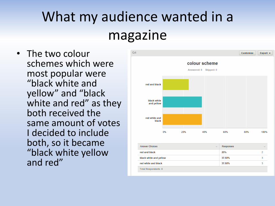
What my audience wanted in a magazine
• The two colour schemes which were most popular were “black white and yellow” and “black white and red” as they both received the same amount of votes I decided to include both, so it became “black white yellow and red”
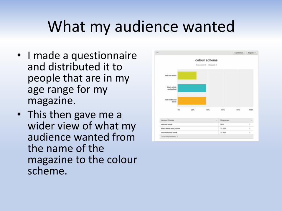
What my audience wanted
• I made a questionnaire and distributed it to people that are in my age range for my magazine.
• This then gave me a wider view of what my audience wanted from the name of the magazine to the colour scheme.
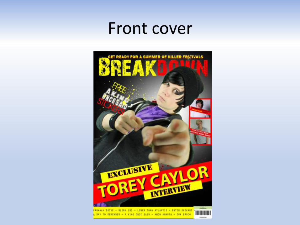
Front cover
Front Cover
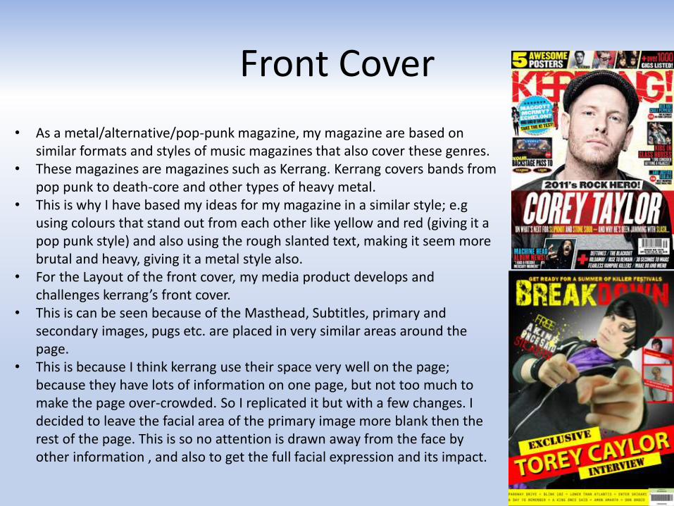
• As a metal/alternative/pop-punk magazine, my magazine are based on similar formats and styles of music magazines that also cover these genres.
• These magazines are magazines such as Kerrang. Kerrang covers bands from pop punk to death-core and other types of heavy metal.
• This is why I have based my ideas for my magazine in a similar style; e.gusing colours that stand out from each other like yellow and red (giving it a pop punk style) and also using the rough slanted text, making it seem more brutal and heavy, giving it a metal style also.
• For the Layout of the front cover, my media product develops and challenges kerrang’s front cover.
• This is can be seen because of the Masthead, Subtitles, primary and secondary images, pugs etc. are placed in very similar areas around the page.
• This is because I think kerrang use their space very well on the page; because they have lots of information on one page, but not too much to make the page over-crowded. So I replicated it but with a few changes. I decided to leave the facial area of the primary image more blank then the rest of the page. This is so no attention is drawn away from the face by other information , and also to get the full facial expression and its impact.
Contents Page
Contents Page
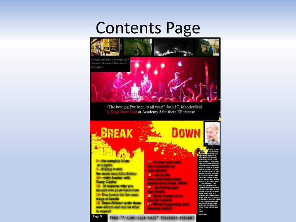
• My contents page has been set out a little differently to kerrang magazine’s contents page. This is because I’ve set of the pictures in a different format to how they would usually have their layout.
• I think my way suits the magazine better as it gives the magazine more of a professional layout; with scenic pictures but with a simple back ground.
• It draws more attention to the photography then the writing, giving the magazine a more professional image and challenges a lot of conventions of real media products around today.
• The column for the editors blog is very similar, just on opposite sides of the page. I choose to use the same format as the Kerrang magazine here because I thought it was a sensible place to put it without it obscuring any of the other text.
• The red and yellow splashes behind the title breakdown show the punk side of the magazine; giving it a feel that we have a free will to do what we want and we don’t care what people think. This will inspire to readers how have the same moral ethics and make them want to read on.
Double Page spread
Double Page spread
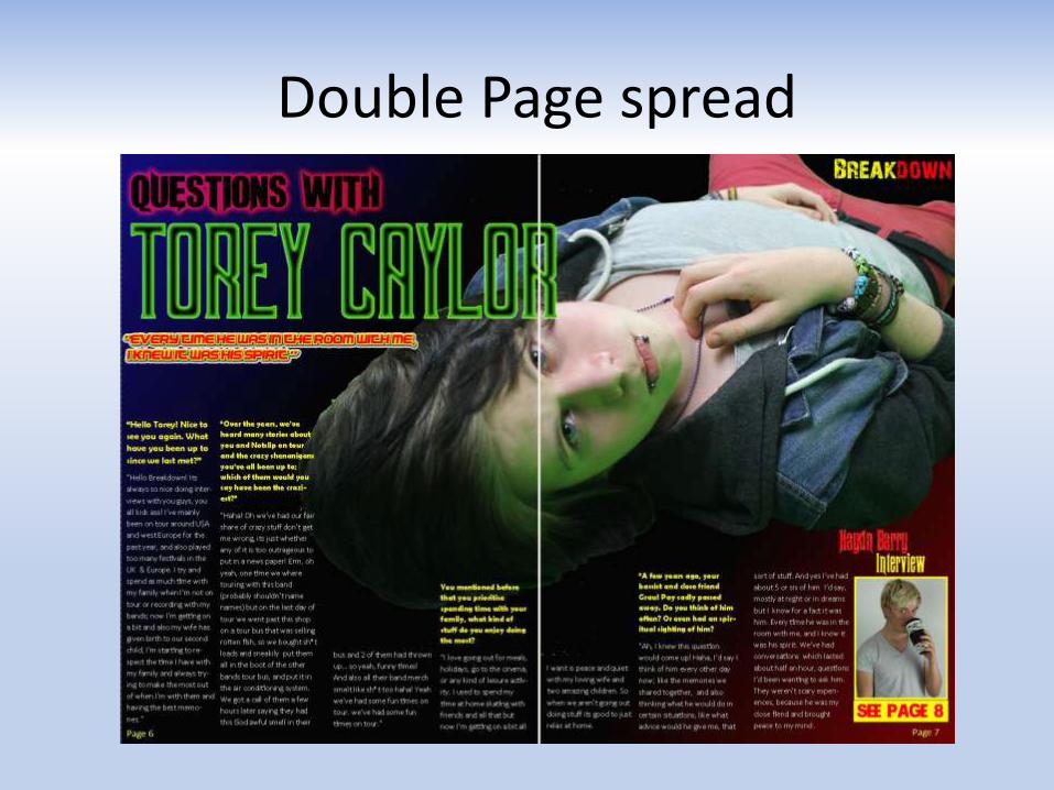
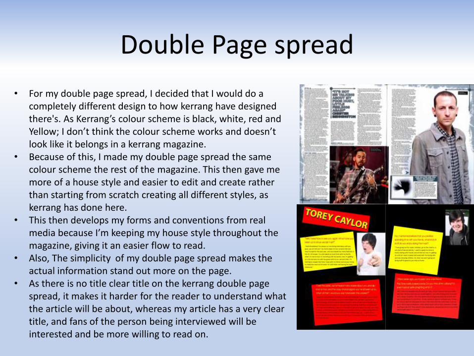
• For my double page spread, I decided that I would do a completely different design to how kerrang have designed there's. As Kerrang’s colour scheme is black, white, red and Yellow; I don’t think the colour scheme works and doesn’t look like it belongs in a kerrang magazine.
• Because of this, I made my double page spread the same colour scheme the rest of the magazine. This then gave me more of a house style and easier to edit and create rather than starting from scratch creating all different styles, as kerrang has done here.
• This then develops my forms and conventions from real media because I’m keeping my house style throughout the magazine, giving it an easier flow to read.
• Also, The simplicity of my double page spread makes the actual information stand out more on the page.
• As there is no title clear title on the kerrang double page spread, it makes it harder for the reader to understand what the article will be about, whereas my article has a very clear title, and fans of the person being interviewed will be interested and be more willing to read on.
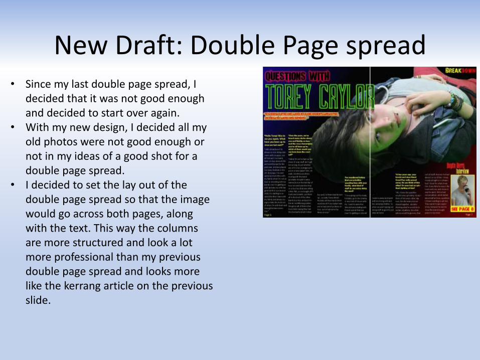
New Draft: Double Page spread• Since my last double page spread, I
decided that it was not good enough and decided to start over again.
• With my new design, I decided all my old photos were not good enough or not in my ideas of a good shot for a double page spread.
• I decided to set the lay out of the double page spread so that the image would go across both pages, along with the text. This way the columns are more structured and look a lot more professional than my previous double page spread and looks more like the kerrang article on the previous slide.
Who would be your audience for your media product
By Haydn Barry
Age Range
• As my music magazine covers various genres, which different age groups tend to prefer.
• Because of this, age ranges differ between the music genres; (“scene” tends to stay around the age of 14-18, were as heavy metal tends to be 15-older)
• Therefore my magazine will bring in a variety of age ranges. But as an average, my target audience for age will be around 14-21.

Lifestyle of my target audience
• As my average target audience is 14-21, most of my consumers will be of school/college age, with the acceptation of some doing apprenticeships or full time work.
• Their lifestyles usually revolve around education and leisure.
• Their main struggles in life are mostly social aspects (e.g. friends, acceptance) and their own personalities showing out and that also being accepted by peers.
• Also this target age group will be going through transitions in their lives i.e. Leaving school moving onto to college and or work placements. These changes will also affect their family relationships as they mature.

Influences on target audience
How does your media represent social groups?
Social groups and music genres
• As people tend to spend time with people who have the same or similar interests as their own, social groups can be associated with the genre of music they all listen to.
• Therefore, the genres that I cover in my magazine could represent different social groups because the people who read my magazine have similar interests and socialize with similar people.
• However, this is not always the case. And my music magazine represents this too. This is because not all people who listen to “metal/hardcore” socialize a lot with others who also listen to these genres. This is represented in my magazine by showing images and information that could be seen as not “metal/hardcore”. This could be because of the way the person is dressed (looks more indie than metal) or words and phrases that could be said more by one socailgroup than another.

How my audience is filtered to suit some social groups than others
• The hand gestures pointing directly at the camera shows a feel of dominance; making him seem powerful in his success and fame. This could inspire other musicians similar to his to try and become like him.
• Then also, the rockstar’s name will make suit my readers as if they are fan’s of “Torey Caylor” then they will be instantly interacted to the site of the magazine.
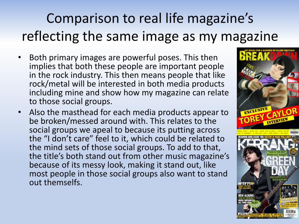
Comparison to real life magazine’s reflecting the same image as my magazine
• Both primary images are powerful poses. This then implies that both these people are important people in the rock industry. This then means people that like rock/metal will be interested in both media products including mine and show how my magazine can relate to those social groups.
• Also the masthead for each media products appear to be broken/messed around with. This relates to the social groups we apeal to because its putting across the “I don’t care” feel to it, which could be related to the mind sets of those social groups. To add to that, the title’s both stand out from other music magazine’s because of its messy look, making it stand out, like most people in those social groups also want to stand out themselfs.

What media institution might distribute your media product and
why?

Media institutions
• I think my media product would be best suited for “Bauer Media”. This is because magazine’s such as kerrang are being published by the same institute.
• As kerrang is very similar to my magazine (covers the same/similar music genres) it made sense to me to be published by the same institute, rather than trying to rival kerrang.
• Also because a lot of media in general (including magazines) are under “Bauer” institution. This would then broaden my horizons with my product and get it distributed nationally without any problems
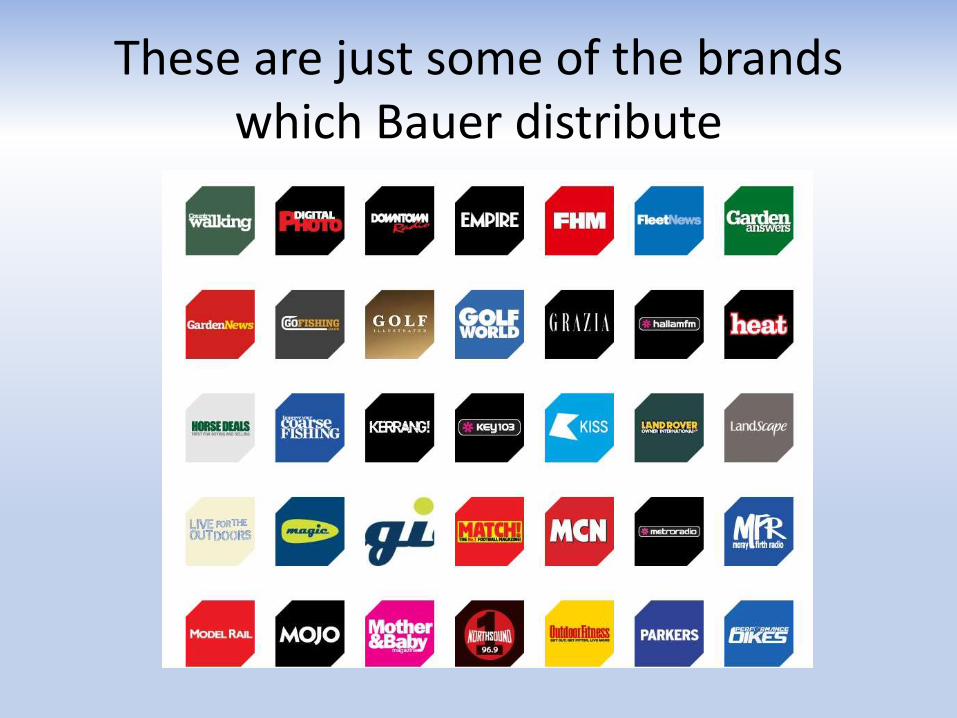
These are just some of the brands which Bauer distribute

Breakdown• Breakdown will be a fortnightly
magazine, priced at £2.10 each issue. • This is because it is a similar price to
kerrang which is a similar magazine to my own in its choice of music genres and all round appearance of the magazine itself.
• Their will be advertisements for clothes which are suited towards the music genres shown in my magazine, band tour dates and band merchandise.
How did you attract/address the audience?
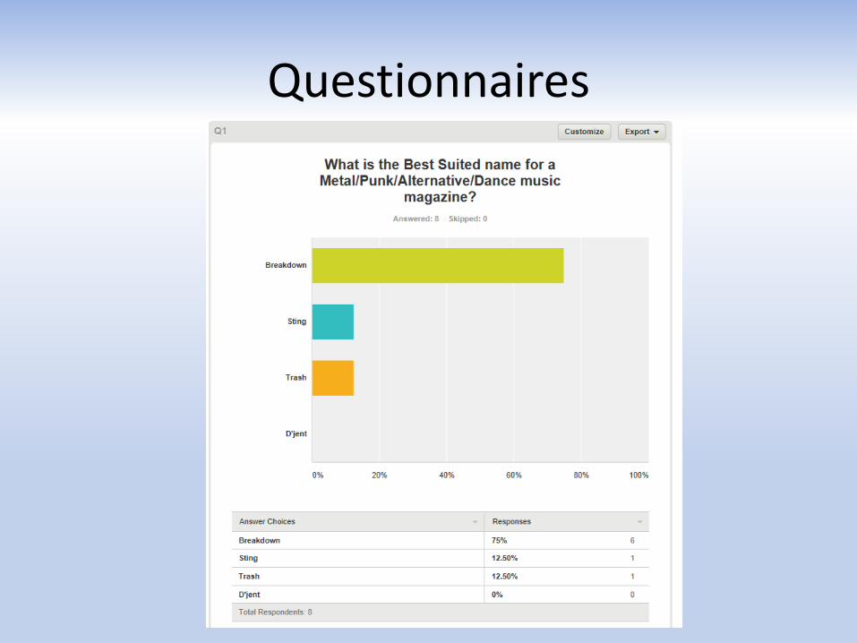
Questionnaires

Analysing results
• As most of my readers will be from 14-21, I sent out a questionnaire for people of this age range and saw what they thought of my ideas for the music magazine (e.gname of the magazine)
• In doing this, I attracted my audience by taking in the information I got from the questionnaire and putting it into my magazine, making my magazine suited towards my audience’s liking.

Evidence
My questionnaire results show that “Breakdown” was the most popular name for my magazine, as the statistics show. Because of this I chose Breakdown as my name for my magazine
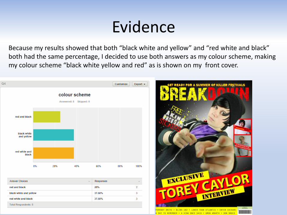
EvidenceBecause my results showed that both “black white and yellow” and “red white and black” both had the same percentage, I decided to use both answers as my colour scheme, making my colour scheme “black white yellow and red” as is shown on my front cover.

What have you learnt from the process off constructing this product
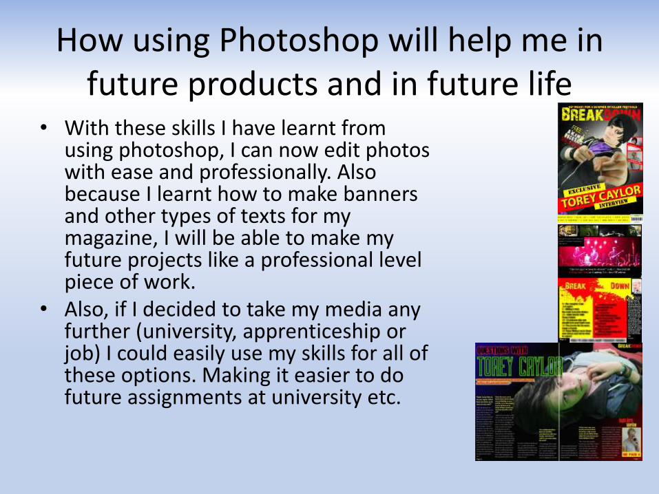
Photoshop
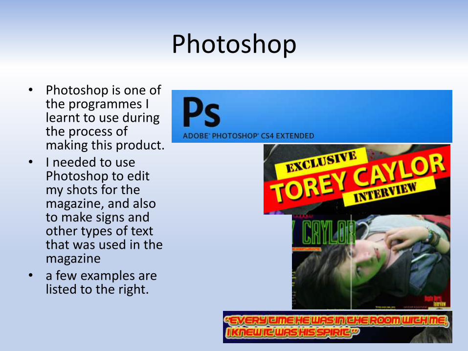
• Photoshop is one of the programmes I learnt to use during the process of making this product.
• I needed to use Photoshop to edit my shots for the magazine, and also to make signs and other types of text that was used in the magazine
• a few examples are listed to the right.
How using Photoshop will help me in future products and in future life
• With these skills I have learnt from using photoshop, I can now edit photos with ease and professionally. Also because I learnt how to make banners and other types of texts for my magazine, I will be able to make my future projects like a professional level piece of work.
• Also, if I decided to take my media any further (university, apprenticeship or job) I could easily use my skills for all of these options. Making it easier to do future assignments at university etc.
Looking back on your preliminary task (aquinas college magazine), what have you learnt in the progression to the full
product

Comparison: front cover
• there is a fairly dramatic difference between my preliminary task and my music magazine front cover.
• I compiled the background on the music magazine by using different effects I learnt like fading two colours into each other, in this case white and black; whereas in my Aquinas magazine it is just a simple white background. This is because I hadn’t yet learnt how to use Photoshop and I was using purely just windows publisher.
• Because of the differences like these, my music magazine is dramatically different and looks a lot more professional than my preliminary task.
